1. Teardrop bouquet with ink outline + pencil petal shading
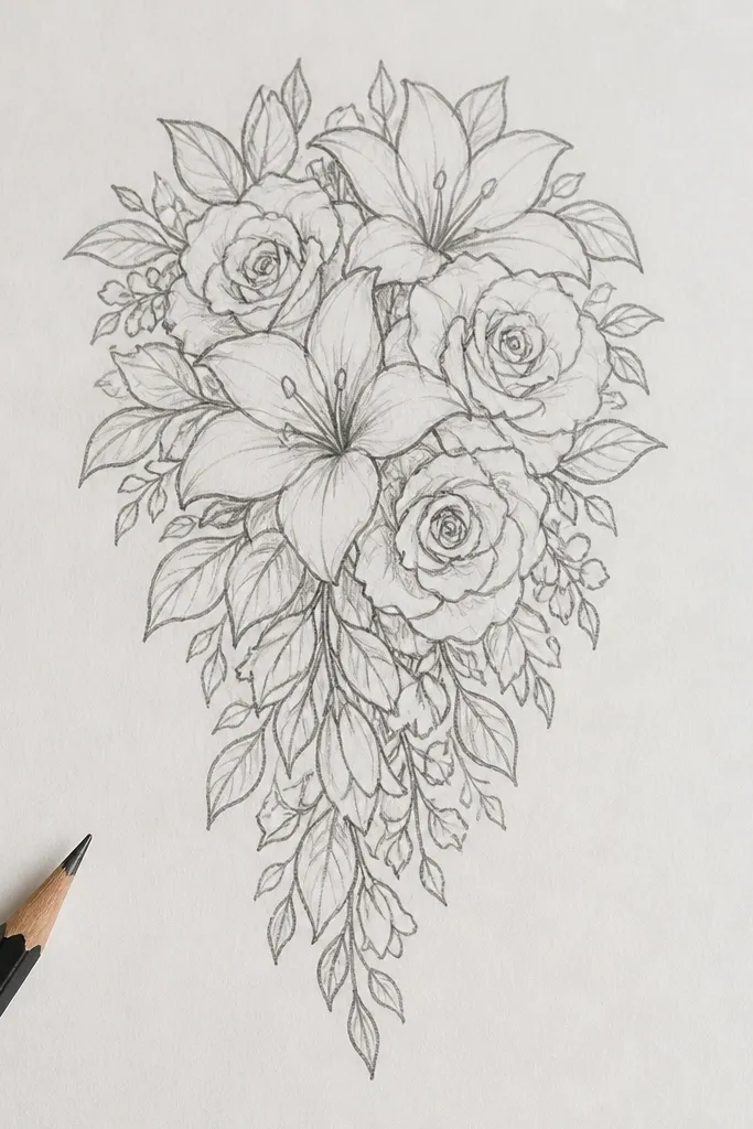
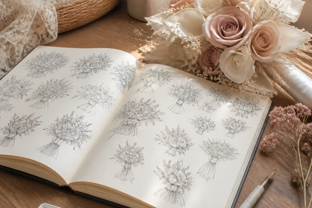
This style is the quickest path to a “wedding illustration” look because the teardrop silhouette gives you structure. Ink lines make the flowers readable from a distance, and pencil shading adds depth without turning the page gray. Keep the petals slightly uneven — tiny variations make it look hand-drawn, not traced. For photos, use a clean white page and leave breathing space around the bouquet so the outline pops.
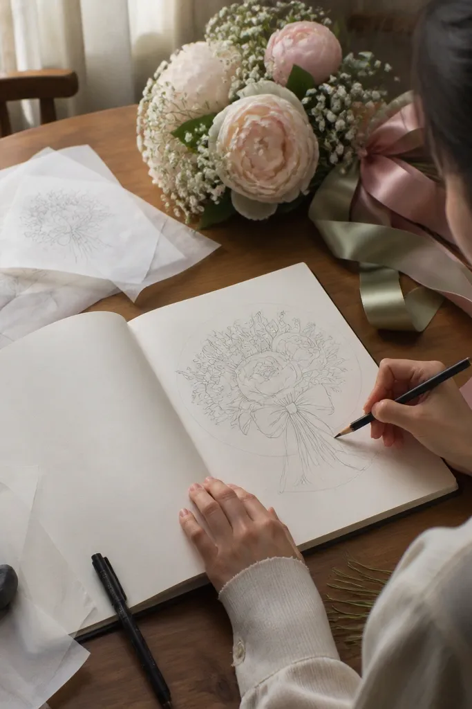
Start by sketching a teardrop guide lightly — wide at the top, narrowing toward the stem end. Draw one anchor cluster first at the widest point, then build petals outward in layers that follow the curve. Finally, ink over the outer petal edges you want to emphasize, then shade only the inner petal folds with pencil using short strokes.
Good to knowInk first, shade second. If you shade before inking, pencil smudges into the wet ink and you lose crisp edges.
Common mistakeDon’t outline every single petal — outline the outer rhythm and let interior petals stay lighter.
2. Round bouquet with watercolor-wash petals and a darker center
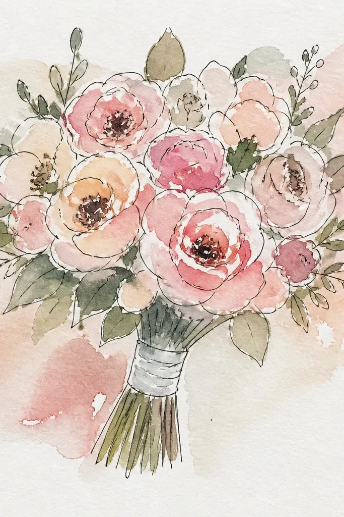
A round bouquet reads like a classic bridal bouquet in photos, especially when the petals are mostly translucent. Watercolor-wash petals give you that soft, airy look without heavy linework. The darker center is the secret — it stops the bouquet from looking like a bunch of blobs. Choose one darker shade (dusty rose or soft plum) for the center and keep outer petals pale.
Lightly pencil a circle silhouette, then place 3-5 flower “puffs” inside it. Mix a very watery wash for outer petals and paint in loose shapes, leaving paper showing through between petals. Drop a darker color into the center of each flower puff, then let it bleed slightly but don’t overwork it.
Good to knowUse tissue to blot one edge of each wash. It creates natural petal variation that looks expensive.
Common mistakeDon’t paint the whole bouquet with full-strength color — watery outer petals are what keeps it bridal.
3. Swoop bouquet with charcoal stems and white highlights
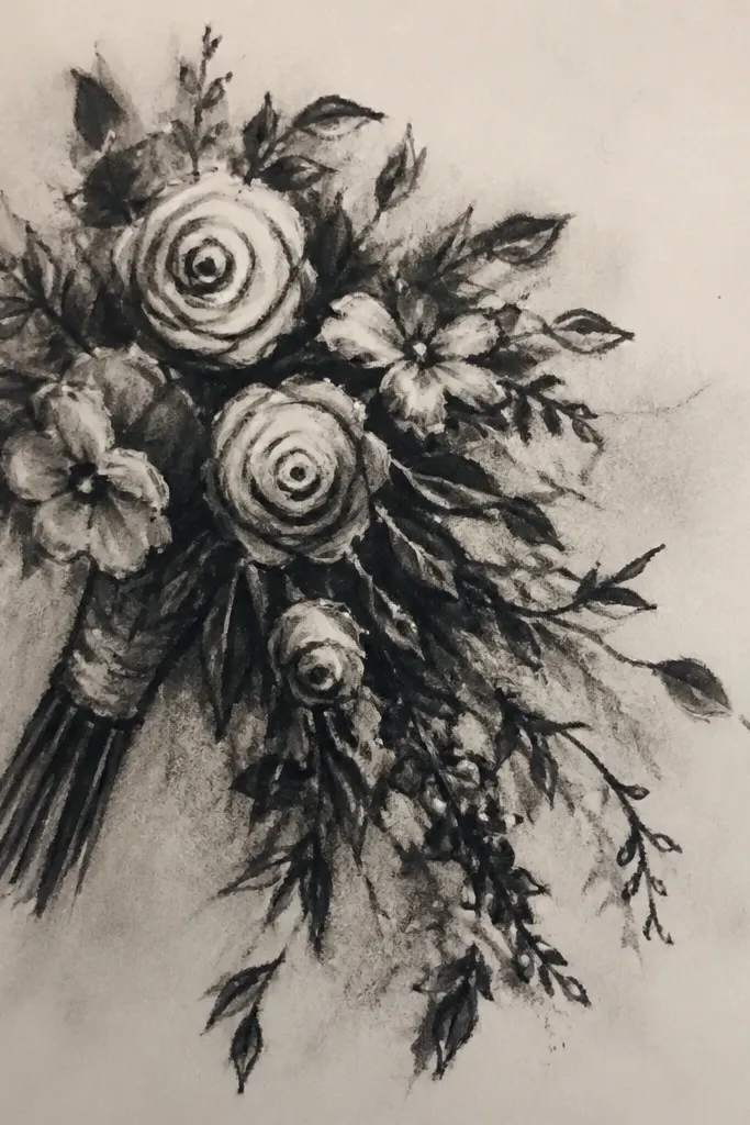
If your drawings look flat, this one adds instant depth. Charcoal stems and darker shadow marks give the bouquet a grounded feel, while white highlights make petals look rounded. It’s dramatic without being messy when you keep the palette limited to charcoal gray plus one blush tone. This also photographs well against off-white backgrounds because the contrast is clear.
Sketch the swooping bouquet line first, then add a few thicker stems that arc across the page. Shade the underside of petals with charcoal using a light pressure gradient — darker under the top layer, lighter near the edges. Add one or two white highlight strokes on each flower cluster using a white gel pen or white gouache.
Keep your charcoal marks directional. Short strokes that follow petal curves look natural; random scribbles look grainy.
Don’t over-smudge. If charcoal turns velvety everywhere, you lose the “highlighted petals” effect.
4. Botanical line bouquet with minimal leaves and tiny buds
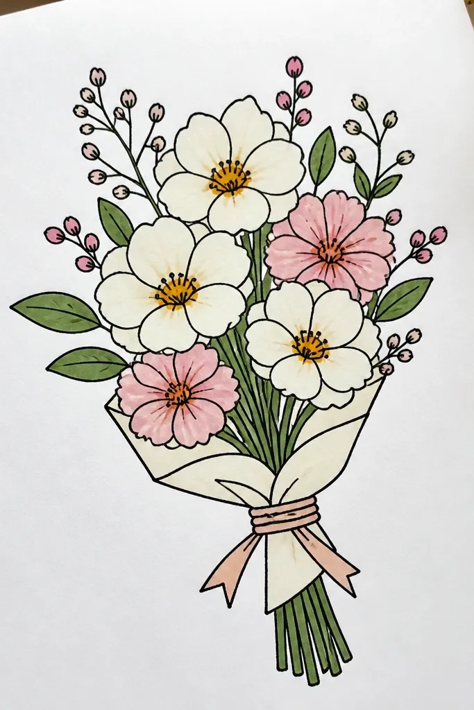
This is the “fine art stationery” look. Minimal leaves keep the composition airy, while tiny buds add detail without clutter. The key is line weight: thicker lines at the outer edge and thinner lines for inner buds and leaf veins. If you want something that looks good even in a small frame, this style wins.
Draw the bouquet silhouette lightly, then place a main cluster first. Add small buds between petals like punctuation — don’t make them the same size as the main flowers. Use a fine liner to add leaf outlines sparingly, then add 2-3 vein lines only where the leaf turns toward the light.
Vary your pen pressure. One pen, two line weights, and the drawing looks instantly more dimensional.
Don’t fill empty space with extra flowers. Leaves and buds should support the cluster, not replace it.
5. Garden rose bouquet with layered petals in colored pencil
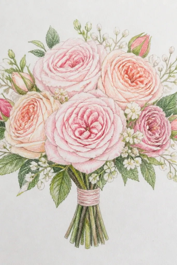
Colored pencil is forgiving and gives you control over petal texture. Layering petals in a rose bouquet makes it look like you spent longer than you did, because each layer catches light differently. Use a warm base color for the petals and a slightly cooler shadow color for folds. This style is ideal if you like soft, realistic shading without watercolor mess.
Pencil a rose shape inside your bouquet silhouette, then block in petal edges with light base color. Add a darker pencil shade along the fold lines and under overlapping petals. Build up the final layer last — the outer petal edges — so they look crisp against the softer interior.
Good to knowSharpen your pencil to a point for petal edges, then use the side of the lead for quick shadow fills.
Common mistakeDon’t press hard on the first layer. Heavy first passes make colors muddy when you layer.
6. One-line continuous bouquet with a bouquet ribbon banner
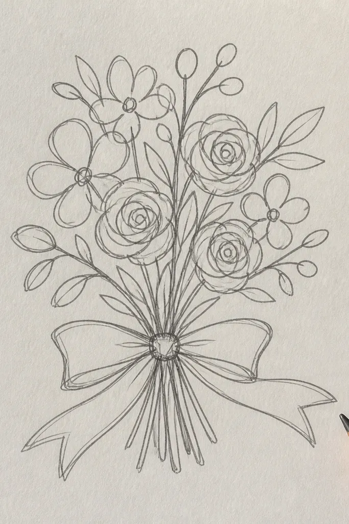
This is the cleanest aesthetic option when you want bold, graphic charm. One-line continuous drawing looks modern, and the ribbon banner gives you a strong focal point in photos. It also helps beginners because you’re not stuck deciding where to stop — the line decides. Use a single ink color and keep the ribbon text area blank for later personalization.
Plan your silhouette first with a very light pencil guide — bouquet top, then ribbon banner area. Start at the ribbon edge, draw up into the bouquet with one continuous stroke, then return down into the ribbon. Add only a few interior loops for flower petals, keeping them simple so the line stays readable.
Good to knowUse a thicker fineliner (0.8 or 1.0). One-line art looks better when the line has weight.
Common mistakeDon’t add too many petal loops. If you over-detail, it stops feeling graphic and starts looking messy.
7. Cream-and-rose bouquet with gouache dots and speckle texture
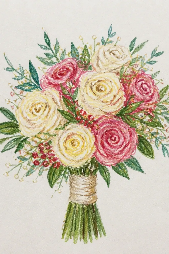
Gouache speckles make petals look like fabric and bring a soft, romantic texture. This style also helps when your petals keep looking too smooth — the speckle breaks up the flat color. Keep the palette tight: cream for most petals and rose for the overlaps. The result is photogenic even when your background is plain.
Sketch your bouquet silhouette and block in cream petals with a light gouache wash. Mix rose gouache for overlaps and add it where petals touch, using the brush tip for controlled edges. Finally, load the brush with more pigment, then flick tiny dots onto petal surfaces and let them dry before adding any extra shading.
Good to knowTest your speckle on scrap first. You want small dots, not splatters that look like mistakes.
Common mistakeDon’t add speckles over every area. Concentrate dots on the top petal layers for a clean look.
8. Eucalyptus frame bouquet with negative space border
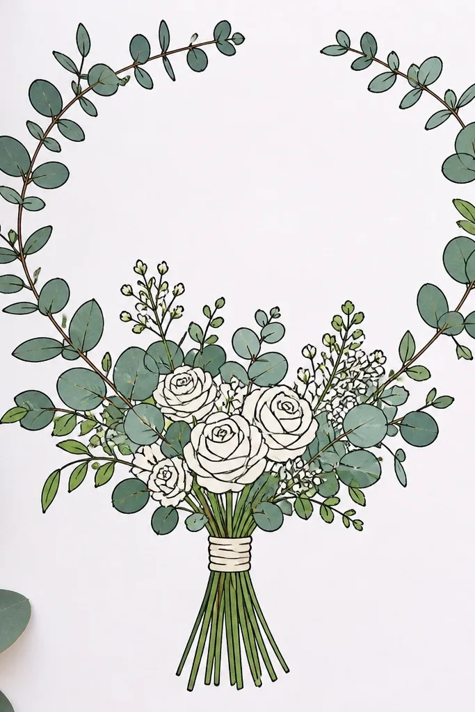
This idea makes your bouquet look like it belongs on an invitation or art print. Eucalyptus leaves around the edges create a frame, but the negative space keeps the drawing from feeling crowded. It’s also beginner-friendly because the leaves repeat in a pattern. The look photographs cleanly because the bouquet stays centered and the background doesn’t steal attention.
Draw a rectangular or oval border guide lightly, leaving a wide empty center. Place eucalyptus leaf stems along the border edges, alternating left and right so it feels balanced. Fill the center with your bouquet silhouette, then add a few leaves that overlap the bouquet edge for depth.
Keep leaf pairs symmetrical on the top half, then let the bottom half taper. That gives a natural, organic frame.
Don’t draw the frame too close to the bouquet. Give it at least 1 cm of breathing space on paper.
9. Watercolor splatter bouquet with controlled drip accents
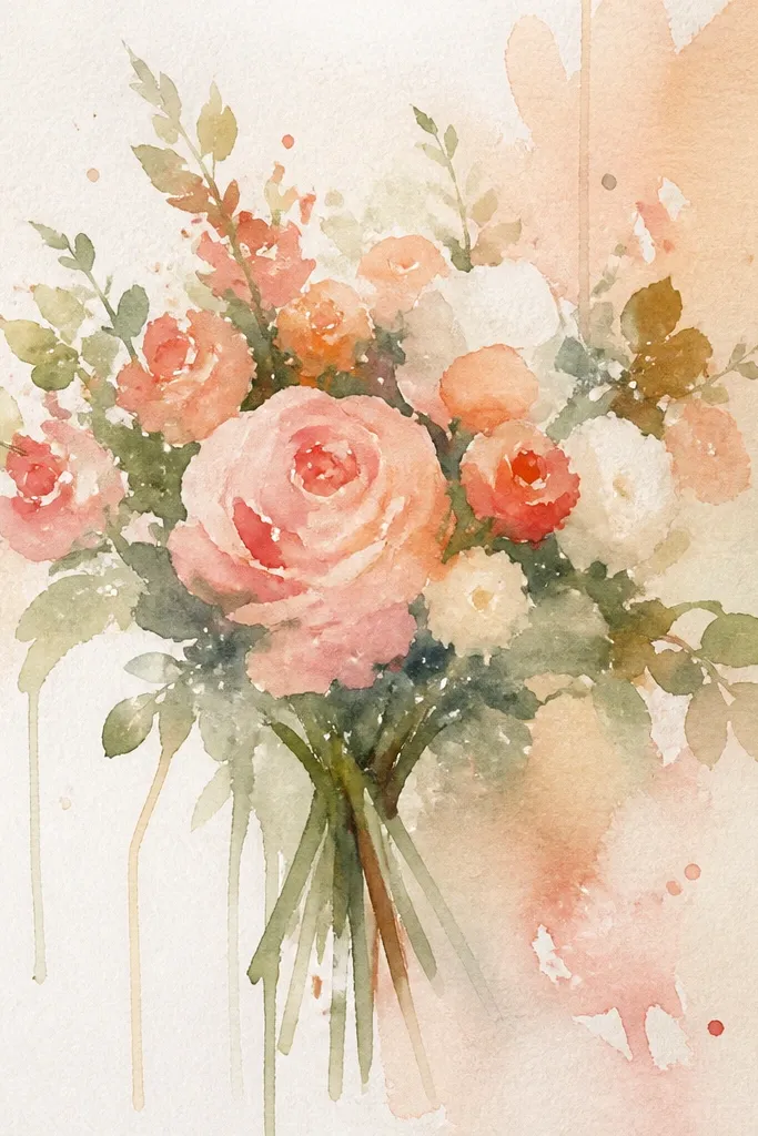
Splatter accents can make a simple bouquet look lively and celebratory. The trick is control: splatter belongs in the background, not on the petals you want to look delicate. This style works great for offbeat wedding vibes while still reading as “soft” because the bouquet colors stay pale. It’s also great if you want a more playful aesthetic than clean line-art.
Paint the bouquet petals first with light watercolor washes so they dry before you add texture. Load a smaller brush with slightly darker diluted paint, then flick away from the bouquet toward the corners. Use a damp brush to pull one or two tiny drips downward from a corner splatter, then stop before it reaches the bouquet.
Tape down the paper edges with painter’s tape. It keeps splatters sharp and prevents warped edges in photos.
Don’t splatter on wet petals. You’ll get watercolor blooms that blur your flower shapes.
10. Marker gradient bouquet with dark-to-light petal edges
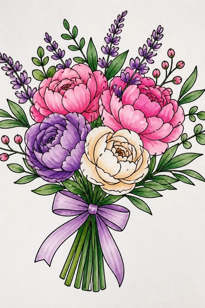
Markers make bouquets look graphic and high-contrast, which reads well in wedding stationery photos. The gradient edge trick adds dimension without complicated shading. Choose one flower color and one shadow tone — for example dusty rose plus mauve, or blush plus plum. Keep your center lighter and edges darker so the petals look rounded.
Sketch the bouquet silhouette and lightly mark petal boundaries with pencil. Color the petal centers first with the light marker tone, then blend toward the edges using the darker marker. Where petals overlap, deepen only the contact area with the shadow tone, then reinforce the outer silhouette line with a fineliner.
Good to knowBlend immediately while the marker is still wet. If it dries, layering creates streaks that show in photos.
Common mistakeDon’t use too many colors. A two-marker system looks cleaner than a rainbow palette.
11. Pencil-only bouquet with graphite smudges and kneaded eraser blooms
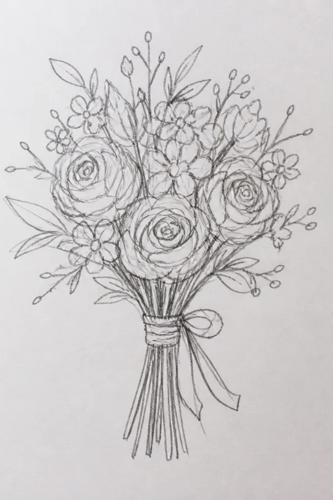
If you want a refined look without color, this graphite method makes petals feel soft and dimensional. Smudges create the base softness, and kneaded eraser blooms create highlight spots that mimic light hitting curved petals. It’s also cheap and quiet — no watercolor cleanup, no marker bleed. The result looks surprisingly “finished” because the contrast is controlled.
Lightly sketch your bouquet silhouette, then shade petals with a soft graphite (2B or 4B) in quick curved strokes. Smudge gently with a blending stump or tissue so the shading becomes smooth. After a first layer sets, dab highlights by pressing kneaded eraser onto the petal surfaces, then refine petal edges with a sharpened pencil.
Use a kneaded eraser like a stamp. Press, lift, press again for natural highlight clusters.
Don’t keep erasing back and forth. It pills the paper and makes the highlights look dusty.
12. Ink wash bouquet with watercolor-like bleeding edges
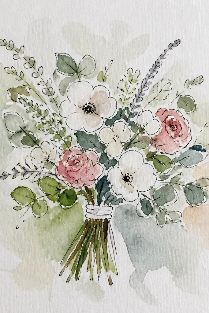
Ink wash gives you the best mix of crisp lines and painterly edges. It looks intentional even when your drawing skills are still developing, because the wash does part of the texture work. Keep your wash light and let it bleed just at the petal edges. This style is great for beginners because you don’t have to shade every fold.
Draw the bouquet outline and major petal shapes with waterproof ink or a dark fineliner. Dilute ink with water for a light wash and paint inside petal boundaries, leaving some paper white for highlights. While the wash is wet, tilt the paper slightly so it creates gentle edge blooms, then let it dry flat.
Good to knowUse a small round brush and keep the water load low. Too much water turns it into a muddy blob.
Common mistakeDon’t draw tiny details before the wash. Let the wash establish the shapes first.
13. Monochrome black bouquet with white gel pen petals
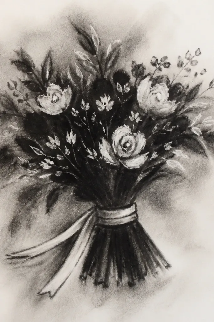
Black paper plus white gel pen creates instant drama and makes every line pop in photos. This style also hides uneven pencil work because the white highlights do the heavy lifting. It’s perfect for a modern wedding vibe and it looks clean even with minimal detail. You’ll get a crisp, high-end look without needing watercolor skills.
Use charcoal or a light pencil to sketch the bouquet silhouette on dark paper so you can see the structure. Outline the outer petals with a white gel pen, then add internal petal lines as thin strokes where petals overlap. Finish by adding a few thicker highlight strokes on the top edges of petals for dimension.
Good to knowPress lightly at first. Gel pen ink builds up fast on dark paper, and heavy pressure can blob.
Common mistakeDon’t use white gel pen for the entire bouquet outline if your lines get thick — mix in a few thinner strokes for balance.
14. Pastel wedding bouquet with layered tissue-paper color blocks
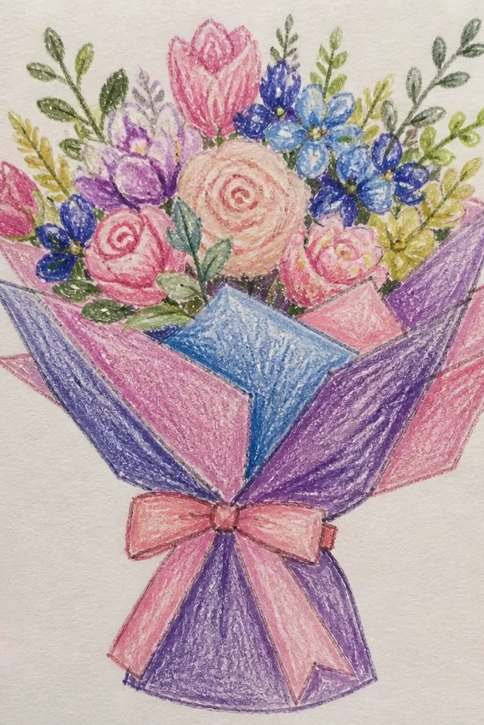
This is the most aesthetic “wow” option without needing advanced drawing. Tissue-paper color blocks create soft edges and a handmade feel that photos love. You define petal shapes by tearing tissue rather than trying to paint perfect curves. Keep it simple: 3 petal colors, one leaf green, and a light cream base.
Sketch the bouquet silhouette on paper, then tear tissue into petal-sized pieces with slightly irregular edges. Lightly glue one color layer at a time, starting with the lightest base petals. Add darker petal pieces on top where overlap happens, then tear a few leaf shapes and glue them last to frame the bouquet.
Good to knowUse a glue stick for tissue — it dries clear and prevents warping better than liquid glue.
Common mistakeDon’t soak the tissue with wet glue. Wrinkles ruin the soft petal look.
15. Ribbon bow bouquet with watercolor bow shading and clean edges
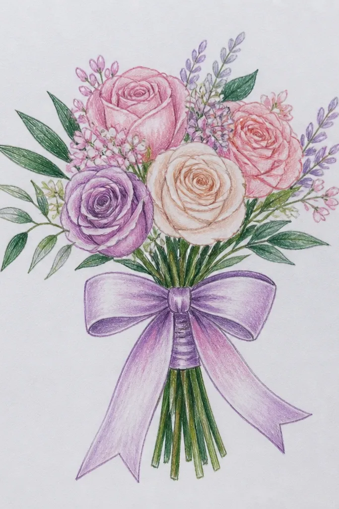
A bouquet drawing looks more bridal when the ribbon bow is crisp and dimensional. The flowers can be soft, but the bow should have clear fold lines and controlled shading. This style gives you a strong focal point near the bottom of the page, which helps photos and keeps the viewer’s eye from drifting. Use a muted ribbon color so it doesn’t overpower the flowers.
Draw the bouquet first with a simple silhouette and cluster anchors. Then sketch the ribbon bow — two loops and a knot — and mark fold lines with light pencil. Paint the ribbon with a light watercolor wash, then add a slightly darker wash along the fold lines and under the knot, leaving highlights unpainted.
Good to knowUse a smaller brush than you think you need for the ribbon fold lines. Clean lines make the whole piece look intentional.
Common mistakeDon’t let ribbon edges bleed into the bouquet. Keep a thin highlight gap at the fold boundary.