
1. One-Tulip Corner Frame with a Clean Stem
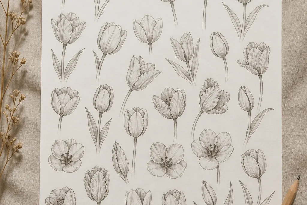
This sketch style is my go-to when I’m making a card because it keeps the tulip airy and leaves room for a greeting. The flower sits diagonally, so the petals show shape instead of spreading outward like a daisy. I use two line weights: a lighter outline for inner folds and a slightly darker line on the outer petal edges. The center stays small, which flatters most compositions because it prevents the tulip from looking top-heavy.
Good to knowIf your lines feel shaky, draw the stem first and anchor the petals to that top point. That one step makes the whole tulip look intentional.
Start by drawing a short guideline for the stem — about 1.5 inches long on a standard 4x6 card — slanting down-left. Then sketch three outer petals as rounded teardrops that meet near the top, keeping the center teardrop about 1/3 the height of the whole bloom. Add one leaf using a single curved stroke with a center vein line. Finally, darken only the outer petal outlines with a fineliner and leave the inner folds in pencil so the flower looks dimensional.
Common mistakeDon’t shade the entire petal — it turns the bloom into a gray blob fast.
2. Tulip Bud Tight Center with Three Fold Lines
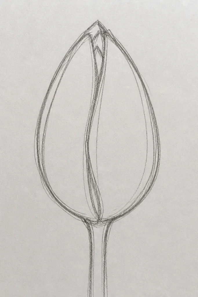
This one reads as a bud, which is perfect for early spring and also looks sweet on gift tags. The narrow bloom shape is the magic here — it gives you a tulip silhouette even if your petals aren’t perfectly symmetrical. I keep the fold lines short and curved, so they look like the petal layers pulling toward the center. This style flatters small spaces because the flower stays compact and doesn’t steal all the attention from text.
Start with a vertical oval for the bloom, then taper the top slightly so it looks closed. Add two outer petals by drawing them as narrow teardrops that overlap the oval edges. Place the center as a small heart shape at the top, then add three fold lines that curve inward — each line about the length of the center heart’s widest part. Finish with a thin stem line and one leaf drawn as a sideways oval with a single vein line down the middle.
Use a lighter pencil for the fold lines, then go over them with pen only if you want extra contrast for photos.
Skip heavy shading on bud tulips — closed petals need line detail, not big gray areas.
3. Side-Facing Tulip Profile with a Single Highlight Edge
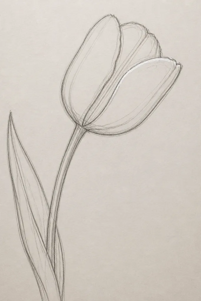
Side-facing tulips look fancy without being hard. They’re also forgiving because the eye expects asymmetry, so your petals don’t have to match perfectly. I draw one darker edge along the outer rim of the petals, like a highlight boundary, and keep the rest lighter. This gives instant depth — the flower looks like it’s turning toward light. It’s great for people who feel overwhelmed by front-facing tulips and want a calmer, more controlled look.
Start with a curved stem line that arcs like an S — about 2 inches long. Draw the outer rim first as a single thick curve, then build the petal cup with two overlapping arcs inside it. Add one inner fold line that follows the curve and stops before reaching the rim. Place a small leaf behind the stem using two short curves that meet at a point. Finally, darken the rim line with pen and erase or lighten any pencil marks inside the cup.
When you ink, leave a tiny gap in the darkest outline — it reads like a highlight edge in photos.
Don’t draw both sides equally dark. Profile tulips need one dominant edge.
4. Tulip Bouquet Cluster of Three with Shared Stems
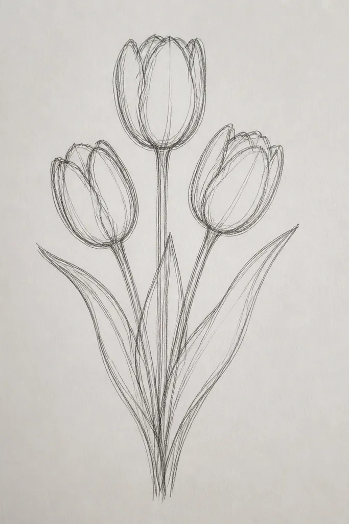
Clusters look best when you repeat the same petal pattern three times and let the angles do the variety. This sketch style is perfect for wrapping paper accents because it fills space without needing background texture. I keep the centers aligned at slightly different heights so the bouquet feels arranged, not random. The shared stem point is the anchor — once that’s right, the rest falls into place. It also looks flattering on wide layouts where one tulip feels too small.
Start by drawing one main stem line down the middle, then extend two short secondary stems that split near the top. Sketch three blooms around the top of those stems using the same petal template: three outer petals and one small center. Keep one bloom slightly higher, one centered, and one lower so the cluster looks natural. Add leaves as two or three fan-shaped strokes that overlap the stems, then darken the outer petal edges while leaving the leaf veins lighter.
If your cluster looks messy, reduce the number of leaves to two. Clean clusters read better in holiday cards.
Avoid drawing three completely different tulip styles. Consistency is what makes it look like a bouquet.
5. Tulip Mandala-Like Bloom with Petal Rays
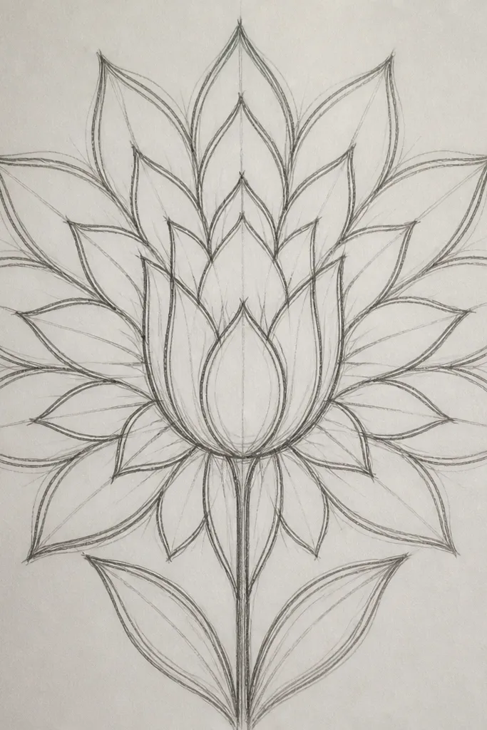
This is the tulip sketch I use when I want something decorative but still tulip-shaped. The secret is repeating small petal arcs around a tiny center, so the bloom feels ornamental without losing the tulip identity. I draw the center as a small circle, then place six to eight petal rays that stop before the outer rim. The result looks like stained glass in pencil because the petal edges catch the light. It looks good on kraft paper and dark cardstock because the linework pops.
Start with a small center circle, about 0.3 inches wide. Draw six to eight curved petal rays around it, each ray as a thin almond shape that points outward. Then outline three larger outer petals that wrap the rays, giving it a true tulip silhouette. Add a minimal stem line and one leaf with a single vein. Finally, ink the outer petals and center circle, then leave the rays lighter so the bloom has a layered feel.
Use a ruler for the center circle only. The petals should be freehand so they look hand-drawn, not printed.
Don’t make the center circle big. A large center ruins the tulip shape and makes it look like a generic flower.
6. Single Tulip with Soft Crosshatch Shading
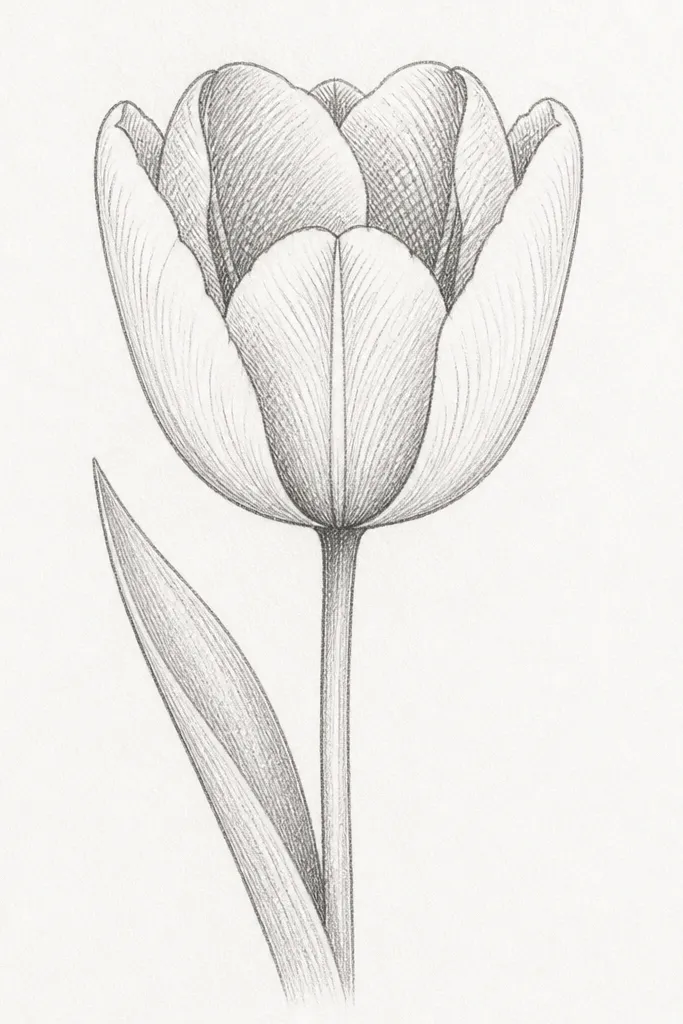
If you want a tulip that looks more finished without coloring, crosshatch shading is your friend. I place the hatch marks only in the inner folds and along the base of the petals, not across the whole bloom. That keeps the edges crisp and prevents the flower from looking smudged. This sketch flatters simple layouts because the shading gives depth even when you keep the background empty. It also works well for beginners because you’re repeating small strokes instead of doing smooth gradients.
Start by outlining the tulip with three outer petals and a small center teardrop. Then add two inner fold areas — think of them as curved wedges inside the petals. Use a 2B pencil to draw diagonal hatch marks inside those wedges, keeping the hatch spacing consistent. Add a tiny amount of hatch at the base where the petals meet. Finish by shading the leaf base lightly and leaving the leaf edges unshaded so it stays fresh.
Turn your paper slightly and keep the hatch direction consistent. That one habit makes shading look intentional.
Skip scribbling over the same area. Too many passes makes it look gray and dirty.
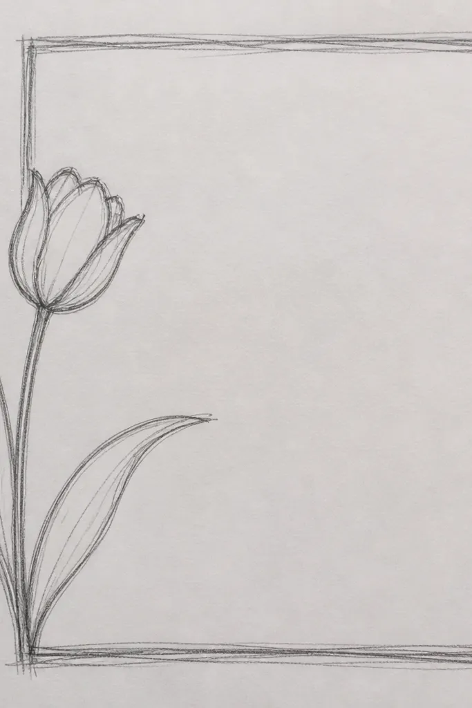
7. Tulip Outline Only with a Double-Line Border
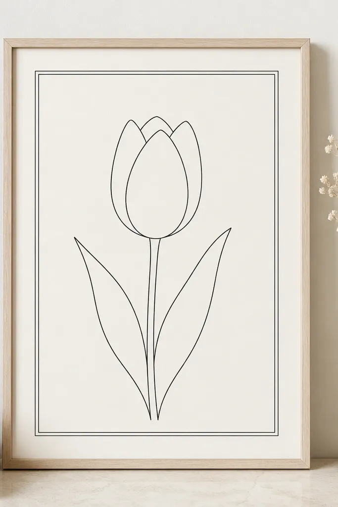
Outline-only tulips look sharp in print and scan really well, which matters for holiday cards. The double-line border gives the drawing a finished edge without needing color. I like using this when I’m making a set of labels because it keeps everything consistent. The tulip itself stays simple: three outer petals, one center, and a thin stem. It works well for pale skin tones and light backgrounds in the sense that it doesn’t fight with typography.
Good to knowIf you’re copying for a set, lock the tulip height to the same measurement each time. Consistent size makes a stack of cards look professional.
Start by drawing a rectangle border about 0.5 inch from the edges of your card or paper. Then sketch the tulip in the center of that rectangle: three outer petals as rounded teardrops and a small center teardrop. Add a straight stem line down with one leaf that curves slightly to the left. Keep all linework the same thickness for the outline. Finally, trace the border with a fineliner slightly darker than the tulip outline so the frame reads first.
Common mistakeDon’t add shading later if you’re planning to print. Outline-only stays clean and crisp.
8. Tulip in a Vase Silhouette with Minimal Details
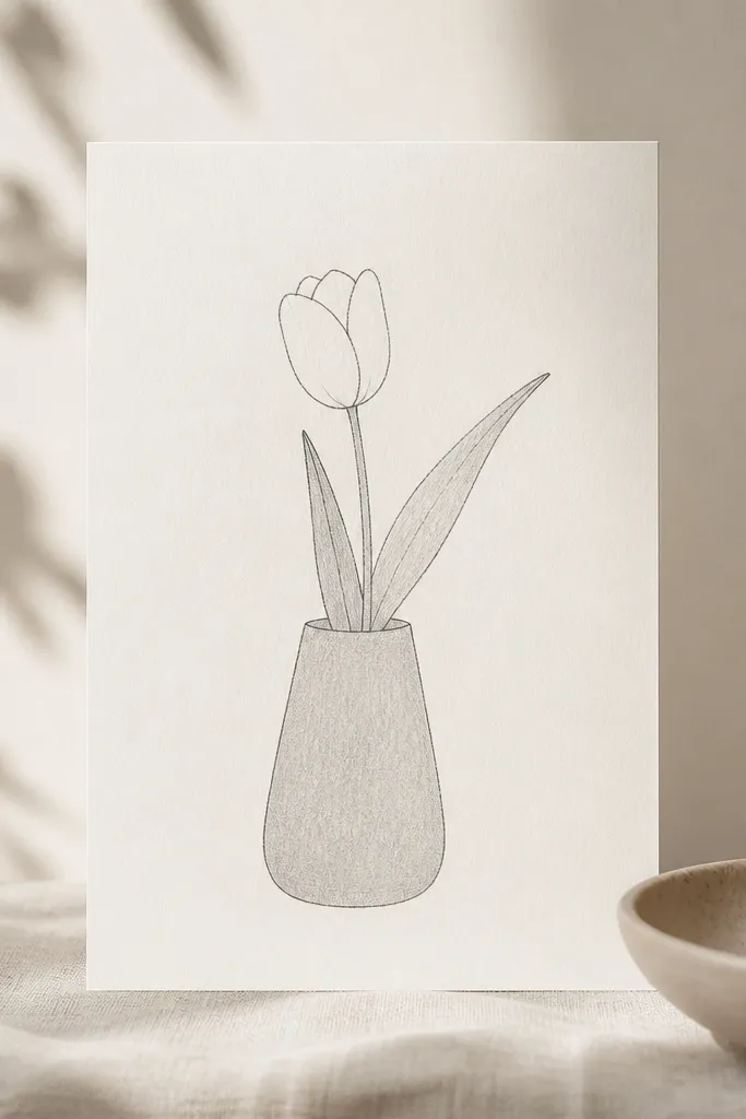
This sketch is great for wall art because the vase silhouette gives you a stronger composition than a floating flower. I keep the vase simple and the tulip detailed, so your eye lands on the bloom. The vase tone is light, just enough to separate it from the background. This style flatters smaller rooms because it looks balanced and doesn’t require a lot of color. It also works for people who struggle with drawing multiple leaves — you only need one leaf to make it feel real.
Start by drawing the vase first: a rounded trapezoid with a slightly wider top opening, about 1.2 inches tall for a small print. Then draw the tulip above it, with three outer petals and a center teardrop — keep the bloom about 1.1 times the vase height. Add one leaf that curves from the base of the stem and points outward. Shade the inside of the vase with light pencil at 10-15% density using gentle strokes. Finally, darken the outer petal edges with pen and erase any stray pencil lines on the bloom.
Use a kneaded eraser on the vase tone edge. Sharp edges make the vase look intentional.
Don’t over-detail the vase. Too many lines make the tulip look secondary.
9. Tall Tulip with Long Narrow Petals and a Lean
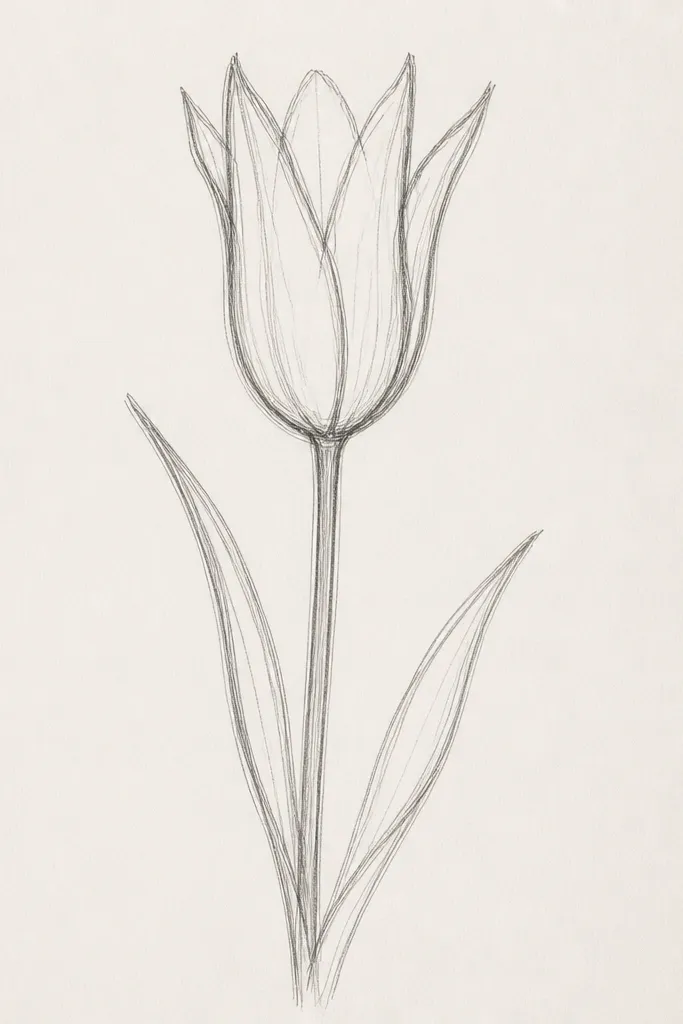
Tall tulips make your art look taller and cleaner, especially on vertical bookmarks and narrow cards. The long narrow petals are the styling choice — they give a graceful curve and make the flower look like it’s reaching. I draw the stem with a slight lean so it doesn’t look stiff. The center is slim and vertical, which helps the petals stay structured. This works especially well if you like minimal linework and want the tulip to look airy.
Start with a vertical stem line about 3 inches long, then tilt it slightly to the right. Draw three long narrow petals that taper to a point at the top, meeting near the center. Make the center as a thin teardrop or a narrow heart, placed slightly lower than you think. Add two leaves: one short leaf near the middle and one longer leaf closer to the base, both angled opposite the bloom lean. Ink the outer petal outlines while keeping the inner fold lines light.
Measure the petal length against the stem once. If the petals are too short, the tulip looks like a squat flower.
Avoid rounding the petal tips. Rounded tips make it look like a generic flower.
10. Tulip Blossom with Watercolor-Style Speckle Texture (Pencil Plan)
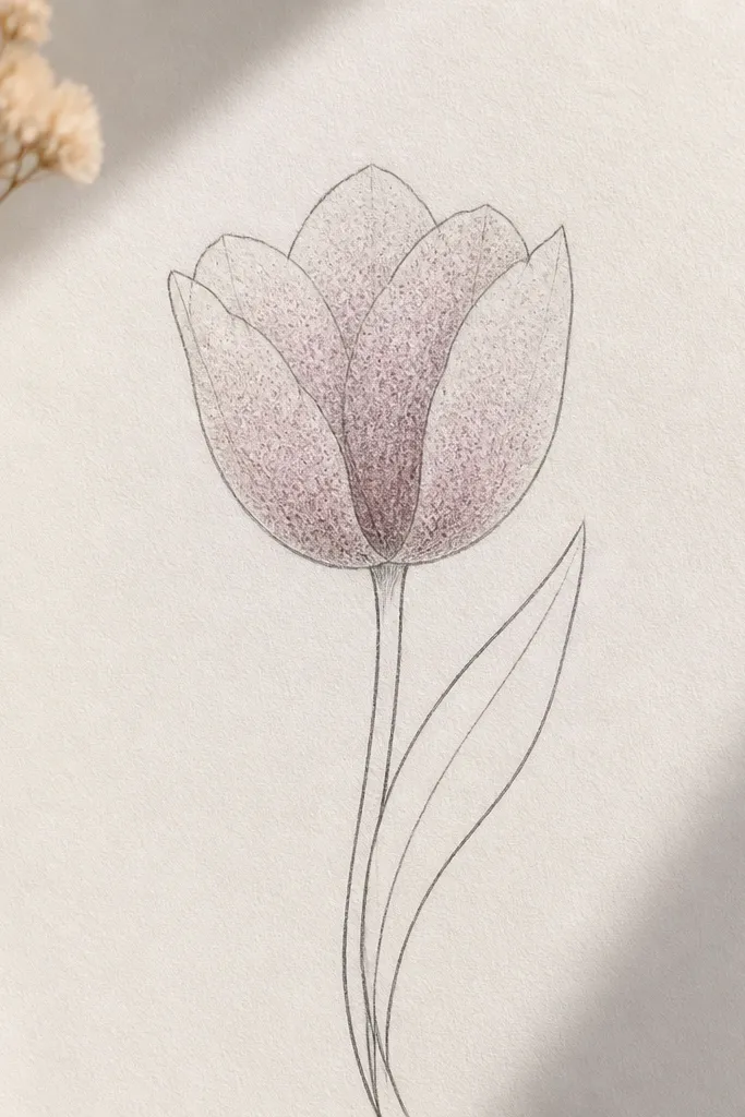
This sketch is for when you want texture without painting a full wash. I plan the speckles in pencil first so I can erase mistakes before I commit with pen or marker. The dots look like watercolor when they’re concentrated near the center fold and fade outward. It creates a soft, seasonal feel that looks great on tags and envelopes. If your coloring always looks too flat, this gives you texture that makes the drawing feel alive.
Outline the tulip with three outer petals and a small center, keeping the edges clean. Then add speckle dots inside each petal wedge — start denser near the center and thin them out toward the outer edges. Keep the dots small, like pencil-sized points, and leave a few blank spots so it doesn’t turn into a uniform gray. After that, ink the outer petal edges and stem lines. Add one leaf with a simple vein and no speckles so the flower remains the focus.
Use a sharp pencil tip and don’t press hard. Light dots look like watercolor specks in the final scan.
Don’t fill the whole petal with dots at equal density. That kills the tulip fold shape.
11. Tulip with Dotted Center and Tiny Petal Notches
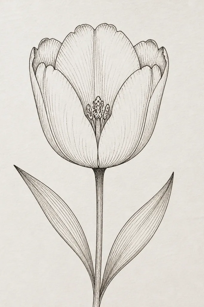
This one looks cute and slightly whimsical, which is why I use it for holiday gift tags. The dotted center gives the bloom a focal point that reads well at small sizes. Tiny notches on the petal tops add realism because real petals often have slight irregular edges. I keep the notches subtle — just a small dip or notch at the top of each outer petal. This flatters clean, simple tag layouts because it gives detail without needing full shading.
Good to knowIf your dots smear, do them last with a 0.1 or 0.3 fineliner.
Start with a basic tulip outline: three outer petals and a center teardrop. Add three small notches at the top edge of each outer petal, one notch per petal. Then draw a small cluster of dots inside the center — 6-10 dots total — concentrated toward the bottom of the center. Add a thin stem line and two leaves drawn as tapered ovals. Finally, darken the outer petal outlines and leave the dot cluster slightly lighter so it looks embedded.
Common mistakeDon’t make the notches too deep. Deep notches make the tulip look torn.
12. Tulip Bouquet in a Circle Badge
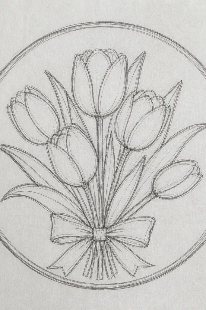
Circle badges are perfect for stickers and labels because the shape frames the tulips and keeps them from floating. The bold circle outline makes the drawing readable even when it’s small. I place one tulip center-front and two around it so you get depth without complex backgrounds. Leaf accents fill the gaps so the circle doesn’t look empty. This style is flattering on darker paper because the badge outline can be dark and the tulips can stay light.
Draw a circle first, about 2.5 inches wide for a sticker-sized layout. Sketch two tulips at the bottom edges of the circle, angled slightly outward, then add a third tulip in the center that’s slightly larger. Keep the shared stem lines minimal; you want the petals to do the work. Add three small leaf shapes around the circle interior — short curved blades with a center vein. Ink the circle and outer petal edges, then lightly erase pencil guidelines so the badge looks clean.
Make the two side tulips smaller than the center one by about 20%. That size difference reads as depth.
Don’t overcrowd the inside with lots of leaves. Three to five leaf accents is enough.
13. Tulip with Ribbon Bow Stem Wrap
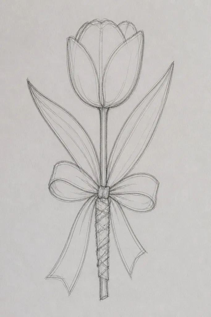
This sketch makes tulips feel gift-ready because the ribbon detail gives you a story instantly. I draw the stem as a ribbon twist — two parallel curves — so it looks like fabric instead of a plant. The bow at the bottom grounds the composition and keeps the drawing from feeling top-heavy. This style flatters small hand-drawn cards because it adds charm without needing a background. It also works well for wedding stationery or Mother’s Day prints.
Good to knowUse the same curve direction for both ribbon lines. If they cross, the ribbon looks like a tangled string.
Start with the tulip bloom: three outer petals and a center teardrop, front-facing. From the center of the bloom, draw a twisted ribbon stem using two curved lines that wrap together. Add a small bow at the bottom with two loops and a tiny knot. Keep leaf detail minimal: one leaf blade on the side of the stem, angled outward. Ink the ribbon lines and outer petal edges, then leave the inner folds as pencil or light linework.
Common mistakeAvoid drawing the bow too large. A huge bow competes with the tulip.
14. Tulip with Checkerboard Petal Pattern Plan
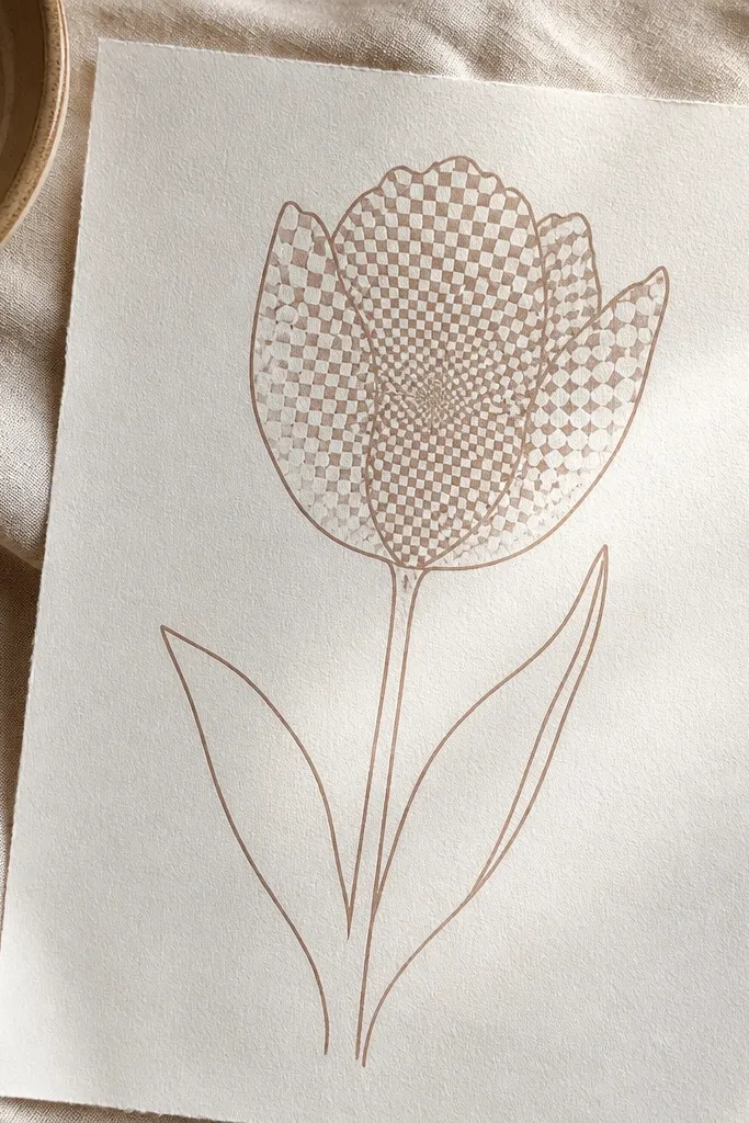
Patterned petals look great when you’re making holiday decor that needs to read from a distance. The checkerboard motif creates a crisp visual texture that still feels tulip-shaped because the pattern follows the petal boundaries. I use small squares or tiny rectangles so it doesn’t look like a grid wallpaper. This style works best with pen because pen dots and lines keep the pattern sharp. It also flatters monochrome designs when you don’t want to color.
Good to knowPractice the checker size on scrap paper first. Consistent square size makes the tulip look intentional.
Outline the tulip with three outer petals and the center teardrop. Then draw a light checker pattern inside each petal wedge, using tiny boxes about 2-3 mm wide. Keep the pattern lighter near the outer rim by skipping every other row toward the edges. Make the center slightly denser by filling more of the checker squares near the bottom of the center teardrop. Finish by inking outer petal edges and leaving the stem and leaves unpatterned for contrast.
Common mistakeDon’t let the checker cross the petal outlines. The pattern must stop at the petal edges.
15. Tulip with Stipple Shading Like a Soft Gradient
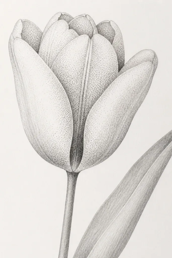
Stipple shading is the fastest way to get that “painted” look using only pen or pencil. I focus dots on the inner folds and along the petal base so you get depth where your eye expects it. The outer edges stay lighter, so the tulip doesn’t become a dark shape. This sketch looks good for holiday cards because it photographs nicely and looks soft without smudging. It also flatters beginners because you’re controlling density instead of drawing complex shadows.
Sketch the tulip outlines first with three outer petals and a small center. Add inner fold areas as two curved zones inside the bloom. Then stipple dots inside those zones — start dense near the center, then reduce dot density as you move outward. Keep the outer petal rim mostly blank. Ink the outer outlines and stem with a fineliner, then leave the stippling as dots only so the texture stays visible.
Use a consistent dot size by keeping the pen tip the same distance from the paper.
Don’t overdo stippling on the rim. Dense rim dots make the flower look heavy.
16. Tulip Line Art with a Single Bold Loop Outline
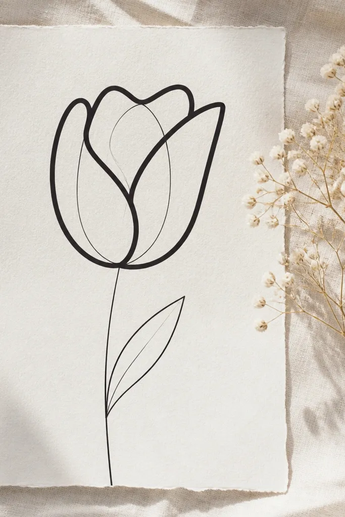
This is the tulip sketch I use when I want strong contrast for monochrome prints. The bold loop outline gives the flower a graphic look, almost like a sticker. You keep the inner structure light so the viewer reads the shape instantly. It’s also great if your hand gets shaky with fine details — the bold outline hides minor imperfections. This style flatters bold typography layouts because it doesn’t compete with text.
Good to knowIf you’re using pen, do the outer loop first. Then fill in internal folds while the thick line guides your proportions.
Start by drawing the stem and one leaf as thin lines. Then outline the tulip petals with a single bold loop line, making sure the loop closes near the center. Add two or three light inner fold lines inside the petals to show layering. Keep the center as a small teardrop, not a big circle. Finally, go back and reinforce only the thick outer loop — don’t add extra bold lines inside.
Common mistakeDon’t draw the inside folds too dark. The graphic look comes from contrast, not from filling everything in.
17. Tulip with Hanging Petal Drops (Like Dewy Edges)
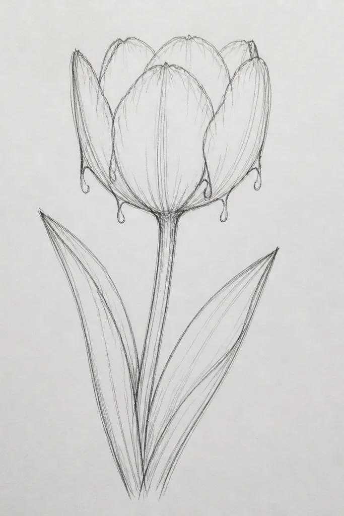
This sketch makes tulips feel dewy and delicate, which is perfect for winter-to-spring holiday decor. The hanging drops add movement and a sense of softness without needing color. I place the drops only on the lower edges where light would catch them, so it still looks realistic. The center stays simple to keep the drawing from turning into a busy doodle. This works best when you want a gentle, romantic vibe on gift tags and envelope seals.
Outline the tulip with three outer petals and a center teardrop. Then pick the lower half of each outer petal and add 2-4 small hanging teardrops that taper downward. Keep the drops slightly different sizes so they don’t look like a pattern stamp. Add a thin stem line and one leaf blade angled to the side. Ink the outer petal edges and stem, then lightly erase pencil lines inside the petals so the hanging drops stand out.
Make the drops end about 1/8 inch below the petal edge. Too long and they look like icicles.
Don’t add drops on the top half of the petals. That ruins the tulip silhouette.
18. Tulip Bud with Layered Petal Tiers (Three Heights)
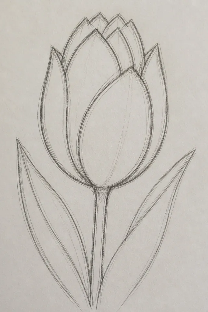
Layered tiers make a bud tulip look dimensional even with simple lines. I draw three heights of petals so you can see the structure: outer cup, middle fold, and inner tip. This makes the bloom feel real instead of just outlined. It also works for beginners because it’s more about stacking shapes than shading. The straight stem keeps it calm and balanced for greeting cards.
Start with a narrow vertical guideline for the bud. Draw the outer petal cup as a tall rounded shape that opens at the top. Add a second, slightly smaller cup inside it, then a third inner fold that ends higher and points inward. Place the center as a tiny pointed shape at the top of the inner fold. Add two leaves: one near the bottom and one mid-stem, both tapered ovals with a center vein line. Ink outer edges and leave inner tier lines lighter.
If tiers blur, erase the pencil lines lightly before inking. Crisp tiers look intentional.
Skip drawing the tiers too evenly spaced. Real buds have uneven folds.
19. Tulip with Geometric Petal Panels (Art-Deco Feeling)
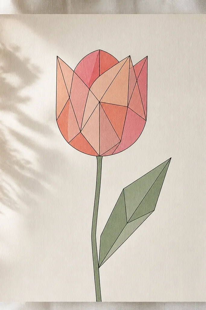
This is the tulip sketch that looks modern on holiday stationery. The trick is mixing smooth petal curves with straight interior panel lines, which makes the bloom read as geometric without losing the flower identity. I use triangles and trapezoids inside the petals so you can later color just one panel at a time. It flatters clean typography because the lines are tidy and don’t sprawl. If your colored drawings look messy, this layout keeps color contained.
Outline the tulip petals with three smooth teardrops and a small center teardrop. Inside each petal, draw straight panel lines that meet near the center, like a fan of triangles. Keep the panel lines thin so they don’t look heavy. Add one leaf using slightly angular edges — still organic, but with sharper points. Finally, ink the outer petal edges and the panel lines, then leave the center blank or lightly textured.
Color one panel per petal with a light wash, then leave the rest white. The geometric contrast looks intentional.
Don’t add too many panel lines. Three to five panels per petal is enough.
20. Tulip with Branchy Stem and Two Leaves in Opposite Directions
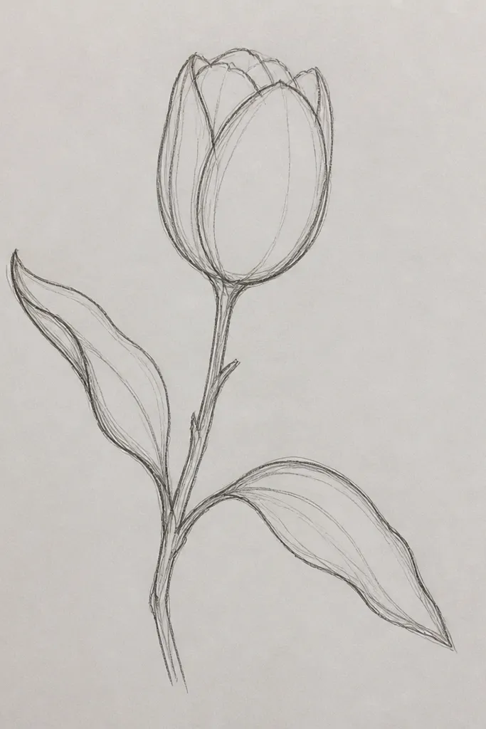
Branchy stems add a natural, garden look without needing multiple flowers. I like this for simple seasonal prints because it feels alive and not stiff. The two leaves in opposite directions balance the bloom and keep the composition from leaning visually to one side. The tulip center stays small and sits at the top so the flower reads first. This is also a good choice if you want to practice leaf drawing because the leaves are separated, not tangled.
Start with the tulip bloom: three outer petals and a small center teardrop, front-facing. Draw a stem line down, then split it into two branches about 1 inch above the bottom. Add one leaf on each branch: each leaf is a tapered oval with a center vein line. Make one leaf angle left and the other angle right so they mirror each other. Ink the bloom outer edges and stem branches, then keep leaf edges clean and unshaded.
If the leaves feel uneven, copy the same leaf shape twice and rotate one. Rotation keeps it natural.
Don’t overcrowd the base with extra twigs. Two branches is enough.
21. Tulip with Simple Hanging Bloom from a Curved Branch
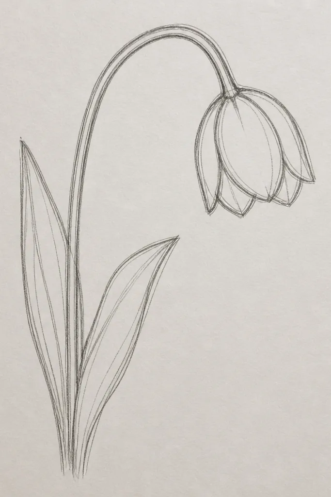
Hanging tulips feel different from the classic upright look, and that makes them stand out on holiday decor. The droop is subtle — just enough so the petals curve downward and the center points down. I draw the branch line first so the bloom hangs naturally from it. This style also hides minor petal asymmetry because drooping petals create a natural shape rhythm. It’s great for ornaments, vertical tags, and anything you want to feel a little playful.
Good to knowMake the branch arc slightly thicker than the stem. It helps the hanging bloom read clearly.
Draw a curved branch line that arcs from top-left to bottom-right. Attach the tulip bloom at the lowest point of the branch — keep the bloom smaller than you would for an upright tulip. Sketch three outer petals as teardrops that tilt downward, and draw a small center teardrop that extends slightly lower than the petal tips. Add one leaf near the branch, drawn as a curved blade with a center vein. Ink the branch and outer petal edges, then leave inner folds in pencil or light linework.
Common mistakeDon’t hang the bloom too far. If the center drops too low, it stops reading as a tulip.
22. Tulip with Burst of Petal Lines Around the Center (Spoke Effect)
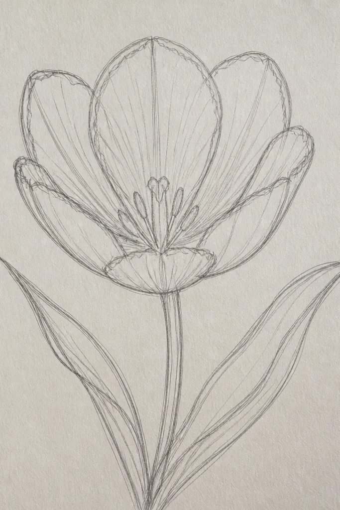
Spoke effects make tulips look like a stylized botanical pattern, which is perfect for wrapping paper or repeating backgrounds. The spokes guide the eye into the center, so the flower reads even in a small print or a quick sketch. I keep the spokes short and stop them at the petal boundaries so the tulip stays structured. This style flatters bold monochrome coloring because it gives you clear sections to fill. It also looks sharp when you use a fineliner — the straight lines stay crisp.
Good to knowUse a light pencil first to place spokes, then ink only after you’re happy with spacing.
Start with a front-facing tulip outline: three outer petals and a small center circle. Draw 8-12 short spoke lines radiating from the center into the petals, each line stopping before reaching the outer rim. Add one inner fold curve line to connect two petals so the spokes don’t look like a separate wheel. Draw a thin stem with two leaves, left and right, both angled slightly downward. Ink the outer petals and center circle, then darken only the spoke ends closest to the center for depth.
Common mistakeDon’t draw spokes all the way to the outer rim. That makes the bloom look like a sun.
23. Tulip with Double-Layer Petal Outline and Negative Space
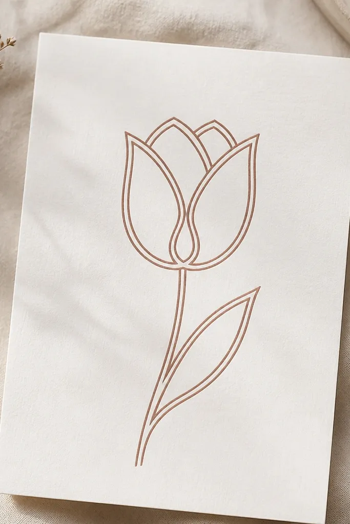
Double outlines create a clean, almost cut-paper look, which is why I use this when I’m planning to color later. The negative space band between the outlines makes the petals look layered without shading. I draw the inner outline slightly offset so the petal edges look like they’re folded. The center stays small with one blank highlight shape, which keeps it from looking flat. This style flatters light backgrounds and works well in monochrome prints.
Good to knowKeep the inner outline offset consistent — about 2-3 mm — so the band width looks even across petals.
Outline the tulip petals with three outer teardrops and a small center teardrop. Then add a second inner outline inside each petal, leaving a narrow white band between the two outlines. For the center, draw a small teardrop and leave one tiny highlight area blank by not drawing lines there. Add a thin stem and one leaf with a single vein line. Ink the outermost outlines first, then ink the inner outlines lightly so the negative space stays crisp.
Common mistakeDon’t make the inner outline too close to the outer one. Thin bands disappear in photos.
24. Tulip with Side-Leaf Cluster and Tiny Flower Buds
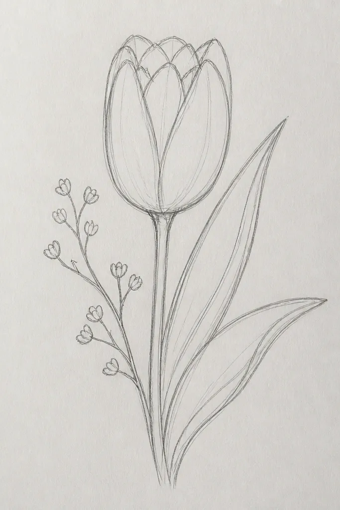
This sketch is a great way to make your seasonal drawings feel “arranged” without actually drawing a full bouquet. The main tulip anchors the composition, and the tiny bud shapes fill the empty space near the top. Side leaf clusters add motion and make the drawing look like it’s part of a real plant stem. I keep the buds smaller and simpler than the main bloom so the tulip still reads as the star. It’s flattering on cards because it creates visual interest around the text area.
Start by drawing the main tulip bloom on one side — about 60% of the total flower area. Add the stem line and then draw a side leaf cluster on the opposite side using 2-3 overlapping leaf blades. Near the top of the stem, sketch two tiny bud teardrops, one slightly higher than the other. Keep the buds' centers blank or lightly indicated with a single fold line. Ink the main tulip outer edges and the stem, then lightly ink the buds so they look secondary.
If your composition feels unbalanced, move one leaf blade closer to the main bloom instead of adding more leaves.
Don’t add three buds. Two is enough for a tidy holiday look.
25. Tulip Flower with Heart-Shaped Petal Tips and Thin Veins
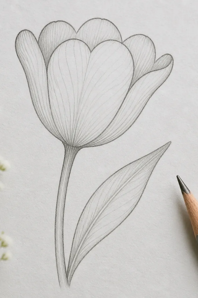
Heart-tipped petals look sweet and slightly romantic, which is why I use them for Valentine-adjacent tulip cards and Mother’s Day tags. The thin veins inside the petals add realism without heavy shading. I draw the heart tips with a gentle inward notch so it still reads as a tulip, not a rose. This style flatters people who want a more delicate look and like clean internal line detail. It also photographs well because the veins create contrast against the lighter petal interior.
Good to knowUse a ruler for the first center placement only. Once the center is right, the veins will naturally fan out correctly.
Outline three outer petals where the top ends are heart-shaped — a soft notch in the middle and rounded edges on both sides. Add a small center teardrop. Inside each petal, draw 1-2 thin vein lines that start near the center and curve toward the heart tip. Draw a slender stem line and one leaf with a center vein and two side curves. Ink the outer edges and the veins with a fineliner, then keep the stem leaf slightly lighter so the bloom stays dominant.
Common mistakeDon’t draw too many veins. Two per petal is enough for a clean tulip look.