1. Cup-and-Center Tulip on a White Card
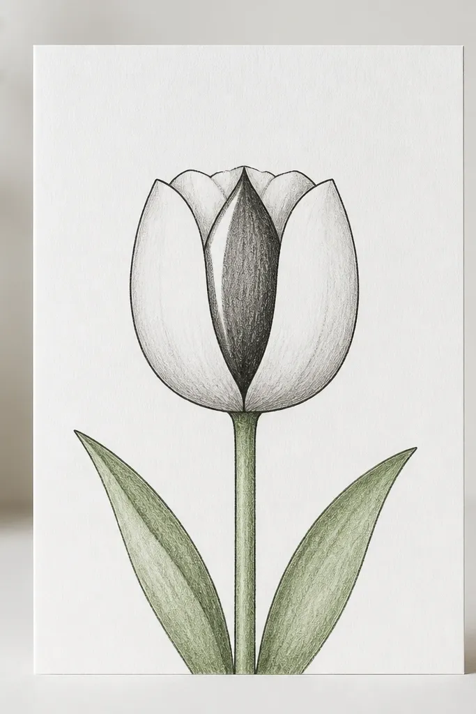
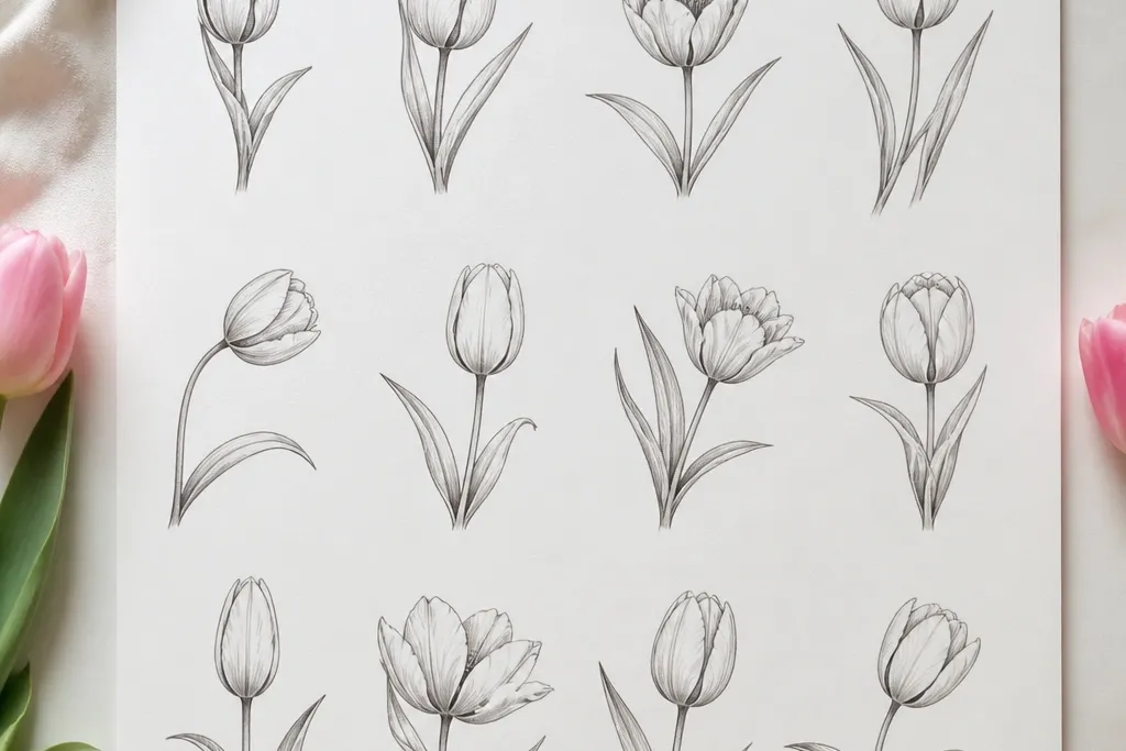
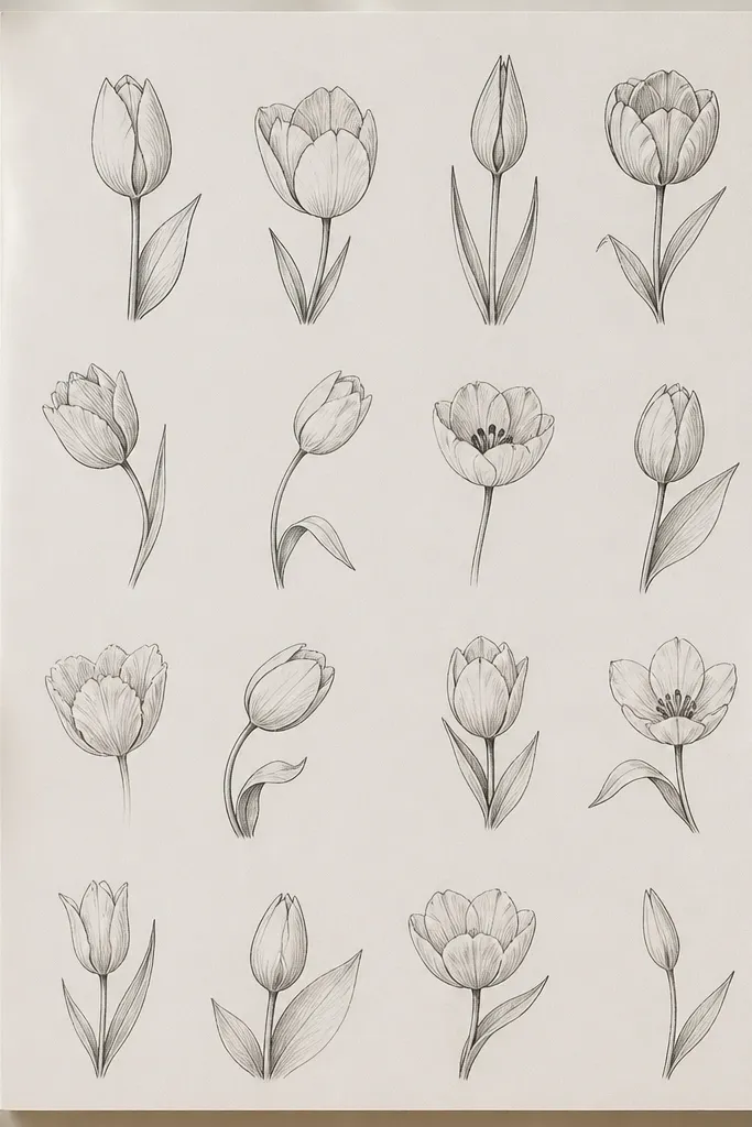
This is the tulip drawing I come back to when I want something cute that still looks “real.” The outer cup shape keeps the flower neat, and the tall center wedge gives it that tulip silhouette. I draw the cup slightly wider at the top so it looks like it’s opening, not drooping. This style flatters small spaces, like card fronts and gift tags, because the flower reads clearly even at a glance.
Step 1: Lightly sketch a rounded “U” cup for the outer petals, then add a tall teardrop wedge in the middle. Keep the center wedge a little narrower than the cup opening. Step 2: Shade the fold side of each petal with a 2B pencil — I shade the right side only — then add one small highlight line on the left edge. Step 3: Outline everything with a 0.5 black pen, and fill the stem with a simple curved line plus two leaf shapes.
If your cup looks lumpy, redraw the top curve once and leave the rest. One clean curve beats five shaky attempts.
Don’t outline the inside highlights with pen — they should stay bright so the petals look glossy.
2. Three Petal Stack Tulip with Minimal Outline
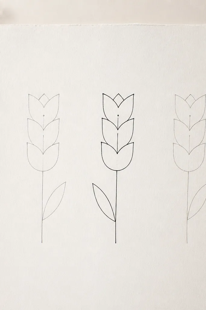
This one is for when you want tulips that feel airy and sketchy, not heavy. The “three petal stack” trick keeps the form simple enough for beginners, but it still looks like a real flower because the petals overlap. I like it for scrapbook paper because it leaves room around the drawing. It also works well for people who want a softer look that doesn’t rely on lots of shading.
Step 1: Draw three tall ovals stacked vertically for the petals, each slightly offset so the edges overlap. Add a tiny center shape — a short vertical oval or dot — right where the petals meet. Step 2: Use pencil only for the first two tulips, then outline just one tulip with a 0.3 liner to create focus. Step 3: Add leaves as simple almond shapes attached to a thin stem line, one leaf per tulip, placed so it balances the flower.
Vary the petal widths by a few millimeters. One tulip slightly wider looks more natural than a perfectly uniform set.
Avoid shading the whole petal — keep it mostly outline and let overlap do the work.
3. Tulip Side View with Curved Stem
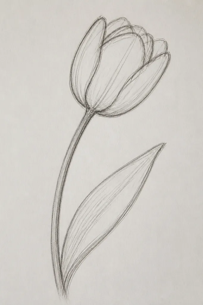
Side-view tulips look extra cute because they feel like they’re leaning in toward you. The petals become narrower, so the drawing looks more delicate and less “blocky.” I use a curved stem to make the whole composition move, and the leaf adds a soft frame around the stem. This style is great for holiday sticker sheets and small prints where you want a gentle, graceful vibe.
Step 1: Draw a narrow teardrop for the outer petal mass, then add two thinner inner petals that curve inward. Keep the opening facing left so your highlight makes sense on the left edge. Step 2: Shade the inner fold with light pencil (HB to start), then deepen it with 2B right where the petals overlap. Step 3: Draw a stem curve that arcs away from the flower, then attach one leaf at the bend so it looks like it’s catching the curve.
Good to knowMake the center slightly darker than the outer petals. That contrast sells the side view instantly.
Common mistakeDon’t make the side view too wide. If the cup is broad, it stops reading as a side-facing tulip.
4. Patterned Tulip with Dotted Center
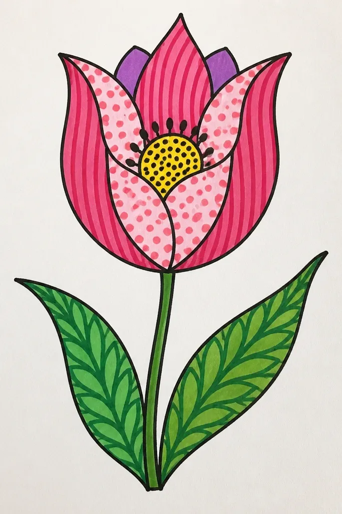
If you want tulips that look playful, this patterned center is the move. The petals get stripes or soft bands, and the center gets dots — that combination reads as “decorative flower art” even with simple lines. I’ve used this style for spring cards because it looks cute without needing realism. It flatters people who like graphic design vibes more than sketch shading.
Step 1: Outline the outer cup and center wedge in pencil, then ink the outline with a 0.3 liner. Step 2: Color the petals with two tones of the same color — for example, light pink for the base and slightly deeper pink for stripes. Step 3: In the center wedge, add a row of tiny dots and short dashes following the center’s vertical direction. Finish with green leaves and one or two vein lines drawn lightly.
Good to knowUse a gel pen for the dots so they stay crisp and don’t smear.
Common mistakeDon’t overfill the center. Leave a little white space between dot rows so it doesn’t turn into a dark blob.
5. Tulip Bouquet Mini Trio (3 Flowers, One Stem)
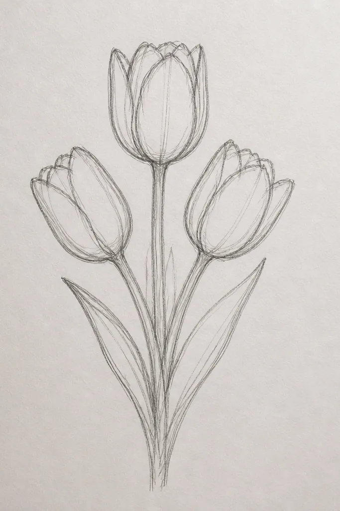
Three tulips in one bouquet always looks more “effortful” than one, and it’s still easy. The key is that all three flowers share the same shape language, just scaled differently. I like this for wrapping paper accents, because it fills space without needing a background scene. It also flatters anyone who wants variety without complicated drawing — the flowers change height, not technique.
Step 1: Draw one main stem line that curves slightly, then add two branch lines near the top where the flowers will sit. Step 2: Sketch three cups with centers — one tall in the middle, one shorter on the left, one medium on the right. Keep the center wedges proportional to each cup opening. Step 3: Add two leaves near the base and one small leaf near the shortest tulip, then outline with a black fineliner and lightly shade the fold side on each flower.
Good to knowMake the middle tulip the darkest shaded one. It becomes the visual anchor automatically.
Common mistakeDon’t make the leaves all the same size. One smaller leaf makes the bouquet look intentional.
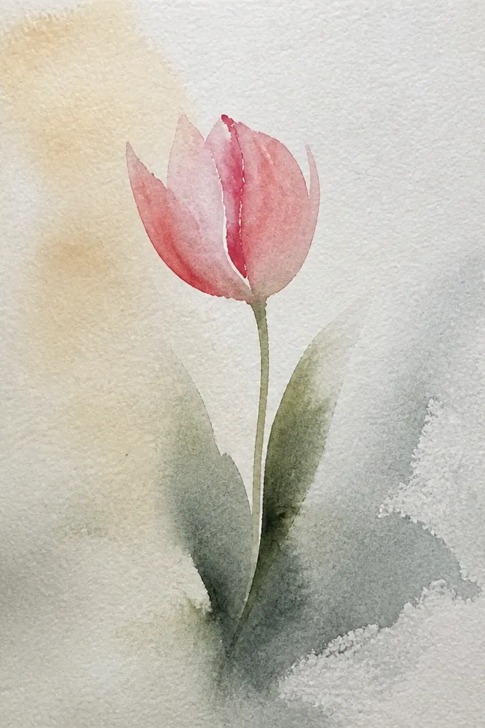
6. Watercolor-Style Tulip Outline with Brush Wash
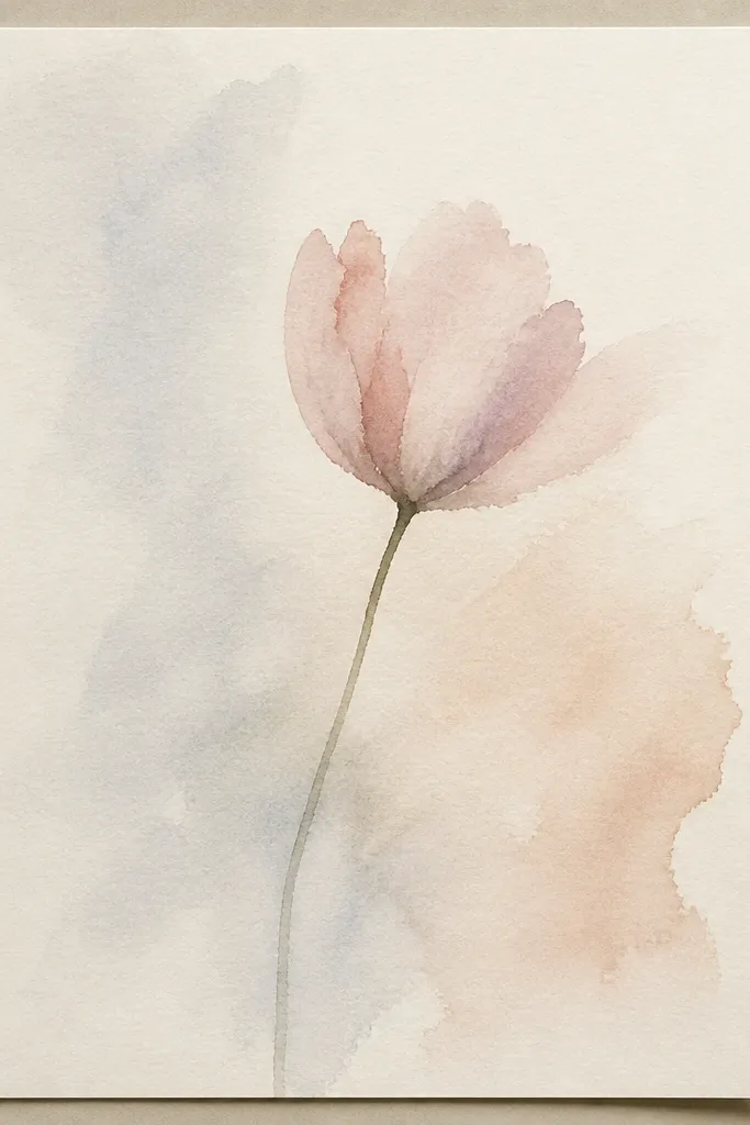
This is the tulip look I use when I want “pretty” without tight realism. The watercolor wash softens everything, so you don’t have to nail every petal line. I keep the outline light and let the color do the work, especially around the petal edges. This style looks great on thicker watercolor paper and also works for quick holiday tags where you want a hand-painted feel.
Step 1: Sketch the tulip cup and center wedge in pencil, then outline lightly with a 0.3 liner or just leave it pencil if you prefer. Step 2: Wet only the petal areas with clean water using a small round brush, then drop in light pink wash. Add a slightly darker pink at the fold side and blend it inward with the brush tip. Step 3: Paint a pale yellow center and a green stem with a darker green line along one edge.
Good to knowUse less water than you think. Too much water makes the petals bleed into each other on small cards.
Common mistakeDon’t paint the whole petal one flat color. The fold shadow should be darker so it still looks like a tulip.
7. Black Ink Tulip with One Gold Accent
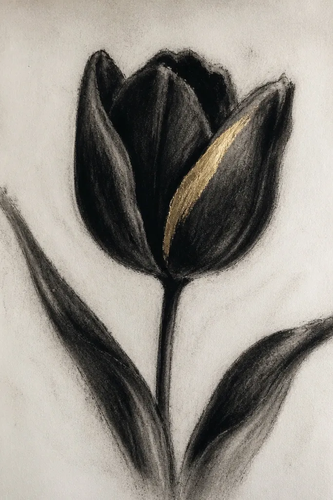
This style is dramatic and still easy because it relies on contrast, not shading gradients. The black ink gives you crisp edges, and the one gold accent makes it feel festive without clutter. I like it for holiday stationery because gold reads instantly “special.” It suits anyone who gets overwhelmed by lots of coloring — one highlight line is enough.
Step 1: Draw the outer cup and center wedge in pencil, then ink the outline with a 0.5 pen. Add inner petal lines with a thinner 0.3 pen so you get line weight variety. Step 2: Color the stem and leaves with a dark green marker or watercolor, keeping them mostly solid. Step 3: Use a gold gel pen to draw one highlight line on the left side of the center wedge and one short gold dot near the inner fold.
Let the ink dry fully before you add gold. It prevents smudges and keeps the gold sharp.
Don’t add gold in three places. One or two accents look intentional; more looks accidental.
8. Pastel Tulip with Soft Blending (Colored Pencil)
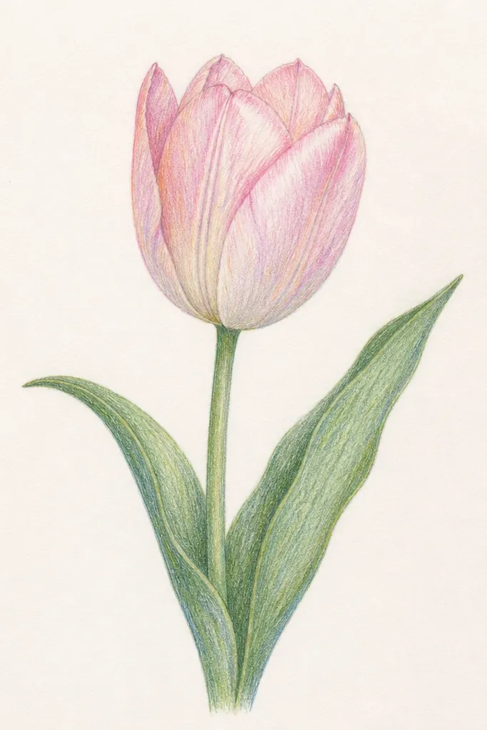
Colored pencil is my go-to when I want soft tulips that look gentle instead of neon. The trick is layering in thin passes and keeping the darkest area small — right at the petal fold. I use pastels like lavender, cream, and sage because they stay cute and don’t look harsh. This style flatters lighter paper and looks especially good for spring or Easter cards.
Step 1: Lightly color the whole petal area with the lightest pastel (lavender) using gentle pressure. Step 2: Add the fold shadow by pressing a bit harder with the darker lavender on the right side of each petal. Blend the edge with circular motions using the lighter color. Step 3: Color the center cream, then add a tiny darker cream or pale orange strip in the center fold. Finish leaves with sage and a darker sage vein line.
Good to knowSharpen your pencil for the vein lines. Dull points make veins look like smudges.
Common mistakeAvoid heavy pressure in the first layer. You’ll get waxy texture that won’t blend cleanly.
9. Tulip with Striped Petals and Simple Stem Wrap
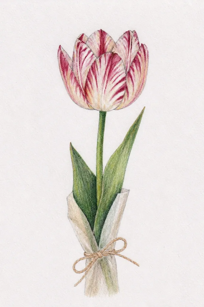
Striped petals make tulips look like they belong on a holiday print or gift wrap. The easiest way is to stripe the petals in vertical direction, matching the center wedge. The stem wrap adds a cute graphic element without needing extra flowers. I use this when I want a tulip that looks designed, not just drawn.
Step 1: Outline the tulip cup and center wedge, then ink the outline with a fine pen. Step 2: Add vertical stripe lines across the petals, leaving a few gaps for white space. Color alternating stripes with two pink tones (light blush and deeper rose). Step 3: Draw the stem as a single line, then add a thin band pattern across it — short horizontal lines spaced evenly. Finish with one leaf and a single vein line.
Good to knowKeep stripe spacing consistent. Even spacing is what makes it look “clean” in a small drawing.
Common mistakeDon’t color over your white gaps. Leave them truly white so the stripes read.
10. Tulip on a Polka Dot Background (Easy Pattern)
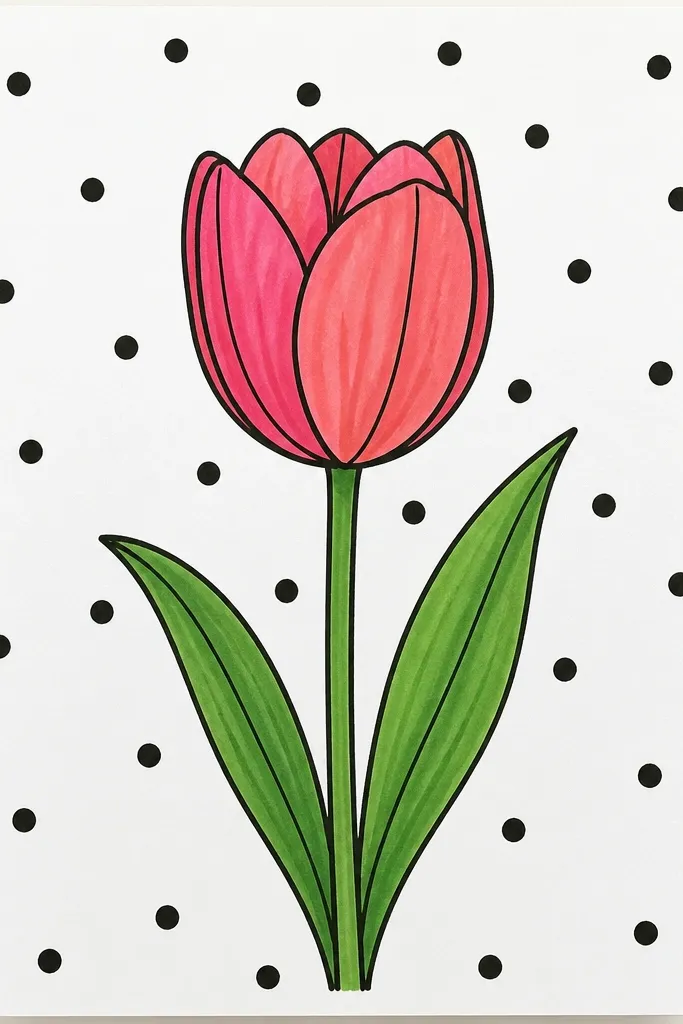
A simple background pattern makes the tulip look like a finished design even if the flower itself is quick. Polka dots are forgiving because they hide small drawing imperfections. I use pale gray dots so the tulip stays the focus, and I keep dot size consistent (like a 1-2 mm circle). This is great for holiday cards because it feels festive without extra ornaments.
Step 1: Lightly sketch your tulip first so you know where to leave space. Step 2: Fill the background with polka dots using a stencil or the tip of a fine marker, keeping dot spacing even. Step 3: Color the tulip petals with light pink and add fold shadow with a deeper pink on the right side. Color leaves sage green and add one vein line each. Finally, outline the flower with a black liner so it pops off the dots.
Use a ruler to keep your dot grid straight. Even dots look more “designed.”
Avoid dark background dots. If the dots are too strong, they compete with the tulip.
11. Tulip Garland Loop (Continuous Line Style)
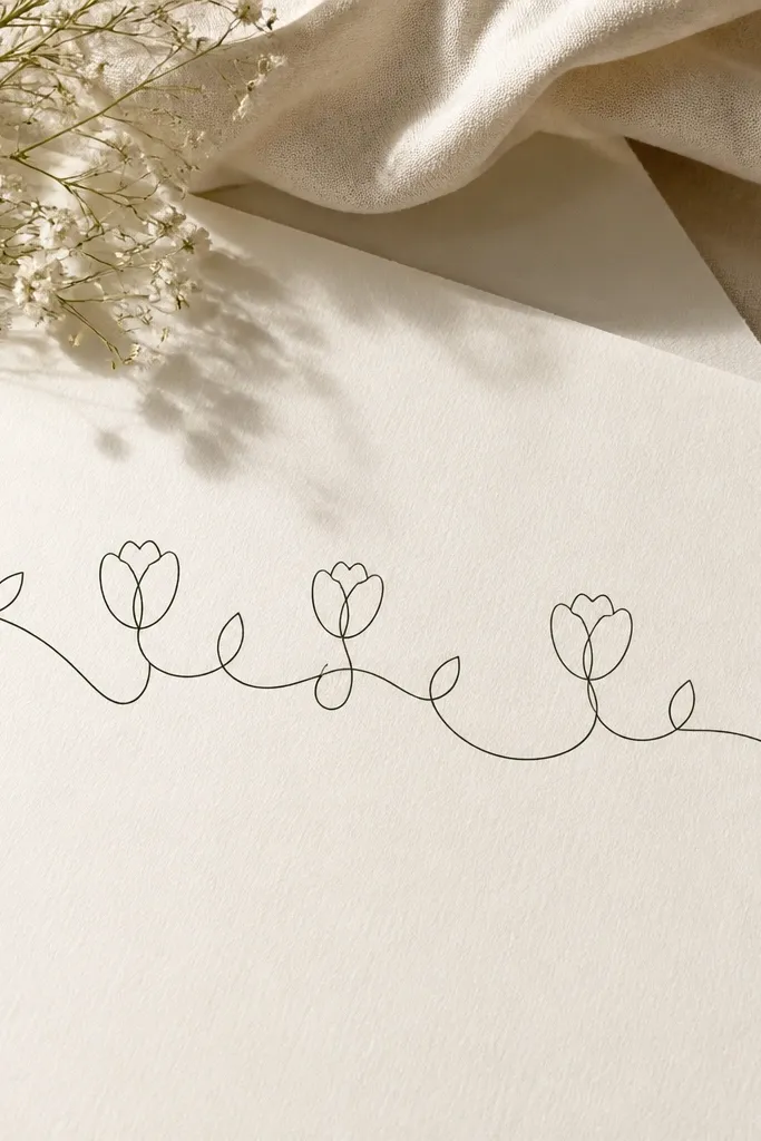
Continuous line tulips are a fun way to practice without getting stuck on perfect petals. The drawing looks like a garland, so it works for banners, wrapping paper accents, and printable party decor. Since everything connects, the composition looks intentional even if your line wobbles a little. I like this for beginners because the structure is built in — you keep going instead of starting over.
Step 1: Draw a sweeping loop line across the page — like a gentle S curve — and plan three tulip positions along it. Step 2: At each position, draw a cup shape around the line and add a center wedge that touches the line. Keep the petals simple and close to the stem. Step 3: Add small leaf bumps where you want extra detail, then outline over the whole thing with a 0.5 pen. Color petals lightly and keep shadows minimal.
Practice one loop on scrap paper first. Once your path feels smooth, the tulips land easier.
Don’t lift your pen for each tulip. Lifting breaks the garland look and makes it feel unfinished.
12. Single Tulip in a Tiny Vase (Cute Desk Art)
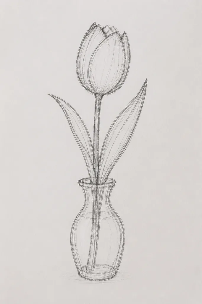
Putting a tulip in a tiny vase makes the drawing feel like a finished scene, even when you only draw one flower. The vase also gives you a natural place to add a shadow, which makes the whole piece look more dimensional. I like this for desk sketches and quick holiday notes because it feels cozy and personal. It flatters small paper sizes because the vase anchors the composition.
Step 1: Draw the vase first — a simple trapezoid with a slightly wider top, plus a curved base line. Step 2: Sketch the tulip stem rising from the center, then draw the cup petals and center wedge. Step 3: Shade the fold side of the petals with a darker pencil tone and add a faint shadow under the vase rim. Step 4: Add one stripe pattern on the vase using a lighter pencil or marker, then outline everything with a thin black pen.
Good to knowMake the vase shadow a single thin line under the rim. That one line makes it look grounded.
Common mistakeAvoid drawing the vase too tall. A tall vase shrinks the tulip and the whole piece feels off.
13. Tulip with Feathered Leaf Edges (Soft Leaf Texture)
Feathered leaf edges are an easy way to make tulips look more detailed without adding more flower complexity. The petals stay simple, but the leaves have texture that reads as “hand-drawn botanical.” I use light orange or peach for the petals because the feathered leaves look extra cute against warm colors. This style looks great for spring and Mother’s Day cards.
Step 1: Draw the tulip cup and center wedge, then outline with a fine liner. Step 2: Shade the fold side of the petals with a deeper orange pencil, keeping the darkest area tight to the petal fold. Step 3: Draw leaves as almond shapes, then add tiny short strokes along the leaf edge like a fringe. Keep the strokes consistent in length so it doesn’t look messy. Step 4: Add a single stem line and one vein line through each leaf.
Use a sharp colored pencil for the feather strokes. Blunt tips make the leaf edge look smudgy.
Don’t over-texture the petals. Keep texture on the leaves so the flower still feels clean.
14. Tulip Mandala-Inspired Background (One Flower Focus)
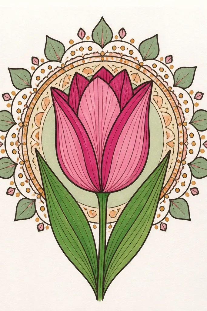
You don’t need real mandala skills to get that decorative look. A small halo of circles and dots around one tulip makes the whole drawing feel intentional, like a holiday coloring page for adults. I keep the halo simple so the tulip stays readable — the tulip is the star. This style is great for prints and card backs because it fills empty space without turning into a busy scene.
Step 1: Draw the tulip in the center first, then outline with a fine black pen. Step 2: Add a ring of small dots around the tulip head, spaced evenly, then add one or two larger circle rings further out. Step 3: Make tiny petal-like shapes between dots on one ring only so it doesn’t get crowded. Step 4: Color petals pink and add fold shadow on the right side, then color leaves green and keep the halo mostly beige or pale gray.
Use a compass or a jar lid to trace one circle ring. Perfect circles make the whole halo look polished.
Avoid adding too many ring layers. Two rings plus dots looks decorative; five rings turns busy.