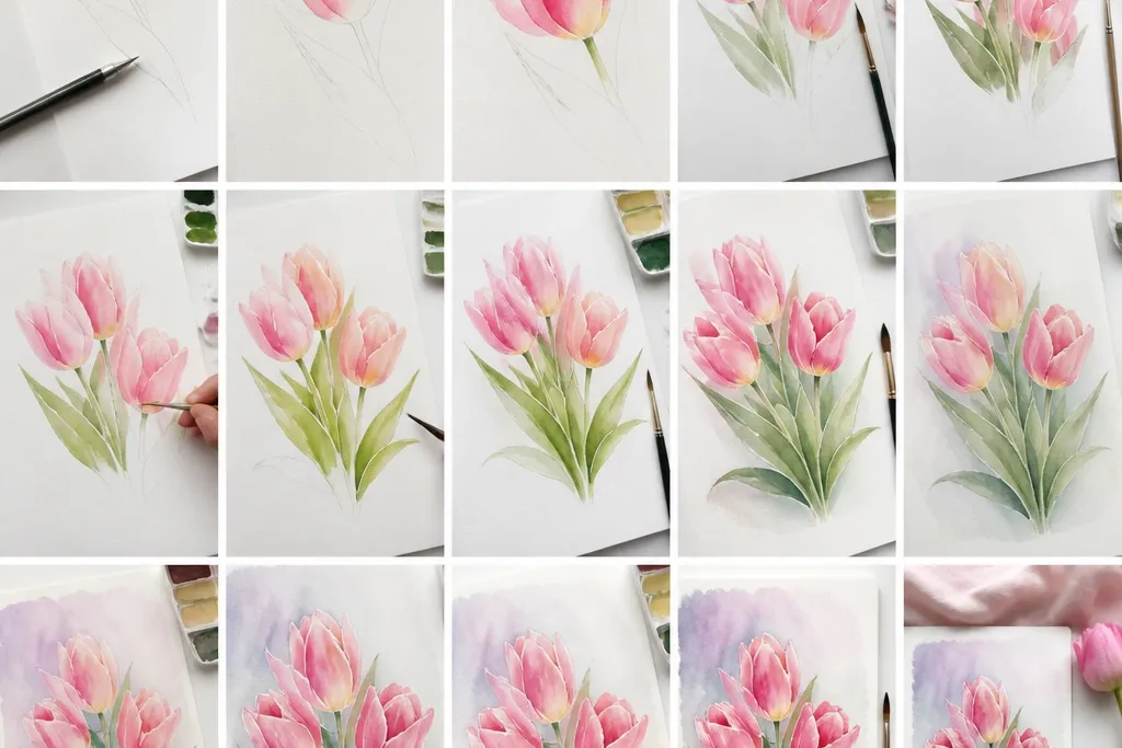
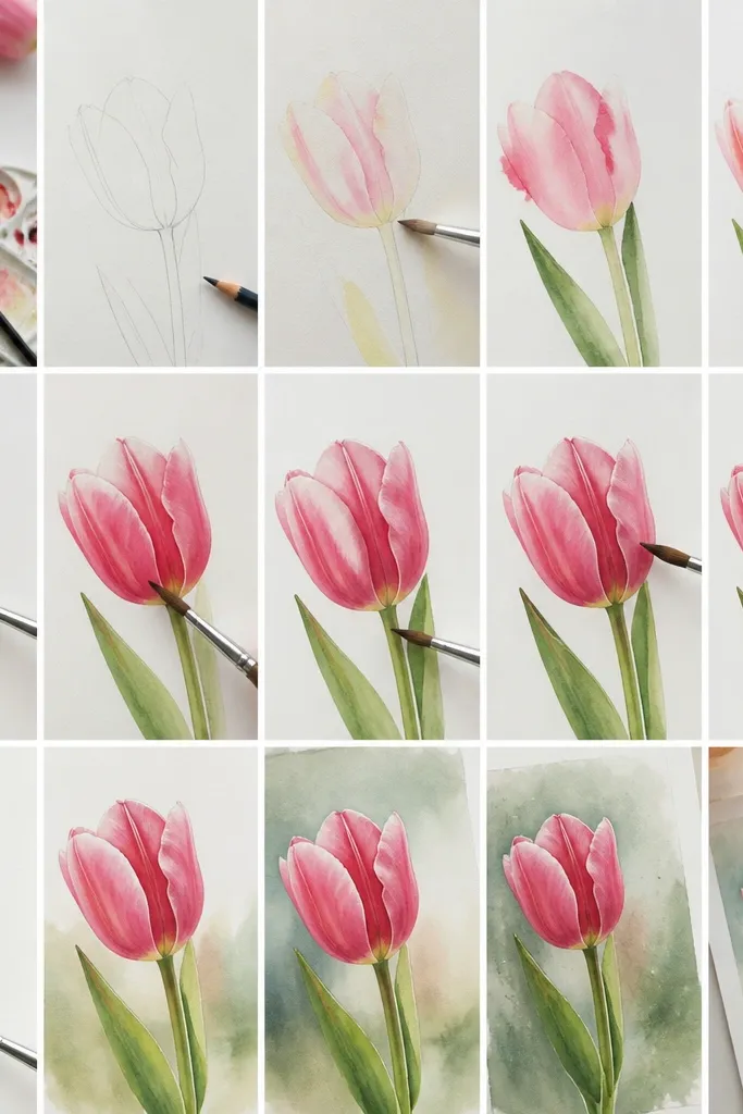
1. Blushing Pink Tulip with Wet-on-Wet Center
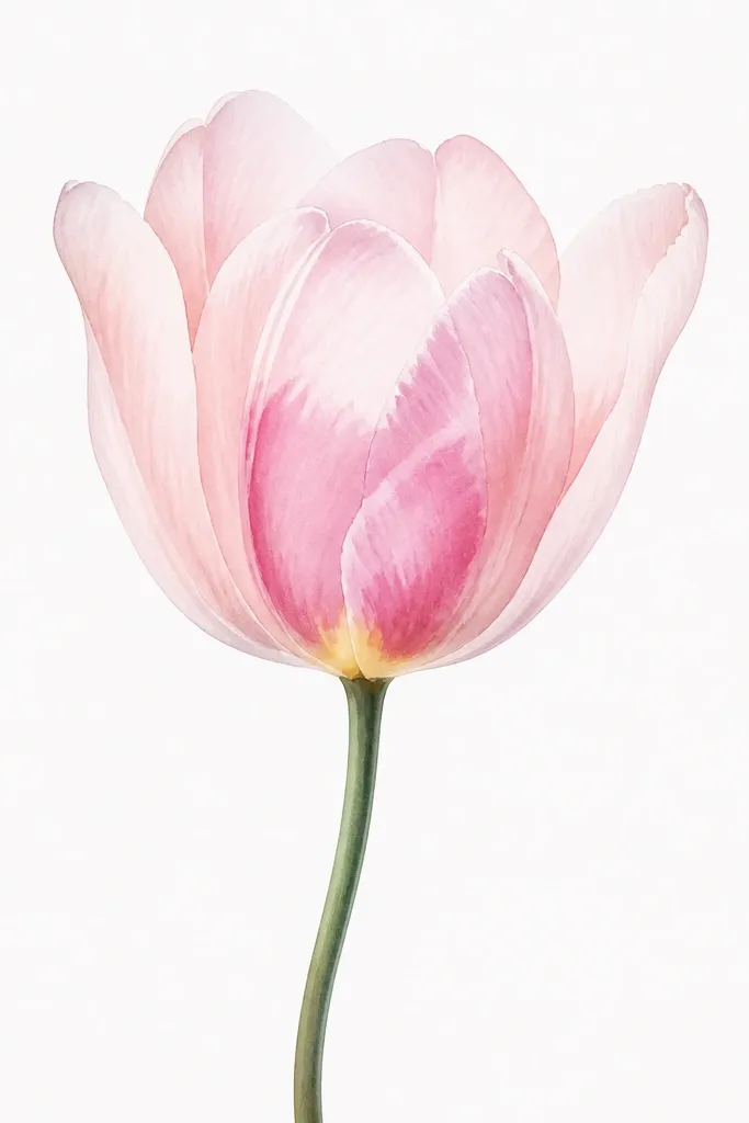
This one looks airy because the petals start almost translucent. Paint the outer petals in a pale pink wash so the paper shows through, then let the center get richer. The inside fold should look like it’s lit from the front — that’s why the center has a slightly wetter area and a brighter yellow at the base. It flatters light skin tones and works great for spring cards because it reads gentle, not loud. If you’re making a gift for someone who likes subtle color, this is the tulip I reach for first.
Start by sketching a tulip outline with a light pencil line, then mix rose pink with lots of water until it’s like watery yogurt. Wet only the outer petal area (not the whole bloom) using a clean brush, then lay in the pale wash so it blooms softly. Let it dry until matte, then add a darker rose crease on the inner fold using a smaller round brush. Finally, touch a tiny yellow spot at the center base and pull a thin line of deeper pink toward it for depth.
Use a paper towel to blot your brush before adding the crease so the paint lands in a soft edge instead of a hard streak.
Avoid painting the center first — it makes the bloom look like a daisy.
2. Sunrise Orange Tulips with Crisp Petal Edges
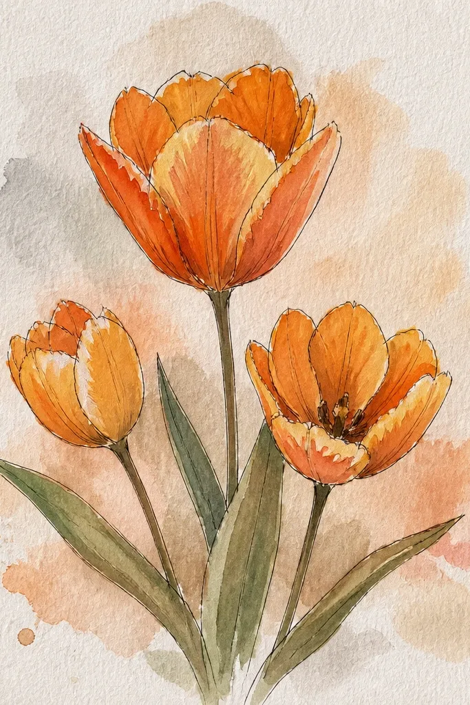
Crisp edges make orange tulips feel like they’re glowing, not smudged. I like this version because it looks bold at a glance but still soft enough for watercolor. The secret is keeping the first wash light and letting it set, then tracing the fold lines with a slightly thicker mix. Orange also photographs well for holiday prints because it doesn’t disappear the way pale yellows can. This style looks great on cream envelopes and pairs nicely with warm-toned frames.
Paint the three blooms first with a watered peach-orange wash, leaving tiny white gaps where petals overlap. Let that layer dry completely — 10 to 15 minutes in a warm room. Mix a stronger orange (same pigment, less water) and paint the underside fold lines and bases, using the tip of a round brush. Add a thin dark line only where petals meet, then finish stems with sap green and a touch of yellow-green for highlights.
If your edges look fuzzy, wait longer before adding the fold lines; matte paint takes darker pigment cleanly.
Don’t overwork the orange after it starts drying — it turns the petals muddy.
3. Deep Magenta Tulip with Payne's Gray Shadow
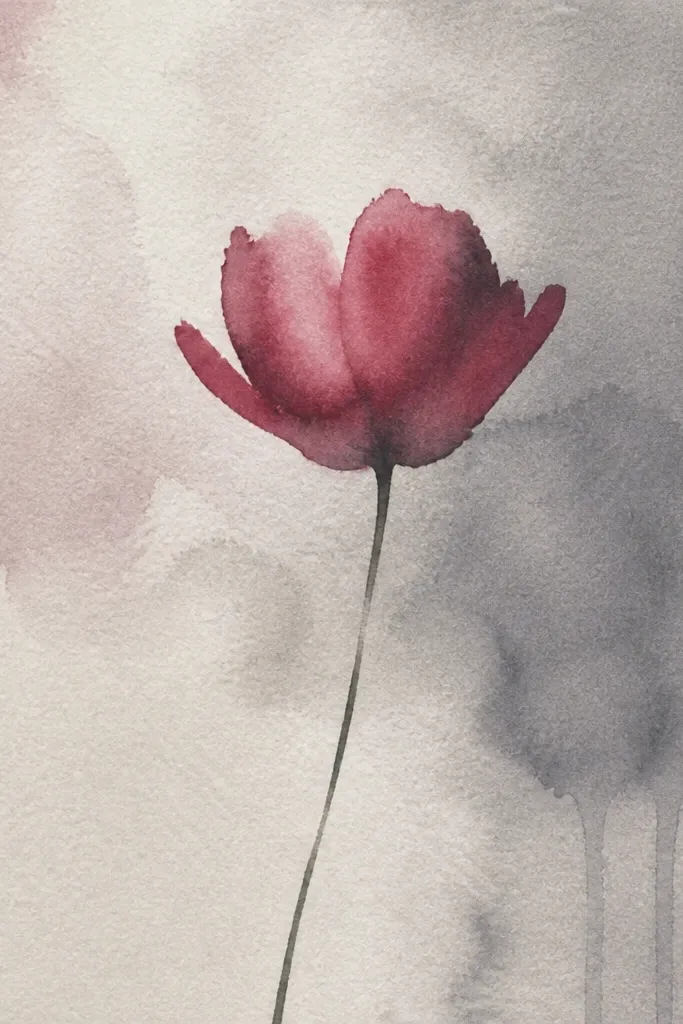
This tulip looks expensive because the shadows are cool, not brown. Magenta alone can look flat, so I add Payne’s gray mixed into the shadow areas to create that cool, realistic fold. The result gives the bloom a rounded 3D shape even though you’re using watercolor. It suits moody seasonal decor and looks striking against white paper or off-white card stock. If you’re painting for a winter gift but want it to still feel floral, this color combo carries the mood without losing softness.
Sketch one tall tulip with a slight lean to the right, then wet the outer petal area lightly with clean water. Lay in a mid-tone magenta wash, leaving the very top edges lighter. Let it dry until matte, then mix magenta plus a small amount of Payne’s gray and paint only the inner underside folds. Add a very thin line of darker mix at the base of the center fold, then paint the stem with Hooker’s green and a tiny bit of gray for depth. Finish with a leaf that’s lighter on top and darker along the underside edge.
Good to knowMix your shadow color on a palette, then test it on scrap paper; gray can overpower fast.
Common mistakeAvoid using black for shadows — it kills the color and makes the tulip look bruised.
4. Cream and Burgundy Tulip with Dry-Brush Texture
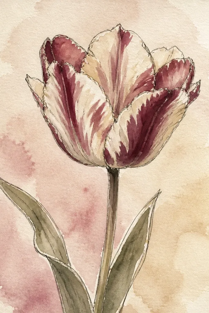
Dry-brush texture makes the petals look like they have natural variation, which is exactly what tulips do in real life. This design uses creamy light petals so the burgundy looks like it’s sitting inside the bloom. It’s a great option if you want something elegant but still handmade-looking. The muted olive stem keeps everything grounded and prevents the flower from looking too candy-bright. It flatters warm neutrals and looks gorgeous on kraft-colored envelopes.
Start by painting the outer petals with a very pale cream wash (watered warm gray or pale ochre mixed with a touch of pink). Keep it thin and let the paper show through. When it’s dry, load a small brush with burgundy — not too wet — then flick or drag lightly along the inner folds. Build the streaks in two passes so you keep control of where the texture lands. Paint the stem in olive green, then add a single leaf with one darker edge line for shape.
Blot your brush on a paper towel before you drag for texture; that’s what keeps it speckled instead of streaky.
Don’t wet the paper when you’re doing dry-brush texture — it turns the speckles into stains.
5. Two-Tone Red Tulip with Soft Gradient Tips
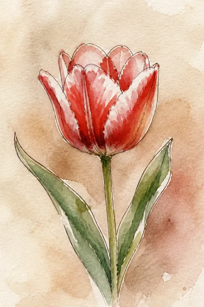
Two-tone tulips look polished because the eye reads a natural fade from base to tip. I paint the base darker first so the flower has weight, then I let the color taper upward. The inner fold stays darker but doesn’t overpower the outer petals. This works well for seasonal wall art because it feels structured — like you planned it — but it’s still watercolor-soft. It also photographs cleanly because the lighter tips prevent the whole bloom from becoming a single red mass.
Sketch two tulips with slightly different heights so it feels natural. Paint the outer petals with a medium red wash, leaving a lighter area near the top where you’ll taper later. While the mid-tone is still slightly damp, soften the top edges by dragging clean water from the top downward a few millimeters. Let it dry, then add a darker red inner fold line and a tiny yellow center base. Finish with thin stems in sap green and a leaf that starts near the stem and angles outward.
Good to knowUse clean water to pull the gradient, not more red paint; that keeps the fade smooth.
Common mistakeAvoid painting the inner folds too wide — it makes the bloom look flat and wide instead of tall.
6. Lemon Center Tulip with Loose Petal Wash
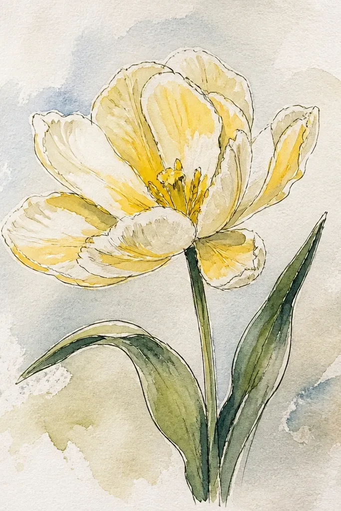
A bright lemon center is the quickest way to make a tulip look lively. The loose petal wash keeps the bloom feeling fresh, like it’s just opened. I use pale yellow-green mixed with peach so the petals feel warm without going orange. The center needs contrast, so the lemon-yellow is stronger and placed only at the fold base, not spread everywhere. This style is perfect for spring brunch menus, place cards, and light backgrounds where you want a cheerful focal point.
Lay in the petals with a pale wash of yellow-green mixed with a touch of peach, keeping the edges slightly uneven. Paint the bloom shape loosely, then stop — don’t chase perfection. Let it dry until matte, then paint the center base with bright lemon-yellow and add two small darker dots (same yellow, slightly stronger). Use a thin brush to paint a subtle darker crease line leading toward the center. Finish with a light green stem and a leaf painted with a single controlled stroke.
Good to knowKeep the yellow center small; if it spreads too wide, the tulip reads like a flower with a big disk.
Common mistakeDon’t add blue-green shadows under the petals — it dulls the warm tulip colors.
7. Velvet Purple Tulip on Light Gray Wash Background
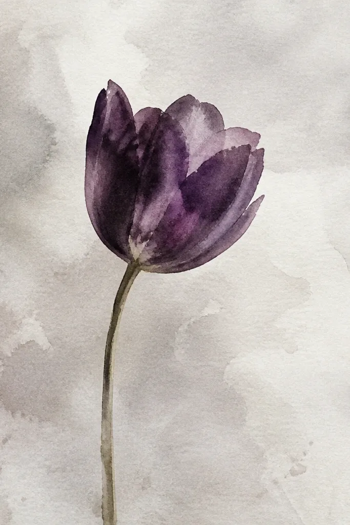
Painting on a light gray wash makes purple look velvet-soft. The gray background cools everything down and makes the tulip stand out without harsh outlines. I like this when I’m making holiday-season cards because it feels moody, but the flower still reads as spring. The key is keeping the background thin and even so it doesn’t fight the petals. This also hides tiny mistakes; if your wash has a few streaks, the gray makes them less noticeable.
Wet the background area with clean water, then brush on a very light gray wash (Payne’s gray plus lots of water). Let it set until it’s no longer shiny. Paint the tulip petals with deep violet, leaving highlights along the outer edges by skipping paint there. After the first petal layer dries, add darker purple fold lines using a smaller brush. Paint the stem in a cool green mixed with a touch of gray, and add one leaf that echoes the gray tone.
Use a larger brush for the background and rinse it often; gray streaks show up fast.
Avoid painting purple directly on a soaking wet background — it will bleed and look flat.
8. Watercolor Tulip Bouquet Strip for Seasonal Cards
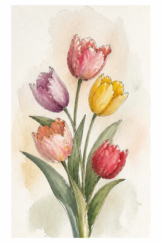
A bouquet strip looks like a real arrangement even when you’re painting only a small area. Overlapping tulips gives depth — the front bloom should be slightly darker and sharper, while the back blooms should be lighter. I like this for seasonal cards because it reads as a gift layout, not a random single flower. The overlap also makes it easier to hide uneven petal shapes; you’re guiding the eye with layers. Keep the background white so the colors feel fresh and intentional.
Draw three tulips stacked vertically so they overlap by about one-third of their bloom width. Paint the back tulip first with a lighter wash of its color, keeping edges soft. Paint the middle tulip next, making it slightly darker, then paint the front tulip last with stronger pigment and sharper fold lines. Add a couple of leaves at the bottom in sap green, with one leaf slightly out of focus (paint it with less detail and lighter pigment). Finish stems with thin lines that cross behind the front bloom.
Front bloom fold lines should be painted with the brush tip, not the side of the brush.
Don’t outline every petal — watercolor tulips need negative space, not cartoon lines.
9. Single Tulip with Hanging Raindrop Highlights
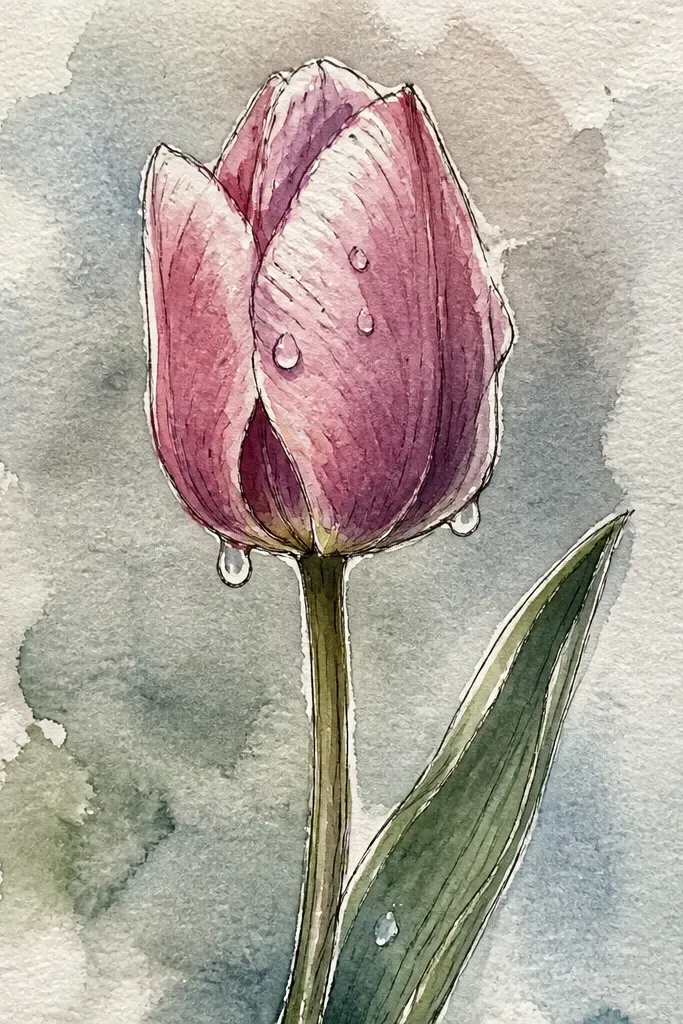
White raindrop highlights make the tulip feel fresh and specific. I use them sparingly — a few droplets on the top petals only — so the flower still reads as a tulip, not a weather diagram. This style looks great for spring and early summer holiday decor because it feels like outdoor air. The contrast between strong red petals and crisp white droplets makes the bloom pop even if your background is plain. It’s also forgiving because droplets hide small patchy spots.
Paint the tulip petals in a medium red wash, leaving the top edge slightly lighter by using less pigment. Let the first layer dry until matte. Mix a slightly darker red for the inner fold and paint only the crease lines. Before the final layer fully dries, dab a wet brush slightly onto the areas you want droplets, then lift off to create raised spots, or use a white gel pen sparingly once everything is fully dry. Paint the stem with Hooker’s green and add a leaf with one darker edge stroke.
If you use a gel pen for droplets, test it on scrap first; some pens lay down too thick.
Don’t add droplets at the base of the bloom — that area should look like a shadowed fold.
10. Pastel Tulip Set with Soft Background Wash Blocks
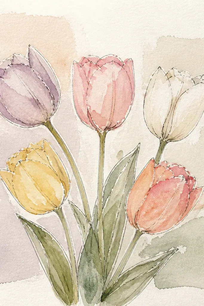
Background wash blocks make pastel tulips look designed without needing heavy outlines. The blocks also frame each bloom so your composition feels balanced even with light colors. I use pastel tulips because they need a gentle contrast — the background blocks provide that without stealing attention. This is a good approach for seasonal wall prints because it looks intentional from a distance. It also flatters people who love calm, low-saturation palettes for their homes.
Lightly tape off a layout with painter’s tape if you want crisp background edges. Paint two background wash blocks first: pale blue on the left and warm beige on the right, keeping them thin and translucent. Let the blocks dry. Paint each tulip with a different pastel: lavender, mint-green, and peach, keeping the petals light and the fold shadows subtle. Add stems in a consistent sap green and keep leaves minimal so the pastels stay the focus.
Pull tape off while the paper is still slightly damp for the cleanest edges.
Avoid using pure white paint for fold highlights; it looks chalky next to pastels.
11. Two Tulips with One Leafy Branch and Bold Negative Space
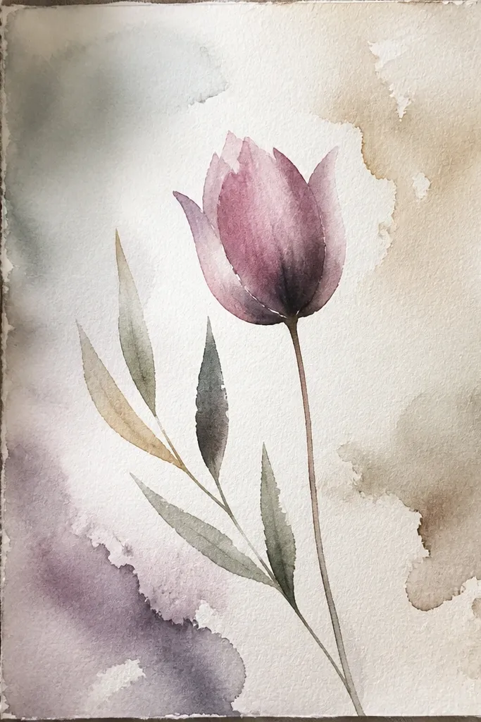
Bold negative space makes the flowers feel modern and clean. Instead of filling the page, you give the tulips room to breathe, which is why the petals can stay soft and still look sharp. This design is great if you’re making a minimalist holiday card or a simple wall print. The leafy branch creates structure, and the narrow fold lines keep each tulip tall. It’s also flattering for mixed skin tones and outfits because it doesn’t pull focus with clutter.
Sketch a single branch line that splits into two stems, then position two tulips so they angle in opposite directions. Paint the stems and one leaf branch first in sap green with a thin, controlled stroke. Paint the pink tulip with a light wash and keep the fold lines narrow. Paint the red tulip last with a slightly darker wash and add a deeper inner fold crease. Leave the spaces between petals and around blooms untouched so the white negative space frames everything.
Good to knowUse the side of your brush for leaves, then switch to the tip for fold creases so the textures stay different.
Common mistakeDon’t paint a full background wash — it ruins the minimalist negative space effect.
12. Rose Tulip with Warm Brown Underside and Tiny Yellow Anthers
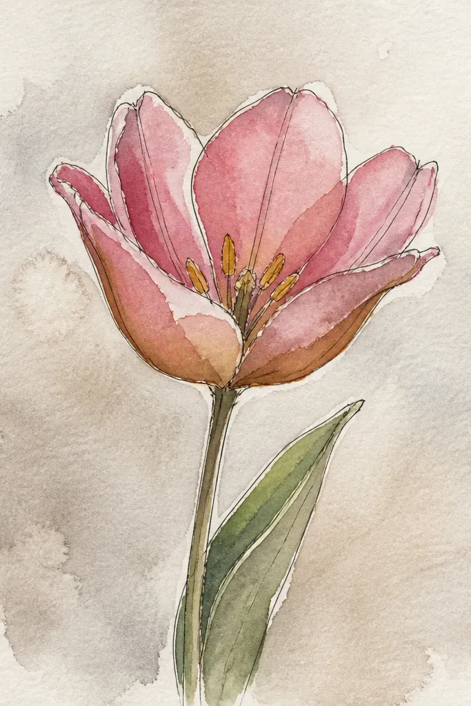
Warm brown shadows give a more natural, slightly old-world look. I use warm brown only under the underside folds, not across the whole bloom, so the tulip stays bright and doesn’t turn sepia. The tiny yellow anthers at the base make it read as a real flower, not a stylized shape. This one is perfect for autumn-spring crossover decor because it has warmth without going fully orange. It also looks lovely on textured paper where the pigment settles slightly.
Paint the outer petals with a rose wash, keeping it translucent so you can see paper white through. Let it dry until matte. Mix rose with a touch of warm brown for the underside fold, and paint just the crease lines that curve toward the center. Add a second pass only where the fold is darkest, then dab two tiny yellow anther dots at the center base. Finish with medium green stems and a leaf that has one darker edge line for shape.
Good to knowKeep the brown mix very small — start with a drop, then add only if needed.
Common mistakeAvoid putting brown into the outer petals — it makes the tulip look dirty.
13. Mint Tulip with Soft Fringe Edges
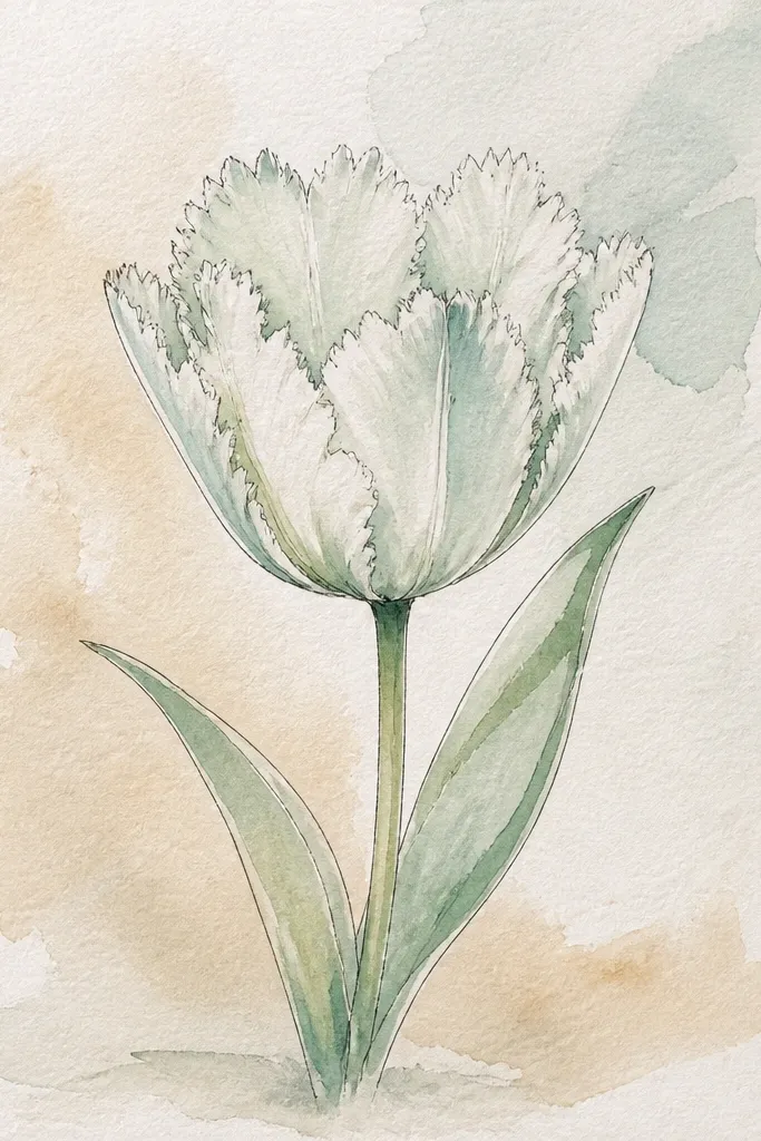
Mint tulips look calm and modern, especially when the edges are feathered. The soft fringe effect happens when you wet the petal edges lightly and let the paint spread just a little. The center stays darker to keep the bloom from looking flat. I like this for spring wedding stationery and light holiday cards because it feels fresh and clean. It also pairs well with silver-toned frames because the cool mint reads crisp.
Sketch the tulip shape, then wet only the outer petal edges with clean water. Mix a pale mint green and paint the petals so the edges feather outward slightly. Let it dry to matte, then paint the inner fold with a slightly deeper mint mix, using a thin brush tip. Add a tiny yellow highlight at the center base if you want extra tulip accuracy. Paint the stem in a lighter green and add a narrow leaf with one faint vein line.
Good to knowIf feathering goes too far, blot the edge once with a clean dry brush — don’t keep adding water.
Common mistakeDon’t over-darken the center; mint can look gray if you push it.
14. Crimson Tulip with Gold-Accent Center (No Foil Needed)
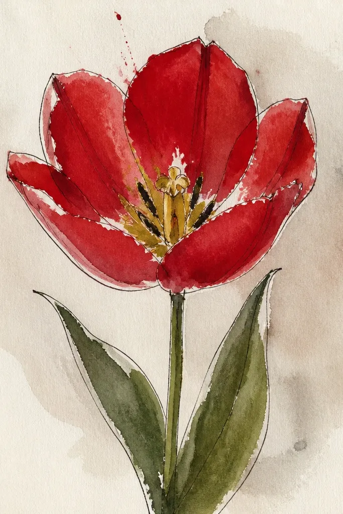
You can get a gold-accent look without foil by painting a warm yellow glow right at the center fold base. Crimson petals need that warm point so the whole flower feels lit from within. I use a small brush and keep the gold area tiny — it should look like the bloom’s natural center, not a decoration. This style looks amazing for holiday cards because the crimson reads festive and the gold reads celebratory. It’s also a great choice if you want something that feels more “occasion” than everyday spring art.
Paint the outer petals in a watery crimson wash, leaving top edges lighter. Let it dry until matte. Add deeper crimson fold shadows with pigment-rich paint, focusing on the inner underside. Mix a warm yellow (a tiny bit of ochre in lemon yellow) and paint a small glow at the center base. To make the gold line, use a nearly dry brush to pull a thin warm line upward along the fold. Finish with dark green stems and a leaf that has a darker underside edge.
Good to knowFor the gold glow, use less water than you think; thin yellow turns pale and disappears.
Common mistakeAvoid painting gold across the whole center — it makes the tulip look like it has a sunburst.
15. Tulip Wreath Corner with Five Small Blooms
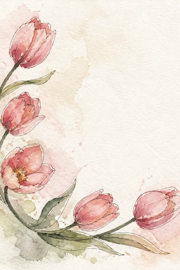
A wreath corner makes the painting feel seasonal without needing a full circle frame. Five small blooms look intentional because the repetition is controlled, and the corner placement feels modern for cards and gift tags. I keep each bloom slightly different in color and height so it doesn’t look like a sticker sheet. The leaves tie everything together and create a rhythm between flowers. This is the design I use when I want tulips to decorate a holiday envelope flap, not just sit in the middle.
Pick a corner and mark a simple arc with pencil so your wreath has direction. Paint the central bloom first, then place two blooms slightly lower and two slightly higher, spacing them so petals don’t overlap too much. Use three colors: pale pink, peach, and one deeper red, keeping the fold shadows narrower on the smaller blooms. Add tiny leaf sprigs between blooms using a thin brush stroke, then connect stems with faint lines so it looks like one arrangement. Keep all backgrounds white and let paper texture show around the flowers.
Use the same brush for stems and leaves, but change pressure: light for stems, heavier for leaf bodies.
Don’t overcrowd the corner with too many leaves — it turns into a green blob.