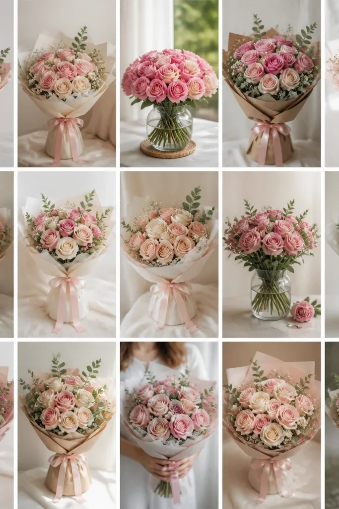
1. Single Rose with Tiny Bud Halo
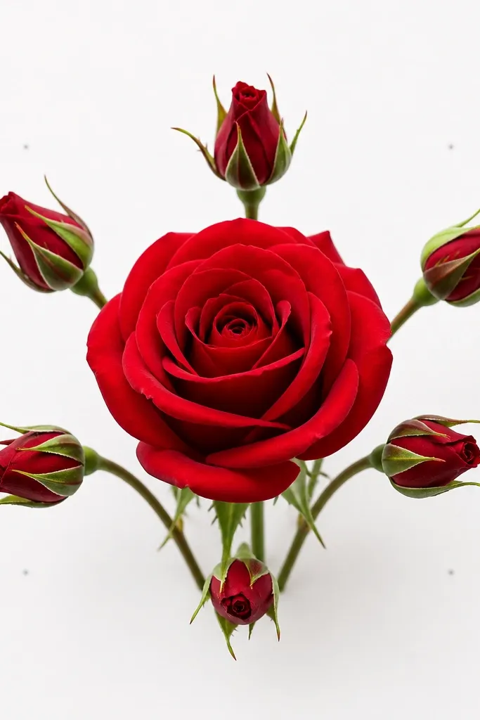
This one is my go-to when you want cute but not busy. Draw one full rose in the middle, then add six tiny buds around it like a halo. Keep the rose petals mostly rounded, with a few sharp tips so it reads as a real bloom. I like it in warm reds and blush pinks because the contrast makes the petals look dimensional even with light shading. It flatters small spaces like 4x6 cards and it also looks good on neutral skin tones in the sense that it doesn't clash with delicate outfits or pastel envelopes.
First, sketch a light oval for the rose base, then build petals around it in a spiral: 6 petals for the first layer, 5 for the second, 4 for the top. Next, place the buds evenly around the rose - each bud is a small teardrop with one curved line for the opening. Then draw a short stem that curves down and two leaves that point toward the rose, not away. Finally, erase extra guidelines and add a soft shadow under the top petals using a 2B pencil or a light watercolor wash along the inner petal folds.
Good to knowUse a kneaded eraser to lift highlights off the petal edges. It makes the rose look wet without adding heavy color.
Common mistakeDon't shade every petal the same dark tone - that kills the rose shape.
2. Bud-and-Rose Ribbon Bouquet (Top Tie)
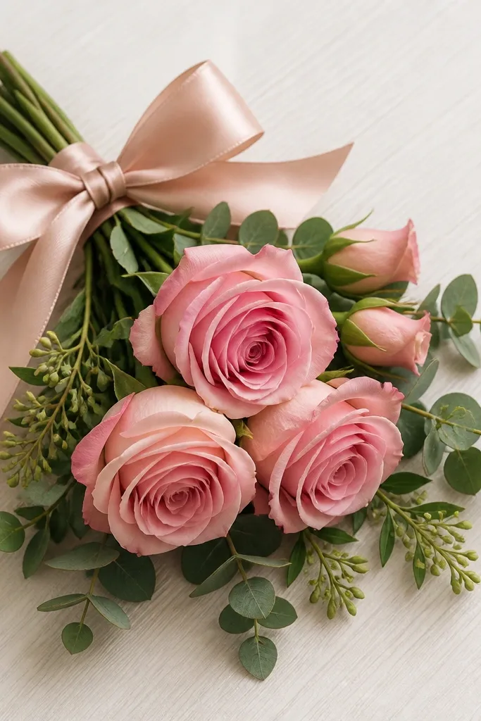
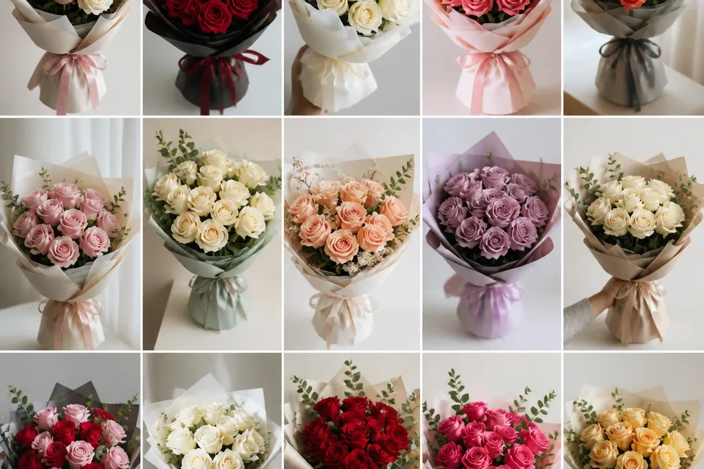
This drawing looks finished fast because the ribbon gives you a strong structure. I draw three roses in a triangle: one big focal rose, two smaller ones behind it. The ribbon tie at the top creates a clear "frame" so the bouquet doesn't sprawl. Color it with a single rose red plus softer blush for the smaller blooms; it keeps the look sweet instead of dramatic. This style is especially flattering for pastel color palettes because the ribbon folds catch light and guide the eye toward the petals.
Start by sketching the ribbon bow first: two loops, then three fold lines on each loop. Place the biggest rose slightly right of center, then add two smaller roses behind it so their outer petals peek out. Draw a simple ribbon tail on both sides - keep the tails about half the height of the bouquet. Next, add stems that converge at the tie point, then tuck two small buds under the left rose and one bud behind the right rose. Finish by adding leaf clusters along the ribbon tails, using short curved leaf shapes with one center vein line.
Good to knowWhen you color the ribbon, leave the fold lines lighter - don't color over them solid. That's what makes it look like fabric.
Common mistakeSkipping the ribbon folds makes the whole bouquet look like loose flowers on a blank page.
3. Three-Rose Corner Bouquet
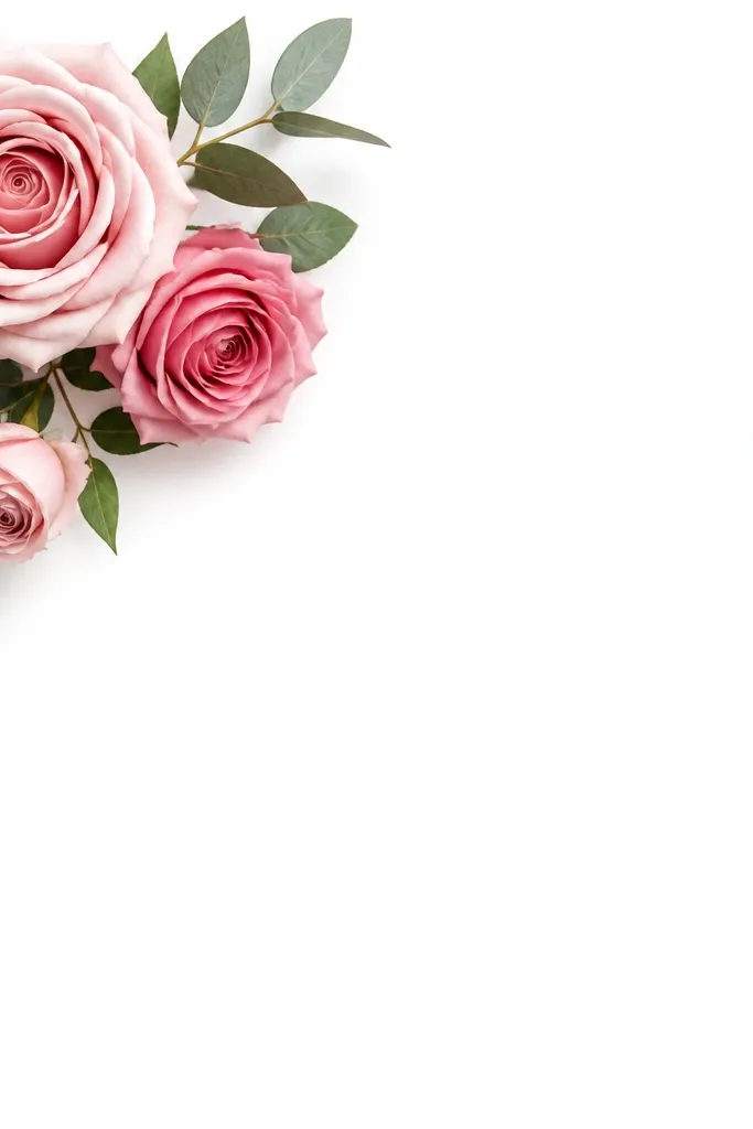
Corner bouquets look extra cute because they use negative space like a cheat code. Put one medium rose closest to the corner, then place a smaller rose slightly below it and a third rose farther in. The diagonal angle makes it feel playful without needing a lot of shading. I like this style for monochrome pencil drawings because the leaves and stems add texture while the empty space stays clean. It also works for people with limited drawing time because the composition does the heavy lifting.
First, draw an invisible triangle that points from the corner toward the center. Place the largest rose at the triangle corner, then add the second rose along one side of the triangle and the third rose along the other side. Draw stems that follow the triangle edges, not straight lines - keep them curved and short. Add leaves in between the roses using two leaf sizes: small teardrops and slightly longer ovals, each with a single vein line. Finally, add a light shadow under each rose base and erase any stray lines so the corner stays crisp.
Good to knowUse a ruler lightly for your stem direction guides, then erase it. Clean direction makes even a simple rose look intentional.
Common mistakeDon't fill the blank space with extra petals. White space is part of the design.
4. Watercolor Wash Backdrop with Line-Petal Roses
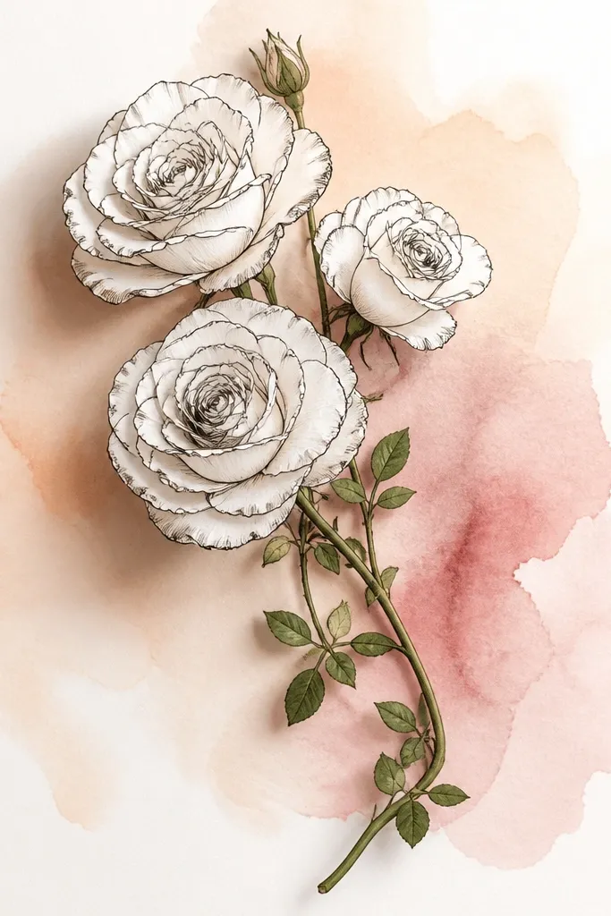
This is the quickest way to get a "wow" look without complicated coloring. You draw the roses in pen or dark pencil first, then add a soft watercolor wash behind them so the roses stay sharp. I use a pale peach wash with a dusty rose edge - it makes red petals look richer without you having to blend a lot. Keep the roses mostly line-based with only light pencil shading on the inner petals. This style looks flattering on light paper and also makes your drawings feel like they belong in a seasonal card set.
Start by outlining three roses and one bud with dark pen or a 2B pencil. Leave at least 1 cm of space between the roses and the page edges so the wash doesn't smear into the petals. Then wet the background lightly with clean water and drop in peach watercolor at the center, blending outward. Add a dusty rose tint only near the bottom edge where the bouquet sits. Let it dry, then add tiny leaf shapes in green and a few stem shadows under the roses.
Good to knowIf watercolor blooms spread, tap the paper gently on a towel. It pulls excess water outward and keeps the wash soft.
Common mistakeDon't paint over your final rose outlines. It makes petals look fuzzy and cheap.
5. Looped Vine Roses with Heart Leaves
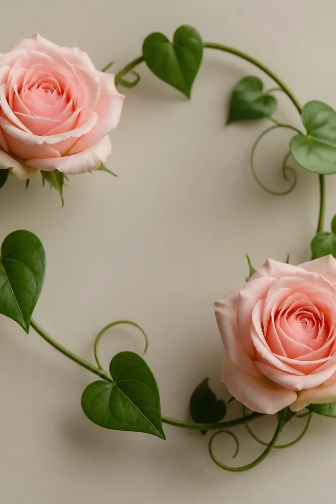
This one is cute because it adds movement without needing lots of extra flowers. I draw two roses - one larger, one smaller - and connect them with a looping vine that creates a gentle S-curve. Heart leaves make it feel sweet and giftable, especially for Valentine season and spring birthdays. Color the vine a muted sage and the roses a warm pink-red mix. The shape works well on tight compositions because the vine fills gaps while still looking airy.
Sketch the looping vine first: start at the bottom, curve up to the larger rose, then loop down to the smaller rose and back up. Draw the larger rose as a spiral of petals, then draw the smaller one slightly more closed with fewer outer petals. Add heart leaves along the vine at uneven spacing, with two or three leaves pointing outward. Next, add thin stem lines inside the vine curve to suggest thickness. Finish with a light shadow on the lower petals and a tiny highlight line on each leaf curve.
Good to knowUse a fine liner for the vine and a softer pencil for petals. Sharp-vs-soft contrast makes it look "designed," not copied.
Common mistakeAvoid drawing leaves as perfect hearts with no vein. Real leaves need one center line.
6. Rose Bouquet in a Teacup (Cute Still Life)
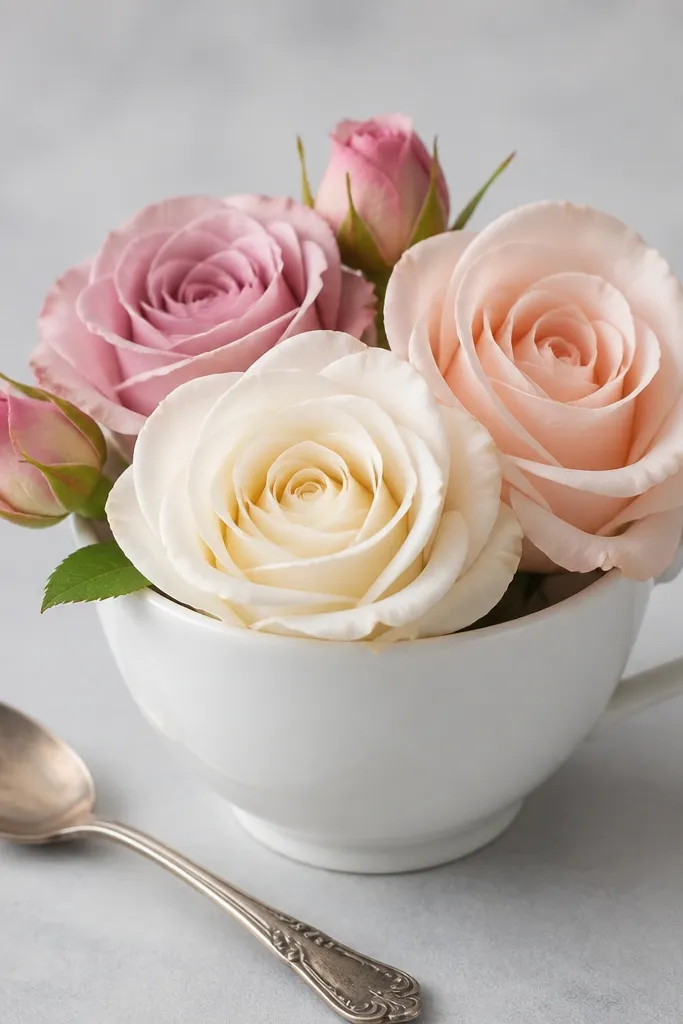
Still life bouquets are my favorite for holiday brunch cards and thank-you notes. The teacup gives you a clear base shape, so you don't have to worry about the bouquet floating. I draw three roses leaning slightly toward the cup opening, which makes them feel like they're "popping up" from the container. Use a muted rose color for the blooms and a soft cream or light gray for the cup. This one looks especially good if you like gentle color palettes because the cup keeps the drawing from becoming too intense.
Draw the teacup first: an oval opening, a slightly narrower base, and a handle that is a simple curved loop. Then sketch three rose stems rising from inside the cup, with the biggest bloom in the front. Add two buds tucked behind the front rose so they peek above the rim. Draw a small saucer circle under the cup and a spoon handle line beside it if you want extra charm. Finally, add leaf clusters along the stems and shade the cup rim lightly so it looks like it's holding liquid.
Good to knowShade inside the cup rim with one thin line of darker gray. It instantly makes the cup look 3D.
Common mistakeDon't make the cup too tall. If it's narrow and tall, it looks like a vase and ruins the cute vibe.
7. Rose Bouquet with Holly and Berries
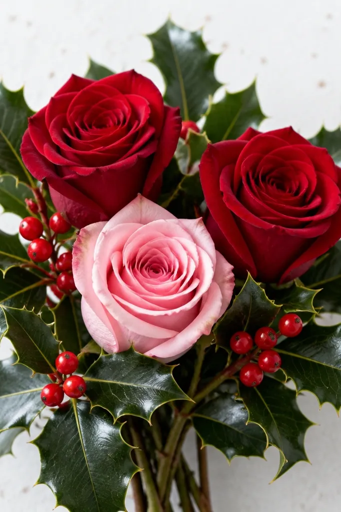
This is the holiday-friendly rose drawing that still reads as "cute," not like a cartoon. Keep the bouquet small - two roses and one bud - then add holly leaves around the edges like a frame. The berries are tiny circles with a darker red center, which makes the whole drawing feel festive even with minimal color. I like red roses with a pink rose so the berries don't overpower everything. It's great for winter cards because the holly shape gives you a strong seasonal silhouette.
Start with a tight bouquet cluster: one large rose centered, one rose to the right, and one smaller bud on the left. Draw stems that tuck behind holly leaves so the leaves look like they wrap the bouquet. To draw holly, use oval leaves with pointed tips and small tooth bumps along the edges. Place three berry clusters along the outer edges, each with 3 to 5 tiny circles. Shade the berry centers with a darker red pencil and add a faint shadow under the bouquet to anchor it.
Good to knowUse white gel pen dots on berries after coloring. It makes them look glossy.
Common mistakeAvoid drawing holly leaves all the same size. Odd sizes look more natural.
8. Single Rose with Lacy Doily Background
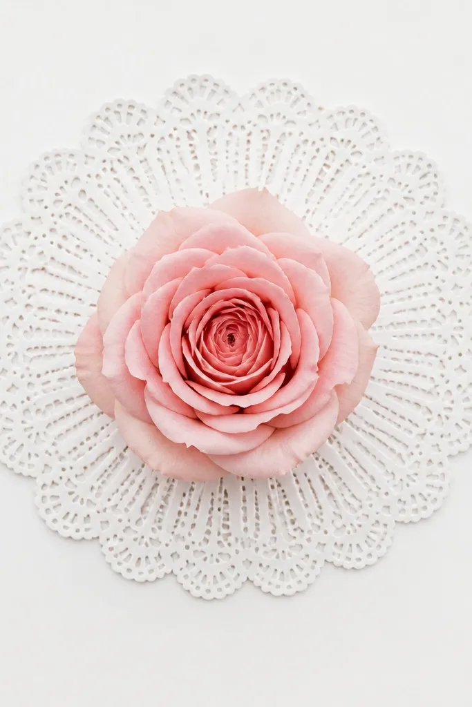
Doily backgrounds make a simple rose look like it belongs on an old-fashioned greeting card. I keep the rose itself clean and slightly realistic, then let the doily do the decorative work. You get contrast between smooth petal curves and the doily's repeating pattern. This style looks great in black ink with light pink shading because the lace reads clearly without heavy color. It's also beginner-friendly since the doily pattern gives you a repeatable structure.
Draw the rose first: one spiral of petals with a few outer petals fanning out at the top. Then sketch a doily circle around it - start with a big outer ring, then add 8 to 10 radiating arcs like spokes. Add small scallops along the ring edge and a couple of smaller circles near the center. Next, draw a few "hole" areas inside the doily by leaving the paper white, then lightly outline them. Finish by shading the rose base and adding a soft shadow where the rose overlaps the doily.
Good to knowUse a compass or trace a cup for the doily circle. Perfect circles make the lace look intentional.
Common mistakeDon't overdraw the doily lines. Too many heavy strokes makes it look messy.
9. Rose Bouquet with Polka Dot Wrap Paper
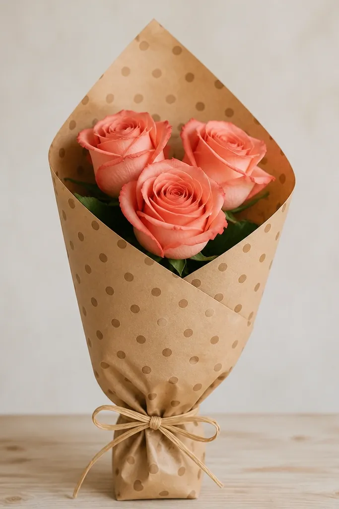
Wrap paper drawings are fun because they add pattern without making the roses harder. I draw a diagonal wrap rectangle, then cut an opening at the top so the roses emerge. Polka dots look cute and forgiving because you don't need perfect spacing to make them charming. Color the wrap paper in warm kraft tones (or light beige) and keep rose colors to one strong red plus a small blush accent. This is perfect for seasonal gifts because it looks like you actually wrapped flowers.
Start by sketching the wrap shape: a tall rectangle tilted slightly, with a fold line down the center. Draw the opening at the top - a curved cut that reveals three rose heads. Then add polka dots across the wrap, keeping dot size consistent (I use small coin-sized dots in my head - about 3-4 mm). Place one focal rose in the middle, then two smaller roses at left and right. Finish with a simple bow knot and two ribbon tails, then lightly shade the wrap folds with one darker brown pencil.
Good to knowColor the dots first, then draw folds on top in pencil. It keeps the dots from getting muddy.
Common mistakeAvoid using black dots with heavy marker. It turns the wrap into a graphic poster.
10. Mini Rose Buds on a Branch Frame
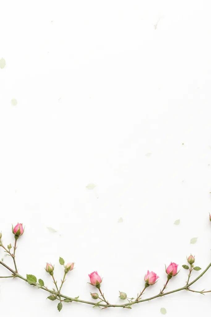
Border frames make your drawing look like it belongs on a printable label or a holiday card corner. This one uses a branch line as the skeleton and tiny buds as the decoration. I like it because buds are easier than full roses - you just need a teardrop bud shape and one curved petal line. Color the buds in soft pink and the branch in muted green-brown. This style looks good for both minimal ink drawings and light watercolor because the buds don't demand heavy detail.
Draw a branch line that forms a gentle U shape or partial rectangle around your center space. Add small buds along the branch: each bud is a teardrop with a single inner curve to show where petals open. Place buds at uneven intervals - don't march them in a straight rhythm. Add tiny leaves as short ovals with one center vein line. Finally, shade the branch underside with a darker green-brown pencil and add a few specks of lighter color around buds for texture.
Good to knowIf your buds look too similar, vary their openness by drawing 1-2 buds as tighter spirals and others as open cups.
Common mistakeDon't thicken every bud outline. Keep buds light so the branch stays the anchor.
11. Rose Bouquet in a Mason Jar
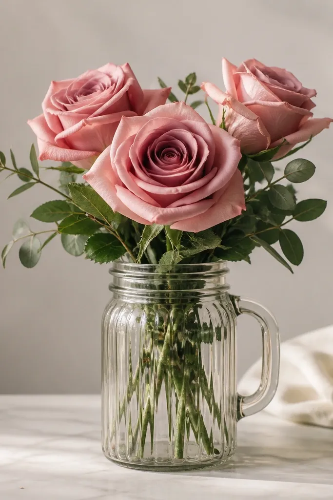
Mason jars make bouquets feel modern and still cozy. The jar's straight sides help your composition stay neat, which means even a beginner drawing looks "planned." I draw three roses - one tall center bloom and two shorter side blooms - then add a few leaves that tuck against the jar rim. Color the jar with a light transparent wash and keep the roses more saturated so they read as the focal point. This works well for all skin tones and color palettes in a practical way because the jar is neutral and doesn't fight your card background.
Sketch the jar first: a rounded rectangle with a lid line on top and a small handle curve if you want. Add 3-5 vertical ridges with light pencil lines. Then draw stems that rise from inside the jar, with one tall rose in the center and two roses flanking it. Add small buds at the back so the bouquet feels layered. Finish by coloring the jar with very light gray or pale blue, then shade the roses' inner petals with a darker pink/red and add leaf veins.
Good to knowUse a light gray wash for the jar, then leave the highlights white. It makes the glass look real fast.
Common mistakeDon't outline the entire jar in thick black. Thin lines look cleaner and more handmade.
12. Rose Bouquet with Striped Ribbon Wrap
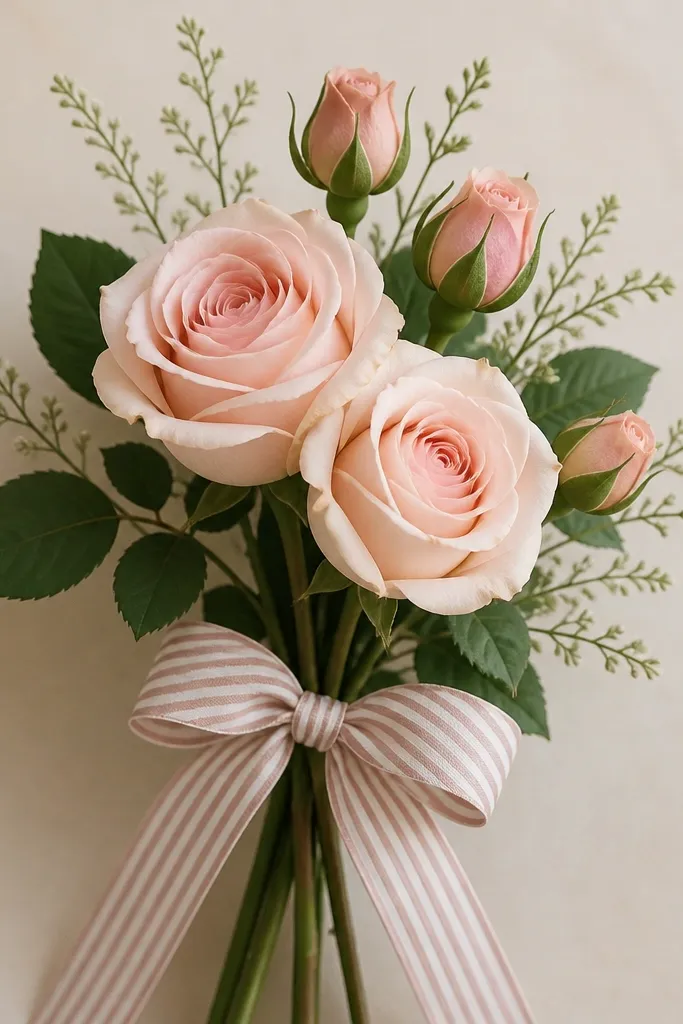
Stripes add energy and make the bouquet look like a gift even if the roses are simple. I keep the roses to a tight cluster, then make the ribbon the detail. Alternate stripes in two soft colors like dusty rose and cream, or sage green and white. The stripes guide the eye toward the knot, and the knot gives you that "finished" look. This style is great when you want something cute for birthdays because it looks cheerful without being childish.
Start with the ribbon knot: draw a small loop on top and two tails that angle down. Add the striped wrap area under the knot using a slightly curved rectangle shape. Then draw three flower heads above it - one bigger rose and two smaller buds or half-open roses. Place leaves behind the flowers so they peek out around the bouquet edge. Color the stripes with thin consistent spacing, then add a gentle shadow under the knot using one darker stripe shade.
Good to knowPress lightly for the stripe lines, then go back with a darker pencil only on every other stripe. It keeps the stripes crisp.
Common mistakeAvoid uneven stripe widths. If one stripe becomes a blob, the whole ribbon looks sloppy.
13. Rose Bouquet with Scalloped Paper Edge
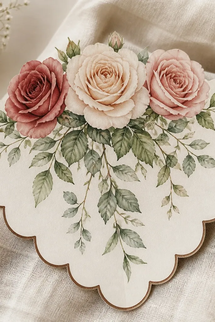
This one is cute because it frames the roses like a vintage craft label. The scalloped edge acts like a border, so you don't need extra background texture. I draw the bouquet slightly higher than center so the leaves can fall into the scallops and feel balanced. Color the scallops in a warm brown outline and keep roses in pink-red tones. It's especially flattering for small drawings because the border hides empty space and makes the piece look complete.
Draw the scalloped border first: a long rectangle with repeating half-circles along the bottom and sides. Keep the scallops evenly spaced, about 1 cm wide each. Place the bouquet near the top: one focal rose center, two supporting roses on left and right, then add a few leaves that drape down. Shade the leaves with a light green pencil, with darker shading under each leaf curve. Finish by adding tiny stem lines that disappear behind leaves, so the bouquet feels layered rather than pasted on.
Good to knowIf you don't have a template for scallops, trace bottle caps for the half-circle pattern, then freehand the rest.
Common mistakeDon't make the scallops too deep. Deep scallops shrink the drawing area and make roses look crowded.
14. Rose Bouquet with Candlelight Glow Background
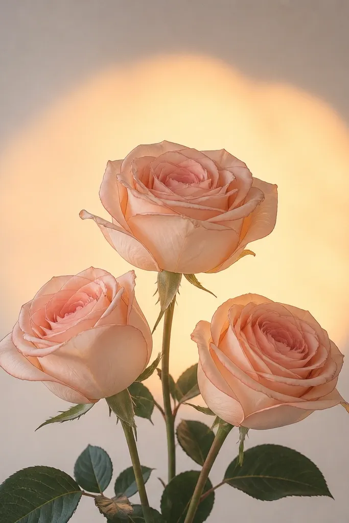
Glow backgrounds turn a simple bouquet into a cozy scene. I draw three roses - one front rose and two behind - then add a circular soft wash behind them like warm candlelight. The trick is keeping the glow lighter than the rose colors, so the roses stay readable. I like warm peach glow with muted green leaves because it feels like evening without looking dramatic. This works well for holiday season cards and also for people who want a gentle aesthetic.
Start with your bouquet outline using a dark pencil or fineliner. Place the largest rose in the center and keep the other two slightly smaller and partially behind. Then paint or lightly shade a circular background behind the bouquet: pale yellow in the center, peach at the edges. Leave it uneven - candlelight isn't perfectly round. Once it's dry, add leaf shading and a little shadow under the front rose petals so it pops against the glow. Finish with a few tiny highlights on petals using a white gel pen.
Good to knowUse watercolor or colored pencil for glow, not marker. Marker glow looks like a stamp and loses softness.
Common mistakeAvoid making the glow too dark. If it competes with the roses, the drawing looks muddy.
15. Rose Bouquet with Simple Origami Paper Fold Wrap
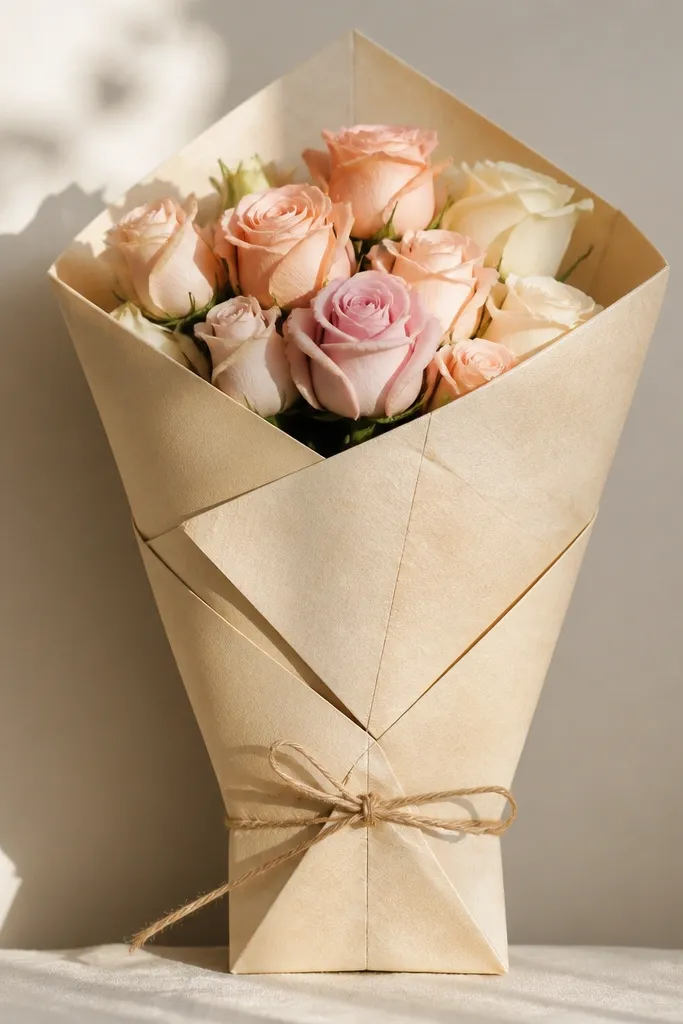
Origami-style wrap looks clever, and it's actually easy because you draw folds as straight lines and triangles. I keep the bouquet compact: three roses and one bud, all coming out of the wrap opening. Color the wrap in pale neutral like cream or light gray, and add one accent fold edge in muted rose or sage. The folds make the drawing feel dimensional even if your petals are simple. This is flattering for anyone who likes clean lines because you get structure from the wrap.
Draw the wrap first: a trapezoid shape with a pointed top opening. Add 4-6 fold creases as straight lines, then outline the fold edges with a slightly darker pencil. Sketch three rose heads emerging from the opening, with the center rose largest and the side roses slightly behind. Add a few leaves that peek out from the sides of the wrap. Finally, shade the fold edges lightly so you get depth: one side darker, the other side lighter.
Good to knowErase your fold guidelines after you ink or darken the final creases. Clean creases make it look like paper, not sketch lines.
Common mistakeDon't add too many extra folds. Three to six creases is enough to sell the origami look.