1. Comma Petal Edges on Mini Roses
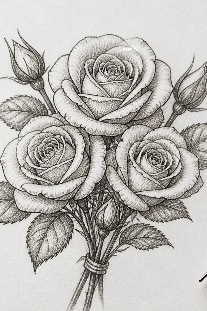
I love drawing mini roses like this because the comma petal edge instantly makes them look soft, not cookie-cutter. Start with 5-7 tight petals around a small center spiral, then let each petal taper to a point with a gentle curve. The color look is gorgeous in blush pink and warm cream because the petal edges catch light instead of turning into one blob. This detail flatters small compositions - it makes a bouquet look delicate without shrinking the whole drawing. For skin tones, it plays nicely with both cool and warm palettes since the rose core stays creamy and the edges stay light.
Start by sketching a small circle center with a tiny spiral line. Then draw each petal as a comma stroke - thick at the base, thinner at the tip - and overlap them so the next petal covers about a third of the previous one. Finally, outline only the outermost petal edges with your fineliner and add one white gel pen highlight on the top petal. Keep the rose size consistent across the bouquet so the overlap looks intentional, not accidental.
Good to knowIf your highlights look chalky, test the gel pen on scrap paper first - some brands need a few seconds to dry.
Common mistakeAvoid outlining every single petal edge - that makes mini roses look harsh and cheap.
2. Calyx Cup Rings at the Flower Base
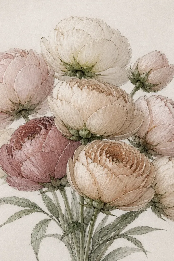
Calyx cups are the detail that makes hand-drawn flowers look like they're actually attached to the stem. I draw them as a thin ring with little pointed "tabs" so the top of the stem looks tucked under the bloom. This works beautifully for daisies, small roses, and even ranunculus-style flowers. In color, calyx cups look best in muted sage or olive with a slightly darker edge - it gives the bouquet weight. It also flatters small bouquets because it adds structure without adding big shapes.
Start by drawing your flower head first, then add the stem line that ends just under the bloom. Draw a thin oval ring at the base of the flower, and add 5 short pointed segments around it like a tiny crown. Then let the stem line break and hide behind the ring so it looks tucked. Finish with a light shadow under the ring using a soft pencil or diluted paint, so the cup reads as a 3D shape.
Good to knowUse the same calyx style on every bloom so the bouquet looks like one set, not mixed flowers.
Common mistakeSkip a flat line under the flower head - it reads like a stem glued on top.
3. Dew Drop Beads on Petals
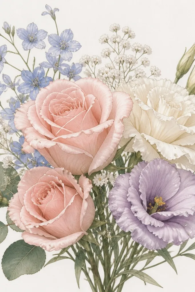
Dew drops make dainty bouquets feel fresh, especially for spring and early-summer holiday cards. I place them sparingly - three to six total in a medium-size bouquet - and I make sure they sit where petals curve upward. The teardrop shape plus one bright highlight makes them look like glass, not just dots. This detail looks great with light coloring like pale peach, soft lavender, and butter yellow because the dew reads as cool contrast. It also flatters any bouquet size since the drops are small but high-impact.
Start by choosing 2-3 petals that face upward and lightly sketch where the droplets will sit. Draw each dew drop as a thin teardrop outline that hugs the petal edge, then add a small white highlight dot near the upper left of the drop. Add a faint shadow line on the opposite side with a light gray pencil or diluted ink wash. Finally, connect none of the drops to each other - keep them independent so they don't look like bubbles.
Good to knowIf you're coloring with markers, outline the dew drops in pencil first, then go over with a gel pen after the ink dries.
Common mistakeDon't draw dew drops as filled circles - they look like stickers.
4. Tiny Seed Head Tufts on Small Flowers
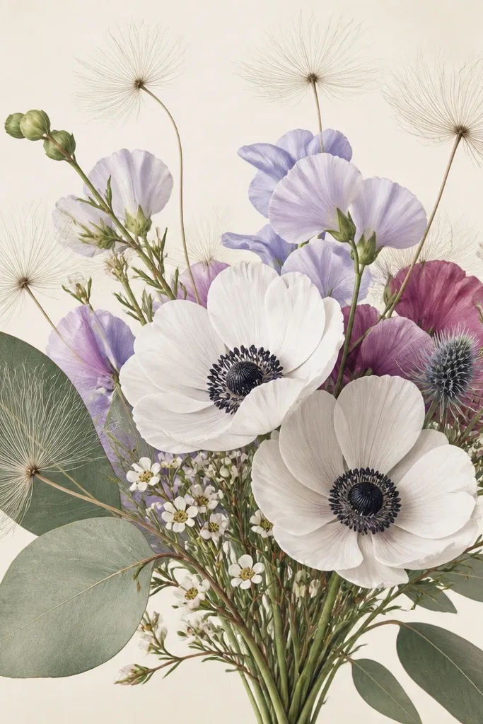
Seed head tufts add movement and realism without turning your bouquet into a wildflower mess. I use them as filler between bigger blooms so the bouquet doesn't feel empty. In drawings, the texture matters: the tufts need multiple short lines, not one spiky star. They look especially good in off-white, pale beige, and soft gray shading, which keeps the bouquet dainty. This detail flatters skinny stems and airy compositions because it fills space while staying light.
Start by drawing a small oval or tiny circle for the seed head base. Then fan out 10-20 hair-thin lines from the center, varying their length so some reach past the oval and some stay tucked. Overlap one or two tufts behind a nearby leaf so depth shows up. Finish by adding one soft shadow under the seed head with a light pencil line following the curve.
Good to knowUse a 0.3 fineliner for the tufts so they stay hair-thin and don't thicken with repeated passes.
Common mistakeAvoid making tufts all the same length - that flat pattern screams "clip art."
5. Petal Overlap Hiding Lines
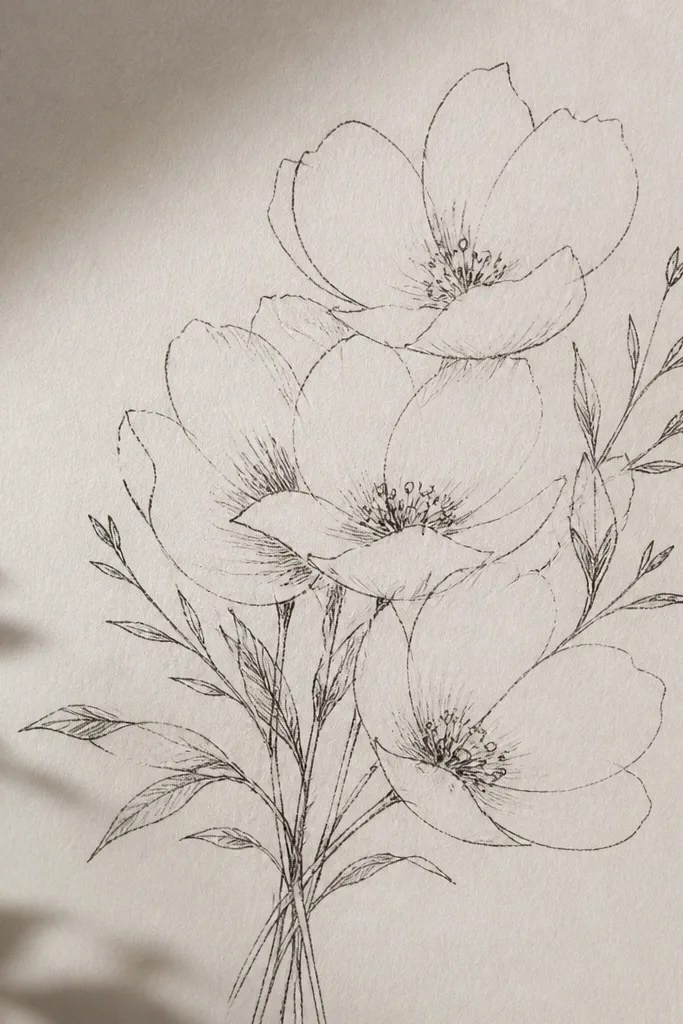
This is the detail that fixes flat bouquets. When you overlap petals, you should hide part of the lower petal edge by stopping the line early. I do this consistently at the contact point so the viewer reads attachment instantly. It works for almost every dainty flower - peonies, camellias, even simple five-petal blooms. The effect is subtle but huge: your bouquet looks layered and dimensional even without heavy shading. It also flatters line-art styles because it relies on line decisions, not extra coloring.
Start by sketching your flower cluster shapes with light pencil - don't worry about perfect petals yet. Then redraw the petals with fineliner, and when one petal overlaps another, stop the lower petal outline at the overlap. Use slightly longer lines on the topmost petals and shorter, broken lines on the ones underneath. Finally, add a small edge highlight on the top petal using a white gel pen or a light pencil glaze.
Good to knowPractice on one flower first: draw two petals overlapping and hide exactly one edge - that's your repeatable rule.
Common mistakeDon't draw every petal edge fully - full outlines make layers look like separate stickers.
6. Leaf Veins with One Central Spine
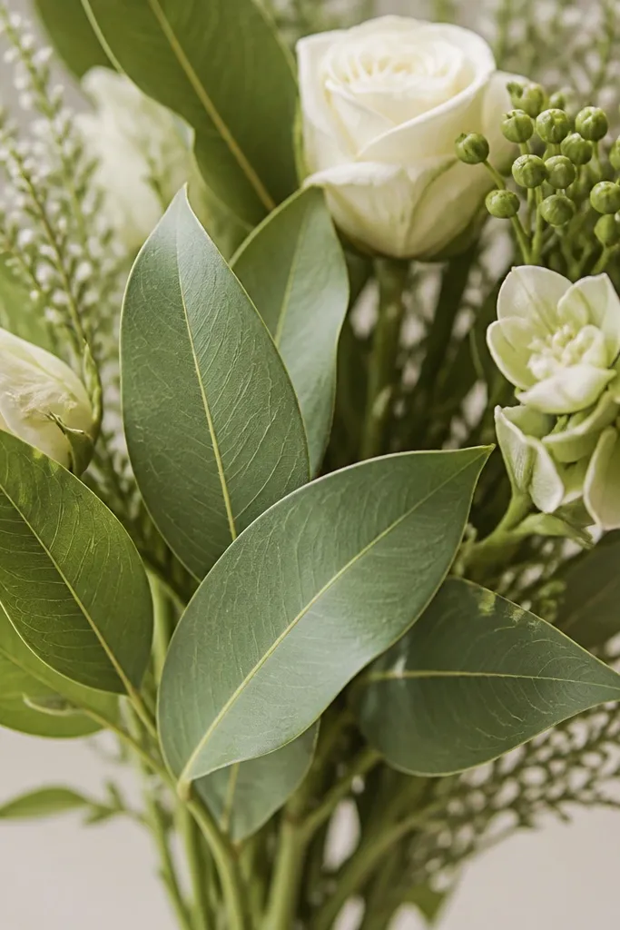
Leaves are where your bouquet gets believable. My favorite dainty leaf detail is a single central spine with a few short angled side veins - it looks natural at a glance and doesn't clutter the page. This works especially well for eucalyptus-style leaves and simple pointed leaves. In color, the central vein looks good in a slightly darker green, while the leaf body stays pale and airy. It flatters bouquets with lots of stems because the leaves guide the eye and break up busy bloom shapes.
Start by drawing each leaf as a teardrop or pointed oval with a smooth outer line. Add a central spine line running from the base to the tip, then add 3-5 short side veins on each side. Overlap one leaf edge over a stem so it looks like the leaf is in front. Finish by shading lightly near the spine edge, then add a tiny highlight line along the top edge if you're using gel pen.
Good to knowKeep side veins shorter near the base and longer near the tip - it looks more alive.
Common mistakeAvoid drawing a full leaf grid pattern - it turns delicate leaves into lace.
7. Ribbon Bow Fold Lines and Shadows
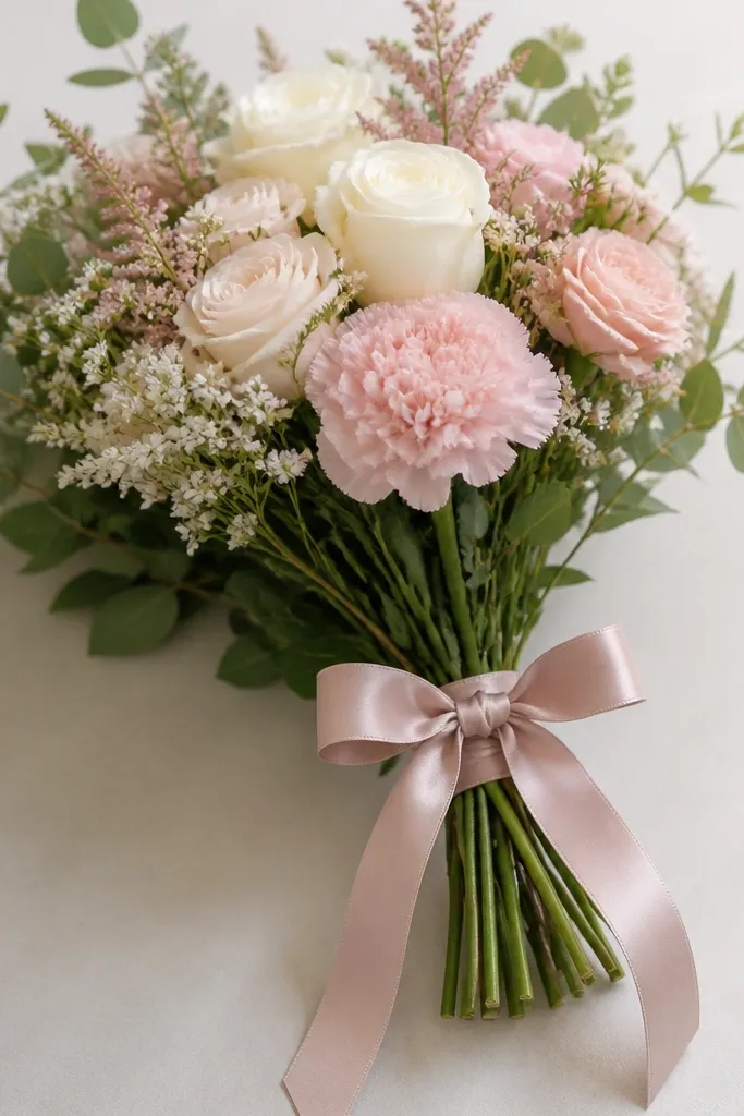
A ribbon bow is holiday-friendly and it makes a bouquet feel finished fast. I draw bows with only two main loops and one knot, then add fold lines that show the ribbon thickness. The bow detail looks best in muted pink, dusty red, or cream satin - it reads dainty instead of loud. This also flatters different body types of compositions: tall bouquets benefit from downward tails, while round bouquets look better with a compact knot. If you're making gift tags, the ribbon gives you a natural place to write a name or message later.
Start by drawing a small knot circle or oval at the center where the ribbon ties. Then sketch two loops - each loop should curve outward and slightly upward - and add one fold line per loop that curves with the fabric. Draw the tails as two thin curved shapes that dip below the stems and add a faint shadow on the underside. Finally, outline the outer ribbon edges more firmly than the inner fold lines so the bow pops.
Good to knowUse a light gray pencil shadow under the knot - it makes the bow look tied, not floating.
Common mistakeDon't add too many bow loops - three-plus loops start to look costume-like.
8. Hollow Center Star on Five-Petal Blooms
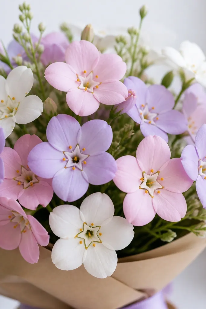
That tiny hollow center star gives five-petal flowers a "handmade" feel. Instead of coloring a center solid, I leave a blank center and outline a star shape that sits inside it. Then I add a few pollen dots around the star for life. This detail looks amazing for mini blossoms like cherry blossoms or simple daisy-like flowers. In pale colors, the hollow center keeps everything airy and prevents the bouquet from turning muddy. It flatters light, pastel palettes because the blank space becomes the highlight.
Start by drawing five petals with a consistent curve and spacing, overlapping slightly where petals meet. Inside the flower, draw a tiny star outline - five points - and leave the middle blank. Add 6-10 tiny pollen dots around the star, keeping them uneven in size. Finally, shade lightly under the petals with a soft pencil so the petals cast a little depth onto the blank center.
Good to knowIf you're using color pencils, press lightly on the petals and leave the center untouched for maximum contrast.
Common mistakeAvoid fully filling the center - it makes dainty flowers look like they're wearing thick makeup.
9. Petal Tip Highlights with a White Gel Pen Dot
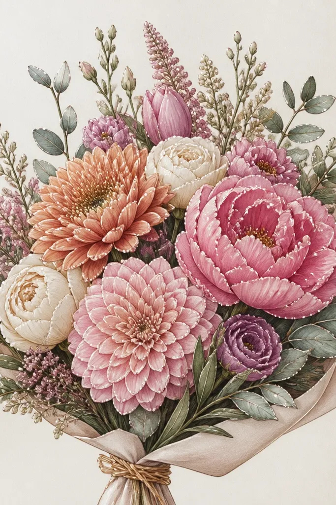
This is my go-to highlight system when I want the bouquet to look crisp without heavy shading. I place a tiny white dot or short line at the petal tip - just one per petal - and it makes the whole cluster look glossy and fresh. The effect works on roses, blossoms, and even simple four-petal flowers. For color, it looks best on petals colored in pastel pink, mauve, and soft peach because the highlight stays small and clean. It flatters minimal line-art styles because it's a detail, not a full watercolor wash.
Start by coloring or lightly shading your petals in your chosen base color. Then pick the top edge of each petal and add a small white dot near the tip using a gel pen. For petals that face sideways, make the highlight a short curved line instead of a dot. Finally, add one extra highlight only on the topmost petal of each bloom to create a focal point.
Good to knowUse a light touch - if your gel pen is too heavy, the highlight looks like paint splatter.
Common mistakeDon't highlight every edge equally - uneven highlights make it look real.
10. Soft Stipple Texture on Flower Centers
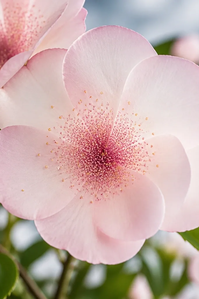
Stipple centers add depth without turning the bouquet dark. I use tiny dots in a tight cluster at the center, then fade them outward so the petals still look light. This detail works for sunburst-like centers, small ranunculus centers, and any flower where you want the middle to feel alive. In muted browns, honey golds, or soft charcoal, stippling creates a natural gradient. It flatters pastel bouquets because it gives you texture without adding big shapes.
Start by sketching the center circle lightly so you know the boundaries. Then use a fineliner to add stipple dots - 20-40 for a small center - with the densest dots in the middle. As you move outward, reduce the dot density until the edge looks almost blank. Finish with 3-6 slightly larger pollen dots on top, then lightly shade under the center with a soft pencil line.
Good to knowIf stippling looks shaky, rest your drawing hand on a scrap paper strip so your wrist doesn't float.
Common mistakeSkip scribbled crosshatching in centers - it makes flowers look dirty.
11. Overlapping Buds Like Little Teacups
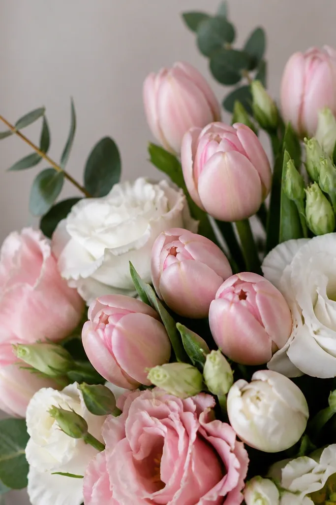
Closed buds bring calm structure to a bouquet. I draw them like tiny teacups: an outer curved shape with a folded lip line, and the stem tucked under. Buds make the bouquet look full even if you keep the main blooms small. They look gorgeous in pale blush with a slightly darker rim, which reads like curled petals. This detail flatters bouquets that need height because buds stack upward without getting bulky.
Start by sketching bud stems first - thin lines that rise and then curve slightly toward the main blooms. Draw each bud as a narrow teardrop with an open top, then add one folded lip line inside the bud. Overlap one bud over another so you hide part of the lower bud edge. Finish by outlining the outer bud silhouette more firmly and leaving the inner fold line lighter.
Good to knowMake buds a little darker at the rim and lighter inside - it looks like petals are curling.
Common mistakeAvoid drawing buds as perfect circles - they lose the curled-petal look.
12. Eucalyptus Leaf Smudgy Texture at Edges
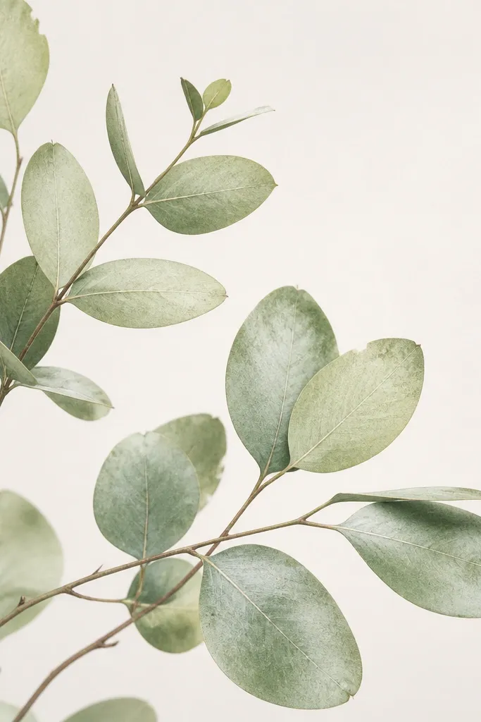
If you want your bouquet to look like it has real plant texture, do the edges. I add a light smudgy speckle along eucalyptus leaf edges so they don't look like plain outlines. The midrib stays crisp, but the edge gets a soft, irregular finish. In color, I use pale sage with a slightly darker green edge, then leave the center lighter. This detail flatters spring bouquets and holiday pieces because it adds "grown" character without overpowering the flowers.
Start by drawing eucalyptus leaves as pointed ovals with a clear central vein. Color the leaf body in a pale sage tone, staying lighter near the midrib. Then, with a darker green pencil or paint, add tiny edge speckles and blend them outward with a clean dry brush or light finger rub. Finally, reinforce the midrib line with a fineliner so the leaf still reads clearly on the page.
Good to knowKeep speckles only on the outer 1/5 of the leaf. Too much and the leaf turns speckled-buggy.
Common mistakeDon't outline eucalyptus leaves with thick black lines - the texture needs softness.
13. Stem Twists with Hidden Crossing Lines
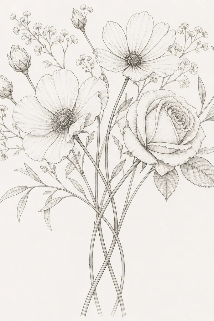
Twisted stems make a bouquet feel hand-tied, not arranged flat. I draw the twist by crossing two stem lines and hiding part of one behind the other at the crossing point. That tiny line decision creates depth instantly. This detail works for ribbon-tied bouquets, small hand bouquets, and holiday cards where space is tight. It also flatters vertical compositions because twists guide the eye upward. Color-wise, it looks great with muted greens and a slight brownish undertone if you add a soft shadow.
Start by drawing one main stem line from the bottom up, then add a second stem that curves toward it. At the crossing point, draw both stems briefly, then stop the line of the stem that should go behind. Add a small leaf or bud right near the crossing so the twist feels intentional. Finally, shade one side of the visible stem with light pencil or diluted paint so the twist reads as rounded.
Good to knowIf your crossing looks confusing, add a single highlight line on the visible stem side - it clarifies which one is on top.
Common mistakeAvoid crossing stems without hiding one line - overlapping lines that both continue look flat.
14. Mini Heart-Shaped Petal Folds
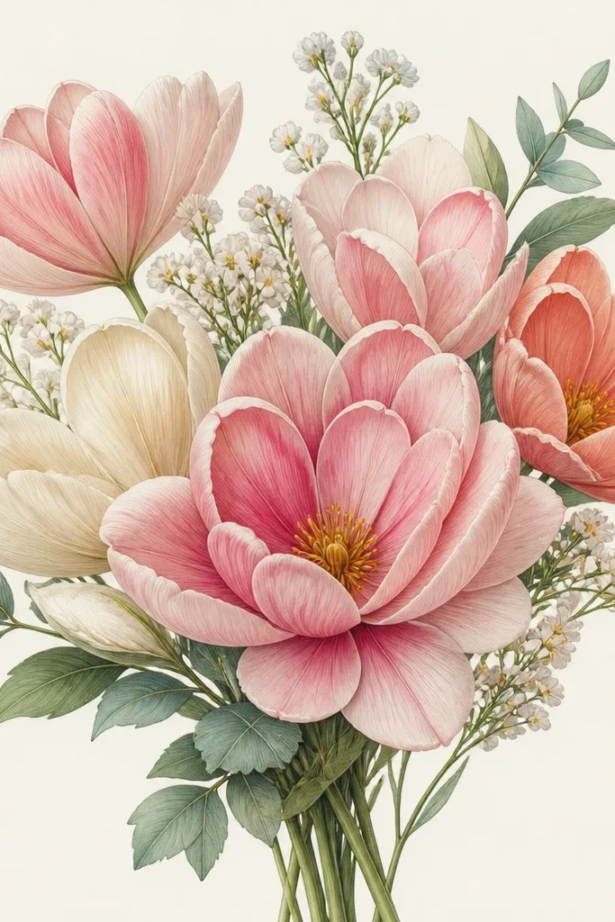
Heart-shaped folds make dainty flowers look like they have structure at the petal base. I use this detail on small blossoms and any flower that feels romantic, like sweet pea or simple five-petal blooms. The fold line - a small inward curve - tells the viewer the petal is shaped, not flat. This detail looks best in pinks, lilacs, and warm creams because it creates a soft contrast line. It flatters small bouquets because it adds character without needing big shading.
Start by drawing each petal outline with a smooth curve and consistent size. Add a fold line inside the petal near the base - it should curve like a tiny heart indentation. Overlap petals so the fold line is visible on the topmost petals and partially hidden on the lower ones. Finish by adding one white highlight near the petal tip so the folded shape stays crisp.
Good to knowMake fold lines lighter than your outer outlines. If the fold line is too dark, it looks like a crack.
Common mistakeSkip heavy fold lines - that makes petals look creased in a bad way.
15. Holiday Snow Dot Sprinkle on Leaves
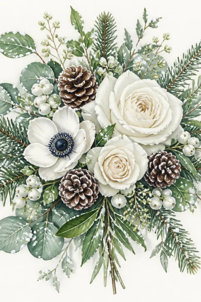
Snow dots on leaves are a clean way to make a bouquet seasonal without adding fake glitter everywhere. I place dots along leaf edges and near the underside of a few petals so it looks like frost settled there. The look is delicate when the dots are small and spaced. In color, pair pale mint or soft sage with cool gray shading under the dots. This detail flatters winter holiday cards because it keeps the bouquet airy and not cluttered with big snowflakes.
Start by coloring your leaves in a soft sage or pale green. Add a faint cool gray shadow along the lower edge of a few leaves so the frosting area has depth. Then use a white gel pen to place tiny dots - 6-12 dots per bouquet - mostly on leaf tips and edges. Finally, add 1-2 larger dots on the most visible leaf to create a focal point.
Good to knowTest the gel pen pressure on scrap. Too much pressure makes blobs that don't look like frost.
Common mistakeDon't scatter snow dots on every petal - it turns the bouquet into confetti.
16. Ribbon Tail Curl with One Twist Line
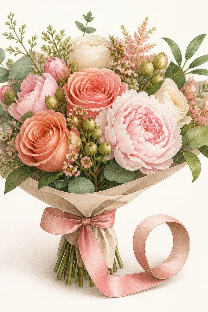
This ribbon tail detail makes your bouquet look like it was tied by hand, not printed. I draw a single curl loop with one twist line to show the ribbon folding over itself. The curl gives movement, and the twist line gives shape. This works especially well for Christmas and winter holiday drawings where you want a little extra flourish but still dainty. In colors, dusty red and cream look best because the curl can show a soft shadow line. It flatters slim bouquets because the curl adds interest without taking up too much width.
Start by drawing the ribbon tails as two thin curves down from the knot. Choose one tail and curl it into a loop at the end, like a question mark shape. Add one internal twist line that follows the loop curve, then shade lightly on the underside of the tail with a cool gray pencil. Outline the outer ribbon edge a touch darker than the inner lines so the curl reads clearly.
Good to knowKeep the curl tight. A big floppy curl reads messy in small card sizes.
Common mistakeAvoid drawing two twist lines. One line looks clean and believable.
17. Satin Shine Band on Single Petal
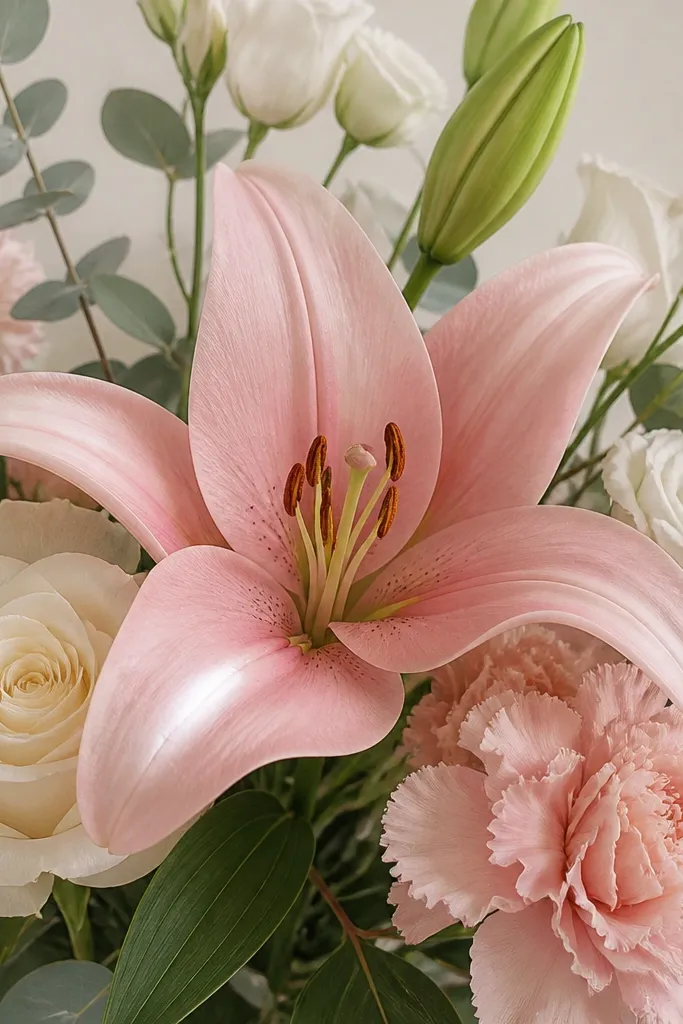
If you want a "pretty but not overdone" look, add one satin shine band on a single standout petal per bloom. It mimics how light catches a smooth surface without turning the whole flower glossy. I use this on larger petals in roses and peony-like blossoms. The shine band looks best on petals colored in smooth marker or watercolor because the edges blend nicely. It flatters bouquets that need a focal point - the shine tells your eye where to rest.
Start by coloring the bloom with a smooth base layer so the petal surface looks even. Pick one petal that faces the viewer and lightly sketch a curved path along its upper third. Use a white gel pen to draw a thin band along that path, then soften the band edge with a clean water brush dab if you're using watercolor paper. Finally, add a tiny dot highlight at the band end so it looks like the light tapers.
Good to knowLimit this to one petal per bloom. If you do it on every petal, it looks plastic.
Common mistakeDon't use thick white paint bands - they cover your petal color and kill the dainty look.
18. Stem Knot Wrap Around a Leaf
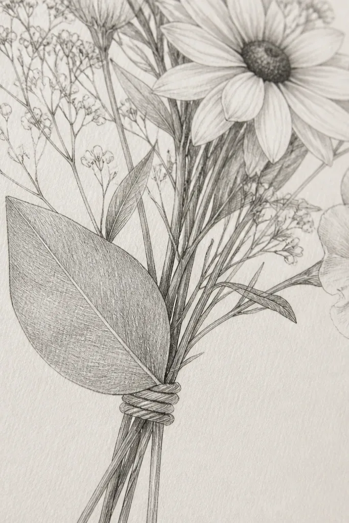
A tiny twine knot is a detail that makes a bouquet feel handmade and cozy. I wrap it around the stem right near a leaf so the knot looks tucked and not floating. The knot looks best with 3-4 tight loops and a small center twist. In a holiday context, it pairs perfectly with kraft-brown paper, cream ribbon, and muted greens. This detail flatters almost any bouquet shape because it adds a small focal point without changing the whole composition. It also looks good across skin tones and color palettes because the twine is neutral.
Start by drawing the stem line and a nearby leaf that will overlap the knot area. Sketch the twine loops as 3-4 short curved lines around the stem, with the bottom loop slightly hidden behind the leaf. Add a small center twist by drawing one short diagonal line where the twine crosses. Outline the twine loops lightly, then shade the underside with a soft pencil so it looks wrapped around a rounded stem.
Good to knowUse a slightly darker brown pencil for the loops that touch the stem shadow side.
Common mistakeDon't draw twine as a single thick band. Knots need gaps between loops.
19. Mini Petal Veins with 3 Short Lines
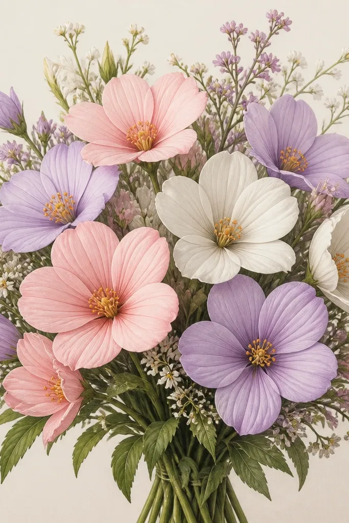
Petal veins are subtle, but they make a flower look alive instead of flat. My favorite approach is three short lines per petal near the center, angled slightly toward the tip. It keeps the drawing dainty because you're not turning every petal into a leaf. This detail works best on larger petals like those in roses, tulip-like flowers, and camellia-style blooms. In color, veins look great when they're just a shade darker than the petal base. It flatters pastel palettes because the veins add texture without adding dark spots.
Start by drawing your petal outline, then add a faint center guideline from base to tip. Near the middle of the petal, draw three short vein lines that start near the guideline and taper as they approach the outer edge. Keep the veins light - pencil pressure should be low - and only darken one vein if the flower is your focal bloom. Overlap petals so the veins on the top petals stay visible while lower petals' veins get partially hidden.
Good to knowUse a 0.3 fineliner for veins if you ink. Pencil veins can look too light once colored.
Common mistakeAvoid lots of vein lines. More than three per petal reads busy.