
1. Classic Tulip Bouquet in a Low Vase
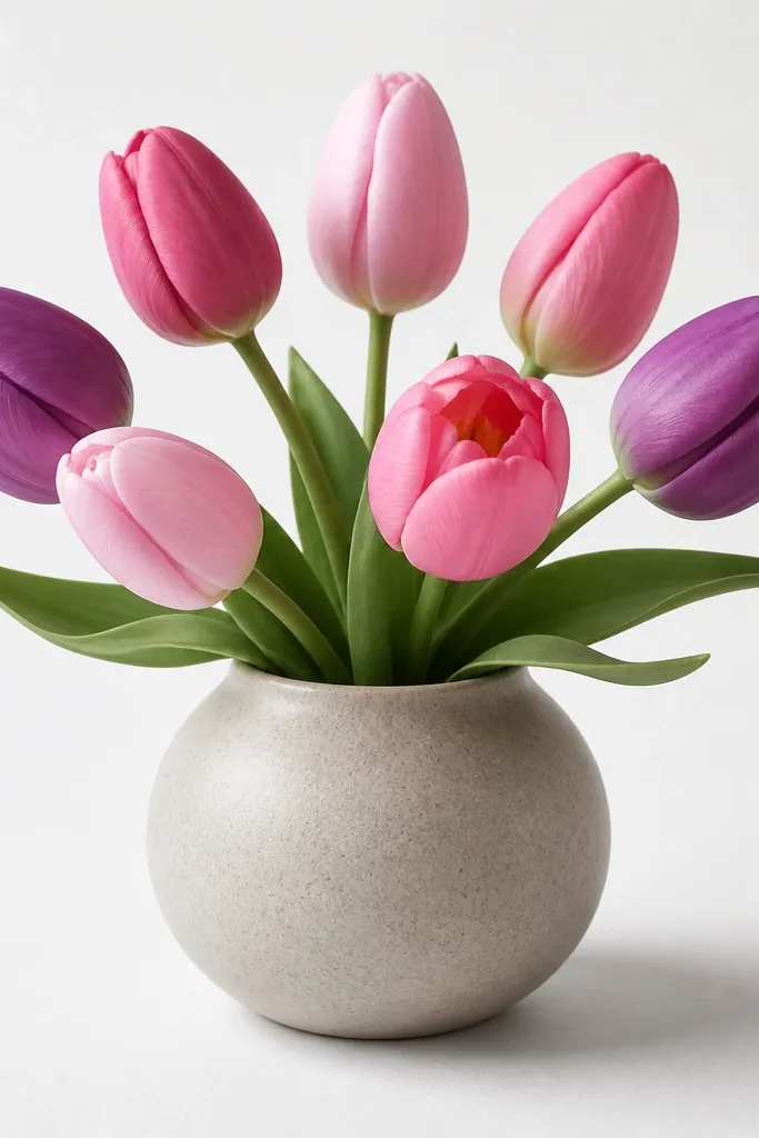
This one looks clean because the vase shape forces everything into a neat triangle. Draw tulips in three shades: warm red, pale pink, and butter yellow, then keep the centers a little darker to suggest depth. The low vase makes the stems feel fuller, so it flatters slim wrists and small hands when you're drawing it for a card - the composition stays compact. I like it for cozy winter-to-spring vibes because the gray shadow under the bouquet makes the whole thing feel grounded instead of floating.
Start by sketching a squat oval for the vase opening, then add a slightly wider oval at the base. Place the tallest tulip in the middle and let the two on either side be about 1/3 shorter, so the bouquet forms a gentle dome. Draw stems as two lines that taper - thicker at the base, thinner at the top - and overlap the cups so the front bloom covers part of the one behind. Finally, add a single shadow under the bouquet: a soft oval with gray pencil, then lightly blend it with a tissue.
Good to knowIf your lines feel wobbly, draw the tulip cups first in light pencil, then trace only the outer edge with fineliner.
Common mistakeAvoid outlining every stem equally - it makes the bouquet look like a cutout pasted on.
2. Single Tulip Bouquet with a Side Ribbon
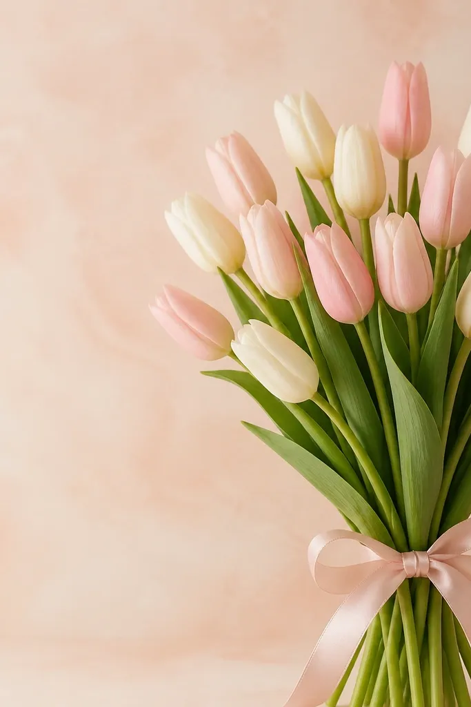
A side ribbon gives the drawing direction. The bouquet looks cute because the ribbon creates a focal point that balances the tall tulip cup shape. I use this when I want the drawing to feel "gift-ready" without adding a ton of flowers. It also works well for people who struggle with drawing many petals - you only need to nail one tulip cup and the ribbon loops.
Begin with a single tulip cup: draw a teardrop with a pointed top, then add a curved inner fold line that stops about halfway down. Sketch two stems that meet at the base, then angle them slightly left so the ribbon can sit on the right. Add the ribbon by drawing a band across the stems, then two loops: one loop taller, one loop tucked behind. Color the tulip in dusty rose, the ribbon in warm white with a faint gray shadow, and the background in a light peach wash.
Good to knowShade the ribbon folds with one gray line per fold - too many lines makes it look like fabric instead of a drawn bow.
Common mistakeDon't make the ribbon bigger than the tulip cup; the bouquet stops reading as the main subject.
3. Tulip Bouquet Frame for a Card Border
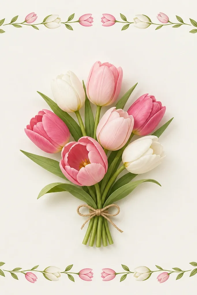
This is the fastest way to make your drawing look "finished" because the border does the layout work. The center bouquet gives you room for detail, and the corners stay simple so the whole page doesn't get crowded. It's flattering for almost any hand because you're drawing smaller shapes at the edges instead of wrestling with one big complicated bouquet. I like this for holiday stationery because you can swap colors quickly - red and green for winter, pink and cream for spring.
Draw a rectangle border with a consistent margin, leaving space for text. Add tiny tulips in the four corners using simplified cups: outer edge plus one inner fold line. In the center, draw 5 tulips that overlap slightly, with the tallest in the middle and two medium-height on the sides. Finish by adding a few leaves tucked between the border flowers and the center bouquet, then lightly shade the center stems with gray pencil.
Good to knowKeep the border tulips all facing the same direction; it makes the card feel intentional even if your lines are light.
Common mistakeAvoid thick black borders everywhere - it makes the drawing heavy and steals attention from the bouquet.
4. Tulips in a Mason Jar with Tiny Sparkle Dots
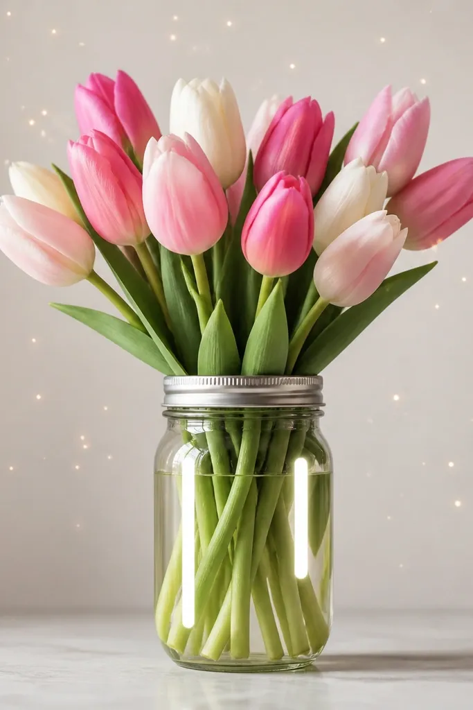
Mason jars look instantly cozy because the glass shape gives you a place to add highlights. The sparkle dots make it feel festive without turning the whole page into glitter chaos. I use this idea when I want the bouquet to feel like a quick holiday gift photo, just translated into drawing. The jar also helps your composition because stems naturally point toward the center opening.
Sketch the jar as a tall rectangle with rounded corners, then draw a curved opening line near the top. Add two thin curved highlight lines inside the jar on opposite sides, leaving white space. Place 6 tulips so their cups peek over the jar lip, with one tulip slightly behind the others. Color tulips in tomato red and soft peach, and color the jar in light gray pencil lines. Dot the background with tiny circles - fewer than 30 dots total - and keep them small so they don't overpower the flowers.
Good to knowAdd one faint gray shadow under the jar rim so the jar doesn't look like it's hovering.
Common mistakeDon't fill the entire background with dots; it turns into noise fast.
5. Tulip Bouquet with Watercolor Wash Background
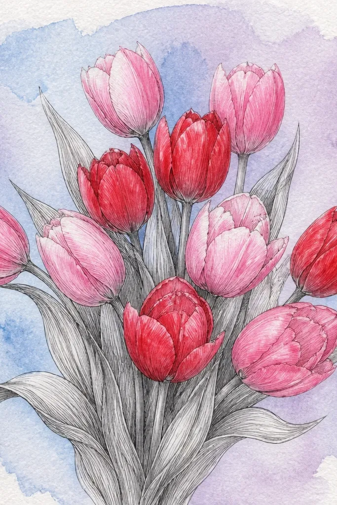
This one looks airy because the watercolor sits behind the line art, not on top of it. I draw the tulip outlines first, then paint only the wash area around and behind the bouquet. The contrast makes the tulips pop, and the paper texture gives it that handmade look. It flatters small bouquets and also reads well in photos because the background wash creates depth without extra objects.
Start with light pencil sketch: 5 tulips overlapping, stems meeting near a small bundle at the bottom. Ink the outlines with fineliner, then erase pencil marks gently. Tape the paper edges if you're using a wet wash, then paint a loose background behind the bouquet with watered-down blue and a touch of lavender. Let the wash dry, then add a very light gray shadow under the bouquet stems. Color the tulips with soft washes, keeping the centers slightly darker than the petal edges.
Good to knowIf your wash bleeds into the lines, use a hairdryer on low for 10 seconds between layers.
Common mistakeDon't paint the tulips first; wet color under ink always looks messier.
6. Tulip Bouquet with Patterned Wrapping Paper
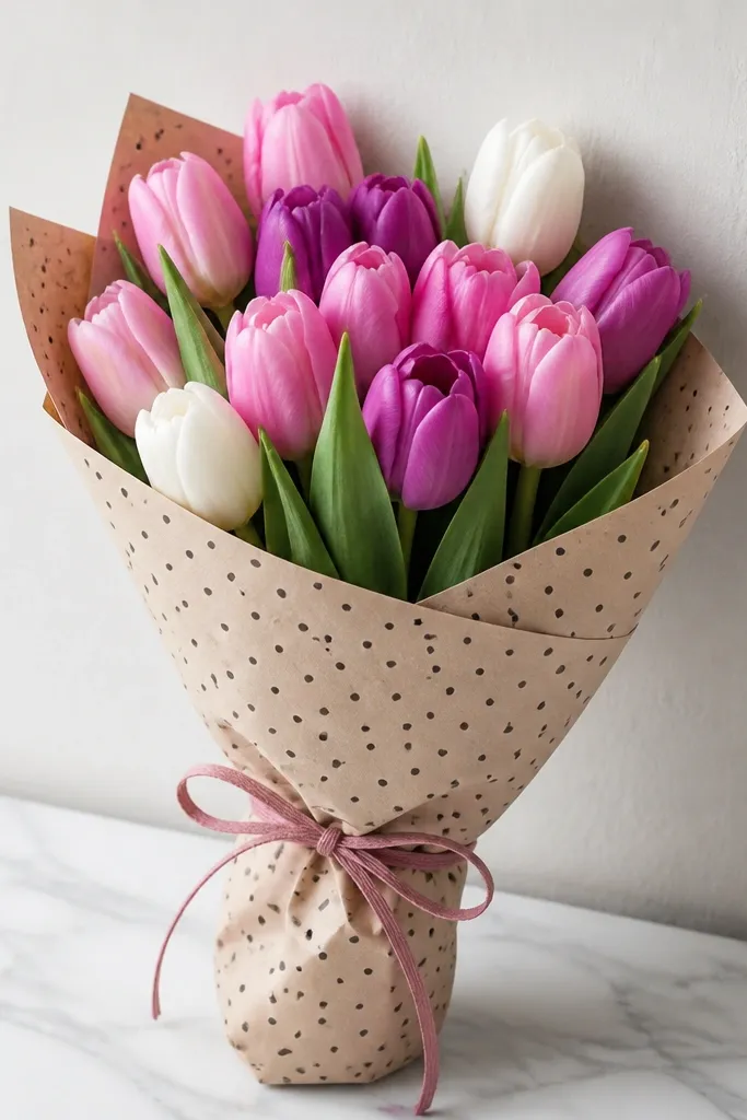
Patterned wrapping makes the drawing look like a real gift because your eyes get a second texture besides petals. I like wrapping with tiny dots or micro stripes since they stay cute at small sizes. This idea suits people who want a "holiday card" look without needing a complicated vase. The wrapping paper also flatters your composition by framing the bouquet and hiding messy stem ends.
Draw the bouquet first: 7 tulips clustered so they overlap like a dome. Add stems that disappear behind a wrapping paper rectangle - draw the paper edges as folded corners at the top. Create the bow with two loops and a small center knot, placed slightly off-center. For the pattern, draw small dots evenly spaced on the wrapping paper, then shade the folds with one darker gray line. Color tulips in two tones of red plus one creamy yellow, and keep the wrapping paper mostly off-white with gray shadows.
Good to knowUse one pattern only; if you mix dots and stripes your bouquet looks busy instead of gift-like.
Common mistakeAvoid coloring the wrapping paper too dark - it steals attention from the tulips.
7. Tulip Bouquet Side View with Curved Stems
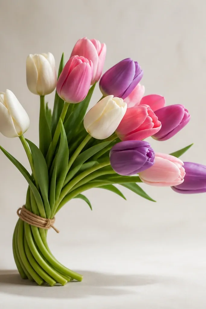
Side view gives your drawing movement. The curved stems look more dynamic than straight lines, and the tulip cups show a clearer fold because you're not facing them head-on. I use this when I want the bouquet to feel like it's leaning toward the viewer, which looks great on bookmarks and tall cards. It also hides small drawing mistakes because the S-curve creates visual flow.
Sketch a ground line lightly, then draw stems as one continuous curve that goes up and back down, like an S. Place 4 tulips along the curve, with the front tulip largest and the back tulip smallest. Draw each tulip cup with the inner fold line slightly offset to match the tilt direction. Add a shadow by drawing a soft curved band under the stems, then shade lightly with gray pencil. Color the front tulip in deep pink, the others in lighter pink and peach.
Good to knowMake the stem curve thicker at the base and thinner at the top; it instantly looks more natural.
Common mistakeDon't stack tulips in a perfect row; side view needs uneven spacing.
8. Tulip Bouquet in a Teacup with a Handle
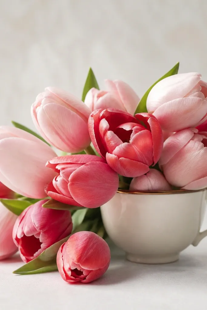
Teacups make tulip drawings feel cozy and a little old-fashioned. The handle gives you a clear shape anchor on one side, so your bouquet can spill naturally. This is a great idea for a "just because" seasonal page because it reads warm even with minimal color. I've used it for gift tags and it always looks sweet without needing a lot of extra leaves.
Draw a teacup as an oval bowl with a slightly thicker rim. Add the handle with two smooth curves, keeping it proportional to the cup height. Sketch 5 tulips that rise above the rim, and let 1 tulip lean toward the handle so it balances the weight. Color tulips in rose pink and scarlet red, then add a pale yellow center highlight on two cups. Shade the cup with light gray under the rim and a soft shadow on the paper below.
Good to knowIf your handle looks shaky, draw it last and keep it thin - a thick handle looks cartoony on small art.
Common mistakeDon't make the cup too wide; wide cups squash the stems and flatten the bouquet.
9. Tulip Bouquet with Hanging Tag and Lettering Space
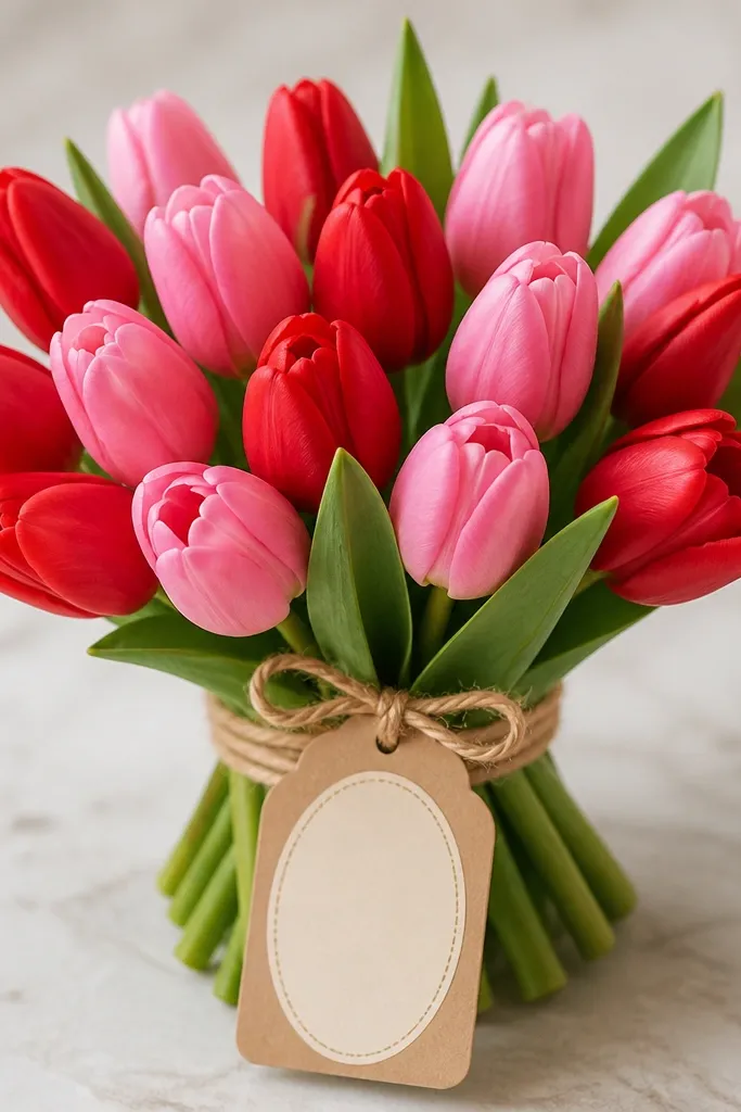
This is a practical drawing idea because it builds in space for writing. The hanging tag acts like a bottom anchor, so your bouquet doesn't drift upward on the page. I like it for holiday notes and spring cards because you can do minimal coloring and still make it feel personal. The blank tag also keeps the piece from looking like a random bouquet sketch - it's clearly meant to be used.
Start with your bouquet cluster: 6 tulips, with the tallest in the center and the left and right slightly lower. Draw stems that meet at a point behind the tag area. Add a small string line from behind the bouquet down to the tag top, then draw the tag as a rounded rectangle with a hole notch at the top. Leave the tag center blank with a light pencil oval so you know where text goes. Color tulips in two reds and one pink, then add just 3 leaves in pine green and one tiny berry-red dot for contrast.
Good to knowUse a light pencil oval on the tag for writing - it guides your lettering without boxing it in.
Common mistakeAvoid adding extra ribbon ends around the tag; it makes the writing area feel crowded.
10. Monochrome Tulip Bouquet with One Accent Color
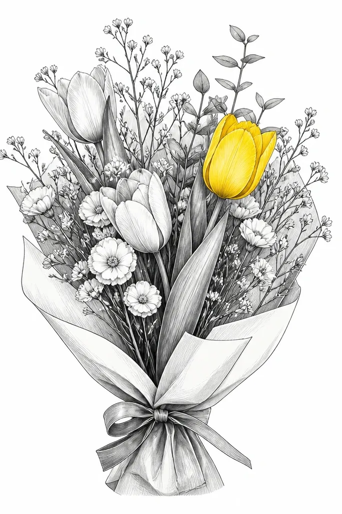
Monochrome is the fastest way to make a drawing look modern. When everything is gray and one tulip is bright yellow, your eye goes straight to the center bloom. I do this when I'm making a print or a planner page because it stays readable even at small sizes. It also flatters darker paper because gray still shows texture while the accent color pops.
Sketch 7 tulips in pencil, then ink outlines lightly with fineliner. Shade petals with gray pencil using a light-to-dark pattern: darker near the fold line, lighter near the outer edge. Color only one tulip bright yellow with a warm tone, like a sunflower yellow, and leave the rest uncolored or lightly gray. Add a simple vase shape or wrapping paper base in gray pencil lines. Finish by adding a single shadow under the bouquet to unify it.
Good to knowPick the accent tulip that faces forward; side-facing accents look less intentional.
Common mistakeDon't color two accents in different spots; it turns into a distraction instead of a focal point.
11. Tulip Bouquet with Dotted Stems and Pointillism Background

Dot stems look playful and handmade because the line becomes texture. The pointillism background adds depth without needing watercolor, so it's perfect if you only have pencil and fineliner. I've used this on holiday journaling pages where I wanted something cute but not messy. It flatters small compositions because dots scale down without losing charm.
Draw 5 tulips with simple cup outlines and inner fold lines. Instead of drawing a continuous stem, place small dot clusters along the stem path - start denser near the base and space them out as the stem rises. Add leaves as small teardrops with a single midline. For the background, make a gradient: start with sparse dots near the bouquet, then increase density farther out in a soft circle shape. Use gray dots for the background and darker dots for the stems.
Good to knowKeep dot sizes consistent by tapping your pen the same way each time - your spacing will look intentional.
Common mistakeAvoid making the background dots the same darkness as the tulip outlines; it flattens the bouquet.
12. Tulip Bouquet with Faux Embroidery Stitches
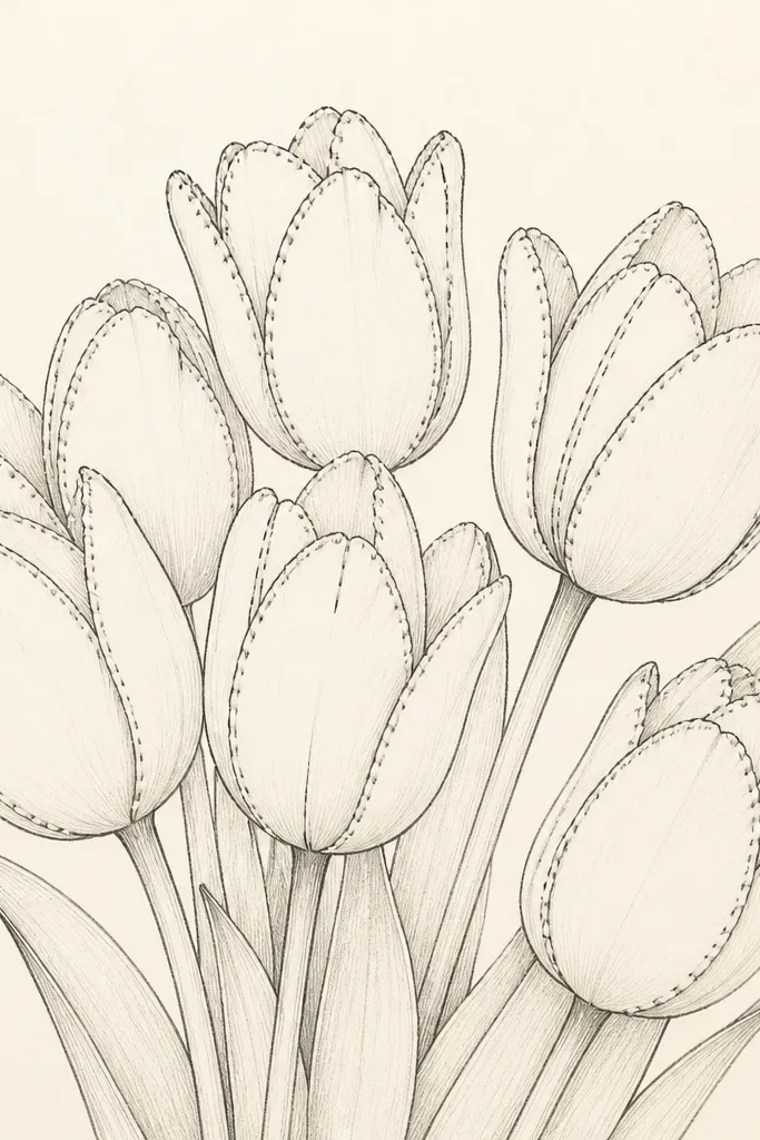
Faux embroidery stitches make a drawing feel tactile without any real fabric. I do this with one consistent stitch style: short dashes following the tulip edge. It looks especially good for holiday because stitched edges remind me of ornaments and handmade stockings. This also flatters your drawing skills because you're adding texture rather than trying to perfect every petal fold.
Sketch 6 tulips grouped tightly, with overlap and slightly different heights. Ink the outer petals first with fineliner, then erase pencil marks. Add faux stitches along the outer edge of each tulip cup using short dashes, placing them a few millimeters apart. Shade the fold area with gray pencil so the stitches sit on top of a visible petal gradient. Color petals with soft red or cranberry tones, leaving the stitch dash lines dark and crisp.
Good to knowDo stitches only on the front-facing tulips; too many stitched blooms can look cluttered.
Common mistakeAvoid long dash stitches - they look like a mistake instead of embroidery.
13. Tulip Bouquet with Snowy Speckle Background
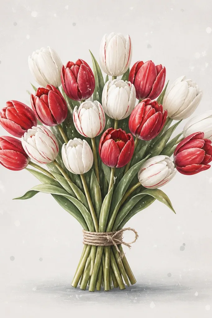
Snowy speckles make tulips feel winter-ready even though tulips are spring flowers. The effect is simple: a light speckle texture behind the bouquet that frames it. I like using this when I'm making a holiday card because it looks festive without adding snowflakes everywhere. It also flatters the drawing because the speckles hide minor pencil marks and uneven coloring.
Draw your bouquet first: 7 tulips with 3 reds, 2 white or cream, and 2 pink, plus 4 small leaves. Ink outlines, then add light gray shading under the fold lines. For the snowy effect, use a white gel pen or a diluted white gouache with a toothbrush: flick tiny dots around the bouquet edges. Keep the densest speckles in the corners, lighter near the center so the flowers stay readable. Add one soft gray oval shadow under the bouquet so the speckles don't make it look flat.
Good to knowTest speckle density on scrap paper so you don't end up with heavy snow that overwhelms the tulips.
Common mistakeAvoid speckling directly on the tulip cups; it makes petals look dirty.
14. Tulip Bouquet with Gold Foil Effect Centers
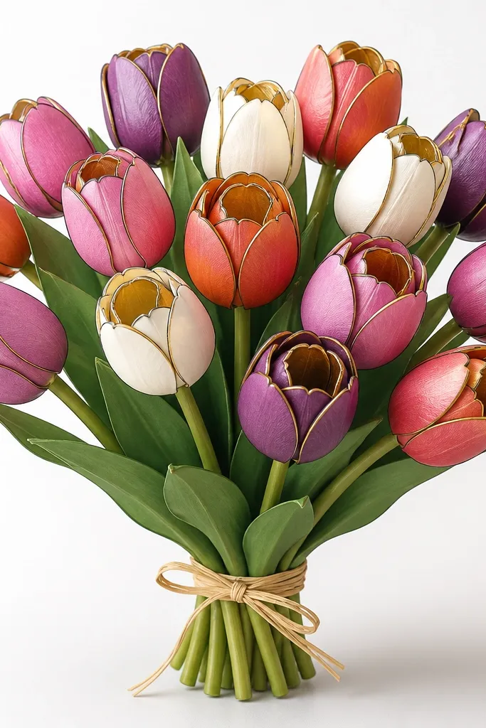
Gold centers make the whole drawing feel special without changing your drawing style. I've done this with gold gel pen and also with adhesive gold leaf flakes - the look is similar: a warm glow inside the tulip cup fold. It works great for holiday because gold reads as gift wrapping and ornaments. The best part is you only need to add gold to 3-4 tulips, so it stays simple while still looking "done."
Sketch and ink 6 tulips, then add a gray shadow on the inside fold line so the cup has a base tone. Color petals in cranberry red, blush pink, and one deep orange-red. Add gold only to the fold area: draw a small curved "C" shape or a narrow oval where the inner fold meets the center. Use a gold gel pen for a smooth look, then lightly press a fingertip over a tiny area if you want it to blend. Finish with a soft gray shadow under the bouquet and a few green leaves in pine green.
Good to knowKeep gold patches small and centered - large gold areas look like stickers instead of light.
Common mistakeAvoid outlining the gold patches in black; it kills the shimmer effect.
15. Tulip Bouquet with Minimal Lines and Big Negative Space
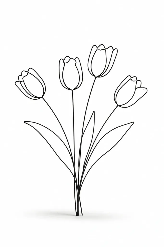
Negative space makes a drawing feel calm and modern. When you use minimal lines, you're relying on shape and overlap instead of detail, and that's a skill you can build fast. I like this for planner stickers and small prints because the bouquet stays readable even when it's tiny. It also flatters uneven coloring - you're not trying to fill every gap, so mistakes don't scream.
Draw 4 tulips with bold outer cup lines and one inner fold line each, keeping the cups slightly different sizes. Use single-line stems that taper by pressure - light at the top, thicker at the base. Cluster them so two overlap in front and two sit behind, leaving a clear gap in the upper right. Add a single shadow under the stems as a soft oval in gray pencil. Color only the front tulips with a light wash so the back two stay mostly white.
Good to knowIf your minimal lines look too thin, thicken only the outer edges of the front tulips with a fineliner pass.
Common mistakeDon't add extra leaves just to fill space; empty space is part of the design.