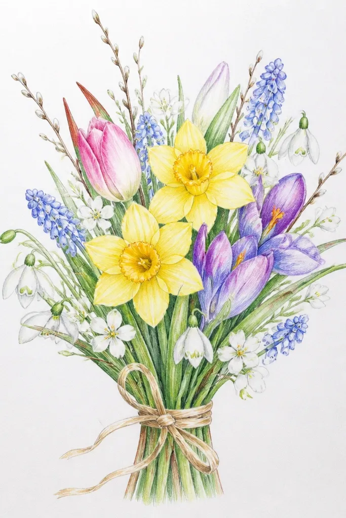
1. Tiny 5-Flower Bud Bouquet
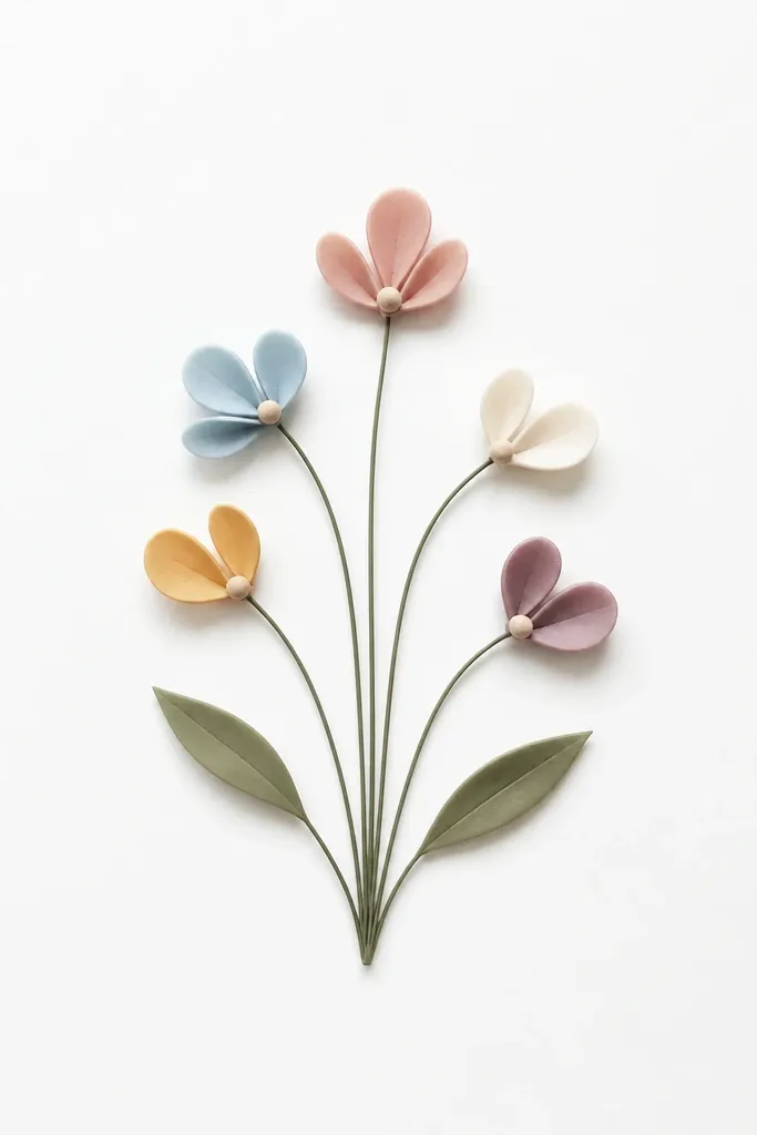
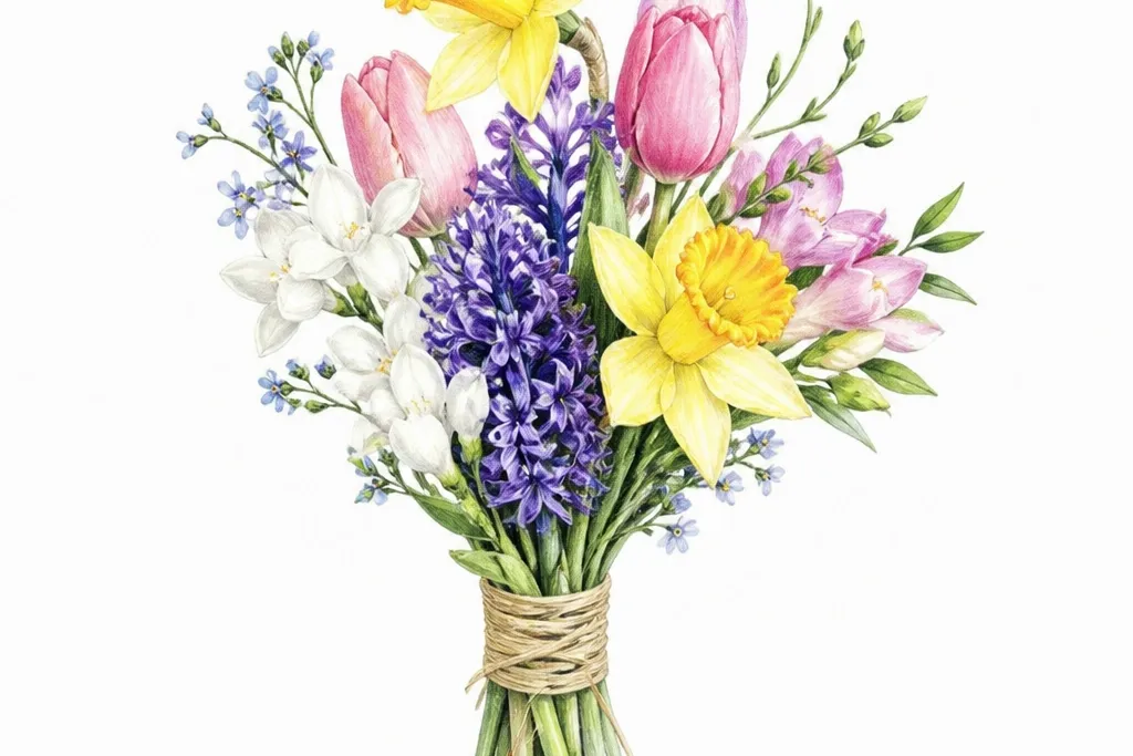
This is the easiest spring bouquet drawing I've used when I'm short on time, because it reads like flowers even if your lines are imperfect. Draw five buds - three facing forward and two slightly turned - so the bouquet looks arranged, not scattered. Use soft pinks (light watercolor or colored pencil) for the petals and a muted yellow for the centers. It flatters small pages and makes beginners look competent because the shapes are big and simple. If your hand trembles, this style hides it since each flower is built from just a few strokes.
Step one: sketch your center point, then draw five short stems that fan upward like a hand-held bouquet. Step two: for each bud, draw a small circle, then add 3 rounded teardrops around it, leaving the top open. Step three: add a tiny dot or small V's at the center of each bud for pollen. Step four: place two leaves - one on the left stem, one on the right - with a single vein line down the middle and small serration bumps at the edges.
Good to knowShade under each bud using a pencil lightly along the lower petal edges, then blend with a tissue for a soft "layer" effect.
Common mistakeDon't outline every petal thick - thick lines make it look like a coloring page instead of a bouquet.
2. Tall Tulip Ribbon Bouquet
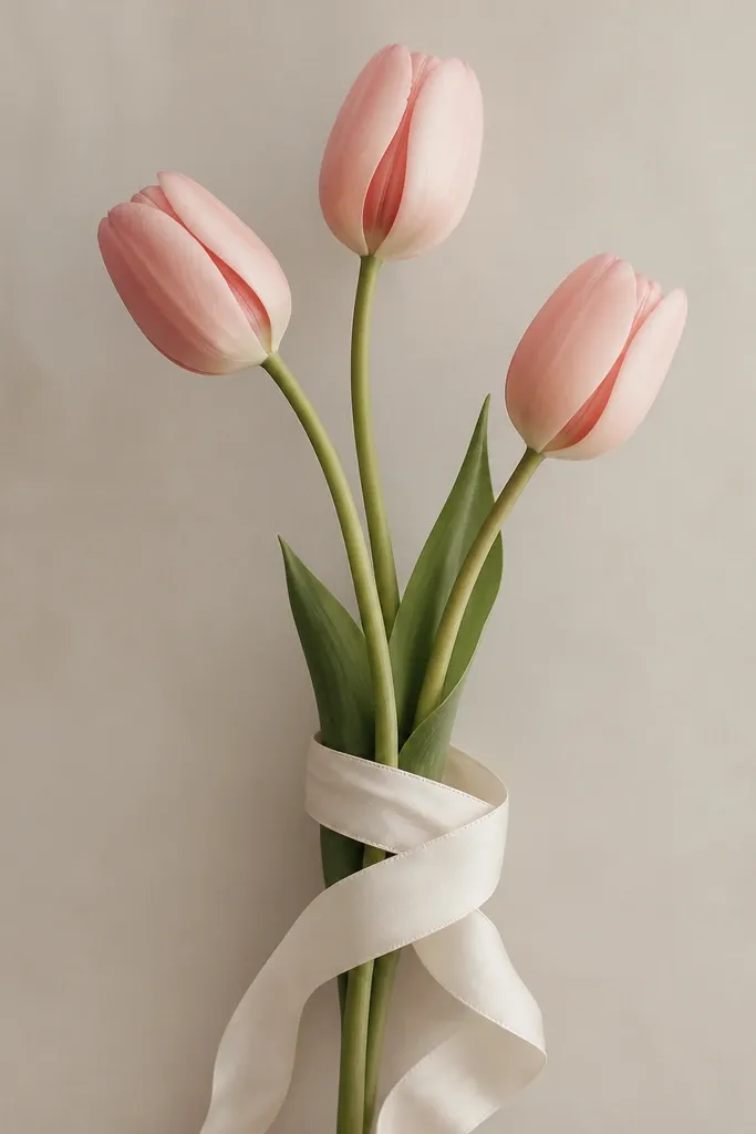
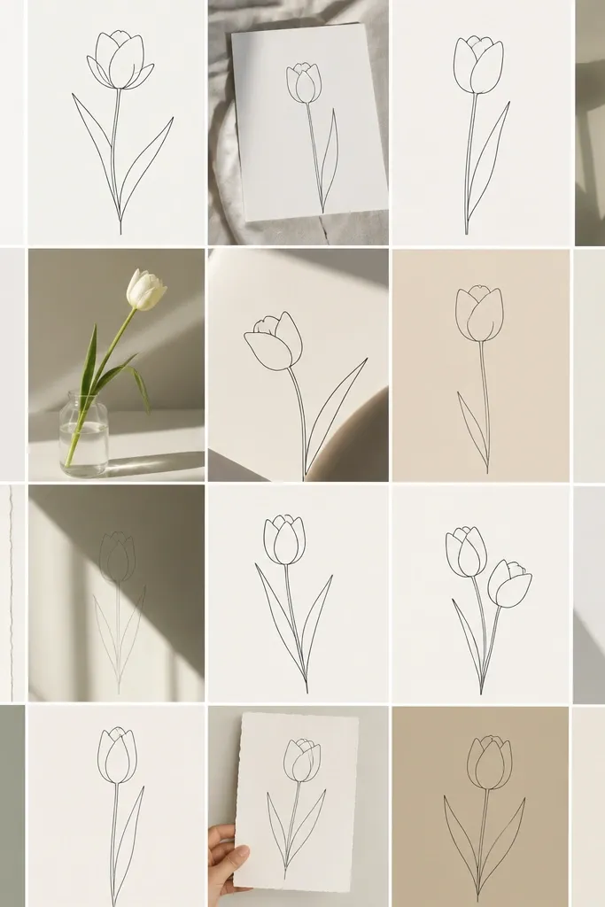
Tulips look fancy with almost no detail because their shape is clean and graphic. This style is great if you want the bouquet to feel tall and elegant on the page without drawing dozens of petals. I color the tulip cups in warm coral, dusty rose, and a pale cream, then add a thin darker line on the inner fold. The ribbon makes the whole drawing feel finished even if your background is blank. It flatters slim compositions and looks good on both fair and deeper skin tones when you color it with warm shades - it won't wash out.
Step one: draw a vertical guideline, then place three tulip heads along it: one at the top, one mid, one lower. Step two: for each tulip, draw a teardrop cup shape, then add an inner fold line that curves from the top down to the center. Step three: connect each tulip head to stems that converge at the ribbon knot. Step four: draw the ribbon as a wide band around the stem junction, then add two ribbon tails with gentle curves and a few fold lines.
Good to knowAdd a tiny highlight gap on each tulip fold - leave the paper white so the petal looks glossy.
Common mistakeAvoid drawing tulips as perfect circles - the cup shape should taper slightly toward the bottom.
3. Peony Layers with Big Petal Clumps
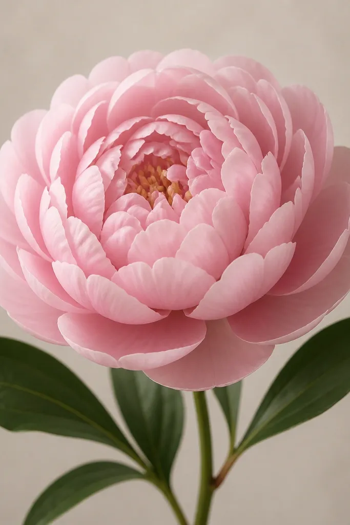
Peonies are forgiving because you can group petals into clumps instead of drawing each one separately. This look gives the "spring bouquet drawing easy" vibe that still looks like you worked - the petals overlap and create depth fast. I color outer petals in soft blush and the inner ones in a slightly deeper pink, then add faint purple shading at the base where petals hide each other. This is flattering for any page size because the rounded head anchors the whole composition. If you want something that looks lush without being complicated, peony clumps do it.
Step one: draw a large circle for the peony head, then add a smaller circle inside it. Step two: around the outer circle, draw 10-12 scalloped petal arcs that overlap slightly, like stacked ruffles. Step three: add an inner layer with smaller, tighter petal arcs, then include 6-8 tiny curled strokes in the center. Step four: draw two leaves at the sides - one larger leaf on the left and a smaller one on the right - each with a single center vein and lightly curved edges.
Good to knowUse one shade of pink and one shade darker, then press harder with the darker tone only where petals overlap.
Common mistakeDon't leave the center empty - the peony needs those small curled strokes or it looks like a simple flower.
4. Daisy Chain Bouquet with Three Heads
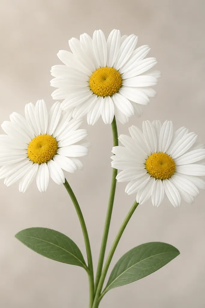
Daisies give you that spring cheer with minimal fuss because the petal pattern repeats cleanly. I like this when I want a bouquet that looks light and airy instead of heavy and fluffy. Color the centers in warm lemon yellow, then add tiny brown specks so it looks textured. Keep petals white or pale cream with a faint gray outline so they don't look flat. This style looks best on people-friendly pages because it works for both small sketches and larger cards.
Step one: draw three circles in a loose triangle arrangement, leaving space between them. Step two: for each circle, add 12-15 petals by drawing short teardrops around the edge, leaving slight gaps between petals. Step three: draw short stems that meet at the bottom, then add a small leaf under the left daisy and another under the right. Step four: shade the center circle with yellow, then add tiny dots around it in a darker brown.
Good to knowMake the petals slightly different lengths - the bouquet looks more natural than perfectly even daisies.
Common mistakeAvoid thick outlines on the petals - keep the petal line light so the center details stand out.
5. Wildflower Sprig Bouquet
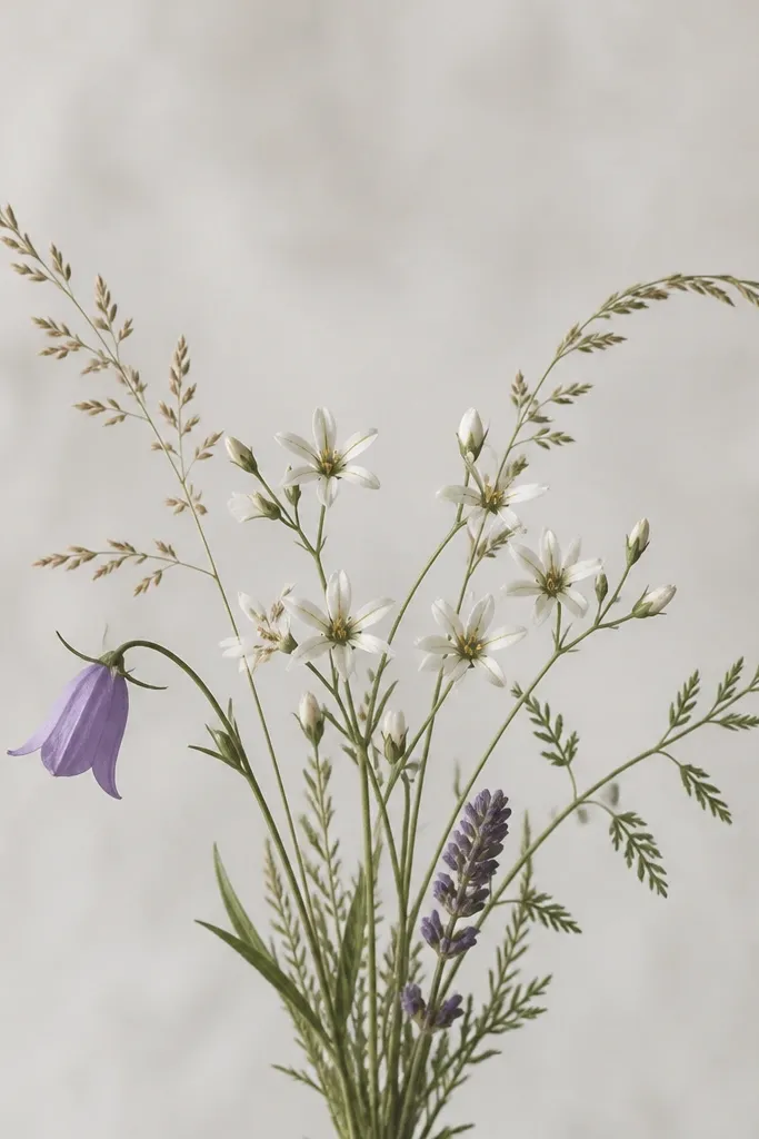
Wildflowers look great when you want "spring garden" energy without drawing realistic anatomy. This style works because you mix flower types - tiny stars, small bells, and a few slender buds - so the eye reads variety. I use pale lavender, sky blue, and soft green for the stems and leaves, then add one warm accent like peach for a single bloom. It flatters simple backgrounds because the cluster has movement. If you struggle with symmetry, wildflowers forgive you because nature isn't balanced.
Step one: draw a bundle of three main stems that curve upward from the bottom center. Step two: add small blooms at different heights: draw a tiny 5-point star for two flowers, a small bell for one, and a tight bud for another. Step three: scatter leaves as thin ovals with short angled cuts, keeping them smaller near the top and larger near the bottom. Step four: add a few short cross-stem lines to connect tiny blooms to the main stems.
Good to knowPick one flower to be the darkest color so the bouquet has a focal point.
Common mistakeDon't make every leaf the same size - it makes the whole cluster feel planted in a grid.
6. Rose Bud Bouquet with Curled Petals
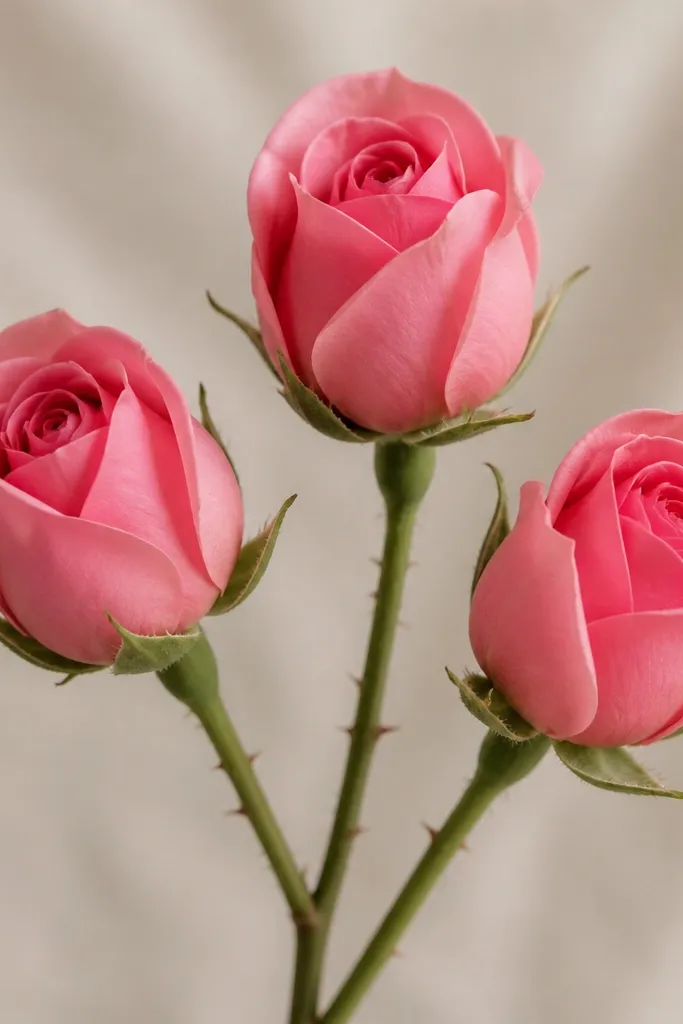
Roses look hard until you stop drawing straight petals and start drawing curled ones. This bouquet uses comma-like shapes that overlap, which makes the rose bud look dimensional fast. I color the buds in muted red with a lighter blush highlight near the left edge, then add a deep shadow under each petal fold. The thin stems and tiny thorn dashes keep it delicate instead of bulky. This style is flattering for wider pages because the buds spread naturally and fill the space without crowding.
Step one: sketch three oval outlines for the rose heads, with the middle one slightly higher. Step two: inside each oval, draw 6-8 curled petal shapes that look like overlapping commas, tighter in the center. Step three: add outer petals as larger arcs that wrap around the inner layer, leaving a small gap in the top right of each rose for a highlight. Step four: draw thin stems that meet at the bottom, then add two simple leaves per stem with one center vein and small serrations.
Good to knowUse a kneaded eraser to lift a small highlight crescent inside one petal fold on each rose.
Common mistakeDon't color the entire petal the same shade - roses need darker shadow under overlaps.
7. Sunflower Mini Bouquet with Dark Centers
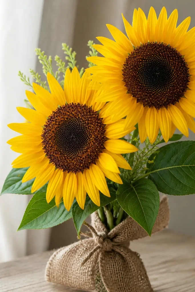
Sunflowers read instantly even when your drawing is simple. The big circular heads and long narrow petals create a bold spring look without needing fine detail. I color petals in bright yellow, then add a light orange gradient near the base of each petal. The centers get dark brown with tiny dot clusters so they don't look like a solid blob. This is a great pick for anyone who wants a cheerful bouquet that still looks "drawn" rather than traced.
Step one: draw two large circles for the heads, one slightly larger than the other. Step two: around each circle, draw 20-25 long teardrop petals that taper at the outer end. Step three: fill the center with dark brown, then add small spiral-ish dots using a fine pencil or colored pencil tip. Step four: draw thick stems with two broad leaves - left leaf bigger, right leaf smaller - each with a center vein and short side veins.
Good to knowPress harder on the center dots and lighter on the petal edges so the sunflower face has depth.
Common mistakeAvoid making the center a perfect ring - a slightly irregular center looks more realistic.
8. Cherry Blossom Branch Bouquet
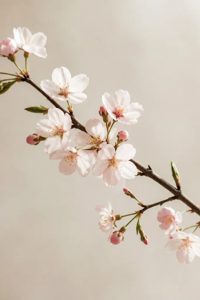
Cherry blossoms are a cheat code for spring drawings because the flower shapes are tiny and repetitive in a way that still looks natural. This style looks airy and delicate, and it fills space without heavy shading. I color open blossoms pale pink and buds a warmer blush, then add a light gray shadow under each cluster. The branch line gives the bouquet direction so it doesn't feel like random flowers. It flatters small sketches because each blossom is quick to draw.
Step one: draw one main branch line sweeping diagonally across the page. Step two: add clusters of 5-petal flowers along the branch - draw a tiny circle first, then place five rounded petals around it. Step three: add 3-4 buds as small teardrops or tiny circles with two petal bumps. Step four: add a few small leaves as teardrops with one center line, keeping them sparse so the blossoms stay the focus.
Good to knowVary petal sizes within a cluster - it prevents the flowers from looking stamped.
Common mistakeDon't outline every bud the same thickness - thin buds look more believable.
9. Lily-of-the-Valley Ribbon Bouquet
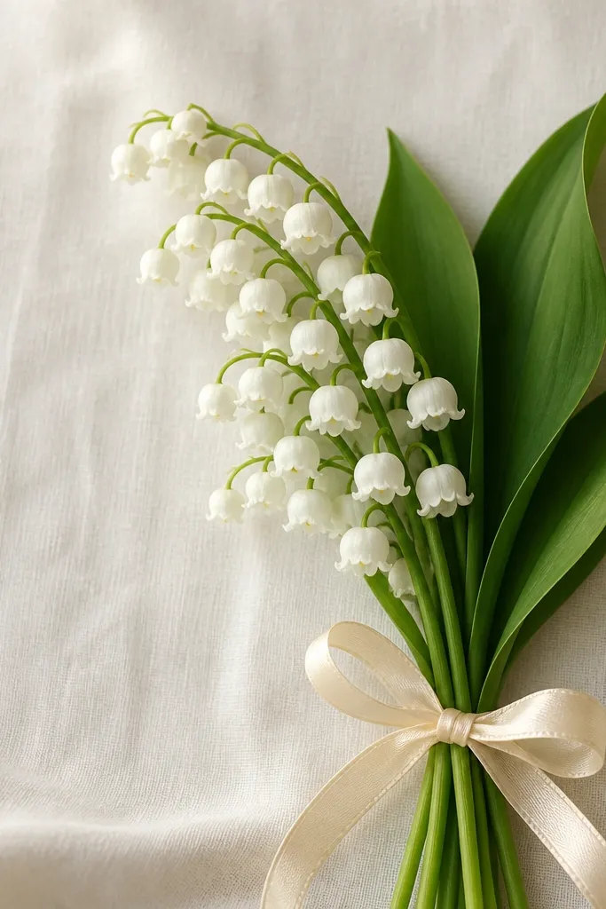
This style looks delicate and "boutique" even when it's easy. Lily-of-the-valley bells are repeatable shapes, and the hanging cluster gives you movement. I keep the bells pale green-white with a soft gray shadow at the base, then add tiny yellow dots inside two or three bells for realism. The ribbon bow at the bottom makes it feel like a bouquet gift instead of a single branch. It flatters people who want a lighter look - it doesn't require dark outlines to feel finished.
Step one: draw a curved main stem that arcs slightly to the right. Step two: along the underside of that curve, draw 10-12 bell flowers - each bell is a teardrop with a scalloped top edge. Step three: connect the bells to the stem with tiny lines so they look attached. Step four: draw the ribbon bow by sketching a wide band around the stem junction and adding two loops with a small knot in the center.
Good to knowShade only the inner base of each bell - it makes the bells look like they're hollow without heavy coloring.
Common mistakeDon't make the bells all the same height - stagger them so the cluster feels natural.
10. Lavender Sprig Bouquet with Simple Buds
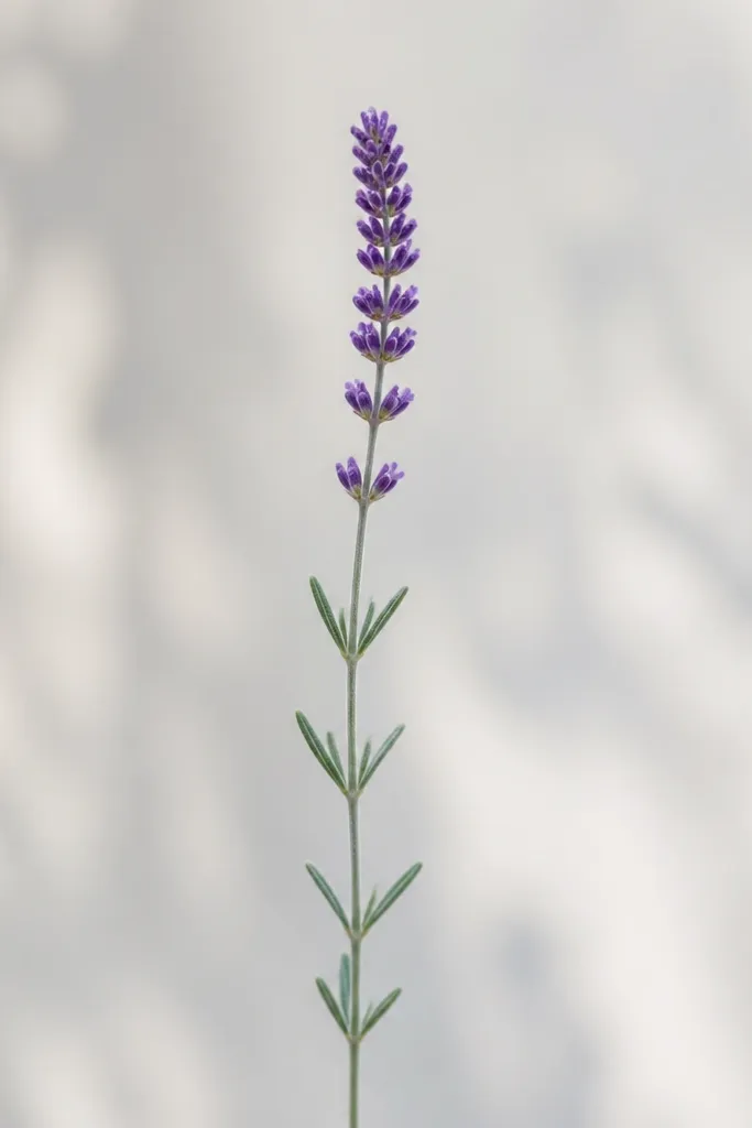
Lavender is one of the best "easy spring bouquet drawing" subjects because the flower head repeats in a tight pattern. This style looks clean and calm, and it's perfect if you want a drawing that looks good even with light coloring. I use muted purple for the buds and cool green for the leaves, then add a thin darker purple line along one side of the flower head for depth. It flatters minimal backgrounds and looks great as a card design because the sprig is tall and simple.
Step one: draw a long stem line and add leaf pairs on alternating sides at intervals. Step two: at the top, draw a vertical rectangle shape for the flower head, then fill it with small bud ovals clustered closely. Step three: add a few stray buds slightly outside the main rectangle to avoid perfect uniformity. Step four: shade one side of the flower head with a darker purple pencil to create a light-from-left look.
Good to knowUse a colored pencil tip for the buds - it creates sharper edges than a broad marker.
Common mistakeAvoid coloring the whole flower head evenly - the side shading is what makes lavender look dimensional.
11. Garden Rose + Dandelion Mix
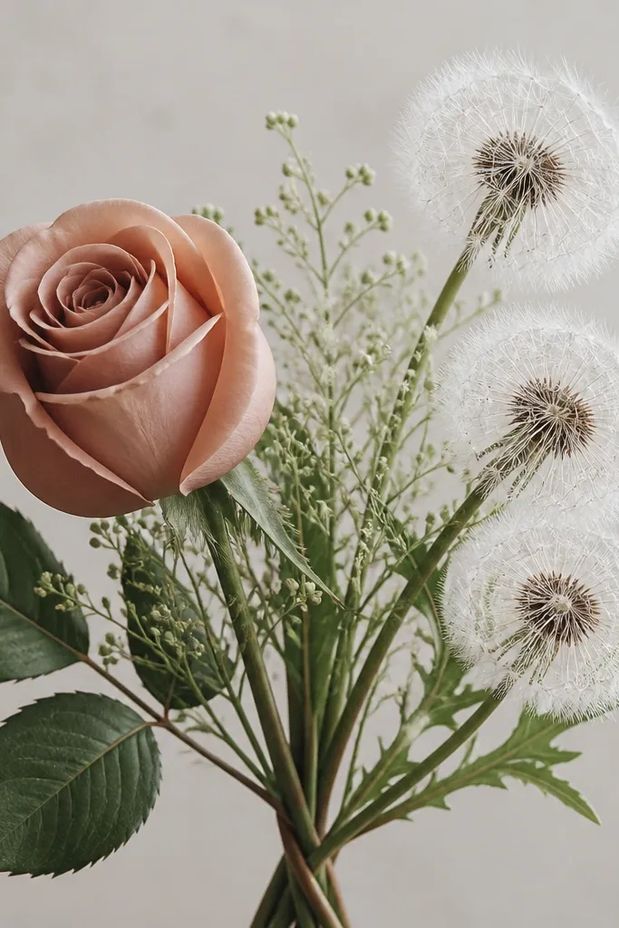
Mixing one "structured" flower (rose) with one "airy" flower (dandelion) makes your drawing look interesting without adding complexity everywhere. The rose gives you a clear focal point, and the dandelion seeds add texture without needing perfect shading. I color the dandelions in soft buttery yellow with light gold seed lines, and keep the rose in muted rose red with a pale highlight. This style flatters medium-size pages and looks playful for spring birthdays or garden themes. If you get bored drawing the same petal pattern, this gives variety.
Step one: draw a rose head on the left using an oval guide and 8-10 curled comma petals. Step two: on the right, draw 2-3 dandelion puffs as small circles, then add 25-35 thin seed lines radiating outward from each puff. Step three: draw stems that twist slightly as they converge at the bottom - keep the rose stem thicker than the dandelion stems. Step four: add one leaf near the bottom for the rose and a small leaf near one dandelion puff so the bouquet doesn't look floating.
Good to knowFor dandelion seeds, vary line length by 1-2 mm so the puff looks fluffy, not spiky.
Common mistakeDon't over-darken the dandelion seeds - keep them lighter than the rose.
12. Hydrangea Cloud Bouquet
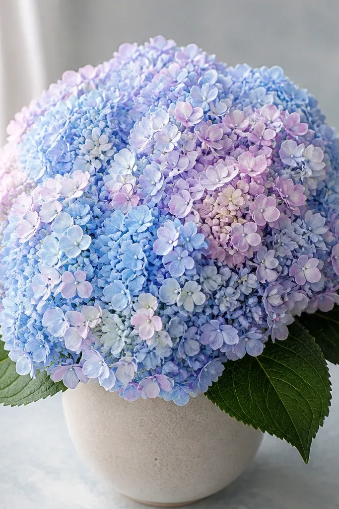
Hydrangea looks like you worked hard because it's full, but the drawing method is simple: tiny shapes packed into a cloud. This makes it a great "easy" bouquet because you don't need to draw each petal separately. I color the cloud in soft periwinkle and pale blue, then add a slightly deeper blue patch on one side for dimension. The leaves stay simple so the flower cluster stays the star. It flatters larger pages and gives a soft, romantic vibe without complicated outlines.
Step one: draw a big rounded shape for the hydrangea cluster, like a thick cloud. Step two: fill it with many tiny circles and teardrops, leaving small gaps so paper shows through. Step three: add a few slightly larger dots and 3-4 tiny "star" centers to avoid a flat texture. Step four: draw two leaves at the base as ovals with a single center vein, then add short stem lines that meet under the cluster.
Good to knowUse a light gray pencil for shadow patches under the densest parts of the cloud.
Common mistakeDon't draw hydrangea as one solid circle - the tiny gaps are what make it look airy.
13. Peach Blossom Branch with Buds
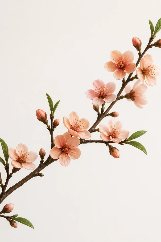
Peach blossoms give you warm spring energy while staying easy because the flowers are small and repeatable. This style looks great if you want a bouquet drawing that feels like a card illustration - minimal background, clean branch line, and soft color pops. I use peach for open blossoms and a slightly darker coral for bud tips, with a pale yellow center dot. The leaves are narrow and sparse, which keeps the branch airy. It flatters people who like warm tones and want something that doesn't require heavy shading.
Step one: draw a branch line that curves like a question mark, then add a few side twigs. Step two: along the twigs, place open blossoms as tiny circles with five rounded petals - keep the petals short. Step three: add buds as small teardrops with two tiny petal bumps on top. Step four: add 4-6 narrow leaves as ovals with one center vein, keeping them smaller than the blossoms so they don't steal attention.
Good to knowColor the blossom centers with a tiny yellow dot and leave a small white highlight in the petal base.
Common mistakeAvoid putting leaves everywhere - too many leaves make it look cluttered.
14. Spring Bouquet in a Simple Vase
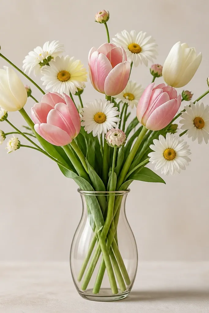
Adding a vase makes any bouquet look like a finished illustration, even if the flowers are simple. This style is a cheat for composition: the vase gives you a stable base so the stems and heads feel arranged. I color tulips in coral and cream, daisies in pale yellow centers with white petals, and buds in soft pink. The vase can be light gray or pastel green, with a darker shadow under it. It flatters beginners because you can keep flower detail limited and still get a polished look.
Step one: draw a simple vase shape - slightly wider at the top, narrow in the middle, then a flat base. Step two: sketch stems starting from inside the vase opening so they overlap naturally. Step three: place 1-2 tulips on the sides, 1 daisy in the center, and 2-3 small buds around the edges. Step four: add a faint shadow line under the vase base, then lightly shade the inside of the vase opening so it looks hollow.
Good to knowKeep the vase lines lighter than the flower lines so attention stays on the bouquet.
Common mistakeDon't draw stems that start above the vase opening - it breaks the illusion fast.
15. Ruffled Paper-Flower Bouquet Look
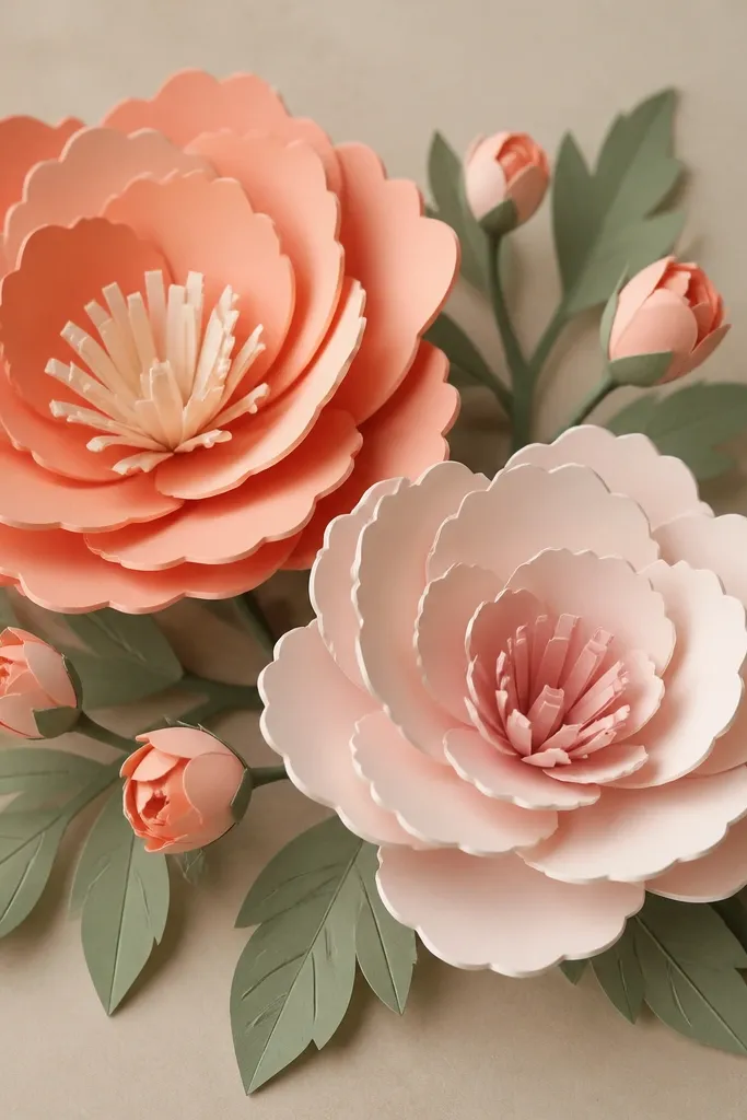
This look mimics layered paper flowers, which makes drawings feel crisp and handmade. It's great for spring because ruffles read as petals, and the clean edges keep the bouquet from looking muddy. I color petals in pastel pink, pale lilac, and soft cream, then add a slightly darker shade only along the lower edge of each ruffle. The gaps between petals are the secret - they create separation and depth. It flatters people who want a "craft" vibe without actually cutting paper.
Step one: draw one big flower head using a loose circle guide, then add 8-10 scalloped ruffle petals around it. Step two: add a second flower head slightly behind the first, smaller and offset to the right. Step three: draw small buds between the big flowers as tiny scalloped circles, then connect everything with thin stems. Step four: add leaves with simple teardrop shapes and one center vein, keeping them lighter in color than the petals.
Good to knowLeave intentional white space between ruffles and darken only the shadow edge where one petal overlaps the next.
Common mistakeAvoid blending all colors together - paper-flower style needs clear edges.