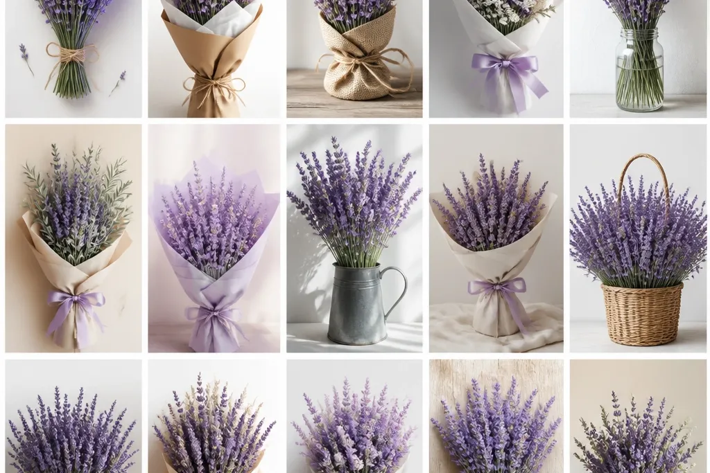
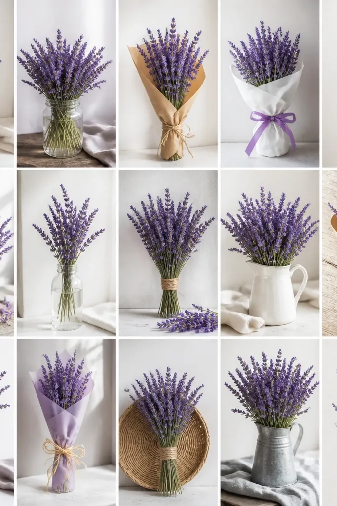
1. Single jar bouquet with loose lavender spikes
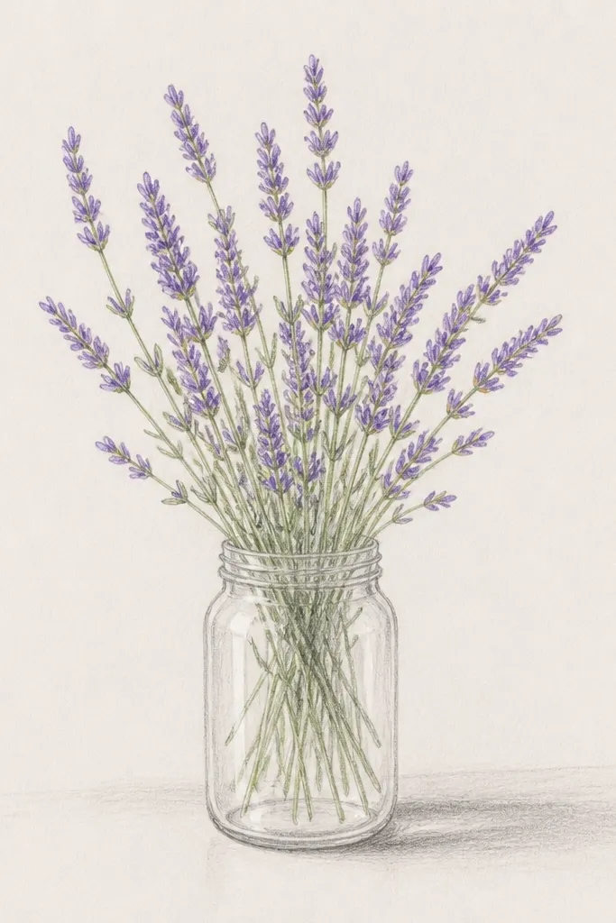
Start with a plain jar outline so the bouquet has a container to "sit" in. I draw the jar with slightly tapered sides and a narrow opening, then leave the inside mostly unshaded so it looks like clear glass. For the lavender, use three main sprigs that overlap, each with flower heads that are tiny and stacked - not big round pom-poms. This style flatters small spaces because the jar gives a clear boundary, and the airy flower heads keep it light. It works great on warm skin tones in a greeting card photo because the purple sits against the neutral paper without looking harsh.
Step one: sketch the jar first - draw an oval mouth, then two slightly curved vertical sides, then a base line. Step two: place the tallest sprig slightly off-center, then add two shorter sprigs behind it so the tops overlap. Finally: shade flower heads with light violet (pencil or watercolor) and keep the stems a cooler sage green; add 5-7 tiny leaf marks along the stem only, not all the way down. Finish by darkening the jar outline a touch more than the stems so the bouquet reads cleanly.
Good to knowLeave a thin white gap between the jar and the stems so the lavender doesn't blend into the glass.
Common mistakeDon't color the whole flower head solid; lavender looks cheap when it turns into one flat purple blob.
2. Lavender bouquet with ribbon bow wrap
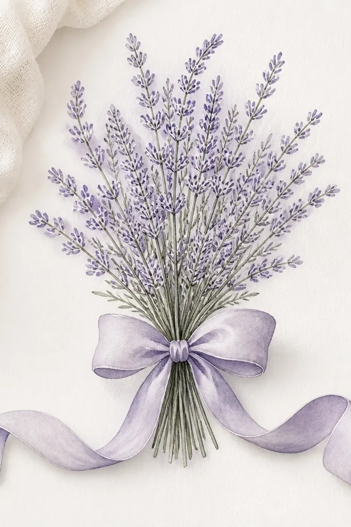
A ribbon bow makes the bouquet feel gift-ready even if your lavender is simple. I like this one because the bow gives you a second focal point, so your drawing feels "done" without adding extra flowers. Draw the bow with crisp loops and a small knot, then let the lavender stems disappear behind the ribbon for a layered look. The purple stays soft because the ribbon area is mostly white or lightly tinted, which keeps the whole piece cozy. This works especially well for holiday cards because the bow shape reads clearly at small sizes.
Step one: draw the bouquet stems first as a fan shape - five to seven stems converging at a point. Step two: sketch the ribbon knot at that point, then draw two symmetrical loops and curl the two tails outward so they frame the bouquet. Finally: add lavender heads along the outer edges of the stems, leaving the center a little lighter so the ribbon knot stands out. Color the ribbon with a very pale rose or warm gray wash, then add slightly deeper violet to only the outermost flower clusters.
Good to knowColor the ribbon a warm gray instead of pure white so it looks like paper, not a blank space.
Common mistakeSkip the tiny dot shading inside the bow loops; it makes the ribbon look like a craft sticker.
3. Lavender in a vintage teacup sketch
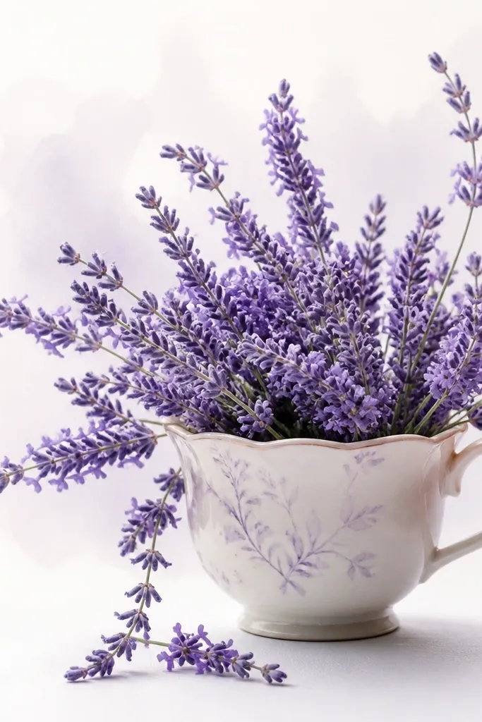
Teacup bouquets look instantly cozy because the cup shape adds charm without extra effort. I draw the cup with a thicker rim line and a gentle handle, then I keep the lavender stems loose so the cup doesn't feel heavy. For the flowers, I use small "comma" strokes that stack along each stem, which makes lavender look like it's breathing. This style flatters anyone who likes a softer look - it's gentle, not graphic. It's also forgiving if your lines aren't perfect because the cup curves hide small wobble.
Step one: outline the cup - scalloped rim, curved body, and the handle on one side. Step two: place lavender stems rising above the cup edge; make the tallest sprig reach about halfway up the page. Finally: add a light watercolor wash behind the cup in a very pale lavender or warm beige, then color flower heads with light violet and a tiny touch of ultramarine at the base of each cluster. Add three small leaves per stem, spaced wide so the bouquet stays airy.
Good to knowUse a ruler only for the cup's base line; let the rest of the cup lines be free so it looks hand-made.
Common mistakeDon't outline every cup detail in dark ink; it will overpower the lavender.
4. Square frame lavender bouquet with minimal leaves
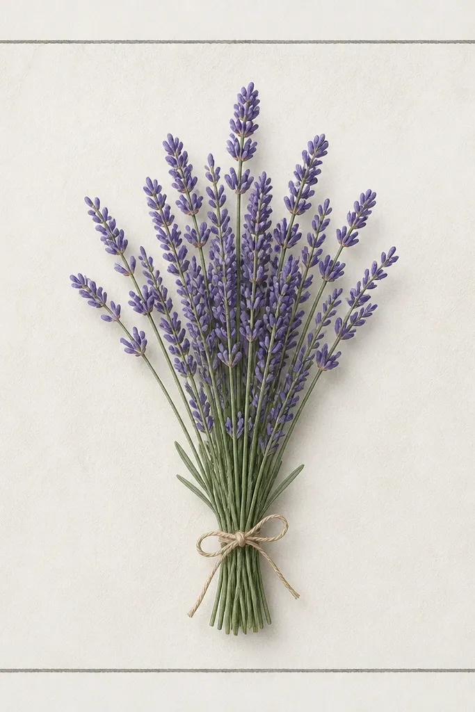
A square frame makes your drawing feel like a print even if it's just pencil and one color wash. I keep this bouquet minimal - fewer leaves, fewer flower heads - so each lavender cluster stands out. The lavender heads are drawn as small stacked ovals, then lightly shaded from one side to give shape. This style looks clean on light paper and holds up well in black-and-white prints because the frame does the heavy lifting. It also flatters people who want a calming aesthetic for seasonal décor without clutter.
Step one: draw a square frame with a 1 cm margin from the page edge (or 1/2 inch if you're using US paper). Step two: sketch a central bouquet with three main stems rising and two trailing stems tucked behind. Finally: add lavender heads along the outer stems only, and keep leaves to 6-10 total marks. Shade the flower heads with one violet tone and add a slightly darker edge only on the side facing your imagined light source.
Good to knowLightly erase the pencil frame after shading - a faint frame looks more intentional than a dark one.
Common mistakeDon't fill the whole bouquet evenly; uneven density is what makes lavender look natural.
5. Lavender wreath bouquet with hanging sprigs
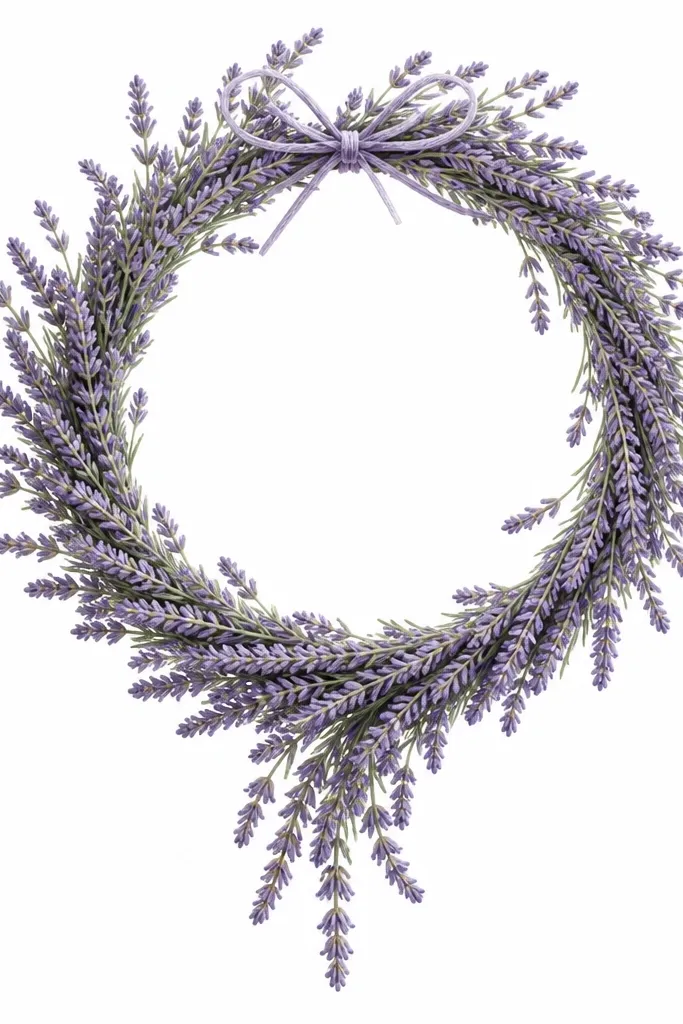
Wreaths are the easiest way to turn one bouquet drawing into seasonal wall art. I draw a circle first, then place lavender clusters along the ring so the bouquet looks continuous. The hanging sprigs at the bottom keep it from looking like a flat sticker; they add motion and make the wreath feel like it's real greenery. The purple stays soft because I limit dark shading to the underside of the flower clusters. If you're drawing for holiday décor, this one fits right in - it reads winter-friendly without needing snowflakes.
Step one: draw a circle outline, then add a second circle inside it to mark the wreath thickness. Step two: map lavender clusters along the outer ring, using short stacked strokes for each cluster and leaving gaps for air. Finally: extend three sprigs downward from the bottom center, then add a small bow at the top of the ring. Color the stems pale sage and the flower heads light violet with a deeper purple only at the base of each cluster.
Good to knowAdd one tiny sprig crossing over another; overlap sells the wreath depth.
Common mistakeSkip thick outlines on the wreath circle; it makes the whole thing look like a coloring book page.
6. Lavender bouquet with watercolor wash background
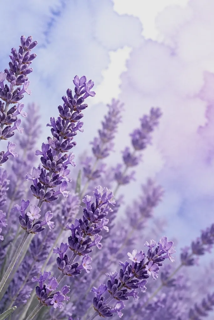
A wash background makes lavender look like it belongs in a cozy café print. I do this with very diluted paint so the background stays translucent; you should still see paper texture. Then I keep the bouquet lighter than the background so the lavender pops without getting too dark. This style is flattering because the purple looks airy against blue tones, and the stems can be cool green rather than yellow-green. It also helps if you struggle with shading - the background does part of the work for you.
Step one: tape your paper and paint a soft wash behind the bouquet area - pale blue on one side, lilac on the other, with a blurry edge where they meet. Step two: sketch the bouquet outline in pencil only, then erase lightly before painting. Finally: paint flower heads with light violet and leave tiny white gaps inside each cluster; add stems with a pale cool green and let some paper show through. Darken only the cluster bases so the drawing doesn't flatten.
Good to knowUse salt sparingly on the background only; it gives a speckled texture that looks intentional.
Common mistakeDon't paint the bouquet first over a wet wash; it will bleed and turn the lavender into one cloudy mass.
7. Ink line lavender bouquet with single-tone fill
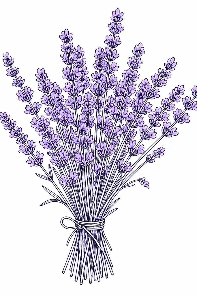
If you want a clean, gift-card style drawing, ink lines with one-tone fill are the move. I use fine-liner ink for the stems and cluster shapes, then add color only to the flower heads in a single violet. Keeping it to one fill tone makes your bouquet look consistent and intentional. This works well for people who like sharper edges or who plan to print it - it stays readable. It also flatters darker paper because the ink gives structure even when the purple is light.
Step one: sketch the bouquet lightly in pencil - three main stems and two secondary ones. Step two: trace over the stems and flower clusters with a 0.3 or 0.5 fine liner, keeping the line weight heavier at the bottom of the bouquet. Finally: color flower heads with a light violet pencil or wash and stop before you reach full saturation. Add a few tiny leaf marks in the same green if you want, but keep leaves minimal so the lavender stays the focus.
Good to knowLet the ink dry fully before coloring; it prevents smudges and keeps the purple edges crisp.
Common mistakeAvoid heavy hatching inside every flower head; the bouquet turns into dark confetti.
8. Lavender bouquet with hanging paper tags
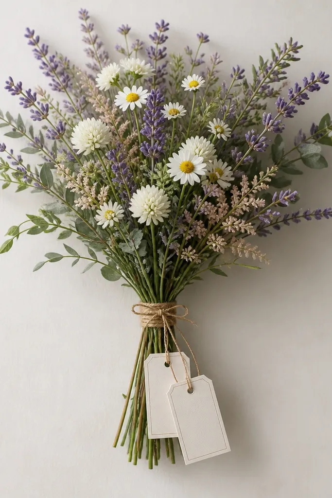
Hanging tags make this bouquet feel like a present even if you leave the tags blank. I like using tags because they give your eye somewhere to rest besides the flower heads, and they frame the bouquet without adding more lavender. The lavender clusters stay small and repeated, which keeps the look tidy. This style works great for seasonal gifting, because you can later add a date or "thank you" by hand. It also suits beginners because tags are just rectangles and string lines.
Step one: draw a simple bouquet base - five stems meeting at a point, then curving outward. Step two: add flower clusters along the outer stems only; keep the center lighter so the bouquet shape reads. Finally: draw two small rectangles hanging from the center with thin string lines, then add a tiny knot at the top. Color the tags in a pale warm gray and keep lavender in light violet with slightly darker tips.
Good to knowRound the corners of the tags a little; sharp corners look too rigid for a cozy sketch.
Common mistakeDon't shade the string heavily; it should look like thin thread, not a thick rope.
9. Lavender and baby's breath style mini bouquet
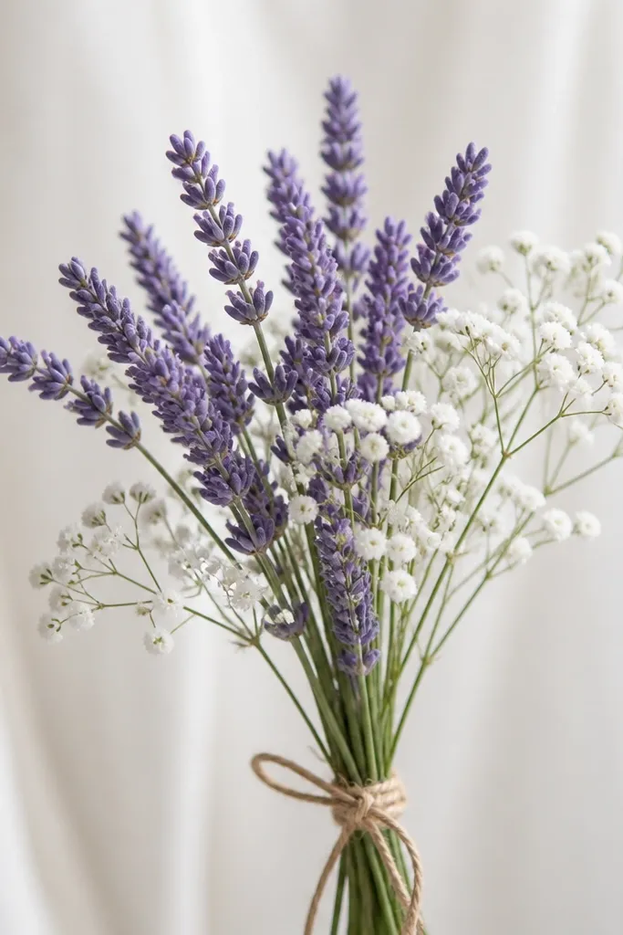
This one feels more airy because you're mixing textures: lavender spikes plus tiny dot-like flowers. I draw baby's breath as small circles with a faint outline, then I leave them mostly unfilled so they stay "sparkly" instead of turning into more purple. The bouquet looks delicate, and it flatters outfits that are neutral or soft - it won't fight with patterned paper. For seasonal holiday stationery, it reads like spring but still feels calm enough for winter cards. It also gives you variety without needing to draw lots of different plant shapes.
Step one: sketch a compact bouquet shape about palm-sized on your page - three lavender stems in the center with two smaller stems on the sides. Step two: add tiny circle clusters around the lavender tips, spacing them so they don't cover the whole bouquet. Finally: color lavender heads light violet and add a faint cool gray outline to the tiny circles; leave the centers white. Add a few thin leaves only at the base of each stem, then erase any stray pencil lines so the dots stay crisp.
Good to knowUse a white gel pen or a white pencil to bring back the dot highlights after the wash.
Common mistakeDon't fill the tiny flowers in purple; baby's breath should stay lighter than lavender.
10. Lavender bouquet with sunlit side shading
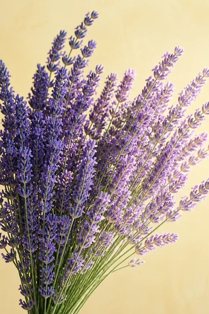
Directional shading makes lavender look dimensional fast. I pick a "sun" direction and shade only the side facing away from it, leaving the other side nearly uncolored. This makes the flower heads look like stacked little buds instead of flat ovals. I also keep the background warm - pale butter yellow or warm cream - because it makes the lavender look cooler and more believable. This style works beautifully for cozy seasonal art because the warmth feels like late afternoon light.
Step one: paint or color a pale warm background wash first, keeping it light enough that paper texture still shows. Step two: sketch the bouquet - three tall stems and two trailing ones - then erase lightly. Finally: shade flower heads with violet, but leave the "sun side" almost white; add a darker violet only along the shaded edge of each cluster. Shade stems with a cool sage on the shaded side and a lighter sage on the sun side.
Good to knowChoose your sun direction before you start drawing and keep it consistent across every sprig.
Common mistakeDon't shade both sides evenly; lavender turns flat when both edges get the same darkness.
11. Lavender bouquet in a paper bag wrap
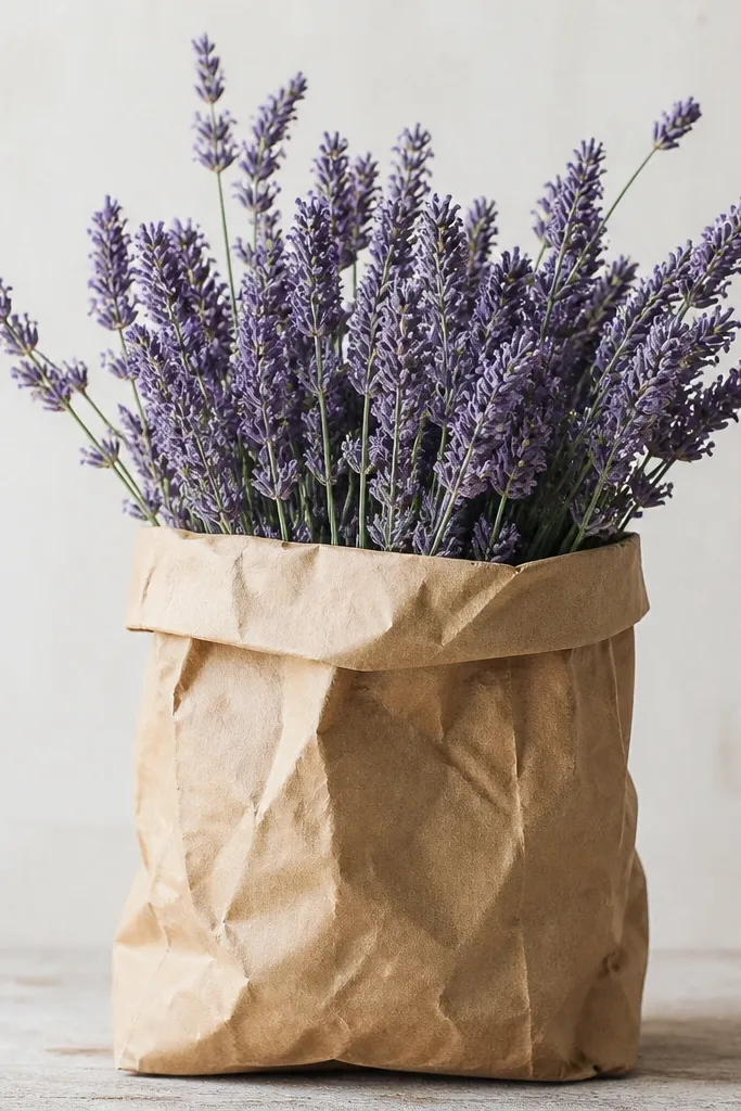
Paper bag wrapping is one of my favorite ways to make a bouquet feel cozy without turning it into a whole still life. The bag gives texture, and lavender gives the soft color contrast. I draw the bag with a few clear creases and a folded rim, then I keep the lavender mostly above the fold so it looks like fresh stems. The brown tones make the purple feel more muted and calm. This style fits seasonal and holiday themes because it looks like something you'd bring home from a market in cold weather.
Step one: draw the bag shape first - a trapezoid that narrows toward the top, then add a folded rim line. Step two: add 6-8 crease lines inside the bag, then lightly shade the creases with a darker warm brown pencil. Finally: place lavender stems emerging from the opening, with flower heads in light violet and stems in pale sage; keep leaves few and small near the base. Add a thin shadow under the bag opening so the bouquet doesn't float.
Good to knowCrumple the bag rim slightly by drawing it as two curved lines instead of one straight edge.
Common mistakeAvoid shading the whole bag evenly; flat brown looks like a stamp, not paper.
12. Monochrome lavender bouquet on kraft paper
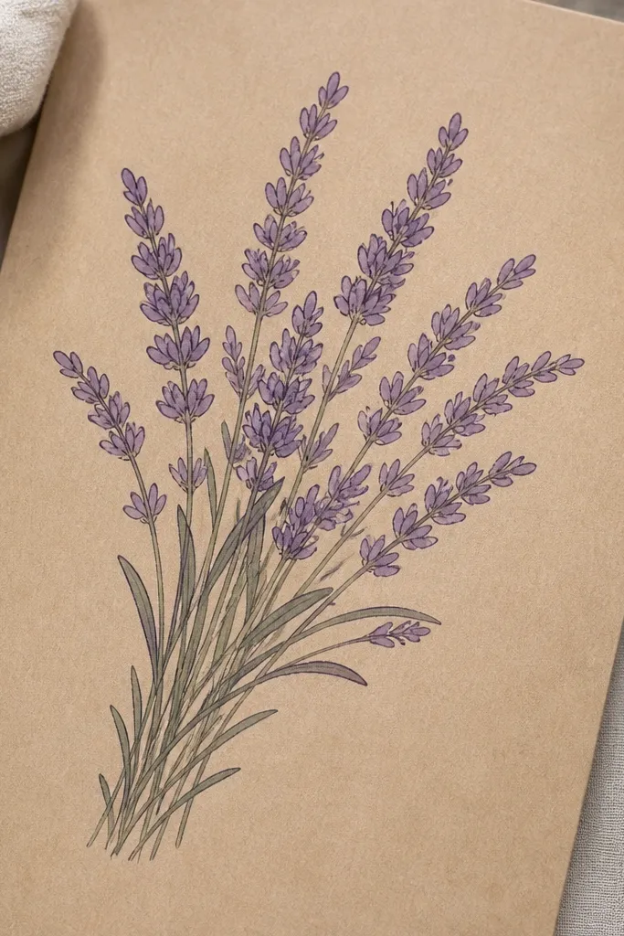
Kraft paper makes lavender look cozy even with limited color. I do monochrome here because kraft already has warmth, and extra colors can fight the paper. Draw the lavender clusters as outlined ovals with a light violet fill, then add a darker violet only at the base of each cluster. Stems in a muted gray-green keep it natural. This style is forgiving and looks good in low light because the brown paper acts like a built-in shadow.
Step one: lightly sketch the bouquet placement with a soft pencil so it won't scratch the paper. Step two: outline flower heads in a darker violet pencil, then fill with a lighter violet leaving tiny kraft highlights. Finally: shade stems and leaves with a gray-green pencil, keeping leaf shapes small and sparse. Add a light shadow under the bouquet with a very soft violet to tie it to the paper.
Good to knowUse a blending stump or tissue to soften violet edges on the flower heads, not the stems.
Common mistakeDon't use bright purple on kraft; it turns neon and kills the cozy look.
13. Lavender bouquet with heart-shaped negative space
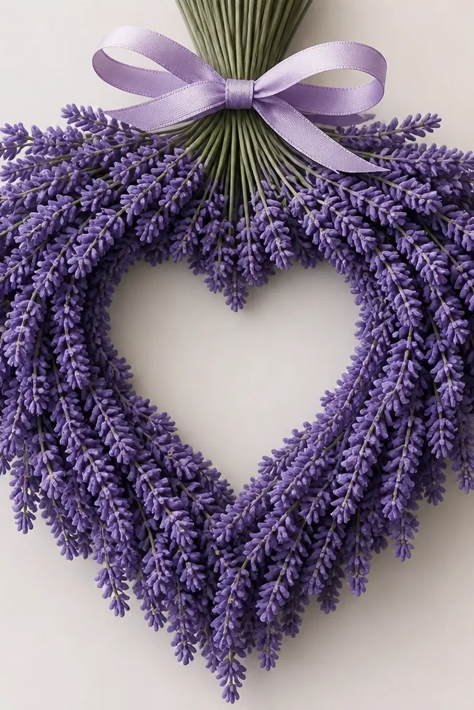
Negative space hearts are a cheat code for sweetness without clutter. I build the bouquet so the lavender clusters frame a heart shape that stays uncolored - it reads clearly even if your drawing style is loose. This idea looks great on plain white paper because the heart pops as a clean shape. It also flatters the look of your line work because the heart gives structure to the composition. Use this for Valentine-season cards, bridal showers, or anytime you want a gentle message baked into the art.
Step one: sketch a heart shape in the center lightly, then draw stems that curve around it like a frame. Step two: place lavender clusters on both sides of the heart, keeping them smaller near the heart edges so the shape stays crisp. Finally: color everything around the heart with light violet and leave the heart completely blank. Add a small bow at the top and shade the bow lightly so it doesn't steal attention from the heart.
Good to knowTrace the heart outline with a kneaded eraser after coloring - lifting pencil marks can sharpen the heart edges.
14. Lavender bouquet with watercolor pencil gradient stems
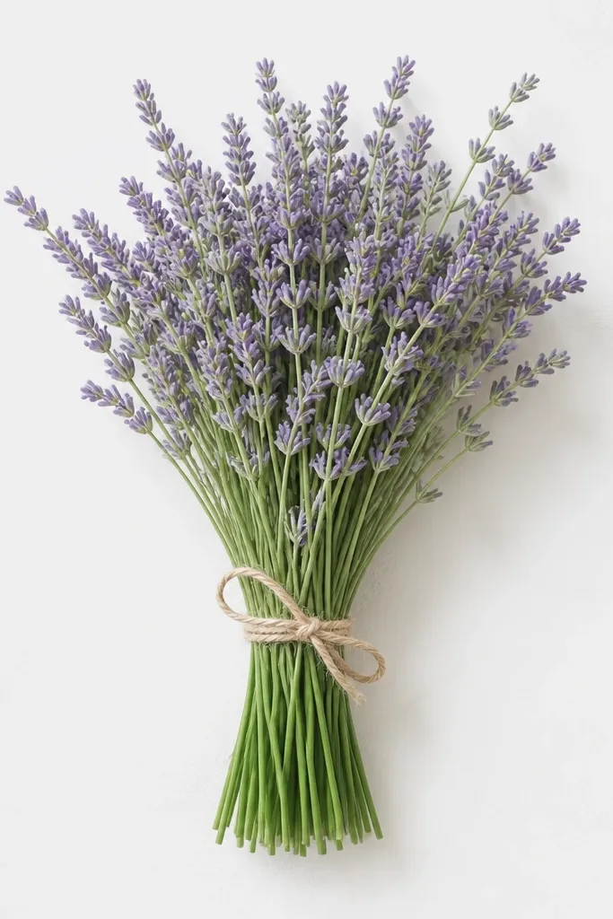
Gradient stems make lavender feel fresh because the plant looks like it has direction and life. I use watercolor pencils for this because they let you control the fade with water. Keep the flower heads light and airy, then put your "wow" into the stems: darker at the base, lighter toward the tips. This style flatters people who like subtle art rather than bold color. It also works well for seasonal décor prints because the gradient reads as texture from a distance.
Step one: sketch the bouquet with three main stems and two side stems, drawing them slightly curved. Step two: color the stem bases with a medium sage-green watercolor pencil, then blend upward with a damp brush so the color fades. Finally: add lavender flower heads with light violet pencil and lightly touch water to each cluster so the color blooms just a little. Leave the top tips almost uncolored so the bouquet looks airy.
Good to knowUse a smaller brush than you think for the flower heads; big brushes make the clusters smear.
Common mistakeDon't over-wet the page; too much water makes the violet pool and lose the lavender texture.
15. Lavender bouquet with winter candle silhouette
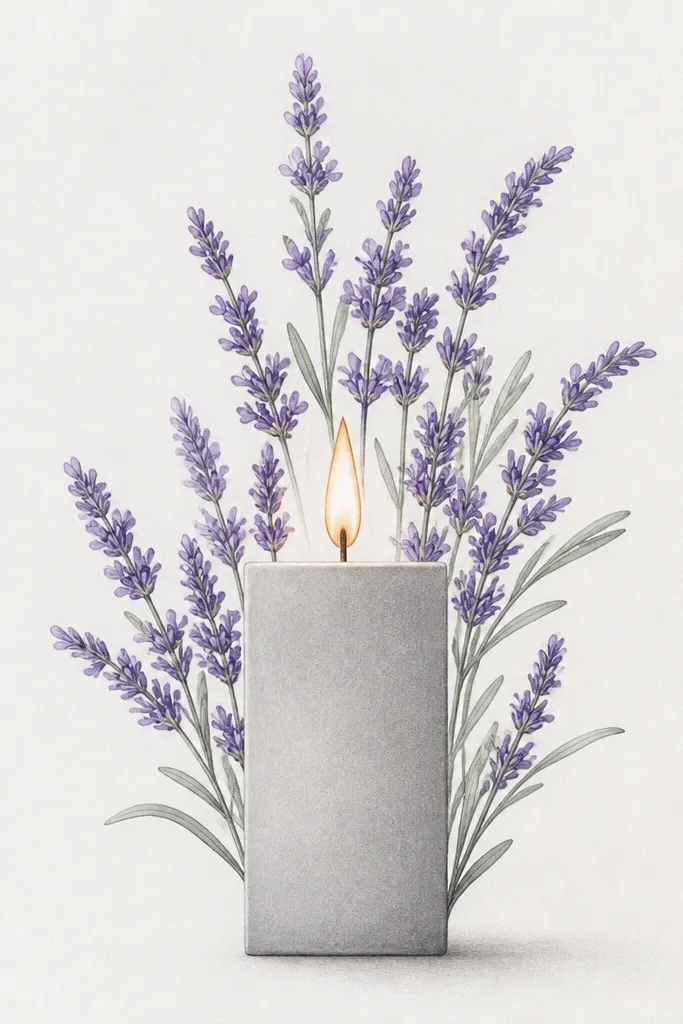
Pairing lavender with a candle silhouette makes the drawing feel holiday-ready without adding lots of extra objects. I draw the candle first as a simple block shape, then let lavender sprigs rise behind it so the bouquet looks like it's part of the scene. The flame adds warmth, and lavender adds calm, so the contrast looks intentional. This works well for winter-season cards because the candle reads clearly even in black-and-white prints. It also flatters your line work since the candle gives strong structure around looser flower clusters.
Step one: outline the candle - tall rectangle, small base, and a flame shape on top; keep edges straight and clean. Step two: draw lavender stems behind the candle, with two taller sprigs on the sides and one shorter sprig in the middle. Finally: color flower heads in light violet and add a warm yellow-orange wash to the flame, keeping the flame small so it doesn't dominate. Shade the candle lightly in cool gray and add a faint shadow under it.
Good to knowLeave a thin white line inside the candle edges so it looks like a light reflection.
Common mistakeSkip detailed wick shading; a simple flame outline looks cleaner.