1. Classic Cup Tulip with Center Seam
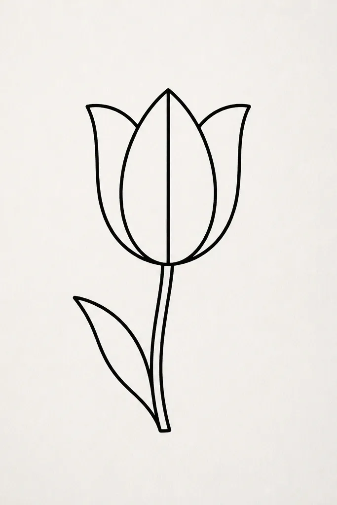
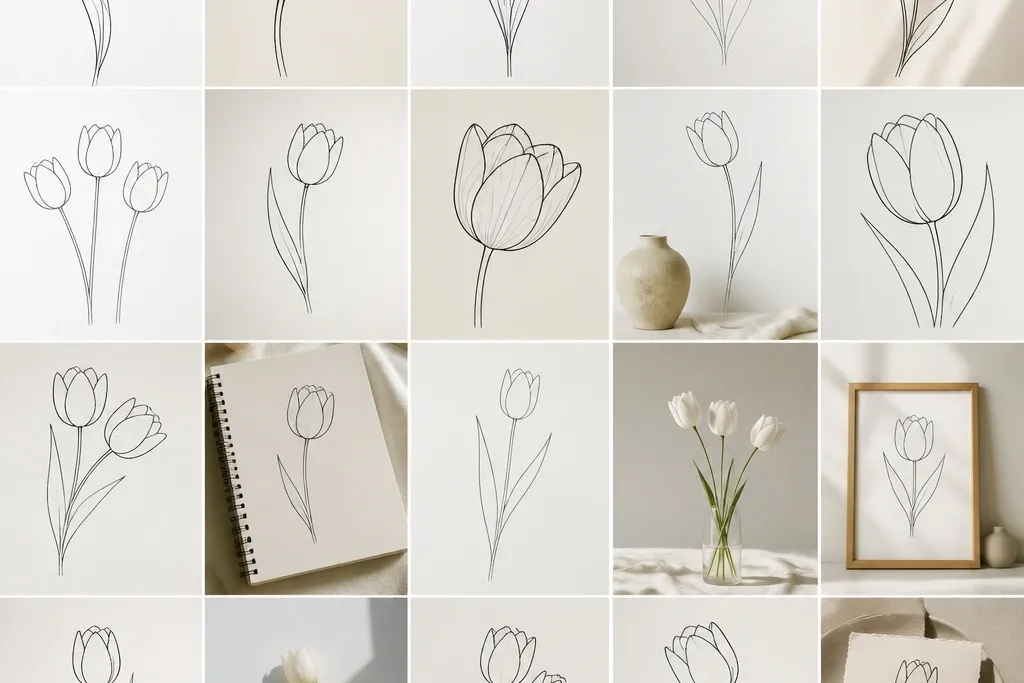
This one is the tulip I start with because it reads clean at any size. The cup shape gives you a strong silhouette, and the center seam keeps the petals from looking like random ovals. I draw it with a slightly tall opening so it flatters narrow frames and vertical cards. It also works well on light skin tone backgrounds because the black line has enough contrast to stand out without needing color fills.
Start with a light pencil guide: draw a vertical line for the center and a short stem line that leans 10-15 degrees left. Add two mirrored petal arcs that meet at the top, then sketch the third petal arc behind them so it peeks from the center. Ink the outer petal edges with a 0.8 pen, then trace the inner seam with a 0.3 pen. Finally, add one leaf with a simple midrib line and two curved veins, keeping the leaf angle opposite the stem lean for balance.
Thicken only the outside contour. If you thicken the center seam too, it starts looking heavy and less “fresh.”
Don’t over-round the top — if the opening becomes a perfect circle, the tulip loses its cup shape and looks like a blob.
2. Side-Facing Tulip Profile (3/4 View)
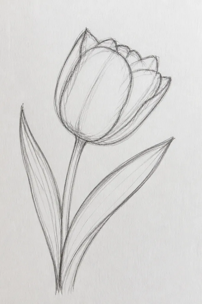
This profile tulip looks more “illustrated” than the straight-on version because you see depth in the petal overlap. I like it for spring banners where some flowers should face different directions. The slight curve in the center seam makes it feel natural, not stamped. It’s especially flattering for wider layouts since the side view fills horizontal space without needing a lot of extra elements.
Draw a center guide line that tilts about 20 degrees right. Sketch the front petal as a tall teardrop arc, then add a second petal that wraps behind it — keep this one narrower. Add a third petal line that peeks from the top-back, using lighter pressure so it looks less dominant. Ink the front outer edge with 0.8, then outline the back petals with 0.5. Finish by drawing a stem that matches the tilt and a leaf that points down-right.
If you want it to look crisp in printing, keep the back petals shorter than you think. Too-long back lines make the profile messy.
Avoid drawing the back petals the same width as the front — that flattens the depth and kills the profile effect.
3. Tulip Bud with Tighter Petals
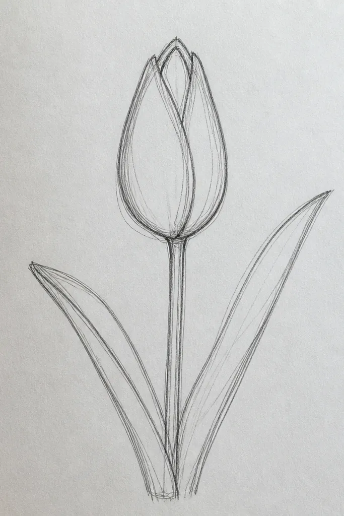
Start with a tall rounded triangle guide: pencil the outline lightly with a narrow top gap. Draw two mirrored petal halves that wrap inward, making the inner edges meet near the center but not at the very top. Add a small center seam line that stops just below the notch. Ink the outside with 0.8, then go over the inner seam with 0.3. Add two leaves using simple almond shapes with a midrib line; keep them narrow so the bud stays the focus.
A bud tulip gives you that “just starting to bloom” vibe without needing shading. The tighter petals are also easier to keep symmetrical because there’s less open space to mess up. This is great for holiday and seasonal sets where you want variety but still keep the same drawing style. On white or cream paper, the thin opening reads clearly and doesn’t feel busy.
Common mistakeDon’t open the petals too wide. If the bud looks like a full cup, the “early bloom” look disappears.
Good to knowUse a smaller pen tip for the notch. A fat notch makes the bud look like it’s bruised.
4. Tall Minimal Tulip Outline (One-Line Look)
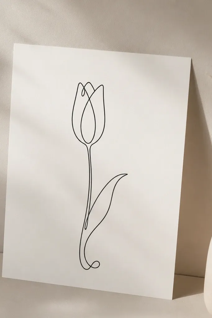
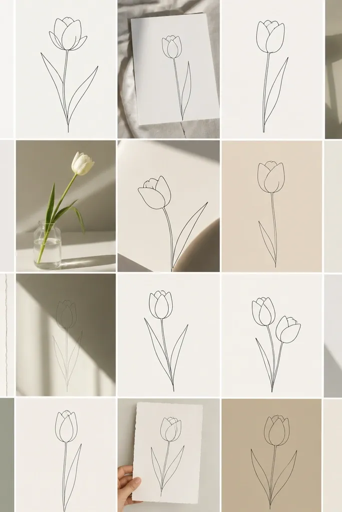
This is the tulip I use when I want the cleanest, most modern linework. The “one-line” feel makes it look airy, and it works great for minimalist planners, stickers, and line-art prints. Because there’s no thick outer edge, it flatters delicate layouts and doesn’t overpower text. It also looks good on darker cardstock because the single line has a crisp edge.
Start at the bottom with the stem line, pulling it up in a smooth curve. Without lifting your pen, draw the first petal arc from the top of the stem to the top center, then mirror it on the other side. Close the cup by drawing a small inner curve at the top center, leaving a tiny opening. Add one leaf with a simple flick off the stem — keep it to one curved line plus a short midrib. If you need a center seam, add it as a short line segment that doesn’t break the flow too much.
Practice the stem curve on scrap first. The stem sets the mood for the whole drawing.
Avoid stopping and restarting mid-petal. Those micro-pauses show up as bumps.
5. Tulip with Curled Petal Tips (Playful Edge)
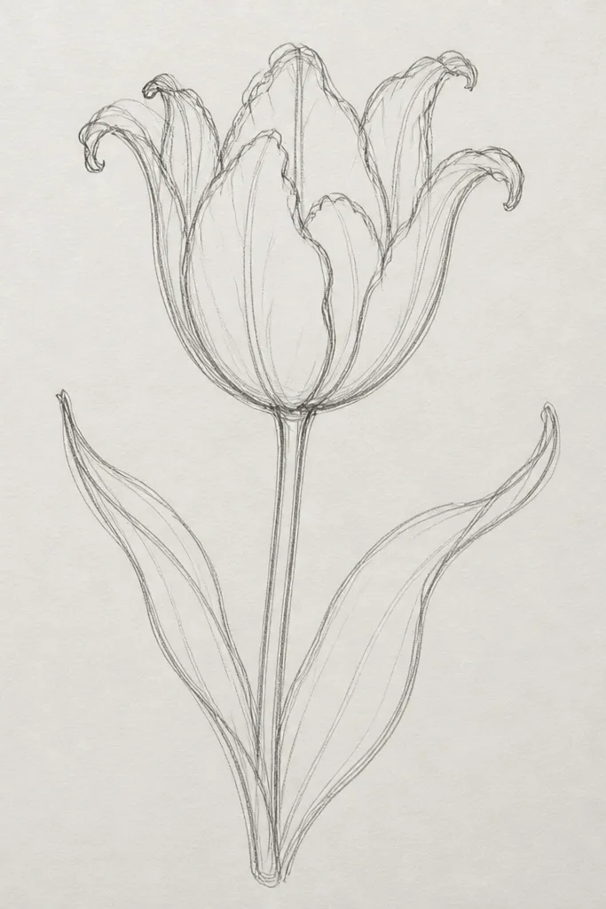
Curled tips make a tulip feel like it’s moving, even as an outline. I use this when I’m making a set of cards and I want the flowers to feel less formal. The curls also help the tulip look dimensional without shading. It flatters playful color palettes later because the line already suggests where color would “sit.”
Draw a standard cup tulip guide first: center seam line and two mirrored outer arcs. Then, at each petal tip, add a small hook curl outward — think of a tiny parenthesis shape at the top of each petal. Ink the outside arcs with 0.8, then ink the curls a little lighter with 0.5 so they don’t look like hard blobs. Draw an S-curved stem and add one leaf with a curled tip that matches the direction of the petal curls. Keep the leaf midrib line thin so the curls stay the focal point.
Make the curls small. If they’re too big, the tulip reads like a stylized cartoon flower.
Don’t curl only one petal. The mismatch makes it look accidental.
6. Tulip Outline with Double Center Lines
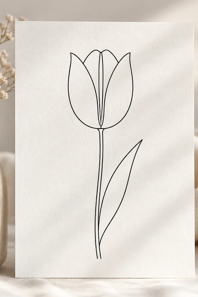
Double center lines add structure without needing color. I like this for greeting cards because it gives the eye a clear path through the flower. The two lines also make the tulip look slightly more detailed while staying an outline. It works well for medium-sized stickers where you want the flower to hold up under close inspection.
Start with a center seam guide, then add a second seam line about 2-3 mm to one side in pencil. Draw the two outer petals as mirrored arcs that meet at the top center gap. Ink the petals with 0.8 on the outside and 0.5 on the inner edges. Then ink both center lines with 0.3, keeping them parallel and stopping them at the same height. Finish with a thin stem line and a single leaf that points toward the direction of the inner seam lines.
If your lines start drifting, stop and redraw the seam pair before you ink. It’s easier to fix pencil than ink.
Don’t make the seam lines too far apart. Wide spacing turns it into a decorative stripe instead of a tulip seam.
7. Tulip Outline with Overlapping Petals (Layered Look)
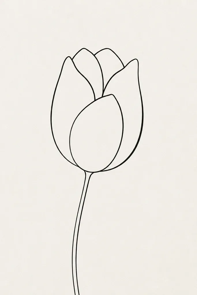
Overlapping petals give you depth even in outline-only art. The trick is line hierarchy: the top petal edge looks darker, and the tucked petal looks lighter. I use this for seasonal holiday sets because it looks more “designed” than a flat outline. It also flatters off-white paper because the thinner lines still show well without filling.
Draw the base cup first with a simple center seam and two petal arcs. Now add overlap by drawing one petal edge that crosses in front — keep that front edge slightly thicker. Ink the front edge with 0.8, the tucked edge with 0.5, and the center seam with 0.3. Add a small notch at the top where the petals meet so it doesn’t look like a sealed cone. Finish with a stem that leans slightly opposite the overlap — if the front petal leans right, tilt the stem left by a few degrees.
Use overlap to create variety across a set. Same tulip style, different overlap direction looks intentional.
Avoid crossing petal edges in random spots. Overlap should happen near the lower third for the most readable depth.
8. Tulip with Minimal Leaf Fan (Single Leaf, Clean Lines)
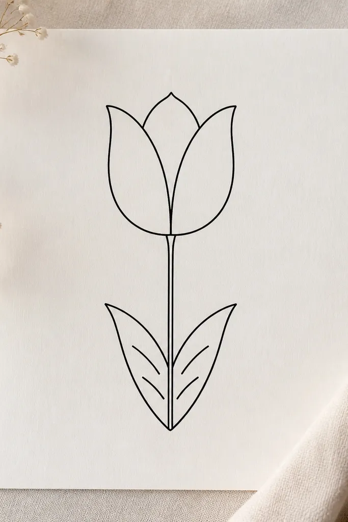
A clean leaf makes the whole drawing feel finished, even when the flower is simple. This version uses a single leaf so it works on small spaces like tag corners or the top of a gift card. The fan shape has a gentle rhythm that balances the cup petals. It’s also easy to match across a bunch of tulips without the leaves turning into a mess.
Draw your classic cup tulip with a center seam and three petal arcs. Keep the petals tall and narrow, with the top opening about the width of one petal. Add the leaf as a fan: draw one midrib line slanting down-right, then add two short curved veins on each side. Ink the leaf outer edge with 0.5 and the midrib with 0.8 so it reads as the main line. Keep the leaf tucked close to the stem so it doesn’t crowd the flower.
If you’re doing multiple tulips on one card, make every leaf fan the same size. Consistency makes the set look designed.
Don’t add extra leaves. Two leaves makes this style look busy fast.
9. Tulip Outline in a Heart Frame (Petals Inside)
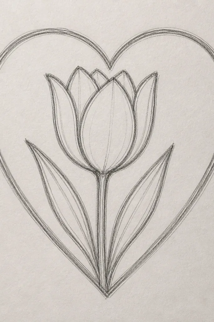
Sketch a heart outline first with a symmetrical top dip and a pointed bottom. Draw a vertical guide through the heart center. Inside, draw the classic cup tulip scaled so its widest part sits about halfway up the heart. Let the stem line end near the bottom point of the heart, with the leaf staying inside the heart edges. Ink the heart with 0.5, ink the tulip outer petals with 0.8, and keep the center seam at 0.3.
Putting the tulip inside a heart frame makes a sweet seasonal motif that still reads as line art, not a cartoon. The heart shape gives the eye a boundary, so even if the tulip varies slightly, the whole piece stays cohesive. I like this for Valentine-adjacent spring cards and for label tags on DIY gifts. The clean linework also makes it easy to add color later with markers or paint pens.
Common mistakeAvoid thickening the heart outline too much. A heavy heart makes the tulip look secondary.
Good to knowKeep the tulip narrower than the heart’s width at mid-height. If it’s too wide, the heart loses its shape.
10. Tulip Outline with Ribbon Stem Twist
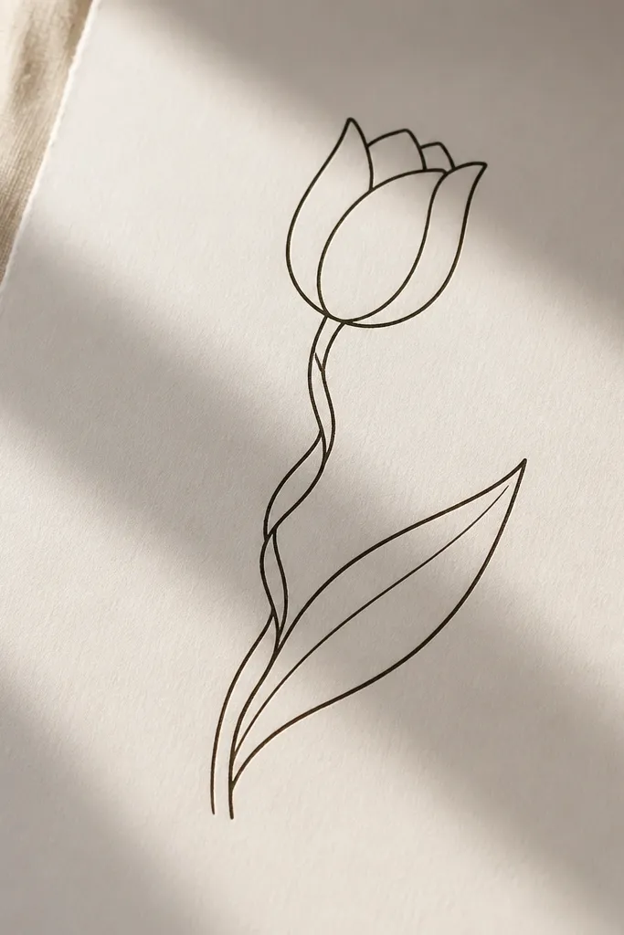
Draw the classic tulip cup with a center seam. Replace the straight stem with a ribbon stem: draw two parallel curves that twist slightly around the center line, keeping the gap between lines around 2-4 mm. Ink the outer curve of the ribbon stem with 0.8 and the inner curve with 0.5 for depth. Add one leaf that attaches to the ribbon twist — draw it as an almond with a midrib and one curved vein line. Ink the tulip petals last so your hand doesn’t smear the ribbon lines.
A twisted stem makes the flower feel handcrafted, like it’s part of a bouquet illustration. This works great when you’re drawing multiple tulips in a row because the stems add motion without changing the petals. I’ve used this on holiday labels where the flower needs to look “fancier” but still stays an outline. It’s also flattering on tall tags because the twist pulls the eye upward.
Common mistakeAvoid crossing the ribbon lines. If they intersect, it starts reading as a knot instead of a twist.
Good to knowMake the twist gentle. A tight spiral makes the drawing look like a lollipop.
11. Tulip Outline with Stamen Lines
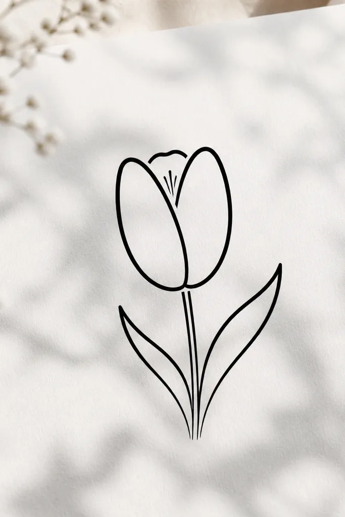
Start with the classic cup tulip but leave the top opening slightly smaller. Draw the outer petals with 0.8 and the inner petal edges with 0.5. Add the stamen: inside the opening, draw three thin curved lines that rise from the center seam area, tapering them slightly shorter as they go outward. Add one tiny dot or hook at the top of each stamen line with 0.3. Finish with a stem line and a single leaf that points down-left so the stamen doesn’t feel crowded by extra elements.
Stamen lines add realism while staying in outline form. I use this on larger art prints because the extra detail is visible from close up and still clean at a distance. It also makes the tulip feel “alive” even without color fills. If you’re drawing on thicker paper for ink markers, this style holds up well because the line weight stays crisp.
Common mistakeDon’t draw stamen lines straight across. Curved stamen reads more natural and less geometric.
Good to knowKeep stamen lines short. If they reach outside the opening, the tulip looks like it’s sprouting hairs.
12. Two Tulips Interlocked (Bouquet Outline)
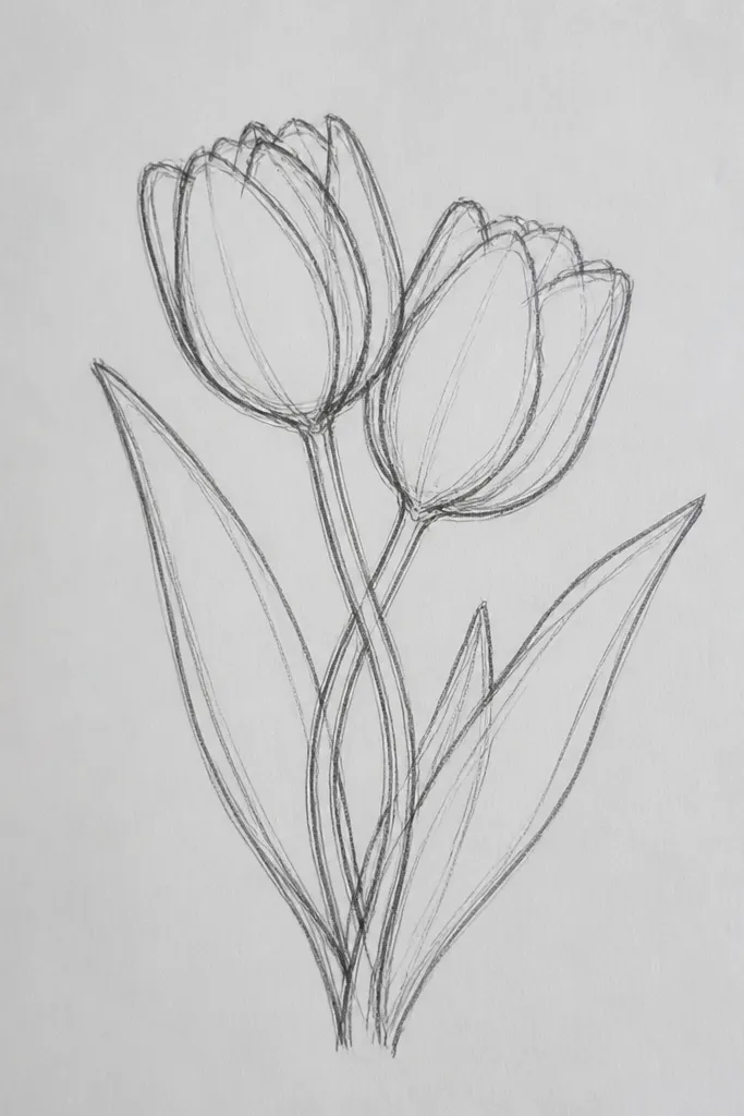
Draw the first tulip cup leaning left, with its center seam tilted about 15 degrees. Place the second tulip cup leaning right so their top openings overlap by about one-third of a petal width. Draw the stems so they cross behind the petals, not through them. Ink the front flower’s outer edges with 0.8, the back flower’s edges with 0.5, and keep the seam lines at 0.3. Add one leaf under each flower on opposite sides, keeping the leaf tips angled outward for a balanced silhouette.
Interlocked tulips look like a real little bouquet even when you only draw outlines. The overlap gives you depth and helps the composition feel full without extra flowers. I like this for mini prints and card fronts because the pair fills the space quickly. It’s also forgiving if one tulip is slightly off — the overlap hides small symmetry issues.
Common mistakeAvoid letting both tulips be the same line weight. Flat overlap looks like two stickers stuck on top of each other.
Good to knowDecide which tulip is “front” before you ink. Then commit to different line thickness for each one.
13. Tulip Outline with Dotted Stem Accent
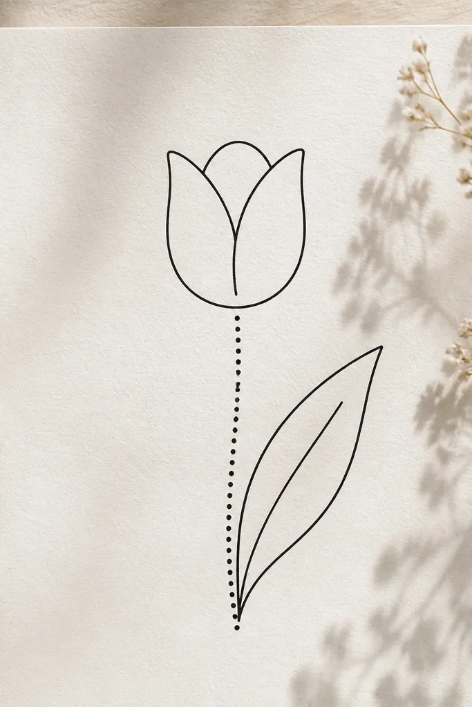
Draw the tulip cup with the classic center seam and outer petal arcs, in solid lines. Ink the petals with 0.8 and the inner edges with 0.5. For the stem, draw the center line as a series of small circles spaced evenly, keeping the vertical rhythm consistent. Add the leaf as a normal almond shape with a midrib line and one curved vein. Ink the leaf outer edge with 0.5 and the midrib with 0.8 so it stays readable against the dotted stem.
Dotted stems add a handmade, playful texture while keeping the flower itself crisp. I use this when I’m making seasonal stationery and want the outlines to feel less “ink stamp” and more hand-drawn. It also helps if you’re adapting the design for embroidery later because the dots suggest stitch points. The style looks good on light paper and also on pastel cardstock because the dotted stem breaks up the black line mass.
Common mistakeAvoid random dot sizes. Big and small dots in the same stem makes it look like a wobble line.
Good to knowMake your dot spacing the same distance you’d space pencil dots for a dotted guideline. Consistency looks intentional.
14. Tulip Outline with Zigzag Petal Edge
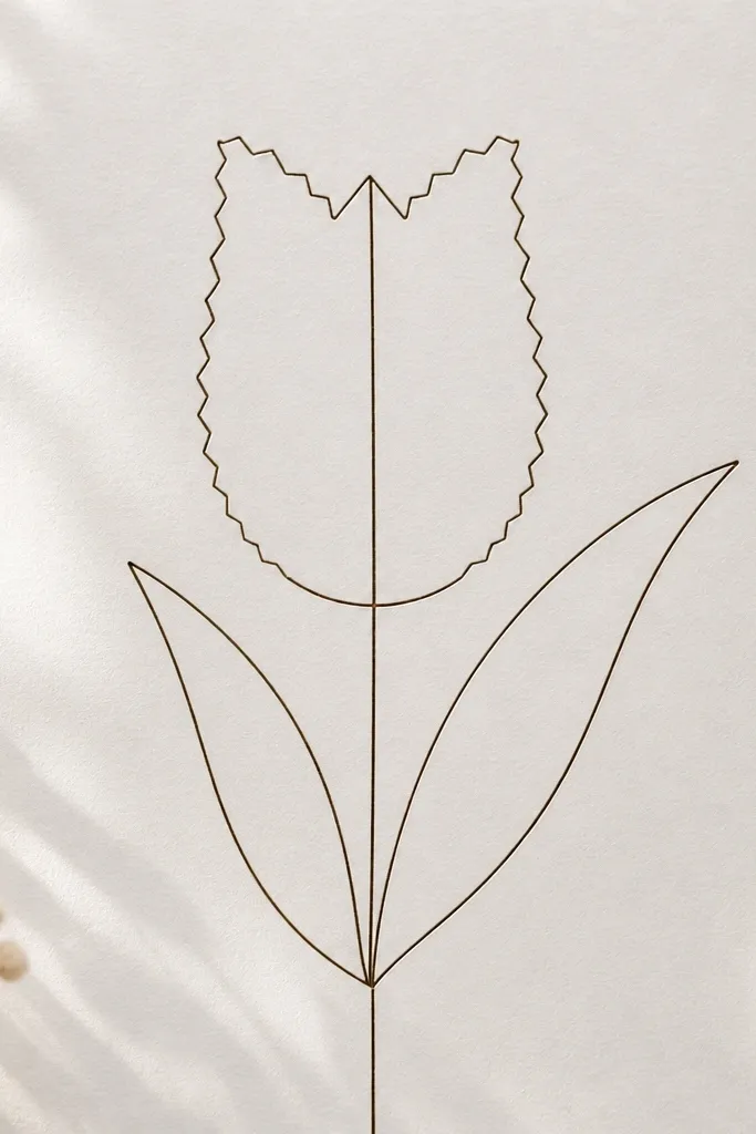
Zigzag edges make a tulip feel like it’s made from cut paper or stamped fabric. This is one of those outline variations that looks bold even without color. I like it for holiday crafts where you want a graphic look but still keep the tulip recognizable. It also flatters bold backgrounds because the zigzag texture adds visual interest without filling the petals.
Start with a normal tulip cup guide, then map the outer petal edge points. Ink the outer edge by drawing a smooth curve but adding small, even zigzag bumps along it — about 3-5 bumps per petal. Keep the inner petal edges smooth with 0.5 so the zigzag stays the feature. Draw the center seam straight with 0.3, stopping at the top opening. Finish with a simple straight stem and one leaf with a smooth outline so it doesn’t compete with the zigzag petals.
Count your zigzags per petal and match them across all three petals. Uneven counts make it feel sloppy.
Don’t zigzag the center seam. Keep that line calm so the flower still reads as a tulip.
15. Tulip Outline with Side Leaf Curl Up
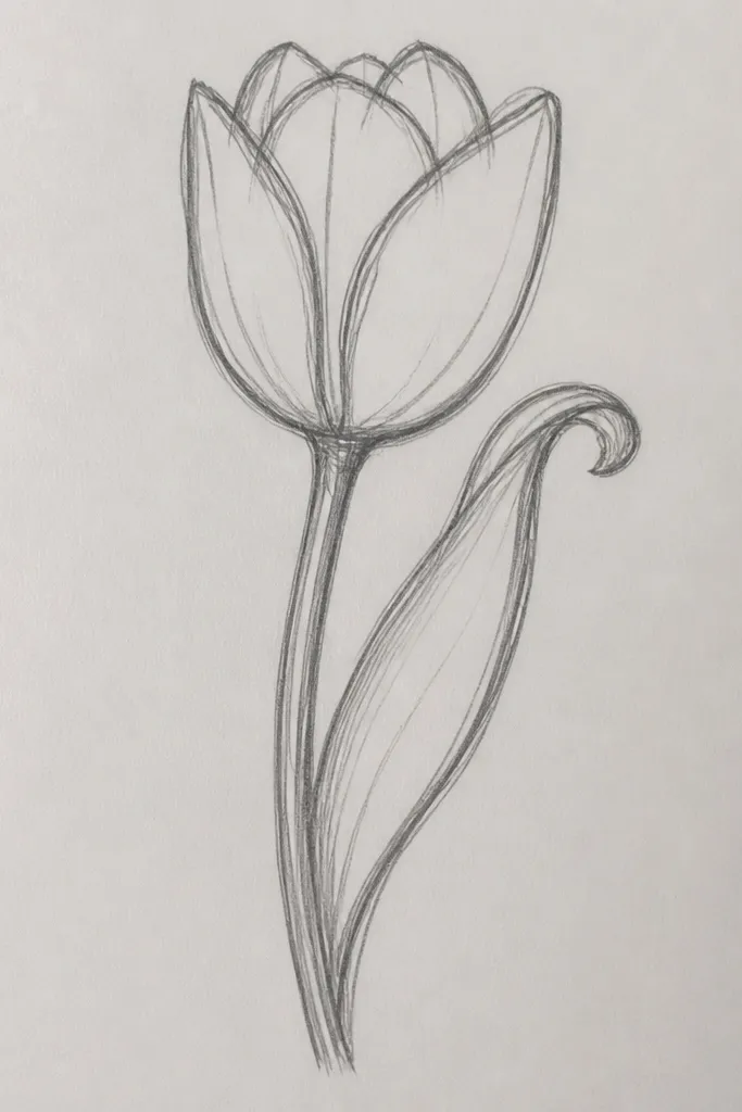
A leaf that curls upward adds personality without making the tulip messy. I use this when I’m drawing tulips for tags and the bottom area needs a stronger shape. The curled leaf also gives you a natural counterbalance to the tulip’s open top. This style looks good across skin tones and paper colors because it relies on line rhythm, not shading.
Draw the classic cup tulip outline with a center seam. Place the leaf on the side of the stem rather than directly below. Start the leaf midrib line, then curl it upward at the top into a gentle hook. Add one outer leaf edge line that follows the curl, and a second thin vein line that runs partway up the leaf. Ink the tulip petals with 0.8 outside and 0.5 inside, then ink the leaf outer edge with 0.5 and the midrib with 0.8 for contrast.
Curl the leaf tip only once. Double-curls start looking tangled.
Avoid making the leaf curl too tight. A tight spiral makes it look like a decorative flourish instead of a leaf.
16. Tulip Outline with Ribbon Banner Across Top
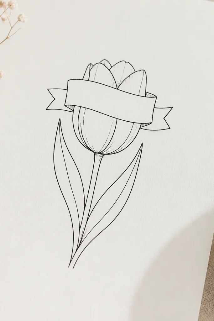
This idea is great when you want space for text or a sticker label without filling the petals. The ribbon banner gives you a natural spot for a short word like “Hello Spring” later. I use it on holiday packaging because the graphic reads clearly even when the print is small. The banner also adds a horizontal element that balances the vertical tulip shape.
Draw the tulip cup outline first, leaving the top opening clear. Sketch a ribbon banner as a curved strip that sits across the top opening, with two tails that drop slightly into the petal area. Ink the ribbon strip with 0.8 and the ribbon tail edges with 0.5 so it looks layered. Keep the tulip outer edges at 0.8 and the center seam at 0.3 so the banner doesn’t steal all the attention. Add a stem and leaf beneath, keeping them thin and simple to leave room for the ribbon area.
Keep the ribbon thickness consistent. If it varies, it looks like it was drawn with two different pens.
Avoid placing the ribbon too low. If it covers the petal opening, the tulip reads as a different flower.
17. Tulip Outline with Double Leaves (Opposite Angles)
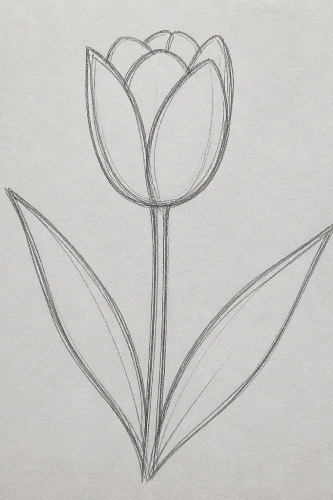
Draw the classic cup tulip with a centered stem guide. Ink the petals with 0.8 on the outer edge and 0.5 inside, then ink the center seam with 0.3. For the leaves, place one leaf on the left side of the stem angled down-left, and mirror it on the right side angled down-right. Each leaf is an almond shape with a midrib line and one curved vein. Ink leaf outer edges with 0.5 and midribs with 0.8, keeping the leaf tips at the same height so the base looks even.
Two leaves make the tulip feel like a complete bouquet stem, not a lone flower. I like this version for larger cards where you need the base to balance the top. Opposite leaf angles make the silhouette wider without adding clutter. It’s also a good match for people who want a consistent look across a set because the leaves can repeat as mirrored shapes.
Common mistakeAvoid drawing both leaves on the same side. It makes the tulip look unbalanced.
Good to knowMatch the leaf lengths, not just the angles. Length differences show up fast in symmetry checks.
18. Tulip Outline with Watercolor-Style Negative Space
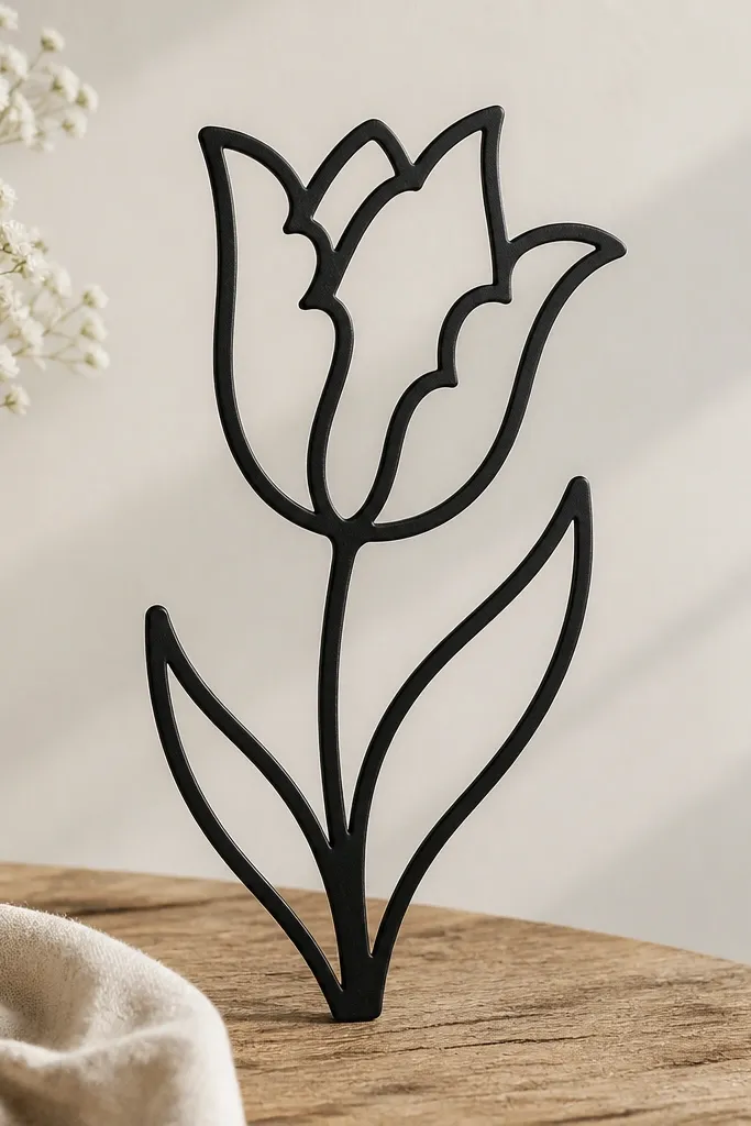
Start with a normal cup tulip outline, but draw the inner petal edges as broken or scalloped lines. Keep the outer petal edges solid with 0.8 so the tulip stays defined. Add 2-3 small scalloped negative-space notches along the inner edges, leaving the center seam intact. Ink the center seam with 0.3 and keep it continuous. Add a simple stem and one leaf, then erase any pencil guide so the blank areas stay clean.
Negative space makes the outline look softer even when you use a dark pen. This is the tulip I use when I plan to add light color later, like a pale pink wash, because the blank areas give the paint a place to breathe. The blank interior also keeps the tulip readable on busy backgrounds like patterned paper. It flatters spring color palettes — think blush, peach, and pale yellow — because the line defines shapes while the interior stays light.
Common mistakeDon’t add too many cutouts. Three notches per petal reads intentional; ten looks like damage.
Good to knowPlan your color later: leave the inner blank space larger on the front petal so the wash looks dimensional.
19. Tulip Outline in a Circle Badge
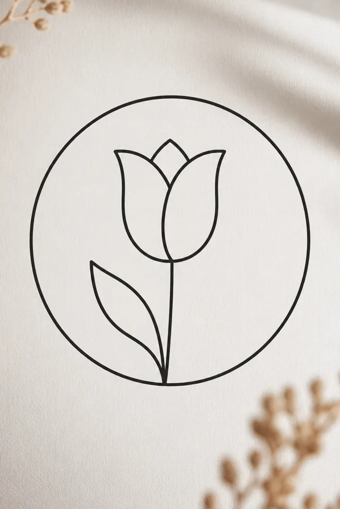
Circle badges make tulip outlines look like labels, stickers, or stamps. The border forces the design to stay compact and keeps the lines crisp when you resize them. I use this for seasonal holiday tags and planner stickers because a badge shape reads fast. It also looks great on both light and dark backgrounds since you have a clear boundary.
Draw a clean circle first using a compass or a tracing tool so the border is even. Inside, draw the tulip cup scaled to about 70% of the circle’s diameter. Keep the stem line centered and let it stop before the circle edge. Add one leaf positioned so it doesn’t touch the border — leave a 5-10 mm gap. Ink the circle border with 0.5, ink the tulip outer edges with 0.8, and ink the center seam with 0.3.
If you’re printing, draw the circle border a hair thinner than the tulip outline. It keeps the tulip from looking crowded.
Avoid putting the leaf right against the circle. The contact point makes it look like the leaf is glued on.