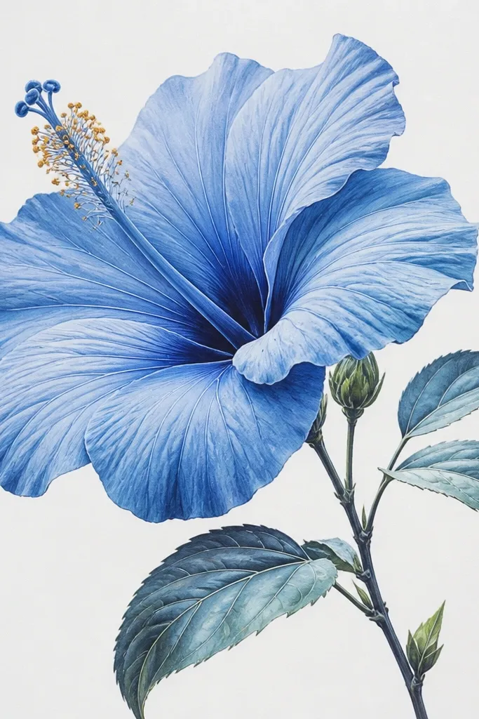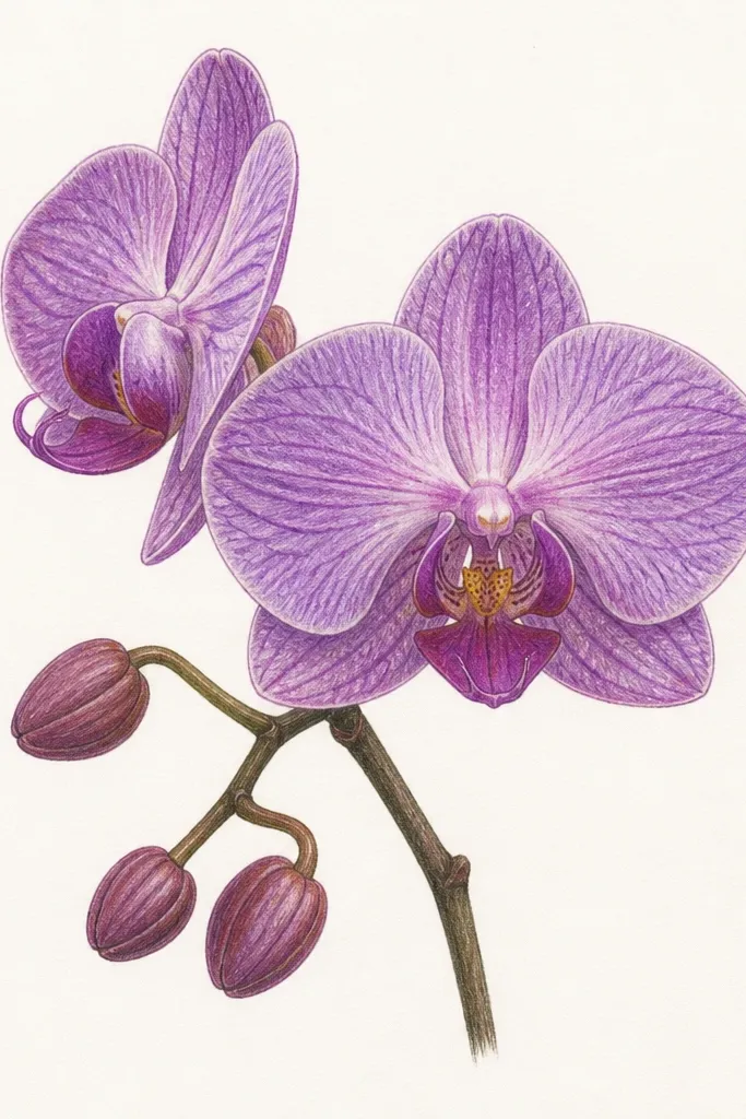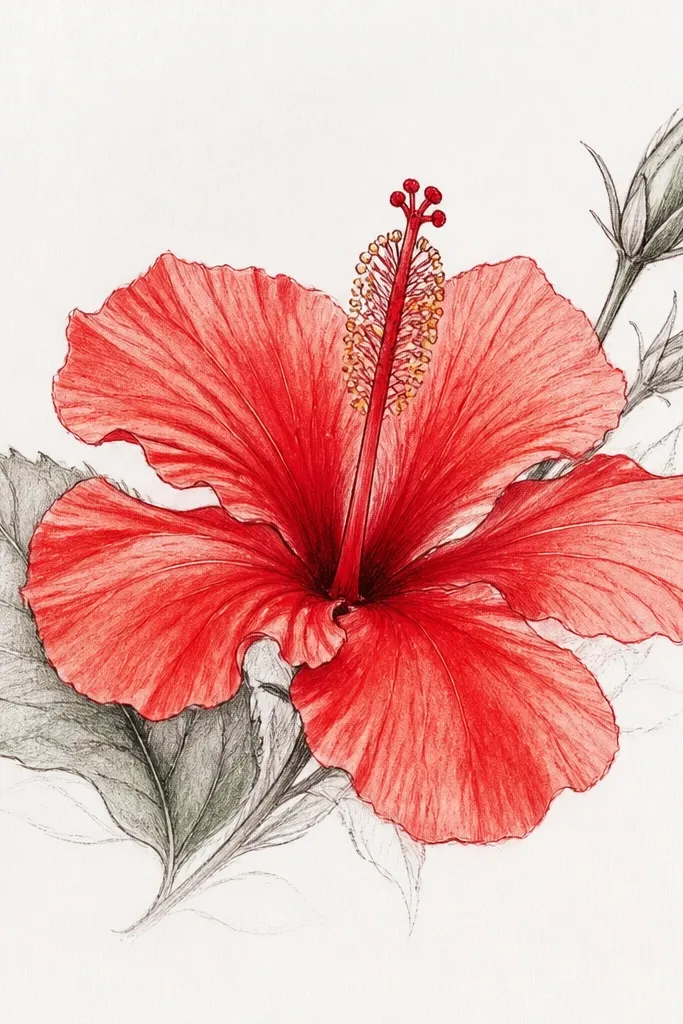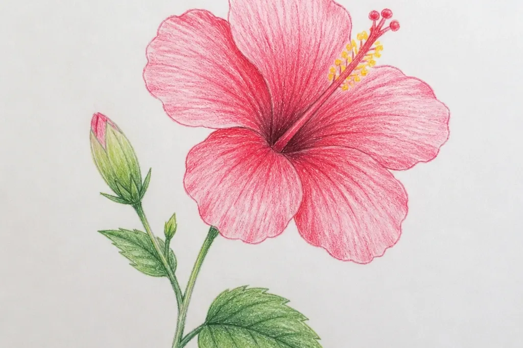
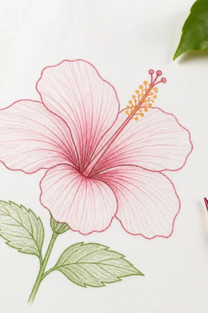
1. Classic 6-Petal Hibiscus with Fineliner Center
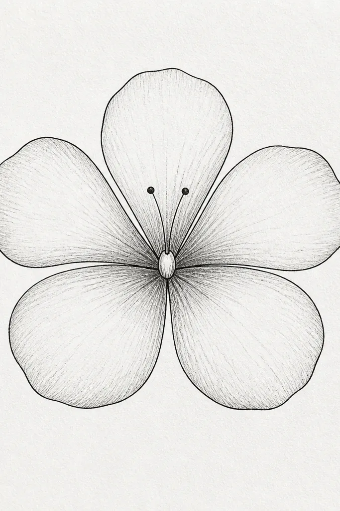
This is the hibiscus I use when I want it to look clean and “right” without overthinking. The six petals are spaced like clock numbers, so the symmetry reads instantly. I draw the center in fineliner first: a small oval, a little bump at the top, then two thin stamens that lean slightly outward. Because the petals are rounded and not too pointy, this works well for small sketchbooks and for anyone who struggles with sharp angles.
Start by sketching a small oval for the center, about 1/2 the width of your final flower. Add two short stamens that cross the center slightly, then draw one stigma bump on top and two dot tips at the ends. Around that, place six flattened teardrop petals: three in front and three slightly behind, each with a gentle curve at the top and a wider base near the center. Finally, darken the petal outlines and add light pencil shading only on the inner half of each petal so it doesn’t look muddy.
Keep your stamens thinner than you think. If they’re thick, the whole flower looks like clip art instead of a real hibiscus.
Avoid drawing petals with long narrow points — it makes the flower look like a generic flower, not hibiscus.
2. Side-View Hibiscus with One Petal Fold
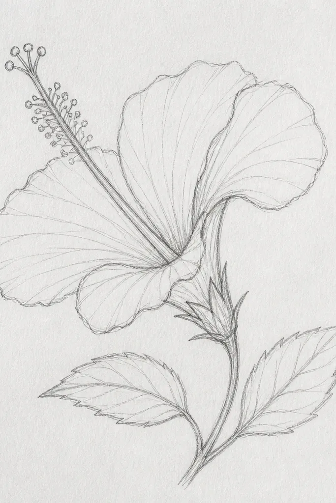
When you want your drawing to feel more lifelike, draw the hibiscus slightly turned. The side view makes the overlap obvious, and overlap is what creates depth without heavy shading. I keep the folded petal thicker in outline and slightly darker inside, so it looks closer to the viewer. This style flatters smaller paper sizes because you don’t need a perfectly centered symmetrical flower to make it look good.
Begin with a tilted oval center, then draw three stamens that fan out, with the middle one slightly shorter. Sketch five petals around the center, but let two petals overlap on the right side and curve toward the viewer. Make one petal the “fold” by drawing its outer edge darker and adding a small inner crease line from near the center to about halfway down. Shade the inner edges of the overlapped petals lightly with pencil, then erase stray construction lines.
Use the fold crease line — it’s the quickest way to make it look 3D even with simple coloring.
Don’t keep all petals the same size in the side view — the overlap will look like a mistake.
3. Hibiscus Bud Close-Up with Veins
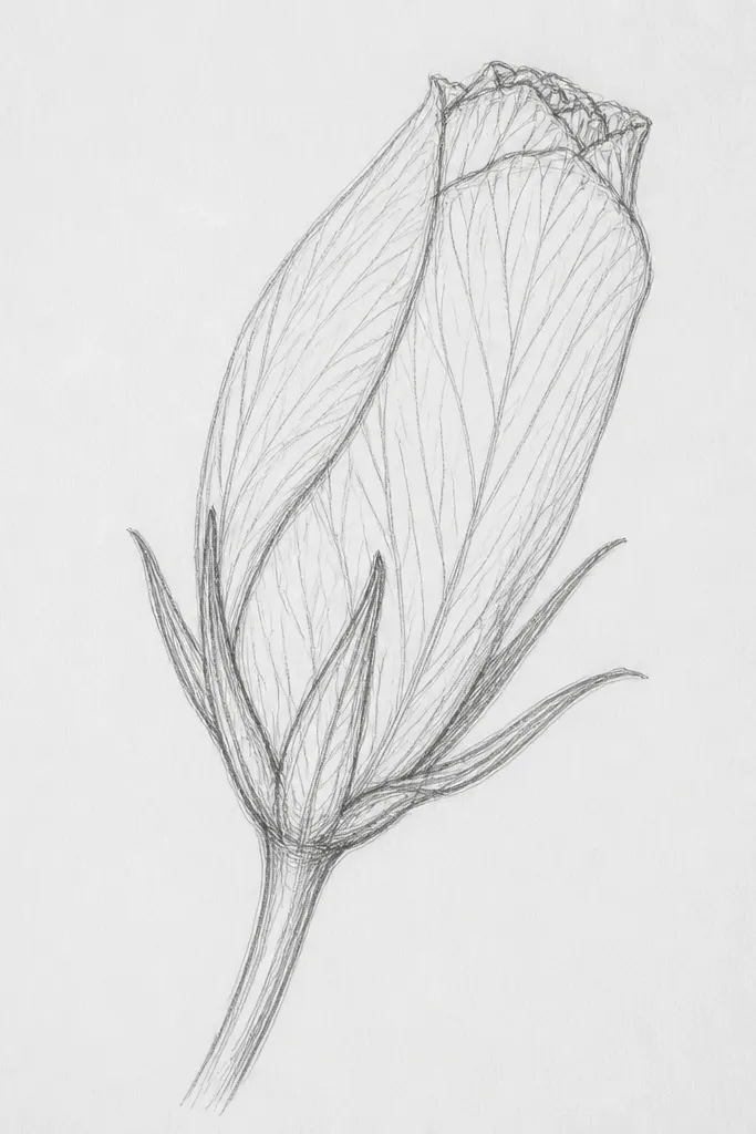
Buds are the easiest way to practice hibiscus structure because the petals wrap in a predictable way. Close-up also hides beginner mistakes in symmetry since the flower is compact. I draw the bud as layered “petal sleeves” and add simple vein strokes that follow the petal curve. This is perfect if you like detailed linework and want something that looks impressive even without full coloring.
Start with a rounded teardrop bud shape, about the size of a large grape on your page. Add two inner layers first: draw two curved petal arcs that meet near the center, then repeat with two more outer layers. For each petal layer, draw one or two vein lines that start near the base and curve toward the top, staying parallel to the petal edge. Trace the outer edges in fineliner, then shade the gaps between layers with light pencil so the bud looks layered.
Veins should be fewer lines than you think. Two clean curved strokes per petal layer look more realistic than lots of scribbles.
Avoid heavy black fills inside the bud — it makes the petals look like dark blobs.
4. Single Petal Study with Center Nibs
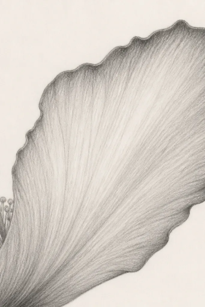
This one is a trick I use when I want to practice hibiscus without drawing the whole flower. A single petal teaches you the hibiscus silhouette: wide base, rounded top, and a slightly curved inner edge. The center nibs — tiny stamens and a stigma — are the visual clue that it’s a hibiscus, even if only one petal is fully shown. It looks good for greeting cards and small stickers because it takes up less space.
Draw a large flattened teardrop for the front petal, with the base wider than the top. Add a small inner curve line on the petal to suggest the fold or thickness. Behind the base of the petal, draw a small center oval and two or three short stamens that peek out. Shade the petal with pencil in two zones: keep the center lighter and deepen only the outer rim and the inner crease.
Color the petal rim darker than the center. That single contrast makes it look like a real flower petal.
Don’t forget the inner crease line — without it, the petal looks like a simple leaf.
5. Symmetry Practice Hibiscus with Grid Guidelines
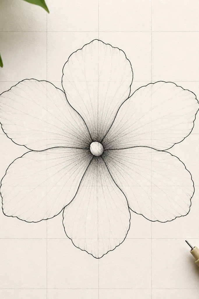
This is the method I use for beginners who want symmetry but hate the “freehand guess.” The grid keeps the petals evenly spaced so you don’t end up with one petal bigger than the others. I like this because it turns hibiscus into a set of repeatable shapes rather than an artistic mystery. Even when you erase the grid lines later, the flower edges stay steady, and it looks polished fast.
Lightly draw a cross guideline through your page center — one vertical and one horizontal line. Add two more lines to make a simple four-quadrant grid so you can place petal tips consistently. Sketch the center oval on the intersection, then place six petal teardrops so their tips land near the same grid distances. Trace over petals with fineliner, then erase the grid carefully and add minimal shading near the center.
Use a kneaded eraser on the grid. It lifts pencil without tearing the paper texture.
Avoid pressing hard on the grid. Deep indentations show through later when you color.
6. Watercolor Wash Hibiscus with Hard Outline
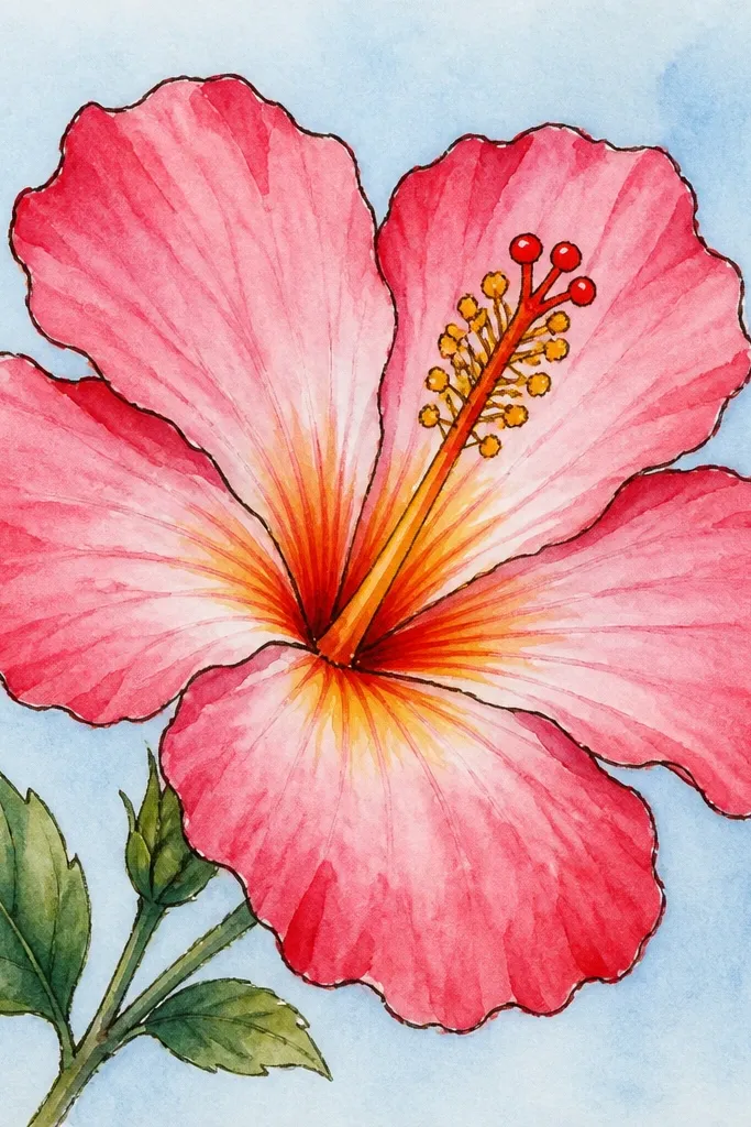
If you want that “I bought this postcard art” look, do hard outlines first, then watercolor washes. The outline keeps petal shapes crisp even when the paint blooms. I use light-to-dark layering: a watery base wash for the petal body, then a deeper edge wash that stays near the rim. This flatters most skin tones if you’re using it for a print or card because bright pink and warm yellow read clean and cheerful.
Draw the hibiscus in pencil, then ink the outline with fineliner so it’s bold. Wet one petal area with clean water using a size 6 round brush, then lay down a light pink wash. After it dries halfway, add a deeper red at the outer edge and along the inner crease line. Paint the center yellow, then dab small orange-red streaks inside the center and let them feather slightly.
Let the first wash dry 70% before adding the darker edge. If you add too soon, everything turns into one flat color.
Don’t paint the entire petal with full-strength pigment. That makes it look like a marker fill instead of watercolor.
7. Colored Pencil Hibiscus with Two-Value Petals
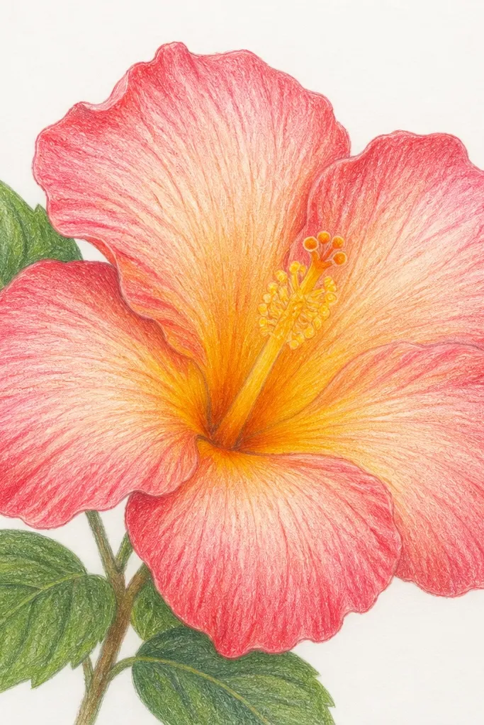
This is the easiest way I’ve found to make petals look dimensional without blending tools. Two values are enough: a light base for the petal body and a darker tone around the rim and veins. The center looks believable when you shade the inside edges darker, because that mimics the way hibiscus petals curl inward. I like this style for beginners because it’s forgiving — you can build color slowly.
Sketch the flower in pencil, then ink lightly or leave pencil lines if you’re confident. Fill each petal with a light pink or coral pencil, leaving the center area slightly uncolored for highlight. Add a deeper pink or magenta along the outer rim and near the inner crease, then lightly blend with circular light strokes using the light color again. Finish the center with yellow for the base and orange-red for streaks, then add tiny dot tips on the stamens.
Sharpen your pencil to a fine point for veins and the center streaks. Blunt points make everything look chunky.
Avoid heavy burnishing over the highlight. If you press too hard, the petal loses its glossy look.
8. Hibiscus Bouquet Frame with Repeating Flowers
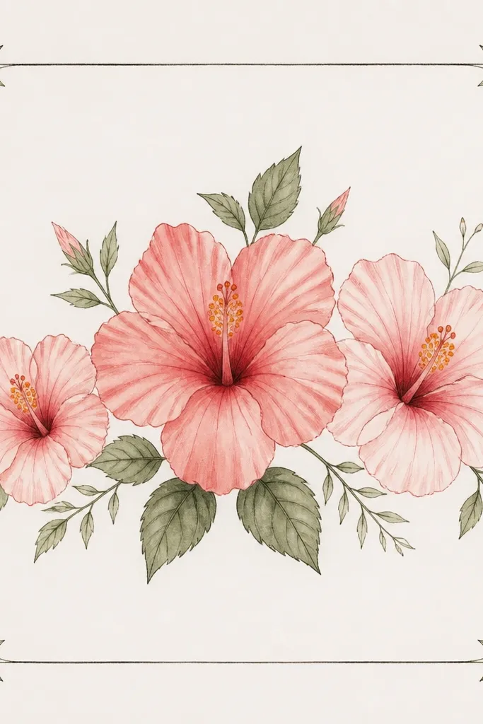
This drawing style makes your page look “done” even if each flower is simple. Repeating the same center shape across multiple hibiscus flowers is what keeps the set cohesive. I add tiny leaves between blooms to fill space so the flowers don’t look lonely. This works well for wall art or a print because the frame gives the eye a path.
Draw a rectangular frame lightly, leaving a 1 cm margin. Place three hibiscus centers along the bottom third, spaced evenly, with the middle one slightly larger. For each flower, use the classic six-petal teardrop approach but vary the petal overlap — one flower faces forward, one tilts slightly, one is partially hidden behind a petal. Add small leaf doodles between flowers, then ink the flowers and leaves and color only the petals in two tones to keep it consistent.
Good to knowMake the background elements smaller than the flowers. If the leaves are as big, the hibiscus loses its focus.
Common mistakeAvoid coloring every flower with different palettes. Consistency makes the bouquet look intentional.
9. Hibiscus Mandala Style with Petal Rings
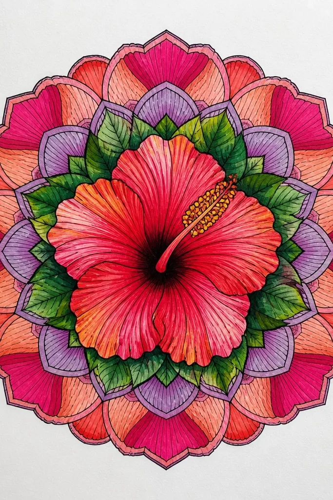
Mandala hibiscus looks complex, but it’s still made from repeatable curves. I use one hibiscus flower at the center, then repeat smaller petal shapes outward like a clock face. The key is keeping the rings evenly spaced so the center stays the star. This style is great if you like symmetry and want a finished piece that looks like you spent hours even when you did it in one afternoon.
Start with a hibiscus center oval and six main petals. Add a second ring of smaller teardrop petals — about half the size — placed between the main petals so they fill the gaps. Then add a third ring of tiny dots or short leaf shapes around the outside. Ink the main flower first, then the rings, and finally color the main petals in pink and the rings in lighter coral so the center pops.
Good to knowUse a compass or a small circular stencil for ring spacing. Even a cheap plastic circle helps a lot.
Common mistakeDon’t make the outer rings too dark. If everything is the same intensity, it turns into a flat blob.
10. Black-and-White Hibiscus Stencil Look
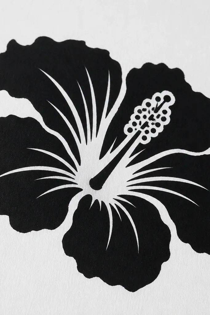
Stenciled hibiscus is bold and graphic, and it hides beginner line wobble. Instead of shading, you use solid shapes and negative space to suggest petal depth. I like this approach for cards and tote bags because it looks good even when printed small. It also forces you to get the petal silhouette right, which improves your drawing quickly.
Sketch the hibiscus in pencil, then trace the outline with fineliner. Fill each petal with black shape blocks, leaving a white highlight strip near the inner crease. Draw the center as a white oval, then add black dot tips on the stamens and small black marks inside the center for texture. Keep edges crisp — use a fine brush or marker tip, then wipe any pencil marks after the ink dries.
Good to knowUse a single highlight strip per petal. Too many highlights make it look messy in small sizes.
Common mistakeAvoid shaky fill edges. If the black shapes look uneven, switch to a marker with a firm tip.
11. Hibiscus Flower Outline Only for Coloring
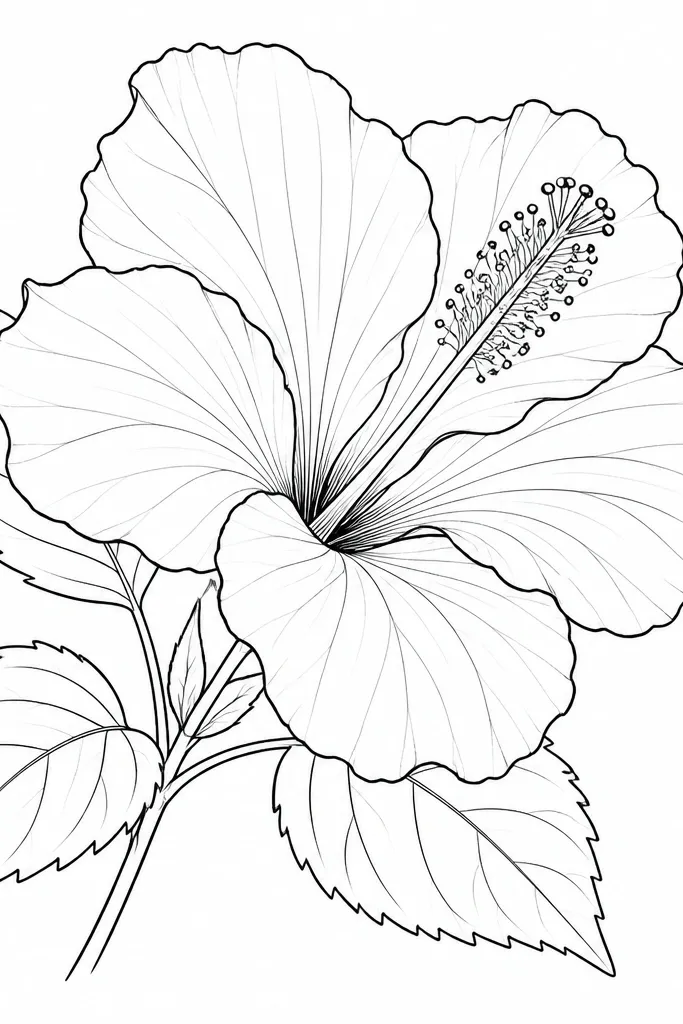
Outline-only hibiscus is my go-to when I want to practice drawing without the pressure of perfect color. It’s also perfect if you plan to color later with markers, crayons, or watercolors. The trick is to keep the lines purposeful: darker outlines, lighter vein lines, and a center that’s detailed enough to make the flower identifiable. This looks great on thick sketch paper because the lines stay crisp.
Draw the center oval first, then the stigma bump and three stamens with dot tips. Add six petals as teardrops, each with a slight inward curve near the base. Add one vein line per petal starting near the center and curving toward the outer half. Trace the outer petal edges with a 0.5mm fineliner and keep the vein lines lighter with a 0.3mm line or pencil.
Check the silhouette from across the room. If it reads as a hibiscus from a few steps away, you’re set.
Avoid drawing too many tiny details in the center. Over-detail makes it harder to color cleanly.
12. Hibiscus in Profile with Curved Stem
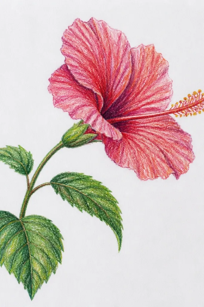
Profile hibiscus plus a curved stem looks natural because flowers rarely grow perfectly upright. The curve gives movement, and the overlap makes the petals feel like they’re attached to a real plant. I keep the flower smaller than the stem’s arc so the whole drawing has a flow. This style is great if you want something that looks like it could be on a planner page or a plant journal.
Draw a gentle S-curve stem line, then add one leaf on the far side of the curve to balance the flower. Place the hibiscus at the top, angled slightly left, and draw five petals with overlap — three visible, two hidden. Keep the center compact and draw only two stamens so the profile reads clearly. Ink everything, then lightly color petals with a pink wash and leaves with a muted green pencil.
Make the leaf closest to the stem slightly smaller. It makes the plant look like it has real proportions.
Avoid stiff straight stems. If the stem is rigid, the whole drawing feels pasted on.
13. Hibiscus with Patterned Petals (Polka and Stripe)
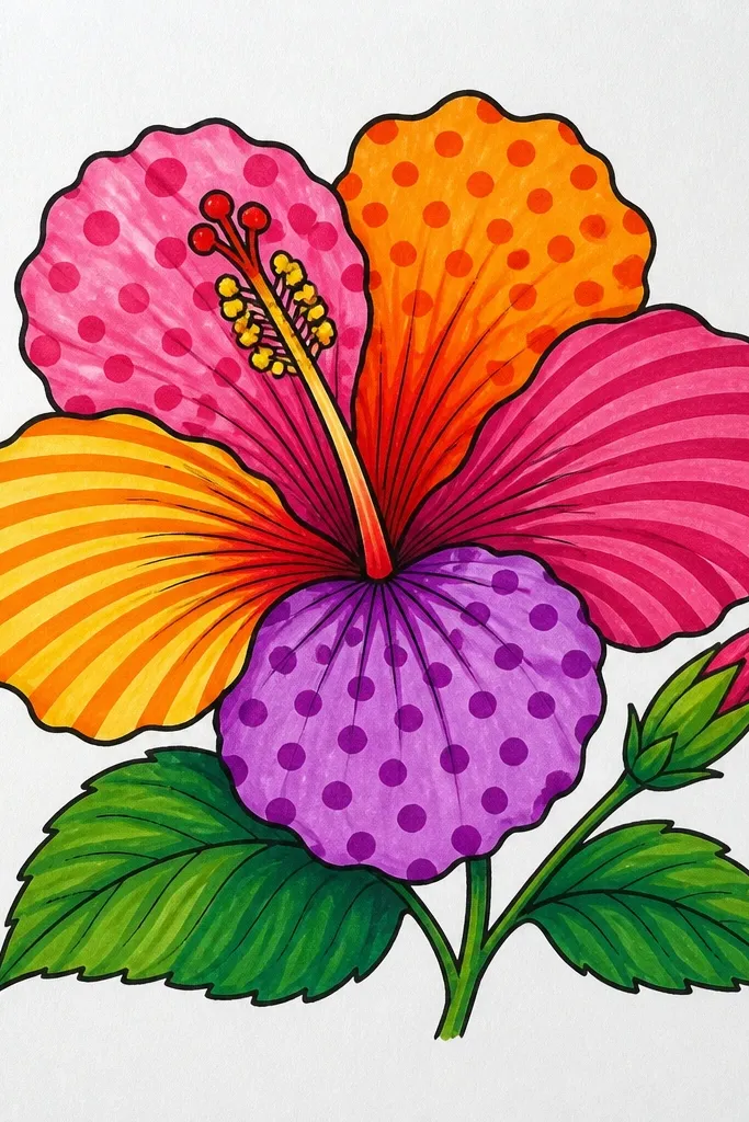
Patterned petals let you create interest without perfect shading. A hibiscus already has texture cues — the veins and inner edge — so adding simple patterns makes it look designed, not unfinished. I keep patterns small and oriented along the petal curve, which makes them feel like they belong to the flower. This style is perfect for scrapbook pages and mixed media because you can match the patterns to your paper.
Sketch the hibiscus normally with six petals and a detailed center. Divide each petal into two zones with a light pencil guideline: inner zone near the center and outer zone near the rim. Add polka dots only in the inner zone on one petal, diagonal stripes in the outer zone on another, and a few repeating curved lines on a third petal. Leave one petal mostly plain so the patterns don’t fight each other, then ink the patterns with a fine pen and color the center yellow-orange.
Good to knowUse a ruler for dot spacing only if you’re frustrated. Otherwise, keep dots uneven — evenness can look artificial.
Common mistakeAvoid putting patterns on all six petals with the same density. The flower looks busy instead of decorative.
14. Hibiscus in a Circle Frame with Dots Around
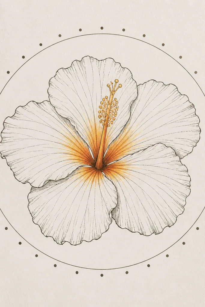
A circle frame turns a hibiscus into a badge. The circle forces your petals to stay in a consistent shape and gives the drawing a finished look without a full background scene. I use dot spacing around the circle because it adds rhythm and makes the flower feel intentional. This is the easiest “aesthetic” layout for beginners who want something clean and symmetrical.
Draw a light circle on your page, then sketch the hibiscus center in the middle of the circle. Place six petals so their outer edges stay within the circle boundary, leaving a small gap at the rim. Add a simple set of dots around the circle — about 24 dots — spaced evenly so they don’t crowd the petals. Ink the hibiscus and the circle after you like the layout, then color the petals in two tones and the center in yellow with orange streaks.
Good to knowKeep the gap between petals and circle consistent. If the gap changes, the circle looks like a frame placed after the fact.
Common mistakeAvoid drawing the petals too close to the circle line. It makes the whole piece feel cramped.
15. Hibiscus on Textured Paper with Soft Pencil Shading
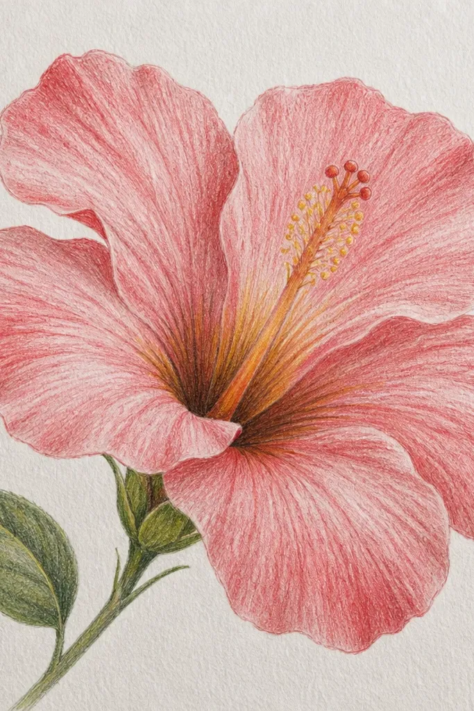
Textured paper makes pencil hibiscus look more expensive because the grain catches light. I use this when I don’t want bright color and I want that soft, natural flower look. The key is to keep shading gentle and let the paper texture do the work. This style looks great for neutral palettes — warm pink, dusty rose, and a brownish-red center — which also makes it feel calm for home decor.
Choose a paper with visible tooth, like sketch paper that isn’t super smooth. Lightly sketch the center oval and stamens, then draw six petals with teardrop curves. Use a light pink or dusty rose pencil for the petal body, then deepen only the outer rim with a slightly darker pencil. Blend by lightly layering with a clean paper stump or just gentle pencil strokes, then add a warm brown-red shade in the center streaks and leave tiny highlight specks uncolored.
Work in layers, not pressure. On textured paper, heavy pressure fills the tooth and kills the soft look.
Avoid erasing too much on textured paper. It leaves shiny patches that stand out.