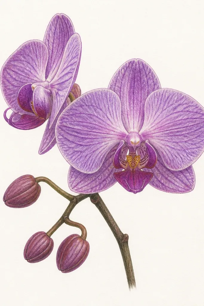
1. Single-bloom center with a 1-inch margin glow
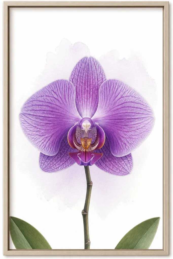
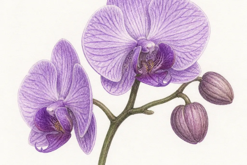
This layout works because it gives your orchid a breathing space, even in a small frame. I keep a literal 1-inch white margin on all sides so the paper doesn’t look crowded, then I place the bloom so it covers roughly two-thirds of the width. Use deep plum for the outer petal shadows and lavender for the highlight areas where the petals curve toward the light. The center lip gets the darkest value so your eye lands there first, then travels outward. It flatters small rooms because it reads clean and calm instead of busy.
Good to knowIf your purple looks flat, add one extra dark pass only on the center lip and the underside fold of the petals.
Start by drawing a light oval for the bloom head and mark the center line. Sketch the three main outer petals with thicker edges on the outside, then draw the inner lip shape in thinner lines so it looks like it’s resting in the center. Shade the outer petals with plum near the petal base and fade into violet toward the middle, then add a soft lavender wash on the top curve. Leave the 1-inch border untouched, then add only two tiny leaf tips near the bottom corners to anchor the composition. Finish by darkening the center lip outline and lightly tapping lavender at the petal highlights.
Common mistakeDon’t fill the whole page with purple — heavy background washes make small frames look muddy.
2. Vertical stem fan with two leaves hugging the sides
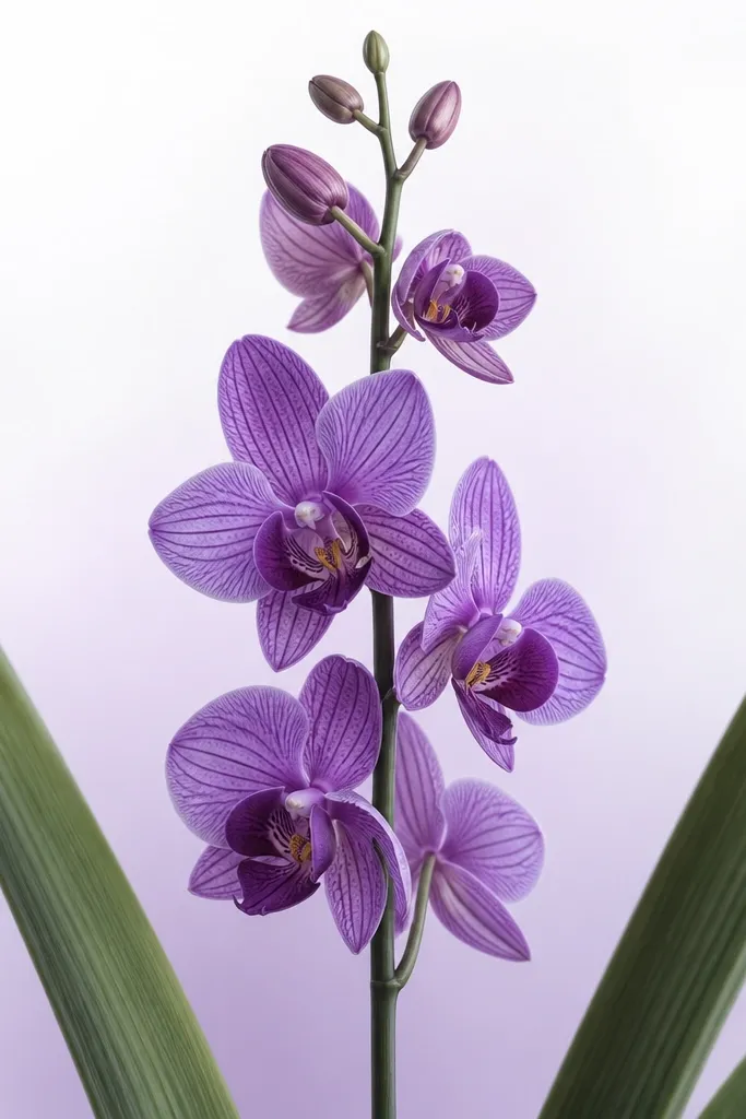
A tall stem composition is my go-to for Purple Orchid Drawing small space because it creates height without needing more width. The two leaves act like natural borders, so the orchid doesn’t feel like it’s floating in the center of a tiny rectangle. I draw the leaves slightly asymmetrical — one leaf overlaps more than the other — which keeps it from looking like a clip-art frame. The bloom sits a little above center so the eye travels upward through the stem. This style looks great in narrow hall frames and beside a small mirror because it visually stretches the space.
Good to knowFor leaf depth, shade one side of each leaf darker — the side that faces away from your light source.
Start with a vertical guideline and lightly map the bloom at the top third, not the middle. Draw the stem as a single line with a slight curve, then add the flower’s outer petals with a gentle upward tilt. Sketch two leaves that curve inward toward the stem, placing their outer edges close to the frame but leaving a small gap so they don’t hit the border. Shade the leaf veins with diluted violet and deepen the underside with plum so the leaves look tucked behind the bloom. Add a light lavender wash behind the flower head only, then darken the petal fold lines near the center.
Common mistakeDon’t make both leaves the same length and angle — symmetry in small art makes it look stiff.
3. Side-angle orchid with a thin branch and drifting petals
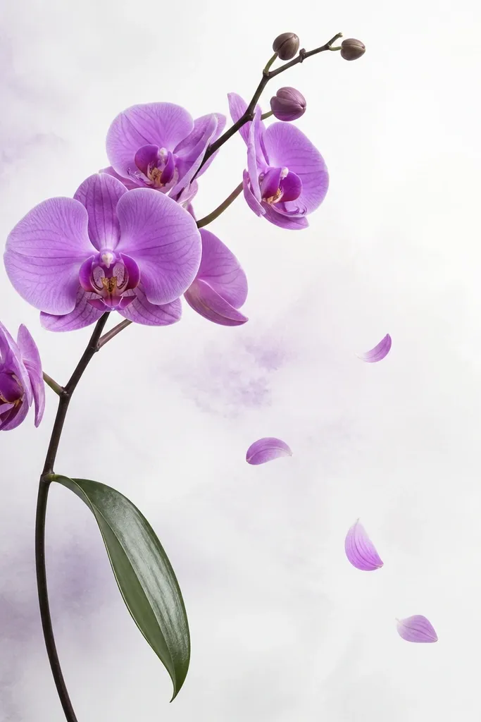
When your space is narrow, a side-angle orchid gives movement and keeps the drawing from feeling like it’s staring straight at you. I like this for shelves because the lean creates a diagonal line that “reads” even at a distance. Keep the branch thin and light so it doesn’t compete with the bloom; the bloom should still be the darkest and most detailed area. The floating petal bits are tiny and low-contrast — they add atmosphere without turning into clutter. This design flatters small spaces with clean, modern interiors because it feels airy.
Good to knowUse a smaller brush for the floating petals — if they get too saturated, they start looking like confetti.
Begin by drawing a curved guideline for the branch and place the bloom so it sits near the top right of your paper. Sketch the outer petals with slightly uneven spacing to show the orchid is angled, then draw the center lip with darker plum and a crisp outline. Add one leaf that trails downward from the branch, then keep it mostly lavender with plum only on the underside. For the drifting petals, draw 3-5 small petal outlines in very light violet and leave them mostly unshaded. Finish with a pale wash behind the bloom, keeping the rest of the page white.
Common mistakeDon’t add more than five floating shapes — small-space art turns messy fast.
4. Orchid in a rounded-rectangle window mat style
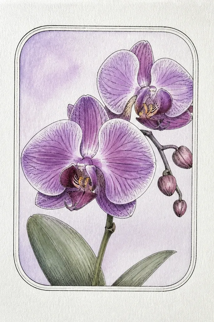
This is a sneaky trick for small spaces: you fake a “gallery window” even if your frame is simple. The rounded-rectangle border gives structure, so the orchid looks intentional rather than like a sketch taped to a wall. I draw the border about 1/2 inch inside the paper edge, then keep the orchid head slightly offset so it doesn’t look like it’s trapped in the center. The border line should be lighter than the orchid outlines — think thin ink, not a thick frame. This works well for renters who can’t hang big art but can swap small frames often.
Good to knowIf your border looks heavy, lighten it with a kneaded eraser before you add color.
Start by drawing the rounded rectangle in light pencil, leaving a 1/2 inch margin from the paper edges. Ink the orchid lines next, then erase any border-pencil smudges later. Shade outer petals with plum shadows and violet mid tones, then add lavender highlights on the top curves. Keep the background wash inside the window only, and stop it before it hits the border line so the edges stay crisp. Add a tiny stem that reaches toward the bottom inside the window, then darken the center lip and the inner petal fold lines.
Common mistakeDon’t darken the border to match the orchid — the border should guide, not compete.
5. Orchid pair: two small blooms on one stem
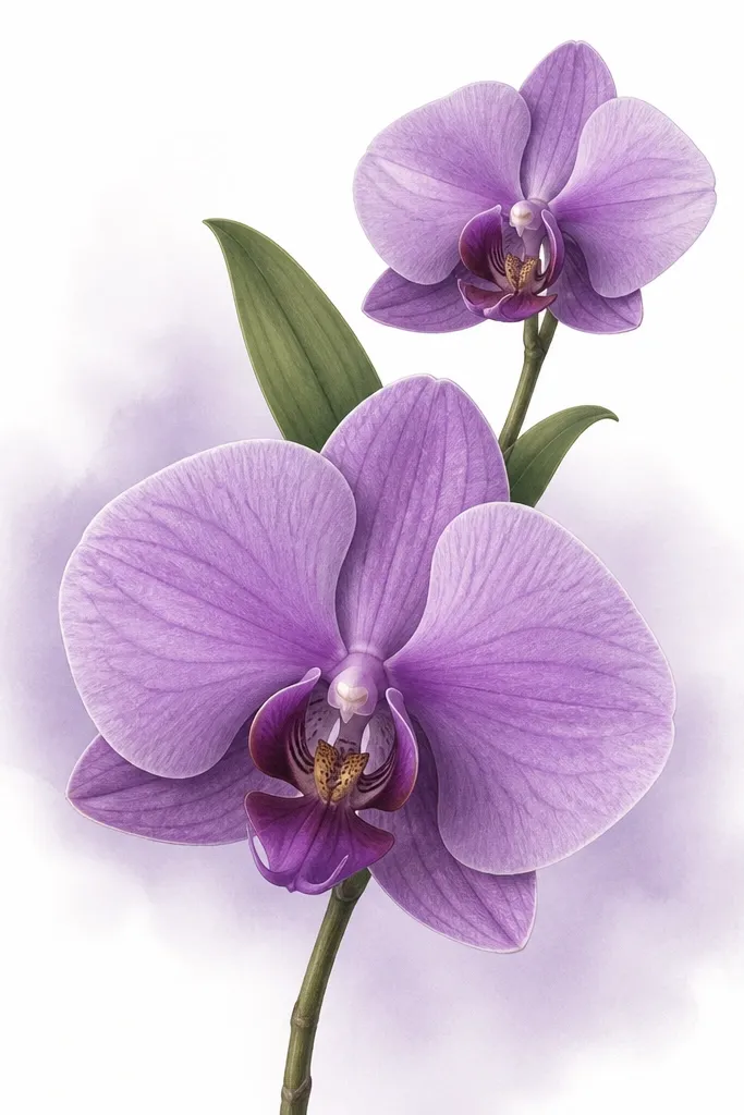
Two blooms let you use small paper width without making each flower too tiny. I place the smaller bloom at about 40% of the width of the main bloom so both read clearly. The trick is value separation: the larger bloom gets the darkest plum shadows and the smaller one stays lighter so it doesn’t steal attention. Leaves should overlap between the blooms to connect the composition and prevent a “two separate drawings” look. This style is great for small entryways because it adds interest without requiring a larger frame.
Draw a single stem line that curves slightly, then mark two bloom positions along it: one at the upper third and one near the middle. Sketch both bloom heads with the same petal shapes, but keep the smaller bloom’s center lip less detailed. Shade the larger bloom first: plum under the outer petals, violet in the mid areas, lavender on highlights. Shade the smaller bloom with the same colors but reduce plum intensity by half. Add two leaves that overlap the stem between the blooms, using diluted violet for veins and plum only along the underside.
Use a slightly different purple ratio on the small bloom — more lavender, less plum — so it feels like it’s in the background.
Don’t make both blooms the same size — in small space, that flattens into a cluttered cluster.
6. Orchid with watercolor bleed edges (controlled)
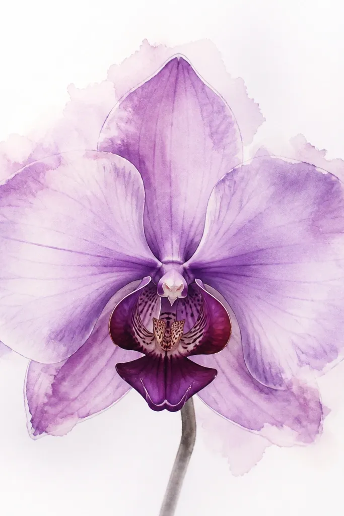
This look is for when you want softness without losing structure. The key is sharp center detail: the lip and the inner folds stay clean, while the outer petal edges get a gentle bleed. I use this when I draw on mixed-media paper because it holds the wash edges without turning grainy. The bleed effect makes the petals look delicate and airy, which works in small spaces where hard lines can feel harsh. If your room is modern and minimal, this softer orchid still reads as “art,” not a sketch.
Start by sketching the orchid with pencil, then ink only the center lip and the inner petal folds. Wet the outer petal areas lightly with clean water using a flat brush, then drop diluted violet and plum into the wet areas. Tilt the paper slightly so the color pulls outward at the edges, then stop before it reaches the inked center detail. Add a thin lavender wash behind the bloom, keeping it lighter than the petals. Once dry, reinforce the darkest plum lines only on the underside fold and the base of the outer petals.
Practice the bleed on scrap paper — the right amount looks like a soft blur, not a puddle.
Don’t flood the whole petal — if everything bleeds, the flower loses its shape.
7. Monoline ink orchid with one purple wash stripe
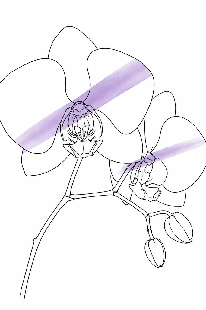
This is the smallest-space style that still looks intentional. Monoline ink keeps it crisp, and the single purple wash stripe gives you color without crowding the page. I place the stripe diagonally so it catches the eye and suggests depth through a single highlight path. The orchid reads well at a distance because the linework carries the structure. This one flatters small frames because it doesn’t need a big background to feel finished.
Draw the orchid with a single-width pen line for the outer petals and a slightly lighter line for inner details. Skip full shading and instead choose one diagonal path across the petals — from upper left petal to lower right lip. Wet that stripe lightly with clean water, then apply diluted violet, letting it fade at the edges. Keep the rest of the petals uncolored except for a tiny dab of plum at the center base. After it dries, add one more thin purple pass on the stripe for a richer edge, then leave everything else white.
If your wash bleeds outside the stripe, use masking fluid on a test scrap first — it’s cleaner than trying to “fix” edges later.
Don’t add extra purple spots after the stripe — the whole look depends on restraint.
8. Orchid with leaf-vein pattern background dots
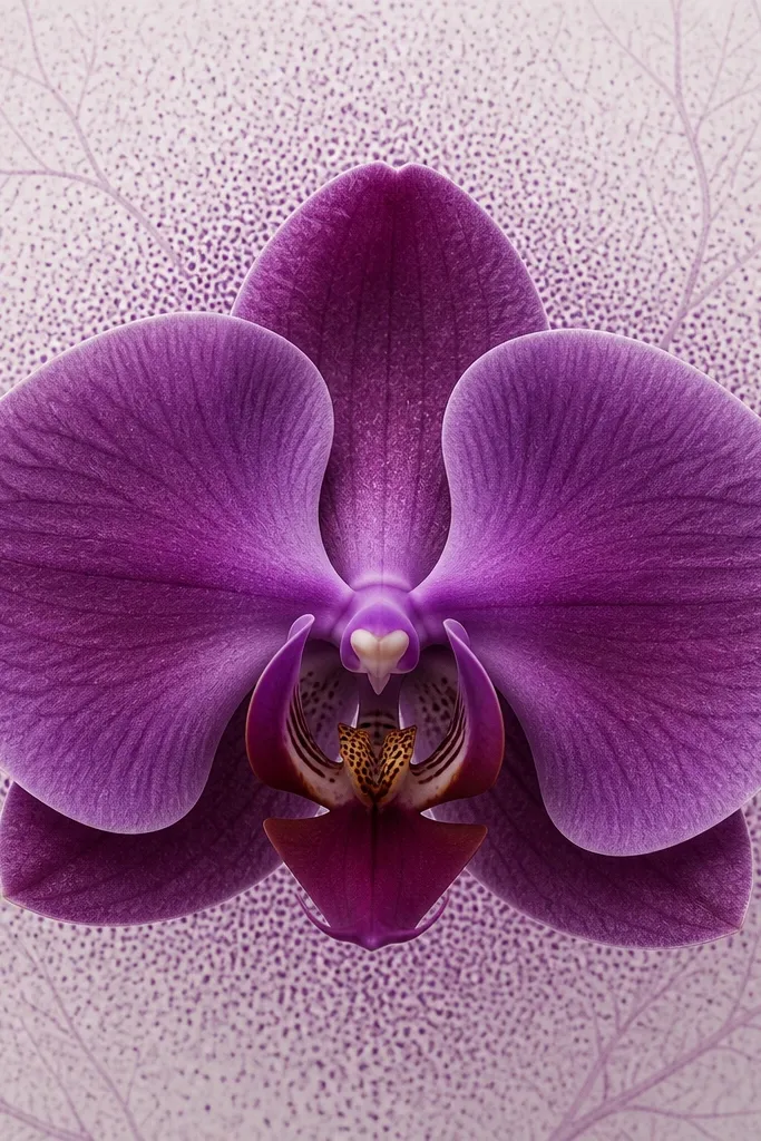
Background texture makes small art feel like it has depth, but only if it stays light. I use tiny dot clusters and faint vein lines that echo leaf structure, then keep the orchid itself darker and sharper. This approach creates a subtle “bokeh” effect behind the bloom, so your orchid stands out without a heavy wash. It’s great for small spaces because it adds interest in the negative space where tiny frames often look empty. The pattern also makes the drawing feel more botanical and less generic.
Sketch the orchid first and shade the petals with plum shadows and lavender highlights, leaving the center lip slightly darker than the rest. Then, using a fine liner, add a loose pattern of tiny dots behind the outer petals only, densest near the center. Add a few faint vein-like lines that follow the direction of the leaves, but keep them very light so they don’t compete with the flower. Keep the background dots at about 2-3 mm apart, then fade them out near the border of your paper. Finish by deepening the orchid’s darkest plum areas and adding a final lavender highlight on the top petal curve.
Use a magnifying lamp if your dots look shaky — clean spacing makes it look intentional.
Don’t make the background pattern darker than the orchid outlines.
9. Orchid on kraft paper with chalky lavender highlights
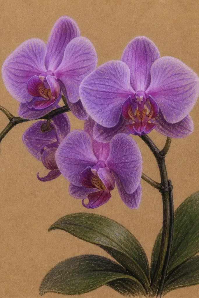
Kraft paper changes everything for a Purple Orchid Drawing small space because warm brown makes purple look richer instantly. I like this when I’m making small gifts because it feels handmade and cozy, not sterile. The trick is to use opaque or semi-opaque lavender for highlights so the light catches the petal curves against the brown. Plum shadows should stay translucent enough to show kraft texture, or it will look painted-over. This style flatters warm-toned rooms and looks great in small frames with simple wood borders.
Good to knowIf your highlights look too weak, go over them with a second lighter layer after the first dries.
Lightly sketch the orchid with pencil so the lines don’t bite into the paper. Shade the petal bases and underside folds with diluted plum, letting the kraft texture show through. Mix or choose a lighter lavender that covers well enough to show up on brown, then add it to the top curves and edges of petals. Draw the center lip with darker violet and a crisp outline so it anchors the flower. Add leaves in violet with plum veins under the surface, then leave the background entirely as kraft paper.
Common mistakeDon’t use watery purple for highlights on kraft — it turns gray and dull.
10. Orchid corner composition for a tight wall shelf
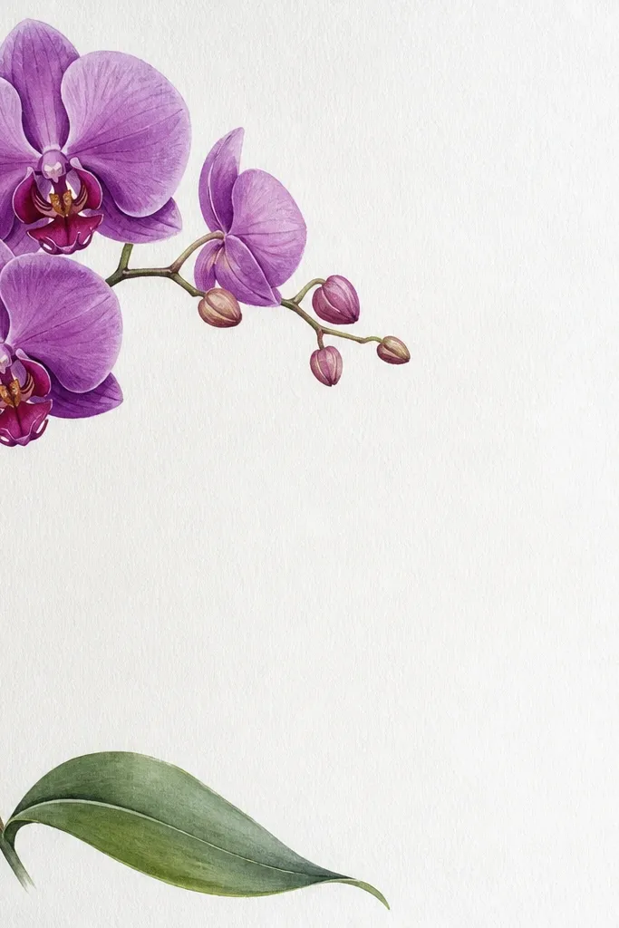
Corner compositions are perfect when your small space has something else nearby — a lamp, a shelf bracket, or a wall outlet. By placing the bloom in the top-left corner, the drawing “reads” without needing centered framing. I keep the stem light and thin so it doesn’t overpower the empty area. The petals should still get the darkest plum at the center lip, or the orchid will vanish into the white. This layout looks clean above a narrow console or inside a small cubby.
Good to knowIf you’re framing this, choose a mat with a wider top-left opening so the corner composition doesn’t feel cropped.
Start by sketching a bloom head in the top-left quadrant, leaving at least 3/4 inch from the top and left edges. Draw the stem down and to the right with a slight curve, then angle the outer petals so they face the open space. Shade outer petals with violet mid tones and plum near the base, then add lavender highlights along the top edges. Place one leaf that reaches toward the bottom edge but stops short of the border. Keep the bottom-right quadrant mostly blank, then finish by darkening the center lip and adding a few fine vein lines in the leaves.
Common mistakeDon’t cram extra leaves into the blank area — corners need emptiness to feel intentional.
11. Orchid with semi-transparent shadow behind petals
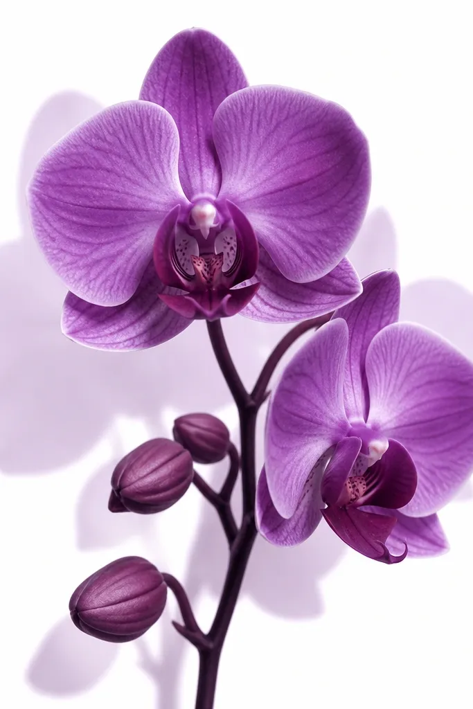
Shadows make small drawings look like they have space, even when the frame is tiny. I draw a soft silhouette behind the petals, offset about 1/4 to 1/3 inch down-right, so it feels like the orchid is slightly raised. The shadow should be lighter than the orchid — think watered violet, not full plum. This style works especially well for small-space shelves because it gives dimension that simple line drawings lack. It also looks great in bright rooms since the contrast stays crisp.
Good to knowUse a ruler or scrap paper to measure the offset so your shadow looks consistent, not accidental.
Sketch and shade the orchid first with plum shadows and lavender highlights. Then, trace the outer petal shapes lightly in watercolor or pencil behind it, offset down-right by about 1/4 inch. Paint that shadow shape with diluted violet, leaving edges soft and uneven. Keep the center lip shadow minimal — just a faint hint under the lip so it doesn’t steal focus. Finally, reinforce the orchid’s darkest plum folds and add thin lavender highlights at the top curves.
Common mistakeDon’t make the shadow too dark — it turns the piece into a smear.
12. Orchid framed by a thin vine swirl (one line)
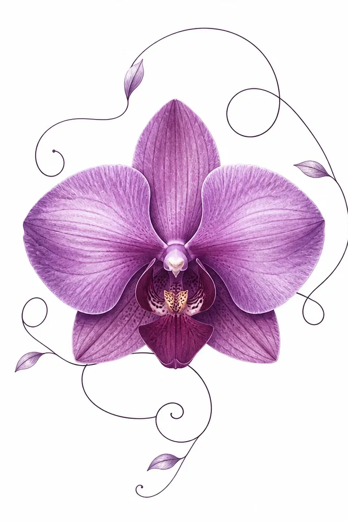
A single vine swirl gives you a decorative frame without eating space. I like one continuous line because it looks intentional and doesn’t feel like a thick border that can overwhelm a small frame. Keep the vine line thinner than the orchid outlines, and use a light violet tint only at the curve peaks. This style flatters small spaces with plain walls because the vine adds movement while the orchid stays the focal point. It also looks good for wedding stationery vibes without being overly ornate.
Sketch the orchid centered first, with the bloom head taking up about two-thirds of the width. Draw the outer petals with thicker ink edges and inner petals with thinner lines. Then, start at the top-left of your paper and draw a thin vine line that loops around the orchid in a loose oval, passing behind the stem area. Tint the vine peaks with diluted violet so it looks like it’s catching light. Shade the petals with plum shadows and lavender highlights, then darken the center lip and add a few crisp vein lines in the leaves.
If your vine line crosses the petals, stop the vine slightly before the petal edge so it looks layered, not tangled.
Don’t thicken the vine — thick borders make small drawings feel heavy.
13. Mini orchid strip for a slim 3x12 canvas
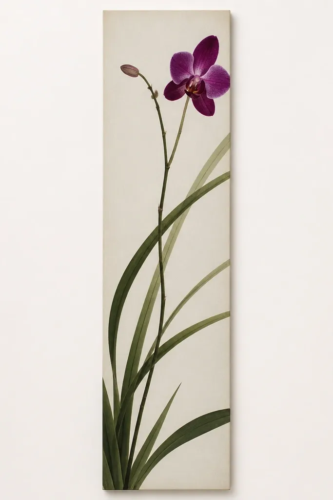
A strip format is one of the best ways to handle a tiny wall — you get art where a larger piece wouldn’t fit. The orchid should be scaled so the bloom head is about 1/3 the strip length, with the stem and leaves doing the rest. I keep the background nearly blank and use strong contrast on the petals so it reads from across the room. This style is great for narrow hallways, the side of a bookshelf, and above a baseboard where only a thin space exists. It looks clean because it’s controlled and doesn’t try to fill every inch.
Good to knowUse a smaller brush tip than you think you need — strip art punishes thick lines.
Choose a 3x12 or similar narrow surface and mark a center line lengthwise. Place the bloom head at one-third from the left end, then draw the stem line running toward the right. Add one leaf blade that crosses the strip width and one smaller leaf that tucks under, both in violet with plum underside shading. Shade petals with plum shadows and lavender highlights, but keep the washes tight so they don’t bleed into the blank strip area. Finish by drawing the center lip darkest plum and adding a couple of fine vein lines to the leaves.
Common mistakeDon’t add a full background gradient — it makes the strip look dirty.
14. Orchid with pale lavender mist background wash
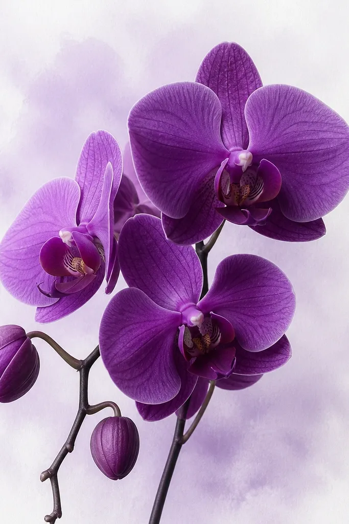
A mist background gives you polish in small space because it replaces blank white with something soft, without turning the piece into a colored block. I keep the wash extremely light and concentrate it behind the bloom head, fading as it reaches the border. The orchid itself stays darker and more defined so it doesn’t sink into the background. This looks great in small frames with no heavy mat because the mist creates an extra layer of depth. It also flatters rooms with neutral decor since lavender sits quietly beside beige and gray.
Good to knowIf your mist dries streaky, add one more ultra-diluted pass with a clean damp brush to smooth it.
Sketch and ink the orchid first, then shade petals with plum and violet. Mix a very diluted lavender and apply it with a damp brush behind the bloom head only, using circular motions so it looks like mist. Let it fade outward naturally, then stop before it reaches the edges so you keep a clean border. Add a slightly deeper violet wash only near the petal bases, then reinforce the center lip with darker plum and crisp lines. Once dry, add lavender highlights at the top petal curves for a final “glow.”
Common mistakeDon’t overwork the background — repeated passes make it look patchy.
15. Orchid with patterned paper cutout texture edges
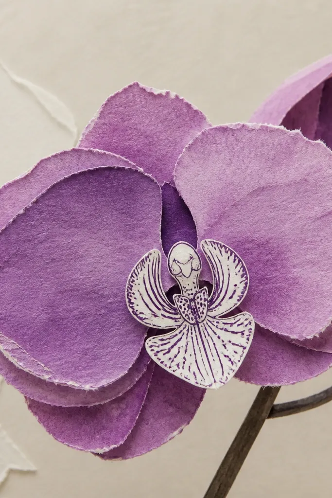
This is my favorite way to make a small orchid drawing look expensive without buying expensive materials. You sketch and shade the orchid on one paper, then add a thin layer of textured purple paper or handmade paper along the outer petal edges. The texture catches light and makes the petals look dimensional. Keep the collage edges only on the outer petals — the center stays clean and inked so the orchid still reads clearly in a small frame. This works for small-space decor because texture adds depth without needing a larger layout.
Good to knowUse a glue stick for thin scraps — it dries flatter than liquid glue and keeps edges crisp.
Sketch the orchid on watercolor paper and shade the petals with diluted violet and plum. Cut small strips or petal-shaped scraps from textured paper in a similar purple tone, then trim them so they only cover the outer petal edges. Glue the scraps lightly, starting with the largest outer petal edges, then overlap toward the center. Leave the center lip mostly drawn and inked, with crisp plum shadows and lavender highlights. Finish by adding a few fine leaf veins with ink and touching up any gaps where the paper layers meet.
Common mistakeDon’t add textured layers to the center lip — it makes the focal point look messy.