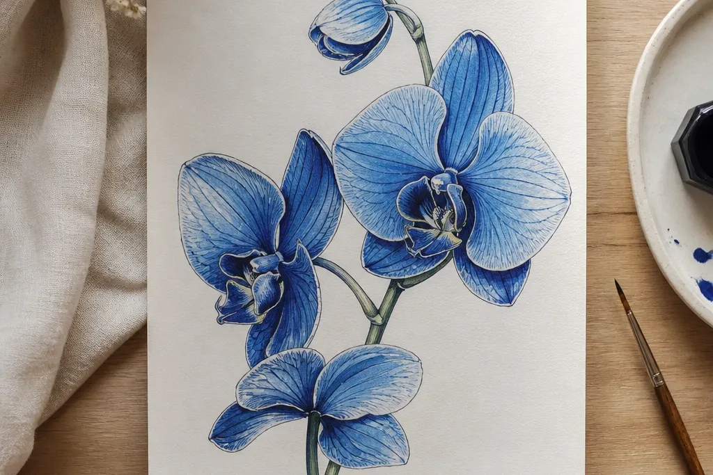

1. Powder Blue Wash Orchid on 200gsm Paper
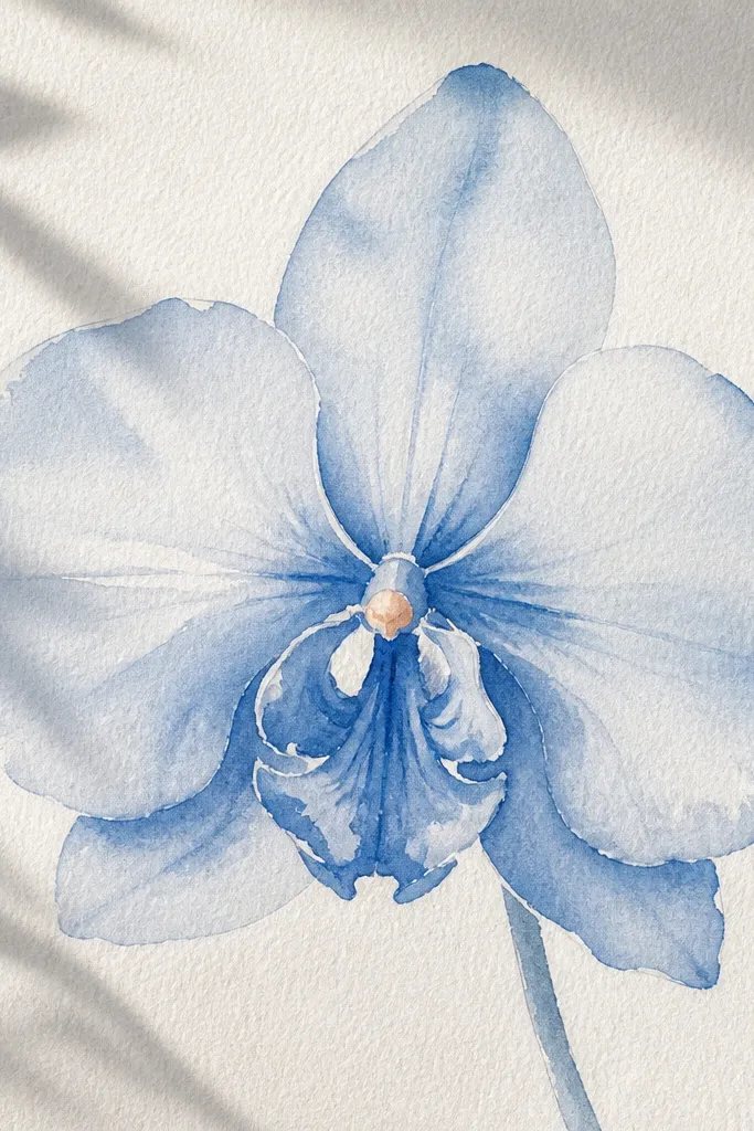
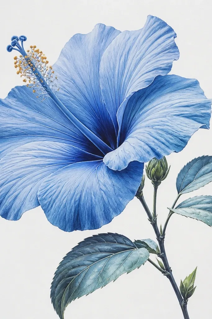
This one is my go-to when I want a clean, airy orchid that still looks dimensional. The base is a powder blue wash (think pale sky blue) laid over the whole petal shape, then I deepen the folds with a separate darker blue. I add the warm accent — a tiny peachy-pink — at the orchid throat so it doesn’t look icy. It flatters light backgrounds and works especially well if your paper has a slight tooth, because the wash breaks slightly and looks like real petal texture.
Good to knowIf the wash looks streaky, tilt the paper and let gravity smooth it for 20 seconds before you stop brushing.
Start by sketching the orchid outline lightly with a 2B pencil and mark the center fold with two curved guidelines. Wet your brush, load it with powder blue, and paint one petal at a time with a thin, even wash; leave the far outer edges a little lighter. When the wash is dry, mix a deeper blue (ultramarine + a touch of gray or just a darker tube) and paint only the crease lines and the overlapping areas. Finally, dab a micro amount of peachy-pink at the throat and add one thin highlight line using a white gel pen.
Common mistakeAvoid painting all petals with the same blue intensity — that’s what kills the orchid’s depth.
2. Cerulean Pencil Orchid with Ink Crease Lines
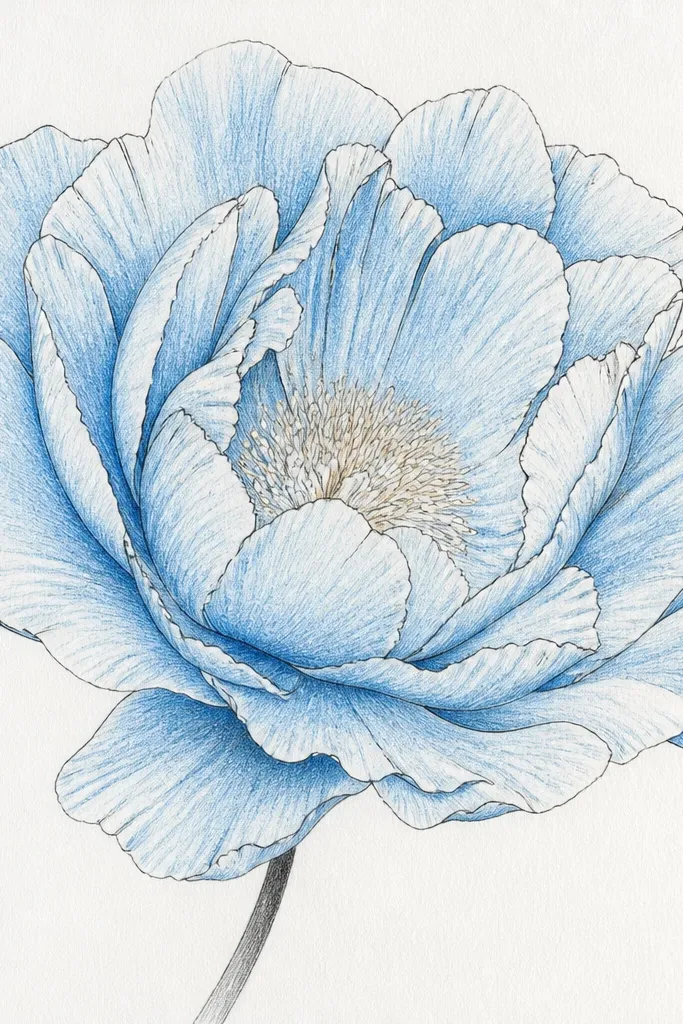
This style is crisp and graphic, like a botanical label you’d see in a tiny gallery frame. I shade the petals with cerulean pencil first so the color sits under the line work, then I add fine ink only where the petal folds overlap. The warm beige at the throat keeps the orchid from looking like a blueprint. This one flatters people who like clean edges and it looks great for small prints because the contrast holds up.
Good to knowUse one ink weight consistently; switching pen thickness mid-drawing makes the orchid look accidental.
Start by blocking the orchid shape with light pencil and then shade the outer petals with cerulean pencil using gentle back-and-forth strokes. Press a little more in the crease areas, but don’t fully darken the whole center yet. With a fine liner (0.3 or 0.5), trace the inner folds and the shadow line where one petal sits over another. Add a very small warm beige dot or short dash at the throat, then soften one edge with a clean blending stump or kneaded eraser to keep it from looking too hard.
Common mistakeDon’t ink the entire petal outline thick — thick all-over lines make it look like a coloring page.
3. Blue Gel Pen Orchid on Kraft Paper
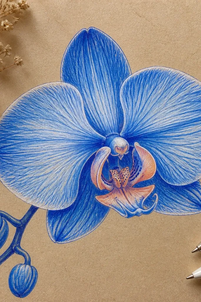
Kraft paper makes blue orchids feel cozy and a little vintage without trying hard. The trick is that kraft is already warm, so you only need a hint of peach at the throat — otherwise it gets too orange. I build the petals with layered blue gel pen strokes, then add white highlights to mimic the smooth, glossy part of petals. This looks best when you want a warm, handmade vibe and you’re okay with slower, stroke-by-stroke coloring.
Good to knowIf your gel pen skips, rub the tip on scrap kraft first to “wake up” the ink flow.
Start with a light pencil sketch, then erase most of the lines so the kraft texture shows through. Use a medium blue gel pen to fill the outer petals with short strokes that follow the petal curve. Layer a darker blue only along the crease and overlap areas, keeping the outer edge lighter. Add white gel pen highlights on the inner fold and one tiny dot of peachy color at the throat.
Common mistakeAvoid heavy scribbling across the whole petal — it flattens the texture and the kraft warmth disappears.
4. Masking Tape Negative Space Orchid
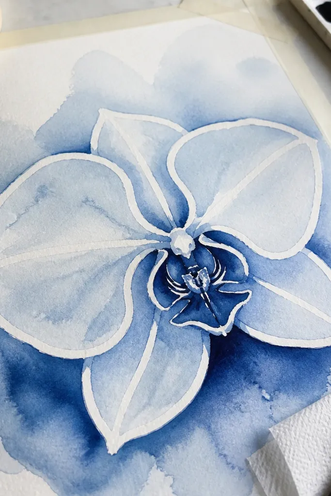
Negative space makes orchids look sharp even when you’re using budget paint. I use masking tape to reserve highlight shapes along the inner folds and outer edges, then paint around them with blue washes. When the tape comes off, you get crisp white streaks that look like real light on petals. This one is great for people who struggle with painting highlights afterward.
Good to knowPeel the tape while everything is fully dry; peeling too early smears the edges.
Sketch the orchid outline and then lightly mark where you want highlight streaks — usually the inner fold and two outer petal edges. Lay small strips of masking tape along those lines, pressing firmly so paint can’t seep under. Paint light blue wash around the petals, let it dry, then do a second pass with a deeper blue on the creases. Peel the tape slowly at a low angle, then add a tiny peach throat dot and a few dark blue overlap lines with a small brush.
Common mistakeDon’t use wide tape sections — big blocks of white look like mistakes, not highlights.
5. Indigo Acrylic Dry-Brush Orchid
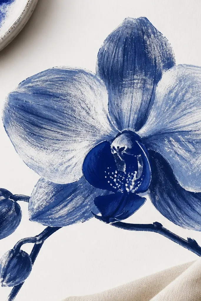
Dry-brush gives you texture fast, which is why I love it for budget supplies. Acrylic dries quickly, so you can layer blues without waiting forever. I keep the outer petals lighter and dry-brush the inner folds with a darker indigo, then I add a few white specks to simulate light catching petal ridges. This style looks great on mixed media paper and it’s forgiving if your brush control isn’t perfect.
Good to knowTest your brush pressure on scrap first; you want scratchy texture, not full coverage.
Lightly sketch the orchid and erase most of the graphite. Dip a flat or filbert brush in indigo, then wipe almost all paint off on a paper towel until the brush leaves faint streaks. Dry-brush the outer petals with light passes, leaving gaps for paper texture. Once dry, load the brush with darker indigo and dry-brush only the creases and overlap areas. Finish with a white gel pen or small white acrylic dotting at the inner fold and throat.
Common mistakeDon’t paint thick layers — thick acrylic makes the orchid look like it’s been stickered onto the page.
6. Blue Orchid from a Single Continuous Line Sketch
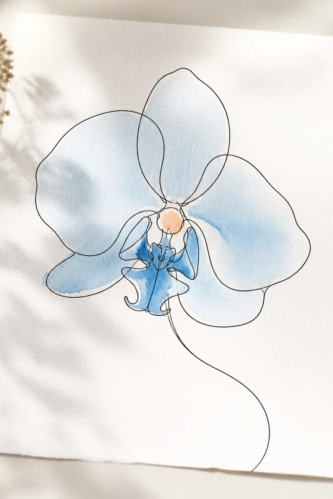
This is the “I have 20 minutes” version that still looks intentional. The continuous line forces you to simplify the petal shapes, then the blue fill brings the orchid to life. I use one light blue wash for most of the petals and only one darker blue for the center crease. The warm peach smear keeps it from looking sterile. It flatters modern frames and works well for people who like clean, airy art.
Good to knowIf your wash bleeds over the pen line, wait until the ink is fully dry before painting.
Start with a single continuous pencil line to map the orchid — no backtracking. Trace the line with a fine black pen if you want extra contrast, then use a small round brush to apply a light blue wash inside the petal shapes. Leave the outer edge slightly lighter by using less paint toward the rim. Add a deeper blue wash or pencil shading only in the center fold and the overlap line. Dab a tiny peach smear at the throat, then add one white highlight line with a gel pen.
Common mistakeAvoid making the continuous line too wobbly; it reads messy instead of artistic.
7. Cobalt Blue Watercolor Stipple Orchid
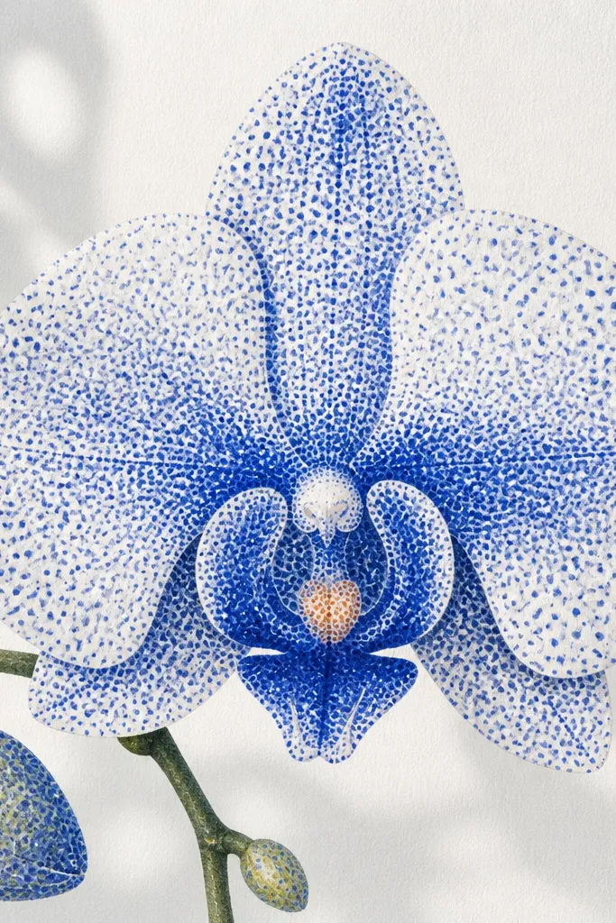
Stippling makes watercolor look controlled without needing fancy brushes. I use cobalt blue for midtone dots, then I increase density along creases to build shadow. The warmth at the throat is small but noticeable — a peach dot that breaks up the blue. This style flatters textured paper because the dots catch the grain and look like real petal speckling.
Sketch the orchid lightly and plan where the shadows sit: inner folds and overlap edges. Load a small brush with cobalt blue, then tap dots across the petals instead of brushing. Keep outer petals less dense, and concentrate stipples along the crease lines. Mix a deeper blue for the center shadow and add denser dots only where the petals overlap. Finish with a peach throat dot and a few white gel pen highlights on the inner fold.
Use a scrap sheet under your paper; stippling drips and you don’t want it to stain your workspace.
Don’t stipple evenly everywhere — even density makes it look like a blue sponge.
8. Blue Orchid with Dry Pastel Shadows
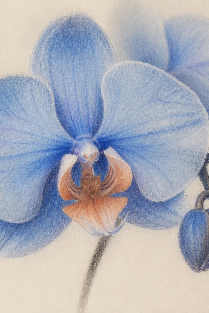
Dry pastels are budget-friendly and they blend beautifully, which is why they work so well for orchid shading. I lay a light blue base, then press a darker blue only into the crease and underside areas. Pastel dust gives a natural gradient that feels like petals instead of paint strokes. The peach throat adds warmth because pastels can otherwise look cool and flat.
Sketch the orchid with a light pencil, then rub a light blue pastel over the petals with your fingertip or a blending stump. Keep the outer edge lighter by using fewer passes. Press darker blue pastel into the inner fold and overlap areas with firmer pressure. Add a small peach pastel at the throat, then use a kneaded eraser to lift one highlight area if you need it brighter. Fix with a light pastel spray if you plan to frame it, but test on scrap first.
If pastel smears, wait until it’s settled for 30 seconds, then blend again with a clean finger edge.
Don’t press too hard on the first layer — you’ll lose the gradient and get muddy edges.
9. Prussian Blue Wash with Salt Texture Orchid
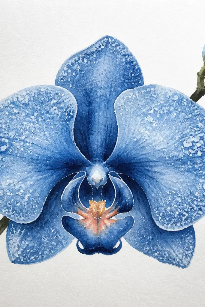
Salt texture makes the orchid feel alive without detailed drawing. I use prussian blue because it holds speckles well, then I concentrate the salt on outer petals where you want a natural, airy look. The inner folds get darker paint without salt so the center still reads clearly. This style looks stunning in close-up photos because the speckles catch light.
Good to knowUse coarse salt, not table salt; coarse crystals create bigger, nicer specks.
Sketch the orchid and paint the outer petals with a light prussian blue wash while the paint is still wet. Sprinkle coarse salt over only the outer petals, not the center fold, and tap off extra after 10-15 seconds. Let the paper dry fully so the salt crystals stay crisp. Brush away the salt gently, then paint deeper blue into the inner folds and overlap lines. Add a tiny peach throat dot and a white highlight line on the inner fold.
Common mistakeDon’t salt the whole orchid — heavy speckling in the center makes it look dirty.
10. Blue Orchid on White Acrylic Gesso Background
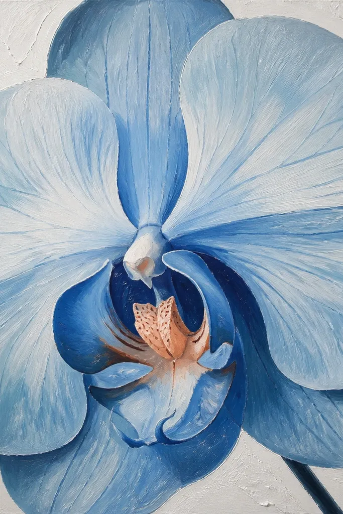
Gesso makes cheap paper act like a better canvas. I apply thin gesso, let it dry, then paint blue petals on top. The surface grabs paint just enough to create soft edges without bleeding, and the raised texture makes the orchid feel tactile. I keep the palette to light blue and medium blue plus a peach throat so it stays clean and doesn’t look like a craft mess.
Good to knowSand the gesso lightly with a fine sanding sponge if you want smoother edges.
Brush a thin layer of white acrylic gesso over your paper and let it dry completely. Lightly sketch the orchid over the gesso, then paint outer petals with light blue in thin layers. Add medium blue to the midtone areas and reserve darker blue for the inner folds and overlap shadows. Dab a peach throat dot and add one crisp highlight line with a white gel pen. If you want extra dimension, dry-brush a tiny amount of light blue at the petal edges once everything is dry.
Common mistakeAvoid painting while the gesso is tacky — you’ll get streaks and uneven color.
11. Blueprint Style Orchid with Marker Gradients
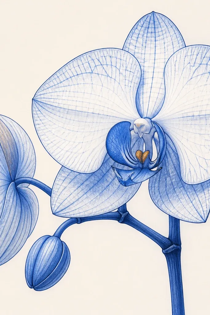
If you like that architectural blueprint vibe, this is the orchid drawing that matches. I use a dark blue marker for outlines and crease shadows, then I blend out to lighter blue with either a lighter marker or a damp brush depending on the marker type. The warm center dot keeps it human, not cold. It’s flattering for bold, graphic rooms because it has strong contrast.
Sketch the orchid shape, then trace the inner folds and overlap lines with a dark blue marker. Fill the outer petals with light blue using quick passes, leaving the creases slightly darker. Blend the gradient by going over the boundary between light and dark with a lighter marker or a barely damp brush. Add a tiny peach dot at the throat and a thin white highlight line with a gel pen. Let markers dry fully before you add the highlights so they don’t smear.
Use a scrap paper underneath when blending — markers can bleed through and stain your desk.
Don’t flood the paper with marker — too much ink makes the edges feather and muddy.
12. Blue Orchid with Wash + Colored Pencil Veins
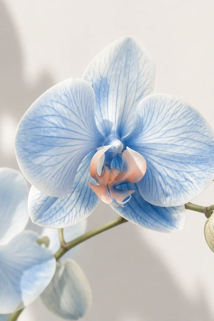
This mix looks expensive because it combines soft color with sharp detail. The watercolor wash sets the petal tone, and colored pencil veins give the illusion of fine structure. I use a darker blue pencil for veins and crease shadows, then keep the throat warm with peach. This style is great for viewers who love realism but don’t want to spend hours on fully rendered petals.
Good to knowSharpen your pencil to a fine point; orchid veins look believable only when they’re thin.
Paint a light blue wash over the petals and let it dry. With a colored pencil in medium blue, draw subtle vein lines that follow the petal curve, especially on the inner petals. Add darker blue pencil to the crease and overlap areas, pressing harder only where petals fold. Lightly shade the throat with peach, then use a white gel pen to add 2-3 tiny highlight marks along the inner fold. Keep the outer edge lighter by using minimal pencil there.
Common mistakeAvoid heavy pencil over wet paint — it drags pigment and makes gray smudges.
13. Blue Orchid Floral Pattern Border Frame
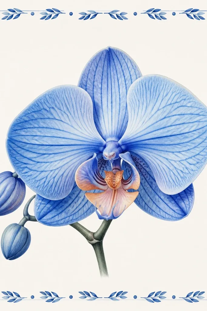
Adding a border turns a single orchid into a finished piece you can frame or stick to a planner. I keep the orchid itself in two blues and one peach, then I repeat tiny blue motifs around it so the whole page feels designed. The border also hides small sketch imperfections because your eye travels. This style flatters small spaces because it looks complete even without a fancy background.
Good to knowMake your border motifs smaller than you think; tiny patterns look cleaner and more intentional.
Sketch the orchid in the center and paint it with light blue washes first, then deeper blue for creases. For the border, draw a thin rectangle frame around the orchid at about 1 inch from the edges of your paper. Inside that frame, add repeating tiny leaf shapes and small dots in medium blue — keep them consistent in size. Add one peach dot accent at the border corners to echo the orchid throat warmth. Finish with a white gel pen highlight on the orchid inner fold.
Common mistakeDon’t make the border the same intensity as the orchid — if the border is too dark, it competes.
14. Monochrome Blue Orchid with One Peach Throat
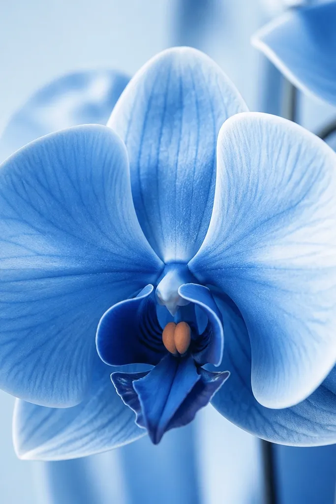
This is the color discipline that makes budget orchids look sharp. Everything stays in blue — from pale wash to deep navy shadows — and only the throat gets peach. That one warm interruption makes the orchid look like it’s lit from within. It’s flattering for minimalist decor and for people who want a clean look without extra decorations.
Start with a light blue wash for all petals, leaving paper showing at the outer edges. When dry, layer medium blue into the midtone areas and use navy blue for inner folds and overlap shadows. Keep your darkest navy confined to where petals cross; don’t spread it across the outer rim. Add one small peach throat dot and blend it slightly into the surrounding blue with a clean brush. Finally, add crisp white highlights in the inner fold and two outer edge streaks.
Use the same brush for blending edges, but rinse it fully between blues so you don’t get gray transitions.
Avoid adding extra colors like green or purple — they make budget palettes look accidental.
15. Blue Orchid Minimalist Poster Style (Limited Lines)
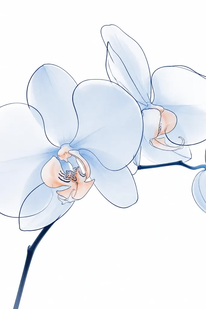
This is the “poster” approach: fewer marks, clearer shapes, and clean negative space. I outline the orchid with a darker blue pen, then fill the petals with pale blue paint in big simple shapes. The inner folds get one darker blue line, not a full shaded rendering. It looks great for quick wall art and it flatters people who prefer clean design over realism.
Good to knowKeep your outlines steady by resting your wrist on the paper edge or a small stack of scrap.
Draw the orchid with a simple outline in dark blue pen or marker. Fill each petal with pale blue paint, leaving the outer edge slightly lighter by pulling paint away with a dry brush. Add one or two medium blue crease lines inside the petals and keep the rest open. Place a small peach accent at the throat and add two short white highlight strokes with a gel pen. Let everything dry flat so the pale fills look smooth.
Common mistakeDon’t over-render — too many lines make the minimalist orchid look crowded.
16. Blue Orchid Watercolor Bleed Edges (Controlled)
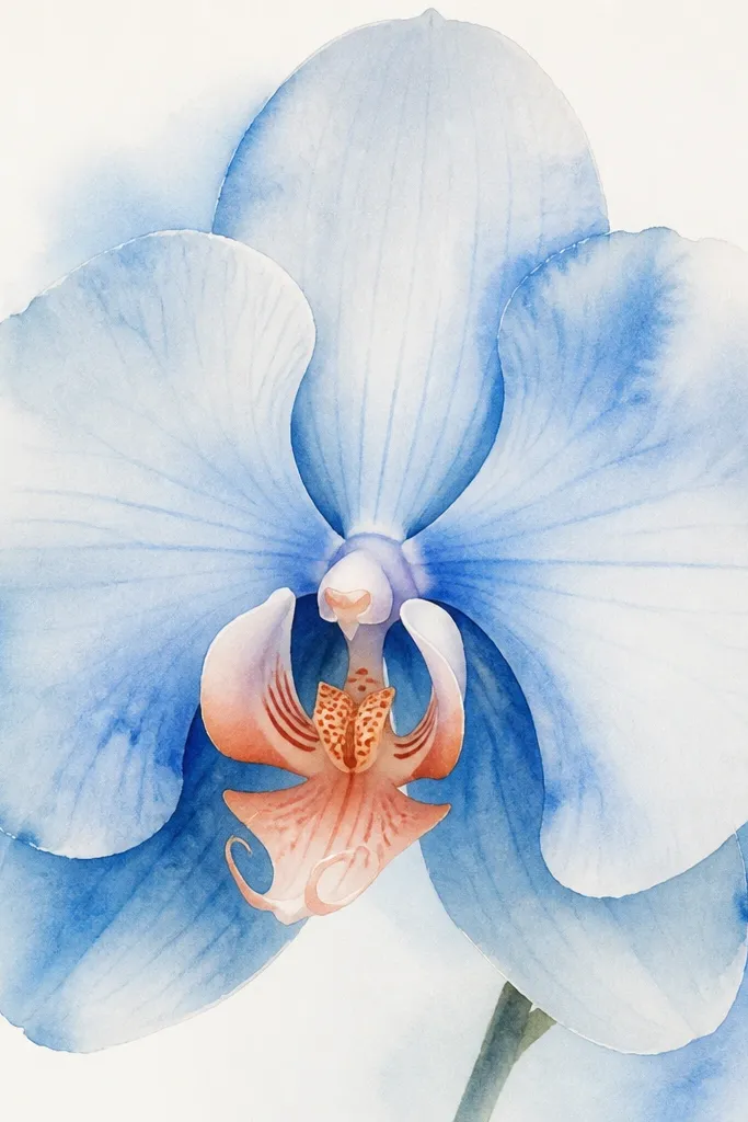
You can use watercolor softness as a feature, but you have to control where it happens. I let the outer petal edges bleed slightly by painting on damp paper, then I keep the inner folds crisp with dry layering. This makes the orchid feel natural and hand-painted without losing structure. It’s flattering for anyone who likes airy art and doesn’t want every edge to be razor-sharp.
Good to knowUse a fan brush or small brush tip — bigger brushes make uncontrolled blooms spread too far.
Wet only the outer petals area lightly with clean water, then drop light blue wash into it so it blooms softly. Leave the center fold area drier so you can paint it with deeper blue later without fuzz. Once outer petals dry, paint inner folds and overlap shadows with a deeper blue using a small round brush. Add a tiny peach throat dot and a white gel pen highlight line on the inner fold. If blooms happen near the center, dab them with a clean damp brush to pull pigment back.
Common mistakeDon’t wet the whole orchid — full-paper wetness makes the center lose its shape.
17. Blue Orchid with Collage Petal Texture
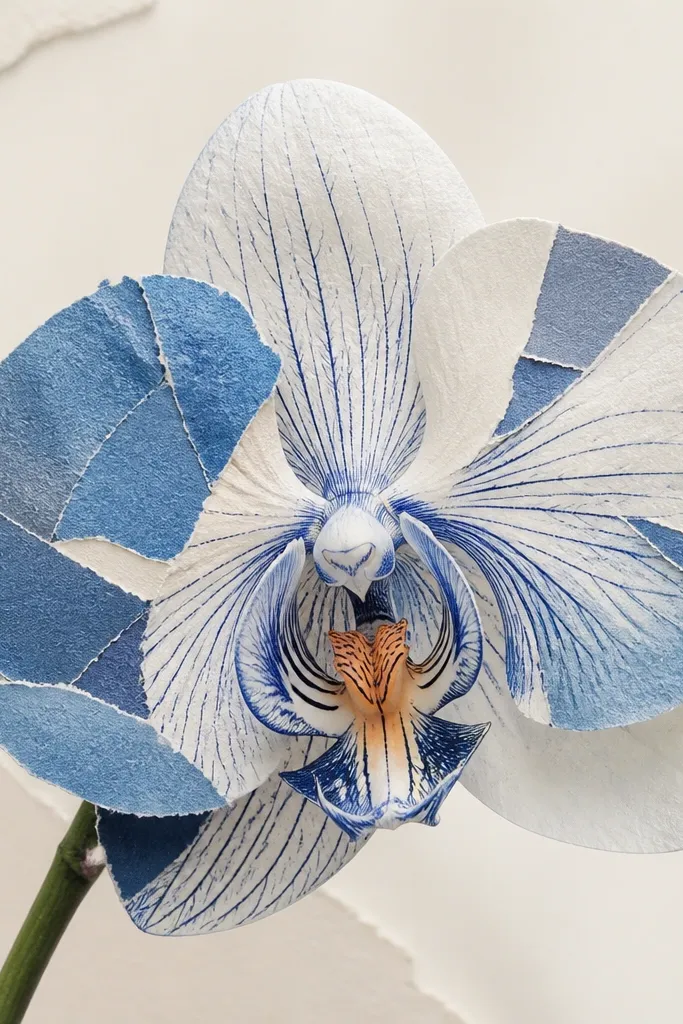
Collage texture is the easiest way to make a budget orchid look rich without buying expensive paints. I use torn pieces of blue paper for the outer petals, then I paint or ink the inner folds so the orchid still reads as one subject. The peach throat ties the collage to the drawing so it doesn’t look like random paper bits. This works well for handmade cards and small framed pieces because texture shows up even in dim light.
Good to knowTear with a slow motion; jagged tears that are too random can make the orchid look messy instead of textured.
Sketch the orchid lightly and decide which petal sections will be collage. Tear small pieces of blue paper in two shades — pale blue and deep blue — and glue them onto the petals with matte glue. Leave the inner folds uncovered so you can draw creases clearly. Paint or ink deep blue lines into the fold areas, then add a peach throat dot. Finish by adding white gel pen highlights on one or two collage edges to make the petals feel glossy.
Common mistakeDon’t cover the entire orchid in collage — plain drawn folds make the texture look intentional.
18. Blue Orchid with Stencil Petal Guide
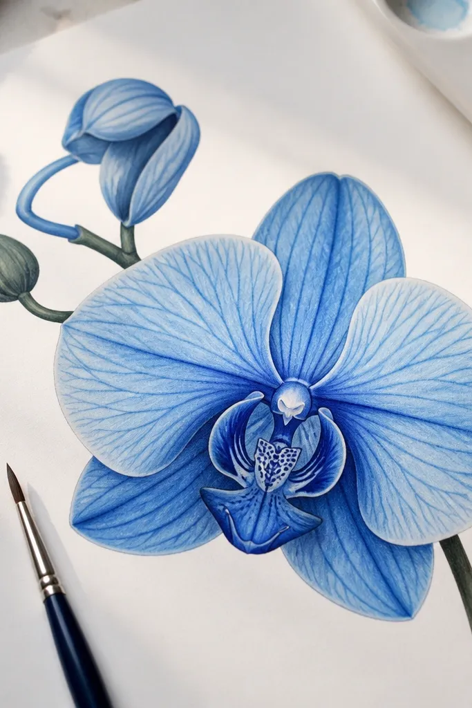
If you want the orchid shape to look right without freehand struggling, a stencil guide does the heavy lifting. I use a simple petal stencil (even a cut cardboard template works) to block the petal outlines quickly, then I shade with pencil or paint. Because the shape is accurate, you can spend your effort on color and edges. The warm peach throat keeps the stencil look from feeling mechanical.
Good to knowUse the stencil to place shapes, then remove it — don’t try to stencil details; details should be hand-done.
Cut or use a petal stencil and place it on your paper to trace the outer petal shapes lightly with pencil. Move the stencil for each petal position until the orchid silhouette looks balanced. Shade outer petals with light blue pencil or wash, then add medium blue to midtones. Trace inner folds and overlap lines with deep blue pencil or a thin brush, keeping those lines crisp. Add a peach throat dot and a thin white highlight line across the inner fold.
Common mistakeAvoid thick traced outlines everywhere — it makes the stencil marks obvious.
19. Blue Orchid on Spreadsheet Grid Paper
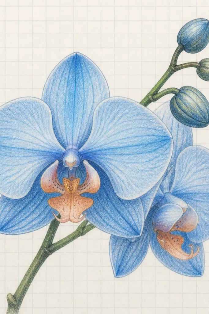
Grid paper is my secret weapon for symmetry when I’m doing orchid drawings that need to look balanced. You can keep the petals evenly spaced and control the center positioning, especially if you’re drawing from a reference. I shade the petals in two blues and keep the throat warm peach, then I clean up the center folds with a darker blue line. This style looks great for planners, because the grid helps the drawing feel orderly even when it’s hand-made.
Good to knowIf you plan to keep the grid visible, use a very light pencil so the grid doesn’t fight the orchid lines.
Sketch a center point on the grid paper and lightly mark two or three petal anchor points using grid squares for spacing. Draw the outer petals so each one spans a consistent number of squares. Shade outer petals with light blue, then deepen the inner fold areas with medium blue. Use a darker blue pencil to draw the overlap shadow lines, then add a small peach throat dot. Finish with a white gel pen highlight on the inner fold and one outer edge streak.
Common mistakeAvoid drawing on thick marker grid paper — it can bleed and warp under wash.
20. Blue Orchid with Indigo Ink Wash and Brush Pen
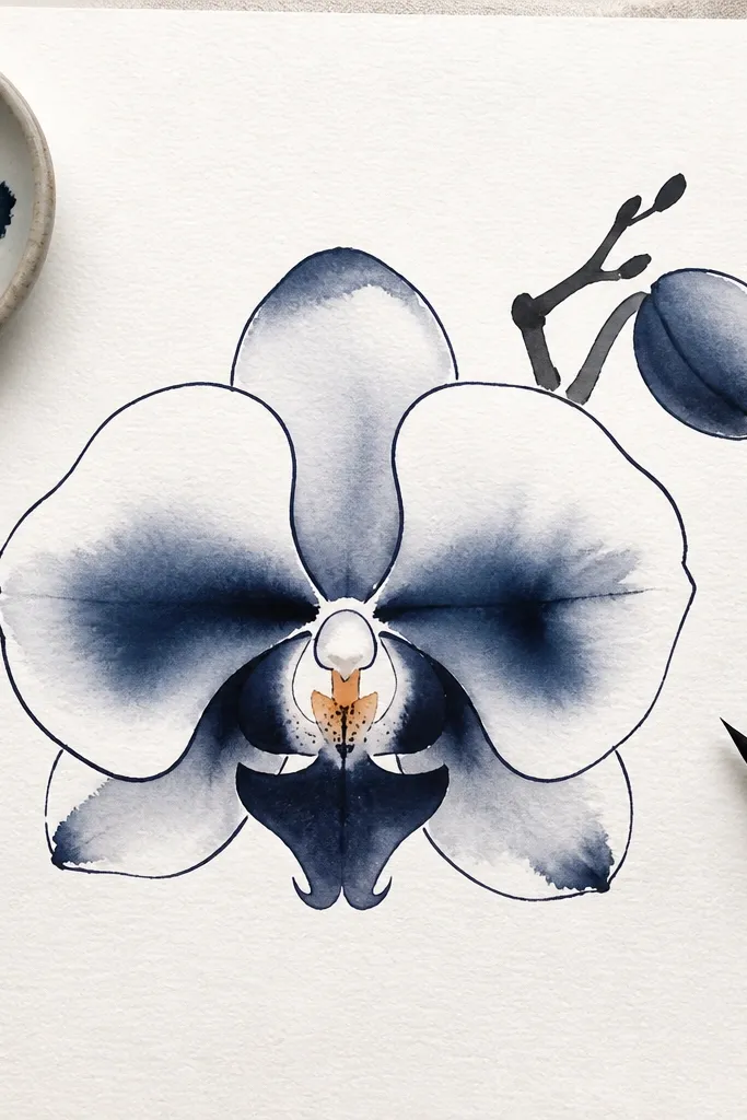
Ink wash gives you that natural, slightly unpredictable watercolor effect, while a brush pen gives you the sharp tapered lines orchids need. I use indigo ink diluted for outer petals, then keep the darkest indigo for crease shadows and overlap edges. The peach throat dot is my anchor — it stops the drawing from turning monochrome-cold. This style looks best on smooth watercolor paper so the ink spreads nicely without feathering.
Dilute indigo ink with water to a light wash and paint the outer petals in thin layers, leaving lighter areas near the outer rim. Let it dry, then use a darker indigo wash for midtones inside the folds. With a brush pen, draw tapered lines along the inner fold and the petal overlap edge, following the petal curve. Add a tiny peach dot at the throat and add white gel highlights on two spots where the petals would catch light.
Wipe your brush pen tip on scrap paper before you start lines so you don’t get a blob at the beginning.
Don’t overwork the ink wash — repeated passes can turn it muddy.