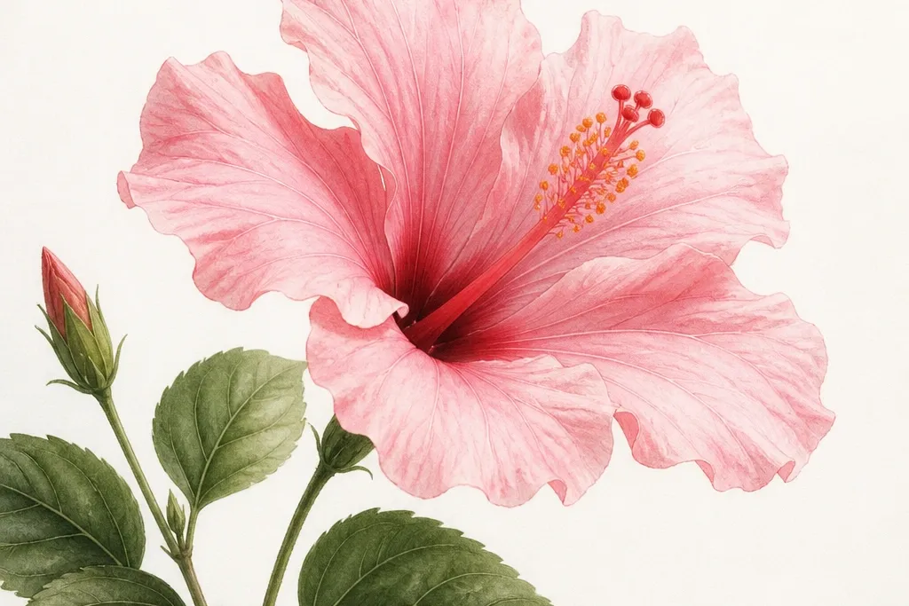
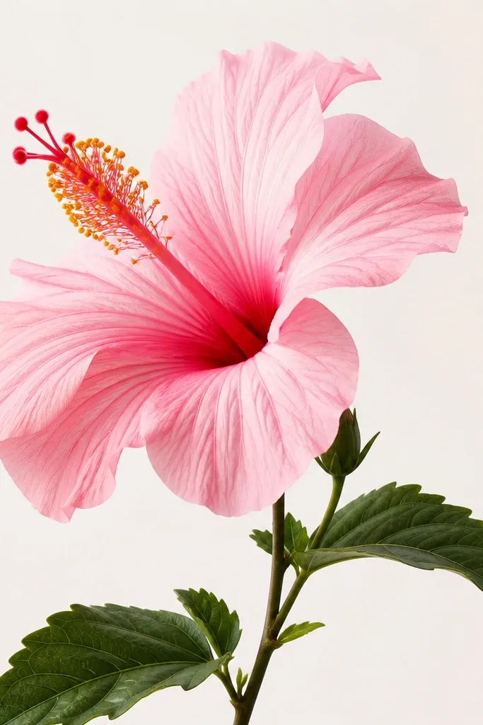
1. Single Hibiscus with Soft Wash Center
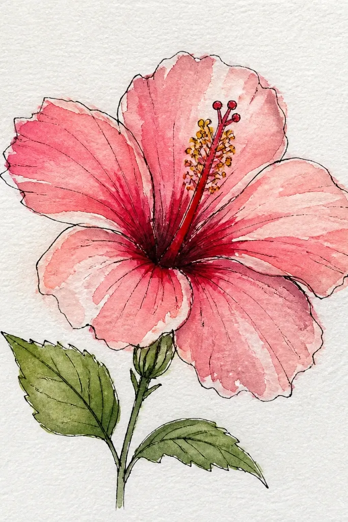
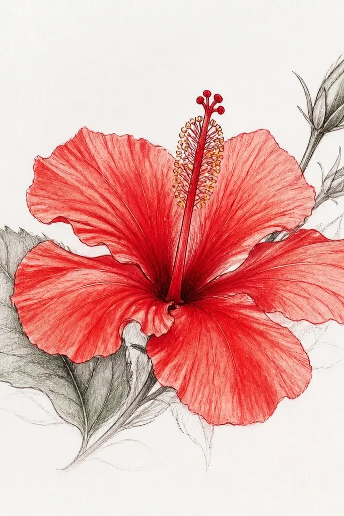
This version is my go-to when I want the drawing to feel airy but still dimensional. I start the petals with a pale pink watercolor wash, then I deepen only the fold areas with a rose tone. The center stays brighter, so the stamen lines look crisp and the whole flower reads clearly at a distance. It flatters almost every skin tone in print because the light pink keeps the contrast gentle and wearable for cards or décor. If you’re drawing for a soft, feminine vibe, this one is the safest bet.
Step 1 — Sketch the outer petal fan first: five large petals in a loose star shape, with the top petal slightly taller. Step 2 — Lightly wash pale pink across the whole petals, then add rose only where each petal overlaps the next. Step 3 — Leave the center column mostly white; then tint around it with a thin rose edge so it looks tucked in. Step 4 — Add the stamen: draw a short vertical column in dark pink or warm brown, then add thin lines for the pollen tips. Finally — glaze one more thin layer of rose at the fold lines and stop as soon as the shading looks smooth.
If your wash dries patchy, go over it with a damp clean brush using only water — no extra pigment.
Don’t color the center as dark as the outer petals; it flattens the flower and makes it look like a blob.
2. Pink Hibiscus Outlined in Black Ink with Marker Petals
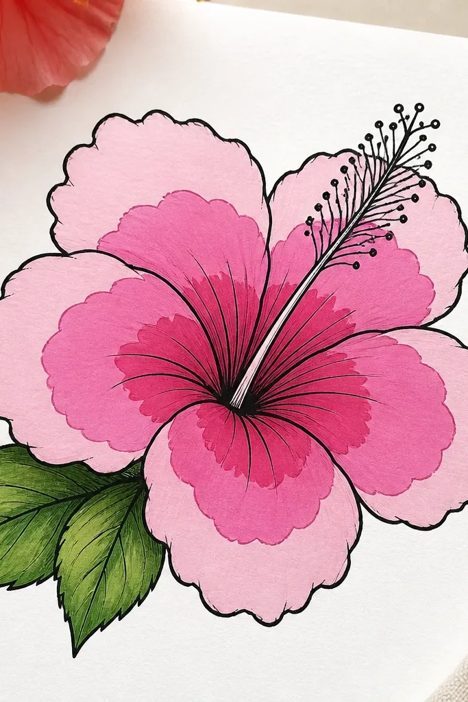
This is the cleanest look when you want a finished, graphic drawing. The black ink gives you structure, and the marker fills give you color that stays even. I use three marker shades so each petal has a highlight edge and a deeper fold — that fold is what keeps it from looking like a cartoon flower. This style works great for gift tags and stickers because the contrast is strong. It also looks good on lighter paper because the ink stays sharp and the pink doesn’t get washed out.
Step 1 — Draw the hibiscus in pencil, keeping the outer petals slightly uneven in size so it feels hand-made. Step 2 — Ink over your lines, then wait 2 minutes before coloring so the ink doesn’t smear. Step 3 — Color each petal with mid pink first, leaving a thin highlight near the top edge. Step 4 — Add darker rose along the inner fold where petals overlap. Finally — darken the center column and add stamen dots with a fine liner or the same ink pen.
Good to knowUse a scrap paper test for marker bleed before you start; some markers feather on cheap notebook stock.
Common mistakeDon’t fill all petals to the same shade; equal coloring kills the folding effect.
3. Hibiscus in Three-Quarter View with Overlapping Petals
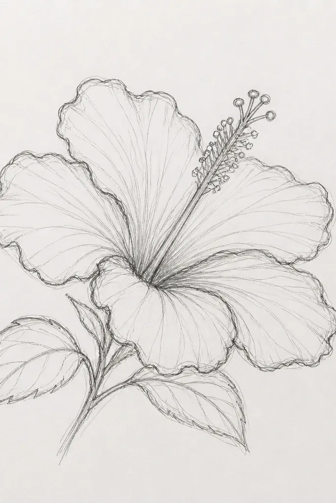
Drawing hibiscus from a three-quarter view is the fastest way to get realistic depth. The flower stops looking like a flat icon because the petals overlap differently in perspective. I keep the near petals darker and slightly larger, then I thin the far petals so they look tucked behind. This style is flattering for prints because the tilt creates movement — it looks good even when the background is plain. If your drawings always look “stamped,” this angle usually fixes it.
Step 1 — Sketch a center axis that tilts about 20 to 30 degrees. Step 2 — Draw the outer petal fan with five petals, but make two petals on the near side bigger and two petals on the far side narrower. Step 3 — Shade fold lines: use rose where petals overlap and pale pink on the outer edges. Step 4 — Draw the inner petal as a thinner leaf shape, tucked closer to the center axis. Finally — angle the stamen lines to match the tilt so the flower reads as one solid form.
Good to knowMark overlap lines lightly in pencil first; shading looks more convincing when you know exactly what covers what.
Common mistakeDon’t make both sides the same size; symmetry in a three-quarter view looks forced.
4. Watercolor Hibiscus with Bleed-Edge Petal Texture
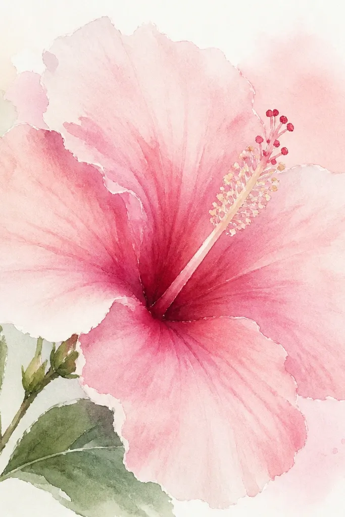
If you want a painterly, organic feel, this one uses controlled pigment bleed. I wet the paper lightly, then drop rose pigment only on the fold lines. The bleed creates tiny gradients that mimic the natural veining and shadow transitions inside petals. The result looks soft without losing shape. It’s a great fit for calm wall art and handmade stationery because it doesn’t look harsh. Your hibiscus will still look like a hibiscus even if your edges aren’t razor sharp.
Step 1 — Lightly wet the petal areas with clean water using a flat brush, keeping the center column mostly dry. Step 2 — Lay pale pink wash first across the petals, then add rose pigment in thin strokes where petals fold. Step 3 — While it’s still damp, tilt the paper slightly so pigment flows a little toward the overlap lines. Step 4 — Let the center column stay lighter, then paint a thin rose outline around it for depth. Finally — once dry, add stamen dots with a small brush and darker rose or warm brown.
Good to knowTilt the paper on a slight angle for 20 to 30 seconds — the flow should be subtle, not streaky.
Common mistakeDon’t flood the whole flower — full wet saturation makes the petals merge into one pink mass.
5. Hibiscus with Pencil Veins and Blended Petal Folds
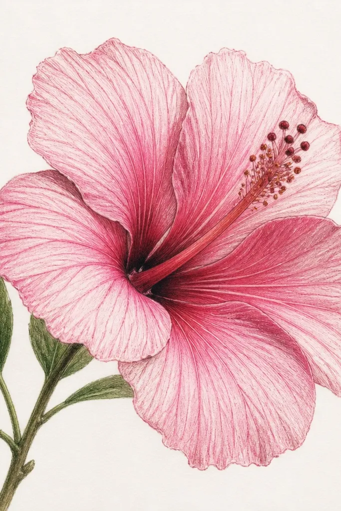
This is the “I want it to look botanical” version. Pencil veins add a sense of structure that marker or watercolor sometimes skips. I lightly draw veins from the petal base toward the outer edge, then blend over them so they stay visible but not harsh. The fold shading is done by pressing harder only along overlap areas — that gives you a realistic shadow without smudging everything. It’s flattering for anyone who likes detail and doesn’t mind a slower drawing session. The center stays clean so the stamen still reads clearly.
Step 1 — Sketch the petal shapes and lightly mark where each petal overlaps. Step 2 — Draw vein lines: 3 to 5 faint lines per petal, curving slightly as they move outward. Step 3 — Shade with colored pencil in layers: pale pink first, then a mid pink layer, then rose only at the overlap folds. Step 4 — Use a blending stump to soften the mid layers, but keep the vein lines slightly darker. Finally — darken the stamen tips with a sharper pencil and add a few tiny dots for pollen.
Use a kneaded eraser to pull back highlights along the top edges after shading.
Don’t erase all the veins; if they vanish completely, the flower looks like a smooth cartoon.
6. Pink Hibiscus Flower Drawing with Gel Pen Highlights
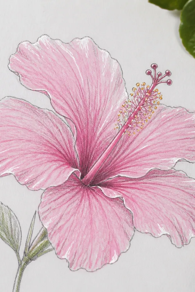
Gel pen highlights make your hibiscus look freshly lit. I use them sparingly — only on the brightest curves of each petal and on a few pollen dots. The contrast is small but it changes how the drawing reads in a photo. This style is great if you plan to post your work online or frame it behind glass. It also works well for people who struggle with getting “shine” in colored pencil drawings. The highlights guide the eye straight to the flower’s center.
Step 1 — Draw the hibiscus in pencil, then shade petals with pale pink and mid pink. Step 2 — Add rose along fold lines and under overlaps, leaving a thin highlight strip near each petal’s top edge. Step 3 — Use a tissue to lightly blend the mid layers, then stop before it turns waxy. Step 4 — Trace the highlight curves with a white gel pen — small curved strokes, not thick lines. Finally — add a few tiny gel pen dots in the stamen area and one short highlight line on the inner petal.
Test the gel pen on scrap first; some pens need a few strokes before they go opaque.
Don’t flood the petals with white highlights; too much makes it look like frosting.
7. Hibiscus Mandala Border with Simple Petal Sketches
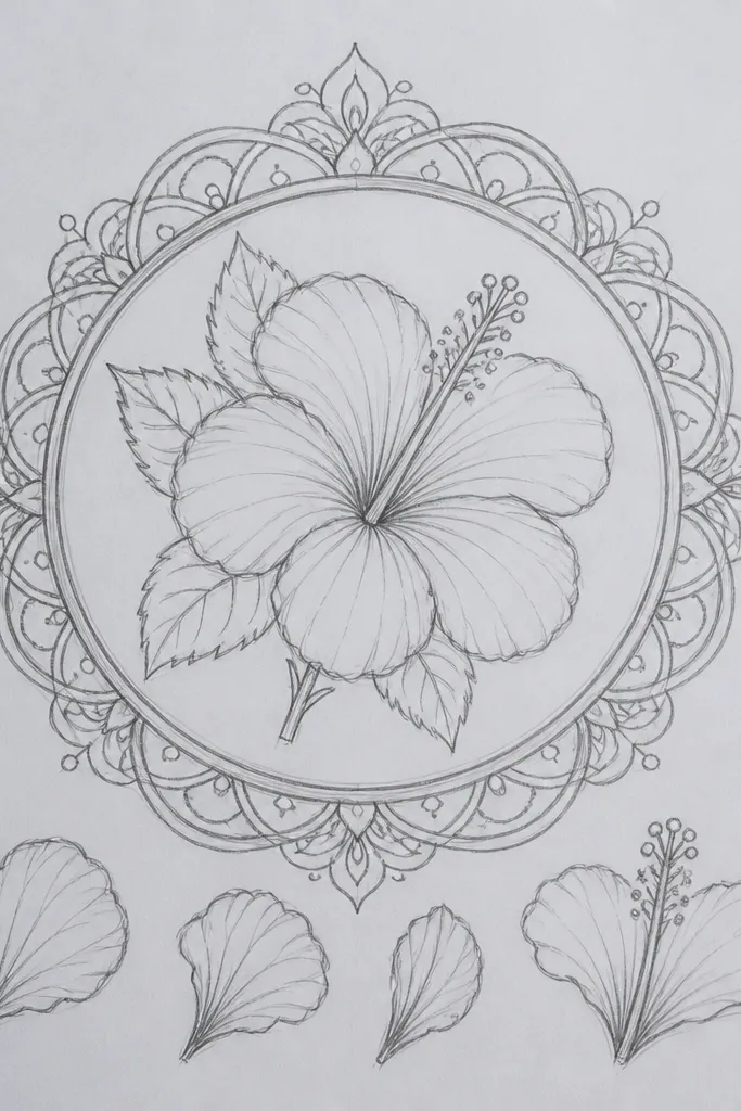
This one turns your hibiscus into a decorative design without needing heavy background coloring. I keep the hibiscus bold in the center, then repeat tiny petal motifs around it. The contrast between a detailed center and simpler border lines makes the flower look like it’s floating. It’s flattering for prints because the border gives the eye a path to follow. If you like aesthetic layouts for stickers, gift wraps, or wall art, this composition is reliable. The key is keeping the border lighter than the flower so it doesn’t steal attention.
Step 1 — Draw a square or circle boundary, then place the hibiscus in the middle. Step 2 — Shade the hibiscus petals in pale pink, mid pink, and rose folds like you would for a single flower. Step 3 — Add a ring of small petal shapes around the flower, each about one-third the height of the hibiscus inner petal. Step 4 — Fill the gaps with tiny dots or short leaf lines in light pink. Finally — outline the outer border with a thin black pen so the whole design looks intentional.
Good to knowKeep the border line thickness consistent; if the border lines are thicker than the flower outlines, it looks messy.
Common mistakeDon’t shade the border heavily in rose; it makes the center lose clarity.
8. Hibiscus Bouquet Sketch with Three Flowers at Different Sizes
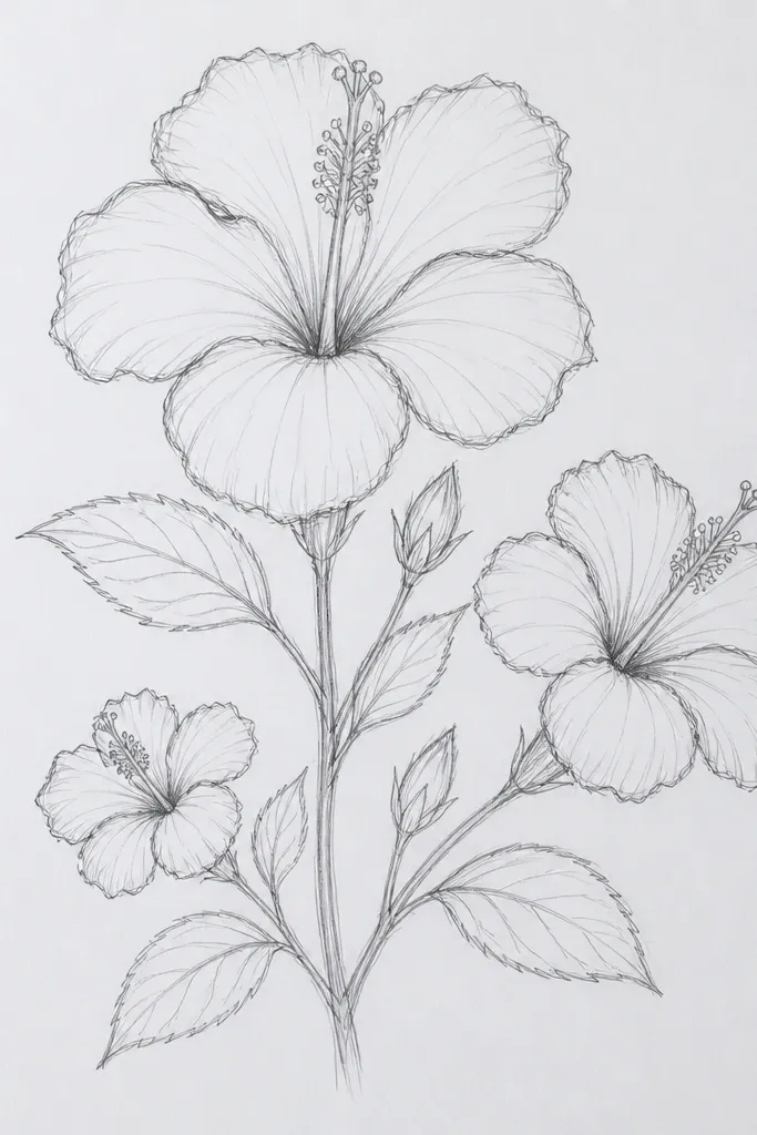
A multi-flower bouquet gives you a natural way to practice spacing and depth. The big front flower teaches your shading, and the smaller back flowers let you simplify without losing the hibiscus look. I use lighter pink and fewer vein lines on the back blooms so the composition feels layered. This style looks good for greeting cards because it fills the space without needing a background scene. It’s also forgiving if your center stamen isn’t perfect on every flower — the size difference hides small inconsistencies.
Step 1 — Lightly sketch three circles of placement, then draw three hibiscus outlines with different scale: about 3 inches tall for the front, 2 inches for the mid, and 1.5 inches for the back. Step 2 — Shade the front hibiscus fully with three-tone pink and visible fold shading. Step 3 — Shade the two back hibiscus using only pale pink and a little rose at the folds, then skip some vein lines. Step 4 — Add thin stems and connect them with a simple curved line. Finally — draw stamen tips on each flower, but keep the back ones simpler with fewer dots.
Leave a clear gap between flowers; touching petals at the wrong angles makes the bouquet look like a single blob.
Don’t give every flower the same detail level — the front needs to be the star.
9. Pink Hibiscus with Cut-Paper Style Petal Edges
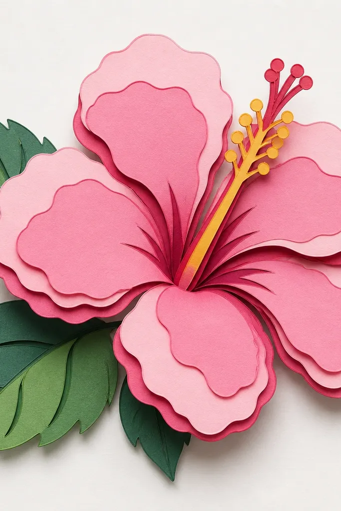
This style is a trick for anyone who struggles with smooth shading. Instead of blending, you build petal depth with clean edges and flat color blocks. It looks like layered paper cutouts, which gives the flower a craft-shop feel. I outline each fold boundary with a thin darker rose line, then fill the petal sections in flat tones. The result looks sharp and intentional in photos. It’s also great for beginners because the “messy” part of drawing is replaced with color separation. Your hibiscus will look designed, not just colored.
Step 1 — Sketch the hibiscus petals and mark the fold lines as clear boundaries. Step 2 — Outline the fold boundaries with a fine pen in dark rose or warm brown. Step 3 — Fill each petal section with flat pale pink and mid pink, leaving the fold area slightly darker. Step 4 — Add a shadow under each overlap using rose and a thin line directly beneath the edge. Finally — build the center column as two or three layered shapes and add stamen dots last.
Good to knowUse a ruler for the center column boundaries; straight edges make the “paper layering” illusion stronger.
Common mistakeDon’t blend the edges — the cut-paper illusion depends on crisp separation.
10. Hibiscus Flower Drawing in Soft Pastel Smudges
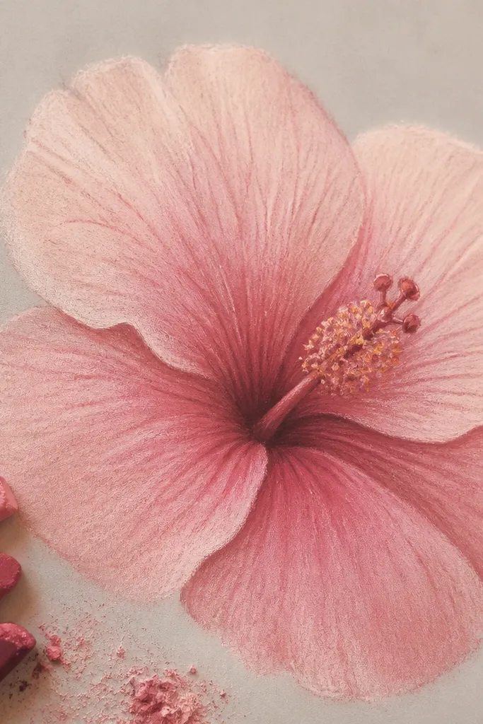
Pastels give hibiscus a velvety look that colored pencil can’t always match. I press the pastel lightly at the highlight edges and more firmly at the folds, then blend with a soft brush. The key is controlling the smudge so the petals still hold their shape. This version looks gorgeous on warm-toned paper because the background adds a natural tint. It flatters a cozy, handmade aesthetic for slow art journaling pages. The flower feels gentle, not glossy.
Step 1 — Sketch the hibiscus lightly in pencil, then erase almost all graphite so it doesn’t smear. Step 2 — Rub pale pastel over the petals first, leaving the fold areas lighter. Step 3 — Add rose pastel at the overlap fold lines and around the center column; press harder there. Step 4 — Blend with a makeup brush or soft cloth, using small circular motions. Finally — add stamen details with a darker pastel pencil, then lightly tap a few specks for pollen.
Good to knowFixative spray should be a light mist only, and do it in short passes so you don’t darken the colors.
Common mistakeDon’t overwork the blend; repeated rubbing turns petals gray and kills the pink freshness.
11. Pink Hibiscus with Crosshatch Shadows and Fine Lines
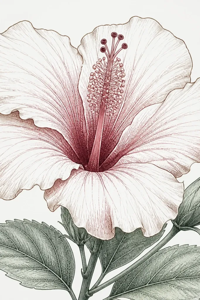
Crosshatch is my favorite when I want the flower to look textured without buying watercolor supplies. You build depth by density: light hatching for mid petals, heavier hatching where petals overlap. This makes the hibiscus look dimensional even though the palette is limited. It also holds up in black-and-white printing because the shading doesn’t rely on color gradients. If your colored pencils always look patchy, this method gives you control. The center looks especially good because dense hatching creates a strong focal point.
Step 1 — Outline the hibiscus in pencil, then ink key edges with a fine liner. Step 2 — Start crosshatching on the fold lines using a rose colored pencil or light red marker. Step 3 — Increase hatch density where petals overlap and near the center column. Step 4 — Keep the top edges cleaner by using fewer hatch lines there. Finally — build the center column with the densest hatching and add stamen lines and dot clusters last.
Good to knowRotate the paper slightly as you hatch so your strokes follow the curve of each petal.
Common mistakeDon’t hatch randomly across the whole petal; focus the density on folds and overlaps.
12. Hibiscus with Two-Tone Gradient Petals (Light-to-Rose Fade)
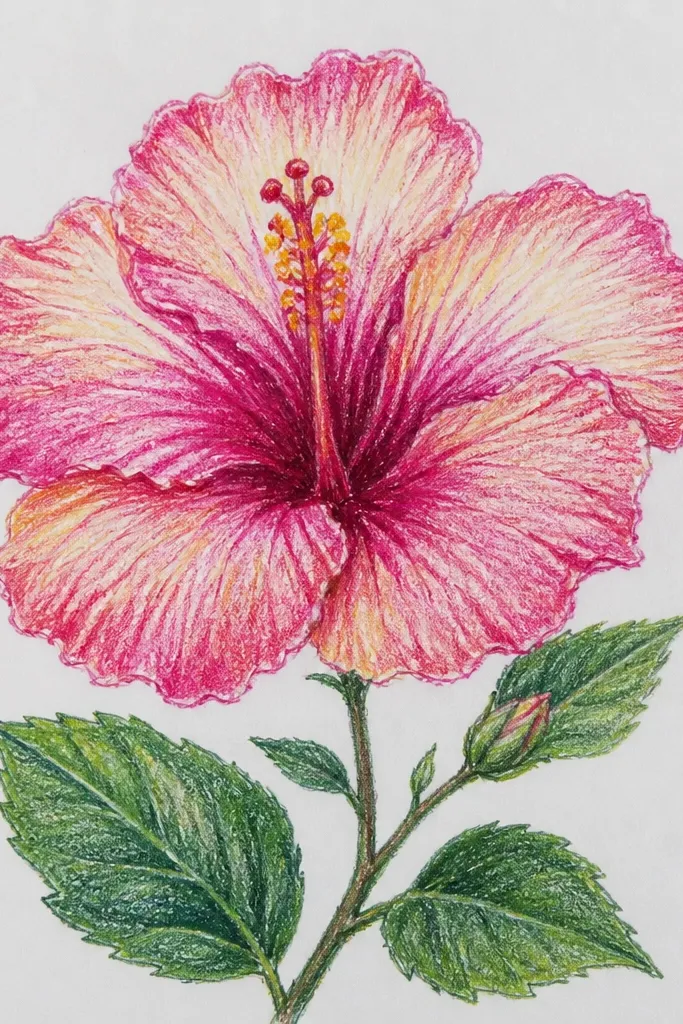
This version uses a directional gradient, not a global wash. I shade from the outer top edge inward, so each petal reads like it’s folding toward the center. The gradient makes the petals feel continuous and rounded, even if your drawing is simple. It looks great for large prints because the fade is smooth and the center stays crisp. This is also a good style when you want a consistent look across a series — every hibiscus can share the same fade direction. The flower feels soft but still structured.
Step 1 — Draw the hibiscus in pencil and lightly mark the fold lines. Step 2 — Fill each petal starting at the outer top edge with pale pink, then drag the color inward using a damp brush or blending pencil. Step 3 — Add rose only near the base where the petal connects to the center column. Step 4 — Keep a thin highlight strip at the top edge by lifting pigment with a clean damp brush. Finally — ink or pencil the stamen lines and add a deeper rose outline around the center column.
Use fewer strokes than you think; blending multiple times can turn gradients streaky.
Don’t blend the gradient past the fold lines; crossing those boundaries makes petals look flat.
13. Pink Hibiscus Flower Drawing with Colored Pencil Burnishing
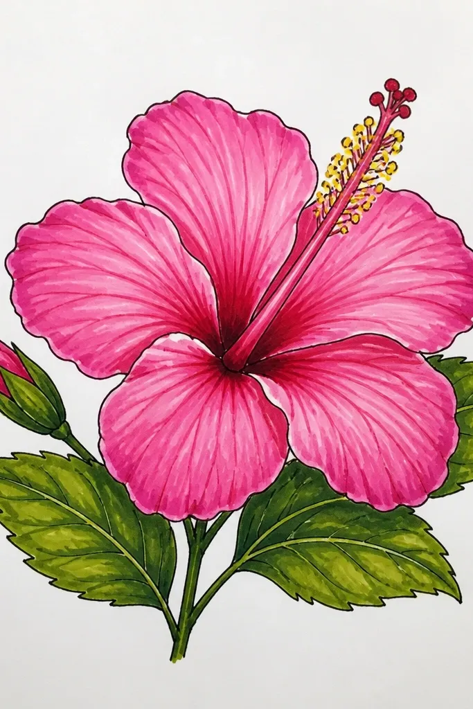
Burnishing makes hibiscus look like it’s printed, not just sketched. I build color in thin layers, then press harder at the fold shadows to create a satin finish. The petals stay smooth, and the fold shadows look like they have depth instead of smudges. This is the style I use when I’m making something I want to frame. It also holds up well under glass because the surface is more uniform. If you like a crisp, finished look, this one hits the sweet spot.
Step 1 — Lay pale pink base with a light hand across all petals. Step 2 — Add mid pink on the main petal body, then rose along fold lines near the center. Step 3 — Use a sharp pencil to define the petal edges and keep the highlight strip clean. Step 4 — Burnish: rub a pale pink layer over the petals with medium pressure until the surface looks smooth. Finally — add stamen dots with a darker rose or warm brown and outline the center column edges with fine pencil.
Good to knowWipe your fingers on a tissue before touching the paper; smudges ruin burnished finishes fast.
Common mistakeDon’t try to burnish right away; you need multiple layers first or it turns patchy.
14. Hibiscus with Patterned Background Stripes Behind the Flower
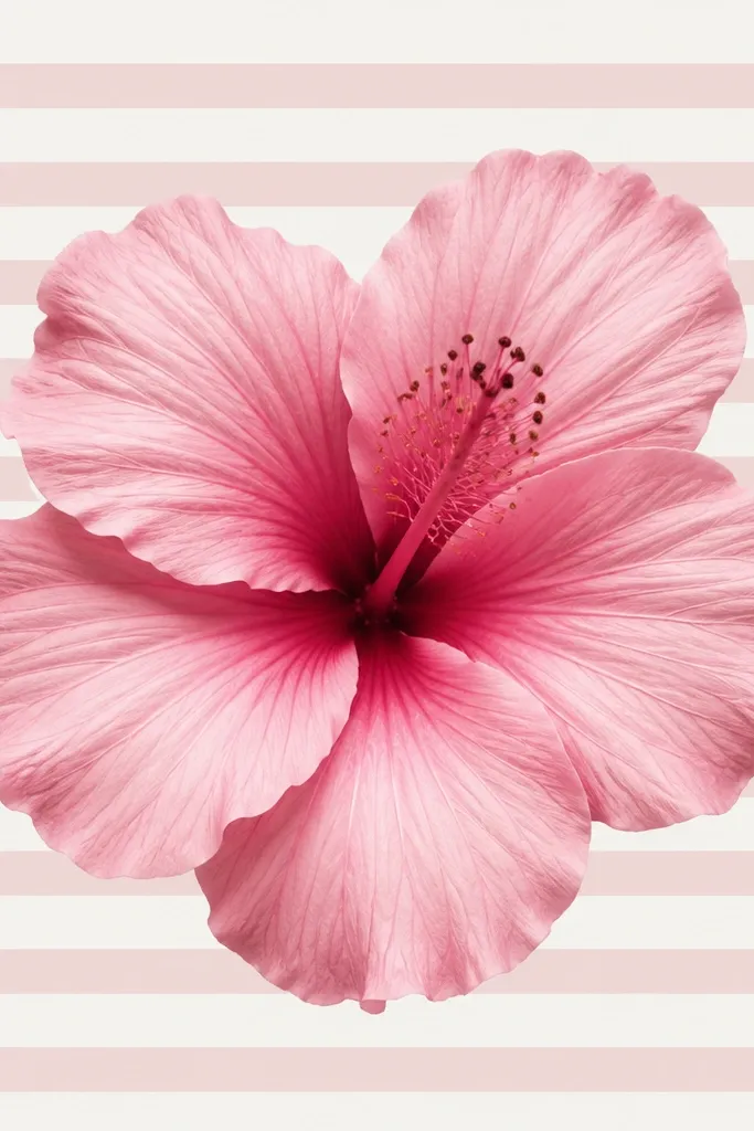
Patterns behind a hibiscus make it look more intentional without needing extra flowers. I keep the background simple — thin stripes or wave lines in pale pink and light gray — so the hibiscus still owns the center. The cutout effect happens when you leave a clean space around the flower outline. This style is flattering for wall art and planner stickers because it adds structure around the organic shape. It also helps if your flower drawing feels too light by itself; the pattern gives it context. The flower looks crisp against the order of the stripes.
Step 1 — Sketch the hibiscus first, then outline it lightly so you can trace around it later. Step 2 — Draw background stripes with a light gray pencil, placing them so they curve slightly around the flower area. Step 3 — Erase stripes underneath the flower silhouette, leaving a gap that matches your hibiscus edges. Step 4 — Shade the hibiscus with pale pink, mid pink, and rose folds, and keep highlights clean. Finally — add a thin dark outline around the hibiscus so it separates from the stripes.
Good to knowUse a ruler for the first stripe spacing; once you match the rhythm, freehand looks steady.
Common mistakeDon’t darken the background more than the petals; if the stripes compete, the hibiscus looks flat.
15. Hibiscus with Tiny Dot Pollen Texture Across the Center
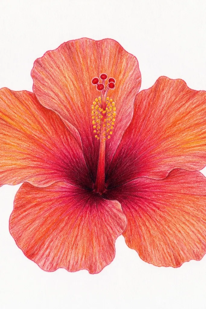
This is the “make the center interesting” idea. Instead of drawing a few stamen lines and calling it done, you build the center with dot clusters. The dots create a tactile look that makes the whole drawing feel alive. I keep petal shading smooth so the dot texture becomes the focal point. This looks great for close-up prints and for cards where the receiver will notice details. It also hides small drawing mistakes in the center because the texture distracts the eye in a good way. If your hibiscus centers always look empty, use this.
Step 1 — Sketch the hibiscus and shade petals in three tones, leaving the center column slightly lighter at first. Step 2 — Outline the center column in rose, then fill the lower part with a deeper rose shade. Step 3 — Add pollen dots: start at the base with small sparse dots, then increase dot density as you move upward. Step 4 — Add a few thin stamen lines above the dot area for structure. Finally — refine the fold shadows under the inner petals so the center dots sit in believable light.
Use a stylus or the tip of a mechanical pencil for dots; press lightly so they stay crisp.
Don’t dot the entire petals; keep dots only in the center so the flower still reads as hibiscus.
16. Pink Hibiscus Flower Drawing in Limited Palette (Pink + Warm Brown)
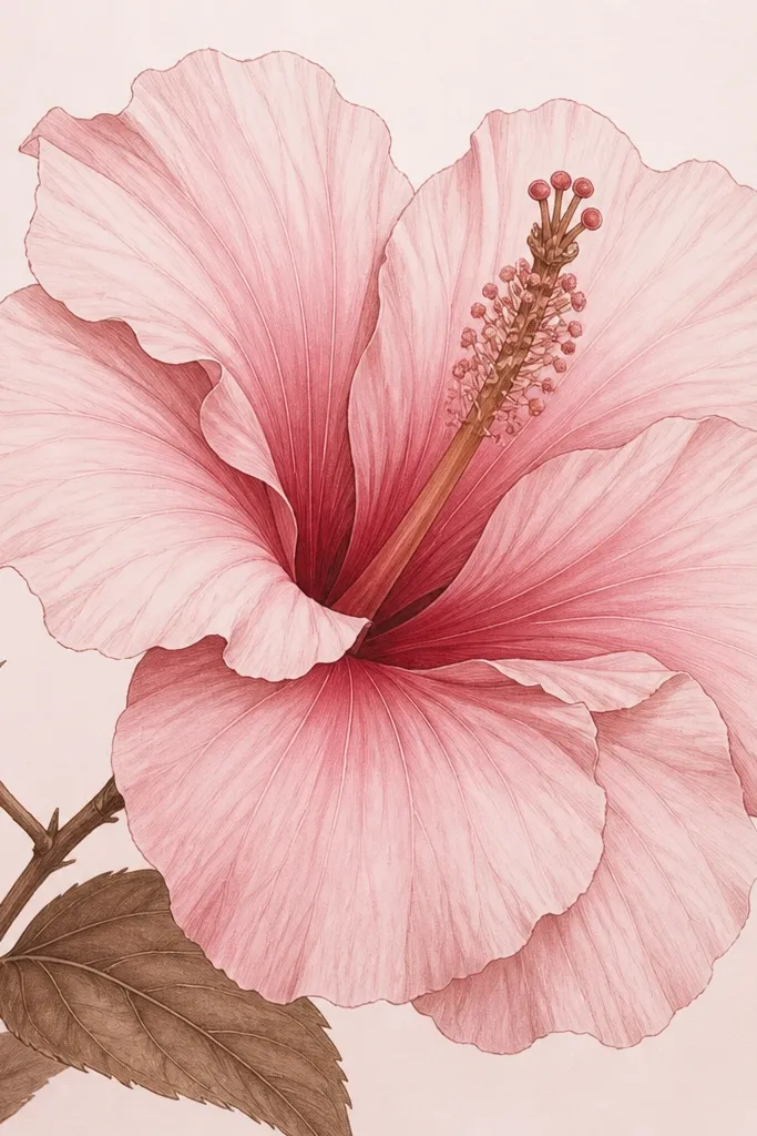
Limiting the palette makes your hibiscus look cohesive. I use one pink family plus warm brown for shadows, which keeps the flower from turning neon or gray. The brown creates a natural shadow that looks like depth instead of dirty coloring. This style works for beginners because you don’t have to manage five shades at once. It also prints well — fewer colors means cleaner reproduction. If your drawings look “off” because of mismatched pinks, this method fixes that fast.
Step 1 — Sketch the hibiscus and keep outlines in pencil or a light brown pen. Step 2 — Color petals with pale pink, then add a mid pink layer where petals overlap. Step 3 — Mix warm brown into rose for fold shadows and shadow underneath the inner petals. Step 4 — Keep the top edges lighter by leaving small highlight gaps. Finally — color the center column with warm brown and add a few darker pink touches on the highest stamen parts.
Good to knowIf your brown looks too strong, dilute it with a little water or blend with a lighter pink pencil instead of adding more pink.
Common mistakeDon’t use cool gray shadows; hibiscus petals look wrong when the shadow temperature doesn’t match the pink.
17. Hibiscus with Bold Petal Veins Using Dark Rose Lines
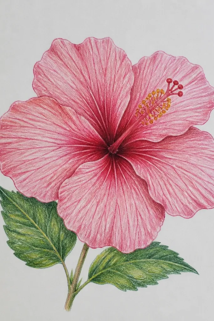
This version is for when you want the hibiscus to look graphic and botanical at the same time. Bold veins act like a skeleton — they show how the petal curves and folds under light. I keep the fill lighter so the vein lines stand out without turning the drawing heavy. This style looks great as a pattern for fabric transfers or repeat prints because the veins repeat well visually. It also flatters people who like crisp linework and don’t want to blend too much. The center looks cleaner because the veins guide attention outward.
Step 1 — Sketch the hibiscus in pencil and lightly mark vein directions for each petal. Step 2 — Fill petals with pale pink first, then add mid pink in the center of each petal. Step 3 — Trace veins with dark rose: 3 to 6 lines per petal, curving slightly and stopping before the very edge to keep highlights. Step 4 — Add a thin dark outline at the petal fold boundaries. Finally — draw a simple center column and add a few stamen lines, keeping dots minimal.
Use a gel pen or fine brush pen for veins so they stay crisp even after coloring.
Don’t outline every single edge thickly; only the fold boundaries should be strong.
18. Hibiscus Flower Drawing with Soft Ombre Background Wash
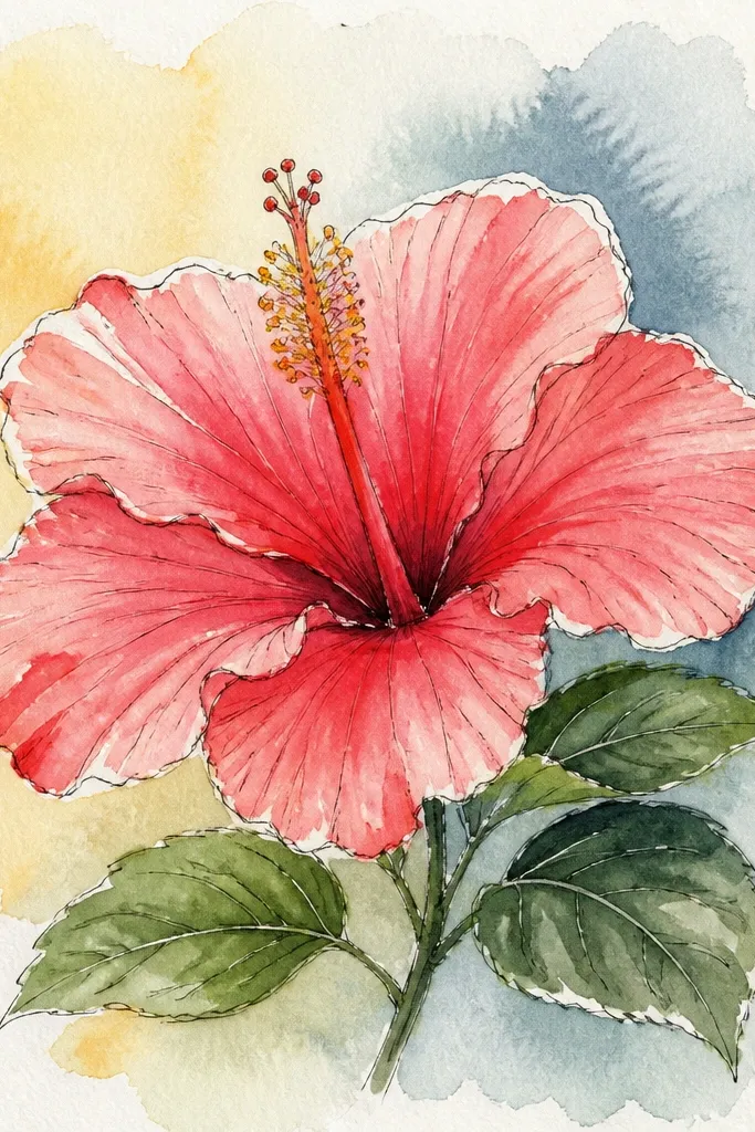
An ombre background turns your hibiscus into a complete composition. I keep the background light and warm so the pink flower doesn’t fight it. The gradient gives depth and makes the hibiscus pop without needing a heavy outline. This style is flattering for wall art because it looks intentional from a distance. It also helps when your flower is smaller — the background gradient fills the page. My favorite part is the soft separation: the flower edges look sharper because the background is smooth and low-contrast.
Step 1 — Tape or brace your paper and paint a very light ombre wash behind the hibiscus area: pale peach at the bottom and pale pink as you move up. Step 2 — Let the background dry fully so it doesn’t bleed into your flower. Step 3 — Draw and color the hibiscus with pale pink, mid pink, and rose fold shadows. Step 4 — Keep the top petal edges lighter by leaving a small highlight gap. Finally — add stamen lines and a rose outline around the center column for contrast.
Use two separate water cups or rinse well; one dirty brush can turn your ombre muddy.
Don’t make the ombre darker than the flower; then the background becomes the subject.
19. Hibiscus in a Circle Frame with Minimal Coloring
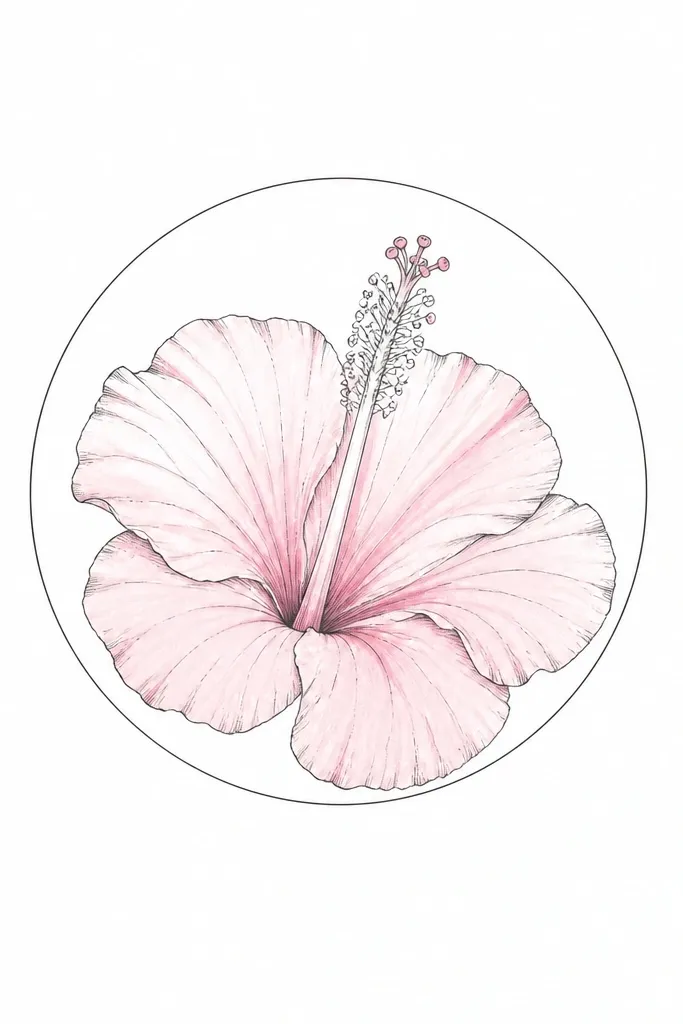
Minimal coloring is a design move, not a compromise. When the petals are mostly outline and just a few rose accents, the hibiscus looks modern and clean. I keep the color concentrated near the folds and center so the flower still has depth. This style is flattering for people who want their drawings to look neat and modern, not painterly. It also works well if you’re making a set of drawings with the same layout — the consistent circle frame ties them together. The center stamen stays readable because it’s mostly linework.
Step 1 — Draw a circle frame around your drawing area, leaving at least half an inch of margin. Step 2 — Sketch the hibiscus inside the circle, keeping petal shapes slightly open so the negative space shows through. Step 3 — Color pale pink lightly across the petals, then add rose only at overlap folds and under the inner petal. Step 4 — Keep the center column mostly linework, with a small rose wash or pencil shading around it. Finally — add stamen lines and a few tiny dot accents in rose.
Good to knowUse a darker outline than you think; minimal color still needs strong edges to read clearly.
Common mistakeDon’t skip the fold rose accents; without them, the flower looks flat and unfinished.