1. Single Bloom Centerpiece With Soft Sky Wash
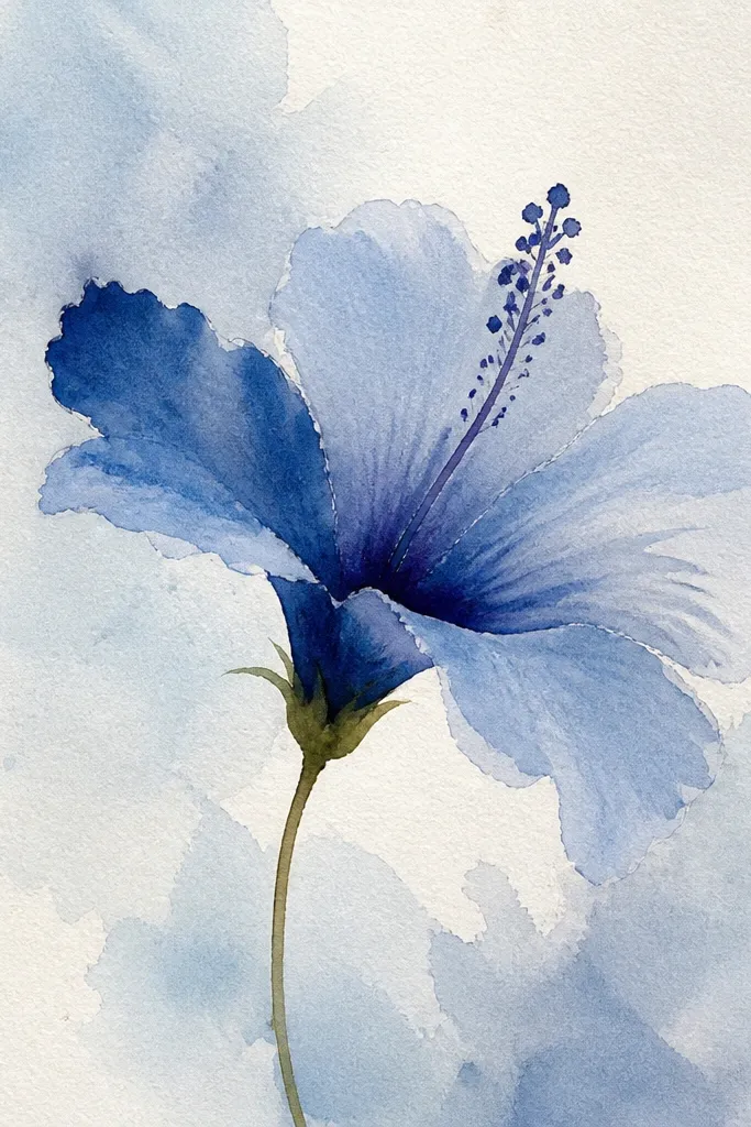
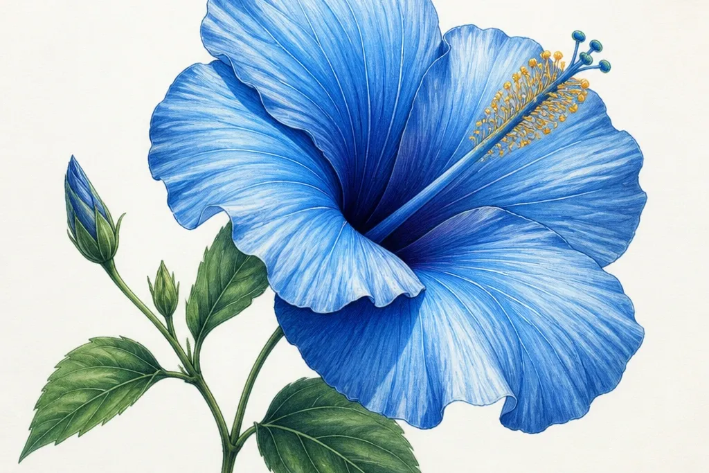
Start with a single hibiscus placed dead center, because it forces your petals to look believable without distractions. Use a light blue base pencil (like a sky blue) over the whole petal, then switch to a deeper cobalt-blue only in the fold shadows. I like graphite underdrawing because the petal folds show through slightly, giving that fabric-like crease. This style flatters smaller spaces like greeting cards because it reads clean at a glance. It also looks great on warm skin tones when you frame it — the cool blues pop against wood frames and cream mats.
Tape your paper to a board, then draw the hibiscus outline with an HB pencil, keeping each petal edge smooth and slightly irregular. Block the darkest folds with 2B pencil where petals overlap, especially near the base of each petal. Then add light blue pencil across the petals, and layer deeper cobalt into the fold areas only, blending outward with short strokes. Wash a very thin watercolor sky behind the flower, keeping the wash lighter than the petals so the bloom stays dominant. Finish by drawing the stamen filaments in a dark pencil or liner and adding small pollen dots at the tips with a gel pen.
Good to knowKeep the watercolor background at least one value lighter than your petals, or it will steal attention from the hibiscus.
Common mistakeDon’t outline every petal edge in dark blue; leaving some edges lighter makes it look hand-painted, not traced.
2. Two-Bloom Pair With Overlap Depth
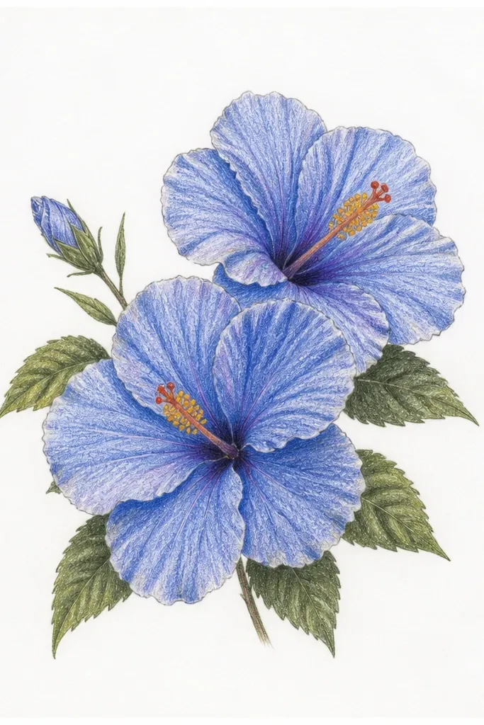
A two-bloom composition teaches overlap, and it’s the fastest way to make your drawing look dimensional. I place one bloom slightly higher and bigger, then tuck the second behind it so only part of the rear petals shows. Use the same blue palette for both, but make the back bloom about 10-15% lighter in value — that’s what sells the depth. This works for people who struggle with flat drawings because you get an easy depth cue right away. It also looks good for wall art because the viewer’s eye gets a clear left-to-right path.
Sketch both blooms first with light HB lines, then decide where the front bloom covers the back one. Shade the front bloom folds using 2B and cobalt-blue; keep the back bloom folds softer with HB and a lighter blue. Add mid-tone blue to both, then deepen only the front petals where overlaps happen. Draw the stamen filaments so the front bloom’s stamens sit clearly above the back bloom’s stamen base. Leave the background plain or add a few tiny leaf tips at the edges so the flowers feel connected.
If you’re unsure about depth, squint at your sketch: the front petals should look darker than the back by at least one pencil shade.
Avoid drawing both flowers with identical darkness; matching contrast kills the overlap effect.
3. Blue Hibiscus in a Teal Ink Frame
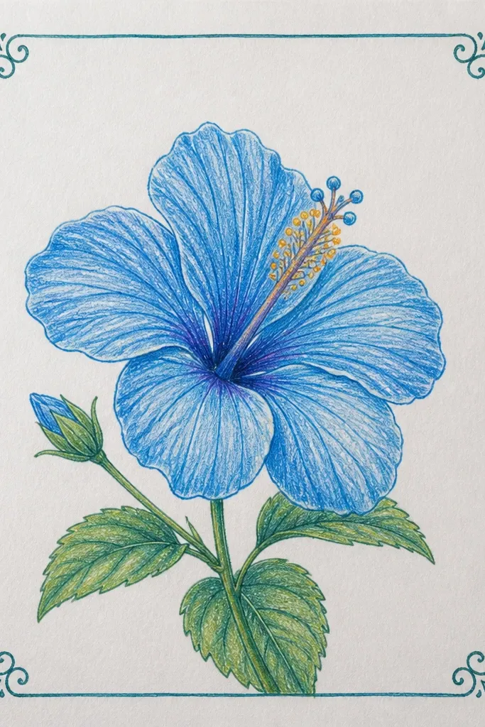
This one looks crisp because the frame gives the eye boundaries. I use a teal ink frame because it harmonizes with blue petals without blending into them. The flower itself stays mostly colored pencil with graphite fold shading, so the ink edges stay sharp and the petals stay soft. It’s flattering for anyone who likes clean, modern art and wants the drawing to look finished without a busy background. The teal also pops nicely against darker mat boards if you frame it.
Draw a hibiscus outline centered on the page, then shade the folds with 2B pencil and layer cobalt-blue colored pencil over the petals. Keep the background pure white — no wash — so the teal frame can do the work. Use a fine liner to draw a rectangular frame about 1 cm from the paper edges; let the ink line wobble slightly for a handmade feel. Add one or two small leaf fragments near the corners inside the frame. Finish the stamen with thin dark lines and add pollen dots with a white gel pen or fine white highlight if you want extra shine.
Good to knowUse the frame to correct composition — if the flower feels too high, lower it before you ink the rectangle.
Common mistakeDon’t put the frame too close to the edge; it looks cramped once it’s matted.
4. Watercolor Bleed Petals With Colored Pencil Control
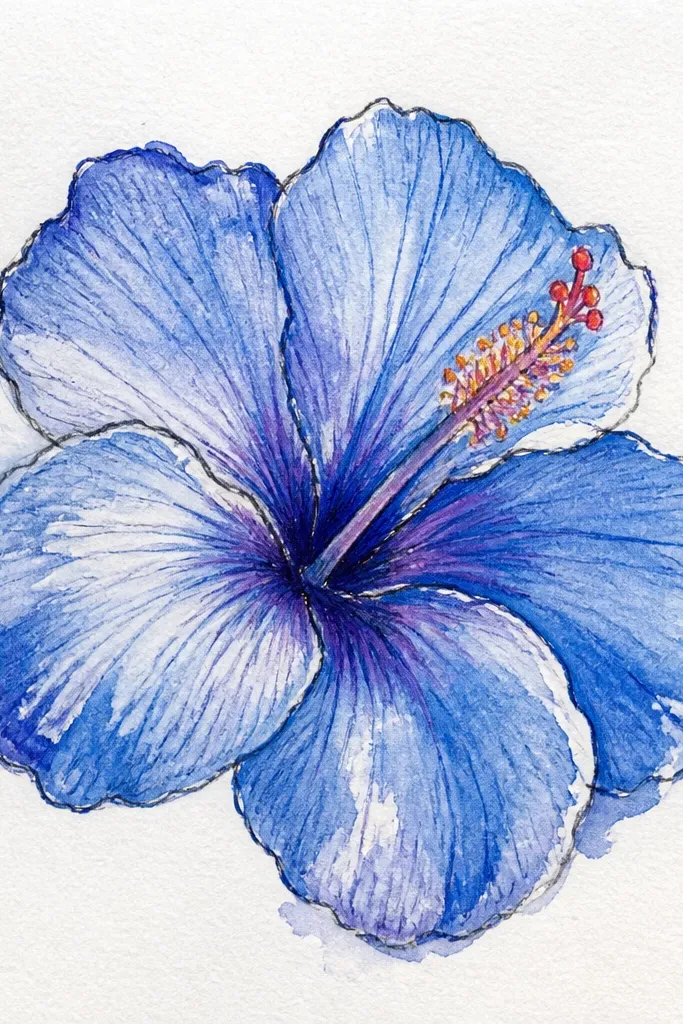
This is the one I do when I want the hibiscus to look alive without losing structure. I lay a loose watercolor wash in light blue across a petal, then I rework the fold shadows with colored pencil once the wash is dry. The contrast between soft bleeding edges and controlled pencil folds makes the bloom feel dimensional. It’s great for medium-skilled beginners because you get a forgiving texture while still having a plan for depth. It also looks amazing on postcards because the petal watercolor edges catch light differently than pencil alone.
Prime your paper with a light watercolor-friendly surface (mixed-media paper works well). Sketch the hibiscus in HB first, then paint light blue watercolor across each petal, leaving the petal folds lighter at first. Let it dry completely. Now add cobalt-blue pencil into the fold shadows and blend outward with gentle pressure. Use a small round brush for a slightly darker watercolor at the petal base, then lock it in with pencil highlights. Draw stamens with a dark pencil or liner, then add pollen dots using a gel pen.
Good to knowKeep a paper towel under your hand; watercolor dries faster and your smudges drop a lot.
Common mistakeDon’t overblend wet watercolor — it turns into one flat blob instead of petal folds.
5. Blue Hibiscus on Kraft Paper With White Gel Highlights
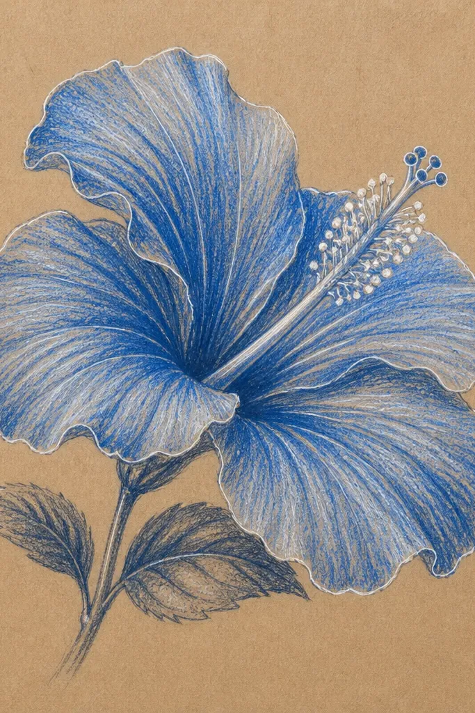
Kraft paper makes blue look warmer and more interesting. You don’t need a dark background because the tan already gives depth. I shade petals with layered blues, starting lighter near the petal edges and deepening in the fold creases. Then I add white gel pen highlights where the petals catch light: along the outer rim and on the stamen curves. This style flatters rustic frames and looks great for gifts because it feels handmade and intentional. It’s also forgiving if your lines aren’t perfect, since the paper texture hides tiny slips.
Lightly sketch the hibiscus with HB so you can erase if needed. Shade the petal folds with 2B graphite, then layer medium blue pencil across the petals. Add deep ultramarine only where petals overlap and near the stamen base. Use a white gel pen to place thin highlight lines along the petal edges and a few on the fold ridges. Keep the background mostly kraft by adding only a couple of leaf silhouettes in graphite at the sides. Finish the stamen filaments in dark pencil and dot the pollen tips with a tiny gel pen dot.
If your white gel looks gray, let the ink/pencil dry fully, then go back with a second gentle pass.
Avoid heavy burnishing on kraft paper; it makes blue look chalky and kills the texture.
6. Monoline Hibiscus With Blue Dot Pollen
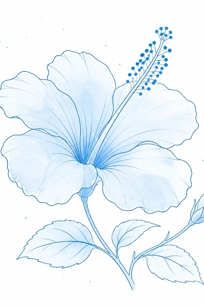
If you want it to look modern and graphic, go monoline. You draw the petal shapes cleanly, then add a light blue wash or pencil fill, keeping shading subtle. The stamen becomes the focal point: instead of realistic filaments, you draw thin lines and finish with blue dot pollen so it reads from a distance. This is perfect for beginners because the linework does most of the heavy lifting. It also looks good in a series, like multiple hibiscus drawings with different blue tones.
Sketch the hibiscus outline with a fine black liner, keeping line thickness consistent. Fill each petal with light blue colored pencil or a very light watercolor wash, leaving fold areas slightly paler. Add a few tiny line marks inside each petal to suggest the crease without heavy shading. Draw the stamen filaments with the same liner, then place small blue dots at the tip ends. Add a few scattered blue specks around the bloom — keep them random but sparse so the drawing stays airy.
Use one blue only for the wash and dots; color harmony matters more than adding multiple shades.
Skip thick outlines around the petals; it makes the flower look like a coloring book page.
7. Hibiscus With Patterned Petal Centers
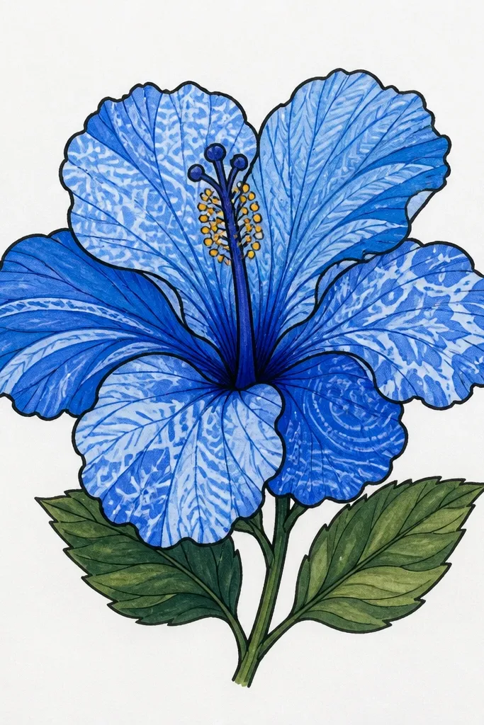
This idea makes your hibiscus feel custom, not copied from a photo. Keep the outer petals smooth and shaded with blue pencil, then put pattern only in the center petals where hibiscus shows natural variation. I use short stripes and tiny dot clusters, with the dots placed where the petal base would catch light. It flatters people who like decorative art and want a drawing that looks good even without a detailed background. The pattern also helps hide minor sketching mistakes because the viewer’s eye follows the design.
Draw the hibiscus with HB, then shade outer petals with light blue pencil and deepen folds with cobalt-blue. Leave the center petals slightly lighter so the pattern can stand out. Use a darker blue pencil to add tiny stripes that follow the petal curve, then add dot clusters near the base of each patterned petal. Keep the stamen realistic: thin filaments in dark pencil and small yellow pollen dots. Add a few leaf veins in graphite behind the flower so it feels connected but not busy.
Good to knowPress lightly for pattern lines; if they’re too dark, the flower looks like a stamp.
Common mistakeAvoid pattern on every petal; too much makes it look like wallpaper instead of a flower.
8. Blue Hibiscus With Pencil Vein Realism
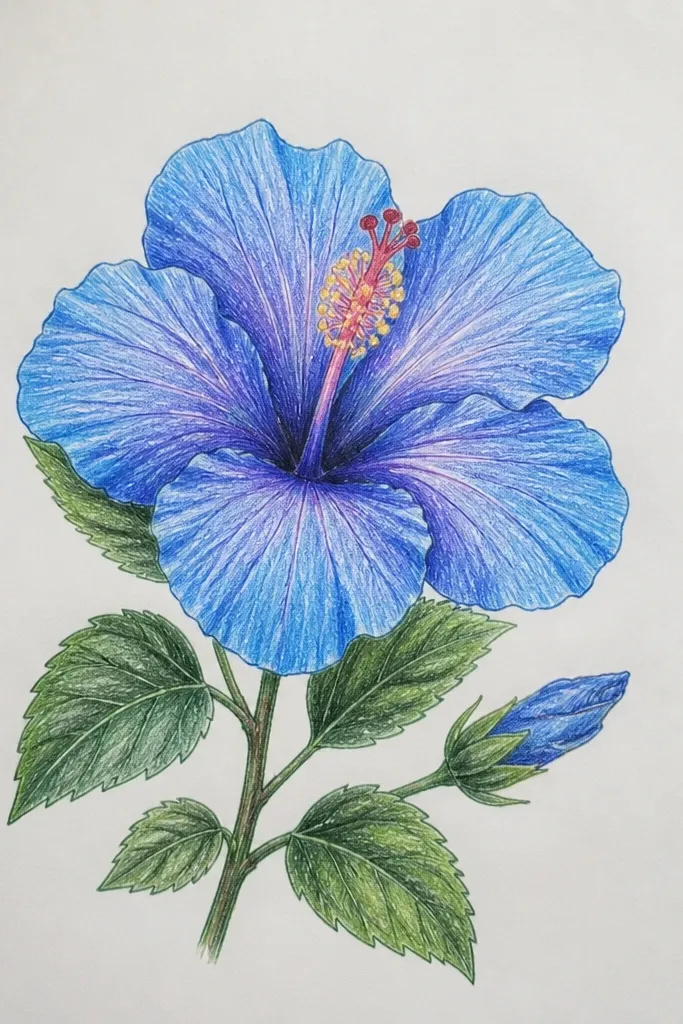
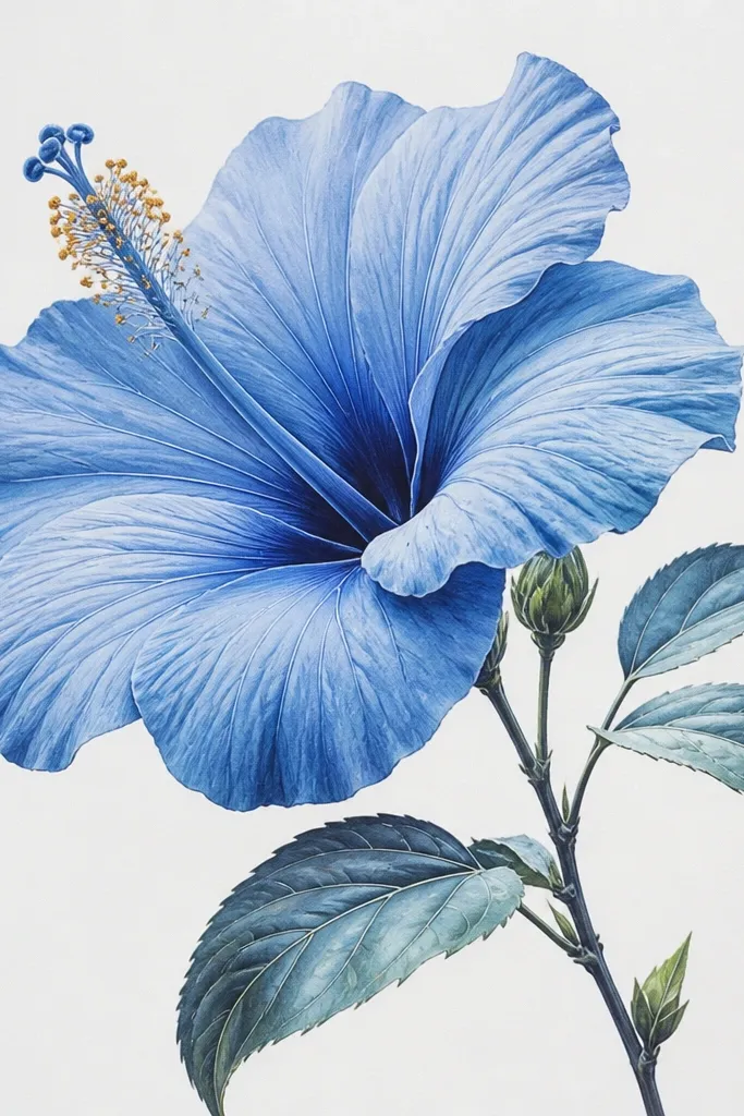
Vein realism is what makes hibiscus look like a real bloom, not a symbol. I shade the petal folds first, then I add vein lines with a harder pencil (H or HB) so the veins look like subtle structure instead of dark cracks. The blue stays translucent because the veins are lighter than the fold shadows. This style is perfect when you want the drawing to feel botanical and you plan to frame it. It also looks great for people who like detail — you’ll get satisfaction from the slow, careful work.
Sketch your hibiscus outline, then map the fold shadows with 2B graphite. Layer light blue pencil across petals, then deepen only fold areas with cobalt-blue. Use an H pencil to draw vein lines: start near the petal base and curve toward the edges, keeping spacing uneven like real veins. Add a few tiny vein cross-lines near the center for depth. Draw the stamen with thin dark lines and add pollen dots with a gel pen. Keep the background white so the veins stay readable.
Use a kneaded eraser to lighten just a few vein areas if they get too dark.
Don’t use a soft 6B for veins; it makes veins look like heavy outlines.
9. Hibiscus Bud and Bloom Duo
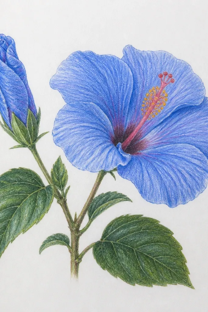
Adding a bud changes the mood from flat flower to growing plant. The bud lets you play with darker blues and tighter petal shapes without overwhelming the page. I place the bud slightly lower and to the side, so the main bloom stays the hero. This composition flatters anyone who wants a more natural bouquet look, especially for spring-themed art. It also makes the drawing feel complete even if you keep the background simple.
Sketch the main bloom first — big enough to take about 55-60% of the page height. Add the bud as a smaller teardrop shape with two or three folded petals in deep blue. Shade fold shadows on the main bloom with graphite and cobalt-blue, but keep the bud darker overall so it feels less open. Add leaves at the bottom using graphite veins and light blue edging. Draw stamens for the main bloom only, with fine filaments and pollen dots. Leave the background white or add a single pale wash behind both shapes.
Make the bud edges darker than the bloom edges; it reads as less open and more shadowed.
Don’t place the bud at the same height as the bloom; it makes the composition look unbalanced.
10. Blue Hibiscus in a Morning Mist Background
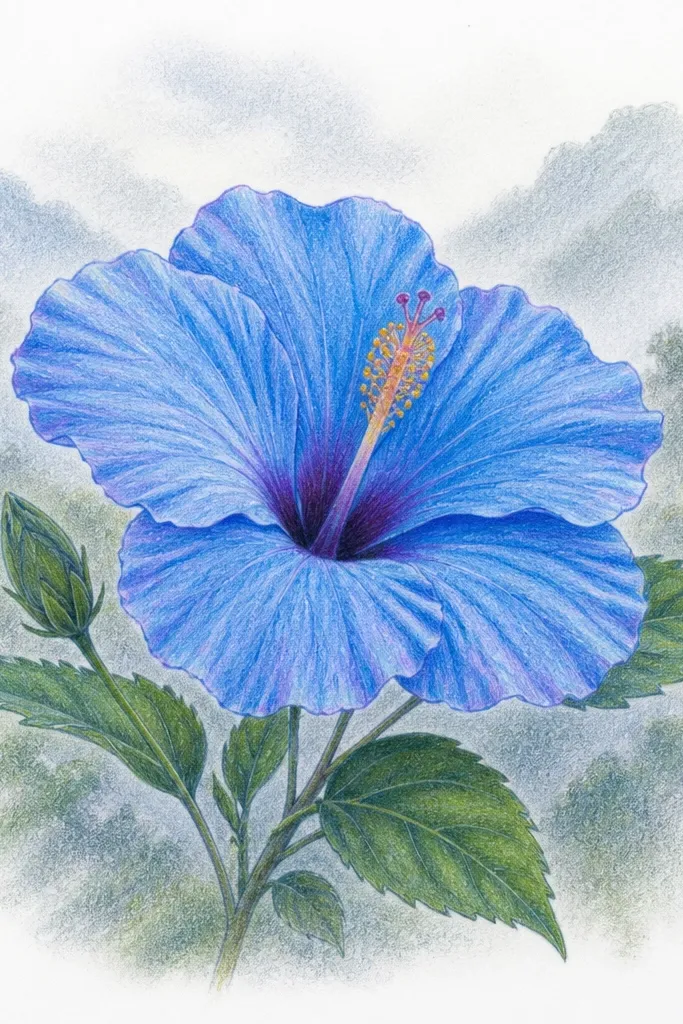
A mist background makes blue hibiscus feel like it’s blooming in air, not sitting on a page. I build it with diluted gray-blue pencil and watercolor, using circles that fade outward so the flower stays sharp. The trick is keeping mist value lighter than your petal folds; otherwise everything merges. This looks great for wall prints because it adds atmosphere without clutter. If you like calm art, this is the one.
Draw the hibiscus outline and shade fold shadows with 2B graphite. Layer light blue pencil across petals and deepen folds with cobalt. Now mix a pale gray-blue (light blue plus a touch of gray) and lightly dab around the flower using a damp brush or soft blender. Build mist in layers: a light haze first, then a few slightly darker circles near the base. Keep the area around the petals clean — don’t smear mist onto the flower edges. Finish with crisp stamen filaments and pollen dots so the center stays the sharp focal point.
Good to knowUse a tissue to lift watercolor pigment right after dabbing; it creates the mist fade faster than blending.
Common mistakeAvoid dark mist all the way to the petals; that’s how it turns muddy.
11. Ink Splatters Behind a Blue Pencil Hibiscus
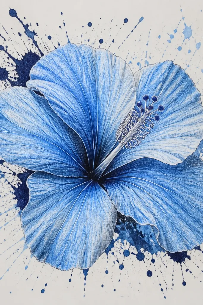
Splatters add energy while keeping the flower calm if you keep them behind the bloom. I do blue hibiscus with colored pencil control first, then I add splatters after the petals are done so nothing smears. Use two ink tones: navy for depth and a lighter blue for the airy look. This style is perfect for sketchbook pages you want to feel like a poster. It also hides small pencil mistakes because the background has movement.
Sketch the hibiscus and shade folds with 2B graphite, then layer light blue pencil and deepen with cobalt-blue. Draw the stamen with thin lines and pollen dots. Let everything sit for a minute so pencil doesn’t smear. Protect the flower area with scrap paper, then flick navy ink splatters behind it using a toothbrush loaded lightly with ink. Add a few lighter blue splatters last for contrast. Remove the scrap paper and check the splatters don’t land on the petals; keep them behind the bloom silhouette.
Good to knowPractice one test flick on scrap paper first — ink density changes fast.
Common mistakeAvoid splattering in front of the petals; it makes the flower look dirty.
12. Blue Hibiscus With Leafy Side Vines
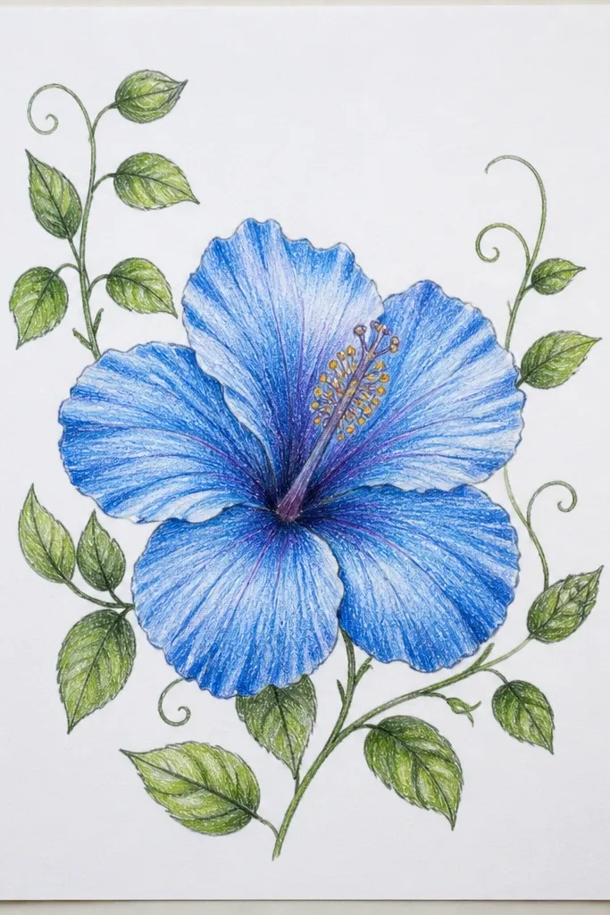
Side vines frame the hibiscus and make it feel like part of a plant, not a floating flower. I draw vines in graphite first, then edge them with light blue so they echo the hibiscus color. The hibiscus stays the biggest shape, while leaves are smaller and lighter to keep focus. This looks flattering for vertical prints because the vines guide the eye up and around the petals. It also works well for wall decals or framed art since the composition has natural movement.
Sketch the hibiscus centered, then add two vine lines that curve from the left and right edges toward the bloom base. Shade hibiscus petals with light blue pencil, deepen fold shadows with cobalt-blue, and keep edges slightly lighter. Draw leaves as almond shapes with a central graphite vein and a few side veins branching out. Add tiny leaf highlights with a white gel pen or lifted pencil using a kneaded eraser. Keep the vines thin so they don’t compete with the stamen. Finish with detailed stamen filaments and pollen dots, then lightly shade leaf edges in blue to tie everything together.
Good to knowMake leaves slightly desaturated compared to petals; if leaves are as dark as the hibiscus, they steal attention.
Common mistakeDon’t draw vines too thick; chunky vines make the whole piece look heavy.
13. Blue Hibiscus With Gold-Tone Stamen Accents
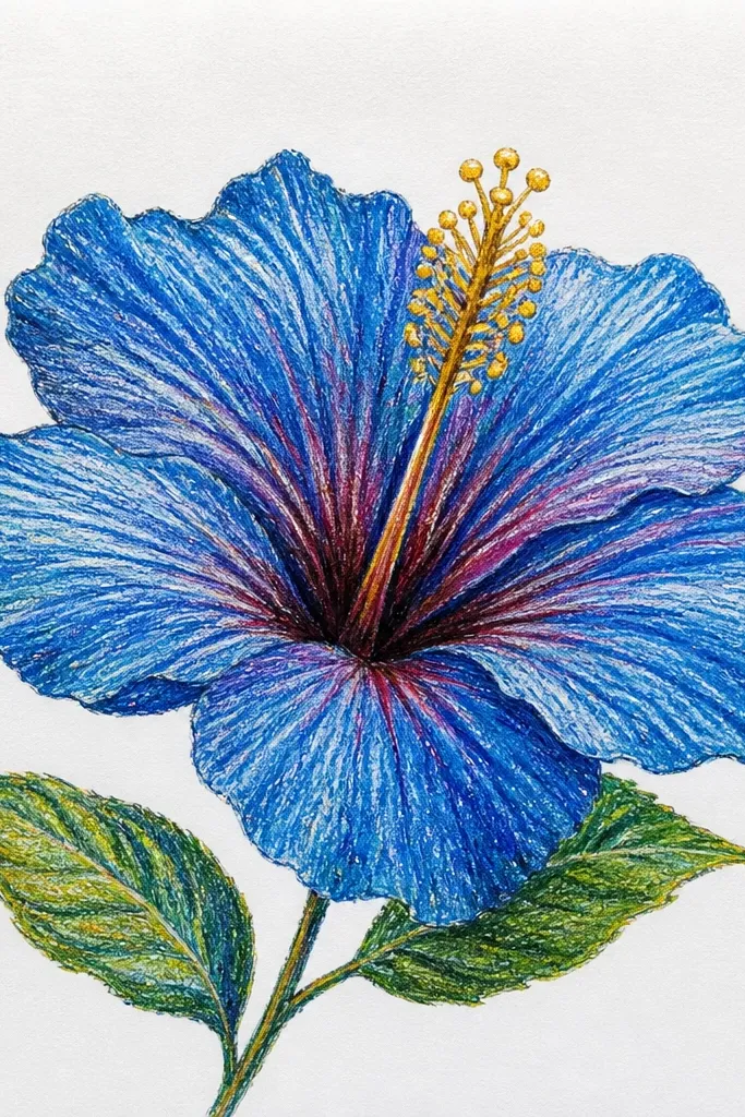
Gold accents make the center look like it’s glowing, which is exactly what you want for hibiscus. I keep petals in cool blues, then I add warm gold only at the stamen tips and a few tiny specks around the center. That contrast makes the stamen feel dimensional and draws the eye right where it should go. This style flatters night-time or moody color palettes, especially if you frame it on black or deep navy mat board. It also looks fancy without needing expensive paints.
Sketch and shade the hibiscus petals with graphite folds, then layer light blue pencil and deepen with cobalt-blue in the overlap shadows. Keep highlights on petal edges lighter by pressing less. Draw the stamen filaments with a dark pencil or fine liner. Color the pollen tips with a gold gel pen, tapping lightly so you get small dot shapes instead of thick blobs. Add a few micro-gold flecks just around the stamen base, not across the petals. Optionally, add one or two tiny white highlights on the petals so the gold doesn’t feel flat.
If the gold looks too opaque, lightly drag a clean pencil over it after it dries to soften the shine.
Avoid coloring the entire stamen gold; it looks like a marker blob and hides the filament shape.
14. Hibiscus With Gradient Petals From Pale to Deep

Gradients make hibiscus petals look like they’re turning toward light. I build the gradient from outer rim to fold center, so the petal feels curved instead of painted flat. Use three blues: a pale sky blue for the outer third, a medium blue for the middle, and cobalt-blue for the fold crease. This style looks great for anyone who wants control and hates muddy blending. It also flatters small drawings because the gradient reads even when you view it from across the room.
Sketch the hibiscus with HB and lightly mark the fold crease lines. Shade the outer petal edges with pale sky blue using light pressure. Then add medium blue in the middle third, leaving the outer rim slightly lighter. Finally deepen the fold centers with cobalt-blue, blending outward with short strokes so the gradient transitions. Draw stamen filaments with a fine liner and add pollen dots. Add one or two thin shadow lines at petal base so the bloom doesn’t look like it floats.
Good to knowUse a scrap paper swipe test to check your cobalt pressure; too much pressure kills the gradient.
Common mistakeAvoid blending with your finger; it smears graphite and makes blue look dull.
15. Blue Hibiscus on Textured Stone Paper
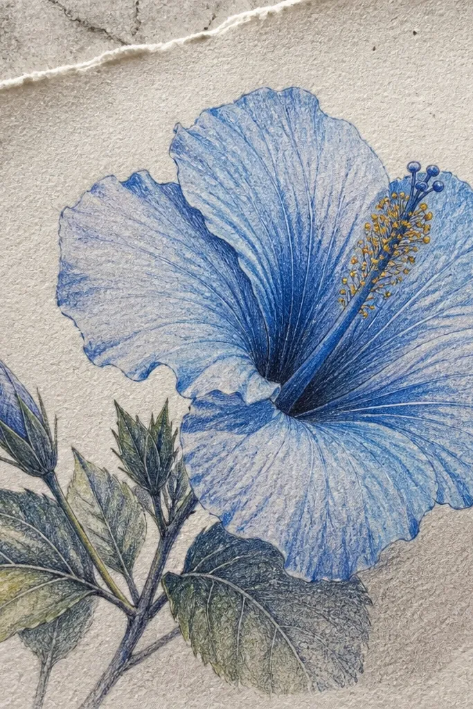
Stone paper makes blue hibiscus look like it has a soft, dry finish. I like it when I want the petals to look airy but still detailed. The texture grabs pencil differently, so you get natural speckle that mimics how pigment sits in real petals. This style works on a small-to-medium size because the texture can overwhelm large areas. It’s also great for people who hate smudges.
Use stone paper or other toothy synthetic paper. Sketch the hibiscus lightly with HB so you can erase without tearing. Shade fold shadows with 2B graphite, then layer light blue pencil across petals. Deepen the fold centers with cobalt-blue, but use gentle strokes so the texture shows through. Draw stamens with a fine liner, then add pollen dots with a white gel pen for tiny highlight points. Keep the background minimal: either leave it blank or add one faint leaf silhouette in very light graphite.
Good to knowPress less than you think; stone paper rewards light passes.
Common mistakeAvoid heavy burnishing on synthetic texture — it creates shiny patches that look uneven.
16. Hibiscus With Negative Space Petal Edges
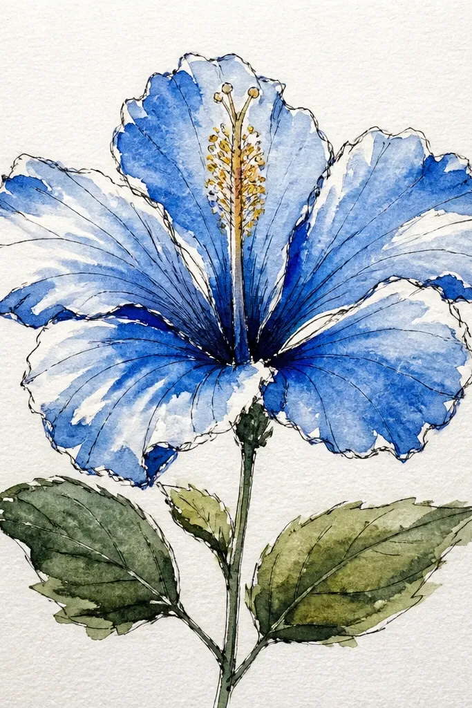
Negative space edges make hibiscus look crisp and graphic even when the shading is soft. I use this when I want the petals to look like layered paper cutouts. The white edge acts like a highlight, so your petals look curved without drawing every vein. It’s flattering for people who struggle with messy edges because you’re intentionally leaving a clean boundary. It also looks good when you print it — the white lines stay sharp.
Sketch the hibiscus and redraw the petal outlines slightly thicker in HB so you can track your edges. Shade the petal interiors with light blue pencil, but stop about 1-2 mm before each outer edge. Add cobalt-blue only along the fold creases and keep it contained. Leave the petal edges blank for a bright white rim. Draw stamen filaments and pollen dots, then add a few tiny shadow lines under the stamen base. If you want extra pop, outline only the center petal folds with a very light pencil tone.
Good to knowUse a ruler or a folded piece of paper as an edge guide to keep your unshaded rim consistent.
Common mistakeAvoid filling the edge rim with blue; once it’s colored, the crisp look disappears.
17. Blue Hibiscus With Water Droplet Highlights
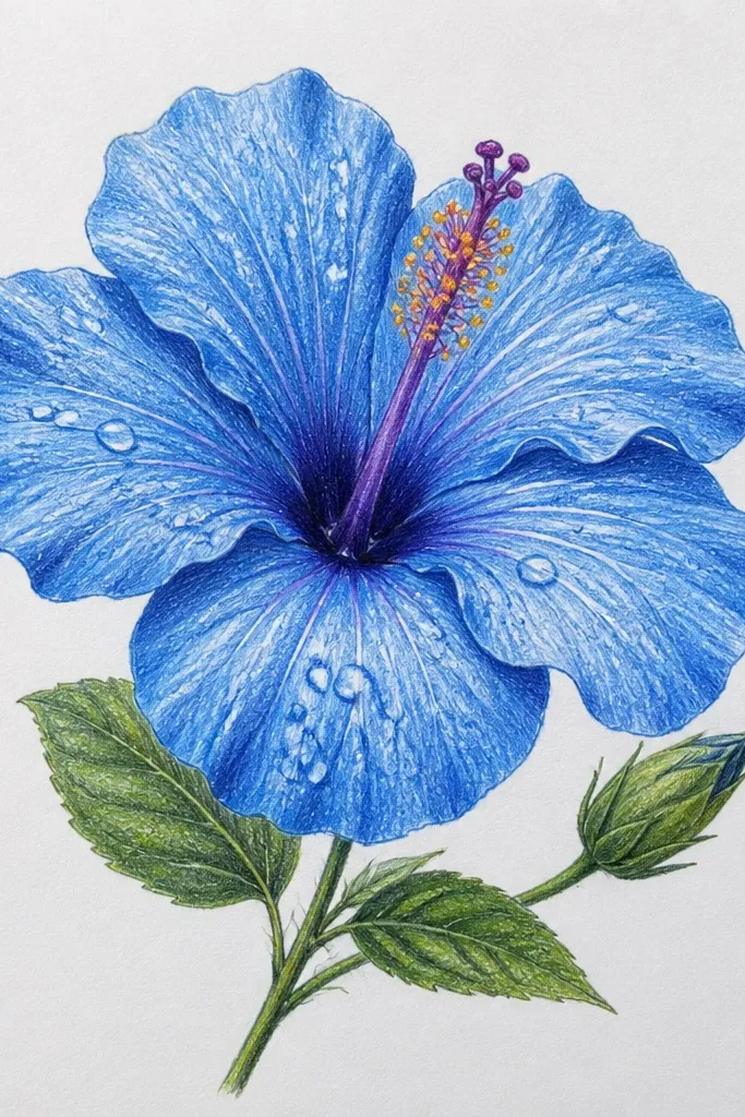
Water droplets turn a simple hibiscus into something that looks fresh after rain. I keep the droplets small and placed where petals naturally catch light — petal outer rims and near the stamen. The effect works because you draw droplets as highlights first, then lightly shade the shadow beneath each droplet with a thin darker blue. This style flatters spring-themed cards and it looks great on dark backgrounds too. On lighter paper it still works, but you need sharper droplet outlines.
Shade the hibiscus first: light blue base on petals, 2B graphite folds, and cobalt-blue in overlap shadows. Let the pencil shading settle for a minute so you don’t smear. Then draw droplets as teardrops with a fine liner or gel pen, leaving the center highlight white. Add a thin shadow under each droplet using a darker blue pencil, keeping it narrow so the droplet looks domed. Draw stamen filaments and pollen dots after the droplet highlights so the center stays crisp. Finish with a couple of tiny micro-dots around droplets to mimic water specks.
Make fewer droplets than you think — 5-8 looks believable; 20 looks like glitter.
Don’t shade the droplet entire shape; it should look clear with only a rim and shadow.
18. Blue Hibiscus With Soft Pastel Background Blobs
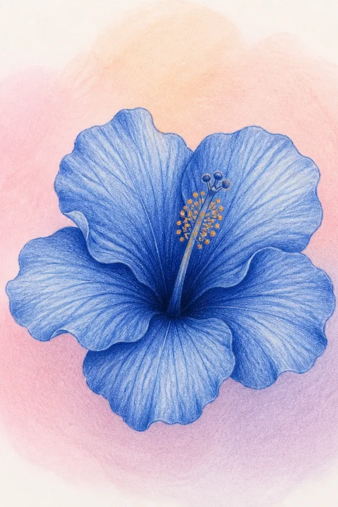
This is the one I pick when I want the hibiscus to feel playful without adding clutter. Pastel blobs give a color mood while keeping the flower the main subject. The secret is to keep the background value lighter than petal folds and avoid dark outlines around the blobs. I use light pastel pencil layers so the background looks like airbrushed paint. It flatters bright spaces and it looks great for wall art prints because the background adds personality.
Draw the hibiscus outline and shade petals with light blue pencil, then deepen fold creases with cobalt-blue. Keep the stamen crisp with fine lines and pollen dots. Now add background blobs: choose three pastels (pale pink, lavender, peach) and lightly layer them in oval shapes around the flower. Blend edges with a light touch so the blobs fade outward. Leave a clear gap of white around the flower silhouette so it stays separated. Darken the center of each blob slightly, not the edges.
Use a separate blending stump for background so you don’t contaminate your blues.
Avoid making the background blobs the same darkness as the petal folds; that flattens the flower.
19. Hibiscus With Blue Pencil + Fine White Ink Outline
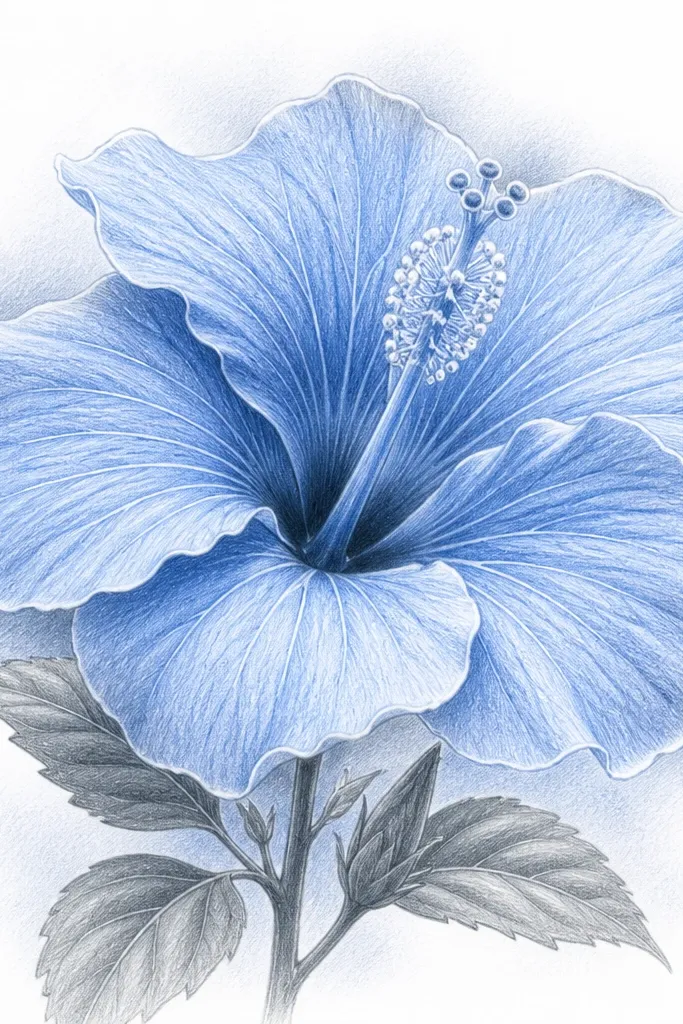
White ink outlines make the hibiscus look like it’s printed on glass. I use this when I want a clean, high-contrast look without turning the whole piece into hard outlines. The white ink sits on top of pencil and catches light, so your petals look sharper even if your shading is soft. This style flatters people who want a modern, poster-like finish and it works well on darker paper too. If you’re drawing for a frame, it makes the artwork look finished from the glass side.
Shade the hibiscus petals with light blue pencil and deepen fold shadows with cobalt-blue. Use 2B graphite for fold crease shadows, then blend lightly with pencil only. Draw the stamen filaments with dark pencil. Once the pencil is set, trace the outer petal edges and a few fold lines with a fine white ink pen, keeping the line thin. Add tiny white dots at pollen tips if you want extra sparkle. Optionally, add a very light gray-blue wash behind the flower so the white outline has something to contrast.
Good to knowLet pencil sit for 5 minutes before inking so the nib doesn’t drag graphite.
Common mistakeAvoid thick white outlines — they look like correction fluid.
20. Blueprint-Style Hibiscus With Ruler Lines
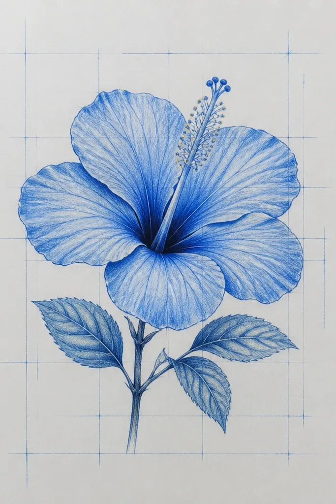
Blueprint styling makes hibiscus look like a design plan, not a nature sketch. I draw it with ruler lines behind the flower, then keep the hibiscus shading controlled so it looks intentional. This is my pick for people who like architecture vibes or want something that looks good in a modern frame. The flower still reads as a hibiscus because the petal shapes and stamen details stay realistic. It also hides minor sketching errors because the grid makes the page feel designed.
Lightly sketch a grid behind your hibiscus using a ruler and HB pencil — about 1 cm squares for a medium page. Draw the hibiscus over the grid, then erase grid lines that cross through the flower so they don’t confuse the silhouette. Shade petals with light blue pencil, then deepen folds with cobalt-blue. Add graphite vein hints only where veins matter — near the center and along a few petal ribs. Draw stamen filaments with a dark pencil, then add pollen dots with a slightly lighter blue pencil or white gel dots. Keep the background grid faint so the flower remains dominant.
Erase grid lines after you shade petals, not before, so you don’t lose your placement.
Avoid dark grid lines — they compete with the stamen detail.