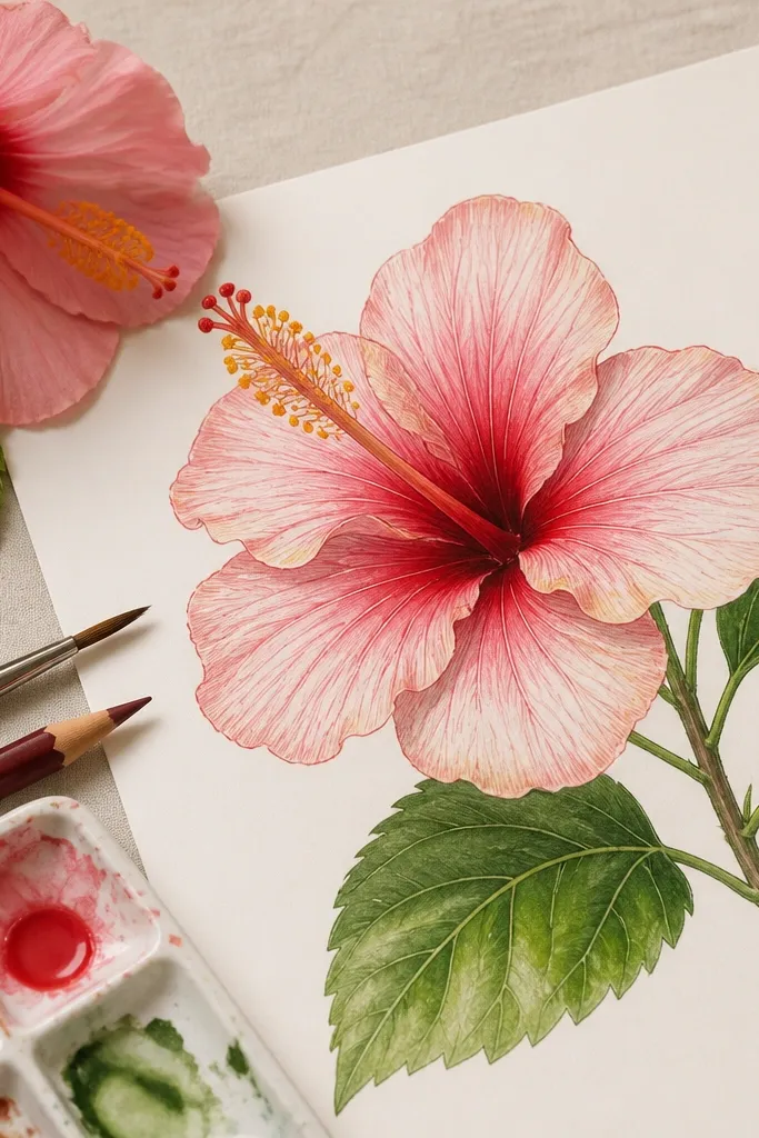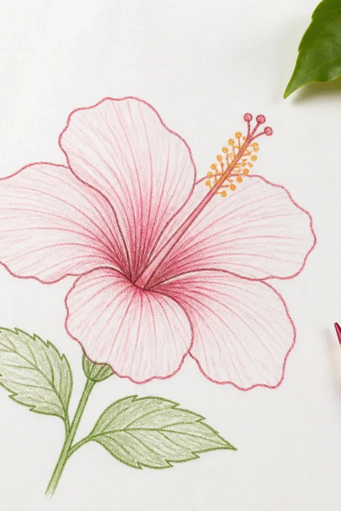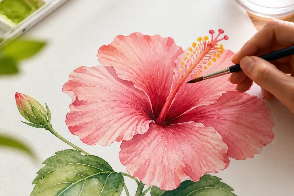
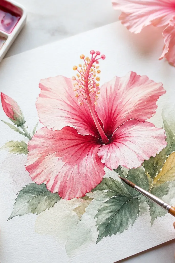
1. Classic pink hibiscus with wet-on-wet petal blooms
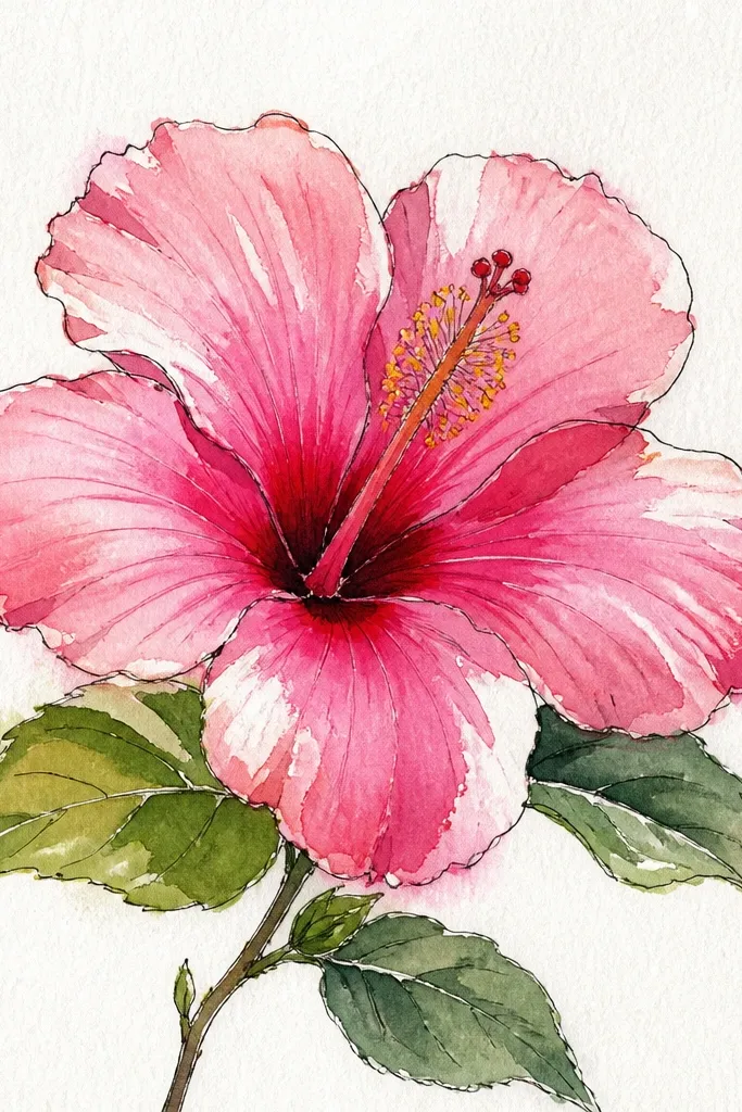
Start by sketching the flower with a loose outline: five main petals, one slightly turned forward. Wet just one petal at the overlap area with clean water, then drop in pale pink and a tiny dab of deeper magenta at the petal base. Repeat for each petal, keeping the center slightly lighter than the edges. Let the wash settle for 30-60 seconds, then use a size 1 brush to add a few vein hints with diluted magenta. Finish by painting the stamen in pale yellow, then add a tiny darker tip with a very small amount of orange-brown.
This look is the one I use when I want a hibiscus that looks airy and bright instead of heavy. You start with a pale pink base (think diluted quinacridone magenta + lots of water) and let it bloom slightly where petals overlap. The darker magenta pools only at the petal base so the flower has direction — it pulls your eye toward the center. It flatters most color palettes because it stays in the pink family and doesn’t fight your background. For drawings, keep your outline light with a 2B pencil so you don’t get graphite shadows through the wash.
Common mistakeDon’t outline with dark paint before the base wash dries — it makes the petals look like cut paper.
Good to knowIf your pink looks chalky, your paint is too dry — add one extra drop of water to your palette mix and try again on a scrap first.
2. Coral hibiscus with warm shadow wedges
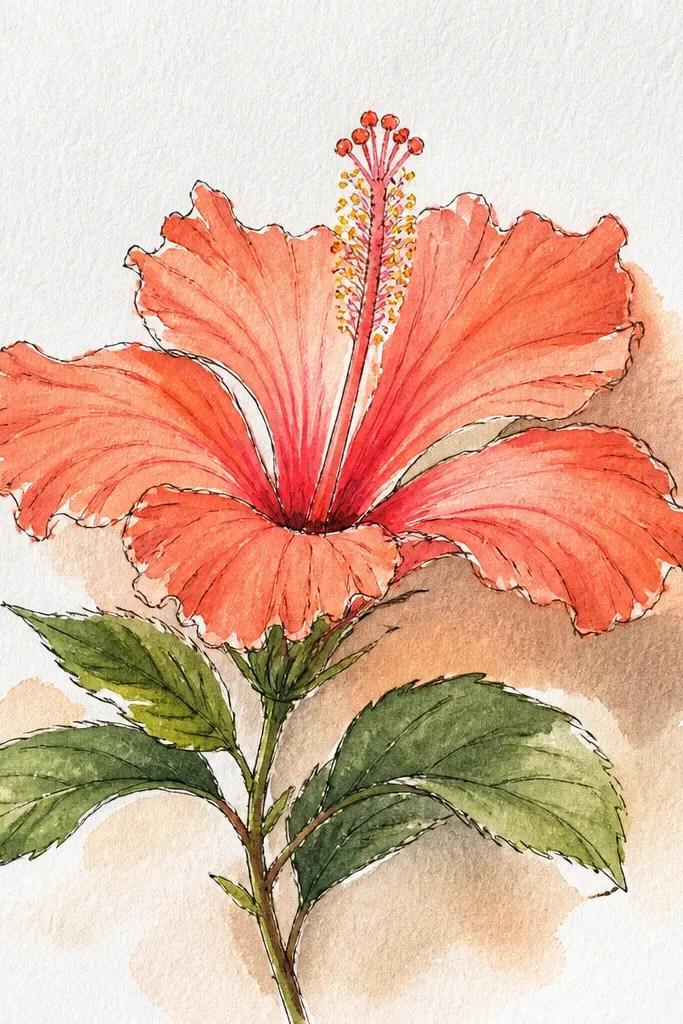
Paint a thin coral wash across each petal, leaving a pale highlight strip near the outer edge. While the wash is still damp, add a narrow shadow wedge at the overlap line using burnt sienna + pink. Keep the shadow wedge clean and tapered so it looks like form, not dirt. After it dries, glaze a second light coral pass over the highlight strip so the petals glow again. Paint the center creamy yellow, then add faint orange dots around the stamen base.
This hibiscus looks like it’s lit from the side. Coral colors can go flat, so I build the illusion with warm shadow wedges — not full shadow blobs. I mix coral using orange + a little pink, then deepen the overlap using burnt sienna mixed with the same pink. The result reads as dimensional even when your drawing is simple. It’s a great choice for warm skin tones in portraits because the flower’s warmth doesn’t clash with underpainting colors.
Common mistakeDon’t over-blend the shadow wedge — if you drag the paint too much, coral turns into a dull brick.
Good to knowUse a separate cup for shadow mix so you don’t contaminate your coral with too much brown early.
3. Deep magenta hibiscus with crisp outline edges
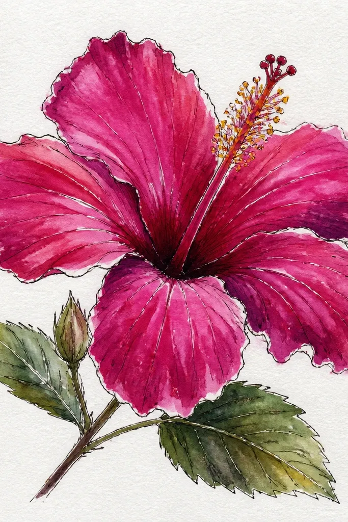
This is the hibiscus I paint when I want drama. The trick is crisp edges: I let the wash dry almost fully, then I add a thin darker line along the petal border and at the overlap points. Deep magenta holds contrast well, so it looks sharp even in small sizes. The flower feels graphic, like a print, and it works on planners, cards, and label art. If you like punchy colors, this one will feel satisfying fast.
Sketch the petals with a light pencil, then erase the heaviest lines so they don’t show. Paint each petal with a mid-tone magenta wash, leaving the center slightly lighter. Let it dry until the shine is gone, about 8-12 minutes depending on your room. Mix a darker magenta (magenta + a touch of ultramarine) and paint a thin border line along the outer petal edge and the overlap seams. Finally, paint the stamen bright yellow, then add the anther with a tiny dot of red-brown and a few short strokes.
If your outline looks too thick, switch to brush size 0 or 1 and pull the line in one confident stroke.
Don’t keep re-wetting the same edge — repeated passes turn crisp borders into fuzzy rings.
4. Sunset hibiscus with orange-to-pink gradient petals
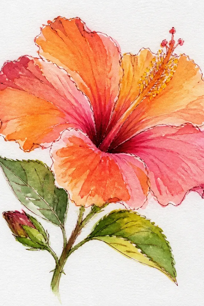
Wet each petal lightly at the base only, not the whole petal. Drop orange into the damp base, then pull pink outward with the brush tip while the paint is still wet. Leave a narrow pale edge at the far tip so the petal doesn’t look heavy. For overlap shadows, add a light glaze of diluted burnt sienna where petals cross. When dry, paint the center yellow-orange and add tiny darker specks near the stamen stalk.
This one looks like sunset light hitting the flower. Hibiscus petals naturally fade — the inside is richer and the outer edge is softer. I paint that fade as a smooth gradient: orange at the base, pink toward the tip. It reads as warm and fresh without becoming neon. It also looks great if you plan to frame the drawing because the gradient gives you movement even on a plain background.
Common mistakeDon’t try to force a gradient on fully dry paper — you’ll get hard bands.
Good to knowUse two separate paint mixes on your palette: orange + water and pink + water. Switching brushes mid-petal prevents muddy gradients.
5. White hibiscus with pale gray-lavender shadows
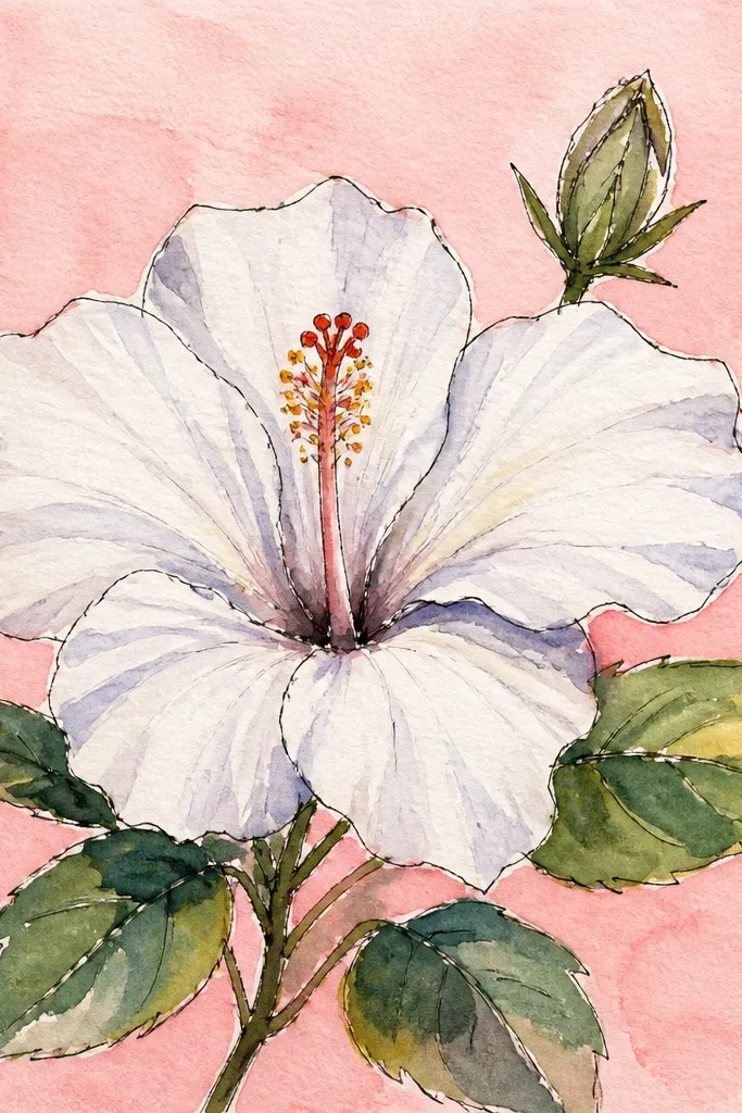
Sketch the hibiscus outline and lightly mark five petals with their overlap lines. Wet the overlap zones only, then paint pale gray-lavender (gray + a hint of purple) into those areas. Leave the rest of each petal mostly unpainted so it reads as white. Add a thin wash of very diluted lavender along a few vein directions. Paint the stamen pale yellow, then dot a tiny brown at the anther tip.
White flowers look simple until you realize they need shadows, not paint. This hibiscus uses the paper as the highlight and paints only the forms: overlap shadows and petal vein hints. I use pale gray-lavender for shadows so it stays cool and doesn’t turn dirty. The center stamen is muted — pale yellow with a touch of brown — so it doesn’t steal attention from the petals. This look is flattering for anyone who likes soft, minimal art and clean negative space.
Common mistakeDon’t fill the whole petal with gray — it turns “white” into “dead gray.”
Good to knowUse the paper’s whiteness as your main color. Your brush should rarely touch the outer petal edges with pigment.
6. Yellow hibiscus with controlled edge darkening
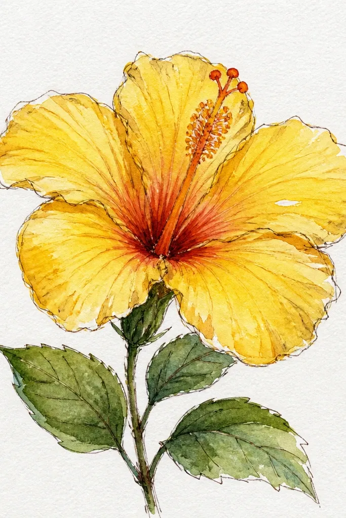
Paint a light yellow wash across the entire petal shape, leaving a tiny highlight near the outer edge. While damp, add yellow-orange to the overlap lines using a size 6 brush, keeping the pigment concentrated near the center. Let it dry, then mix a slightly darker orange-yellow for a thin accent along the petal border. Paint the stamen in bright yellow, then add a warm brown dot at the anther. Finish with a few fine vein strokes using diluted orange.
Yellow can either glow or look like a smear. This look makes yellow feel dimensional by darkening only the overlap edges and keeping the outer petal edges cleaner. I paint a light yellow wash first, then add yellow-orange to the overlap line where one petal sits over another. The stamen stays bright and the anther is a darker warm brown so the center anchors the flower. It works especially well on darker paper because yellow pops, but it also looks great on white.
Common mistakeDon’t use brown shadows too early on yellow — it makes the petals look dirty.
Good to knowIf your yellow gets streaky, rotate your brush and reload with fresh paint — don’t keep dragging the same dry streak.
7. Blue hibiscus with teal undertones and violet center
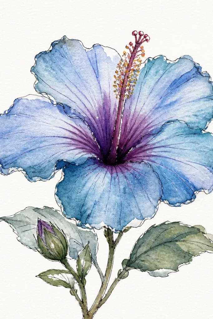
Cool hibiscus looks modern fast, and it’s the one I paint when I want the flower to feel like it belongs on a clean, minimal page. The undertone is teal inside overlaps, while the center uses violet and deep blue for depth. I keep the stamen pale yellow so the warm center balances the cool petals. This pairing makes the flower feel intentional, not random. If you’re planning a set of hibiscus drawings, this colorway makes the whole series look more collected.
Sketch the petals and lightly map the overlap seams. Paint a light blue wash over the petals, leaving the outer edge slightly paler. While damp, glaze teal into the overlap areas near the base. After drying, add violet and deep blue around the center where petals converge. Paint the stamen pale yellow, then add the anther with a tiny amount of deep blue mixed with brown.
Mix a violet that leans blue, not magenta-red, so it stays cool under the blue petals.
Don’t let teal and violet mix everywhere — keep teal to overlaps and violet to the center zone.
8. Two-tone hibiscus with greenish petal veins
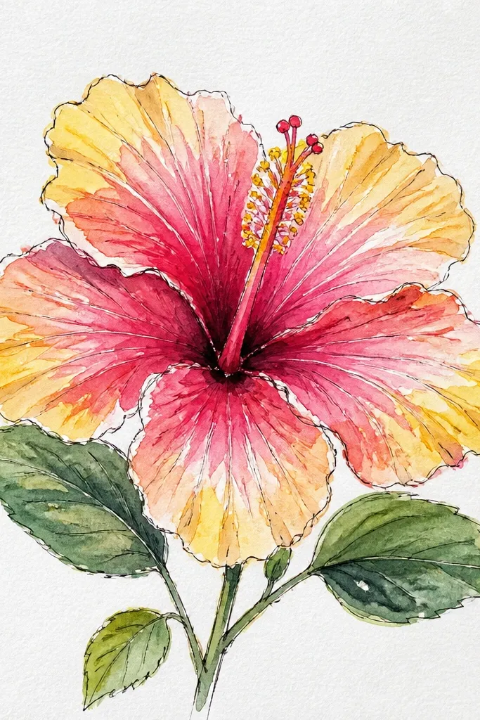
Paint the petals with a soft pink base wash, darker near the base using a diluted magenta. Keep the outer edges light so the veins show contrast. Let it dry, then mix a muted green (green + a tiny bit of blue and a touch of yellow). Using a size 1 brush, paint a few vein lines from the petal base toward the tip, then add short side veins branching off. Paint the stamen yellow and dot the anther with red-brown.
This look adds that botanical “alive” detail that makes your drawing feel real. The petals are still pink, but the veins are a muted green-blue that you only see where light catches the surface. I keep the veins thin and sparse — too many lines makes it look like a cartoon. It flatters anyone who likes nature-inspired art because it reads like actual plant structure. It also makes your hibiscus stand out in a set where most flowers are solid color.
Common mistakeDon’t outline the veins in dark green — it looks like marker.
Good to knowPractice vein strokes on scrap: you want tapered lines, not thick pen-like strokes.
9. Monochrome hibiscus in warm sepia wash
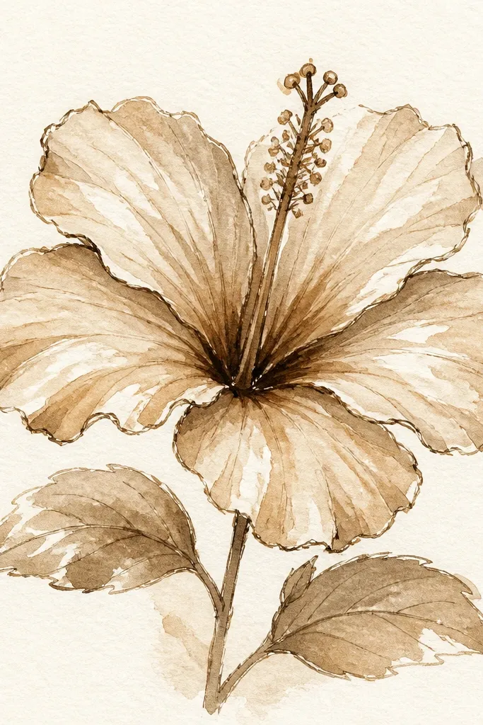
Sketch the flower and erase any heavy graphite. Mix a light sepia wash (burnt sienna + water, with a tiny touch of ultramarine for neutrality). Paint each petal with the light wash, then add darker sepia only at overlaps and where petals curve under. After it dries, glaze a thin darker line along the petal border using a size 1 brush. Paint the center cream-yellow, then add a small brown ring around where the stamen base meets the petals.
Monochrome hibiscus is for when you want calm, vintage paper-art vibes. Sepia also hides minor pencil sketch lines because the whole piece is one value family. I use a light tan wash first, then deepen only overlap seams with richer brown so the flower still has shape. The stamen gets a cream-yellow highlight so it doesn’t disappear. This style looks great in journals and on kraft paper because the tones match the surface.
Common mistakeDon’t use black paint for outlines — sepia needs warmth to stay natural.
Good to knowIf sepia looks too red, add a whisper of ultramarine to cool it down.
10. Hibiscus with granulation texture using wet edge
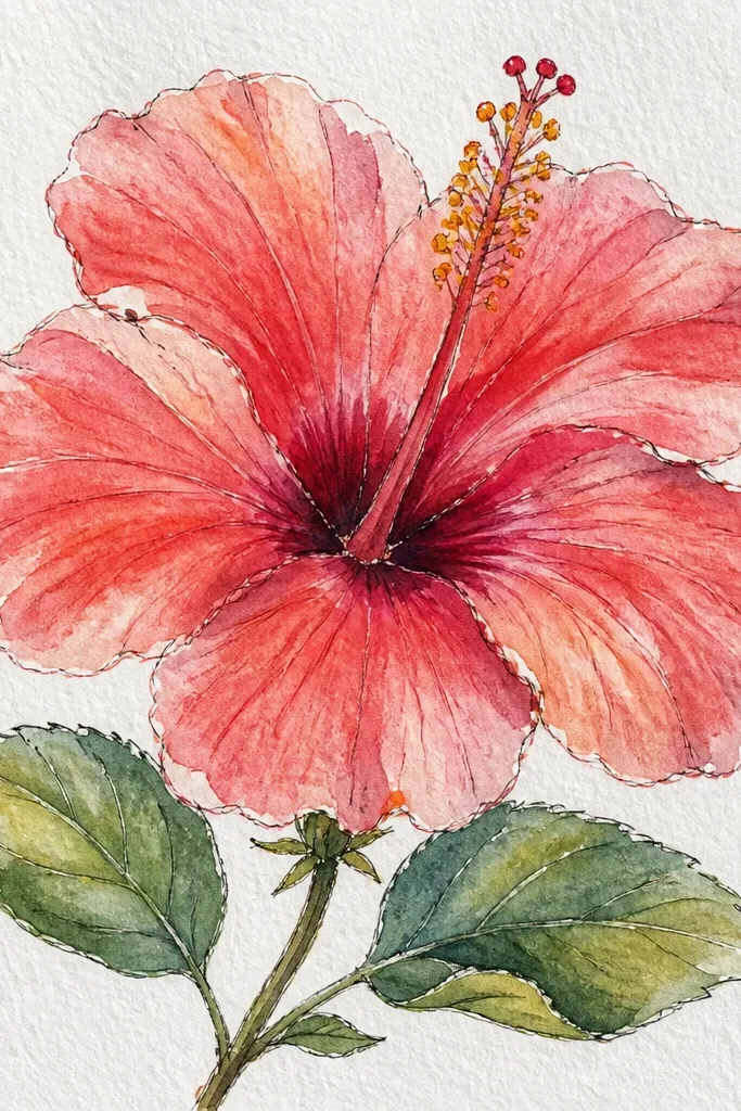
Granulation gives hibiscus that handmade, botanical texture. I use a pigment that naturally granulates (like a granulating magenta) so you see tiny speckles instead of a flat wash. The trick is where you let it granulate: I want texture in the petal base and overlap areas, not on the pale outer edges. This look is best when your drawing is bold enough to hold texture. It also makes your painting look more “real” without extra line work.
Paint a mid-tone pink wash on each petal base, and don’t smooth it too much. Keep the overlap areas slightly wetter so the pigment can settle into granules. Leave the outer edge lighter by dabbing clean water with a brush tip and lifting pigment gently. Once dry, deepen the overlap with a concentrated granulating mix, then add a few darker specks to the center. Paint the stamen yellow, and let any natural granulation show on the anther area for extra detail.
If you don’t see granulation, your paint is probably too diluted — use a thicker mix for the petal base.
Don’t scrub the wash while it’s wet — you’ll erase the texture.
11. Hibiscus with watercolor salt sparkle center
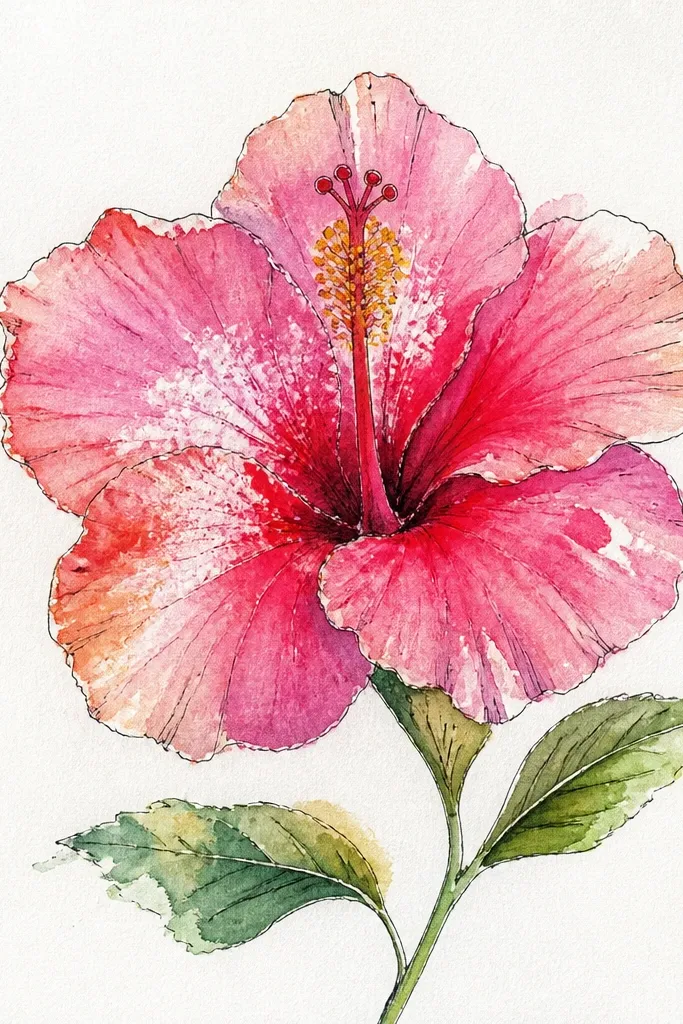
Paint the petal washes normally, keeping the center area slightly darker with diluted magenta near the base. While the center wash is still wet (shiny stage), pinch a tiny amount of salt and sprinkle it lightly just around the inner petal base and near the stamen outline. Leave the rest of the flower untouched. Let it dry fully, then brush off the salt gently with a dry soft brush. Paint the stamen over the texture with pale yellow and add the anther dot with red-brown.
Salt effects look magical when you place them in the right spot. I use salt only in the center base, where hibiscus petals gather, so the sparkle feels like light and pollen rather than random specks. The petals stay smooth and soft everywhere else. This look is fun for cards and prints because it adds a surprise texture without you having to draw tiny dots. It also hides small mistakes in the center because the salt breaks up the wash.
Common mistakeDon’t salt the outer petals — the texture will look like dust.
Good to knowUse coarse salt, not table salt, for bigger sparkle. Tap the salt container over scrap first to see how it falls.
12. Hibiscus on a textured wash background
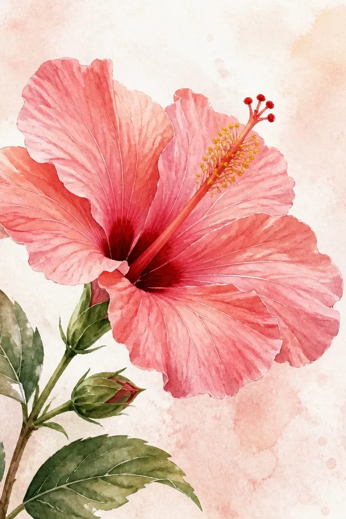
Wet the whole page lightly with clean water using a large brush, then drop in very diluted pink and a tiny touch of yellow for warm haze. Flick a brush with pigment to create small controlled specks, then let the background dry until it’s matte. Paint your hibiscus petals with stronger washes, keeping the outer edges lighter so they stand out from the textured background. Add overlap shadows with diluted magenta-brown and paint the stamen last. Finish by adding a few fine vein lines so the hibiscus feels crisp against the soft background.
This look makes the hibiscus feel like it belongs in a finished piece, not just a cut-out flower. I paint a very light background wash first, with a bit of water and pigment splatter for texture, then I paint the hibiscus on top while the background is mostly dry. The petals keep their shape, while the backdrop adds movement. This is great for wall art or bookmarks because it fills the page without overpowering the flower. It also makes small hibiscus mistakes less obvious.
Common mistakeDon’t paint the hibiscus while the background is still wet — the flower will bleed into the haze.
Good to knowKeep background pigment very diluted. If it’s too strong, your hibiscus edges won’t read cleanly.
13. Hibiscus with watercolor pencil linework then wash
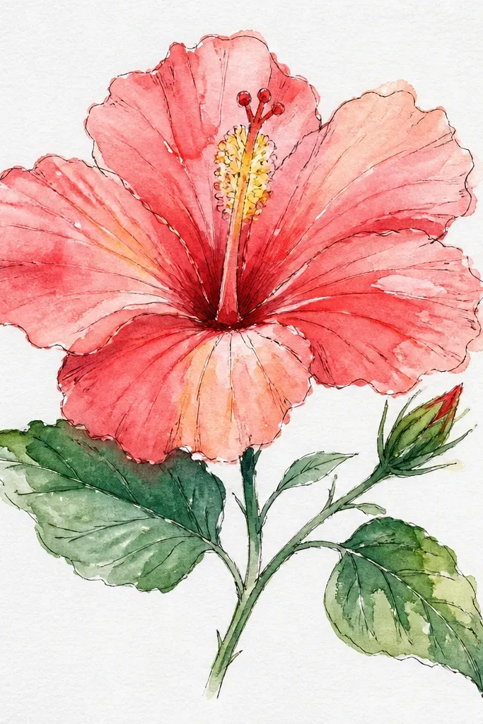
Sketch the hibiscus with light pencil, then go over the main petal shapes and overlap seams with watercolor pencil in mid-pink. Add a few vein lines with a slightly darker pencil shade so you have a map. Now apply a light wash starting at the lightest petal areas, keeping the pencil lines visible. While damp, add deeper magenta to the petal base and overlap. Finish by painting the stamen and using a size 1 brush to reinforce a few pencil vein lines with diluted pigment.
This method gives you control without the hard look of ink. I draw the hibiscus using watercolor pencil first, dark enough to guide you but light enough to blend. Then I wash over it so the lines become part of the paint layer. It’s a lifesaver when your hand shakes or you keep losing petal shapes in wet washes. The result looks like a botanical illustration, clean and intentional. It also works well if you want to keep the drawing lines visible.
Common mistakeDon’t press hard with the pencil — deep grooves show as ugly streaks under wash.
Good to knowUse a paper towel to blot your brush before you touch the pencil line area, so you don’t lift the pencil too aggressively.
14. Red hibiscus with translucent petal layers
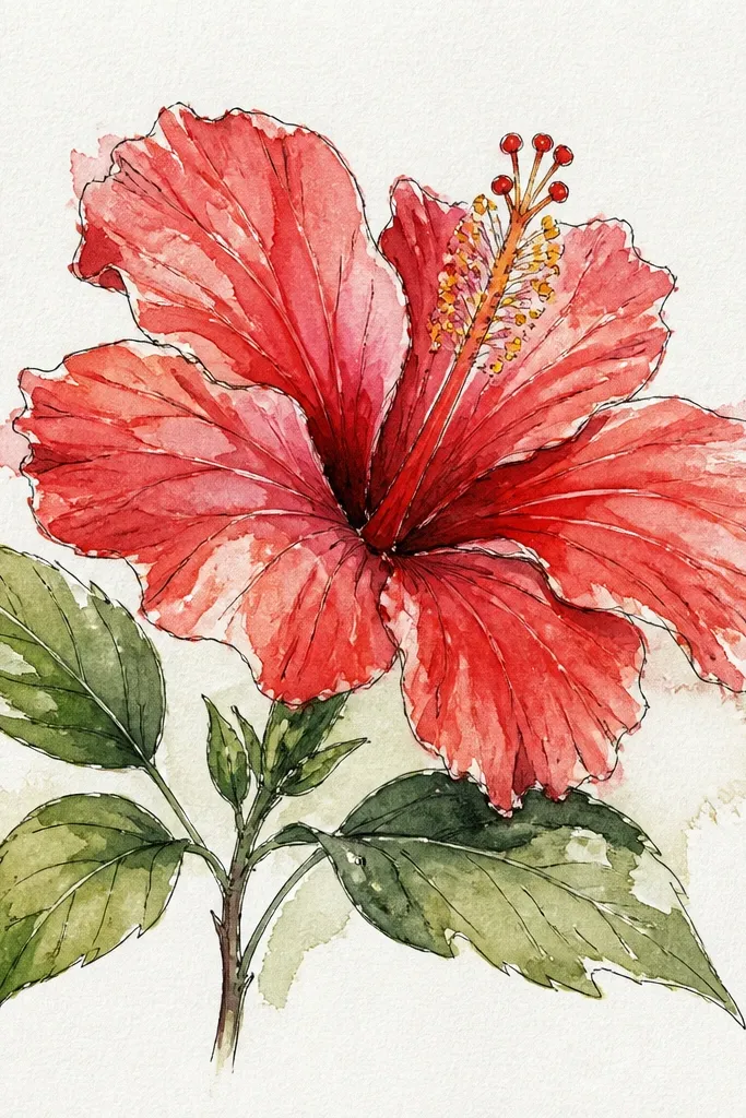
Paint one petal at a time, starting with the back petal. Use a watery red wash and let it dry just enough that it’s not bleeding into the next petal, about 5-8 minutes. Paint the next petal on top with another thin red wash so the overlap becomes darker by layering. Add a concentrated red at the overlap seam and a tiny darker line near the petal base. When all petals are done, paint the stamen yellow and add a red-brown anther dot.
Translucent layers make hibiscus look like real petals because you can see the overlap structure. I paint each petal in a semi-transparent red, then deepen only the overlap lines with a stronger red. The outer edges stay lighter so the flower doesn’t turn into a single red blob. This style looks great for small-format paintings because the layering gives depth even at a glance. It’s also forgiving if your drawing isn’t perfectly symmetrical.
Common mistakeDon’t mix your red with too much black or gray — it will look like a bruise.
Good to knowLayer with patience: thin coats look richer than one thick coat.
15. Hibiscus with watercolor masking fluid for sharp highlights
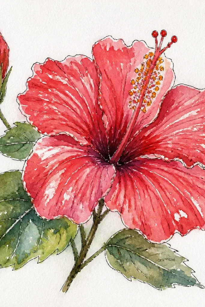
Sketch your hibiscus and decide where the highlights sit: a broad highlight band on each outer petal edge and one curved streak near the center. Paint masking fluid only on those highlight shapes and let it dry fully. Mix a mid pink wash and paint over the entire petal, then add deeper magenta at overlaps. Let the wash dry, remove the masking fluid with gentle rubbing, and you’ll see crisp white shapes. Paint the stamen last with yellow and add the anther dot.
Masking fluid is how you get those crisp petal highlights that make hibiscus look glossy. I use it on the highlight band near each petal edge and a couple of narrow streaks inside the petal curve. The paint goes over everything, and the highlights stay untouched and bright. This makes the flower look more dimensional than relying only on leaving paper white. It’s a little more work, but the results look cleaner and more “finished.”
Common mistakeDon’t paint masking fluid too thick — it can leave gummy edges that repel paint.
Good to knowRemove masking fluid when the paper is completely dry so you don’t tear the surface.
16. Hibiscus with soft background vignette and floating petals
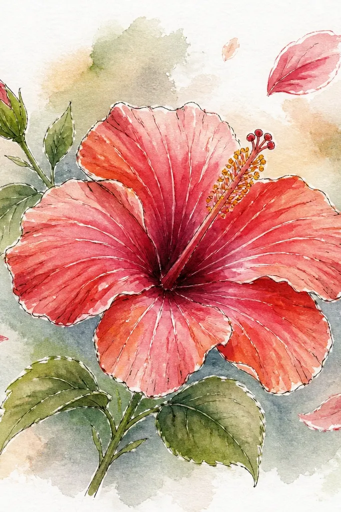
Tape your paper down if needed. Wash a very light pale pink or warm gray across the page, leaving the center slightly lighter. After it dries to matte, wet the outer edges only and glaze a diluted darker pink-gray around the corners to create the vignette. Let the vignette dry completely, then paint hibiscus petals with stronger pink and coral washes. Add overlap shadows and paint the stamen last, then reinforce a few petal edges with a very thin darker glaze.
A vignette background makes the hibiscus feel like it’s framed by light. I paint a light wash background, then deepen the corners with diluted pigment so the center stays pale. The petals keep their contrast, so the flower pops without you needing heavy outlines. This style is great for greeting cards because it looks like a finished illustration even when the drawing is simple. It also makes small hibiscus details stand out.
Common mistakeDon’t wet the whole page for the vignette — you’ll lose the crisp flower edges.
Good to knowKeep the vignette one tone darker, not two — otherwise it competes with the petals.
17. Hibiscus with watercolor splatter pollen dots
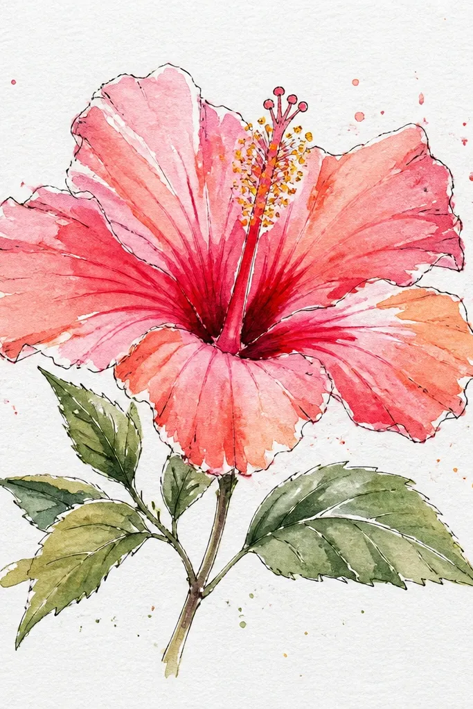
Paint the hibiscus petals with your chosen palette, leaving the center slightly darker near the base. While the center wash is still damp, load a toothbrush or a stiff brush with concentrated yellow-orange watercolor. Flick it toward the center area from a few inches away, so dots land mostly around the stamen base. Add a second, smaller flick with diluted red-brown for tiny accents. When everything dries, paint the stamen and outline a few stamen edges with a size 1 brush.
Pollen dots add realism because hibiscus centers aren’t perfectly smooth. I use splatter like a controlled sprinkle, focusing on the center zone so it looks like pollen dusting the petals. Keep the dots warm: yellow-orange and a few tiny red-brown specks. The rest of the flower stays clean so you don’t end up with a noisy painting. This look is especially good if you’re drawing hibiscus for stickers, envelopes, or any design where the center needs energy.
Common mistakeDon’t splatter across the whole page — it makes the flower look like it was hit by paint.
Good to knowPractice the flick on scrap paper — distance decides dot size more than speed does.
18. Hibiscus with layered leaves and stem in one continuous wash
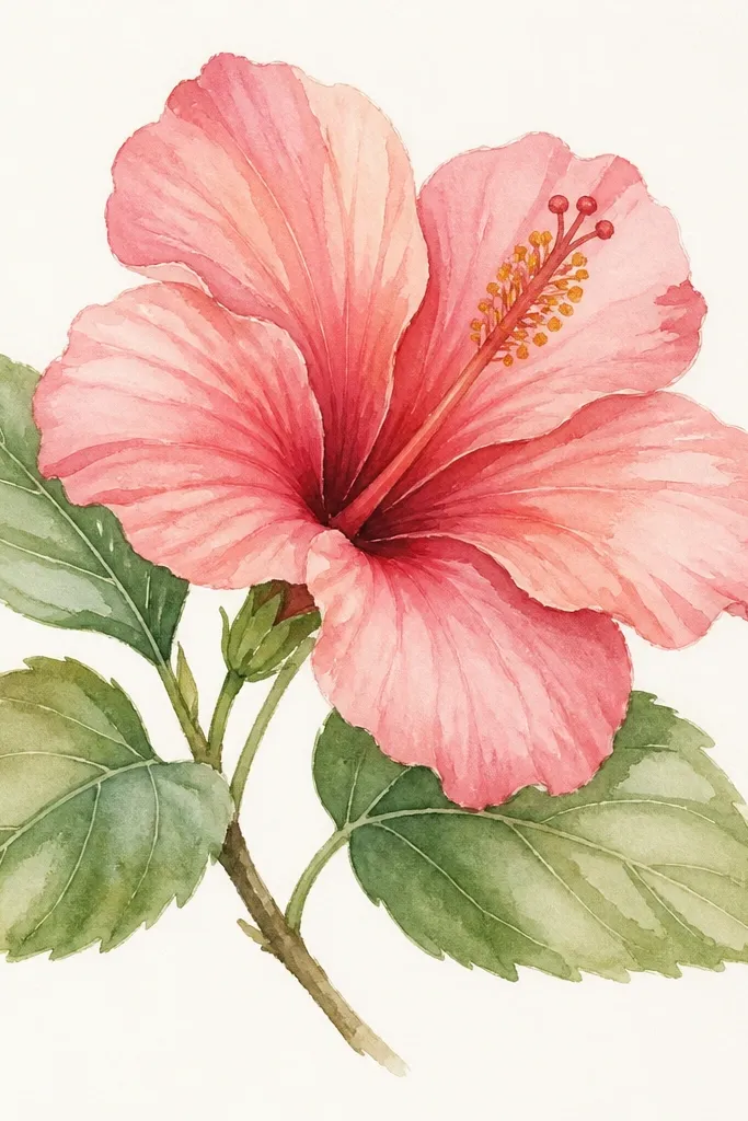
This is the hibiscus I paint when I want the flower to look anchored on paper instead of floating. By painting a few leaf shapes in the same “loose family” of washes, the flower feels like part of a botanical sprig. I keep the leaf greens slightly warm (green + yellow) so they match the hibiscus warmth. It flatters the eye because your viewer gets a visual rhythm from leaves to petals to stamen. If you’re drawing for home decor, this composition looks better than a single isolated bloom.
Sketch the hibiscus and add two leaf shapes: one angled up, one angled down behind the bloom. Mix a soft green wash and paint the leaves first, then add darker green at the vein lines while they’re damp. Let the leaves dry. Paint the hibiscus petals with a light base wash, then deepen overlap shadows with magenta mixed with a touch of burnt sienna. Finish the stamen and add a thin stem line with a size 1 brush so the plant connects visually.
Match your leaf shadow color to your petal shadow color — even a tiny overlap in temperature makes it feel cohesive.
Don’t paint leaves with pure blue-green — it clashes with warm hibiscus pinks.
19. Hibiscus in a tight sketchbook style with quick wet layers
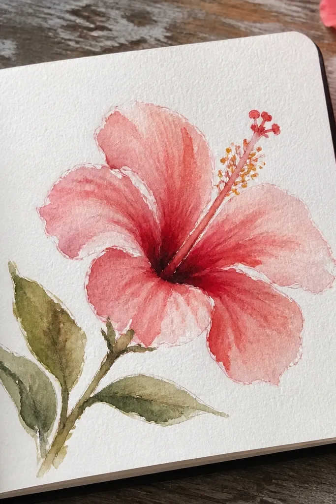
Sketch the hibiscus lightly and mark where petals overlap with short pencil lines. Wet one petal overlap seam, then paint a quick base wash across that petal. Move to the next petal and paint over the overlap seam so the center darkens by layering. While the center is still damp, add a deeper magenta around the base and paint the stamen with pale yellow. Finish with just a few vein strokes and stop — the loose edges are part of the charm here.
Sketchbook hibiscus should look like you caught it in motion. This look is about speed without losing the hibiscus structure: five petals, overlapping seams, and a defined center. You still paint in layers, but you don’t overwork the edges. The flower looks charming because the wash has movement, and that movement is what sells it. It’s beginner-friendly because you’re not chasing perfect symmetry — you’re chasing the petal overlap logic.
Common mistakeDon’t keep fixing the same petal after it dries — the sketchbook look turns into mud.
Good to knowKeep a timer for yourself: 25 minutes max for the wash, then 10 minutes for details.
20. Hibiscus with ombre background wash behind the flower
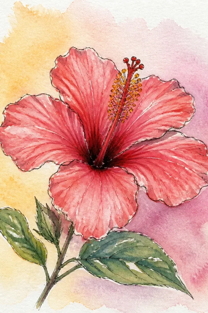
Paint an ombre background by wetting the top half lightly and applying diluted pigment, then pulling it down with a clean damp brush. Keep the bottom half almost white so the hibiscus has space to breathe. Let the background dry to matte. Paint the hibiscus petals with a light base wash, then deepen overlaps with magenta-brown. Add stamen bright yellow and a tiny anther dot, then reinforce a few petal edges with a thin darker glaze.
An ombre background makes the hibiscus feel like it’s sitting in atmosphere. I paint the gradient first, then leave the hibiscus for last so the flower stays crisp. The ombre can be as simple as pink-gray fading down the page, and it gives you instant depth even if your hibiscus drawing is small. This looks great for framed art because the background gradient adds polish without adding extra objects. It also helps your stamen pop because the center has a bright warm contrast.
Common mistakeDon’t paint the ombre too dark — it will swallow the flower’s highlights.
Good to knowUse less water near the bottom of the ombre so the fade doesn’t spread into the whole sheet.