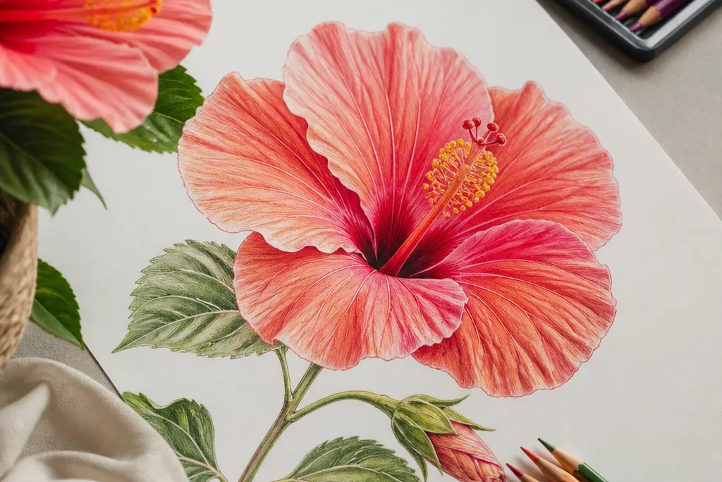
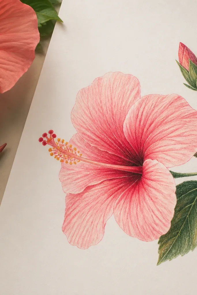
1. Single Hibiscus With Sunlit Throat Glow
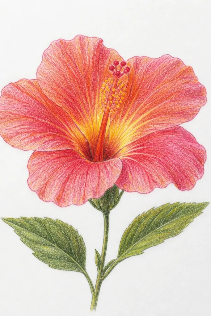
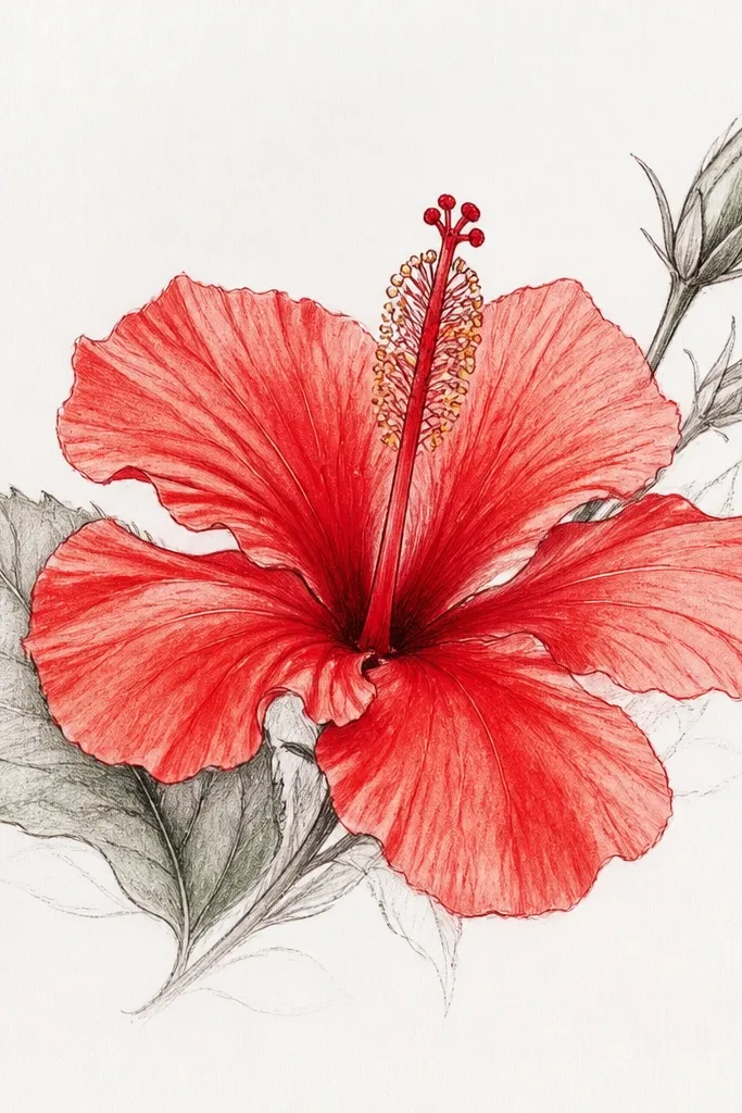
This one is my go-to when I want the flower to look “alive” fast. The petals use light pink as the first layer, then rose pink and a touch of magenta only in the fold lines. The throat starts with pale yellow-orange, then you add rust and deep red right where the petals overlap. Because the background stays mostly white, the glow reads clearly even if your blending isn’t perfect. It suits most skin tones and lighting because it’s high-contrast and clean — no busy background to distract from the petals.
Sketch the flower with a simple five-to-six petal shape, then mark the throat area as a small oval. Lay pale pink over each petal using light, curved strokes that follow the petal edge. Next, deepen the folds with rose pink, keeping the outer petal edges lighter than the inner folds. Color the throat with pale yellow-orange, then add rust-red near the center and press a darker red-brown only along the petal overlap lines. Finally, add two to three thin green vein lines on the petals and leave the rest of the background blank.
Leave a tiny highlight gap at the top of each petal where the light hits — it makes the whole flower look glossy.
Don’t shade the whole petal evenly; hibiscus looks best when only the folds and veins get the darkest color.
2. Hibiscus Side Profile With Overlapping Petals
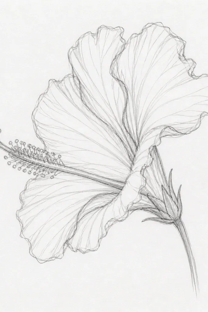
Side-profile hibiscus teaches you depth without needing a complex background. I keep the foreground petal the lightest, then I tuck the back petals into slightly cooler shadows so they look like they’re behind. The throat shows less space, so the yellow-orange glow is smaller and more intense. Use warm reds in the fold areas, but keep the outer edges cooler with a faint mauve. This design looks great in sketchbooks because it creates a natural focal point — the big foreground petal — even on smaller pages.
Draw the flower with one dominant petal facing you, then add two or three petals behind it using partial outlines. Start by coloring the foreground petal with a light peach-pink, then add rose pink along the fold lines. For the back petals, use a cooler mauve layer and keep the highlights thinner. Shade the throat with yellow-orange, then add deep red-brown under the overlapping petal edges. Finish by lightly tinting the background edges with a very light blue pencil so the flower pops.
Use shorter strokes on the back petals — it helps them recede.
Don’t outline every petal edge in dark pencil; side depth comes from shading, not heavy outlines.
3. Two Hibiscus Flowers On a Stem
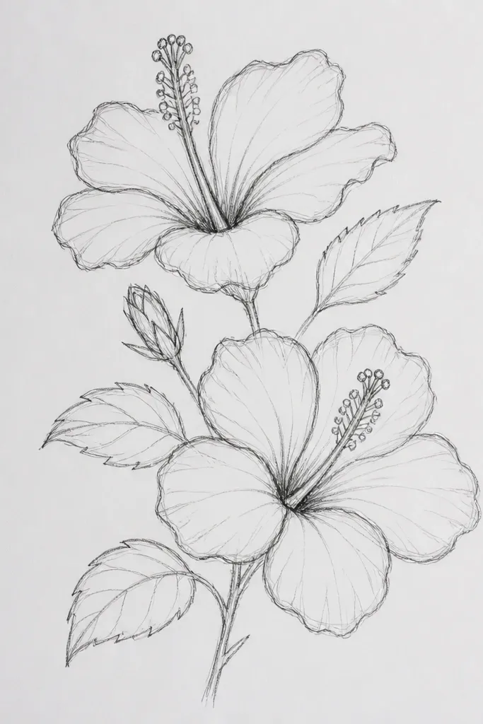
Two flowers give you instant variation. I color one bloom as the “main” with deeper reds and richer greens, then I soften the other bloom with lighter pinks and fewer dark veins so it feels farther away. The stem and leaf veins let you practice consistent line direction, which matters for realism. This layout looks good for gifting because it reads like a small bouquet, not a lone flower. It’s also forgiving if your shading varies — the second bloom hides minor inconsistencies.
Good to knowMake the smaller flower’s throat a little less saturated; it sells the distance.
Sketch a gentle S-shaped stem, then place the larger hibiscus on the left and the smaller one on the right. For both flowers, start with pale pink on all petals, then deepen the main bloom folds with rose and magenta. Keep the smaller bloom folds lighter — use only rose pink and skip the darkest red-brown ring. Color both throats with yellow-orange and add rust-red only at the inner overlap zones. Shade leaves with mid green, then darken the vein line and edges with olive green.
Common mistakeAvoid using the same dark red intensity on both flowers — it makes them look flat and stuck on the same plane.
4. Hibiscus Bud Before Opening
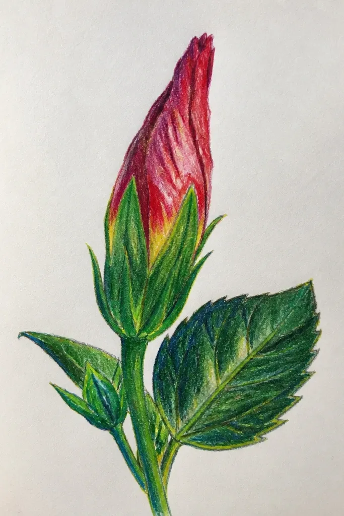
A bud is a different shading problem, and that’s why it’s worth doing. Folded petals mean you have fewer flat surfaces and more shadowed edges. I use green outer layers with a warm tint so the bud doesn’t look like a generic leaf. Then you add a strip of pink at the petal tips, and only a small throat opening with yellow-orange. This design looks great for practicing edges because the folds are crisp and you get clear contrast between green and pink.
Good to knowUse a darker green only on the creases, not across the whole bud.
Draw an oval bud shape and wrap three to four petal tips around it like folded envelopes. Color the outer bud with mid green, then add olive green to the deepest fold shadows. Lightly tint the petal tips with pale pink, then deepen the fold lines with rose pink. For the tiny opening, add yellow-orange and then a thin rust-red shadow line at the fold edge. Keep the background white so the bud reads clearly.
Common mistakeDon’t make the bud petals fully flat; folded shapes need narrow highlights and tight shadow bands.
5. Hibiscus Center Study With Vein Practice
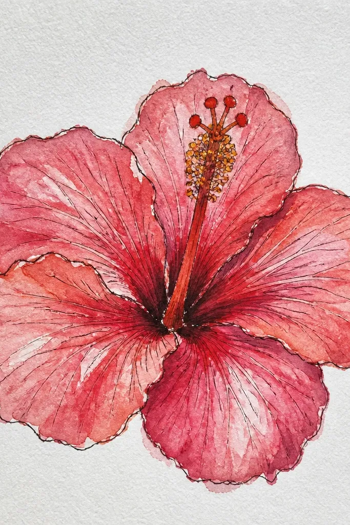
This is a training page, not a pretty page — and it pays off fast. When you zoom into the center, you can see exactly how veins pull color toward the throat. I build the center with yellow-orange first, then I layer orange and a darker rust-red along the fold edges. The inner petals get a light rose base with thin dark vein lines that follow the curve. It works for anyone who struggles with petal realism because it teaches you where the darker pigment actually sits.
Good to knowSwitch to a lighter pencil for blending — heavy pressure ruins the vein detail.
Sketch an oval center and crop the surrounding petals so you only see half of each one. Lay yellow-orange in the throat area with light strokes, then gently blend outward with pale peach. Add rust-red along the fold edges and deepen with a brown-red pencil only where petals overlap. Use a sharp tip to draw thin vein lines in rose, then press slightly harder at the vein start near the throat. Keep the outer petals mostly pale so the center stays the star.
Common mistakeDon’t scribble over the veins; keep them crisp and let the layering do the work.
6. Hibiscus on Textured Paper With Soft Blending
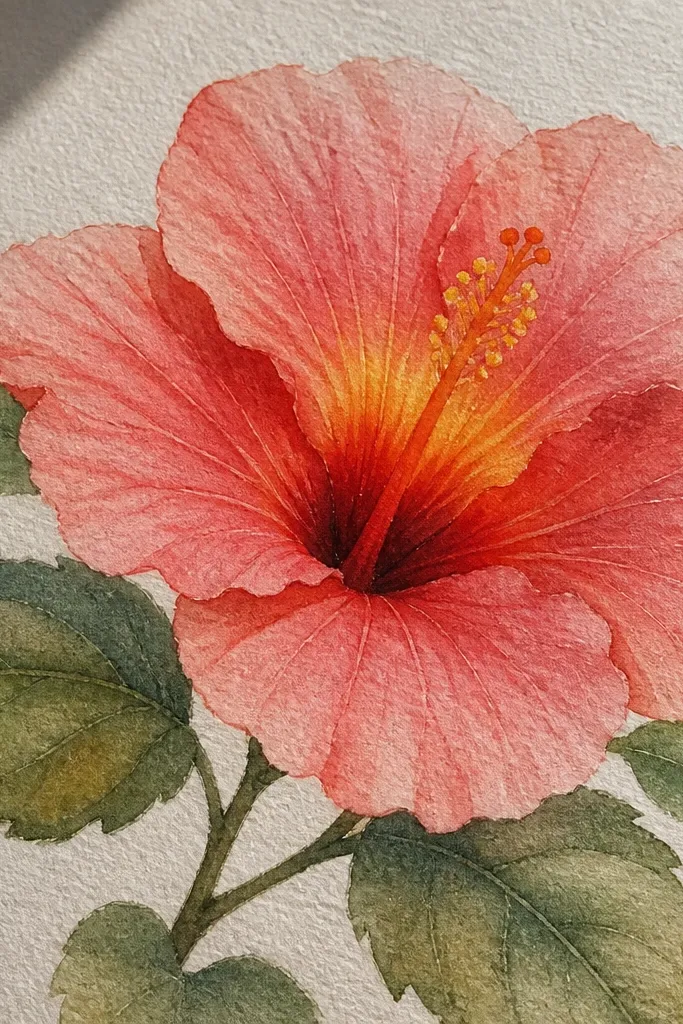
Textured paper changes how pencil behaves, and this idea uses that to your advantage. The tooth of cold-press paper grabs pigment, so you get natural speckling that looks like petal surface. I keep blending light and let the texture do the smoothing, especially on the outer petals. The throat still needs control: yellow-orange stays bright, and red shadows sit in a tight ring. This design looks best when you use fewer bold outlines and rely on shading gradients.
Good to knowUse a tissue to lift a little pigment on the outer highlights; it creates a natural “shine” look.
If your paper is textured, sketch the flower with light lines so you don’t indent it. Start petals with pale pink, coloring in small circles to let pigment catch the tooth. Add rose pink along fold shadows, but don’t try to fully erase texture — keep it airy. Color the throat with yellow-orange, then add rust-red with a tighter edge where petals overlap. For leaves, use muted green and add olive shading only at the vein bends. Leave the background empty to avoid competing with the paper texture.
Common mistakeDon’t push hard on textured paper; it turns highlights chalky and the whole flower looks scuffed.
7. Hibiscus Flower With Patterned Background Dots
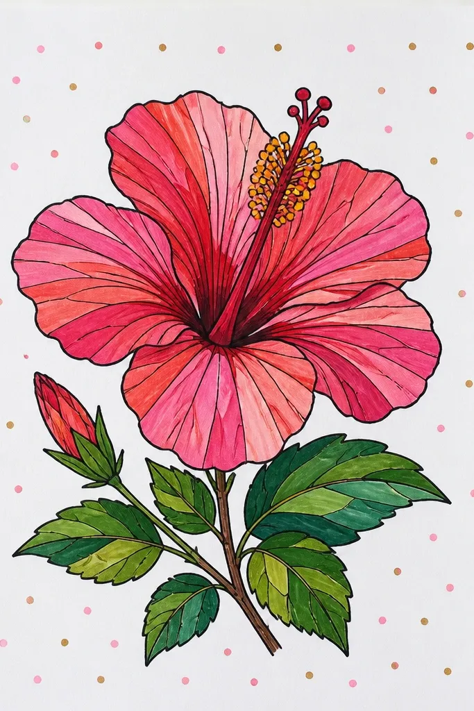
A patterned background makes your drawing look designed, even when the flower shading is simple. I use tiny dots because they’re easy to control and they don’t fight the petal edges. The dot colors are faint: pale yellow and light blue, both lighter than the petals. This keeps the hibiscus as the focal point while still giving your page personality. It’s great for scrapbooking because it looks intentional and doesn’t require a full watercolor wash.
Good to knowUse a sharp pencil tip for dots and keep your pressure consistent so they look like they’re printed.
Draw the hibiscus first and keep the petals outlined lightly. Color petals with pale pink base, then rose and magenta only in fold areas. Keep the throat glow warm with yellow-orange and rust-red shadows. Now plan your dot grid: lightly mark a few horizontal guide lines, then add tiny dots with a pale yellow pencil, alternating with light blue dots. Stop the dots about 2-3 mm before the flower outline so the background doesn’t blur the petals. Finish leaves with mid green and darken the vein line with olive green.
Common mistakeDon’t use dark dots behind the flower; it makes the petals look messy instead of layered.
8. Hibiscus With Watercolor-Style Color Pencil Wash
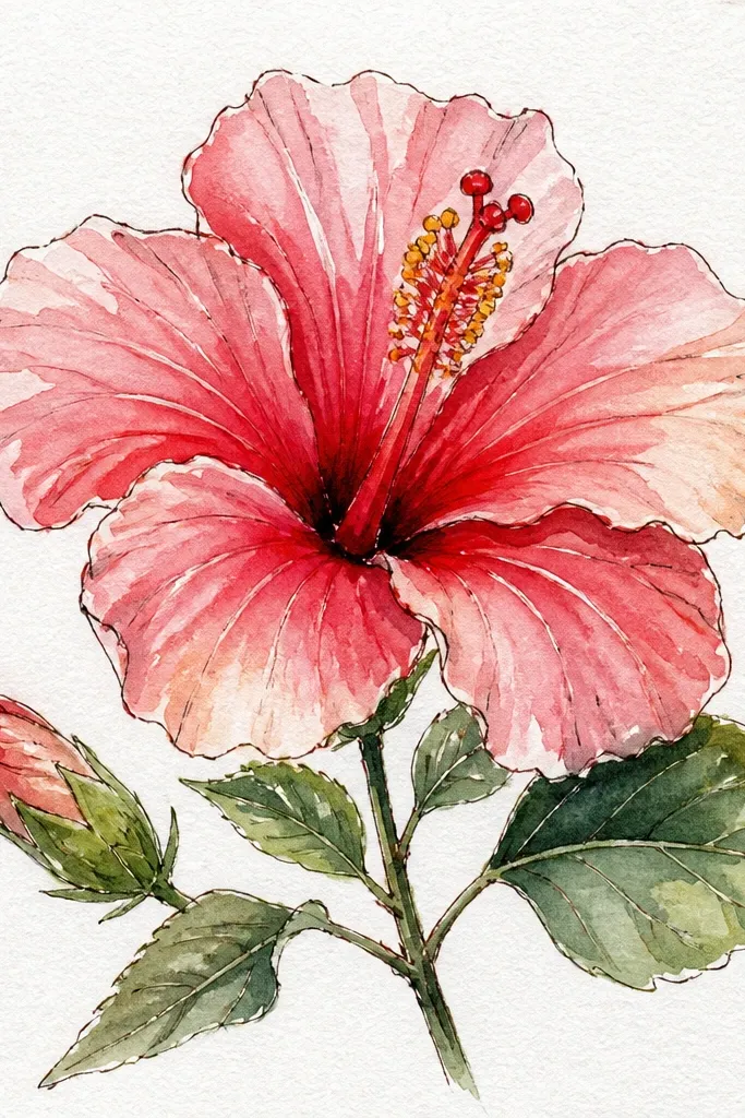
If you like watercolor vibes but want pencil control, this is the method. You’re not using wet paint — you’re building a wash with pencil and blending so the transitions look fluid. I lay a very light base across petals, blend until it’s smooth, then add darker fold color in thin passes. The throat glow stays bright by using yellow-orange first, then glazing red-brown only at the inner overlap. This design looks dreamy without losing shape.
Start by lightly sketching the hibiscus and lightly coloring the petals with pale peach-pink, leaving some paper showing for highlights. Blend the base with a soft pencil or colorless blender until the gradient looks even. Add rose pink in the folds with short, gentle strokes, then blend lightly to smooth edges. For the throat, build yellow-orange first, then glaze rust-red and red-brown only where petals overlap. Add a pale lavender wash behind the flower with very light pencil and minimal blending. Keep leaves simple: mid green with a softer blend.
Blend most of the petal, then stop blending right before you add vein lines so they stay crisp.
Avoid heavy black-brown in the throat; it turns muddy fast and kills the glow.
9. Hibiscus Bouquet With Two Leaves and a Bud
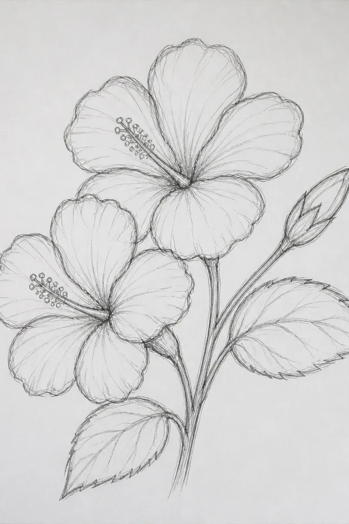
This one looks like you planned it for a greeting card. The open flower gives you the main color, the smaller bloom adds depth, and the bud fills the space so the composition feels balanced. I make the leaves carry contrast: deep green shadows and lighter green vein lines. The flowers use the same palette so everything matches, but I vary intensity — open bloom is richest, bud is muted. It flatters any page layout because it uses a clear triangle composition: leaf corner, open bloom, bud.
Sketch a loose triangle: place the open hibiscus near the lower right, the smaller bloom above-left, and the bud at the top. Color open petals with pale pink base, then rose and magenta in folds, adding a rust-red ring at the throat. For the smaller bloom, use the same colors but skip some darkest folds so it feels lighter. Color the bud with green and tiny pink tips, and add only a small throat hint in yellow-orange. Shade leaves with deep green, then lightly add lighter green on the vein line and edges for shine.
Keep leaf highlights on the same side for all leaves — it makes the whole page feel lit from one direction.
Don’t overcrowd the space with extra leaves; two strong leaves look cleaner than five sketchy ones.
10. Hibiscus With Bold Ink-Look Edges (Pencil Outline)
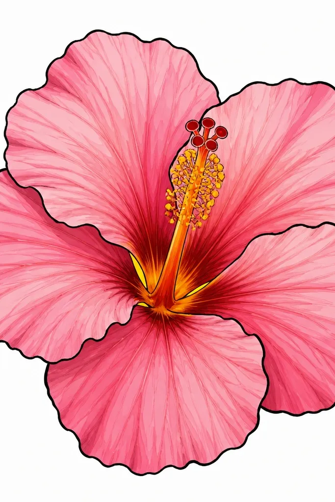
This design is for when you want your drawing to read clearly at a distance. I use pencil outlines that are darker than usual, but I still shade inside with soft layers so it doesn’t look like a coloring book. The trick is to keep the outline only at the outer edge and major fold lines, not around every vein. The throat stays bright because you control the darkest red-brown to the inner contour. It works on lighter paper and makes your hibiscus look finished without adding a background.
Sketch petals lightly, then identify the outer edge and the main fold lines. Go over those lines with a dark brown or deep red pencil, pressing lightly but consistently. Fill petals with pale pink base, then add rose and magenta in folds, keeping the outline edges crisp. Shade the throat with yellow-orange, then add red-brown along the inner contour — stop before it reaches the very center highlight. Add a few green leaf veins with a medium green pencil and keep leaf outlines slightly lighter than the flower outline. Leave the background blank.
Use a darker pencil for outlines but a lighter pencil to blend — it keeps edges sharp.
Don’t outline every single petal crease; too many dark lines flatten the shape.
11. Hibiscus With White Gel Pen Highlights
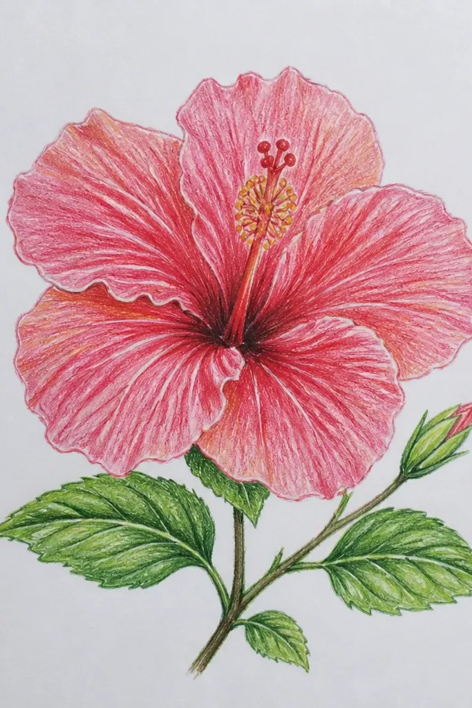
Color pencil alone can leave petals looking matte. White gel pen (or white pencil) fixes that by placing tiny, sharp highlights exactly where light hits. I shade the petals normally with pink layers, then I wait until the end to add highlights so they sit on top. The throat glow looks more realistic because the highlight catches the curve of the fold. This style looks great for close-up portraits because the highlights make the flower feel glossy, not flat.
Good to knowTest your gel pen on scrap paper first; some pens need a few pumps to start clean.
Color the hibiscus petals with a pale pink base, then deepen folds with rose and magenta. Shade the throat with yellow-orange, then add rust-red and red-brown at the inner fold shadows. Blend lightly so gradients look smooth, but keep the petal edges defined. Once everything is colored, draw thin white highlight lines along the top of each petal curve and a small crescent on the throat. Add one or two tiny white dots near vein intersections to mimic sparkle. Finish leaves with mid green and add very small white vein highlights.
Common mistakeDon’t add white highlights before you finish shading; you’ll smear the highlight and lose the crisp shine.
12. Hibiscus With Sunset Gradient Background
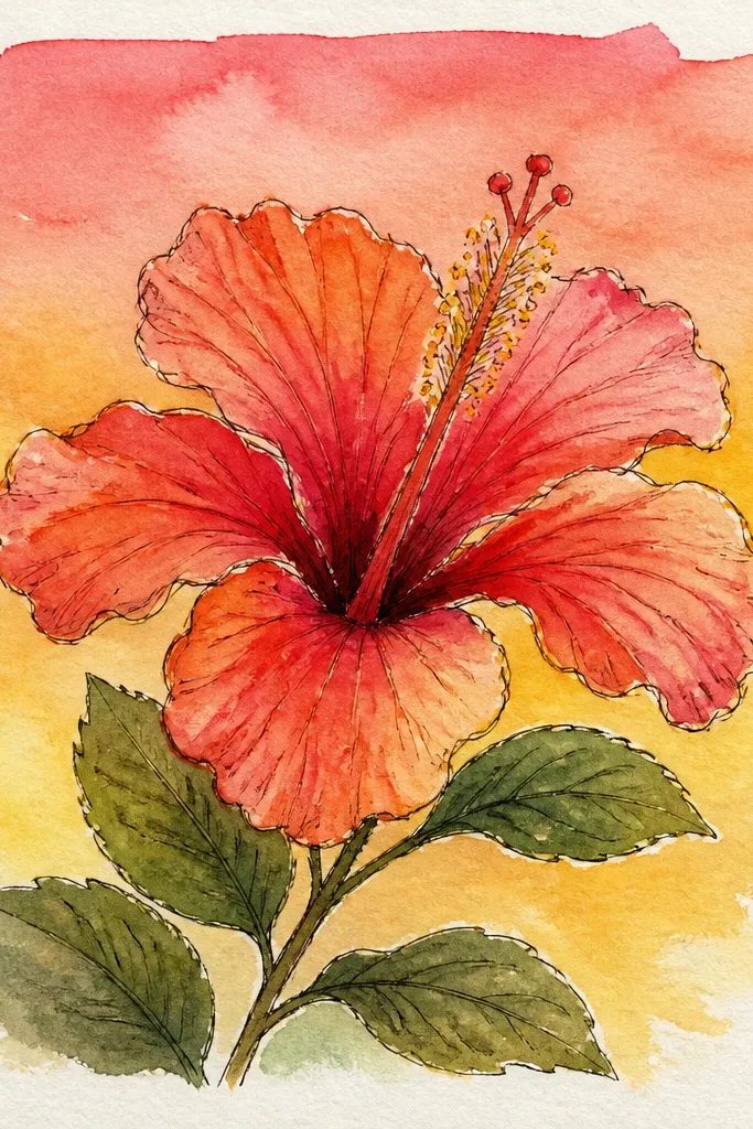
A sunset background makes hibiscus look like it’s lit from behind. I keep the flower colors warm — pale pink, rose, magenta, and a yellow-orange throat — so the background doesn’t fight it. The gradient is faint and smooth, and the flower stays sharply layered. This is a strong choice for gifting because it looks like a scene, not a study. It also helps with contrast: the purple background makes the pink petals pop.
Draw and color the hibiscus first with pale pink base and rose/magenta fold shadows. Shade throat with yellow-orange and rust-red inside the overlap, leaving a tiny highlight spot near the center. Add leaves with mid green and olive shadows. Next, lightly shade the background: put pale orange behind the lower half of the flower, then blend upward into soft purple, and fade to very light blue near the top corners. Keep the gradient at least 5 mm away from the flower edges so the hibiscus stays crisp. Add one final dark touch to petal fold edges using a deep rose or maroon pencil.
Blend background colors with light pressure and stop early; too much blending turns the background gray.
Avoid dark brown in the background; it will make everything look dirty.
13. Hibiscus With Patterned Petal Veins (Graphic Look)
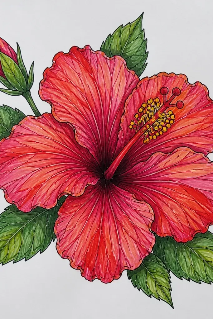
This is the style I use when I want the drawing to look bold without using heavy outlines everywhere. You shade the petals with a smooth base, then you add vein lines that are darker and more deliberate than realistic drawing. It looks graphic and clean, like a printable design. The throat still needs realism: yellow-orange center glow and a darker ring where folds shadow. The result reads well on social media because the veins guide the eye.
Sketch the hibiscus and fill petals with pale pink base using light, even strokes. Deepen fold areas with rose pink, but keep the rest of the petal relatively uniform. Add magenta only along the fold edges, then stop — don’t overwork. Color the throat with yellow-orange, then trace a thin ring of deep red-brown around the inner fold. Use a sharp pencil tip to draw vein lines radiating outward, keeping line thickness consistent. Optionally add a very light pale green background wash behind the bloom.
Make vein lines slightly curved and stop them before they hit the petal edge to avoid a harsh look.
Don’t shade the veins too heavily; the base should stay softer so the lines pop.
14. Hibiscus With Soft Shadow Ground
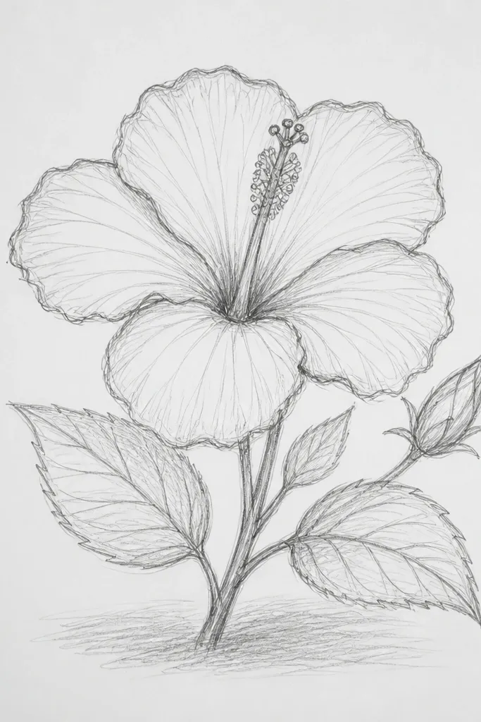
Adding a ground shadow is the quickest way to make your hibiscus feel like it’s sitting on paper, not floating. I keep the shadow soft and cool-toned so it doesn’t turn into a stain. The flower colors stay warm and layered, so you get a clean separation between subject and background. This works for any skill level because it doesn’t require a full scene — just one shadow shape. I use it when I’m drawing for cards and want the flower to look more dimensional.
Draw and shade the hibiscus normally with pale pink base and rose/magenta fold shadows. Color the throat with yellow-orange and rust-red in the overlap folds. Leaves use mid green and olive shading. Now add the ground shadow: choose a shadow color like cool gray-purple, then lightly color a shape under the flower that matches the petal footprint. Blend outward with light pressure so it fades smoothly at the edges. Keep the shadow darker closest to the petals and lighter farther away.
Make the shadow edge soft, not fuzzy; use very light strokes for the final blend.
Don’t make the shadow too dark; it should support the flower, not compete for attention.
15. Hibiscus With Partial Leaf Frame
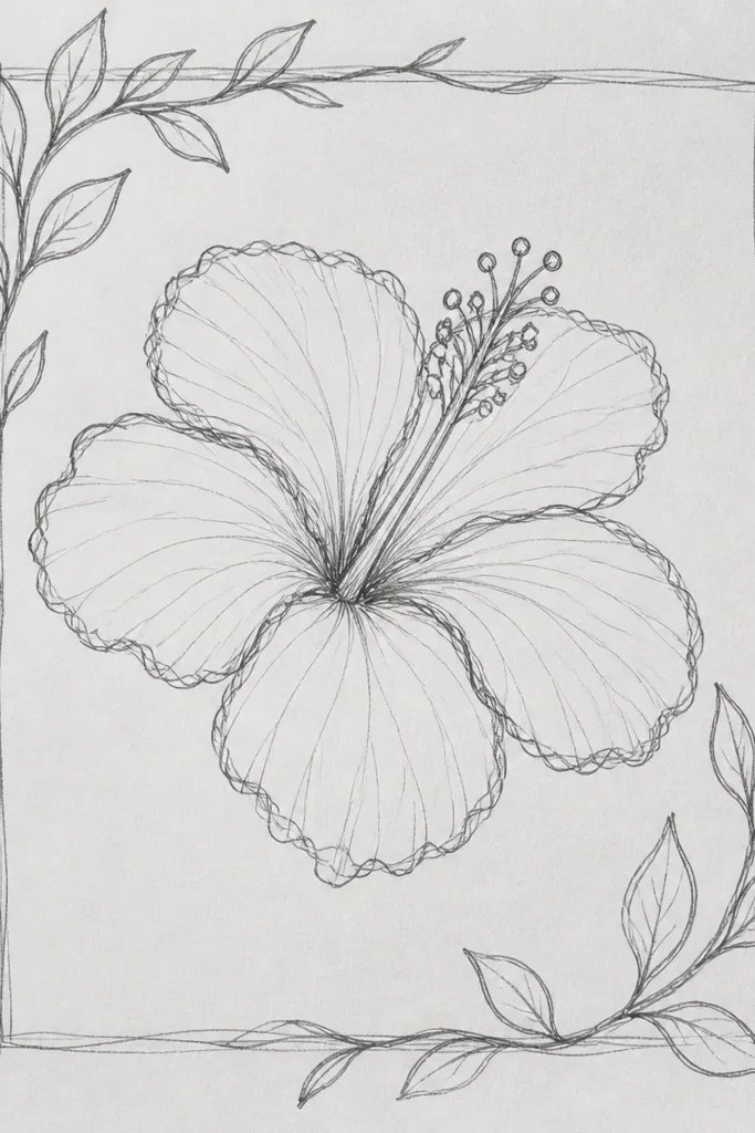
Leaf framing gives you a natural border without drawing a whole background. I keep the leaves slightly darker than the petals so they read as structure. The overlap matters: if a leaf covers part of a petal, you shade the covered edge darker and less bright. That overlap sells depth instantly. This style looks good for wall art because it feels composed, and it works nicely on smaller paper sizes where a big background would feel empty.
Sketch the hibiscus first, then place two leaves on the left and right so they partially cover the outer petal edges. Shade petals with pale pink base and rose/magenta folds, keeping the throat warm and bright. Color leaves with deep green, then add olive green on the underside and near the overlap points. Shade the petal edges that are under the leaves with a darker rose so they look tucked back. Keep leaf veins visible with lighter green lines and a few thin dark accents at vein bends. Leave the rest of the background white.
Overlap one leaf edge higher than the other; it creates a more natural, hand-drawn balance.
Don’t draw leaves as if they’re floating; overlap and shadow the covered petal edge.
16. Hibiscus With Minimal Outline and Extra Soft Shading
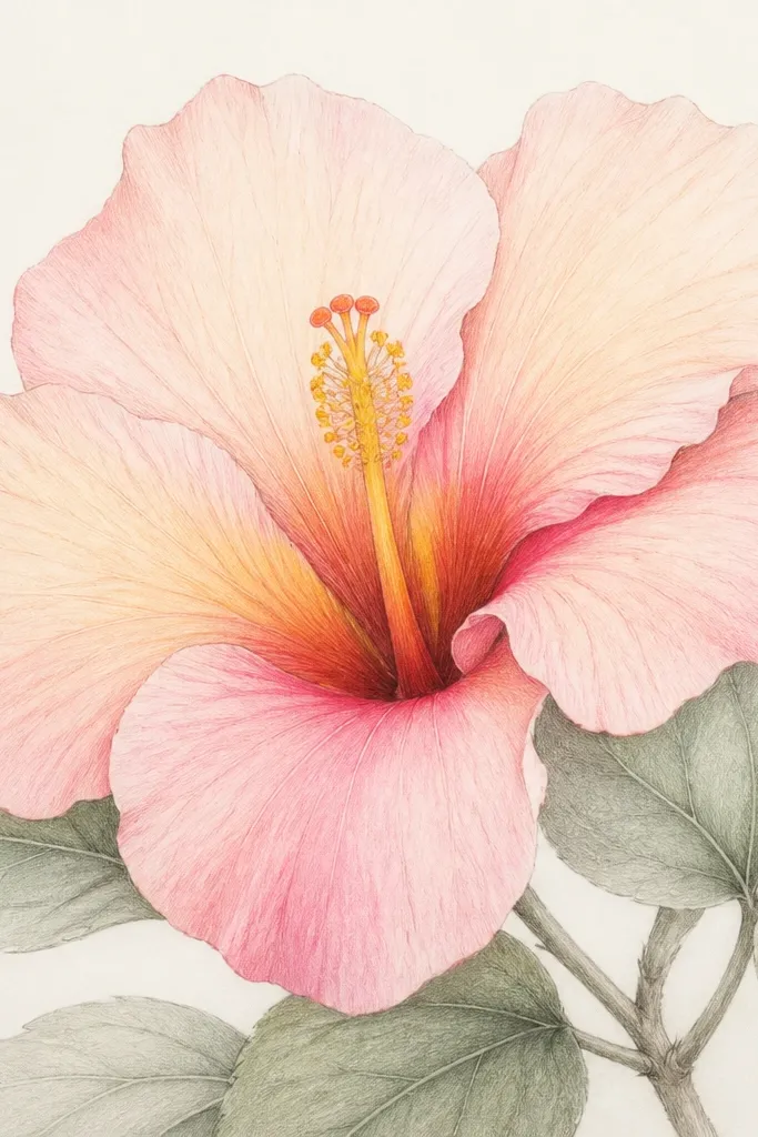
This one is for when you want a delicate, airy look. Minimal outlines mean your shading has to carry the shape, and hibiscus is perfect for that because the petals naturally form smooth curves. I use pale peach and light pink layers first, then I deepen fold areas gradually, blending as I go. The throat is where you add the most contrast: yellow-orange center with a soft rust-red ring. This style looks best on paper that takes blending well, and it reads like a gentle illustration.
Sketch the flower with a light 2B pencil and keep lines thin. Layer pale peach-pink across petals, then blend until smooth. Add rose pink in fold zones and blend again, keeping the outer edges lighter than the inner folds. Color the throat with yellow-orange, then add rust-red and a bit of red-brown at the inner overlap, blending softly outward. For leaves, use light mid green and blend with olive at vein bends. Erase any sketch lines only after the shading is dry and settled.
Work petal by petal; stop and check contrast before moving on so nothing gets overworked.
Avoid pushing dark color too early; you’ll lose the airy look.
17. Hibiscus With Red Maroon Fold Ribbons
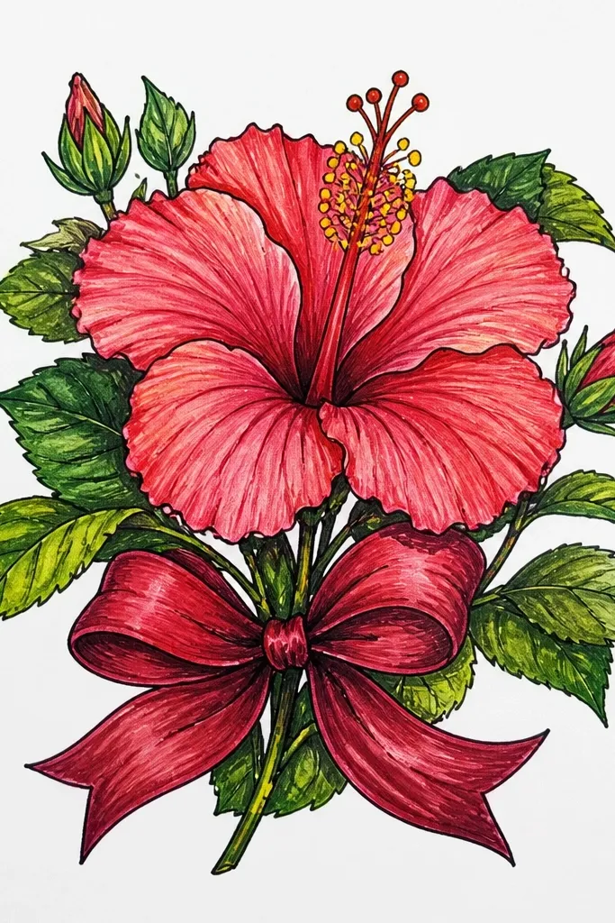
This style looks fancy but it’s just controlled dark accents. The maroon fold “ribbons” make the flower look structured, even if the background is blank. I keep the base petals light so the maroon lines stay crisp. For the throat, I use yellow-orange first, then deepen the ring with deep red-brown — you get that classic hibiscus depth. It flatters anyone who wants a bold look without heavy black outlines.
Good to knowUse a sharp pencil tip and draw the fold ribbons in one smooth pass per petal.
Start with pale pink base across every petal, leaving highlights uncolored. Add rose pink lightly where folds curve, then draw the maroon ribbon folds: thin bands that follow the petal center curve. Don’t fill the entire fold area — keep the ribbon edges sharp and narrow. Shade throat with yellow-orange, then layer deep red-brown only at overlap edges, leaving a tiny lighter spot near the center. Color leaves deep green and add bright vein lines with a lighter green pencil.
Common mistakeDon’t blend maroon into the base; it turns into a muddy stripe.
18. Hibiscus With Gold-Tone Center Using Warm Ochre
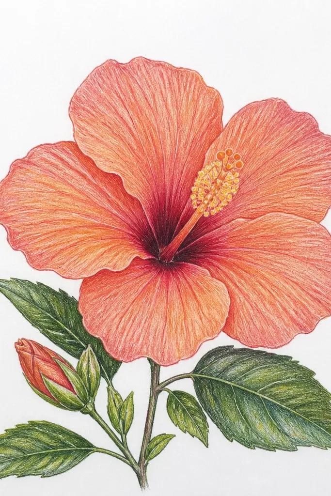
If your hibiscus throat looks flat, this fixes it with a warm ochre step. I start with yellow-orange, then glaze warm ochre over parts of the throat to make it look brighter and more “lit.” Tiny specks near the center mimic the tiny texture you see in real hibiscus blooms. This style looks great in drawings meant for bookmarks or smaller frames because the center reads clearly even when the rest is simple.
Color petals pale pink, then deepen folds with rose and a little magenta. Shade the throat with yellow-orange using light pressure. Next, add warm ochre over the brightest throat area and blend outward slightly so it fades into the red-brown shadows. Add deep red-brown only in the overlap folds, leaving the ochre area mostly clean. For the specks, tap a sharp pencil tip lightly with a darker brown-red and keep the specks confined to the center. Finish leaves with mid green and tiny darker vein tips.
Press less than you think on the ochre glaze — it should glow, not cover.
Avoid using pure yellow everywhere; it makes the throat look like a sticker.
19. Hibiscus With Monochrome Pink Petals and One Green Accent
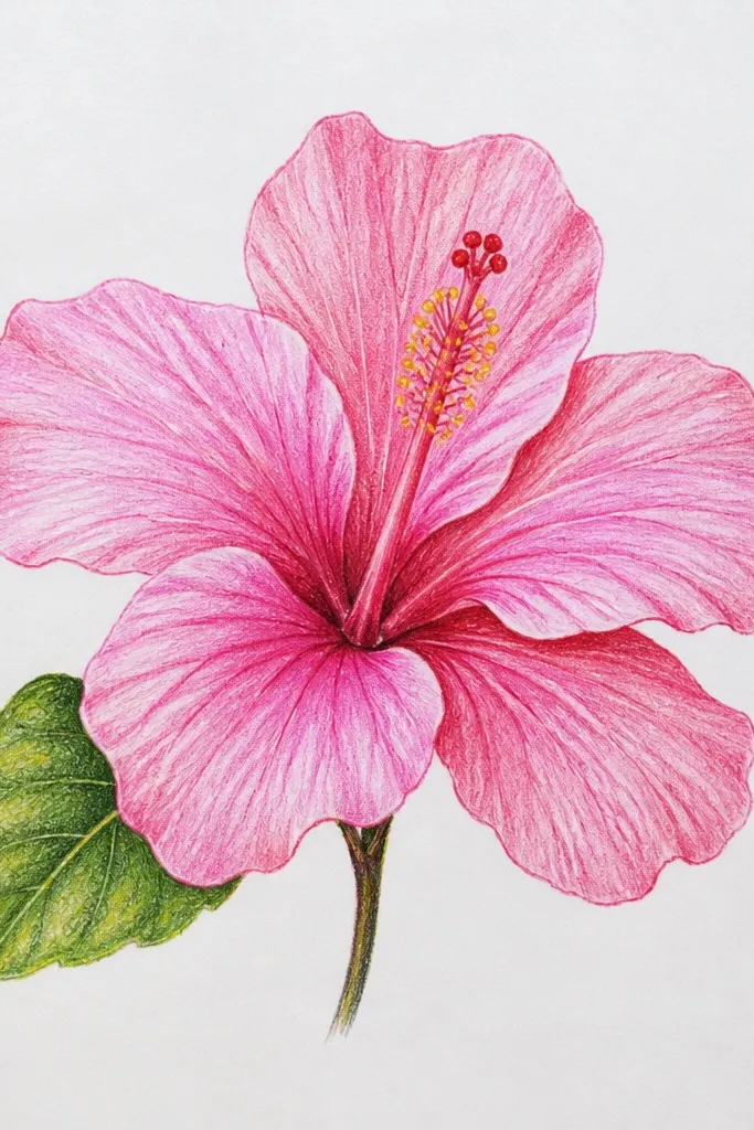
Monochrome petals keep the drawing calm, then the single green accent adds life. I use a tight palette: pale blush, medium pink, and hot magenta for fold shadows. The throat gets warmth so it still feels dimensional. This looks flattering on busy pages because it doesn’t demand attention everywhere — your eye goes from center to petal folds to the one green highlight. It’s also a great training page if you want to learn how much contrast you can get with just a few pencils.
Sketch the flower and shade petals with pale blush first. Add medium pink along fold lines, then use hot magenta only where petals overlap or fold inward. Shade throat with yellow-orange, then deepen overlap folds with rust-red and a touch of red-brown. Color leaves with muted green and add a brighter green only on one vein or one leaf edge so it pops. Keep the background blank so the monochrome pink reads clean.
Pick one leaf to accent before you start coloring so you don’t accidentally brighten multiple spots.
Don’t add extra colors to fix “flatness” — increase contrast in the pink folds instead.
20. Hibiscus With Cropped Petals and Corner Composition
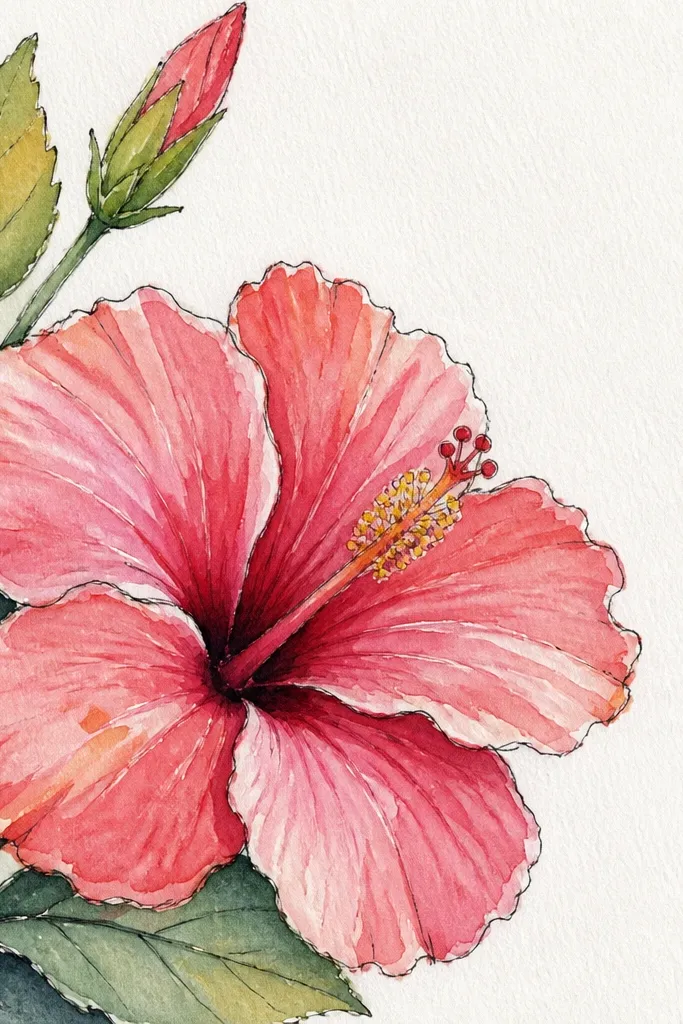
Cropping makes hibiscus drawings look modern and dramatic, even with simple shading. I place the flower off-center so one petal reaches into an empty corner. That empty space gives your shading room to breathe. This style looks good for stickers and small prints because the viewer instantly sees the flower shape. It also hides minor asymmetry because the crop frames the bloom.
Good to knowUse a ruler to mark where the crop happens so petal edges don’t look accidental.
Sketch a hibiscus larger than the page area, then erase or ignore the parts that will be cropped. Start with pale pink base on visible petals only. Add rose and magenta in fold regions, concentrating darkest values near the throat and overlapping petal edges. Shade the throat with yellow-orange and rust-red shadow lines. Add one small leaf or none — if you add it, place it at the bottom so it balances the top crop. Finish by sharpening one or two petal edges with a darker rose pencil.
Common mistakeDon’t crop randomly with heavy dark outlines; it makes the cut look like a mistake.