1. Single Hibiscus with Center Spotlight
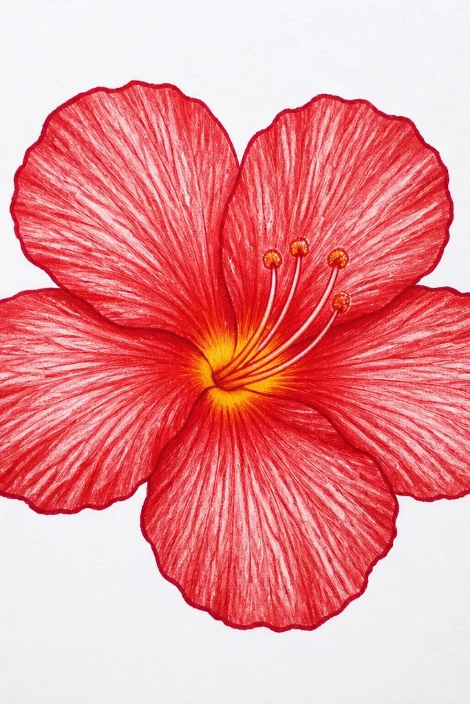
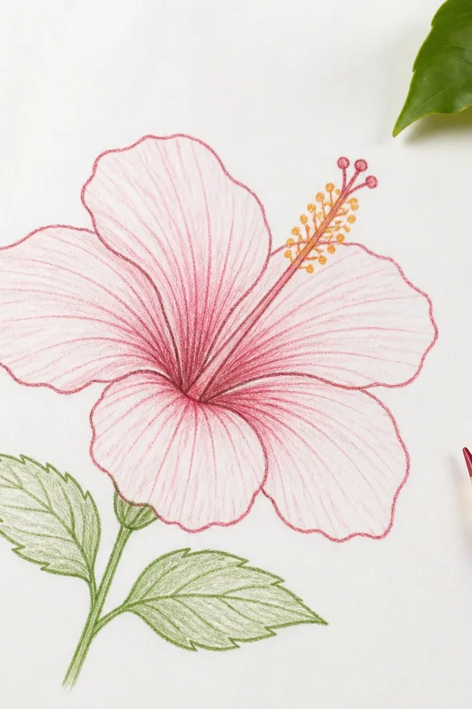
Start by sketching a small oval for the center, then draw five petals around it like rounded teardrops pointing up. Add stamens: five thin lines that curve outward, with tiny bumps at the tips to suggest pollen. Color the throat first with yellow-orange, then wash or marker base red across the petals. Finally, shade the overlap zones with a darker red and add a few thin highlight streaks using a gel pen.
Draw this when you want a clean, framed look. The flower fills about two-thirds of the page, so the red feels bold without crowding the paper. I keep the petal outlines slightly darker than the fill, then I leave thin lighter gaps inside each petal so the red looks glossy instead of flat. The warm yellow-orange throat makes the whole flower read even if you only use two red shades. This one looks great on warm skin tones when you use it on a greeting card, because the yellow center warms the palette.
Common mistakeAvoid outlining every petal edge with the same bold line weight — it makes the petals look like cut paper.
Good to knowUse a red gel pen for just 3-5 highlight streaks. Too many highlights make it look like glitter, not flower.
2. Hibiscus Bouquet Cluster of Three
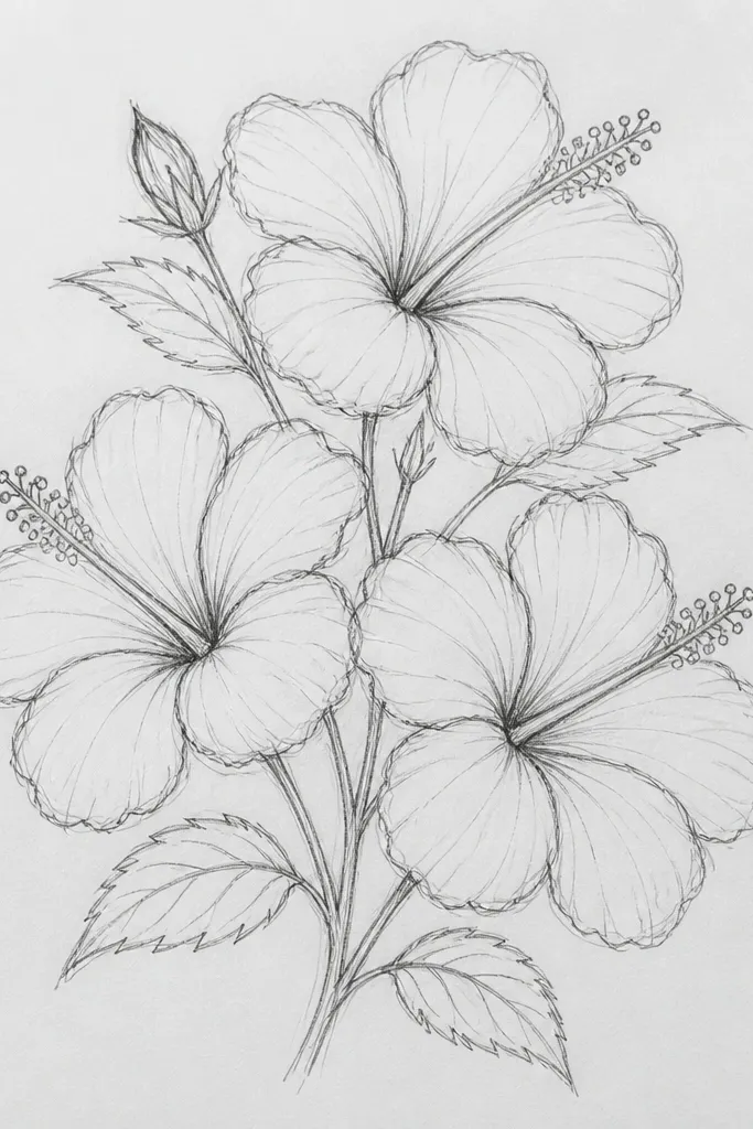
This is the layout I use when I want a page to look full without turning into a busy mess. With three blooms, you get variation in petal angles, which makes the red feel richer even if you use the same colors. I draw the centers at different sizes: one center bigger, one medium, one smaller, so your eye moves naturally. The overlap between flowers gives you built-in shadows, which is where a drawing gets depth fast. It flatters cooler color palettes too, especially if your paper is off-white or has a slight gray tint.
Sketch three centers in a triangle formation, with the middle one lowest and biggest. Draw five petals for each flower, but rotate the petal shapes so each bloom looks at a different angle. Color the centers first using yellow-orange, then fill petals with base red. Add darker red only where petals overlap between flowers, not everywhere. Finish by drawing short stems and a few leaf shapes in muted green or pale brown-green.
Keep the smallest flower petals slightly simpler — fewer internal highlights. It makes the whole cluster look intentional.
Don’t outline all three blooms equally dark. If every flower has the same line darkness, they merge into one blob.
3. Side-View Hibiscus with Curled Petals
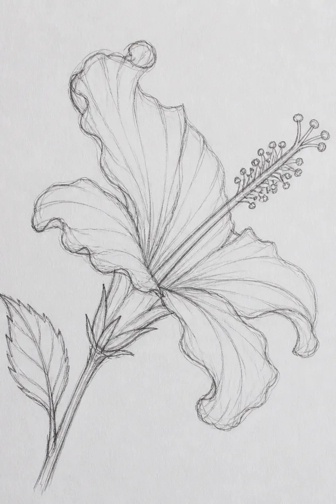
Draw a center oval slightly to the left, then place a front petal that covers part of it like a shell. Add three more petals behind it, each one slightly narrower than the first to imply depth. Shade the underside of the curled petals with a darker red pencil or marker, and blend the edge lightly with a fingertip or blending stump. Add stamens as thin lines that arc toward the viewer, then dot the tip ends with warm yellow. Finish with a few short highlight strokes on the outer petal surfaces.
Side view is where hibiscus drawings stop looking like clip art. The key is that the petals curl, so you shade one side darker and leave the other side lighter. I keep the center partly covered by a front petal, which creates a natural shadow pocket that makes the red look layered. This style is gorgeous for wall art because it has movement, even though you’re only drawing. It also looks great for people who prefer less “front-facing” compositions — it feels airy instead of crowded.
Common mistakeAvoid drawing the side-view petals as flat teardrops. The curl is the whole point.
Good to knowFor the curled effect, draw the petal edge with a lighter line on the top edge and a darker line on the underside.
4. Watercolor Hibiscus with Bleed-Red Edges
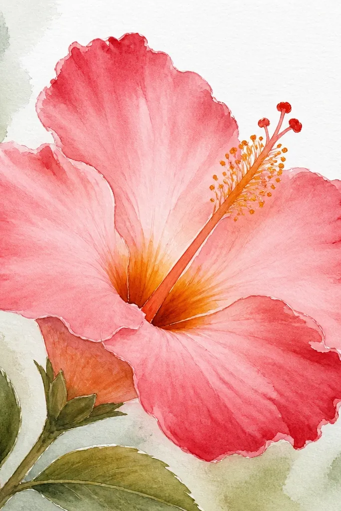
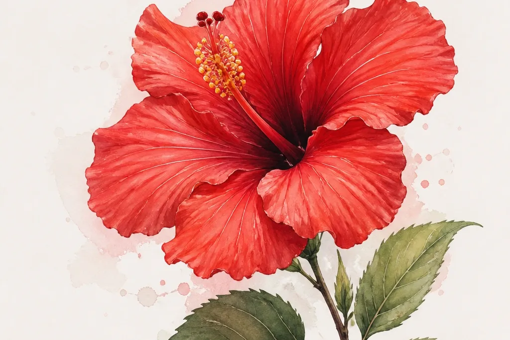
Lightly sketch the petal shapes with a pale pencil. Wet one petal area with clean water using a small round brush, then wash in a medium red. While it’s still damp, touch darker red to the petal tip and the fold area where petals overlap. Paint the throat with yellow-orange, then add a darker orange ring around the center. After it dries, draw stamens with a fineliner or a very diluted reddish-brown wash.
This one is for when you want the drawing to look like it happened quickly, but still looks intentional. Watercolor hibiscus works because the red pigment naturally gathers at the petal edges, which imitates the flower’s darker folds. I start with a light wash of red, then I drop in darker red at the tips and overlap lines. The center throat gets a warm gradient so the flower looks alive. This style looks especially good on textured paper because the pigment catches and creates natural speckles.
Common mistakeDon’t outline in dark ink before watercolor. The ink barrier makes the petals look like they’re trapped behind glass.
Good to knowUse a hairdryer on low for 10-20 seconds so you can add the darker edges before the wash dries fully.
5. Colored Pencil Hibiscus on Kraft Paper
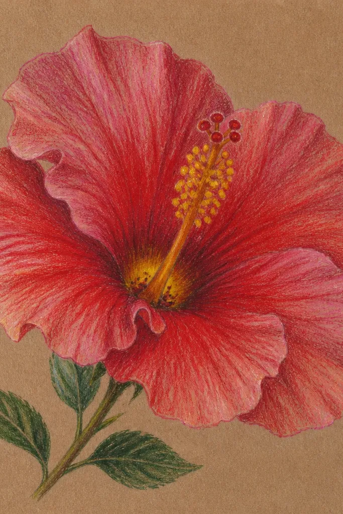
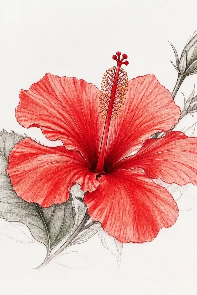
Sketch the bloom lightly, keeping the petal outlines flexible instead of heavy. Layer a mid red across each petal using short strokes that follow the petal curve. Add darker rose or maroon in the overlap folds, then blend the boundary with a softer red pencil. For the throat, use golden yellow, then tap a darker maroon pencil around the inner ring. Finish by drawing fine stamen lines with a dark brown-red and adding a few tiny pollen dots.
If you want hibiscus that feels warm and handmade, kraft paper is the cheat code. The paper’s tan base makes red look deeper and less flat, even with light pencil work. I layer red in thin passes, then I burnish the highlights with a lighter rose pencil so the petal edges look glossy. The center throat pops because you can use yellow first, then add maroon specks around it. This style looks great for fall-themed cards too, because the warm paper matches the flower’s natural warmth.
Common mistakeAvoid using only one red pencil shade. One flat shade makes kraft paper look like you just colored in a patch.
Good to knowBlend highlights last. If you blend highlights early, you’ll lose the glossy look.
6. Ink Outline + Red Gel Pen Highlights
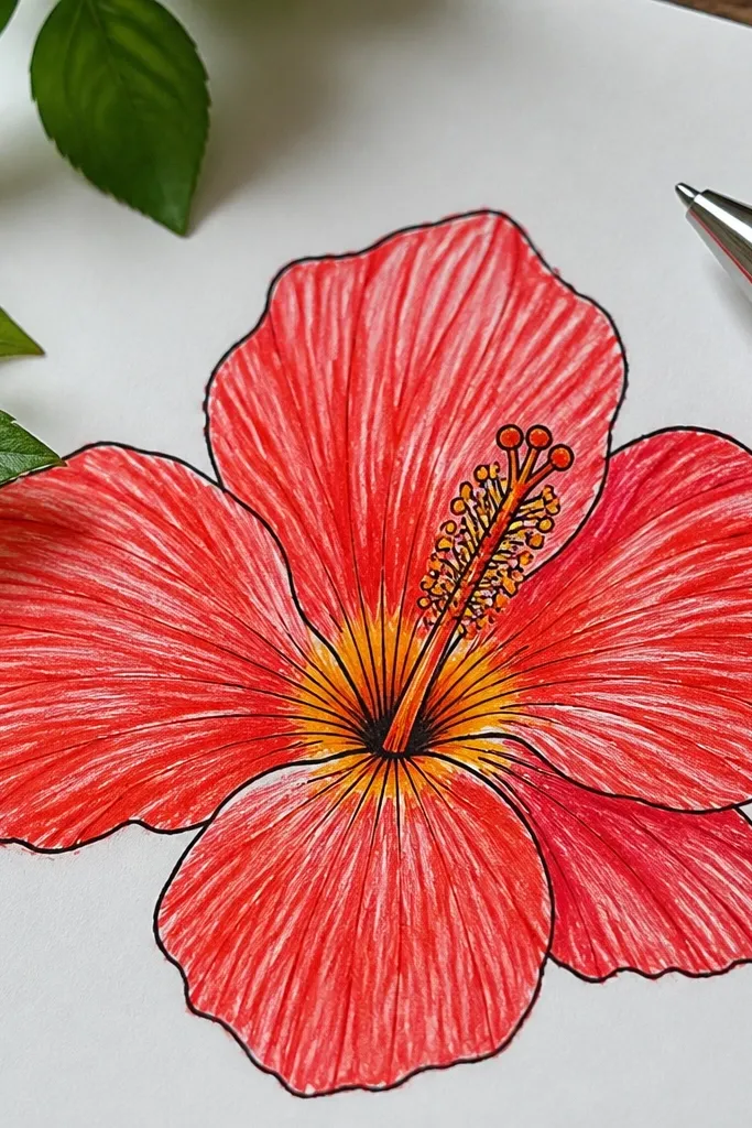
This is my go-to when I want a crisp drawing that still feels soft. The ink line gives structure, and the gel pen highlights create that wet-petal shine you see in photos. I fill petals with a light red so the gel pen has something to sit on; the highlight shows up as a lighter red streak instead of white. The center throat is drawn with marker or watercolor, then I add stamen lines with a dark brown fineliner so they don’t look like spaghetti. This style looks clean enough for prints and still feels personal for notes and cards.
Draw the flower in pencil first, then trace the petal edges with fineliner. Fill each petal with light red marker, leaving a few thin uncolored streaks. Add the throat in yellow-orange, and darken the inner ring with a warm orange. Use a red gel pen to draw 3-5 curved highlight streaks across each petal. Finally, add five stamen lines and a few tiny pollen dots at the tips.
Let marker dry fully before gel pen. If it smears, you’ll get fuzzy highlights.
Don’t overfill the petals with dark red. It kills the shine and makes the flower look heavy.
7. Red Hibiscus with Side Leaves and Buds
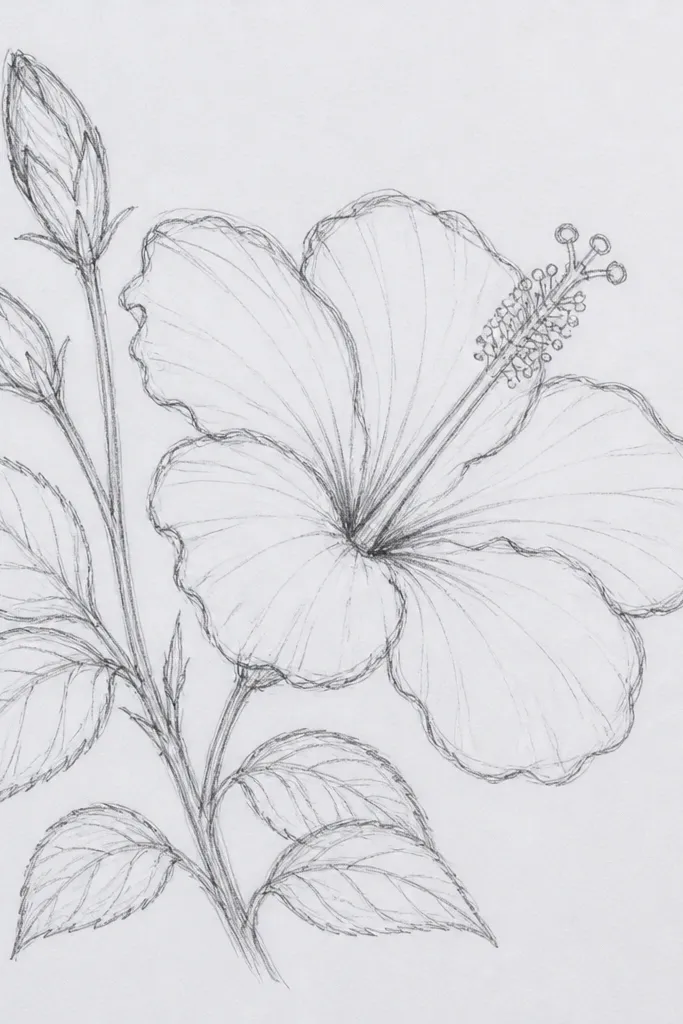
Adding buds and leaves makes your hibiscus look like it’s part of a real plant, not a single flower floating on paper. I place one bud slightly behind the main bloom so it overlaps and creates an easy shadow. Leaves are drawn smaller than you think you need — hibiscus already has big shapes, and giant leaves make it look cartoonish. The red stays the focus, while the green gives you contrast and a place for the eye to rest. This is a good fit for framing because the composition feels complete.
Sketch the main flower center first, then draw five petals around it. Place two buds as small teardrops or half-open petals on left and right, slightly behind the main bloom. Add 2-3 leaf shapes with a simple center vein, keeping them narrow and tapered. Color the throat yellow-orange, then fill petals with base red. Shade overlap folds with darker red, and lightly color leaves with muted green and a touch of brown-green for veins.
Use one leaf at a time in your sketch. It keeps the spacing believable.
Avoid drawing leaves in bright neon green. It fights the red and makes the whole page look cheap.
8. Hibiscus Mandala Style with Petal Spokes
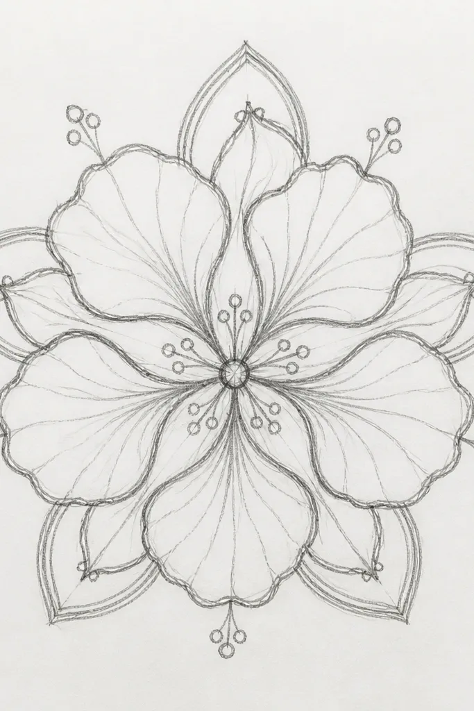
Mandala-style hibiscus is where your drawing becomes decorative, not just floral. You keep the hibiscus recognizable by drawing a real center throat and stamens, then you add repeating petal spokes around it. I use alternating red shades so the spokes don’t blend together. The yellow-orange center acts like the anchor, and the repeating shapes create a calm rhythm. This one looks great on square paper and pairs well with simple black ink lines for a clean look.
Draw a circle and mark the center throat as a small oval. Sketch five main petals first like a normal hibiscus. Then add an outer ring of repeating petal shapes, each one aligned with a spoke from the center. Color the main petals with medium red, then use darker red on alternate spokes and overlap areas. Add throat yellow-orange and dot a few darker orange spots, then draw stamens as short lines that sit above the throat.
Use a ruler for the faint circle and spokes, then erase hard. Clean geometry makes the decorative look feel intentional.
Don’t make every outer petal the same exact size. Slight variation keeps it from looking mechanical.
9. Mini Hibiscus Trio in One Corner
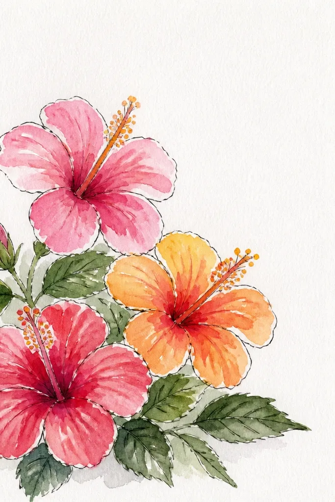
In pencil, place one main mini flower at the corner, then sketch two smaller ones behind it with partial overlap. Outline petals with fine liner, keeping line weight consistent on each flower. Color petals with a light red marker or watercolor wash, then add one darker red fold line per petal. Fill centers with yellow-orange and add tiny pollen dots with a brown-red pencil. Finish with a thin branch line and two small leaf shapes.
Tiny hibiscus drawings are perfect when you’re making a card, sticker sheet, or journal page. Because they’re small, you can’t afford messy shading, so you rely on strong linework and a limited color palette. I keep the petals slightly simplified: five big shapes, one darker fold line, and a few highlight streaks. The yellow-orange centers are the only bright detail, so they pop even at small size. This looks great for people who want a subtle floral vibe without taking over the whole page.
Common mistakeAvoid adding full shading gradients on tiny flowers. It makes them look smudged instead of crisp.
Good to knowUse a single highlight streak per petal on minis. It looks glossy without clutter.
10. Hibiscus with Patterned Petals (Polka Fold)
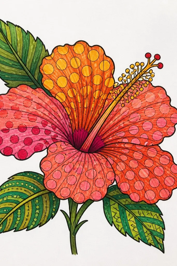
Patterned petals make your hibiscus drawing feel designed, not copied. The trick is to place the pattern only where the folds already create texture, like the inner half of each petal. I use tiny dots and short curved dashes in darker red so they look like shadow texture instead of decoration. This works especially well if you’re using fine liners, because the dots stay crisp. It’s flattering for art prints because the pattern adds depth even if the flower is small.
Sketch the hibiscus in pencil and outline with fineliner. Fill petals with a light-to-medium red, leaving a few highlight streaks unfilled or lightly colored. Add darker red dots and short curved dashes only on the inner half of each petal, following the petal curve. Paint or mark the throat yellow-orange, then add a ring of darker orange specks. Draw stamens with a dark brown-red line and keep them thin so the pattern stays the star.
If dots look too busy, switch to curved dashes on two petals and dots on the other three.
Don’t pattern the entire petal edge to edge. That’s how it turns into a cartoon sticker.
11. Red Hibiscus in a Glass Teacup Frame
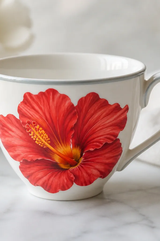
Drawing the hibiscus inside a teacup frame makes it feel like a still life, even if you only spend an hour. The gray-blue cup rim gives you a cool contrast that makes the red petals look brighter. I add simple reflection lines on the cup so the drawing has dimension, but I keep the reflections faint so they don’t steal attention. This is also a smart trick for composition: your flower has natural boundaries, so you don’t overfill the page. It looks good for kitchen-themed cards and prints.
Sketch the teacup first: an oval opening, a slightly curved rim, and a handle on the right. Place the hibiscus center in the cup opening and draw five petals that reach up to the rim. Shade petal folds with darker red, then add a few highlight streaks with gel pen. Color the throat yellow-orange and add a darker orange ring. Finish by drawing a few cup reflections in light gray-blue and lightly shading the cup interior with a pale wash.
Keep the cup reflections to two or three thin lines. More than that looks like chrome, not glass.
Avoid making the cup rim the same color as the petals. If they match, the flower loses its frame.
12. Hibiscus with Bold Shadow Cast
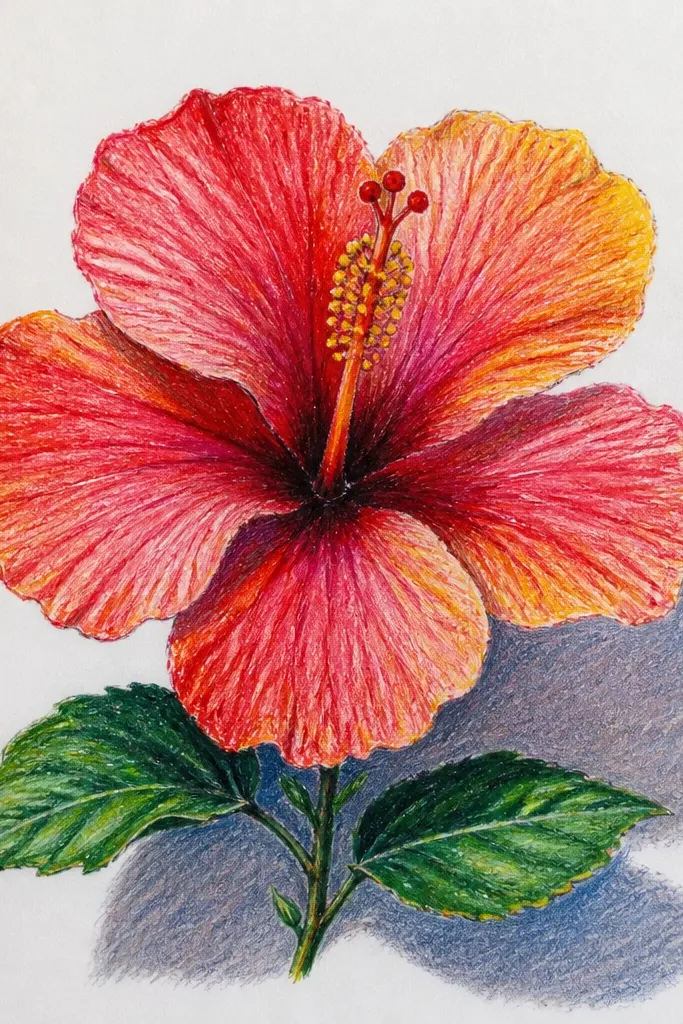
Sketch the hibiscus normally, then decide where the light source is — I usually place it top-left. Draw a shadow shape behind the bloom by tracing an offset version of the outer petals, extending it a bit downward and to the right. Color the flower petals with base red, then add darker red fold shading. Create the shadow by layering gray-red or cool gray lightly, then blur with a blending stump. Finish with yellow-orange throat and brown-red stamen lines on top of the shadow.
When you add a cast shadow, the hibiscus stops looking flat immediately. I like this style when I’m drawing on smooth white paper and using colored pencils or markers, because the shadow gives you a “lifted” effect. The shadow should be slightly bluish gray or gray-red, not pure black, or it looks like a sticker stuck on paper. The flower still stays red-focused, but the page gains depth. This works well for slim portrait cards where you want the flower to look like it’s sitting forward.
Common mistakeDon’t put the shadow right under the petals with no offset. That makes it look like a smear.
Good to knowTest your shadow color on scrap first. Gray-red looks natural; gray-black can feel harsh.
13. Hibiscus with Watercolor Wash Background Gradient
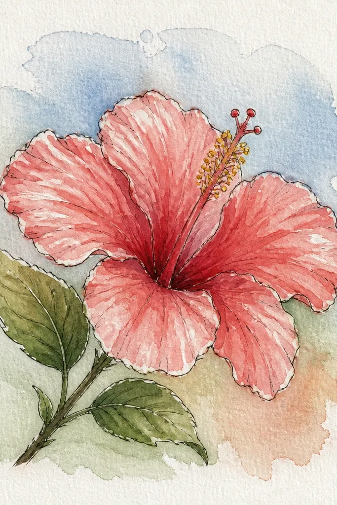
This layout makes your hibiscus look like it belongs in a poster. The background gradient should be light enough that the red petals stay the main event. I use pale peach and light pink washes, then I keep them watery so the hibiscus lines don’t get lost. The yellow-orange throat adds warmth, and the contrast between the soft background and crisp petal shapes makes the flower pop. If you’re working with watercolor, this is one of the easiest ways to make the page look finished without adding extra objects.
Wet the background area lightly with clean water, then wash pale peach starting near the bottom and fade it upward into light pink. Let it dry until it’s just slightly tacky, then paint the hibiscus petals with medium red. Add darker red into the fold areas and at petal edges, but keep it controlled so it doesn’t spread across the whole petal. Paint the throat yellow-orange and add a darker orange ring. After everything dries, draw stamens with a fine brush or fineliner and add a few highlight streaks.
Paint the background first, then tape the paper edges so you get crisp outer margins for a clean finished look.
Avoid using a dark background wash. Dark washes make red look dull and muddy.
14. Hibiscus Outline Only with Red Marker Infills
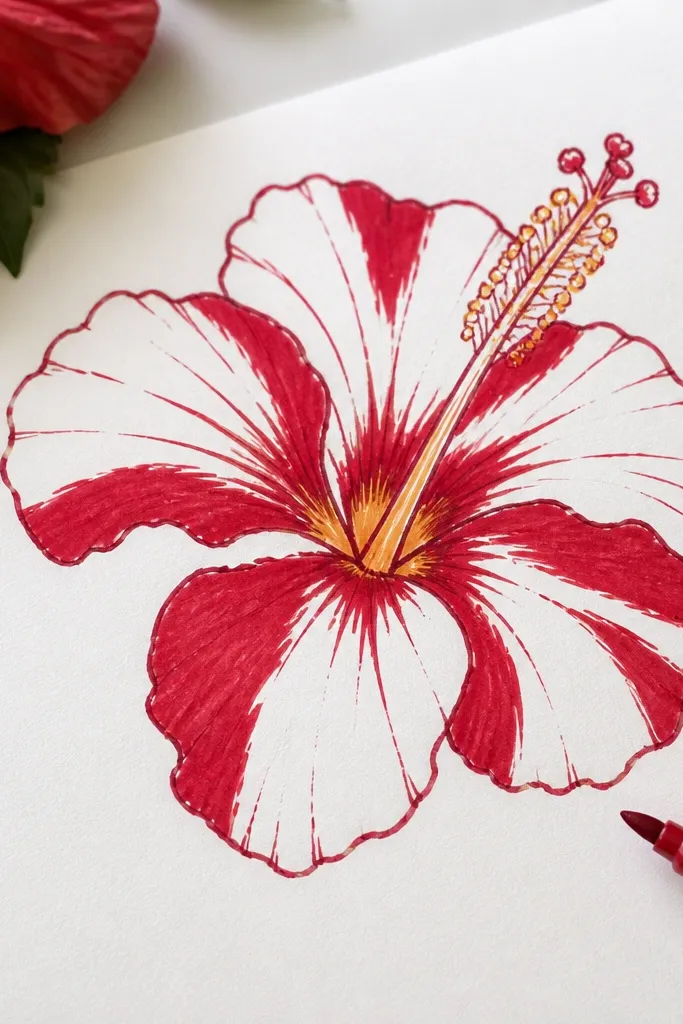
This is my pick when you want a graphic, modern look. By leaving parts of the petals unfilled, you create natural highlights without adding extra gel pen work. The center stays simple, so the flower reads quickly. I use marker infills only on the outer petal halves and the overlap folds, leaving the inner petal area mostly white. The result looks airy and clean, and it’s great for beginners because you don’t have to blend. It also looks good on darker paper because the white negative space turns into the highlight.
Sketch the hibiscus petals with pencil, then trace with a dark red fineliner. Fill the outer half of each petal with red marker, but stop short of the inner edge so you keep negative space. Add a darker red marker only in the overlap fold lines between petals. Color the throat yellow-orange and add a thin darker orange inner ring. Draw stamens with a thin brown-red line and leave them mostly unshaded.
Use two marker tones: one medium red and one darker red. One shade makes the negative-space trick disappear.
Avoid filling every petal area evenly. That removes the airy highlight effect.
15. Red Hibiscus with Embossed White Gel Highlights
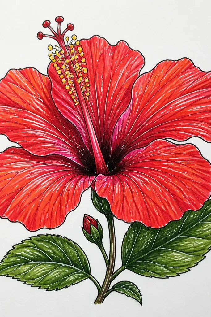
Sketch the hibiscus and outline with fineliner. Base the petals with medium red using marker or watercolor, then shade overlap folds with darker red. Let it dry completely, then apply white gel highlights as thin curved streaks on the top half of each petal. Add a few tiny white dots around the throat rim to suggest sparkle and depth. Finish stamens with brown-red lines and keep them thin so the raised highlights stay visible.
Raised highlights make your drawing feel dimensional even on paper without texture. I use white gel pen or white gel paint for the highlights after the red base is fully dry, so the white sits on top and stays crisp. The hibiscus petals look like they have a glossy surface, like fresh petals in daylight. I keep the raised highlights narrow and curved, matching the petal shape. This style is flattering for bright rooms because the highlights catch real light and make the drawing look “finished” quickly.
Common mistakeDon’t apply white gel over wet paint. It turns streaky and dull instead of raised.
Good to knowUse a scrap to test how opaque your white gel is on your paper. Some papers need two passes.