1. 6-Petal Center Seed Pod Lotus (Big Kid Lines)
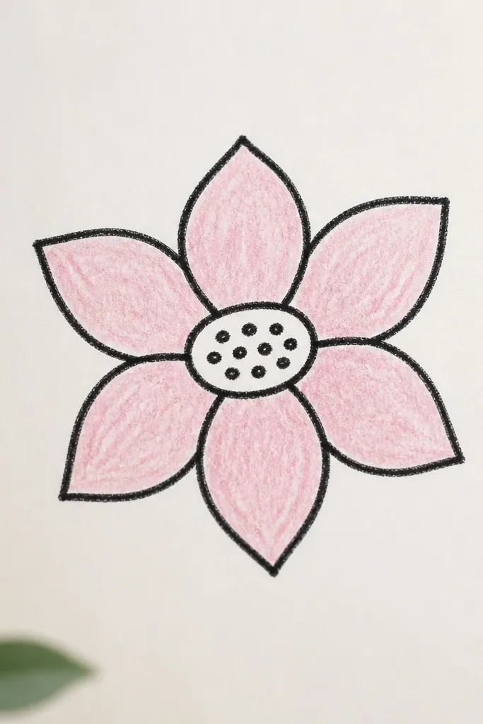
This one is the easiest "real lotus" layout because it uses a center pod and only six outer petals, so kids don't have to count dozens of shapes. I like it for kids ages 6-9 because the symmetry is straightforward and the drawing stays readable from across the room. The thick outline makes the lines look confident even when the curves are wobbly. It also works really well for classroom paper because the center gives the eye a clear starting point.
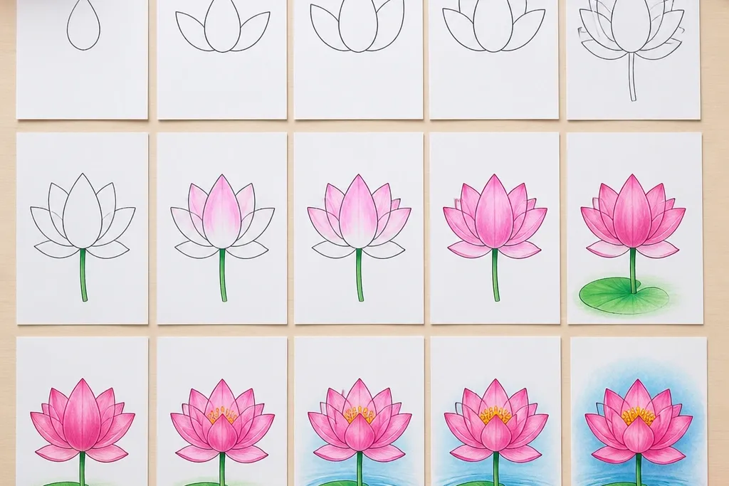
Start by drawing a small vertical oval in the middle of the page. Add a few short curved lines inside the oval to suggest seeds, then lightly sketch a circle around it as a guide. Next, draw six teardrops around the oval, each one touching the circle and pointing upward. Finally, add one simple vein line down each petal and color the inner half pale pink while the outer tips stay slightly lighter.
Good to knowHave kids trace the petal outline with the marker after they're happy with the pencil shape. The second pass hides shaky first attempts.
Common mistakeDon't add tiny frills to the petals before the six main shapes are drawn - it makes the lotus look messy.
2. Half Lotus on the Page Edge (Instant Composition)
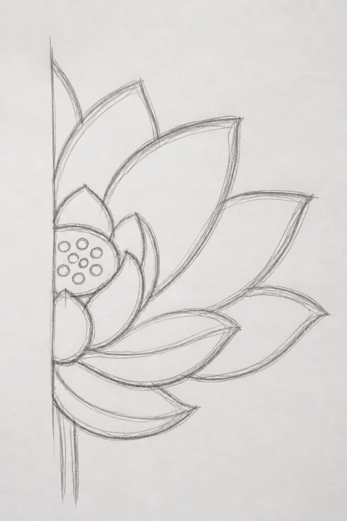
This looks fancy because it uses a cropping trick, like kids see in art books. I use it when a kid gets bored by full-page symmetry because they only need to draw about half the lotus. The seed pod still anchors the drawing, so it doesn't look unfinished. It also flatters different skill levels: if the petals are uneven, the edge crop hides it.
Start with the seed pod slightly right of center so it has room for petals on the visible side. Draw three upward teardrop petals on the right side, each one with a single curved vein. Then add three petals on the left side but only draw their inner halves - stop the lines where the page edge would crop them. Finish by coloring the visible petals with a pink-to-lavender gradient using two crayons blended lightly.
Good to knowUse a light crayon for the first color pass, then add a deeper pink only at the petal bases to create depth.
Common mistakeSkip the temptation to draw all six petals fully - the "half" framing is what makes it look intentional.
3. Lotus with Two Petal Layers (Inner Lift, Outer Spread)
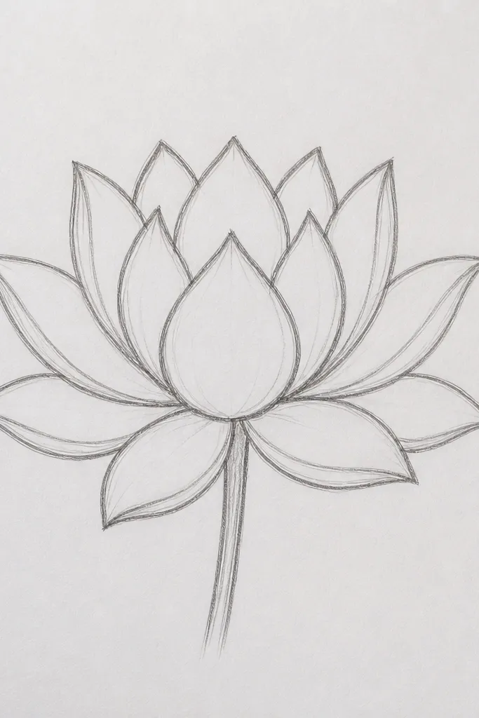
Two layers make a lotus look dimensional without any realistic shading. I like this for kids because the structure is clear: inner petals are smaller and point up, outer petals are wider and curl outward. The color contrast helps the brain read the layers instantly. It also looks great for cards because it fills space without getting too crowded.
Draw a small circle or oval seed pod in the center and add short seed lines inside. Make the inner layer first: draw six smaller teardrops around the pod, keeping them closer together so they overlap slightly. Then draw the outer layer: six bigger teardrops around the inner ones, wider at the base and slightly flatter at the top. Color inner petals bright pink and outer petals peach, leaving a thin white highlight at the top edge of each petal.
Good to knowPress lightly with the crayon on the first layer so the highlight stays clean. Then press a bit harder only near the petal bases.
Common mistakeDon't make the outer petals the same size as the inner ones - the lotus loses its "bowl" shape.
4. Dotted Seed Pod Lotus (Texture Without Detail Stress)
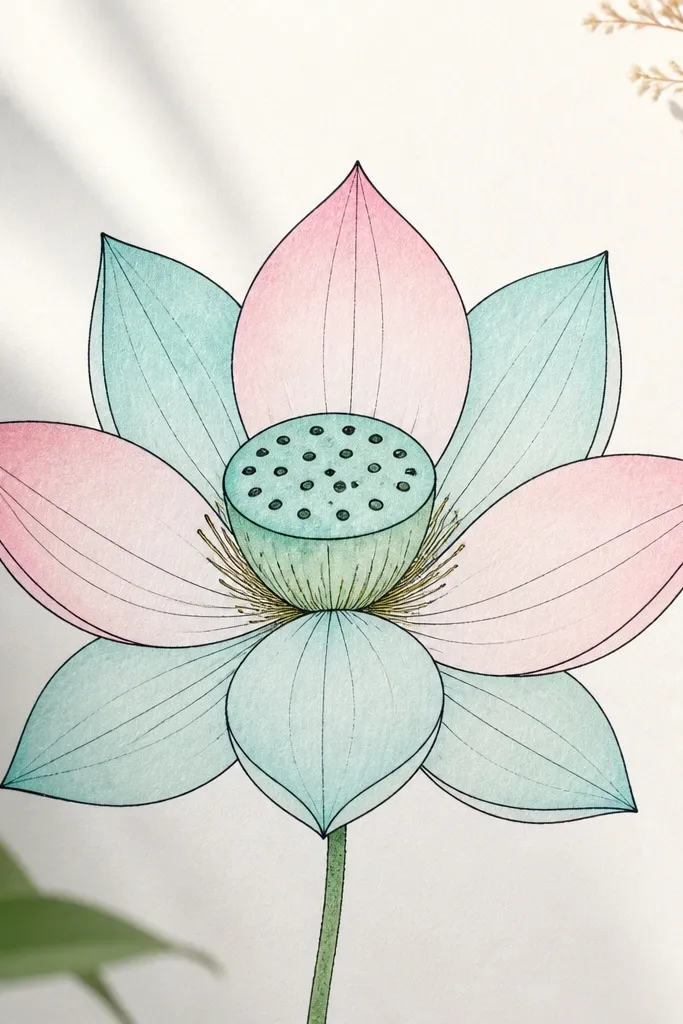
This version tricks kids into doing texture without drawing lots of tiny lines. The dotted pod gives a satisfying pattern that looks "finished," even if petals are simple. I use it when kids get stuck on the center and want something more interesting than a bare oval. The aqua and pink combo also reads fresh for spring-themed crafts.
Start with an oval pod in the center. Instead of drawing seed lines, add a grid of small dots inside the oval, leaving a little gap at the top for a highlight. Draw six petals around the pod using teardrop shapes that touch at their bases. Add three short curved veins per petal (one central vein and two short side curves). Color petals with alternating aqua and pale pink so the pattern stays lively.
Good to knowUse the tip of a colored pencil or a white gel pen to place 6-10 tiny highlight dots on the petals after coloring.
Common mistakeDon't dot the petals too - dots on the center only keep it looking intentional.
5. Lotus in a Circle Frame (Sticker-Style Finish)
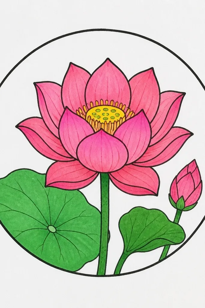
A circle frame makes the drawing feel like a sticker, which kids love. It also solves a common problem: kids don't know what to do with the empty space around the lotus. The frame tells their hand where to stop, so the page looks clean. I've used this for classroom worksheets because it reduces messy backgrounds.
Draw a circle first, leaving a margin around it. Inside the circle, place the seed pod at the center and draw six petals around it. Add a second outer ring of only three larger petals that peek near the circle edge, so the lotus feels layered without covering the whole frame. Color the inner petals darker pink and the outer petals lighter pink, then outline everything with a thick marker so it pops against the paper.
Good to knowColor up to the circle line, not over it. That crisp boundary makes it look professionally planned.
Common mistakeDon't shade the whole circle background - keep it white or lightly colored so the lotus stays the focus.
6. Lotus Bud Close-Up (Big Petal Curves)
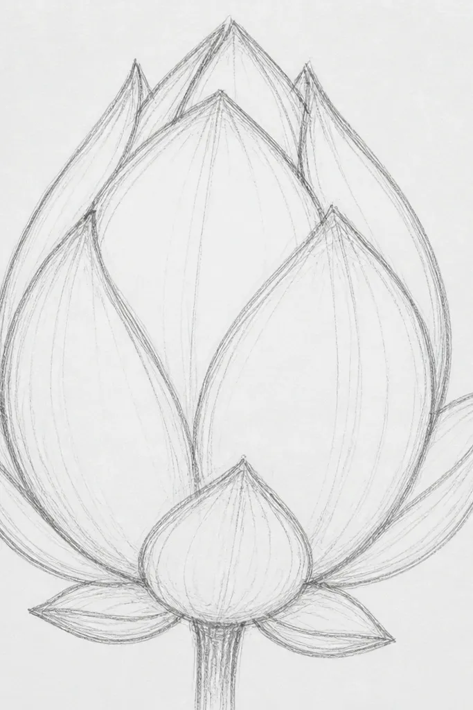
Close-ups feel advanced even when the drawing steps are simple. This one uses only three big petals that curl inward, so kids don't have to draw a full flower. I like it for younger kids because the shapes are large and forgiving. It also looks great on bookmarks because the composition fills the space nicely.
Draw a small oval seed pod near the bottom center, then draw three large teardrop petals that wrap around it like open cups. Keep the top edges of the petals rounded and slightly curled inward. Add one vein line down the center of each petal. Color the base of each petal deep magenta and the top edge lighter rose, leaving a thin white highlight line where the petal curves.
Good to knowIf a petal looks too flat, thicken the outline at the outer edge to sell the curl.
Common mistakeDon't add a full six-petal ring here - the bud look comes from those three huge petals.
7. Lotus with Water Ripples (Calm Background)
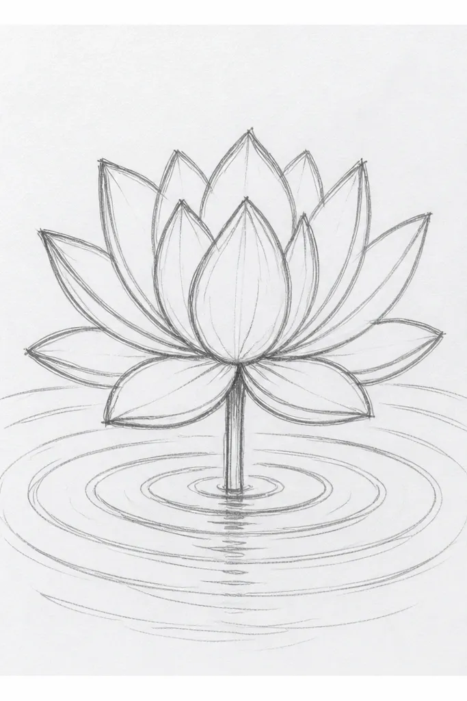
Ripples give the lotus a story without making kids draw complicated scenery. I use this when kids finish the flower early and start scribbling random backgrounds. The ripple lines also help them place the lotus as if it's floating, which makes the drawing look intentional. It flatters kids who like drawing lines because the ripples are repetitive and relaxing.
Draw the seed pod and six petals like the first idea. Place the lotus slightly above the lower third of the page. Then draw 6-8 curved ripple arcs starting under the lotus base, each arc slightly longer than the one before it. Color the lotus with pale pink and add a light blue wash to the ripples using a watercolor pencil or watered-down paint. Keep the ripple color lighter at the edges so it fades.
Good to knowUse a ruler only for the ripple spacing, not the ripple curves. Curves stay freehand, spacing stays tidy.
Common mistakeDon't fill the whole page with ripples - keep them concentrated under the flower.
8. Lotus Mandala Style (Simple Symmetry, Not Chaos)
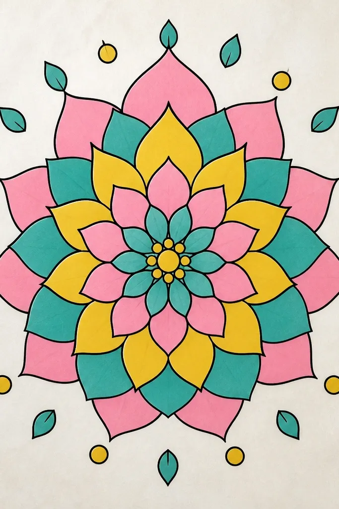
Mandala-style drawing works because it repeats shapes in a controlled way. Kids get the satisfying "pattern" look without needing fine shading. I've found this layout keeps their attention longer because there's a clear rhythm: petal layer, then small leaf, then a ring of dots. The limited colors make it look clean, not busy.
Start with the seed pod and draw six petals as your first layer. Add a second ring of six slightly larger petals, then a third ring of smaller petals that point between the gaps. Around the outer petals, draw 12 small leaf shapes spaced evenly like petals-within-a-wheel. Add tiny dots between leaves and color in alternating sections teal and pink, with a bright yellow seed pod.
Good to knowCount your outer leaf shapes out loud as you draw. It prevents the "uneven ring" look.
Common mistakeDon't add too many extra rings. Two outer rings plus one leaf ring looks balanced; five rings makes it cluttered.
9. Lotus + Hanging Garland (Toddler-Friendly Shapes)
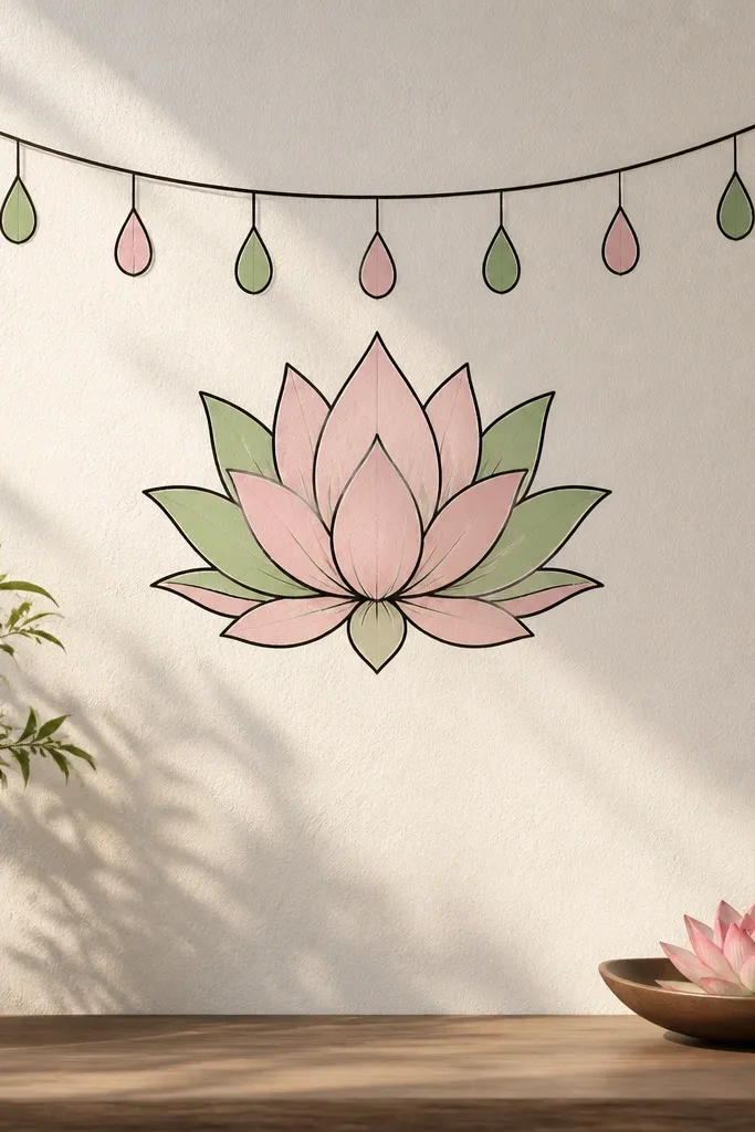
This one is fun for kids because it adds a clear "theme" element without requiring new drawing skills. The garland pieces are just teardrops on a line, so the lotus stays the main focus. I like it for craft days where you're making a paper banner or decorating a classroom wall. The green accent also makes the drawing feel fresh instead of only pink.
Draw the lotus seed pod and six petals in the usual way. Then draw a straight line across the top of the paper and add three short lines down from it. On each short line, draw a single teardrop garland piece, then outline each one with the same black pen. Color lotus petals pale pink, add light green to the outer tips, and color the garland pieces a slightly deeper pink so they stand out.
Good to knowKeep the garland pieces bigger than you think. Kids' lines look bolder when the shapes are chunky.
Common mistakeDon't crowd the garland right against the lotus - leave a small gap so the lotus stays readable.
10. Lotus Flower Bouquet Stem (One-Simple-Stem Look)
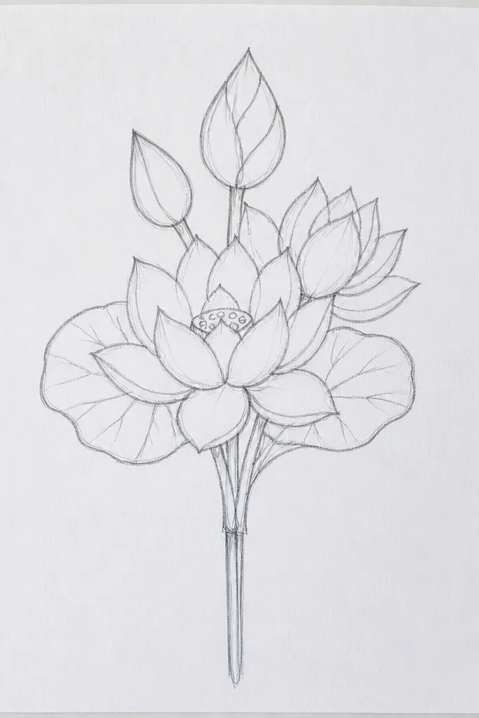
A stem turns a lotus drawing into a "thing," not just a floating flower. I use this for kids who like crafts with cut-and-paste later, because stems are easy to trace onto another sheet or cut out. The single stem also keeps the page from feeling empty. Color-wise, yellow and blush pink look warm and friendly on white paper.
Draw the seed pod and six petals first, placing the lotus near the top center. From the bottom of the pod, draw one long curved stem down to the lower third of the page. Add two leaf shapes on the stem, each drawn as an oval with a pointed tip, and add one center vein line to each leaf. Color the seed pod orange, petals blush pink with a yellow base near the pod, and keep the stem and leaves light green.
Good to knowAdd a tiny bud at the stem tip below the lotus. It makes the whole drawing look intentional even with simple lines.
Common mistakeDon't add five different leaf styles. One leaf shape repeated looks cleaner.
11. Lotus with Crayon Resist Highlights (No Paint Skills Needed)
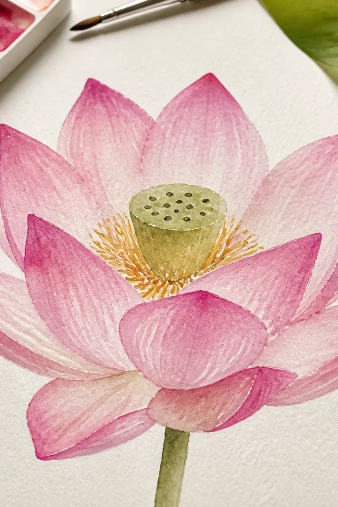
Crayon resist makes kids feel like they're doing magic, and it hides shaky coloring lines. You draw highlights with a white crayon, then paint over everything so the highlights stay bright. I like this for classrooms because it creates a polished look without requiring perfect drawing. It also works for kids who struggle with staying inside the lines - the resist edges guide the eye.
Start by drawing the lotus with a pencil or light marker: seed pod plus six petals. Use a white crayon to draw thin highlight lines on each petal and a few highlight dots inside the seed pod. Then color the petals with light pink watercolor pencil or skip color and go straight to watercolor wash. Paint over the whole lotus with a diluted pink or purple, letting the white crayon streaks stay visible. Let it dry fully before outlining again with a black marker if needed.
Good to knowUse a small brush and fewer paint passes. Too many layers lift the resist and blur the highlights.
Common mistakeDon't press so hard with the white crayon that the paper dents - dents show through the wash.
12. Lotus with Side Petal Perspective (Slight Tilt)
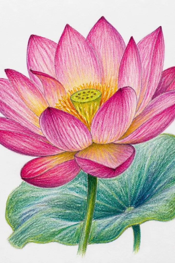
Perspective sounds hard, but this simple tilt makes the drawing look more lifelike. Kids get a "3D" vibe by hiding one petal and angling the rest slightly. I use this for kids who complain that flat drawings look boring. The slight tilt also makes the lotus feel like it's turning toward the viewer.
Draw the seed pod and then sketch six petals, but erase or lighten one petal outline so it looks hidden behind others. Make five visible petals slightly angled to the right, with the leftmost petal shorter. Add one vein line for each visible petal. Color using two shades of pink: lighter on the top half of each petal and a slightly darker pink on the bottom half. Keep the hidden petal uncolored so it doesn't interrupt the shape.
Good to knowUse an eraser on the hidden petal early. A light guide line is easier than redrawing a whole petal after coloring.
Common mistakeDon't shade every petal the same way. Uneven shading sells the tilt.
13. Lotus Bloom with Falling Petals (Movement Lines)
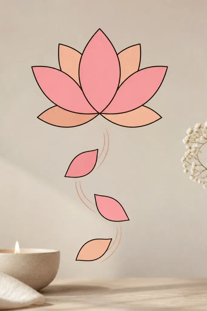
This one looks playful and animated without needing action scenes. Kids draw the lotus normally, then add a few extra petals drifting away. Motion lines tell the eye where the movement is, so the drawing feels alive. It's great for kids who like storytelling and want their art to "do something."
Draw the seed pod and six petals in the center. Color the main petals peach on the inside and pink on the outer edges. Next, draw three smaller teardrop petals below the lotus, spaced diagonally from left to right. Add 2-3 curved motion lines behind each falling petal, drawn lighter than the petal outline. Finish by adding one vein line on each falling petal so they match the style of the main flower.
Good to knowKeep the falling petals smaller than the main petals by about half the height. If they're too big, it looks like extra flowers.
Common mistakeAvoid too many falling petals. Three looks playful; five turns into clutter.
14. Lotus Flower on Lined Paper (Straight Petals, Neat Center)
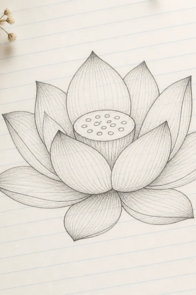
Using lined paper is a sneaky trick for kids who struggle with spacing and centering. The notebook lines act like a guide for where the petal tips land, so the lotus looks tidy even when the hand is learning. I've done this with kids who get frustrated quickly because it reduces "where do I put it?" moments. It also works for writing names or adding a short caption under the lotus later.
Start by lightly sketching the seed pod in the center area of the page, using the notebook lines to keep it level. Draw six teardrop petals so the tips reach roughly the same notebook line height. Add a simple ring outline around the pod to keep petals evenly spaced. Then add three small seed dots per petal base area if you want extra texture. Color with crayons in light pink and pale yellow, and outline with a marker only after the shape looks balanced.
Good to knowIf the marker bleeds, trace with a gel pen instead. The gel pen holds up better on thin notebook paper.
Common mistakeDon't erase aggressively after coloring. You can scuff the paper and make the center look gray.
15. Lotus + Simple Shading with One Pencil (No Blending Required)
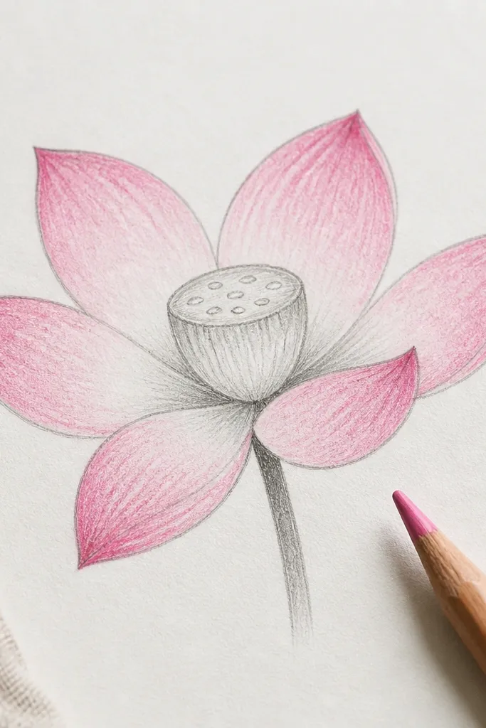
This version looks "smarter" because it uses shading in one place only: the petal base. Kids learn that depth comes from contrast, not from complicated realism. I like this for older kids who want their lotus to look more grown-up than a flat colored one. It also keeps the drawing from turning muddy because the shading stays limited.
Draw the seed pod and six petals, then color the petals light pink with a crayon. Use a pencil (HB or 2B) to shade only near the bottom third of each petal, leaving the top third bright. Add a darker outline line along the outer edge of each petal so it looks crisp. Finally, add a few seed lines inside the pod and color the seeds yellow-orange for contrast. Don't blend with your finger - leave the pencil marks slightly visible for a hand-drawn look.
Good to knowShade with the side of the pencil, not the tip. It creates a smoother patch without scribbles.
Common mistakeAvoid shading the entire petal. Full-petal shading makes it look dirty fast.