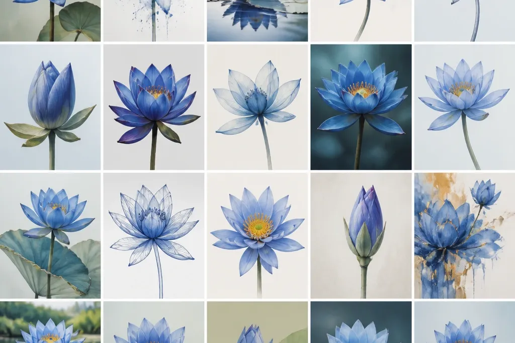

1. Cobalt Halo Lotus with Soft Gradient
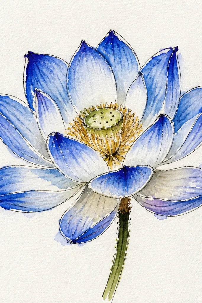
This one looks like a calm morning window — the lotus is crisp, and the background does the heavy lifting. I draw the petals in pale pencil lines, then color them with cerulean at the mid areas and cobalt only where petals overlap. The halo is a circular gradient behind the bloom, leaving a lighter ring closest to the petals so the flower looks lit. This style flatters smaller sketchbooks because the glow frames the flower without needing extra elements. It also looks good on warmer skin tones and cool skin tones alike because the blue values stay consistent and don’t shift toward purple.
Start by sketching the seedpod in the center and drawing 8 outer petals with evenly spaced gaps. Then erase lightly so the lines stay visible but not dark, and color the petal centers with a thin cerulean wash or light colored pencil. Next, add cobalt shading only along petal edges and where petals sit on top of other petals. Finally, blend a soft halo behind the lotus: wet the paper lightly around the flower, then swipe cobalt outward and let it fade into lighter blue toward the edges.
Good to knowKeep the halo ring closest to the petals lighter than you think — it makes the whole drawing feel more luminous.
Common mistakeDon’t flood the halo too dark all the way to the petal edges or the flower will look heavy and flat.
2. Ink Outline Lotus with Watercolor Petal Wash
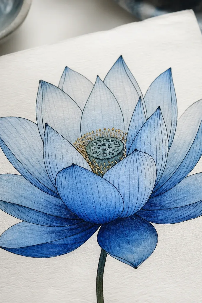
If you like sharp edges, this is the one I reach for. The ink outline keeps your lotus shape graphic, while the watercolor wash gives it that airy softness. I use a fine black or deep navy ink pen to outline the petals, then paint each petal with light blue first and deepen the lower third with cobalt. The result looks clean even if your hand shakes a little, because the ink defines the structure. It’s also great for greeting-card size work since the contrast reads well at a distance. The navy-blue ink pairs nicely with cool-toned blues and doesn’t fight warm paper tones.
Start by lightly pencil-sketching the seedpod and 12 petals, then trace over the final lines with a fine ink pen. Leave the paper slightly white at each petal’s highlight — a thin unpainted strip. Then apply watercolor in two stages: paint a pale wash across the whole petal, let it dry, and add a second cobalt pass only along the petal base and overlap areas. Finish by adding tiny ink dots or short line strokes on the inner seedpod for pollen texture.
Let the first watercolor layer dry fully before adding cobalt, or you’ll get blooms that muddy the petal edges.
Skip thick watercolor coverage; it makes ink lines look fuzzy and cheap.
3. Derwent-Style Layered Pencil Lotus on Cream Paper
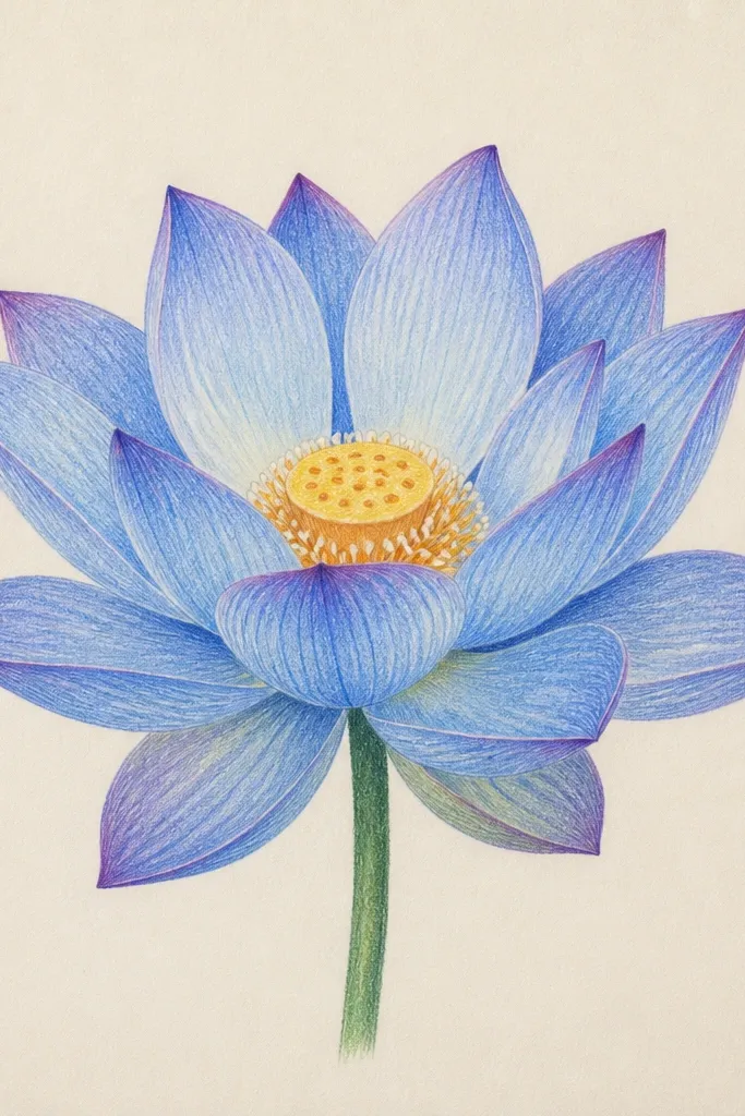
This is my go-to when I want control and no warping. I draw on cream paper so the blues look warmer and more natural than on bright white sheets. Each petal gets multiple pencil layers: light sky-blue for the base, then medium blue for the form, and navy only at the seams where petals overlap. The seedpod stays lighter so it looks like it’s catching light. This style looks especially good for wall art because it has that “soft illustration” feel without needing watercolor. It also works across skin tones because the blue stays true and the cream paper warms the whole piece.
Start by sketching the lotus with 10 petals and a centered seedpod, then shade the petal bases lightly with sky-blue. Next, add medium blue only on the inner halves of each petal, following the curve toward the overlap. Then sharpen your navy pencil and draw a thin shadow line along the petal edges where one petal sits above another. Finally, blend gently with a paper stump or a soft eraser edge to smooth transitions, and keep a narrow highlight unshaded on each petal tip.
Good to knowUse a white gel pen or white pencil to reinforce one highlight line after blending.
Common mistakeDon’t burnish the whole petal — it turns the blue flat and gray.
4. Night Navy Lotus on Speckled Background
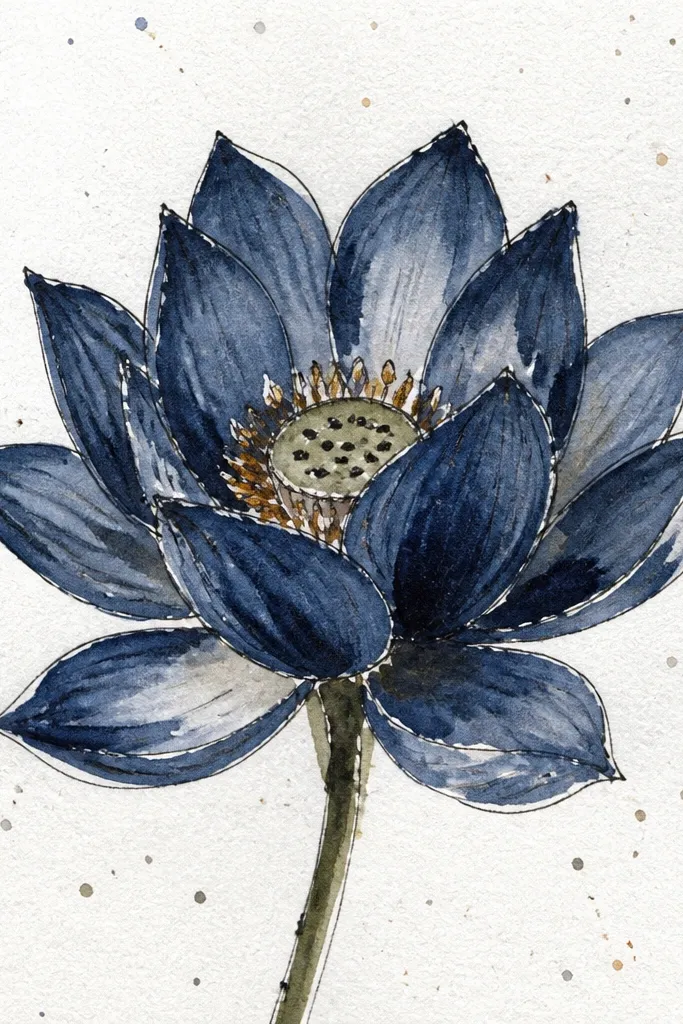
This drawing looks dramatic but still clean. The lotus petals are mostly navy with bright sky-blue highlights, so the flower reads clearly against a busy background. I create speckles behind it using a toothbrush method with watered light-blue paint or white gouache — the dots should be smaller and concentrated farther from the center. The contrast makes the lotus feel like it’s glowing from within. This is a great choice if you want something that looks good framed because the background adds depth without extra objects. It also hides minor pencil mistakes because the speckles break up the page texture.
Start with a pencil sketch of the lotus, then color the petals with a dark navy layer, leaving petal highlights near the top. Add medium blue to the inner petal curves, and keep the seedpod pale with a light blue wash. For the speckles, cover the lotus area with a scrap paper mask, then flick watered light blue and white paint across the background. Remove the mask after the background dries and add a few small speckles near the outer petals for a natural fade.
Good to knowPractice the flick on scrap paper first so your dot size matches the scale of your lotus.
Common mistakeAvoid large blotchy splatters; they look messy and make the lotus look like it’s stained.
5. Open Lotus with Floating Pollen Dots
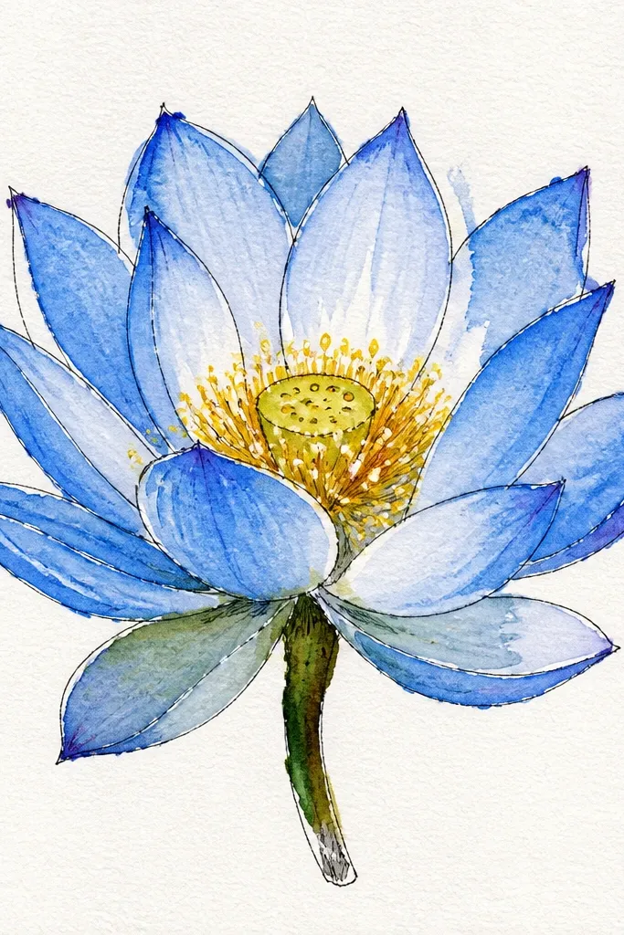
This one feels airy and “alive” without turning into clutter. The lotus is open, so you get more petal edge shading and more chances for clean blue gradients. I keep the seedpod as a lighter blue cluster and add tiny pollen dots around it, not across the entire page. The dots guide the eye back to the center and make the flower look dimensional. It’s a flattering design for smaller formats because the extra dots fill negative space without needing a complex background. If you like your art to look gentle instead of spooky, this is the sweet spot.
Start by drawing a lotus with 14 petals and a slightly flatter seedpod so there’s room for pollen. Color the petals in three values: light blue at the top, medium blue in mid areas, and navy at petal seams. Then paint or color the seedpod with medium blue and add a lighter highlight on the top curve. Finally, add pollen dots: use a white gel pen for bright dots and a pale blue pencil for softer dots, placing them mainly above and around the seedpod.
Good to knowVary dot sizes — 2-3 tiny dots per petal edge looks more natural than equal spacing.
Common mistakeDon’t scatter dots evenly across the page or the background will steal attention from the flower.
6. Blue Lotus in a Circle Mandala Frame
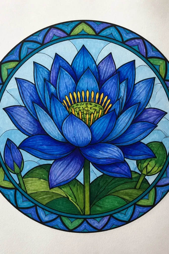
A circular frame gives your lotus a finished “poster” feeling even when the flower is simple. I draw the lotus first, then build a ring of tiny repeating petal shapes around it so the page has rhythm. The lotus stays the brightest element, and the frame is slightly darker and more muted. This design looks great when you plan to turn it into a print or sticker because the border holds everything together. It also works well for people who struggle with backgrounds — the frame is your background. The blues stay consistent so it doesn’t look like random colors pasted together.
Start by sketching a faint circle guide and drawing the lotus center inside it. Add petals with alternating light and medium blue — keep navy shadows only along overlap edges. Then draw a second circle near the outer edge and fill the ring with small teardrop petals pointing inward. Color the ring with medium blue and use navy only on the inner edges of each tiny teardrop. Finish by adding tiny dot highlights between teardrops with a white gel pen.
Good to knowUse a compass or a cup as a circle guide so your frame ring stays smooth.
Common mistakeDon’t make the frame as bright as the lotus or it will compete and flatten the center.
7. Lotus on Rippling Water Lines

This is the drawing I do when I want the lotus to feel grounded and not floating in blank space. The trick is making the reflection lighter and blurrier than the flower. I draw the lotus normally, then mirror it in the lower area but reduce contrast and soften edges. Use pale blue for the reflection and add horizontal wave lines that cut across it. This looks good for anyone who wants a calm scene with movement, and it reads nicely even with simple supplies. The cool blues plus the lighter reflection give a soothing, watery effect.
Start by drawing the lotus in the upper half with strong petal edge shading in cobalt and navy. Keep your highlights clean so the flower looks crisp. Then sketch a reflection below: lightly mirror the petal shapes and seedpod, but keep everything one value lighter (pale cerulean instead of cobalt). Add horizontal wave lines across the reflection area, using a light pencil or thin watercolor line, and erase some lines under highlights. Finish by fading the reflection toward the bottom with a very light wash.
Leave a gap of white between lotus and reflection so the water line looks real.
Don’t copy the lotus reflection at full contrast or it looks like a photocopy.
8. Minimal One-Petal Lotus Study
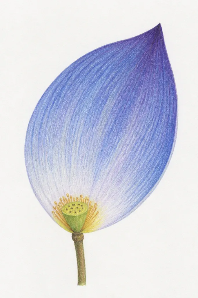
This is a small format trick that still looks like a “real” design. Instead of drawing the whole flower, you focus on one main petal and a partial fan of others so the page feels intentional. I use one big petal in cobalt with lighter cerulean toward the tip, plus a tiny seedpod in the center. The minimal approach makes your hand feel steadier because you’re not counting 20 petals. It also works beautifully as a background element for planners, cards, or journaling because it doesn’t demand attention. The limited palette keeps the blue looking clean, not muddy.
Sketch a seedpod in the upper center and draw one dominant petal sweeping outward, then add 2-3 smaller petals behind it. Color the dominant petal with a gradient: light cerulean at the top, medium blue mid, and cobalt at the base near the seedpod. Add navy shadow along the petal edge where it overlaps the smaller petals. Finally, reinforce the outline with a fine pen or darker pencil so the minimal shape stands out against the paper.
Good to knowIf your line wobbles, darken only the outer contour, not the entire sketch.
Common mistakeDon’t add lots of extra petals — the minimal look falls apart fast.
9. Blue Lotus with Gold-Tone Accent Dots
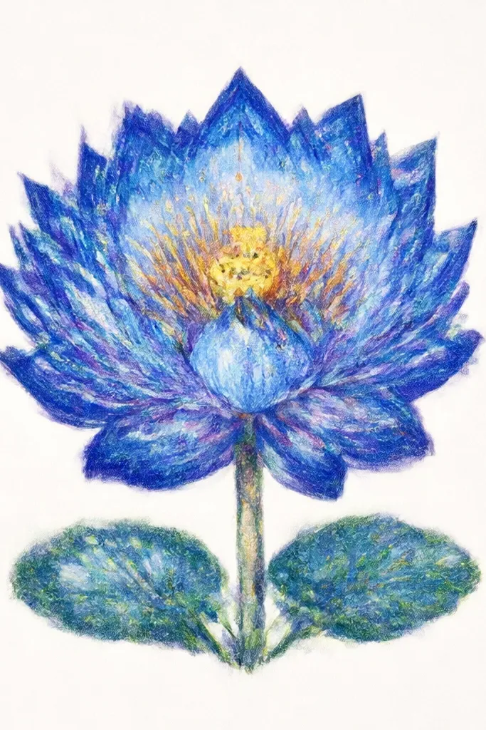
This one is for when you want the lotus to feel special without turning into glitter chaos. I keep the lotus blue-only, then add a small number of gold accent dots around the seedpod and one petal edge line. Those warm dots make the cool blues look richer, but the gold is used sparingly so it doesn’t become the theme. I usually use metallic gel pen or metallic acrylic with a fine brush. The result looks great on off-white paper and in photos because the dots catch light. This style works for gifts and wedding stationery because it feels delicate and intentional.
Start with the pencil sketch of a full lotus, then color petals in three values: light cerulean highlight, medium blue midtone, cobalt for shadows. Shade only overlap seams with navy so the petals stay airy. Paint or color the seedpod slightly darker than the petal highlights. Then add gold dots: place 12-20 dots around the seedpod and a few tiny dots along the inner edge of 2 petals. Let the metallic dry flat so the dots don’t smear.
Test your metallic pen on scrap so you know if it skips — you want consistent dot size.
Don’t run gold along every petal edge or it looks like cheap craft confetti.
10. Watercolor Wash Lotus with Salt Texture
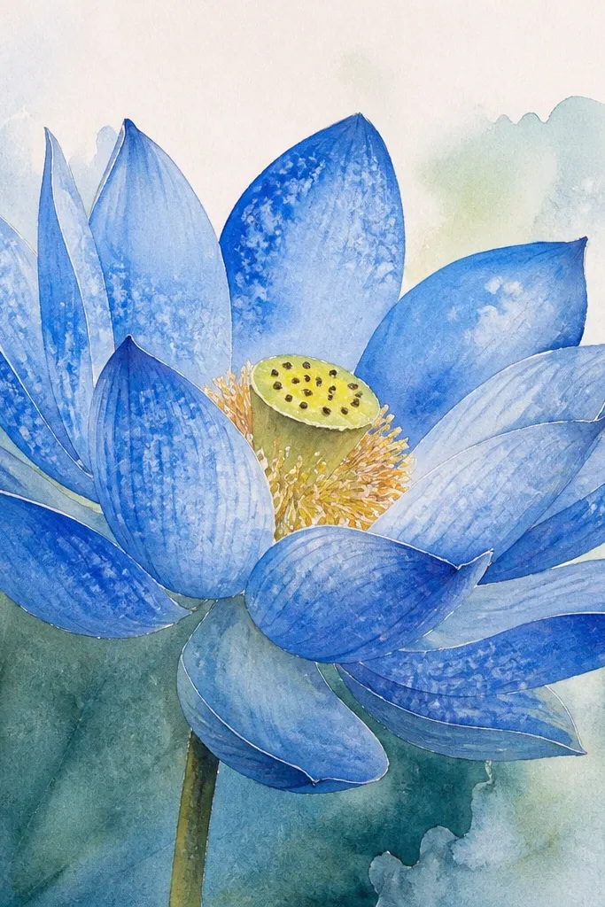
Salt texture makes watercolor lotus petals look natural and softly textured, like petals catching mist. I paint the petals with a wet-on-wet cerulean base, then drop coarse salt into the darker cobalt areas before it dries. The salt pulls pigment and creates tiny irregular speckles that look like light scattering. Keep the salt away from highlights so the top of each petal stays smooth and bright. This style looks stunning on darker blue backgrounds too, but it still works on plain white. It’s also forgiving if your petals aren’t perfectly symmetrical because texture hides small imperfections.
Sketch the lotus lightly, then wet one petal at a time with clean water. Apply cerulean wash first, then add cobalt only along the petal base and overlap region. Before it dries, sprinkle a pinch of coarse salt over the cobalt areas and leave highlights untouched. Let everything dry fully, then brush off salt gently with a soft brush. Finish by tracing petal edges with a darker blue pencil so the texture doesn’t blur your flower outline.
Good to knowUse coarse salt, not table salt, or the texture looks too tiny and disappears.
Common mistakeDon’t salt the whole page — you’ll get a grainy look instead of petal sparkle.
11. Blue Lotus with Patterned Petal Stripes
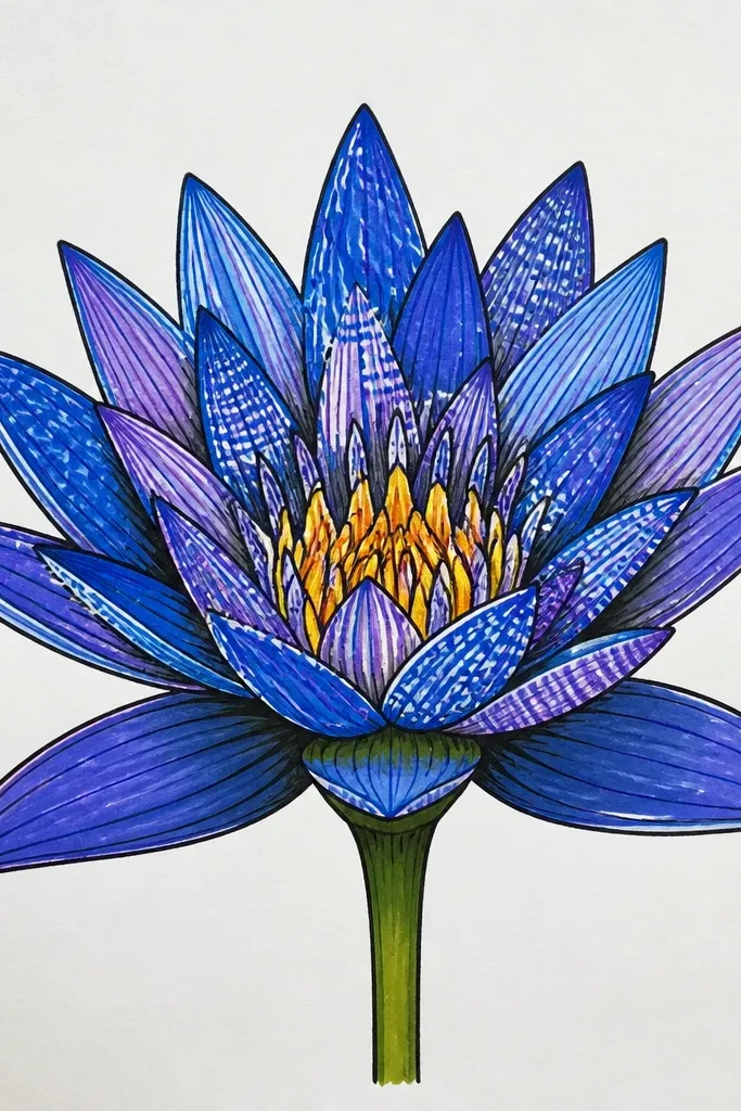
If you like designs that look handmade and decorative, striped petals are the quickest way to get that. I draw the lotus shape normally, but instead of smooth shading I add curved stripes that follow the petal curve. The stripes are alternating light cerulean and cobalt, with navy used for the shadow stripe where petals overlap. This makes the lotus look like fabric or inked paper cutouts. It also keeps your drawing from looking flat because the stripes create texture without needing heavy background. This design looks great for scrapbooking and wall hang tags.
Start with a clean pencil sketch of 12-16 petals and a seedpod center. Color the petal base with a light cerulean wash or light pencil layer, leaving it even. Then draw curved stripe lines across each petal following its arc — 3-5 stripes per petal. Color every other stripe with cobalt, and keep navy only in the overlap shadow areas between petals. Add a few stripes on the seedpod too, then outline the whole lotus with a darker blue pencil to lock it in.
Good to knowMake stripe spacing slightly wider on outer petals so the pattern feels natural.
Common mistakeDon’t make stripes perfectly straight across curved petals or it looks like a sticker pattern.
12. Lotus Corner Composition for Journals
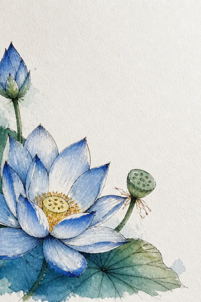
Corner compositions are a lifesaver when you want art in your journal without stealing the whole page. I place the lotus in the top-right or bottom-left corner and let a few petals extend toward the center, so it feels planted in the page. The background is a soft wash behind the flower only, not across the entire page. I keep the petals mostly light blue with cobalt shadows at overlap points, so it doesn’t overpower handwriting. This style flatters your notes because the contrast is contained to one area. It also works for different skin tones in photos because the blue remains the dominant color.
Sketch the lotus small in your chosen corner, leaving at least 2 inches of blank space from the edges if you’re writing. Use fewer petals — 8-10 — so it stays readable at a glance. Shade petal overlaps with navy and keep highlights near the tip uncolored. Add a faint watercolor wash behind the flower using watered cerulean, staying inside a loose oval shape. Finish with a thin pen outline around the outermost petals to make the small drawing pop.
Use a smaller brush for the background wash so it doesn’t creep into your writing zone.
Don’t place the lotus too close to the page edge or the petals look cramped.
13. Blue Lotus with Botanical Leaves and Simple Stem
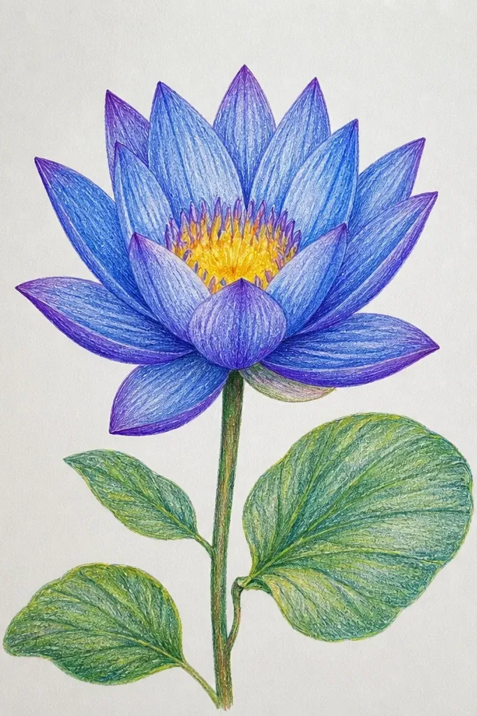
Adding leaves makes the lotus feel like part of a plant set, not a standalone flower. I keep the leaves simpler than the petals — one main leaf shape and one smaller leaf — so the lotus stays the focal point. The leaves are shaded with the same three blue values, but with more negative space so they don’t compete. This style looks great on bookmarks, wall prints, and gift tags because it has a clear silhouette. It’s also forgiving for beginners because you’re only drawing a few extra shapes. The cool blue palette stays cohesive and doesn’t clash with warm paper tones.
Start by drawing the stem line with a gentle curve, then place the lotus at the top and two leaves along the stem. Draw petals in a standard lotus layout and shade overlaps with cobalt and navy. Color the leaves with cerulean for the base and add cobalt along the leaf veins and edges. Add a thin highlight line on each leaf to keep it fresh. Finally, use a fine pen to define the leaf outline and seedpod center so the whole plant reads clearly.
Good to knowSketch leaf veins lightly first so your darker vein lines look planned, not accidental.
Common mistakeDon’t over-detail the leaves — too many lines make the drawing look busy.
14. Blue Lotus with Cut-Paper Look Edges
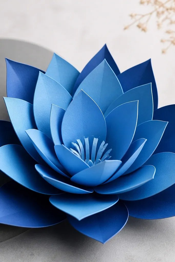
This style gives you that paper-craft vibe without needing scissors. The trick is creating gaps and layered edges that mimic cut paper. I draw the petals in separate layers: one light blue base shape, then a darker blue overlay shape that sits slightly offset, with a thin shadow line between them. It makes the petals feel dimensional even on flat paper. It also looks great in photos because the crisp edges create strong contrast. This design flatters people who like clean graphic art more than soft watercolor blends.
Sketch the lotus and assign each petal to a layer: base layer in light cerulean and overlay in medium blue. Draw the base petal shapes first, then draw slightly offset overlay petal shapes so you can see a sliver of the base underneath. Add cobalt to the overlap areas and navy as the thin shadow gap between layers. Keep highlights as uncolored white strips on the overlay petals. Outline the outermost petals with a darker blue pencil or fine pen to lock the silhouette.
Offset overlay petals by a consistent amount, like 2-3 mm, so the “cut paper” effect looks intentional.
Don’t blur the edges — if you blend the layer borders, the cut-paper illusion disappears.
15. Blue Lotus Mandala with Tiny Concentric Rings
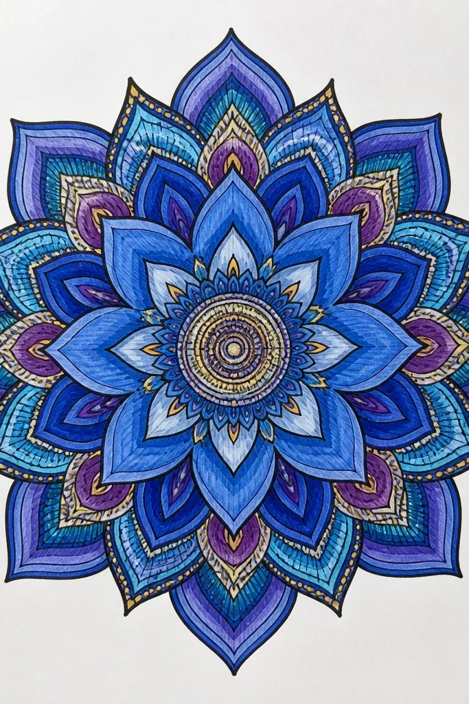
Concentric rings around the lotus add structure and make the drawing feel meditative without needing a full background scene. I use tiny dots and short curved marks that radiate from the seedpod outward. The rings help your eye read the center first, then move across petals in a controlled way. I keep the rings lighter than the petals so they don’t steal attention. This design looks great as a cover art element, especially for planners and journal covers. Blue stays consistent across the piece, so it still looks cohesive even with lots of small details.
Start with the lotus at the center and shade petals with light cerulean highlights and cobalt/navi overlap shadows. Draw a small circle around the seedpod, then add dot rings every 1-2 mm outward. Keep the dot colors in a gradient: pale blue near the center, then medium blue, then cobalt farther out. Add short curved marks between dot rings to echo petal curves. Finally, outline the lotus with a darker blue pencil so the petal edges stay crisp against the dot field.
Good to knowUse the tip of a ballpoint pen for dots — it gives consistent dot size without a shaky hand.
Common mistakeDon’t make dot rings too dense; if every space is filled, it turns into noise.
16. Single-Line Lotus with Blue Marker Wash
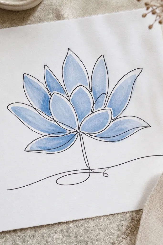
This is the quickest way to get a modern look. The single-line outline gives you a clean, flowing shape, and the marker wash adds color without overworking the paper. I keep the marker wash loose and let it pool slightly at petal bases for natural variation. The seedpod is left lighter so it looks like it’s under the petals. This style works well for beginners because you only commit to one outline pass, then color inside. It’s also great for making multiple versions fast — the line is your repeatable template.
Draw the lotus outline in one continuous line with a black or deep navy fineliner. Then color each petal using a light blue marker, leaving a narrow highlight area near the top of each petal. Add a darker cobalt marker only at overlap seams and petal bases. Use a clean brush with a tiny bit of water to soften marker edges where you want a gentle gradient, and keep the outer edges crisp. Finish by adding a few darker marker dots on the seedpod center.
Good to knowKeep a scrap paper under your hand — marker can transfer, and you don’t want smudges on your next petals.
Common mistakeDon’t over-blend — if you spread marker too much, the petals lose their shape.
17. Blue Lotus with Soft Charcoal Shadows
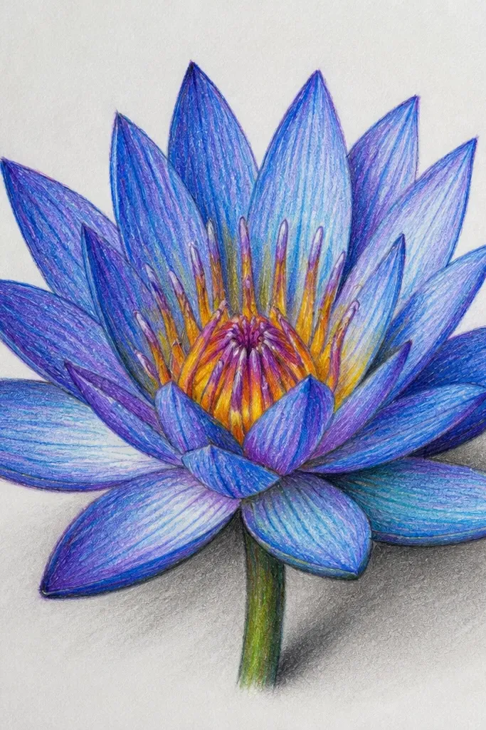
Charcoal shadows make the lotus feel grounded and three-dimensional. I use blue pencil or watercolor for petal color, then add charcoal only where petals overlap to deepen the form. The charcoal also helps the flower cast a subtle ground shadow so it doesn’t look like it’s floating on white paper. This style looks dramatic in a quiet way, like a sketchbook page you’d want to keep. It’s also helpful if your blue shading looks too even — charcoal gives you a natural, irregular darkness. The mix of cool blue and neutral charcoal reads clean across different lighting.
Sketch the lotus and lightly color petals with cerulean and medium blue, keeping highlights unshaded. Then use charcoal pencil to add shadow under each petal where it touches another petal, keeping the shadow edges soft. Add a faint ground shadow below the lotus in the same charcoal tone, about 1 cm wide, fading outward. Blend charcoal gently with a tissue so it stays soft, not smudged everywhere. Finally, reinforce petal outlines with a light blue pencil so the edges stay defined.
Good to knowFixative spray helps charcoal stay put, especially if you plan to scan or frame the piece.
Common mistakeDon’t use charcoal on the highlights or it will kill the glow.
18. Blue Lotus on Lined Paper with Watercolor Bleed Effect
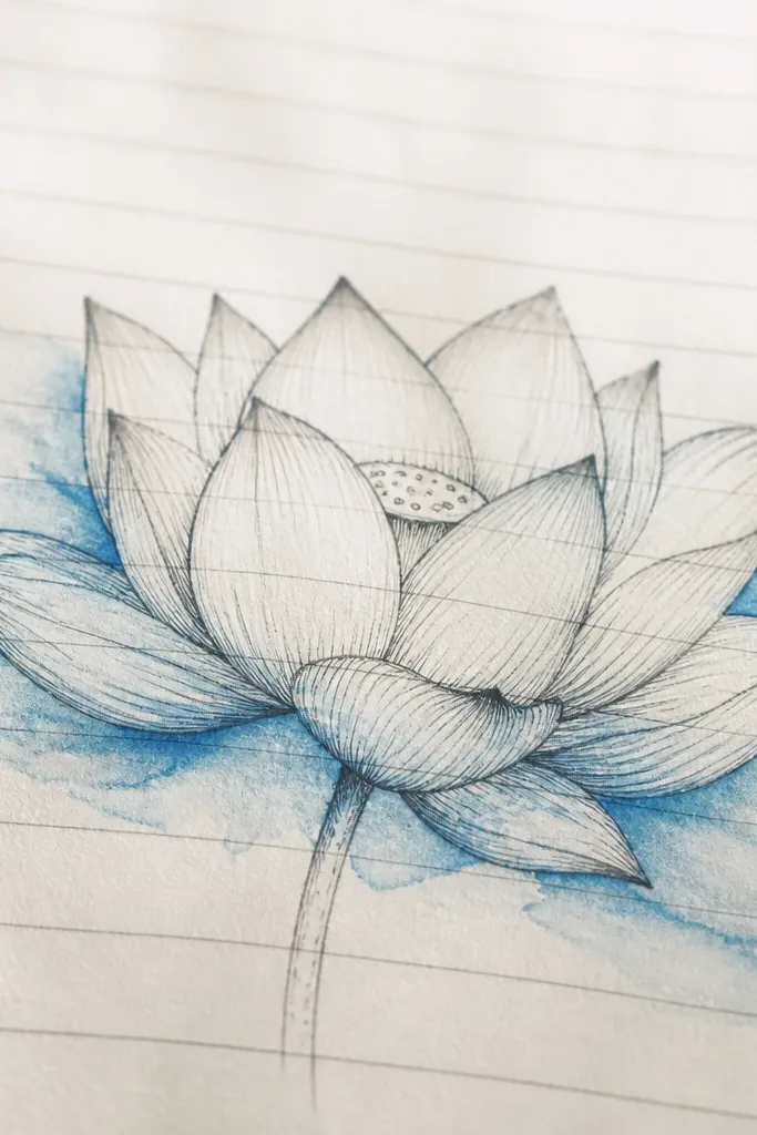
This one leans into the texture of real notebook paper. The faint lines make a subtle pattern, and the watercolor bleed effect makes the lotus look spontaneous and lived-in. I draw the lotus in pencil, then paint only select areas so the pigment spreads where the paper absorbs more water. The petals still look like petals because I keep the overlap shadows in deeper cobalt. It’s a great choice for quick art sessions where you want the page to look real, not perfectly finished. Blue stays the theme, while the bleed gives it character.
Sketch the lotus on lined paper and lightly erase so the lines are visible under your drawing. Paint petals with a watery cerulean wash, but only deepen edges with cobalt — don’t fill everything solid. Let the watercolor sit and spread naturally along the paper texture. When it starts to dry, add navy to overlap seams and seedpod center. Finish by tracing petal outer edges with a fine pen or darker pencil so the shape holds even with bleed.
Use less water than you think — you want controlled bleed, not full smearing.
Don’t paint over the entire petal with thick wash or the notebook lines disappear and the effect gets muddy.
19. Blue Lotus with Stencil-Like Petal Edges
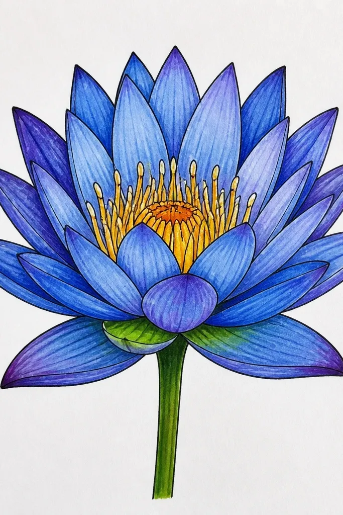
Stencil edges make the lotus look clean and graphic, like printed art. I get this by building petal color as blocks instead of smooth gradients. Each petal has a light base, then a darker edge band that follows the petal outline. The seedpod gets a small darker ring so the center looks formed. This style is great if you want your drawing to match modern decor — it looks good on plain backgrounds and in simple frames. It also helps you practice consistent petal shapes because the edges are defined by color bands.
Sketch the lotus petals and seedpod, then color the whole petal base with pale cerulean. Next, add a darker cobalt band along each petal edge, leaving a thin highlight strip inside the band. For overlaps, add navy only on the inner edge where petals stack. To make the stencil-like look, keep color boundaries sharp and avoid blending across the highlight strip. Finish by adding a tiny navy ring around the seedpod and outlining the outermost petals with a darker pencil.
Good to knowUse a small flat brush or colored pencil with a sharp point so edge bands stay straight and crisp.
Common mistakeDon’t blend the edge band into the highlight strip or you lose the stencil effect.