1. Sunlit Meadow With Diagonal Blade Sweep
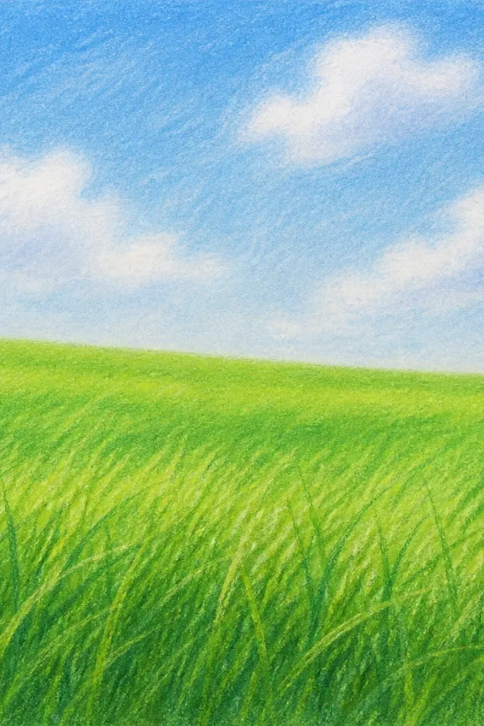
Start with this one when you want your grass to look like it has movement without drawing thousands of blades. The diagonal sweep gives the eye a path, so your field feels windy even if you keep the sky simple. Use a light pencil for the base and then add darker clusters every few centimeters so the grass reads as groups, not noise. This style looks best when your light source is consistent, like sun coming from the left, because the right edges of blades can stay darker.
Good to knowPick one side for highlights and keep it the same across the whole drawing, even if you rush.
Draw a horizon line 2.5 cm from the top of an A5 page, then lightly sketch a ground slope that dips toward the left.,Block the foreground with short, light strokes first, then add longer blades in the bottom 1/4 of the page, leaning left-to-right. Keep the midground blades about half the length and soften them with light shading.,Darken the blade tips and cluster gaps near the bottom, then blend the back-row texture with a paper stump so it fades into the horizon.
Common mistakeDon’t draw every blade the same length — that’s the quickest way to get a “felt carpet” look.
2. Rainy Field With Vertical Drips and Dark Rows
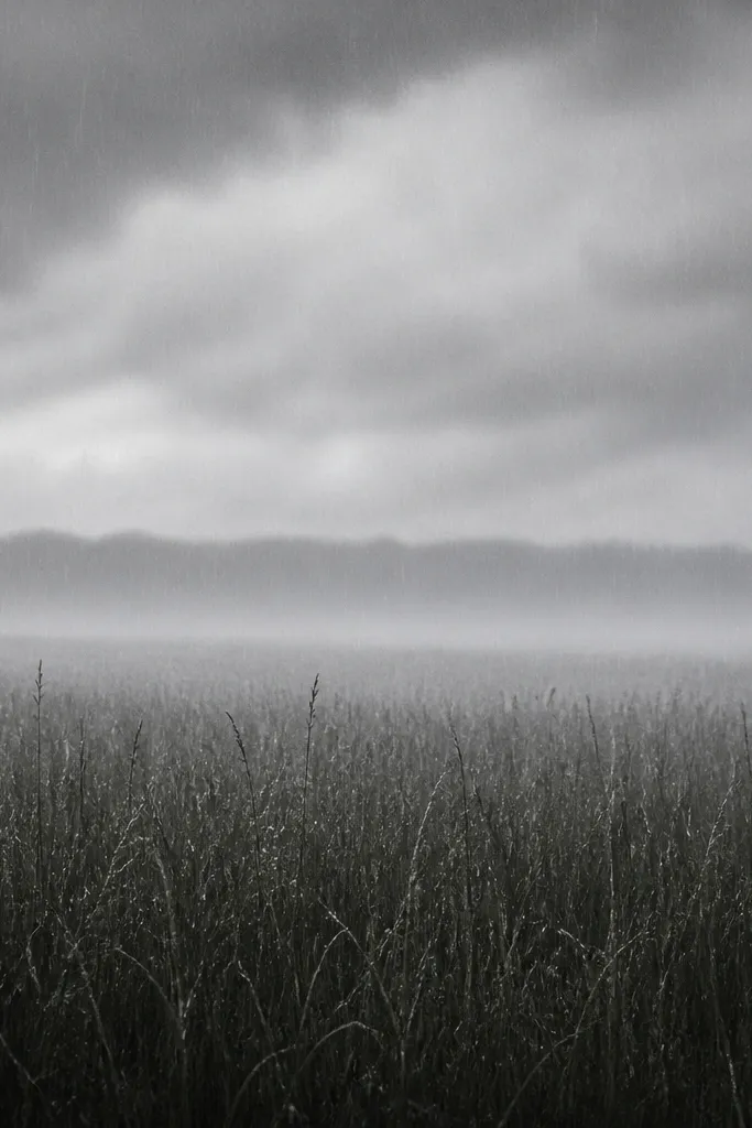
Rain scenes are forgiving because the atmosphere hides small mistakes. Vertical blades keep the mood clear, and the rain streaks give your viewer an instant story. Use pencil values to make the grass look heavier and wet: darker at the bottom, grayer in the middle, and softer near the horizon. This looks great for beginners because you can skip ultra-detailed blade edges and still get a believable field.
Lightly sketch your horizon and ground, then shade a dark value strip 1 cm above the bottom edge to anchor the foreground.,Draw grass blades straight up, but vary pressure so some are thin and faint and others are thicker and darker. Add short rain streaks as tiny vertical lines that start on blade tops.,Blend the midground with a stump or your finger, leaving the foreground sharper. Finish by darkening just a few clumps near the bottom so the wet texture pops.
Use a kneaded eraser to lift highlights on a few blade tops — the “wet shine” trick sells the rain.
Don’t outline every blade — the scene should feel blurred by moisture, not inked like a coloring page.
3. Wildflower Edge With Grass Tufts and Seed Heads
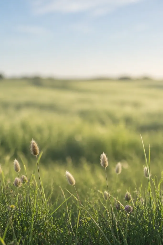
If you want grass that looks lively without adding a full flower garden, this border idea does it. Seed heads create vertical accents that break up the repetitive blade texture. You also get a natural focal point where the grass meets “something else,” which makes the whole drawing feel intentional. This works especially well on lighter skin tones in portraits? Not relevant here — in art terms, it works best on off-white paper because the pale fibers hold pencil texture nicely.
Good to knowKeep the seed heads in one general direction, like leaning with the wind, so the border looks cohesive.
Start by drawing a soft, uneven line for the ground edge, then lightly block the midground as a broad gray-green value band.,In the bottom 20% of the page, draw tufts as clusters: 20-30 blades per tuft, each tuft slightly different in lean direction. Add 3 to 6 seed heads using small oval shapes with short feathery strokes radiating outward.,Place tiny flower bumps as 3-dot clusters or small circles, then blend the surrounding grass so the accents stay crisp.
Common mistakeDon’t scatter seed heads randomly across the whole page — too many focal points makes it feel messy.
4. Cartoon Grass Field With Thick Strokes and Simple Clumps
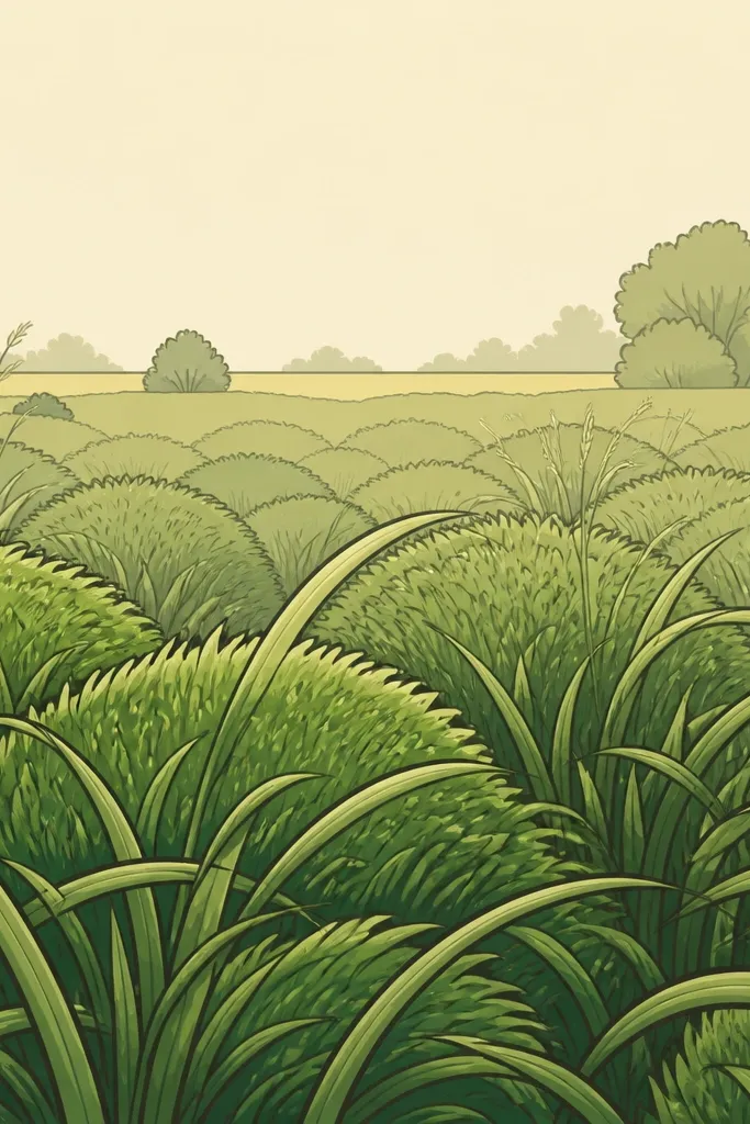
This is for when you want the vibe of grass without the stress of realism. Thick strokes create a graphic look that still reads as “field” because the shapes are grouped. You’ll keep your drawing clean by using fewer marks and larger clumps. It flatters anyone who likes bold lines and quick progress — you can finish this in under an hour and still get something you’d hang on a wall.
Good to knowPick one grass color tone for shading, like warm green, and use it consistently across clumps.
Draw your horizon line and then block the ground as a wide triangle shape pointing down toward the viewer.,Use a 0.5 fineliner (or a black marker) to outline 6-10 large grass clumps along the bottom. Fill each clump with short curved strokes, leaving a few white gaps to show light.,Add a lighter midground band with thinner strokes, then stop detailing once you reach the horizon.
Common mistakeDon’t add tiny blade detail in the background — it breaks the cartoon style and makes it look unfinished.
5. Pencil Study in 3 Values Only
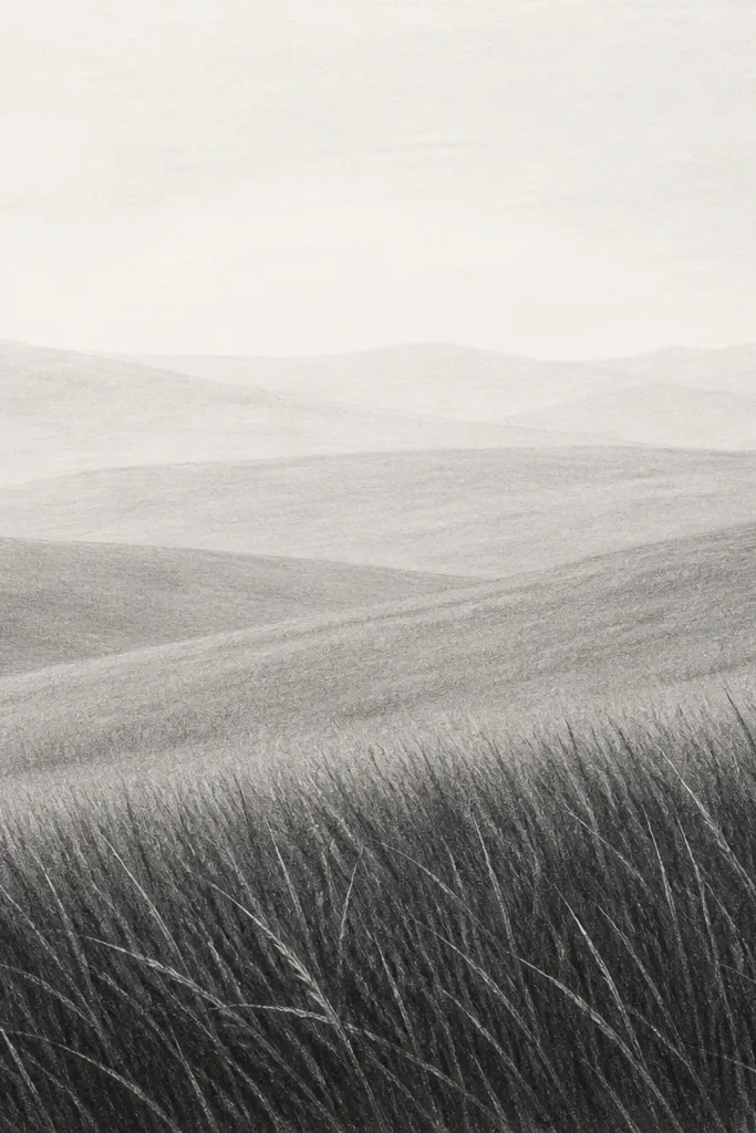
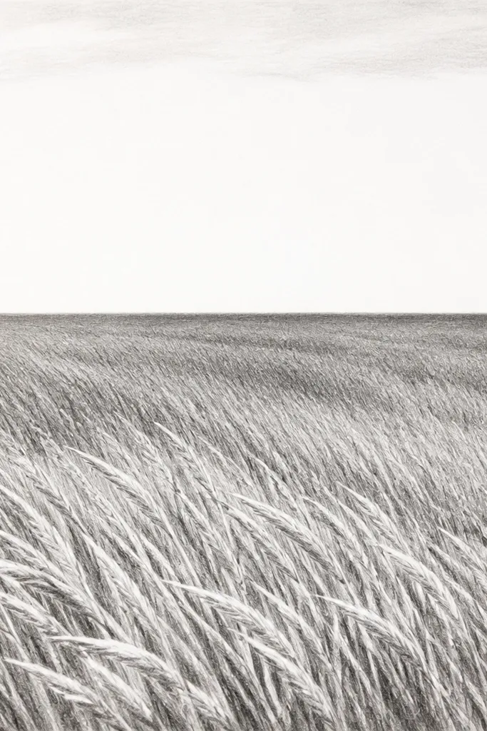
This idea is a cheat code when you feel stuck. Three values force your brain to focus on depth instead of drawing every blade. The foreground has the most contrast, the midground is softer, and the background is almost a texture wash. It’s also easier to fix — you can erase and re-shade without drowning in detail.
Good to knowSquint at your drawing. If the depth disappears, darken only the bottom band and leave the horizon alone.
Pick three pencil tones: light base with HB, midground with 2B, and foreground accents with 4B or heavy HB pressure.,Sketch the horizon and then shade a medium band across the midground. Add foreground blade clusters only in the bottom 15-20% with sharp tips.,Blend the midground lightly so it transitions into the background, then add a few dark clump shadows to anchor the scene.
Common mistakeDon’t use four or five pencil pressures at random — that extra contrast is what makes it look chaotic.
6. Watercolor Grass With Dry Brush Haze
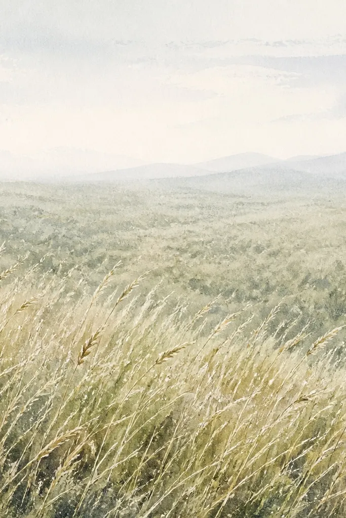
Watercolor grass is where dry brush becomes your best friend. When paint is almost dry on a brush, it leaves broken marks that read like blade tips. I use this when I want a landscape that feels airy, not overly detailed. The trick is layering: you start with a base wash, then add dry-brush grass strokes, then deepen only the areas you want to feel close.
Good to knowUse a hair dryer on low for 20-30 seconds between layers so you can control crisp dry-brush marks.
Wet the paper lightly for a thin ground wash, then paint a pale green-gray base. Let it dry until it’s just tacky, not glossy.,Mix a darker green with a touch of brown and use a flat brush loaded with paint, then wipe most off on a paper towel. Drag short, upward strokes in the bottom third so the brush skips and creates blade texture.,Add a midground glaze by brushing a thin gray-green over the middle area, then leave the top near the horizon lighter.
Common mistakeDon’t overwork wet paint. If you keep dragging the brush, you get muddy streaks instead of grass texture.
7. Ink Grass With Crosshatch Depth Lines
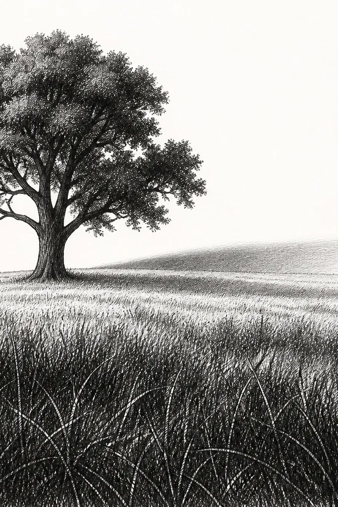
Ink grass can look sharp fast if you treat it like shading, not a blade-by-blade coloring book. Crosshatching gives you depth because the lines cluster and fade. Your grass doesn’t need to be perfect — it needs consistent direction and value. This works well when you want a dramatic contrast piece, like something you’d frame in a simple black mat.
Draw the horizon and block the ground with light pencil so you know where to stop ink.,In the foreground, draw short blade strokes that angle slightly, then add crosshatch lines that run perpendicular to the blade direction. Build darkness gradually.,In the midground, reduce the density: fewer lines, lighter pressure, and leave more paper showing. Keep the background minimal so the field breathes.
Use the same crosshatch angle across the whole piece; changing angles makes it look accidental.
Don’t fill the sky with ink. Leaving the background cleaner makes the grass look more detailed by contrast.
8. Charcoal Field With Smudged Blade Edges
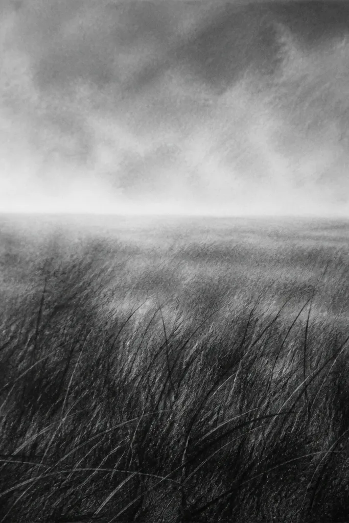
Charcoal is messy in the best way for grass. You get a natural blur that makes the distance feel far away, even if your blade drawing is rough. This style is forgiving for beginners because you don’t need perfect line control. It also looks dramatic on textured paper like charcoal sketch sheets, where the tooth grabs pigment and holds texture.
Good to knowFix only after you’re done. If you spray too early, you lock in smudges you might want to adjust.
Sketch the horizon lightly with a kneaded eraser as your guide, then pack charcoal into a dark foreground band.,Use the side of the charcoal stick to drag short strokes upward for grass blades, then smudge some edges with a tissue. Keep the very closest area darkest and sharpest.,For midground, use lighter pressure and fewer strokes. Leave a faint haze strip near the horizon by lifting charcoal with an eraser.
Common mistakeDon’t press hard everywhere. Charcoal needs controlled dark areas or it turns into a flat gray sheet.
9. Evening Field With Long Shadows and Blade Highlights
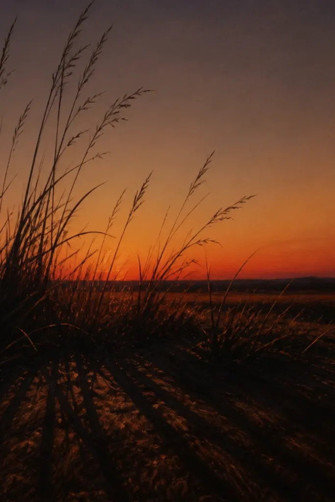
Long shadows make grass feel real because they show the sun angle. In this idea, you keep blade detail mostly in the foreground and add shadow lines to create depth. I like warm gray for the shadows and a slightly lighter tone for blade edges facing the light. This is a great pick when you want your drawing to look “finished” even if you don’t add flowers or houses.
Good to knowPick one sun direction and commit. If shadows point different ways, the scene loses realism instantly.
Sketch the horizon and then lightly map the ground direction so shadows angle across the page.,Draw grass blades in the foreground as short-to-medium strokes, then shade around them with a dark pencil. Add shadow lines that extend from blade bases in one consistent direction.,Warm the horizon band with light orange-brown pencil, then blend lightly so the light glow sits above the grass.
Common mistakeDon’t add bright highlights on every blade. Keep highlights to the top edge of a few clusters.
10. Perspective Path Through Tall Grass
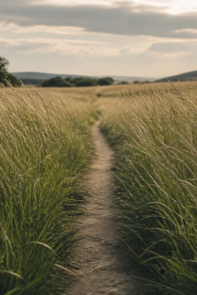
A path gives your viewer a built-in focal point, so the grass has a job. You can draw fewer blades overall because the path shape tells the story. The best part is how the grass leans toward the path edges — that tiny direction change sells perspective. This works for beginners because you can measure the path width at the bottom and keep it consistent while it narrows toward the horizon.
Good to knowKeep the path edges softer than the foreground grass edge, so your depth transition reads naturally.
Draw a center vanishing point on the horizon line. Mark two lines from that point down to the bottom edge to form the path sides.,Shade the path area slightly lighter than the surrounding grass, then add tall grass blades along both edges. Make foreground blades longer and lean them inward toward the path.,Reduce grass detail as it approaches the vanishing point, turning the midground into a darker value band with fewer blade tips.
Common mistakeDon’t make the path the same width all the way — that’s what breaks the perspective.
11. Grass With Wind Lines and Layered Clumps
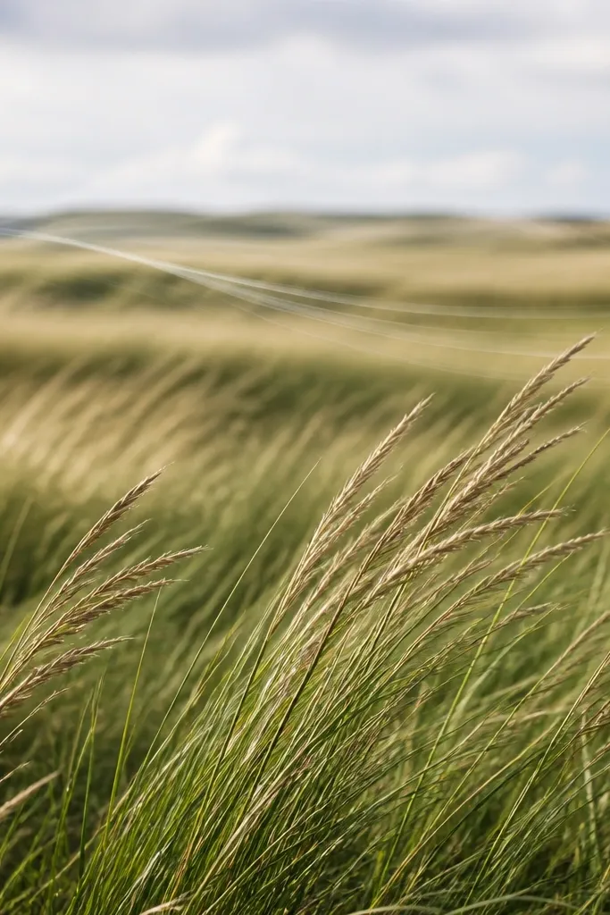
Wind lines are a simple way to add motion without drawing waves of grass. The clumps give structure; the wind direction gives emotion. I use this layout when I want a lively field that still stays readable. It’s also a strong option for paper that smudges easily, because you can rely on grouped strokes and atmospheric fading.
Good to knowMake wind lines lighter than the grass shadows. If they’re too dark, they look like cracks instead of wind.
Sketch the horizon, then block three depth zones with light values: light foreground, medium midground, dark background haze.,Draw grass clumps in the foreground as grouped strokes, all leaning the same direction. Add a few curved wind lines across the midground as very light pencil arcs.,In the background, reduce blade detail and increase softness with blending, keeping the wind direction implied by the diagonal shading.
Common mistakeDon’t draw wind lines across the foreground — keep them in the midground where they can fade.
12. Monochrome Green Marker Grass Stripes
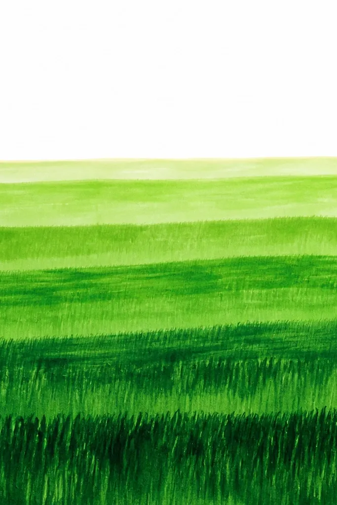
Marker stripes work because markers are great at making smooth value bands, and grass looks believable when you combine bands with a few crisp blade marks. This idea keeps your palette tight: one green family, varied pressure, and a little yellow-green for highlights. It’s clean and fast, and it’s friendly for beginners who struggle to blend pencil.
Good to knowUse a slightly lighter green for the blade highlights — it reads more natural than white gel pen on most paper.
Draw a horizon line and lightly mark a rectangle for the ground area.,Use one green marker to paint three horizontal bands: dark at the bottom, medium in the middle, light near the horizon. Let each band dry 1-2 minutes before adding details.,Add blade strokes only on the bottom band using the marker tip, then dot in a few darker clumps. Keep the midground mostly banded with minimal blade marks.
Common mistakeDon’t overfill the midground with blade strokes. The stripe structure is what keeps it from looking scratchy.
13. Graphite + White Gel Blade Contrast
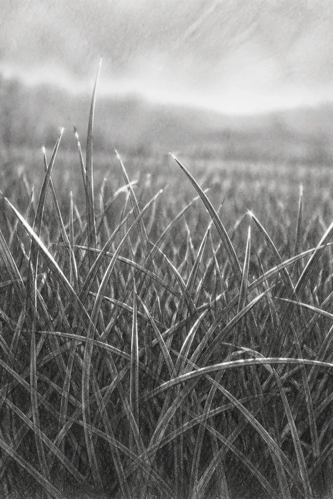
This is the “instant pop” technique. Graphite gives you depth and texture, and white gel pen gives you crisp highlights that make grass look sunlit. I use it when a piece looks flat after shading — the gel marks fix that by adding a light source cue. It’s also very beginner-friendly because you only need to highlight a few areas, not every blade.
Good to knowTest the gel pen on scrap paper first. Some brands skip on smooth paper and need more pressure.
Shade the grass base with graphite in layers, starting light and building up to a darker foreground. Blend the midground with a stump so it fades.,After everything is dry, use a white gel pen to draw short highlight lines along blade tips and a few edges of clumps. Keep highlights clustered in the same side of blades for consistency.,Re-darken any areas that got too light, then gently blend around the gel highlights so they look embedded, not pasted on.
Common mistakeDon’t put white highlights everywhere. Too many highlights turn grass into glitter.
14. Paper Cutting Grass Silhouette With Shadow Backing
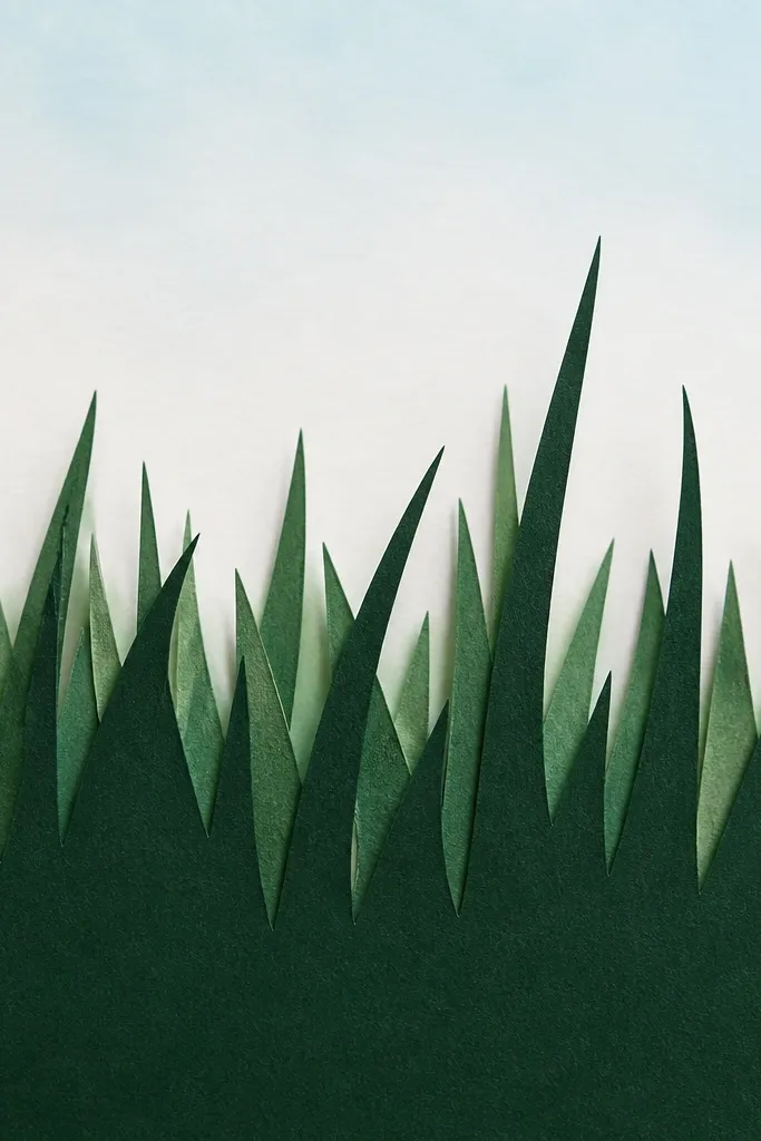
This is a craft-decor version of grass drawing that still uses the same design rules: depth and edge contrast. Cutting grass blades gives you crisp shapes fast, and adding a backing creates a realistic shadow layer. It’s great for beginners because the “drawing” is really about cutting clean edges and grouping blades into clumps. You get a finished decor piece even if your hand drawing isn’t perfect yet.
Good to knowCut blade tips at different angles. That one choice makes the silhouette look like real grass instead of a comb.
Cut a rectangle of backing paper and place it behind a sheet of black craft paper that will become the grass silhouette.,Sketch your horizon line lightly, then cut grass clumps as one continuous silhouette with varied blade heights. Cut fewer, larger clumps — the eye reads them as texture.,Offset the black silhouette slightly so the backing shows as a thin glow. Add a light watercolor wash or pencil gradient above the horizon to finish the landscape.
Common mistakeDon’t cut blades evenly across the whole piece. Uniform edges look like a stencil.
15. Two-Tone Pastel Grass With Side Lighting
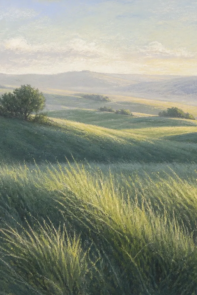
Pastels are perfect for this because they blend fast, but you can still keep crisp foreground texture. The side-light rule is what makes it look like a real field rather than a generic green smudge. I like using two pastel sticks: one darker cool green and one lighter yellow-green, then adding a touch of gray to unify. This style looks especially good in rooms with daylight because the texture catches light from the side.
Good to knowKeep a paper towel nearby and wipe your fingertip often. Dirty smudges kill the two-tone contrast.
Lightly sketch the horizon and rough ground curve. Apply the dark green pastel to the entire grass area with short strokes.,Add the lighter yellow-green on the side where the sun would hit. Focus on blade tips and the upper half of foreground clumps, then blend the midground with your fingertip or a paper blending stump.,Use gray pastel sparingly near the horizon to create haze, leaving the top area slightly lighter so depth stays clear.
Common mistakeDon’t keep blending until everything matches. You need clear separation between foreground highlights and background haze.