
1. 5x7 Frame Sea Grass Border (One Direction Pull)
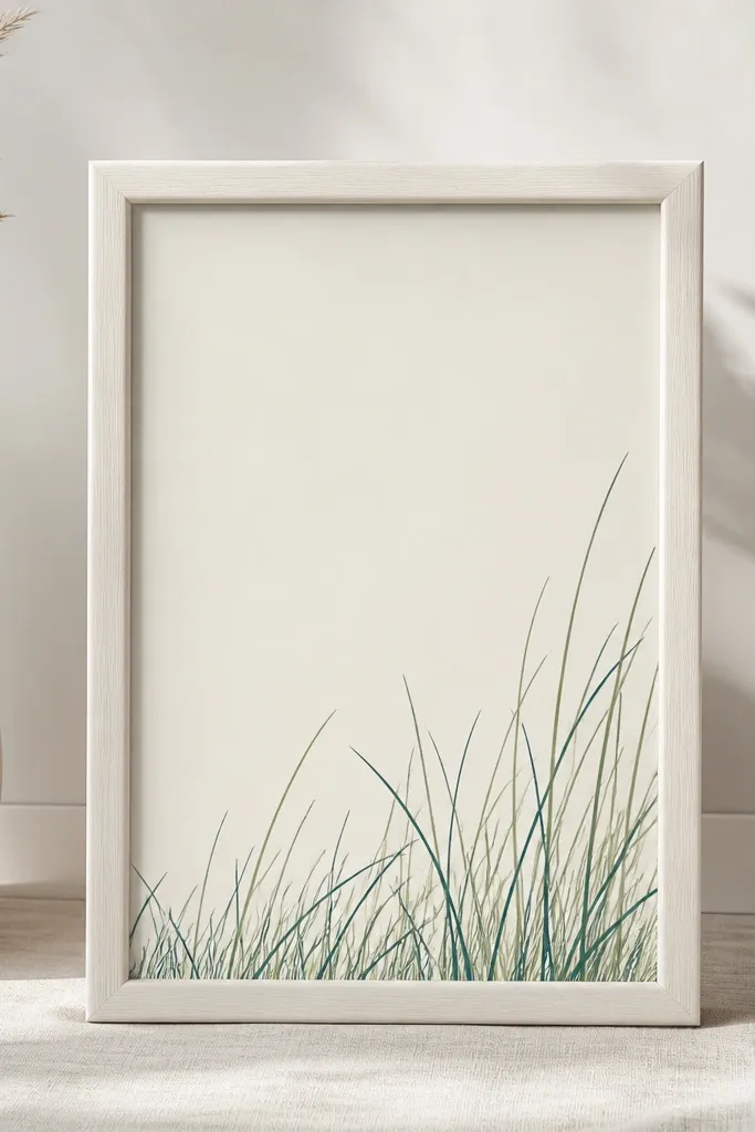
This one is my go-to for small entry nooks because it reads like coastal movement without taking up wall space. I draw the blades in one direction so your eye follows the flow instead of bouncing around. The color combo I use is deep teal ink (almost navy) plus a few blades in seafoam green so it feels like water, not just grass. It flatters small rooms because the composition sits low and leaves the upper space clean. It also looks great next to warm woods — the teal lines contrast without needing bright colors.
Start by taping a straight “waterline” pencil guide about 1 inch from the bottom of your paper. Trace your grass outlines with a 0.3 fine liner, keeping blade spacing tight near the center and wider at the edges. Add a second pass with a lighter green pen for only 20-30% of the blades so it looks layered. Mount the finished art under glass or a thin acrylic sheet, and keep the frame matte to reduce glare. If you want it extra coastal, add two tiny wave arcs above the grass in the same teal, spaced far apart.
Good to knowUse a ruler for the waterline, not for the blades — blades look best when they’re slightly imperfect.
Common mistakeDon’t fill the whole page with blades; heavy coverage makes it look like a coloring page.
2. Vertical Window Strip (Tall Blades on a Thin Canvas)
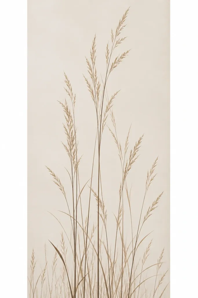
This layout is perfect when your space has height but no width, like between a doorframe and a shelf. Tall, vertical grass lines pull the eye upward, which makes the area feel taller instead of crowded. I keep the outlines mostly black-brown ink for realism, then add a thin wash of diluted sage green on a few blade bases. The result feels coastal and grounded. It works especially well in kitchens with warm beige tiles because the sand background matches without blending away the lines.
Start with a thin canvas panel, around 4 inches wide and 10-12 inches tall. Sketch three columns of grass — left, center, right — with tall blades in the center column and shorter blades on the sides. Ink the main outlines using a 0.5 brush pen for confident thick-to-thin strokes, then go back with a 0.3 liner to sharpen a few blade tips. Add small “root” curls at the bottom of each column so the grass looks anchored. Finish by sealing the ink with a matte spray made for art on canvas or paper.
If your lines look shaky, anchor your wrist on the edge of the canvas and move from the elbow.
Don’t make the blades all the same height; that’s what kills the layered illusion.
3. Drawer Front Sea Grass (Stencil + Freehand Tips)
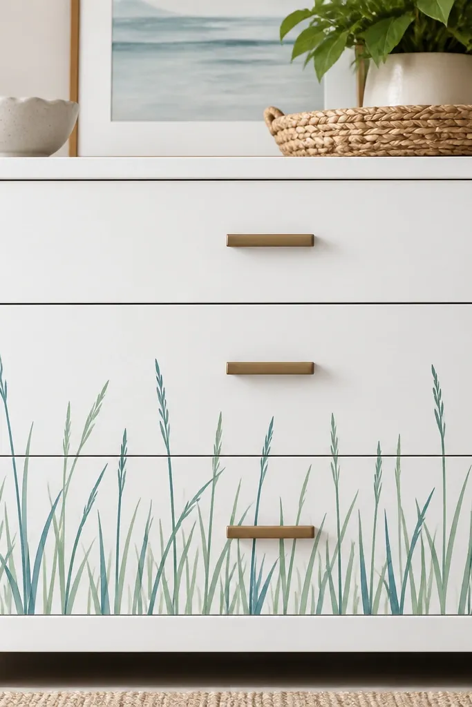
I love this for small spaces because drawers are where your eyes land when you’re busy, and the art feels personal. The stencil part gives you clean, repeatable grass clusters, and the freehand tips keep it from looking mass-produced. I paint the base drawer in a matte white, then draw the outlines in dark teal acrylic ink. For the tips, I add a thin swipe of sage green so the grass looks like it’s catching light. This style looks best on bright, solid colors — it keeps the drawing readable and crisp.
Start by lightly sanding the drawer front and wiping it clean, then paint a matte white base. Position a simple grass stencil along the lower third, leaving 1-1.5 inches of breathing room from the bottom edge. Dab stencil ink or acrylic paint in dark teal, then immediately remove the stencil so edges stay sharp. After it dries, freehand extra blades on top of the stenciled clusters using a 0.3 liner, varying angles and lengths. Seal with a matte topcoat if you want it to survive daily handling.
Good to knowKeep a damp cloth nearby — stencil ink smears fast on porous paint.
Common mistakeDon’t use glossy paint under the drawing; the ink lines look washed out.
4. Coaster-Size Sea Grass (Round Outline with Negative Space)
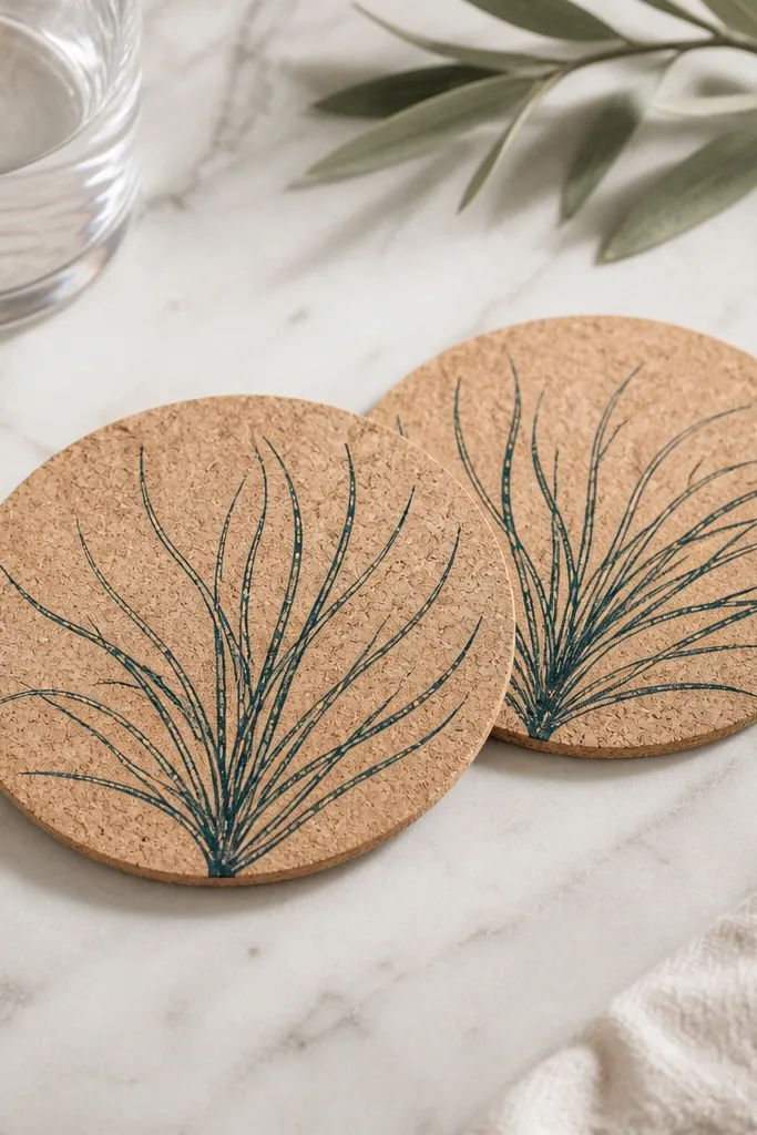
Round pieces are tricky, but they make small spaces feel intentional because the shape forces a focal point. I draw the blades like a fan starting from the center, and I leave a clear circle in the middle so the background stays visible. The dark teal outline looks crisp against the cork texture, and a few blades in lighter green keep it from feeling too heavy. This looks great in coffee corners, especially when you’ve got wood tables and neutral decor. It also flatters your room because it adds texture without adding clutter.
Start with cork coasters sealed with a matte sealer, or use blank cork rounds. Use a pencil to mark a center point and lightly sketch a curved “fan” boundary where the blades will land. Ink blades with a 0.3 fine liner, placing the longest blades at the bottom of the fan and shorter blades near the top curve. Add two or three short blade clusters near the rim for balance, then erase pencil lines after the ink sets. Let it cure fully, then apply a thin matte varnish layer to protect the ink from condensation.
Good to knowUse a scrap piece of paper under your hand — cork fibers grab ink and cause smudges.
Common mistakeDon’t fill the center — the empty circle is what makes it feel airy.
5. Sea Grass on a Mirror Tray (Ink Outline Behind Glass)
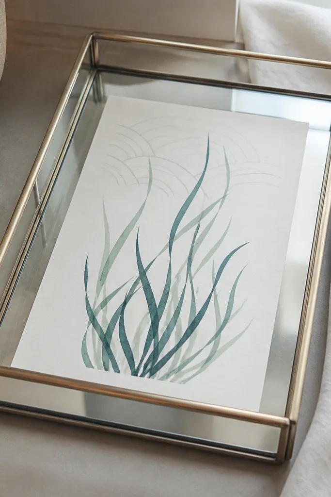
This is the cleanest look when you want coastal art in a very small area like a bathroom counter. The mirror tray makes the drawing feel brighter because the glass reflects light back through the paper. I keep the linework thin and mostly teal, then add seafoam green only at the blade bases. The reflection makes the pattern feel larger without actually taking up more space. It suits people who like minimal decor — no thick paint, just crisp outlines.
Start by cutting paper to fit your tray, leaving a 1/8 inch margin so it doesn’t catch the glass edge. Draw the grass outlines directly on the paper with a 0.3 fine liner, placing the tallest blades near the back edge of the tray. Add three wave arcs above the grass, each arc about 2 inches long, spaced evenly. Color in only a few blade bases with a seafoam gel pen so it stays delicate. Place the paper under the tray glass, then seal the paper with a spray matte fixative if your tray isn’t fully enclosed.
Good to knowDo one test tray first — mirror reflections can make thick lines look muddy.
Common mistakeDon’t use watercolor washes on paper under glass; they can bleed when sealed.
6. Chalkboard Shelf Tag (Sea Grass Label Art)
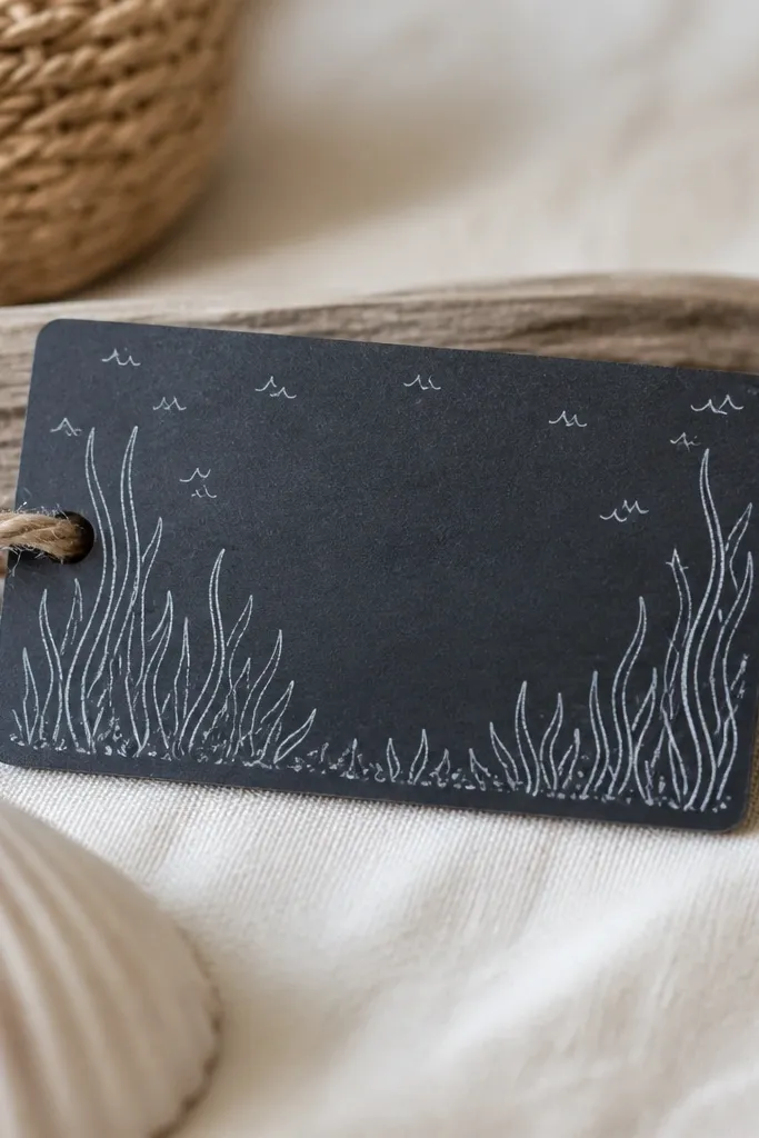
Chalkboard tags work when you want decor that looks handmade but doesn’t take over your shelves. The sea grass outline at the bottom frames the tag and makes the label feel themed. I draw with white chalk or a chalk marker, then add a tiny amount of light blue chalk to a few blade tips. It looks best in kitchens and pantries because the matte chalk texture matches the dusted, lived-in look of chalkboards. It also flatters small shelves because it adds vertical interest without clutter.
Start by wiping the chalkboard tag clean and letting it dry. Use a pencil lightly to mark a baseline about 1 inch from the bottom. Draw your grass blades with a chalk marker, keeping each blade about 1.5-3 inches long depending on the tag size. Add small wave ticks above the grass — just 6-10 marks, spaced out. Finish by rubbing a fingertip over the blue chalk areas only so the color softens at the tips.
Good to knowUse a paper towel to test your chalk marker pressure on scrap first — too hard makes blobs.
Common mistakeDon’t draw thick chalk lines all over; it turns into a solid block.
7. Terracotta Planter Accent (Painted Outline + Dry Brush Shadow)
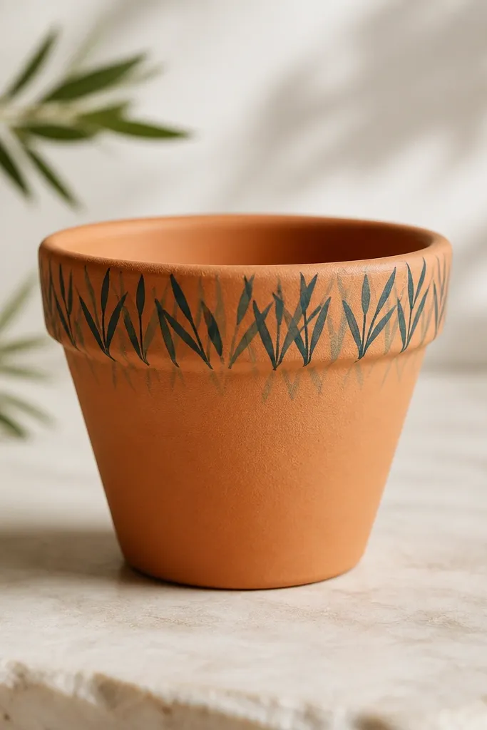
If you’ve got a plant shelf, this makes the planter look designed even when the plant is small. Terracotta gives you warmth, so the grass needs cool ink tones to balance the color. I use dark teal for the outline and then add a dry brush of muted gray-green right under the blades to fake depth. The effect looks like sea grass in real shoreline light. It’s flattering for planters in bathrooms and sunny windows because the outline stays readable in daylight.
Start by cleaning the planter with rubbing alcohol and letting it dry completely. Paint the outline directly around the rim using a 0.3 liner and dark teal paint. Keep the tallest blades at the back of the planter so the front looks tidy. Then dip a small dry brush in gray-green paint and lightly flick under the outline — just a soft shadow, no filling. Let everything cure, then seal with a matte sealant that’s safe for painted ceramics.
Good to knowWarm terracotta absorbs paint; do two thin coats instead of one thick coat.
Common mistakeDon’t paint the blades straight across the rim; follow the curve so it looks natural.
8. Fabric Wall Art (No-Sew Frame Backing with Ink Outline)
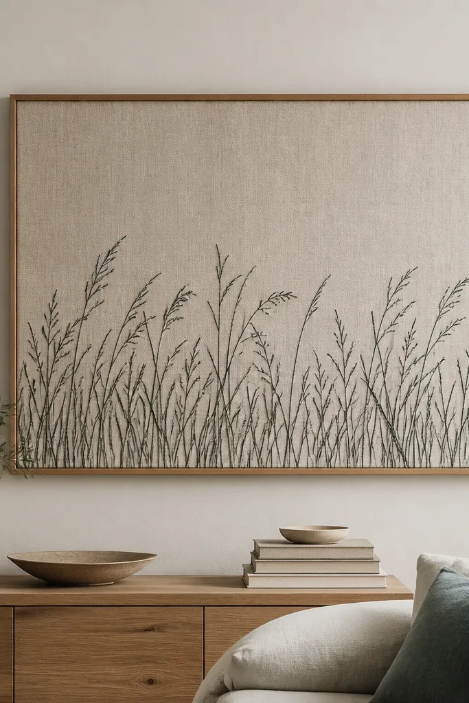
Fabric is where this style looks soft and expensive without heavy work. I use linen or cotton duck because it holds ink lines better than thin polyester. The outlines in dark teal look crisp, and the fabric texture makes the blades feel like they’re floating. This is a great choice for bedrooms or hallways where you want coastal calm. It flatters small spaces because the art looks larger than it is — the weave texture fills in the quiet spots.
Start by stretching linen on a simple frame and securing the corners tight, no wrinkles. Use a fabric-safe marker or dilute acrylic ink with a liner brush, then sketch your three height zones across the bottom third. Draw tall blades first, then add medium blades in the middle, and finish with short blades at the front edge. Leave 2-3 mm gaps between clusters so the linen shows through. After it dries, heat-set if your marker needs it, then add a thin fabric-safe matte fixative.
Good to knowIf your marker bleeds, let it dry between clusters — speed causes feathering.
Common mistakeDon’t press hard on the fabric; deep indentations show through and ruin the look.
9. Book Page Sea Grass (Ink Outline on Aged Paper Look)
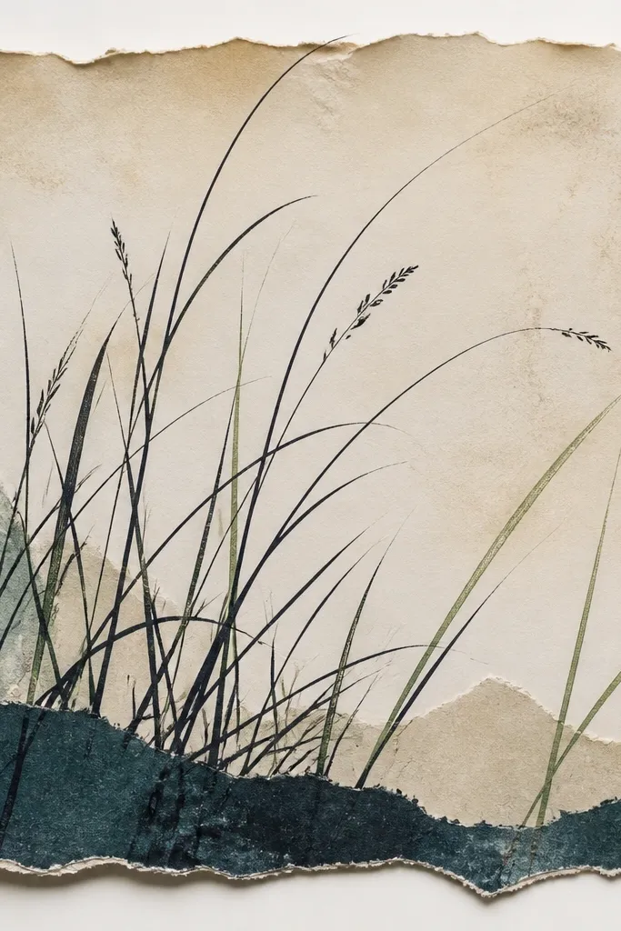
This gives you coastal vibe with an antique feel, and it’s perfect for small shelves where you want something textured. I pull the outlines tight and clean so the sea grass still looks modern even on older paper. The color I use is near-black teal, then I highlight a few blades with a pale green gel pen. It flatters warm skin tones in photos because the palette sits in creams and cool teals — it doesn’t fight your other decor. Also, it’s forgiving if your space is cluttered; the torn edges keep it from looking like a label stuck on a wall.
Start by aging paper lightly with a very diluted tea or coffee wash, then let it dry flat. Tear a rectangle and glue it to a backing board, leaving uneven edges. Draw the grass outlines along the bottom using a 0.3 fine liner, with tall blades in the back and short ones in front. Add two or three highlight blades in pale green, keeping them sparse. Seal with a matte medium so the ink doesn’t smudge when you handle the panel.
Good to knowTear the paper first, then draw — the edge shape changes the way the blades should lean.
Common mistakeDon’t outline on wet paper; it spreads and looks fuzzy.
10. Whiteboard Magnet Scene (Compact Grass + Tiny Horizon)
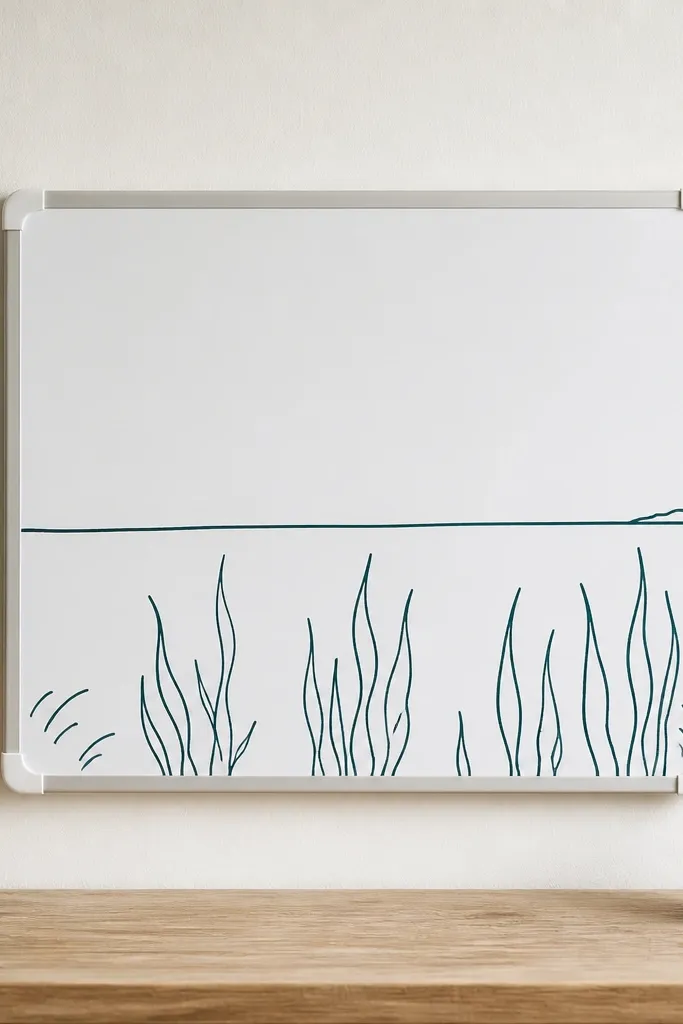
Magnet scenes are a small-space cheat code because you can move them when your decor changes. The thin horizon line makes the grass feel like it sits in a real shoreline view. I use dark teal for outlines and add a single pale blue stroke for the waterline reflection. This style looks great in offices, craft rooms, and kids' spaces because it’s clean and graphic. It also flatters small desks: it adds interest without taking up shelf depth.
Start with a small magnetic board or a magnetic sheet on a frame. Draw a straight horizon line across the middle using a ruler and pale blue pencil or marker. Place the grass outlines below the horizon, starting with a cluster on the left and one on the right, then add a smaller center cluster. Ink with a 0.3 liner, and keep blade tops varied but not chaotic. Finish by adding two tiny “wind” lines above the grass — short, angled marks in the same teal.
If the magnets warp, press them under a book for an hour before drawing.
Don’t draw the grass above the horizon; it makes the scene feel wrong.
11. Saltwater Bowl Insert (Contact Paper Outline Layer)
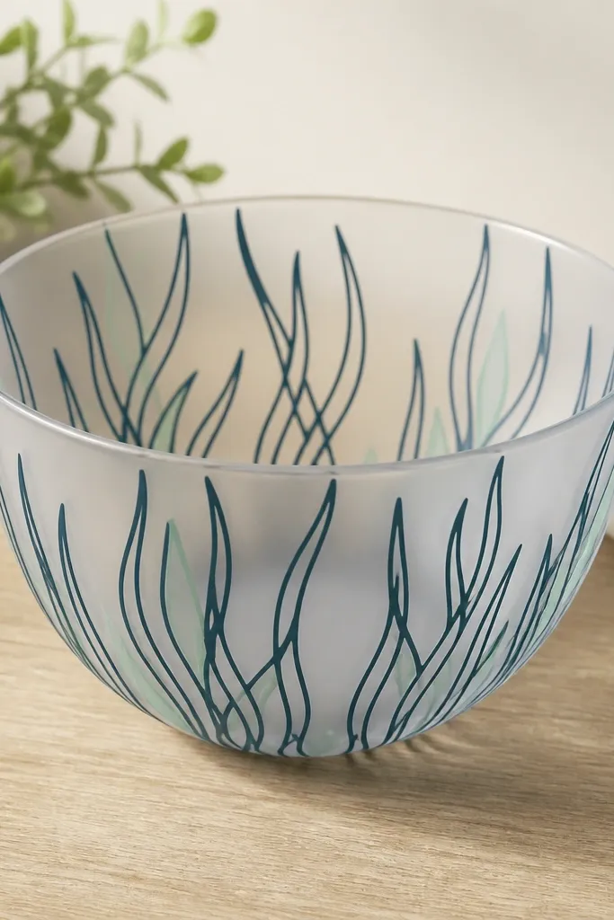
This one looks surprisingly polished in a small coastal vignette because it’s layered under clear glass. I use frosted contact paper for the base so the ink stays crisp and doesn’t show glare. The grass outline is dark teal with a few seafoam green accents at the bottom edge. It’s great for coffee tables and bathroom shelves where you want a “scene” without painting. The frosted surface makes the drawing readable even in mixed lighting.
Start by cutting frosted contact paper to fit inside a shallow clear bowl. Sketch your grass outline lightly on the backing side, then trace with a fine marker that works on contact paper. Cut the grass shape out with a craft knife if you want the outline to show as a negative cut, or keep it as a printed outline if you prefer simple. Add seafoam green marker to a few blade tips, keeping it to 10-15 blades. Lay the insert inside the bowl and smooth any bubbles with a plastic card.
Good to knowUse a fresh blade in your craft knife — dull blades drag and widen lines.
Common mistakeDon’t skip smoothing; bubbles make the lines look crooked.
12. Tile Coaster Grass Outline (Ceramic Paint + Fine Brush)
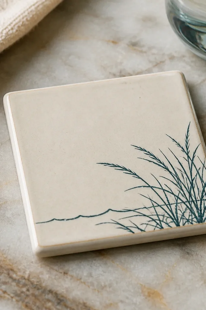
Ceramic tiles add heft, and the outline style looks sharp even when the piece is small. I like corner placement because it makes the coaster feel like part of a set, not a random drawing. Use dark teal paint for outlines, then add a thin highlight stroke in muted green only at the ends. It looks good with farmhouse tables and also with clean, modern decor because the linework is graphic. If you set it under a plant pot, it reads coastal without competing with the plant.
Start with a glazed ceramic tile cleaned with rubbing alcohol. Mark a corner area about 2 inches wide by 2 inches tall for the grass cluster. Paint the grass outlines with a fine detail brush — 0.5 size works well — keeping blade lines mostly straight with slight curve at the tips. Add a single wave line above the cluster, about 1 inch long, using the same teal. Let it dry fully, then seal with a clear ceramic-safe matte sealer.
Paint one blade at a time and stop if your brush frays; swap brushes before the next cluster.
Don’t use craft acrylic without sealing; it chips at coaster edges.
13. Paper Garland Grass Line (Mini Blades on Twine)
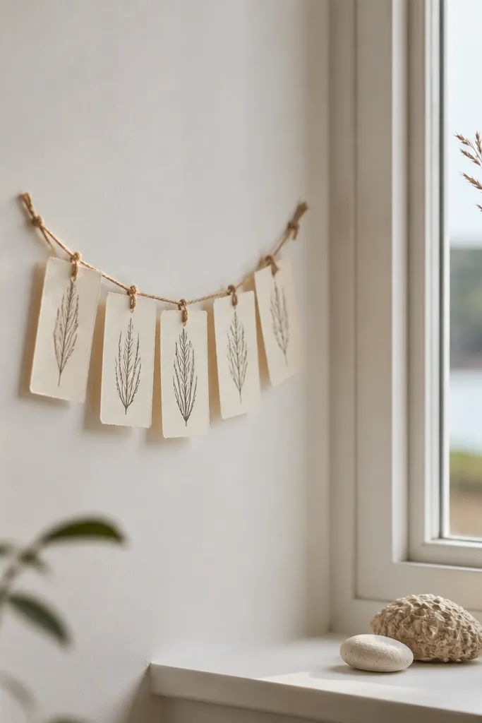
Garlands are small-space friendly because they don’t need wall space. This one looks airy because each blade is tiny, and the twine adds a gentle curve. I draw the grass in dark teal ink on thin paper strips, then add a few seafoam green dots at blade bases like water highlights. It flatters spaces with lots of vertical lines, like a bookshelf or window frame. The whole thing reads coastal even if you only hang it for a season.
Start by cutting paper strips about 1 inch wide and 4-6 inches long. Punch a hole near the top of each strip and thread onto twine with even spacing. Draw a mini grass outline on each strip using a 0.3 fine liner, keeping blades mostly centered and slightly angled. Add one or two tiny wave arcs above the grass on every third strip so it feels intentional. Hang at window height, then adjust spacing so taller strips sit in the middle.
Good to knowUse a ruler to keep strip widths consistent; tiny differences show in photos.
Common mistakeDon’t hang it too low — the lines disappear when they’re below eye level.
14. Sea Grass Outline on Painted Wood Sign (Thin Blade + Burnished Edge)
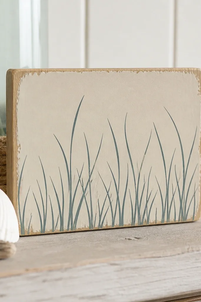
This is what I make when someone says they want coastal decor but their style is more “wood and neutral” than “beachy bright.” The thin blade outline keeps it modern, and the distressed edge adds warmth. I use sand-colored paint as the background, then draw the grass in dark teal with a 0.3 liner. A few blades get a seafoam green overlay near the base for depth. It flatters small entry tables because the sign has height but the drawing stays minimal.
Start with a small wood plank, around 6x10 inches, and paint it sand in a matte finish. Lightly distress the edges with sandpaper so the wood grain shows — keep distress only on the border. Sketch your grass cluster across the lower half with three height zones, leaving a clear gap in the middle so it doesn’t look packed. Ink the outlines with dark teal, then add seafoam green to just the bottom 25% of selected blades. Seal with matte polyurethane so the teal doesn’t rub off.
Good to knowIf your lines look uneven, draw the backbone first with a pencil — blades follow better after that.
Common mistakeDon’t use metallic paint for the main outline; it looks cheap next to matte sand.
15. Shadow Box Grass Outline (Layered Paper Cuts Behind Glass)
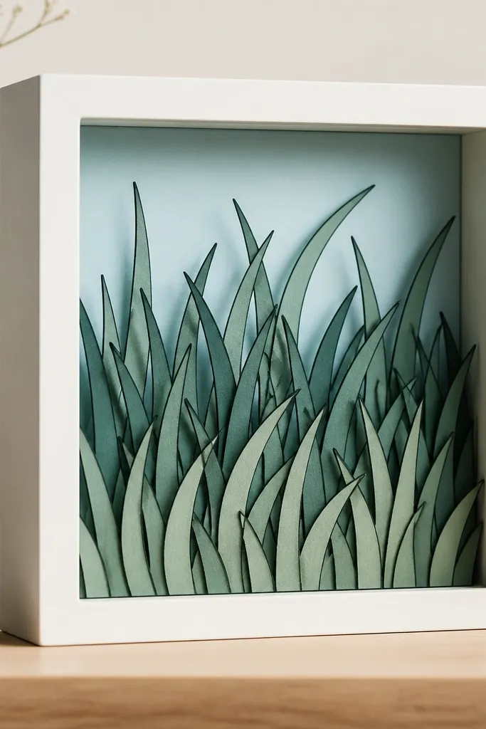
Shadow boxes are how you get real depth in a tiny piece. The key is that each grass layer is cut slightly differently and sits at a different depth, so you see tiny shadows between blades. I use pale blue paper for the background, then dark teal outlines on each layer. One layer is the tall back grass, one is medium, and one is short front grass that nearly touches the glass. This looks great in small hallways because it reads as a scene, not a flat drawing, even at arm’s length.
Start with a small shadow box frame and pale blue backing paper. Cut three grass layers out of white paper, then trace and ink the outlines on each layer before assembling. Place the tall layer first, about 1/2 inch behind the front plane, then glue the medium layer closer, and mount the short layer last near the glass. Add two thin wave arcs on the background paper only, so they don’t compete with the foreground grass. Seal the ink with a light matte fixative and let it dry before closing the box.
Use thin foam tape for spacing between layers so the shadows look even across the box.
Don’t stack layers without spacing — flat stacking makes it look like a single cut-out.