
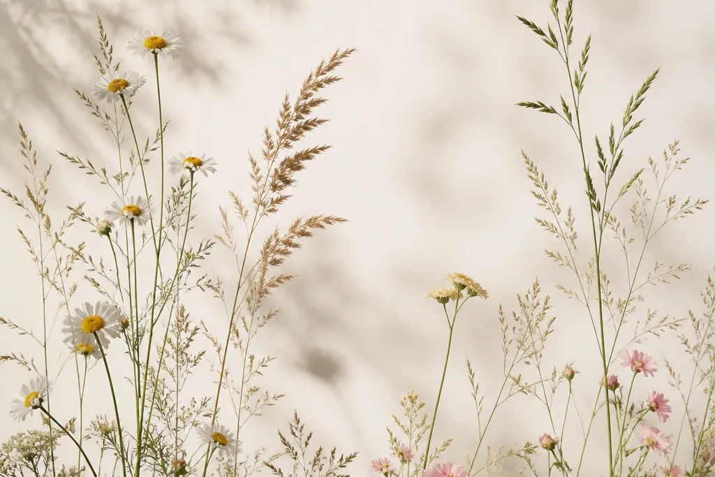
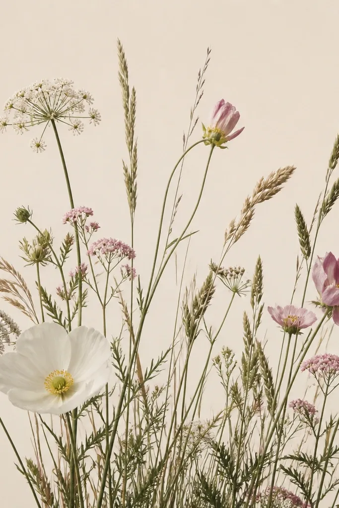
1. Dewy Meadow with Three Flower Clusters
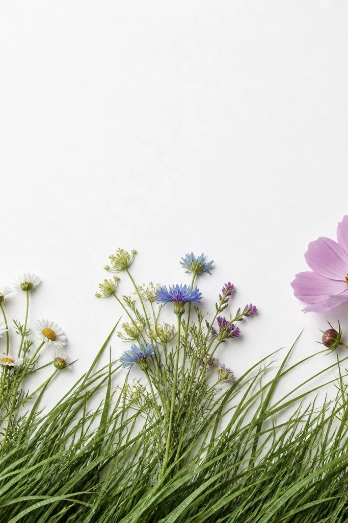
This one works because the grass does the heavy lifting and the flowers act like punctuation. I use a cool green base for the grass, then a darker green only at the very bottom so the foreground feels grounded. The three clusters spaced left, center, right keep your eye moving without turning the page into a confetti mess. It flatters most styles because it doesn’t demand perfect realism — simple petals still look like a “real place.” This is also friendly for beginners because you can draw grass first and worry about flowers after.
Start by lightly sketching a straight horizon line at about 60% of the page height. Then draw grass in the bottom third with quick strokes, leaning the blades the same direction; use a mid green for the bulk and add a darker green strip along the very bottom edge. Place the left flower cluster, then the center cluster, then the hero bloom on the right, keeping each cluster the same “petal language” (same petal shape). Finish by adding tiny white dots or short white strokes on a handful of grass tips and a couple of petals to mimic dew.
If you’re drawing with pencil, leave the paper highlights alone and only shade around them. If you’re using marker, add highlights with a white gel pen after the ink dries.
Avoid using five different greens — it kills the dreamy tone and makes the grass look dirty.
2. Soft Focus Sunrise Grass with Warm Highlights
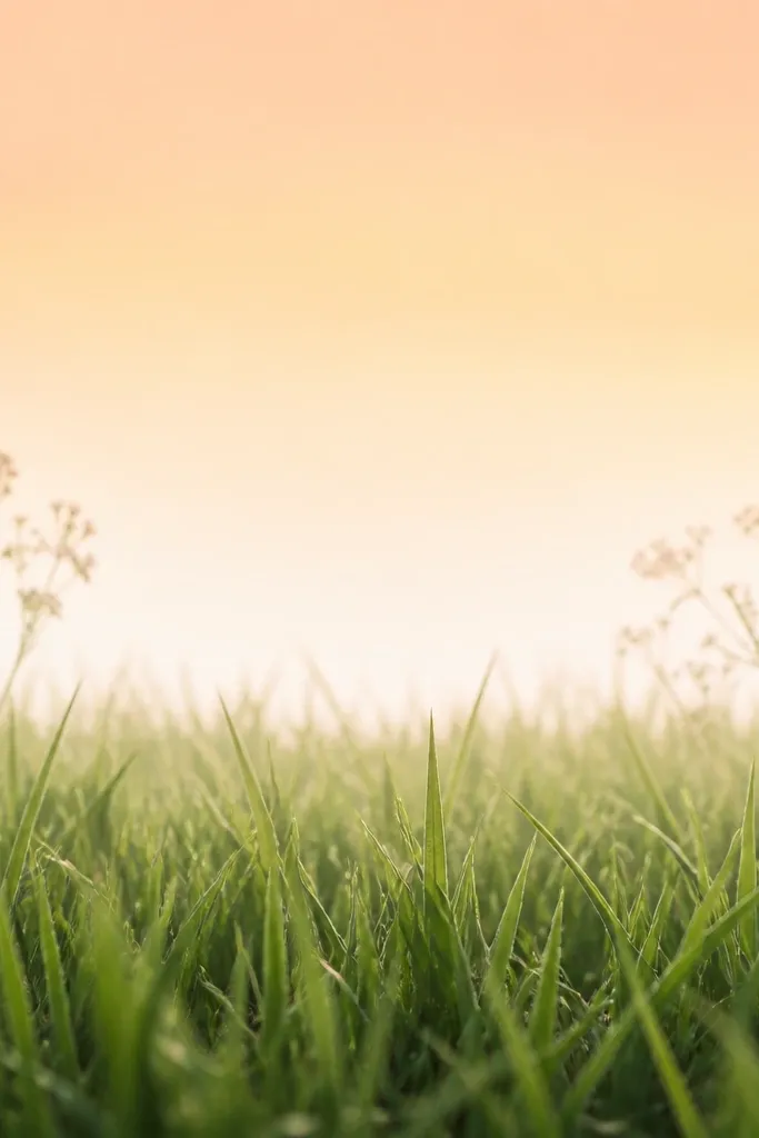
Warm light changes how grass reads instantly. I draw the sky as a simple peach-to-cream wash, then I match the grass highlights to that warmth so the whole piece feels lit from one direction. The front grass stays darker and more defined, while the back grass gets paler and thinner so it looks like morning haze. This is flattering for anyone who likes pastel aesthetics because the colors stay gentle and airy. It also looks good framed because the bright top area gives your eye a place to rest.
Start with a very light wash or colored pencil shading for the sky: peach at the top edge, blending into cream by the horizon. Sketch grass blades from the bottom upward, but keep the back half lighter by using fewer lines and lighter pressure. Add two flower clusters close to the horizon, using pale pink or soft lavender petals and tiny centers. Finally, glaze a warm tint over some of the grass tips near the horizon so they catch the sunrise glow.
Use a tissue to blend the sky only — don’t blend the grass or it turns flat.
Don’t outline every blade — that makes it look like a pattern sheet, not a soft morning scene.
3. Vine-and-Flowers Corner Curtain
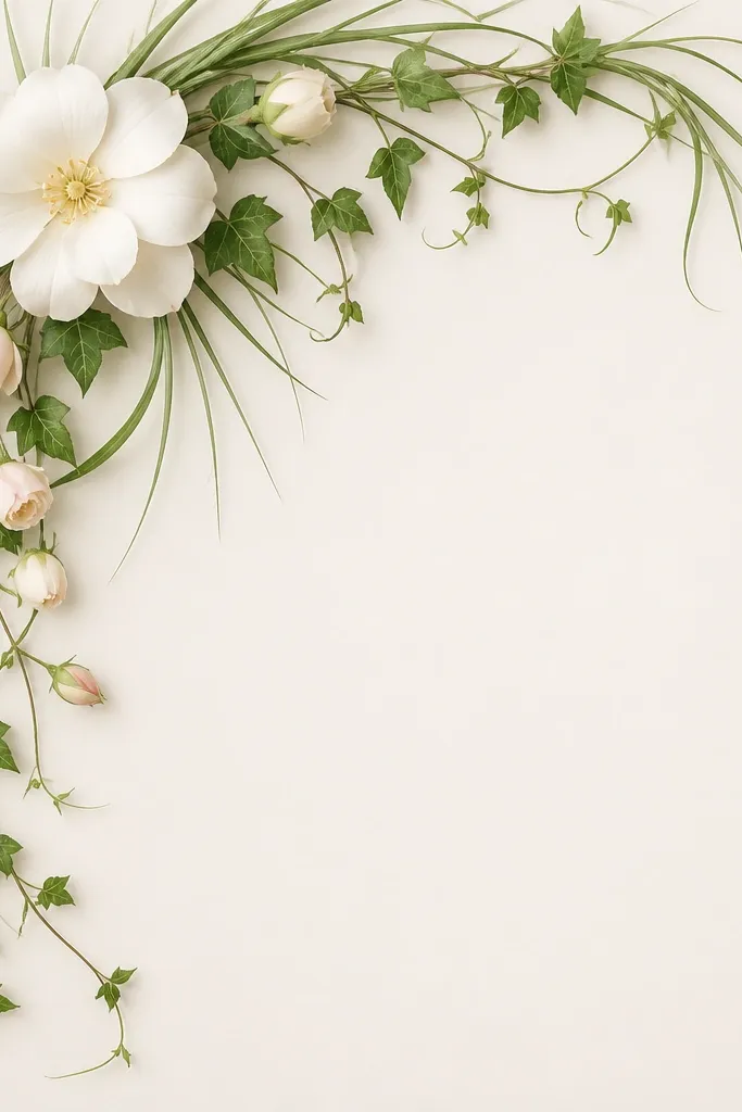
This idea is dramatic without being complicated. The corner framing gives you structure, and the cascading vine creates motion even if your flowers are simple. I like using one vine line weight — thin for the top, slightly thicker where it meets the grass — so it feels dimensional. The mostly blank center makes the flowers look intentional and airy. This works especially well for wall art because it reads like a “window” into a meadow.
Start by drawing two guide lines from the top left and top right corners toward the center, leaving a clear blank area in the middle. Draw the vine as a looping line following those edges, then add small side shoots and buds along the vine. Fill the bottom area with grass blades that lean inward toward the corner, using darker green at the very bottom and lighter green near the vine. Place flowers along the vine at different heights, keeping petals small and repeating the same petal shape for consistency.
Good to knowAdd one thin shadow under the vine with a darker green pencil — it makes the corner feel raised.
Common mistakeDon’t crowd the blank center with extra grass — it ruins the “curtain” effect.
4. Butterfly Meadow Border
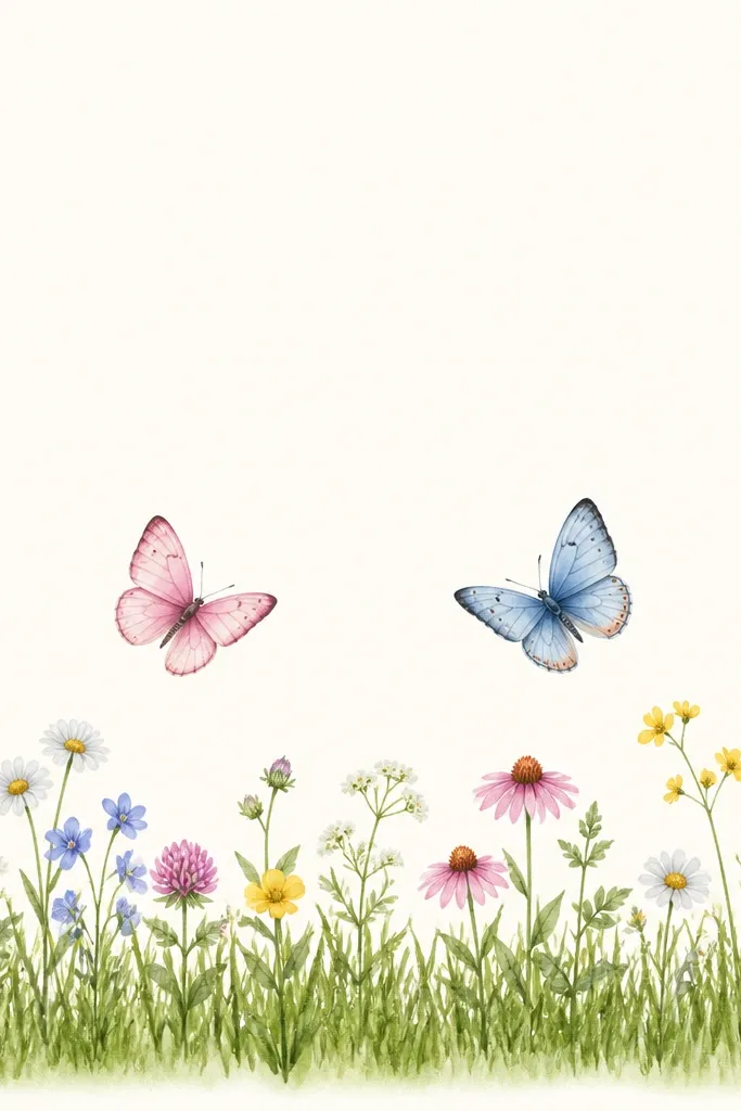
Borders are where this aesthetic really shines because the grass strip sets the mood fast. The butterflies add a focal point without forcing you to draw a full background. I keep the butterflies simple with two wing shapes and a few antenna lines; the grass stays detailed enough to feel like texture. This flatters small spaces like cards and bookmarks because the layout is clear and doesn’t require a big scene. If you like cute-but-not-babyish art, this is the sweet spot.
Start by drawing a thick grass band along the bottom edge, about 1.5 to 2 inches tall on an 8x10 page. Use short, repeated strokes for the blades, then add a darker green shadow band along the very bottom. Place two butterflies above the grass strip, one slightly left and one slightly right, then tuck small flower clusters between and around them. Finish by adding a few tiny grass blades that extend upward toward the butterflies for depth.
Good to knowUse a single flower color for the border and save your brightest color for one flower near a butterfly wing.
Common mistakeAvoid drawing the butterflies with heavy outlines — they look pasted on. Keep lines light.
5. Lone Path Through Tall Grass
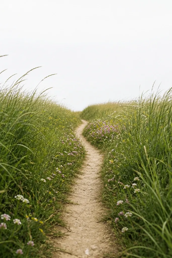
A path gives you a built-in composition line. You don’t need a detailed background because the viewer’s eye follows the path’s width change and the grass leaning inward. I use a muted brown-gray for the path so it doesn’t compete with the flowers. The taller blades on the sides create a tunnel effect that reads dreamy and cozy. This one flatters anyone who wants a story feel without drawing people or houses.
Start by sketching the path as a simple trapezoid that narrows toward the horizon, then lightly mark its edges. Draw grass blades along both path edges, leaning inward toward the path; make the front blades taller and more defined than the back ones. Add a small line of flowers along the path edges, with one medium cluster about halfway up. Shade the path with light gray-brown and keep it lighter than the grass so it recedes.
Good to knowKeep flower sizes decreasing toward the horizon — it’s the fastest way to sell distance.
Common mistakeDon’t make the path the same width the whole way. That kills depth instantly.
6. Pressed-Flower Style with Loose Grass Skirts
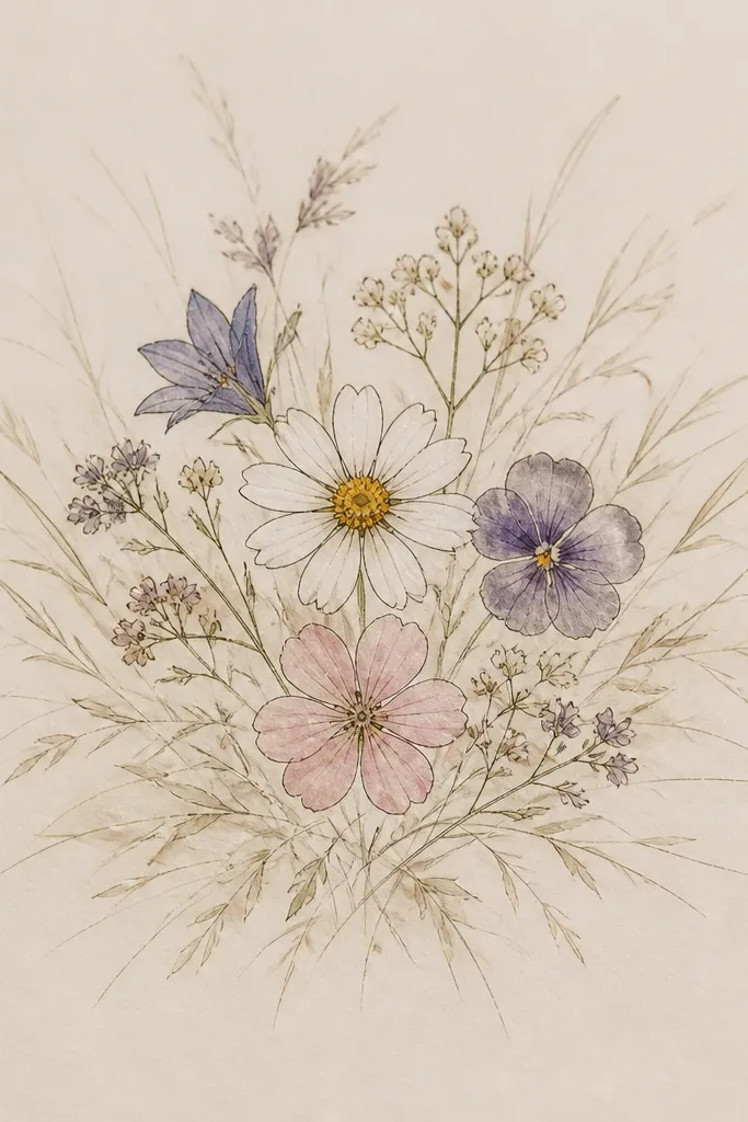
This is the “pretty centerpiece” version of the aesthetic. Crisp flower outlines in the center look like a pressed specimen, while the grass skirt frames them like a meadow skirt. I use thinner lines for grass and keep the flower petals more defined so the contrast reads intentional. This flatters minimal color palettes because the paper texture and linework do the work. It also looks great in scrapbooks because it feels both soft and organized.
Start by picking three flowers and drawing them larger than you think you need — about 1.5 inches tall each on an 8x10. Use light color fills or pencil shading inside petals, then add a few vein lines with a darker pencil. Surround the blooms with grass strokes that start thicker near the bottom of the center and fade outward. Keep the grass direction consistent in each side of the ring so it doesn’t look chaotic.
Good to knowAdd one or two tiny seed dots near the flower centers for a more “real botanical” look.
Common mistakeDon’t outline the grass too dark. Heavy outlines make it look like a sticker cutout.
7. Watercolor-Style Blot Grass with Pen Flowers
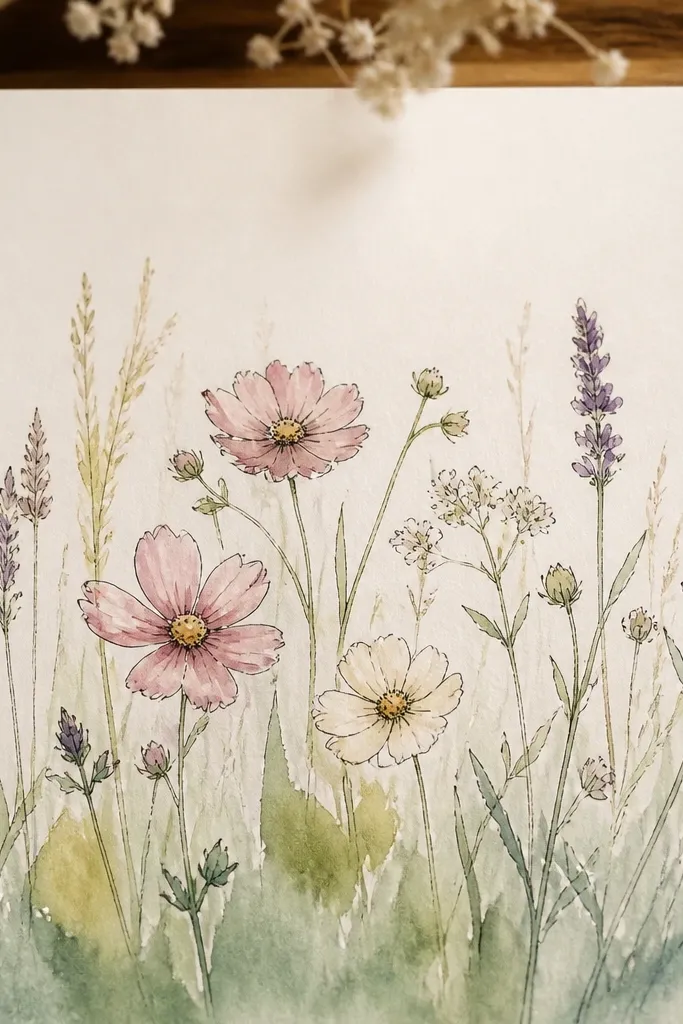
This one looks dreamy because it mixes textures on purpose. I paint or sponge the grass with blot-like marks so it gets that cloudy, out-of-focus meadow feel. Then I draw the flowers with a pen so they stay readable. That contrast is what makes the piece feel designed, not accidental. It’s flattering for anyone who struggles with drawing many blades — you can imply grass with shapes. It also looks great when you use limited colors like sage, dusty green, and pale pink.
Start by wetting a section of the bottom half lightly with water and dabbing sage-green paint in uneven blot shapes. Add thin grass tips with a dry brush or pencil once the paint is mostly set. Next, draw flower outlines on top with a fine pen, then color the petals with a very light wash. Keep the far grass lighter by using less paint and more water as you go upward.
Good to knowLet the grass dry before inking the flowers so the pen lines don’t feather.
Common mistakeAvoid painting the entire page. The blank space gives the flowers their breathing room.
8. Monochrome Green Grass with White Flowers
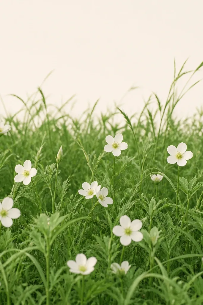
Monochrome green makes the aesthetic feel calm and grown-up. When flowers are white, you can skip heavy coloring and rely on shading for depth. I use multiple green values: a light sage for the far grass, a mid green for the main blades, and a dark green for the foreground shadow strip. The flowers pop because they’re the brightest value on the page. This style flatters cooler skin tones in wearable versions and looks good in minimalist frames.
Start by choosing one white flower shape you can repeat fast — five simple petals works. Sketch the grass first with light sage, then add mid green for the bottom third and dark green for shadows near the base. Place white flowers in small clusters, keeping them slightly higher toward the horizon and smaller as they recede. Shade each flower’s center with pale yellow-green so the petals don’t look flat.
Use a white gel pen for bright petal highlights after shading with pencil.
Don’t use gray for the flower centers. It makes them look dull and muddy.
9. Lavender Field with Curved Grass Waves
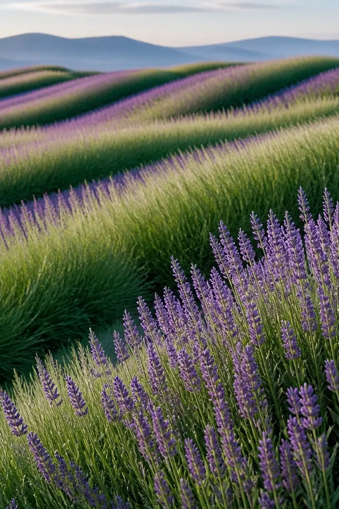
Curved grass waves add rhythm, which is why this looks more “dreamy” than straight-blade scenes. I keep the lavender spikes simple and repetitive, then let the grass colors blend slightly so the field feels like it moves. The foreground has more contrast, while the back waves soften and thin out. This is flattering for anyone who likes motion without drawing perspective buildings or paths. It also works well if you want a calm, relaxing color story.
Start by drawing three or four broad curved guide lines across the grass area, leaving more space near the horizon. Draw grass blades following those curves, leaning along the wave direction; keep the front waves darker and the back waves lighter. Add lavender spikes as short vertical strokes with a tiny bulb at the top, repeating them in clusters along the ridges. Finish by glazing a faint purple tint over some grass tips to tie everything together.
Good to knowPick one lavender hue and don’t mix it with too many purples. One shade keeps it cohesive.
Common mistakeAvoid random grass directions. Curves look intentional only when the whole field leans the same way.
10. Pink Wildflowers Over Sage Grass Horizon
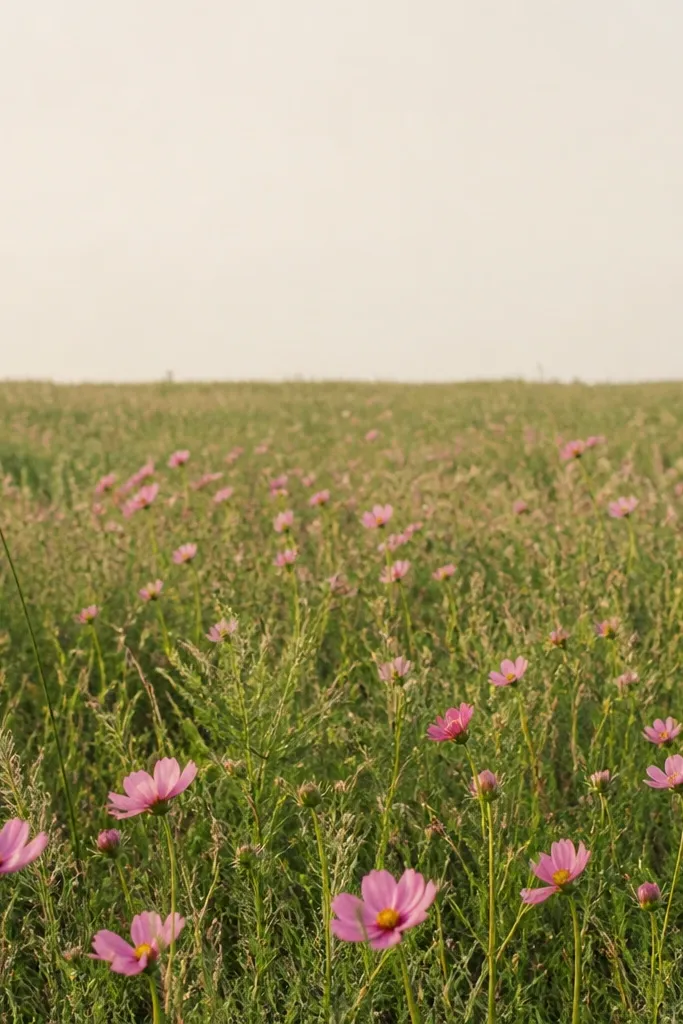
Pink wildflowers look dreamy because they feel airy and a little wild. I keep the grass mostly sage and only deepen shadows at the base so the pink reads brighter. The horizon line is subtle, but the change in grass density sells depth. This style flatters people who like a cheerful look without going fully bright. It also works well for greeting cards because it’s easy to scale down.
Start by sketching the horizon line lightly and blocking in sage green from the bottom to the horizon. Add grass blades in the bottom third with a darker sage shadow, then thin them out near the horizon so there’s less texture. Draw pink wildflowers with small petal shapes and tiny centers; place bigger blooms in the foreground and smaller ones near the horizon. Add a few buds that are only half-drawn, so the field feels natural.
Good to knowUse a dark pencil for the flower centers, not the petals. That keeps the petals soft and airy.
Common mistakeDon’t add heavy outlines to every pink petal. It makes the flowers look like stickers.
11. Dramatic Foreground Grass Fringe
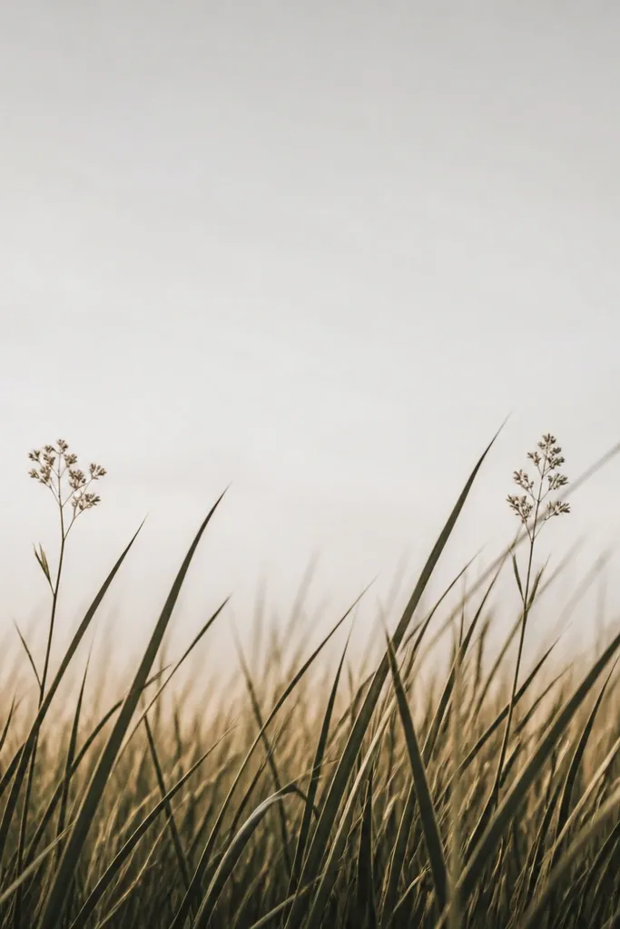
A dramatic grass fringe creates instant depth and a “caught in the breeze” mood. You don’t need much else because the foreground texture becomes the focal anchor. I use very dark green at the very base and keep the blade tips crisp, then fade the grass as it rises. Flowers stay small and near the horizon so they don’t compete with the fringe. This is flattering for bigger paper sizes because the fringe can breathe. It also looks great when you frame with a white mat — the blank top area makes it feel intentional.
Start by blocking the background as mostly blank light paper or a very faint wash. Then draw tall grass blades from the bottom edge, overlapping them so the front feels thick. Use dark green for the bottom third and lighter green for the mid area, reducing the number of blades as you approach the horizon. Place one small flower cluster left of center and one right near the horizon, with minimal petals and light coloring.
Good to knowLeave a few blades unshaded. The white of the paper makes them look like sunlit edges.
Common mistakeDon’t crowd flowers in the foreground fringe. The scene loses its depth and looks busy.
12. Terracotta Pot with Grass and Tiny Flowers
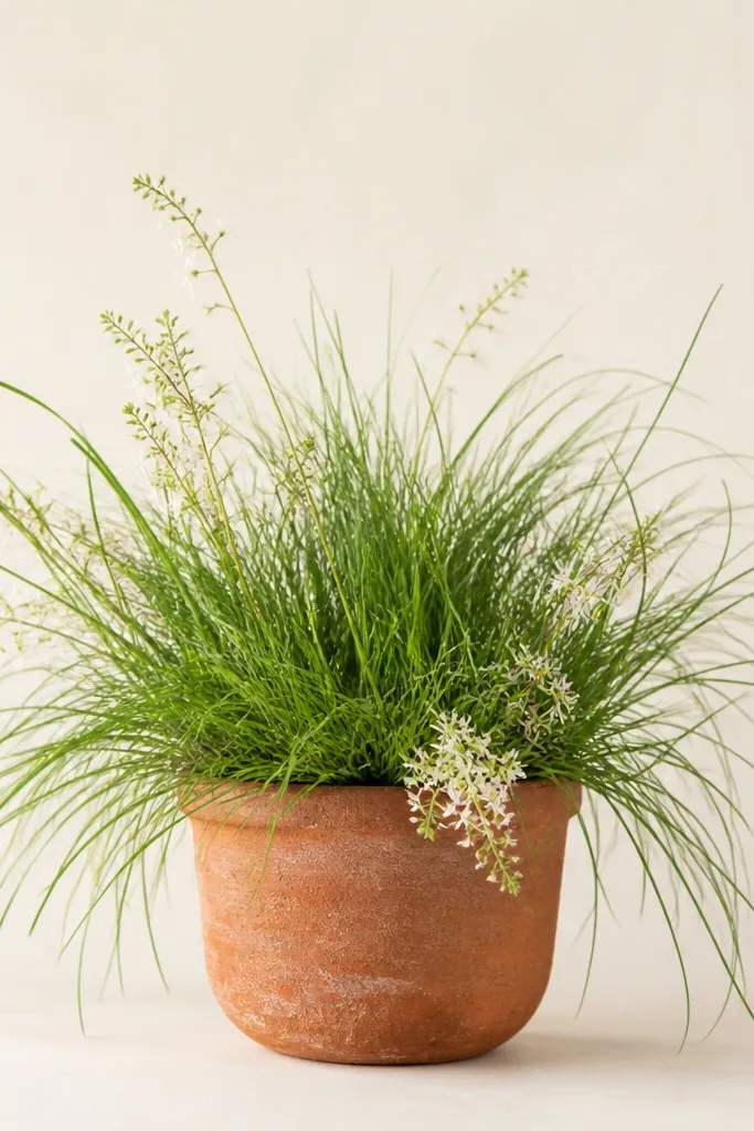
This is the “decor” version of the grass and flowers drawing aesthetic. The pot gives you a grounded base so the grass feels like it’s growing, not floating. I like terracotta because it contrasts with green and makes the flowers look more vivid. Keep flowers tiny and grouped so the pot doesn’t become a clutter magnet. This style flatters small wall spaces and looks good as a printable, because the composition is centered and simple.
Start by drawing the pot shape with a simple ellipse for the top rim and a slightly wider base. Shade the pot in terracotta tones, adding a darker band near the bottom for depth. Draw grass blades spilling from behind and around the rim, leaning outward; keep the front blades darkest and the back blades lighter. Place tiny flower dots or small five-petal blooms around the rim and one larger mini-cluster where grass thins out.
Good to knowAdd one thin highlight line on the pot rim with a white gel pen to make it look glazed.
Common mistakeDon’t draw the pot with heavy black outlines. Terracotta should feel warm, not cartoonish.
13. Sketched Meadow with Pencil Smudge Clouds
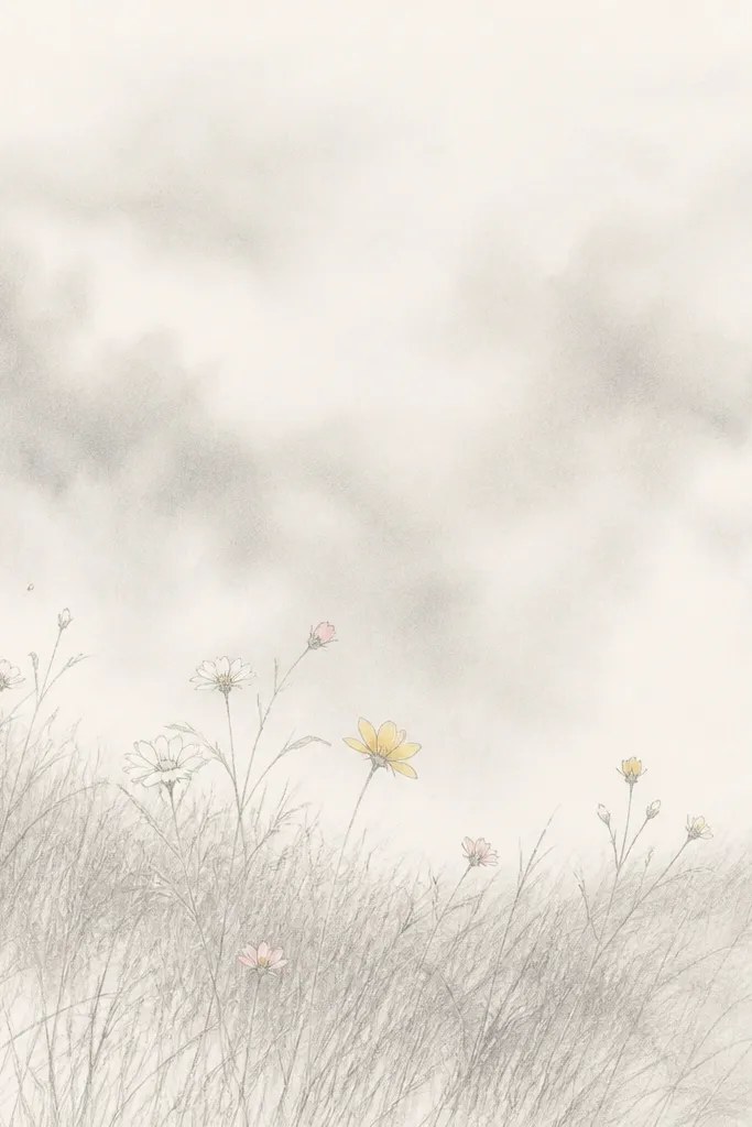
Mist makes everything look dreamy because it softens edges where your hand might get shaky. I use pencil for grass texture and then smudge only the background haze so the foreground stays crisp. Flowers stay slightly outlined so they read even through the fog. This is flattering for anyone who wants a moody, calm vibe without going full watercolor. It also hides uneven coloring because the haze blends naturally.
Start by drawing grass blades lightly across the bottom half, leaving the top third mostly empty. Then shade a faint mist band above the grass using very light pencil and smudge with a blending stump or tissue. Add flowers with light color in the mid area and keep their outlines visible. Finish by darkening grass near the bottom and leaving the haze lighter above so the depth feels real.
Good to knowSmudge the haze, not the flowers. Keep flower edges sharper for contrast.
Common mistakeAvoid smudging the entire page. It makes the grass look like a gray mess.
14. Blue-Gray Evening Sky with Sunken Flowers
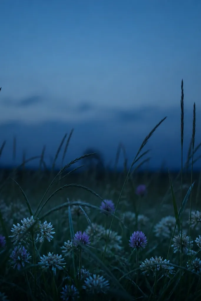
Evening scenes look dreamy when you lower contrast instead of making everything bright. I use blue-gray in the sky and cool blue-green in the grass so the whole piece feels like dusk. Flowers sink into the grass by placing them low and letting blades cover parts of petals. That overlap makes the scene look natural and not pasted. This style flatters people who like moody decor and darker frames. It also looks good in small formats because the colors do the work.
Start with a blue-gray sky wash or pencil shading at the top, darker near the horizon and lighter upward. Draw grass blades in cool green and add a darker shadow band at the bottom. Place flower clusters low in the grass, and let grass overlap the lower petals so only the upper parts show. Add muted lavender or dusty pink to petals and keep the centers darker to match the dusk mood.
Good to knowUse a kneaded eraser to lift a few highlights in the sky if you want a subtle star-like sparkle.
Common mistakeDon’t use bright neon pink. It looks wrong against a dusk palette.
15. Garden Sketch Frame with Grass Inside a Rectangle
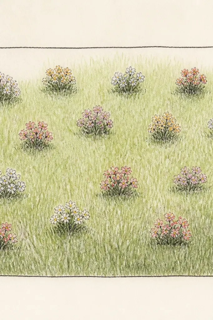
A simple rectangle border makes the whole drawing feel like a page from a real sketchbook. It also helps you control composition because your grass and flowers stay inside a defined space. I like adding a slightly uneven border line to make it feel human, not printed. The grass inside stays layered and consistent, while the border keeps the piece tidy. This is flattering for anyone who wants an aesthetic that looks artsy without being messy. It also works great if you plan to print or frame multiple drawings as a set.
Start by drawing a thin rectangle border about 1/2 inch from the page edges. Sketch the horizon line inside the rectangle at about 60% height, then draw grass from the bottom up with consistent blade lean. Place flower clusters sparingly so you don’t hit the border with flowers — keep them at least 1/4 inch away. Shade grass in the bottom third darker and leave the mid area lighter so the flowers don’t disappear.
Good to knowAdd tiny leaf doodles in the border corners only. It makes the frame look intentional.
Common mistakeAvoid putting flowers right against the border line. It makes the drawing feel cramped.
16. Green-and-Gold Bokeh Flowers on Dark Grass
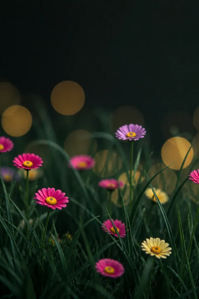
This one reads dreamy because it adds light haze behind the flowers. I use dark grass as the base, then add bokeh circles in pale gold to mimic sun catching pollen in the air. Flowers sit in front of the bokeh, so they look like they’re lit. This flatters bold color lovers because you get contrast without needing a complex background. It also looks good when you use metallic gel pens sparingly on the gold centers.
Start by shading the sky/background area in dark green or deep charcoal-green, leaving the bottom for grass texture. Draw grass blades on top with lighter green strokes, keeping the darkest values at the very bottom edge. Add bokeh circles behind the flower clusters using a pale gold marker or metallic gel pen, and keep them soft by using light pressure. Draw small flowers in front with bright petals and gold centers, then add a few gold highlights to grass tips.
Good to knowUse metallic only for centers and bokeh — too much metallic makes it look glittery instead of dreamy.
Common mistakeDon’t make the bokeh circles too large. Big circles flatten the scene.
17. Tiny Daisy Grid with Grass Diagonal Fade
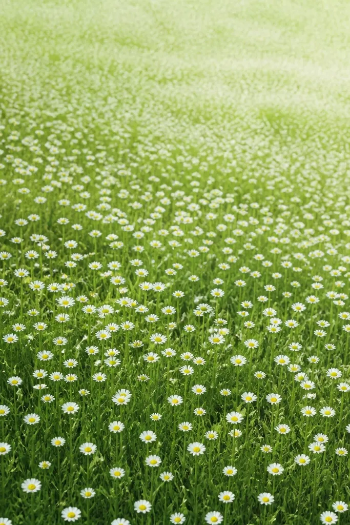
A controlled grid of tiny daisies looks charming because it gives structure while the grass fade adds softness. I like diagonal fades because they feel like a camera tilt or a breeze moving across the field. The trick is keeping the daisies small and repeating the same size — then the grass does the variation. This style flatters clean, minimalist tastes and looks great in a simple frame. It also works well for practicing consistency in flower drawing.
Start by sketching a diagonal fade line across the grass area, from bottom-left toward top-right. Draw grass blades leaning in the same direction, but keep the strokes darker on the bottom-left and lighter as you move diagonally. Place tiny daisies with five small petals and a dot center, spacing them evenly across the mid area and leaving some gaps for breathing room. Add a slightly denser cluster in the bottom-left corner to pull the eye in.
Use a ruler lightly for your spacing dots, then erase it after placing flowers.
Avoid drawing big daisies. Large flowers break the pattern and look out of place.
18. Single Flower Stalk with Grass Halo
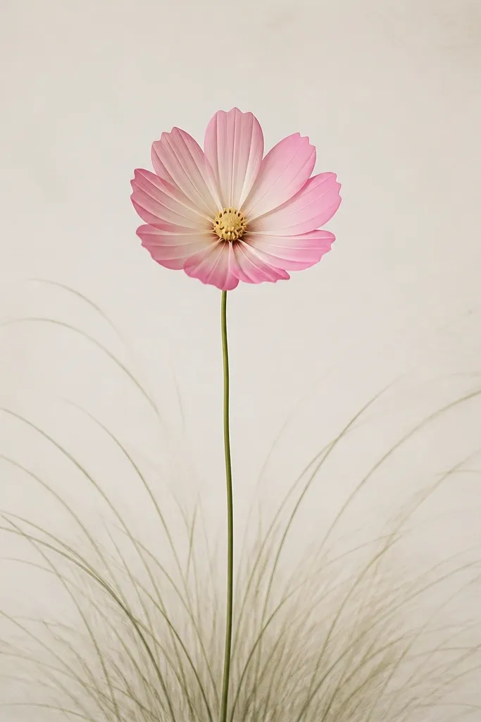
This idea is simple, but it looks intentional because the composition is one clear focal point. A halo of grass frames the single stalk and creates a soft spotlight effect. I keep the grass ring consistent in direction so it feels like a breeze around the flower. The rest of the page stays calm, so the flower reads as the hero. This is flattering for delicate color palettes and for people who want a clean, modern look. It also works well for small paper because the center carries the piece.
Start by drawing the flower stalk from the bottom center, with a gentle curve and one bud or bloom at the top. Sketch a ring of grass blades around the stalk, leaning outward at the base and fading as they go outward. Shade the grass darker near the bottom and lighten toward the top of the halo. Add a few tiny leaf shapes near the stalk so it doesn’t look like the flower is floating.
Make the flower petals slightly asymmetrical. Perfect symmetry reads stiff.
Don’t add extra flower clusters. The halo needs negative space to feel dreamy.
19. Wildflower Bouquet in the Grass Foreground
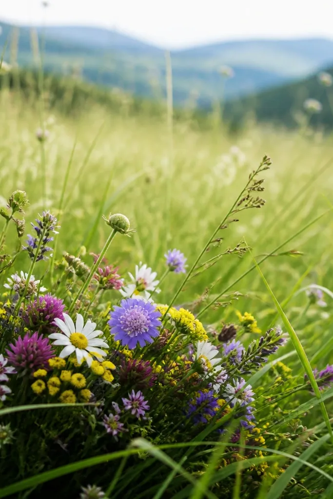
This looks lush because the foreground is crowded on purpose, then it clears up as you go back. I draw a bouquet cluster low and let grass overlap it so it feels grown, not arranged in a vase. The mid area stays lighter with fewer flowers, so your eye understands distance. This style flatters anyone who likes romantic, full-looking art. It also hides hand-drawn imperfections because the density masks uneven lines.
Start by blocking the foreground with grass blades that overlap and fill the bottom half, using darker green at the base and lighter green in the mid. Place your wildflower bouquet cluster low in the scene, with 1-2 larger flowers and several tiny buds around them. Keep the mid area sparse: add only one or two small clusters near the horizon. Finish by darkening the grass that overlaps the bouquet so the flowers sit “in” the field.
Use one flower color as a highlight and keep the rest in softer tones. It stops the bouquet from becoming visually flat.
Avoid coloring every petal the same intensity. Variation makes it look real.
20. Meadow at 45 Degrees with Side-Looking Grass
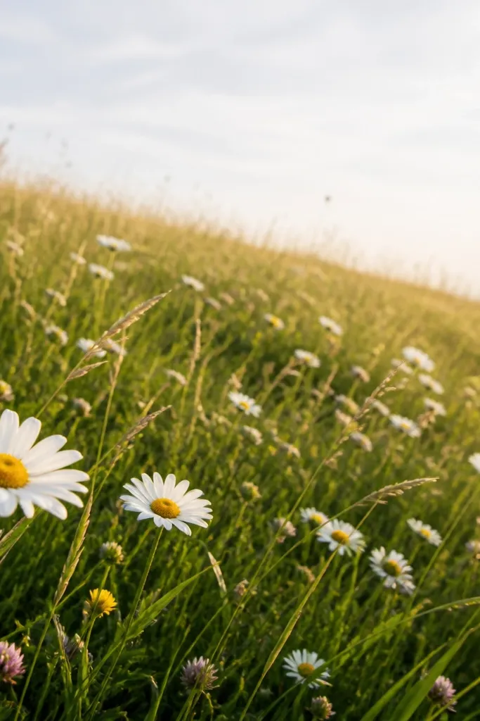
Side-looking angles make the grass feel like it’s moving toward you. When you draw blades diagonally at a consistent angle, the viewer’s eye reads motion even if your background is simple. I keep the horizon implied by thinning the grass, not by drawing a hard line. Flowers follow the diagonal too, so it all feels aligned. This flatters people who get bored with straight-on meadows. It also gives a more dynamic feel for sketchbook pages.
Start by choosing a diagonal direction across the page, like from bottom-left to top-right. Lightly sketch the horizon as a thin band where grass density changes, then draw grass blades diagonally with consistent lean. Make the bottom-left area darkest and densest, then lighten and thin out toward the top-right. Place flowers along the diagonal path of sight: bigger blooms near the dense area, smaller blooms near the thin area. Add a few blades crossing in front of flower petals to deepen the overlap.
Good to knowPick one diagonal angle and stick to it for the whole drawing. Changing angles mid-way makes it look accidental.
Common mistakeAvoid drawing the horizon as a bold straight line across the page. It kills the side-angle effect.



