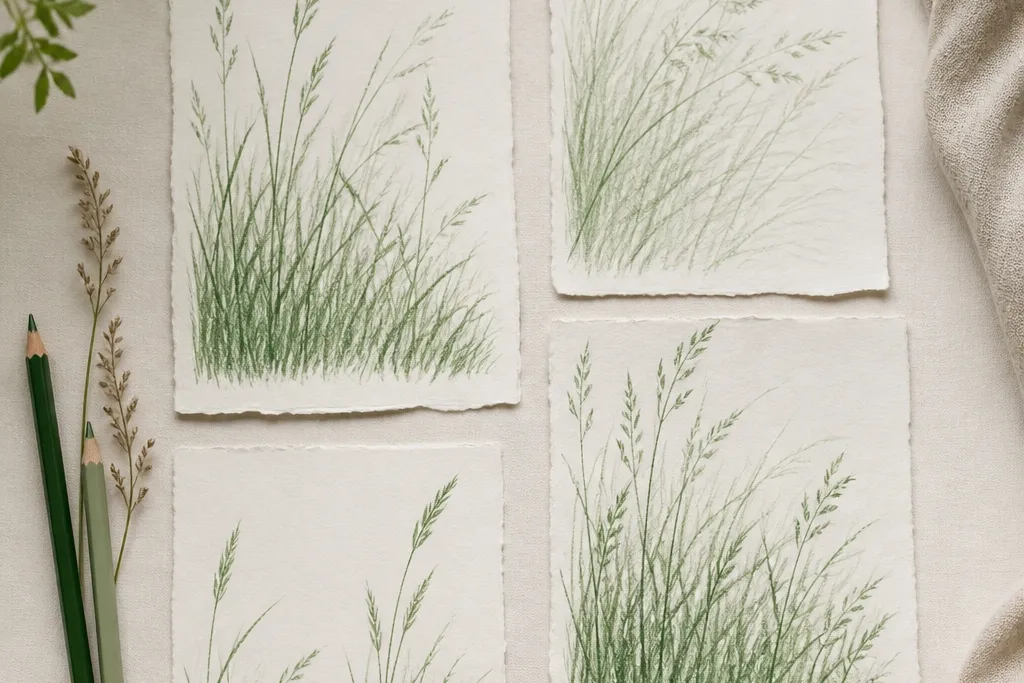
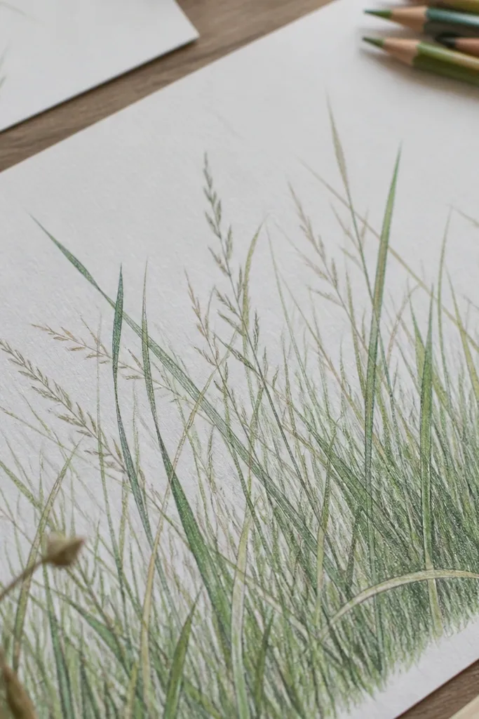
1. Side-Drag Blade Field on Warm Tan Paper
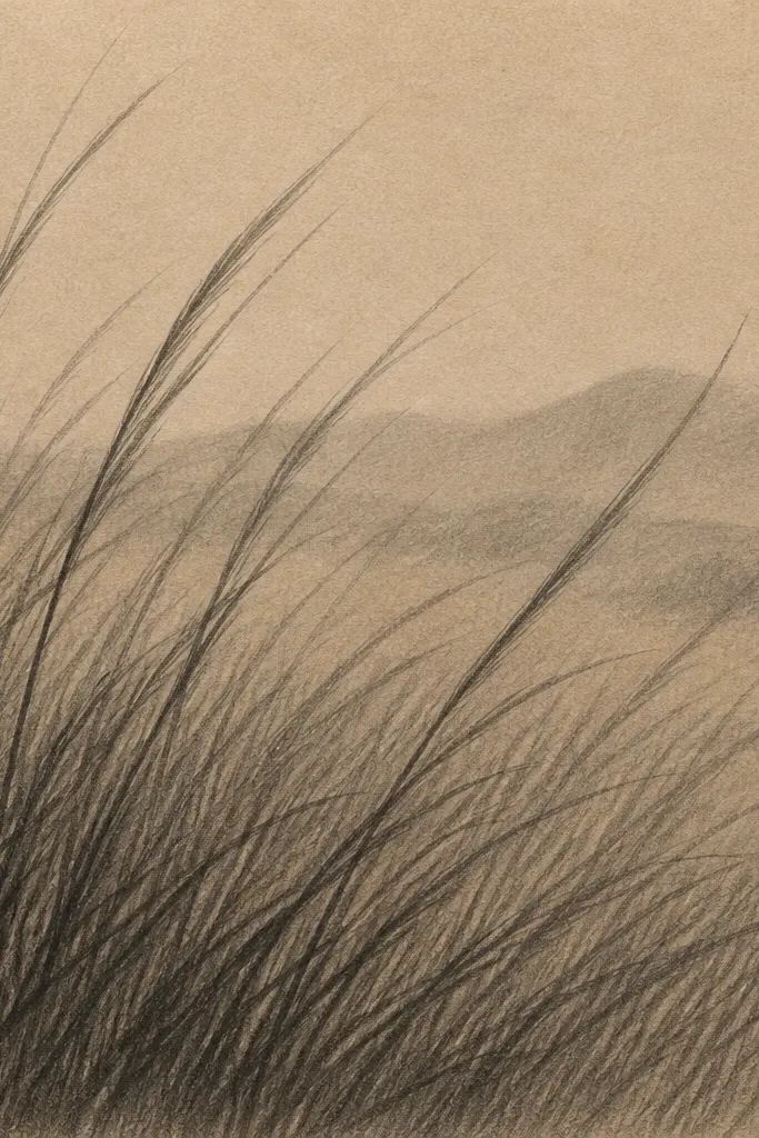
I use this when I want grass that reads “real” without looking sketchy. The warm tan paper makes greens feel sunlit even if you only use graphite. Hold a 2B pencil so the side of the lead touches — you get a thin, natural edge that looks like blade striations. This one flatters most skin tones and frame styles because the whole piece has that golden undertone; it also looks great in simple black frames.
Start by shading the whole area with a light gray wash using the pencil side, leaving a few untouched spots for highlights. Then draw blades from bottom to mid-height in groups of 8-12, changing pressure so some strokes are crisp and others are lighter. For the background, stop drawing full blades and instead make short, faint side-scrapes across the top half, blending lightly with a stump. Finish by lifting tiny highlights with a kneaded eraser — press, lift, and move to a new spot each time.
Draw your blades slightly curved like they’re leaning toward light, not perfectly vertical.
Don’t shade every blade the same darkness — uniform pressure makes it look like a texture stamp.
2. 3-Band Height Study with Hard Foreground Edges
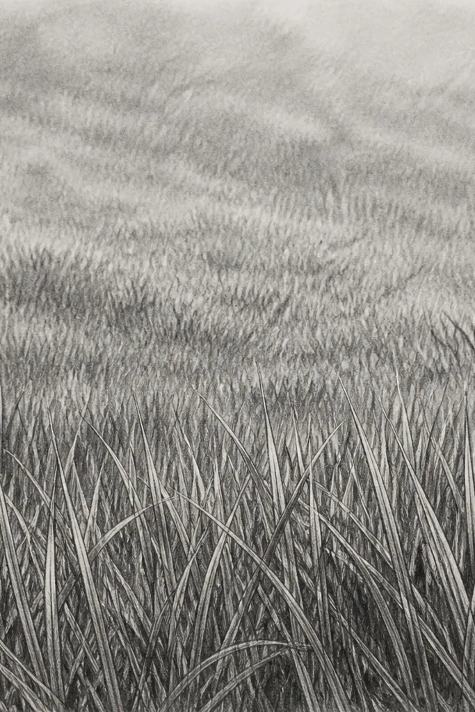
This is the quickest route to depth that doesn’t require fancy blending. The key is height bands: foreground blades stay sharp and tall, middle blades shorten and lighten, and the top becomes haze. I like this for garden scenes because it mimics how your eyes soften distant detail. If you’re making wall art for small rooms, this layout keeps the scene airy instead of heavy.
Start with a light mid-tone smudge across the whole page — I use a 2B pencil and a paper stump, not full coverage. Then draw the foreground blades in dark 6B, keeping them 1.5-2x taller than the middle band blades. For the middle zone, switch back to 2B and shorten strokes, leaving more paper showing. Finally, for the top zone, stop blade outlines and use a few broken strokes plus a soft smudge, then lift highlights with the kneaded eraser at the horizon line.
Keep the horizon band slightly lighter than you think — it helps the grass recede.
Avoid drawing blades all the way to the top edge; it flattens the distance.
3. Tooth-Paper Scrape Texture with an Old Pencil Tip
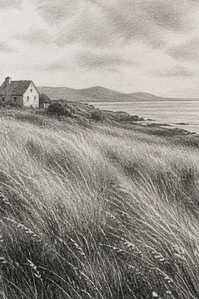
This works because toothy paper holds graphite in a way that looks like real blade edges. I do this when I want a gritty, lived-in lawn texture, not neat cartoon grass. Use an old pencil that’s worn down — the lead edge catches the paper and makes broken lines that look like individual blades. It’s especially good for earthy decor themes and for pieces that will sit close to the viewer.
Start by lightly tinting the background with 2B using a broad side motion. Then take your worn pencil tip and scrape short directional marks downward, letting the paper texture create the breaks. Build darkness by repeating scrapes in the foreground only — I keep the top half lighter. Finish by dabbing a cotton swab with a tiny bit of graphite dust to soften the far edge, then lift a few bright specks with the kneaded eraser.
Good to knowAim for uneven rhythm: draw 6-10 scrapes, then leave a gap before the next cluster.
Common mistakeDon’t use a brand-new sharp pencil point — it makes thin smooth lines that look too perfect.
4. Toothbrush Stipple for Mottled Lawn
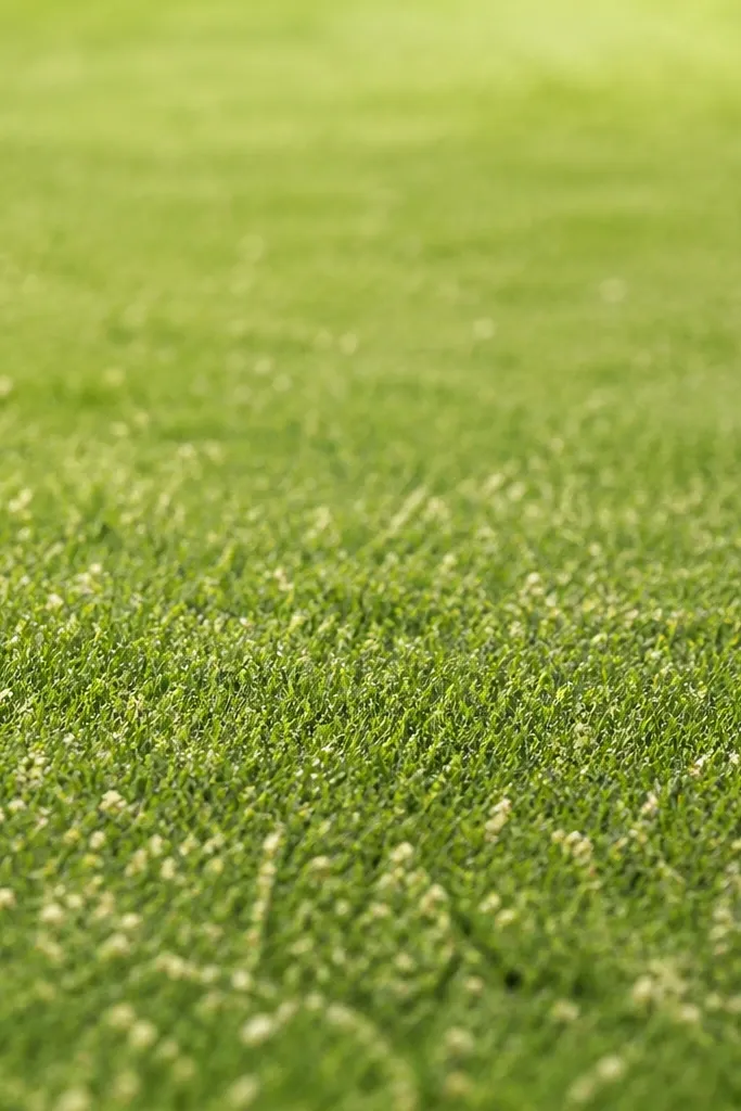
Toothbrush stipple is my go-to for that mottled, living texture where blades overlap and cast tiny shadows. You get realism fast because the speck pattern is naturally irregular. I use it for backgrounds and mid-ground, then I add a few dark blade strokes on top so it doesn’t read as noise. It looks great behind a subject like a mushroom, a bunny, or a fence line because it gives atmosphere.
Load a toothbrush with graphite dust by rubbing it lightly over the side of a 6B pencil. Flick upward from the bottom area so the specks land in a gradient — dense at the base, sparse at the top. Then draw a light mid-tone smear behind the densest speck zones so the speck doesn’t float. Add 20-30 longer blade strokes with 2B in the foreground so the eye catches actual direction.
Test on scrap paper first — you want “dusty” specks, not clumps.
Don’t over-flick; a heavy sprinkle turns it into pepper, not grass.
5. Cotton Swab Smudge Bands for Distant Grass
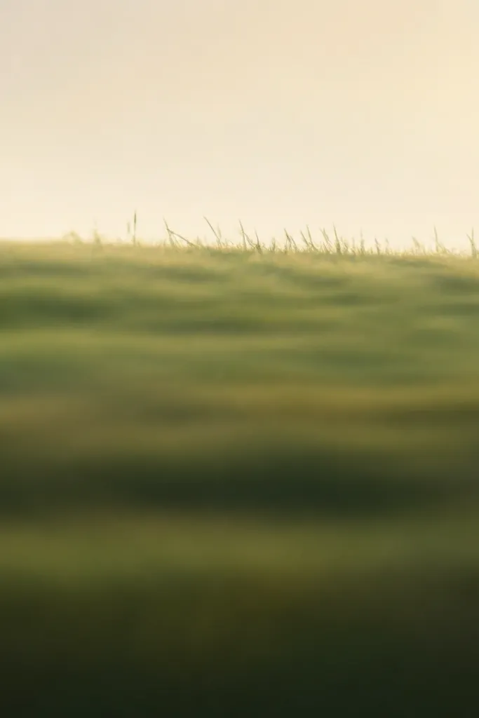
When your grass needs to feel far away, smudge bands beat detailed blade drawing. I use cotton swabs because they push graphite around in a controlled blur without turning everything into one gray blob. This technique makes the background feel atmospheric and keeps the piece looking intentional. It also pairs well with watercolor washes if you later add a thin green glaze.
Start by sketching a faint horizon line where the grass should soften. Use a 2B pencil to add a base gradient — darker near the bottom, lighter upward. Lightly tap a cotton swab onto graphite dust (or drag the swab through a small pencil mark) and smear in horizontal passes, staying within the top half. Then add a few sharp blade tips in 6B at the boundary between sharp and soft areas, and lift tiny highlights with the kneaded eraser.
Good to knowKeep smudging strokes horizontal; diagonal smears look like wind-swept hair.
6. Gel Pen Grass Strands with Graphite Underlayer
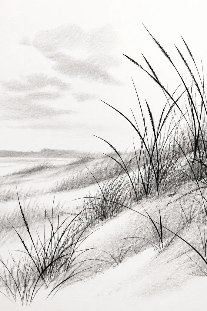
Pen + pencil is the cheat code for realistic edges. Graphite gives you the mass and haze, and gel pen gives you the sharp blade tips your eye expects. I use a fine black gel pen (0.5 or 0.38) over a graphite underlayer so the ink doesn’t look harsh. This is great for greeting cards because the blades look crisp even after you mail it.
Begin with a light graphite base: shade the lower half with 2B and lightly blend with a stump. Then draw 3 height bands in graphite — don’t worry about blade detail yet. Add the pen blades last, starting at the bottom and pulling upward with quick wrist motions; vary line length and leave spaces between groups. Use a kneaded eraser to carve a couple bright streaks where sunlight hits, then stop — don’t keep adding pen until it looks like a black carpet.
Good to knowLet the ink go dry fully before erasing anything — otherwise you smear it.
7. Green Pencil Edge Glow on Black Paper
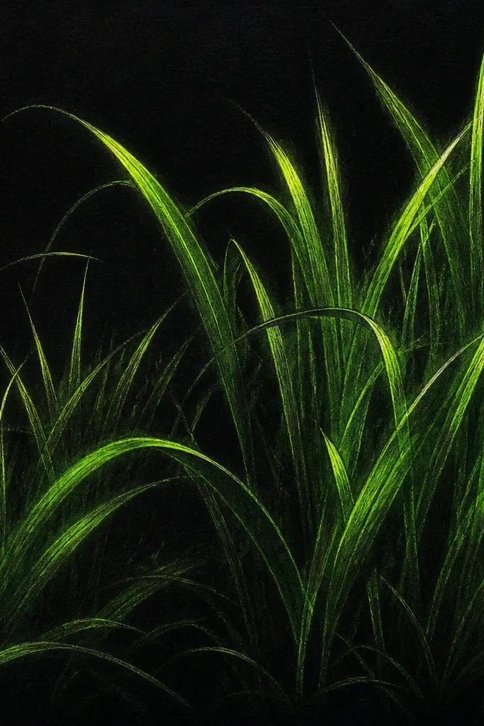
This is dramatic but still cheap, and it looks amazing in photos. Black paper forces high contrast, so you don’t need heavy shading to make depth. I layer green-gray and yellow-green pencils to create a sunlit edge effect. It flatters modern interiors because the glow reads clean and bold, not messy.
Start by sketching grass clumps lightly with a green-gray pencil — keep the marks directional and slightly curved. Then layer a brighter yellow-green along the right or top edge of each blade, like light is coming from one side. Add darker shadow gaps by pressing less and letting black show between clusters. Finish by sharpening a few foreground blades with a harder pencil pressure, then blend only the far background with a paper stump.
Pick one light direction and stick to it for every blade edge.
8. Crayon Resist Highlights for Sunlit Grass
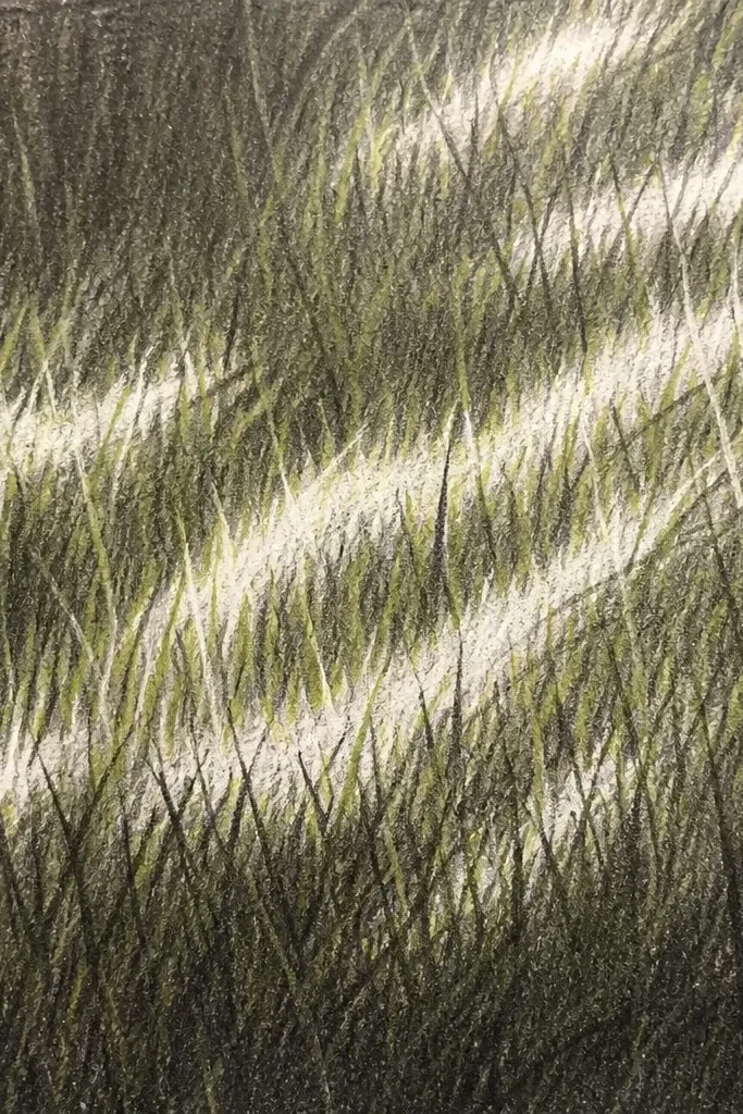
Crayon resist makes highlights without fighting the paper. I use this when my grass always ends up too dark, even with careful blending. The waxy marks repel graphite, so you get clean light streaks that look like blades catching sun. It’s also friendly for beginners because the highlight placement is forgiving.
Rub a white crayon lightly across where you want sunlight streaks, keeping them as thin lines that follow the direction of the grass. Then shade over the whole area with 2B pencil, using the side of the pencil so you get blade-like texture. Add darker blades in the foreground with 6B, drawing over the graphite but not trying to cover the crayon lines. Blend the background lightly, then sharpen the brightest highlights by lightly scraping with the kneaded eraser.
Use pressure changes: light pressure for haze, firm pressure only for the bottom third.
9. Felt-Tip Dry Brush Grass on Mixed Paper
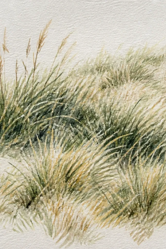
Dry-brush style grass reads alive because it looks like layers of color instead of perfectly drawn blades. I use a felt-tip marker sparingly, then soften it with a dry brush or paper stump so it turns into texture. This works well for people who hate drawing individual blades. It’s also easy to control the color temperature — I keep it cooler in the back and warmer in the sunlit front.
Start with a light pencil outline of your grass banding — no blade detail. Color the top half with a light green felt tip, then immediately blend with a dry paper stump so it turns into streaks. For the foreground, press harder with a darker green and add a few short blade strokes with a darker marker. Finish by adding pencil highlights on top of the colored texture using a kneaded eraser to lift a couple thin streaks.
Blend while the ink is still a little tacky, not fully dry.
10. Pencil Shading with a Plastic Card Comb
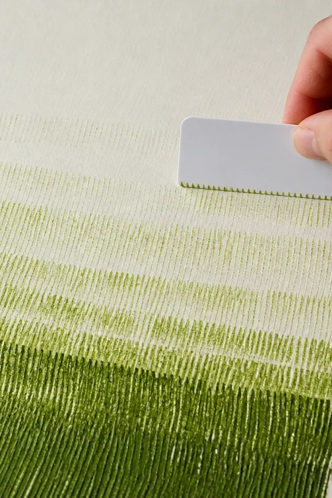
This is a neat trick for consistent blade direction without tracing anything. The plastic card acts like a comb, turning graphite into uniform micro-striations that look like grass texture at a distance. I use it for backgrounds and mid-ground because it gives a believable pattern quickly. It looks clean in minimal frames and doesn’t go muddy if you keep the pressure light.
Shade a thin graphite base with 2B, then scrape excess lightly so it’s not too dark. Lay the plastic card flat at a slight angle and drag it upward in short sections, creating parallel micro-lines. Repeat those comb drags more times in the foreground and fewer times in the distance. Add a handful of individual 6B blades at the bottom edge to break the pattern and make it feel less mechanical.
Clean the card between sections so you don’t smear a gray bar.
11. Marker + Eraser Carve for Thorny Grass Look
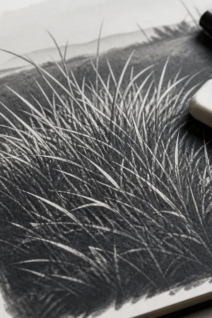
If you want grass that looks rough and scrubby, eraser carving is the way. You lay down a dark tone fast, then you sculpt blades by lifting graphite/ink. This gives you instant edge definition that would take ages with pencil alone. I use it for meadow edges, paths, and places where grass looks dry.
Start with a mid-dark base using a green marker or diluted green pencil — press enough to cover but not so much that it pools. Then draw a faint direction line for the grass and carve blade shapes by rubbing a kneaded eraser upward in short strokes. Add a few deeper shadow grooves with a 6B pencil between carved highlights. Finish by adding a small number of fully dark blades at the bottom so the scene has both spiky highlights and solid shadow.
Good to knowCarve fewer blades than you think; sparse sharp tips look more natural than full coverage.
12. Sharpie Wash Layers with Pencil Blade Tips
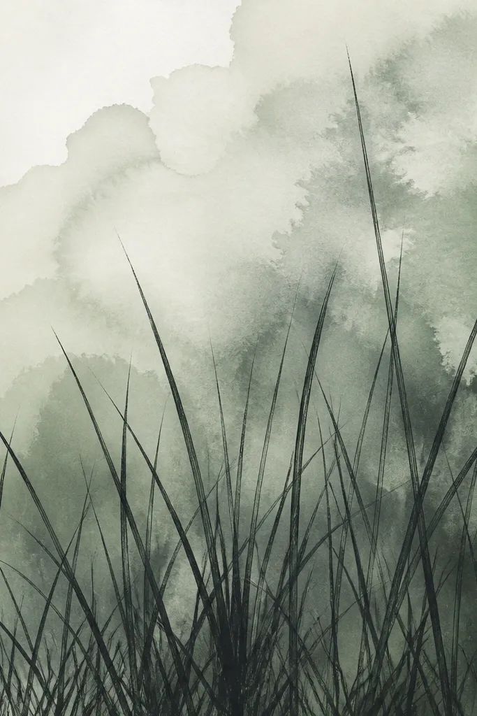
Watered marker washes create that soft, living depth that pencil alone sometimes struggles with. I use this when I want grass to feel like it’s under a light haze — like early morning or rainy day. Then I switch to pencil to add blade tips so the piece doesn’t turn into a flat wash texture. This looks great for small prints because it has depth without tiny detail overload.
Mix a tiny amount of black marker with water on a scrap palette, then test the value on scrap. Paint a soft wash across the top half and let it dry, keeping the bottom half lighter. Add a second darker wash only near the bottom band, then let it dry again. Finally, draw individual blades with a 2B and 6B pencil at the bottom edge, varying height and pressure, and lift a few highlights with the kneaded eraser.
Good to knowUse two drying stages; rushing makes the wash muddy.
13. Colored Pencil Sun Hits on Top of Graphite Mass
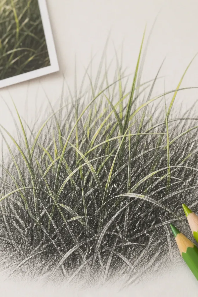
This is my favorite way to keep grass looking believable without turning it into a full-color mess. Graphite gives you the structure and shadow, while colored pencil adds only the light. I use a yellow-green for highlights and a cooler green-gray for midtones, then I stop. The result looks clean and realistic from across the room.
Start with a full graphite grass base using 2B, blocking in your three height bands with side strokes. Blend the background haze lightly so it softens. Then add colored pencil only on the top edges of foreground blades — short, thin strokes that follow blade direction. Use the yellow-green for the brightest parts and green-gray for the darker sides, then burnish gently with a clean finger if your pencil is waxy.
Good to knowKeep color off the shadow side of blades; that’s what prevents muddy green.
14. Black-and-White Pencil Only with Paper White Blades
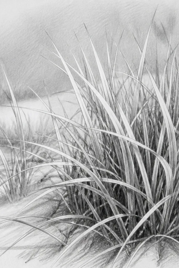
Monochrome grass sounds boring until you do it this way. Leaving paper white as blade highlights makes the scene look crisp and dimensional. I use it when I want a minimalist look that still feels realistic. It works on white or lightly tinted paper, but white paper makes the blade highlights pop the most.
Shade the whole area lightly with 2B so you have a mid-tone. Then map your blade direction and draw the shadow sides of blades with 4B, leaving the highlight side blank. Build depth by darkening only the bottom third and keeping the top half lighter. For the brightest foreground blades, lift graphite with kneaded eraser to carve thin streaks, then add a couple final dark tips with 6B.
Good to knowThink in shapes: draw shadow shapes first, then carve highlights.
15. Ink Outline + Crosshatch Grass Texture
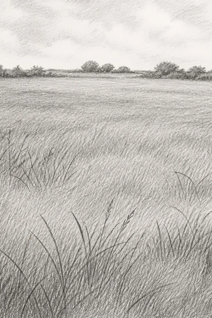
This one makes grass texture look architectural, like you’re sketching a yard from a slightly raised angle. Ink clumps give you structure, while crosshatching gives you grass mass. I keep the crosshatch angle different in foreground versus background so the scene has motion. It’s great for drawings you plan to frame without color.
Sketch clump shapes lightly with pencil, then add ink outline only for the biggest clumps. Fill the foreground with crosshatch pencil lines at one angle, darker at the bottom. For the middle and background, switch to a softer angle and fewer lines, leaving more paper showing. Finish by adding a few long blade strokes in 6B on top so the texture doesn’t look like flat hatch shading.
Good to knowUse ink only for boundaries, not for every blade. That keeps it from turning into scribble.
16. Mossy Clump Dots with Light Green Pencil
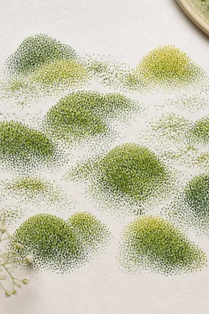
Dots and tiny comma strokes are perfect when your grass looks like thick ground cover instead of tall lawn blades. I use this for patches under trees or edges of planters where blades bunch up. The rounded clumps read as volume, especially when you leave tiny white gaps between dot groups. It’s also forgiving because you’re not chasing perfect lines.
Start by lightly drawing the mound silhouette with 2B pencil — keep it soft. Then tap in small dots using a light green pencil, building density toward the center of each mound. Add darker green-gray dots around the edges to create shadow depth. Finish with a few short comma strokes in yellow-green on the top of the mounds to suggest sun hits.
Good to knowVary dot size: small dots in the back, bigger dots in the front.
17. Graphite Dust Cloud for Hazy Grass
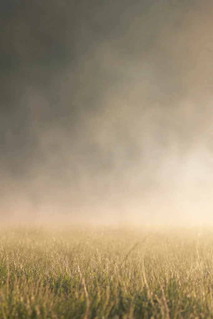
This technique is for grass that should feel like fog or heat haze. It’s cheap because you’re basically using graphite as atmosphere. I like it for background fields behind a character because it creates distance without stealing attention. The trick is controlling how far you blur — keep the foreground sharp enough to anchor the eye.
Lightly shade the bottom third with 2B to create a starting value. Rub the pencil side on scrap paper to create dust, then tap and drag that dust upward with a paper stump. Keep the top half airy by using fewer taps and more space between dust clouds. Add a few sharp dark blade marks at the bottom edge with 6B, then lift two or three highlight streaks with kneaded eraser.
If it looks too gray, lighten by lifting with kneaded eraser, not by adding more pencil.
18. Masking Tape Horizon for Crisp Grass Edge
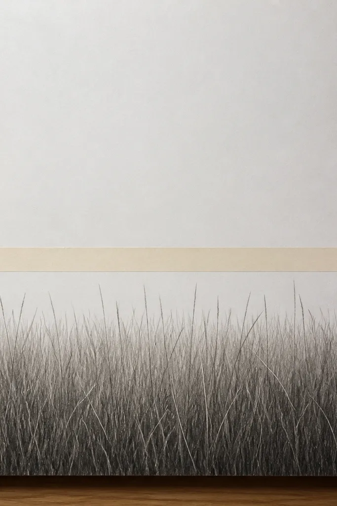
Masking tape makes a clean boundary that pencil alone can’t. I use it when I’m drawing grass in front of a path, sidewalk, or a building base and I want that sharp stop line. The result looks intentional and finished, even with cheap tools. This is also a great trick for beginners because the tape handles your straight edge.
Place masking tape along the horizon line where the grass should stop. Shade the grass area from the bottom upward with 2B, leaving a few highlight gaps. Draw blades in the foreground with 6B, keeping them angled slightly and varied in length. For the middle, reduce detail and blend with a stump, then remove the tape while the graphite is still a little workable so you get a crisp edge.
Good to knowPress the tape down firmly with a fingernail so graphite doesn’t sneak underneath.
19. Oil Pastel Base then Pencil Over for Depth
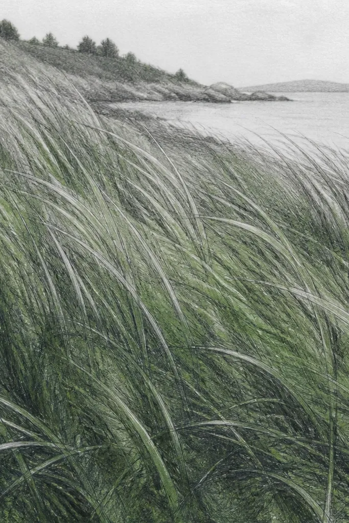
Pastel under graphite creates depth because the graphite sticks to some areas and skips others. I use oil pastel when I want the grass to look richer without buying a full set of colors. The base gives you a color temperature, and pencil gives you the blade detail. It’s a good option if your pencil grass always looks too flat.
Block in the grass mass with a green oil pastel — keep it broad and uneven, concentrating darker near the bottom third. Lightly smudge once with a tissue so you avoid harsh streaks. Then layer 2B pencil over the pastel and draw blade marks, using 6B for the deepest shadows. Finish by carving highlights with kneaded eraser so the blades have a bright edge against the colored base.
Use the pastel as a fog layer, not a full outline layer.
20. Felt Marker Teeth Texture with Short Vertical Pulls
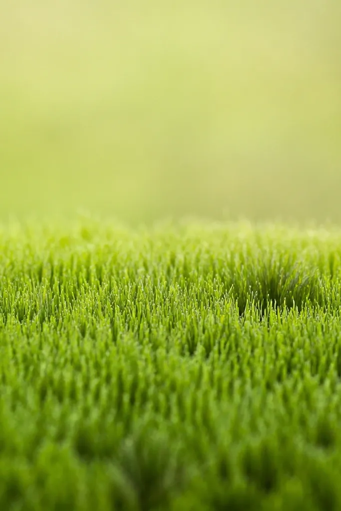
This is the fastest “grass texture drawing” method I’ve used when I’m making a bunch of studies for a layout. The felt marker makes tiny vertical teeth that read like blades at a distance. Pencil then sharpens the few foreground details so it doesn’t look like a marker rug. It’s great for quick decor mockups.
Start with a light pencil guide for where the grass ends and where it fades. Color the bottom third with a darker green felt tip using short vertical pulls, leaving gaps between strokes. Blend the middle half by lightly smudging with a stump so the teeth soften. Add pencil 6B blade tips in the very bottom edge and lift a couple highlights with kneaded eraser.
Good to knowKeep your pulls short — 6-10 mm — for believable blade scale.