
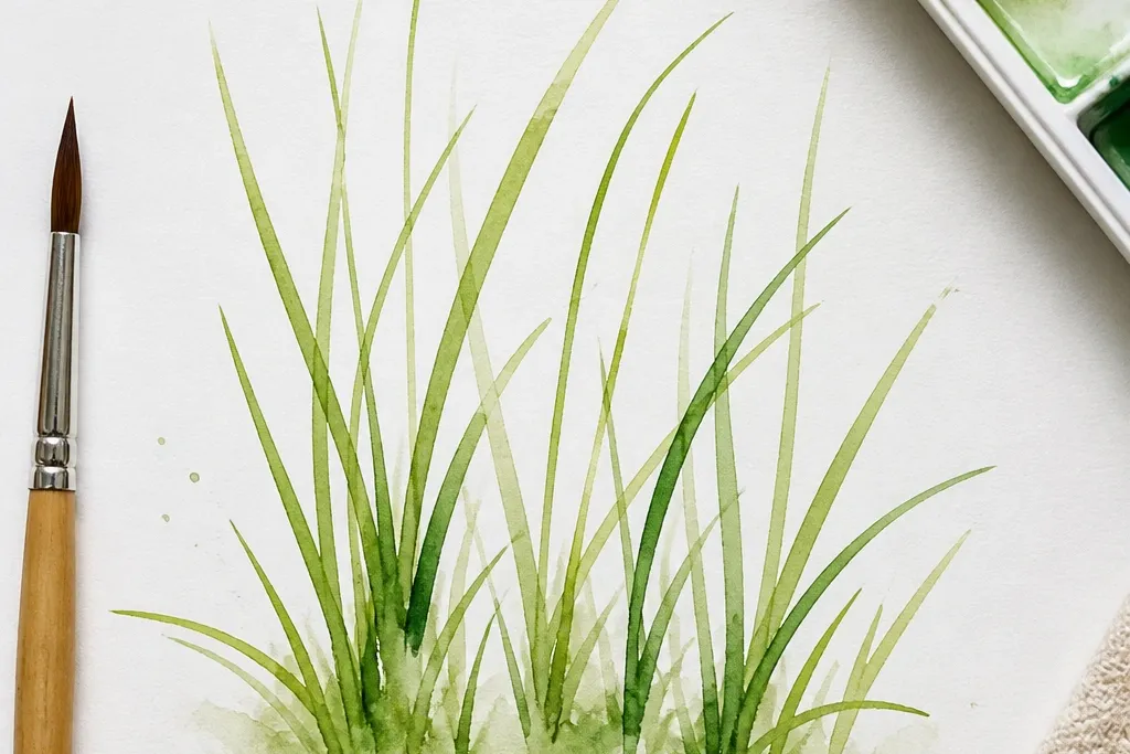
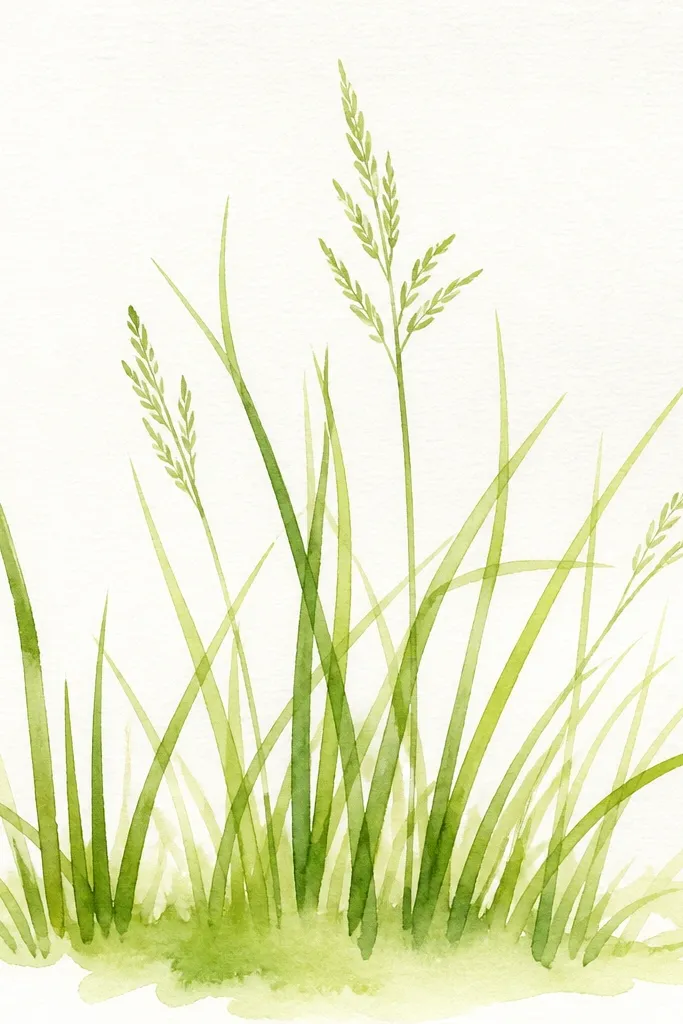
1. Lemon Tip Lawn Border
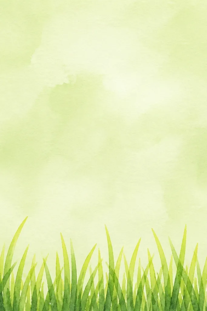
This one looks clean and friendly because the grass is controlled to a border height. Start with a pale wash for the ground — I use watered-down olive with a hint of sap green so it doesn’t turn muddy. Then you paint blades that are mostly vertical, with a slight lean to the right so it feels like a breeze. The lemony tips come from lifting the brush tip into a lighter lime-green mix. It flatters small spaces like cards because the grass stays readable without taking over the whole page.
Step 1: Paint the ground wash from the horizon line down, leaving a little lighter area near where the grass will start. Step 2: Load your brush with deep green for the base, touch the paper, then flick upward quickly so the tip grabs light green. Work left to right, keeping blades around 1/4 to 1/2 inch tall and spacing them irregularly. Step 3: After the first pass, reload with lime-green only and add short “tip flicks” on top of the darkest strokes. Finally, blot any stray wet spots with the corner of a paper towel.
If your tips look dull, add a tiny dab of yellow to your light green mix and test on scrap first.
2. Forest Fringe With Wet-on-Wet Fade
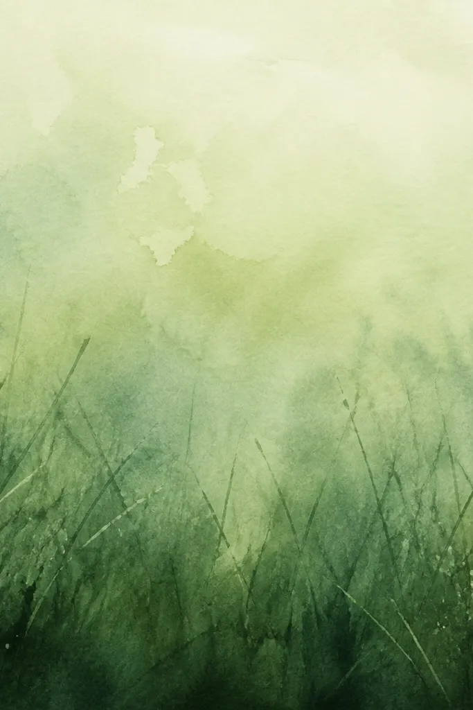
This style looks atmospheric because it uses wet-on-wet fading - the grass turns into a soft edge instead of crisp blades. I do it when I want a cozy woodland vibe without spending time on individual details. The lower area uses deeper greens (sap or Hooker) while the upper fade mixes in more water and a touch of blue-green. It’s flattering on paper that has light texture because the grain makes the fade look natural. The result reads as depth even when you paint quickly.
Step 1: Wet the bottom strip lightly with clean water using your brush, then drop in deep green at the very bottom edge. Step 2: While it’s still damp, flick short grass strokes upward with a medium green, keeping most strokes under 1/3 inch. Step 3: As you move upward, switch to a lighter mix and press less so the strokes soften. Finally, leave the top of the grass area slightly foggy — don’t try to make it sharp.
Work in small sections so the top doesn’t dry before you blend the fade.
3. Sunlit Meadow Diagonal Streaks
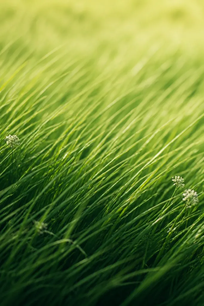
Diagonal streaks make grass look like it’s catching light across a slope. I use this when the horizon is slightly tilted or when I want motion without drawing wind lines. The foreground is darker — deep olive with a touch of brown — and the midground shifts to brighter green. The diagonal angle also helps hide uneven blade lengths because your eye reads them as one direction. It looks great on people’s wall art because it feels energetic while staying calm.
Step 1: Paint a soft ground wash in medium olive, keeping it lighter near the horizon. Step 2: Load your brush with deep green and paint diagonal strokes from left-bottom toward right-top, about 1/4 to 1/2 inch long. Step 3: Immediately add a second layer of medium green on top of some strokes, leaving gaps so the base wash shows through. Finally, near the horizon, reduce pressure so the diagonal streaks get shorter and lighter.
Good to knowMark your diagonal with two pencil dots (start and end) and aim every stroke through that imaginary line.
4. Tiny Needle Grass Field
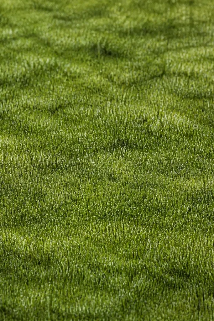
Needle grass works when you want texture more than height. It’s the fastest way to make a flat area look alive because you’re repeating a small motion, not drawing long blades. I like it for backgrounds behind flowers or for filling empty space on a card. Use three greens max: deep green, medium green, and a light highlight. The highlight is key — without it, needle grass turns into one flat blot.
Step 1: Wash the ground with a light medium green and let it dry fully so marks stay crisp. Step 2: Reload with deep green and tap the brush point lightly while dragging upward a tiny amount, creating 1-3 mm “needles.” Step 3: Add a second pass with medium green, focusing on gaps and edges where you want depth. Step 4: Finish with light green tip touches — just the top 1-2 mm of a few needles.
Good to knowIf your brush is too wet, the needles turn into dots. Blot once on paper towel before you start.
5. Tall Blade Accent Strip
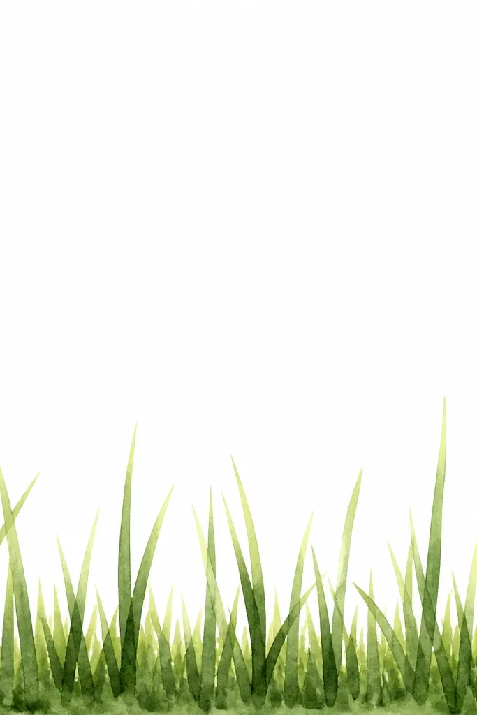
This is the quickest way to make grass feel layered without painting a whole field. I use tall blades as an accent strip when I’ve already drawn a flower stem or a fence line and I need something in the foreground. It flatters most compositions because the tall strokes create a focal edge. Keep the tall blades fewer than you think — too many makes it messy. The color rule stays the same: dark bases, bright tips.
Step 1: Paint the ground wash and add a short grass layer first using medium green, keeping everything under 1/4 inch. Step 2: After that dries a bit, add a row of taller blades using deep green, placing them unevenly across the strip. Step 3: Flick up with a lighter green on the tips only, not the whole blade. Finally, add a few extra short blades between the tall ones so the transition looks intentional.
Use your brush tip like a pencil point. If you press flat, you get thick marks that look artificial.
6. Feathery Grass Fan
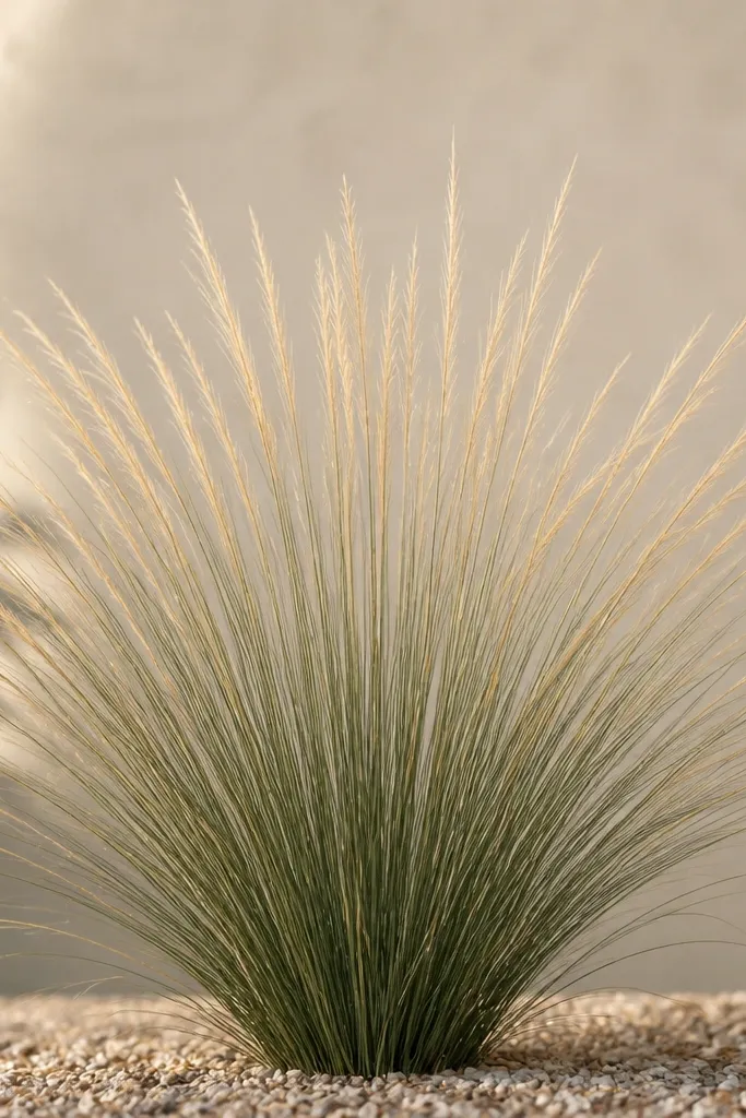
A fan pattern makes grass look like it’s growing from one spot, like the edge of a planter or a tuft. It’s visually satisfying because you can see structure even at a glance. I like this for mini art because it frames a subject — a butterfly, a small bouquet, or a single stem. Use medium green for most blades and reserve the brightest lime-green for the outer tips so the fan feels sunlit. This style is forgiving: slight differences in stroke direction still read as texture.
Step 1: Paint a small darker patch where the tuft sits, about 1.5 inches wide on a 4x6 card. Step 2: Start at the bottom center and pull short strokes outward and upward in a fan shape, each stroke about 1/2 inch long. Step 3: Switch to deeper green for a few inner blades to create depth. Step 4: Add lime-green tips to the outer half of the fan and leave the inner area slightly darker.
Keep your fan edge lighter. Darkening the whole fan makes it look like a blob.
7. Raked Grass Texture
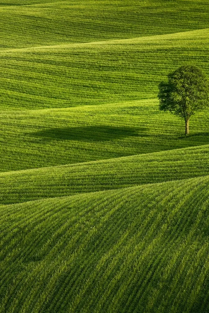
Raked grass gives you a clean, graphic texture that still looks natural. I use it when the piece needs structure — like behind a sign, a path, or a simple cottage scene. The look comes from repeating parallel strokes and varying pressure so some lines are darker and others fade. It also helps cover uneven washes because the strokes “read” as intentional. This one is especially flattering for wide backgrounds.
Step 1: Wash the ground with medium green and let it dry enough that it won’t smear. Step 2: With deep green, paint parallel strokes from left to right (or along a diagonal), each stroke 1/4 inch long. Step 3: Without re-wetting the whole area, add lighter green on top of every other stroke for a striped depth effect. Finally, drag the brush tip lightly through a few areas where you want a softer transition.
If your lines look too uniform, stop every few strokes and leave a gap for the wash to peek through.
8. Crescent Horizon Grass
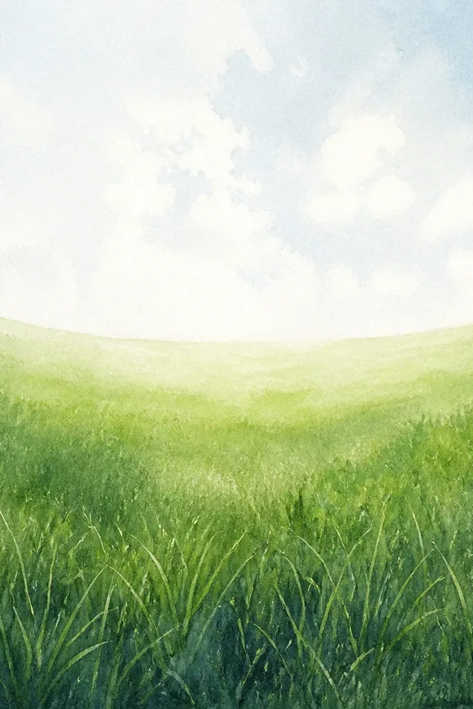
A crescent horizon makes your grass feel like it sits on a gentle hill. It’s a great trick when your horizon wash looks flat and you need shape. The foreground crescent should be darker so it reads as land, and the top edge should fade so it feels distant. I use a mix of olive and a touch of blue-green for the distant layer — it keeps it from turning yellow. This style works for beginners because you’re controlling a curve, not thousands of blades.
Step 1: Draw a faint pencil arc for the horizon line. Step 2: Wash the area below the arc with medium green and let it settle. Step 3: Paint blades along the arc with deep green, keeping the strokes slightly curved following the horizon. Step 4: Add a lighter green layer above the deepest blades near the horizon so it fades upward. Keep the tallest blades on the outer curve edges, not in the center.
Use the brush edge for the first layer, then switch to the tip for the lighter top flicks.
9. Dewy Highlights Grass Tips
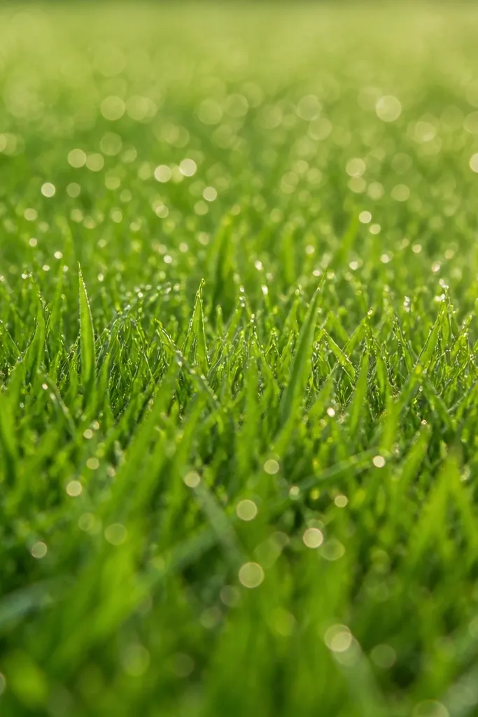
This look is all about sparkle, and it comes from tiny controlled highlights. I do it when the rest of the painting is simple and you want the grass to carry the charm. Keep your base grass medium green so the bright tips stand out. The dew effect is not white paint everywhere — it’s light green tips mixed with just a touch of yellow and applied sparingly. It flatters pastel palettes because the highlights add brightness without harshness.
Step 1: Paint a medium green ground wash and add short grass strokes using a deeper green, letting it dry 5 minutes. Step 2: Mix a light green (lime plus water) and reload the brush. Step 3: Tap the brush tip lightly at the top of some blades so only the upper edge turns bright. Step 4: Add a few micro highlights — even 1 mm marks — spaced irregularly across the field.
Good to knowIf you want stronger “dew,” use a smaller brush size 0 or 1 for the highlight taps.
10. Shadowed Grass Underlayer
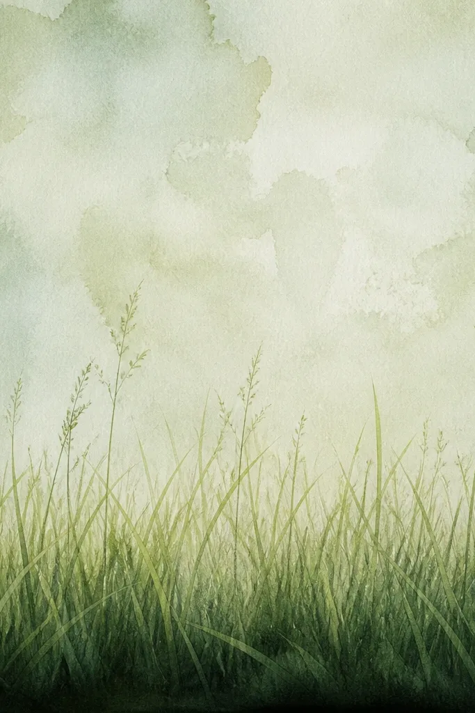
Shadowed underlayer makes grass look dimensional fast. You’re creating a base shadow that tells the viewer where the ground “falls away.” I like this for evenings scenes, card corners, or any piece where you want depth without adding more objects. The underlayer should be darker than you think — deep sap green with a tiny touch of brown keeps it natural. Then the top blades come in lighter so they sit on top visually.
Step 1: Paint a ground wash in medium green, then add a darker band along the bottom edge about 1 inch tall. Step 2: While that band is still slightly damp, flick grass strokes upward with deep green, keeping them short. Step 3: Let it dry, then paint a second layer of blades using medium green, starting where the shadow band ends. Step 4: Add lime-green tips to the top layer only so the highlights don’t get swallowed.
Good to knowDon’t blend the dark band too much. A crisp-ish edge makes the shadow read better.
11. Backlit Tall Grass Silhouette
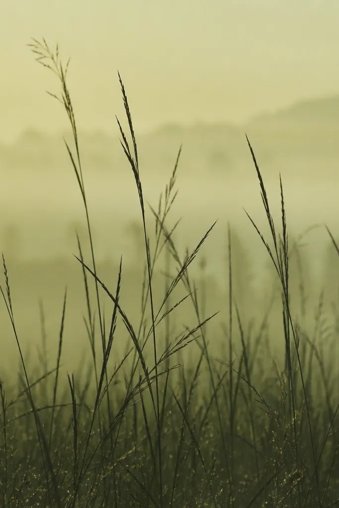
Backlit grass looks dramatic and still simple. You paint the background first, then you draw grass over it like silhouettes. This works well when your sky or background wash is pale because the grass needs contrast. I use deep green for the silhouettes and keep the blade shapes thin by using the brush tip. The backlit look is forgiving because the viewer expects softer edges in bright light.
Step 1: Wash your background and ground in a pale green, leaving plenty of light space. Step 2: Once dry-ish, load deep green on your brush and paint tall blades, mostly vertical with slight curves, around 1/2 to 3/4 inch tall. Step 3: Add a second pass with medium green on only a few blades to create variation. Step 4: Use a damp brush to soften the base of a few strokes so it blends into the ground wash.
Keep your strokes fewer and thinner. If you fill the whole page with tall blades, it turns heavy.
12. Meadow Swish With Broken Color
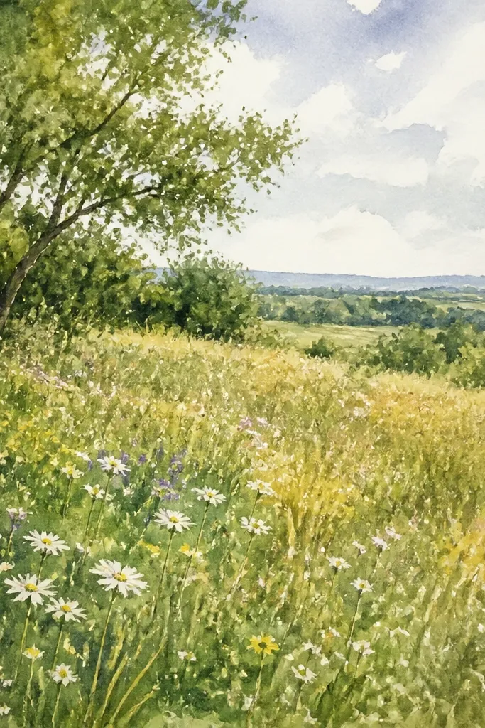
Broken color grass looks more natural than perfect single-green strokes because it mimics plant variation. I do this when I want the field to feel lived-in, like it’s been through sun and wind. Mix your greens on the palette with a little water so you get slight color shifts within the same stroke. Use olive for most blades, then dip the brush tip lightly into a lime mix for a few strokes. It flatters anyone’s beginner skills because you don’t need ultra-sharp lines — the variation does the work.
Step 1: Wash the ground in a medium olive and let it dry slightly. Step 2: Paint short grass strokes, but reload often so the color breaks. Step 3: Every few strokes, touch the brush tip to lime-green before flicking upward. Step 4: Keep blade lengths varied — some 1/4 inch, some 1/2 inch — and leave little gaps so the wash shows through.
Good to knowDon’t rinse between every reload. A tiny leftover tint on the brush creates better broken color.
13. Triangle Patch Grass Pattern
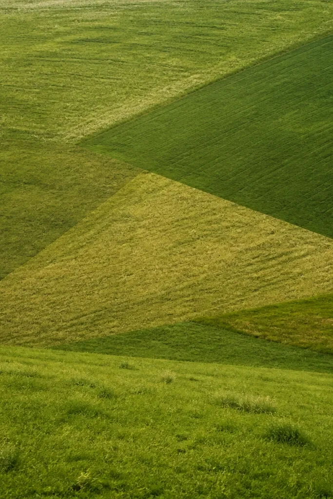
Patchwork shapes make grass drawings look intentional, like a design element. I use triangles when the piece needs structure without adding buildings or animals. Each triangle gets its own direction and depth, so the whole field doesn’t look flat. Choose one base green and one shadow green, then a light green for highlights. This style flatters small art because the shape boundaries keep it readable.
Step 1: Lightly sketch two or three triangle patches on the ground area using a pencil. Step 2: Wash each triangle slightly differently: medium green for one, olive for another, and a touch darker for the third. Step 3: Paint short grass strokes inside each triangle in a consistent direction per patch (one diagonal, one vertical, one horizontal). Step 4: Add lime-green tips across only the lightest triangle so it pops.
Use a ruler to keep triangle edges clean if you’re worried about wonky geometry.
14. Border Grass Over Textured Wash
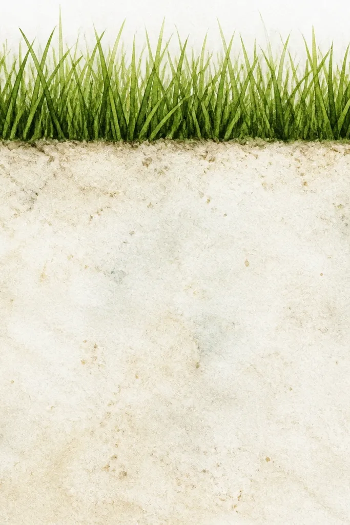
Texture-first grass looks richer because the ground has movement even before you add blades. I do this by creating a speckled wash - tiny blooms that happen when you add salt or lift paint — then I paint the grass on top. The contrast makes the grass look sharp and intentional. This style looks best for frames and wall art where the viewer will get close. It also hides paper imperfections because the texture gives the eye something to grab.
Step 1: Make your ground wash medium green. Step 2: While it’s wet, pinch a tiny amount of coarse salt and sprinkle lightly, then set it aside until dry. Step 3: Brush off the salt gently. Step 4: Paint a grass border on top using deep green bases and medium green strokes, then finish with light green tip flicks. Keep the border height around 1/2 inch for a card, and 3/4 inch for a larger panel.
Don’t over-salt. Too much texture makes the grass look buried.
15. Grass With Tiny Flower Buds
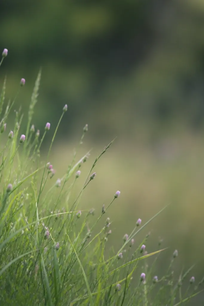
This one blends grass and decor without turning into a full bouquet. I add tiny bud marks right into the grass tips, so it looks like wildflowers tucked in. It flatters lots of skin tones and outfit colors when you later match the palette, because pink and purple sit nicely against green. The grass should stay slightly darker than the buds so the buds read as separate. Keep the buds small — the moment you make them big, the grass stops looking like grass.
Step 1: Paint the ground wash and add a first grass layer with medium green, short strokes under 1/2 inch. Step 2: Add a second grass layer with deep green bases for depth. Step 3: Load a small brush with pale pink and dab tiny bud dots at the top of a few blades. Step 4: Add a second color dab in light purple on a couple buds for variation. Finally, brighten just the top edges of the grass around the buds with lime-green.
Use the brush tip, not the side. Buds that are too wide look like paint blobs.
16. Vine-Like Curved Grass
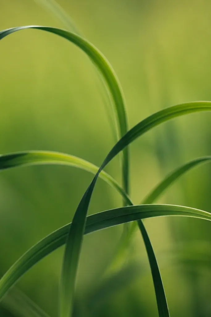
Curved grass looks fancy with almost zero extra work. I use it when I want movement — like grass wrapping around a path or spilling from a pot. The curve makes the painting feel intentional even if the blades are short. Color still matters: deeper green on the “inside” of the curve and lighter green at the outer edges. It looks great for decor pieces because it adds a gentle flow line that guides the eye.
Step 1: Wash the ground in medium green and let it set. Step 2: Paint curved strokes like thin ribbons, using deep green and keeping each stroke 1/4 to 1/2 inch tall. Step 3: On top of the deepest curve, add medium green strokes offset slightly so the curve looks layered. Step 4: Finish with lime-green flicks along the outer edge of the curves only.
Draw your curve with a light pencil guide first if your hand gets shaky.
17. Stippled Grass Ground Cover
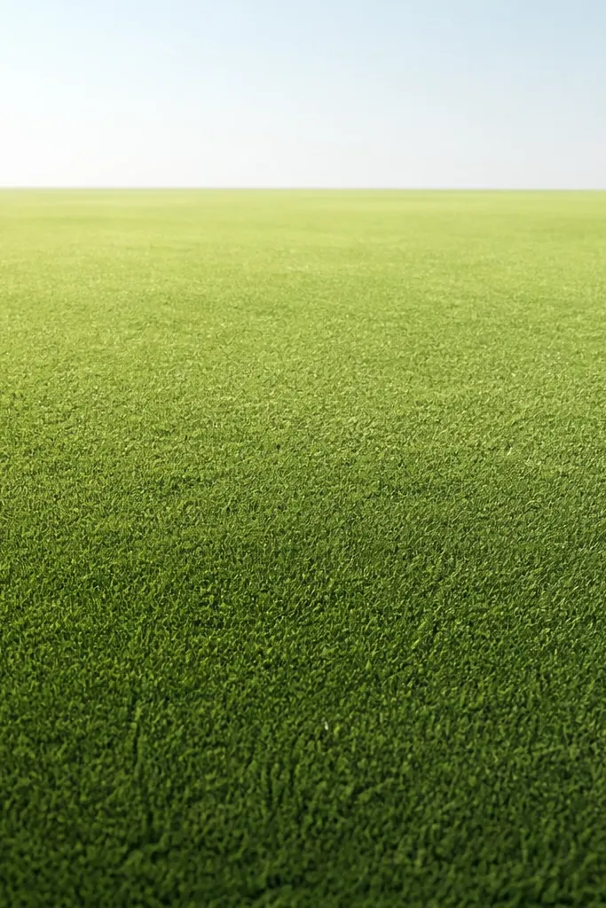
Stippled grass is my go-to when I’m painting quickly and want the texture to do the heavy lifting. It reads like grass because the dots create tiny highlights and shadows at once. I use it behind more detailed elements like a tree trunk or fence so the background doesn’t compete. Keep the stipples small and varied, and make the bottom darker for depth. This style is forgiving for beginners because you don’t need perfect blade lines.
Step 1: Wash the ground with a gradient — deep green at the bottom fading to medium green near the horizon. Step 2: Load your brush with deep green and stipple small dots, letting them cluster near the bottom and thin out upward. Step 3: Add a second stipple layer with medium green to brighten the midground. Step 4: Finish with a few lime-green dots as “sun hits” across the top of the field.
Good to knowTap from the same height every time. If you hover, your dots smear.
18. Shadowy Grass Around a Rock
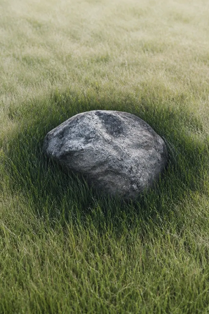
When you paint grass around an object, it instantly looks more realistic. The trick is to change density near the rock — more blades hugging the edges, fewer farther away. I use deep green for the halo so it feels like the rock casts shade. Then I add lighter blades at the outer edge of the grassy area. This style flatters compositions because it gives your rock or stump a frame.
Step 1: Paint your rock first, keeping it dry and crisp. Step 2: Wash the ground around it in medium green. Step 3: With deep green, paint short grass strokes that curve slightly and crowd closer to the rock edge, creating a dark ring. Step 4: After that dries, add medium and light green strokes farther out so the density drops. Finish with lime-green tips on the outer blades only.
Leave a tiny gap of clean paper between rock and grass halo. That negative space makes the rock pop.
19. Horizon Grass With Soft Edge
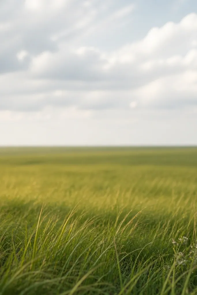
Soft-edge horizon grass makes your painting feel like it has air. It’s the fastest way to avoid the “sticker grass” look where blades are equally sharp everywhere. I keep the foreground crisp with short flicks, then I fade the grass into the horizon wash. Use more water as you move upward so it loosens. This style is great for landscapes where you already have a sky wash.
Step 1: Paint the sky and horizon line lightly, then wash the ground below in a light medium green. Step 2: Paint crisp grass strokes only in the bottom 1 inch with deep green and medium green layers. Step 3: Move upward and switch to a lighter green mixture with more water, using shorter flicks that you stop before they get crisp. Step 4: Add one last light green pass with a damp brush to blend the top edge.
If your horizon grass dries too sharp, re-wet the top edge with clean water and soften it before it fully sets.
20. Grass Over Paper Towel Lift
This look uses lift-and-layer so the grass has natural variation. I do it when my ground wash looks too flat, especially on cheaper paper. You lift a few spots with a damp paper towel so you get light “sun hits,” then you paint grass on top. The lifted patches make the grass tips look brighter without extra paint. It’s flattering because the variation keeps the field from looking one-note.
Step 1: Wash the ground in medium green and wait until it’s wet but not pooling. Step 2: Lightly press a damp paper towel onto a few areas to lift paint, then blot the towel on scrap so you don’t smear. Step 3: When dry, paint grass strokes with deep green bases, flicking upward with medium green on some blades. Step 4: Add lime-green tips mostly where the paint was lifted so the highlights match the light patches.
Good to knowLift in small patches, not big areas. Big lifts make the grass look like it’s floating.



