
1. Single Lotus on Mirror Water with Soft V-Reflections
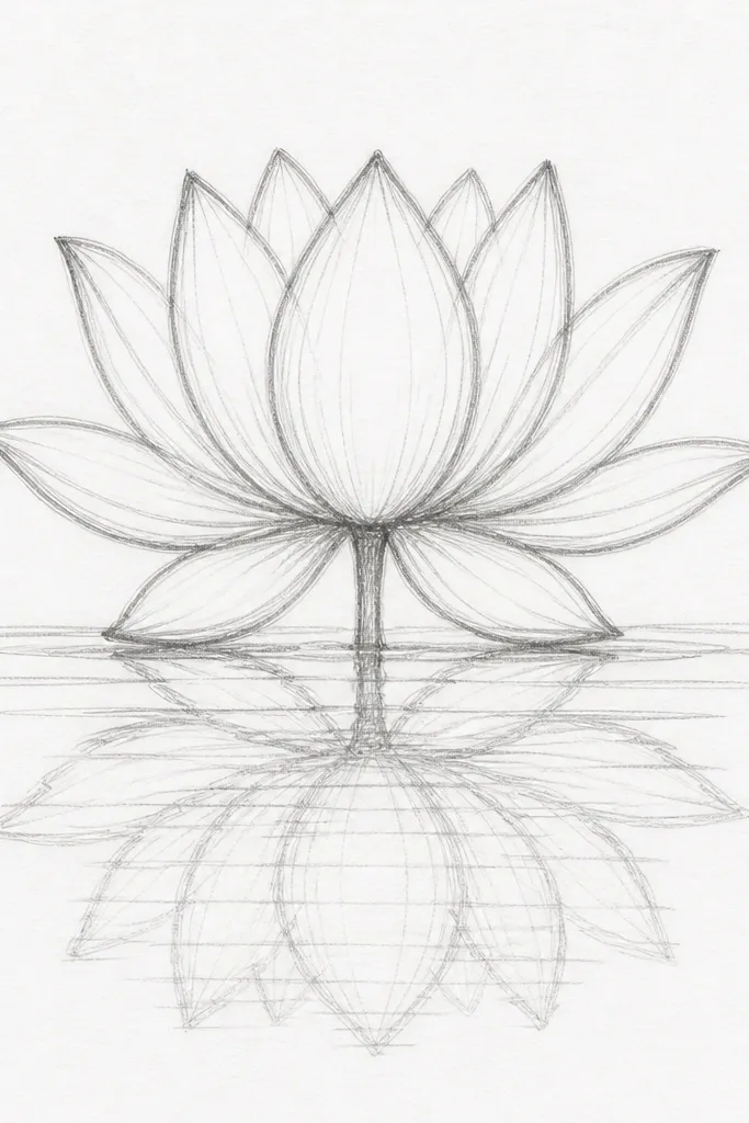
This idea is the one I reach for when the paper feels too blank and you want instant calm. Use a light pink wash for the petals (diluted rose + a touch of purple) and keep the edges slightly darker for definition. The center seed pod is warm ochre with tiny dots, so it reads as real even when the rest stays soft. The water is mostly negative space, with only a few ripple lines that curve outward — it flatters small spaces and works well for anyone who’s new to water reflections.
Start by sketching one lotus about 60% of the page height, leaving a wide margin below for the water. Paint the petals first with a light wash, then add a second pass along the petal edges while the paint is still damp so you get that natural gradient. Let it dry, then mix a watery version of the same pink and paint a V-shaped reflection under each petal — keep it lighter than the real petals. Finally, pull 5-7 thin ripple lines across the reflection using a liner brush, spacing them farther apart near the top and closer near the bottom.
After the reflection dries, add two tiny highlight strokes where the water would catch light — bright white gel pen works great.
Don’t outline the water ripples too dark — it turns the whole piece into a cartoon.
2. Three-Lotus Cluster with Overlapping Ripple Bands
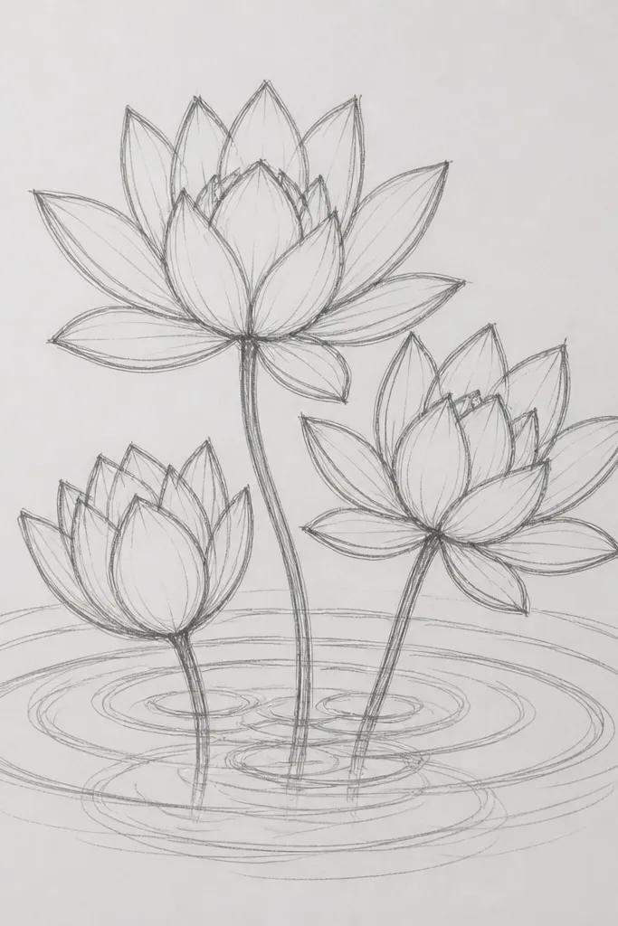
A cluster makes the drawing feel lively without losing structure. I use three lotus petals shades: blush pink for the top bloom, warm coral for the left bloom, and pale peach for the right bloom. The overlap matters — reflections should stack and slightly darken where they cross, because real water doesn’t reflect in clean layers. This style looks great on off-white paper and flatters warm skin tones if you’re matching it to a warm-toned room decor.
Good to knowUse a flat brush for the ripple bands so the edges stay straight and smooth.
Sketch three lotus circles spaced so the middle one sits slightly higher than the others. Paint each bloom separately: seed pods first (burnt umber + yellow ochre), then petals with a wet-on-wet edge for softness. When everything is dry, create water by painting 4-5 horizontal ripple bands with a thin blue-gray wash. Under each lotus, paint a smaller reflection that matches its shape, then let the ripple bands partially cover the reflections for that overlapping effect.
Common mistakeAvoid painting the reflections at the same strength as the petals — that’s the fastest way to make it look like stickers.
3. Lotus Bud in the Water with a Curled Leaf Shadow
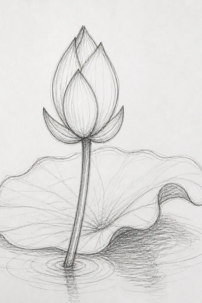
This one feels more natural because the bud breaks the symmetry of a full bloom. The petals are pink but slightly cooler than the earlier ideas (rose with a hint of blue), and the waterline is a soft, darker band. I add a curled leaf shadow in deep green-gray so the scene has depth, not just flower and water. This style looks good for smaller paper because the shadow gives you a strong shape to anchor the composition.
Good to knowUse a damp paper towel to lift a thin highlight at the waterline for extra realism.
Draw a bud with three main petals above the waterline and two petals implied below. Paint the bud petals first, keeping the lower petal edges lighter and less defined to suggest water coverage. For the waterline, swipe a thin gray-blue strip across the middle, then soften its edges with a damp brush. Add the reflection as a shorter, lighter version of the bud — stop it earlier than you think, so it reads as partially submerged. Finish by painting a curled leaf shadow using a dark green-gray wash under one side of the bud.
Common mistakeDon’t make the reflection too long — submerged parts reflect less.
4. Lotus on a Diagonal Water Ripples Background
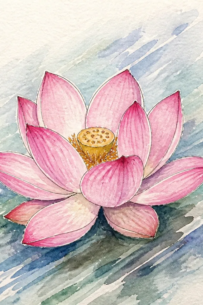
Diagonal ripples create motion even if your lotus is simple. I paint the lotus upright but rotate the water ripples so they sweep from upper left to lower right, giving the whole piece energy. Use a soft lavender-gray for water, then keep ripple lines thin and consistent. This works especially well if you’re using thicker watercolor paper because the diagonal strokes can stay crisp instead of feathering.
Sketch the lotus centered but tilt the outer petals slightly so the bloom looks like it’s leaning toward the light. Paint petals in light pink, then add darker pink along the petal folds. After drying, lightly wash the whole water area with pale gray-blue. Pull diagonal ripple lines across the page using a fine liner, and paint the reflection as a diagonal “echo” of the petals — lighter near the top of the reflection and slightly darker toward the bottom. Add three or four white highlight dashes along the strongest ripple lines.
Plan your ripple direction first — draw 3 guide lines in pencil so your ink stays even.
Don’t cross diagonal ripples too aggressively; crossing lines make it look messy.
5. Ink Lotus with Watercolor Ripples (Bleed-Control Style)
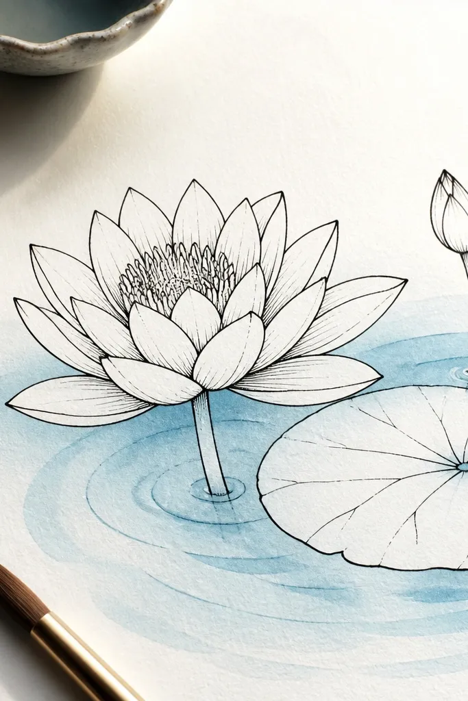
If you want a crisp, graphic look, do ink first and watercolor around it. The lotus stays sharp because the outlines are solid black, and the water stays soft because you never paint directly on wet ink. I use a waterproof black fineliner for the lotus, then watercolor ripples in very light blue-gray. This style is flattering for bold wall art because the contrast is high and the lotus reads from across a room.
Good to knowUse a hairdryer on low for the watercolor so the ink doesn’t bleed.
Draw the lotus in waterproof ink, including the seed pod dots and a few petal vein lines. Let it dry, then mask the lotus with a piece of thin paper if you’re worried about accidental washes. Wash the water area with very diluted blue-gray. For ripples, use the side of a flat brush to drag short curved arcs; stop each arc before it reaches the lotus edge so you keep that clean boundary. Finally, glaze a faint reflection by lightly tinting the water directly under the petals.
Common mistakeAvoid regular ink that smudges — you’ll lose the whole crisp look.
6. Lotus in a Tea Cup Bowl with Realistic Water Surface
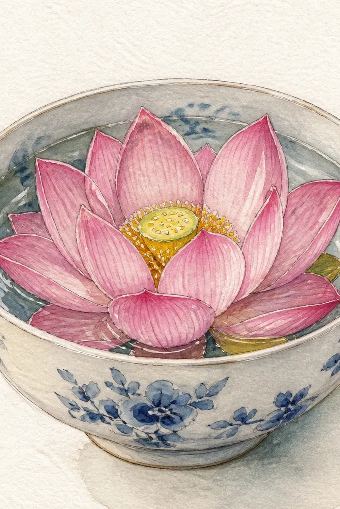
Bowl framing makes the water feel like an object, not just a background. I draw the cup with a thin gray outline and add a darker inner rim so the viewer instantly understands depth. The lotus stays centered, and the reflection bends slightly to match the bowl curve. This works well for decorating small items like greeting cards or journal covers because the shape gives you a natural border.
Good to knowIf your bowl curve is off, fix it by adjusting only the rim band — it’s easier than redrawing the whole cup.
Sketch a cup outline first — keep the top opening about 70% of the page width. Paint the lotus inside the bowl, then add ripples that follow the bowl interior with circular arcs. For the water surface, glaze a pale blue wash up to the rim, then add a darker band at the inner edge. Paint the reflection as a smaller, lighter lotus under the bloom, then soften it with a damp brush so it looks like it’s sitting on curved glass. Add 6-8 short circular ripples that start near the lotus and radiate outward.
Common mistakeDon’t forget the rim band — without it, the water looks flat.
7. Watercolor Lotus with Dry Brush Ripples (Texture First)
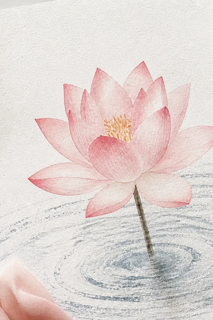
Dry brush ripples look like real surface texture without you drawing every line. I like this when I’m using student-grade watercolor paper with strong grain, because the speckling helps the water feel alive. The lotus stays soft and airy, with petals painted using a lightly loaded brush so you see the paper through the color. This style suits anyone who doesn’t want to do lots of fine-line work and still wants a polished result.
Good to knowTest your dry brush on scrap paper — you want speckle, not full streaks.
Paint the lotus petals first with a light pink wash, leaving intentional white gaps between petals. Use a dry brush technique on the petals too: load the brush with pigment, wipe most on a paper towel, then paint so the grain shows. After the lotus is dry, load a gray-blue pigment lightly and drag across the water area in short horizontal strokes for ripples. Keep the strokes broken and uneven near the bottom, and smoother near the top. Add a reflection by lightly brushing a faint wash under the lotus, then blend just the edges with a barely damp brush.
Common mistakeDon’t overwork the ripples. If you keep dragging, you’ll turn texture into mud.
8. Lotus Reflection Split by a Dark Ripple Veil
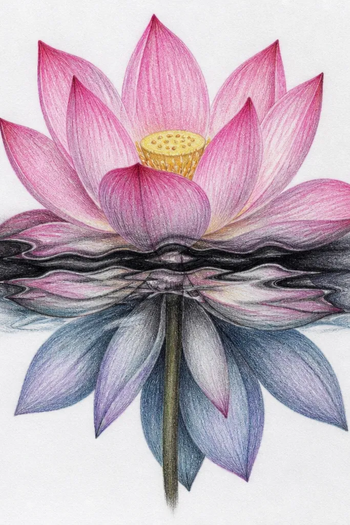
This idea is dramatic because you treat the water like layers of motion. The lotus is clean and bright, while the reflection gets interrupted by a darker moving band, so it feels like something is passing over the surface. I use a deep teal-gray for the veil, then glaze it lightly so it doesn’t overpower the petals. This style flatters moody color palettes and looks great on darker sketchbooks where white gel highlights pop.
Paint the lotus petals in pale pink, then add a warm yellow center with tiny dots. Let it dry completely. For the water, paint a light blue-gray wash across the bottom half. Mix a darker teal-gray and paint a diagonal or curved ripple veil across the reflection area, leaving the edges softer than the middle. Under the veil, paint the reflection lighter; above it, keep the reflection slightly darker so you get that split effect. Finish with 4-6 small highlight strokes that sit on top of the veil.
Use two passes for the veil: first a thin glaze, then a second one only on the darkest band.
Avoid painting the veil too opaque — you want it to interrupt, not cover.
9. Lotus and Water Grid Ripples (Controlled Symmetry)
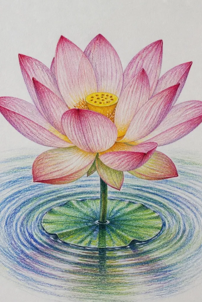
When you want it to look neat and intentional, use a ripple grid. I’ve done this with a ruler lightly for guide lines, then freehand the curves so it still feels organic. The lotus can be simple: three petal layers, one seed pod, a few vein lines. The grid ripples make the reflection feel more structured, which looks good for home decor prints and stationery.
Good to knowKeep ripple lines the same length so the water looks calm, not chaotic.
Sketch the lotus with a clear center axis. Paint petals with light pink, keeping edges slightly darker. After drying, draw faint pencil guide curves across the water area, evenly spaced. Erase the guides later or keep them faint. Paint ripple lines using a thin diluted gray-blue — follow the curves and keep line thickness consistent. For the reflection, lightly shade the area under each petal and let the ripple grid lines pass through it without darkening too much.
Common mistakeDon’t make the grid lines dark — it will look like fabric stitching.
10. Lotus with Floating Petal Confetti Ripples
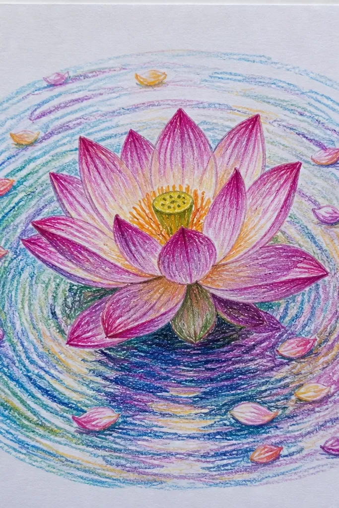
This style adds story without clutter. Instead of drawing only one ripple source, you use small rings from floating petals, which makes the water feel like it’s reacting. The lotus petals are still the main focus, but the tiny confetti shapes guide the eye across the page. I use pale pink and pale yellow for the floating petals, and the rings are drawn in soft gray-blue. It’s especially forgiving if you’re still learning because small rings can hide minor reflection mistakes.
Good to knowKeep floating petals at least 1 cm apart so rings don’t overlap into one blob.
Draw the lotus first and paint it in pale pink with a warm yellow center. Add 5-8 tiny floating petal shapes around the lower water area, keeping them smaller than the lotus seed pod. Paint the water wash in light blue-gray. For each floating petal, draw 2-3 concentric ripple rings using a fine brush, making the rings wider and lighter farther from the source. Paint the reflection under the lotus as a faint pink wash, then break it slightly where the ripple rings cross. Add a few white highlights on the nearest ring edges.
Common mistakeDon’t draw too many rings — 2-3 per petal is enough.
11. Blackwash Lotus with Silver Gel Highlights
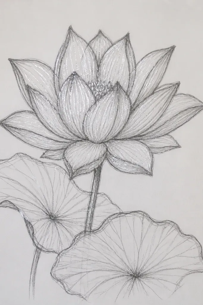
This is the moody version that still looks clean. I start with charcoal-gray or diluted blackwash for the water and lotus shadows, then bring back light with silver gel pen. The contrast is strong and makes the petals feel dimensional even if you keep the drawing minimal. If you like graphic art, this one reads like ink illustration with a real water shine. It also looks great on black or toned paper because silver highlights glow.
Sketch the lotus in pencil, then ink or paint it with a diluted charcoal wash. Paint petals with a gradient: darker at the base, lighter at the outer tips. Let it dry. Wash the water area in a thin gray, then add ripple lines using a damp brush so they look soft, not sharp. Paint a reflection in a lighter gray under the petals, and stop the reflection early for realism. Finally, add silver gel highlights on ripple crests and two reflection edges — keep highlights narrow and crisp.
Use a light touch with gel pen. Pressing hard makes thick lines that look like marker.
Avoid fully blacking out the water. Leave some lighter areas so the highlights have something to hit.
12. One-Petal Lotus with Long Ripples (Minimalist Zen)
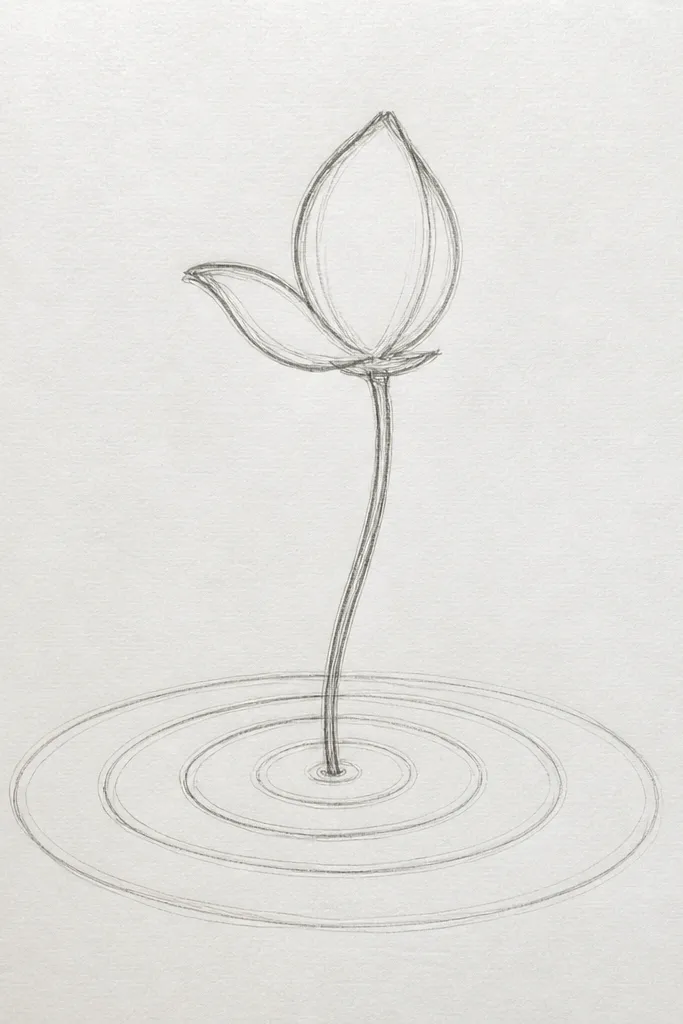
Minimalist drawings look harder than they are, but this one is straightforward. You paint one petal — big enough to be the hero — then make ripples do the work. Use a soft gradient from deep rose at the base to pale pink at the tip. The water stays mostly blank with only long ripple lines, so even beginners get a clean result. This style works well on small paper sizes because the simple shape reads instantly.
Sketch one petal centered, with a slight curl at the tip. Paint it in watercolor with a darker base and lighter top, leaving the paper showing through. Add a tiny hint of seed pod at the base if you want context, but keep it minimal. After drying, wash the water area very lightly in pale blue-gray. Draw 10-14 long, thin ripple lines across the water, curving them gently as they pass under the petal. Add a faint reflection by mirroring the petal curve in diluted pink and then fading it out with a damp brush.
Use a ruler for the first ripple line, then copy the spacing by eye.
Don’t add extra petals. One petal plus good ripples beats five messy ones.
13. Lotus with Gold Center and Pale Water Rings
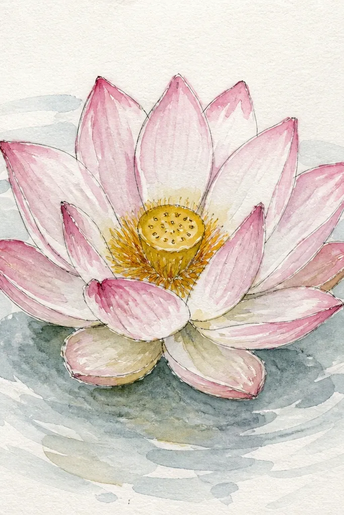
The gold center makes the whole lotus feel finished even if your water is simple. I use metallic gold paint for the seed pod, then glaze a warm yellow wash around it so it blends into the petals. The rings are pale, not dark, so they look like gentle movement rather than heavy waves. This idea looks stunning in daylight because gold catches light and makes the drawing feel more dimensional.
Paint the lotus petals in pale pink with slightly darker pink along the creases. Mix a warm gold center using metallic gold paint over a light yellow underlayer for coverage. After the lotus dries, wash the water area in a thin light blue-gray. Draw 6-10 faint circular rings centered under the lotus using a very diluted gray-blue — make them barely visible. Paint the reflection under the seed pod as a softer, lighter pink shape and blend the edges so it fades. Finish with two tiny highlight dots in white gel where rings intersect the reflection.
Prime the seed pod area with light yellow first so metallic gold doesn’t look patchy.
Don’t make the rings too dark. Faint rings are what keep it elegant.
14. Lotus in Turquoise Water with Wet-on-Wet Blooming Ripples
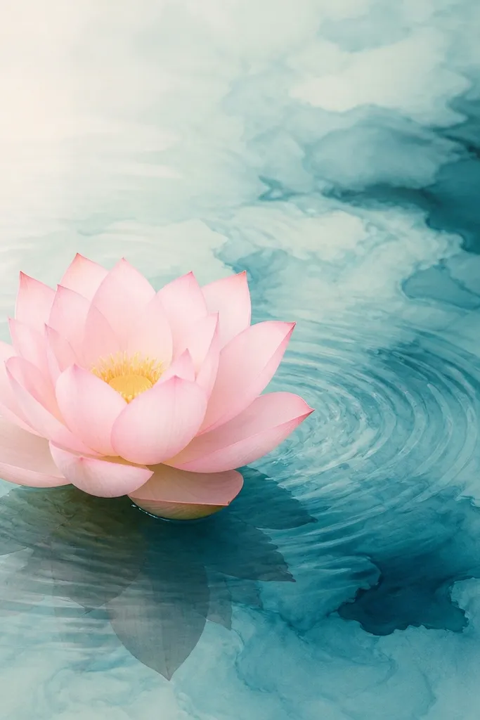
Wet-on-wet ripples look like water turbulence without you drawing every wave. The turquoise wash gives you a clear color mood, and the lotus edges stay soft so the scene feels like it’s breathing. I use a light turquoise first, then drop in slightly darker turquoise in streaks — the blooms create natural ripple texture. This style is great for painting on thicker paper because you need time for the wash to spread before it dries.
Good to knowTilt your paper slightly while the wash is wet. Gravity helps the ripples flow naturally.
Wet the water area lightly with clean water using a flat brush, then apply a light turquoise wash. Drop in darker turquoise in 5-6 streaks radiating out from under the lotus, keeping them thinner near the top. Paint the lotus petals while the water is drying so you get a soft contrast between crisp petals and blended water. After everything dries, add minimal ripple line accents with a diluted gray-blue — just 4-6 strokes. Paint a faint reflection by glazing light pink under the lotus and blending the bottom edge with a damp brush.
Common mistakeDon’t overdrop darker color. Too many dark blooms turn the water into a stain.
15. Lotus with Pencil-Drawn Ripples and Watercolor Wash
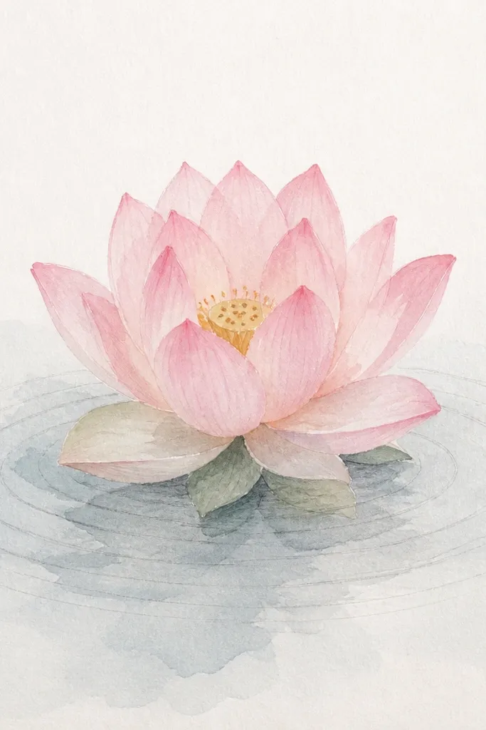
This mixed look is clean because the ripples are controlled in pencil, then watercolor adds mood behind them. I use graphite ripples instead of ink so they stay lighter and don’t fight the lotus. The lotus is painted with soft pink, and the water wash is pale blue-gray, leaving the graphite ripples visible. It’s a great option when you want a sketchbook style that still looks intentional.
Sketch the lotus petals and seed pod first. Paint the lotus in light pink and let it dry. Without erasing the pencil guides, draw ripple lines beneath the lotus using a 2B pencil — keep them thin and slightly curved. Add a light watercolor wash over the water area, but don’t fully cover the pencil lines; leave them readable. Paint the reflection as a faint watercolor glaze under the petals, then lightly blend it so it fades into the wash. Stop once it looks soft — too many layers will darken the graphite.
Use a kneaded eraser to lift a few ripple highlights so the water looks glossy.
Avoid thick graphite. Dark pencil ripples make the water look dirty.
16. Lotus on Ripple Paper Background (Pattern Through Water)
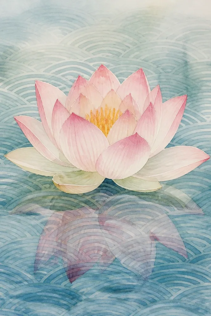
If you’re making decor, this one looks great because the background pattern stays consistent. You draw ripple lines across the whole water area first, then glaze a translucent wash on top so the pattern shows through. The lotus becomes the focal point because it’s painted with stronger color, while the water stays patterned and calm. It’s also forgiving — if your reflection isn’t perfect, the pattern still sells the water idea.
Start by drawing ripple lines across the lower half of the page using a fine liner. Keep the spacing consistent and vary line thickness slightly for realism. Paint a very light watercolor wash over the patterned area — pale blue-gray with plenty of water so the lines show through. Paint the lotus petals above, using light pink and darker edges. For the reflection, lightly glaze pink under the lotus but keep it translucent so the ripple pattern reads through. Add a few crisp highlight strokes with white gel pen on top of the ripples near the lotus.
Make the background ripples slightly lighter than you think — they should support, not dominate.
Don’t outline the lotus reflection too sharply. Let it fade into the patterned water.
17. Lotus with Side Lighting and Strong Edge Highlights
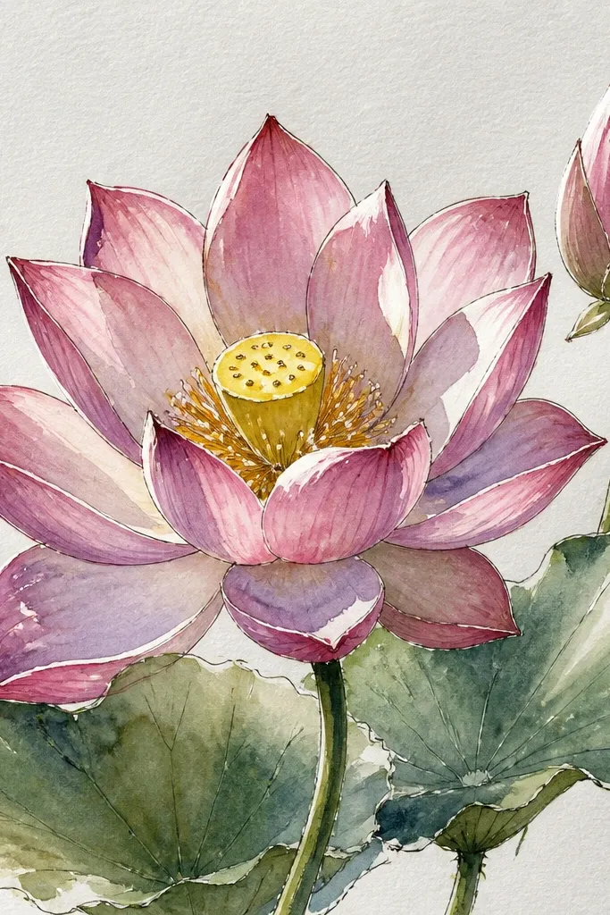
Side lighting makes lotus petals look sculpted. I pick a single light direction and commit — it’s the easiest way to avoid random shine. The left edges get bright highlights, and the reflection under those petals is slightly stronger too. The water ripples are drawn with lighter lines on the highlight side and darker lines on the shadow side. This style looks especially good when you’re using colored pencil or gouache because you can control highlight placement precisely.
Good to knowPick one highlight size and reuse it. Consistent highlight thickness looks expensive.
Sketch the lotus with a clear left-right petal orientation. Paint petals in light pink, then add a darker pink wash on the right side of each petal. Use white gel pen or a thin white gouache line to mark highlights along the left petal edges. For the water, wash a pale blue-gray base, then draw ripple lines that are lighter on the left side and darker on the right side. Paint the reflection under the lotus by mirroring the petal shapes, but keep it brighter on the left and fade it quickly to the right. Finish with two longer highlight strokes across the reflection to match the strongest ripple crests.
Common mistakeAvoid adding highlights on every edge. That flattens the form.
18. Lotus with Green Leaves Floating Around (Waterline Drama)
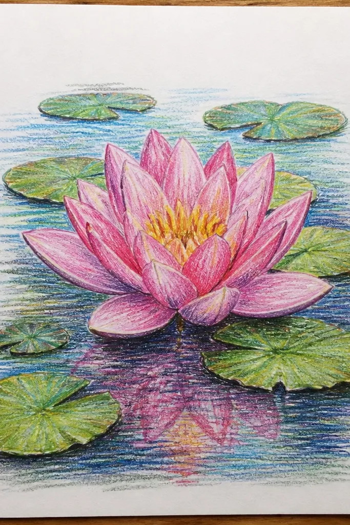
Leaves give you real obstacles, and obstacles make water look believable. I paint leaves in two greens: olive for the base and slightly cooler green-blue for the underside shadow. The lotus stays pink and bright so the scene has contrast. The reflection is partial because leaves block the surface — that interruption is what makes this look like a real moment, not a staged illustration.
Sketch the lotus in the center, then add 3-5 leaf shapes around the lower half of the page, some touching the waterline. Paint leaves first with olive green, then add a darker underside shadow along one edge. Paint the lotus on top, then wash the water area in pale blue-gray. For ripples, draw curved lines that bend around leaf edges; keep ripple lines tighter near leaves. Paint the lotus reflection under the bloom but stop it where leaves overlap — instead, leave a faint blur at those overlap zones. Add a few white highlights on leaf edges and on ripple crests near the bloom.
Use a small round brush to pull leaf veins. Two or three veins look better than ten scribbles.
Don’t let leaves float without a shadow. A soft shadow makes them sit on the water.
19. Lotus in Water with Bubble Rings and Tiny Airy Highlights
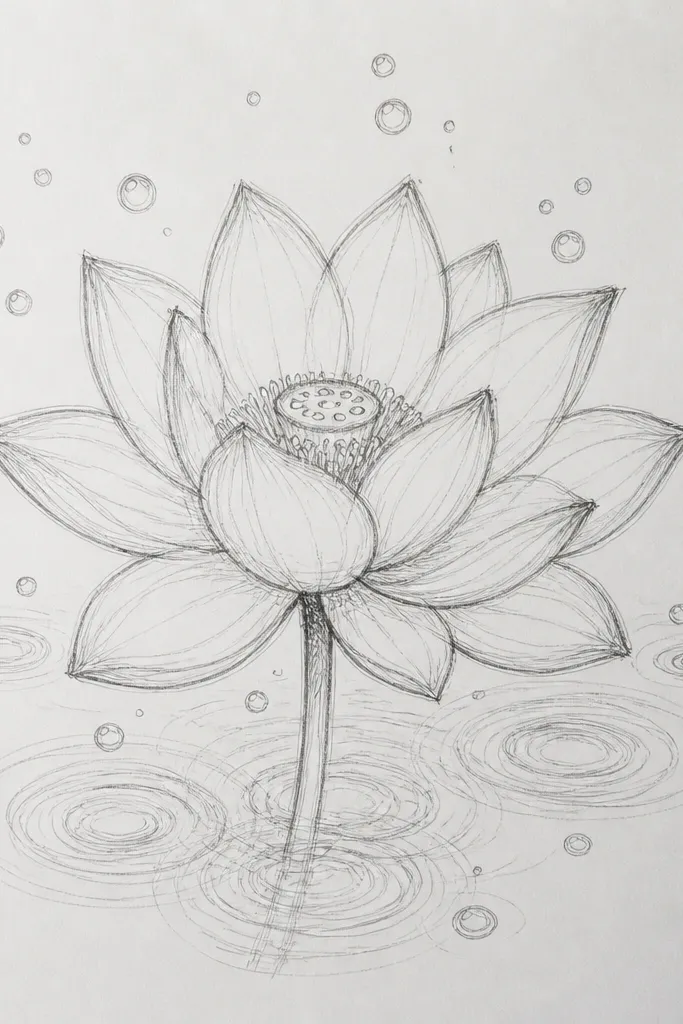
Bubble rings add whimsy while keeping the water structure simple. I use very small circles and let them fade as they spread, so the surface feels lively. The lotus petals stay smooth and soft, and the bubble highlights give you a reason to add white sparkles without overdoing the reflection. This style is perfect for greeting cards and small wall pieces because it’s detailed but still readable.
Paint the lotus petals in pale pink and add a warm seed pod center with a few dot marks. Wash the water area in light blue-gray. Under the lotus, paint a faint reflection — keep it lighter than you think. Then draw 6-10 bubble rings across the water: tiny circles with a second, larger ring around each. Add sparkle dots by placing 10-15 tiny white dots with a gel pen, but only on the ripple crests and near the reflection edge. Finish with one soft ripple arc behind the brightest sparkle cluster.
Keep bubble rings smaller than the seed pod. If they’re bigger, they steal the show.
Don’t draw thick bubble outlines. Thin, fading rings look like air, thick rings look like coins.
20. Lotus with Sunset Pink Water Gradients and Gentle Ripples
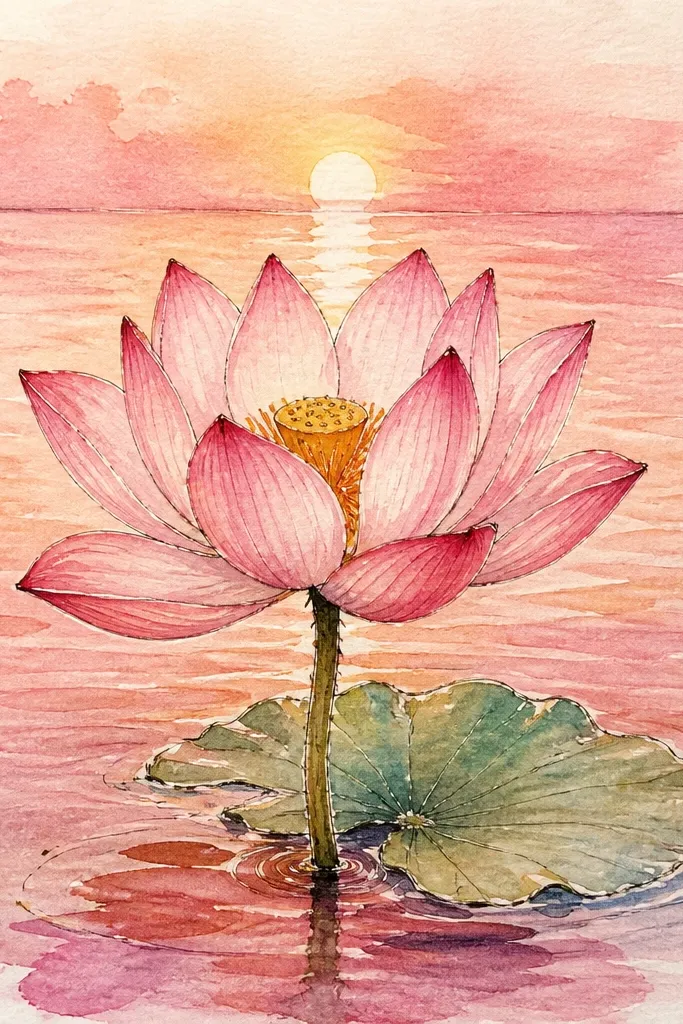
Color gradients make water feel dimensional even with simple ripple lines. I paint a sunset palette: peach near the top of the water, lavender in the middle, and pale blue at the bottom. The lotus stays pale pink so it doesn’t fight the background. This style looks great for home decor because it has a warm-to-cool transition that feels cozy.
Good to knowBlend from one color to the next while it’s wet. Hard bands look like paint spill marks.
Sketch the lotus and paint petals in pale pink with slightly darker creases. Let it dry. For the water, wet the top of the water area lightly and blend in peach watercolor, then fade into lavender, then into pale blue at the bottom. While the wash is still slightly damp, pull a few gentle ripple arcs using a diluted gray-lilac, keeping them spaced far apart. Paint the reflection under the lotus with diluted pink glaze, then blend it softly so it matches the background gradient. Add two or three white highlight strokes across the reflection where the ripple arcs are strongest.
Common mistakeAvoid using straight black or dark purple in the water gradient. It makes the scene look bruised.
21. Lotus with Water Droplets on Petals and Ripples Below
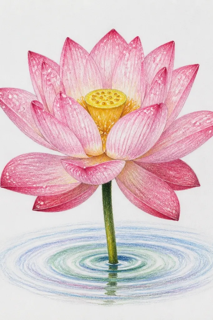
Droplets make the lotus feel fresh and real. I place a few droplets on the outer petal tips and paint them as small translucent teardrops with bright highlights. Then I echo those positions with small ripple rings in the water. This style looks best when you use a fine brush and a steady hand because the droplet shapes are small but high-impact. It’s also a great way to hide imperfect petal edges — the eye goes to the highlights.
Paint the lotus petals in pale pink and add darker pink along fold lines. While still slightly damp, paint tiny droplet teardrops using very diluted paint, then outline the droplet edges with a thin darker pink. Let it dry and add bright white gel highlights inside each droplet. Wash the water area in light blue-gray, then draw ripple rings centered under each droplet. Keep the rings small and thin, with 2-3 rings max per droplet. Paint the reflection as a faint pink under the lotus, then let the ripple lines cut through it a bit so it feels like surface movement.
Use a white gel pen for the final dot highlight — it looks glossy even on watercolor paper.
Don’t add droplets all over the petals. Five well-placed ones look intentional; twenty looks messy.
22. Lotus with Crayon Resist Water Highlights
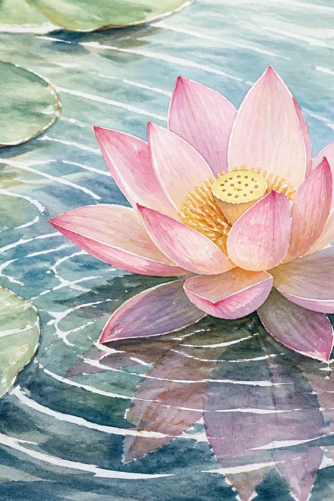
Resist highlights are the quickest way to make water look shiny. I use white or pale crayon to mark ripple crests and a few reflection streaks before painting watercolor over everything. When you wash over the resist, the highlights stay bright and crisp, which reads like light on water. This is a fun technique for beginners because the “mistake” becomes part of the look — the resist lines guide you.
Good to knowUse the side of the crayon for streaks, not the tip. Streaks look like light bands on water.
Sketch the lotus and color the petals lightly with crayon (white or pale pink) where you want highlights. Draw ripple crests and a few reflection streaks in white crayon across the water area. Paint the lotus petals with watercolor, then paint the water wash over the entire water zone using pale blue-gray. After drying, gently rub off any excess crayon so the resist highlights pop. Add a faint reflection under the lotus by glazing diluted pink, but don’t paint over your crayon crests. Finish with two or three ripple lines in a light gray-blue to connect the highlights to the water motion.
Common mistakeAvoid heavy crayon layers. Thick wax can repel watercolor unevenly.
23. Lotus with Pencil Veins and Watercolor Wash Veil
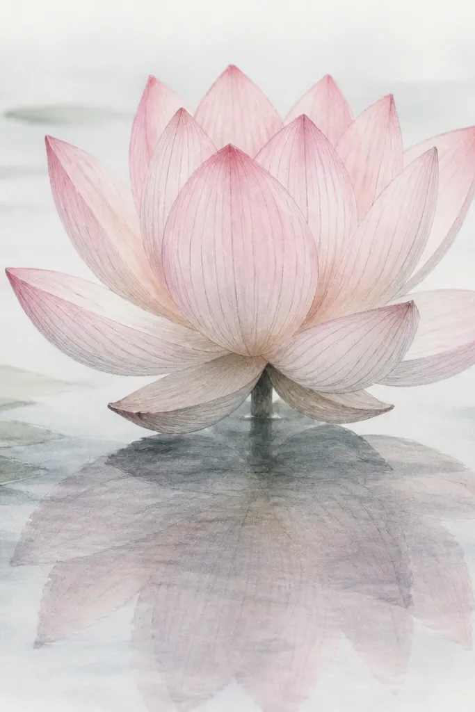
Veined petals look more botanical, and pencil lines are the easiest way to do it without overpainting. I sketch veins lightly, then paint over them with thin watercolor so the veins show as subtle structure. The water stays hazy so the veins don’t get lost. This style flatters readers who like drawing realism but don’t want to spend hours on every ripple — the pencil texture handles part of the detail.
Good to knowKeep your vein lines lighter than you think. Dark veins make it look like a coloring book.
Sketch the lotus petals and add 2-3 vein lines per petal using a light HB pencil. Paint the petals in thin watercolor washes, leaving the vein lines visible through the pigment. Let the lotus dry fully. Wash the water area in very light blue-gray, then add a few ripple arcs with diluted paint so they stay faint. Paint the reflection under each petal with a translucent pink glaze and lightly blend it downward using a damp brush. Add one extra layer of faint pencil lines in the reflection area if you want the water to look slightly textured.
Common mistakeAvoid painting veins with dark paint. Pencil veins look airy; dark paint veins look harsh.
24. Lotus in Tea Glass with Two-Layer Reflection (Glass Thickness)
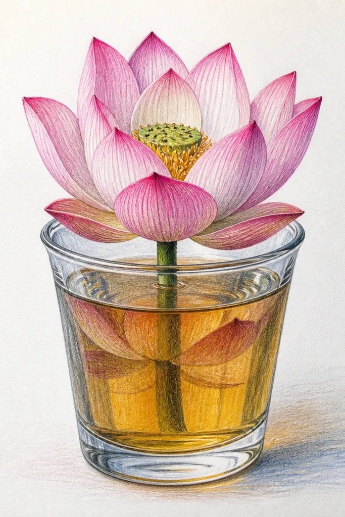
Glass thickness changes how reflections behave, and that’s why this looks more advanced. I draw one clear waterline, then create two reflection layers: a sharper one near the surface and a softer one deeper down. The lotus petals stay crisp so the viewer can tell what’s being reflected. This style looks great for wall art because it has depth cues without needing complicated backgrounds.
Draw a glass outline or at least a clear waterline band across the page. Paint the lotus above the waterline in pale pink with defined edges. Paint the water area under the line in a light blue-gray wash. For the first reflection, glaze diluted pink directly under the lotus and keep it sharper with clearer edges. For the second layer, add an extra softer reflection lower down, faded and slightly darker at the edges. Finally, add 5-7 thin ripple lines that sit mostly in the top reflection layer and fade as they go down.
Make the second reflection 60-70% as dark as the first. Too close in value makes it look copied, not refracted.
Don’t draw two equally sharp reflections. That reads like a mirror, not glass.
25. Lotus with Ripple Rings in One Color Only (Monochrome Study)
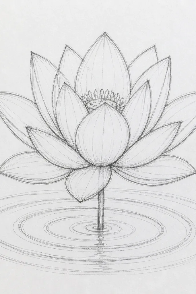
Monochrome studies train your eye fast. When the lotus and water use the same color family, you focus on value and edge control instead of chasing pigments. I like gray-purple because it looks calm and still has enough contrast for shadows. The lotus petals stay soft, while the ripple rings are drawn as thin circles that fade outward. This style is forgiving on cheap paper because you can keep everything in one wash tone.
Good to knowUse a single brush for ripples and reflection so line behavior stays consistent.
Sketch the lotus and seed pod. Mix a gray-purple wash and paint the petals in light value first, then add darker edges along folds. Let it dry. Wash the water area with an even lighter gray-purple. Draw ripple rings under the lotus using a fine brush, keeping rings thin and spaced so they don’t overlap heavily. Paint the reflection as a faint mirrored shape under each petal, then fade it with a damp brush so it blends into the wash. Add two or three highlight dashes with white gel pen to finish the sheen.
Common mistakeAvoid adding a second color for “interest.” Monochrome only works when you commit.