
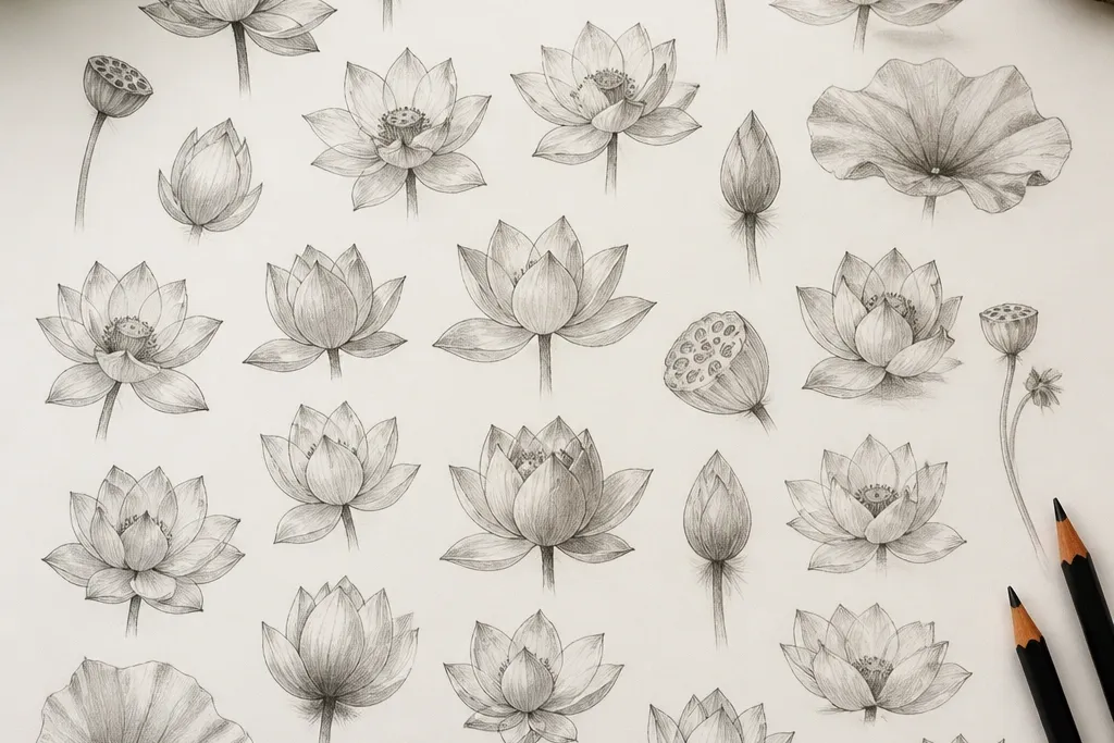
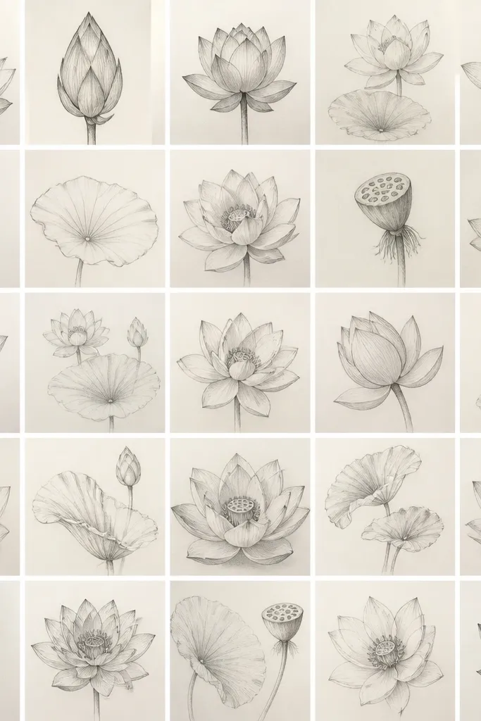
1. Single bud lotus in a 3-petal rhythm
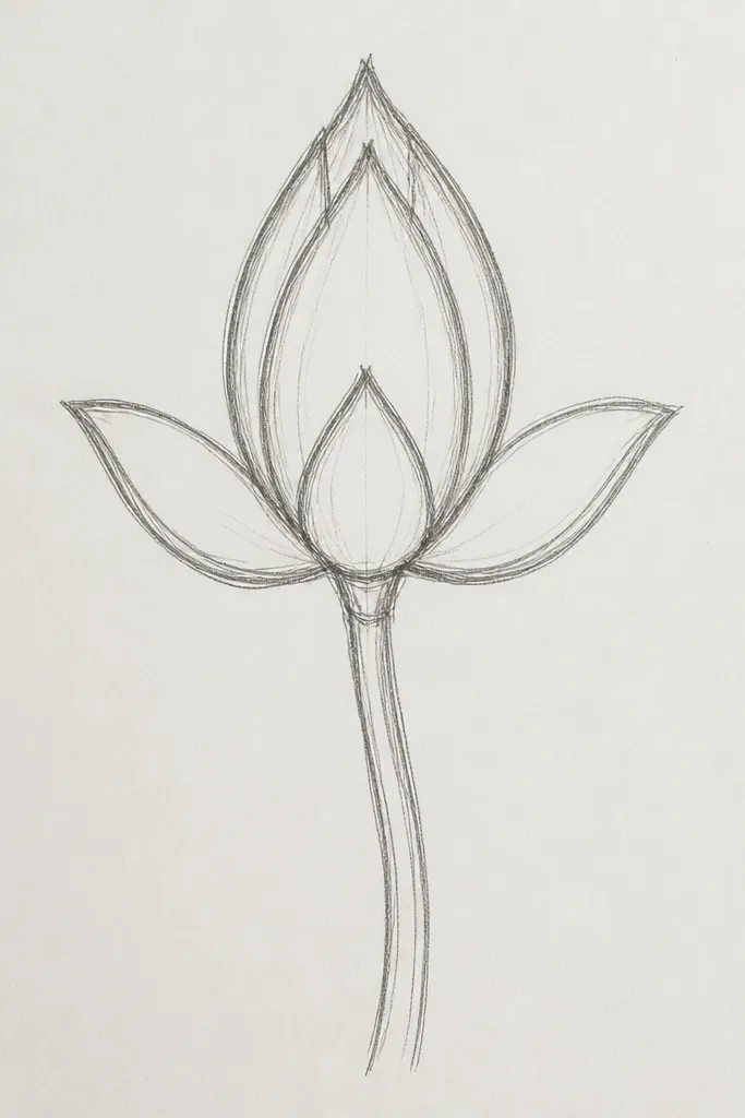
This sketch is the one I start with when I want the flower to look calm and “clean.” The bud sits high in the page with three main petals, so your eye reads the shape instantly. Use a cool off-white pencil for the petal faces and a darker gray for the fold where petals overlap. It works especially well for small paper, like 4x6 cards, because the negative space around the bud makes it feel intentional. If your drawings often look stiff, the simple petal rhythm here helps you keep curves consistent without overthinking dozens of tiny lines.
Start by placing a small oval for the bud center, then add one curved petal on the left and one on the right, each with a slightly thicker outer edge. Finally, add the third petal behind them so the overlap creates a natural “V” shadow near the base. Shade the inner fold under each petal with a light 2B pencil — keep the shading narrow, like a shadow strip. Leave the outer petal face mostly unshaded so the flower stays airy. Finish with a soft line at the bud tip so it looks rounded, not pointed.
When you shade the overlap, stop after 1/3 of the petal width so the bud still looks glossy instead of muddy.
Don’t outline every petal crease — too many dark lines make it look like a coloring book.
2. Top-down lotus with 12 petals and soft value
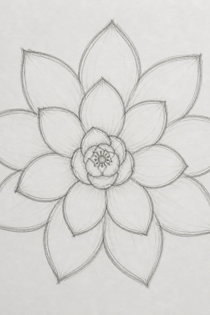
A top-down view is a cheat code for symmetry. You get a clear petal count you can repeat, which makes it easier to draw the same lotus shape again and again. The center looks like a shallow bowl, so the darker tone goes only under the petal overlaps, not across the whole petal. I like this for practicing control because you learn how to make a circle feel dimensional using only pencil values. For people with warmer skin tones and cream paper, the graphite softens beautifully and looks natural, not harsh.
Draw a circle lightly, then mark 12 equal petal wedges using quick tick marks. Sketch each petal as a rounded teardrop pointing outward, keeping the base slightly thicker. Shade only the underside near each petal base, leaving the outer rim clean. Add a small circular center dish and a ring of tiny seed dots inside it. Blend the shading with a tissue or blending stump so the gradients stay smooth.
Use a kneaded eraser to lift highlights along the outer petal rims — it makes the top-down view look polished.
Avoid heavy dark shading across the entire petals; it flattens the flower into a dark disk.
3. Side-facing lotus with an S-curve stem
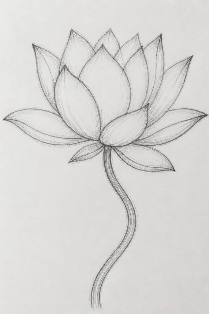
This one looks more “alive” because the bloom is angled, not straight-on. The petals fan out with a clear foreground and background, so your shading can follow the angle. I use it when I want my drawings to look like they’re floating above water. The S-curve stem gives the whole sketch motion, even if the bloom stays simple. It flatters longer compositions — tall sketchbooks, bookmark art, and narrow frames — because the stem pulls the eye upward. If your lines usually look shaky, the stem curve gives you a single guided motion to copy.
Start with the S-curve stem using a light guideline line, then place the bloom base where the curve tightens. Draw the first foreground petal closest to the viewer, then add two side petals that overlap behind it. Finally, add the back petals thinner and lighter so they recede. Shade the underside of the foreground petals with 2B, and keep background petals in lighter HB graphite. Add a few seed dots in the center dish to anchor the tilt.
Good to knowMake the foreground petal lines slightly darker than the background lines — it sells the angle instantly.
Common mistakeDon’t draw the back petals with the same darkness as the front; it kills the 3D tilt.
4. Lotus bloom with a dotted seed spiral
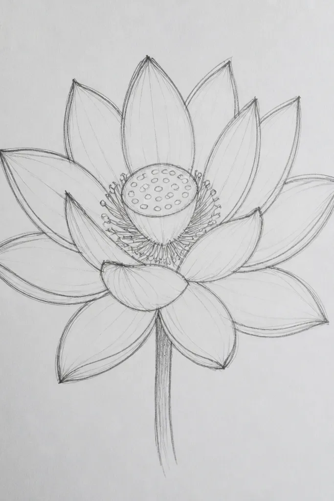
The dotted spiral center is what turns this from “pretty outline” into “finished.” The spiral creates a sense of depth without needing heavy realism. I like this sketch when I’m practicing texture — the dots are small, but their spacing tells the story. The petals stay clean and slightly translucent, so the center becomes the focal point. This style looks great for small art pieces because the center pattern reads even when the petals are simplified. On warmer-toned paper, the graphite dots look like soft seed pods instead of dirty specks.
Outline the outer petals first, using 0.5 fineliner for crisp edges. Keep the petals spaced so you can shade only at the overlap. Draw a shallow oval center dish, then place a spiral of dots starting near the edge and winding inward. Shade the petal bases with pencil and blend lightly, but keep the center dots unshaded except for a few darker clusters. Add a tiny highlight at the top of the bud fold using an eraser.
Good to knowUse a sharpened mechanical pencil for dots so the size stays consistent across the spiral.
Common mistakeDon’t overfill the spiral — too many dots make it look like noise instead of a structured seed pattern.
5. Lotus flower frame for greeting cards
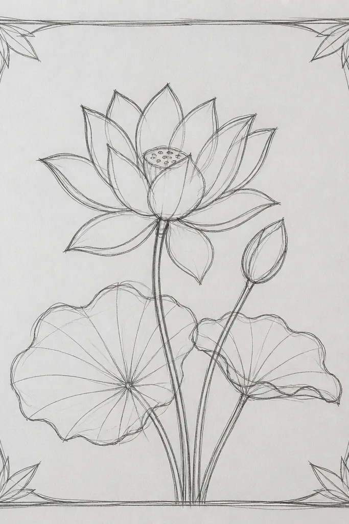
This sketch is built for using as a card front or wall print. The lotus sits centered, and the side leaves act like visual handles that keep it from feeling lonely. The border line gives you a ready-to-letter layout for a name, date, or short quote. I like this for making DIY stationery because you can scan it, print it, and color it later without redesigning the composition. It looks best on A6 or 4x6 formats where a central focal point matters more than tiny detail.
Draw a thin rectangle or card-safe frame margin lightly, leaving about 1/2 inch around the edges. Sketch the lotus bloom in the center with 8-10 petals, then add two leaves on each side angled slightly inward. Shade only the overlap folds at the petal bases and keep the border line unshaded. Finally, add a few small leaf veins using short curved lines so the border doesn’t look flat. Darken the outer petal outlines last so the bloom pops against the frame.
If you plan to write text on top, keep your center shading lighter so the ink doesn’t fight the graphite values.
Don’t push the border line too dark; it competes with the lotus and makes cards look cluttered.
6. Lotus mandala with 16 petals and inner rings
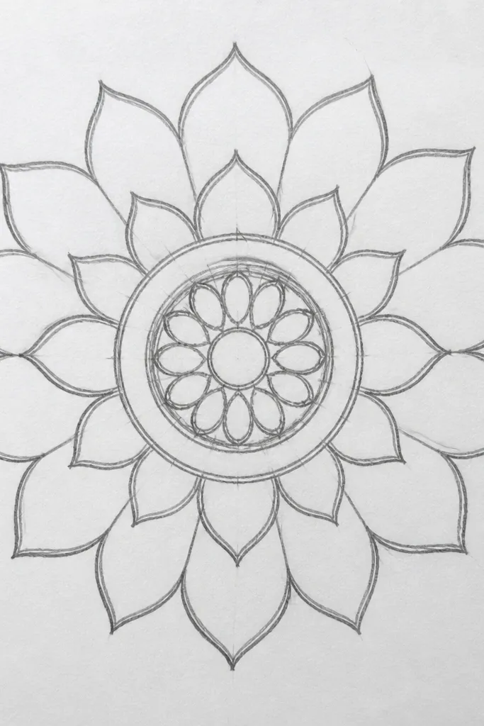
This is the lotus sketch I pick when I want “decor” energy without messy complexity. The inner rings guide your hand and keep symmetry under control. You get depth by making the outer petals darker and the inner rings lighter, almost like a graded halo. The center arcs create movement, so the piece feels finished even if you only use pencil shading. It’s flattering for anyone who struggles with drawing too many tiny details — you repeat the same motif in rings. Use it for prints, stickers, or coloring-in later.
Start with a faint circle, then draw 16 petal arcs around it, evenly spaced. Add a second ring of smaller petals nested between the outer ones, keeping their bases aligned to the first ring. Shade the underside of each outer petal overlap with 2B, but keep the inner ring mostly light. In the center, draw a tiny ring and fill it with short curved arcs pointing inward. Darken the outer petals last so the mandala reads from a distance.
Good to knowUse a compass or a drawn coin circle for the outer boundary — it keeps the mandala from drifting.
Common mistakeAvoid random petal sizes; mandalas look cheap when the symmetry breaks.
7. Minimal lotus outline with one shadow band

Minimal lotus sketches are harder than they look because you have to place the one shadow exactly where the eye expects it. This sketch works because it uses one clear overlap shadow band, so your brain still reads the layered structure. I like it for journaling pages where you want decoration without stealing attention from handwriting. It’s also great for beginners because you don’t need to render every petal crease. If your drawings look too dark, this style teaches restraint and keeps the paper clean.
Draw the outer silhouette with a light fineliner, keeping the petal edges thin and consistent. Add the inner bud and 2-3 overlap petals so the structure is clear. Leave the petal faces blank. Then add a single shaded band under the overlapping petals with a soft pencil and blend just the edge. Finish with one or two tiny center lines so the bud doesn’t look hollow.
Good to knowUse a single pencil for the shadow band so the gray tone stays uniform.
Common mistakeDon’t add extra shading “just because” — one shadow is the point here.
8. Lotus with watercolor-wash petals over pencil
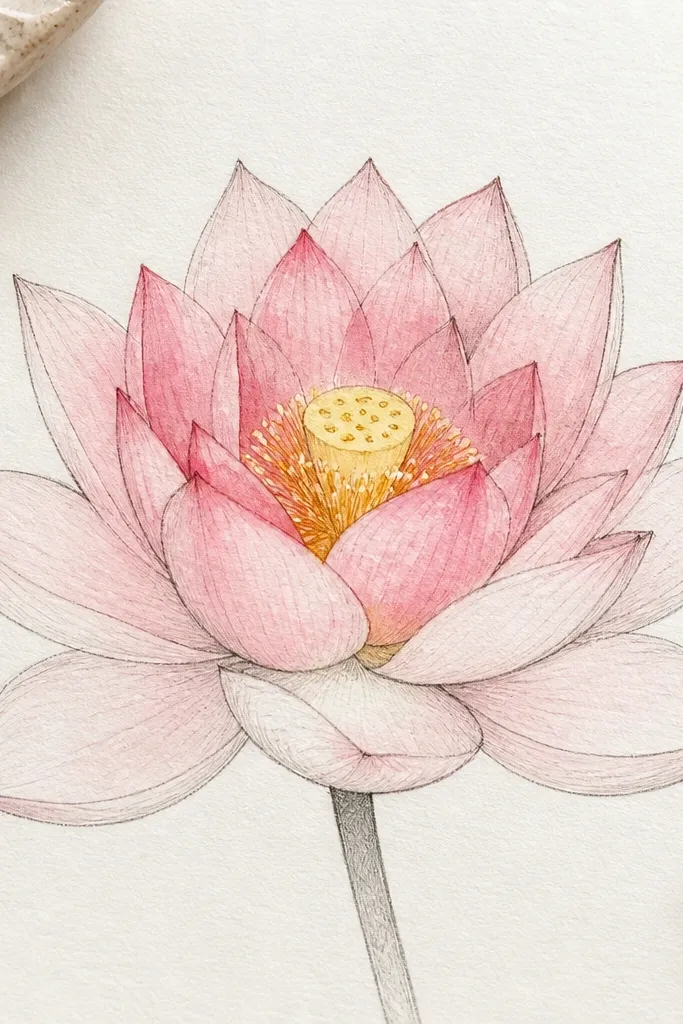
This one is for when you want your drawing to look painted but still controlled. The pencil outlines tell the shape, while the watercolor wash gives the petal softness. I’ve used this approach with inexpensive pan watercolors: pale blush for outer petals, a richer rose only at the overlap folds, and a warm yellow for the center dish. The result looks good on off-white paper because the wash doesn’t sink too much. It also flatters people who like gentle color — it doesn’t turn neon or muddy. The key is to keep the wash light and let the paper show through.
Start by drawing the lotus in pencil with clear petal overlaps and a defined center dish. Then wet only the petal faces lightly with clean water using a round brush, avoiding the overlap shadows. Apply pale pink wash to the outer petals and a slightly stronger rose to inner petals near the folds. While it’s still damp, drop a tiny warm yellow in the center dish and a few seed dots. Let it dry fully, then go back with fineliner for crisp edges.
Good to knowPaint the outer petals first, then wait for them to dry before coloring the inner petals so edges stay sharp.
Common mistakeDon’t flood the paper; over-wetting makes the outlines bleed and the lotus looks blurry.
9. Lotus flower with ink crosshatch shading
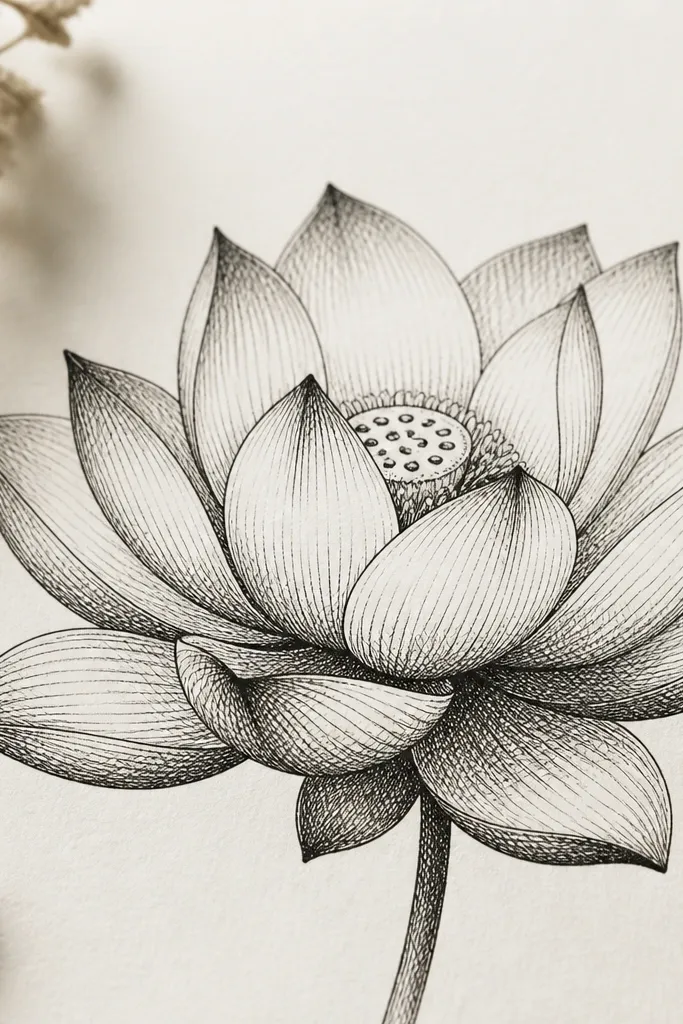
Crosshatching is the fastest way I know to make a lotus look dimensional without color. The folds darken in a believable way because the hatch lines follow the petal curve. This sketch looks bold and prints clean on textured paper. I use it when I’m making wall art or a zine page, because the black ink has a strong focal contrast. It also suits people who like graphic styles more than soft pencil shading. The center can stay simpler, so your attention stays on the petal volume.
Draw the lotus outline with fineliner first, keeping the petal edges smooth and curved. Add the inner bud and overlap petals, then leave the petal faces blank. Start crosshatching only under each petal fold, with lines curving slightly to match the petal. Increase hatch density at the overlap junctions, and keep outer rim hatching light. Finally, add a small ring of dots or short lines in the center dish for texture.
Good to knowRotate your page slightly while hatching; it keeps the hatch lines consistent and prevents accidental stripes.
Common mistakeDon’t hatch the entire petal face evenly; it flattens the form.
10. Lotus bud and half-open flower in one sketch
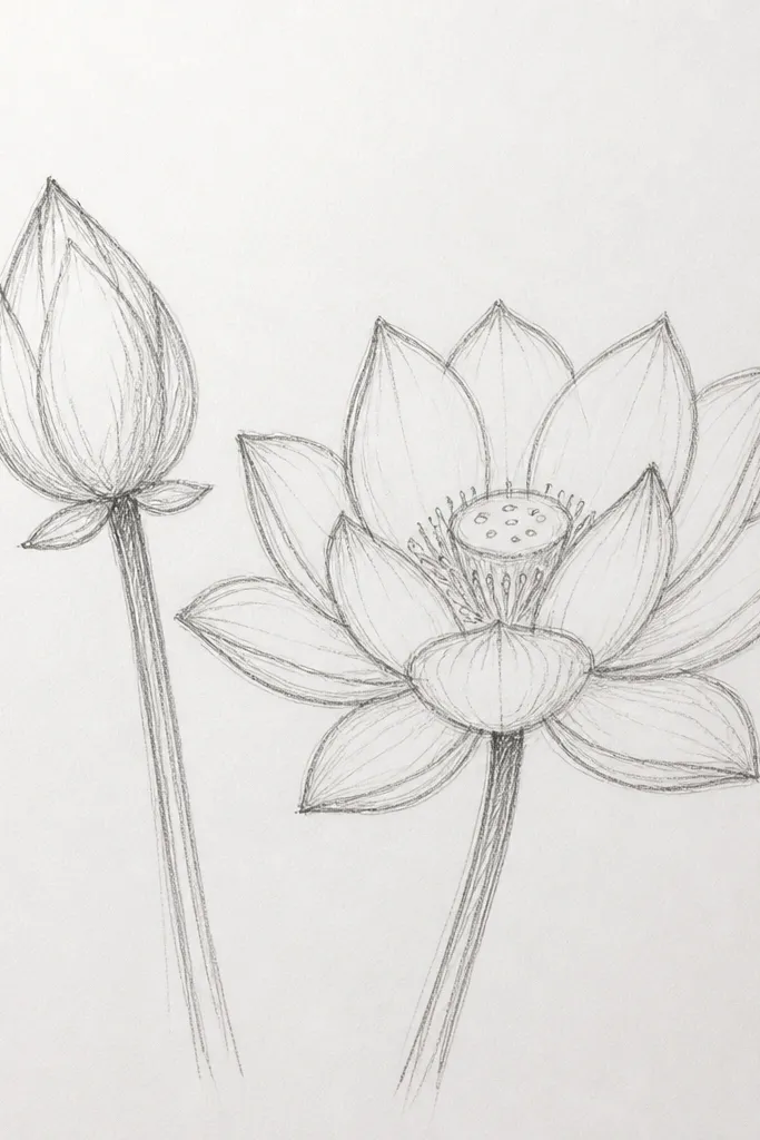
This composition teaches progression. A bud has tight folds and fewer visible petals, while a half-open bloom shows petal thickness and overlap edges. Drawing both in one sketch helps you understand how the petals “unfold” from the center. I like it for practicing the same hand motion in two different stages. It also looks good for seasonal decor — like a spring card where one bloom is just starting. If you struggle with drawing petals from different angles, this pair forces you to vary your curves deliberately.
Sketch the bud first: draw a small oval center and 3-4 petals wrapped around it. On the right, draw the half-open bloom with larger outer petals that arc outward and reveal the center dish. Keep the bud’s petals narrower and more tightly overlapped. Shade the fold areas: darker under the bud’s inner wraps and darker at the overlap points of the half-open petals. Add a few seed dots only in the half-open center so the contrast makes sense.
Good to knowUse the same line thickness for both blooms, then vary shading only — it keeps the pair looking cohesive.
Common mistakeDon’t add fully open petals to the bud side; it defeats the learning purpose.
11. Lotus with long droplet leaves and hanging stems
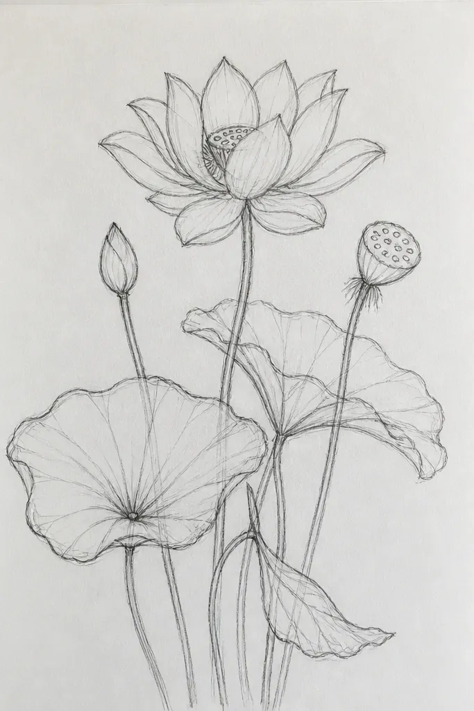
Droplet leaves make the whole drawing feel like it’s floating on water. The lotus sits above, and the leaves create a natural frame that guides the viewer’s eye back to the center. I like this sketch for wall decals and bookmarks because the downward leaf shapes add length and balance. It also gives you a place to practice leaf veins without turning the whole page into a leaf-drawing project. If your lotus centers look too small, the hanging leaves visually stretch the composition so the bloom reads bigger.
Draw the lotus bloom first, then place the droplet leaves on either side with their tips pointing down. Sketch each leaf as an elongated teardrop with a central vein line, then add 3-4 curved side veins. Keep leaf shading minimal: just a faint gray under the central vein and near the leaf base. Shade the lotus overlap folds lightly, focusing on the underside petals. Finish with a few tiny stem lines connecting leaves to the bloom.
Make leaf veins lighter than the lotus fold shadows so the flower stays the main subject.
Avoid dark outlines on leaves; thick leaf borders make the drawing look cartoonish.
12. Lotus in a circle medallion with bead dots
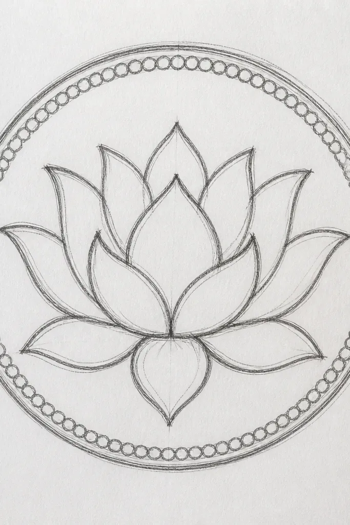
This is a decorative sketch that feels finished even if you don’t add color. The bead dots create a jewelry-like border and make the lotus look intentional, like it belongs on a pendant design. The center ring of circles adds texture without clutter. I’ve used this layout for printable stickers and it works because the medallion crops clean. It flatters small formats because the circle holds the composition together. If your drawings need a “container” to look intentional, this does that without extra work.
Draw a circle for the medallion, then sketch the lotus in the center with 10-12 petals. Add a center dish and a ring of tiny circles inside it. Shade the overlap folds with pencil, keeping the petal faces mostly light. Now add bead dots around the outer circle — place them evenly, touching the circle edge. Darken the lotus outline slightly more than the bead dots so the border doesn’t steal attention.
Good to knowUse a ruler to place the bead dots evenly, then remove pencil lines with an eraser after inking.
Common mistakeDon’t make the bead dots large; oversized dots make it look like a cheap stamp.
13. Lotus flower with pencil stipple texture
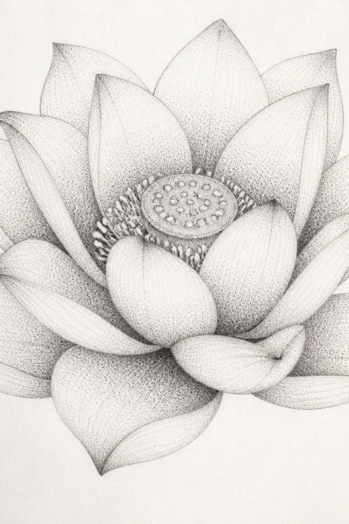
Stippling gives you texture without heavy graphite smears. This sketch is great when you want a clean look that still has depth. The stipple density is the whole trick: light dots on the outer petals, dense dots under each fold. I love this for paper that has a bit of tooth, because the dots catch the surface and look crisp. It also works well for monochrome wall art where you want detail but no color mixing. If you tend to over-shade with pencils, stipple teaches you to build darkness slowly.
Outline the lotus petals lightly so you can erase guides later. Add overlap folds and a simple center dish. For shading, start with sparse stipples under each petal fold, then add more dots only where the petals overlap more. Keep the outer rim nearly blank, just a few dots to suggest thickness. Finish by stippling the center dish more heavily and adding a few brighter highlights with an eraser.
Good to knowUse a harder pencil like HB for the first stipple pass, then switch to 2B for the densest overlap areas.
Common mistakeDon’t scribble stipples in random directions; loose scribbling looks grainy and unfinished.
14. Lotus bloom with shaded inner veins
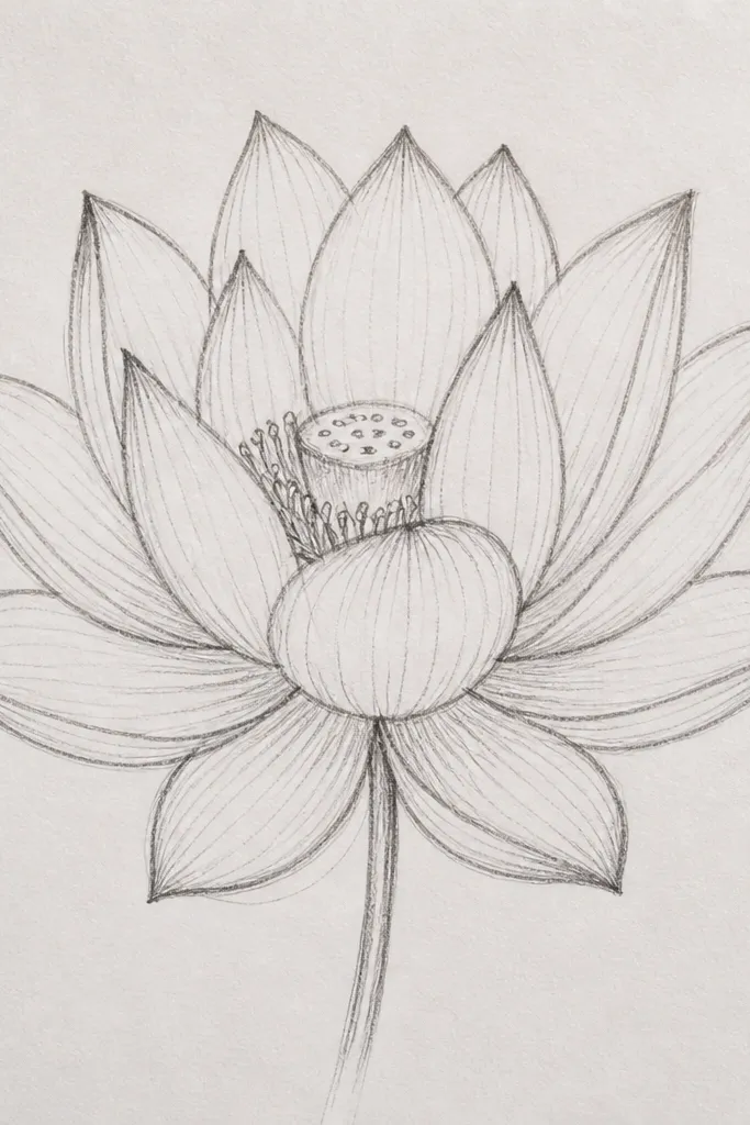
Veins make petals feel like leaves, not paper. This sketch still stays clean because the veins are subtle: one central vein line and a soft shaded strip near the overlap fold. I like it for botanical-style drawings because it gives a realistic texture without turning into a full science illustration. The center lines keep it from looking like a blank bowl. This style works well for medium paper sizes where you can see the vein detail. If you have a steady hand, the veins look delicate and give the whole bloom a gentle, airy feel.
Sketch the lotus outline with petal layers, then draw a single vein line down each petal from base to tip. Add overlap folds and shade only the underside near each base, using a light-to-medium pencil. Keep the vein lines thin and darker than the petal face, but lighter than the overlap shadow. Shade the center dish with a soft gradient and add a few seed dots along the inner ring. Finally, reinforce the outer petal edges with a slightly darker pencil so the flower reads clearly.
Good to knowErase tiny vein guideline marks after shading so the veins stay crisp instead of smudged.
Common mistakeDon’t add multiple vein branches to every petal; it gets busy fast and looks amateur.
15. Lotus in a square frame with corner blooms
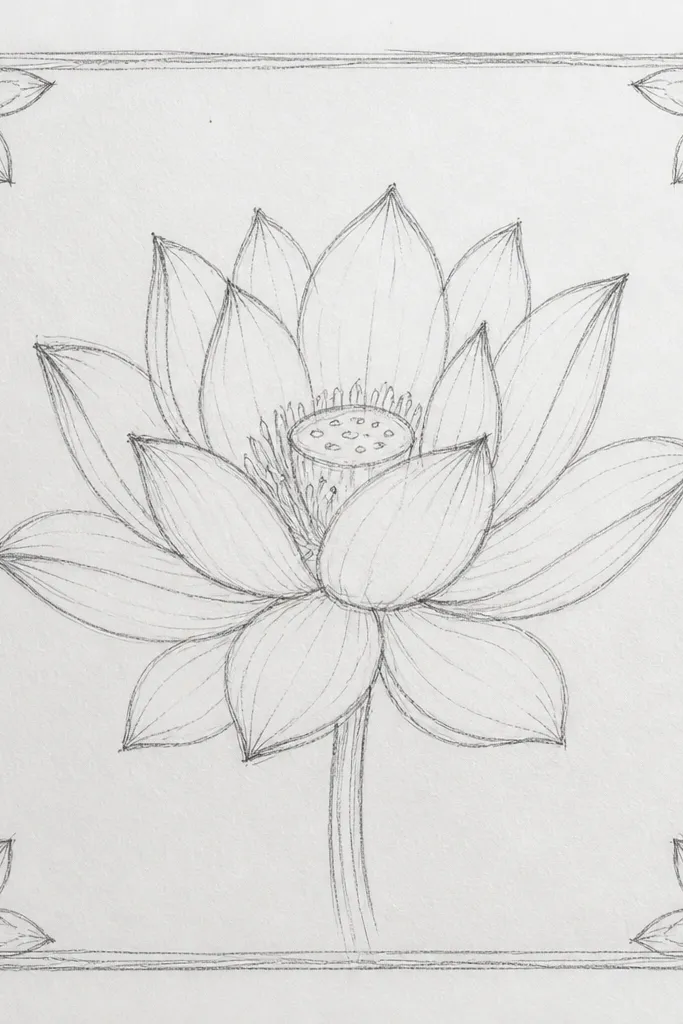
Square frames are great because they make your drawing look like it belongs on a planner page, a fabric panel, or a ceramic tile pattern. The mini corner blooms give you that repeating rhythm without needing to draw a full background pattern. I use this when I’m designing decor where the center needs to be strong, but the corners can still look decorative. The center lotus can carry the shading, while the corner blooms stay lighter. It flatters clean layouts and makes your art look organized even if you’re using simple materials.
Draw a square border with a margin inside it so the lotus doesn’t touch the edges. Sketch the center lotus with 8-12 petals and add overlap shading at the folds. Now add four mini lotus outlines in the corners — keep them smaller, with only 5-7 petals each. Shade the corners very lightly, just at the base folds, or leave them unshaded. Add tiny center dots to each mini bloom so the corners match the center’s style.
Good to knowMatch the petal shapes across all five blooms so the set looks intentional, not like five unrelated drawings.
Common mistakeDon’t make corner blooms as detailed as the center; it makes the layout feel crowded.
16. Lotus bloom with metallic-gold gel pen highlights
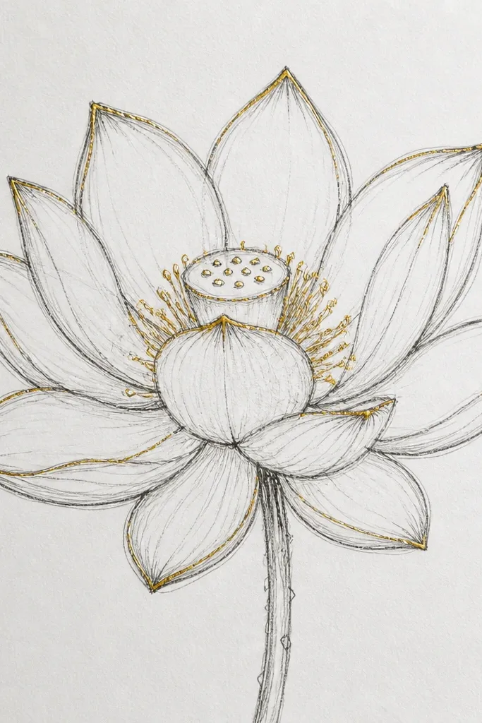
Metallic highlights make a lotus look like it’s lit from within. This sketch is the one I do when I want a finished piece that looks like I spent money on supplies. The trick is to keep the metallic gold limited to a few high-contrast spots: outer petal edges, the center dots ring, and a couple of overlap highlights. The rest stays in pencil/ink so it doesn’t turn into a glitter mess. It looks great for holiday cards and small gifts because gold draws attention fast. For people who love warm tones, this also flatters cream paper and beige sketchbooks.
Start with a clean lotus outline in fineliner and add pencil shading only under the overlap folds. Shade the center dish lightly, then draw a ring of dots inside it. Use metallic gold gel pen to trace only the outer petal edges and the top rim of the overlap folds. Add gold dots in the center ring and two short gold highlights on the inner bud. Let the gel pen dry fully before smudging anything nearby with your hand.
Test the gold gel pen on scrap paper first; some brands need a second pass to look even.
Don’t outline every petal in gold; it looks like costume jewelry instead of a refined highlight.
17. Lotus with wet-on-wet watercolor center glow
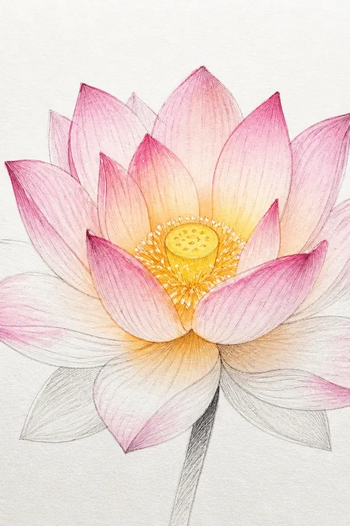
This sketch is about atmosphere. The center glow creates a gentle bloom effect that makes the petals look like they’re absorbing light. The outer petals stay cooler and lighter so the warm center stands out. I use it when I want the lotus to feel dreamy but still readable. It looks good on thicker watercolor paper because the wet-on-wet edges stay soft instead of tearing. If you’re the type who worries watercolor will ruin your drawing, this design keeps most of the color concentrated in one area.
Draw the lotus in pencil, then erase any harsh lines so watercolor doesn’t look gray. Wet the inner petal faces with clean water using a small brush, keeping the outer petals dry. Drop warm yellow into the center dish area, then blend a pale orange outward just a few millimeters. Let the wash bleed slightly into the inner petals, but keep the outer petal edges crisp by painting around them. After it dries, use pencil or fineliner to reinforce the petal overlap folds.
Keep paper flat and dry between layers; any shift makes the glow smear unevenly.
Don’t paint the whole flower wet; the edges will go mushy and the lotus loses its structure.
18. Lotus with bold marker outline and light gray fill
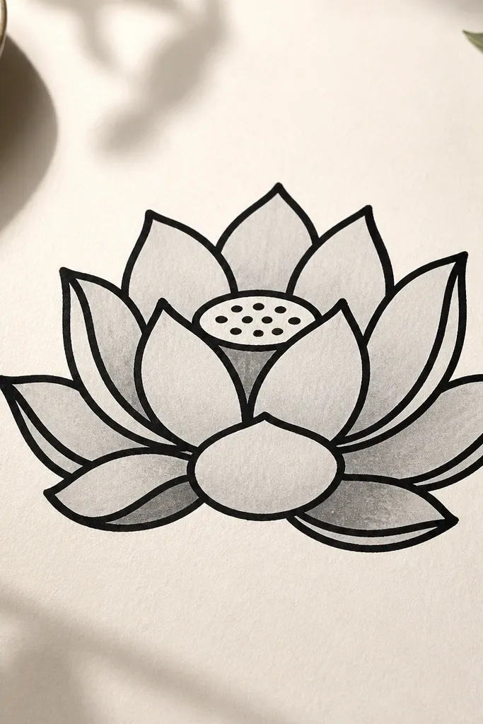
This is a high-contrast style that looks good fast. Thick marker outlines keep the lotus readable at a distance, while light gray fill keeps it from looking like a cartoon sticker. I use it for DIY decals and printable labels because the outlines scan clean. It also works well if you have shaky pencil lines — the marker straightens the overall look. For darker skin tones on printed paper, the black outline pops without looking harsh because the fill stays light. It’s also forgiving: you can redraw petals without worrying about tiny perfection.
Sketch the lotus in pencil first, then ink the outer petal silhouette with a bold marker. Fill the overlap folds with darker gray using a soft marker or pencil, but keep the rest of the petal faces near white. Add a center dish with a few seed dots and a short curved line to suggest depth. Reinforce only the outermost petal edges with marker so the interior stays lighter. Finally, add a tiny highlight on the top overlap where light would hit.
Good to knowUse a kneaded eraser to lift pencil lines before marker so the ink stays crisp.
Common mistakeAvoid filling the petals with medium gray everywhere; it turns the lotus into a flat blob.
19. Lotus with ribbon-like petals and thin ink lines
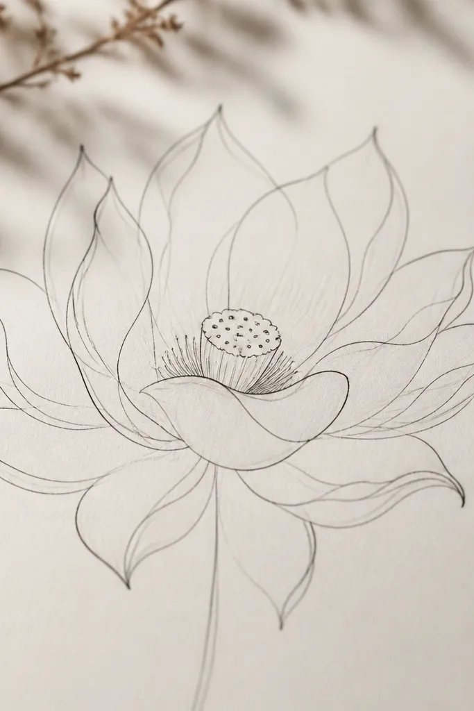
Ribbon petals look elegant because they imply motion. This sketch uses thin lines and minimal shading so the lotus feels airy instead of heavy. I like it for decorative backgrounds where you’ll later add color or pattern. It flatters people who draw with pen more than pencil because it doesn’t demand heavy shading. The center stays light, so the petals carry the design. If you want a lotus that looks modern and graphic, this is the style.
Draw the outer petals with thin fineliner, keeping them longer and slightly wavier than a realistic lotus. Add overlap petals behind by drawing fewer lines and leaving more white space. Use a light pencil to shade only the very base of each petal overlap. Draw the center dish as a small oval with a few short curved lines inside. Finish by adding one or two darker outline passes only on the front-facing petals.
Good to knowKeep your petal curves consistent — if one petal is tight and the next is loose, the ribbon effect breaks.
Common mistakeDon’t add lots of crosshatching; ribbon petals should stay light.
20. Lotus with braided texture on the petals
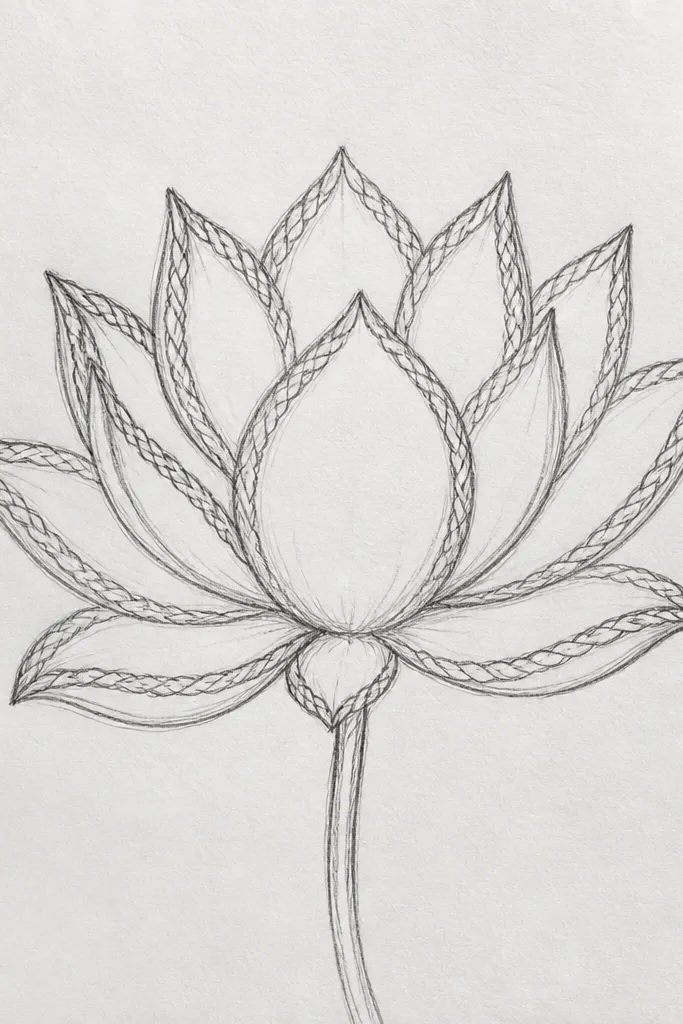
Braided texture makes the lotus feel handcrafted, like it belongs on a woven placemat pattern. The braid lines also help you imply the petal curvature because the lines follow the petal’s direction. I use this sketch when I want my lotus drawings to look more design-oriented and less botanical-realistic. It flatters people who like repeating motifs because the braid pattern is repeatable across petals. The center spiral ties it together so the whole flower reads as one theme.
Outline the lotus petals and add overlap folds with light pencil. For each petal, draw a central curve, then add two sets of small curved lines that crisscross lightly near the fold area. Keep the braid lines lighter on the outer petal faces and darker where petals overlap. In the center, draw a tighter spiral made of small repeating curves. Shade the overlap folds with pencil only where the braid lines meet the fold, not across the entire petal.
Good to knowUse a ruler edge lightly as a guide for spacing braid lines so they don’t drift across petals.
Common mistakeDon’t braid every petal the same density; variation makes it look woven, not stamped.
21. Lotus with a watercolor wash background circle
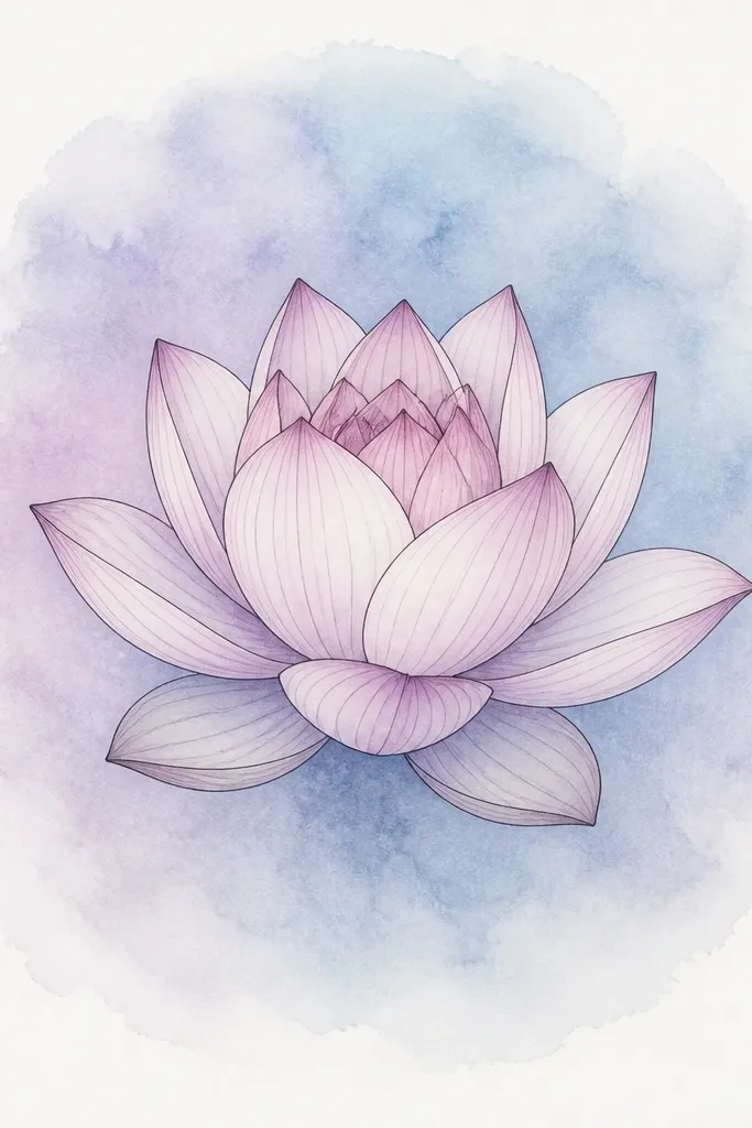
A background wash makes the lotus look like it’s floating, and it’s the easiest way to make your sketch feel like decor instead of a practice sheet. The key is to keep the background pale and keep the lotus edges crisp. I’ve done this with simple pans: pale blue or lavender wash around the lotus, fading to white at the edges. It looks great for wall art because the circle frames the bloom and makes it easier to hang. For people who want a softer aesthetic, the background adds mood without extra line work.
Paint a light watercolor circle behind the lotus first, leaving a clean white halo around the flower. Use pale blue on one side and lavender on the other so the wash looks dimensional. After it dries, draw or trace the lotus on top in pencil, then ink the petal edges lightly. Shade overlap folds with a soft pencil and keep petal faces mostly white. Add a small warm yellow center dish so the lotus reads clearly against the cool background.
Good to knowLeave a 1-2 cm white margin between the wash and your lotus outline so edges stay sharp.
Common mistakeDon’t paint the background too dark; it makes the lotus look like it’s buried.
22. Lotus flower in a glass bowl with waterline
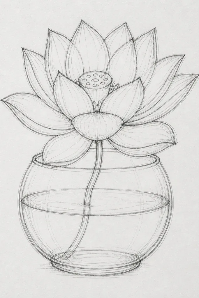
This sketch adds context and depth fast. The waterline gives you a natural reason for lighter shading on the submerged petals, so you learn atmospheric contrast without complex realism. I like it for making drawings that feel like a still-life centerpiece. The glass bowl outline frames the lotus, which makes the center look intentional even if the petals are simplified. It’s great for gift tags and small prints because the bowl silhouette makes the composition easy to crop. If your lotus drawings feel too flat, this forces you to treat the petals differently above and below the water.
Draw a simple bowl outline with a thick rim, then add a curved waterline across the bowl. Place the lotus so the bottom petals touch the waterline. Draw the petals above water with normal line weight and shade the overlap folds darker. For petals below the waterline, use lighter pencil shading and fewer detail lines. Add a subtle reflection line under the rim and a few tiny ripples at the waterline to connect the scene.
Good to knowUse an HB pencil under the waterline so submerged petals look faded instead of muddy.
Common mistakeDon’t keep full detail underwater; it makes the waterline meaningless.
23. Lotus bloom with a centered leaf notch and symmetry guides
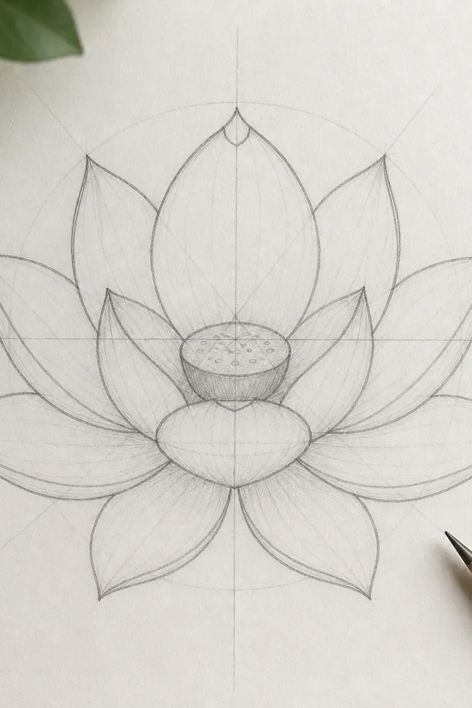
This is the sketch I use when my lotus petals keep drifting out of alignment. The faint symmetry guides show you how to space petals so the bloom doesn’t look lopsided even if your hand isn’t perfect. The centered leaf notch gives a strong focal point at the top, like a little design signature. I like it for practicing structure because it teaches you where to place the top petal relative to the center. It works on any paper size, and it’s especially helpful if you’re drawing from imagination and want the lotus to still look believable. The symmetry also makes it easy to repeat the design for pattern work.
Start by drawing a light vertical guideline down the center, then mark petal spacing points around an oval base. Draw the top petal with a small notch at its tip, then place the remaining petals evenly around it. Keep the petal overlap folds on the same side for each petal so shading stays consistent. Shade the underside folds with a single value — use HB to map the form, then add 2B only at the darkest overlap junctions. Finish by drawing a symmetrical center dish and a ring of seed dots.
After you’re happy with the layout, erase the symmetry guides fully so the final looks intentional, not like a construction sketch.
Don’t shade one side darker than the other without a reason — it makes the lotus look tilted even when it isn’t.
24. Lotus with smoky pencil gradient petals
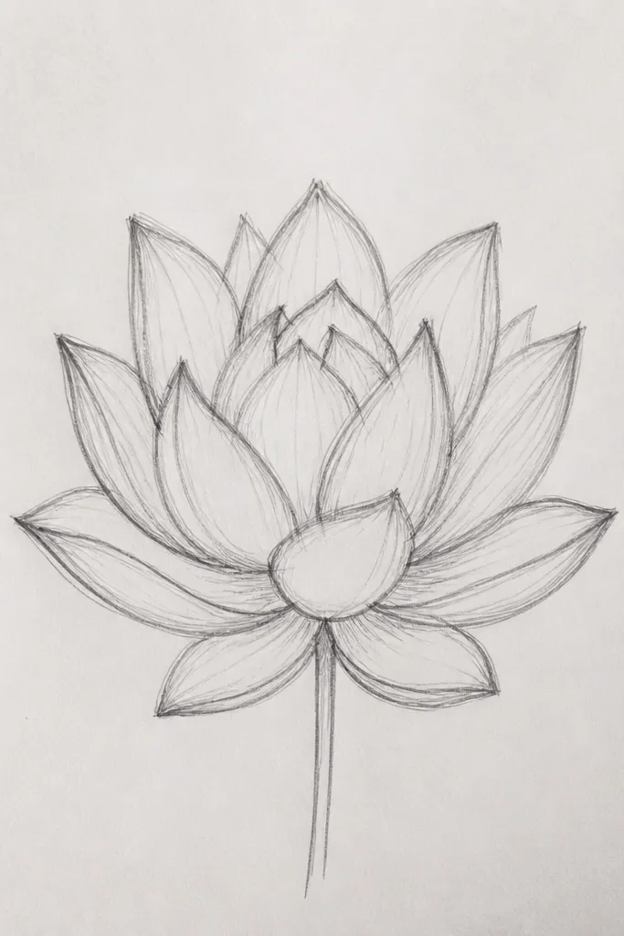
Smoky gradients make a lotus feel soft and atmospheric. This sketch works when you like a more painterly pencil style instead of crisp linework. The petals look translucent, and the center fold looks shadowed, which gives depth without heavy ink. I’ve used this for relaxing drawing sessions because it’s forgiving: your shading can blend and still look intentional. It flatters people who want a dreamy aesthetic for wall art or journals. The biggest payoff is that even simple petal shapes can look refined when the shading transitions are smooth.
Draw the lotus outline lightly in pencil and keep the petal shapes simple. Shade each petal face with a very light gradient, darkest near the base fold and lighter toward the rim. Use a blending stump or tissue to soften the graphite, but keep the overlap edges slightly darker so the petals separate. Add a center dish with a darker smoky oval and a few faint seed marks. Finally, use an eraser to lift highlights on the top petal rims so the lotus looks glossy.
Good to knowBlend in small circular motions and stop before the graphite looks gray-black; you want soft, not muddy.
Common mistakeAvoid going too dark too early; smoky gradients need layers, not one heavy pass.
25. Lotus flower drawing with colored pencil edge glow
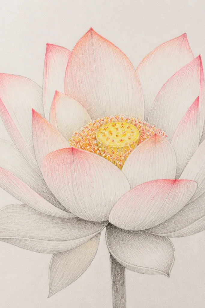
Colored pencil edge glow makes the lotus look lit without turning the entire flower into a solid block of color. I like this for DIY decor because it’s easy to control: you color the edges, then blend gently inward. The contrast between warm edge tones and lighter petal centers creates a natural gradient. This style looks good for people who want color but hate marker bleed. It also flatters cream paper and textured cardstock because the colored pencil sits on top and doesn’t swamp the pencil lines. The center dots add just enough warmth to keep the lotus from looking washed out.
Start with a pencil lotus sketch and shade overlap folds in light gray. Apply peach colored pencil along the outer petal rims, staying within 2-3 millimeters of the edge. Blend that color slightly inward using a lighter peach so the rim glow fades naturally. Add pale pink to inner petal edges near overlap zones, then keep the petal centers mostly light. Color the center dish warm yellow and add tiny red-orange dots along the inner ring.
Good to knowUse a light hand for blending; colored pencil over graphite can look dusty if you press hard.
Common mistakeDon’t color the petal faces all the way to the fold shadows; it flattens the depth.



