
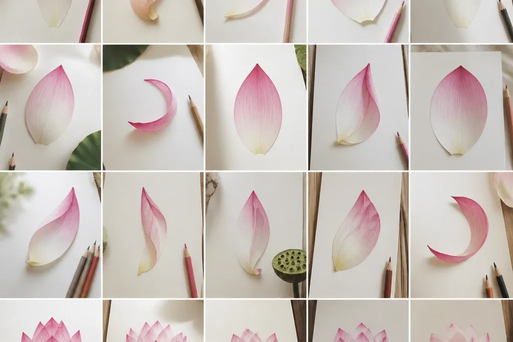
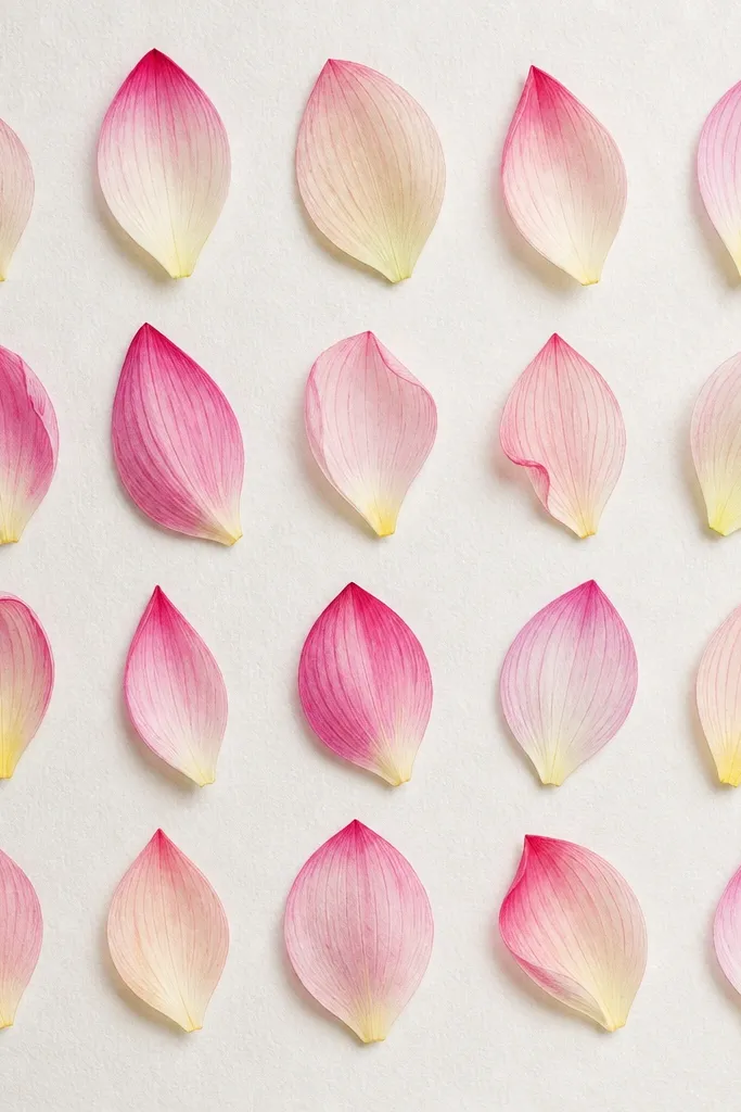
1. Single pointed petal with center ridge
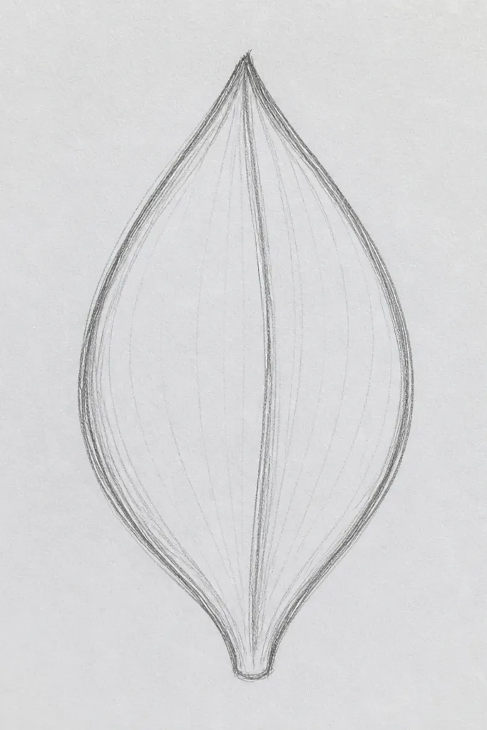
This one is my go-to when I want the lotus to look delicate but still believable. Start with a teardrop outline that narrows at the top and widens slightly at the base. The center ridge gives the petal a clear “fold” so it doesn’t look flat. I usually shade the base darker because petals naturally collect shadow where they overlap the flower. It looks great on cream paper with graphite because the tip stays airy, and it works for clean line art or soft realism.
Step 1: Lightly sketch a teardrop with a slightly thicker base — keep the tip sharp but not needle-thin. Draw a single center line from base to tip, then add two tiny curved lines on each side of the center line to suggest veins. Step 2: Shade only the lower third using a 2B pencil, pressing harder near the base and lifting pressure toward the middle. Step 3: Blend the shading with a paper stump or the side of a kneaded eraser so the gradient fades smoothly. Finish by tracing the outer edge with a darker HB line so the petal pops.
If your tip looks too sharp, stop the taper 1-2 mm earlier and round it slightly — lotus petals read better with a soft peak.
Don’t shade the whole petal evenly; that makes it look like a flat leaf.
2. Scalloped edge petal with layered lip
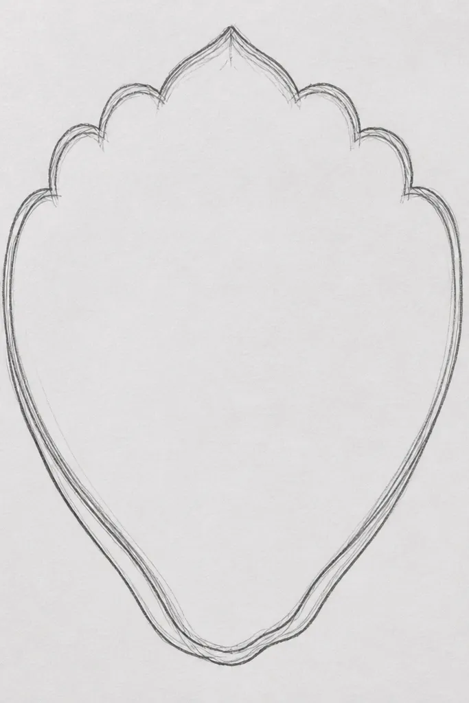
This style looks lush without turning into a mess. The scalloped edge gives the petal that soft, gathered texture you see on real lotus blossoms. The layered lip at the base makes the petal feel attached to the flower instead of floating. I use this for medium to dark paper because the silhouette stays readable. It flatters bold color palettes too — the scallops catch highlights and make reds and pinks look richer.
Good to knowUse a ruler only for the base lip spacing; freehand the scallops so they look organic, not manufactured.
Step 1: Draw a teardrop outline, then add 5-7 small rounded bumps along the outer edge, keeping them consistent in size. Add a double base: draw one thick curved line for the outer lip and a second thinner line inside it about 3-4 mm above the base. Step 2: Draw a center ridge, then add 4-5 short curved vein lines that start near the ridge and sweep toward the scallops. Step 3: Shade the base lip darker and leave the top half unshaded or lightly shaded. Step 4: Darken the scallop creases with short pencil strokes so each bump has a tiny shadow.
Common mistakeDon’t make the scallops too deep — deep dips turn the petal into a cookie cutter shape.
3. Folded petal with inner shadow fold
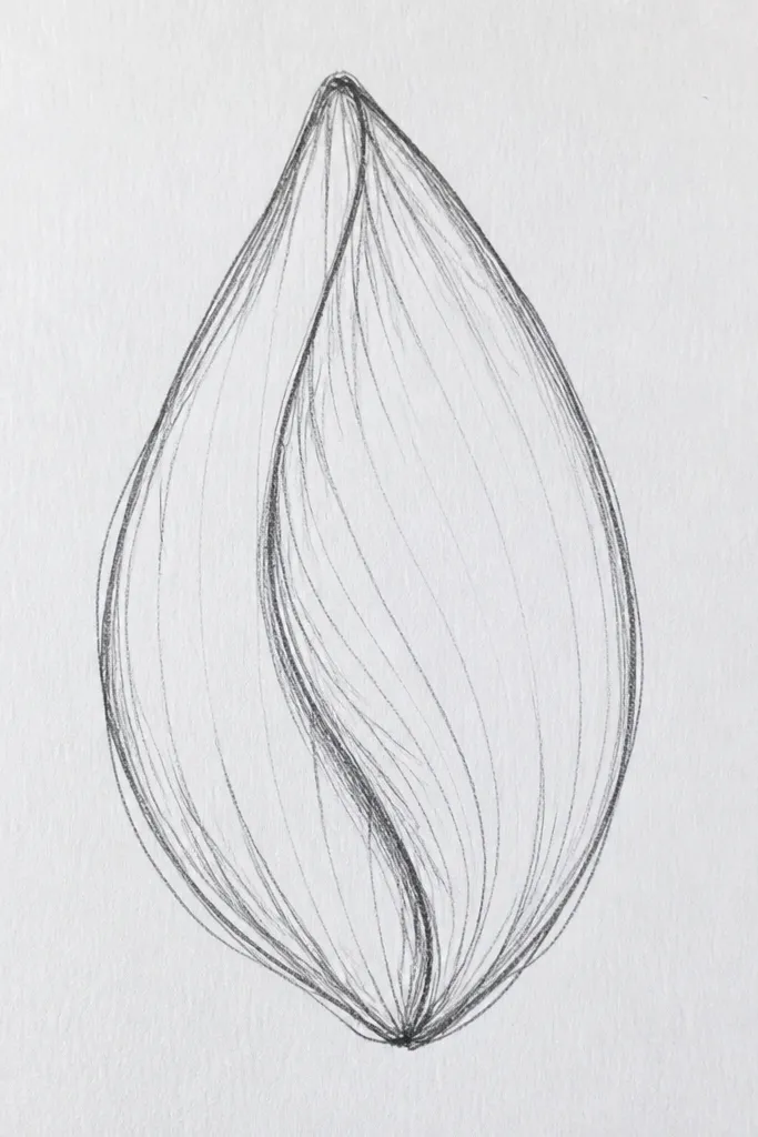
This is the petal I draw when I want motion. The folded look comes from an off-center ridge and a single strong inner shadow fold. It makes the viewer feel like the petal is curling, which is why it looks good even with minimal details. I like it for side-view lotus petals on greeting cards because the shape reads instantly. It also works for people who struggle with “too many veins” because the fold shadow replaces some of that complexity.
Good to knowWhen you blend the inner shadow, blend only along the fold curve so the edge stays crisp.
Step 1: Draw a teardrop outline, then place the center ridge slightly to the left or right (about 15-20% off-center). Step 2: Add an inner curved fold line that follows the ridge but arcs toward the base, then darken the region between the ridge and the fold line using a soft pencil (2B or 4B). Step 3: Keep the opposite side lighter — blend lightly on that side only. Step 4: Add one set of veins: 2-3 short curved lines that start at the ridge and stop before the fold shadow.
Common mistakeDon’t shade both sides equally — that kills the folded illusion.
4. Two-tone petal wash with dry-brush highlight
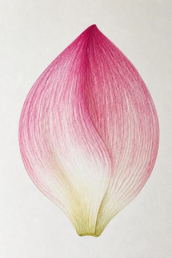
If you want color that looks like it came from a real flower, do this two-tone approach. The base wash anchors the petal, while the dry-brush highlight keeps it from looking like a color sticker. I use this on hot-pressed watercolor paper because the dry-brush texture stays controlled. It looks amazing for lotus greens and also for purple and pink variations. The result reads as airy and soft, not flat, and it holds up on small pieces like 4x6 cards.
Good to knowTest your two-tone mix on a scrap first; lotus petals look best when the base is about 2 shades darker than the tip.
Step 1: Outline the teardrop petal lightly in pencil, then erase the pencil once it’s inked if you’re using ink. Step 2: Mix two watercolor values: one darker (like teal + a touch of brown or ultramarine) and one lighter (same mix diluted). Wet only the lower half and paint the darker tone into the base, then let it bleed upward slightly. Step 3: While the paint is still damp, load a dry brush with light paint and swipe lightly across the top half so it skips and leaves speckles. Step 4: Add a darker center ridge line with a thin brush only after the wash dries.
Common mistakeDon’t overwork the wet area; repeated passes make the edges go gray.
5. Fineliner petal with micro-vein hatch
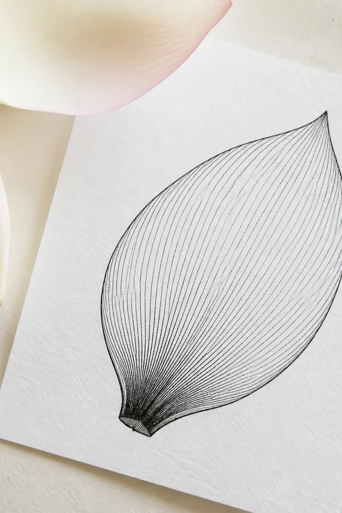
This is the petal I use when I want crisp, print-friendly detail. Micro-veins make the petal look layered and real even without heavy shading. The fineliner outline keeps it sharp, and the hatching controls the light. I like this style for black-and-white art, because it still has depth without color. It also works well on mixed media cards where you want line art to survive scanning.
Step 1: Draw the teardrop outline with a 0.3 or 0.5 fineliner, keeping the base slightly wider. Add a center ridge line, then draw 6-8 curved vein guides radiating outward. Step 2: Use micro-hatching: draw short curved lines that match the vein guides. Start denser at the base (about 2-3 times more lines) and thin out toward the tip. Step 3: Add a small shadow at the base overlap with tight hatching on the lower edge only. Step 4: If lines look too dark, lift by erasing pencil guides earlier and keep hatching pressure light.
Use a ruler under your paper edge to keep your hand from drifting; tiny lines look steadier when your wrist has a reference point.
Don’t fill the entire petal with hatching — it turns into a textured blob.
6. Ribbon petal with long sweeping veins
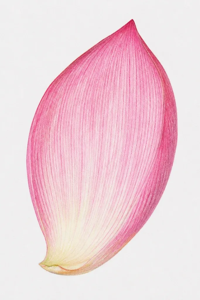
This one looks elegant because the veins are the main feature. Instead of many tiny lines, you draw fewer but longer sweeps that follow the petal’s curve. I use it when I’m doing a lotus border around a frame or on stationery. It flatters minimal color schemes because the white space stays clean. If your hand shakes a little, this style forgives it because the veins are broad curves.
Good to knowAim for vein arcs that hit the outer edge at slightly different heights; perfect symmetry can look too mechanical.
Step 1: Sketch an elongated teardrop, slightly taller than wide. Draw the center ridge, then add three long vein arcs — one straight-ish down the ridge, and two that curve toward the outer edge. Step 2: Outline the petal with a darker pencil or fineliner, then erase construction lines. Step 3: Shade only the outer rim: run a light graphite tone along the left and right edges, and keep the center bright. Step 4: Add one thin shadow under the base lip to show overlap.
Common mistakeDon’t shade the center; that removes the ribbon effect.
7. Wet-on-wet watercolor petal gradient
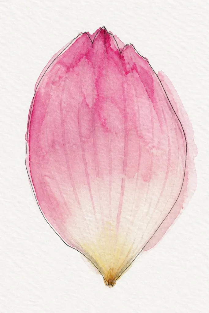
This style is for when you want softness that looks expensive. Wet-on-wet makes the color transition blur in a way that hand shading can’t mimic easily. I use it for lotus petals in warm pinks and peaches, because the bloom looks like natural translucency. It’s also beginner-friendly if you control the water amount. The petal still looks structured because you draw the center ridge and keep the outline clean.
Step 1: Lightly pencil the teardrop and center ridge, then ink the outline if you want crisp edges. Step 2: Wet the entire petal area with clean water using a large round brush. Step 3: Drop a warm pink pigment at the base and let it spread upward naturally; add a tiny touch of orange in the midsection for warmth. Step 4: While it’s still damp, pull a thin darker pigment line along the ridge with a smaller brush. Step 5: Let it dry fully, then add a few vein marks with a very light tint.
If the color blooms too far, blot once with a dry brush and stop adding pigment — lotus should look airy, not soaked.
Don’t redraw the outline after it dries; repeated wet passes make edges look fuzzy.
8. Point-to-base shading fan
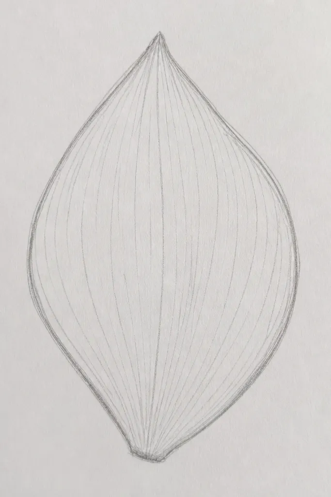
This is a pencil technique that makes petals look layered without extra details. The fan shading follows how light wraps around a curved surface. You get depth even if you only draw one or two veins. I use it when I’m doing a series of petals for a wall print because the look stays consistent across pages. It flatters charcoal and graphite styles because the strokes show texture. It also works well for people who struggle with smooth gradients.
Good to knowKeep your strokes curved in the same direction; mixed directions make the petal look like it’s been scrubbed.
Step 1: Draw a teardrop petal outline and the center ridge. Step 2: Starting near the tip, draw 6-10 short pencil strokes that angle down toward the base, each stroke slightly longer than the last. Step 3: Increase pressure and density on the lower third to form a darker base lip. Step 4: Blend lightly with a paper stump only in the base area so the tip keeps its pencil texture. Step 5: Add one vein line near the center and keep the rest implied by the fan shading.
Common mistakeDon’t fully burnish the shading; that flattens the petal.
9. Double-layer petal with inner outline
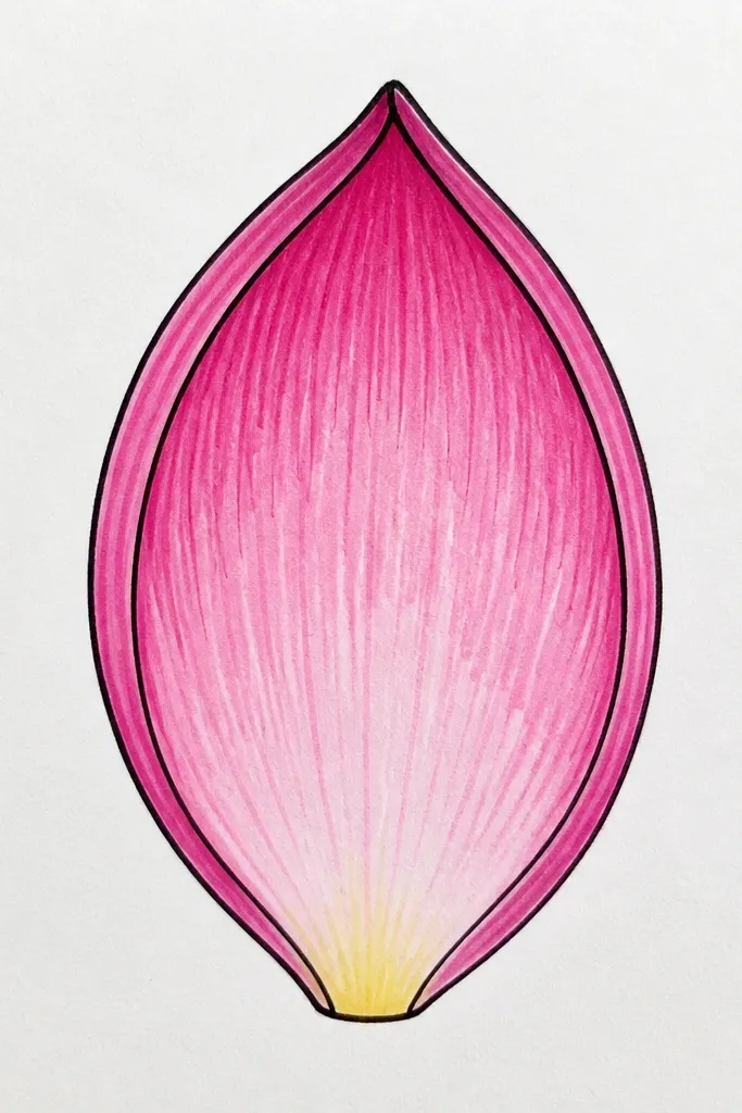
This is the petal style that looks dimensional with almost no extra drawing. The inner outline creates a clear second layer, like the petal has a curled rim. I like it for lotus centers where petals overlap tightly. It flatters both light and dark palettes because the gap between layers reads as shadow. If you do this in pencil first, you can erase the inner outline until the spacing feels right.
Good to knowUse a pencil compass or a small circle template to keep the inner outline from drifting unevenly.
Step 1: Draw the outer teardrop petal. Step 2: Inside it, draw a second teardrop outline that is about 8-12 mm smaller, leaving an even gap all around. Step 3: Shade the gap between the two outlines lightly at first, then darken it near the base. Step 4: Draw a center ridge line on the inner petal only, and add 2-3 short vein lines that start from the ridge. Step 5: Trace the outer edge darker so the outer layer reads clearly.
Common mistakeDon’t make the inner layer too close to the outer edge; a tiny gap looks like a mistake, not a rim.
10. Oversized petal with tiny base shadow
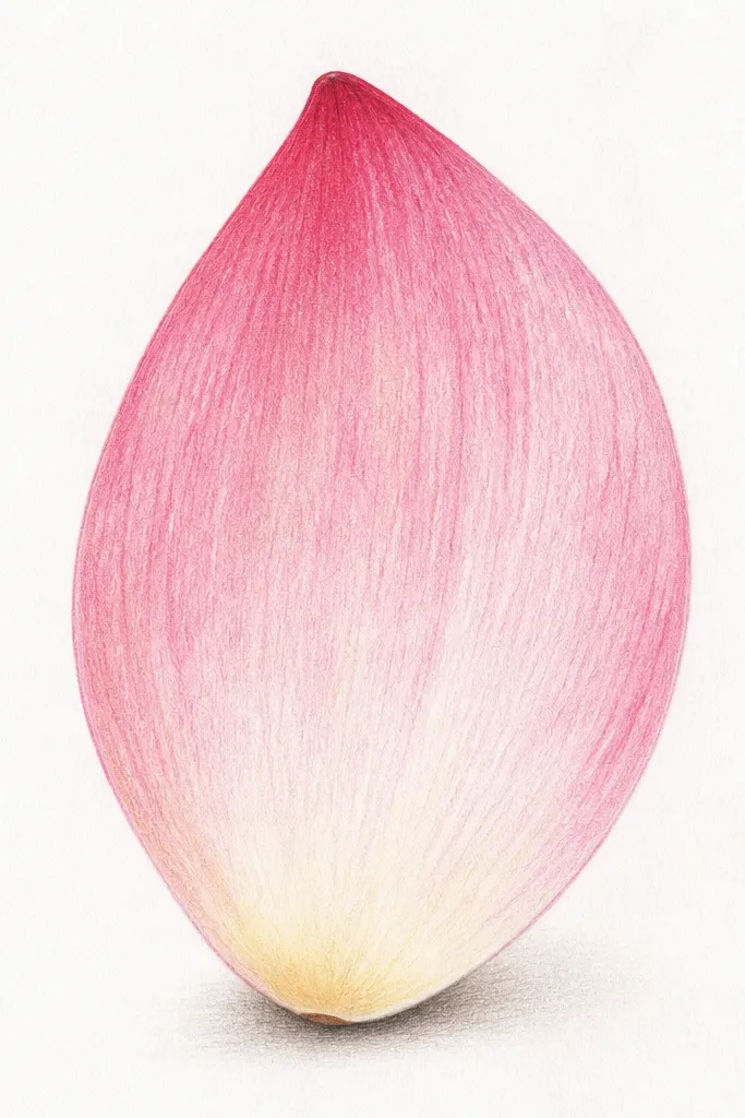
When you want the lotus to look airy and modern, minimal shading wins. This style uses one small base shadow and a center ridge to communicate form. It’s also forgiving because the big shape covers up shaky details. I use it for wall decals and large printable art where you want the viewer to read the flower from across the room. It flatters pastel palettes because the petal stays light and the shadow adds contrast.
Good to knowIf the base shadow looks too harsh, blur it with a kneaded eraser edge rather than rubbing it with your finger.
Step 1: Draw a large teardrop petal with a smooth outline, keeping the base slightly wider than the midsection. Step 2: Add a light center ridge line and one faint curved vein line on each side. Step 3: Shade only a tiny crescent at the base — about 1 cm wide — using a softer pencil like 2B. Step 4: Leave everything else white. Step 5: Add a darker outline pass so the silhouette stays crisp after scanning or photographing.
Common mistakeDon’t add multiple shadow zones; the simplicity is the point.
11. Harsh contrast petal with rim highlight
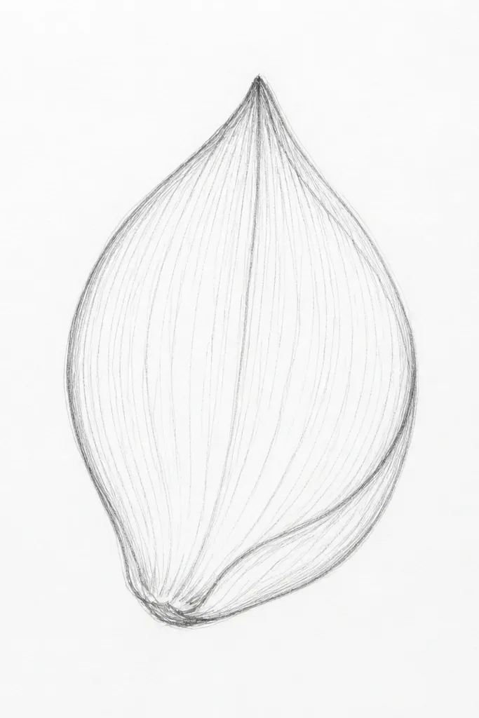
This style looks dramatic because it uses a rim instead of full shading. The rim shadow makes the petal read as thick, like it’s folded. I like it for monochrome posters and for people who prefer bold line work. The rim highlight keeps it from looking flat — you’re basically drawing the light edge. It flatters darker paper because the white center still pops.
Good to knowUse a white gel pen sparingly; one clean highlight line looks better than a bunch of thick ones.
Step 1: Outline the petal and draw the center ridge lightly. Step 2: Shade the outer rim with a 4B pencil, but stop the shading about 5-8 mm before the center. Step 3: Add a thin highlight line near the darker rim — lightly erase a line or draw it with a white gel pen if you’re on dark paper. Step 4: Draw only 3-4 vein lines near the center and let them fade. Step 5: Darken the outer outline last so the rim shading doesn’t look messy.
Common mistakeDon’t fill the whole petal with dark; keep the center bright.
12. Pastel chalk petal with soft edges
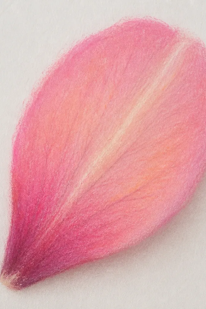
Chalk and soft pastels make lotus petals look like they’re glowing from within. The soft edges feel like petal fibers, and the layered color gives depth without heavy rendering. I use this when I’m making art for scrapbooks because it’s quick and forgiving. It flatters warm skin tones in color choices — peaches, corals, and soft pinks look especially good. The center ridge keeps the petal from turning into a color blob.
Good to knowBlend with tissue or a blending stump, not your finger. Fingers leave oil and make pastels dull.
Step 1: Lightly sketch the petal outline and center ridge in a light pencil. Step 2: Rub a base pastel color (like coral pink) into the lower third, then blend upward with a lighter peach pastel. Step 3: Leave a narrow lighter stripe along the center ridge — don’t color that stripe. Step 4: Add veins using a slightly darker pastel pencil or the side of a darker stick, drawing 5-6 short curved lines. Step 5: Fix with pastel fixative in thin sprays if you’re handling the piece often.
Common mistakeDon’t press hard with the pastel; heavy pressure kills the airy look.
13. Ink outline with watercolor bleed veins
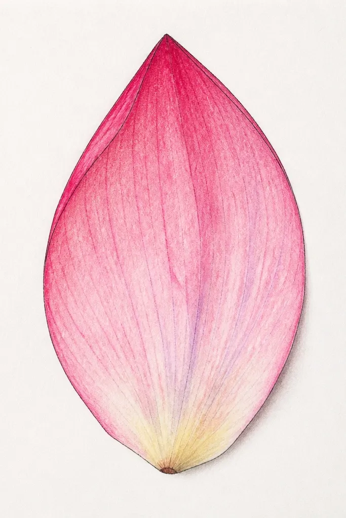
This is the one I do when I want crisp structure but organic color. Ink gives you clean edges and vein placement. Watercolor bleed in the veins adds a handmade feel that doesn’t look digital. I use it for teal, mauve, and soft orange palettes because the bleed looks pretty in those hues. It’s also great for gift tags — you can keep the wash light so the ink stays readable.
Step 1: Draw the petal outline with a 0.3 fineliner and add a center ridge plus 4-6 vein guides. Step 2: Paint a very light wash over the whole petal using diluted pigment, keeping the base slightly darker. Step 3: Drop a stronger, diluted color into the vein lines so it bleeds a few millimeters. Step 4: Add one extra darker vein near the center after the first bleed dries for depth. Step 5: Let it dry fully before you touch up outlines.
If the ink feathers, let the ink dry longer — 10 minutes is usually enough for thin fineliner lines.
Don’t paint thick wash over ink veins; it smears and ruins the vein shape.
14. Graphite smudge gradient with clean edge
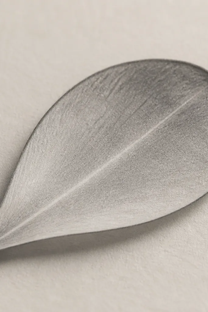
This looks like soft realism without needing fancy tools. You get a calm gradient, and the sharp outer edge keeps the petal from looking hazy. I use it when I’m drawing a set of petals for a print because the gradients look consistent if you blend the same way each time. It works especially well in gray tones and looks great on white paper under natural light. The center ridge line is what keeps it from looking like a random teardrop.
Good to knowBlend in one direction only, from base toward tip. That keeps the gradient smooth and not streaky.
Step 1: Sketch the petal outline and center ridge lightly. Step 2: Shade the base third with a 2B pencil, then blend upward using a paper stump or folded tissue. Step 3: Keep the outer edge clean by re-tracing it lightly with HB once blending is done. Step 4: Lightly erase the center ridge area so it stays lighter than the surrounding gradient. Step 5: Add two subtle vein arcs with a softer pencil to avoid making it too busy.
Common mistakeDon’t over-blend the base until it turns gray all the way to the edge.
15. Carbon paper tracing petal with crisp veins
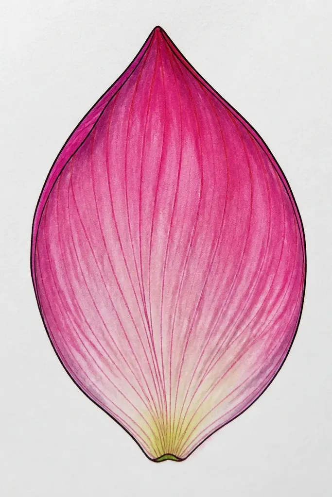
If you want consistency across a whole page, tracing is the shortcut that still looks handmade. Carbon paper transfers your outline and keeps the petal proportions right, so you can spend your time on vein quality. I’ve used this for repeatable lotus patterns on wrapping paper, where symmetry matters. It also helps if your hand gets tired — you can keep the lines uniform. The crisp veins look better because you’re not redrawing the whole petal each time.
Step 1: Print or draw a single lotus petal template on plain paper. Place carbon paper between the template and your final page, then trace the outline and center ridge. Step 2: Lift the template and re-draw veins with a fineliner, spacing them evenly (about 6-8 veins depending on petal width). Step 3: Shade only the base with light graphite or a diluted watercolor wash. Step 4: If carbon smudges, erase gently with a kneaded eraser and then re-ink the outer edge.
Use a soft kneaded eraser first, then a clean art eraser for final cleanup so you don’t scratch the paper.
Don’t trace the veins with carbon; carbon makes veins too thick and muddy.
16. Crayon petal with waxy highlight line
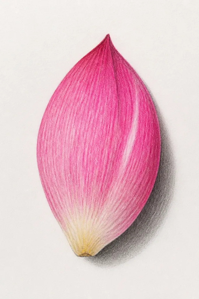
Waxy media changes everything because the highlight line actually resists paint or pencil. I use this when I want petals that look like they have a glossy surface. The center highlight line makes the petal look curved without doing a ton of shading. This also works great for kids, but I still use it because the texture looks charming in adult decor too. It flatters warm colors like gold, coral, and soft green — the waxy shine makes them feel more “flower-like.”
Good to knowPress the highlight line only once — multiple passes make it too thick and chalky.
Step 1: Outline the teardrop petal and draw the center ridge with a white or light crayon. Step 2: Color the petal body with a base crayon color, pressing a bit harder at the base. Step 3: Add vein lines using a darker crayon shade, keeping them short and curved. Step 4: If you’re adding watercolor on top, paint lightly over everything except the white highlight line. Step 5: Let it dry and then reinforce the outer outline with a fineliner if needed.
Common mistakeDon’t smudge the waxy highlight; smudging removes the crisp light edge.
17. Charcoal petal with lifted texture
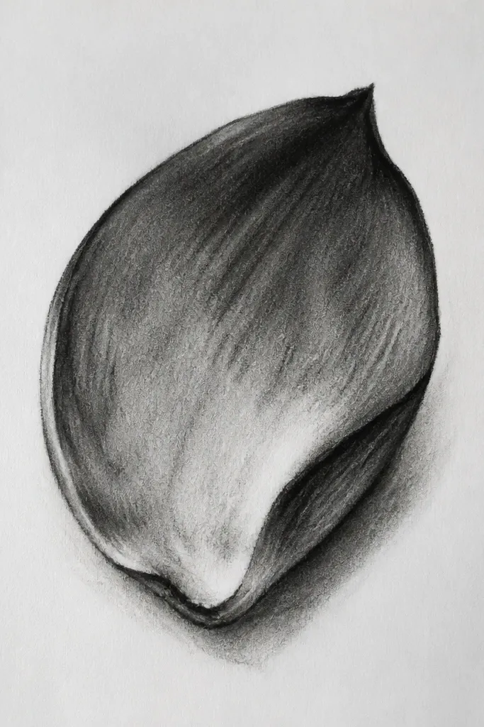
Charcoal gives you that smoky, soft petal surface that graphite can’t quite replicate. The trick is to lift highlights instead of trying to blend everything to perfect smoothness. This makes the petal look airy, like it’s catching morning light. I use it for moody monochrome lotus drawings — black, gray, and soft white highlights. It also looks good in frames because the contrast is dramatic without needing ink.
Step 1: Sketch the petal outline and center ridge lightly with a soft pencil so you have structure. Step 2: Rub charcoal into the base third and blend upward with a tissue, but keep the top lighter. Step 3: Lift the center ridge and a couple of vein highlights using a kneaded eraser — press and lift, don’t rub. Step 4: Add 4-6 vein marks with a thin charcoal stick, keeping them lighter than the base. Step 5: Use a fixative spray lightly if you want the drawing to last.
If you lose the shape while blending, stop and re-outline the outer edge with a soft pencil before continuing.
Don’t over-fix too early; heavy fixative can lock in smudges you want to lift.
18. Colored pencil petal with hard-edged rim
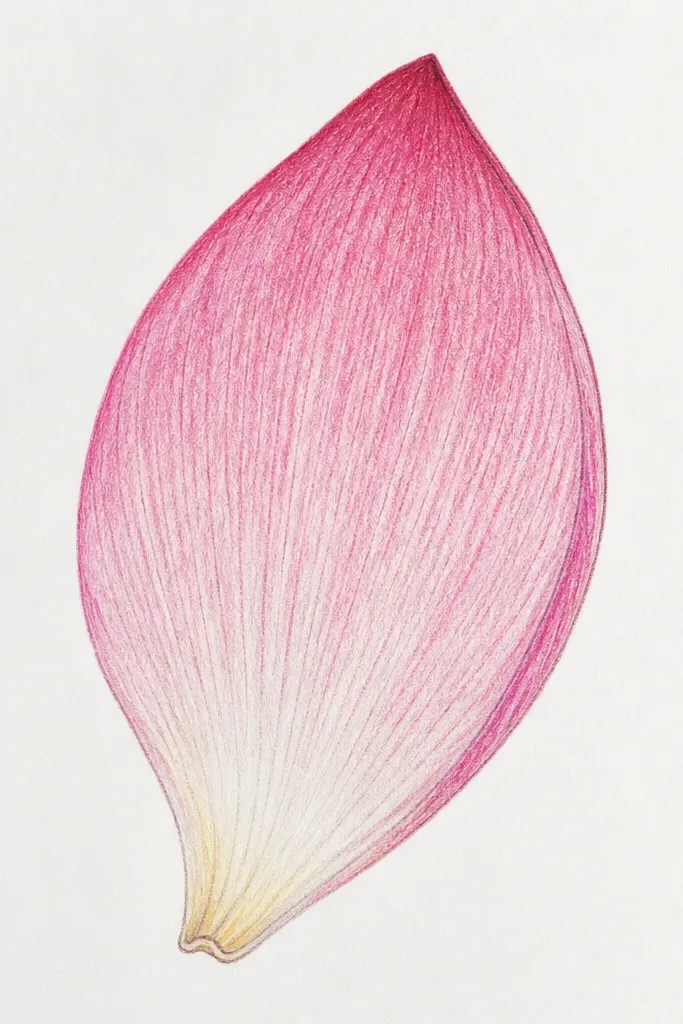
Colored pencil is the best tool when you want control and still want a soft look. A hard-edged rim gives the petal shape clarity, especially when you scan or photograph. The interior gradient stays gentle, so the petal doesn’t look cartoonish. I use this for home decor prints because the texture looks consistent and doesn’t smear. It flatters jewel tones like deep magenta with a lighter pink tip, and it also works for sage green with a creamy highlight.
Good to knowWork in layers: 3 light layers look better than one heavy layer that dents the paper.
Step 1: Lightly sketch the petal outline and center ridge. Step 2: Lay a base color in the lower third, then layer lighter tones upward, keeping the tip almost bare. Step 3: Create a hard rim by tracing the outer outline with a darker pencil shade and lightly burnishing inward about 2-3 mm. Step 4: Draw veins with a slightly darker pencil but keep them thin and spaced. Step 5: Blend the interior gently with a colorless blender or light pressure of the base color.
Common mistakeDon’t press hard early; it makes the paper slick and prevents smooth blending.
19. Mini lotus petal set for patterns
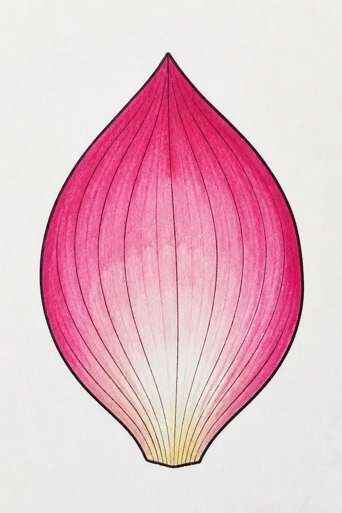
This is a practical drawing idea for anyone making repeat patterns, stickers, or wrapping-paper style art. Keeping the petal size small forces you to simplify while still keeping the lotus identity. The secret is that every petal shares one construction rule: center ridge plus base shadow. Then you vary only one thing per petal — scallops, pointed tips, or vein count. It’s the fastest way I’ve found to build a cohesive set without losing your style mid-page.
Good to knowPick one fineliner size and stick to it for the whole grid so the pattern reads clean.
Step 1: Draw a light grid on your paper, spacing squares about 3 cm apart. Step 2: In each cell, draw the same teardrop shape with the same center ridge, keeping the base about the same width. Step 3: Vary one detail per cell: some petals have scalloped edges, some have folded inner shadows, some have micro-veins. Step 4: Shade only the base overlap in a consistent way, like a small crescent or tight hatching. Step 5: Trace all outlines with the same fineliner thickness so the set looks planned.
Common mistakeDon’t change the petal proportions across the set; inconsistency makes the pattern look accidental.
20. Lotus petal with ink splatter accents
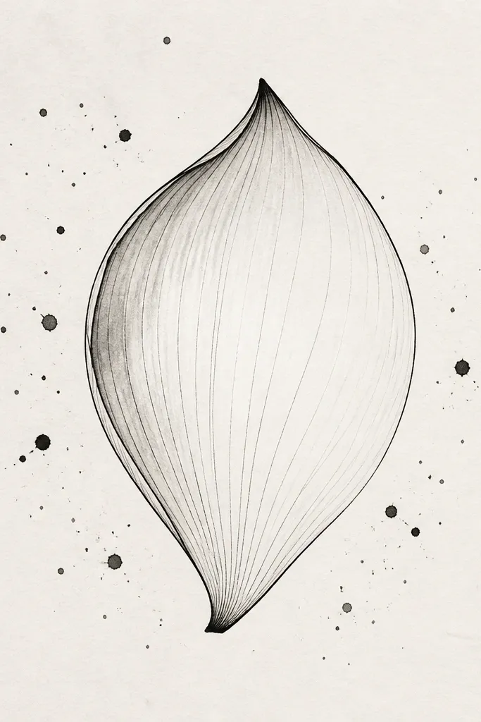
This is for when you want the petal to feel artsy without adding clutter inside the shape. Splatter accents create an energy around the lotus, while the petal stays structured with a center ridge and a few veins. I do this on watercolor paper when I’m making wall art or small prints, because the splatter looks textured and organic. It flatters monochrome ink with one color wash on the base — like pale green or soft purple. The key is keeping splatter away from the petal edges so it doesn’t smear your outline.
Step 1: Draw the petal outline and center ridge with fineliner, then add 4-6 vein lines. Step 2: Lightly shade the base with diluted ink or graphite, keeping the rest bright. Step 3: Load a toothbrush with diluted ink, hold it a few inches from the paper, and tap gently so splatters land mostly in the background. Step 4: Use a paper towel to blot any splatter that lands too close to the outline. Step 5: Let everything dry, then reinforce the petal outline so it stays crisp.
Do splatter on a separate scrap first to dial in the distance and ink thickness.
Don’t add splatter on top of wet watercolor; it turns into a gray stain.



