1. Cream Lotus With Teal Winged Friend
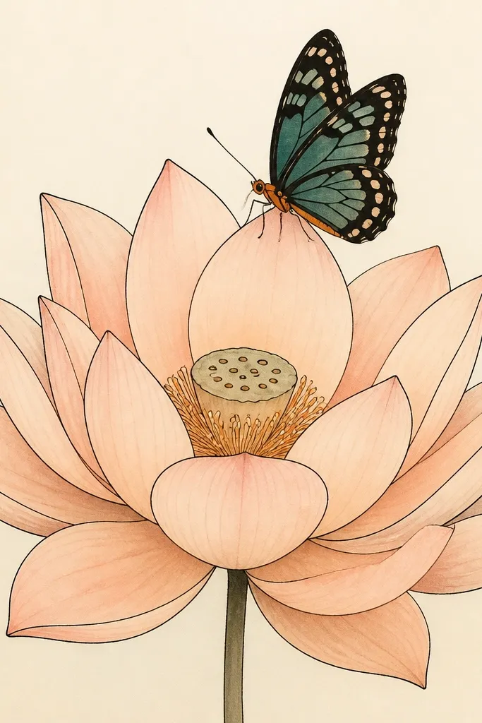
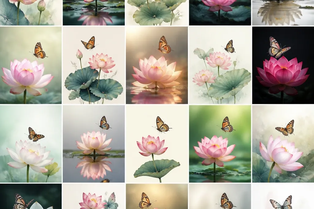
Start with a lotus that feels like morning light. Draw the petals as stacked arcs, then tint the petals in pale peach (diluted watercolor or very light gouache) so the paper color still shows through. Ink the outlines with a 0.3 fineliner, then add the butterfly with teal wing sections - not a gradient, just clean blocks with dot rows. This pairing flatters warm skin tones in photos because peach and teal balance each other, and it looks especially good for journal covers and calm wall art. Keep the butterfly slightly smaller than the lotus center so the lotus stays the star.
First, sketch a lotus circle using a light pencil guide for the outer petal tips. Then ink petal lines from the base upward, and paint only the petals - leave the center mostly cream with a faint yellow tint. Next, draw the butterfly body hovering right at the top petal rim, and split each wing into two teal patches with 3-4 dot marks per wing. Finish by adding a thin warm-orange line under the butterfly body to anchor it to the lotus. Let it dry fully before you erase pencil marks.
Good to knowIf your teal looks chalky, mix it with a touch of water and paint two thin layers instead of one heavy one.
Common mistakeDon't overfill the wings with lots of tiny details - it makes the butterfly look like a sticker instead of a sketch.
2. Monochrome Lotus With Inky Butterfly Details
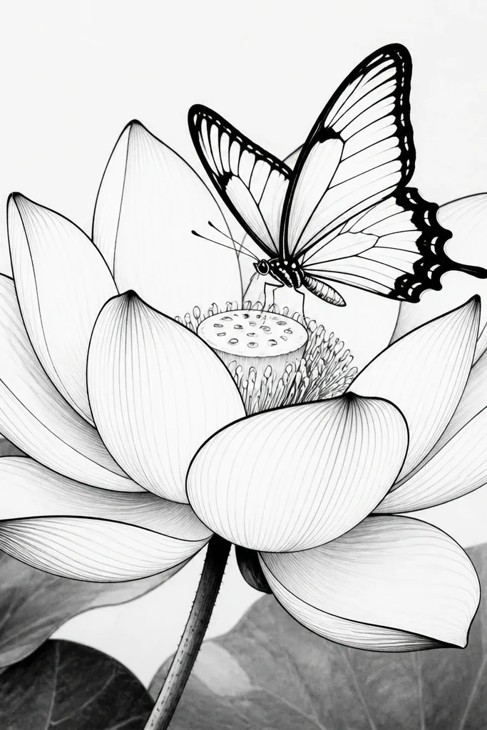
This is the look I use when I want it to feel modern and clean. The lotus gets strong outlines and light gray shading - I do it with a soft pencil or diluted black wash on only the inner petal folds. The butterfly is the detail magnet: thick outer wing borders, then thin inner lines that repeat like a small fan. Monochrome like this reads well on dark frames and makes the drawing feel graphic, not delicate. It also works for people who want a piece that matches almost any room color.
Start by drawing the lotus petals as 6-8 stacked arcs, each arc slightly shorter toward the center. Ink the outer petal edges with a 0.5 fineliner, then add inner fold lines with a 0.3 for contrast. For shading, lightly brush a diluted gray wash into the inner petal valleys only. Draw the butterfly with a narrow body and wings that overlap the lotus center by about one-third of their width. Finally, add repeating dash marks inside the wings - stop at 6-8 marks per wing so it stays crisp.
Good to knowUse a ruler for the butterfly's wing symmetry lines while you sketch, then erase it after inking.
Common mistakeAvoid gray shading on every petal - it flattens the lotus and makes the butterfly blend in.
3. Pastel Lotus Border With Side-Flying Butterfly
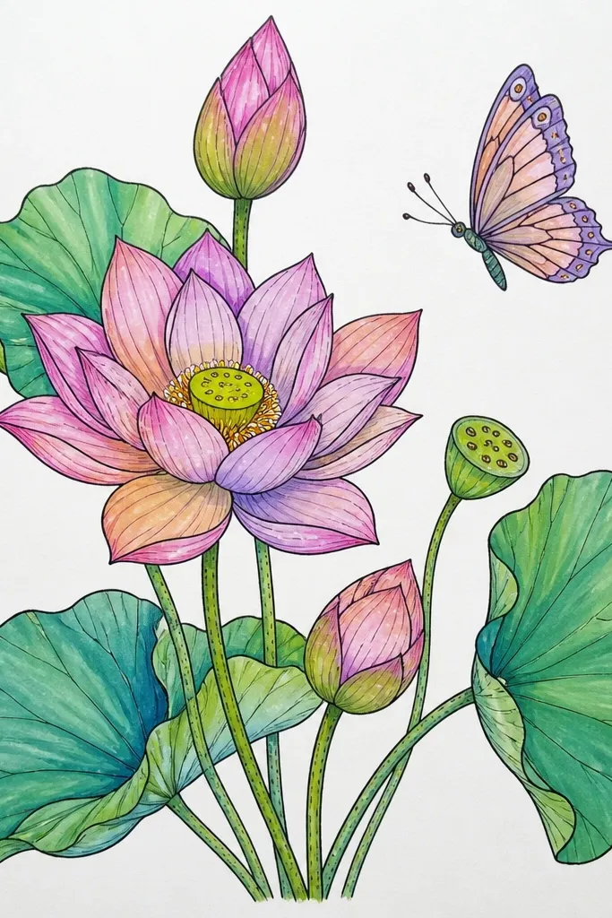
This one looks like a handmade invitation and it's super forgiving. The border uses tiny lotus buds, each one simpler than the main flower - just three petal arcs and a tiny center dot. The main lotus is pastel pink with lavender shadows, while the butterfly flies sideways so it feels like it's moving across the page. I like this for cards because the composition gives you structure even if your butterfly lines wobble. Pastels also photograph well in daylight, especially on cream cardstock.
First, draw a light rectangle border 1 cm inside the card edge. Then add six to eight small lotus buds around the border, keeping them consistent in size and spacing. Place your main lotus slightly left of center, with 8-10 petals and a soft lavender wash at the base of each petal. Draw the butterfly on the right side in mid-flight: wings angled, body pointing diagonally back toward the lotus. Color the wings in pale yellow with mauve outlines, then add two small dot clusters on each wing.
Good to knowIf your border looks uneven, make each bud the same petal height and vary only the petal count between 3 and 4.
Common mistakeDon't make the border buds too detailed - they should frame, not compete with the main lotus.
4. Watercolor Lotus With Bleeding Butterfly Wash
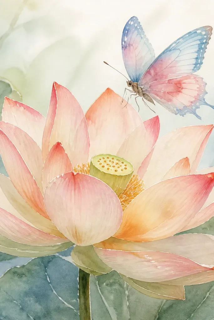
This look is for when you want softness and movement. Use wet-on-wet watercolor for the butterfly wings so the edges feather naturally, and keep the lotus petals slightly more controlled with a dry brush or lighter wash. The butterfly colors are pale blue and rose - together they look airy against peach lotus petals. I've used this on 200 gsm cold-press paper and it dries with a gentle texture that looks expensive. It's great for wall art that's meant to feel calming rather than crisp.
Start by wetting only the lotus petal areas with clean water, then paint peach wash and let it spread lightly. While the lotus is still damp, add tiny touches of light green at the petal bases for depth. For the butterfly, draw the outline in pencil, then paint the wings using wet-on-wet: pale blue first, then drop in rose near the wing tips. Don't overwork the wings; stop after the first wash when you still see paper texture. Finish by adding a very light gray outline around the butterfly body so it stays readable.
Good to knowUse a bigger brush for the butterfly wings than you think - it helps the color pools look intentional.
Common mistakeAvoid dark outlines around a bleeding watercolor butterfly, or it turns muddy fast.
5. Gold Gel Pen Lotus Center With Navy Butterfly
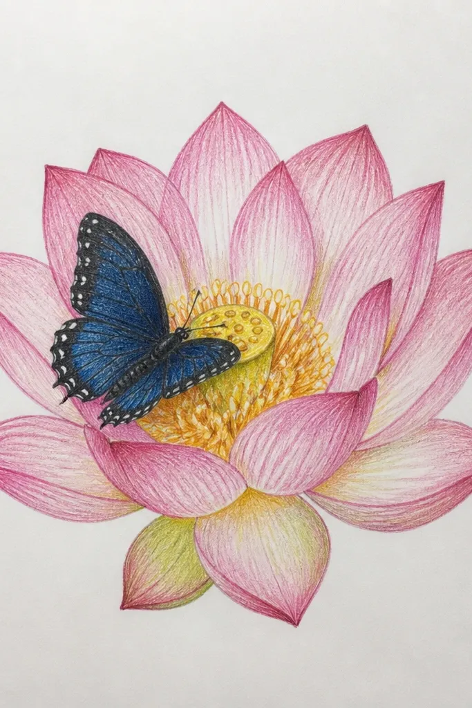
If you want instant "fancy" without complex skills, this is it. The lotus petals stay soft and matte - pale cream with muted rose washes. Then the center gets gold gel dots that look like pollen, and it catches light even in plain room lighting. The butterfly comes in navy with gold dot accents, so it matches the gold center and looks cohesive. This is a strong choice for gift tags and holiday-style cards because metallic details make people stop and look longer. It also works for people who prefer minimal color but want sparkle.
First, draw the lotus with 10 petals using pencil, then ink the outlines lightly with a 0.3 fineliner. Paint the petals pale cream, then add a muted rose wash at the folds. Let it dry, then use gold gel pen to dot the lotus center tightly - about 25-35 dots in a small circle. Draw the butterfly above the lotus center, ink the wings with navy using a gel pen or watercolor pencil activated with water. Add gold dots on each wing and a thin gold line for the body. Don't add extra glitter - the gold dots already do the work.
Good to knowTest the gold gel pen on scrap paper first so you know how it lays down on your exact paper.
Common mistakeAvoid thick gold outlines around every petal - it looks like a costume instead of a drawing.
6. Lotus Bloom Mandala With Small Butterfly at the Tip
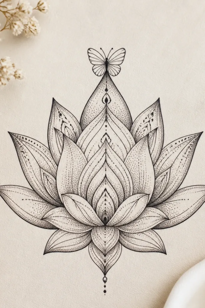
This one turns the lotus into a pattern without losing the flower shape. I use a mandala approach: keep the petal outline smooth, then add fine inner details like dots and short curved lines only inside each petal fold. The butterfly stays small and placed at the top tip so it doesn't clutter the symmetry. This is perfect for meditative journal pages because the repetition is satisfying, and it looks neat even in small sizes. It flatters people who like clean symmetry and don't want heavy watercolor mess.
Start by drawing the lotus with 12 petals, keeping them evenly spaced around a tight center. Then add inner mandala details: 3-5 dots per petal fold and a short curved line near each petal edge. Ink over the whole lotus with a 0.3 fineliner, leaving the center slightly lighter. Place a tiny butterfly at the top petal tip, wings angled upward, each wing with 3 curved lines and one dot. If you want color, add a single soft wash of light teal to only 4 petals so the pattern still reads clearly.
Good to knowUse a white gel pen to add one small highlight dot on the butterfly wing tip after everything dries.
Common mistakeDon't add mandala details to the butterfly wings - keep them simple so the eye knows what to focus on.
7. Lotus and Butterfly Overlapping on a Diagonal Vine
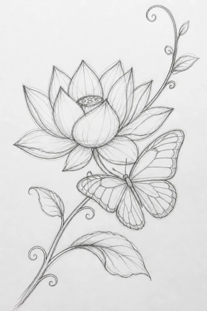
This is the composition I use when I want the drawing to feel like it has motion. The diagonal vine line gives you direction, and the butterfly resting on that line makes the whole piece look more "designed" than centered art. The lotus stays the anchor, while olive-green leaves add depth without adding a lot of color. I've used this style on sketchbook pages that later got turned into framed prints because the diagonal structure reads well from a distance. It also flatters small rooms because it creates a visual path instead of a static blob.
First, draw a single diagonal vine line from bottom-left to top-right with a gentle curve. Add two olive leaves spaced along the vine, each leaf drawn as an oval with a center vein. Place the lotus near the middle of the diagonal line so one petal edge overlaps the vine. Draw the butterfly so its body sits on the vine and its wings overlap the lotus petals - overlap about one-quarter of wing width. Color the butterfly wings pale yellow with a thin olive outline, then add tiny dot clusters near the top wing edges.
Good to knowKeep the vine line thinner than the lotus outlines so the lotus stays dominant.
Common mistakeAvoid drawing the vine with the same thickness as the lotus - it steals focus.
8. Torn Paper Background Lotus With Ink Butterfly
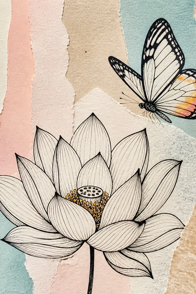
This one looks handmade because the background is physically textured. Use torn paper pieces in pale pink, cream, and a whisper of light gray so the lotus has contrast without needing heavy paint. The lotus itself is inked cleanly with a fineliner and lightly washed with diluted peach - just enough to show shape. The butterfly is mostly ink with a tiny accent of lavender in the wing tips. I like this for wall art that needs dimension because the torn paper catches light and makes the drawing feel layered. It's also great if your drawing lines aren't perfect; texture hides small wobble.
Start by tearing small strips of paper and gluing them to a watercolor paper base with matte medium. Press the seams down so the surface stays mostly flat. Then draw the lotus center and petals on top, ink with 0.4 for outlines and 0.2 for petal folds. Add a light peach wash to the petals, keeping the center cream. Draw the butterfly above the lotus and ink it boldly; color only the wing tips with lavender watercolor pencil activated with water. Let it dry under something flat so the torn edges don't lift.
Good to knowUse matte medium instead of glue stick so the torn edges stay sealed and don't curl later.
Common mistakeAvoid glossy topcoat on torn paper - it makes the texture look plastic.
9. Blue-Gray Night Lotus With Firefly-Style Butterfly
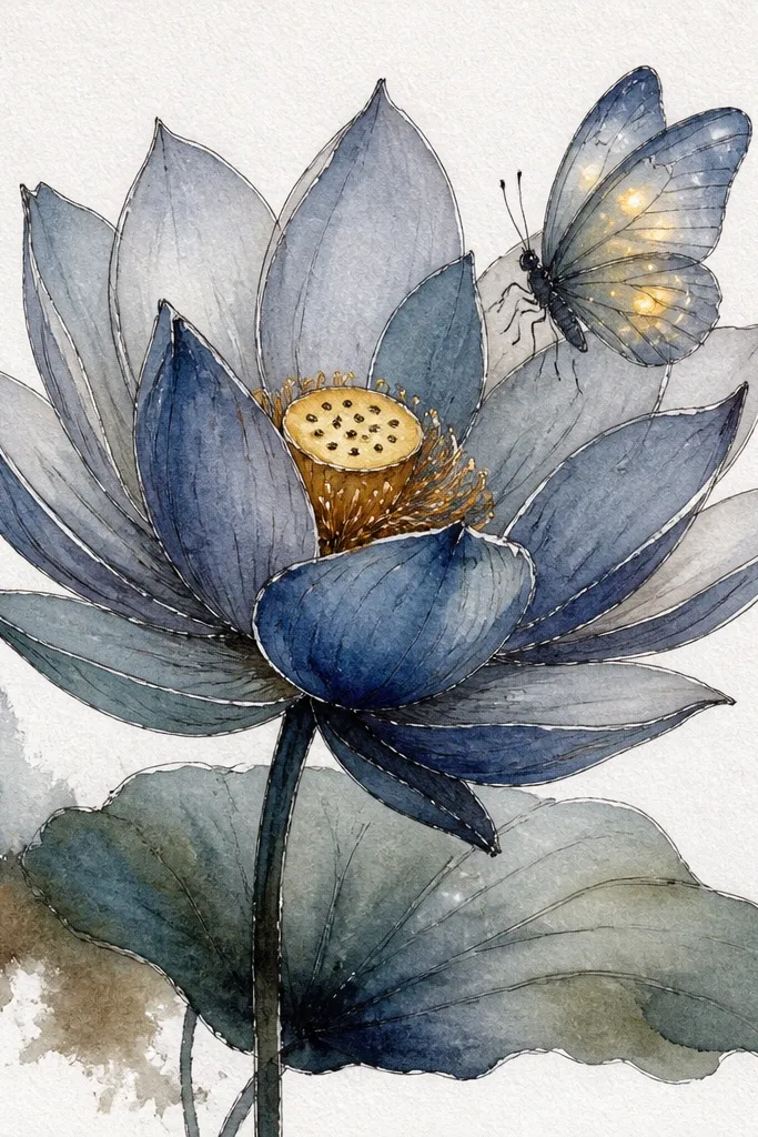
This is the night version that still feels cozy. The background is blue-gray wash, then the lotus petals are lifted with lighter blue and white highlights so they glow softly. The butterfly uses pale yellow dots like tiny fireflies - I keep the wings mostly light with dot patterns rather than heavy fill. It's dramatic without being loud, and it looks amazing in a simple black frame. If you want art that feels calm and a little magical, this is my go-to.
Start by washing the paper with blue-gray watercolor, then let it dry completely. Outline the lotus in pencil, then ink and paint petals in a light blue wash, leaving white paper for highlights. Add a few deeper folds with diluted indigo so the petals have shape. Draw the butterfly above the lotus center and paint the wings with very light yellow - keep it translucent. Then add 10-15 tiny dot specks per wing with a fine brush, and leave the wing centers lighter for glow. Finish by adding a thin white gel pen highlight on one wing edge.
Good to knowUse gel pens for highlights on dark backgrounds - watercolor white often looks dull.
Common mistakeAvoid painting the butterfly with the same dark tone as the background, or it disappears.
10. Lotus Buds Row With One Big Butterfly Landing
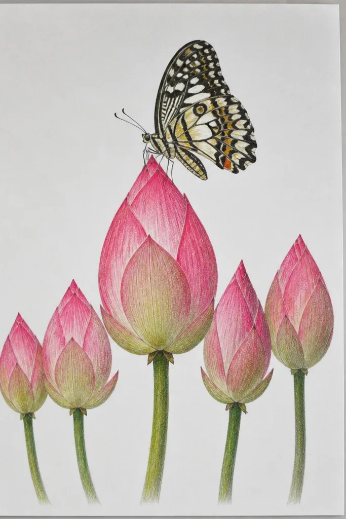
This layout looks great for bookmarks and narrow prints because it uses a clear horizontal story. The bottom row has lotus buds and tiny leaves, drawn quickly with simple shapes so you don't spend all day. The main lotus is larger and centered above the row. The butterfly is the landing moment - wings patterned with pink and cream blocks so it looks like it's touching the petal. This style flatters small spaces on shelves, because the viewer reads it like a band of nature.
First, draw a straight baseline across the page where your bud row sits, about 3 cm from the bottom. Add 6-10 lotus buds along that line, each bud with two or three petal arcs and a tiny center dot. Place the big lotus above, with 9-11 petals and a slightly taller center. Draw the butterfly so one wing overlaps the lotus petal edge and the other wing sits above the petal fold. Color the wings with alternating pink and cream sections, then add a thin darker outline around each section. Finish by adding a small shadow under the butterfly body using diluted gray.
Good to knowKeep your bud row lighter than the main lotus so the eye goes upward naturally.
Common mistakeDon't make the bud row the same size as the big lotus - it fights for attention.
11. Lotus Bloom in a Circle Frame With Butterfly Inside
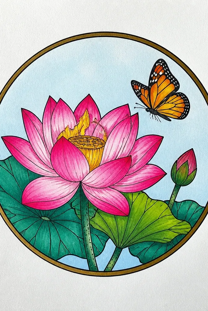
Framing the lotus in a circle makes the drawing feel like a badge or sticker, even when it's just paper. I draw the circle first, then build the lotus inside so petals don't sprawl. The butterfly goes inside the circle too, but positioned so it doesn't sit dead center. Color stays limited: coral for the butterfly wings and light green for leaf touches, with a pale wash for petals. This is a clean choice for wall art because the circle border gives structure and helps the piece look finished.
Start by drawing a circle lightly in pencil, leaving a 1 cm margin from the page edges. Sketch the lotus inside with a tight center and 8 petals that reach close to the circle but don't touch. Ink the lotus petals and paint them in pale peach with light green shadows near the base. Draw the butterfly inside the circle, perched just above the lotus center - wings angled outward. Color wings coral with light green at the wing tips, then add small vein lines using a 0.3 fineliner. Erase pencil marks carefully once the ink is dry.
Good to knowUse a compass or a jar rim for the circle so it looks crisp, not wobbly.
Common mistakeAvoid letting petals touch the circle border - it makes the composition feel cramped.
12. Lotus Petals With Pattern Fill and Butterfly Outline Only
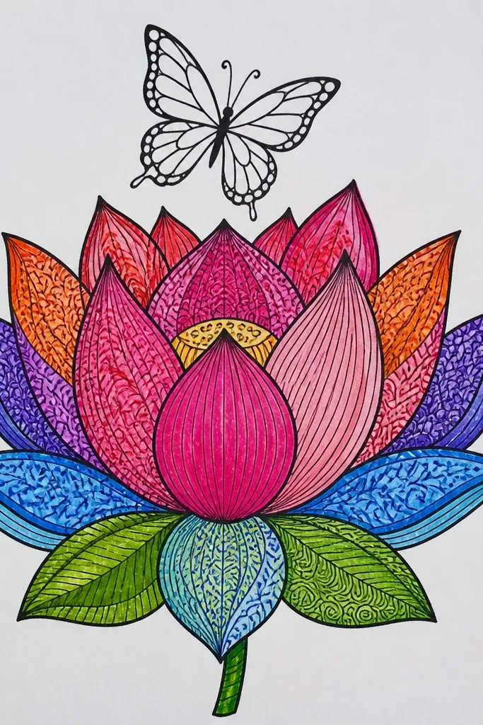
This idea flips the usual rule. Instead of coloring the butterfly, you put pattern inside the lotus petals and keep the butterfly as clean line art. The result looks artsy but still readable because the butterfly doesn't turn into another busy pattern. I use dotted and striped fills because they sit nicely inside petal shapes and don't smear. This is great for people who love pen-and-ink work and want a finished piece without watercolor. It also looks good on darker paper if you invert the colors.
First, draw the lotus petals as arcs with a tight center and 10-12 petals. Ink the outline with a 0.4 fineliner, then switch to 0.2 for inner pattern lines. Fill each petal with one pattern type: alternate between dot clusters, short curved dashes, and tiny crescent shapes. Keep the butterfly outline simple: draw its wings with smooth outer lines and a few vein curves, no fill. Place the butterfly slightly above the center so it reads as the focal point. Add a tiny shadow under the butterfly body using light pencil.
Good to knowChoose just three pattern types and rotate them across petals - it keeps the look intentional.
Common mistakeAvoid mixing pattern types within a single petal - it looks messy fast.
13. Minimal Lotus Sketch With One Bold Butterfly Wing
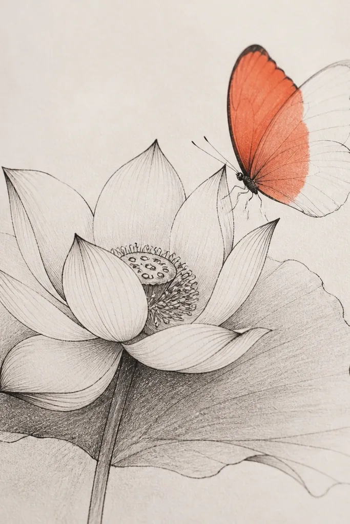
Minimal drawings can still look finished when you pick one bold element. I keep the lotus mostly light - pencil sketch with a few ink outlines and tiny gray shadows at the petal folds. Then I color just one butterfly wing solid warm coral, leaving the other wing unfilled except for ink lines. That imbalance gives energy without clutter. This style looks great for quick cards and for people who like airy art that doesn't overwhelm a page. It also works well if you're learning because it limits the number of decisions.
Start by sketching the lotus in pencil with 7-8 petals and a small center, keeping lines light. Ink only the outer petal edges and one or two inner fold lines. Add a light gray wash or pencil shading at the petal bases. Draw the butterfly above the lotus center and ink the wing outlines. Fill only one wing with warm coral watercolor or gel pen, keeping the other wing transparent. Add two small coral dots on the body area so the color feels connected to the wing.
Good to knowIf coral bleeds, use watercolor pencil instead of paint so the fill stays controlled.
Common mistakeAvoid coloring both wings the same - it removes the punchy contrast.
14. Lotus and Butterfly With Washy Green Leaves and Soft Pink
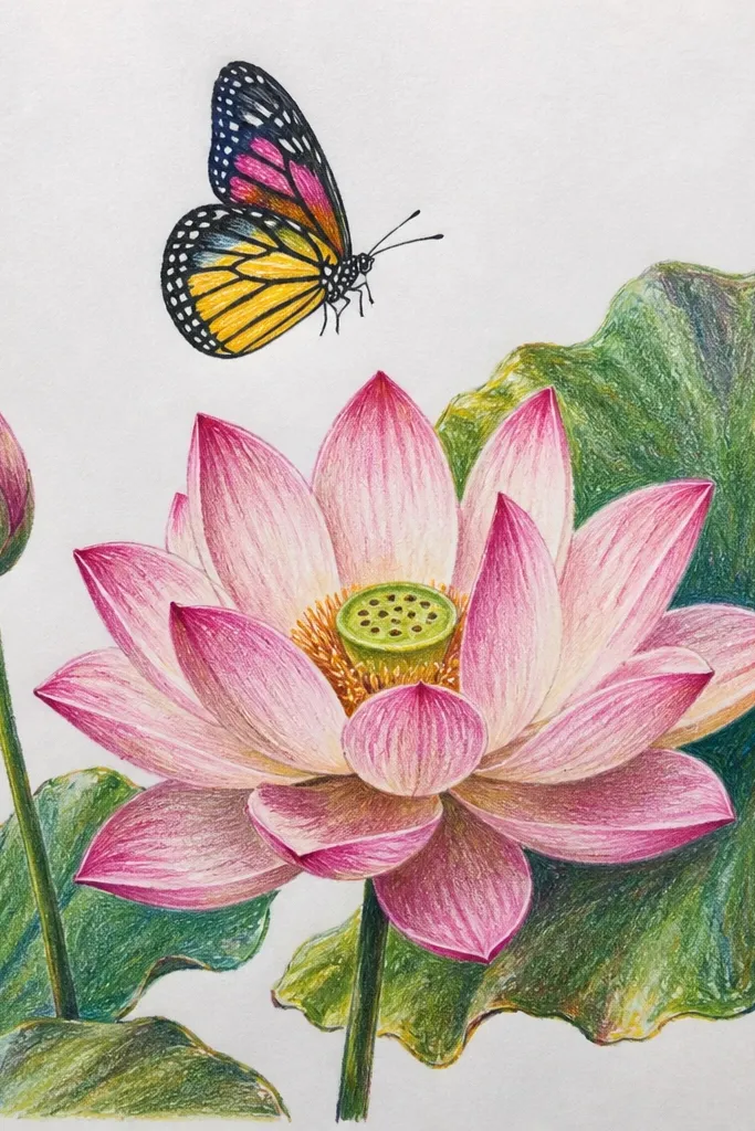
This is the "garden sketch" look that feels natural. The lotus is soft pink with thin darker outlines, while the leaves are a muted green - I like olive-green mixed with a tiny bit of gray so it doesn't look neon. The butterfly gets pale pink wash with a soft green shadow at the base of each wing, which makes it look like it's lit by daylight. This works for spring-themed decor and also for people who want their art to match plant-heavy interiors. It's friendly for warmer skin tones in photos because the pink and green feel balanced.
First, draw the lotus petals with 10 arcs and ink them lightly. Paint petal interiors with soft pink wash, leaving the very center cream. Add 2-4 leaves around the lotus - each leaf has a curved outline and a center vein, then a light green wash. Draw the butterfly above the lotus and paint wings pale pink; add greenish shadow near the wing base using a slightly darker green. Finish by adding tiny dot highlights on the butterfly wings with a white gel pen after drying.
Good to knowMix your green with gray if it looks too bright - a single drop changes the whole vibe.
Common mistakeAvoid using pure bright green - it makes the piece look like craft foam rather than watercolor.
15. Ink Lotus Stamp Style With Butterfly in Negative Space
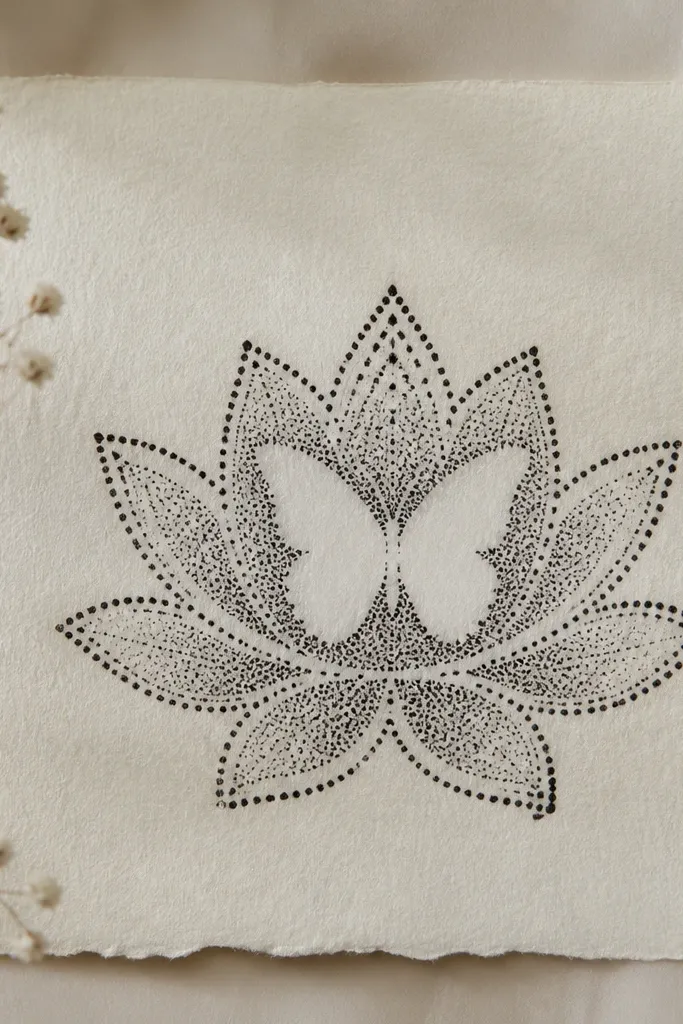
Negative space makes the butterfly look crisp and intentional even if the lotus has texture. I do a stamp-like lotus: bold outline plus tiny dot speckles along petal edges, so it has that "printed" feel. Then I leave the butterfly wings mostly clean - no fill, just outline and a surrounding speckle that stops at the wing shape. This creates a sharp silhouette that reads from far away. It's a great choice for monochrome lovers and for prints that you want to look graphic, like a poster.
Start by drawing the lotus outline in bold black with a 0.5 fineliner. Add small dot speckles along the petal edges and in the outer petals only. For the butterfly, sketch wings as a clean silhouette and ink only the outer contour lines. Then use a fine brush or toothbrush technique to speckle ink around the butterfly - stop the speckle right at the wing edges so the wings stay blank. Add a thin black line for the body and a couple of wing veins. Let it dry flat so the speckles don't smear.
Good to knowPractice the speckle on scrap first so your dot size matches your paper texture.
Common mistakeAvoid speckling inside the butterfly wings - it kills the negative-space effect.
16. Lotus Corner Piece With Butterfly Landing on the Margin
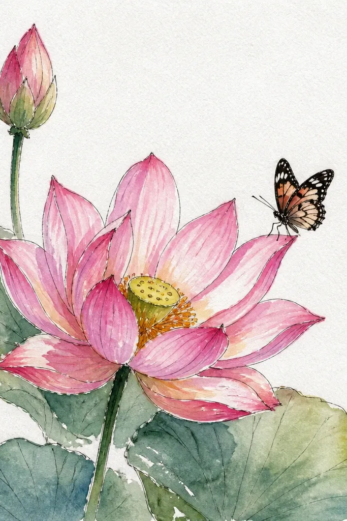
Corner art looks cozy because it feels like it belongs to the page, not pasted onto it. I place the lotus in the top-right and let petals extend inward, keeping the outer corner petals smaller so nothing crowds the edge. The butterfly lands right where the lotus meets the page margin, which makes the composition feel "natural" like a sticker that belongs there. Color stays light: lilac wings with soft yellow highlights, and tiny green sprigs behind. This style works for journal pages, planner covers, and envelopes because it uses the page space efficiently.
First, lightly mark a 2.5 cm margin on the top and right edges. Sketch a lotus that fits inside that corner - 7-9 petals, with the biggest petal facing inward. Ink the lotus outlines and paint petals pale cream with a faint lilac wash at the folds. Draw the butterfly perched on the inward-facing petal edge, wings angled toward the center. Color wings lilac with soft yellow at the wing tips, then add tiny green sprigs behind the butterfly using a 0.2 liner. Keep the background mostly blank so the corner stays clean.
Good to knowAdd one tiny leaf sprig behind the butterfly body - it anchors the butterfly without extra clutter.
Common mistakeAvoid placing the lotus too close to the edge - leave at least 1 cm so it doesn't look cut off.
17. Lotus With Ribbon-Like Petals and Butterfly on the Fold
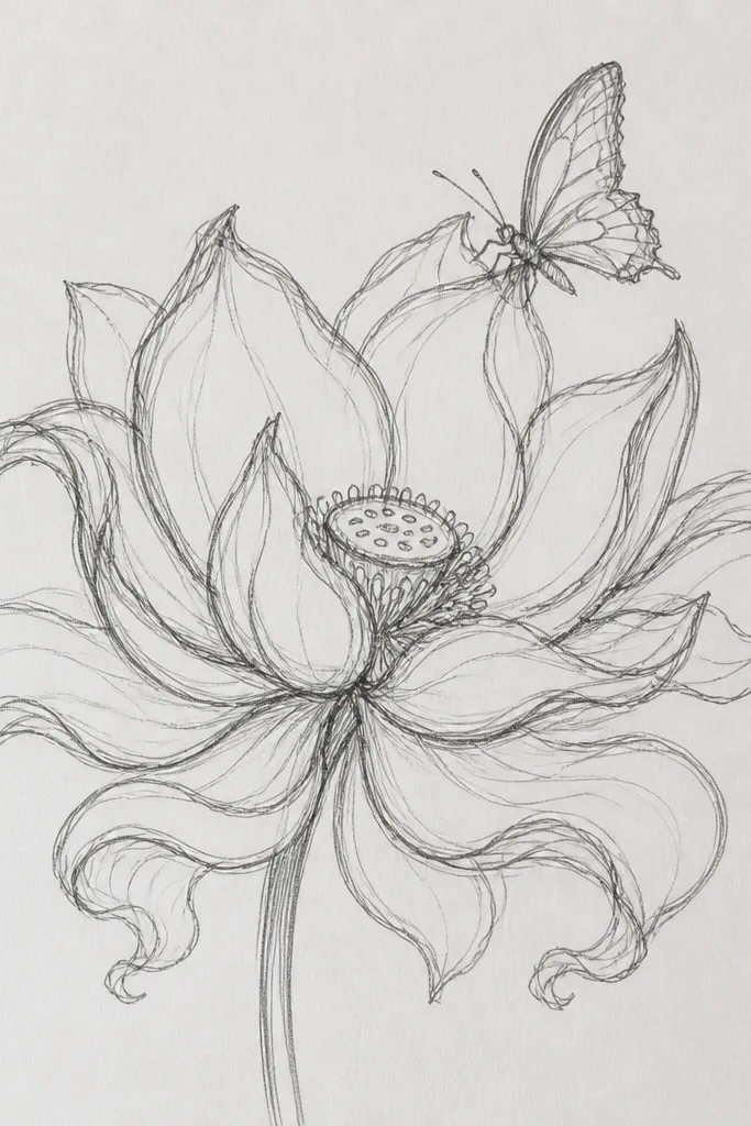
Ribbon-like petals give you a more dimensional lotus without complex shading. You draw petals as long strips with a highlight line down the middle, then you shade the sides lightly so the petal looks folded. The butterfly sits right on a fold line, which makes it feel like it's landing on texture. I use muted peach and brown speckles on the wings because it looks like natural markings instead of cartoon colors. This style is great for sketchbooks and prints because it feels tactile even though it's paper.
Start by sketching the lotus petals as elongated arcs with a clear center cone. Ink the petal outline, then add a single curved highlight line in each petal where you will keep it lighter. Paint the petals muted peach, leaving the highlight lines mostly unpainted. Add light brown shading on the petal sides near the base. Draw the butterfly so its body rests on one petal fold line and wings spread slightly upward. Color wings muted peach with brown speckles in small clusters, then add a few thin wing veins in ink.
Good to knowUse a small round brush and keep shading to the petal edges so the ribbon highlights stay crisp.
Common mistakeAvoid full dark shading in the petal center - it flattens the ribbon effect.
18. Lotus on Textured Watercolor Wash With Butterfly in Pencil
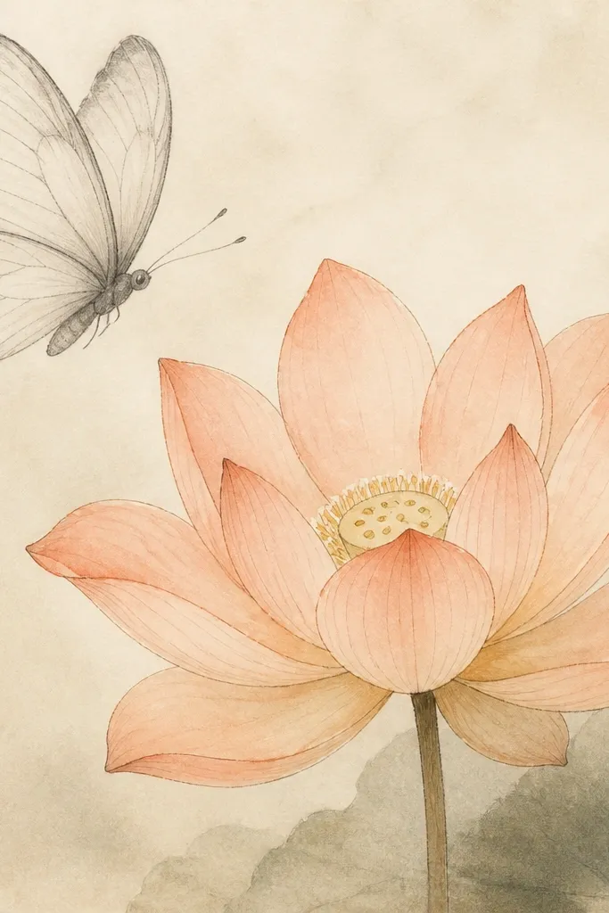
This look is subtle and it's one of my favorites for cozy decor. The background is a pale beige watercolor wash with texture - you can get it by dragging the brush with uneven pressure or letting it dry with slight streaks. The lotus is painted light peach with crisp ink outlines so it stays readable. The butterfly is pencil only, lightly shaded, so it feels like a sketch inside a painting. It's flattering in rooms with neutral colors because nothing screams for attention, yet the lotus still pops. It also works when you want a calmer piece for gifts.
First, wash the background pale beige and let it dry without smoothing it out. Then draw the lotus and ink only the outer petal edges with a 0.3 fineliner. Paint petals in light peach wash and add a tiny bit of warm orange at the base of the center petals. For the butterfly, sketch in pencil and keep the wings mostly outlined with light graphite shading - no ink fill. Place the butterfly near the top of the lotus so it reads as part of the bloom. Add one or two darker pencil lines on the butterfly body to keep it from fading.
Good to knowIf pencil looks too light, press a little harder only on the butterfly body and wing edges.
Common mistakeAvoid inking the butterfly after you start pencil - the contrast can feel harsh.
19. Lotus and Butterfly With Red Ink Accents on White
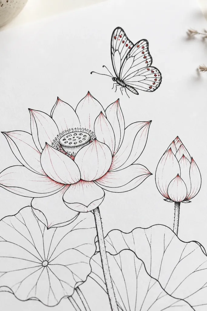
Red accents make the whole drawing feel warm and handmade. I keep the lotus mostly white with black ink outlines and very light gray shading at petal folds. Then I add red accent lines - thin little strokes - near the fold points so the lotus looks like it has depth. The butterfly is black outlined with red dots on the wing tips and a small red streak down the body. This is a great look for quick gifts because it needs fewer colors and still looks intentional. It also photographs cleanly because white paper keeps it bright.
Start by drawing the lotus petals with 9-12 arcs and ink them in black using a 0.4 fineliner. Add minimal gray shading with a soft pencil under the inner petals. Then add red accent lines only on 3-5 petals near the fold - keep them short and thin. Draw the butterfly above the lotus center and outline wings in black. Add red dots on each wing tip cluster (about 6 dots per wing) and a tiny red line for the body. Finish by adding one red dot at the lotus center so both elements match.
Good to knowUse a fine red gel pen so the accent lines stay crisp and don't bleed into the paper fibers.
Common mistakeAvoid red across every petal - it turns into a pattern that hides the lotus shape.
20. Lotus With Soft Ombre Petals and Butterfly Near the Center
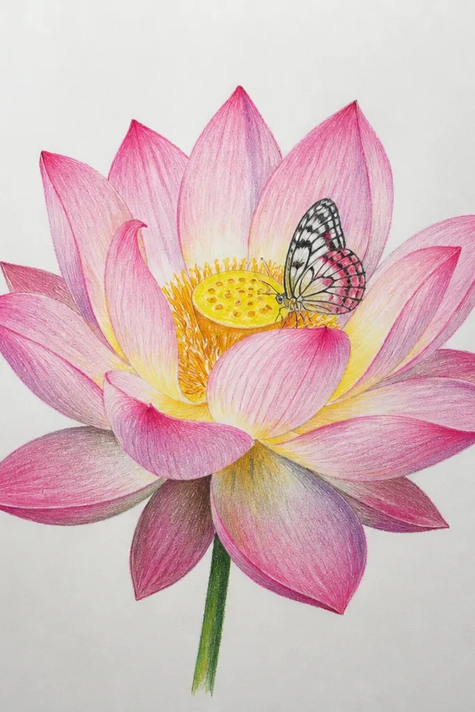
Ombre petals give you a lot of depth without heavy line work. I draw the lotus outlines, then paint each petal with a gentle gradient: lighter near the tip, deeper near the base. The butterfly sits close to the center so it looks like it's emerging from the bloom. I use pale pink and pale blue on the butterfly wings because the cool tone balances the warm lotus, and it still feels cozy. This style works for larger pieces because the gradient shows best when the petals have enough width. It also flatters anyone who likes softer, less graphic art.
First, outline the lotus petals with pencil, then ink with a 0.3 fineliner - keep outlines lighter on the outer petals. Paint the petals in two passes: start with a very light cream wash over the whole petal, then while it's still slightly damp, add pale pink at the base and blend upward with a clean damp brush. Add a tiny deeper pink line at the inner petal folds for shape. Draw the butterfly near the lotus center and paint wings pale pink with pale blue shading near the wing base. Add small vein lines in ink and a light yellow dot on the body for a focal point.
Good to knowBlend with a clean damp brush only once per petal - too many passes create water rings.
Common mistakeAvoid hard edges in the ombre unless you want a graphic look - patchy gradients look accidental.