
1. Blush Center Lotus with Soft Watercolor Wash
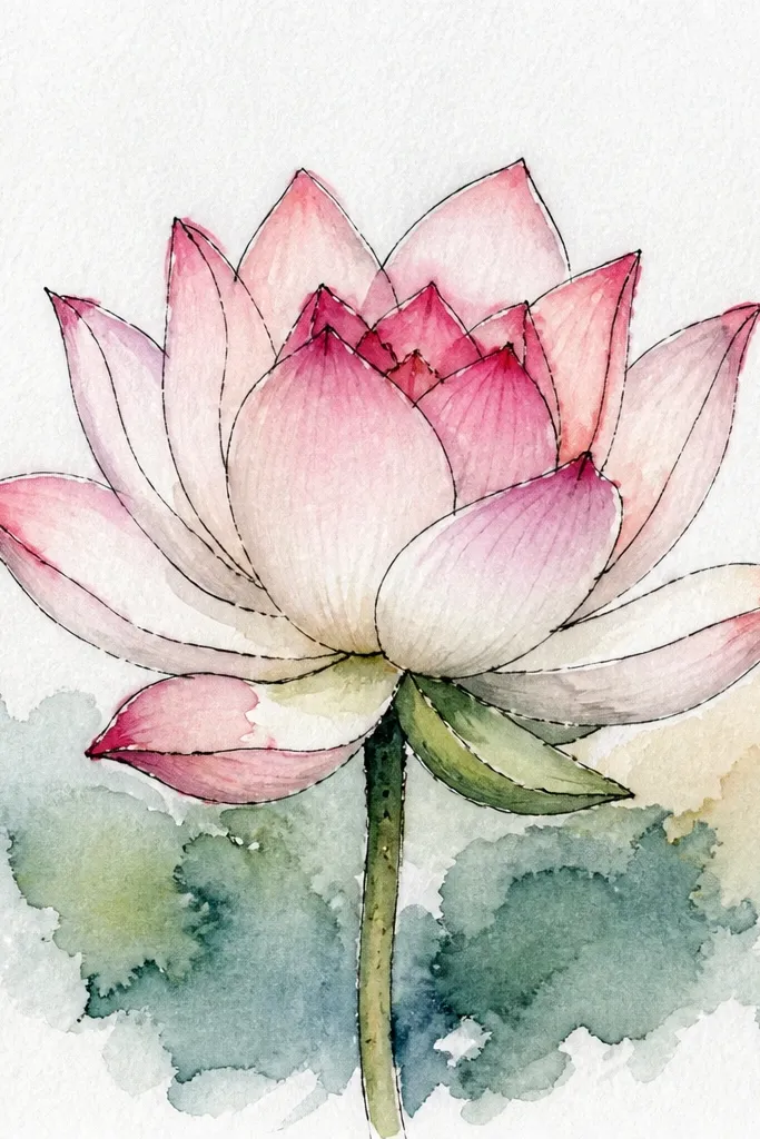
Start by sketching the lotus in pencil with 1 tight center circle and 6 inner petals that point upward. Ink the center and inner petal outlines using a 0.3 fineliner, then leave outer petals lighter in pencil so they look soft. Color the inner petals with a very light blush wash, then tap medium rose only along the overlap lines. Finally, add dusty mauve to the bottom half of the outer petals and let it fade at the tips. Do not darken the very top edges — keep those airy so the bloom feels open.
This one looks delicate because the center stays almost white-pink and the wash gets stronger only on the inner petal overlap. I use a light blush (almost like strawberry milk) for the inner petals, then a medium rose for the ring around it, and finish with dusty mauve on the outer edges. The petals are drawn with a smooth teardrop curve, and the shadow is placed where petals overlap, not randomly. It’s flattering for anyone who wants a clean, airy look on cream paper and it works great for small art prints and gift tags.
Common mistakeDon’t outline every single outer petal tightly — the softness is what makes it look expensive.
Good to knowUse watercolor pencils if you’re new; you can build the wash slowly without flooding the paper.
2. Rose Petal Fan Lotus with Inked Overlap Lines
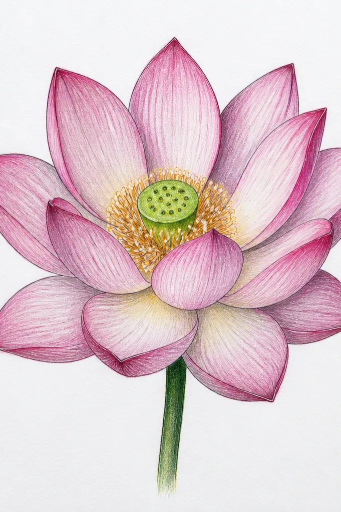
Sketch the center first: a small oval with a ring of 8 tiny teardrops around it. Add two layers of petals: inner petals that are narrower and outer petals that are wider and slightly flatter. Ink the inner petal outlines and the overlap boundaries where one petal sits in front of another. Color the petals with rose using short strokes that follow the petal curve. Leave the overlap lines slightly darker by not fully filling over the pen lines, then add 3-5 tiny dots in the center for detail.
This style looks crisp because the overlap is drawn on purpose. I darken the overlap lines using the fineliner — not heavy marker, just a confident pen stroke — and then color over the top with rose. The result is a lotus that reads clearly even when the petals are simple shapes. It flatters bold layouts because it doesn’t need a lot of background. If you want your drawing to look like it belongs on a planner page or a fabric patch, this is the one.
Common mistakeAvoid coloring all the petals the same flat pink — the overlap lines need contrast.
Good to knowPress a little lighter on the first pass of color so the ink shadows stay visible.
3. Mauve Ombre Lotus on Cream Paper
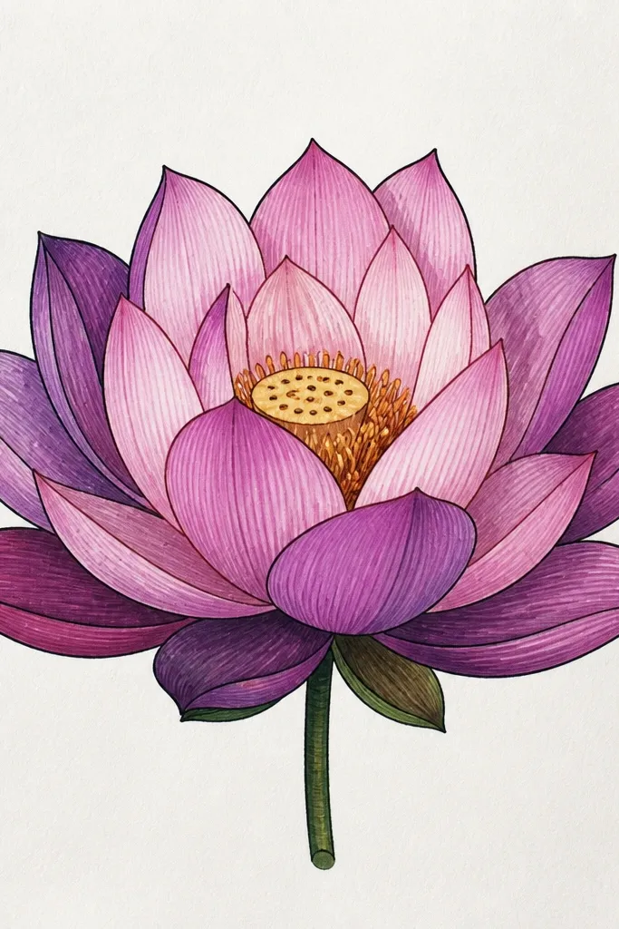
Begin with a pencil guide of 12 outer petals and 8 inner petals, each shaped like a curved almond with a point. Ink only the outer edge of the petals; keep the inner overlap lines light. Color the outer petals first with mauve at the base, then blend toward the tip using a lighter pink pencil or watered brush pen. Leave a narrow white highlight strip along the top edge of each petal so the flower looks glossy. Finish by adding a tiny center ring in medium rose and dotting the center with darker mauve.
Ombre petals look real because your eye reads the gradient as light. I start the base of each petal darker mauve, then blend upward to a pale blush so the tips look like they catch light. The center is kept minimal: a small warm pink circle with a few darker dots. This style looks good for large blooms because the gradient gives the flower a gentle glow without extra details. It’s also forgiving if your lines aren’t perfect, since the shading does the heavy lifting.
Common mistakeDon’t cover the entire petal — the highlight strip is what keeps it from looking muddy.
Good to knowBlend with a tissue or blending stump while the pigment is still slightly tacky for smoother transitions.
4. Pink Lotus with Dot Center and Speckled Texture
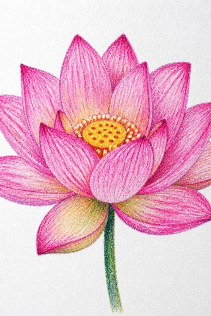
Sketch a lotus with a small center and 10 outer petals that curve upward. Ink the outlines and add 5-6 overlap lines that divide each petal’s shadow area. Fill inner petals with light rose, then add speckles with a darker pink pencil or fine brush pen where petals overlap. For the center, make 30-40 tiny dots in a tight spiral, with the darkest dots near the center point. Add a thin wash of dusty mauve along the outer petal bottoms and stop before the tips.
This one feels handmade in a good way because the texture is intentional. I draw the petals smooth, then add speckles only in the shadow zone near the overlap and along the lower outer edges. The center is a small cluster of dots — not a fully shaded circle — which makes the bloom look like it has pollen. It’s great for mixed media pages because it hides small imperfections. If you want a softer, more organic lotus that still looks finished, this is it.
Common mistakeSkip speckles in the highlights — they make the petals look dirty.
Good to knowUse a toothpick to place speckles — it gives you consistent dot size without blotting.
5. Minimal Line Lotus with One Pink Wash Layer
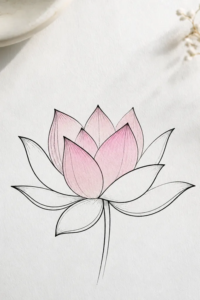
Draw the center as a small oval with 6 inner petals around it, using a single continuous line style. Ink the lines and erase pencil marks. Add a light blush wash only to the inner petals, staying inside the outlines and leaving the petal tips slightly lighter. Keep the outer petals as line only, with just one subtle shadow line at the overlap points. Add 4 small dots in the center and stop — no extra texture.
Minimal linework looks modern and it photographs well because it relies on shape, not heavy shading. I keep the outer petals as simple outlines and add one wash layer only on the inner petals. The pink stays light, like a watercolor bookmark. This works for people who struggle with shading — you’re not fighting gradients, you’re using negative space. It also looks great on small surfaces like bookmarks and the front of envelopes.
Common mistakeDon’t color the outer petals — too much pink turns a minimal design into a busy one.
Good to knowUse a brush pen with a very diluted ink so the wash stays airy.
6. Hot Pink Lotus with Dark Rose Rim Shadow
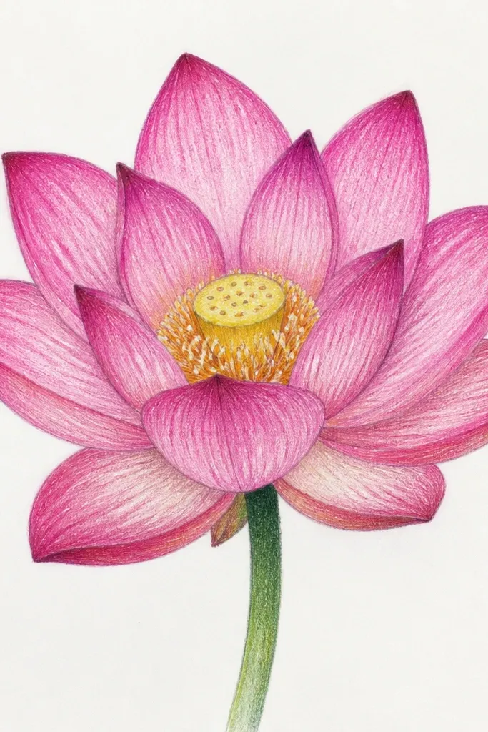
Sketch 8 outer petals and 7 inner petals, keeping the outer petals wider and more rounded. Ink the entire silhouette with a 0.5 pen for bold edges. Color the inner petals hot pink, leaving a tiny highlight at the top edge. For the outer petals, paint hot pink first, then trace a dark rose line along the underside and blend outward with light pressure. Finish with a deeper rose center and add 2-3 short curved highlight lines on the inner petals.
This lotus is for when you want impact. The hot pink gives you that “fresh flower” feeling, and the dark rose rim shadow makes the petals look like they’re lifting off the page. I draw a thin shadow line under the outer petals, then fill slightly beyond it so the underside looks darker. The center uses deeper rose for contrast, plus a couple of short highlight strokes. It flatters bright, colorful aesthetics and looks amazing on dark cardstock if you flip the colors slightly toward mauve.
Common mistakeSkip muddy blending — keep the rim shadow crisp so it stays graphic.
Good to knowIf your hot pink looks patchy, layer it in two thin coats instead of one thick coat.
7. Pastel Pink Lotus with Colored Pencil Soft Blending
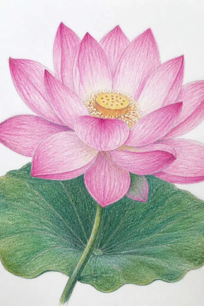
Colored pencil makes this lotus feel like it’s floating. I use very soft pressure for the base color, then I build shadows gradually with a mauve pencil that matches the paper warmth. The key is that the pencil shading follows the petal curve so the flower doesn’t look like it has blobs. The center stays pale peach-pink so it doesn’t overpower the petals. This style is flattering for light skin tones in artwork prints and it looks calm on planner pages and stationery.
Start with a pencil sketch of 9 outer petals and 6 inner petals, keeping the lines loose. Ink lightly or skip inking if you want a softer look. Color the inner petals with pale blush using circular strokes, then blend outward with very light pressure. Add shadows by shading only the lower third of each petal and blending into the base color. Use a peach-pink for the center circle and add a few darker peach dots for depth.
Use a kneaded eraser to lift tiny highlights on outer petal tips after shading.
Don’t use heavy pressure — it makes colored pencil look grainy and harsh.
8. Pink Lotus with Gold Gel Pen Center Glow
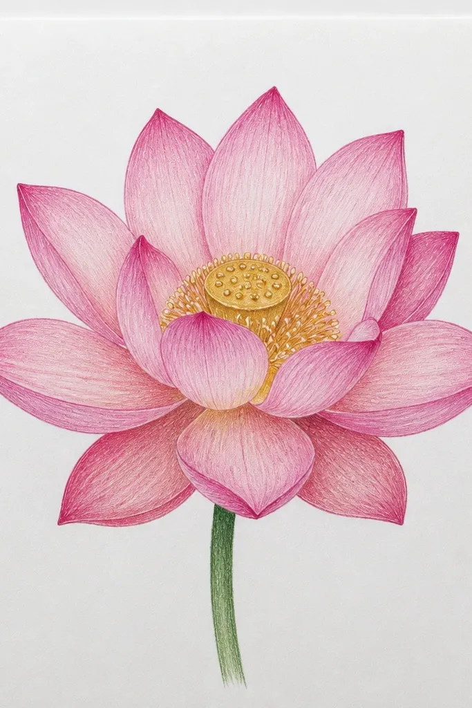
Sketch the lotus with a small center and 10 outer petals. Ink with a fine pen, then color inner petals light rose and outer petals rose with dusty mauve shadows at overlap points. Add a dot center using a deeper pink, placing dots tightly in a spiral. Let everything dry, then go over the top half of the center dot cluster with gold gel pen. Add 2-3 tiny gold strokes on inner petals where they face upward.
Gold in the center makes the whole drawing feel celebratory without adding extra shapes. I draw the lotus in pink first, then place gold gel pen only where the center would catch light. That means the gold is not everywhere — it’s a small glow over the dot cluster. The petals look best in light rose with shadows in dusty mauve so the gold has room to stand out. This one looks great for wedding cards, birthdays, and anything that needs a little “special” detail.
Common mistakeDon’t cover the whole petals with gold — it turns the lotus into glitter confetti.
Good to knowTest the gold gel pen on scrap first; it often needs a few presses to flow smoothly.
9. Lotus Flower Buds Around a Main Bloom
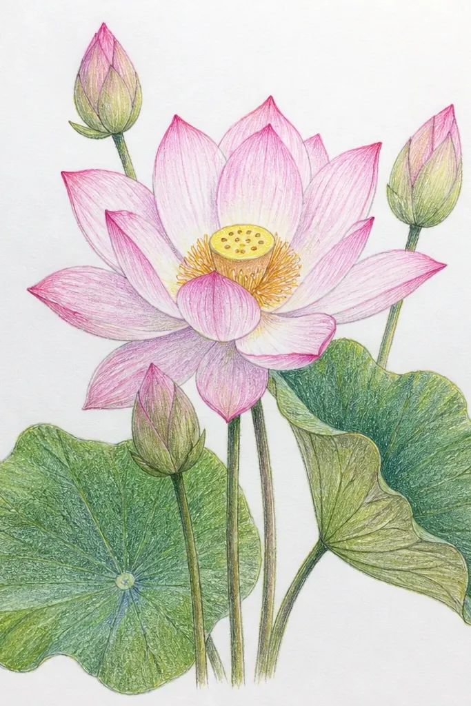
Draw a large lotus in the center with 12 outer petals and 7 inner petals. Place two smaller buds on the left and right, each with 3-4 curved petals and a tiny center point. Ink and color the main bloom with blush to rose gradients, and add dusty mauve shadows on the outer petal bases. Color the buds with the same blush but skip the detailed overlap lines — keep them airy. Finish by adding a thin stem curve that connects visually to the buds without crowding the page.
This composition looks balanced because it adds movement around the main flower. I keep the main lotus fully developed with layered petals and clear shadows, while the buds are simpler and paler. That contrast helps the viewer’s eye land on the main bloom first. It’s especially nice for wall prints because the buds frame the center and make the piece feel complete. If you like floral drawings that don’t look flat, this layout fixes that.
Common mistakeDon’t shade the buds as dark as the main flower — it steals attention from the focal bloom.
Good to knowKeep the buds at about one-third the height of the main bloom so the scale reads instantly.
10. Pink Lotus Mandala Frame with Simple Petals
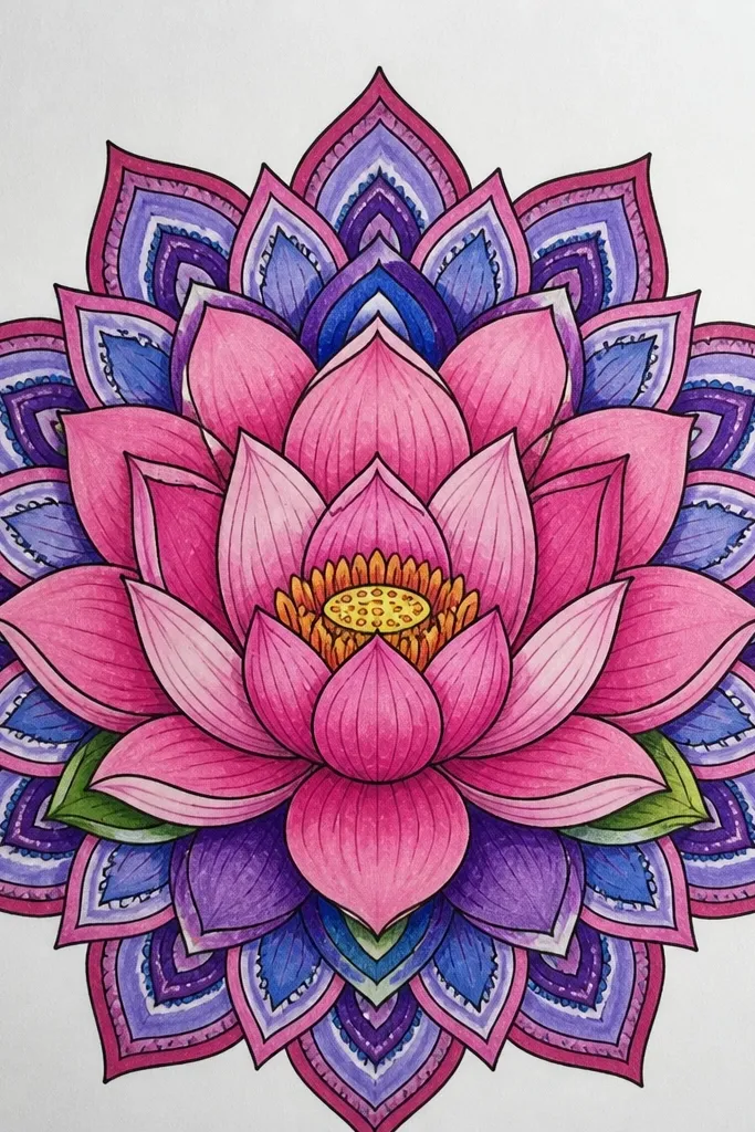
This works because the lotus is the center, and the frame is just enough structure to make the whole page look designed. I alternate light blush and medium rose on the outer petal ring so it looks patterned without becoming geometric. Around the lotus, I add a dot ring and small leaf marks — simple shapes that don’t compete with the petals. The result is a drawing that looks great in a square frame and on bookmarks because it has a clean border. It also hides uneven petal drawing since the pattern ties it together.
Sketch a circular mandala guide lightly with a compass or a round object, then draw the lotus in the center. Create an outer ring of 12 petals with alternating colors: blush on every other petal and medium rose on the rest. Ink the lotus outlines and add a few overlap lines, but keep them minimal. Add a dot ring just outside the petals, then place 12 short leaf marks between dots. Shade the lotus shadows in dusty mauve only at the lower edge of each petal, leaving the top edges light.
Use a ruler for the circle guide lines, then erase fully after inking so it stays crisp.
Don’t add too many extra symbols inside the frame — it makes the lotus look lost.
11. Pink Lotus on a Water Ripple Background
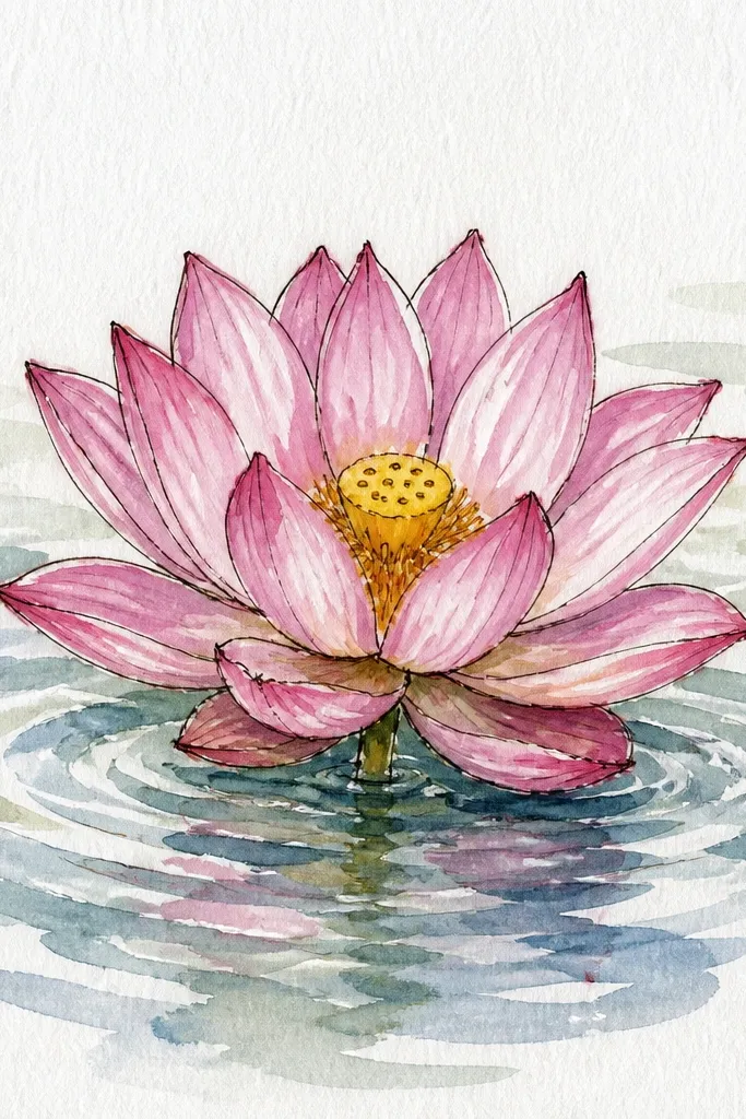
Draw the lotus first so you don’t lose its shape to the background. Outline and color the lotus with blush inner petals and rose outer petals, then add dusty mauve shadows where petals overlap. Under the lotus, draw 6-10 ripple arcs that get wider as they move down. Add a faint reflection by lightly mirroring the outer petal shapes as pale rose lines, stopping before the ripples get too strong. Color the ripples with a light wash of blue-grey using very diluted paint.
A water ripple background makes the lotus feel like it’s resting on a pond, not sitting on blank paper. I use thin curved ripple lines in pale blue-grey, and I keep the lotus slightly darker than the ripples so it stays the focal point. The petals use light rose with mauve shadows, and I add a faint reflection curve under the outer petals. This style looks good for postcards and art journal pages because the background adds interest without making the lotus complicated.
Common mistakeDon’t darken the ripples — dark backgrounds make the lotus look flat.
Good to knowKeep the ripples lighter than your lotus by using diluted color — the lotus should look closer.
12. Pink Lotus with Black Ink Splash Accents
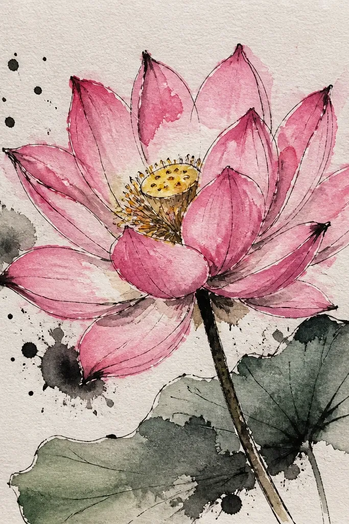
Sketch the lotus with 10 outer petals and 7 inner petals, then ink with a 0.5 pen for crisp edges. Color the petals with rose and blush: inner petals blush, outer petals rose, and overlap shadows in mauve. Add a small center dot cluster and two short highlight lines. Let the color dry fully, then use a toothbrush flick technique to create black ink splashes around the lotus — protect the petals by shielding them with scrap paper. Add only a few splashes, mostly on the sides and upper corners.
This is the “I want it to look artsy” version. The black ink splashes add energy, but the lotus stays controlled with clean petal shapes. I keep the petals in a consistent rose-pink range so the splashes don’t overwhelm the flower. The center has simple dot detail, and the outer petals have a soft shadow at the base. This looks great for sketchbook covers and modern wall prints where you want a little contrast.
Common mistakeDon’t splash over the petals — splatter on the flower makes it look messy instead of intentional.
Good to knowPractice one flick on scrap; you want small droplets, not big blobs.
13. Double Lotus Bloom with Matching Pink Tones
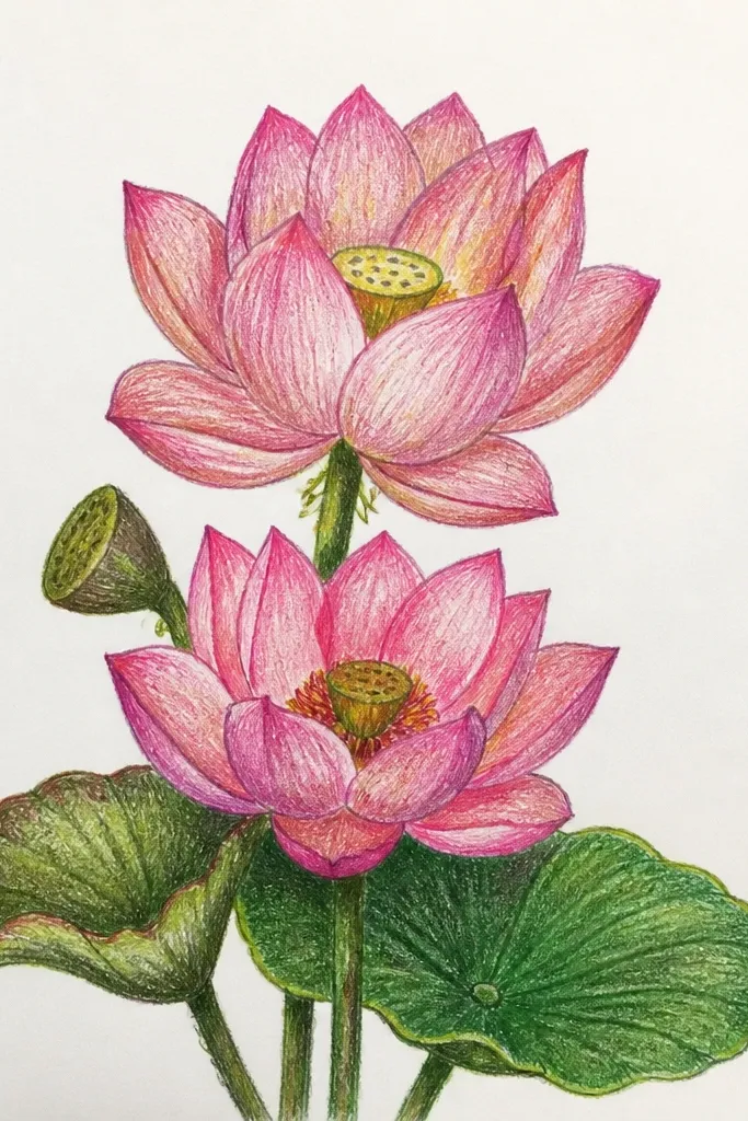
Sketch two lotuses: a back one at about 70% of the size of the front. Draw the back lotus first in pencil and keep its petals simpler and lighter. Ink both blooms, but add overlap lines only on the front lotus. Color the back lotus with blush and minimal shadow, then color the front lotus with rose and dusty mauve shadows at overlap points. Finish with a center dot cluster on both, using slightly darker pink on the front center.
A double bloom looks fancy because it creates depth without needing a complex background. I place the back lotus higher and lighter, then bring the front lotus forward with darker rose petals and deeper mauve shadows. The overlap between blooms is where it sells the 3D look — you treat the back bloom like it’s farther away. This works well for greeting cards where you want a clear focal point but also want something extra. It also looks good in vertical formats like bookmarks.
Common mistakeDon’t make both blooms the same brightness — the depth disappears.
Good to knowKeep the back lotus shadow lighter — it should look like it’s behind the front petals.
14. Pink Lotus in a Circle Badge with Thick Outline
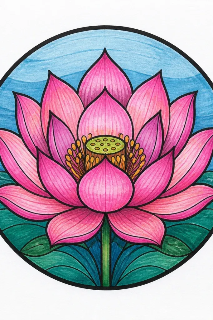
Badges and stickers work because the thick outline creates instant readability. I use a bold black circle around the lotus and keep the lotus design clean and compact. The petals are shaded with blush to rose so it still looks dimensional, but the thick outline prevents the drawing from looking delicate or lost. This is perfect for labels, planner stickers, and small decor prints where you need a strong silhouette. It flatters simple, modern aesthetics and looks sharp even when scanned.
Draw a circle badge first, then sketch the lotus inside with 9 outer petals and 6 inner petals. Ink the badge circle and the lotus outlines with a 0.5 or 0.7 pen. Color inner petals blush and outer petals rose, then add dusty mauve shadows along the underside of the outer petals. Add a dot center and a couple of tiny highlight strokes. Keep the space between the lotus and circle border clean — no extra doodles.
If your pen bleeds, use a waterproof fineliner and let it dry fully before coloring.
Don’t let the petals touch the circle border — leave a small gap for a crisp badge look.
15. Lotus Flower with Patterned Petal Veins (Stippling Look)
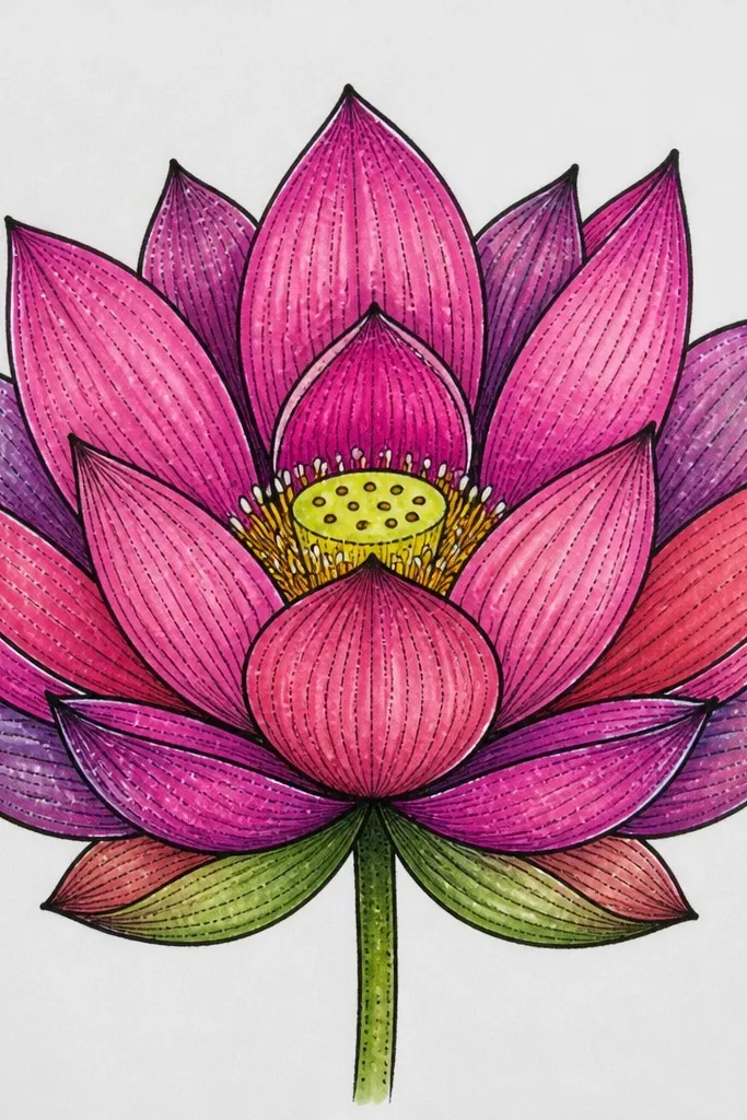
Vein patterns make the lotus look detailed without needing heavy realism. I draw a few main vein lines on each petal, then I add stippling (tiny dots) along those lines to suggest texture. The pink stays in a controlled palette: blush for inner petals, rose for outer petals, and mauve stipple for shadows. This style looks best when you’re using watercolor pencils or colored pencil because the texture matches the medium. It’s great for gift tags and framed art where you want the viewer to notice details up close.
Sketch the lotus with clear petal shapes and decide how many veins you want — I do 3 main veins per petal. Ink outlines, then lightly draw vein lines with a pencil so you can erase if needed. Color inner petals blush and outer petals rose, keeping shading mostly at the petal base. Add stippling along the vein lines using a mauve pencil, concentrating on the lower half of each petal. Finish the center with a small dot cluster and a few darker stipples radiating outward.
Use a sharp colored pencil and tiny circular motions for stippling so the dots look consistent.
Don’t add vein lines everywhere — too many veins make it look like a coloring book page.