
1. Burnt Umber Foreground Tufts on Cream Mat
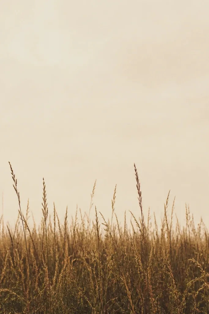
This one looks calm because the foreground has weight but the rest of the page stays quiet. I start with a cream base so the burnt umber grass reads like dry late-autumn growth, not a muddy brown blob. The blade texture is made from short, slightly varied lines — you’ll see tiny differences in length, which stops it from looking stamped. It flatters small spaces because it doesn’t compete with furniture patterns; cream also works with warm woods and beige walls.
Step 1: Tape off a “field strip” across the bottom third of your paper, then lightly wash the top area with a very thin mix of warm beige (or diluted ochre) so it doesn’t look stark. Step 2: Use a paint pen in burnt umber and draw vertical grass blades, starting dense at the tape line and thinning as you move upward. Add olive tufts by dropping a second color into 10-20% of the blades, keeping the direction consistent. Step 3: Remove the tape once everything is fully dry and check the baseline — if you see gaps, add a few extra short blades right on the edge.
Keep your burnt umber strokes under 1/2 inch each for a “dry grass” look instead of tall weeds. If you want more fall warmth, add a tiny dab of orange-ochre on only the top halves of the tallest blades.
Don’t shade the whole field with a solid brown wash; it kills the blade texture and makes it look flat.
2. Honey Ochre Dots Between Blade Lines
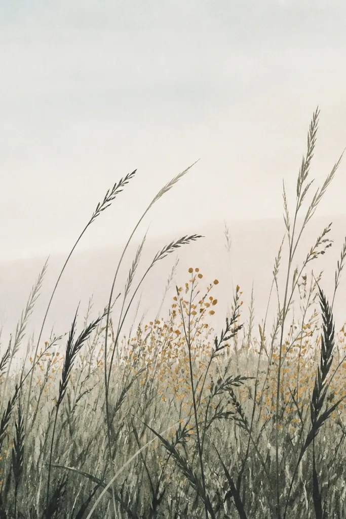
This is my favorite trick for making grass look like it has depth without drawing a ton of extra lines. The ochre dots act like seed heads and sunlit highlights, so your eye reads “autumn” instantly. I use charcoal or deep green for the base blades, then add ochre dots only in small clusters so it doesn’t turn into confetti. This look flatters anyone who wants something that reads detailed from across the room but still stays low maintenance up close.
Step 1: Draw a simple horizon line using a thin pencil or very light marker, then block in the field with muted green paint pen strokes that follow the horizon direction. Step 2: In the mid-ground (middle third of the field), add honey-ochre dots between blade groups. Keep the dots about the size of a pencil eraser tip, and leave plenty of negative space. Step 3: Add a few taller strokes in the foreground using the same green, then finish by lightly blending the top edge of the field with a diluted ochre wash so everything feels tied together.
Good to knowUse a light touch when placing ochre dots; if you press too hard, you’ll get thick blobs that look like paint drips.
Common mistakeAvoid adding dots everywhere — clusters in the mid-ground are what make it look like light hitting seed heads.
3. Spiral Wind Grass Swipe
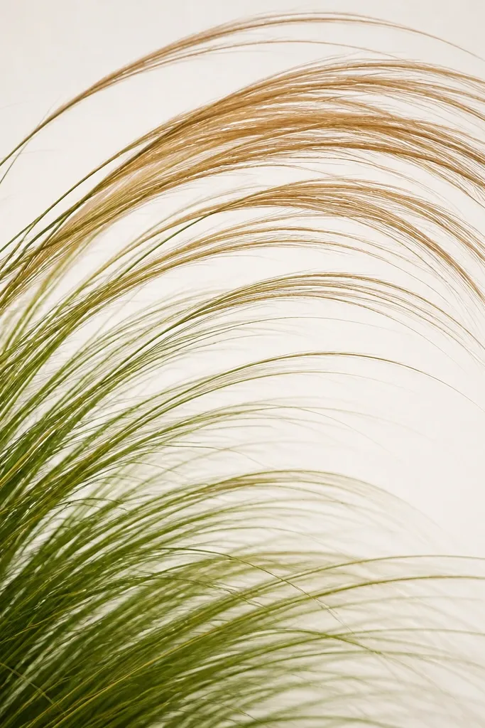
Wind movement makes a field drawing feel alive, even when the technique is simple. I draw the blades along a spiral path, so they look like they’re leaning the same way rather than random. The deep green base anchors the scene, and warm brown tips sell the fall transition. This one looks best in portrait frames because the spiral motion fills the height and gives the eye a route.
Step 1: Mark a curved “wind line” from bottom left to upper right with a pencil dot grid so you don’t lose the curve. Step 2: Start at the bottom left and draw short blades that lean along the wind line, pressing harder at the base and lifting as you reach the tip. Step 3: Switch to warm brown for the top 20-30% of the blades, but only in the outer half of the spiral so the center stays greener. Finally, add a few extra tall blades that cross the spiral line to create a foreground peek.
Good to knowPractice the lean angle on scrap paper first — you want the blades to feel like they share one “breathing direction.”
Common mistakeDon’t make the blades too long; long spiral blades start to look like grass in a kid’s coloring page.
4. Layered Tape Horizon With Three Grass Bands
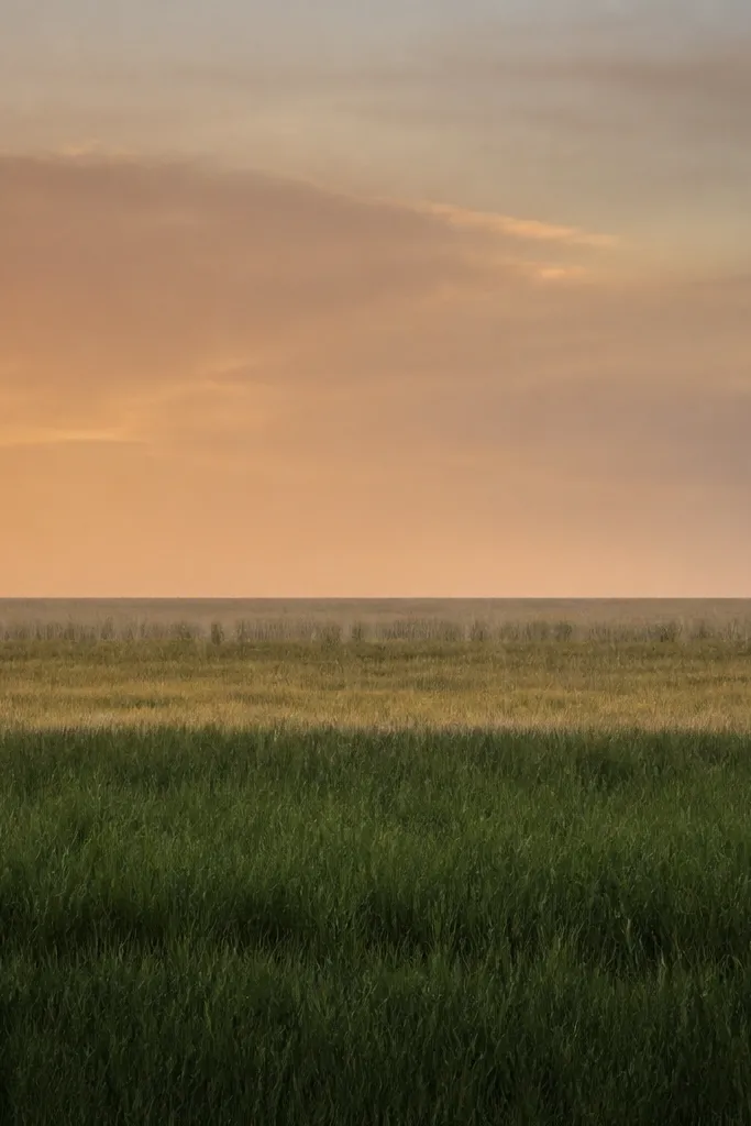
Tape makes this look neat without effort, and neatness is what reads “decor.” You’re creating three distance layers: dense foreground, mid-ground texture, and sparse far field. The sky wash in orange-gray ties the autumn palette together and stops the grass from looking cut-out. This flatters mantle displays because the horizon line looks crisp and intentional from across the room.
Step 1: Tape three horizontal lines across your paper, spaced so the bottom band is about 40% of the field height, the middle band 35%, and the top band 25%. Step 2: Paint or draw the bottom band with dark green strokes that start thick at the tape edge and taper upward. Step 3: For the middle band, use olive and draw fewer blades, leaving more gaps. Step 4: For the top band, use a thin pen (or diluted paint) to add short, light lines — just enough to imply depth. Remove the tape after the last layer dries.
If you want the far field to look misty, dilute your far color with water or medium and keep those lines extra faint.
Don’t overfill the far band; dense distant grass kills the distance effect.
5. Matte Chalk Grass With Soft Smudge Shadows
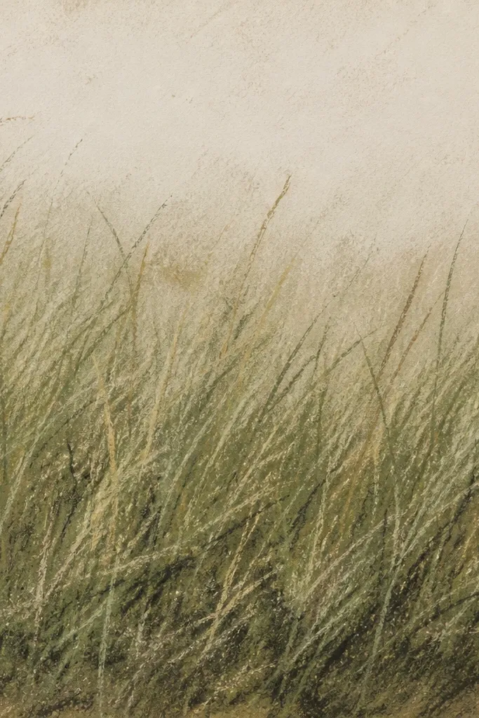
Chalk is low maintenance because it blends fast and hides small unevenness in your strokes. The trick is to keep blade lines sharper than the shadows — you want crisp grass, then soft shadow under it. I use a light dusting of green first, then add darker chalk for the blade tips. This works great for gifts because chalk art looks cozy and slightly vintage, and it doesn’t demand perfect line control.
Step 1: Lightly sketch the horizon and then dust a base layer of pale green chalk across the field area. Step 2: Use a darker green chalk stick to pull short vertical strokes, pressing just enough to leave a visible edge. Step 3: Dip a fingertip or a paper stump in a brown chalk and swipe a thin shadow band at the bottom edge of the field. Step 4: Add a few burnt umber strokes on top of the darkest area for autumn warmth. Fix with a light spray from a distance once the whole piece is dry.
Good to knowSpray fixative in two passes, not one heavy coat. Heavy coats can erase the texture you worked for.
Common mistakeDon’t rub over your blade strokes repeatedly — it turns them into a flat green haze.
6. Paint Pen Seed Heads on Olive Field
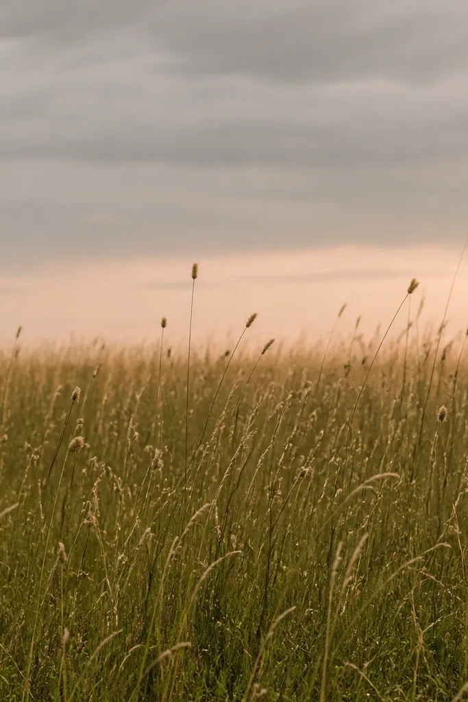
Seed heads make the grass feel like a real plant, not just a texture. I draw the seed heads as small ovals or tiny teardrops perched on top of a few blades, mostly in the mid-ground and slightly fewer in the foreground. The pale gold color catches light under indoor bulbs, which is why this reads cozy. It also looks good on medium skin tone walls because the gold doesn’t pull red — it stays warm and soft.
Step 1: Color the field with olive paint pen strokes, keeping most blades 1/4 to 1/2 inch long. Step 2: Add a thin horizon wash in muted gray with a touch of peach at the base, then let it dry. Step 3: For seed heads, switch to pale gold and place small ovals on about 15-25% of the blades, leaving the rest plain. Step 4: Deepen the foreground by adding a few darker olive strokes at the bottom edge, then stop before it turns into a black mass.
Good to knowSeed heads look best when they’re slightly uneven — vary their size by 20% so they don’t look stamped.
Common mistakeAvoid drawing seed heads on every blade; you’ll lose the airy field feel.
7. Dried Grass Fringe Edge on Dark Green Base
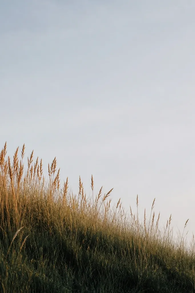
This one is a cheat code for “fall texture” because the fringe edge creates a strong silhouette. The dark green base makes the tan and burnt orange tips pop without you having to add lots of detail across the whole page. I like it for long, narrow frames because the fade from left to right feels intentional. It also looks great in kitchens and entryways where you want something warm but not too busy.
Step 1: Paint or marker-block a dark green field base across the bottom 25-35% of the page. Step 2: Starting at the base, draw lighter tan blades along the left side and gradually reduce their density toward the right. Step 3: Add burnt orange tips on only the top halves of the tan blades — keep the color change subtle. Step 4: Use a very light gray wash above the field to suggest air and distance.
If your tips look too bright, mix burnt orange with a bit of brown before you color the top halves.
Don’t outline each blade with a dark border; it turns the fringe into a cut-paper craft look.
8. Two-Tone Grass Ombre With Soft Watercolor Sky
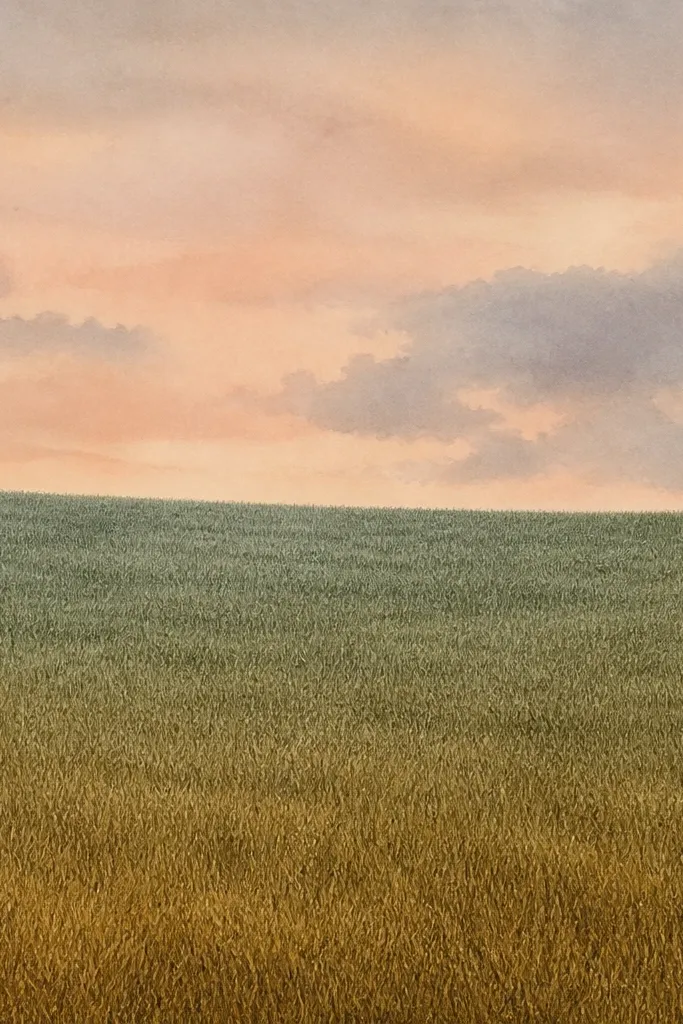
Ombre grass looks high effort because the colors shift smoothly, but the method is simple. I draw the blades in the same direction, then change the color mix as I move down the page. The top stays cooler so the field feels farther away, and the bottom warms up so it feels grounded. This works for people who want a “modern cozy” look that still feels handmade.
Step 1: Wet the sky area lightly with clean water and wash in peach-gray watercolor, keeping the horizon area slightly darker. Step 2: For the field, start drawing short blade strokes at the top using a cool muted green. Step 3: As you move downward, switch mixes: olive first, then olive-brown near the bottom. Keep stroke lengths consistent so the gradient reads as color shift, not different blade sizes. Step 4: Add a small set of taller foreground blades in the bottom warm area to anchor the scene.
Blend your color shift on the paper by overlapping two colors in the transition zone for about 1 inch.
Don’t let the sky wash creep into the field if you want clean grass edges.
9. Mini Frame Meadow With Dense Foreground and Empty Center
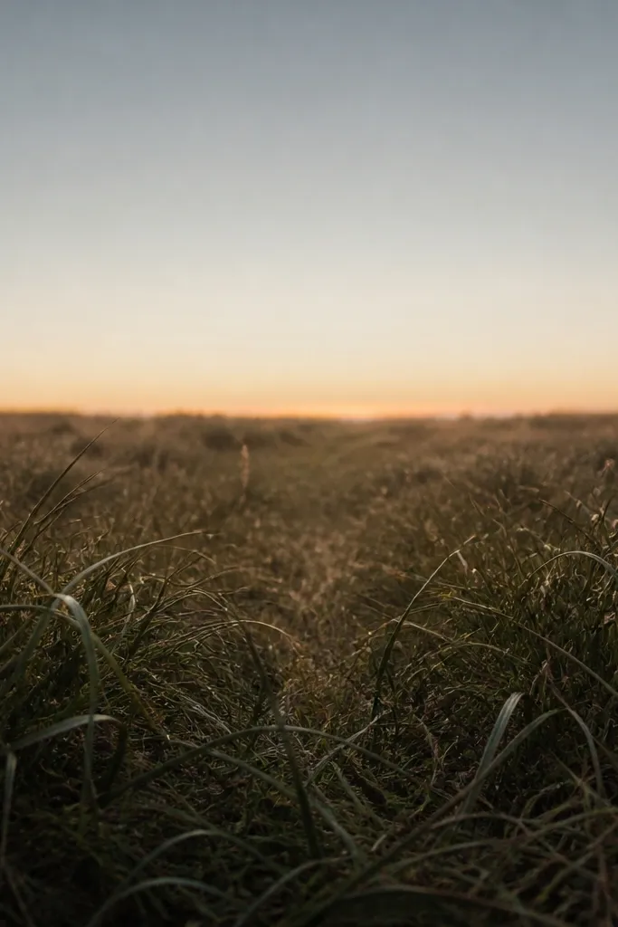
Negative space is what makes this feel airy, not messy. I keep a “breathing path” in the center by drawing fewer blades there, then let the foreground fringe and the sides do the work. This gives you a cozy meadow even in a tiny frame because the eye has room to rest. It also hides shaky drawing hands since you aren’t forced to fill every inch.
Step 1: Choose a small frame and mark the field area with a pencil rectangle. Step 2: Draw dense grass along the bottom edge using dark green strokes, then leave a central vertical strip about 1/4 of the field width with minimal blades. Step 3: Add side grass clusters by drawing blades near the left and right edges, curving slightly toward the empty center. Step 4: Add a thin horizon line with a warm gray and a single wash of pale ochre so it still reads autumn.
Good to knowIf the empty center looks too blank, add only 5-10 taller blades that lean inward toward the negative space.
Common mistakeAvoid filling the center “just to balance it” — the breathing space is the whole point.
10. Ragged Hill Foreground on One Sheet
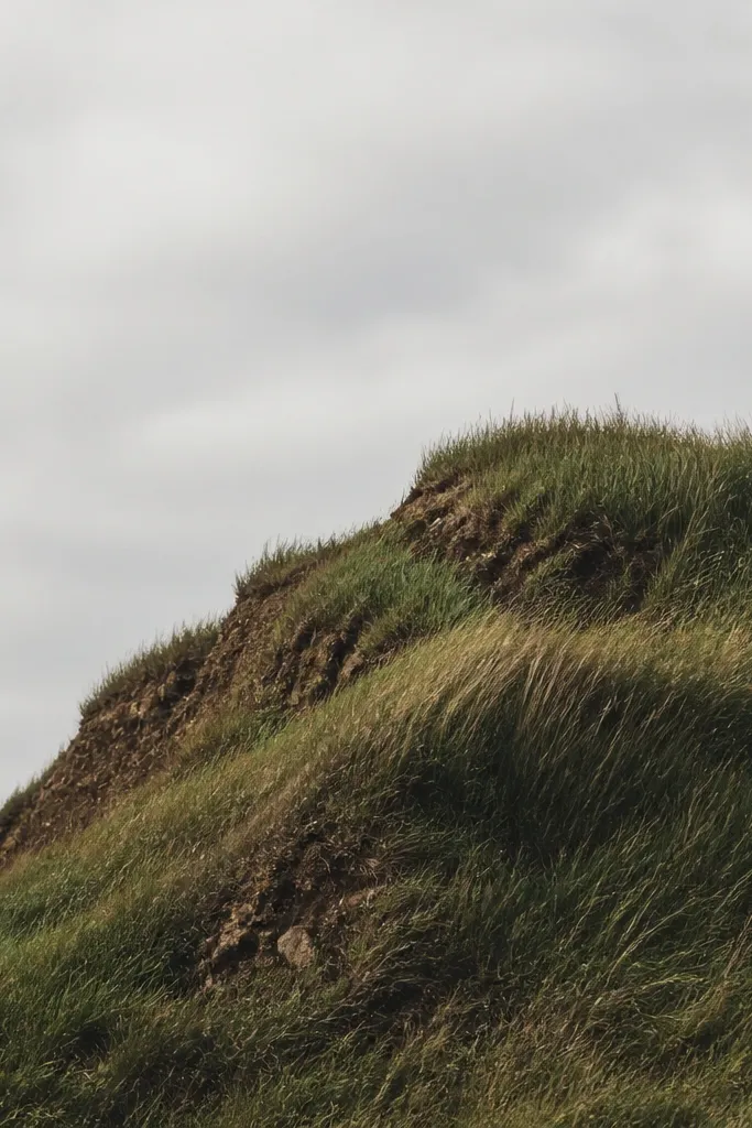
A ragged hill edge makes your field look like it has terrain, not just flat texture. I draw the hill silhouette first, then cover it with grass strokes that follow the slope direction. Because the hill top catches light, I use lighter greens there and darker shadows along the lower slope. This is flattering for people who want a more dramatic piece for a shelf without adding houses or trees.
Step 1: Draw a jagged hill outline rising from the bottom edge using a pencil. Step 2: Fill the hill with grass blades that lean slightly along the slope; keep strokes shorter near the shadowy lower edge. Step 3: Add burnt umber to the shadow side by layering a darker color on about 30% of blades at the base. Step 4: Leave the sky area simple — a pale wash with a warm horizon band is enough. Let it dry fully before you handle it.
Good to knowUse a smaller nib (fine paint pen) on the hill top so the grass looks lighter and more airy up high.
Common mistakeDon’t smooth the hill edge; a clean curve looks like a cartoon hill and kills the autumn feel.
11. Vertical Stacked Blades Like a Field Fence
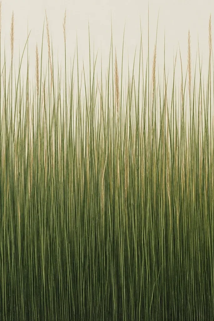
Straight vertical blades read crisp and modern, and they’re forgiving when your hand shakes. I treat them like stacked lines: consistent direction, lots of small gaps, and color variation only at the tips. The tan highlights make it feel like late-season sunlight without needing seed head details. This looks great in minimalist rooms because it doesn’t rely on lots of extra elements.
Step 1: Lightly sketch the horizon and mark where the field starts. Step 2: Use muted green to draw straight up strokes, starting sparse at the top of the field and getting denser toward the bottom. Step 3: Add tan highlights only to the top 1/3 of blades, spacing them so they don’t form solid stripes. Step 4: Finish by deepening the very bottom with a darker green so the field has a grounded base.
If your lines wobble, fix it by drawing in rows — complete one row of blades, then move up slightly.
Avoid turning it into a solid “grass carpet” by filling every gap.
12. Willow-Drop Grass Over a Soft Horizon Line
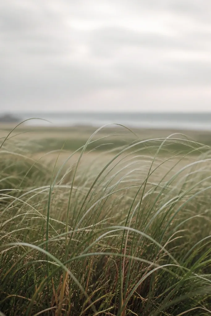
Drooping blades give you that cozy, slightly romantic autumn look without adding any extra subject matter. I draw the blades with a gentle curve so they “fall” toward the horizon, then I keep the horizon hazy with a light wash. The copper-brown near the bottom adds warmth like late afternoon light. This flatters people who want decor that feels softer than sharp, upright grass.
Step 1: Wash the sky area with pale gray and a faint peach near the horizon, then let it dry enough to draw on top. Step 2: Draw the horizon with a very light pencil line — you’ll cover it with grass texture. Step 3: Use muted green to draw drooping blades, curving them slightly as they rise then fall. Step 4: Add copper-brown highlights on only the lower third of the blades so the warmth sits near the base.
Good to knowKeep your curves shallow. Deep S-curves look like stylized weeds instead of a calm field.
Common mistakeDon’t make the horizon line dark and sharp; it will fight the softness of the drooping blades.
13. Speckled Distant Field With Fine-Tip Lines
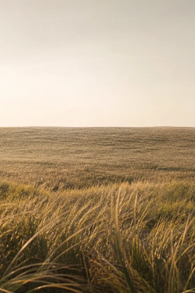
Distance is the whole trick here. The speckled distant field gives you depth without drawing a ton of blades. I use a fine-tip paint pen for the far area so the marks stay tiny and airy, then switch to a thicker tip for the foreground so the scene has contrast. This is low maintenance because you can stop adding detail once the foreground feels grounded.
Step 1: Create a simple horizon wash using diluted cream or warm gray. Step 2: In the upper field, use a fine-tip pen to add short marks — think tiny lines and dots — leaving lots of white space. Step 3: In the bottom third, switch to a broader tip muted green and draw blade strokes that are longer and denser. Step 4: Add a few burnt umber shadows at the base of the foreground blades and stop there.
Good to knowIf the distance looks too dark, lighten it with diluted paint and a soft brush, then let it dry before adding any more speckles.
Common mistakeAvoid using the same tip thickness for the distance and foreground; it makes everything look the same depth.
14. Autumn Stripe Field on a Stretched Canvas
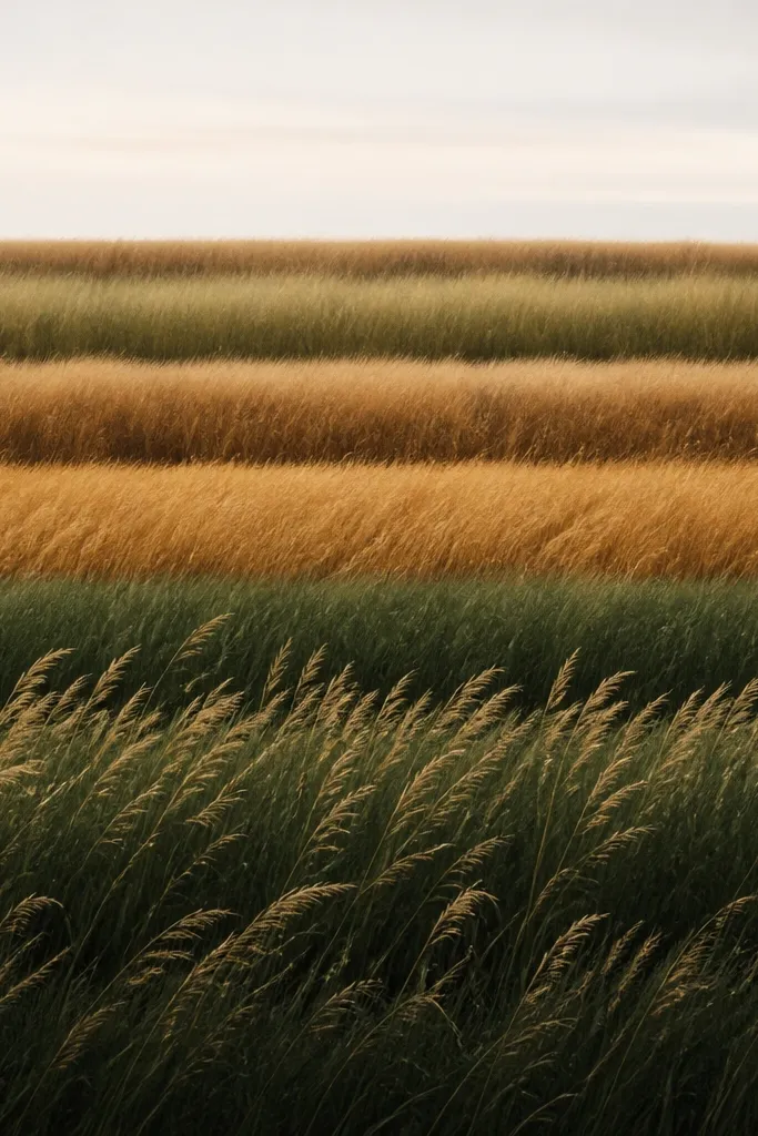
Canvas gives you a finished look fast because the texture grips paint pen lines. The stripe method is low maintenance because you’re repeating a pattern across the width. I like this for wall hangings because the stripes read clearly from across the room, and the grass adds softness so it doesn’t look like a graphic print. It also flatters modern interiors since the composition is structured.
Step 1: Prime or start with a light canvas base, then paint 4-5 horizontal stripes using muted green, olive, and one warm brown stripe. Step 2: Let each stripe dry for a few minutes so paint pen lines don’t smear. Step 3: Draw grass on each stripe using the same direction, but use tan highlights on alternating stripes and darker shadows on the brown stripe. Step 4: Add a thin, pale sky wash at the top and keep it simple — no trees, no extra shapes. Finish by touching up any spots where the pen skips on canvas texture.
Use a paint pen with a chisel tip for stripes so you get consistent blade width on canvas bumps.
Don’t overblend the stripes; if they bleed together, the grass texture looks muddy.
15. Paper-Cut Look Grass Using Tape Resist
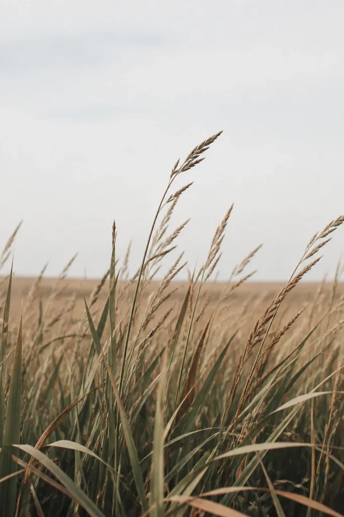
Tape resist gives you that crisp, paper-cut effect without actually cutting paper. The negative spaces make your grass look intentional, and the crisp edges read premium even when your strokes are simple. I use muted greens for the blades and warm brown for the shadow layer, then keep the sky pale so the field stands out. This is great for people who want clean decor that still feels handmade.
Step 1: Tape small strips across the field area where you want negative spaces between grass groups, leaving gaps about 1/4 inch wide. Step 2: Paint or draw your main grass color over the taped area using short vertical strokes. Step 3: After it dries, remove the tape and add a shadow layer in warm brown right at the base of the uncovered blade groups. Step 4: Finish with a pale wash sky and a light horizon line so it all connects.
Good to knowRemove tape while the paint is still slightly tacky if you want the sharpest edges. Too dry tape removal can lift paper fibers.
Common mistakeAvoid heavy paint coverage over tape; thick paint can seep under and blur the resist.
16. Dandelion-Seed Specks Over Green-Brown Grass
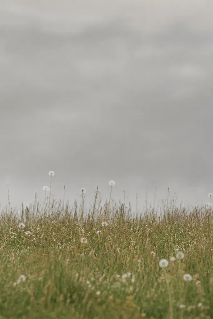
Seed specks create motion without drawing a flying bird or anything complicated. I use tiny white dots and a few small ring shapes to suggest dandelion fluff catching light. The grass stays muted so the white specks pop and feel airy. This look is especially forgiving — even if the specks aren’t perfect circles, they still read as seed fluff from a distance.
Step 1: Draw your grass field first in muted green with some warm brown undertones near the bottom. Step 2: Add the horizon with a soft warm gray wash and let it dry. Step 3: With a white paint pen, place tiny dots above the grass line, then add 5-10 small ring shapes that look like dandelion seed heads. Step 4: Keep the densest specks near the horizon and thin them out as you move upward so it feels like depth.
If dots look too bright, lightly tap them with a dry brush to soften the edges.
Don’t scatter big white shapes across the sky; it will look like snow instead of seed fluff.
17. Burnt Orange Sunlit Edge on Mulch Brown Grass
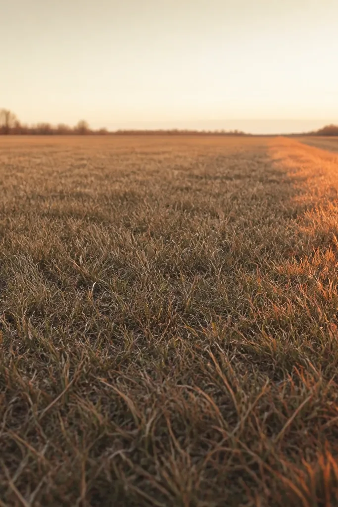
Sunlit edges make the whole drawing feel directional, which is the secret to “cozy” rather than random. I draw most blades in mulch brown and muted green, then add burnt orange only along one edge so it looks like the sun hits from one side. This reads well in fall because burnt orange is close to dried leaves and late-afternoon light. It also flatters warm-toned decor since the orange doesn’t compete with neutrals.
Step 1: Paint a pale yellow-gray sky wash and keep it thin so the paper shows through. Step 2: Draw the grass blades in mulch brown across the whole field, then layer muted green into the foreground. Step 3: Choose one side (left or right) and add burnt orange to the top halves of blades within about 1.5-2 inches of that edge. Step 4: Blend the boundary by mixing a tiny amount of orange back into brown on the last row of highlighted blades.
Good to knowHold your pen at a consistent angle for the highlight so the orange looks like it’s catching light, not changing style.
Common mistakeAvoid making the orange highlight too wide; broad orange blocks flatten the field.
18. Staggered Blade Columns for a Modern Field
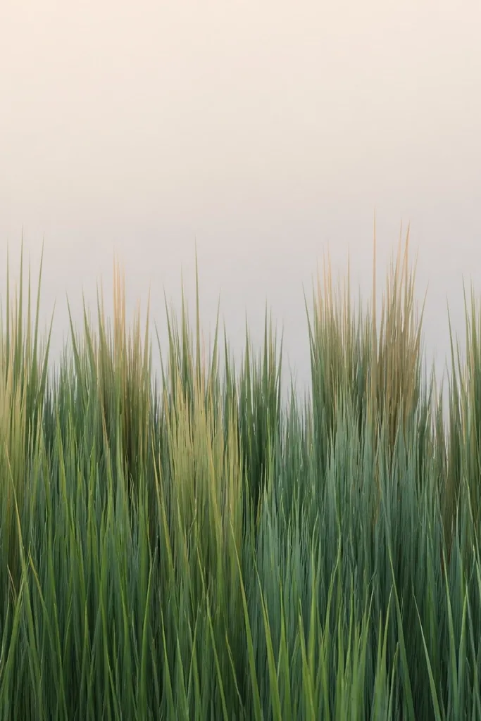
This is the modern version of grass drawing that still feels autumn. By building the field from staggered columns, you get rhythm without needing tiny details everywhere. I use gray-green for the base so the tan streaks feel like sunlight, not just another brown. It looks great for people who like clean lines and want decor that matches simple frames.
Step 1: Add a smooth pale gradient sky using watered-down beige and gray-green. Step 2: Create columns by drawing vertical blade stacks, leaving gaps between stacks so the paper shows through. Step 3: Alternate blade heights: some columns are short and dense, others are taller with tan streaks at the tips. Step 4: Finish the bottom edge with a darker gray-green strip so the composition feels anchored.
Good to knowCount your columns roughly (like 18-25) before you start so the rhythm stays even across the piece.
Common mistakeDon’t draw every column the same height; identical columns look mechanical and less like grass.
19. Feathery Grass With Fine Dry-Brush Texture
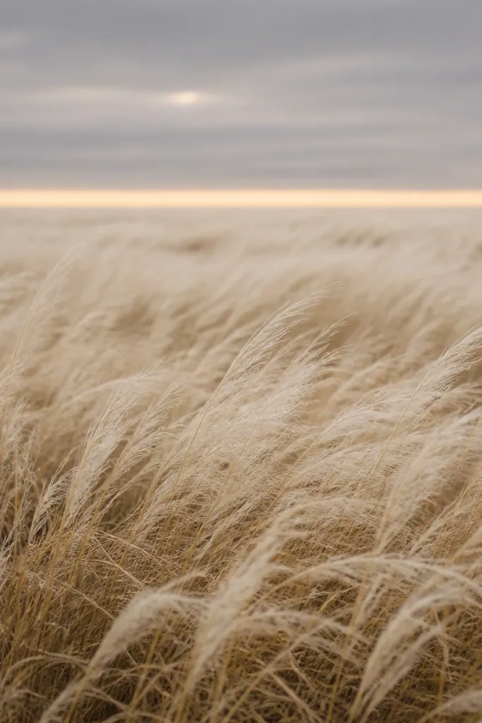
Dry-brush texture gives you blade-like softness without drawing each blade. I use a stiff flat brush loaded with very light paint, then drag it in short strokes so it deposits pigment like tiny grass hairs. The result looks natural from a distance and still handmade up close. This is a great option when you want low maintenance but don’t want a pen-drawn look.
Step 1: Wash the sky area with muted gray and a faint warm line at the horizon. Step 2: For the field, load a stiff brush with a dry mix of muted green and wipe most paint off on a paper towel. Step 3: Drag short strokes from bottom to mid field, keeping the foreground darker and the mid-ground lighter. Step 4: Add burnt umber with a lighter hand on only the top half of the foreground texture to sell the fall change.
Good to knowUse a paper towel to remove paint until the brush feels like it’s leaving specks, not stripes.
Common mistakeAvoid wet brushing — it smears and turns into a flat patch.
20. Grass Field With Tiny Fence Posts and No Other Objects
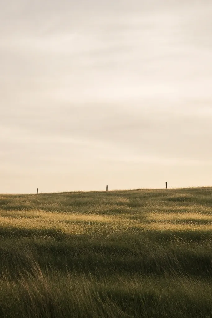
Fence posts add story without clutter. I keep it to 3-6 posts so the drawing stays low maintenance and doesn’t become a full landscape. The posts also help your eye separate distance: posts look taller and darker near the foreground, then smaller and lighter near the horizon. This flatters busy homes because it adds interest while staying mostly grass — no trees, no houses, no extra work.
Step 1: Draw your grass field with muted green blades, dense at the bottom and sparse near the horizon. Step 2: Add a warm gray sky wash and keep it minimal so the posts stand out. Step 3: Draw tiny fence posts with a fine pen: two lines for each post with a slight lean, then add one or two horizontal rails in the background. Step 4: Add pale ochre highlights in the grass around the posts so they look like they’re in the same light.
Keep fence posts thin — about the thickness of two or three grass blades, not thicker.



