1. Burnt Sienna Foreground Blades
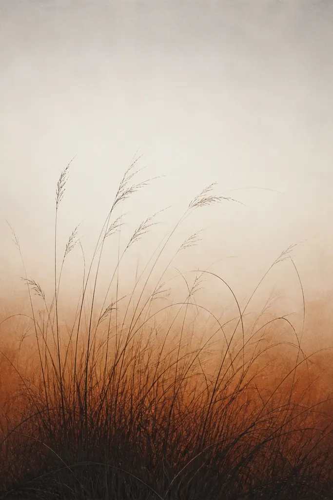
Start with a warm wash that you can see through, not a solid paint blob. I use burnt sienna diluted to a tea-like consistency, then let it dry fully. On top, draw thick clumps in 4B pencil at the bottom edge, then pull thinner blades upward with lighter pressure. The warm wash makes the shadows look like late afternoon, and the pencil keeps it grounded instead of "cartoon grass." This one flatters cozy spaces because the color temperature stays warm without turning orange.
Step 1: Brush a thin burnt sienna wash across the lower third, keeping the top half mostly white. Step 2: After it dries, block in three big clumps with short, heavy strokes at the bottom, about 2 to 3 cm tall. Step 3: Pull blade lines upward from each clump - make them 1/3 the length at the far edges and 2/3 length near the center. Finally, lift a few highlights between clumps with a kneaded eraser so the grass looks sun-struck.
Good to knowIf your wash looks streaky, stop brushing halfway and let the paper absorb it - streaks read like dry stems.
Common mistakeAvoid drawing every blade the same length or the grass turns like a pattern sheet.
2. Raw Umber Horizon Fade
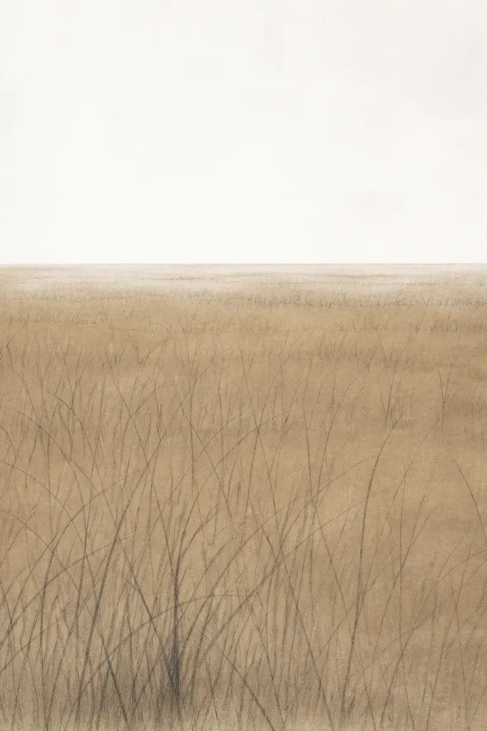
This idea is all about the fade. Raw umber gives a grounded, earthy warmth that doesn't shout. You'll keep the horizon airy by using fewer strokes there, and you'll make the foreground feel closer by packing in short, dark marks near the page bottom. I like this one for autumn scenes because it looks like foggy morning light without turning gray. It also looks good in rooms with cooler decor since the raw umber warms the center.
Step 1: Lightly haze raw umber diluted wash in a horizontal band from mid-page to just below the horizon area. Step 2: While it's dry or almost dry, draw a faint horizon guideline with a hard pencil (HB) so it stays light. Step 3: In the foreground, draw dense grass tufts using 2B pencil - keep them only in the bottom 1/4 of the page. Step 4: Above that, pull long, thin strokes that stop before reaching the horizon, so the distance stays breathable.
Good to knowUse a tissue to smudge only the mid-band, not the blades; it keeps the grass sharp where it matters.
Common mistakeDon't outline the horizon like a border - that makes it look like a cartoon cutout.
3. Two-Tone Pencil Clumps
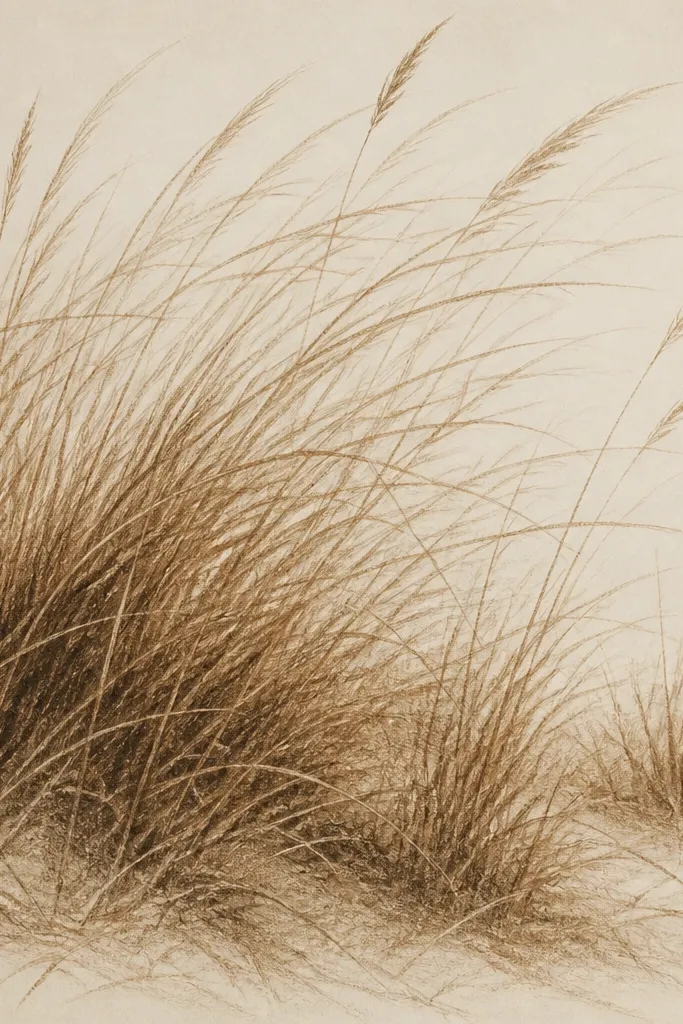
Two-tone clumps give you that "natural clump" look without needing fancy tools. I use 4B for the base mass and 2B for the upper blades, then I add a few HB lines for the thinnest stems. The effect is cozy because the darkest parts feel like shadowed soil, while the lighter strokes feel like sunlit tips. This is especially flattering for small drawings because it reads clearly without lots of detail.
Step 1: Draw three large clumps at the bottom using 4B pencil with short, layered strokes. Step 2: Build the clumps upward with 2B, but change the direction slightly so blades don't look straight-fanned. Step 3: Add scattered HB lines that reach higher than the 2B blades, but keep them sparse. Finally, press lightly with a kneaded eraser on a few mid-blade areas to create tiny gaps that catch light.
Good to knowSharpen your pencil to a fine point for the HB lines; thick lines destroy the delicate tip effect.
Common mistakeAvoid using only one pencil hardness - one value makes grass look flat.
4. Kneaded Eraser Sun Spots
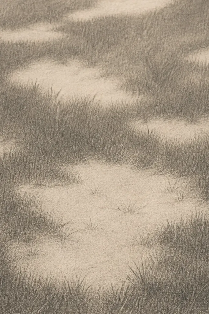
This one is cozy because it mimics sun hitting dry stems. You draw darker grass first, then lift highlights with a kneaded eraser so the light looks natural instead of drawn on. I keep the lifted spots irregular - like tiny gaps between blades - and I don't overdo it. The result feels like late autumn afternoon when the light is low and warm. It works great for anyone who thinks their highlights look "too white," since lifted graphite blends smoothly.
Step 1: Sketch the grass clumps lightly with HB so you don't fight the paper. Step 2: Go over the clumps with 4B to create a dark base texture, focusing on the bottom half. Step 3: Use a kneaded eraser to dab and lift small highlights inside the clumps, leaving some areas untouched. Step 4: After lifting, draw a few fine blades around the lifted spots with HB so the light gaps look intentional.
Good to knowRoll the kneaded eraser into a small ball so you get crisp little highlight dots instead of smudgy blobs.
Common mistakeDon't rub hard with the eraser - that makes gray smears that look dirty.
5. Orange Leaf Sprinkle Ground
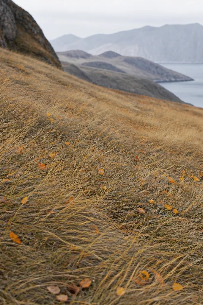
If you want autumn to read instantly, add leaf debris without turning it into confetti. I keep the leaf marks tiny - like specks the size of a pencil eraser dot - and I limit them to the bottom band. The grass stays controlled and directional, while the leaf sprinkle adds warmth and movement. This looks great for cozy entryway art because the orange pops against the warm browns. It's also forgiving if your grass strokes aren't perfect; the debris gives the eye something to land on.
Step 1: Draw grass blades in 2B across the bottom third, leaning them slightly right so the whole piece feels like a breeze. Step 2: Add a light wash of diluted raw umber behind the blades so the ground looks earthy. Step 3: With colored pencil or a tiny brush, add tiny leaf specks in ochre and burnt orange - keep them under 1 cm across. Step 4: Darken a few grass clumps in the same spots as the densest leaf specks so the ground feels layered.
Good to knowUse a reference photo and match the leaf density to the "shadow" areas, not the brightest spots.
Common mistakeAvoid big leaf shapes - they steal attention from the grass drawing.
6. Soft Pencil Spiral Breeze
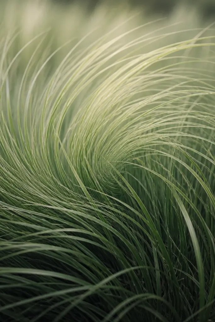
A breeze pattern makes grass feel alive without needing a whole landscape. I draw grass as a spiral flow - blades curve around a central point - so your eye naturally follows the motion. Keep the spiral subtle and don't over-swish the lines. The cozy part comes from the shading: darker clumps at the base and a soft fade upward, so it feels like wind in warm air. This is flattering for portrait-format art because the motion leads the viewer upward.
Step 1: Lightly mark a loose spiral center using a pencil dot, then draw short clumps around it at the bottom. Step 2: Pull blades upward in curved lines, making the center blades slightly longer than the left and right edges. Step 3: Use 4B for the lowest 5 cm, then switch to 2B and finally HB for the topmost blades. Step 4: Add a faint raw umber wash behind the spiral's center for extra warmth, then let it dry before you refine the blades.
Good to knowTurn the paper slightly while drawing so your hand follows the curve naturally.
Common mistakeAvoid sharp, uniform curves - they look like stylized hair rather than grass.
7. Charcoal Dust Trail
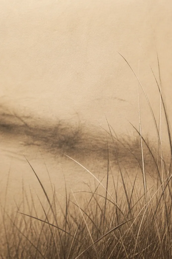
Charcoal dust gives you that dry, late-fall texture fast. I use a soft charcoal stick lightly in the midground to create a drifting shadow, then I draw sharp pencil blades in front. This contrast - dusty background, crisp foreground - makes the grass look dimensional. It feels cozy because the midground shadow adds depth without adding a harsh black sky. It also works well for people who want a more dramatic look without painting.
Step 1: Sketch grass blades in HB across the bottom third, then darken the closest blades with 4B. Step 2: Use charcoal to lightly smear a diagonal dust patch behind the blades, about the width of two fingers on the page. Step 3: Blend the charcoal with a clean tissue for a soft edge. Step 4: Go back in with HB and 2B to refine blade tips so they stay crisp against the dust.
Good to knowKeep charcoal off the very bottom edge - it makes the foreground look muddy.
Common mistakeDon't over-blend - if everything turns gray, you lose the cozy contrast.
8. Honey Ochre Dry Brush Wash
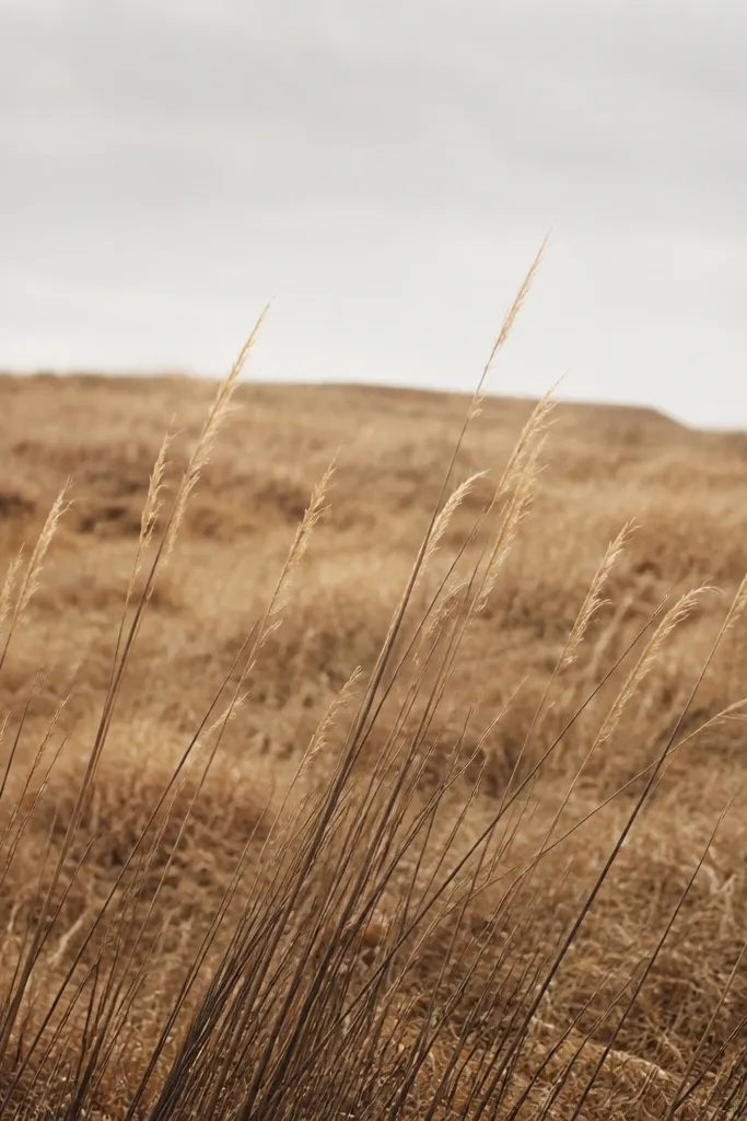
A dry brush wash is cozy because it has texture like dry air. I mix honey ochre (or a similar yellow-brown) with very little water so it lands in speckles. Then I draw grass blades over the speckled surface, letting some paper show through. The speckle makes the grass feel like it's catching light, even with simple pencil strokes. This idea looks best in warm lighting and pairs well with cream paper.
Step 1: Using a flat brush, load a honey ochre mix that's thick enough to leave texture, then tap off excess. Step 2: Brush across the middle band in short, uneven strokes, leaving the top half mostly blank. Step 3: After it dries, draw thick clumps with 4B at the bottom, then add 2B blades that rise and taper. Step 4: Add a handful of HB tips that stop early so the midground stays airy.
Good to knowPractice on scrap paper first to learn the paint thickness that gives speckle instead of puddles.
Common mistakeAvoid a wet, glossy wash - it makes pencil smear and kills the cozy paper texture.
9. Mossy Gray-Green Distance
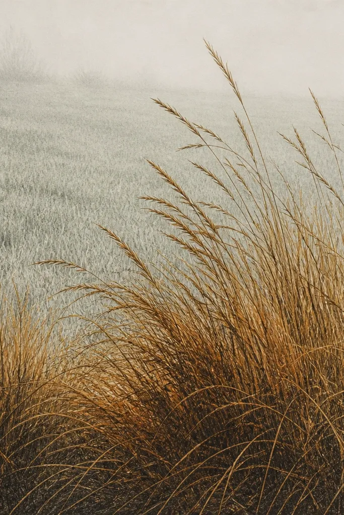
Warm foreground with cooler distance makes the drawing feel real, like the air has depth. For this one, I keep the distance gray-green using a light wash of cool gray mixed with a hint of green. Then I draw long thin blades that fade out before they reach the top. The foreground stays warm with raw umber and 4B pencil. This is flattering for rooms with green accents because the distance color ties in.
Step 1: Lightly wash a gray-green tint across the upper half, keeping it very thin so the paper still shows. Step 2: Draw a low horizon line with HB - faint and short. Step 3: In the bottom third, draw dense clumps with 4B and 2B, making blades thicker near the center. Step 4: Add a few extra-long thin blades in the mid-distance using HB, then stop them before they hit the top edge.
Good to knowIf your gray-green looks too blue, warm it with a tiny bit of raw umber in the wash mix.
Common mistakeAvoid coloring the whole page the same temperature - the drawing looks flat and "one-note."
10. Vertical Combing Stems
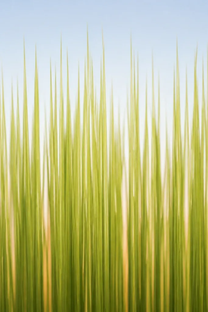
Vertical combing strokes feel tidy and cozy, like dry grass after a breeze settles. I keep the strokes mostly vertical, but vary length so it doesn't look like a picket fence. The warmth comes from a lower wash and darker shading under the densest stems. This works well for gift cards and small frames because the pattern reads instantly. It also flatters anyone who likes clean lines but still wants texture.
Step 1: Brush a thin raw umber wash in the bottom quarter, then let it dry. Step 2: Draw vertical stems with HB first, spacing them so gaps still show. Step 3: Add darker shading under the densest stem groups using 2B, focusing on the center band. Step 4: Press harder at the bottom edge to thicken the first 2 cm of each stem, then lift pressure as lines go up.
Good to knowUse a ruler to lightly mark where the bottom edge ends so your thick zone stays consistent.
Common mistakeAvoid perfect uniform spacing - real grass has uneven gaps.
11. Rolling Dune Grass Waves
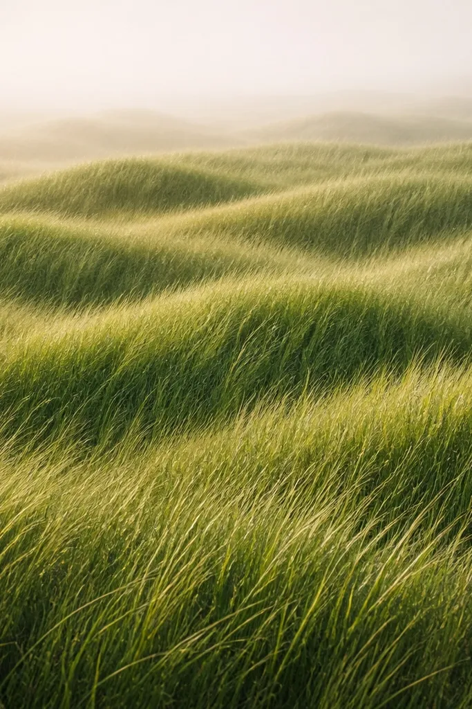
Grass on a dune gives you natural wave lines without drawing a whole scene. I create two to three rolling ridges and then let the blades follow those curves. The cozy effect comes from the shading under each ridge - darker at the base, lighter on the crest. It reads soft because the wave lines guide the eye. This one suits horizontal frames and feels great above a console table.
Step 1: Lightly sketch two curved ridge lines across the page with HB, keeping them close to the bottom half. Step 2: Draw grass blades so they curve slightly along each ridge, using 2B for mid tones. Step 3: Darken the ridge shadows with 4B, focusing under the crests. Step 4: Add a light wash of burnt sienna over the bottom ridge area, but keep it thin so you can still see pencil texture.
Good to knowMake the crests lighter by leaving more paper showing - it's the easiest way to sell the wave shape.
Common mistakeDon't turn the ridges into thick outlines; keep them as implied shadows.
12. Fuzzy Backlit Pencil Glow
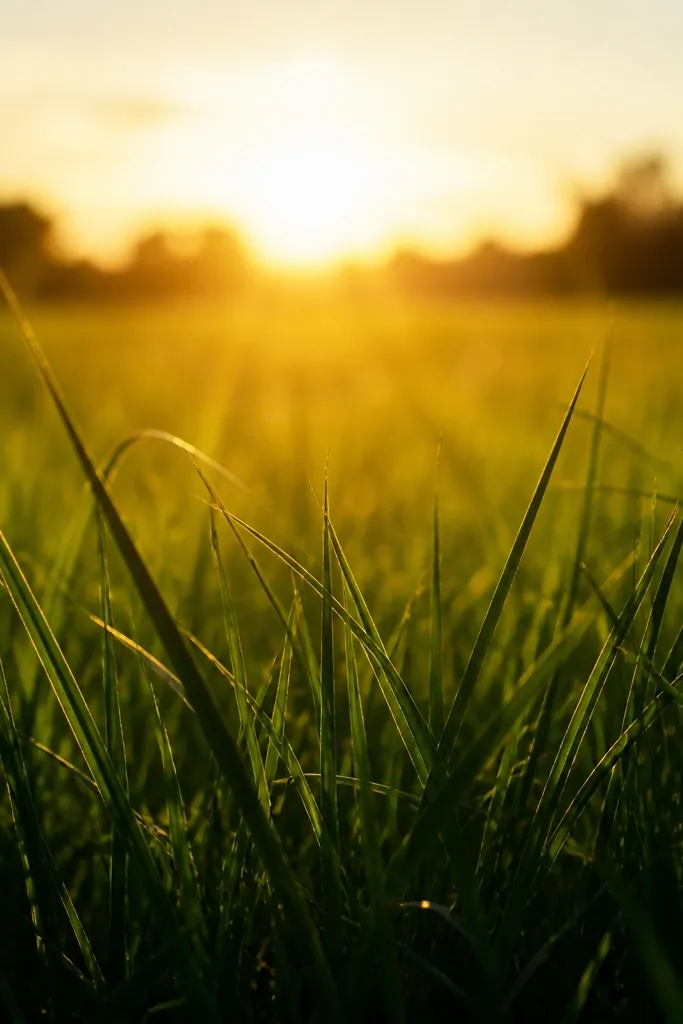
Backlit grass looks cozy because it feels like warm sunlight coming through thin stems. I do this by softening the midground with a light smudge, then keeping the foreground blade tips sharp. The contrast makes the glow believable. Use warm browns, not bright oranges, so it feels like autumn late-day light. This is flattering for people who want a softer, less realistic drawing but still crave texture.
Step 1: Draw dense foreground clumps with 4B, then add finer blades with 2B. Step 2: In the midground behind those clumps, lightly smudge graphite with a clean blending stump or tissue until it looks hazy. Step 3: Add a very thin burnt sienna wash behind the hazy area, then let it dry. Step 4: Re-draw a few sharp blade tips in HB so the top edges pop against the glow.
Good to knowKeep the smudge area smaller than you think; a little haze looks like backlight, too much looks cloudy.
Common mistakeAvoid smudging the foreground clumps - that's how it starts looking cheap.
13. Leaf-Shadow Grass Silhouette
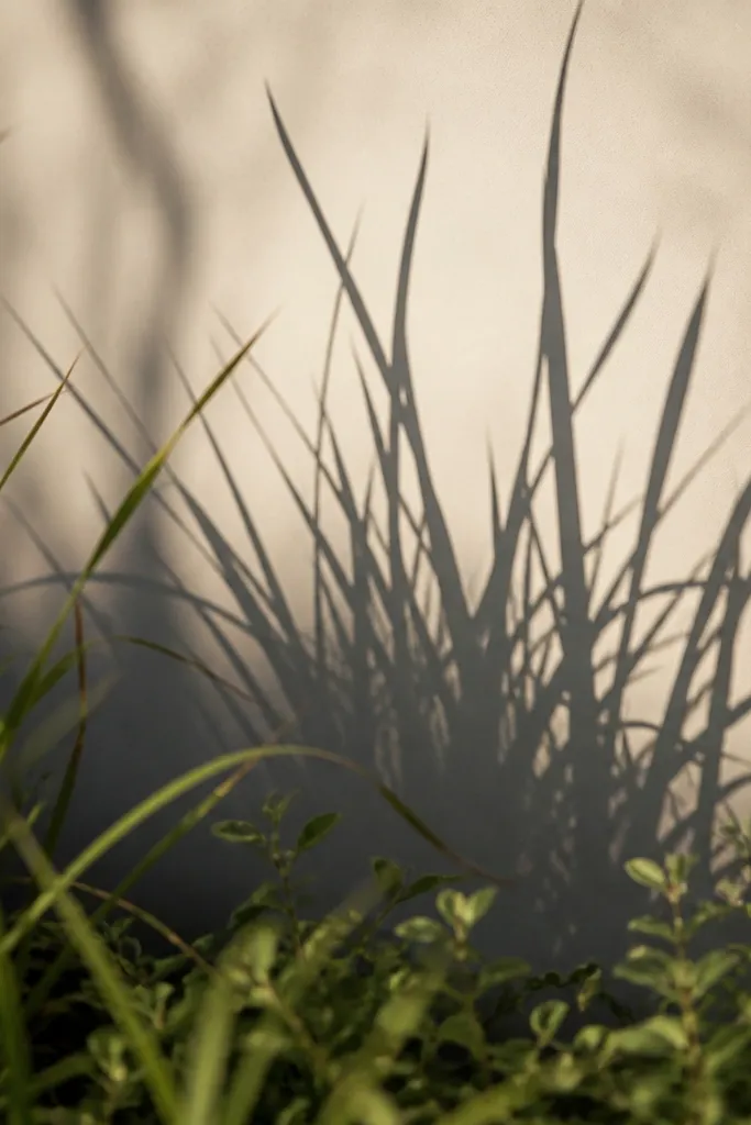
This one gives you a graphic, cozy look. You draw grass normally, then place a shadow shape that looks like a leaf cluster or branch shadow. The shadow area should be darker and more uniform than the grass around it, so the blades feel layered. I use it when I want the drawing to look intentional even if the grass strokes are simple. It's great for making a greeting card because the silhouette reads clearly at small sizes.
Step 1: Draw grass blades in HB across the lower half, then darken the bottom clumps with 2B and 4B. Step 2: Choose a shadow shape - I sketch an irregular oval with a few pointed edges - and fill it lightly with 2B, keeping the edges soft. Step 3: Draw grass blades on top of the shadow area, but make them shorter and fewer so it reads like they are blocked. Step 4: Add tiny leaf specks in ochre near the bottom edge to tie the shadow to the season.
Good to knowUse a kneaded eraser to soften the shadow edges so it looks like light passing through leaves.
Common mistakeAvoid sharp, hard-edged shadow shapes - they look pasted on.
14. Cotton Wash + Pencil Rake Texture
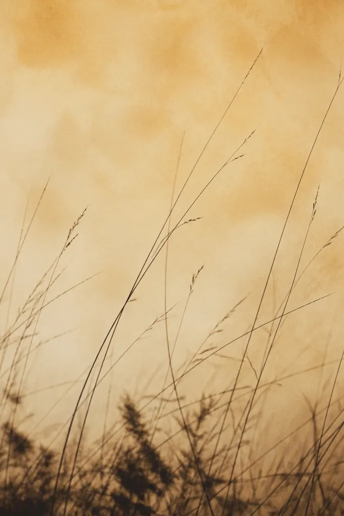
This is the closest I've gotten to that cozy "soft grass in fall wind" look without painting grass green. I start with a warm diluted wash, then use a wad of cotton or paper towel to lift texture while it dries. After that, I draw pencil blades with a rake-like motion so they follow the lifted texture. The result feels airy and tactile. It's especially flattering for cream paper and for anyone who wants a softer, less dark drawing.
Step 1: Wash diluted raw umber across the lower half, keeping it light enough to see paper. Step 2: While it's still damp, dab cotton lightly in a few vertical streaks to create lifted highlights. Step 3: After drying, draw dark clumps with 4B at the bottom edge and rake pencil strokes upward with a 2B pencil. Step 4: Add a few HB lines that are longer and thinner, then stop them before the lifted texture fades.
Good to knowUse a fresh clean cotton wad for each dab so you don't smear too much pigment.
Common mistakeAvoid dragging the cotton across the page - it turns the texture into muddy streaks.
15. Warm Sepia Vertical Stripe Field
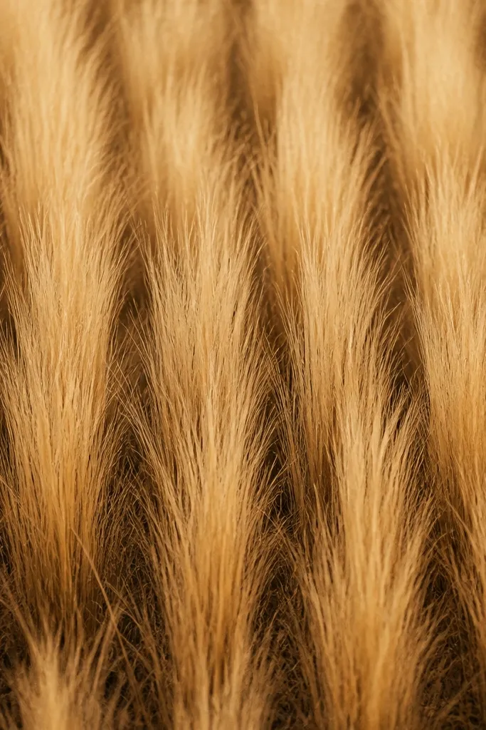
Vertical stripes make the grass feel like it's growing in clumps across a field. The warm sepia tone ties the whole piece together, so it looks cozy instead of "just pencil." I keep each stripe as a small group of blades, not one long line, so the texture stays natural. This is flattering for people who like structure but still want organic edges. It also frames well because stripes naturally guide the eye.
Step 1: Lightly wash sepia or a burnt umber tint across the bottom third. Step 2: Divide the page mentally into 8 to 12 vertical bands and sketch 1-2 clumps per band with HB. Step 3: Shade the bottom of each band with 4B, then pull blades upward with 2B and taper them with lighter pressure. Step 4: Leave a few gaps between bands so the paper shows through, then add a tiny highlight lift with kneaded eraser at the top of two bands.
Good to knowKeep your blade direction slightly inconsistent across bands - that's what makes it look like grass, not a barcode.
Common mistakeAvoid drawing long continuous lines - grass has breaks and clumps.
16. Pencil and Watercolor Pencil Tip Fade
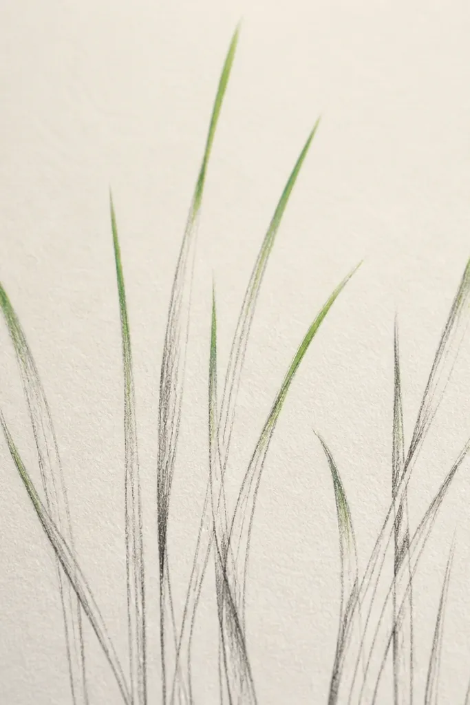
This looks cozy because the color only lives where the light hits - at the tips. I start with pencil for structure, then add watercolor pencil touches at the ends with burnt sienna and a pinch of ochre. The pigment softens when you add water, so the tips blur slightly like real dry stems. It's a clean way to get fall color without coloring the whole background. This one flatters small frames because it keeps the drawing airy.
Step 1: Draw grass clumps with HB and 2B, keeping the blades mostly uncolored. Step 2: Add small dabs of watercolor pencil at the very tips only, about 5 to 10 mm long. Step 3: With a tiny brush, pull water from the tip downward just a little so the color feathers. Step 4: Once dry, reinforce the darkest base clumps with 4B so contrast stays strong.
Good to knowUse a light hand with water - one brush pass is enough or you'll bleed color into the stems.
Common mistakeAvoid coloring the mid-blades - it makes the whole piece look flat and muddy.
17. Twiggy Branch Overhang Grass
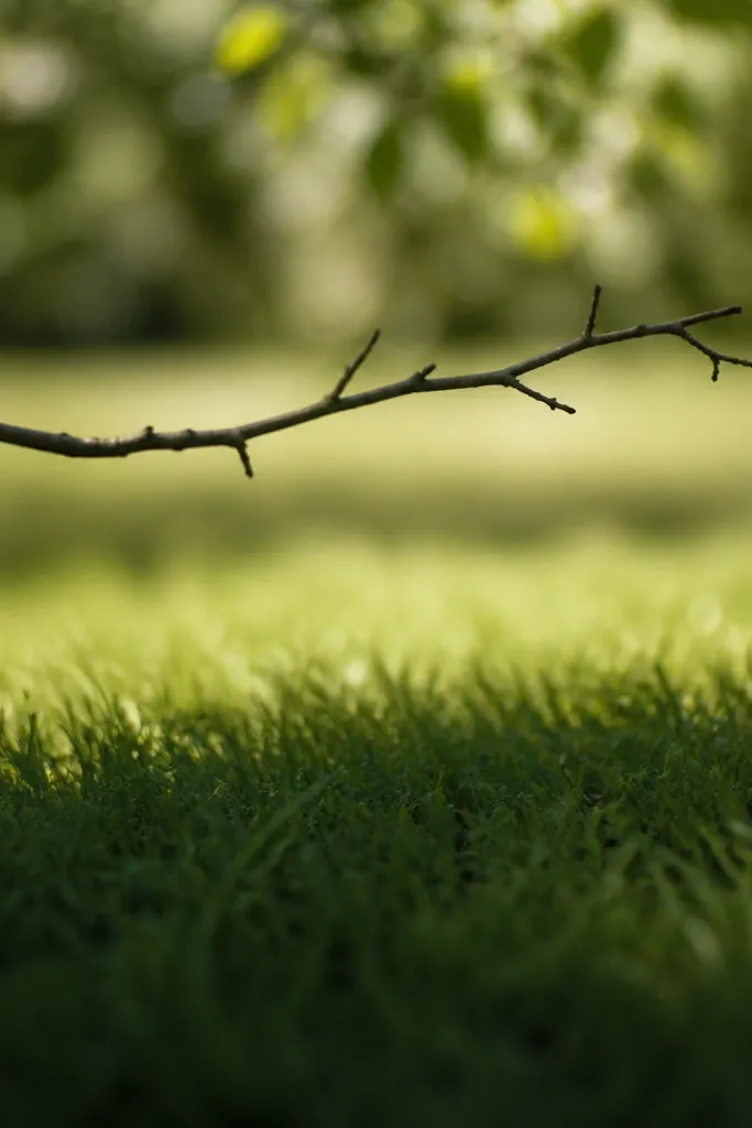
A thin branch overhang turns simple grass into a scene without adding a full background. I draw a dark twig silhouette across the upper third, then I shade the grass under it darker and denser. Beyond the branch, I thin the blades and lighten the wash so it looks like sun. This creates instant cozy contrast - shade feels cooler, sun feels warm. It's flattering for anyone who wants their autumn art to look "thought through" even when it's quick.
Step 1: Lightly wash burnt sienna in the lower half, then let it dry. Step 2: Draw a twig branch line across the upper third with HB, then darken it with 2B. Step 3: Under the branch, draw dense grass blades with 4B for the bottom zone and 2B above it. Step 4: On the sun side, keep blades longer but thinner in HB, and leave more white space so it feels airy.
Good to knowMake the branch slightly uneven in thickness - the wobble sells it as real twig, not a straight line.
Common mistakeAvoid drawing the branch too thick; a heavy branch makes the whole piece look like a silhouette cutout.
18. Ragged Border Frame Grass
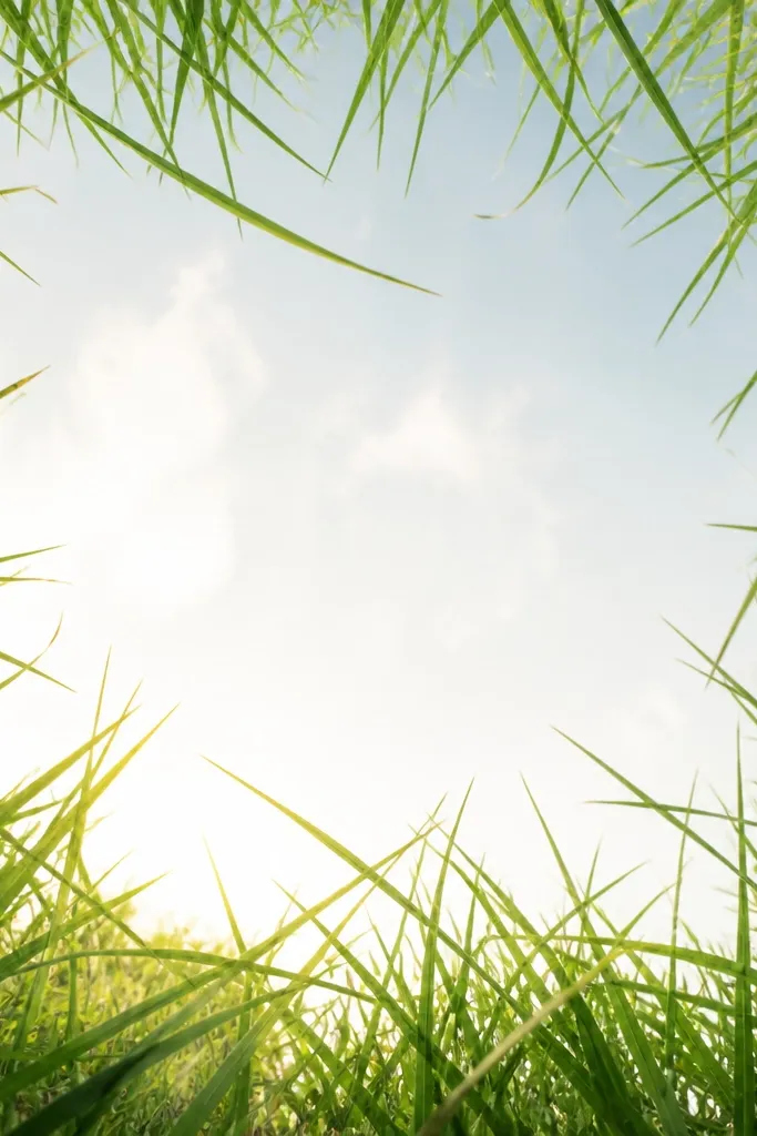
Framing your grass with a ragged border makes the center feel cozy and calm. I keep the middle mostly light and simple, then build thick grass along the perimeter like a curtain of stems. It's a great trick for people who struggle with backgrounds - you're basically giving the viewer a "safe" empty area in the middle. The border also makes the drawing look finished when you hang it without a scene. This one is perfect for small prints because it adds structure.
Step 1: Leave the center of the page mostly blank and bright, with only a faint wash if you want. Step 2: Along the bottom and sides, draw dense clumps with 4B - keep them thicker near the corners. Step 3: Add 2B blades that lean inward, crossing slightly but never filling the center. Step 4: Use HB to add a few longer strays that reach toward the middle, then stop before they touch it.
Good to knowIf your border looks too symmetrical, break one corner with a taller clump and it instantly feels natural.
Common mistakeAvoid filling the center with grass - it removes the cozy "breathing space."
19. Dawn Warm Wash with Dark Toe
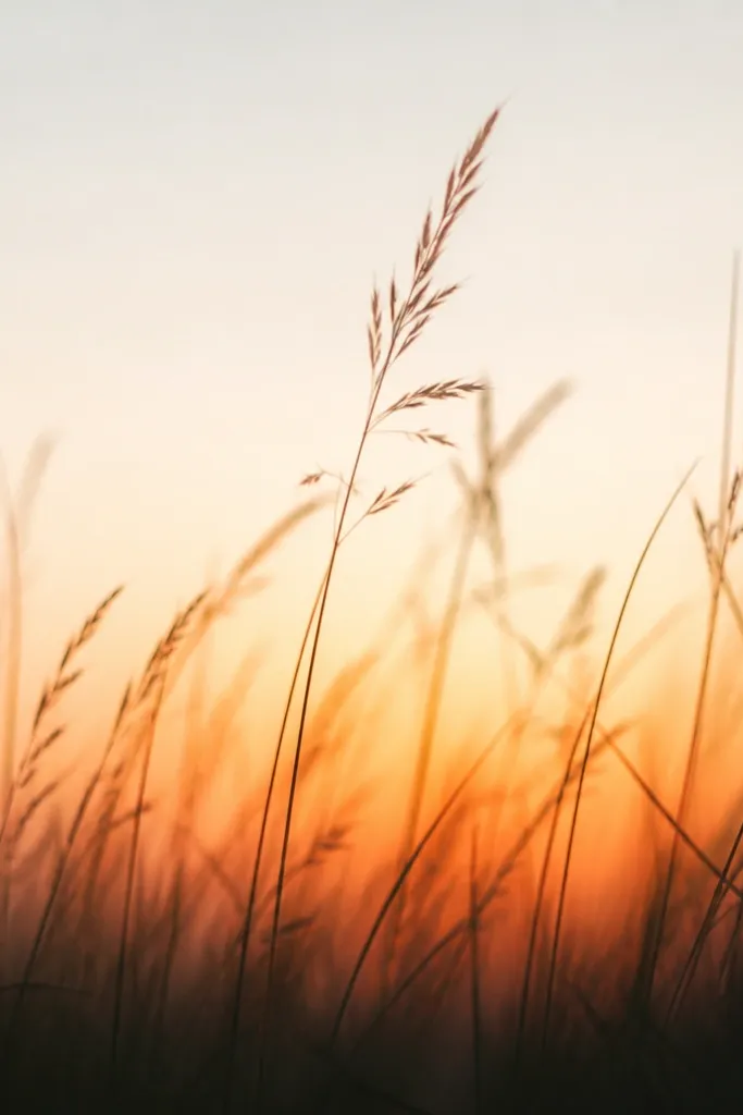
This reads like early morning autumn light: warm near the ground, cooler and paler above. I paint a very light warm wash at the bottom with a darker toe - a narrow band of deeper brown - so the grass has a strong anchor. Then I draw upward blades that get thinner and lighter. The cozy effect is the gentle gradient, not heavy color. It's flattering for long, narrow frames and looks great near entry doors.
Step 1: Mix burnt sienna with lots of water and paint a soft gradient band across the bottom 1/3, fading upward. Step 2: Add a darker toe band at the very bottom edge using raw umber or 4B pencil, about 1 cm tall. Step 3: Draw grass blades from that toe band upward with 2B, making the closest blades thicker and the far ones thin. Step 4: Finish with a few HB tips that stop halfway up so the top stays pale.
Good to knowLet the gradient wash dry completely before you darken the toe band or you'll get smudgy edges.
Common mistakeAvoid making the whole page one warm tone - you need the fade to feel like dawn.
20. Terracotta Shadow Bands
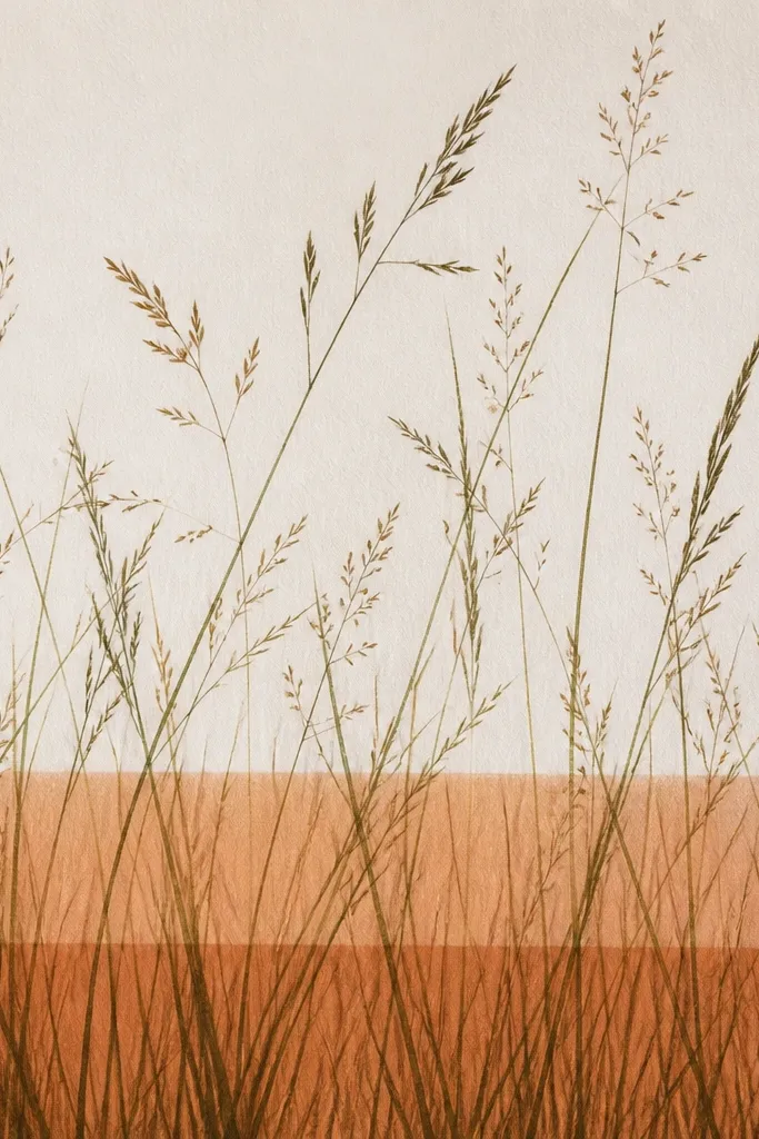
Shadow bands make grass feel layered even if you only draw grass. Terracotta is perfect for autumn because it's warm but slightly muted, not neon. I place two shadow bands across the midground and then keep the grass blades heavier where they cross those bands. The result feels like late fall light hitting uneven ground. This works well for cozy decor because it adds warmth without needing a full sky.
Step 1: Lightly wash terracotta (burnt orange-brown) as two thin horizontal bands across the middle of the page. Step 2: Let the wash dry, then draw grass blades in pencil across the entire lower half. Step 3: Where the bands sit, press harder with 4B and shorten the blades so they look "covered" by shadow. Step 4: Above the top shadow band, keep blades lighter with HB and add fewer strokes so the scene doesn't feel crowded.
Good to knowUse a ruler for the shadow band lines when you're learning; later you can loosen them.
Common mistakeAvoid thick, solid terracotta stripes - they look like marker bands, not shadow.