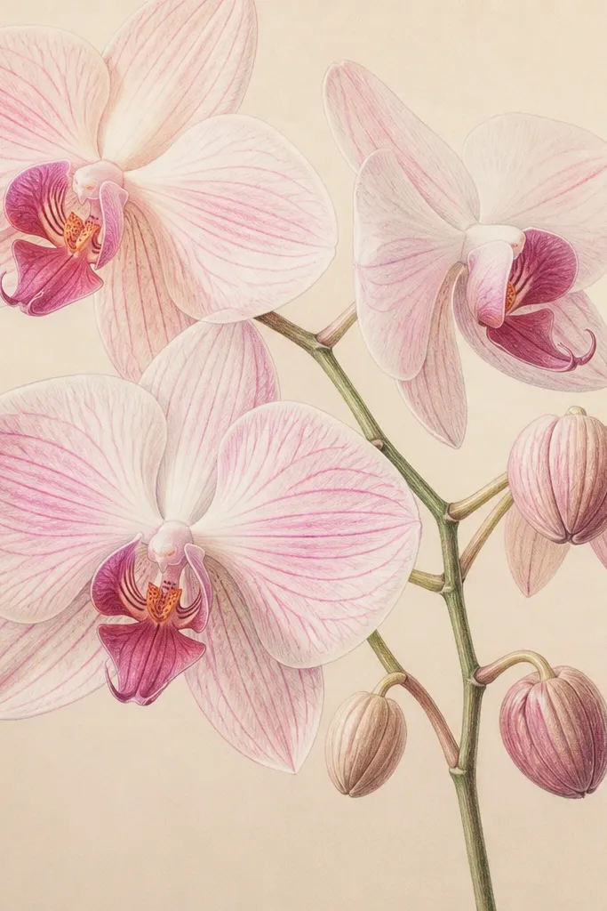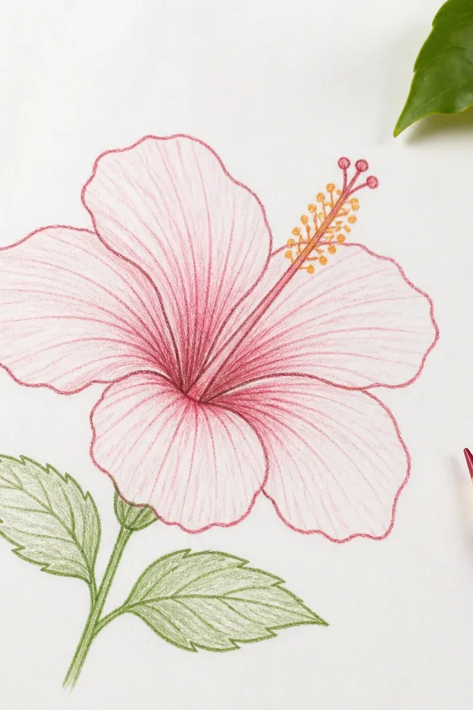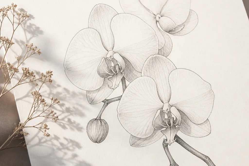
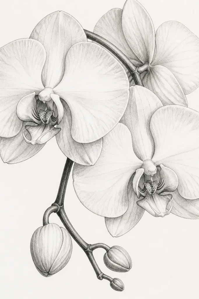
1. Single Orchid Centered on Off-White Negative Space
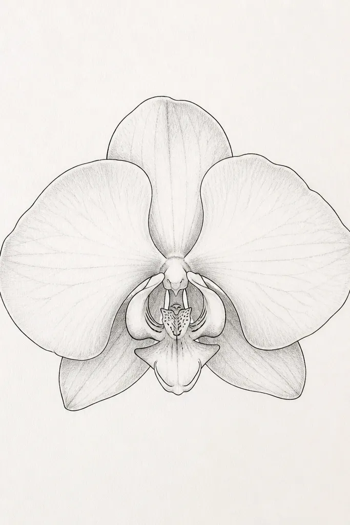
This one looks modern because it gives the orchid room to breathe. Use a bright off-white sheet so your black lines stay sharp and your gray shading doesn’t look dirty. I like a Phalaenopsis-style orchid here because the petals are naturally curved and read well with minimal detail. It flatters most rooms because it doesn’t compete with furniture — it sits in the space like a calm focal point. For people who like clean stationery vibes, this also works great as a print for a desk or gallery ledge.
Start by drawing the orchid center first: sketch the lip shape, then place two small side ridges inside it. Outline the two main side petals with a 0.5 fineliner, then add three to four short contour lines on each petal using a 0.1 fineliner. Add shading with a soft pencil in only two zones: the petal base and the underside curve. Finally, erase stray pencil marks and leave the rest of the page empty — no border, no extra leaves.
If you plan to print, do a quick test print at 100% size before committing to a framing order.
Don’t add extra background doodles — they make the sketch look like a craft project.
2. Orchid in a Thin-Line Circle Frame
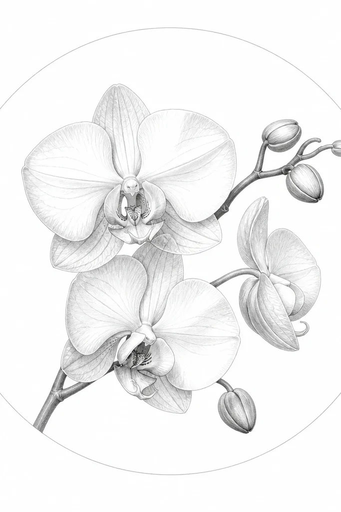
A circle frame makes the sketch feel graphic and modern without turning it into a cartoon. Keep the circle line thinner than the orchid outline so the orchid still wins visually. I’ve used this for prints that hang in tight spots because the circle helps the eye read the whole composition quickly. It also flatters smaller spaces because the frame creates a clear boundary without heavy borders. Choose this if you want the orchid to look like it belongs in a minimalist gallery wall.
Tape your paper to a board and lightly mark the center point. Draw a circle with a compass or a string-and-pencil method, then draw the orchid inside starting with the lip. Use 0.5 fineliner for the outer petal edges and 0.1 for inner veins and speckle dots. Add a light gray wash only at the base of the petals, then keep the circle line consistent and unshaded. Leave a 1-2 cm margin outside the circle so it prints clean.
Use a ruler to check that the circle isn’t tilted — a slightly skewed circle reads sloppy in modern work.
Avoid thick marker lines on the circle; it makes the whole piece look heavy.
3. Two Orchids Mirrored for a Symmetry Look
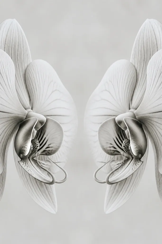
Mirrored orchids look modern because symmetry feels designed, not accidental. I use this when I want the drawing to feel balanced even if the orchid details are simple. Phalaenopsis orchids mirror really well because the lip and side petals can be repeated with small adjustments. This style looks great for people who like calm, structured decor — it doesn’t feel chaotic. It also works nicely for larger frames because the eye has a clear path down the center line.
Draw a light vertical guideline down the center of the page. Sketch one orchid half first: lip, one side petal, and a few inner contour marks. Then flip your placement and mirror the same shapes on the other side without changing the angles — keep the spacing consistent. Outline both orchids with 0.5 fineliner, then add tiny dot clusters on the lip using 0.1. Finish with light shading under each petal with a kneaded eraser to keep the gray soft.
If one side looks heavier, lighten the darker side by lifting graphite with a kneaded eraser instead of redrawing.
Don’t freehand the center axis away — losing the guideline makes the symmetry feel off.
4. Orchid Sketch with a Watercolor Wash Background
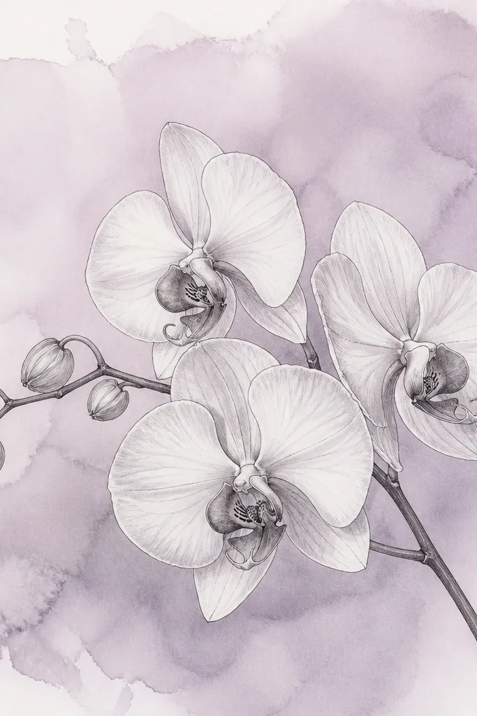
Watercolor wash behind crisp ink lines looks modern because the background adds color without adding clutter. I use dusty lavender or pale sage because they complement orchid tones and keep the sketch from looking neon. The ink stays clean when you let the wash dry fully before drawing. This is a strong choice for bedrooms because the palette feels gentle, not graphic. It also flatters skin tones on prints — the lavender undertone makes the drawing feel warmer against neutral walls.
Good to knowUse a hair dryer on low for background only, then wait 10 minutes before inking.
Wet the paper lightly with clean water using a flat brush, then drop in diluted watercolor to create a soft wash. Tilt the paper so the wash pools slightly at the bottom for a natural gradient. Let it dry completely — I wait 45-60 minutes. Then draw the orchid with 0.5 fineliner and add thin interior lines with 0.1. Shade only the petal bases with light pencil so the watercolor stays the main color.
Common mistakeDon’t start inking while the wash is damp; ink will feather and ruin the modern crispness.
5. Orchid with a Subtle Dot Grid Underlay
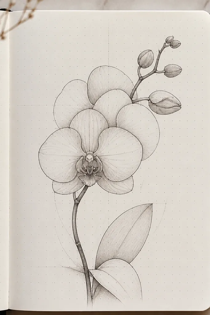
A dot grid underlay reads modern because it adds structure without becoming a pattern takeover. I keep the dots super light so they act like “invisible” layout. This style feels great for people who like stationery, planners, and design-y aesthetics. It also flatters the orchid because the viewer’s eye gets a gentle guide to the composition. If you’re drawing on copy paper, the dot grid trick helps hide uneven lighting when you photograph it.
Use a light gray micron (or very light pencil) to place dots in a 1 cm spacing grid across the paper. Press lightly so the dots don’t show too dark in scans. Draw the orchid on top, keeping the outer outline consistent thickness with 0.5 fineliner. Add vein lines and speckles only on the lip and near the petal base. Finish with soft shading — I keep it to under-petal shadows only, not full gradients.
Test your dot grid on scrap first; if it shows dark in your phone photo, lighten your pressure.
Avoid dark dot grids; they make the orchid look like it’s printed from a template.
6. Orchid and Minimal Stem in a Single Continuous Line
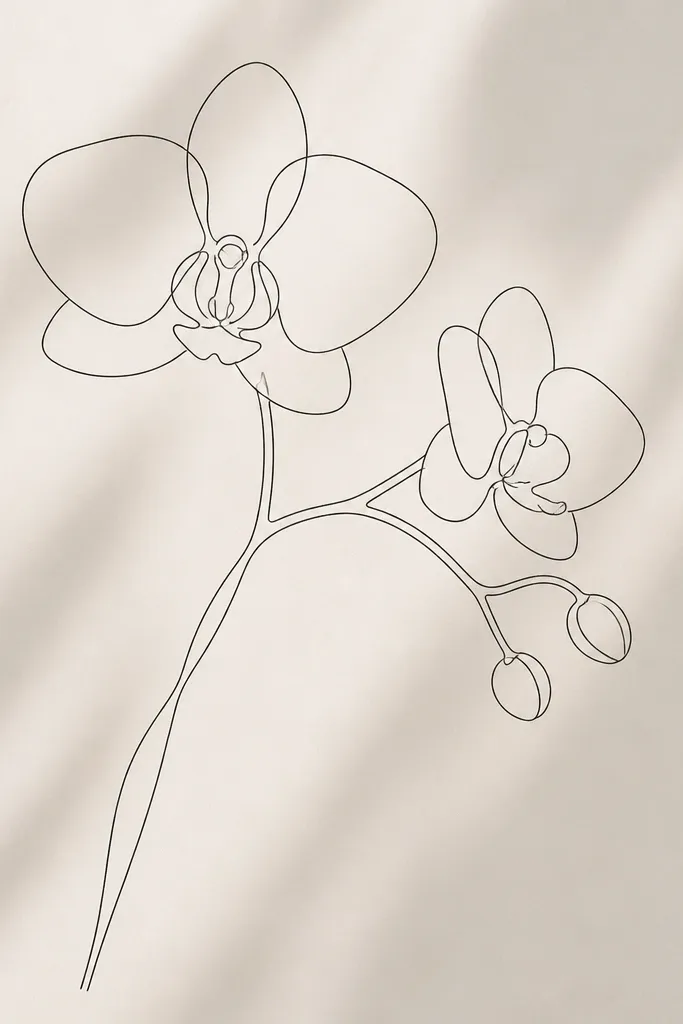
Single continuous line orchid sketches look modern because they feel intentional and graphic. It also forces you to simplify the petals into smooth contours, which is what makes it look design-led instead of doodle-led. I use this when I want a relaxing drawing session but still want results that look stylish on a wall. It flatters small frames because the line is the whole story. Pair it with a neutral frame and it looks like a fashion illustration from a magazine.
Choose a 0.3 fineliner for the whole drawing. Start at the top petal tip, trace the outline down into the lip shape, then continue into the side petals and back out to the stem. Keep your line unbroken across the lip so the center looks cohesive. Skip shading completely, and instead use tiny line breaks at the petal folds to suggest depth. Leave the background blank.
Slow down at the lip; that’s where continuous-line drawings usually look messy.
Don’t add lots of tiny details to “fix” the look; it breaks the modern simplicity.
7. Orchid with Geometric Leaf Shapes
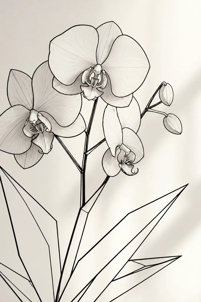
Geometric leaves make the orchid feel modern because they bring structure to the organic flower. I like drawing leaves as angled ovals, triangles, or folded ribbon shapes instead of realistic leaf veins. This works well for people who want a cleaner look for a kitchen or office where realistic art can feel too heavy. The orchid stays soft while the leaves add a design edge. It also flatters bold wall colors because the geometry gives the piece an anchor.
Draw the orchid first in the upper half of the page. Use 0.5 fineliner for the petals and 0.1 for the lip details. Then add two leaves below the orchid as large geometric shapes: one angled left, one angled right, with straight-ish edges. Shade only the underside of the petal bases in light gray pencil. Keep the leaf shading minimal — one light pencil tone under each “fold” line.
If your leaves look too cartoony, add one realistic curve to each leaf edge and keep the rest geometric.
Avoid realistic leaf veins next to geometric leaves; it mixes styles and looks cheap.
8. Orchid Sketch on Kraft Paper with White Gel Highlights
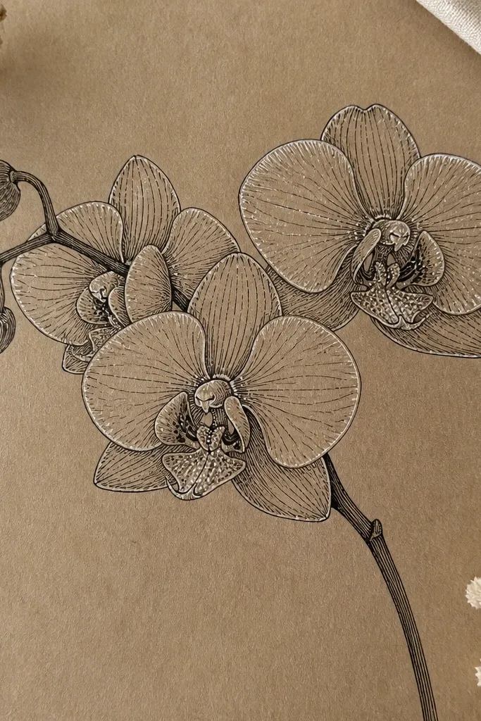
Kraft paper turns a simple orchid sketch into something warm and modern. The brown background makes the black lines feel richer and makes the orchid look more tactile. I use white gel pen highlights because they look like light catching the petal — crisp, not chalky. This style looks great in cozy rooms and on shelves where you want a handmade feel without losing polish. It also flatters warm skin tones when you hang it near wood furniture because the color family matches.
Use a pencil to lightly map the orchid center and outline, then ink with a 0.5 fineliner or fine brush pen. Keep the shading with pencil very light; kraft paper already holds contrast. Add white gel pen highlights along the petal edges and a few dots inside the lip. For a modern touch, draw one leaf in the same ink style but skip highlights on it. Finally, gently erase any pencil smudges with a soft kneaded eraser.
Press gel pen lightly at first — heavy pressure can create blobs on kraft paper.
Don’t use gray wash on kraft; it can turn muddy against the brown.
9. Orchid in a Minimal Square Frame with Corner Marks
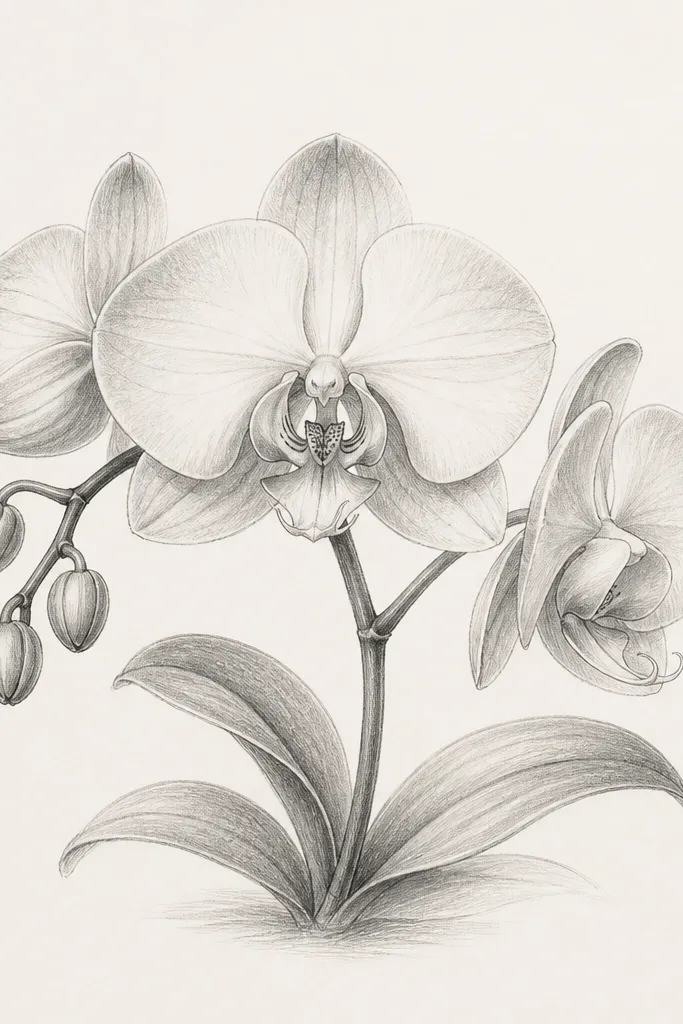
Corner-mark frames look modern because they hint at structure without drawing a heavy border. I love this for prints because it feels like design drafting. The orchid stays the focus, and the corner marks give the page a clean edge even when the paper is photographed at an angle. This style suits people who like architecture vibes. It also works well for vertical frames because the corner marks keep the composition from feeling too empty.
Good to knowIf your frame is tight, keep the orchid edges at least 1 inch away from the corner marks.
Lightly sketch a square boundary using a ruler but erase most of it — keep only short corner segments. Place the orchid in the center, using 0.5 fineliner for the outer petals. Add interior vein lines with 0.1 and keep shading to a soft pencil gradient at the petal base. Add a single stem line that connects to one bottom corner mark. Finish by darkening the corner segments slightly so they read clearly in print.
Common mistakeAvoid a full heavy border; it makes the piece look like a school assignment.
10. Orchid with a Single Accent Color Wash Under the Lip
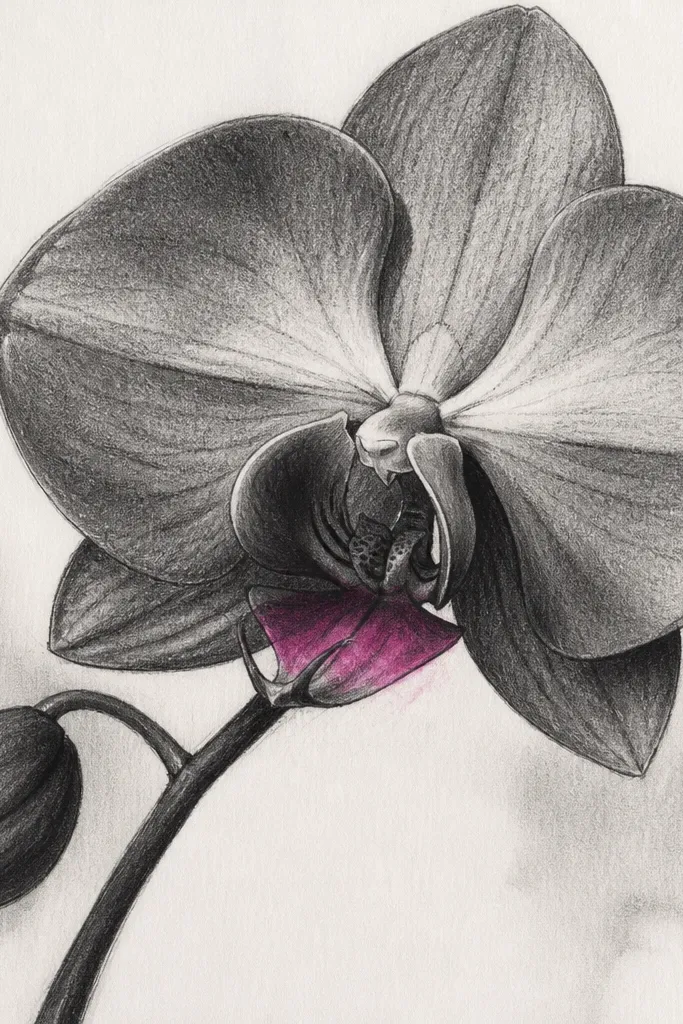
This is modern because the color is controlled and small. One accent patch makes the orchid feel alive without turning the whole page into a watercolor painting. I use a magenta or deep orchid-purple wash because it matches the flower’s natural center without overpowering the line work. This style looks great when you want a focal point for a neutral room. It also flatters people who like bold color but hate clutter.
Good to knowUse a smaller brush than you think — the accent should stay the size of a thumbnail.
Sketch the orchid with pencil first, then ink the petals and lip with 0.5 fineliner. Add gray pencil shading on the petal folds only. Mix a small amount of watercolor magenta with a lot of water, then paint a tight oval wash directly under the lip center. Leave the rest of the petals unpainted. Let it dry, then add tiny white gel pen specks on the lip to keep it crisp.
Common mistakeDon’t paint color across multiple petals; that’s how it stops looking modern.
11. Orchid Sketch with Thin Caption-Like Lines
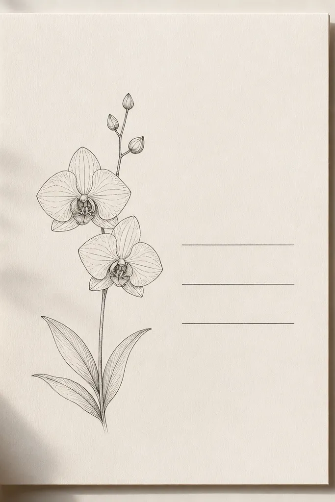
Label-like lines give a modern editorial feel. I’ve used these when I wanted the piece to look like a botanical diagram from a design magazine, not a craft drawing. Keep the lines thin and evenly spaced so they feel intentional. This style suits desks and office walls because the structure reads “organized.” It also flatters smaller orchids in larger frames because the lines give visual weight without adding text noise.
Draw your orchid slightly off-center to the left. Ink the petals and lip with 0.5 fineliner, then add minimal 0.1 vein lines. On the right side of the page, draw three thin horizontal lines with a ruler, each about 1.5-2 inches long. Connect one line to the stem with a short angled stroke. Shade only the petal bases with light gray pencil so the lines and orchid stay clean.
Keep the lines the same thickness as your orchid interior marks, not your outline.
Avoid actual text if you’re not confident — random lettering makes it look amateur fast.
12. Orchid with a Long Diagonal Stem Sweep
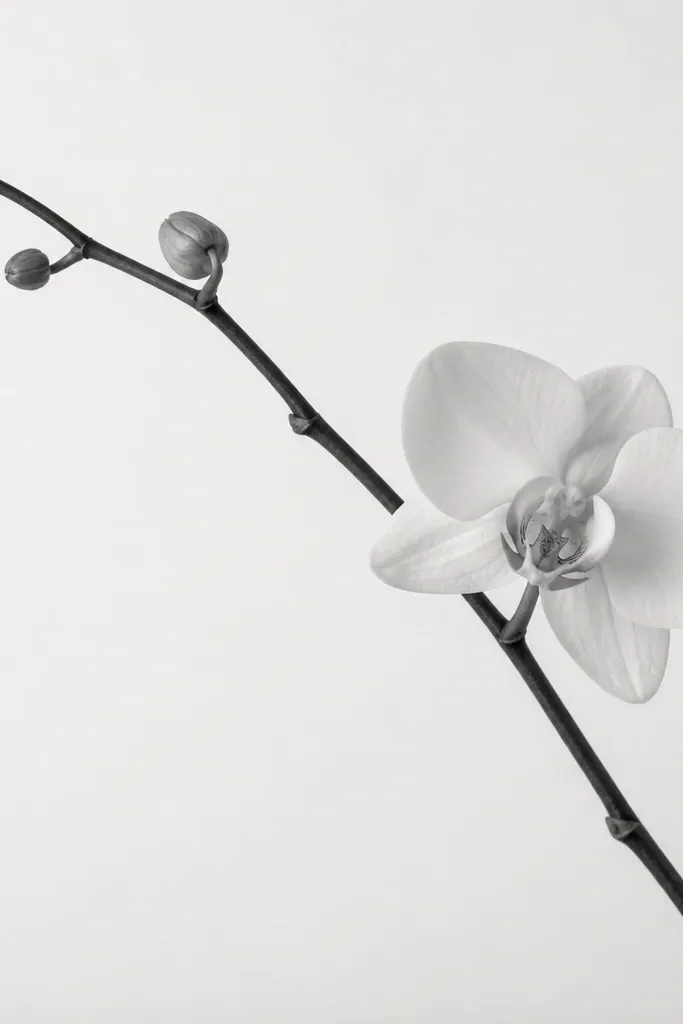
Diagonal compositions look modern because they create motion and break the “centered print” look. I use a long stem sweep to make the orchid feel like part of a larger design system. It’s especially good for tall frames and for hanging above a couch where you want the piece to guide the eye horizontally. This also flatters people who like minimal art with a bit of drama. The orchid itself stays simple; the stem does the work.
Start with the diagonal stem line using a ruler for the main line, then freehand the curve where it meets the orchid. Place the orchid near the upper third so the diagonal feels balanced. Outline petals with 0.5 fineliner, then add lip speckles with 0.1. Shade the underside of petals lightly with pencil, keeping the shading tight. Add one small leaf mid-stem as a simple oval with one fold line.
Before inking, lightly sketch the diagonal in pencil and measure the angle so it feels deliberate.
Don’t overcrowd the stem with lots of leaves; one small leaf keeps it modern.
13. Orchid Sketch with Partial Cropping for a Gallery Wall Feel
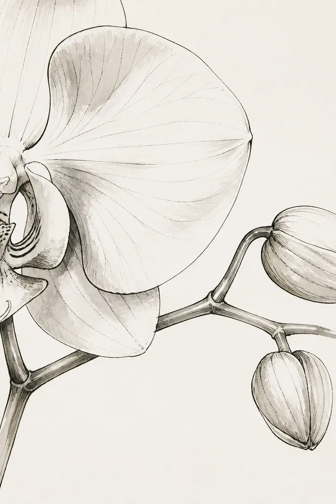
Cropping gives you that gallery wall energy because the viewer feels like they’re seeing a moment, not a whole product. I like it when you want the sketch to look like it belongs in a set of prints, even if you made it at home. Keep the outline clean and let the cropping cut through the line — it looks intentional. This style flatters modern interiors because it breaks the “whole frame” rule. It also works well for small orchids and prints with oversized mats.
Sketch the orchid larger than your paper — plan it so one side petal goes off the page. Ink with 0.5 fineliner and add lip details with 0.1. Shade only the petal undersides with light gray pencil so nothing looks heavy near the crop edge. Add one small stem curve that also reaches the edge. Once the ink dries, erase pencil marks near the crop so the edges look crisp.
If you’re printing, crop digitally with a clean margin so the cut-off lines don’t look accidental.
Avoid messy pencil lines near the edge; crop edges show every smudge.
14. Orchid and Minimal Botanical Labels Without Text
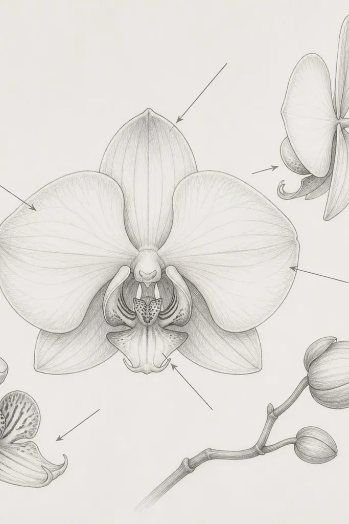
Arrows without text feel modern because they suggest “information” without turning the page into writing. I use this when I want a diagram vibe that still looks soft. The arrows should be thin and match your interior line weight, not your bold outline. This works well in kitchens or craft rooms because it looks playful but organized. It also flatters people who love botanical art but don’t want readable text clutter.
Good to knowPlace arrows so they don’t overlap the densest part of the lip — keep them in the blank space.
Draw the orchid center and outline first. Then add two or three arrows pointing to the lip and one petal fold, using a ruler for straight segments and a gentle curve for arrowheads. Keep arrow thickness consistent with 0.1 fineliner. Add gray pencil shading under the petal folds and on the lip base. Leave the rest of the page clean so the arrows don’t compete with the orchid shape.
Common mistakeAvoid thick arrows; they make the orchid look like it’s been highlighted.
15. Orchid Sketch on Whiteboard-Style Gray Paper
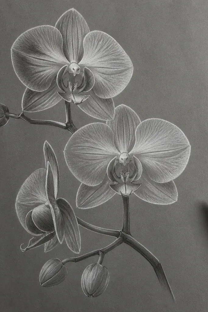
Gray paper changes everything because it forces high contrast. White pencil or chalk-like pencil highlights look bright and modern on the midtone background. I used this approach on cardstock for a client and the orchid looked like it belonged in a modern cafe window. It flatters darker rooms because the art glows a bit against shadows. If you like bold contrast without color, this is the cleanest option.
Start by lightly mapping the orchid with a faint pencil line so you can erase if needed. Ink with a dark fineliner (0.5) for the outer petals and lip outline. Add shading using soft white pencil on the petal edges and underside curves. If you want extra crispness, add a few tiny black dots in the lip center with 0.1 fineliner. Keep your background untouched — no wash, no extra marks.
Test your white pencil first on scrap gray paper; some brands look dull.
Don’t smudge the white pencil everywhere — keep highlights on edges and folds only.
16. Orchid Sketch with Minimal Speckle Pattern Background
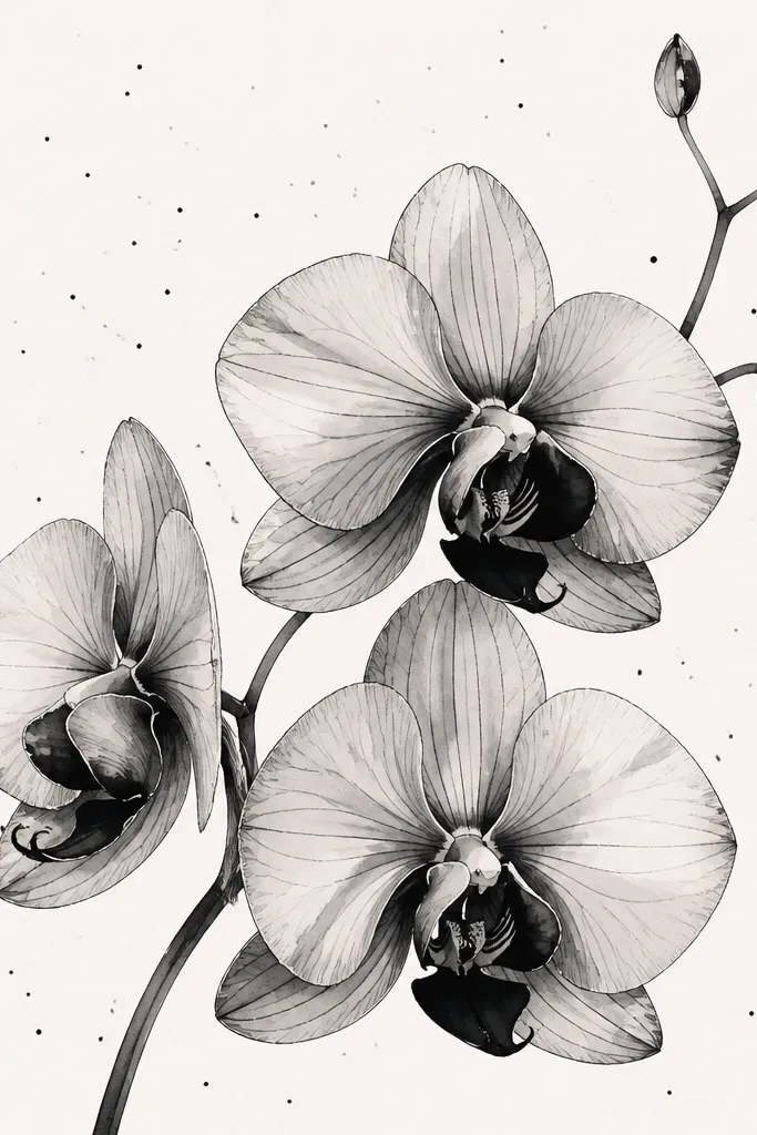
Sparse speckles look modern because they add texture without turning into a full pattern. I keep the speckles light and uneven so they feel like atmosphere, not wallpaper. This works well for soft orchid styles where you want the petals to feel delicate. It also flatters framed art because the speckles hide tiny printing imperfections. Choose this when you want something more interesting than blank paper but still clean.
Good to knowIf speckles look too dark, wipe your pen tip on scrap before touching the paper again.
Draw the orchid with 0.5 fineliner and add 0.1 interior lines. Shade petals lightly with pencil in small patches under each fold. Use a toothpick or small brush to add tiny ink speckles around the orchid, starting in the corners and leaving the center cleaner. Keep the speckle density lower than you think — you should see lots of blank space between dots. Let the ink dry fully before erasing pencil marks.
Common mistakeAvoid dense speckle clusters; they make the piece look like noise.
17. Orchid Sketch with a Thin Vertical Ruler Line Accent
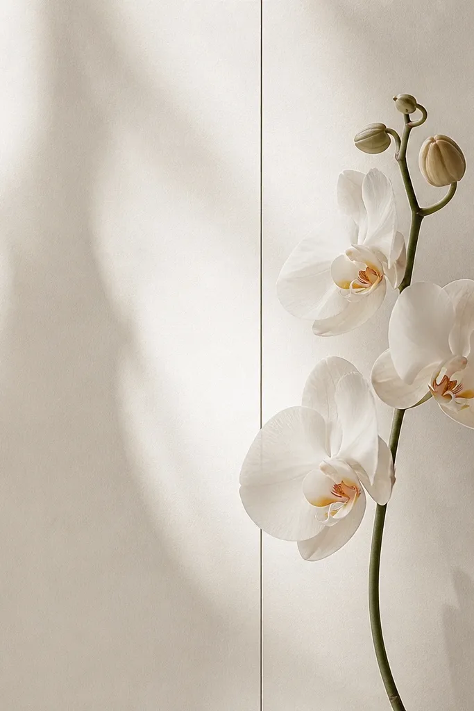
A single vertical guide line reads modern because it adds a subtle design structure you’d see in layout work. I use it when I want the orchid to feel aligned and calm. The guide line should be thinner and lighter than the orchid outline, so it doesn’t steal attention. This style fits tall prints and feels clean in monochrome interiors. It also flatters people who like strict composition but still want a handmade touch.
Use a ruler to draw a light gray vertical line about one-third from the left edge. Place the orchid with its center (lip) slightly to the right of that line. Outline petals with 0.5 fineliner, then add interior contour lines with 0.1. Shade only the petal undersides with light pencil so the guide line stays visible. Finally, erase any pencil that overlaps the orchid so you keep the line art crisp.
Make the guide line light enough to fade in a photo; it should be a quiet structure.
Avoid bold black guide lines — it turns into a border.
18. Orchid Sketch with Two Tone Ink Outline (Black + Sepia)
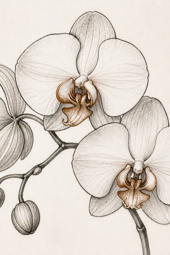
Two-tone outline makes the orchid feel modern because it adds depth without adding heavy color blocks. I use sepia-brown only on the inner petal edges so the flower looks dimensional but still graphic. This style flatters warm-toned rooms and wood frames because sepia plays nicely with beige and honey colors. It also makes the sketch look more “illustration” and less “copy of a photo.” If you want modern but warm, this is the sweet spot.
Ink the main outer petals and lip with black 0.5 fineliner. Then switch to a sepia fineliner for inner petal edges and a few contour lines that sit inside the outline. Shade with a light gray pencil under petal folds, keeping it minimal. Add tiny sepia dots in the lip center instead of filling the whole lip. Keep the background blank and let the two inks create the depth.
Use sepia only where you want a shadow edge; too much sepia makes it look dirty.
Don’t mix three ink colors; it stops reading as modern and starts reading as accidental.
19. Orchid Sketch with a Single Leaf Sweep and No Background Marks
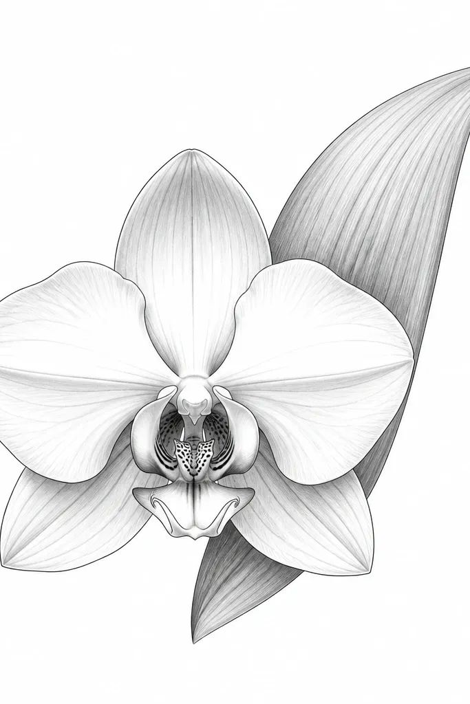
A single leaf sweep makes the orchid look intentional without adding pattern clutter. I like placing the leaf behind the orchid so it frames the petals like a soft silhouette. This style is modern because it keeps the line art clean and avoids extra elements like stems, flowers, or decorative borders. It’s great for small prints where you need the composition to stay readable at arm’s length. It also flatters minimalist wardrobes and neutral decor because it stays monochrome and calm.
Good to knowKeep your leaf line smoother than you think; jerky leaf lines make it feel handmade in a messy way.
Draw the orchid first, centered. Ink petals with 0.5 fineliner, then add 0.1 interior veins and speckles on the lip. Shade petal bases with light gray pencil — just two or three strokes per petal fold. Then add one leaf behind the orchid using a smooth continuous curve, with a single fold line down the middle. Finish by erasing pencil lines completely so only ink and shading remain.
Common mistakeAvoid adding a second leaf; it makes the sketch feel crowded fast.
20. Orchid Sketch with Graphic Parallel Lines Behind the Stem
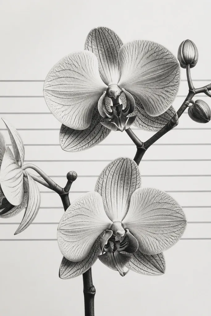
Parallel lines behind the stem look modern because they create a graphic rhythm. I keep them light and spaced so they feel like a design element, not a coloring page background. This style works well for vertical art because the lines guide the eye upward. It also flatters monochrome rooms since the only “pattern” is gray line work. If you want a little energy without color, this is the cleanest way I’ve found.
Good to knowKeep line spacing consistent; uneven spacing reads sloppy even when your orchid is perfect.
Sketch your orchid and stem first, then ink with 0.5 and 0.1. Use a light pencil to plan the parallel lines area behind the stem. Draw 8-12 parallel lines with a ruler in gray pencil, starting below the orchid center and stopping around the bottom third. Shade petals lightly with pencil so the lines remain the background feature. Erase any pencil that crosses your ink outlines so the ink stays crisp.
Common mistakeDon’t darken the parallel lines; heavy background lines kill the modern focus.
21. Orchid Sketch with Oversized Petal Detail Panel
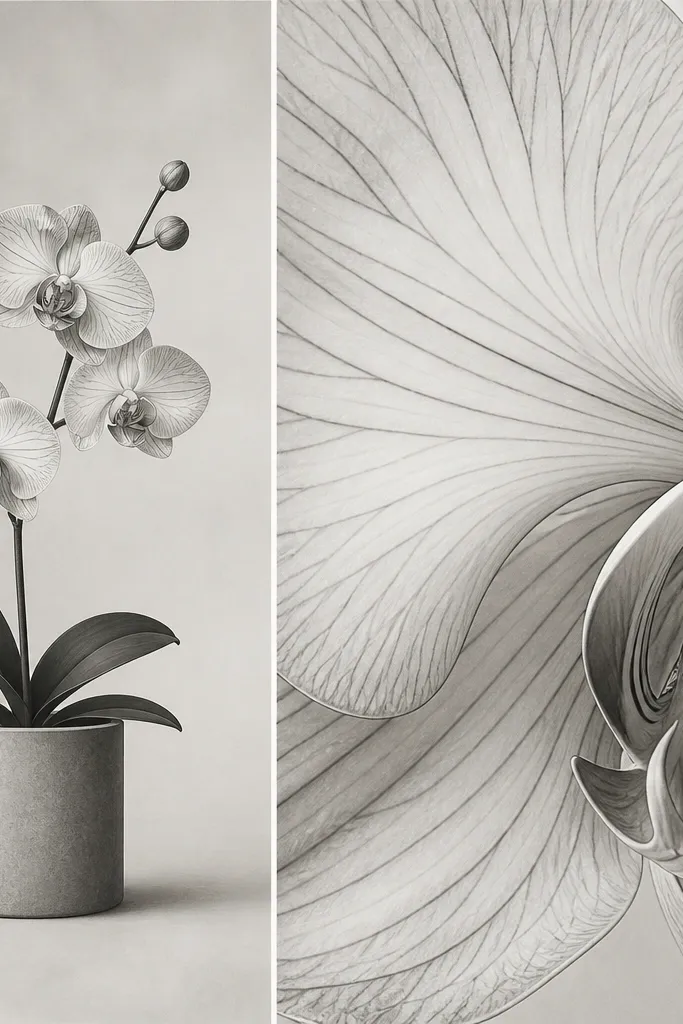
This layout looks modern because it mixes scale like an illustration spread. I do a small full orchid on one side and a magnified petal on the other so the viewer gets both the big shape and the texture. It flatters people who love detail — you can go deeper on veins without cluttering the whole page. This style also works well for teaching or journaling because it feels like a “study.” The modern part is the clean panel division and consistent line weight.
Good to knowIf the close-up feels too busy, remove half the veins — the remaining ones look more intentional.
Draw a vertical split down the middle of the page with a ruler, but keep it light. On the left, sketch a small orchid with 0.5 outline and 0.1 interior marks. On the right, draw a single oversized petal close-up that fills most of the panel — include 6-10 vein lines and a few speckles near the petal base. Shade the close-up with pencil in only two tones: base shadow and edge highlight. Finally, keep the panel border thin and unshaded so it stays crisp.
Common mistakeAvoid drawing both panels at the same scale of detail; it makes the page feel flat.
22. Orchid Sketch with a Soft Gray Drop Shadow Effect
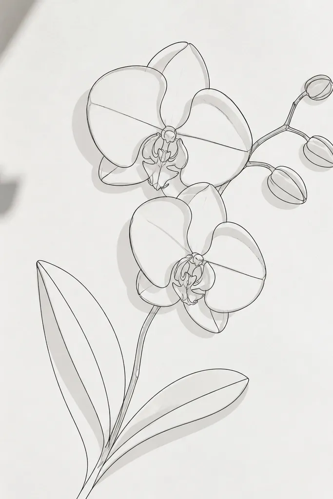
A soft drop-shadow effect makes a sketch feel modern because it adds dimensional separation without using color. I create this by duplicating the outline in lighter gray and offsetting it a few millimeters. It looks like layered paper even though it’s just pencil and ink. This style flatters frames with glass because the shadow gives depth when light hits. It also looks great in larger sizes where tiny details would otherwise disappear.
Ink the orchid outlines first with 0.5 fineliner. Then lightly pencil a second outline behind the petals, offset 3-5 mm down and to the right. Fill the shadow area with soft gray pencil using short strokes, staying inside the shadow shape. Keep the lip and center crisp — don’t shade the center heavily. Finish by going back over the main outlines with the fineliner so the top layer stays sharp.
Use a scrap sheet to measure the offset distance so it stays consistent across petals.
Avoid a dark, full shadow; it makes the sketch look like a sticker.
23. Orchid Sketch with Minimal Ribbon Banner Across the Bottom
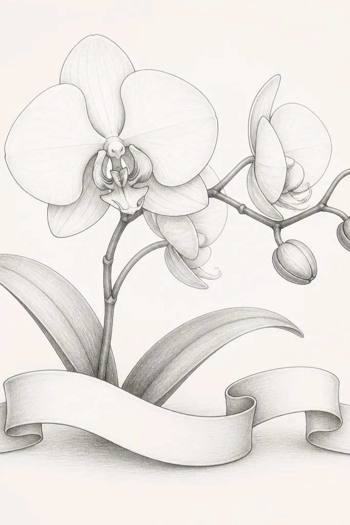
A bottom ribbon banner gives the piece a finished, design-led base. I keep it text-free, using only the banner shape and a tiny fold line so it doesn’t become a sign. This style looks modern because it adds a geometric anchor while the orchid stays organic. It flatters living rooms because it gives the eye a landing spot under the flower. If you want something that looks “planned” without lettering, this is a winner.
Good to knowMake the ribbon width about the same as the orchid’s widest petal span so it feels balanced.
Draw the orchid in the upper half with clean 0.5 outlines and 0.1 interior marks. Then draw a ribbon banner across the bottom: a long rounded rectangle with a slight dip in the middle. Add one fold line down the center of the banner with 0.1 fineliner. Shade the underside of the ribbon with light gray pencil so it looks like it sits above the paper. Keep the background blank and erase any pencil smudges under the banner.
Common mistakeAvoid thick ribbon lines; thin lines keep it modern.
24. Orchid Sketch with a Watercolor Edge Bleed (Painted Border)
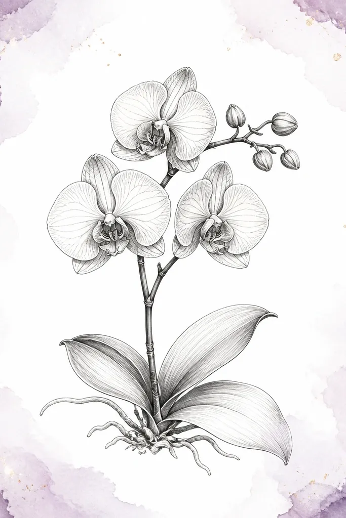
A watercolor edge bleed makes the orchid feel modern because the border behaves like a frame without being a rigid rectangle. I use a thin watercolor wash around the edges, letting it fade toward the center so it doesn’t compete with the flower. This style looks great for prints you’ll frame with a mat, because the border gives depth even when the mat covers parts of the edges. It flatters rooms with soft lighting because the watercolor edges glow slightly. It also keeps the orchid as the main event.
Good to knowKeep the paint band thin — if it’s too wide, it reads as messy rather than modern.
Mask nothing — just paint lightly. Dilute watercolor (lavender or pale blue) and paint a thin band along each edge of the paper, stopping 1 cm from the center area. Let it dry fully. Then ink the orchid with 0.5 fineliner and add 0.1 interior details. Shade petal bases with light pencil, keeping the watercolor as the only color element. After it dries, add a few white gel pen highlights on the lip to keep the center bright.
Common mistakeAvoid painting a full solid rectangle border; it looks like a craft stamp.
25. Orchid Sketch with Two Stems in a V Shape
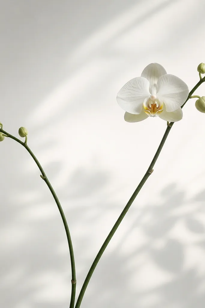
Two stems in a V shape look modern because they create a strong structure under a delicate flower. The orchid can be slightly asymmetrical and still feel designed because the V shape guides the eye. I use this when I want the drawing to fill more of the page without adding extra flowers. It flatters taller frames and looks good in entryways where you want a vertical focal point. The modern feel comes from the clean stem geometry and controlled shading.
Sketch a V shape in pencil, then place the orchid at the top where the stems meet. Ink the stems with 0.3 fineliner for a lighter look than the petal outline. Outline the orchid petals with 0.5 fineliner, then add 0.1 interior veins and lip speckles. Shade only the underside of petals and the inner fold lines. Add two tiny leaf shapes on the stems as simple ovals — one per stem.
Keep the V angle wide enough that it doesn’t feel like a funnel; about 60-70 degrees looks balanced.
Avoid adding too many leaves; it turns into a busy botanical drawing.