1. Blush center orchid with warm shadow glazing
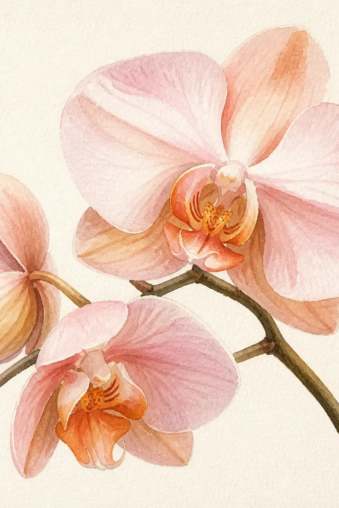
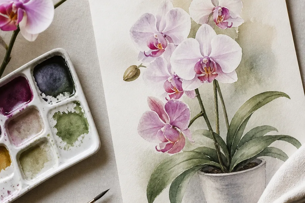
This look flatters skin tones that lean warm because it uses blush pinks and apricot shadows instead of harsh magentas. I paint the petals as a light wash first, then I glaze warm shadow under the folds so the flower looks dimensional even if your lines aren’t perfect. The center stays airy, which makes the orchid feel cozy rather than dramatic. If you’re drawing for a small card or planner page, this palette keeps everything gentle and readable at a glance. It also works well for people who like soft home decor because the colors sit close to beige and blush.
Start by wetting only the petal areas lightly with clean water, then lay down a very watery blush wash. While it’s still damp, drop in a diluted quinacridone rose at the petal fold and pull it slightly toward the center with the tip of your brush. Let it dry fully, then mix a warm shadow glaze using burnt sienna plus a touch of magenta and paint it under each fold in thin strokes. Finally, add the darkest rim only along the outer edge where petals overlap, using a slightly thicker mix so it doesn’t spread.
Good to knowIf your blush wash dries streaky, add one more thin glaze instead of scrubbing the paper. Scrubbing ruins the paper tooth and makes the petals look grainy.
2. Creamy ivory orchid with tiny purple veins
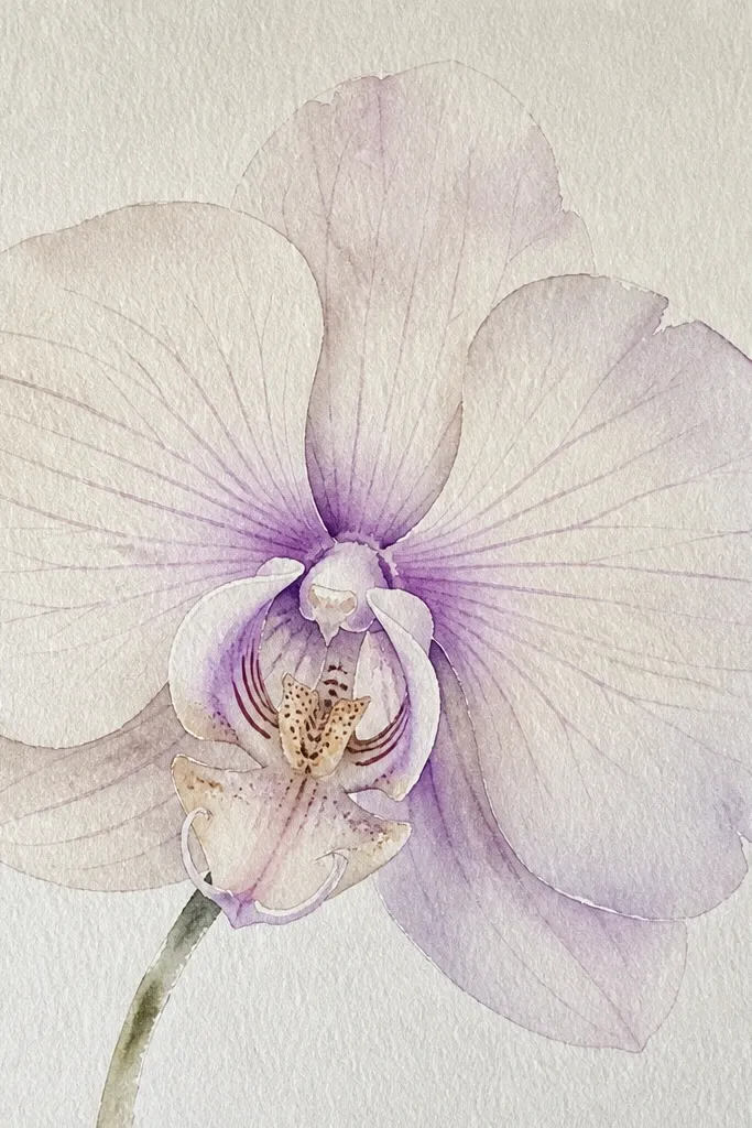
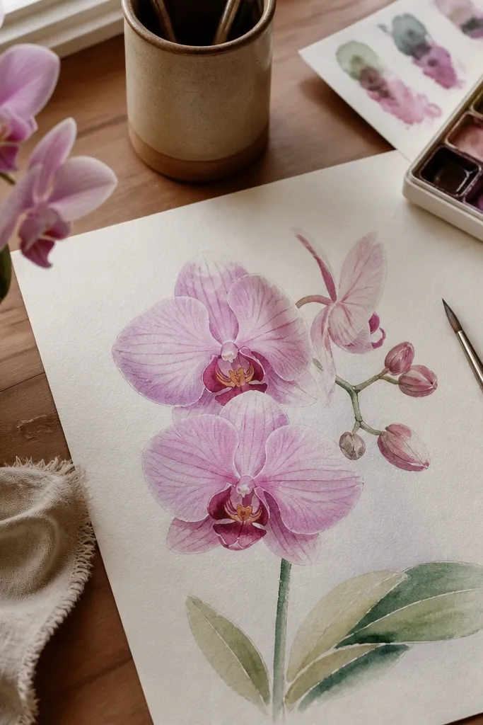
This is the clean, calm look I use when the sketch needs to feel airy. The ivory base makes the orchid look delicate, and the tiny purple veins add detail without turning the drawing heavy. It’s flattering for cool-toned decor because the purple stays soft and doesn’t go muddy. I like this style for framed prints because the light petals keep the image from feeling busy. If your goal is “cozy” but also “minimal,” this is the one.
Paint a very pale wash of diluted purple on the petals, keeping it thin so the paper stays visible. While the wash is wet, tap a little stronger lilac only at the center folds, then stop — don’t fill the whole petal. After it dries, use a liner brush to add hairline veins from the center outward. Keep the veins uneven in thickness so they look natural, not stamped. Finish by darkening only the overlap zones with a micro amount of dioxazine purple, then blend the edge with a damp clean brush.
Good to knowUse a liner brush with a sharp point. If the tip is rounded, the veins look like dots instead of threads.
3. Deep magenta orchid with wet-on-wet bloom edges
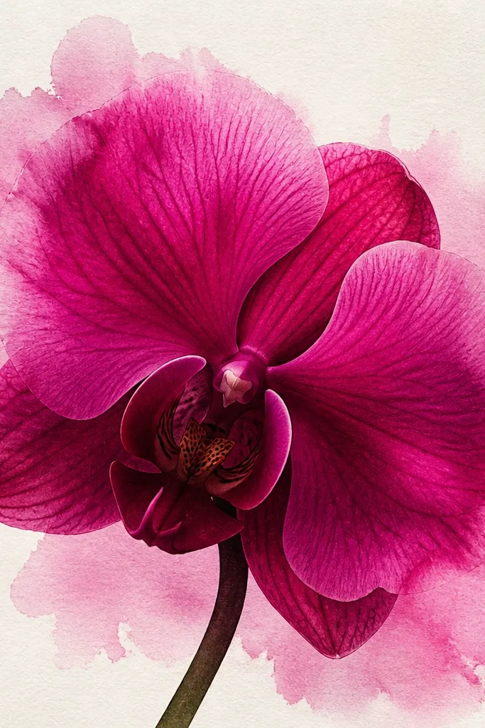
This look is for when you want the orchid to look lush, not flat. Wet-on-wet bloom edges create that “petal softness” that makes the flower feel real. I like it because the dark magenta carries the sketch even if your line work isn’t super crisp. It also looks good in warm rooms because magenta warms up under yellow light. If you’re making a gift card, this style reads instantly from across the room.
Start with the lightest wash: diluted quinacridone magenta across each petal, leaving paper showing at the highlights. While the wash is still damp, drop in a stronger magenta at the petal base and let it spread a little toward the rim. Don’t overwork the blooms; stop when you like the softness. After it dries, glaze a darker mix into the overlaps and under-fold areas. Finally, add a few vein lines with a damp brush and a small amount of diluted purple so the veins look like they’re embedded in the petals.
Good to knowIf the petals go too dark too fast, rinse your brush and lift pigment with a clean damp paper towel. Lift before it dries fully so you can rescue the highlights.
4. Muted lavender orchid with blue-grey background wash
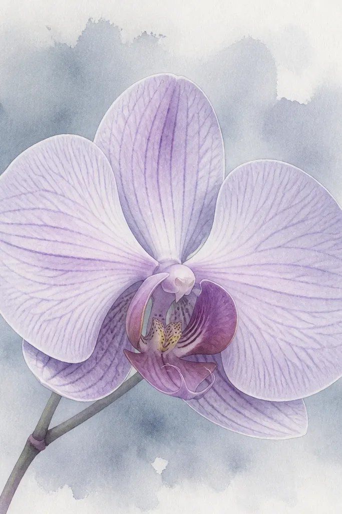
This look makes the orchid feel cozy because the background is quiet and the petals can breathe. Muted lavender plus a blue-grey wash keeps the whole piece from looking too “pink-heavy.” It’s flattering for people who like cool pastels and want the orchid to match dishes, towels, or wall paint that leans gray. The key is that the background stays lighter than your petal darks, so the flower remains the focus. I’ve used this on practice sheets and then later kept the best one for a small gallery wall.
Paint a light blue-grey wash behind the orchid first, using a big brush and lots of water so it fades at the edges. Keep it loose around the petal outlines, leaving a small white halo around each petal if you want extra separation. Then paint the petals with a diluted lavender wash and let it dry. Once dry, add slightly darker lavender at the folds and blend with a damp brush edge. Finish with thin, darker purple veins and a small amount of shadow under the lowest petal.
Do the background first. If you paint behind after, you’ll risk dragging pigment into your clean petal highlights.
5. Sage-tinted orchid with warm undertone shadows
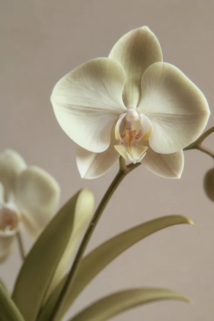
This is the “cozy garden” orchid. The sage tint cools the petals just enough to feel fresh, and the warm shadows keep it from looking icy. It flatters yellow-leaning spaces because warm shadows tie the green into the room. I also like it for practicing color mixing because you learn how little green it takes before it turns chalky. The orchid still reads as pink/purple, but it feels calmer and more natural.
Mix a pale wash by adding a tiny amount of Sap Green to your light pink, then dilute until it looks like mist. Paint the petals with that wash, leaving the center highlights mostly untouched. Add warm shadow under each fold using burnt sienna plus a touch of purple, and keep those strokes thin. For the stem and leaves, paint them in two steps: a light sage base, then a darker green mix in the vein lines. Finish by adding darker rim color on the overlapping petals and a few fine veins in purple.
Start with less green than you think you need. You can always glaze more, but you can’t un-green a petal without repainting.
6. Peach and rose orchid with a soft halo highlight
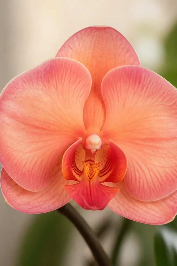
This look is cozy because the peach and rose tones blend like a warm blanket. The halo highlight makes the petals look rounded, especially in small drawings where you don’t have room for a lot of detail. It’s flattering on prints because peach reads well against off-white frames and paper. I use this when I want the orchid to look friendly instead of high-contrast. The halo also helps your orchid drawing look intentional even if your petal shapes aren’t symmetrical.
Paint a peach-rose wash across the petals using a diluted quinacridone rose with a touch of burnt sienna. Leave a narrow strip near each petal edge almost unpainted so it stays light. While the wash is still damp, add a slightly darker rose at the petal fold and pull it gently toward the center. After drying, glaze a thin line of darker rose along the overlap edges. Finally, add a center dot pattern and a few tiny vein scratches with a liner brush.
To keep the halo clean, don’t overblend it. Stop blending once you see the highlight edge.
7. Moody orchid with near-black plum edges
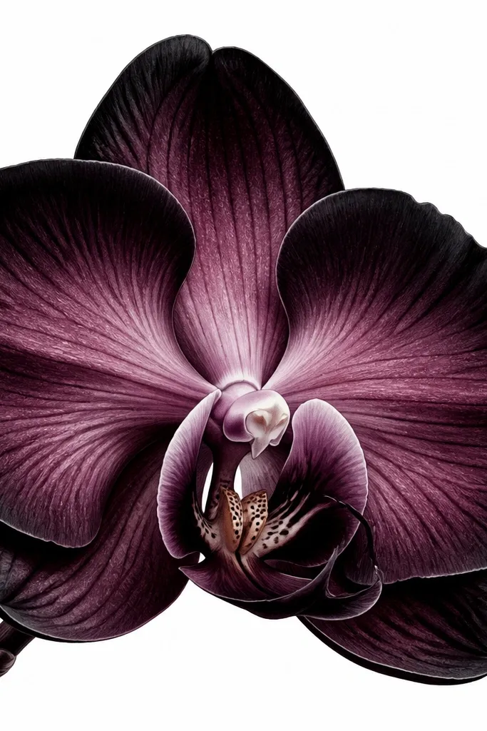
This look makes the orchid feel dramatic but still controlled, because only the edges go dark. I use it when a sketch feels too pale and I need contrast for it to read. The near-black plum edges create a crisp outline without turning the whole flower harsh. It’s flattering in modern interiors because the contrast looks intentional. If you’re gifting a darker aesthetic print, this is the fastest way to get that “premium” look.
Start with a mid-tone plum wash across the petals, leaving highlights as paper white. While damp, keep the center softer — don’t push it dark yet. Let it dry, then mix a deep plum by combining dioxazine purple with neutral tint. Paint that deep mix only on overlap zones and along the outer petal rims. Use a damp brush to soften the inner side of each dark edge so it melts into the petal, then add a few vein lines in a lighter purple.
Good to knowUse neutral tint sparingly. Too much makes plum turn flat gray.
8. Two-tone orchid with split-color petals
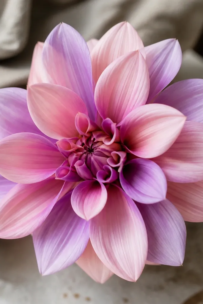
Split-color petals look fancy because your eye sees two temperatures at once. I do this when I’m practicing color placement because it teaches you how to control gradients instead of filling everything evenly. The pale pink plus light purple combo stays cozy and doesn’t feel neon. It also looks great for greeting cards because the two tones create natural movement. Your orchid will look more complex even if the drawing itself is simple.
Start by wetting one side of each petal with clean water, then paint pale pink on that damp half. Without re-wetting, paint a light purple on the other half, letting the colors meet in the middle. Keep the meeting area soft by lightly dragging the brush at the boundary once — then stop. After drying, glaze darker color into folds using a diluted magenta-purple mix. Finish by adding veins in the darker tone and a tiny center highlight to keep the split-color from looking muddy.
Good to knowDon’t try to make the split perfectly straight. A slight wobble makes it look hand-painted.
9. Pastel orchid with wet-on-wet gradient petals
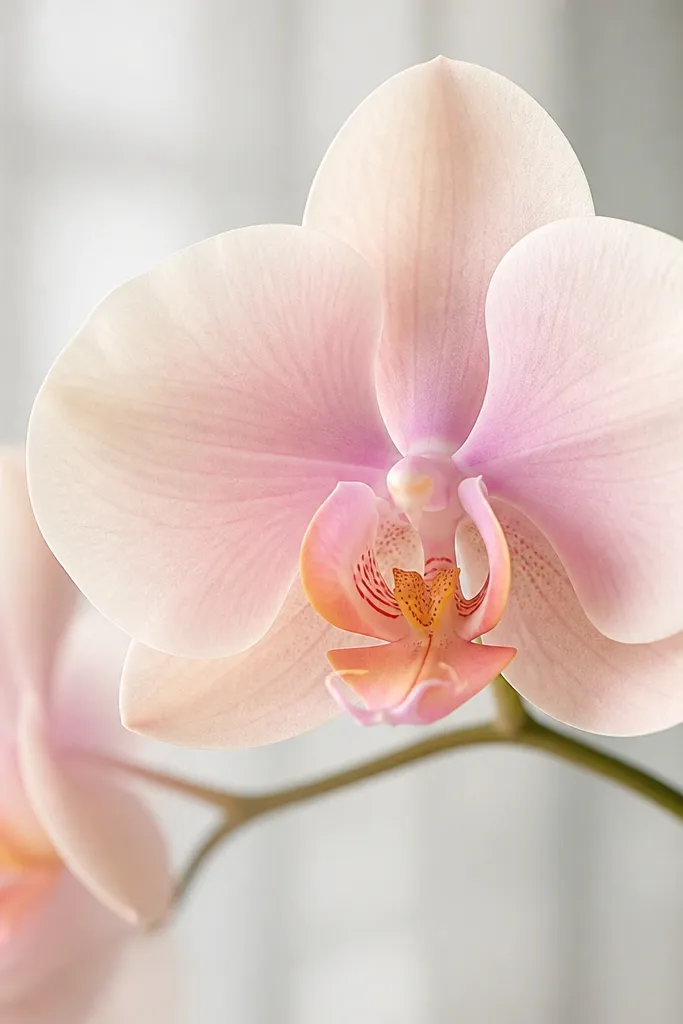
This look is for when you want the orchid to feel like a soft watercolor print. Wet-on-wet gradients hide small drawing mistakes because the edges aren’t as rigid. It’s flattering for people who like calm, low-contrast art and it works well for larger paper pieces. The petals look “silky” because the pigment spreads evenly. It also teaches you timing — when to stop blending.
Wet each petal area lightly with clean water. Paint a very light wash of your base color, then while it’s still wet, add a slightly stronger mix near the center fold. Blend only once or twice with the edge of your brush so the gradient stays smooth. Let everything dry completely. Then add veins with a very diluted purple, using only a few lines so they don’t overpower the gradient. Finally, darken the overlap edges with a tiny amount of the stronger mix.
If your gradient turns blotchy, you overworked it while it was too wet. Let it sit 30 seconds before you touch it again.
10. Gold-warm orchid with burnt sienna undertones
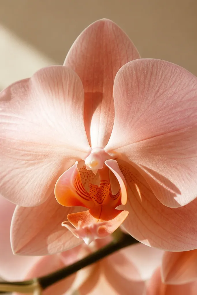
Burnt sienna under watercolor makes orchids feel warm and cozy without changing the flower’s identity. The undertone gives you a natural shadow color that looks like light passing through petals. This is flattering for homes with warm lighting and wood tones. The warm shadows also make the orchid look more dimensional even if you keep the petals light. I like it for practicing shadows because burnt sienna is forgiving — it doesn’t go black and it blends easily.
Paint the petals with a pale pink wash, but don’t fully cover — leave paper showing. Mix burnt sienna with very diluted purple and glaze a thin layer under each petal fold. Let that dry, then add a slightly darker glaze only in the deepest overlap. For the center, add a warm orange-pink mix by combining rose with burnt sienna and keep it concentrated. Finish with a few purple vein lines and a clean rim line where petals overlap.
When you glaze burnt sienna, keep it thin. Thick sienna dries darker than you expect.
11. Cool blue orchid with soft teal shadows
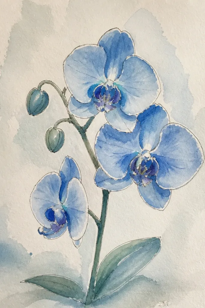
This orchid feels cozy because it’s cool without going icy. Teal shadows add a hint of ocean air, and blue-lavender petals keep it gentle. It’s flattering for people who like blue bedding, white curtains, or kitchen tile that leans gray. The contrast between blue petals and teal shadows makes the flower look dimensional. This is also a good practice piece if you want to learn complementary mixing — teal makes purple look richer.
Start with a light blue-lavender wash across all petals. While still damp, add slightly darker blue near the folds, then stop so it doesn’t bleed everywhere. After drying, mix a teal shadow by combining a small amount of green with blue and a touch of purple, diluted to a watery glaze. Paint the teal only under the fold lines and in the overlap shadows. Finish with thin vein lines in a darker blue-purple and a crisp rim on the outer edges using wet-on-dry.
Use teal shadows sparingly. If you spread it across the whole petal, the orchid looks like a watercolor stain.
12. Rose monochrome orchid with dry-brush texture
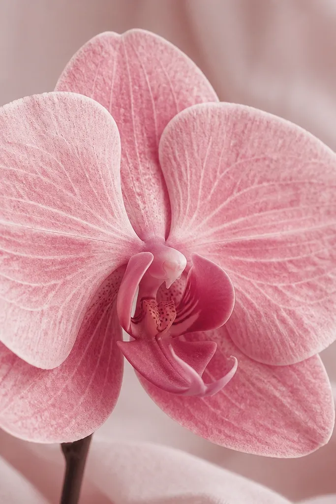
Dry-brush texture makes a watercolor orchid look like it has real surface — like petal fibers catching light. I use this for cozy practice because it hides tiny mistakes in petal edges. The rose monochrome palette stays calm and cohesive, so your drawing doesn’t look patchy. It’s flattering for prints where you want a romantic vibe without bright color jumps. If you’re drawing for wall art, texture gives it that handmade feel that people actually notice.
Load your brush with a medium dilution of rose (not watery). Dab most of the paint off on a paper towel until the brush leaves faint, broken marks. Paint the petals in short strokes following the petal curve, leaving highlights as paper white. Let it dry, then glaze a slightly darker rose into folds for depth. Add veins with a very light dilution so they look like they belong on top of the texture, not under it. Finish by tracing the outer overlap edges with a cleaner wet-on-dry rim.
If your texture looks too scratchy, you used too little water or too much paint. Re-wet the brush and try again on a scrap first.
13. Sunkissed orchid with peach wash background
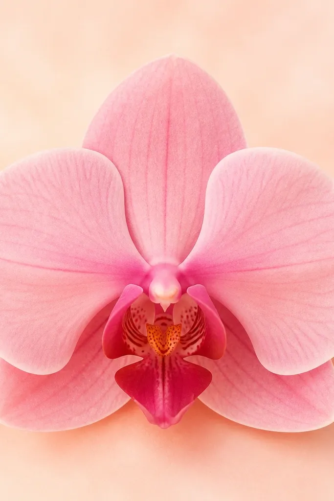
A peach wash behind the orchid makes the whole drawing feel warmer, like late afternoon light. It’s cozy because the background color wraps around the flower without stealing attention. This palette is flattering for warm skin tones and warm home decor, especially if you plan to frame it with a cream mat. The orchid looks more dimensional because the background hue shifts the perceived shadows. I’ve used this on practice sheets and ended up liking the background so much I kept it as the final.
Paint a pale peach wash behind the orchid using a big brush, leaving the orchid area slightly lighter at first. Let the background dry, then paint the petals with a light pink wash. Add darker rose at the folds while the petals are still damp for softness. After drying, glaze warm shadow under overlaps with diluted burnt sienna plus rose. Finish with crisp outer rim lines and tiny center details using a liner brush.
Good to knowKeep the background one step lighter than your darkest petal edge. If the background is too strong, the orchid flattens.
14. Lavender orchid with speckled salt sparkle
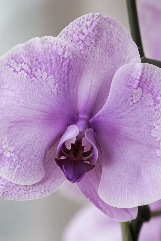
Salt sparkle is the easiest way to add “cozy magic” to watercolor without drawing extra details. This look works because the orchid already has natural texture — speckles mimic tiny petal spots and make the center feel lively. Lavender stays soft, so the sparkle doesn’t look like glitter or mess. I like this for practice because it teaches you control: where you place salt matters more than how much you use. It’s also great if you want visual interest in a small drawing without clutter.
Paint your lavender base wash and let it sit until it’s damp but not fully wet. Dab a little stronger lavender mix into the folds for depth, then sprinkle fine salt on only the petal areas you want speckled. Wait for it to dry completely, then brush off the salt gently with a dry soft brush. After removing salt, add vein lines and a slightly darker rim using wet-on-dry so they stay sharp. Finish the center with a tiny dot or two of stronger lavender.
Good to knowUse fine salt, not chunky. Chunky salt leaves ugly craters that look like damage.
15. Monochrome charcoal-purple orchid study for clean edges
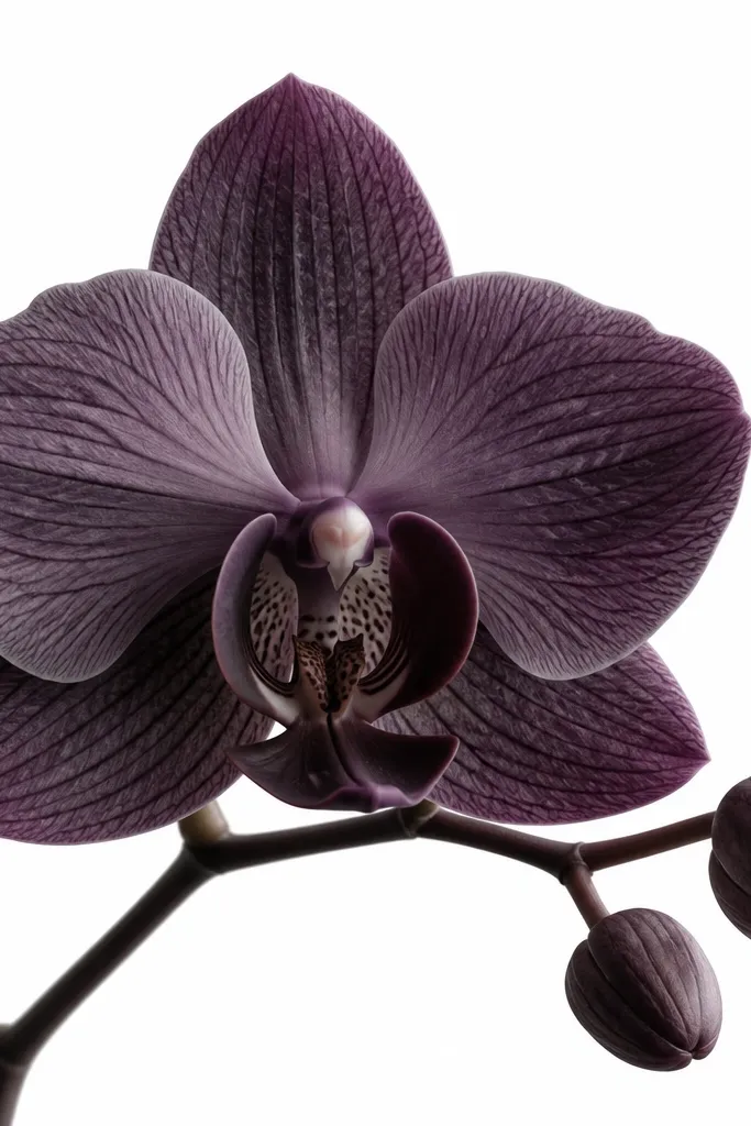
This look is practical because it trains edge control, which is what makes orchid drawing look “painted,” not colored. The monochrome palette keeps you focused on value — light vs dark — instead of chasing new colors. I use it when I want the petals to look crisp and the center to look structured. It’s flattering for simple decor because the colors sit between plum and charcoal, so it matches black frames and gray mats. If you’re building a consistent style, this is a solid anchor practice.
Draw your orchid outline lightly, then paint a light purple wash over the petals, leaving the highlight shapes paper-white. While still damp, deepen only the fold lines with a slightly stronger purple and avoid the outer rim. Let it dry. Then mix a charcoal-purple by combining dioxazine purple with neutral tint and paint it only on overlaps and outer edges. Add veins with a liner brush, keeping them thinner near the rim and thicker near the center. Finish with tiny touch-ups where two petals meet so the overlaps look intentional.
Good to knowIf your edges feather too much, your paper is too wet. Let the first layer dry longer before you add the dark rims.