1. Throat Shadow Orchid with Pencil-First Control
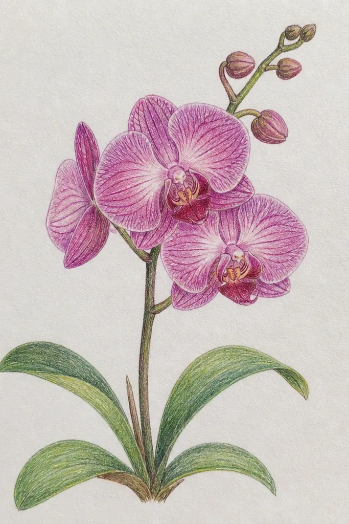
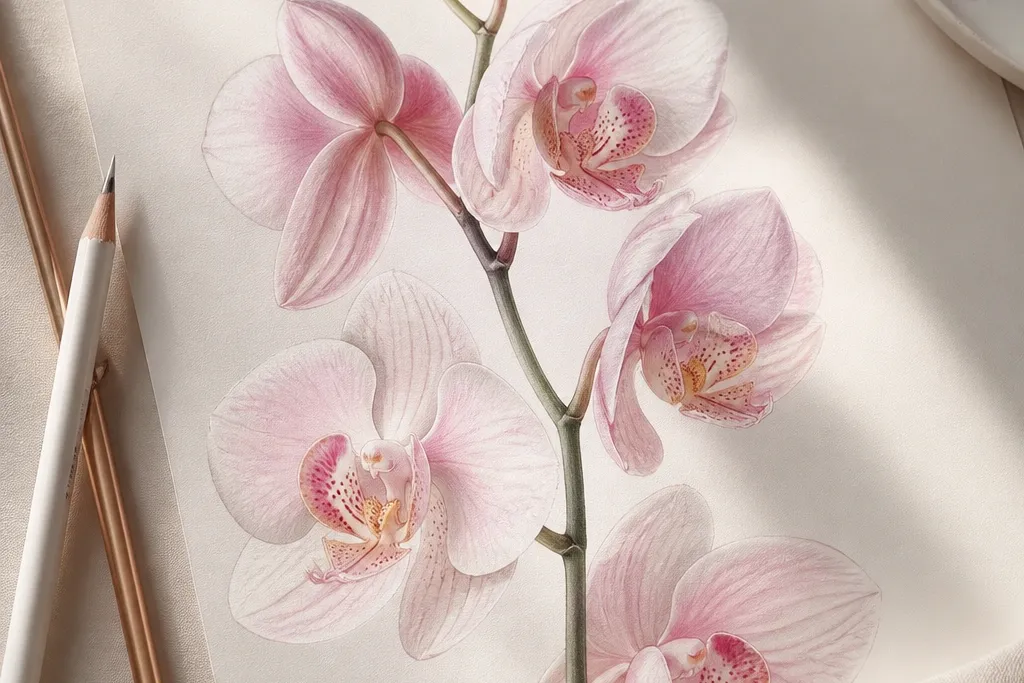
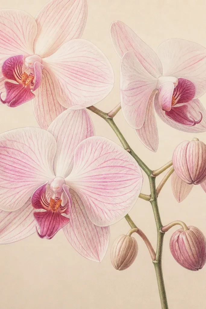
This look is the one you want when you hate smudges. I build the orchid structure in colored pencil first, then I punch the throat shadow last so it doesn’t flatten the whole bloom. Use Orchid Purple and Lavender Mist for the petals, then add a warm undertone with a light touch of rose-brown in the throat so the purple looks dimensional. The veins should look like thin threads, not scribbles — that’s how it reads expensive. It flatters people who like clean lines and it works beautifully for small frames because the sharp edges hold up at distance.
Good to knowSharpen your pencil to a needle point before the veins. If the tip is even slightly rounded, the lines widen and the whole drawing feels cheap.
Start by sketching the bloom with a soft graphite like 2B, keeping the petal outlines light. Block the petals with a thin colored pencil layer in Lavender Mist, then add Orchid Purple in the mid-tones where the petals fold. Next, draw the veins with a sharpened pencil using short, controlled strokes — I keep my hand moving in the direction the veins curve. Finally, deepen the throat with a denser Orchid Purple layer and add a tiny warm brown glaze around the shadow edge so it looks like depth, not just darker color.
Common mistakeAvoid coloring the throat first — if you do, you lose the value contrast that makes the orchid look dimensional.
2. Milky Lavender Orchid Glow with Watercolor-First Wash
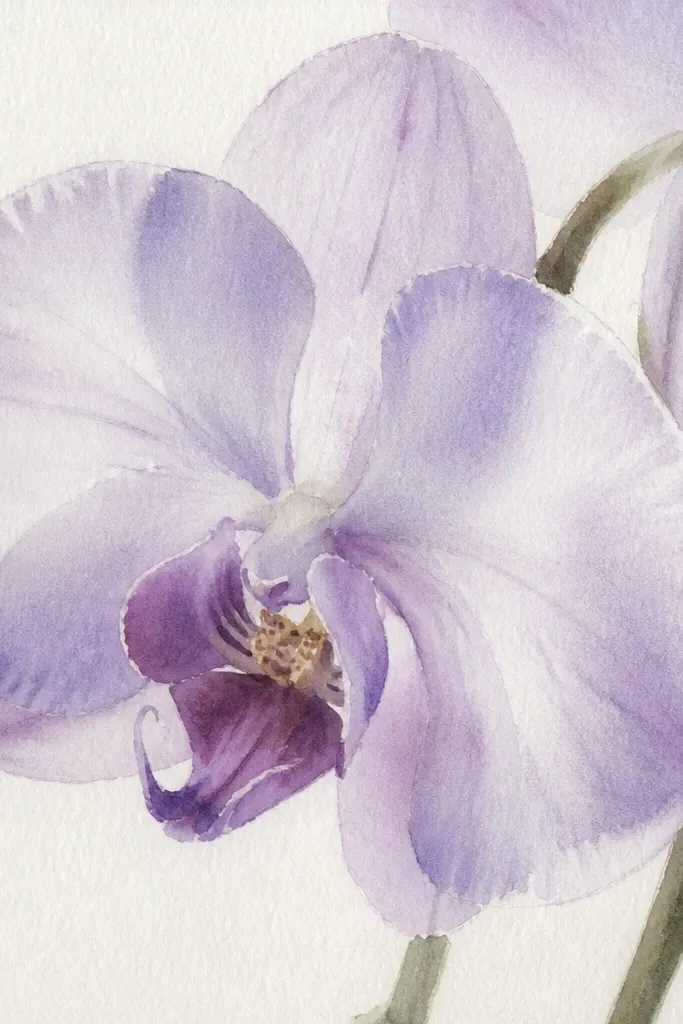
This is the orchid look that reads like high-end pastel painting. Watercolor-first gives you that milky, atmospheric fade across each petal - especially along the outer edges where orchids look like they’re glowing. I keep the washes diluted and layer them slowly, so the lavender stays light instead of turning muddy. After the wash dries, I add only a hint of vein structure so the softness stays the main event. This style flatters a looser, romantic vibe and it looks gorgeous when you frame it behind glass because the haze effect stays smooth.
Tape your paper down and wet a clean brush lightly, then mix lavender with a lot of water so it looks like colored milk. Block the largest petal shapes first, leaving the highlight curves nearly untouched. Let it dry fully — I wait until the paper is cool and dry to the touch, not just “looks dry.” Then add a second, lighter wash in Orchid Purple where the petals fold and deepen the throat with a concentrated but still translucent mix. Finish with a very light colored pencil pass for a few key veins only, so you don’t erase the watercolor glow.
Mix your lavender on a separate palette well before you start. If you remix mid-petal, the shade jumps and the glow looks uneven.
Don’t overwork the wet wash. Repeated brushing turns the petal edges into a hard, grainy mess.
3. Luxe Hybrid: Watercolor Mass + Pencil Veins
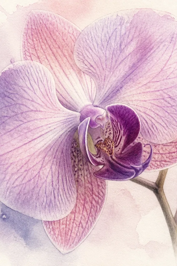
This one is my favorite for “Orchid Drawing luxe high end pastel” because you get both textures: painterly softness and controlled detail. Watercolor lays down the atmospheric petal masses, then pencil brings back the structure where your eye needs it. The trick is to keep the watercolor layer light enough that pencil can sit on top without turning into waxy grit. I use cool lavender for the main petals, blush pink for the inner folds, and a deeper orchid purple for the throat pocket. It flatters most tastes because it looks polished up close and readable from across the room.
Good to knowUse a separate sheet of scrap paper as a test swatch for pencil pressure. If your pencil is digging in, your veins will look scratchy instead of luxe.
Start with a watercolor block-in of the petal masses using diluted Lavender Mist and a blush-pink wash for the inner folds. Leave the highlight curves almost white. Let everything dry completely, then go in with colored pencil for the veins and edges: draw the vein lines with short strokes and keep the pressure light. Add a darker throat shadow in Orchid Purple, then soften the transition by lightly blending with a dry pencil layer rather than re-wetting. Finally, add a tiny warm brown accent just where the shadow meets the throat edge for depth.
Common mistakeAvoid drawing heavy pencil over wet watercolor. It lifts and drags the pigment, and the texture looks messy.
4. Pencil Underpainting + Watercolor Glazes for Depth
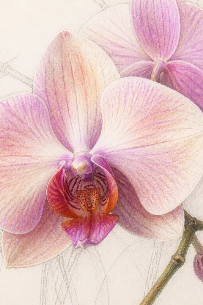
This method looks expensive because the pencil underdrawing gives the watercolor something to cling to — and it keeps the shape crisp. I map the orchid in colored pencil first at low pressure so the paper still accepts glazes. Then I use watercolor in thin, controlled glazes so the color stacks without flooding the veins. The result is luminous pastel depth, like the orchid is lit from inside. It’s best for people who like clean outlines but still want the soft, painterly finish.
Good to knowDo glazes in thin layers, not one big wash. If you flood it, the pencil texture disappears and the orchid looks flat.
Lightly sketch the orchid petals with 2B graphite, then cover the petal areas with a thin colored pencil layer in Lavender Mist and Orchid Purple. Keep the veins lightly indicated, not fully drawn yet. Mix your watercolor to a very light concentration and glaze over the petals in one direction — outer edge to center — so the glaze looks like it flows. Let each glaze dry before the next pass. When the glazes are done, darken the throat with a stronger watercolor mix and then finish veins with a light pencil pass for crisp lines.
Common mistakeDon’t press hard with pencil during the underpainting. Deep grooves make watercolor pool and create ugly tide marks.
5. Orchid Highlight Curves with Masking Fluid
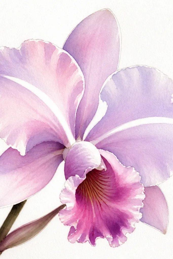
This is the look you get when you care about highlights. Orchids have those curved, glossy-looking highlight arcs, and masking fluid keeps them sharp even when the rest of the petal is wet. I use it when I want the drawing to feel high-end and “finished,” especially for frames under glass. The rest of the petals stay milky and soft, but those white curves stay clean and make the whole bloom look more realistic. It flatters a more polished style and works great when you’re drawing larger blooms like 8x10 because the highlights show clearly.
Good to knowTest masking fluid on a scrap first. Some brands leave a tacky residue that needs a quick wipe before you add pencil.
Sketch the orchid lightly and plan your highlight arcs along the petal curves. Apply masking fluid with a small brush only where you want the white to stay — keep your lines smooth and continuous. Paint the petals in diluted Lavender Mist and blush pink, letting the watercolor edges feather naturally. After everything dries, remove the masking fluid gently with an eraser or your fingertip — don’t scrape hard. Finish by adding vein lines with colored pencil and deepen the throat with a darker, concentrated watercolor wash.
Common mistakeAvoid masking tiny specks randomly. If your highlights look scattered, the orchid reads artificial.
6. Dusty Blush + Cool Lavender Contrast Orchid
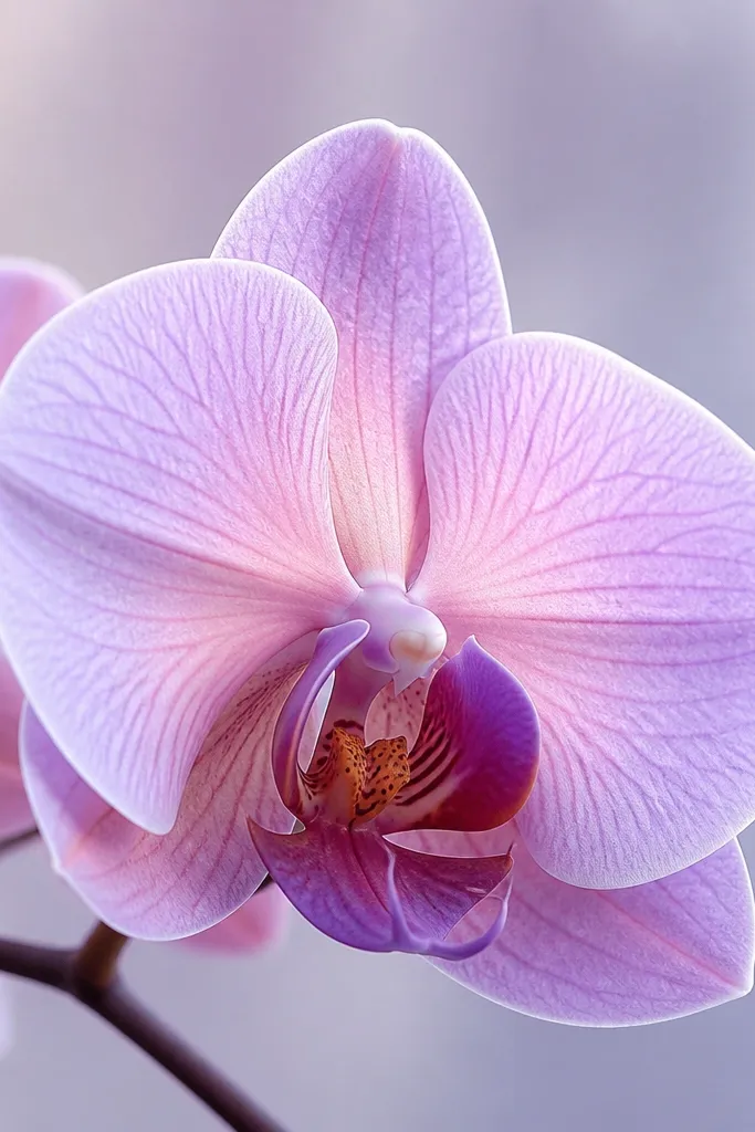
This look is how you make pastel purples feel expensive instead of flat. I pair cool lavender in the outer petal zones with dusty blush pink inside the folds, so your eye sees depth through temperature change. The throat gets Orchid Purple plus a whisper of warm brown, which makes the purple look richer without turning into dark gray. I keep the veins light so the color temperature does the heavy lifting. It flatters people who like soft color harmony and it looks great in neutral frames because the blush pops against the cool lavenders.
Good to knowUse two separate pencils for the two temperatures. A single purple pencil mixed with brown makes everything look muddy faster than you think.
Start with a light base in Lavender Mist across the outer petals. Add dusty blush pink only in the inner folds and along the lower petal curve, keeping a clean boundary where the colors meet. Build the throat with Orchid Purple, then add a tiny warm brown at the shadow edge. If you’re pencil-first, draw veins lightly with a sharp pencil in lavender tones; if you’re watercolor-first, add veins after the wash dries. Finish by reinforcing only the darkest parts of the throat and leaving highlight arcs untouched.
Common mistakeDon’t carry blush pink all the way to the outer petal edge. That kills the cool-to-warm depth effect.
7. Vein-Forward Orchid for Close-Up Detail
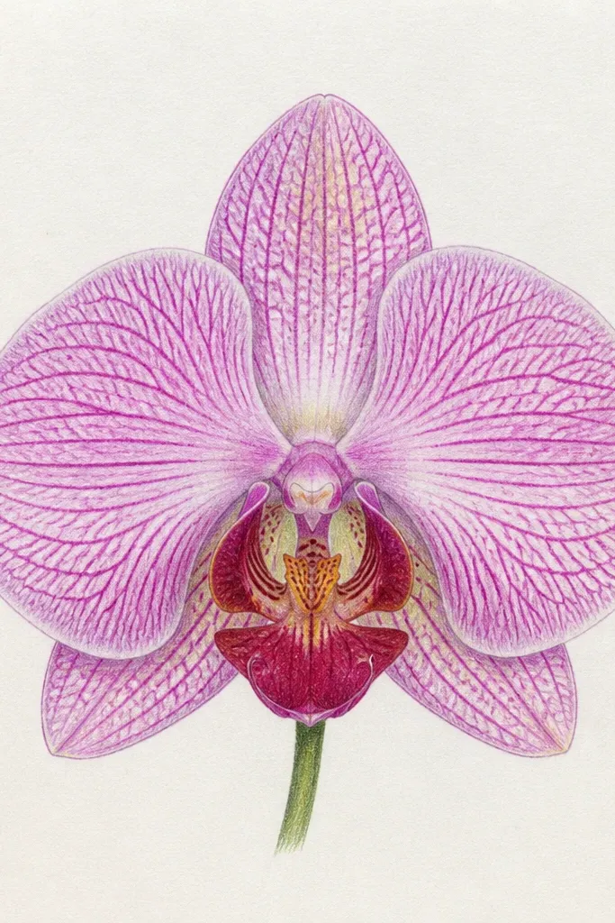
If you sell or gift drawings, this is the one people lean in for. The luxe look here is the vein density: not random scribbles, but controlled, layered lines that follow the petal’s curve. I keep the petal color light and let the veins create contrast — that’s what makes the drawing feel high-end. For color, I stay in Lavender Mist and Orchid Purple so it doesn’t turn into a rainbow. This style flatters detailed work and it looks best on a toothier paper that holds pencil texture without turning gritty.
Sketch the orchid and block the petals with a light layer of Lavender Mist. Then map the vein direction — I draw the main vein with a slightly darker pencil, and I keep side veins thinner and lighter. Build veins in two passes: first place the lines lightly, then deepen only where the vein meets the mid-tone folds. Add the throat shadow last with Orchid Purple, keeping it concentrated around the throat pocket. Finish highlights by erasing gently with a kneaded eraser or leaving them untouched during color blocking.
Use a kneaded eraser for highlights instead of gouging. You get clean ridges without damaging the paper tooth.
Avoid heavy dark veins on the lightest petals. The contrast becomes harsh and the orchid looks graphic.
8. Watercolor Edge Feather Orchid with Soft Petal Borders
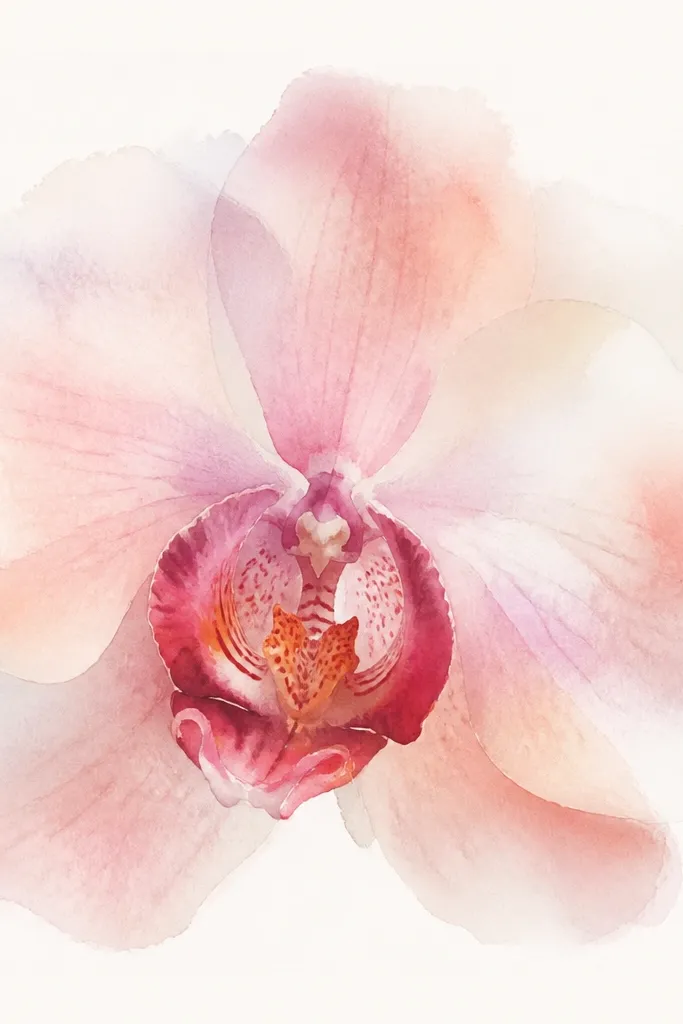
This is the style you pick when you want the orchid to feel delicate and airy. The watercolor edge feather gives you a natural softness that colored pencil alone can’t replicate. I keep the paint diluted and let the paper do the blending, then I add only light pencil for vein hints. The throat stays a touch darker so the bloom has a center, but the outer edges remain cloud-like. It’s flattering for airy, feminine rooms and it looks especially good on textured cold-press paper because the pigment catches lightly.
Good to knowStop painting when it still looks too pale. Watercolor dries lighter, and if you chase darkness you’ll lose the feathered edge.
Use diluted Lavender Mist to paint the outer petal shapes first, letting the edges feather outward. Keep the center slightly more saturated by adding a second light wash only in the inner fold area. Let the watercolor dry fully, then lightly sketch veins with colored pencil so you don’t lose the airy edges. Add a concentrated throat shadow in Orchid Purple, but keep it small — a deep pocket, not a big dark blob. If you want extra softness, lightly glaze one more time over the petal masses, then stop.
Common mistakeDon’t outline the petals with pencil right after watercolor. The sharp outline fights the feathered watercolor border.