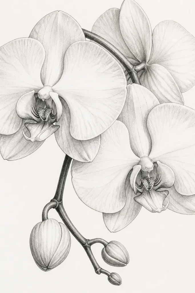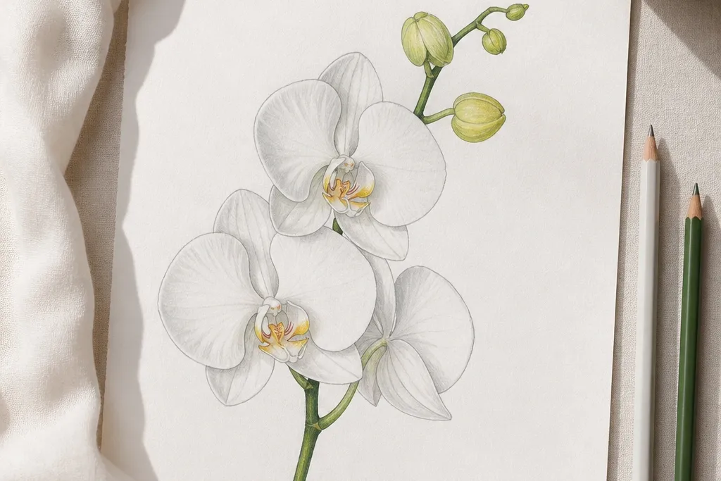
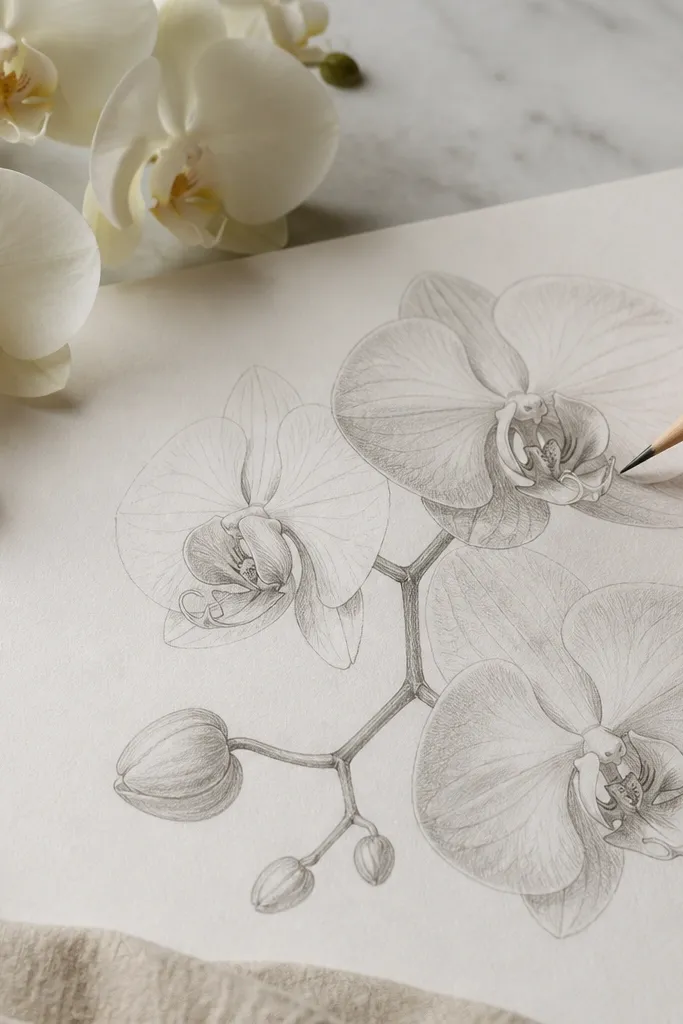
1. Single Moon Halo Orchid
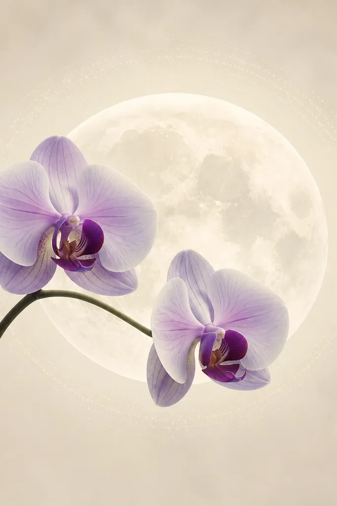
This layout is the one I reach for when I want the “pretty from far away” look with minimal effort. The moon sits dead center, painted in diluted warm white, then you add a thin halo ring using light gray-blue dots. The orchid is one main stem with two blossoms, so you don’t have to balance multiple branches. It flatters small rooms because the vertical stem gives height without clutter, and the lavender petals look good against warm skin tones when the art is near a vanity or makeup mirror. Keep the orchid center in deep plum so the whole piece has one strong anchor.
Good to knowIf your moon looks too bright, glaze it with a whisper of light gray so the orchid lavender doesn’t compete.
Start by sketching a moon circle that takes up about 40% of the page height. Trace the halo ring just outside the moon using a mechanical pencil, then dot it with a 2B pencil or a light gray watercolor pencil. Draw one orchid stem with two blossoms, placing the lowest petal tip so it touches the halo ring. Color the petals with watercolor pencil in lavender, then blend with a slightly damp brush for soft edges. Finish by adding a dark plum center with a tiny brush tip, and outline only the petal edges in fineliner to keep it airy.
Common mistakeDon’t outline every petal edge — too many dark lines makes it look like a coloring page.
2. Moon Cut-Out Orchid Arch
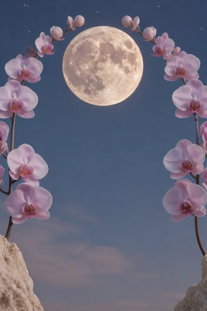
This one reads modern because the moon is a strong shape and the orchid wraps like a frame. I use a cut-out feel by leaving the interior space of the moon and halo lighter, while the orchid lines create the arch. It works great for narrow wall spaces because the arch pulls the eye upward and keeps the composition tight. The pale pink-lavender petals look flattering in bright kitchens or halls where you want calm without heavy contrast. The styling principle is clean negative space: the moon area stays airy so the orchid looks light, not heavy.
Begin with a moon placed high on the page, about 45% of the page width, leaving a bit of sky space underneath. Sketch an orchid arch that curves from the lower left and lower right toward the moon, with blossoms spaced evenly along the curve. Leave the moon interior and halo area mostly uncolored so it stays crisp and bright. Color petals in a gradient from pale pink at the base to lavender at the tips, then add a tiny dark dot in each center. Add star dots with a white gel pen or white paint over a dry surface, then seal with matte once fully dry.
Use a ruler for the moon circle edge, then freehand the orchid — the contrast between perfect and organic looks intentional.
Avoid crowding blossoms too close to the moon edge; it makes the arch look cramped.
3. Two-Tone Orchid Moon Bloom
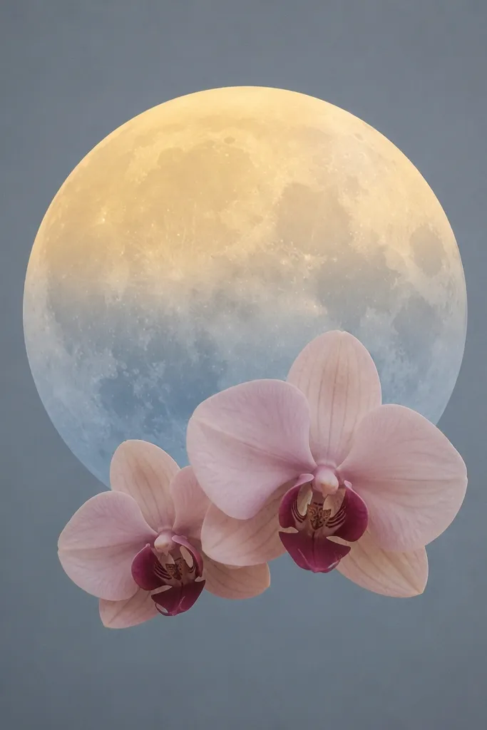
This is for when you want a moon that feels dimensional without adding extra elements. I paint the moon with a top-to-bottom shift: warm pale yellow near the top, then gray-blue underneath, so it looks like light is coming from one direction. The orchid stays simple — two blossoms only — but they pop because of the maroon centers. This flatters rooms with cool lighting (bathrooms, north-facing windows) because the warm yellow keeps it from feeling sterile. The key is two-tone control: one warm hue + one cool hue, then keep the orchid to one petal family.
Good to knowTest your moon gradient on scrap paper first — the exact dilution decides whether it looks airy or muddy.
Paint the moon first using watercolor paint diluted heavily, starting with pale yellow at the top third and gray-blue in the bottom third. While it’s still slightly damp, soften the boundary with a clean brush so you don’t get a hard line. Sketch two orchid blossoms at the moon’s lower edge, with the larger one on the left. Color petals in peach-lilac using watercolor pencil, then blend gently. Add maroon centers and a thin shadow line under each petal using a diluted plum wash. Let it dry fully, then add one last fineliner pass on the petal edges for crisp definition.
Common mistakeDon’t add extra stars or extra stems; the two-tone moon already does the work.
4. Dotted Glow Orchid Trail
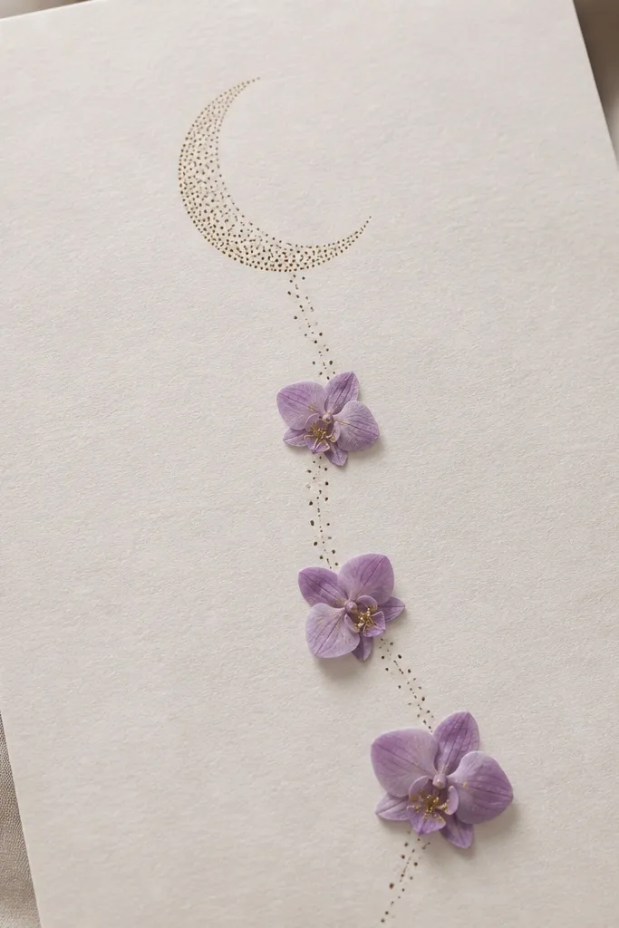
If you hate messy painting, this is your friend. The glow is made with dots, so you don’t need smooth brush gradients. I build the moon as a crescent of tiny marks, then guide the orchid placement along the dot trail so everything feels connected. It works well for entryway art because the dot trail creates motion without looking busy. The lavender petals with gold specks feel warm even in neutral decor. The styling principle is repetition: the same dot size used across the moon and trail makes the piece look intentional.
Sketch a crescent moon shape lightly, then fill it with dots using a 0.3mm fineliner or a dotting tool dipped in watered ink. Draw a dotted trail that curves downward, and mark three anchor points for orchids along it. Keep each orchid small: one central petal and two side petals per blossom. Color petals with lavender watercolor pencil, then add gold specks with a metallic gel pen only in the center. Finish by reinforcing the trail dots with a second pass so it reads clearly from a distance.
Use the same pen for moon dots and trail dots so dot thickness matches across the whole drawing.
Avoid switching dot sizes mid-piece; it makes the glow look accidental.
5. Night Sky Wash Moon Orchid
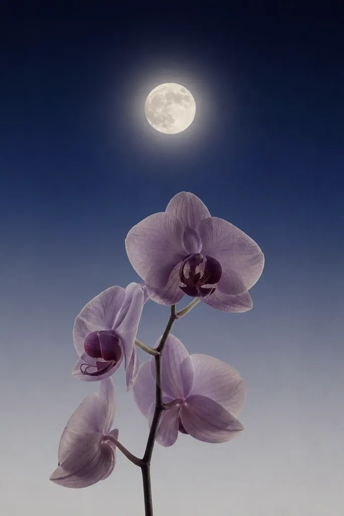
This gives you drama without heavy work. I do a simple night sky wash — navy at the top fading downward — then keep the moon bright and clean so it becomes the focal point. The orchid looks extra refined against the dark-to-light gradient, and the muted lavender petals don’t get lost. This flatters larger walls because the night wash adds depth, but it still stays low maintenance because you’re not painting detailed clouds. The styling principle is contrast control: dark background, light moon, one orchid stem.
Wet the top of your paper lightly with clean water using a wide brush, then paint a diluted navy wash and let it fade downward. Don’t overwork the wash; stop once it looks like a soft gradient. Draw the moon in the center on top of the wash, then paint it with warm white so it looks like the light source. Add a glow ring around it using light gray-blue dots or a thin diluted wash. Sketch one orchid stem rising from the bottom edge, keeping petals in muted lavender and adding a deep center in plum. Seal with matte after everything dries completely.
If your navy bleeds too far, dab it with a dry paper towel while it’s still wet to pull the pigment back.
Don’t paint the orchid directly over dark navy without a pale base — it will look dull.
6. Moon and Orchids Mirrored Symmetry
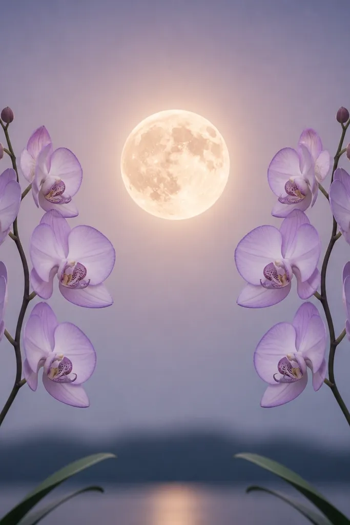
Symmetry makes this look “designed” even when you’re moving quickly. The moon stays centered, and the orchid stems mirror each other so you don’t have to worry about balance. I prefer this for gifts because it photographs well and looks calm on a shelf. The pale lilac petals with darker tips create a gentle structure without turning harsh. This flatters people who like clean, minimal decor — it doesn’t have to fight patterned wallpaper. The styling principle is repeat geometry: mirror the stem angles and leaf positions.
Draw a centered moon and glow ring first. Lightly sketch a vertical guideline through the moon so you can mirror placement. Draw the first orchid on the left with one blossom and two leaves, then flip the same shape onto the right by measuring distances from the guideline. Color petals in pale lilac, then add darker outlines only at the petal tips with fineliner. Add a tiny shadow under each blossom using a diluted gray-lilac wash. Let it dry, then apply matte seal in one light coat.
Use a light-box or phone flashlight under the paper to check symmetry before you commit to outlines.
Avoid freehanding leaf shapes in different sizes on each side; the asymmetry reads sloppy.
7. Crescent Moon Orchid Stem Wrap
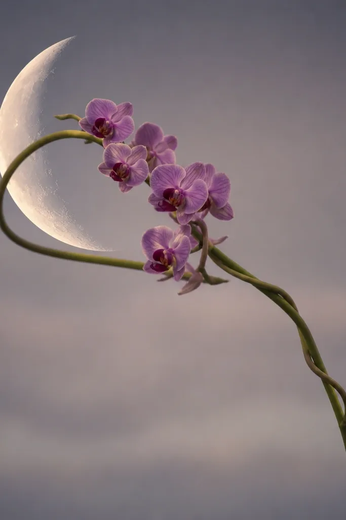
This one looks like it’s moving, but it’s still easy because the structure is one continuous stem. The crescent moon sits off-center, and the orchid stem wraps around it so the eye follows a single path. It works well for long, narrow frames because the composition has a diagonal flow. The lavender petals look airy against the negative space of the crescent, and the maroon throat gives you that orchid realism. The styling principle is one dominant curve: draw the stem first, then place blossoms along it.
Good to knowIf the curve looks wobbly, trace it with a ruler-freehand method: mark three points along the curve, then connect them smoothly.
Place the crescent moon in the upper left, with the opening facing inward toward the page center. Draw the orchid stem curve as a thick line guide — I use a pencil line about 1/8 inch thick. Add small blossom clusters along the curve, keeping them consistent in size so the wrap doesn’t look uneven. Color petals lavender, then add a maroon throat and tiny highlight lines with a white gel pen. Keep the crescent itself mostly pale, with a light wash on the outer edge for depth. Seal once dry.
Common mistakeAvoid adding a second stem — too many curves compete with the crescent.
8. Watercolor Orchid Over Paper Texture Moon
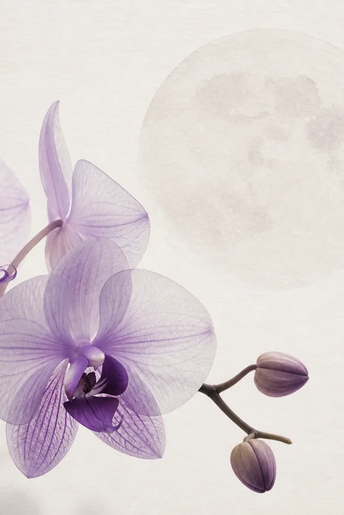
This is the most “handmade” look because you let the paper texture do part of the work. I paint the moon in very diluted watercolor so it stays light and textured, then layer orchid petals with transparency. The result feels soft and expensive, especially on cotton paper. This flatters people who like subtle art that doesn’t scream for attention. The styling principle is transparency layering: you build petal color in thin passes, not one heavy paint job.
Good to knowDo one petal at a time, not the whole orchid — drying speed controls how translucent each layer stays.
Use cotton paper or thick watercolor paper if you have it. Paint the moon with a very diluted wash of warm white so the grain shows. Sketch your orchid lightly, then paint petals in lavender in two or three thin layers, letting each layer dry. Add darker veins on the lower petals using a darker purple watercolor pencil, then blend lightly with a damp brush. Place a tiny white highlight in the orchid center with a gel pen once dry. Finish with matte seal so the transparency doesn’t dull.
Common mistakeDon’t flood the petals with water; it turns lavender into gray mush.
9. Orchid Silhouette Moon Frame
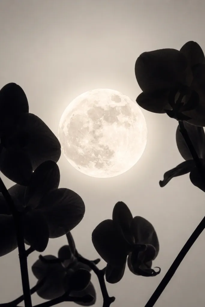
If you want the cleanest, lowest-maintenance look, silhouette wins. You draw the orchid as a solid shape, then place it around the moon so the moon stays bright and the orchid reads like a cut-paper effect. I use deep charcoal instead of pure black so it doesn’t look harsh under indoor lighting. This flatters minimalist homes and works great for people who struggle with detailed petal drawing. The styling principle is edge control: sharp silhouette edges plus a soft moon glow.
Draw the moon first as a clean circle. Add a thin glow ring with a light gray pencil or diluted gray paint. Sketch an orchid silhouette around the moon, leaving a clear gap between silhouette and glow ring. Fill the orchid shape with deep charcoal ink using a brush or a thick fineliner, then add a few negative cut lines inside the silhouette for petal separation. Keep the silhouette simple — one stem, two blossoms. Let dry and seal with matte to keep the charcoal from smearing.
Use a kneaded eraser to clean the pencil lines under the moon before you ink so the glow ring stays crisp.
Avoid pure black everywhere; it makes the moon look gray instead of bright.
10. Gold Accent Moon Orchid
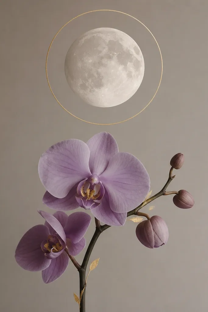
Gold accents make this feel special without adding complexity. I keep the gold limited to a ring and a handful of tiny marks on the orchid center, so it looks intentional instead of flashy. The lavender petals stay soft, and the gold gives you that warm glow effect. It flatters warm-toned interiors — think honey oak shelves, beige walls, and brass picture frames. The styling principle is restraint: gold appears in two places only.
Paint the moon with warm white watercolor and let it dry. Draw a thin ring around it, then trace the ring with a metallic gold paint marker or gold gel pen. Sketch one orchid with one main blossom and one smaller bud, placed just under the glow ring. Color petals lavender, then add a deep plum center. Finally, add gold leaf-shaped highlights: one curved stroke on the center and two small strokes along the stem shadow. Seal carefully with matte spray, and avoid spraying directly over thick gold paint.
If your gold looks streaky, let it dry fully and do a second light pass instead of pressing harder.
Don’t cover the whole moon with gold; it kills the soft moon look.
11. Pastel Ombre Moon Orchid Ladder
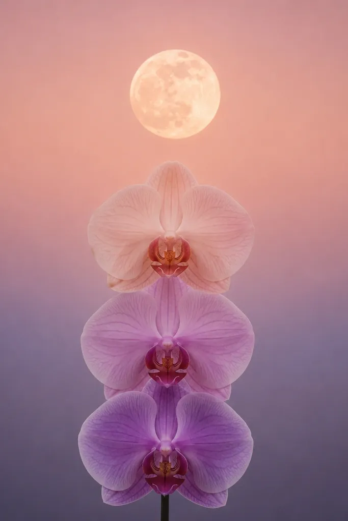
This layout gives you height and rhythm. The ombre glow under the moon creates a gentle gradient effect, and the three blossoms stacked like a ladder make it feel structured even when the petals are simple. It works great for taller frames or gallery walls where you need a vertical piece. The pastel peach-to-lavender glow flatters both cool and warm decor because it bridges the two tones. The styling principle is graduated color: each blossom gets a slightly different petal intensity.
Draw the moon centered, then paint a glow band beneath it that fades from pale peach near the moon to lavender lower down. Keep the glow band about 1/6 of the page height so it doesn’t overwhelm. Sketch three orchid blossoms aligned vertically, with the top blossom smallest and the bottom blossom largest. Color the top petals pale lavender, middle petals lavender with peach undertones, and bottom petals more saturated lavender. Add dark plum centers to each blossom for consistency. Outline only the outer petal edges so the ombre remains soft.
Use two separate brushes for peach and lavender so your glow stays clean.
Don’t make all three blossoms the same saturation; the ladder effect disappears.
12. Pressed Petal Orchid Moon Transfer
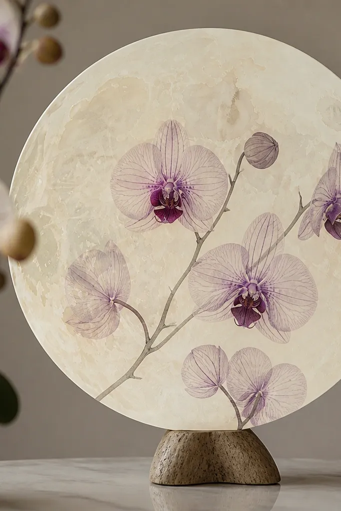
This is my favorite trick for realistic texture without hours of brushwork. You create a faint “pressed” look by transferring leaf-like textures into the orchid petals, then you outline just enough to read as an orchid. The moon stays calm and plain so the texture becomes the visual interest. It looks especially good in kitchens and laundry rooms because the organic veins feel fresh and light. The styling principle is texture-first: let the texture do the realism, then use color sparingly.
Start by collecting a small piece of greenery with visible veins, like a thin leaf or a fern frond section. Lightly sketch your orchid on the paper and paint a very pale lavender base on the petals. Place the textured leaf on the painted area, press gently with a clean spoon or burnisher, and lift carefully after a few seconds. Outline the petal edges with gray pencil or fineliner, then add a deeper purple center and a small white highlight. Finish by painting the moon in warm cream with a thin glow ring. Seal with matte once everything is dry.
Practice on scrap first to learn how long to press; too long smears the texture.
Avoid using thick, waxy leaves; they leave greasy spots instead of clear veins.
13. Mini Moon Trio Orchid Notes
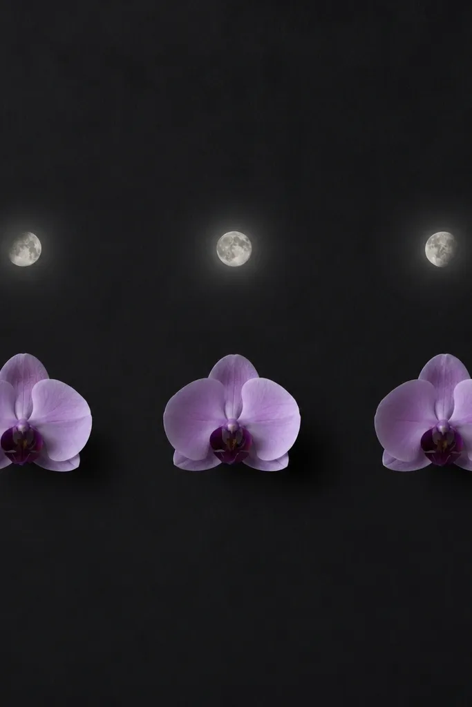
This is for when you want a set look without turning it into a full-size mural. Three mini moons give you variety and charm, and each orchid only needs one blossom to look complete. I’ve used this layout on desk-sized paper and it still reads clearly in photos because the elements are separated. It flatters small frames and makes a great gift because the piece feels playful but still elegant. The styling principle is spacing: each moon-orchid pair has its own breathing room.
Good to knowUse a consistent spacing ruler or measure between moon centers so the trio looks intentional.
Draw three small moons across the upper third, each about 1.5 to 2 inches wide depending on your paper size. Add a tiny glow ring around each moon using light gray-blue dots. Under each moon, draw one orchid blossom with three main petals and a small leaf at the base. Color petals lavender, center plum, and add one white highlight stroke. Keep outlines thin and consistent so the three blossoms don’t look like different drawings. Let it dry, then apply matte seal in a single light coat.
Common mistakeDon’t cram the moons together; the trio needs separation to feel organized.
14. Moonlit Orchid on Dark Paper
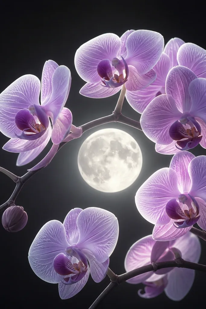
This is the closest thing to “no-fuss drama.” Working on dark paper means you don’t have to fight the background — your moon and orchid highlights automatically pop. I use charcoal or deep gray paper, then paint the moon in creamy white and the orchid in lilac with bright white highlights. It looks incredible under warm lamps and feels cozy rather than stark. It’s also forgiving for beginners because you can correct edges by reapplying color on dark ground. The styling principle is light placement: white highlights tell the shape, not heavy outlines.
Start with charcoal or deep gray paper. Sketch the moon lightly with pencil, then paint it with opaque creamy white, leaving a soft gradient at the edges. Draw one orchid stem with two blossoms and one small leaf. Paint petals in diluted lilac, then add white highlight lines along the petal folds. Add a deep purple center and a few tiny shadow strokes near the underside of petals. Finish by sealing with a matte fixative made for mixed media, since dark paper can absorb spray differently.
Use opaque white paint for the moon so it stays bright even on dark paper.
Avoid translucent white — it looks gray and dull on charcoal backgrounds.
15. Orchid Vines Around Moon Frame
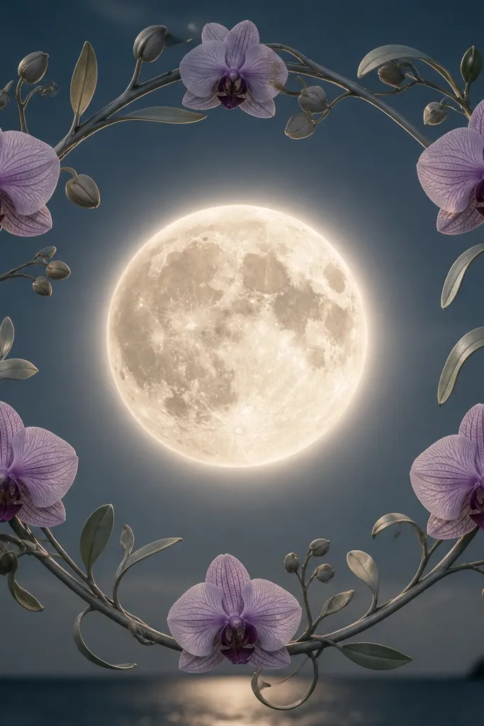
This one gives you a fuller, wallpaper-like feel without heavy painting. You build a vine frame around the moon, then place a few orchid blossoms as punctuation. I like it for living rooms because it looks like a complete composition, not just a single motif. The gray-green vines keep the piece grounded, and the lavender blossoms stay the star. It flatters people who want more detail but still want low maintenance — the vines are line work, not full watercolor filling. The styling principle is line consistency: keep vine thickness uniform and blossoms evenly spaced.
Good to knowIf your vines look wobbly, draw them in sections: curve one segment, pause, then continue from the last anchor point.
Draw the moon centered, then add a glow ring using light gray-blue pencil. Sketch vine lines that curl around the moon like an oval frame, keeping the line thickness consistent. Place three orchid blossoms: one near the top, two on the sides, leaving the bottom mostly clear. Color petals lavender and add darker veins with watercolor pencil, but keep the petals semi-transparent. Add a deep plum center to each blossom. Finally, reinforce the vine lines with fineliner and seal with matte after drying.
Common mistakeAvoid filling every vine gap with extra leaves; it makes the moon feel crowded.