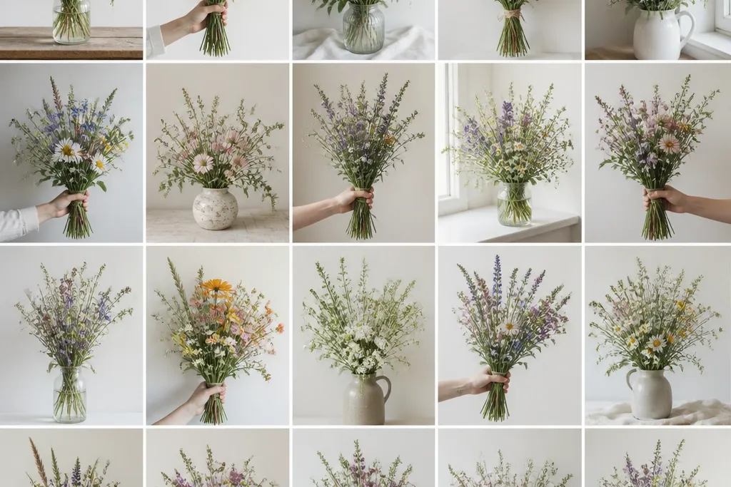
1. Daisy + Queen Anne's Lace Field Cluster
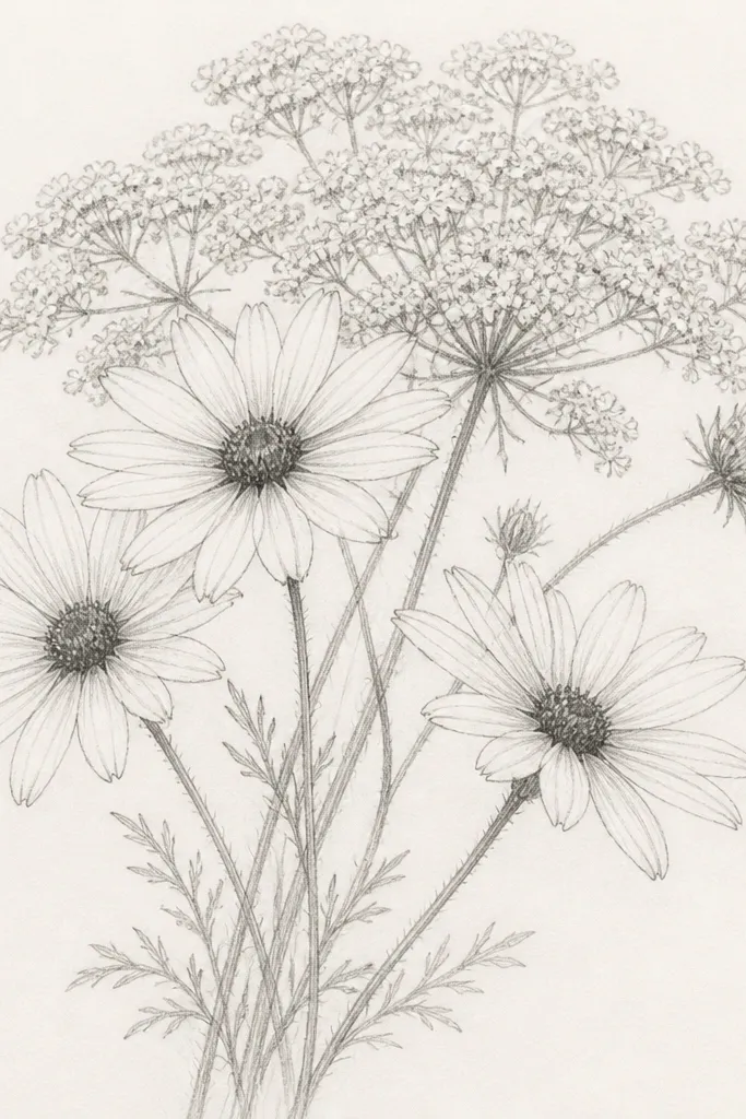
Start this one if you like clean, bright flowers. The daisies give you crisp focal points, and Queen Anne's lace adds airy "negative space" so the bouquet doesn't feel heavy. I draw the daisy petals with short, rounded strokes, then I keep the lace flowers as fine repeating loops so the background stays light. This layout flatters small spaces like gift tags because the main flowers sit in a tight triangle.
Draw a loose triangle silhouette with a light HB - widest at the bottom, narrowing near the top. Then sketch three sturdy stems for the daisies, each with a slightly different angle, and add a thin umbrella cluster behind them. Shade the daisy centers with 2B in small circles, then soften the edges with a kneaded eraser so they look natural. Finally, add lacey "threads" radiating from the lace center, keeping the lines lighter than the daisy petals so depth reads clearly.
Good to knowUse a kneaded eraser to lift highlights inside the daisy petals - it makes the bouquet look freshly drawn.
Common mistakeDon't shade the entire lace cloud - if it turns gray all over, it stops looking airy.
2. Wild Poppy Lean with Torn Petal Edges
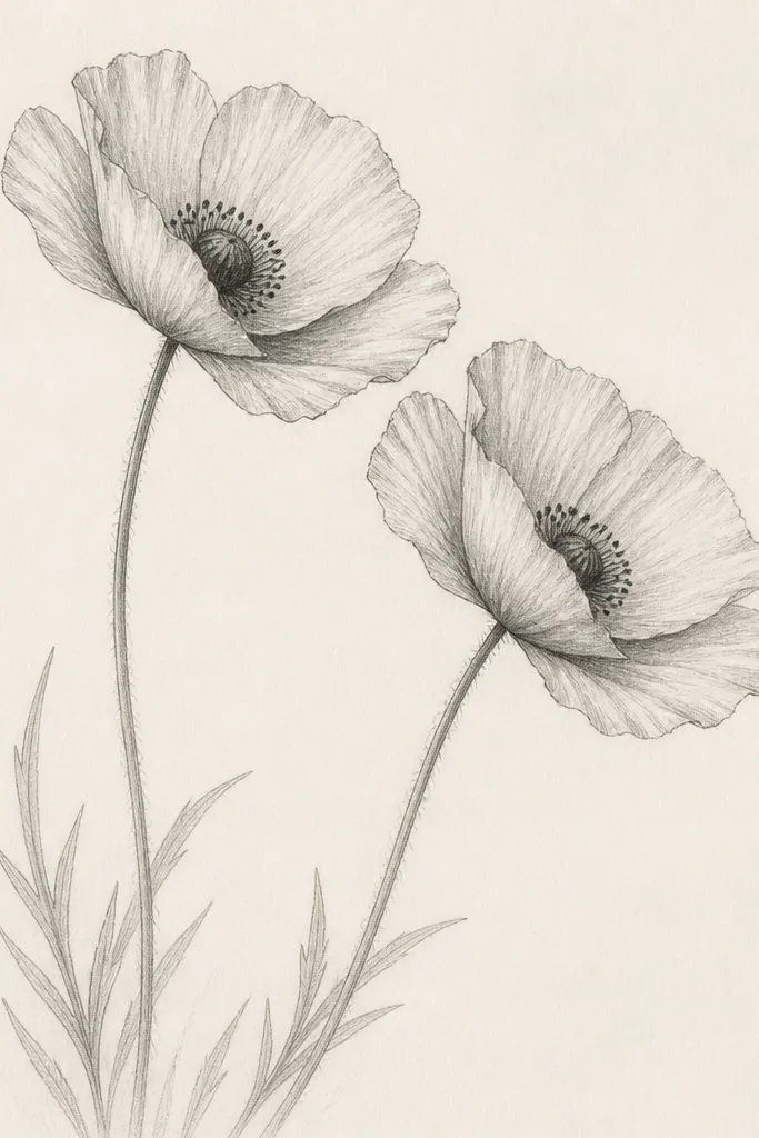
This is the bouquet I grab when I want drama without adding extra flowers. Poppies naturally look dimensional because their petals fold - you can mimic that with thicker pencil at the inner curve and lighter lines at the outer edge. The lean to one side creates movement, so even a simple two-flower sketch feels like a real field moment. It also looks great for people who prefer darker accents, like contrast on cream paper.
Block in one dominant stem first, angled from lower left to upper right. Place two poppy cups at different heights, then draw petals as layered arcs: outer petals first, inner petals second, with the inner arc drawn darker. Shade the center with 4B, then add tiny vertical dash marks for stamens using a harder pencil (HB) so they don't clump. Finish by sketching two narrow leaf shapes on the lower stem and one small leaf near the top, keeping leaves lighter than petals.
Good to knowPress harder only near the inner petal folds. Leave the petal tips lighter for that torn-but-soft look.
Common mistakeAvoid perfectly symmetrical petals - poppies look best when one side is a touch messier.
3. Lavender-Like Sprigs with Soft Buds
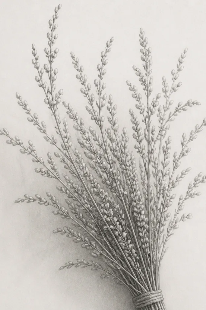
If you want dreamy and calm, this is your layout. The sprigs create a repeating pattern that looks intentional even when your wild drawing skills are still growing. Buds in rows also photograph well because the texture shows up even on small prints. I use this for holiday cards when the recipient likes subtle florals rather than bold blooms.
Draw 5-7 thin stems branching from a single base point. For each stem, add bud clusters as tiny teardrops or short ovals aligned along the stem - keep them irregular in size so it feels wild. Shade the base of each bud cluster with a light 2B, leaving the top edges as pale pencil. Add a few small leaf marks only where stems overlap, so the bouquet keeps its airy vertical movement.
Good to knowBlend bud shading with your fingertip lightly for a few strokes, then stop. Too much blending smears the texture.
Common mistakeDon't add full leaves on every sprig - it turns into a generic garden bouquet fast.
4. Sunflower Buds on a Loose Hand-Tied Bundle
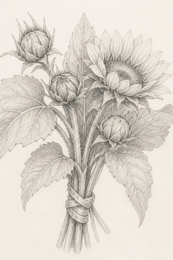
This one looks warm and gift-ready because you get a clear center mass plus soft wild leaves. Even if you only draw three sunflower heads, the big petal shapes do the heavy lifting for composition. The hand-tied wrap gives the sketch a "finished" feeling without adding complex details. It flatters thicker paper and larger cards because the leaves need space to breathe.
Sketch a bundle base - a rounded rectangle shape where stems meet - then draw three to five stems rising from it at different angles. Place one large partially opened sunflower near the center and two closed buds on the sides. Draw petals with broad, curved lines that taper at the ends; shade the petal base and the center disk lightly. Add large lobed leaves, but keep veins simple as 3-4 lines per leaf, then finish with a wrap band around the stems using two parallel lines that curve slightly.
Good to knowShade the center disk with a circular scribble, then lift a small highlight with a kneaded eraser.
Common mistakeAvoid tiny petals on sunflower heads - they need bigger shapes to read as sunflower quickly.
5. Cornflower + Wild Clover Soft Triangle Bouquet
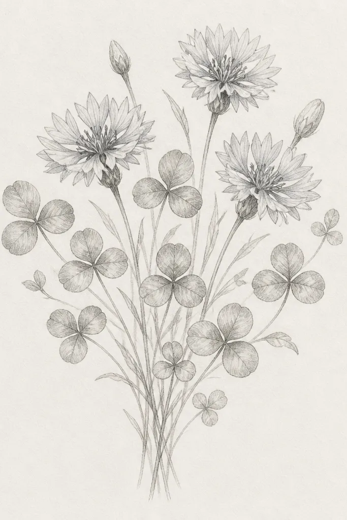
Cornflowers give you a clean outline, while clover adds that wild, meadow feel without clutter. I like this layout for holiday seasons because the cool flower shape looks crisp against warm paper. It also flatters smaller wrists and hands when you're drawing - the clover shapes repeat quickly. Keep your shading light and you'll get that soft, dreamy look instead of a dark mess.
Start by drawing a triangle silhouette with the widest point near the bottom. Place two cornflower heads near the top, then one slightly lower in front so you get layering. Draw cornflower petals as 8-12 rounded points around a small center dot; shade the center lightly with 2B. Scatter clover leaves as small three-lobed shapes along the stems, and shade just the underside where leaves overlap. Finish by adding a few thin grass-like lines at the base for movement.
Good to knowUse a sharp pencil tip for cornflower points - dull tips make them look fuzzy and muddy.
Common mistakeDon't shade the entire clover - only shade the overlap shadows.
6. Wild Rosebuds with One Open Bloom
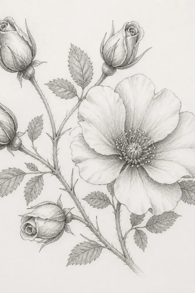
This bouquet looks fancy because rose shapes read as detailed even when you keep the palette to pencil. The trick is drawing rosebuds as spirals - that gives you depth without a ton of extra petals. One open bloom anchors the whole sketch so it doesn't feel like a row of similar circles. It flatters card sizes where you want a focal point near the center, not just scattered flowers.
Draw a gentle S-curve for the main stem, then add two side stems that mirror the curve. Place one open bloom slightly off-center and cluster four rosebuds around it like a loose wreath. For each rosebud, draw a spiral of 6-8 petal lines that get wider toward the outer edge. Shade the open bloom center with 3B, then add darker tones only along inner petal folds. Add small serrated leaves near the base and one leaf just behind the open bloom to create a layered silhouette.
Good to knowIf your petals look flat, add one darker "fold line" on each petal near its inner curve.
Common mistakeAvoid drawing perfect circles for rosebuds - real buds are slightly lopsided.
7. Forget-Me-Not Spray with Tiny Center Dots
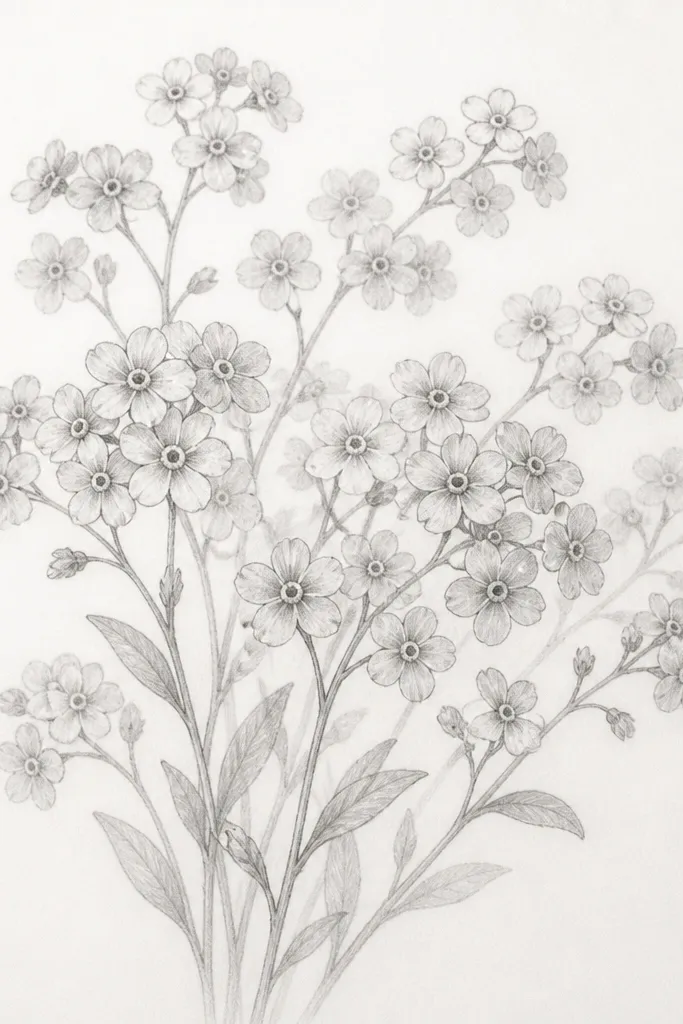
Forget-me-nots give you that delicate, nostalgic vibe with minimal space. The tiny centers are the secret - when you commit to dark dots, the whole sketch looks intentional. This layout is perfect for small ornaments, mini gift cards, or the corner of a larger page because it reads even at reduced size. I use it when I want the drawing to feel like lace without drawing lace.
Sketch a soft cloud outline first, using light lines. Then add one main stem line and branch into two or three thinner stems that fill the cloud area. Draw each flower as a simple five-petal star with uneven spacing; keep the petal lines light. Shade the center dots with 2B, and add a tiny darker patch near the base of two opposite petals for dimension. Add small leaf shapes as short ovals under some flowers, then erase a few guide lines so the cloud stays airy.
Good to knowUse the tip of a mechanical pencil for the dot centers so they stay crisp.
Common mistakeDon't connect every flower with heavy outlines - it turns into a blob.
8. Sweet Pea Vines with Winged Petals
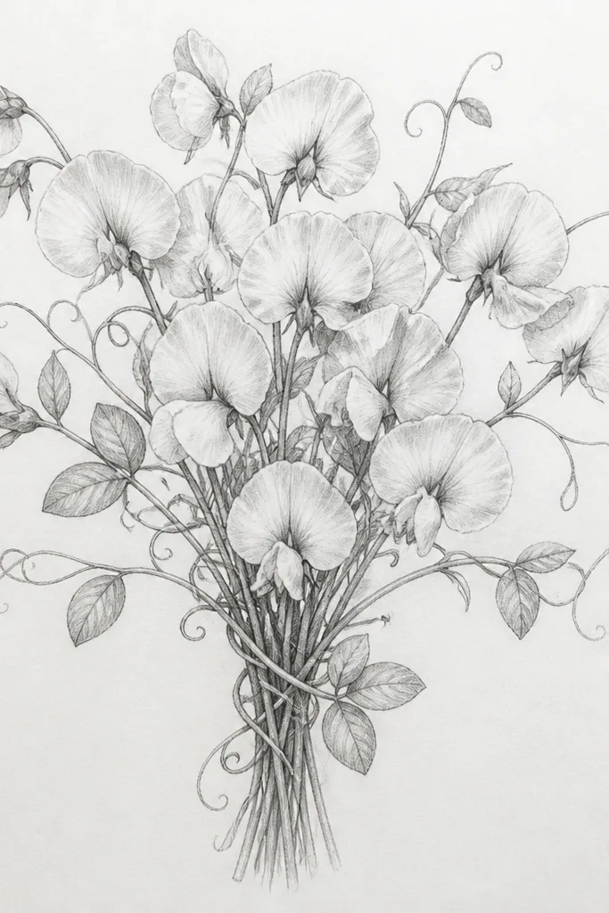
Sweet peas look like movement even on paper. Vines give your bouquet a sense of wrapping, and the winged petal structure gives you an obvious focal shape. This is a great choice when the receiver likes whimsical florals - it doesn't read as formal, it reads as playful. On thicker, warmer paper, the light pencil shading looks especially soft.
Start with a main stem and then draw two vine curls around it, like a loose S. Add flower clusters along the vine - space them so there's breathing room between each bloom. Draw each flower with three parts: a small inner keel line, two wider wing petals on either side, and a tiny base line at the stem. Shade the inner keel with 2B and keep the wings mostly outline with light shading only near the base. Finish with leaves as paired ovals plus one thin tendril line reaching outward.
Good to knowLet one vine curl cross in front of a flower. Overlap is what makes it look dimensional.
Common mistakeAvoid drawing vines as straight lines - curves are what make sweet peas feel real.
9. Wild Anemone with Spidery Stamens
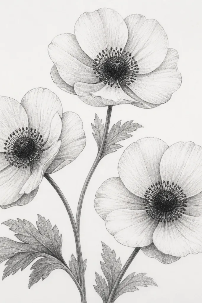
Anemones look dreamy because the centers are dramatic while the petals stay soft. The spidery stamens give you a way to add detail without drawing lots of extra flowers. If you want your sketch to look "finished" fast, this one does it. It also works well for people who like bold focal points but still want a light, wild bouquet overall.
Draw three stems that curve outward, then place one anemone on each. Sketch the petal ring first as 8-10 rounded petal shapes around a blank center circle. Fill the center with tight scribble shading using 4B, then add stamens as thin lines that radiate and vary in length. Keep the petal shading minimal: add a soft gray along the inner petal edge only. Add one or two broad leaf shapes near the bottom, but don't shade them heavily so the centers stay the darkest area.
Good to knowUse short, broken lines for stamens instead of perfect straight lines - it looks more natural.
Common mistakeDon't shade the petals as dark as the center. If the center isn't clearly darkest, it loses the anemone effect.
10. Meadow Thistle Puff with Spiky Texture
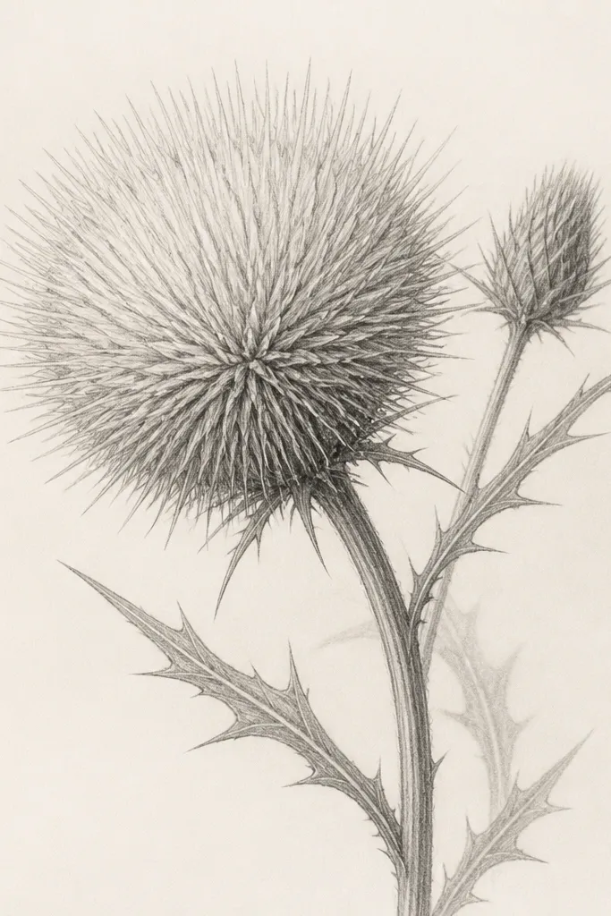
Thistles are a cheat code for texture. You get a lot of visual interest from only one main bloom, and the spiky puff reads instantly as "wild." This layout feels modern on holiday paper because it has a graphic silhouette. It also flatters monochrome palettes since texture creates the contrast.
Draw a circular puff shape for the main bloom - not perfect, slightly lopsided. Add a few short stem lines below and a smaller bud behind it. Fill the puff with tiny spikes drawn as short V shapes or thin triangles, keeping the outer spikes slightly longer. Shade the base of the puff with 2B and add a darker shadow where the smaller bud overlaps. Finish with narrow, jagged leaves - keep them simple so the bloom remains the star.
Good to knowIf your spikes look too uniform, erase a few and redraw them with random length.
Common mistakeAvoid smooth shading inside the puff. Thistle texture should be line-based.
11. Wild Violets in a Low Bowl Arrangement
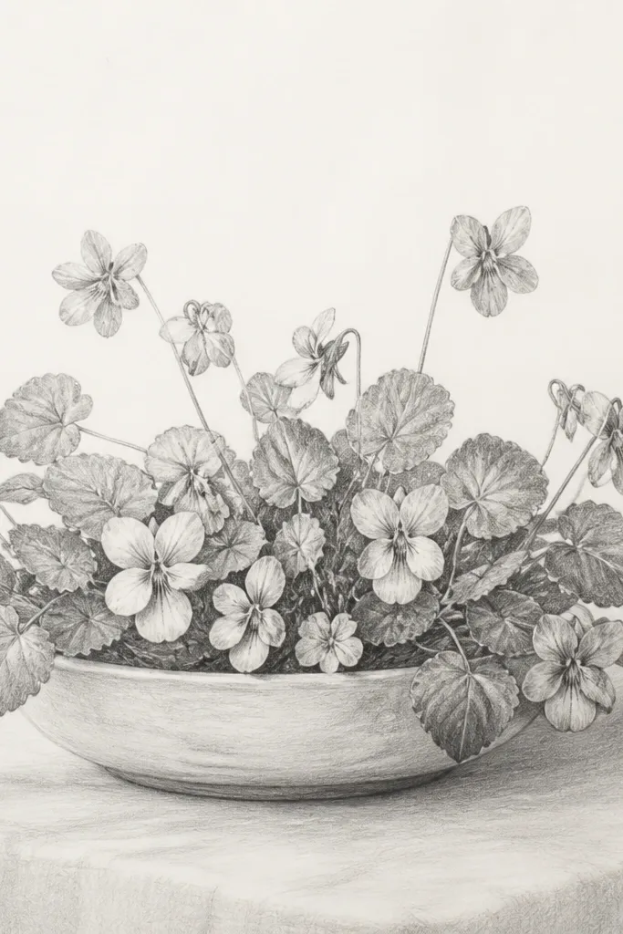
A low arrangement makes the bouquet feel grounded and cozy, which is why I use it for fall and winter cards. Violets are small, so you can pack them without crowding if you keep leaf shapes bigger than the flowers. This layout flatters short, wide cards because the visual weight stays near the bottom. It also looks sweet for recipients who love understated florals.
Sketch an oval "bowl" outline lightly at the bottom of the page. Place 8-12 violet flowers inside it, keeping their stems short and mostly hidden. Draw each violet as five rounded petals, with the two lower petals slightly larger and more curved. Shade the petal base and center with a soft 2B, and add a tiny darker patch in the center. Add heart-shaped leaves as larger shapes around the flowers, then draw a few simple vein lines and lightly erase overlap lines so the leaves look layered.
Good to knowKeep flower stems thin and leave gaps between blossoms - that's what keeps violets from turning into a gray mass.
Common mistakeDon't outline every leaf thickly. Thick outlines make violets look like stickers.
12. Orchid-Style Wild Bloom with One Long Petal
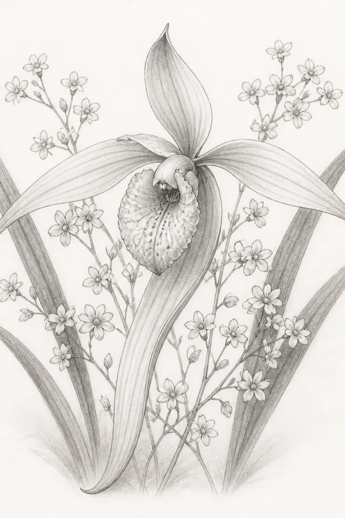
This idea is for when you want one clear showpiece instead of a full bouquet. The long petal creates a strong silhouette, which makes the sketch look elegant even with pencil alone. Add tiny filler blooms so the empty space doesn't feel blank. It flatters tall cards and vertical art because the long petal pulls the eye downward.
Draw a vertical stem line and place the main bloom slightly above center. Sketch the orchid structure: two side petals, one long drooping petal, and a central lip shape. Shade the lip and inner folds lightly with 2B, then deepen the center with 3B so it reads as a focal point. Add 3-6 tiny filler flowers around the main bloom, spaced like a gentle halo. Finish with two narrow strap leaves on the sides that taper at the ends and overlap slightly behind the main flower.
Good to knowUse your eraser to carve a highlight along the long petal's inner edge. Highlights make pencil orchids look glossy.
Common mistakeAvoid drawing the long petal too thick at the tip. It should taper like a brush stroke.
13. Wild Tulip-Like Buds with Ribbon Ties
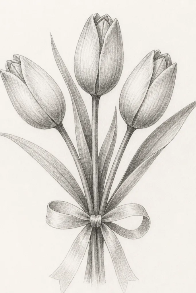
This is holiday-friendly because the ribbon gives you a clear "gift" cue. Tulip-like buds are simple to draw but still look special because the petal folds make them feel 3D. The long leaves add motion, and the ribbon adds structure so the page doesn't feel chaotic. It flatters anyone who wants a clean, centered composition for cards and tags.
Draw three stems that meet at a point where the ribbon tie will be. Sketch the buds as elongated ovals, with layered inner lines that stop about halfway down the oval for a realistic fold. Add long narrow leaves that curve outward and slightly behind the buds. Shade the inner petal folds with 2B and keep the outer petal lines lighter. Draw a ribbon tie around the stems using two curved lines, then add two ribbon tails that hang down and taper at the ends.
Good to knowShade one side of each bud darker than the other. That one light direction makes everything look intentional.
Common mistakeAvoid shading the entire bud - keep shading to folds and a thin edge so it stays airy.
14. Wild Forgetful Bouquet Corner Frame
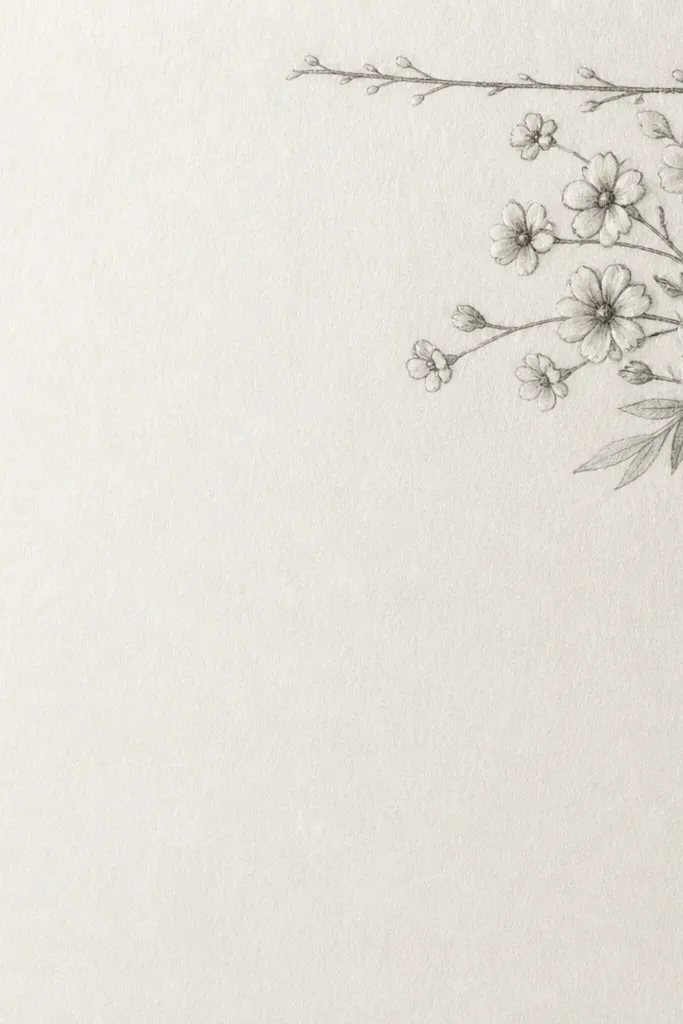
Corner bouquets are the easiest way to make holiday stationery look custom without filling the whole card front. Tiny blooms and light shading keep the drawing delicate, while the curled stems give it movement. I like this for wrapping paper labels, envelope seals, and small gift tags because the rest of the space stays clean. It flatters minimal designs - your drawing reads as intentional decoration, not clutter.
Start by marking the corner boundary with light, straight guide lines. Then sketch a main curled stem that enters from the corner edge and flows outward into the page. Add 5-10 tiny flowers along the stem as five-petal star shapes with dot centers. Place a few leaves as small ovals with one vein line each, mostly near where stems overlap. Finally, add 2-3 thin branch lines to suggest a loose frame, keeping them lighter than the flowers so the bouquet stays the focus.
Good to knowLeave at least one clean patch of paper inside the corner frame. That negative space makes the whole sketch look airy.
Common mistakeDon't crowd every inch of the corner. If it's full, it stops looking like a delicate drawing.
15. Field Grass + Wild Rose Mix with Soft Smudge Shadows
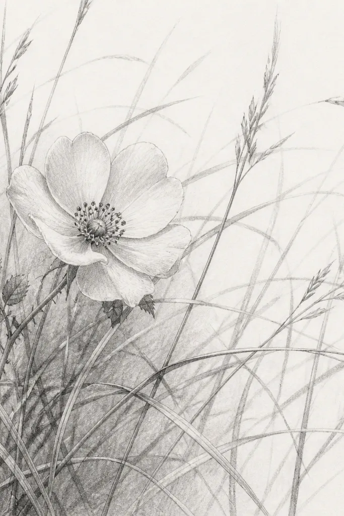
This is the bouquet I draw when I want the "just picked" feeling. The rose gives you a focal flower, and the grass does the work of filling space without adding more blooms. The soft smudge shadows make it look like evening light hitting the bouquet, not flat line art. It flatters anyone who likes a natural, slightly messy meadow look.
Draw one main rose stem and place the rose near the center. Sketch the rose petals as 10-12 rounded layers around a dark center, but keep the outer petals light. Add 15-25 grass blades around the rose, varying their length and thickness, with most blades starting from the bottom edge. Where grass overlaps the rose, shade the overlap lightly with 2B, then blend a tiny area with a finger or blending stump to create soft shadows. Finish by adding a few darker grass blades in the foreground so depth shows.
Good to knowBlend shadows only under petals and overlap points. If you blend everywhere, the grass loses its texture.
Common mistakeAvoid drawing grass as identical lines. Repetition makes it look like a border pattern.
16. Dried Seed Head Bouquet with Paper-Coat Texture

Seed head bouquets look dreamy because they're mostly texture - and texture reads even when you don't color. I like this for holiday seasons when people want something that feels natural, not overly bright. The stalk structure also makes the silhouette clear, so your sketch still looks good when it's small. It flatters minimalist cards and anyone who loves "dried flowers" aesthetics.
Draw 6-8 thin stalks that converge at the bottom like a bouquet base. For each stalk, add seed rows as tiny ovals or short dashes, spacing them unevenly. Shade each seed row with light 2B and add a few speckled dots to suggest depth. Keep leaves minimal: one or two narrow leaf shapes near the base, drawn with light lines. Add a deeper shadow under the front stalks using 3B so the bouquet has a foreground and background.
Good to knowUse a light stipple for seeds. Stippling looks like seed texture without smudging.
Common mistakeDon't outline every seed head thickly. Thick lines make it look like a stencil.
17. Berry Branch Bouquet with Small Wild Buds
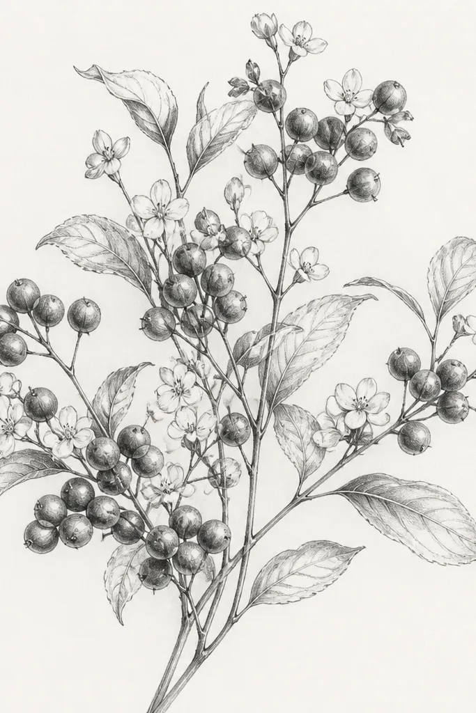
Berries make pencil sketches feel festive fast. The round shapes give you easy highlights, and the thin branches keep the sketch from feeling heavy. I use this layout for winter holidays because it reads like cold-weather foraging. It also flatters people who want a bouquet that looks like it could be part of a wreath, even though it's drawn.
Sketch a main branch curve and add two secondary branches branching off it. Place berry clusters along the branches as small circles grouped in 3-6 clusters. Shade berries with a light 2B, then leave one small highlight spot unshaded on each berry. Add tiny bud flowers between berry clusters as small five-petal shapes with a dot center. Finish with thin curled leaves, drawn as small teardrops with one vein line, and shade leaf undersides lightly where they overlap branches.
Good to knowPick a single light direction and keep berry highlights consistent - it makes the drawing look polished.
Common mistakeAvoid dark shading on every berry. Leave several berries lighter so you get a natural mix.
18. Hollyhock-Like Wild Bloom with Big Petal Waves
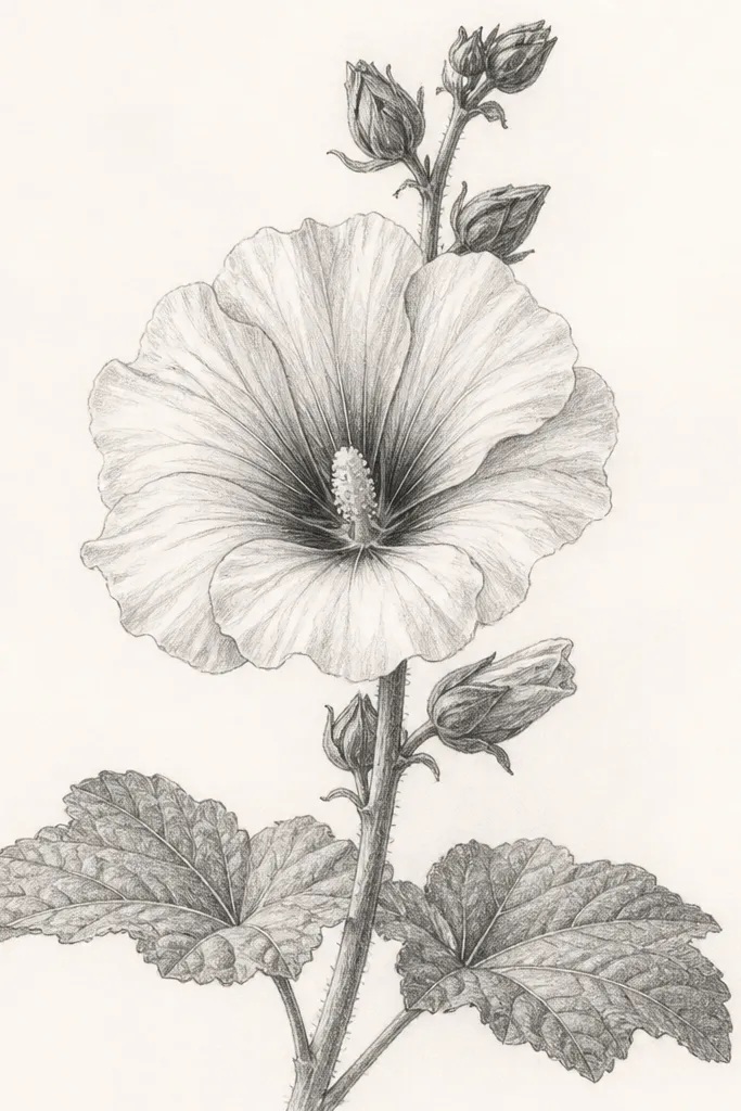
Big petal waves look dreamy because you get movement with minimal detail. This layout works when you want a tall, dramatic sketch without filling the page with lots of different flowers. The center being darker gives you depth, while the petal waves stay light and airy. It flatters vertical cards and anyone who likes bold silhouettes.
Draw one strong stem line and place the main bloom near the upper third of the page. Sketch layered petal bands as wide curved shapes that overlap like ripples, leaving gaps for paper showing through. Shade the inner folds with 3B, and add a darker center oval with 4B. Add two small side buds as smaller stacked petal shapes on the stem below the main bloom. Finish by drawing broad leaves low on the stem as large lobes with simple vein lines.
Good to knowWiggle your petal outlines a little. Perfect smooth curves make it look printed, not drawn.
Common mistakeDon't outline every petal edge equally dark. Vary pressure so some edges are soft.
19. Wild Daisy Chain with Three Overlapping Heads
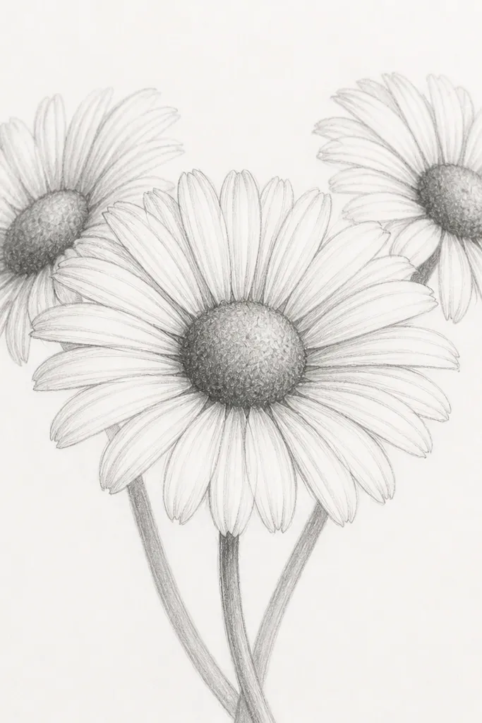
This is the layout I use when I want instant depth on a small page. Overlap is everything: one bloom in front, two behind, and the centers get darker as they come forward. It makes the bouquet look dimensional even if your line work isn't perfect yet. The chain shape also feels playful, like a casual field bouquet rather than a formal arrangement.
Draw a gentle S-curve stem line. Place the front daisy slightly larger and lower, then add two more daisies behind it at different heights. Draw petals as short curved strokes radiating outward, keeping the front petals slightly longer than the back ones. Shade the front center with 3B, the back centers with 2B, and use a kneaded eraser to lift a small highlight in each center. Add a few small leaf marks at the base and one leaf tucked behind the front bloom to strengthen the overlap.
Good to knowMake the back blooms lighter and fewer petals. That contrast reads as depth immediately.
Common mistakeAvoid drawing all three daisies the same size. Depth disappears fast when everything matches.
20. Clover + Tiny Wild Flowers with One Dark Leaf
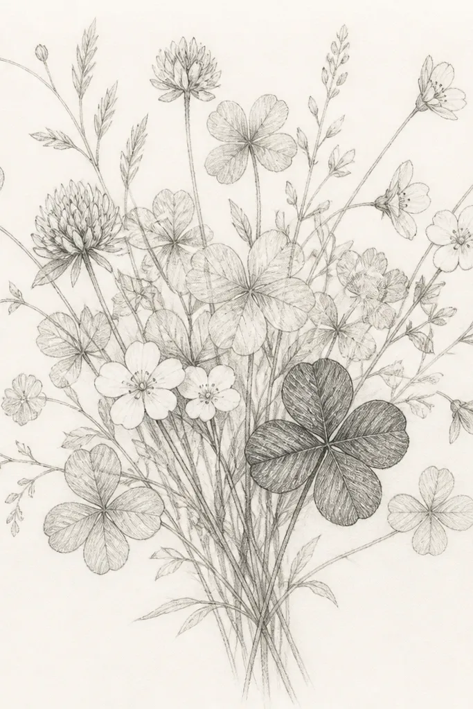
This one is for that dreamy, airy look where only a few parts get dark. Clover repeats shapes quickly, which keeps the drawing consistent, and the single dark leaf gives you a focal point without adding extra flowers. It flatters small cards because the contrast sits in one spot and the rest stays light. It also works for beginners because you're only mastering one "shading moment."
Sketch 6-10 small stems that spread outward from a bottom point. Place clover leaves along the stems as three-lobed shapes, then add 6-10 tiny five-petal flowers between them. Keep all flower centers light except for a few dot centers for variety. Choose one clover leaf closest to the viewer and shade its underside with 3B, then add a few vein lines with an HB pencil. Add light overlap shadows just where stems cross, and erase any heavy guide lines so the page stays clean.
Good to knowPick your darkest spot before you start shading. One planned dark patch looks better than accidental darkness everywhere.
Common mistakeDon't shade multiple leaves dark. Two dark spots make the sketch feel busy.