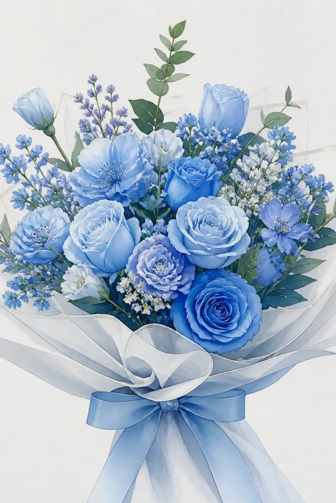
1. Graphite Blue Bouquet Outline with Soft Petal Wrap
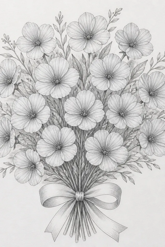
This is the pencil-only look I reach for when I want the bouquet to read clearly from across the room. The flowers stay airy because you're not fighting pigment texture, and the "blue" feeling comes from gray-blue shading - think graphite mixed with a cool, bluish shadow tone. It flatters smaller frames because the linework stays crisp and doesn't blur at the edges. I like it for fair-skin palettes and light backgrounds, since the contrast stays bright and the bouquet looks fresh for spring or winter cards.
Start by lightly sketching the bouquet silhouette: one main cluster at the top, three side flowers, and a ribbon loop centered low. Then shade under each petal using a single direction of light - I use top-left light - and keep the darkest values under overlapping petals and along the inner calyx. Use a blending stump or the side of a kneaded eraser to soften the middle shadows, but leave petal edges sharper than the centers. Finally, add highlights by lifting graphite with a kneaded eraser on the upper petal ridges and darkening only the core shadows where petals overlap.
Good to knowUse a 2B pencil for shadows and a 4H for outlines - that contrast makes the bouquet look "finished" without color.
Common mistakeDon't press hard on every line - it turns the whole bouquet into one gray blob.
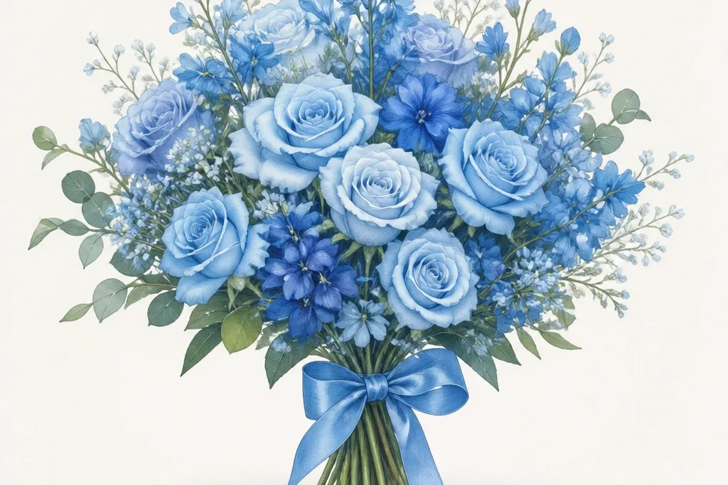
2. Color Pencil Blue Bouquet with Cobalt Base + Violet Depth
This one looks like a real bouquet because the blue isn't one color. The petals start as a light cobalt base, then you sink depth into the fold lines using violet and gray-blue, so the flowers look dimensional instead of flat. It's flattering for medium skin tones in photos because the blues pop without turning the whole image icy. I use this for holiday cards when I want the bouquet to look "done" even if the recipient only glances at it for a second.
Start with a very light cobalt layer across all petals, staying inside the outlines and leaving paper showing between strokes. Next, deepen the shadow areas: add violet to the petal folds and the areas where flowers overlap, then glaze gray-blue right at the base of each flower head. Use a colorless blender or the lightest pencil pressure to smooth transitions - only on the midtones, not the edges. Finish with a sharp highlight pass: use a white gel pen or white colored pencil on the top petal ridges and on the ribbon crease peaks.
Good to knowKeep your violet pencil sharpened - dull tips smear and make shadows look muddy.
Common mistakeDon't color back and forth in the same spot - it darkens the whole petal and kills the highlight shape.
3. Pencil Underpainting + Color Pencil Glow (Hybrid)
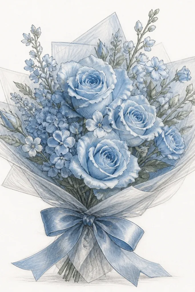
This is the method I use when I want control and speed. The pencil underdrawing fixes the bouquet structure - where each petal edge goes, which petals overlap, and how the ribbon sits - before color adds the mood. The result looks more "illustrated" than purely colored, because the linework still reads. It's especially flattering for anyone drawing from reference with a busy background, since the pencil structure keeps the bouquet from drifting.
Begin with a full pencil sketch, but don't shade yet - just place the petal edges and overlap points. Then lightly glaze color pencil over the graphite map using a light blue first, keeping pressure light so the pencil lines still guide the edges. After that, shade shadows with gray-blue and deepen fold lines with violet, always following your overlap map from the pencil stage. Finally, clean up petal edges using a kneaded eraser on the highlight side, then add the brightest highlights last with white gel pen on the petal tips and ribbon peaks.
Good to knowIf your outlines feel too dark under color, lift them with a kneaded eraser before you start layering blue.
Common mistakeDon't skip the overlap map - without it, the shadows land in the wrong places and the bouquet looks flat.
4. Blue Bouquet on Kraft Paper with Warm Shadow Contrast
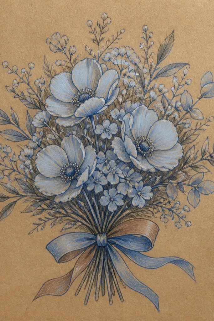
Kraft paper changes how blue reads. The warm tan background makes the sky-blue petals look brighter and more handmade, like a holiday tag you'd buy at a craft market. This style flatters warm-toned homes and rustic frames because the colors don't look sterile. I love it for winter because the warmth behind the blues feels cozy, not cold.
Start by sketching the bouquet with a light graphite so the tan doesn't grab too much pigment. Use a light sky blue for the first petal layer, then deepen shadows with a mix of gray-blue and a touch of brownish gray (or warm gray) to keep the contrast from turning purple. Outline only the darkest petal overlaps with a deeper blue pencil so edges stay crisp. Finish by adding white highlights with a gel pen - kraft paper makes highlights pop hard when you place them only on the top ridges.
Good to knowPress less than you think. Kraft grabs pigment, so thin layers look cleaner than heavy ones.
Common mistakeDon't use only cool blues - without one warm shadow tone, the drawing can look detached from the paper.
5. Soft Colored Pencil Bouquet with Powdery Sky Blues and Blended Centers
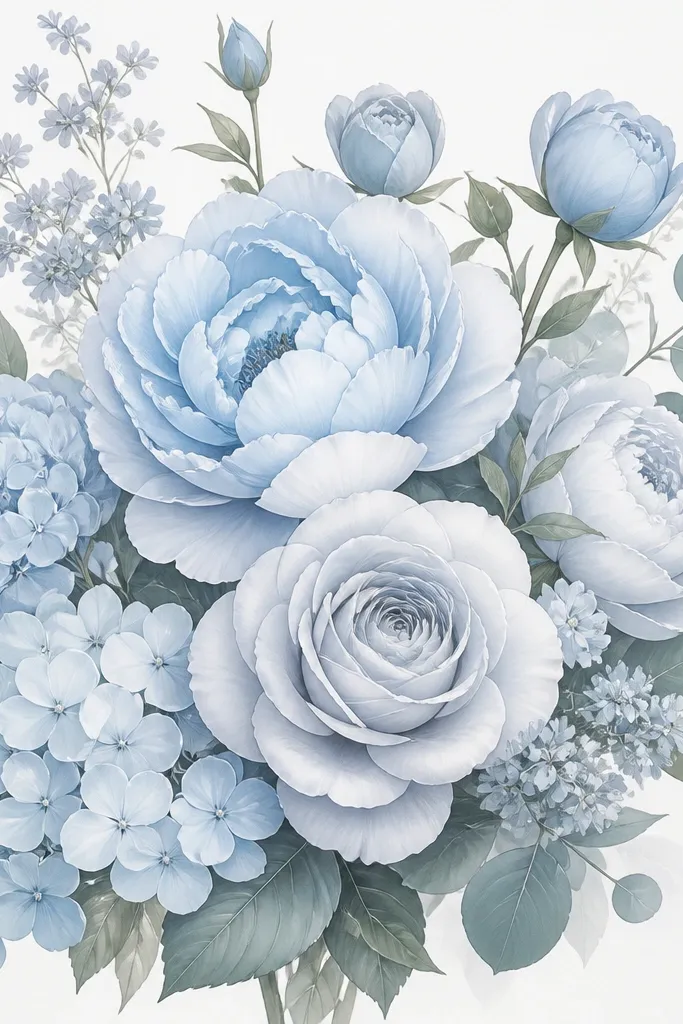
This look is for when you want the bouquet to feel calm instead of dramatic. The petals are mostly light sky blues, and the depth comes from soft gray-blue shading rather than heavy violet shadows. It flatters pastel-loving people and works great for smaller prints where harsh contrast looks too busy. I use this when the bouquet will sit next to lots of other elements on a card and you want it to stay gentle.
Start with a light sky blue base across every petal, leaving the petal edges slightly paler than the centers. Then blend the centers with gray-blue using circular strokes, keeping the darkest spots only where petals overlap. Use a slightly darker blue for the calyx area and ribbon fold lines, but keep it restrained. Add highlights with a white colored pencil first, then touch the brightest points with gel pen so you get a fine, crisp shine.
Good to knowBlend with the side of the pencil for powdery softness - it holds less pigment than a sharp tip.
Common mistakeDon't outline every petal - skipping edge detail keeps the bouquet from looking stiff.
6. Dark Blue Outline Bouquet with Light Fill (High Contrast Pencil-First)
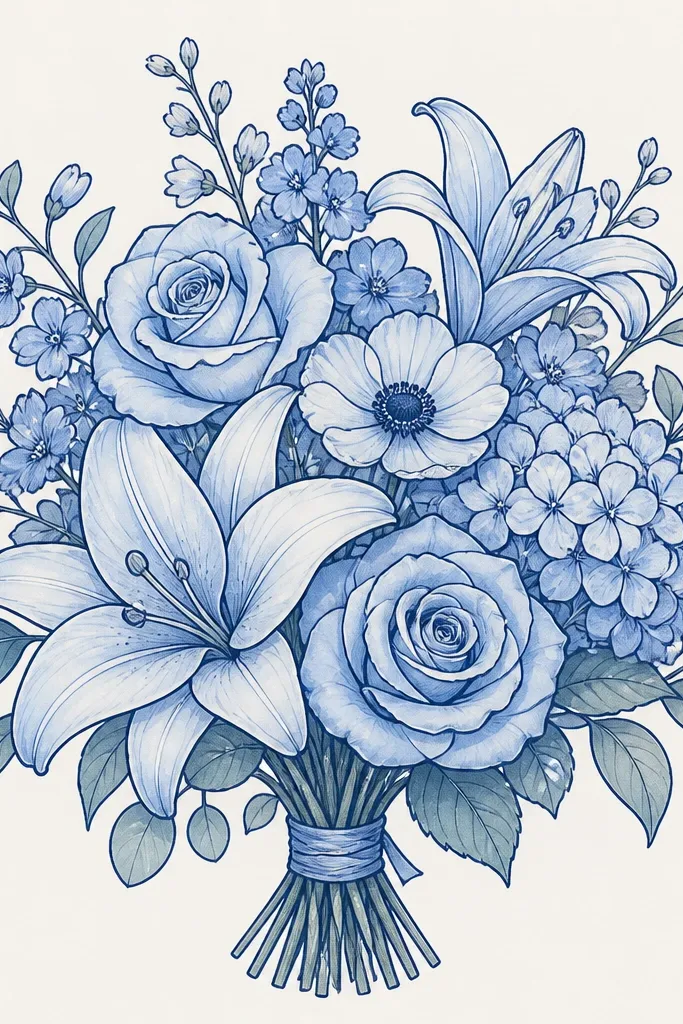
This is the "comic-clean" version that still looks hand-drawn. You get a strong silhouette because the outlines do the heavy lifting, and the light fills keep it from getting heavy. It flatters people who like crisp lines and it reads well on darker card stock too. I use this style when I'm making a set of matching drawings and I want every bouquet to look consistent.
Sketch the bouquet in light graphite first, then trace the main petal edges with a darker blue pencil - keep the outline thicker on outer edges and thinner inside overlaps. Fill petals with a light blue layer, leaving tiny paper gaps so the fill doesn't go flat. Shade overlaps using cool gray-blue only under the touching petals, and keep the rest of each petal lighter. Finish with tiny highlight marks on petal tops and a slightly darker ribbon crease line so the ribbon doesn't look like a single block.
Good to knowDo your outline last after you've mapped overlaps - it prevents outlines from covering up shadow logic.
Common mistakeDon't color the outline and the fill with the same pressure - that makes everything merge into one tone.
7. Monochrome Pencil Bouquet with Blue-Tinted Shadow Plan
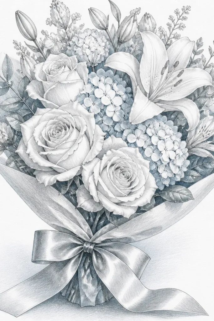
This is the pencil-only approach that still feels like "blue" because the shadow plan has a cool temperature. I build shadows with graphite smudges that lean cool by layering lightly and keeping the darkest areas under overlaps. The bouquet looks clean and intentional, and it's great for people who don't want to buy color pencils. It's flattering on white paper and works for both winter and spring themes because the mood comes from shadow placement, not bright color.
Draw the bouquet shape with a light 4H pencil and keep outlines thin. Next, shade only the shadow sides of each petal using a 2B, but stop before you fill the whole petal. Blend lightly in the middle of each shadow area, then deepen overlap cores with extra 2B so the darkest values stay small. Add the ribbon with two folds: one shadow fold under the bouquet and one highlight ridge on the top edge.
Good to knowUse a paper towel fold to remove graphite dust, then blend again lightly - it keeps the shadows clean.
Common mistakeDon't erase too much - lifting graphite repeatedly creates patchy, shiny spots.
8. Color Pencil Bouquet with Sharp Petal Highlights and Crisp Ribbon Creases
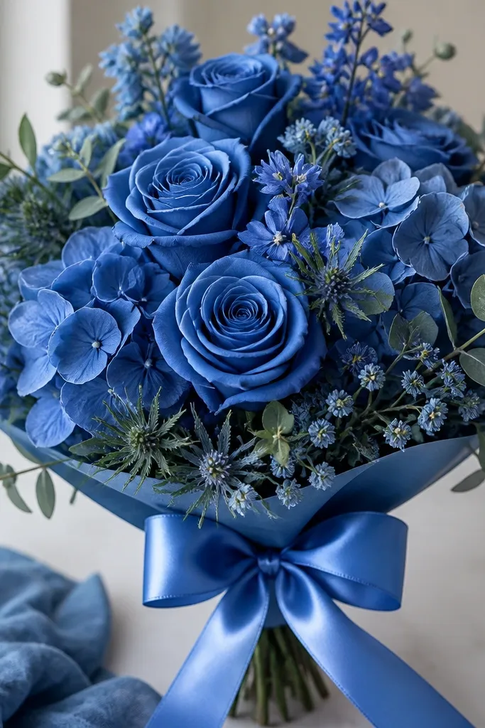
This style looks polished because highlights are placed with intention. The petals have fine, bright lines that match the direction of light, and the ribbon shows real folds instead of flat shading. It flatters gift cards and prints where the bouquet needs to look finished even in a small size. I like it for winter because the crisp edges make the bouquet feel crisp, not dreamy.
Lay down a light blue base first with gentle pressure so the paper texture stays visible. Add shadows with gray-blue along overlap lines and use violet only in the deepest fold pockets. Keep edges clean by using a sharpened pencil tip to define the petal silhouette after most blending is done. Then add highlights last: white gel pen for the thinnest highlight lines on petal tops and white pencil for broader soft shine on the ribbon peaks.
Good to knowUse a ruler edge or the side of the gel pen tip to drag straight highlight lines without wobble.
Common mistakeDon't add white highlights before the shadows - you'll cover up the glow you're trying to create.