1. Cream Rose and Dusty Plum Ribbon Bouquet
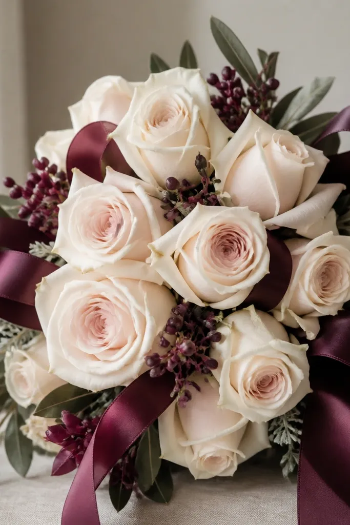
This palette looks clean on almost every skin tone because the cream petals sit in a warm-neutral zone and the plum adds contrast without turning harsh. I like it for holiday cards because it reads "cozy" rather than loud. For the roses, I keep the center slightly peachy and let the outer petals fade to near-white. The ribbon is where the color pencil really shines - deep plum with a thin highlight line makes it look like satin.
Start by sketching the bouquet shape with a light cream pencil, then block in rose centers using warm peach. Add shadow petals by pressing harder with a plum pencil only on the right side of each bloom. For the ribbon, draw the loop folds with plum, then burnish a narrow highlight stripe using white along the fold edges. Finish leaves with muted olive and cool gray veins, staying careful not to outline everything - let the petal shadows define separation.
Good to knowDraw the ribbon folds first. Once those highlights are in, the roses look instantly more dimensional.
Common mistakeDon't color the entire ribbon the same value - flat plum looks like marker, not satin.
2. Winter White Anemones with Pine-Needle Green
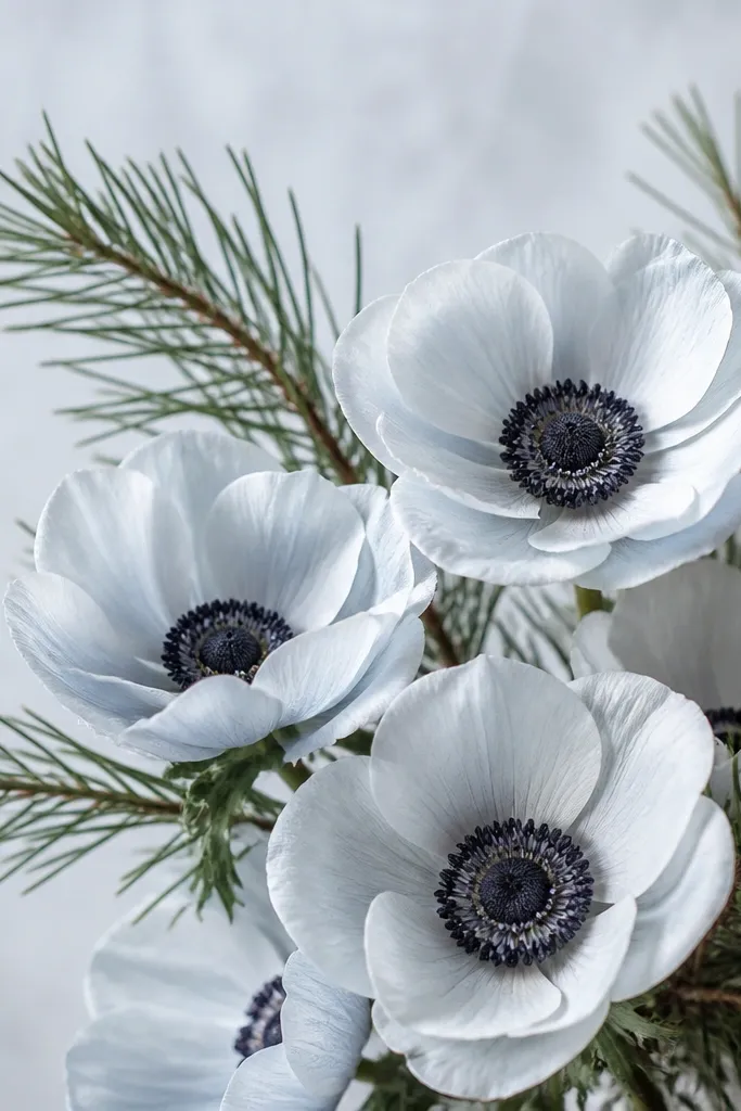
Winter white flowers give you a crisp, graphic look that still feels soft. The charcoal centers add structure so the petals don't blend into the paper. Pine-needle green makes the whole thing look seasonal without needing actual snow - it also makes the whites pop because greens and whites contrast well. I've used this for cold-weather sketches and it always photographs better than bright spring palettes.
Start with a light outline, then shade the anemone petals using a very light blue-gray first. Add the petal shadows with a cooler gray on the shaded side only, and keep the petal edges brighter by using lighter pressure. Color the centers with charcoal, then lift a few tiny highlights using a kneaded eraser. Frame the bouquet with pine needles: long thin strokes in pine green, then deepen some needles with a darker green at the base.
Good to knowUse a kneaded eraser to "save" tiny highlight dots on the petals. It makes white flowers look glossy.
Common mistakeAvoid warm browns in the petals. They turn white flowers yellow and muddy.
3. Sunset Marigold Bouquet with Tangerine Highlights
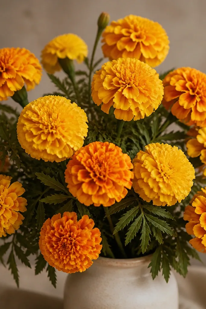
Marigolds are the easiest way I know to get a lively look without fighting gradients. The trick is to keep the yellow warm and reserve tangerine for the petal folds so the blooms feel layered. Deep green leaves prevent the bouquet from looking like a highlighter. This one flatters warm-toned color palettes and it looks great for autumn and late-season celebrations.
Sketch the flower heads as overlapping circles, then fill the base petals with golden yellow using light, repeated strokes. Create depth by adding honey orange in the petal creases, pushing harder only where petals overlap. Add tangerine accents as short curved strokes that follow the petal fold direction. Color leaves with deep green, then add warm brown under the veins to make them feel slightly dusty. Finish stems with a thin glaze of brown-green so they don't look neon.
Good to knowKeep tangerine to the creases. If you spread it everywhere, the bouquet turns flat and orange-brown.
Common mistakeDon't blend the whole marigold head until it's uniform. Texture is what makes marigolds look real.
4. Peach Peonies with Dusty Teal Leaves
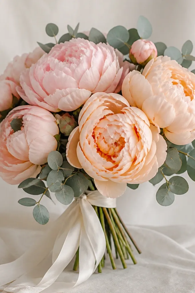
Peach peonies look flattering and gentle because peach sits between pink and beige. Dusty teal leaves add a cool counterpoint, which makes the petals look lighter. I like this bouquet for spring birthdays and also for Mother's Day because it feels personal, not overly formal. The ribbon being cream keeps the drawing airy.
Start by mapping the peony layers as separate petal groups. Base each petal group with peach, then shade the underside using a light rose pink on the shadow side. Add deeper folds with a slightly darker peach and blend only at the edges using gentle circular motion. Leaves go in dusty teal, then shade with a muted blue-green under the veins. Tie the ribbon in cream: draw the fold lines in light gray, then add a thin highlight stripe with white.
Good to knowUse tiny gaps of paper between petal layers. Those gaps read as light and make peonies look fluffy.
Common mistakeDon't outline every petal. Too many hard edges make peonies look like cut paper.
5. Black-Red Anemones with Cream Veins
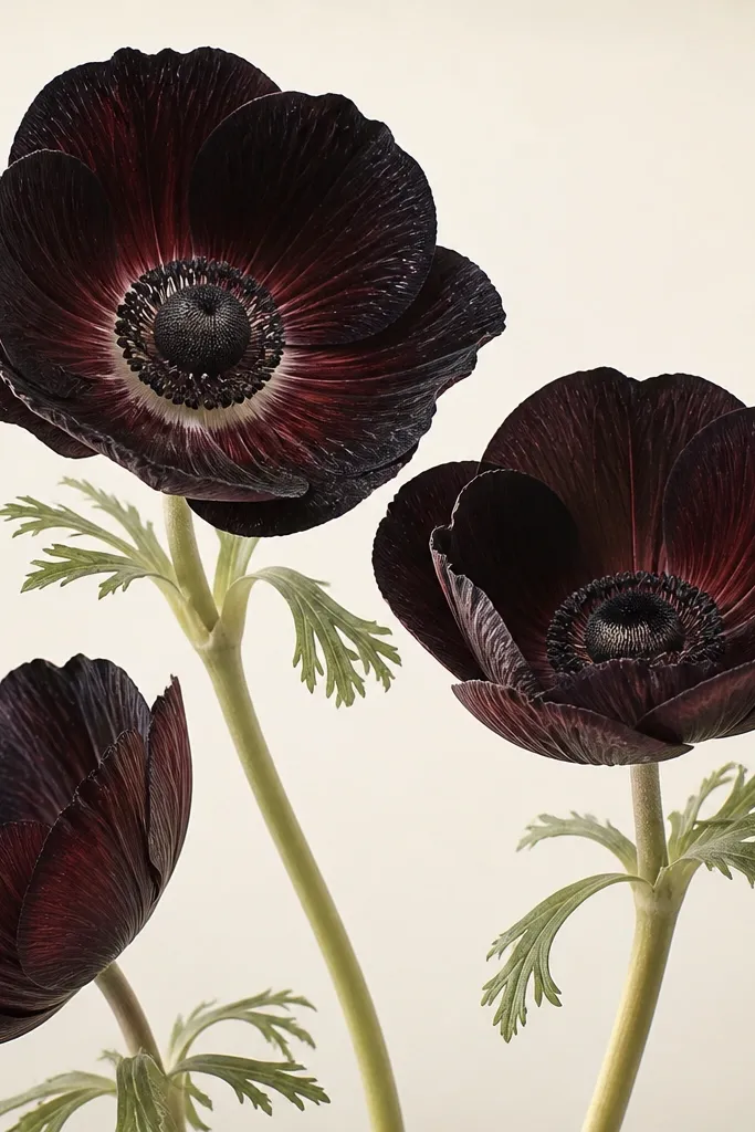
This is a dramatic bouquet that still looks controlled because the cream veins act like "structure lines." I've drawn this for winter events and it turns out striking without needing glitter or metallics. The near-black petals can go dead if you don't add a deep red undertone, so I always start with dark maroon before pushing to black. Cream highlights keep the flowers from looking like a single blob.
Sketch the anemone petals, then base them with deep maroon using light strokes. Shade the lower and right sides with black, but keep a maroon edge where petals overlap. Add cream veins by drawing thin curved lines with a cream pencil, then soften them with a light touch of white so they look like highlights, not outlines. Stems and leaves are pale green with a thin shadow line in gray. Finish by adding a few tiny specular highlights on petal tips with white.
Good to knowWork in thin layers on the black. If you press hard immediately, you lose the red undertone and the petals look flat.
Common mistakeAvoid gray-only shadows on dark petals. They make anemones look like bruises.
6. Gerbera Daisies in Hot Pink and Lemon
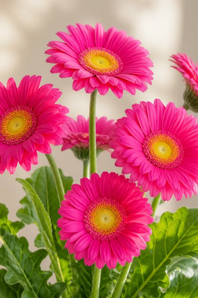
Hot pink and lemon-yellow is bold, but it works because the centers are a different value family than the petals. The yellow center gives the bouquet a "sunburst" look that reads well even when the petals are small. I like this idea for spring and cheerful holiday cards because it feels sunny without being messy. Green stems keep the composition from looking like a sticker sheet.
Start with lemon-yellow circles for each flower center, then shade the center rings with a deeper golden orange. Draw petal shapes in hot pink, leaving tiny paper highlights at the petal edges. Add shadows under each petal with a cooler magenta or raspberry shade, keeping the darkest parts between overlapping petals. Color leaves with medium green, then add bright vein lines using a lighter green pencil. Add a thin stem shadow with a gray-green so the leaves look attached.
Good to knowUse a sharp pencil for petal tips. Tiny sharp edges make gerbera petals look crisp.
Common mistakeDon't blend hot pink into yellow. Keep the boundary clean for that "gerbera" look.
7. Lavender Bud Bouquet with Soft Gray Background
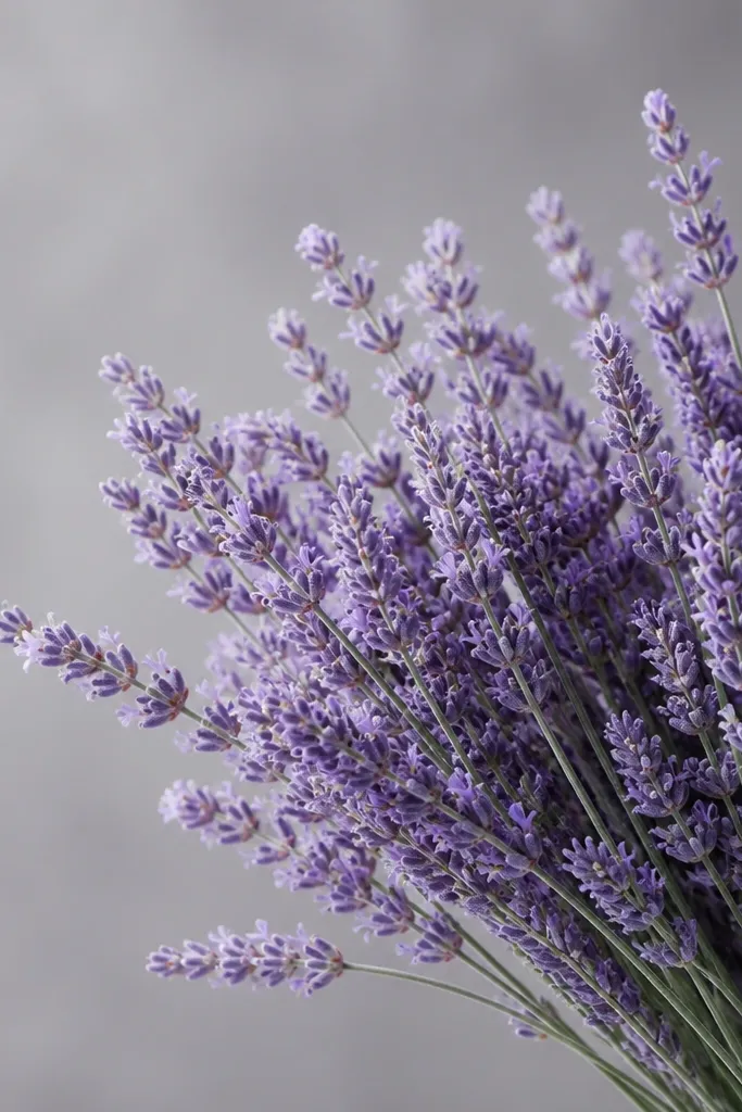
Lavender looks expensive on paper because the color pencil can mimic the powdery texture of real buds. A soft gray background makes the purples look cleaner and keeps the drawing from looking washed out. This bouquet also works for weddings and spring events because it stays romantic without being overly saturated. The stems being slightly cool gray-blue keeps everything cohesive.
Sketch stems with a light gray-blue, then block in each bud cluster with pale purple in short strokes. Shade bud undersides with a slightly deeper lavender-blue, and keep the top edges lighter. Add tiny highlight specks with white on a few buds only - too many highlights makes it look glittery. Background: lightly layer gray over the paper with broad strokes, then erase or lighten around the flowers so they pop. Finish by deepening stem shadows with a darker gray-blue.
Good to knowShort, uneven strokes on buds look more real than long smooth shading.
Common mistakeSkip dark violet everywhere. Use deeper purple only in bud shadows.
8. Tropical Hibiscus in Coral Orange and Seafoam
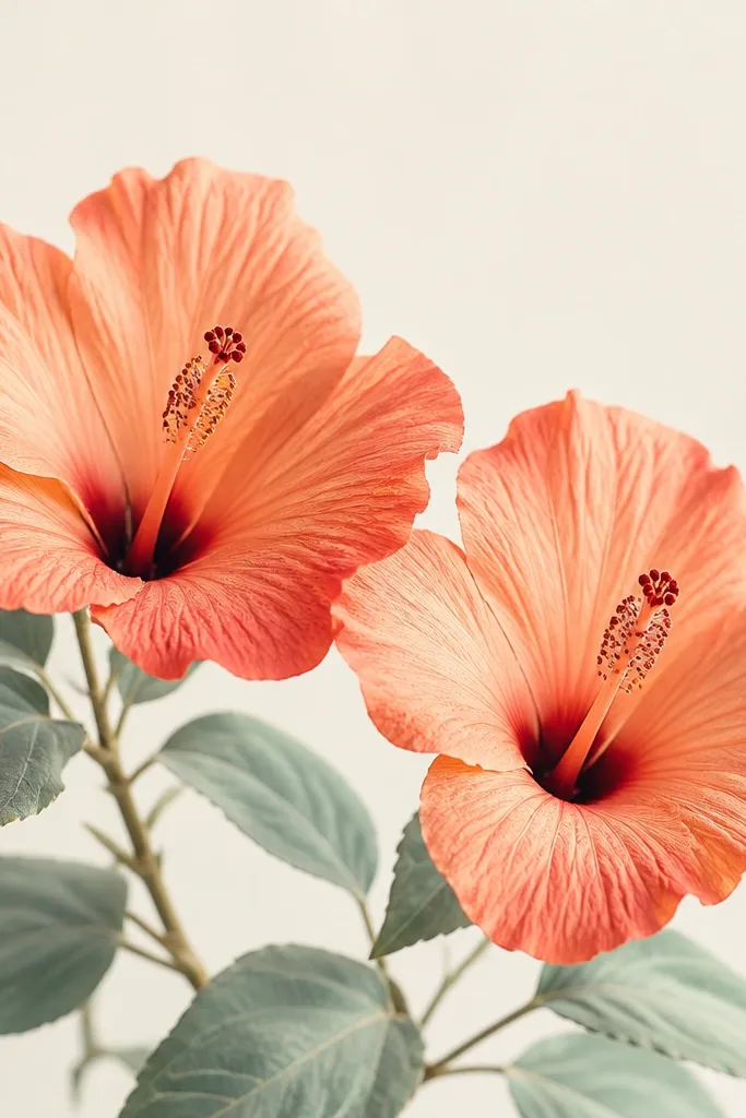
Coral hibiscus looks lively, but seafoam leaves keep it grounded and wearable. I've used this for summer notes and it always feels like a vacation drawing. The key is the petal edge: darker coral outlines make the bloom look layered even when you're not adding every tiny vein. Stamen details give a focal point so the bouquet doesn't look like a blob of orange.
Start with the petal shapes in coral orange. Add darker coral shading along petal edges and in the fold areas where petals overlap. For the seafoam leaves, base with light seafoam green, then shade with a slightly deeper blue-green under the veins. Stamen: color the center with dark brown or black, then add a tiny yellow highlight at the tip with a small yellow pencil. Finish by adding a thin shadow under each flower on the stem.
Good to knowAdd one tiny stamen highlight dot. It makes the whole flower feel alive.
Common mistakeDon't cover the entire petal with deep coral. Keep the center lighter.
9. Classic Red Rose Bouquet with Evergreen Sprigs
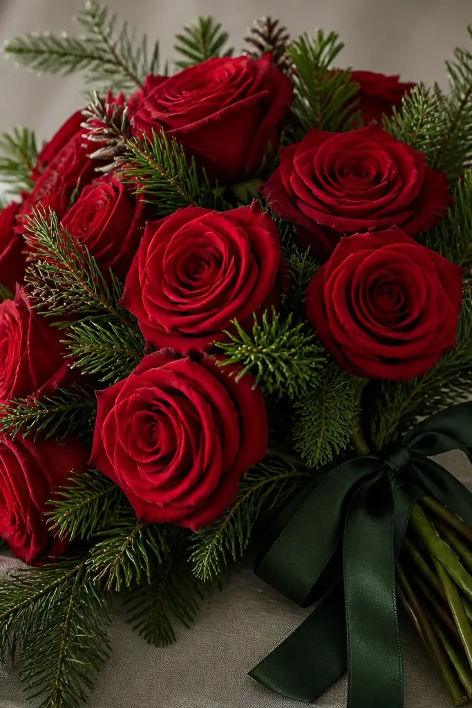
Red roses are the safest "holiday" bouquet because the color pencil can create that glazed petal look. Evergreen sprigs add texture and a sense of time - the greens look like they belong in winter. The deep green ribbon keeps the composition from screaming red-only. I like this for winter birthdays because it still looks romantic, not just festive.
Sketch rose heads and map petals as overlapping layers. Base petals with medium red, then add darker crimson shadows on the right side and under overlaps. Use a lighter bright red for highlight edges, then burnish lightly with white on those edges only. Evergreen sprigs: draw thin needles with dark green, then add lighter green strokes along one side for shine. Ribbon: color deep green with a thin highlight stripe in pale green or white.
Good to knowBurnish highlight edges at the very end. Red looks glossy when you add white last, not first.
Common mistakeAvoid orange-red mixed into every shadow. It makes roses look sunburnt.
10. Dahlia Bouquet in Burgundy, Rose, and Antique Gold
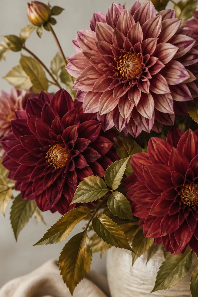
Dahlias look fancy because they have a built-in pattern - you just need to follow the petal rows. Burgundy and rose give you depth, while antique gold keeps the center from looking flat. I like this for autumn because the tones feel like dried leaves and candlelight. It also flatters people who like warm art - the gold center makes the bouquet feel "glowy" even on matte paper.
Start with the dahlia center as antique gold, then shade it with a darker amber ring. Build petal rows: use burgundy for the outer rows and dusty rose for the inner rows, keeping each row slightly lighter as it moves toward the center. Shade each petal with a darker version of its own color on the underside, then add a tiny highlight line with pale rose or cream. Leaves are olive with muted gold highlights on the top surfaces and gray-green shadows underneath.
Good to knowFollow the petal row direction. If you shade against the row, the dahlia loses its shape.
Common mistakeDon't blend rows together. Dahlia texture comes from row separation.
11. Blue Hydrangea Bouquet with Soft Pink Center Tints
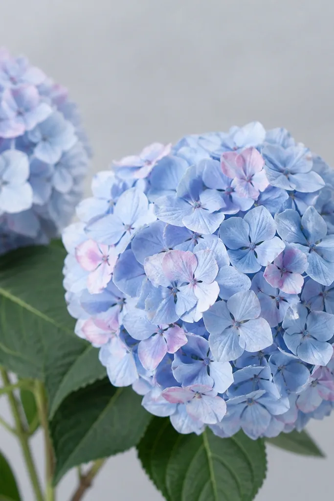
Hydrangeas are perfect for color pencil because they're basically lots of tiny petals. Blue hydrangea looks airy, and a few pink tints inside the clusters make it feel natural instead of dyed. I like this idea for spring showers and also for baby shower invitations because the palette feels gentle. The stems and leaves being cool gray-green keep everything from turning too sweet.
Sketch a few large hydrangea heads. Base the clusters with pale periwinkle, then deepen shadows with mid blue on the shaded side. Add soft pink tints in random small pockets inside the cluster, and keep them small so the bouquet stays blue-first. For highlights, lightly burnish with white on the top-left edges of each cluster. Leaves: cool gray-green, with a darker green under the cluster attachment points.
Good to knowUse a light touch for the cluster texture. Pressing hard turns hydrangea into a single blue mass.
Common mistakeAvoid purple-gray everywhere. It makes the blues look dull instead of powdery.
12. Orchid Bouquet in Magenta with Deep Plum Shadows
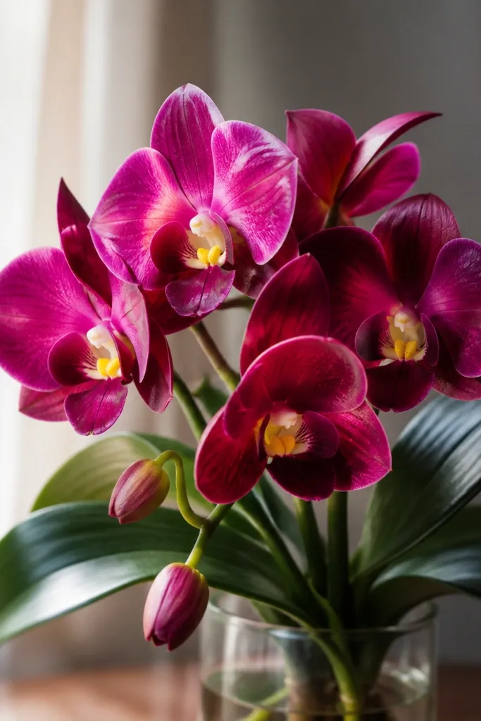
Orchids look dramatic without being messy because their shapes are simple: bold petals and a clear center. Magenta reads lively, and deep plum shadows give you that velvet look. Pale yellow throats add a focal point, which makes the drawing pop even when the background is plain. I've used this for birthday gifts because it feels fancy but still doable with colored pencils.
Start by blocking the main petal shapes in magenta. Shade the underside and areas near overlaps using deep plum, leaving a clean magenta highlight edge. Add the center throat in pale yellow, then deepen the throat edge with warm orange-brown. Leaves are dark green: base with medium green, then add glossy highlights with a lighter green pencil on the top surfaces. Finish by outlining the orchid center with a very light plum line so it looks crisp.
Good to knowKeep the highlight edge unshaded. Orchids look glossy when the highlight stays clean.
Common mistakeDon't smear plum into magenta too much. It dulls the color intensity.
13. Sun-Kissed Wildflowers in Peach, Honey, and Sage
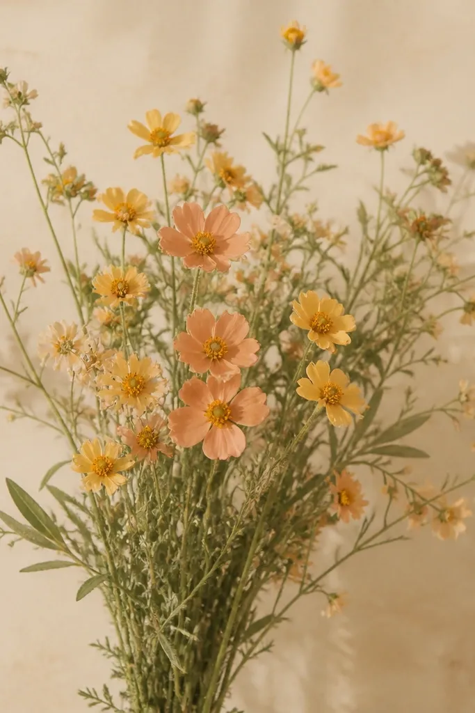
Loose wildflowers are forgiving because you're not forced to make perfect symmetry. Peach and honey give you a warm glow, and sage stems keep the palette from looking sticky. This is my go-to when the drawing needs to look "effortless" but still pretty. It also works well for seasonal decor because you can add a few tiny berry dots to shift it toward fall.
Sketch stems first with a light sage green. Add small flower heads as simple oval petals in peach, then place tiny honey-yellow centers. Shade each petal with a slightly darker peach on the shadow side, using short strokes so the petals look textured. Add sage leaves with light green base and gray-green shadows. Finish with a few honey-brown dots around the centers to suggest seed heads.
Good to knowUse negative space. Leave some paper showing between stems so the bouquet feels airy.
Common mistakeAvoid heavy outlines around every flower. Wildflowers look real when edges are softer.
14. Christmas Poinsettia in Garnet Red and Soft Cream
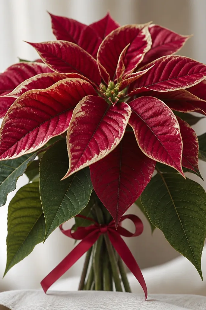
Poinsettias are bold, but they look believable when the bracts have an edge highlight. Garnet red gives a deeper, richer look than straight crimson, and soft cream highlights mimic the natural waxy shine on bracts. The dark green leaf cluster grounds the red so the drawing doesn't feel like a single color block. This works for winter because it reads instantly, even in a small format.
Draw the star shape of the bracts as overlapping teardrops. Base bracts with garnet red, then shade creases with darker maroon on the underside. Add soft cream along the bract edges where light hits, then lightly blend inward with very light pressure so the highlight stays crisp. Leaves: dark green with a gray-green shadow under each leaf fold. Ribbon: red with a narrow highlight stripe and a darker red fold line.
Good to knowKeep the cream highlight thin. Thick highlights make poinsettias look like they were painted with chalk.
Common mistakeDon't make every bract the exact same red. Variation is what keeps it realistic.
15. Cobalt Forget-Me-Not Bouquet with White Speckle
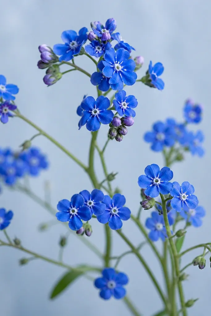
Forget-me-nots look delicate but still pop on paper because the cobalt blue holds saturation. The white speckle centers make each flower feel tiny and real. I like this bouquet for spring because the palette feels fresh and the stems are light and airy. It also works for people who want something pretty without spending time on lots of petal layers - each flower is small and repetitive.
Sketch a bunch of thin stems, then place small five-petal flowers as rounded shapes in cobalt blue. Shade the underside with a slightly darker blue, leaving the top petals lighter. For the center, add tiny white dots and a small yellow-tinted core if you want more life. Add buds as smaller blue teardrops. Background: lightly shade blue-gray around the stems, leaving the flowers crisp by not coloring through them.
Good to knowUse a sharpened pencil for the speckles so they stay pointy, not smudged.
Common mistakeDon't over-darken the petals. Too much cobalt shadow makes forget-me-nots look heavy.
16. Rosemary and Wild Berry Bouquet in Olive, Berry, and Smoke Gray
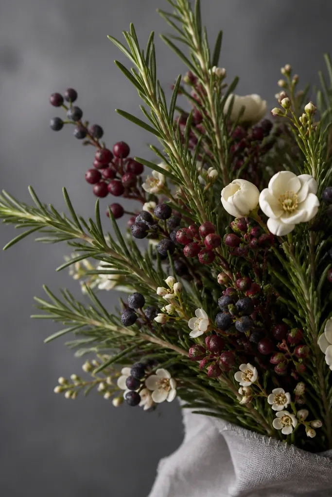
This idea looks like seasonal styling because it's mostly texture: rosemary needles and berry dots. Olive and smoke gray make the berries look jewel-like instead of childish red. I've done this for fall and winter and it always reads "styled" because the drawing includes small repeated details. It flatters anyone who likes muted art - the palette stays calm while the berries give a focal punch.
Sketch the rosemary stems with a light olive line. Draw rosemary needles as short angled strokes, then shade the underside with a darker olive. Add berry dots in layers: start with deep berry red, then add darker purple shadows on one side of each dot. Place a few tiny cream blossoms to soften the composition. Smoke gray background: lightly layer gray with a soft hand, and darken behind berry clusters to increase contrast.
Good to knowMake berry dots vary in size by 2 to 3 mm. Uniform dots look stamped.
Common mistakeAvoid bright primary red. Use berry red and purple so it feels autumn, not cartoon.
17. Mauve Tulip Bouquet with Cocoa Stems
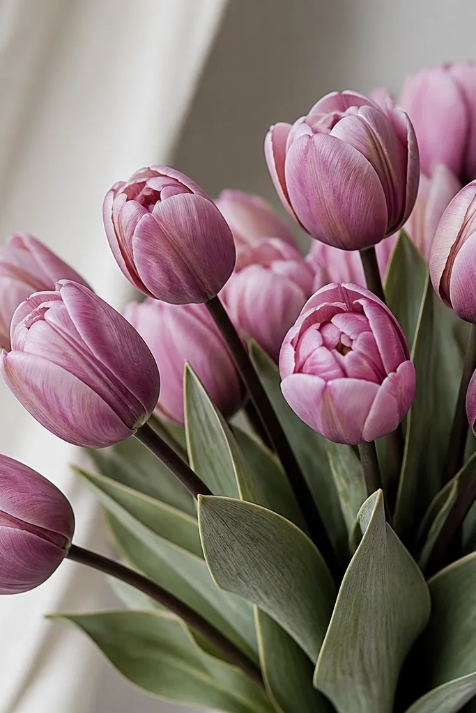
Tulips look best when the petals have a smooth curve and a defined center fold. Mauve is flattering because it sits between cool purple and warm pink. Cocoa stems add realism because tulip stems are rarely pure green; they pick up warm browns from the plant. This bouquet works for spring holidays and gift art because it feels gentle but still structured.
Sketch tulip heads as teardrops with a center seam line. Base petals with mauve, then shade the seam and the underside with deeper plum. Add highlight along the outer petal edge using a lighter mauve and a tiny amount of white. Stems: color with cocoa brown, then add a subtle green glaze on the top side using dusty green. Leaves: dusty green with darker gray-green under veins and a light vein line near the top.
Good to knowDraw the center seam before shading. It keeps tulips from turning into rounded blobs.
Common mistakeDon't outline tulip petals with heavy dark lines. Let shading and highlights define the shape.
18. Blue-Green Calla Lily Bouquet with Silver Pencil Highlights
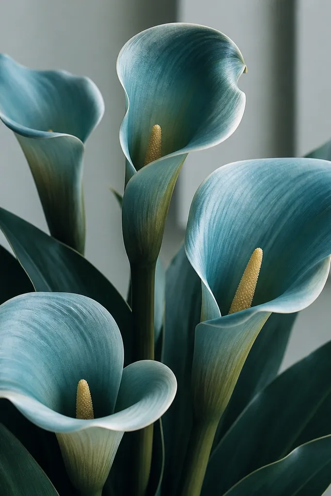
Calla lilies have that smooth, sculptural shape, so they look great with color pencil when you keep the shading simple. Blue-green petals create a modern look, and a pale yellow spadix gives contrast without needing bright reds. I like this bouquet for clean, minimalist seasonal art because it feels calm but still fancy. Silver-like highlights make the petal curve feel glossy.
Sketch the lily shape as a curved teardrop with a long inner fold line. Base the petal with blue-green, then add shadow along the inner fold and bottom edge using a darker teal. Highlight the outer curve using a lighter teal, then go over the highlight line with a light gray pencil to simulate a metallic sheen. Spadix: pale yellow with warm orange-brown shading at the base. Leaves: dark teal with crisp edge shading and a lighter teal vein line.
Good to knowUse short strokes only on shadows. Smooth strokes on highlights keep the calla lily shape silky.
Common mistakeAvoid dark black shadows under the petals. Use teal shadows so the lily stays cool and soft.
19. Pastel Spring Bouquet in Soft Pink, Butter Yellow, and Sage Green
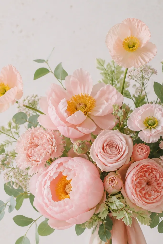
Pastels look good when you control value - light colors must still have shadows. Soft pink plus butter yellow gives a friendly spring feeling, and sage green keeps it airy. I like this for baby showers and spring parties because it looks sweet without looking childish. The key is that you use gray shadows, not brown, so the pastels stay clean.
Sketch your flowers with light pressure. Base pink petals with a pale rose, then add shadows with a light gray-pink on the shaded side. Butter-yellow centers get a deeper golden ring and a tiny highlight dot with white. Leaves: sage green base with gray-green shadows and a light vein line. Background: lightly tint with a near-white gray and leave the paper texture visible around the bouquet.
Good to knowIf your pastels look chalky, layer more lightly instead of pressing harder. Chalkiness usually comes from one heavy pass.
Common mistakeDon't add brown to pastel shadows. Brown makes pastels look dirty.
20. Autumn Sunflower Bouquet with Ochre and Charcoal Depth
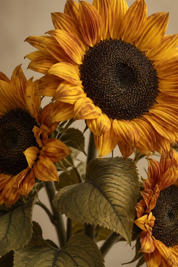
Sunflowers are the fastest "wow" bouquet because the pattern of seeds creates instant realism. Ochre petals keep it autumn, and charcoal depth makes the center look dimensional instead of flat. Leaves with dusty yellow-green and dark veins keep the bouquet from looking like a single orange sun. This one suits fall decor and it also makes a great practice piece for controlled shadowing.
Base petals with ochre, then shade near the petal bases with burnt orange. Add a thin darker edge along the bottom of each petal using a deeper amber or reddish-brown. Seed center: color with charcoal brown, then add light tan dots where seeds catch light. Use a kneaded eraser to lift a few highlights in the center ring. Leaves: dusty yellow-green base with gray-green shadows and darker vein strokes.
Good to knowDraw seed patterns in small sections. Finishing the center in chunks keeps it from getting messy.
Common mistakeAvoid pure black in the seed center. Charcoal brown looks more natural and less harsh.
21. Spring Lilac Bouquet with Lemon Butter Highlights
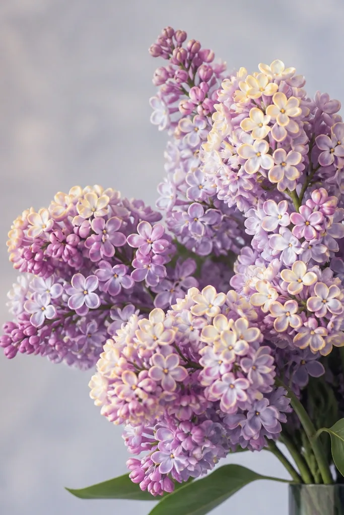
Lilacs look best when you treat them like clusters, not individual petals. Pale purple with lemon butter highlights makes the flowers feel sunlit, especially if your background is neutral. It's a sweet bouquet that still has contrast because the yellow highlights pull the eye forward. I've used this for early spring wall art and it stays pretty even from a distance.
Sketch lilac stems and cluster blobs in simple shapes. Base the clusters with pale purple using light, repeated strokes. Shade shadows with slightly deeper lavender on the lower half of each cluster. Add lemon butter highlights on the top petals only, then soften edges with white so the yellow reads as warm light. Stems: cool green with gray shadows beneath the clusters, and add a few thin leaf lines for structure.
Good to knowKeep yellow to the upper third of each cluster. That's where it looks like sunlight hits.
Common mistakeDon't over-press on lilac clusters. Too much pressure makes them look like a solid purple ball.
22. Monochrome Blush Bouquet in Pink-Gray Tones
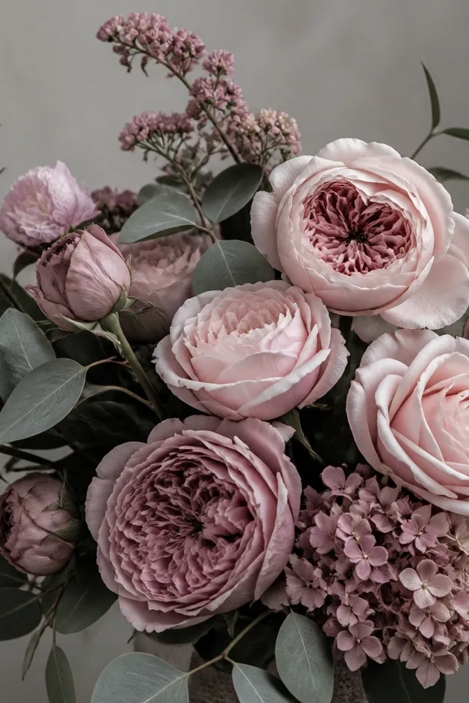
Monochrome blush is the hardest-looking style that actually works once you commit to value control. Pink-gray tones look sophisticated and they're forgiving if you mess up a little because everything is in the same family. I like this for minimalist seasonal decor because it looks calm on the page and it matches almost any frame. It also flatters people who prefer subtle color pencil work instead of bright saturation.
Sketch the bouquet with a light rose-gray pencil. Base petals with blush pink, then shade with deeper rose-gray on the right side and under overlaps. Add highlights by burnishing with white along petal edges, then lightly glaze over highlights with blush to keep them from looking stark. Leaves are gray-green: base with a cool gray-green, shade with darker gray, and add a thin vein highlight in pale gray. Background: keep it near-white with a light gray wash so the bouquet stays the focus.
Good to knowUse mid-gray to test shadows before you add them to petals. You'll keep values consistent.
Common mistakeAvoid adding one bright color. Monochrome gets ruined when a single hue jumps out.
23. Peach and Green Christmas Rose Bouquet with Gold-Tan Center
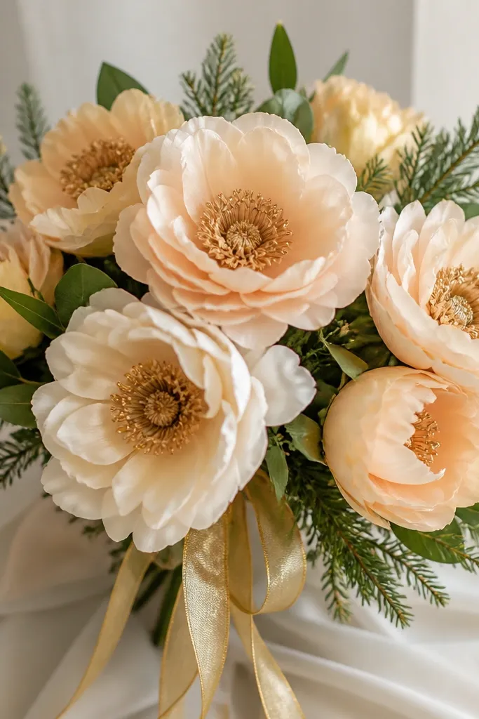
This is my favorite "Christmas but not red" bouquet. Peach flowers keep it soft, green leaves keep it seasonal, and gold-tan centers add warmth without looking like metallic paint. It flatters warm skin tones and it also looks good on darker paper because peach and gold still read clearly. The gold ribbon ties the whole holiday vibe together.
Sketch flowers as soft star-like rounds, then base petals with peach. Shade petal folds with a slightly darker peach and a touch of rose-gray so the shadows stay clean. Centers: gold-tan first, then deepen with amber brown toward the bottom. Leaves: green with gray shadows under the veins, then add tiny highlight strokes with pale green. Pine needles: dark green needle strokes and a few lighter green highlights. Ribbon: warm tan-gold with a narrow highlight stripe in pale yellow.
Good to knowAdd only 3 to 5 pine needles. Too many makes it look like a craft project.
Common mistakeDon't use bright chartreuse for leaves. It makes the holiday theme look cheap.
24. Tangerine and Magenta Geranium Bouquet with Olive Shadows
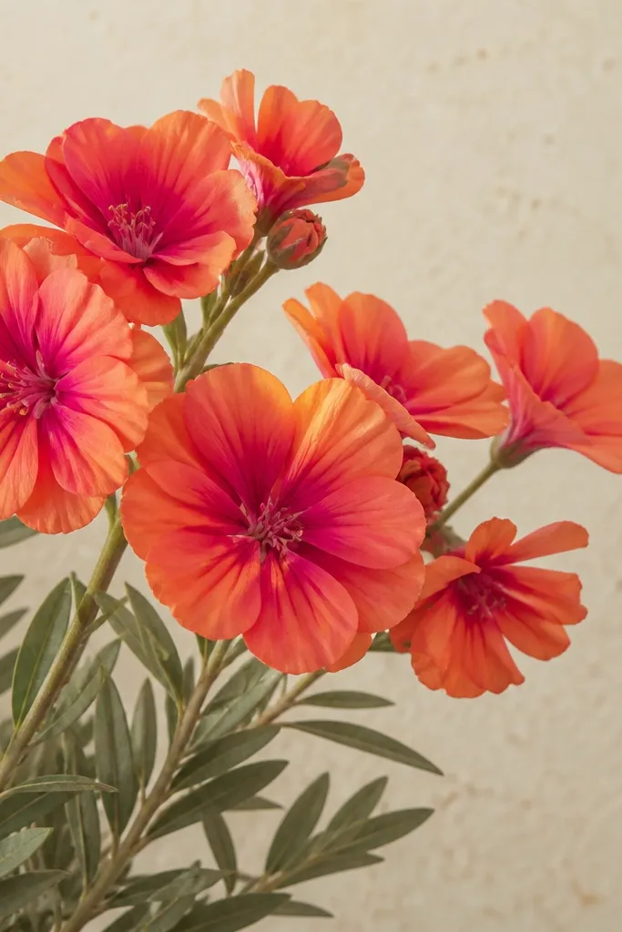
Geraniums look lush when you blend tangerine into magenta at the petal edges, not in the whole middle. Olive shadows make the colors feel grounded, so the bouquet doesn't look like candy. This palette looks great for late summer and also for indoor decor because it has warm energy without going neon. I like it for people who want a bold drawing but hate heavy outlines.
Base petals with tangerine, then add magenta only along the outer edges and crease lines. Shade petal undersides with a muted olive-brown rather than gray - it keeps the warm mood. Centers are a warm yellow-orange with a darker ring. Leaves: olive green base with darker olive shadows under the leaf folds and a lighter olive vein line. Add a few small buds as smaller magenta-tangerine shapes to fill gaps.
Good to knowKeep the petal center lighter than the edges. That contrast is what makes geraniums look full.
Common mistakeAvoid gray shadows in a warm palette. They make geraniums look lifeless.
25. Monkshood-Style Dark Flowers in Teal-Black and Antique Rose
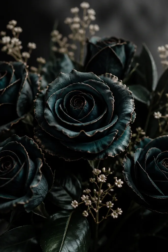
Dark flowers are dramatic, but they only look good if you use a color shadow instead of straight black. Teal-black with antique rose edges gives you that moody depth without turning into smudged charcoal. The pale highlights make the petals feel curved and alive. This bouquet flatters people who like dark academia style and it looks incredible against a light background.
Sketch flower shapes with a dark teal pencil. Base petals with teal-black, then add antique rose along the edges where light would catch. Shade deeper areas with darker teal rather than pure black. Add tiny highlight lines with white along petal curves and on a few leaf edges. Leaves: nearly black-green with a slightly lighter teal vein line so the foliage stays readable.
Good to knowUse white sparingly. Two or three highlight strokes per flower head is enough.
Common mistakeDon't erase and redraw constantly. Dark colors show smudges fast.