
1. Sunrise Stripe Field with Long Shadows
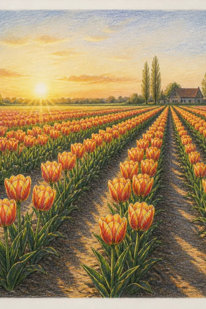
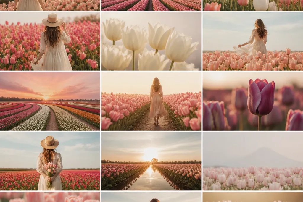
I love this one because it turns tulips into a rhythm pattern instead of a random cluster. Put your horizon low, then let the sun light hit from the left so every tulip has a highlight on its left petal edge and a shadow under the right fold. Use warm pinks and peaches in the petals, then a cool bluish-green in the grass shadows so the whole scene feels like morning air. This is the most flattering layout for small pages because the long shadows add scale fast.
Start by drawing the horizon line about one quarter from the top. Sketch 3 to 4 rows of tulips: foreground stems tall and spaced wider, midground stems tighter, background stems smallest. Add petal folds with two curved lines — one for the outer edge highlight and one for the fold — then fill the fold base with a muted violet-red. Finally, draw shadow stripes: use a thin watercolor wash or a soft pencil line under each tulip, angled diagonally down-right, and keep the shadow edges slightly blurry in the background.
Good to knowIf your shadows look too dark, dilute your paint until the shadow is only 10-20% darker than the grass.
Common mistakeDon’t outline every tulip in black; it makes the sunrise look like paper cutouts.
2. Dusk Purple Field with Halo Sky
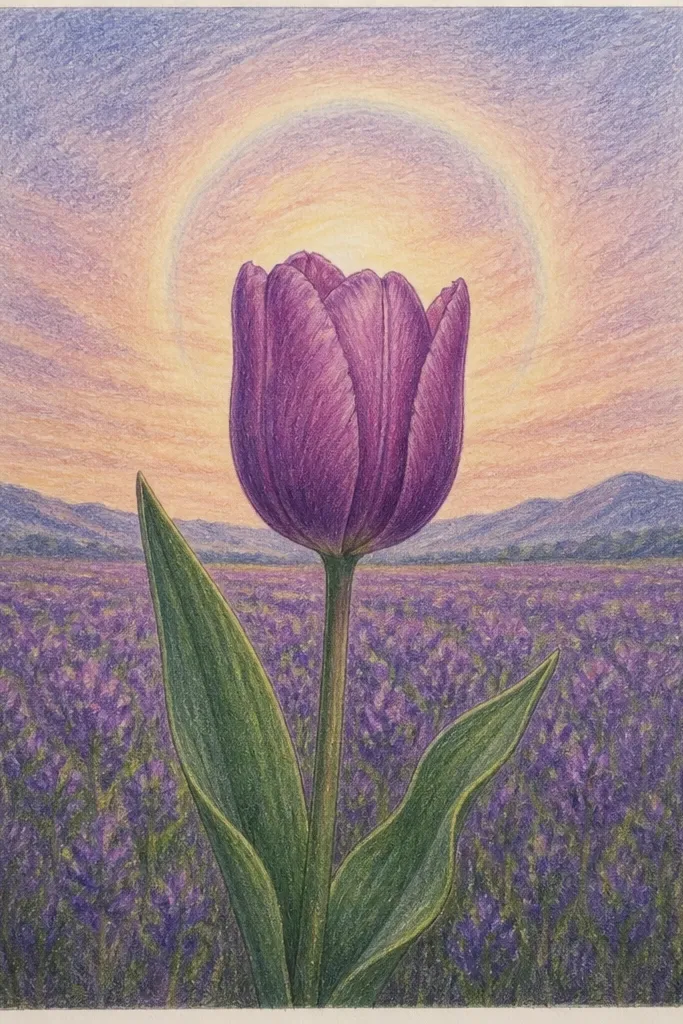
This scene is all about mood, and it comes from value control. The sky is a gradient from muted indigo at the top to a lavender halo near the horizon, which makes the tulips pop without needing heavy outlines. Use deep magenta and plum for the petals, then keep the highlights smaller and cooler — pale pink instead of warm white. It flatters anyone who wants a dramatic look that still feels airy, because the haze in the back makes the field feel huge.
Lightly sketch the tulips in three sizes, keeping the background tulips about half the height of the foreground. Paint the sky first: wet the paper around the horizon, then blend indigo into lavender, leaving the halo area lighter. Next, paint foreground tulips with saturated magenta, then glaze a darker violet at the petal fold base. For the grass, use a dark teal wash and add a few vertical strokes with a small brush only in the front third.
Keep your highlights tiny. I use a damp brush to pull a small pale edge into the petal, then stop before it spreads.
Avoid a flat purple wash for the sky; you need a lighter band near the horizon for the halo effect.
3. Windy Tulips with Curved Stems
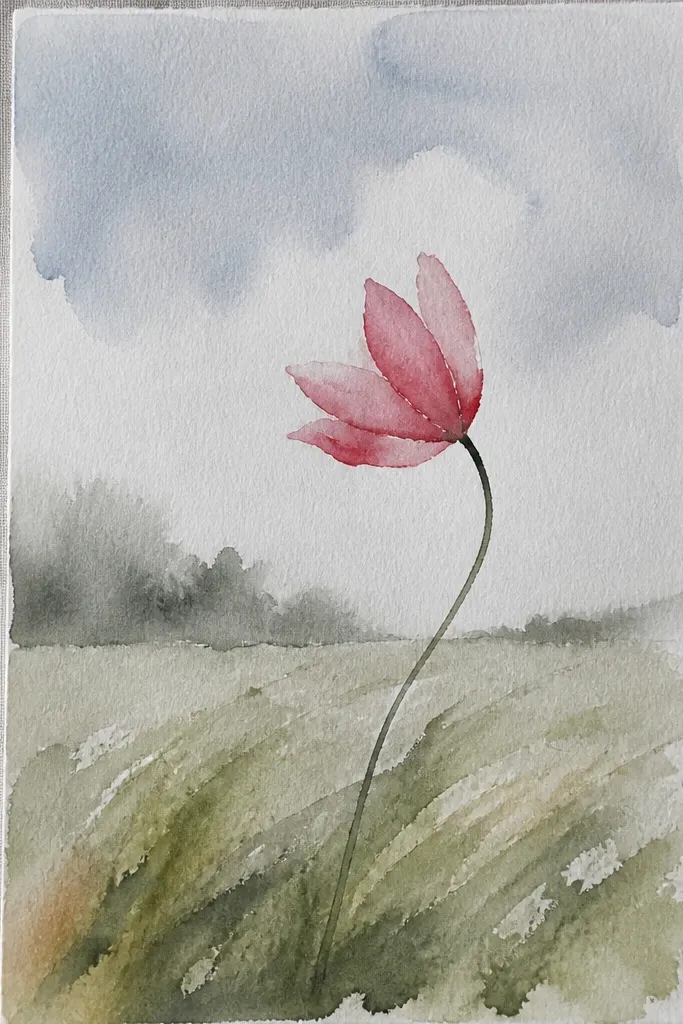
Wind gives you movement without complicated details. When stems curve in one direction, your viewer’s eye follows the “flow,” and the field looks alive even if you keep the background simple. I use side light again so the leaning tulips show consistent highlights on the upper petal edge. This one flatters sketchers because you get shape variety from stem angles rather than having to draw a hundred separate flowers.
Draw a baseline horizon, then sketch stems that lean 10-20 degrees in one direction. Place the tallest tulips in the foreground and overlap them heavily so the wave feels continuous. For each tulip, draw the petal as a teardrop shape, then add one darker fold line on the inside curve. Add wind texture to the grass using long, curved pencil strokes that match the stem lean, keeping the background strokes shorter and lighter.
Good to knowPick one direction and commit. Changing the lean direction mid-page ruins the wave.
Common mistakeDon’t draw the petals perfectly symmetrical; wind makes the folds look slightly off-center.
4. Scattered Bloom Path Through the Field
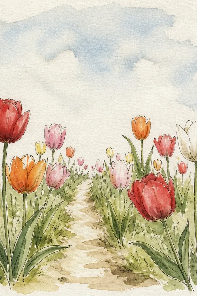
A path is your depth cheat. It gives the viewer a clear “leading line,” so your perspective looks intentional even if your tulips are simple. Use fewer flowers along the path and let the grass show more value contrast there. I like warm reds and oranges on the side tulips, with cooler green-gray ground in the path so the field feels layered. This is the best option when you want a scene that feels like you’re walking into it.
Start with a thin guideline for the path that converges near the horizon, about one third down from the top. Sketch tulip clusters on both sides, leaving a clear gap near the path so the ground reads. Paint the path first with a light sand wash, then glaze a slightly darker tone under each tulip for cast shadow. Finish by adding grass tufts as short strokes around the path edges, with the front tufts sharper and the back tufts faded.
Good to knowMake the path wider at the bottom and narrower at the horizon. Even a 2 cm difference on paper makes it feel real.
Common mistakeDon’t fill the path with tulips; the scene turns into a flat pattern.
5. Close-Up Tulip Corner with Field Blur
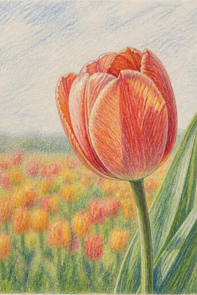
This is the easiest way to make your drawing look expensive. By placing one detailed tulip close to the viewer and fading everything behind it, you create depth without perfect perspective grids. I use one bright tulip — hot pink or coral — then surround it with muted reds so the focal flower stays the star. This layout flatters small sketchbooks because the big foreground flower gives you composition heft.
Sketch a single tulip in the bottom left, letting it overlap the edge of the paper so it feels close. Add a soft horizon line far back, then block in the field with light green shapes instead of individual stems. Paint the close tulip with richer pigment, then pull a few edges outward with a damp brush to make the fold highlights glow. For the background, use watered-down paint and blot with a tissue so the tulips look blurred — just suggest their centers as tiny darker dots.
Choose one tulip to be crisp. Everything else should look slightly lazy.
Avoid drawing full outlines for every flower in the background. Crisp outlines kill the blur illusion.
6. Two-Tone Petals with Sunlit Highlights
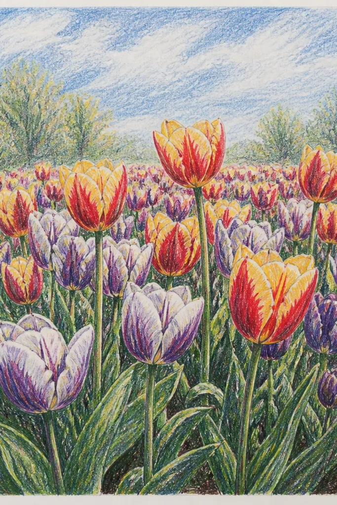
Two-tone petals are where the realism clicks. I paint the outer petal edge with a warm hue, then glaze the inner fold with a cooler shade so the flower looks dimensional. The key is consistent highlight placement: pick the sun side and keep every tulip’s bright edge on the same side. This looks great on people who like clean, controlled art because you can repeat the same petal method across the page.
Sketch 4 rows of tulips, with the front row larger and the back row smaller. Mix two petal tones: for example, warm coral-pink plus a cooler mauve-violet for the fold. Paint the outer edge first, then add the inner fold shade while the first layer is still slightly damp for a natural blend. Add grass with one green base wash, then deepen only the shadow side of the grass stems to keep the field from looking mottled.
Good to knowMark the sun direction with a tiny arrow on scrap paper. It stops you from drifting halfway through.
Common mistakeDon’t add dark shadows on both sides of each tulip; that makes them look flat and cut-out.
7. Golden Hour Field with Honey Sky and Crisp Grass
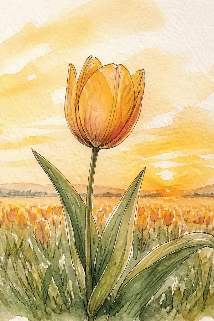
Golden hour is forgiving because warm light hides sketchy edges. The trick is to keep your grass marks directional and your tulip centers bright. I use honey yellow in the sky, then soften it with pale peach near the horizon so it doesn’t turn neon. Tulips look best when the center is a clear yellow and the petal fold is a darker orange-red. This suits anyone who wants a cheerful, bright page without going hyper-detailed.
Paint the sky with a wet-on-wet blend: honey yellow at the top, pale peach near the horizon, leaving paper texture visible. Sketch tulips with a simple teardrop shape and a small pointed top for the bud. Fill petals with warm orange-red, then add a darker orange-red at the fold base. For grass, use a small brush or pencil to draw short, upright strokes, with darker green tips only in the lower third.
Add three to five extra-bright yellow centers only in the front row. Too many yellows looks cartoonish.
Don’t make the sky too saturated. If it’s the darkest area, your tulips lose focus.
8. Pastel Spring Field with Whitewashed Paper Texture
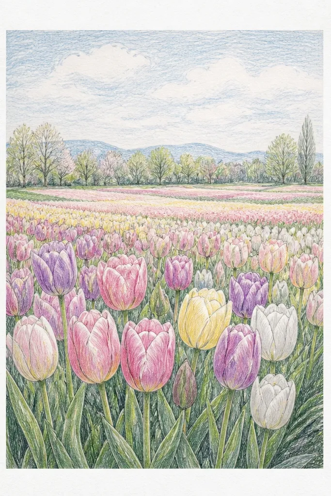
This is the “airy sketchbook” option. You don’t need perfect pigment coverage because the whitewash texture does the work. Use pastel tulip colors — pale pink, butter yellow, and light lavender — and keep your shadows faint. The grass is mostly a light green wash with a few darker strokes for direction. This flatters people who like minimal lines and want the page to look light and calm.
Start with a very light pencil sketch of tulip positions, then erase hard so you don’t get gray smudges later. Wash a pale green base over the field, keeping the wash thin so the paper shows through. Paint petals with diluted colors and leave tiny gaps in the petal folds as highlights. Add a few darker green vertical strokes only where tulips overlap the grass — front row gets more strokes, back row gets almost none.
Good to knowUse watered-down paint and let the paper do the blending. Overworking pastels makes them chalky.
Common mistakeAvoid heavy black outlines. Pastels need soft edges, not crisp ink.
9. Red Tulip Row with Checkered Depth Bands
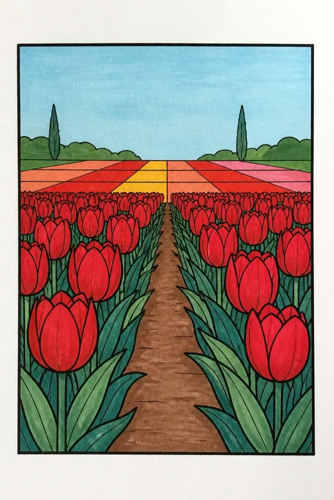
If you want graphic charm, this is it. The depth comes from horizontal bands of value rather than drawing every stem. Keep tulips in repeated rows so the viewer reads them as a field, not scattered flowers. Use one main red for most petals, then a darker maroon for the fold and a lighter red for highlights. This style flatters people who like clean shapes and want a composed look that still feels dreamy.
Draw the horizon line first, then divide the field area into 3-4 horizontal bands with very light pencil lines. In the front band, draw larger tulips with clear petal folds and visible centers. In the next band, draw smaller tulips and simplify the petals into fewer curves — just outer edge plus fold line. Paint each band’s grass with a different green value: front band darkest, back band lightest, then keep the band edges slightly soft so it still feels natural.
Good to knowUse one red family. Mixing too many reds makes the graphic effect muddy.
Common mistakeDon’t outline the band divisions with dark lines. The bands should be value shifts, not stripes.
10. Rainy Day Tulips with Droplets on Petals
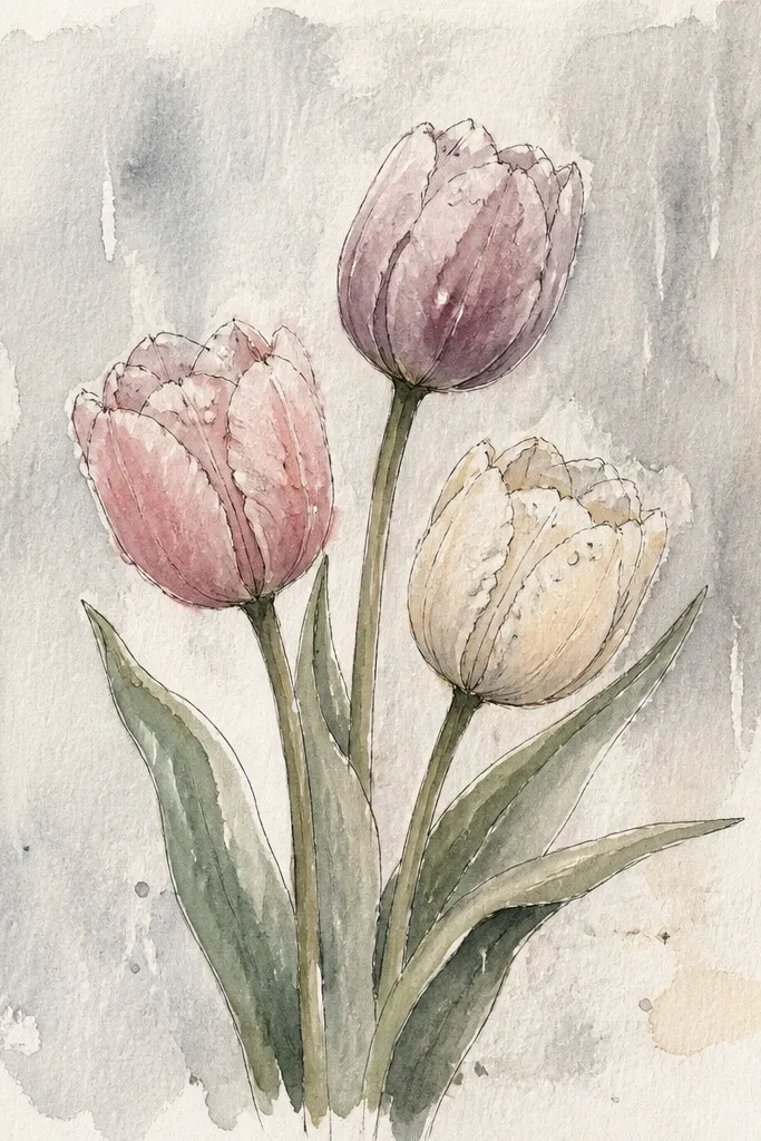
Rain changes everything: highlights get sharp, and shadows get softer. This scene looks realistic when you treat droplets as tiny reflections, not full circles. Use gray-blue sky, deep greens, and muted tulip colors like dusty rose or cranberry. The droplets sit on the top petal edge and catch light as small white marks with a faint blue tint around them. It flatters anyone who likes moody artwork without needing complex clouds.
Sketch your tulips in the usual three zones, but make the background stems thinner and lighter. Paint the sky with a gray-blue wash, then add a lighter band near the horizon. For petals, paint muted rose or cranberry, then add a darker shadow at the fold base. Add rain streaks with a light pencil or thin paint line — keep them sparse in the foreground, denser in the background — then place 5-10 tiny white highlights on petal edges as droplets.
Use a white gel pen only after everything dries. Wet paint turns those highlights into smears.
Don’t draw dozens of droplets. A few convincing ones look real; too many look like glitter.
11. Windmill Silhouette Behind Tulip Haze
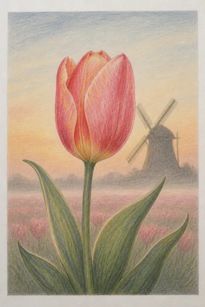
Adding one distant object gives your scene a story instantly. The windmill silhouette is simple, but it anchors the horizon and makes the haze feel purposeful. Keep the windmill dark — near-black — and let it fade at the edges into the mist. Tulips in front should be warmer and clearer, while background tulips become light and less defined. This is great for medium-size pages because the silhouette gives scale.
Sketch the horizon line and place the windmill just above it, slightly off-center. Block in the field in three layers: foreground tulips warm and detailed, midground slightly faded, background simplified. Paint the haze around the windmill by wetting the area with clean water, then blending in a very light gray-lavender wash. Finish by painting foreground tulips normally, then use diluted paint for the background so the windmill stays the sharpest dark shape.
If the haze looks flat, add one darker green band just below the windmill for depth.
Avoid drawing extra buildings or lots of objects. One silhouette is the whole point.
12. Cartoon-Soft Tulips with Crayon Texture
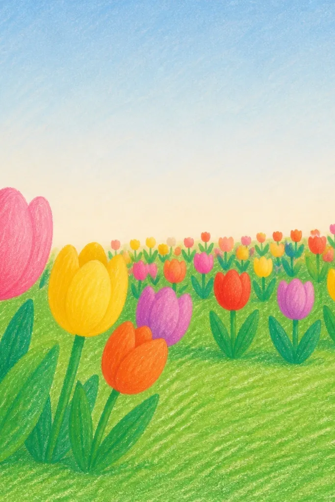
This is for when you want dreamy without realism pressure. Crayon texture makes the field feel tactile even if your tulips are simplified shapes. Use thick strokes for the grass and rounded petal outlines so everything looks friendly, not stiff. I like limited colors: one tulip red, one tulip pink, and one grassy green, plus a pale blue sky. It flatters beginners because the shapes are forgiving and you don’t need fine detail.
Color the sky first with a light blue crayon, then blend lightly with a tissue. Sketch tulip positions in pencil, then fill petals with thick crayon blocks in red and pink, leaving a tiny white highlight gap along the petal fold. For grass, scribble with green crayon in vertical strokes, then layer a darker green on the lower third. Add a few center dots in yellow or cream to pull the tulips together.
Press harder for the front row and lighten pressure for the back row. That pressure difference creates depth.
Don’t use too many colors in the grass. Two greens are enough.
13. Evening Blue Field with Orange Petal Pop
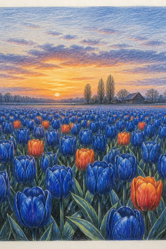
This is the color-contrast scene I reach for when my page needs drama but not complexity. Cool blue sky and teal grass push your orange tulips forward like lanterns. Keep the petal fold shadows a deeper, desaturated brown-red so the orange doesn’t turn muddy. The spacing helps too: leave more negative space between midground tulips so the field reads as a pattern, not a wall of color. It flatters anyone who likes modern-looking illustrations.
Paint the sky with a deep blue gradient, darker at the top and lighter near the horizon. Sketch tulips with simple teardrops and vary heights: a few tall in front, many medium in the midground, tiny in the back. Paint petals in orange-red, then glaze a darker brown-red at the fold base. For grass, use teal and add a handful of darker vertical strokes at the bottom third only, so the field doesn’t get too busy.
Good to knowIf the orange looks flat, add a thin lighter orange highlight on the petal edge that faces the sky light direction.
Common mistakeAvoid coloring the whole field the same green. You need value changes or it turns into one flat teal.
14. Foggy Morning Field with Soft Edges
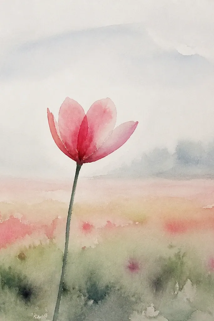
Fog is your permission to simplify. When you blur the background values and soften edges, even basic tulip shapes look like a real scene. I keep the foreground tulips slightly darker and more saturated, then let the background wash out into near-gray. Use muted pinks and faded reds, and keep the grass tone consistent — a light gray-green works better than bright green. This flatters people with less time because the fog does the heavy lifting.
Sketch tulip clusters in the front third only, then lightly place small tulip blobs in the midground. For the sky and mist, paint a pale gray wash that covers the entire upper area and blend it into the field — skip a hard horizon line. Paint foreground tulips with more pigment, then soften their edges by lightly dragging a damp brush outward on one side of the petals. For midground and background, use diluted paint and blot with a tissue to create fuzzy shapes.
Good to knowChoose one edge to keep crisp on each front tulip — usually the sun-facing outer edge.
Common mistakeDon’t leave a sharp horizon line. Fog should blur it.
15. Tulip Field Seen from a Low Angle
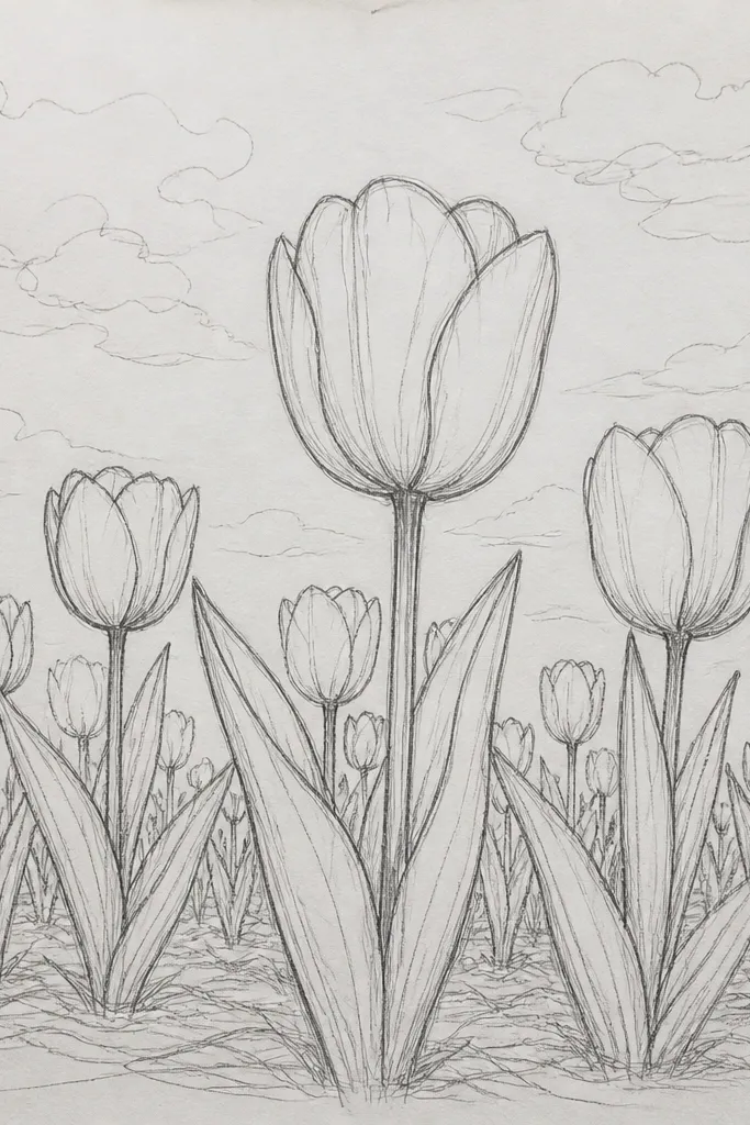
Low angle makes tulips feel taller and more dramatic without needing extra flowers. You’ll see lots of stems and overlap, and the field stretches upward. I use a higher horizon placement so the viewer feels like they’re kneeling in the grass. Petal colors can be classic red, pink, or mixed, but keep the shadows under the petal folds slightly darker and more visible. This flatters tall paper formats and gives a strong composition even when the sky is simple.
Place the horizon around one third from the top, then draw the tallest stems from the bottom edge so they overlap. Sketch tulips with big petal shapes in the front, then shrink them as they approach the horizon. Add ground texture by drawing short grass strokes horizontally near the bottom, then switching to more vertical strokes as you go up. Paint grass with a mid green base, then deepen the shadow side under overlapping stems and soften the far background with a thin wash.
Overlap is the secret. If stems don’t cover each other, the low angle won’t feel real.
Don’t keep every stem the same thickness. Vary thickness from front to back for depth.