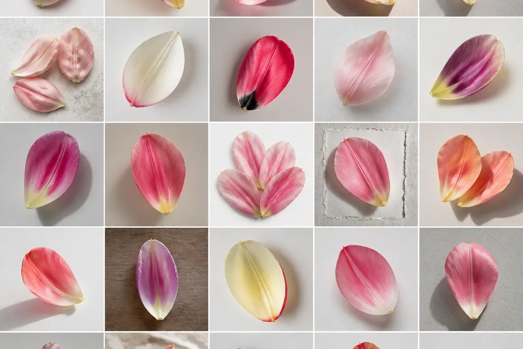
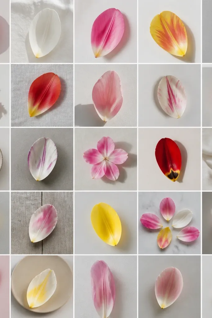
1. Single Tulip Petal Stack on Warm Cream Paper
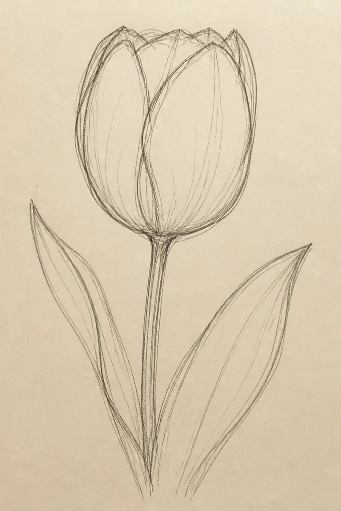
Step 1: Lightly sketch three petal layers — outer petal, middle petal, inner petal — so each layer overlaps the one below by about a third of its width. Step 2: Outline only the outer edges with a gel pen, then add a thin crease line inside each petal using a gray colored pencil. Step 3: Shade from the crease toward the petal tip with a light pink, leaving the crease darkest and the center area almost blank. Finally, add a tiny crescent highlight near the inner glow using a pale yellow pencil or white gel pen.
I love this one because it looks “done” fast and still feels handmade. Start with a tall tulip shape that fills about 70% of the page height, then build petals in overlapping teardrop curves. Use dark brown or deep plum for the outer outline, and keep your crease shading tighter than you think. This flatters most skin tones in photos because the warm cream background makes pinks and yellows look natural, not neon. It also looks great for both spring cards and simple holiday tags when you swap the center glow from yellow to pale gold.
Common mistakeAvoid coloring the entire petal the same tone — that kills the fold.
Good to knowPress your pencil less near the tip; the petal needs to fade out to read as real.
2. Tulip Petals with Double-Edge Highlights
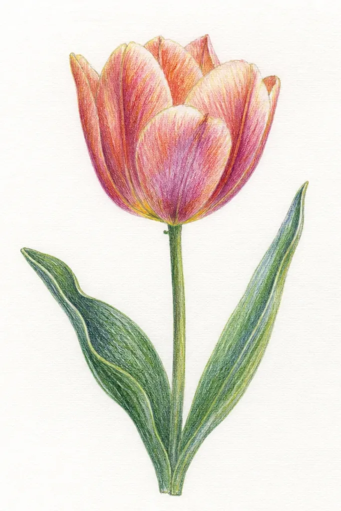
Step 1: Draw your tulip silhouette first — one outer petal curve and one inner petal curve — then add a third small inner fold at the top center. Step 2: Outline the outer rim with a fine black or dark brown pen, then draw a second highlight line about 2-3 mm inside the rim using a white gel pen. Step 3: Shade with colored pencil — coral on the fold area and peach on the rest — leaving the inner shine line almost untouched. Finally, add a tiny yellow-white center dot and blend lightly with a paper stump if you have one.
This style looks glossy even if you use basic tools. The double-edge highlight mimics the way light catches a tulip petal — one line marks the rim, the other marks the inner shine. I use coral and peach because they photograph well under warm indoor lighting, and they look clean on white or off-white paper. This is flattering for anyone because it hides sketchy proportions; the highlights guide the eye toward a neat silhouette. It also works beautifully for holiday season decor when you add a thin gold edge highlight instead of white.
Common mistakeAvoid thick white lines; they make the petal look like a sticker.
Good to knowIf your highlight looks streaky, tap the gel pen once, then leave it — don’t keep dragging.
3. Burgundy Tulip Petals with Frosted Background Wash
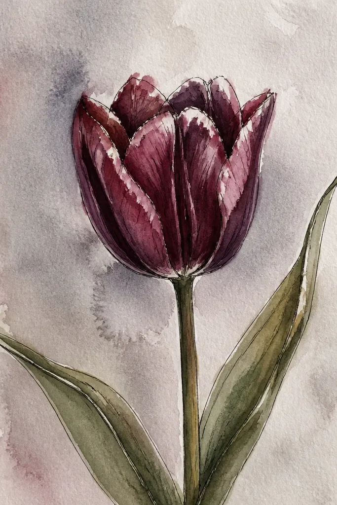
This is my go-to when someone wants “holiday” without adding snowmen. The burgundy petals feel festive because the color holds up in low light, and the frosted background keeps the whole piece airy. I shade the fold with a darker maroon and leave the outer edge lighter with a thin cream line so the petals look crisp. This palette looks especially good on darker paper tones too, but it still works on white if you do a soft wash first. It flatters the eye because the cool background makes warm petals pop.
Step 1: Tape a border around your paper if you want clean edges, then watercolor a loose wash behind the tulip using watered-down blue-gray. Step 2: While it’s still slightly damp, dab a little white paint or diluted gouache for frost speckles. Step 3: Draw tulip petals on top with a light pencil, then ink the outer edges with a fine pen. Step 4: Color the petals with burgundy colored pencil, concentrating the darkest tone at the crease and keeping a cream edge line along the outer rim.
Let the wash dry fully before you ink; it prevents feathering around your outlines.
Avoid painting the petals before the background dries — you’ll get muddy edges.
4. Tulip Petal Mandala Frame Using Only Petal Shapes

Step 1: Draw a small tulip cluster in the center — three overlapping petals — then outline a square frame area around it using a pencil guide. Step 2: Repeat petal shapes outward in rows, rotating each petal slightly so the tips don’t line up perfectly. Step 3: Shade alternating petals with two pencils: dusty rose for odd petals, soft pink for even petals, and keep shading only near each petal crease. Finally, add tiny ink dots in the empty corners and along the inner frame edge.
This looks like you spent hours, but it’s just repetition with control. I use petal shapes as the “tiles” in a frame — think of a tulip petal as a teardrop with a pointed top. Alternating two shades keeps it from looking flat, and the tiny ink dots add movement without clutter. This is flattering on any paper color, but I prefer bright white so the dusty rose reads soft. For gift tags, it also gives you a built-in border so the design feels finished even if you leave the corners plain.
Common mistakeAvoid over-shading every petal; leave the outer halves lighter.
Good to knowUse the same petal size for the first row, then shrink by 1-2 mm each row to keep the frame balanced.
5. Two-Tone Tulip Petals with Ombre Center Glow
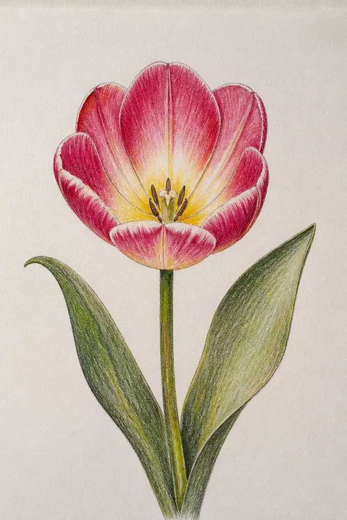
Step 1: Draw your tulip outline and divide each petal visually into outer and inner halves with a faint pencil curve near the crease. Step 2: Color the outer half with lavender-pink, then color the crease and inner half with peach. Step 3: Use a light blending motion with a clean pencil or blending stump to soften the transition where the two colors meet. Finally, add a pale yellow ombre near the center and leave a small highlight gap so the glow doesn’t look flat.
This one makes the tulip look like it’s lit from inside. The trick is to blend two color families across the petal: cool on the outer half and warm near the fold. I use light lavender-pink for the outer shading and peach for the fold area, then I blend into pale yellow at the center. It flatters people with warm or cool color preferences because both palettes look intentional together. For holiday decor, it reads like a candle glow — especially if you add a soft shadow under the tulip.
Common mistakeAvoid mixing too many colors at the center; yellow should be the brightest tone.
Good to knowBlend with light pressure; if you press hard, the colors turn gray-brown.
6. Tulip Petal Studies on Grid Paper for Perfect Symmetry
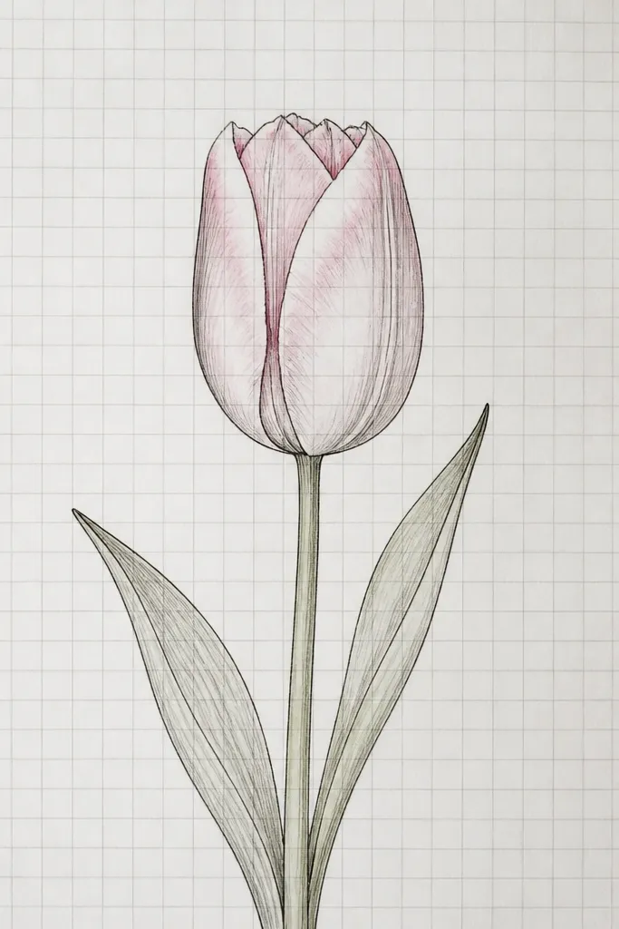
This is the style I use when I’m drawing multiple tulips for a set and I want them to match. The grid makes the petal tips land in the right spots, and it gives you a clean way to measure overlap. I keep shading minimal so the petal shape reads clearly; later you can add color only where you want drama. It flatters any skill level because it removes the “why does mine look crooked?” problem. For holiday cards, symmetry makes the design feel formal without being stiff.
Step 1: Choose grid paper or draw a light 1 cm grid with a pencil. Mark the center line, then sketch one petal half first, using the grid to mirror it. Step 2: Add the next petal by overlapping by one grid square width at the bottom, then repeat on the other side. Step 3: Use a fine pen to ink only the outer rim and the crease lines, then add light gray shading just along the crease. Finally, add a tiny pink wash with watercolor or a light pencil tint near the inner glow.
If you hate grids, draw them in pencil and erase before you ink.
Avoid inking over heavy pencil lines; it makes the whole page look messy.
7. Tulip Petals as Stained Glass Panels
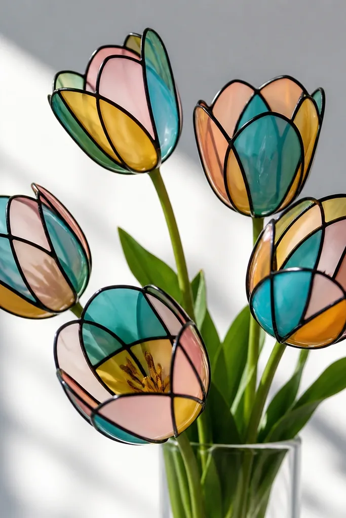
Step 1: Draw the tulip silhouette with a pencil, then outline thickly with a black fineliner or brush pen. Step 2: Divide each petal into 2-3 panels using thin pen lines, keeping the divisions close to the fold. Step 3: Fill panels with different colors — teal on the outer panel, pink on the fold panel, honey yellow near the center — leaving tiny white gaps where panels meet. Finally, if you have it, add a light gray shadow under the tulip with watercolor to ground it.
This style looks crisp and fancy because the outline does half the work for you. I draw thick “lead” lines around each petal segment, then fill each segment with color so you get that stained-glass glow. Use translucent-looking mediums like watercolor pencils or markers diluted with a brush for a glassy effect. It flatters people who want bold results without heavy shading skills. For holiday season, it reads like a window decoration, especially if you add a dark background wash behind the paper.
Common mistakeAvoid filling to the very edge of the black lines; stained glass needs that thin white breathing space.
Good to knowLet the ink dry fully before coloring so the colors don’t bleed into your lines.
8. Single Tulip Petal with Crosshatch Texture
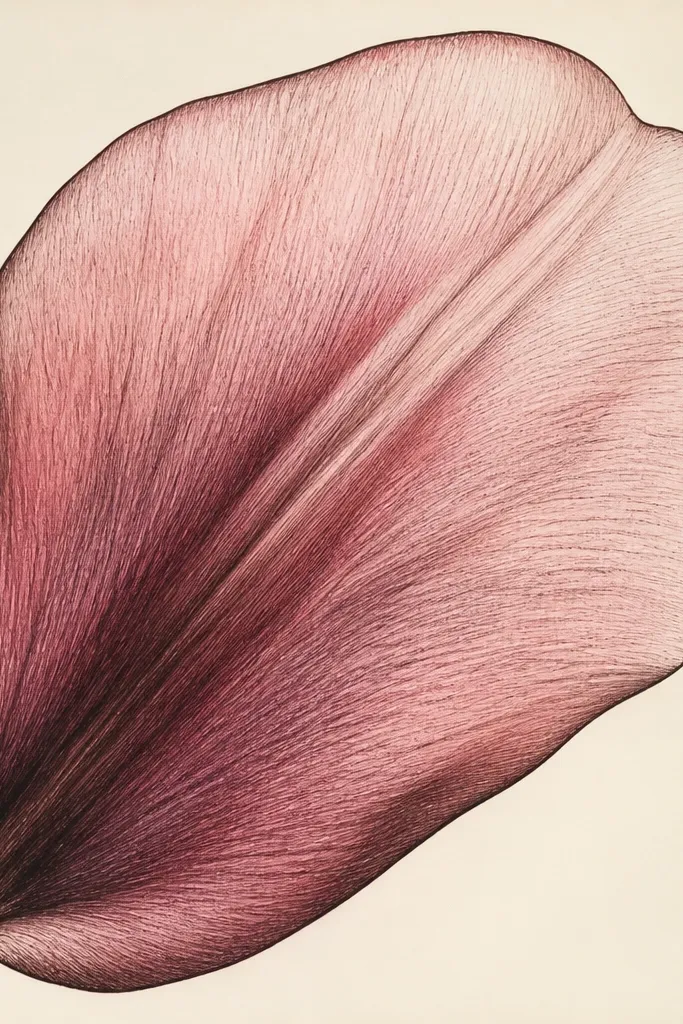
Crosshatching gives you texture without smudging, and it’s perfect if you like pen work. I draw the petal in clean curves, then shade using short hatch marks that follow the petal’s direction. The darkest hatch cluster sits right at the crease line, and the marks get lighter as they move toward the tip. This flatters small spaces because the texture makes even a simple petal look rich. It also works for holiday because you can swap the petal color — burgundy for winter, bright red for Valentine season.
Step 1: Sketch one large petal shape with a pointed top, then lightly draw a crease line about one-third down from the top. Step 2: Ink the outer edge with a fine pen, then add short crosshatch strokes that change direction at the crease to show the fold. Step 3: Keep the tip area mostly blank or lightly hatched so it stays bright. Finally, add a thin colored pencil tint over the pen shading — just enough to color the crease and inner edge.
Use a ruler to keep your hatch marks consistent if your hand drifts.
Avoid hatching randomly across the whole petal; keep it directional.
9. Tulip Petal Wreath Around a Circle Ornament
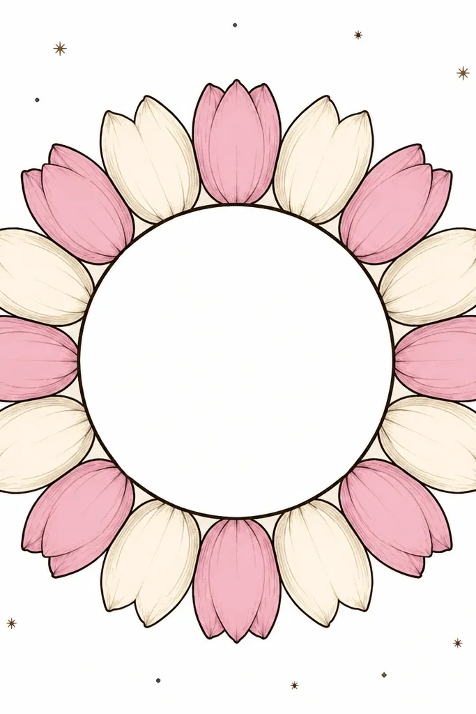
Step 1: Draw a circle using a compass or traced bowl, then draw a second outer circle about 4-5 cm bigger for the wreath boundary. Step 2: Fill the ring with tulip petal shapes, each one angled slightly so the tips point inward. Step 3: Outline each petal with a dark pen, then color alternating petals — pink on one, pale cream with a hint of yellow on the other. Finally, add tiny dot stars around the outer boundary and a light shadow under the wreath if you want depth.
This turns tulip petals into a holiday-looking ornament without adding extra objects. The circular format makes your drawing feel intentional, and the alternating petal colors add rhythm. I use a thick outline around each petal so the wreath reads from across the room. The center circle gives you a spot for a name tag later, or you can leave it blank for a minimalist look. This style flatters small frames because the design stays balanced even if your petals aren’t identical.
Common mistakeAvoid making every petal the same angle; it looks mechanical.
Good to knowColor only one side of each petal slightly darker so the wreath looks dimensional.
10. Tulip Petal Side Profile with Soft Watercolor Bleed
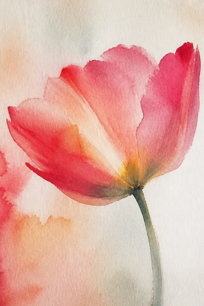
Side profiles look elegant because the petal folds show clearly from one angle. I draw the tulip cup shape first, then I let watercolor do the “soft edge” thing while keeping the crease line controlled with pencil. This style flatters people who like gentle art and want less hard outlining. It also works well for spring and Easter, but you can make it holiday by using deep red and adding a cool gray background wash. The watercolor bleed gives movement without you having to over-render the petals.
Step 1: Lightly sketch the side tulip cup — outer petal curve, inner petal curve, and a small top fold. Step 2: Wet the paper slightly around the petal edges with clean water, then paint diluted rose or red, letting pigment pool near the crease. Step 3: After it dries, add a thin pencil crease line and optionally ink just the outer rim with a fine pen. Step 4: Add a tiny highlight at the petal edge with a white gel pen once everything is dry.
Use less water than you think; too much causes blooms you can’t control.
Avoid re-wetting the same spot repeatedly; you’ll get muddy tulip color.
11. Tulip Petal Confetti Background with Clean Center Bloom

Step 1: Draw a centered tulip bloom with three overlapping petals, and ink the outer edges with a fine pen. Step 2: Shade the petals with colored pencils — darker at each crease, lighter toward the tip — and add a small inner highlight. Step 3: In the remaining background area, draw tiny petal confetti shapes, varying size from 2 mm to 1 cm and rotating them randomly. Step 4: Color confetti with two or three tones: pink, pale cream, and a light gold tone using metallic watercolor pencil or gel pen.
This is the “party” version of tulip petal art. You keep the tulip itself neat and dimensional, then you add playful petal confetti around it. I like it for seasonal cards because it hides blank space without turning the page chaotic. The gold and cream confetti makes it feel celebratory, and the crisp center keeps it from looking like random doodles. It flatters different face shapes in photos because the design draws attention to the center area, not the edges.
Common mistakeAvoid coloring the whole background solid; confetti should stay airy.
Good to knowKeep confetti outside the tulip outline by at least a finger-width so the center stays readable.
12. Mirrored Tulip Petal Wings on a Dark Charcoal Sheet

Dark paper makes tulip petals look like neon light even with simple shading. I draw the tulip petals symmetrically like wings, then outline everything with a white gel pen for a crisp edge. The fold shading uses pale pink and lavender so it reads softly instead of harsh. This flatters anyone who likes moody holiday decor because it looks dramatic without being messy. It also photographs well because the white edges separate the petals from the charcoal background.
Step 1: Sketch a vertical center line on charcoal paper, then draw one tulip petal arrangement on the right side with three layered petals. Step 2: Mirror it on the left side so the tips match within 1-2 mm. Step 3: Outline the outer edges and fold lines with a white gel pen, then shade the fold with light pink and the outer half with lavender. Step 4: Add a pale yellow-white center glow and a faint gray shadow under the center area to ground it.
Use a fresh gel pen tip; worn tips create thick lines that look uneven on dark paper.
Avoid using only one light color; the fold needs a slightly darker tone to look 3D.
13. Tulip Petal Border for a Gift Tag with Handwritten Space
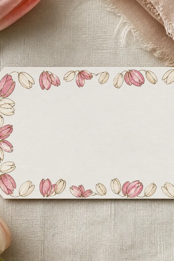
This idea is practical because it’s designed for writing. I build a narrow tulip petal border around a mostly blank center so you can add To/From or a short message. The petals are small, and the shading stays minimal, which keeps the tag from looking busy. For holiday gifting, it makes a simple kraft tag feel intentional. This flatters handwriting styles because the blank center gives you clean contrast — dark ink on pale paper looks crisp.
Step 1: Choose a tag size around 3.5 x 5 inches, and draw a border rectangle about 1 cm in from the edges. Step 2: Place small tulip clusters in the border corners and mid-sides, each cluster made of three tiny overlapping petals. Step 3: Outline the border petals with a fine brown pen, then color with light pink and pale cream, leaving the petal tips lighter. Step 4: Add a few small leaf strokes only where the border corners meet so the tag doesn’t look empty.
Write first, draw border second if you’re nervous about smudging ink.
Avoid drawing full tulips at tag corners; it crowds the writing area.
14. Watercolor Tulip Petals with Bleached Edge Highlights
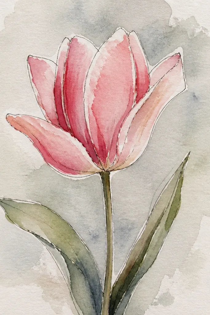
This one looks painterly without turning into a watercolor accident. You paint the petal normally, then you lift color off the edge to create a bright highlight that looks like reflected light. I use rose watercolor for petals and a tiny bit of deep red for the crease so the fold stays readable. It flatters anyone who likes softer art and wants a tulip that looks airy. For holiday season, this also works with darker pigments because the lifted edge stays bright.
Step 1: Paint the petal base with diluted rose, leaving the inner center a little lighter. Step 2: While the paint is still damp, use a clean damp brush or paper towel to lift pigment along the outer rim highlight area. Step 3: After it dries, add deeper rose shading at the crease line with a smaller brush. Step 4: Dot a pale yellow center glow and add a final thin white gel pen line to sharpen one edge.
Lift color with a mostly dry towel — wet towels spread pigment and blur your highlight.
Avoid lifting too much; one bright rim highlight looks intentional, five looks accidental.
15. Tulip Petal Pattern Using One Line Weight Rule
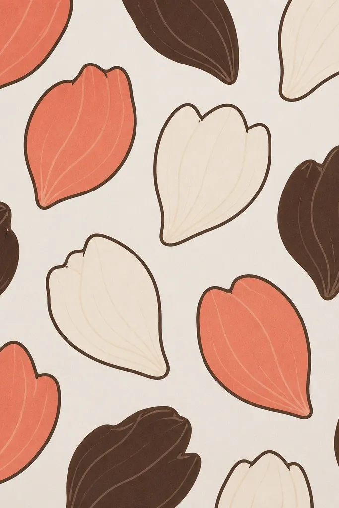
Step 1: Pick one pen thickness for the outer rim and one thinner line for creases, then test on scrap paper. Step 2: Draw a repeating tulip petal motif across the page, keeping the center fold line consistent in placement. Step 3: Color with only coral and cream, adding dark brown only at creases and near overlap edges. Step 4: Finish by lightly erasing any pencil guides so the pattern looks clean and intentional.
Line weight is the secret sauce here. I use one thick line for the petal outer rim and a thinner line for creases so the viewer instantly reads depth. When you repeat the same rule across a pattern, the whole page looks polished even if the petals are slightly different sizes. This flatters beginners because you’re not fighting shading complexity. It also works for seasonal wrapping paper style designs — just add a simple repeat and keep the palette tight.
Common mistakeAvoid mixing thick and thin outlines randomly; it makes the pattern look unfinished.
Good to knowIf you can’t keep line thickness steady, slow down and draw fewer motifs per page.
16. Tulip Petal Pop-Up Card Style Folded Petals
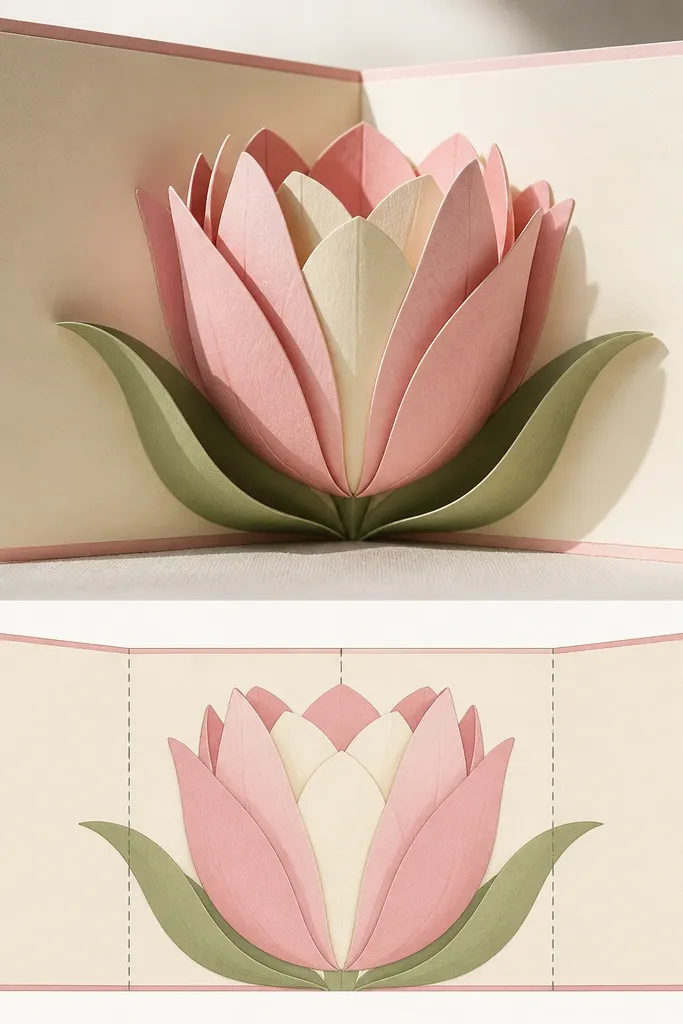
This one is for people who want the drawing to become a physical moment. I sketch tulip petals with clear fold lines, then I plan the placement so the petals lift off the card when opened. The shading is built around where the fold happens — darker near the crease, lighter on the lifted surfaces. It flatters anyone who likes interactive crafts because it looks impressive without adding a bunch of supplies. For holiday, you can make the center glow gold and add a tiny “snow” dot pattern behind the lifted petals.
Step 1: Draw a tulip petal on a card template, then outline a second version of the same petal slightly offset to show the lifted layer. Step 2: Trace the petal shape onto cardstock, cut it out, and score the fold line where the petal should bend. Step 3: Shade the lifted petal with colored pencil — darker at the crease line — then glue it to the scored base so it stands up. Step 4: Use a darker shadow line behind the lifted petal on the front panel so it reads as 3D.
Test the fold with a scrap before you commit to the final cardstock cut.
Avoid gluing the lifted layer flat across the crease; it won’t pop.
17. Tulip Petal Confetti Border with Metallic Gold Center Dots
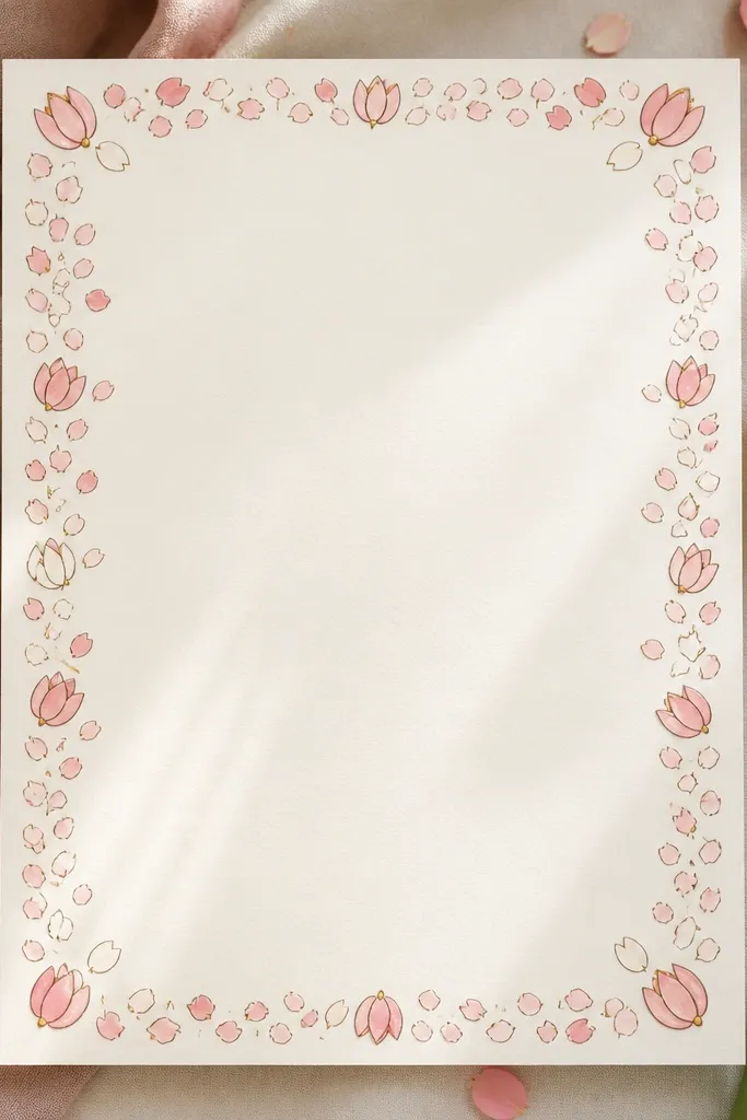
Step 1: Draw a border rectangle on your cardstock, leaving a wide center for the message. Step 2: Along the border, place small tulip petal shapes in a staggered pattern, each one made of two overlapping petal curves. Step 3: Outline in deep brown, color petals with pink and pale cream, and keep shading only near the fold. Step 4: Add a tiny metallic gold dot at the center of each tulip using a metallic gel pen or gold paint pen.
This is the “holiday card that looks expensive” version. The metallic gold center dots catch light in a way flat ink can’t, and they add a focal point even when the petals are small. I use deep brown outlines so the gold doesn’t look washed out. This flatters photos because the gold dot gives a sharp highlight that reads in both daylight and warm lamp light. If you’re making a batch, this design repeats easily and still looks consistent because the gold dot becomes your anchor.
Common mistakeAvoid using metallic paint over wet pencil shading; it can bleed and dull.
Good to knowLet the metallic ink dry fully before you stack cards; wet gold smears fast.
18. Tulip Petals with Pencil Smudge Gradient Only on Creases
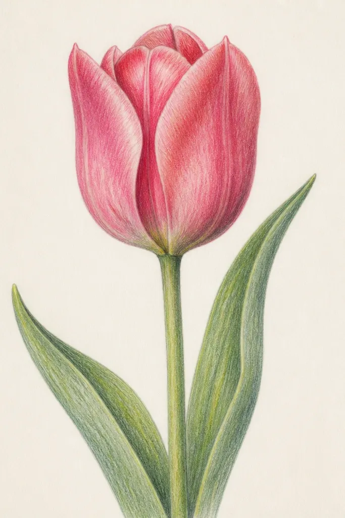
Step 1: Draw your tulip petals and mark each crease line lightly with pencil. Step 2: Color the crease area with a darker pink or burgundy pencil, staying within a 5-8 mm strip along the fold. Step 3: Use a cotton swab or paper stump to smudge only that strip outward, leaving the petal tip lighter. Step 4: Add a crisp white highlight along one edge with a gel pen and a pale yellow center glow.
Smudging looks soft and realistic when you limit it to the crease. I shade with colored pencil first, then I smudge just the fold area so the light catches the petal edge cleanly. This approach is forgiving: even if your petal shape is slightly off, the crease gradient makes it feel dimensional. It flatters people who want a softer style without watercolor. For holiday, use darker pencils like burgundy and add a pale cream highlight line to keep the tulip from looking muddy.
Good to knowIf you smudge too far, erase gently with a kneaded eraser — then re-color the crease.
19. Tulip Petal Bouquet Silhouette with Negative Space
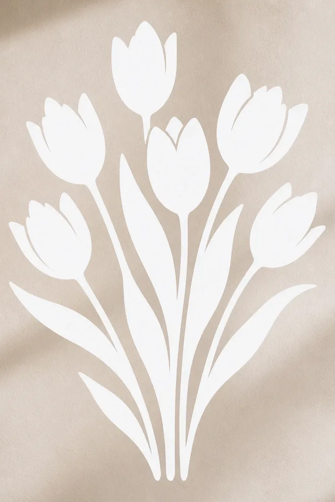
Negative space makes your tulip petals look graphic and modern. I start by coloring the background lightly, then I draw tulip petals by erasing or reserving the petal shapes so they stay white. This is a great option if you struggle with shading because the contrast does the work. It flatters clean, minimal holiday looks and also works for spring because you can keep the palette airy. If you use deep green or navy background, the white petal shapes feel wintery without any added icons.
Step 1: Choose a background color wash like pale teal or light navy and apply a light even layer across the page. Step 2: Lightly sketch tulip petal outlines on top, then erase the petal areas so they stay lighter than the background. Step 3: Add a thin outline around the erased petal edges using a colored pencil or fine pen so the shape reads clearly. Step 4: Add minimal shading only at the center fold with a darker version of your petal color, then finish with a small yellow-white center highlight.
Reserve the petal shapes from the start — don’t rely only on erasing after heavy pigment is dry.
Avoid heavy background saturation; it makes erasing look ragged.
20. Tulip Petal Edge Pattern Like Embroidery Stitches
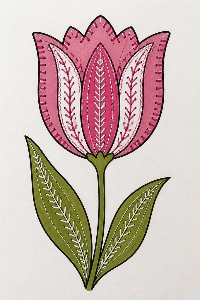
This style gives you that stitched craft vibe without needing a needle. I outline each petal and then add tiny stitch marks along the outer edge — consistent spacing makes it look intentional. The inside stays simple: just a crease shade and a light center highlight. This flatters people who want a handmade look for holiday labels and wrapping without sewing. It also photographs well because the stitch marks create texture that shows up in close-ups.
Step 1: Draw a tulip with three petal layers and ink the outer edges with a fine pen. Step 2: Add a dashed stitch border along the outer rim — each dash about 2-3 mm long with a 1 mm gap. Step 3: Shade the crease line with a darker pink or burgundy pencil, then blend lightly toward the petal tip. Step 4: Add a small white highlight near the inner fold using a gel pen and keep the rest of the petal mostly light.
Use the same pen for the stitch dashes and the outline so your line weight stays consistent.
Avoid random dash lengths; it looks like accidental pen marks.
21. Tulip Petal Bouquets in Mini Frames for a Seasonal Set
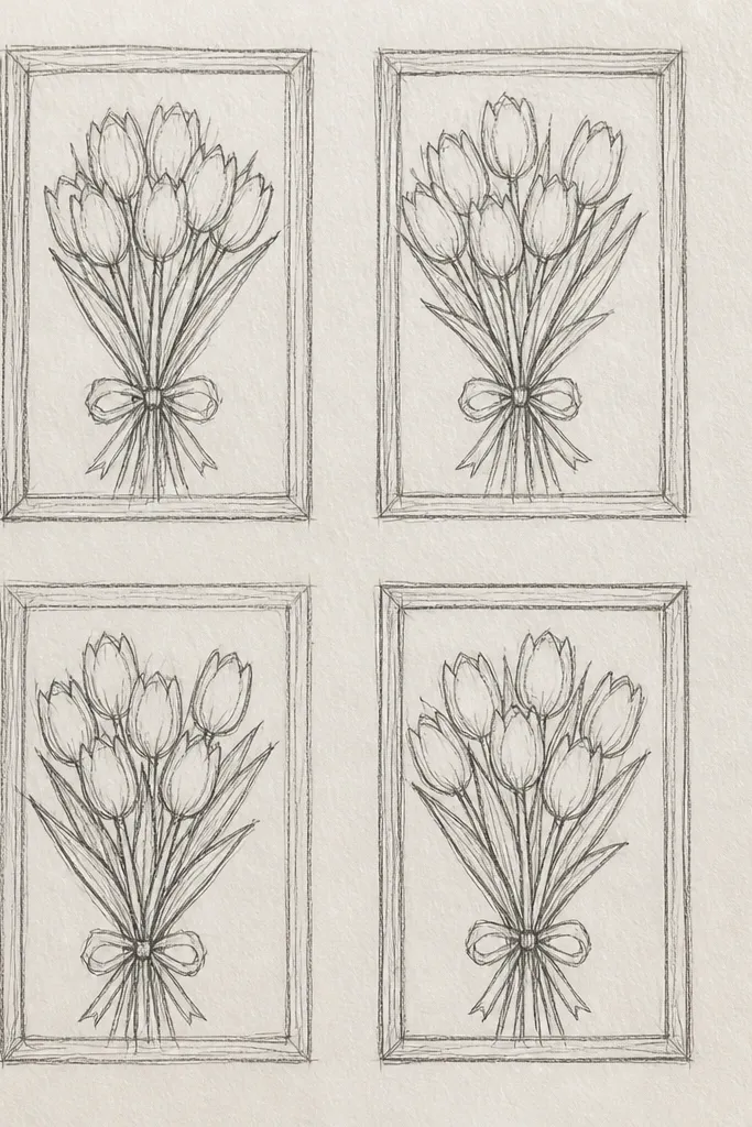
If you’re making a set for a wall or seasonal gifts, mini frames are the cleanest way to keep things cohesive. I draw the same tulip petal layering structure in every frame, then I change one palette per mini box. That gives you variety without chaos. The thin frame lines keep the pieces from bleeding into each other visually. This flatters anyone who likes a neat finish because you get ready-to-print or ready-to-cut sections. For holiday, you can mix spring colors with one deep burgundy palette to tie it together.
Step 1: On one page, draw a 3x3 grid of mini frames, leaving 1 cm gutters between frames. Step 2: In each frame, draw one tulip with three petal layers using the same proportions — outer petal biggest, inner petal smallest. Step 3: Ink the outer rim and crease lines consistently across all frames, then color each frame with a different palette: coral, peach, lavender, burgundy, cream, or pale gold. Step 4: Add a tiny center glow dot in every frame so they match even when colors change.
Keep your frame line color consistent, like dark brown, so the set looks like one collection.
Avoid changing petal structure per frame; that’s what makes sets look random.
22. Tulip Petal Banner Banner Flags for a Holiday Line
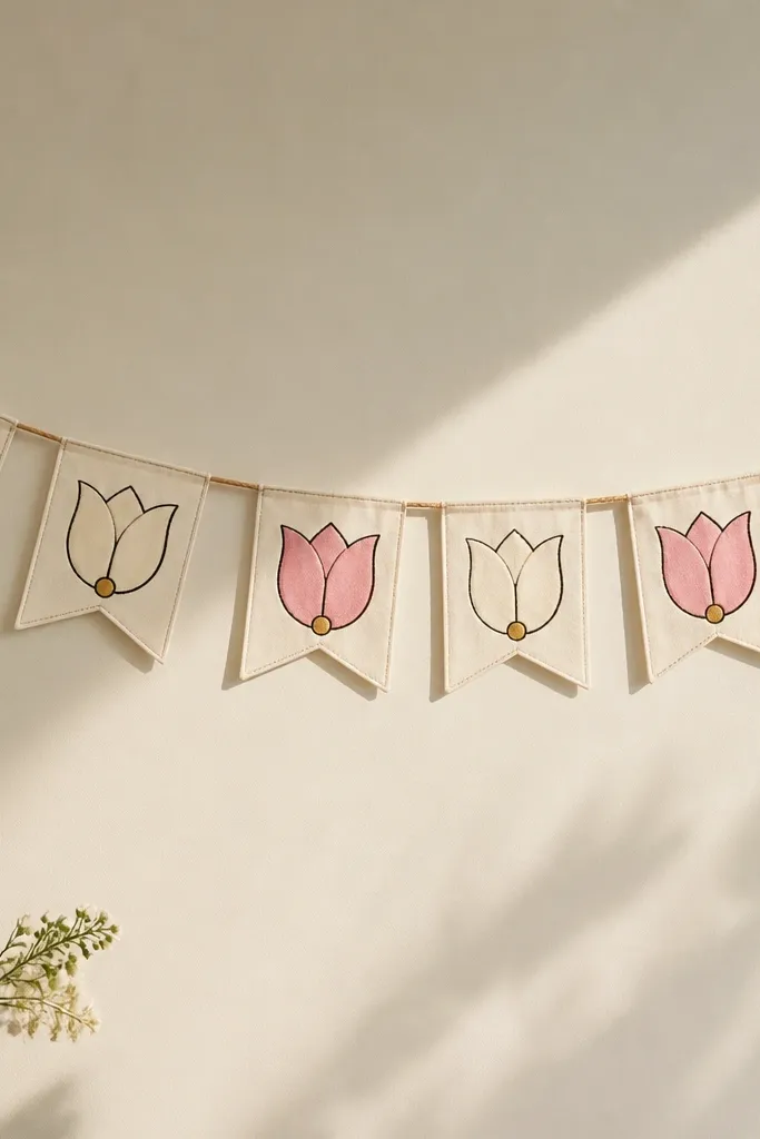
This is a practical drawing idea you can turn into actual decor. Flag banners look great above a mantel because they create a diagonal rhythm, and tulip petals are simple enough to repeat across multiple flags. I keep each flag motif small and centered, with one clear focal petal crease. The gold dot center makes it feel festive even without snowflakes. This flatters holiday setups because it adds color without competing with ornaments or lights. If your home decor is minimal, the clean outlines keep the banner from looking too crafty.
Step 1: Draw the banner string line across the page and sketch 8-10 flag shapes beneath it, each about 2.5-3 cm tall. Step 2: In every flag, draw a tulip petal motif with three layers and ink only the outer rim and crease lines. Step 3: Color alternating flags with pink and cream petals, and add a tiny metallic gold center dot on each tulip. Step 4: Shade the fold area lightly and leave the outer edges lighter for a clean, airy look.
If you plan to cut these out, draw on thicker paper and keep the outlines bold so they don’t disappear when cut.
Avoid full watercolor washes on tiny flags; they bleed and blur the motif.
23. Tulip Petal Spiral with Center Whorl Like a Rose Window
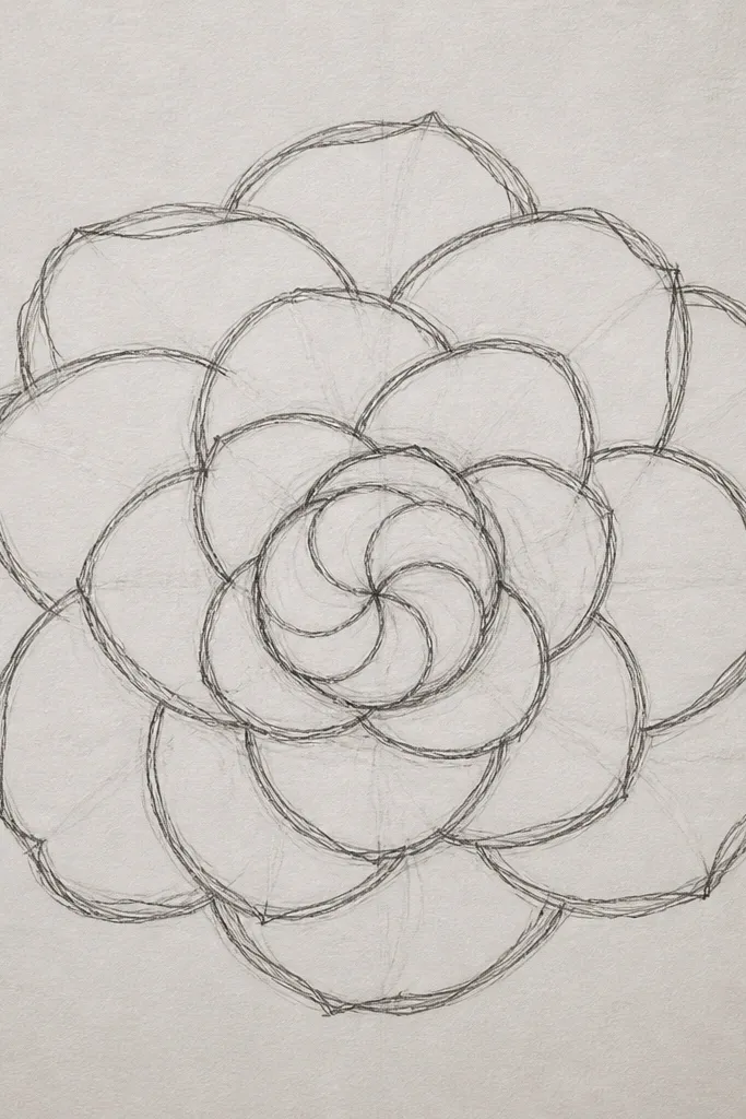
A spiral tulip petal design looks extra special because the eye follows the petal overlap inward. I use a rose-window feel by layering petal shapes like curved blades around a center whorl. The center glow is the brightest area, then the tones deepen outward so the spiral reads as 3D. This flatters anyone because symmetry isn’t required — the spiral direction does the balancing. For holiday, use deep reds and add a light gray background to mimic stained glass without the heavy black outlines.
Step 1: Draw a small circle center, then draw a larger circle boundary about 6-8 cm out. Step 2: Starting near the boundary, draw repeating tulip petal shapes that curve inward, each petal overlapping the previous one by about a quarter of its width. Step 3: Shade petals with a gradient: pale yellow near the center, then peach, then deeper pink toward the outer ring. Step 4: Add thin crease lines inside each petal with a lighter pencil so the fold shows without heavy shading.
Keep every petal tip pointing slightly toward the center for a consistent spiral look.
Avoid equal shading everywhere; the center must be lighter or the spiral won’t pop.
24. Tulip Petal with Leafy Negative Space and White Gel Highlights
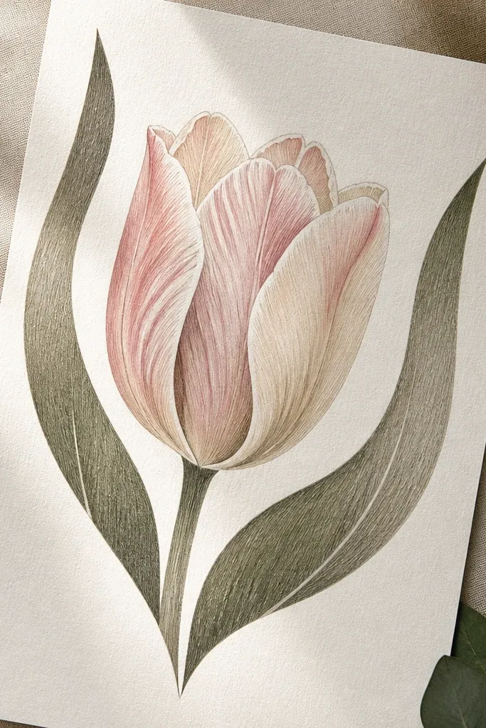
This design feels airy because the negative space is intentional, not accidental. I place simple leaf shapes near the tulip and leave them uncolored so they frame the petals. The white gel highlights on the petal edges and leaf veins make the whole piece look crisp and fresh. This flatters holiday and spring because it doesn’t rely on heavy seasonal icons. It also looks good in close-ups — the white highlights catch the light and make your drawing feel “clean” even if the shading is light.
Step 1: Draw a tulip with three petals in the center, then sketch two leaf shapes that overlap the lower sides of the tulip. Step 2: Shade the tulip petals lightly with muted pink, keeping the crease area darker. Step 3: Leave the leaf shapes mostly white, then add only a few light vein lines with a pale green pencil. Step 4: Finish with white gel pen highlights along the outer petal rims and one or two leaf veins for sparkle.
If your gel pen skips, warm it by rubbing the pen tip gently on scrap paper for 10 seconds.
Avoid coloring the leaf shapes too much; the negative space needs to stay clean.
25. Tulip Petal Drawing on Kraft Paper with Cream Gouache Centers
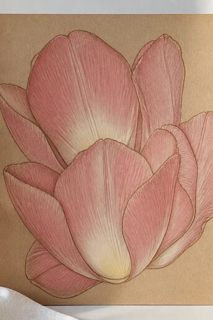
Step 1: Sketch your tulip petals lightly so you don’t dent the paper, then ink outer edges and crease lines. Step 2: Color petals with muted pink pencil, pressing a bit harder only at the crease. Step 3: Mix cream gouache (or white gouache plus a tiny bit of yellow) and paint only the inner center glow area, keeping the edges soft. Step 4: Add a final thin cream highlight line along one outer rim using the same gouache or a white gel pen.
Kraft paper changes everything. The warm brown background makes tulip petals feel cozy, which is perfect for holiday season gift wrap and tags. I outline with dark brown ink, then shade petals with muted pink colored pencil so they don’t look too bright against the kraft. The center glow gets cream gouache because pencil alone looks too dry on textured paper. This flatters warm-toned spaces and photos because the cream center reads like light reflecting off fabric.
Good to knowUse gouache sparingly; one smooth layer looks better than multiple thin layers.