1. Single Center-Vein Leaf (Clean Outline)
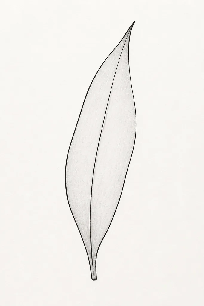
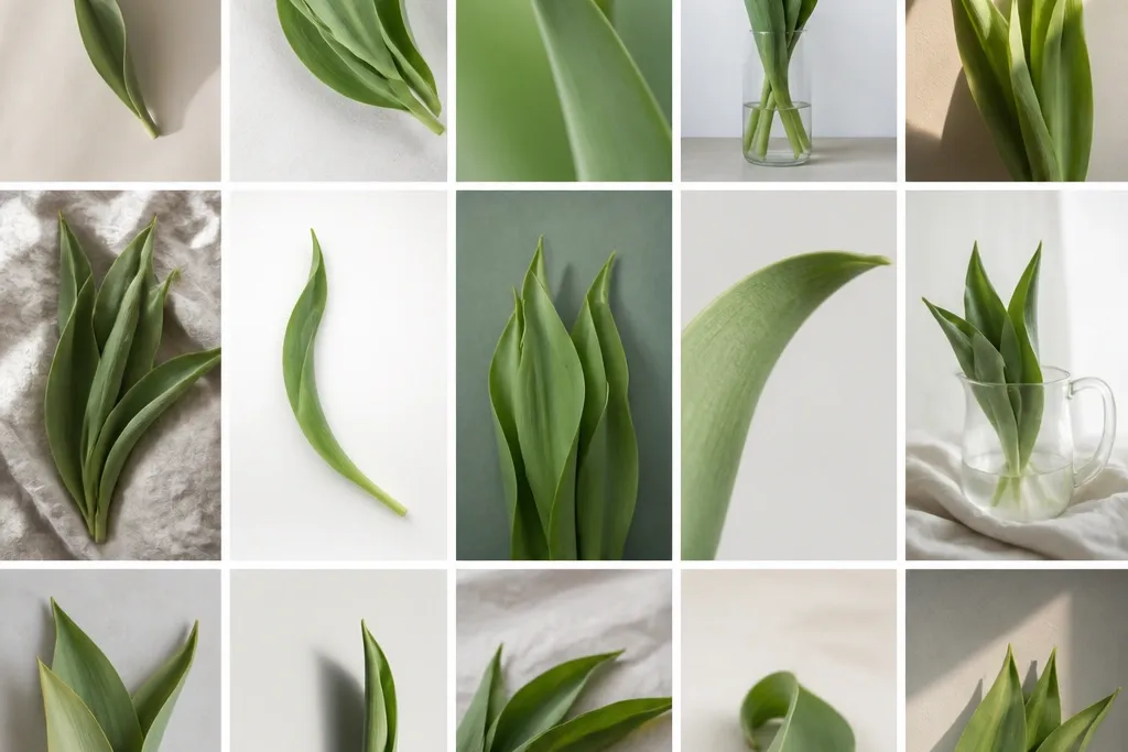
This leaf style is the quickest way to make tulips look “real” without overworking the page. You draw one long tapered leaf with a single center vein so the viewer’s eye has a guide line. I use it when the petals are busy or when the leaf is tucked behind a ribbon or greeting text. It flatters small compositions because it stays readable even at card size. It also works well for monochrome winter cards since the leaf reads crisp in plain black.
Start by sketching a teardrop-leaning silhouette: the base is wider and the tip narrows to a point. Add the center vein as one continuous line, slightly offset toward the leaf’s thicker side. Then trace a second outline pass lightly along one edge so it looks like the leaf has a front and a back. Keep the leaf height about 1.5 times the width of its base so it doesn’t look like a strip. Finish by erasing pencil marks and reinforcing the center vein with the ink pen.
Good to knowIf your leaf looks flat, darken only the outline on the side facing the light (usually the left edge in your drawing).
Common mistakeAvoid adding side veins when the leaf sits behind petals; it makes the whole card look cluttered.
2. Three Side-Veins Leaf (Balanced Detail)
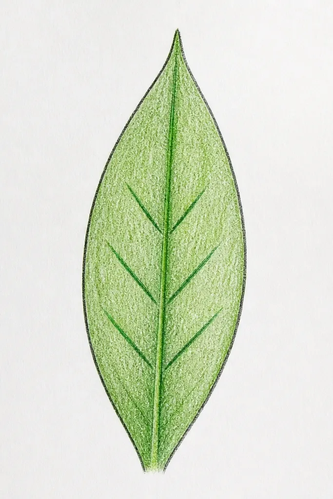
This is my go-to leaf when I want detail but not mess. Three side-veins on each side give structure so the leaf looks ribbed, but the interior stays simple enough for holiday layouts. It flatters medium-size drawings like a top corner cluster because the leaf reads clearly at a glance. The angled fan pattern also looks good in both portrait and landscape compositions. I use it for spring-to-early-summer sketches where the colors are soft and the line work needs to stay neat.
Draw the leaf silhouette first with a gentle S-curve — the tip should lean slightly away from the base. Add a center vein line from base to tip, then place three side vein marks on one side, each one shorter as it goes toward the tip. Repeat on the other side so the strokes mirror each other. Keep the side veins at roughly a 35-45 degree angle from the center vein. Finally, add a thin darker outline along the outer curve so the leaf edge pops.
Good to knowStagger the side veins: the middle stroke should start a bit lower than the top stroke so the ribbing looks natural.
Common mistakeDon’t make the side veins all the same length; that makes it look like a ruler-drawn leaf.
3. Curtain-Edge Leaf (Wavy Rim)
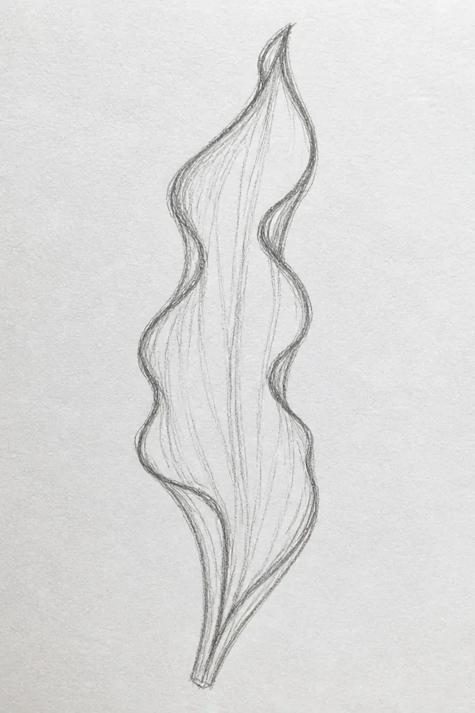
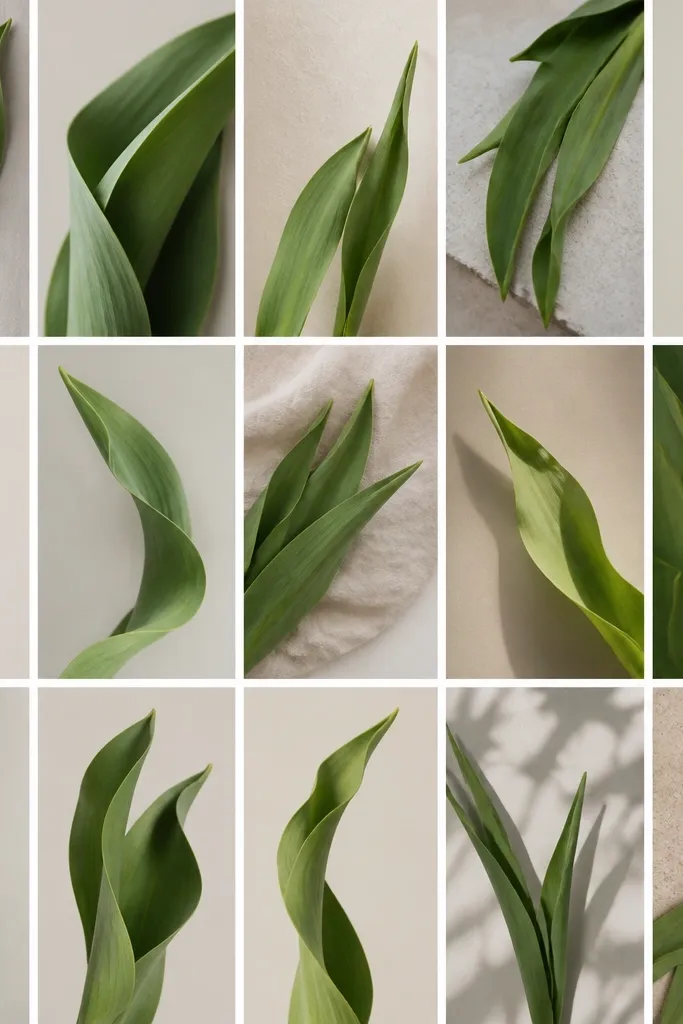
A wavy rim leaf adds motion to your tulips, especially when the stems are angled. I use this on cards where I’m going for a looser, hand-drawn look instead of crisp botanical accuracy. The wavy edge makes the leaves look softer and more playful, which pairs well with pastel petals and light backgrounds. It flatters compositions where leaves frame text, because the movement guides the eye around the message. If you color, this style looks great with a single pale green wash because the rim catches the light.
Start with a standard tapered leaf silhouette, then redraw the perimeter with small wave bumps. Keep the center vein straight and clean; the wobble should live in the edge, not the vein. Add two to three side veins on each side, but stop them short — about halfway to the tip. Then darken the wavy outline line slightly more than the center vein so the contour reads first. Draw a second leaf behind it with a smaller size so the front leaf becomes the anchor.
Good to knowColor the rim darker (even with a light pencil) and leave the center vein lighter to mimic highlight.
Common mistakeAvoid wiggling the center vein; if the vein swerves, the leaf loses its tulip identity.
4. Overlapping Leaf Layer (Behind-Petal Look)
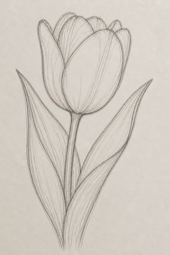
This idea solves the “why do my leaves look pasted on?” problem. Overlapping makes leaves feel like they grow from the stem, not like separate stickers. I draw the back leaf lighter so the front leaf reads as closer to the viewer. This style flatters layered tulip bouquets and wreath corners because it creates depth even with simple line work. It also works for cards with a focal tulip — the overlap frames the bloom without blocking it.
Draw the stem first as a gentle curve. Place the back leaf behind the stem line so it peeks out on both sides, using a lighter outline or lighter pencil pressure. Add the center vein and only one or two side vein strokes on the back leaf. Then draw the front leaf on top, slightly larger, with the full set of side veins (usually three on each side). Finish by erasing any pencil lines where leaves overlap so the edge separation looks clean.
Good to knowUse pressure control: press harder on the front leaf outline and lightly on the back leaf so the overlap feels natural.
Common mistakeDon’t outline both leaves equally dark; equal darkness kills the depth.
5. Ribbon-Bend Leaf (Diagonal Motion)
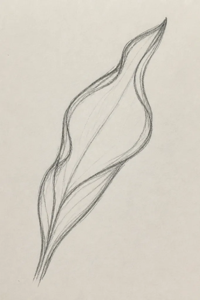
When you want your tulips to feel like they’re leaning toward the greeting, this leaf shape does it. The diagonal bend gives a “wind” feeling without turning the drawing messy. I use it in holiday cards where the composition is tight and the tulip leans into a corner. It flatters narrow spaces because the leaf stretches the eye along the card’s width. If you color, a ribbon-bend leaf looks good with a gradient pencil from base to tip.
Sketch the leaf silhouette with a diagonal tilt, keeping the base slightly thicker. Draw the center vein following the same diagonal curve so it looks aligned with the leaf bend. Add two side veins on the upper side and three on the lower side to create an asymmetrical rhythm. Keep side veins shorter near the tip so they don’t look like feathers. Outline the outer edge a touch darker, then add a final tiny tapered point at the leaf tip.
Good to knowMatch the leaf bend to your stem bend. If the stem is angled 30 degrees, aim for the same angle on the leaf silhouette.
Common mistakeAvoid making the diagonal bend too sharp; a 20-40 degree tilt looks natural, sharper looks cartoonish.
6. Fishtail Tip Leaf (Sharp End)
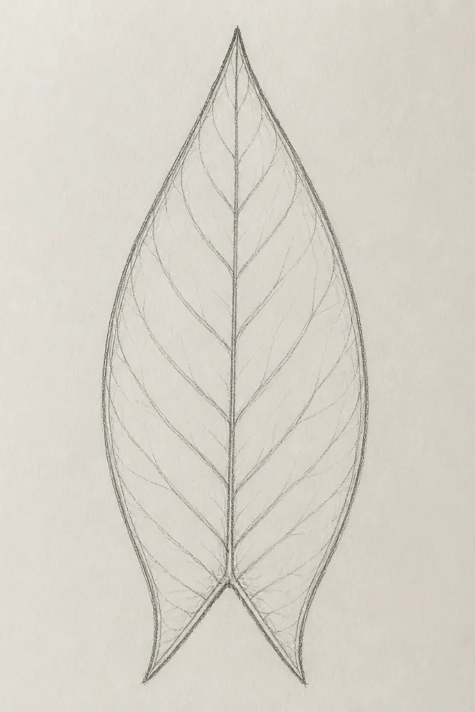
The fishtail tip gives a crisp, decorative finish that still reads botanical. I use it for tulip leaves when I’m drawing on craft paper or doing holiday tags where the design needs a clean edge. The split tip creates a little “spark” that looks good with metallic gel pens on the outline. It flatters cards with a bold border because the leaf tip echoes the border’s geometry. It also makes your drawing look intentional even if your petals are minimal.
Draw the main leaf silhouette with a tapered tip, but instead of ending in one point, make the last 8-10 mm split into two narrow points. Keep the center vein line continuous and let it run into the split, then stop the side veins about 1 cm before the split. Add three side veins on one side and two on the other so it feels hand-made, not symmetrical. Outline the fishtail edges with slightly darker ink and keep the inside lines lighter. If you erase, do it before you add the tip split in ink so you don’t smear.
Use a fine 0.3 or 0.5 gel pen for the tip split; thick lines make it look like a fork.
Avoid splitting the tip too wide; it should look like a narrow fork, not a wide V.
7. Leaf With Accent Vein (Highlight Line)
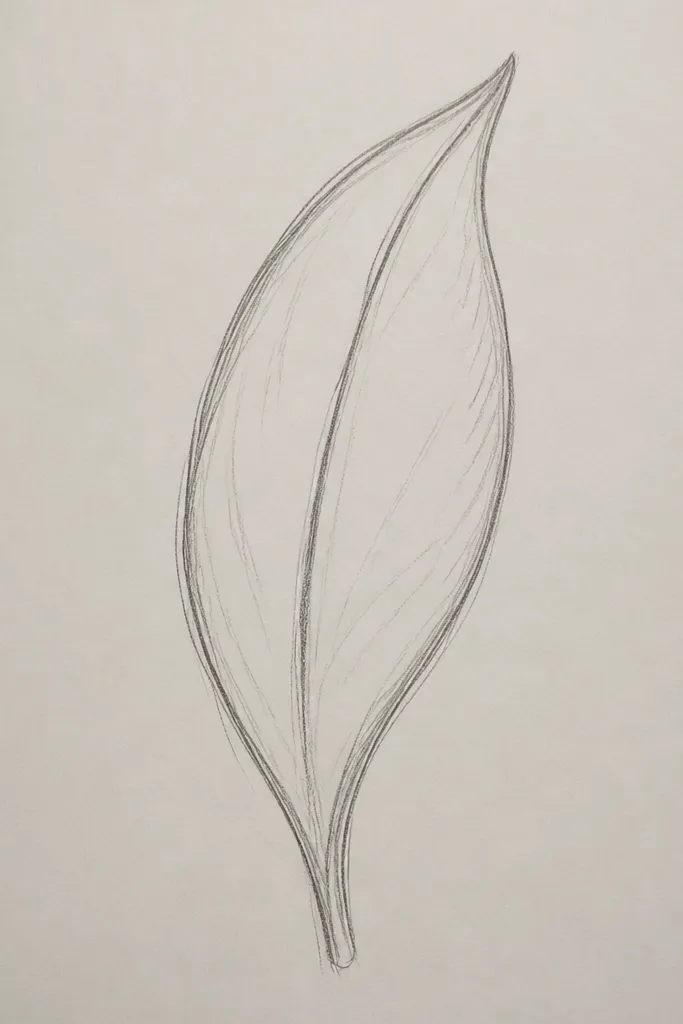
This is a trick I learned after coloring too many leaves and realizing line work can do the depth. The accent vein makes the leaf look rounded, even when you don’t color. I use it for monochrome ink drawings on white cardstock because the highlight line catches attention without adding color mess. It flatters clean, modern card styles and it works great for holiday line-art ornaments. If you like a minimalist look, this gives dimension with one extra line.
Start with a standard tapered leaf silhouette and draw a center vein in darker ink. Then, choose one side (I pick the left edge) and draw a second thin line parallel to the center vein but closer to the outer edge. Add 2-3 side veins that intersect the accent vein so the interior looks connected. Keep the accent vein lighter — use pencil first, then ink only the ends if you want. Finally, reinforce the outer leaf edge with one smooth dark stroke.
Good to knowMake the accent vein start thinner at the base and fade as it approaches the tip so it looks like a highlight, not another rib.
Common mistakeDon’t add the accent vein on both sides; the leaf turns into a striped leaf instead of a tulip leaf.
8. Double Leaf Fan (Wreath Corner Pop)
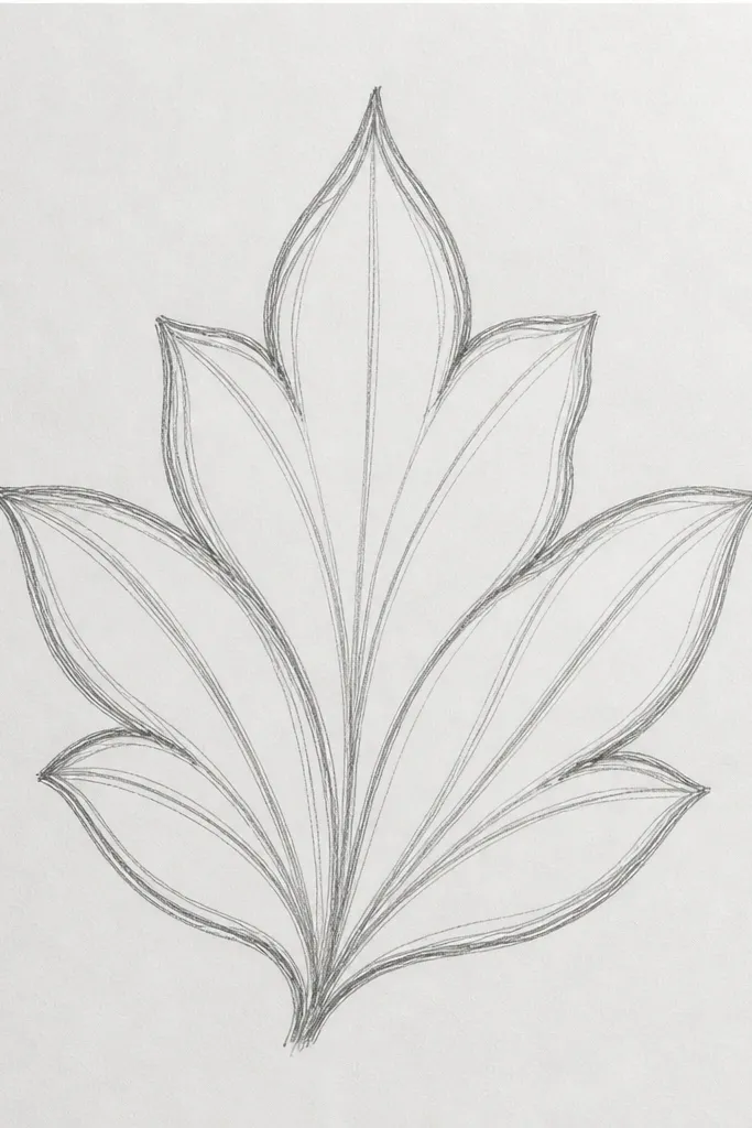
A fan arrangement makes leaves feel like they belong to a wreath, even when your tulips are spaced far apart. I use this at corners because it fills empty space without covering the main elements. The fan shape also creates a natural frame for a bow or a single tulip bloom. It flatters balanced compositions because it spreads weight outward while keeping the center clean. For holiday cards, it pairs well with red petals and gold ink highlights on the leaf edges.
Draw an invisible center direction line toward your corner. Place the first leaf slightly above that line, then the second leaf below it so the bases overlap at the same point. Keep both leaves tapered and add center veins in the same direction. Add three side veins on each leaf, but vary the spacing: one leaf has tighter spacing near the base, the other has wider spacing. Outline both outer edges darker, then erase any pencil overlap lines so the fan looks layered cleanly.
Good to knowIf you’re short on space, shorten the leaves but keep the fan angle wide; the angle reads even when the length doesn’t.
Common mistakeAvoid drawing the fan too symmetrical; a tiny difference in tip angle makes it look hand-drawn.
9. Leaf With Speckled Texture (Ink Dot Vein)
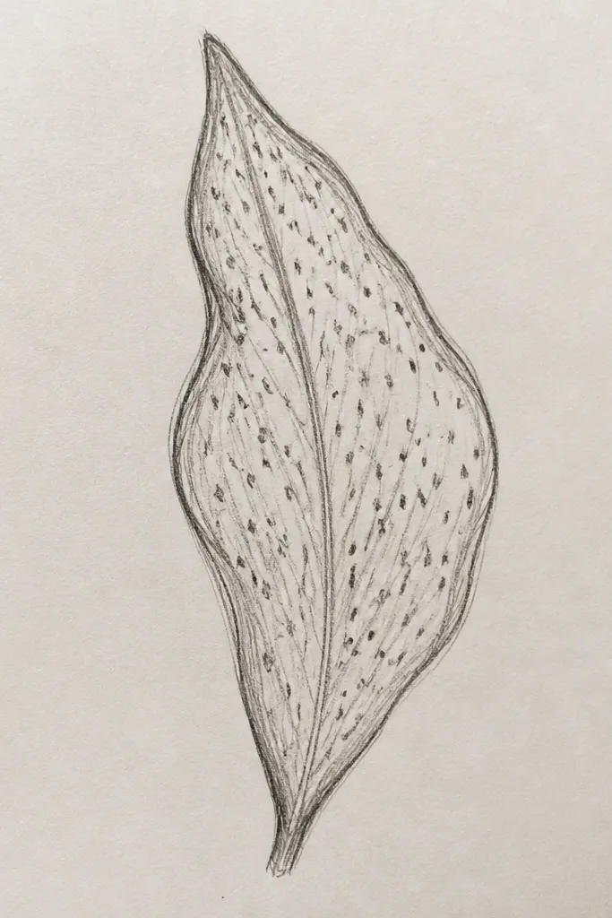
Texture is what makes this leaf feel festive when you’re doing seasonal cards. Instead of solid interior lines, you use dot clusters to suggest ribbing and surface grain. I like it for kraft paper, where solid black lines can look too harsh. It also flatters holiday palettes like terracotta, forest green, and warm neutrals. The dot method makes the leaf look layered without extra coloring steps.
Draw the leaf silhouette in pencil first, then ink the outer edge with a smooth line. Add a center vein made from small dots rather than a continuous stroke; think of it as a dotted rail. Place side veins as 2-3 dot lines that meet the center vein near the base and fade out toward the tip. Add 3-5 extra dots along one outer edge to suggest texture. Finally, lightly erase pencil marks and keep the dot density higher near the base where the leaf is thicker.
Good to knowUse a gel pen or fine brush pen that holds a little ink — dry pens make dot veins look scratchy.
Common mistakeAvoid overdoing speckles across the whole leaf; keep them mostly along one side and the veins.
10. Watercolor-Edge Leaf (Bleed Effect)
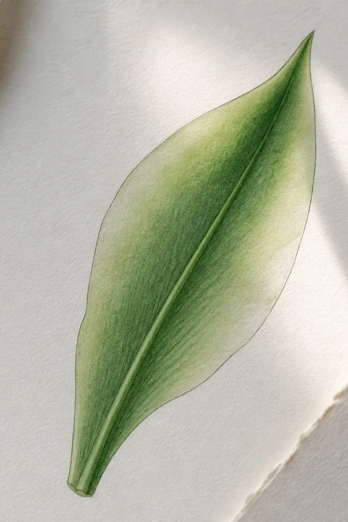
This leaf style is for when you want color without filling every rib. The key is leaving the center vein and a stripe near one edge slightly lighter so the watercolor looks like it’s sitting in the paper fibers. I use it for spring and early summer holiday cards where you want a soft, airy look. It flatters lighter skin tones on printed faces because the leaf color stays gentle and doesn’t overpower. If you like a hand-painted vibe, this one gives it fast.
Draw the leaf silhouette and center vein in pencil, then lightly ink the outline. Mix a simple green wash: start with a medium green, then water it down for a lighter tone. Brush the lighter wash first across the leaf body, leaving the center vein area slightly unpainted. Then add a deeper green along one edge and let it feather outward with wet-on-wet. Finish by re-darkening the center vein with a thin green or diluted black and adding 2-3 faint side veins.
Good to knowUse cold-press watercolor paper if you can; the bleed looks intentional instead of muddy.
Common mistakeDon’t paint the whole leaf the same darkness; flat fill makes it look like a sticker.
11. Holiday Bow-Loop Leaf (Stem-Linked Curl)
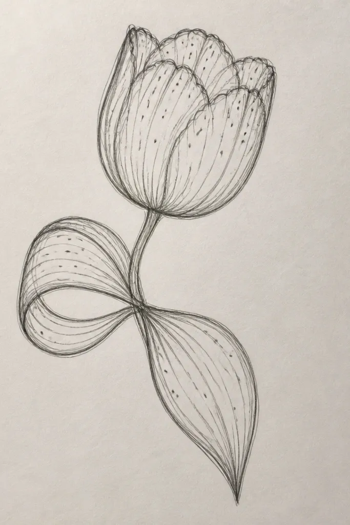
This leaf shape is built for ribbon-and-bow compositions. Instead of a straight leaf, it curls near the bow loop so it visually ties the ribbon to the tulip stem. I use it on gift tags and ornaments where the bow is the main element and the tulip is secondary. The curl gives a sense of motion and makes the drawing look “done” even with few lines. It flatters darker backgrounds because the curl creates a clear outline silhouette.
Draw the stem curve where the leaf will attach. Sketch a tapered leaf shape that curls at the tip into a small loop near the bow, keeping the base connected to the stem line. Draw the center vein following the curve, then add side veins that curve with it — keep them shorter on the inside of the loop. Outline the outer edge darker and leave the inner edge lighter. If you’re adding a bow, place the leaf so it partially overlaps the bow tail for a layered look.
Good to knowKeep the loop small: the curl should fit within a circle about the size of your thumbnail so it reads as a leaf, not a swirl.
Common mistakeAvoid making the loop too tight; tight curls can look like a vine decoration instead of a tulip leaf.
12. Two-Leaf Split From One Base
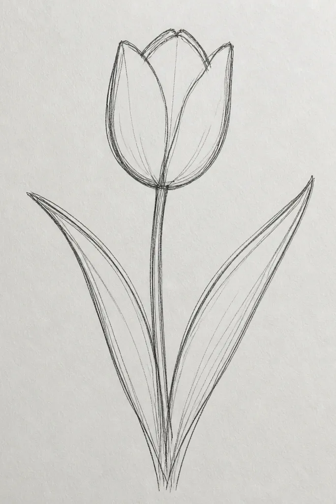
This is one of the quickest ways to fill space around a tulip bloom. When two leaves split from one base, your plant looks fuller without adding more flowers. I use it for holiday cards where the tulip head is small and needs supporting foliage. It flatters vertical layouts because the leaves create a natural X-like structure around the bloom. It also looks good with limited line work because the split itself is a strong shape.
Start with a small stem junction point and draw two tapered leaf silhouettes from that same base. Make one leaf slightly longer and the other shorter so the pair doesn’t look like mirrored twins. Add a center vein to both leaves, then include side veins on the longer leaf (3-4 total) and fewer side veins on the shorter leaf (2-3 total). Outline the outer edges darker, especially the leaf that faces forward. Erase pencil lines at the junction so the split looks clean and not messy.
Good to knowPick one leaf to be the “front” leaf and keep its outline darker; it makes the whole cluster look intentional.
Common mistakeAvoid equal-length leaves with equal line weight; it turns into a generic leaf pair.
13. Leaf Border Repeat Strip (Pattern Band)
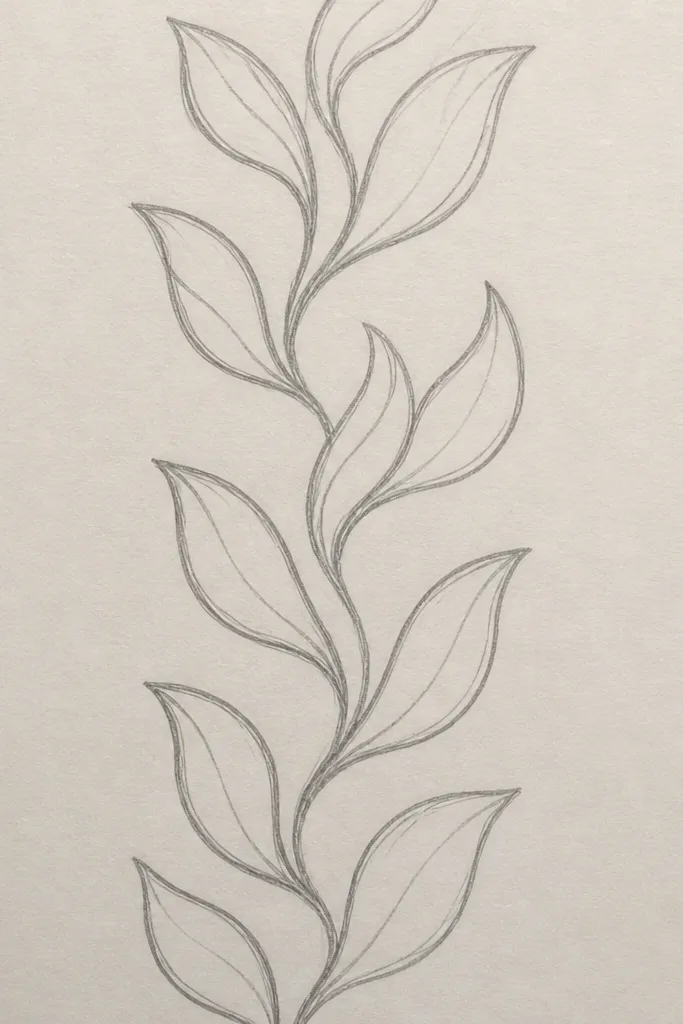
If you’re making wrapping paper style panels or card borders, a repeat strip is the fastest way to look “designed.” Alternating leaf angles keeps the band from looking like a single stretched shape. I use this for holiday labels and envelope liners because it reads clean and consistent. It flatters busy backgrounds since the leaves are line-based and don’t require full coloring. The center-vein repeat also makes the pattern look cohesive from a distance.
Draw a baseline guide where the leaf bases sit. Create your first leaf at one angle (leaning right), add center vein and three side veins, then move over about one leaf width. Repeat the leaf but flip the angle for the next one (lean left) so the tips alternate up and down. Keep the leaves consistent in size so the border rhythm feels even. Finish by darkening every third leaf outline slightly so your pattern has a subtle pulse.
Good to knowMake the overlap tiny: let each leaf base touch the next leaf base so there are no gaps.
Common mistakeAvoid random spacing; uneven spacing makes the border feel handmade in a bad way.
14. Ink Wash Outline Leaf (Dark Edge + Light Fill)
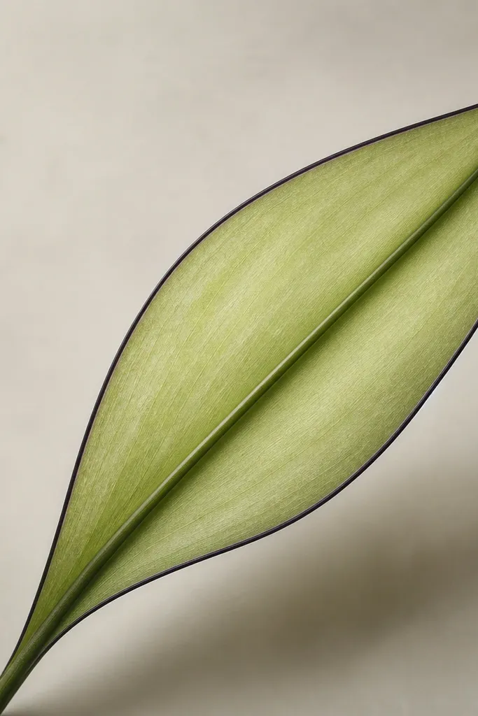
This is the “I want it to look finished fast” leaf. The bold edge gives structure, and the light fill keeps it airy. I use it when I’m drawing on colored cardstock where a pure white background isn’t available. It flatters darker paper because the outline anchors the shape and the wash adds a gentle green glow. The center vein gets extra attention so the leaf reads as tulip foliage instead of generic greenery.
Outline the leaf silhouette with a fine black pen or brush pen, keeping the outer contour smooth. Mix a pale green wash and apply it lightly inside the outline, leaving the center vein area slightly paler. Then add the center vein in a slightly darker green or diluted ink and reinforce it twice for contrast. Add two to three side veins on each side using the same darker green but keep them faint. Let it dry fully before you erase any pencil marks.
If your wash dries patchy, add the darker center vein last — it hides unevenness better than trying to fix the fill.
Avoid fully coloring to the edges with the same darkness; it makes the leaf look like a filled sticker.
15. Mini Leaf Accent (Tiny Detail for Clusters)
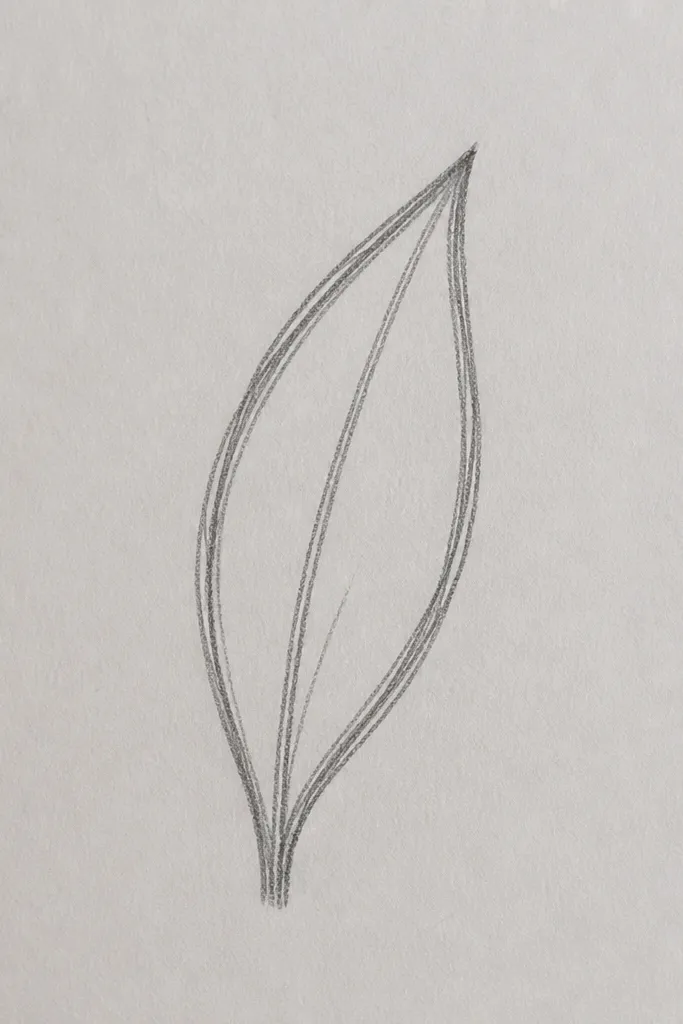
Mini leaves are the finishing move when your tulip drawing feels slightly empty. They don’t need full interior detail because the purpose is spacing and balance. I use them around the main tulip head, especially near the stem bend, to make the cluster look intentional. It flatters small ornaments and narrow greeting cards because the scale stays consistent. This style also helps when you’re using watercolor petals and don’t want extra wet textures competing with the petals.
Draw the tiny leaf silhouette first: keep it about a third of the main leaf size. Add a center vein line and then one short side vein stroke on the outer edge side. Repeat 3-5 mini leaves around the main stem bend, spacing them so tips don’t collide. Outline the tiny leaves with a slightly thinner pen than your main lines so they don’t overpower. Finally, if you color, keep mini leaves uncolored or use only a light green pencil so they stay secondary.
Place mini leaves in clusters of two or three rather than scattering single leaves everywhere.
Avoid making mini leaves the same size as the main leaf; that breaks the hierarchy.