1. Blush rose cluster in a warm ivory mat
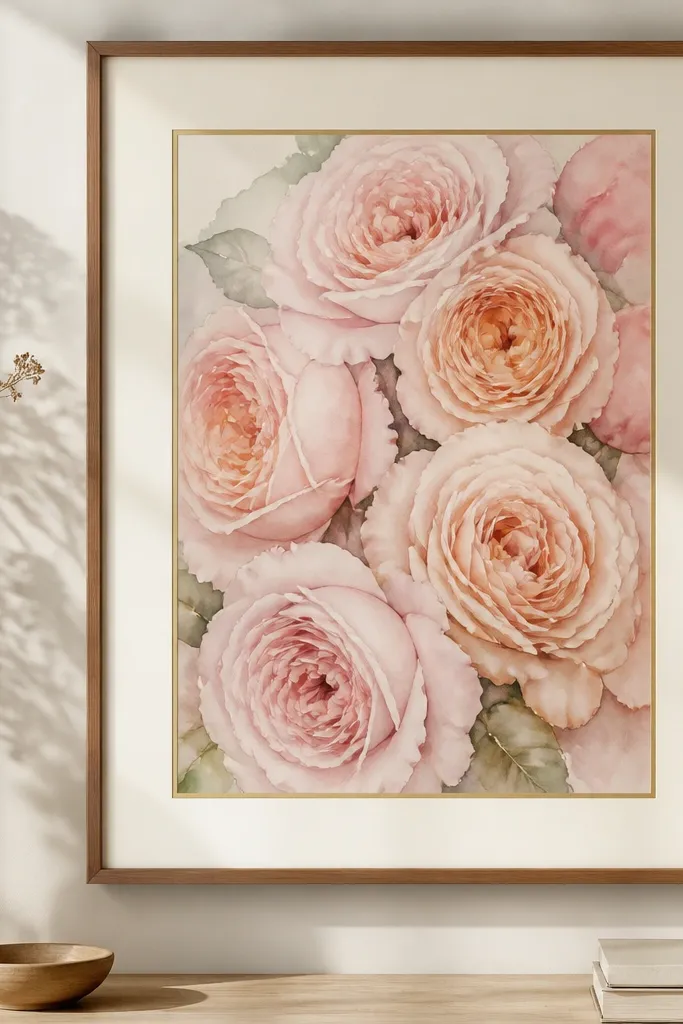
This style works because the flowers are packed close together, so the watercolor wash reads as one unified mass. I like it for people with warm undertones because blush and peach make skin look even and fresh in photos. The warm ivory mat keeps the print from looking washed out, especially if the wall has cool lighting. Use it when your room already has neutrals like oatmeal, beige, or taupe - the print adds color without shouting. The styling principle here is contrast control: the mat should brighten the flowers, not compete with them.
Start by centering the print so the bouquet sits in the middle third of the mat. Choose a warm ivory mat that is 1.5 inches wide and add a thin gold inner line if your frame shop offers it. Use a thin warm wood frame, around 1 inch wide, so the print stays the star. Hang it at eye level, then place a second print beside it that has similar blush tones, even if the flower type changes. Finish by keeping the wall around it light - I've used white or very pale greige paint to make the watercolor glow.
Good to knowIf your print has a lot of pale pink, add a gold inner line. It makes the wash look intentional instead of flat.
Common mistakeAvoid bright white mats - they make blush watercolor look chalky.
2. Peony bouquet with dusty mauve edges
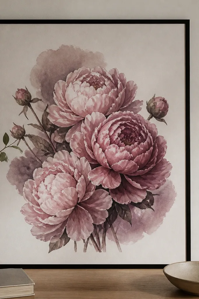
Dusty mauve peonies bring a slightly romantic, moody feel without going dark. I've used this look in rooms with olive or charcoal accents, and it ties everything together because mauve sits between pink and brown. It's flattering on medium to deep skin tones in photos because the petals echo the warmth in skin undertones. The watercolor edge behavior - those mauve shadows and petal fades - is what makes it look expensive. The principle is "soft darkness": you want one deeper color in the print so the rest of the room can stay simple.
Frame this print in a black frame with a mat that matches the mauve - not a literal purple, but a light smoke tone. Keep the mat width to about 1.25 inches so the bouquet stays close and lush. If you add a second print, pair it with something that has similar dusty pink shadows, like a rose-and-eucalyptus watercolor. Hang the set with a slight stagger: one print flush at eye level, the next 2-3 inches higher to create a gentle rhythm. Use warm bulbs or lamps nearby since cool blue lighting can turn mauve gray.
Good to knowAdd a small brass wall sconce near the gallery. Brass warms mauve and keeps the watercolor looking dimensional.
Common mistakeDon't pair dusty mauve with bright neon frames - it turns the print into a costume.
3. Trailing wildflowers with sage green wash
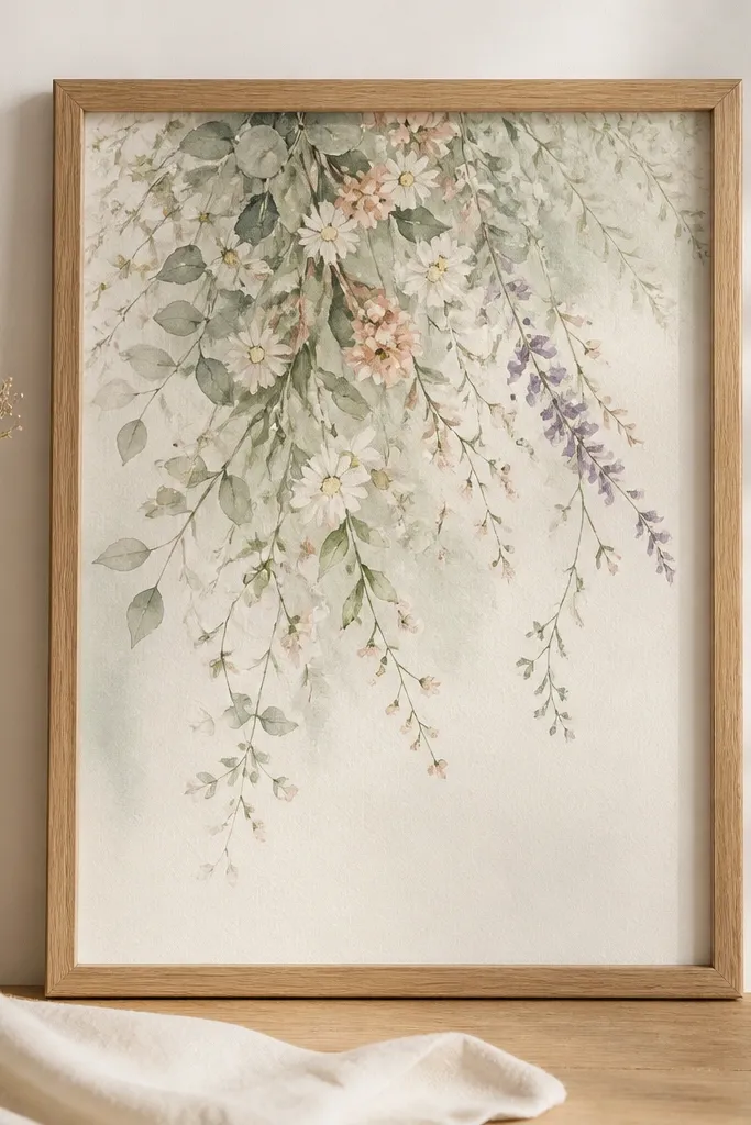
Trailing wildflowers look airy because the composition moves diagonally from top left to bottom right. Sage green wash makes the whole print feel like fresh air, and it works especially well if your decor has linen, natural baskets, or light wood. This style flatters lighter skin tones by keeping the palette soft and not too saturated. It also photographs well because the greens give the camera something to focus on besides pink petals. The principle is motion: you want diagonal elements to guide the eye across your wall.
Choose a natural oak frame and a 1.5-inch mat in warm white. Place the print so the trailing end hangs slightly closer to the bottom - don't center it perfectly if the bouquet naturally drifts lower. Add one coordinating print next to it with a similar leaf wash, even if the flowers are different. If you're hanging multiple, keep the spacing consistent at about 2 inches between frames. Style the wall with one texture item nearby, like a woven lamp shade or a linen runner, so the sage feels grounded.
Good to knowUse matte glass if you can. It reduces glare and keeps the sage wash looking smooth.
Common mistakeAvoid glossy frames - they reflect light and make the watercolor look flat.
4. Sunlit yellow daisy bouquet on cream paper
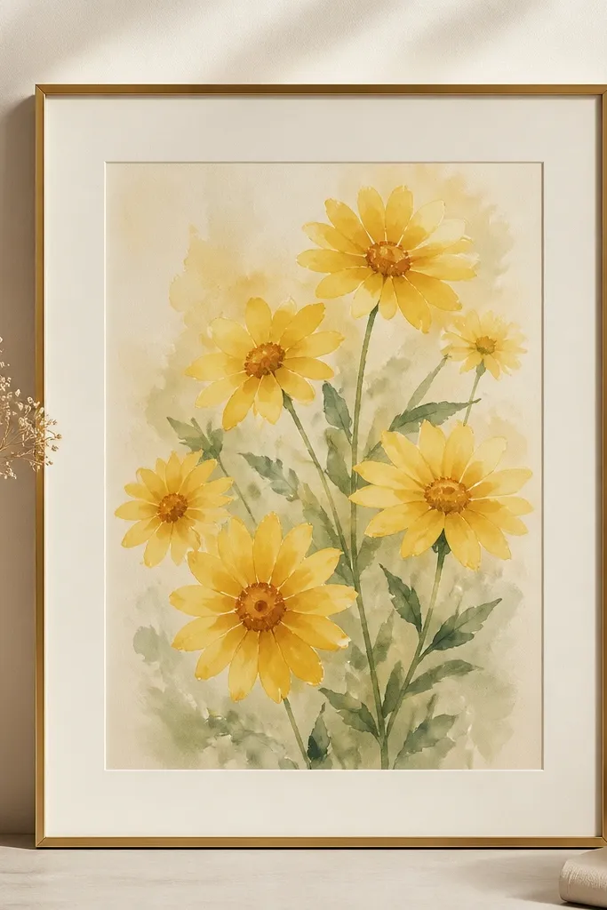
Yellow daisies are the fastest way to make a room feel cheerful without adding clutter. Cream paper matters here - it keeps the yellow from going lemony and harsh. I've used this print in entryways where coats and bags can make the space feel busy, and the watercolor instantly makes it look clean. It's great for most skin tones because the warm yellow mirrors natural warmth. The styling principle is "bright accent with soft edges": let the flowers be the punch, but keep the frame and mat light so it doesn't feel loud.
Use a thin brass frame and a cream mat that matches the paper tone closely. Mat width should be 1.25-1.5 inches so the daisies have breathing room. Hang it slightly above eye level if your hallway is narrow - about 58-60 inches to the center. Pair it with a second print that has either soft greens or muted blush so the yellow doesn't look alone. If you have a shelf nearby, add a small ceramic vase with real greenery so the watercolor palette continues in 3D.
Good to knowIf the print has tiny speckles, wipe the glass with microfiber before framing - dust makes speckles look messy.
Common mistakeDon't use a white frame - yellow against stark white can look like a sticker.
5. Orange ranunculus with terracotta undertones
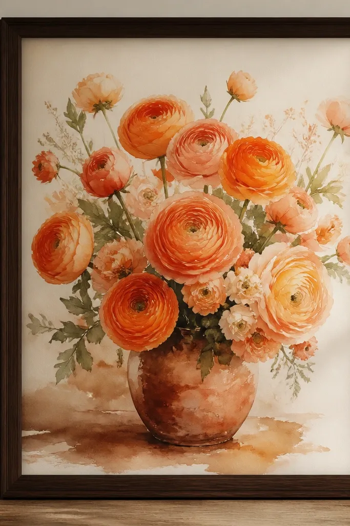
Ranunculus prints with terracotta undertones pull fall energy into your space without switching to heavy autumn art. I've done this in October on a gallery wall and it instantly made the room feel warmer, even before I changed pillows. The orange-apricot range is flattering on medium and deep skin tones because it reads like golden light. The terracotta shadow gives the bouquet weight, so it doesn't float away from the wall. The principle is seasonal warmth: you're adding one warm family to your palette, then repeating it in small decor choices.
Frame it in dark walnut or espresso wood for a grounded look. Use a mat in light oatmeal (not beige-yellow) with 1.5 inches width. If you're hanging a set, place this piece as the anchor in the center and surround it with cooler prints like mauve or sage. Keep the frame line consistent across the set; even if the colors change, the borders should match. Style nearby with a small terracotta bowl or a rust candle holder so the print feels connected, not random.
Good to knowMatch the mat color to your flooring, not your paint. Flooring tones show up in reflections on the glass.
Common mistakeAvoid gray mats - they make terracotta look dull.
6. Cottage bouquet with tiny blue forget-me-nots
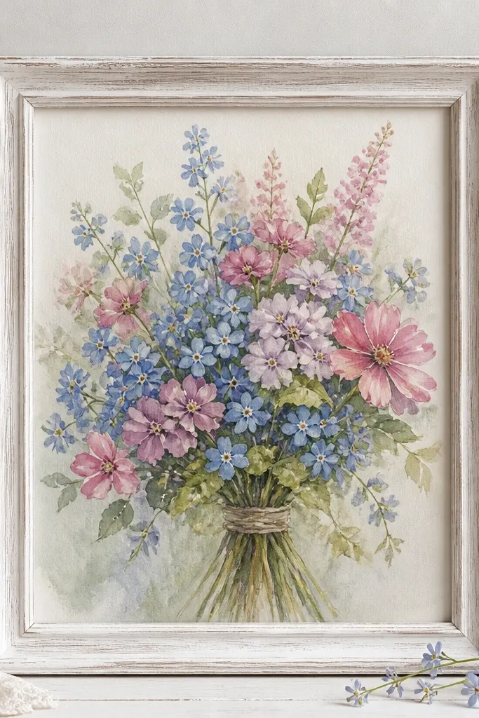
Blue forget-me-nots give a cottage feel, and watercolor keeps the blue gentle instead of icy. This is the print I reach for when the room has farmhouse textures - distressed wood, cream curtains, or chunky knit throws. It flatters cool undertones because the blue sits cleanly next to pink blooms. The key is that the blue is small and scattered, so it reads as a detail instead of a dominant color. Principle: use micro-accents to make a bouquet feel lived-in.
Choose a whitewashed frame and a 1.25-inch mat in soft cream. Keep the placement slightly off-center if the bouquet has a loose, hand-tied look - I usually align the main bloom group about 2 inches above center. Pair it with one print that has similarly small scattered elements, like tiny daisies or sprigs. Hang the set with even vertical alignment so the blue details don't "sink" visually. Finish with one decor item that echoes the blue tone, like a ceramic vase with a dusty sky glaze.
Good to knowUse a thin antireflective glass sheet if your wall gets direct light. Blue details wash out with glare.
Common mistakeDon't put this in a glossy black frame - the blue can look harsh.
7. White lily bouquet with soft gray shading
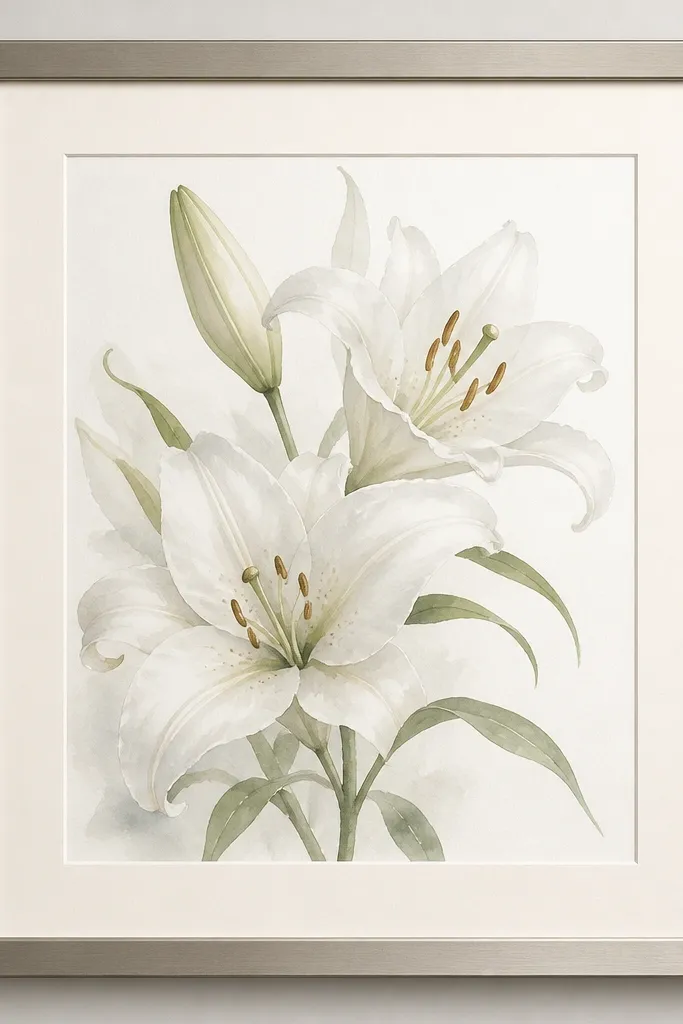
White lily watercolor looks clean, but the gray shading is what makes it feel real. I like this for bathrooms, hallways, and bedrooms because it reads fresh even when you don't change decor often. It's flattering for almost anyone because whites and pale greens don't compete with skin tones in photos. The gray shading gives depth without adding heavy color, which means you can pair it with almost any other bouquet print. Principle: anchor your set with one near-neutral bouquet so the brighter prints have room to breathe.
Use a brushed nickel frame and a warm white mat with 1.5 inches width. Position the bouquet so the top lilies sit close to the upper mat line, leaving a little space at the bottom for the stems. If you add a companion print, choose one with pale green leaves or soft blush petals. Keep lighting warm - 2700K bulbs - because cool lighting can make whites look sterile. Style the wall with minimal decor: a simple wood tray or a single ceramic bud vase.
Good to knowIf your room has lots of white fixtures, match the frame finish to the hardware. It looks intentional without extra effort.
Common mistakeAvoid bright white mats - they can erase the gray shading that gives lilies dimension.
8. Rose and eucalyptus bouquet with deep green leaves
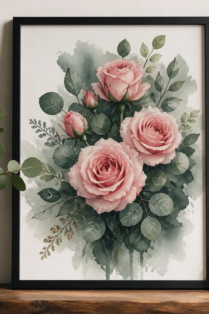
Eucalyptus leaves add structure, and watercolor makes that structure soft instead of sharp. This is my go-to for holiday season because deep green reads festive even before you add ornaments. It's flattering because the greens and pinks create a warm contrast that looks good in skin tones across the board. The watercolor technique here is layered washes - you can see leaves darker at the edges and lighter toward the center. Principle: build contrast with one deep color so the bouquet looks anchored on the wall.
Pick a matte black frame and a 1.25-inch mat in off-white with a hint of gray. Hang the print in portrait orientation at about 60 inches to the center. Pair it with a light bouquet like blush roses to keep the wall from feeling too heavy. If you're making a set of four, place this as one corner piece so the deep green balances the brighter prints. Style the surrounding wall with one plant or a dried eucalyptus bundle so the green repeats in real life.
Good to knowDust the eucalyptus bundle and keep it dry - the color fades fast if it's humid.
Common mistakeAvoid brown frames with deep green - the combination can look muddy.
9. Peach garden roses with watercolor splatter background
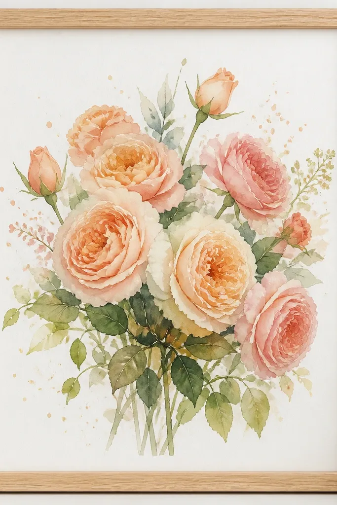
Splatter background prints look playful, and they work best when the frame is light and the mat is simple. Peach garden roses are forgiving - they hide minor misalignments when you hang a gallery. I've used this style in kitchens and breakfast nooks because it makes the space feel cheerful without turning it into a theme. The watercolor splatter adds texture, so the bouquet feels less like a flat sticker. Principle: pair "busy background" with "quiet frame" so the art stays readable.
Use a pale oak frame and a plain cream mat with 1.5 inches width. Keep the print centered and align the top bloom group to the same height as your other prints. If you're adding other pieces, choose ones with clean backgrounds - no splatter - so the wall has one texture moment. Hang at eye level and keep the spacing between frames consistent, about 2 inches. For styling, add a simple white vase or a ceramic jar - anything that doesn't have a busy pattern.
Good to knowIf the splatter looks too light in your lighting, tilt the framed print slightly outward on the wall so texture catches shadows.
Common mistakeDon't use patterned mats - they compete with the splatter dots.
10. Monochrome pink bouquet in a soft blush frame
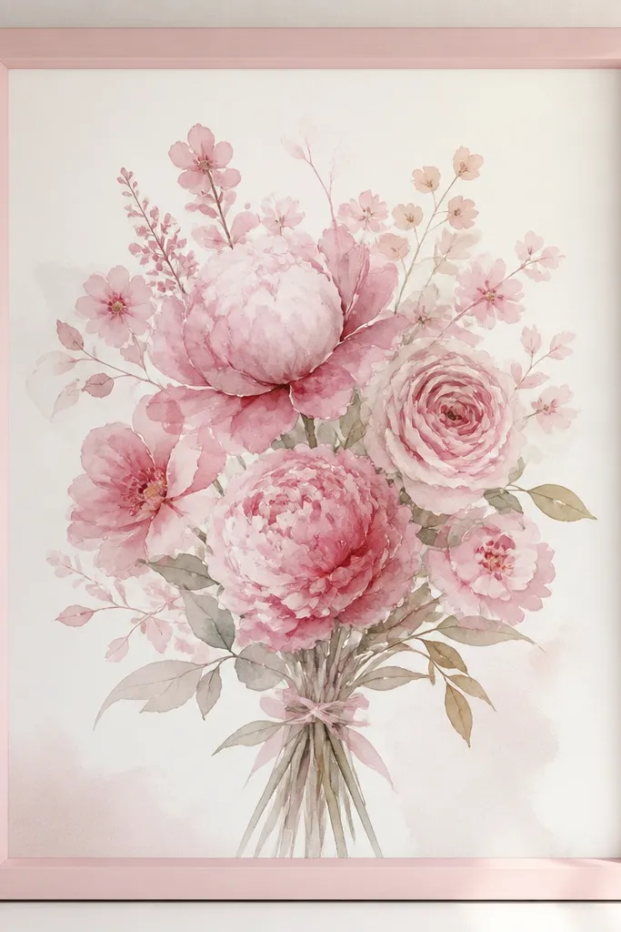
Monochrome pink prints look high-end because they rely on petal shape and wash variation instead of multiple colors. A blush-painted frame keeps it cohesive, especially in bedrooms where you want calm rather than contrast. This style flatters fair to medium skin tones by adding gentle warmth near your space. The watercolor wash should show light-to-dark transitions - you want petals darker at the base and lighter at the tips. Principle: keep the palette tight and let the watercolor do the work.
Choose a blush frame and a mat in warm white with 1.25 inches width. Keep the glass clean because monochrome prints show smudges more than colorful ones. Hang this as a single statement piece over a dresser or bed, or as the center of a three-print row. If you go multi-print, surround it with one neutral bouquet (white lilies) and one sage-leaf bouquet to balance the pink. Keep other decor colors muted: sand, cream, and soft gray.
Good to knowWhen you hang monochrome prints, use warm lighting - the pink looks less dusty under 2700K bulbs.
Common mistakeAvoid silver frames with monochrome pink - they make the pink look cold.
11. Champagne rose bouquet with champagne-gold accents
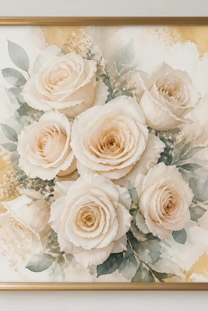
Champagne rose palettes sit between blush and cream, so they feel special without needing bold color. I've used this for holiday table moments because it matches both warm candlelight and neutral linens. It's flattering for all skin tones in photos because the colors are close to skin warmth. The watercolor effect is in the highlights - the petals look luminous instead of flat. Principle: use metallic frame tones that match the warmth in the print, not the cool shine in your furniture.
Use a champagne-gold metal frame and a cream mat with 1.5 inches width. Place the print so it's centered and upright, then add it to a gallery wall with only neutrals around it. If you're building a set, pair it with white lilies and sage eucalyptus for a three-piece grouping. Keep the wall color in a warm white or very light beige so the champagne doesn't look gray. For styling, add one gold-toned candle holder near the artwork, not a whole cluster.
Good to knowClean the frame with a dry microfiber cloth. Champagne gold shows fingerprints fast.
Common mistakeAvoid bright yellow-gold frames - they overpower champagne watercolor.
12. Lavender sprig bouquet with pale lilac wash
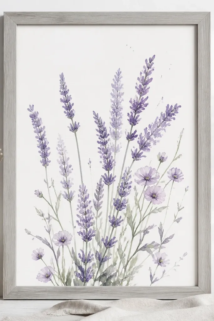
Lavender sprig watercolor looks best when it has breathing room in the composition. The pale lilac wash makes the print feel calm, and it looks great in rooms with light gray, pale blue, or white bedding. It flatters cool undertones because lilac sits cleanly next to skin without pulling too much warmth. The negative space matters - it makes the bouquet look lighter than the frame. Principle: let empty background be part of the design, not an accident.
Use a light gray wood frame and a 1.5-inch mat in off-white. Hang it with the center at about 59 inches so the negative space feels balanced above furniture. If you pair with other prints, choose ones with similar airy backgrounds - avoid splatter-heavy prints next to it. Keep the mat edges crisp and straight; a crooked mat makes pale art look messy. Style the wall with one simple textile like a light linen curtain or a minimal throw in pale blue.
Good to knowIf the print is very pale, consider using museum glass to reduce glare and keep the lilac readable.
Common mistakeDon't choose a dark mat - it shrinks the airy look and makes lavender feel heavy.
13. Red rose bouquet with watercolor bleed at the edges
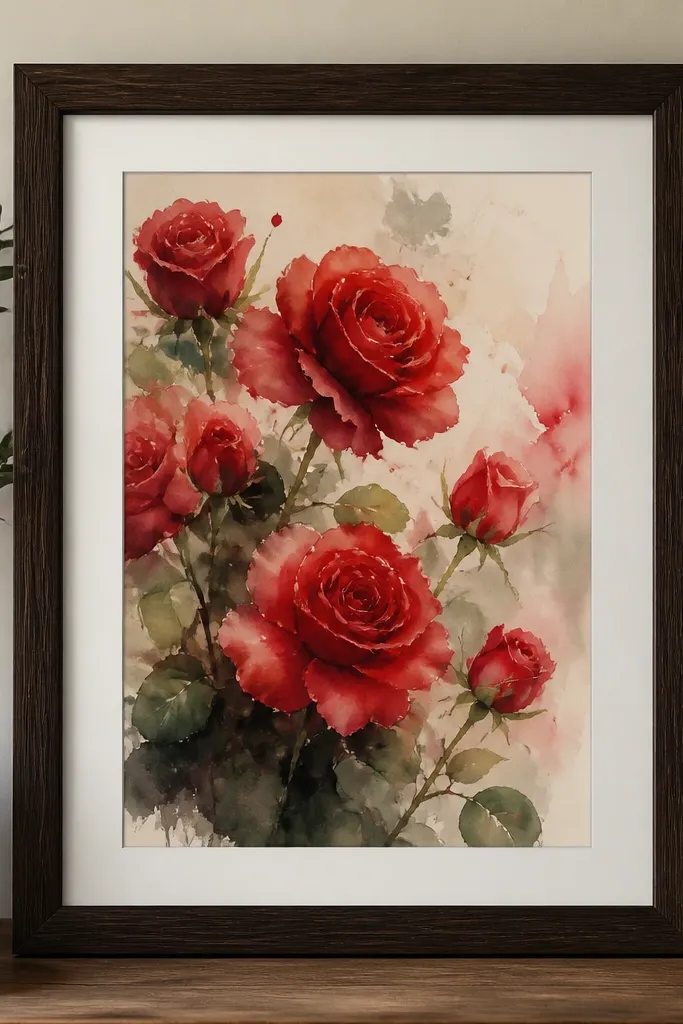
This print style looks dramatic because the red has that watercolor bleed - you can see pigment pooling and fading instead of hard outlines. I use it when I want one strong color point on a gallery wall. It's flattering because deep reds create contrast that looks good next to warm neutrals and also makes skin look richer in photos. If your room has beige, cream, or tan furniture, this red will pop without needing more color. Principle: anchor the set with one high-saturation piece, then surround it with lighter bouquets.
Frame the print in deep espresso wood and use a mat in warm off-white with 1.25 inches width. Put this piece slightly lower than the others by 1-2 inches so the red doesn't feel top-heavy. If you're doing a four-frame grid, place it in the center-left or center position. Pair it with blush rose or white lily prints so the red reads as a focal point. Style nearby with a simple dark ceramic vase or a single red berry branch if it's seasonal.
Good to knowAvoid direct overhead glare - red watercolor shows reflection. Use a lamp or diffused lighting in the room.
Common mistakeDon't use a black mat with red roses - it can make the watercolor look like it's trapped.
14. Garden bouquet with mixed florals and blue ribbon bow
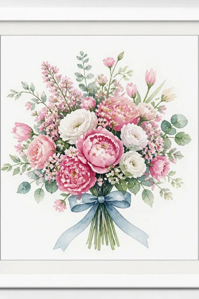
A ribbon bow detail gives the bouquet a story, like it's wrapped for a gift. The blue ribbon is small enough to feel sweet, but it's still a color anchor that makes the print look finished. This style works well for spring birthdays and Mother's Day because it reads gift-ready. It's flattering on most skin tones because the palette isn't too saturated - the blues are soft and the pinks are gentle. Principle: add one "human detail" (ribbon, tag, wrap) so the bouquet feels like it belongs in real life.
Use a clean white frame and a mat that has a thin gray inner line if available, keeping the overall mat width around 1.25 inches. Hang it slightly above eye level if there's furniture below, so the ribbon bow sits clearly. Pair it with two prints that have either white flowers or soft blue leaf wash so the ribbon color doesn't feel random. Keep spacing between frames consistent at about 2 inches. For styling, add a small wrapped gift box or a ribbon-tied vase nearby for one day - it makes the artwork feel intentional.
Good to knowIf your wall is warm beige, choose a cooler gray inner line so the blue ribbon stays crisp.
Common mistakeAvoid thick rustic frames - they fight the delicate ribbon detail.
15. Tropical pink anthurium bouquet with watercolor shadows
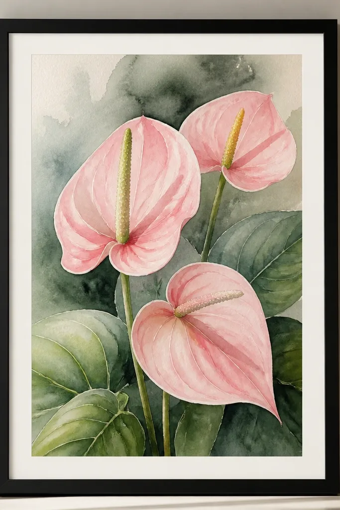
Anthrium-style bouquets bring a tropical edge while still reading like watercolor art. The pink is bold, but the shadows keep it from feeling flat. I like this in summer because it looks fresh next to light wood and natural fibers. It's flattering because the pink has a warm undertone that plays nicely with warm and neutral skin tones. The principle is contrast through shadow: you want darker background wash behind leaves so the bouquet feels dimensional.
Frame in matte black with a 1.25-inch mat in light warm gray. Hang it as a single statement piece, centered above a dresser or console, so the larger leaf shapes have room. If you add other prints, keep them smaller and lighter, like forget-me-nots or blush rose clusters. Position the print so the darker shadow area sits around mid-height - it helps the eye settle. Style with one tropical element, like a simple green plant or a woven basket, and keep other colors neutral.
Good to knowUse a level to hang - anthurium shapes look wrong fast if the frame tilts.
Common mistakeDon't use white frames in bright sun rooms - glare can wash out the shadows.
16. Winter berry bouquet with pale blush roses and holly dots
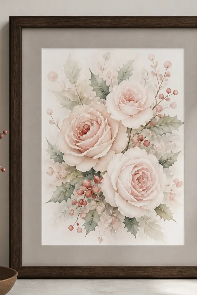
Winter berry bouquets look seasonal without turning into cartoon holiday art. The tiny berry dots add sparkle under warm lighting, and the blush roses keep it from looking too cold. I've used this style in December when I didn't want red ornaments all over - just one framed print and a candle. It's flattering because the palette is soft: blush plus muted berries reads gentle next to skin tones. The principle is holiday detail at small scale - the berries should be visible but not overwhelming.
Use a dark walnut frame and a warm gray mat with 1.5 inches width. Hang it at about 61 inches to the center so it sits above a console or mantel. Pair it with one neutral floral print like white lilies so the berries don't steal all the attention. If you're making a gallery wall, place this in a corner so the holiday vibe feels tucked-in. Style the area with a small pine sprig or a single candle in a matte ceramic holder.
Good to knowChoose matte candles and matte ceramics near the print. Glossy surfaces reflect and compete with watercolor dots.
Common mistakeAvoid bright red frames - they make the berries look like they're pasted on top.
17. Spring tulip bouquet with soft green stems
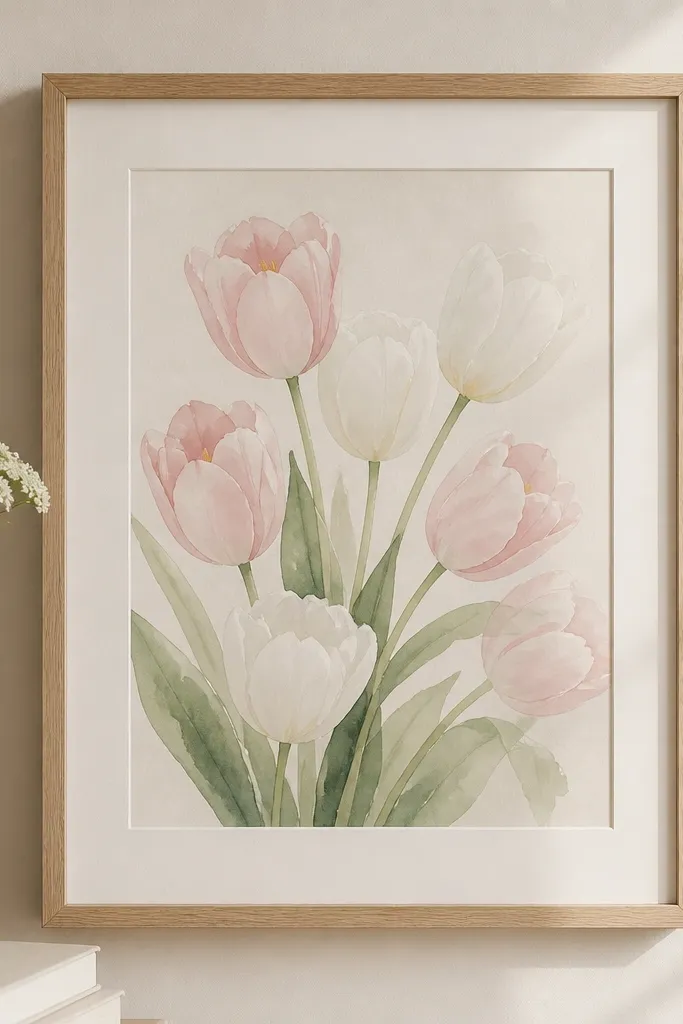
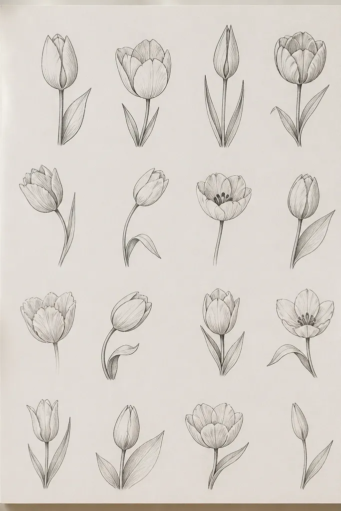
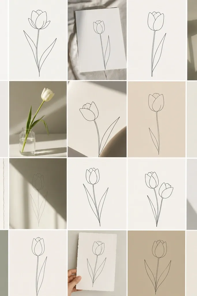
Tulip bouquets feel fresh because the stems are clean and the flowers have clear shapes. Soft green stems keep the print from feeling too sugary, and the pale pink plus white combo reads airy in daylight. I've used it in spring on walls that already have light curtains; it looks like the room is blooming. It's flattering because the pale tones don't overpower skin - they brighten the space instead. Principle: use clean stem lines to create order on a wall.
Frame in light oak and use a cream mat around 1.25-1.5 inches wide. Keep the bouquet centered and upright, aligning the tallest tulip tip with the top third of the mat. Pair it with one eucalyptus rose print to bring back depth through leaves. Hang the tulip print near a window or under a lamp with warm bulbs so the greens look natural. Style with a small vase of real tulips or a single bud jar - even one stem makes a difference.
Good to knowIf you don't have real flowers, use a green glass vase. The glass makes the watercolor stems feel more alive.
Common mistakeDon't pair tulips with heavy dark backgrounds right next to them - they fight for attention.
18. Soft rosebuds with watercolor wash rectangle
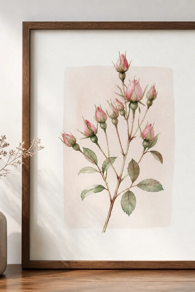
Rosebud prints with a wash rectangle feel modern because they have a defined background shape. The tiny blossoms look delicate, but the rectangle keeps the composition from floating randomly. I like this in rooms with modern furniture because it bridges soft and clean. It's flattering because the tiny pinks don't overwhelm - they add a gentle glow near skin. Principle: use a background shape to make a delicate bouquet feel structured.
Use a simple walnut frame and a mat in warm white with 1.5 inches width. Center the wash rectangle so it sits perfectly in the middle of the mat opening. If you're grouping prints, keep the other frames simple too - no busy inner lines. Hang it as a two-print set with another watercolor that has a similar wash block or a clean negative space background. Keep surrounding wall decor minimal: one textured pillow or a plain ceramic vase works best.
Good to knowIf the wash rectangle edges are faint, increase the mat width by 0.25 inches so it reads clearly.
Common mistakeAvoid ornate frames - the modern structure gets lost.
19. Peach and cream bouquet with hand-tied bow
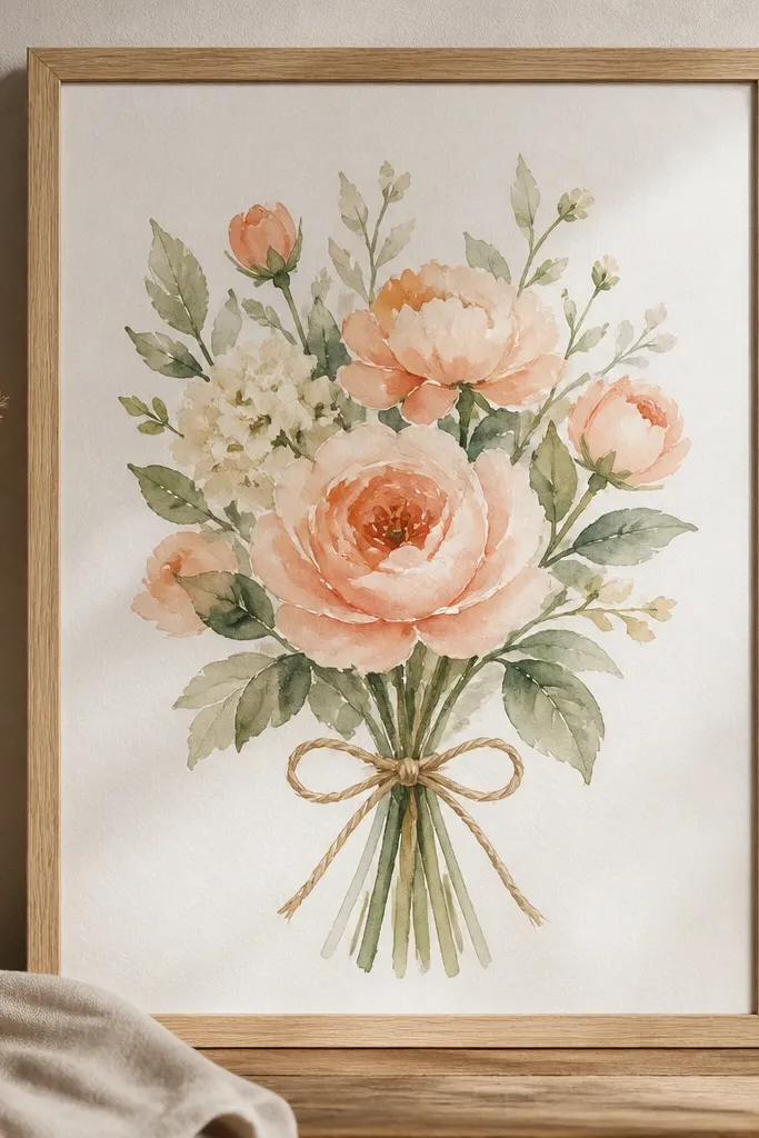
Hand-tied bows make watercolor bouquets feel like they were wrapped by a real person. Peach and cream tones are forgiving, and the neutral twine grounds the softness. I've used this style for wedding season prints and small holiday gift corners because it reads thoughtful, not formal. It's flattering because peach near skin adds warmth without looking intense. Principle: add a realistic tie element so the bouquet feels tactile, not just painted.
Use a natural wood frame and a 1.25-inch mat in cream. Align the bow so it sits just above the center of the mat opening, letting the flower mass fill the lower half. Pair it with a sage-leaf print or a lavender sprig print to keep the palette gentle. Hang it on a light wall and keep the frame finish consistent across the set. If you're styling on a shelf, place a small piece of twine or a mini paper tag nearby for one supporting touch.
Good to knowKeep the twine color in mind when you choose your mat - cream mats make neutral bows look right.
Common mistakeDon't choose a too-pink mat - it can make twine look tinted.