1. Lavender tulips with ink outlines and soft wash centers
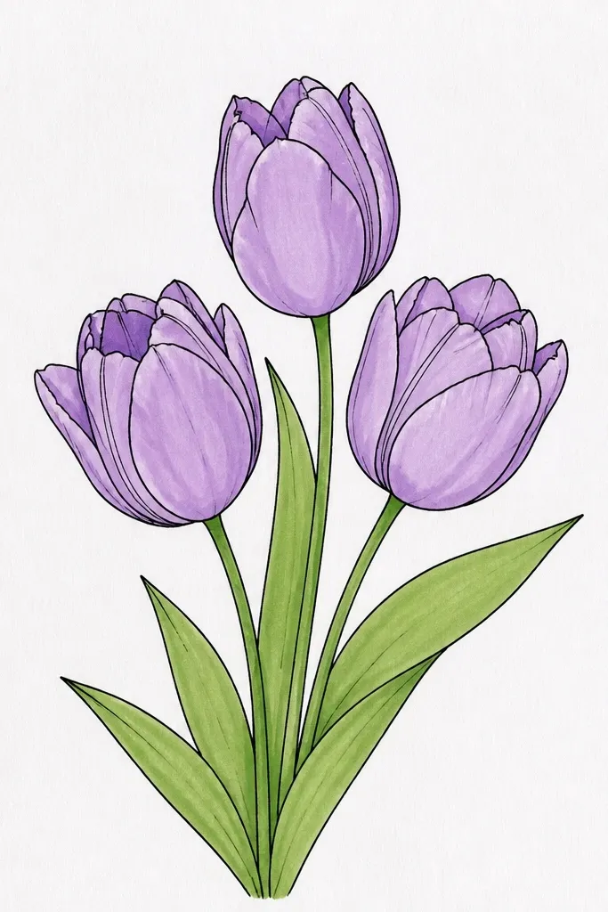
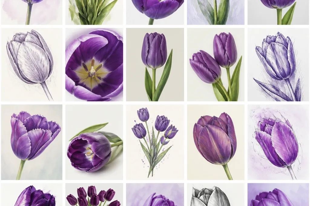
I love this one because it looks "professional" without fighting with messy color. Start with sharp outlines so the shape stays clean, then add a light watercolor wash only where you want the petals to glow. Use lavender for the outer petal area and lilac for the inner fold, leaving a thin unpainted edge to act like a highlight. It flatters most skin tones in photos because the purple reads cool and the sage greens keep it from looking heavy. This style is also great for gift tags since the ink lines hold up even if your paper isn't perfect.
First, sketch three tulips with a slight stagger: one facing forward, one angled left, one angled right. Then trace the outer petal edges with a 0.3 or 0.35 fineliner, keeping the line weight heavier on the shadow side. Next, watercolor in layers: paint the outer petals with pale lavender, then dab lilac only along the inner fold seam. Finally, add tiny yellow dots at the center and a couple of short sage leaf strokes under each stem.
Good to knowLet the lavender wash dry before you add the lilac seam or the colors will bleed into one flat purple.
Common mistakeAvoid full-petal saturation with watercolor - it makes the flower look like a blob instead of a fold.
2. Deep violet tulip bouquet with dry-brush shadows
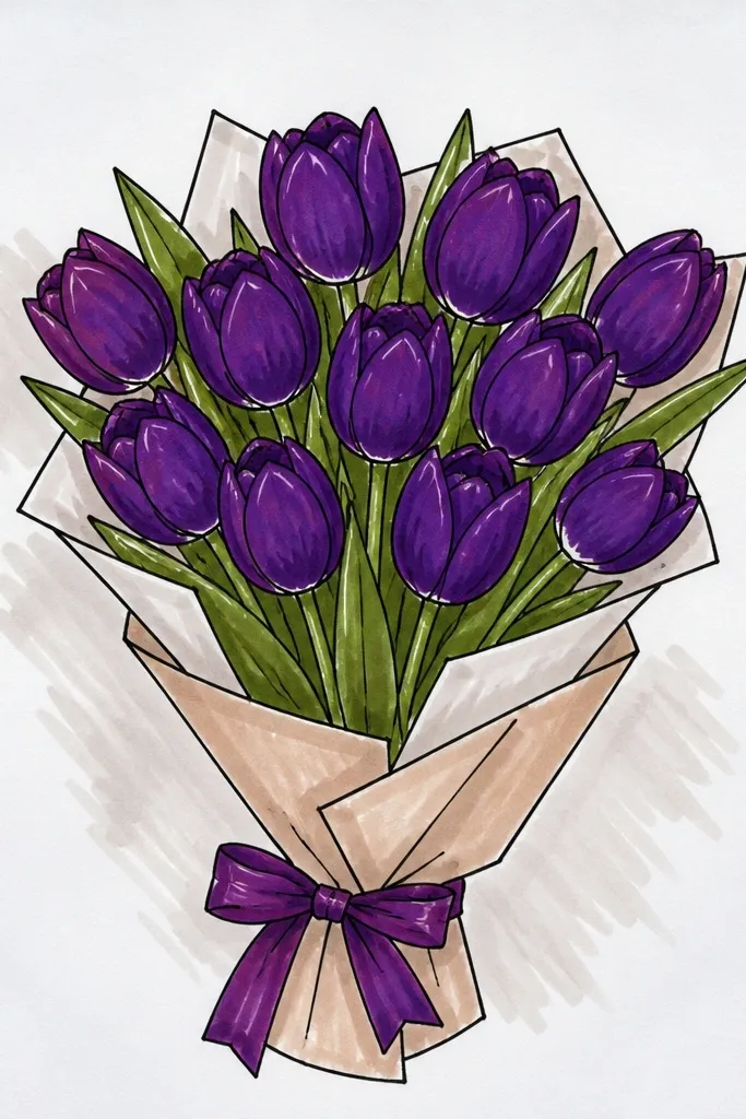
This drawing works when you want a moody, evening-garden vibe. The dry-brush look adds real texture to petals, so you don't need super detailed linework. I use deep violet for the base and then pull the paint lighter near the top edge, so each tulip has a natural gradient. It looks especially good on thicker cardstock because the texture catches and stays crisp. If you're making a fall-winter holiday card, this style feels rich without turning into a dark mess.
Start by blocking the bouquet shape with light pencil circles for the flower bases and simple curved stems. Then draw the petal outline with a thicker pen or marker so the silhouette stays clear. Load a small flat brush with deep violet, wipe most paint off on a paper towel, and dry-brush the lower petal halves. After that, lightly brush lavender along the top edges and add a few dry streaks down the center seam for structure. Finish with dark green leaf strokes that follow the same dry-brush direction as the petals.
Good to knowWipe your brush often - too much pigment kills the dry-brush texture.
Common mistakeDon't blend everything smooth with water - the dry-brush effect is the point.
3. Purple tulip ribbon banner with patterned background dots
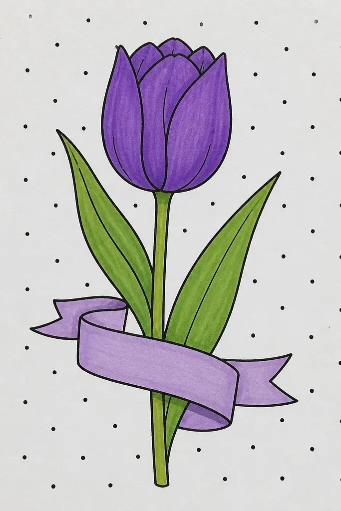
This one is a lifesaver for holiday layouts because it fills empty space without looking busy. The ribbon shape gives you a clear path for the eye, and the dot background makes the purple pop. I keep the tulips mostly line and flat color, then add only two shadow spots: the inner seam and the underside edge. That restraint keeps the design from feeling cluttered on a small card. It also looks good for people who struggle with perspective because the ribbon curve does most of the "composition work."
First, draw a gentle arc across the page and sketch a ribbon fold line about 1 cm below it. Then place four tulips along the top edge, spacing them evenly and keeping their stems aligned to the ribbon. Use a purple fineliner or pen for the outlines and add flat fills in lavender, leaving the highlight edge uncolored. Add deep violet only where petals fold - one short line inside each flower and a small shadow under the outer petal. Finally, dot the background with a 0.5 mm pen or a white gel pen, spacing dots consistently across the empty areas.
Good to knowKeep dots slightly lighter than the flowers (pale lavender), or the background steals attention.
Common mistakeAvoid random dot sizes - uneven dots make it look like a mistake instead of a pattern.
4. Monoline purple tulips with bold stems on white space
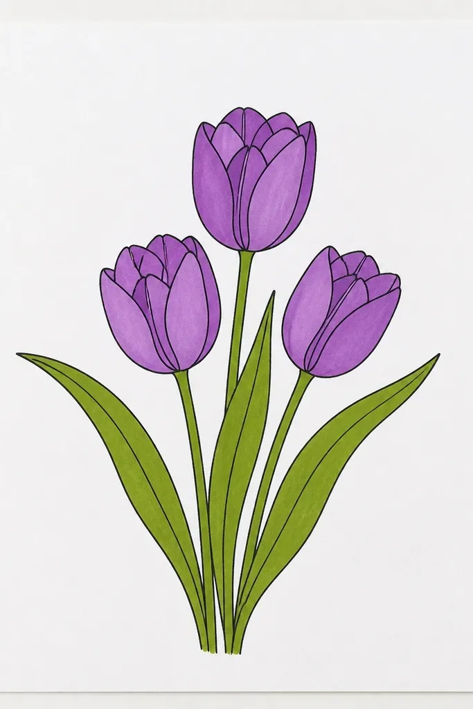
If you want something that still looks good even when your shading skills are shaky, this is it. Monoline tulips rely on clear silhouette and a few solid color accents, not gradients. I pick one purple pen shade for outlines and a darker violet for two wedge-like shadows inside the petals. The leaves are also simplified to a few bold strokes so the whole piece stays graphic. This style looks clean in small formats like bookmarks and fits winter holiday stationery nicely because it doesn't compete with text.
Start by drawing stems first as thick lines, about 2-3 mm wide at the base if you're using a brush pen. Then sketch three flower heads with a single line each - petals are just three big curves. Add one darker violet wedge inside each tulip, placed on the fold side under your chosen light source. For leaves, draw two long leaf shapes with one continuous stroke and a small midline line for definition. Leave the rest of the page blank so the composition breathes.
Good to knowChoose one pen width and stick to it - monoline looks wrong when line thickness changes randomly.
Common mistakeDon't add lots of tiny details to the petals - it defeats the clean monoline look.
5. Tulips with salt sparkle
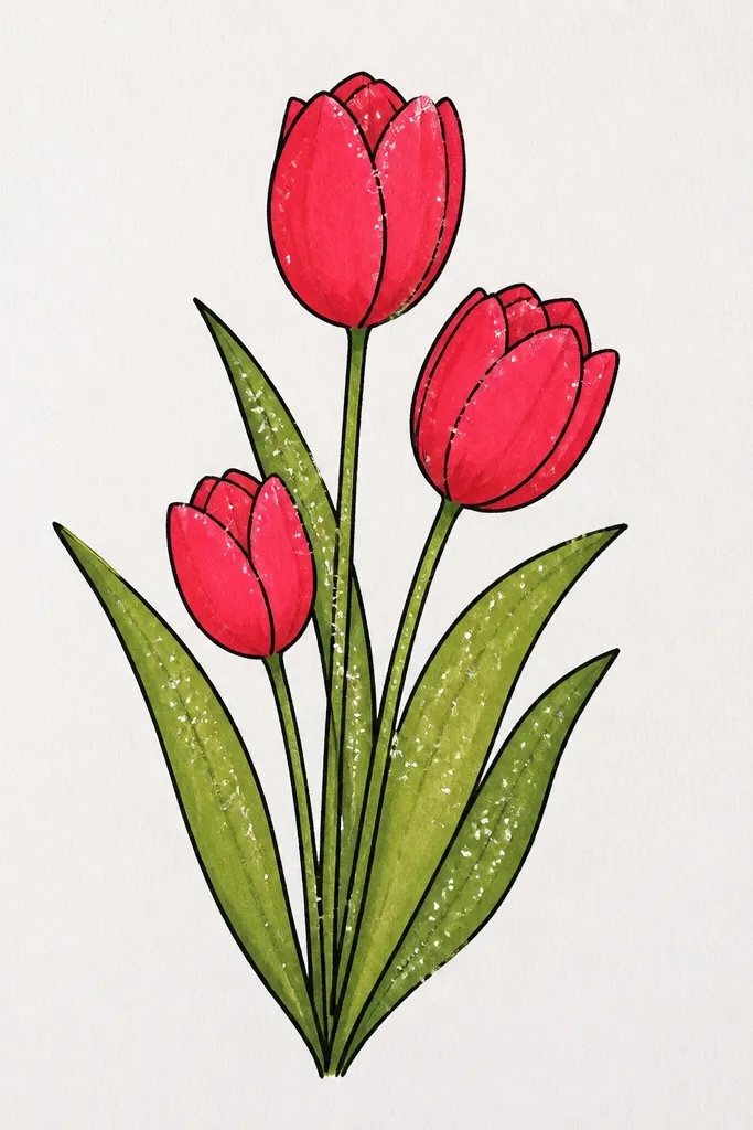
This one looks like you bought it from a shop, and I'm saying that honestly. The trick is salt - it creates natural star-like textures that mimic highlights on petals. I use lavender washes for the petal body and deep violet only on the fold and tips, then let the splashes happen around the flowers. It looks best on watercolor paper because the texture holds the salt effect. For holiday cards, the sparkle reads festive without adding actual glitter.
Wet the petal area lightly with clean water using a small round brush, then drop in lavender and let it bloom. While the paint is still wet, sprinkle a tiny amount of coarse salt on the petals and the background around them. After the flowers dry completely (at least 20-30 minutes depending on humidity), brush off the salt gently. Add deep violet to the inner folds with a careful second pass, then paint loose green leaves with a slightly wetter brush for soft edges. Finish by flicking diluted violet water to create controlled splashes near the stems.
Good to knowUse coarse salt, not table salt, for bigger sparkle flecks.
Common mistakeDon't touch the salt while the paper is wet - it smears the texture.
6. Purple tulips in a stained-glass window frame
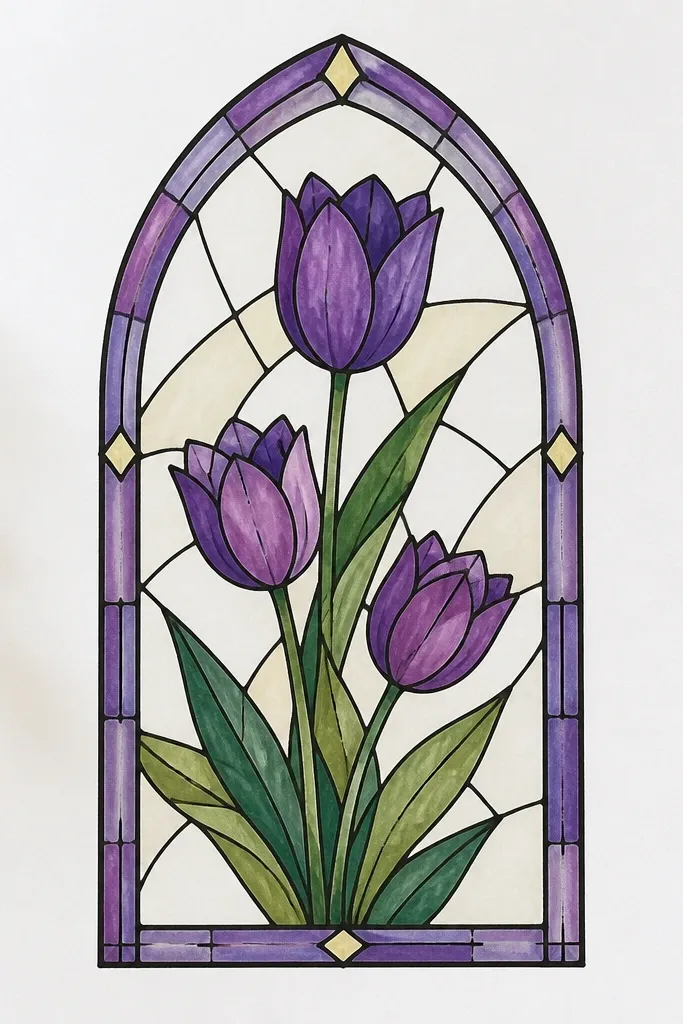
Stained-glass style turns tulips into something holiday-worthy because the structure looks like a keepsake. The segmented petals make it easier to control color - you're not blending smoothly, you're filling shapes. I like this with markers plus a little watercolor because the glassy look comes from layering translucent tones. It also photographs well because the black lead lines give crisp contrast. If you're making a window-style wall hanging or card, this method stays clear even when viewed from a distance.
Draw a rectangular border and add vertical and diagonal "lead" lines inside to guide petal sections. Sketch three tulips with the petals broken into 4-6 segments each, leaving thin white gaps between them. Color each segment with translucent marker washes: lavender first, then deeper violet only on segments facing the shadow side. Add a pale cream background fill around the tulips so the purples glow. Finish by tracing some lead lines thicker with a black pen so the frame looks dimensional.
Good to knowLeave tiny gaps between segments - those gaps are what sell the stained-glass effect.
Common mistakeAvoid fully coloring to the border with no white lead gaps - it turns into a flat color block.
7. Tulips with soft highlights
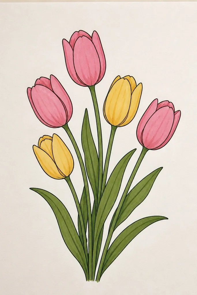
This is for when you want a moody, artsy tulip that still reads clearly. Charcoal gives you smooth, velvety shadows without needing careful pen shading. I tint the petals with a purple pastel only in the lighter areas so the overall look stays smoky, not neon. Eraser highlights matter here - they create the illusion of glossy petals. It looks great for winter holiday decor because the palette feels more muted and grown-up than bright spring florals.
Start by sketching tulip outlines lightly with charcoal, keeping the petal edges soft. Shade the underside of each petal using charcoal and blend with a tissue, focusing the darkest areas on the inner fold. Use a purple pastel to tint the upper petal highlights in thin layers, then blend lightly so it stays semi-transparent. Press an eraser into the center fold area to carve out a bright oval highlight. Finish with smudged leaves that fade into the paper and deepen the flower shadows so the tulips pop.
Good to knowUse a kneaded eraser for highlights - it gives you control instead of tearing up the paper.
Common mistakeDon't over-blend the outer edges - if everything smudges the same, the tulip shape disappears.
8. Purple tulips with geometric petals and pencil grid construction
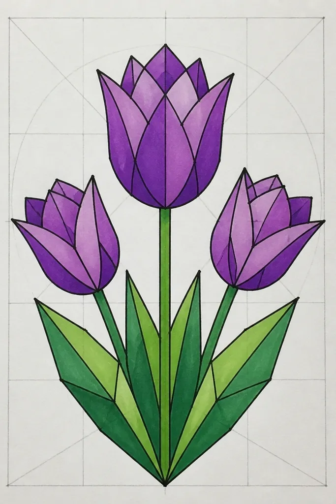
This one is for people who want crisp shapes without tracing. The grid helps you place petals so they look balanced, and the geometric faceting makes the tulip feel modern for holiday stationery. I use pencil construction lines only lightly, then ink over the final facet edges. Purple becomes more interesting when you color "planes" instead of smooth blends. It also flatters your design space because the geometric structure leaves room for a greeting without crowding.
Draw a light square grid on your page using a 2B pencil (keep it faint). Sketch one tulip head using geometric guidelines: place three main petal facets, then add smaller facets on the fold side. Ink the facet edges with a fine liner, then erase the construction grid. Color facets with colored pencils: lavender on the front planes, mid violet on secondary planes, and deep purple on fold planes. Add simple leaf shapes as two angled triangles connected to a stem line.
Good to knowColor one petal at a time so you keep consistent values across the whole flower.
Common mistakeAvoid heavy grid lines - they show through and make the design look unfinished.
9. Single tulip portrait with foil-like gel pen veins
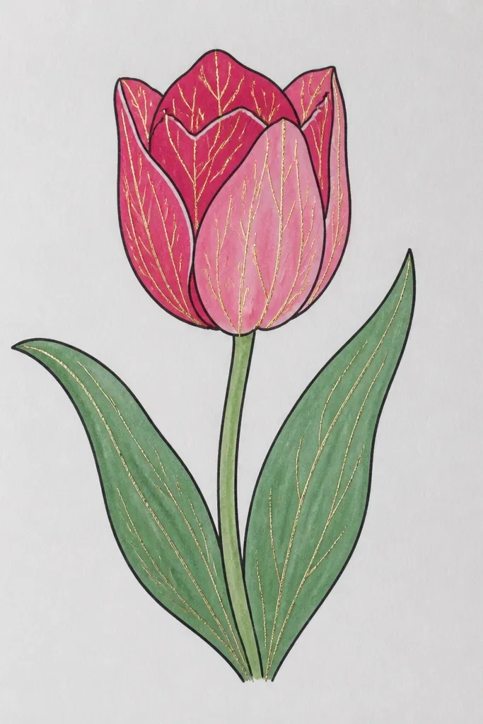
A single tulip portrait makes the purple feel intentional and not busy. I use gel pen veins to mimic the natural striations inside tulip petals - it adds a "light catching" detail that reads fancy even on plain paper. The metallic lines are thin, so they don't overpower the drawing. This looks great for holiday tags because it leaves space for handwriting. It also flatters people who like clean composition and don't want a bouquet.
Sketch a tall tulip with a wide top and a narrow stem, keeping the flower about 70% of the page height. Shade petals with colored pencil or marker: start with lavender base, then build deep violet along the fold and outer underside. Add a soft highlight by leaving a narrow strip unshaded on the front petal. With a metallic gel pen, draw 4-6 thin vein lines starting near the center and fanning outward. Finish with dark green stem and two small leaf accents that point diagonally down.
Good to knowPractice the vein lines on scrap first - you want them light and even, not thick and wobbly.
Common mistakeDon't cover the petals in metallic ink - a few veins are enough.
10. Purple tulips framed by a scalloped border and tiny stars
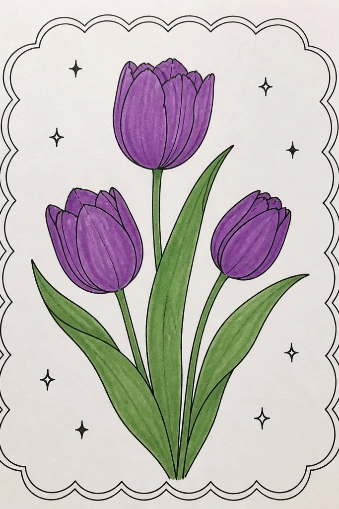
Scalloped borders make the whole design feel finished without needing a complicated background. I like to keep the tulips simpler inside the frame and let the border do the holiday work. The tiny white stars add a celebratory feel that still looks subtle next to handwriting. Purple stays the main character because the border is light and the stars are small. This is a great fit for ornaments, mini prints, and holiday cards where you want a decorative wrapper.
Draw a scalloped border around your composition area, leaving a 1-1.5 cm margin. Place two tulips centered inside, one slightly higher than the other, with stems that curve toward the bottom center. Outline petals with a purple pen and fill with lavender color. Add deep violet only on the fold side and at the petal tips. Add tiny stars with a white gel pen, focusing them near the border corners so the center stays calm.
Good to knowMake stars about the size of a pinhead so they look like highlights, not confetti.
Common mistakeAvoid thick stars - they look like stickers instead of drawn light.
11. Top-down tulip cluster with layered paper-thin petals
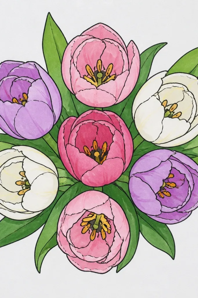
Top-down clusters look especially good for seasonal art because they feel "arranged" like a centerpiece. Overlapping petals create depth even when you're not doing heavy shading. I draw tulips as layered shapes - each petal has a front edge and a fold edge so the overlap reads instantly. Purple stays consistent across flowers, but the dark violet fold edges vary slightly so each tulip looks turned differently. This style flatters viewers because it's easy to understand from a quick glance.
Sketch four tulip heads as overlapping ovals, with one in the center and three around it. Draw petals so each petal has a visible front edge and a fold edge; the fold edge should be darker. Color all petals with lavender base, then add deep violet along the fold edges where one petal sits behind another. Keep leaves thin and tucked around the cluster, using sage green for the top leaf parts and a darker green for the underside. Add a few short stem lines only where they peek out from under petals.
Good to knowIf one tulip looks flat, darken only the fold edge where it overlaps the one in front.
Common mistakeAvoid equal shading on every petal - the overlap needs contrast.
12. Purple tulips on textured kraft paper with white gel highlights
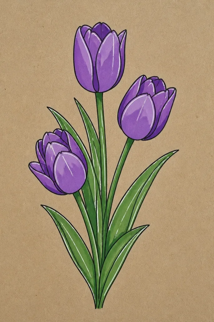
Kraft paper makes purple look earthy and holiday-friendly. The brown base automatically warms the palette, so your lavender doesn't look too icy for winter decor. White gel highlights are the secret weapon here - they pop against kraft and mimic the glossy shine on petals. I also keep the leaf color muted so it doesn't fight the paper tone. This style is perfect for gift tags and envelope seals because kraft already looks handcrafted.
Lightly sketch two to three tulips with a pencil, placing them slightly off-center for a natural feel. Wash petals with lavender diluted watercolor or marker, then deepen the fold edges with a violet mix. Don't try to cover the kraft completely - let the paper texture show through. Once dry, use a white gel pen to draw thin highlight lines along petal edges and a small inner highlight near the center. Paint leaves with muted green, then dry-brush a darker green on the underside for form.
Good to knowUse gel highlights sparingly: 2-3 lines per petal look better than full outlining.
Common mistakeAvoid heavy coverage with opaque white paint - it kills the kraft look.
13. Purple tulips in a teacup and saucer holiday doodle
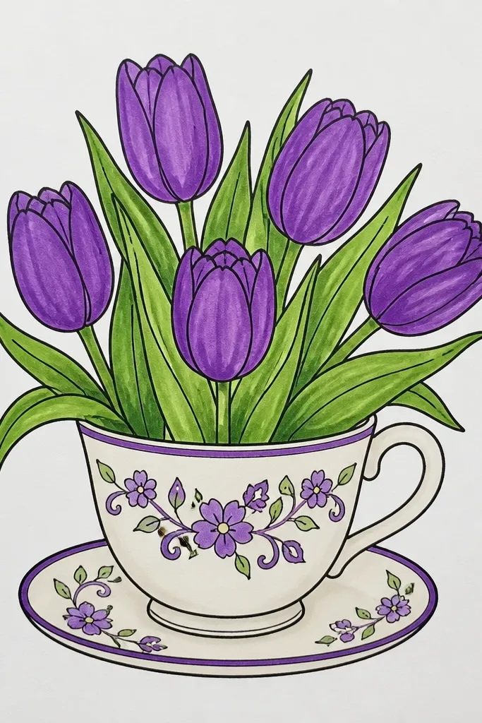
This is one of my favorite "holiday still life" doodles because it gives tulips a reason to be there. The teacup adds a cozy frame, and the steam curls let you fill negative space without adding extra flowers. I use brown for the cup outline so the purple stays the star. The tulips are simplified: larger petal shapes, one shadow fold, and a tiny center detail. It's great for cards where you want a cute scene but still need room for a message.
Draw the teacup first: an oval bowl shape, a handle on the right, and a saucer beneath. Add two tulip stems rising from the cup opening, then shape the petals so they lean slightly outward. Color cup outline in dark brown, then fill with a pale warm tint if you want. Shade the tulips with lavender washes and deepen the fold seam with deep violet. Add 3-5 steam curls above the cup and finish with tiny dot accents around the steam using pale lavender.
Good to knowKeep steam curls thin and light so they don't compete with the flower petals.
Common mistakeAvoid drawing too many tulips in the cup - it crowds the cup rim.
14. Purple tulips with ribbon banner behind
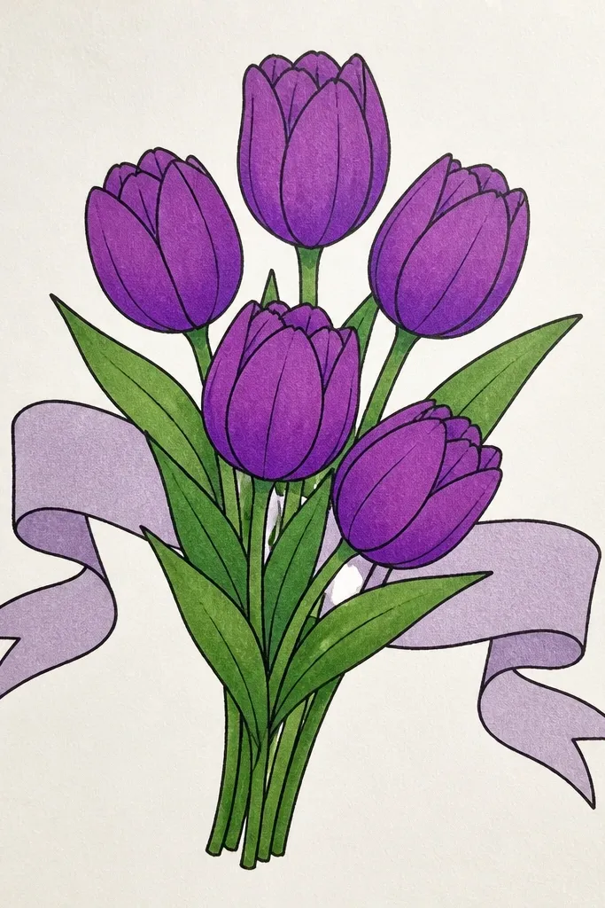
A ribbon wash behind the flowers gives you instant depth without a full background scene. I like a wide band placed behind the tulips so the purple feels continuous across the page, which is especially helpful for holiday cards. The tulips stay crisp because you outline them, while the ribbon stays soft. This combination makes the purple look intentional rather than scattered. It also works well when you want a clean spot for text - keep the ribbon away from where you'll write.
Sketch and outline 3 tulips in the lower half of the page, then decide where your greeting will go and leave a clean margin. Paint a thick watercolor ribbon behind the tulips: start pale lavender on one end and blend into deep violet across the width. Keep the ribbon edges soft by painting slightly wet and letting it feather. After the ribbon dries, fill tulip petals with lavender and add deep violet on fold seams. Add a couple of leaf strokes in sage green at the bottom edge and keep everything else white.
Good to knowPaint the ribbon first so you can place flowers where the ribbon is darkest.
Common mistakeDon't put the ribbon right behind the petal highlights - it dulls the shine.
15. Purple tulips with Zentangle-style petal patterns
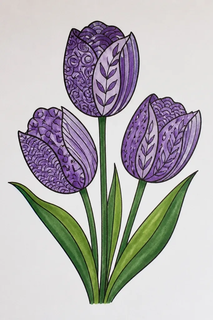
Patterned petals look amazing for holiday art because they feel detailed without requiring realistic shading. Zentangle-style marks give texture and make each petal unique, which prevents the "same flower" look in a cluster. I keep the motifs small and consistent: dots, short lines, and tiny curls - nothing huge. Color stays in the purple family, so your page looks cohesive even with lots of marks. This is also a good method when you want to relax while still creating something impressive.
Outline two or three tulips with a dark pen, keeping petals slightly separated so you can pattern each one. Color petals with a light lavender base if you want, then fill each petal section with small Zentangle marks. Use mid violet for patterns on the front-facing petal areas and deep violet for patterns near the inner folds. Keep the center and inner seam darker with tight dot clusters. Add leaves with simple linework only, using a couple of short parallel lines to show veins.
Good to knowChoose 3 motif types max per tulip so the pattern looks planned, not random.
Common mistakeAvoid mixing big motifs with tiny motifs - the scale mismatch looks cheap.
16. Purple tulips in a oval frame
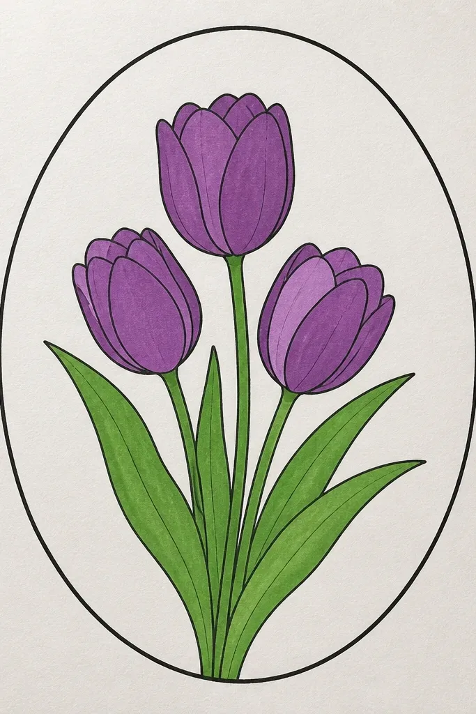
An oval frame makes your tulips feel like a featured illustration, not a random doodle. Watercolor oval edges look handmade and soft, which fits seasonal holiday aesthetics. I keep the inside mostly white so the tulips pop, then I add subtle speckles inside the oval for movement. The tulip shading is simple: lavender base, violet fold seam, and a slightly darker tip. This style works well for wall prints because the oval frame reads like a gallery piece.
Draw an oval frame around the composition, leaving a small gap between the oval and the tulips. Paint the oval border with a loose lavender wash, making the edges uneven on purpose. Sketch three tulips inside the oval and outline them with a fine pen. Fill petals with lavender and add deep violet along the inner fold seam, keeping the highlights mostly clean. Add a few faint speckles inside the oval using diluted violet paint, then paint leaves in muted green with soft edges.
Good to knowKeep the oval border lighter than the petals so the flowers remain the focal point.
Common mistakeDon't darken the oval frame too much - it can steal attention from the tulips.
17. Purple tulips with bold paper-cut look using gouache and tape resist
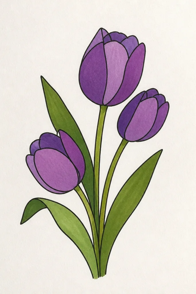
This is the style I use when I want clean edges on holiday cards without fancy tools. Tape resist gives you crisp separations that look like paper cutting, even if you're drawing on flat paper. Gouache works great because it stays opaque and doesn't smear like watercolor. The purple looks bold and graphic, and the white lines between shapes make the flower folds easy to read. It's also forgiving - if your lines are slightly wobbly, the tape edges still make it look intentional.
Sketch a tulip cluster with blocky petal shapes instead of detailed curves. Place painter's tape along the lines where you want white "cuts" between petal sections. Paint the exposed areas with lavender gouache first, then add deep violet on fold sections and near petal tips. Let everything dry, then remove tape slowly at a low angle so you don't tear paper. Finish with muted green gouache leaves as simple shapes and add a tiny darker green line where the leaf bends.
Good to knowUse thinner tape for smaller tulips so the white lines don't get too wide.
Common mistakeDon't remove tape while paint is wet - you'll lift pigment and blur the edges.
18. Purple tulips with wintery snow flecks and frosted shading
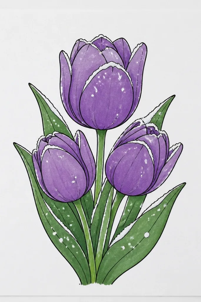
This design turns tulips into a winter holiday illustration without changing the flower shape. The frosted shading is what sells it: pale lavender highlights that look like cold air, plus deep violet folds for contrast. Snow flecks add a seasonal cue, but I place them lightly so they don't cover the tulip details. This style looks best on white or light gray paper, and it photographs well because the contrast is clear. If you're making winter cards, this keeps tulips feeling festive instead of purely spring.
Sketch two tulips and outline them with a dark purple pen so the shape stays crisp. Shade petals using a lavender base, then add deep violet only along inner folds and underside edges. Create frosted look by blending a very light lavender or even a hint of gray on the top petal areas. Flick diluted white paint or use a white gel pen to add small snow flecks around the flowers and a few on the upper petals. Finish with dark green stems and a couple of simple leaves, leaving some negative space for the snow.
Good to knowUse a stiff toothbrush for snow flecks so you get tiny, controlled dots.
Common mistakeAvoid large snow blobs - they look like paint spills.
19. Purple tulips with letterbox style border and centered greeting space
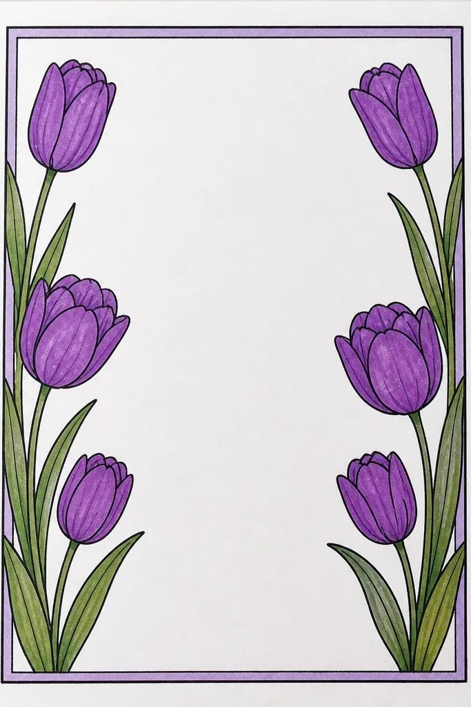
Letterbox framing is how you make a drawing feel designed, not random. I like placing the tulips in one band and leaving the center clean for a greeting - it keeps the holiday message readable. The border colors are light so the tulips stay bold, and the tulips are shaded minimally so the layout doesn't get crowded. This style flatters busy card designs because it gives you a clear structure. It's also a good choice when you're doing quick batches of holiday cards.
Draw two horizontal rectangles or bands: one top band and one bottom band, leaving a large blank center for text. Paint or color the top band in pale lavender and the bottom band in mid violet, then outline the tulips. Place three tulips in the bottom band with stems that curve slightly upward but stay inside the band. Use lavender fill for petals and deep violet fold seams on each flower. Add two small leaves near the stems so the tulips don't look floating, and leave the center completely uncluttered.
Good to knowPlan your greeting first - measure the space you need, then place tulips around it.
Common mistakeDon't tuck details into the text zone - it makes handwriting look cramped.
20. Botanical purple tulips with fine-line crosshatching leaves
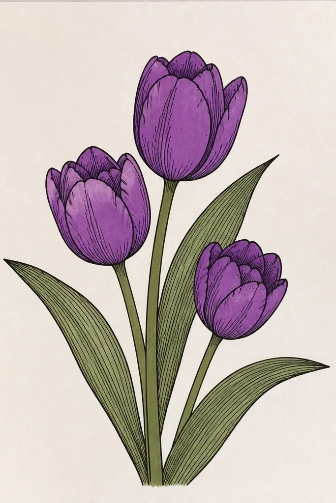
Fine-line crosshatching makes the leaves look real, and that realism makes the tulip petals feel more grounded too. I keep the petals simpler - mostly flat lavender with a darker inner fold seam - because the leaves already carry the texture. This style is perfect when you want a more "botanical print" look for holiday stationery. It's also forgiving: if your petal shading isn't perfect, the leaf texture still makes the drawing feel intentional. I use it for DIY art prints because it holds up well in photos.
Outline two tulips with a fine liner and sketch the stems and leaves with light pencil first. Fill petals with lavender, then add deep violet only on the inner fold seam and at the petal tip. For leaves, draw the leaf outline and add crosshatching lines that follow the leaf vein direction. Make the hatch density heavier near the leaf base and lighter toward the tip. Add a few fine stem lines and a tiny center detail on each tulip, keeping everything else clean and white.
Good to knowUse a 0.1 or 0.2 liner for hatch lines so they look botanical, not scribbly.
Common mistakeAvoid hatching petal areas too - it turns the flower into a leaf pattern.