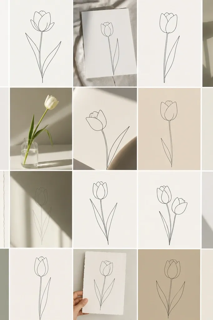

1. Classic Front-Facing Bud with 6 Petals
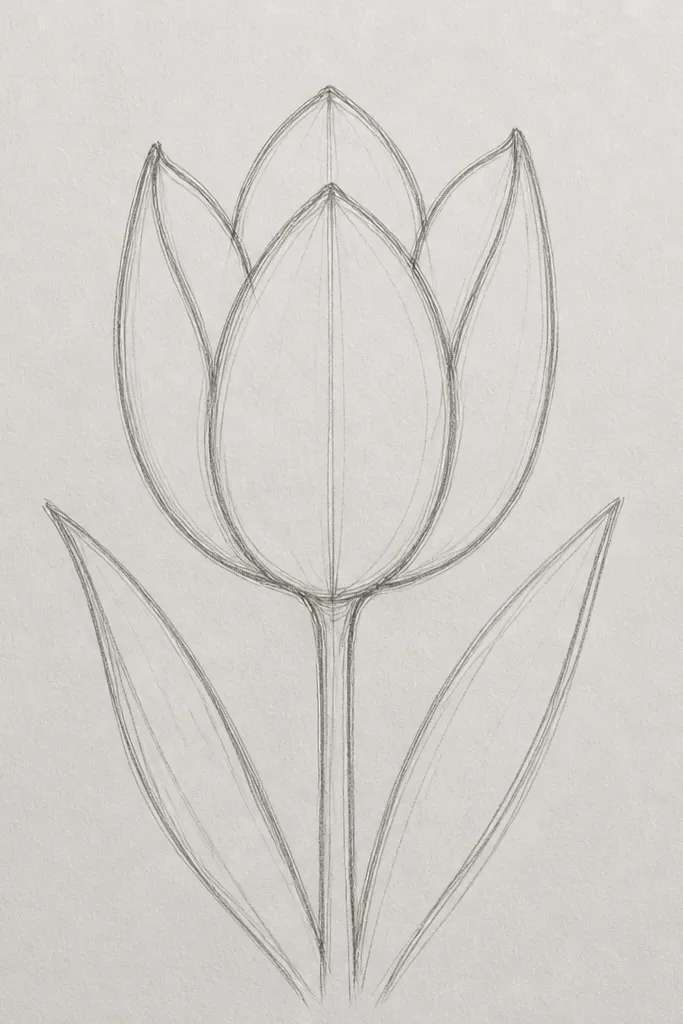
This one is the fastest way to get a tulip bud that reads as "tulip" on the first try. I draw it straight-on because it hides the hardest part - the petal overlap depth - and lets the petal curves do the talking. Use a 2B pencil to darken the outer rim edges so the cup looks firm instead of airy. It flatters simple card layouts because it sits neatly in a circle-like space, and it works for both pale and deeper skin tones when you color the bud with warm reds and light peach highlights. If you're drawing for winter cards, this front-facing shape still feels fresh when you color it with cranberry, dusty pink, or marigold.
Start with a light pencil center line - a gentle vertical curve that becomes the stem. Then draw a rim arc across the top like a half-ellipse, making it slightly wider than you want the bud. Sketch six petals around that rim, spacing them evenly, and make the outer petal lines darker than the inner folds. Finally, shade under each petal overlap with short strokes, keeping the shading concentrated near the rim so the center stays lighter.
Good to knowInk the outer rim first with a 0.3 liner, then add inner lines after - it keeps the bud from looking lopsided.
Common mistakeDon't make all six petals the same width; the uneven widths make it look hand-drawn, not traced.
2. Side-Fold Bud with a Visible Hinge
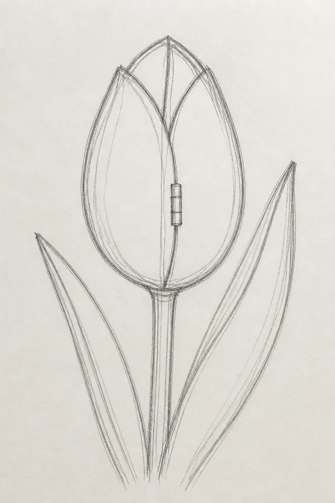
This bud is my go-to when a drawing needs to look more like a real flower without adding extra petals. The visible hinge gives you depth even if you keep the lines simple. I usually choose a side angle because it looks good on gift tags and vertical banners - it doesn't feel too round for narrow spaces. For coloring, try a cooler pink or rose on the outer petals and a warmer peach inside the fold; the contrast makes the bud pop. It also works well for monochrome ink drawings since the hinge line creates the "3D" effect.
Start by drawing a slanted center line that leans slightly right. Make a rim arc that's taller on the left side, then sketch two main outer petals that overlap - one on top-right (darker) and one on top-left (lighter). Add one inner petal that tucks behind the left side, ending in a point near the hinge. Shade along the inner fold with short, curved strokes, then lift a tiny highlight with a kneaded eraser on the brightest petal edge.
Good to knowKeep the hinge line slightly curved, not straight - straight hinges look like a folded paper craft.
Common mistakeAvoid drawing the inner petal sticking out past the outer rim; that breaks the "cup" shape.
3. Half-Open Tulip Bud with a Teeny Gap
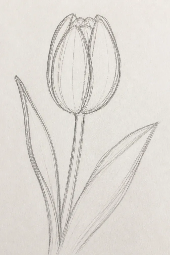
A tiny opening makes the bud feel alive, like it's about to bloom. I like this version for spring holiday art because it bridges "closed bud" and "full flower" without needing a full petal fan. The gap also gives you a natural place to add a warmer shadow, which makes the drawing look dimensional fast. When I color it, I put a light yellow tint inside the gap and keep the outer petals in tomato red or plum for a realistic glow. This one is forgiving for beginners because you can keep the inner shapes minimal and still get a believable opening.
Draw a closed bud outline first using a simple oval cup shape and a center line that rises from the base. Then separate the top by drawing two outer petal tips that don't fully meet - leave a small arc gap. Add two inner petal lines inside the gap, thinner than the outer lines, and curve them toward the center. Shade the underside of the top petals and along the inner gap edge, then add a small highlight on the upper rim using an eraser.
Good to knowIf you mess up the gap size, redraw only the top petal tips; don't redo the whole bud.
Common mistakeDon't leave the gap too wide; wide gaps turn into a flower head, not a bud.
4. Tall Bud with Long, Pointed Petals
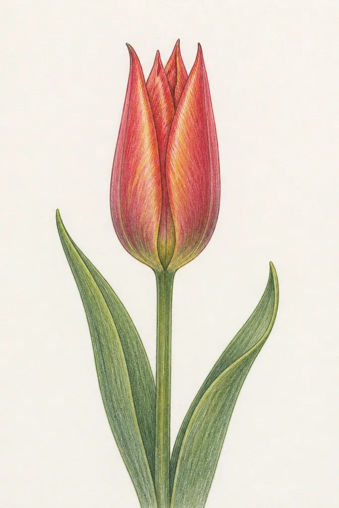
Tall buds look fancy on the page, and they're easy to draw once you commit to one proportion: height is bigger than width. I use this for minimalist holiday cards because the vertical lines feel crisp and clean. Pointed petals create a "tail" that makes the bud look elegant even with simple coloring. When you color, keep the outer petals one solid color (like deep magenta) and add a single lighter streak down the center for dimension. This shape also looks great on darker paper since the highlights read clearly against the background.
Start with a vertical center line and draw a narrow rim arc at the top, making the arc taller than it is wide. Sketch three outer petals that are longer and more pointed than the classic bud, then add two inner petal lines tucked inside. Darken the outermost petal edges and the lower fold lines. Shade with short strokes in a narrow band inside the bud, then add a thin highlight streak down one outer petal using a light eraser touch.
Good to knowMeasure width by eye: if the bud width is more than half the height, it stops looking tall.
Common mistakeDon't round the petal tips; rounded tips make it look like a generic flower bud.
5. Dotted Guide Bud for Beginners
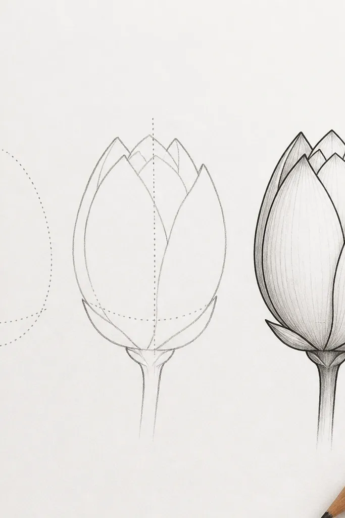
This one is for when your hand needs training wheels. I use dotted guides because they remove the guesswork of where petal curves should start and end. The result looks tidy and intentional, which helps a lot when you're drawing multiple buds for a border. It also makes it easier to repeat the same bud size across a page, so your final card looks consistent. If you're using colored pencils or markers, the clean spacing keeps colors from bleeding into each other. I've used this setup for kids' craft days and for adults who just want a relaxing, repeatable sketch.
Lightly place a dotted rim arc across the top using small dots spaced evenly. Add a dotted center line from the base to the top petal meeting point. Draw the outer petals by connecting the dots with curved lines, then go over with a darker pencil or pen. Finally, erase the dots (or leave them faint if you're going for a sketchy look) and add light shading only under the top rim.
Good to knowUse a 0.5 pen for the final lines so the petals look confident, not sketchy.
Common mistakeDon't press hard on the pencil guides; heavy dots show through and make the bud look messy.
6. Thick-Lined Ink Bud with Minimal Shading
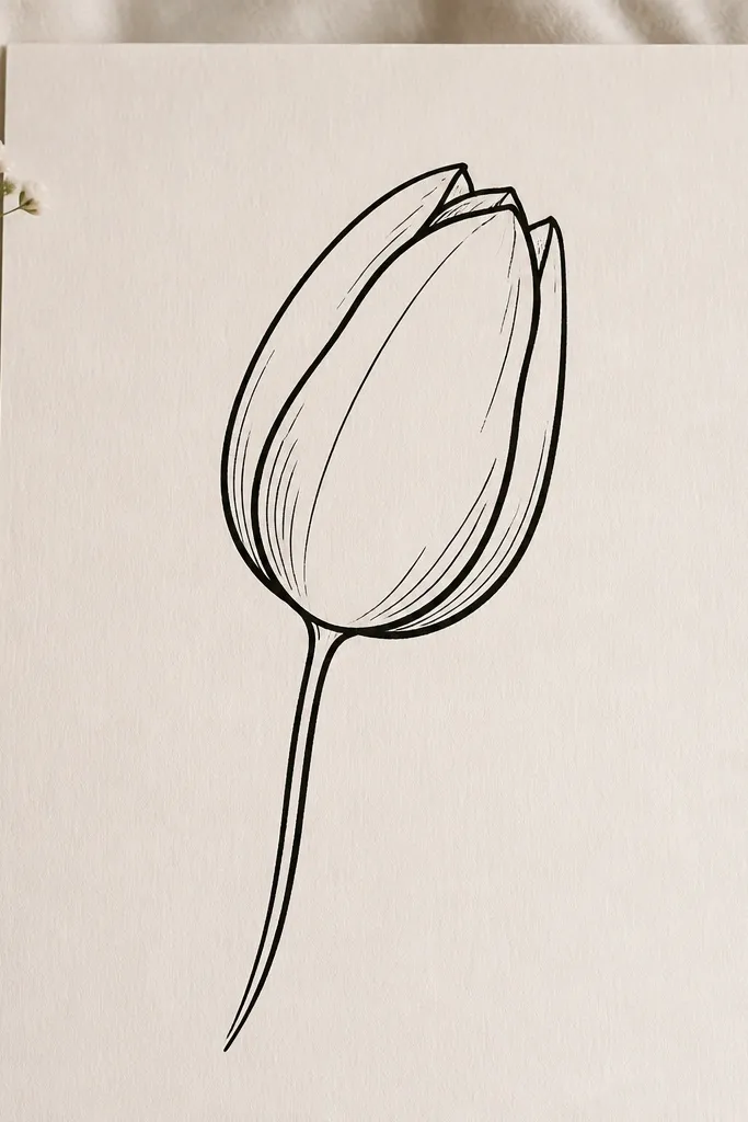
If you want your drawing to look finished without heavy coloring, this is the one. Thick lines give you a graphic look that works for holiday labels, where small details get lost when printed. I keep shading minimal because the line weight already creates depth. This style looks great with black ink on cream or green cardstock, especially when you later add a single color wash inside the petals. It also holds up well if you scan it - thin pencil shading tends to disappear, but thick ink survives.
Sketch the bud lightly in pencil first with a simple rim arc and a center line. Then ink the outer petal edges with a 0.8 or 1.0 liner, keeping the curves smooth and continuous. Add just a couple of thin inner fold lines with a 0.3 liner to show overlap. Finish by adding two short hatching lines under the rim and a tiny highlight on the top petal edge using an eraser or white gel pen.
Good to knowLet the ink dry, then do one pass with the kneaded eraser - it keeps the lines crisp instead of smudged.
Common mistakeDon't add lots of tiny cross-hatching; it turns into clutter at small sizes.
7. Watercolor Wash Bud with Hard Ink Edges
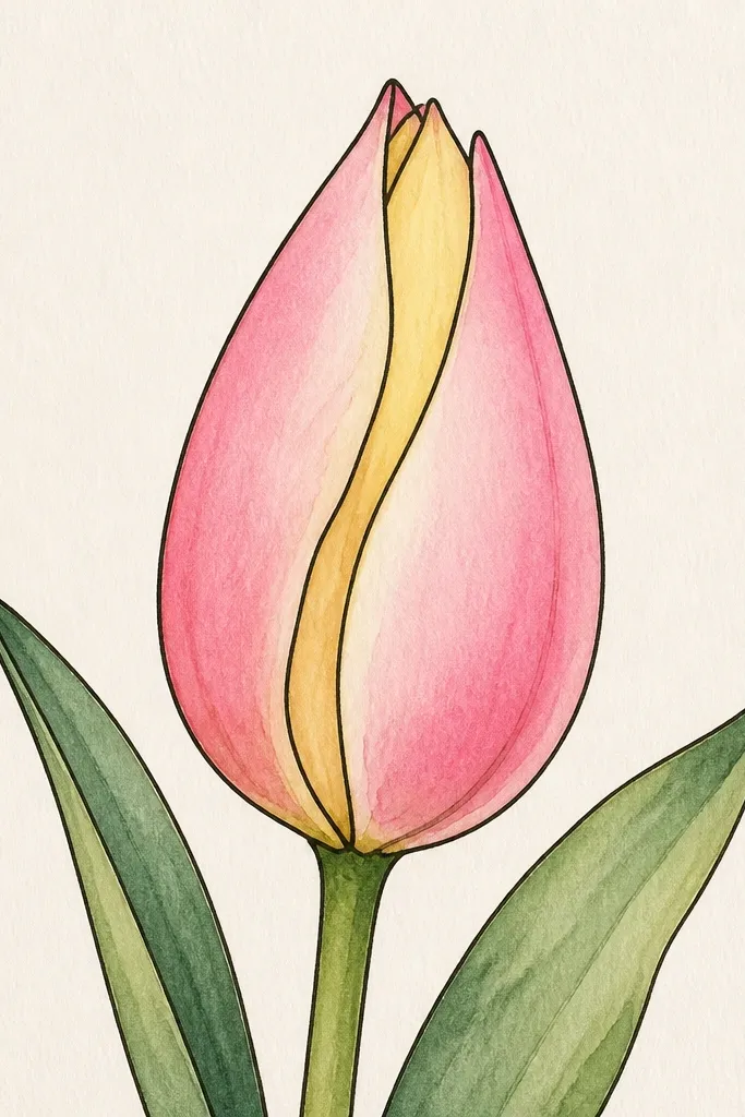
This is the "holiday card ready" version because watercolor gives you color depth without extra drawing. I always ink first, then paint inside the boundaries so the petals stay crisp. Use a limited palette: one pink or red for the outer petals and one lighter tone for the inner fold, plus a tiny yellow touch near the opening. The hard ink edges make it look intentional, even if your watercolor washes are imperfect. This one flatters busy backgrounds too, because the outlines keep the bud readable.
Ink a side-fold or front bud in a fine liner, leaving the pencil construction lines erased or very faint. Wet the inside of the outer petals lightly with clean water, then apply a diluted wash of pink, letting it pool slightly near the rim. Add a paler wash inside the fold and drop in a tiny yellow tint near the center. Finally, deepen the shadow under the rim with a slightly stronger pigment and let it dry before adding any extra line accents.
Good to knowUse watercolor paper or at least 140 lb cardstock so the ink doesn't feather.
Common mistakeDon't flood the whole bud at once; heavy water blurs petal boundaries.
8. Marker Shading Bud with One Dark Edge
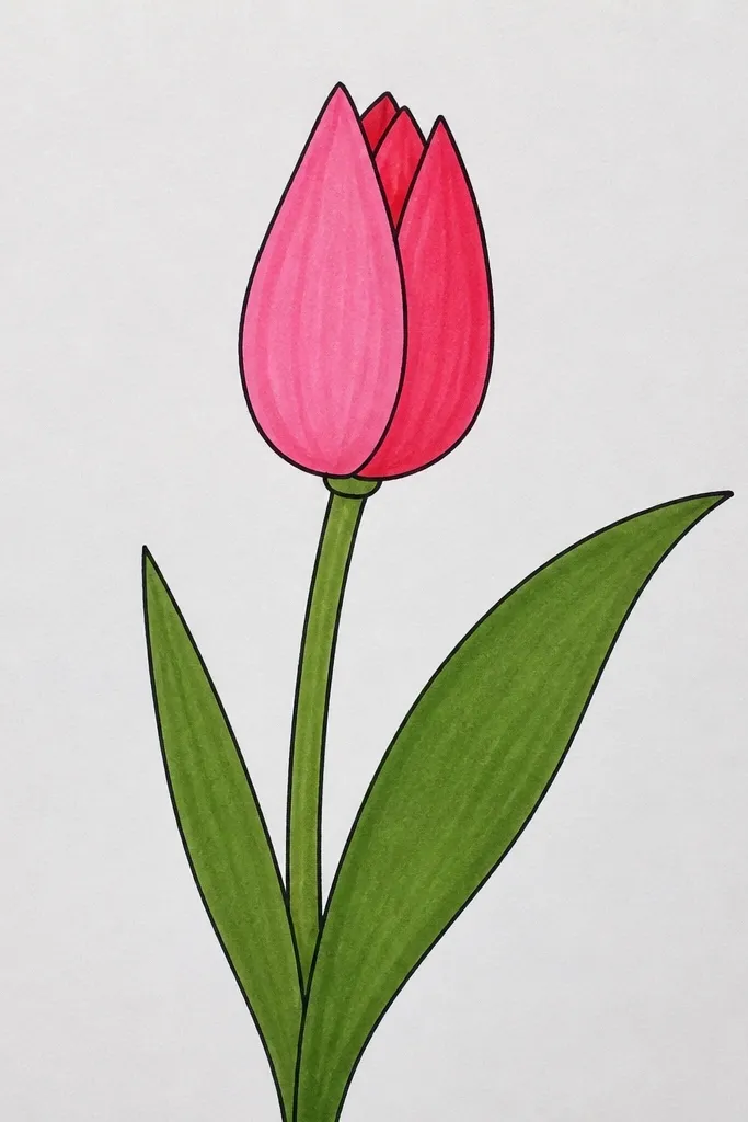
This is how I color tulip buds when I want quick results that still look dimensional. The rule is simple: pick one dark edge and let it do the work. When you keep the shading to one side, the bud looks clean and not "smudgy." I use this on holiday tags because markers dry fast and don't smear if you add the final highlight last. Pair a warm red marker with a lighter pink for the outer petals, then use a soft brown or deep rose for the inner fold shadow. It flatters any style from cute to classy because the color control is strong.
Sketch the bud in pencil and erase lightly so it stays faint under marker. Color the entire outer petals with the lighter marker tone first, staying inside the outlines. Then run the darker marker only along one outer edge and under the rim fold, following the petal curves. Add a narrow inner shadow band on the fold, then finish with a white gel pen highlight along the top petal edge.
Good to knowColor in the same direction each time; it prevents streaks that show up on scans.
Common mistakeDon't color the inside fold with the same marker as the outer petals - it makes the bud look flat.
9. Graph Paper Tulip Bud with Perfect Symmetry
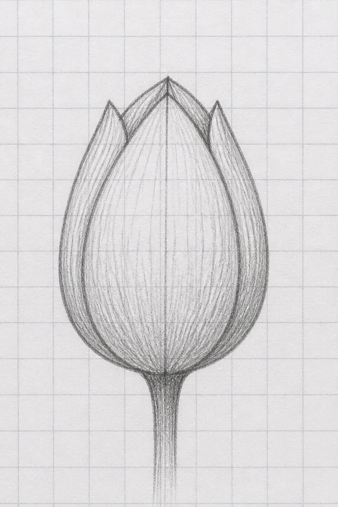
This is my choice when I'm drawing for prints, because symmetry keeps the set looking professional. Graph paper lets you repeat the same bud shape across a row without eyeballing every curve. It's also helpful if you're drawing a border for a holiday banner where spacing matters. I use it for front-facing buds, because the mirrored petals look like a pattern instead of random doodles. For coloring, symmetry makes it easier to place highlights - one on each side - so the bud looks balanced.
Draw a vertical center line on graph paper and lightly mark a top rim arc width using two grid points. Sketch the outer petals as mirrored curves across the center line, keeping each petal thickness consistent. Add inner fold lines that stop at the same grid height, so the overlap looks even. Shade with small strokes under the rim, then erase any extra construction lines once you're happy with the petal alignment.
Good to knowPick one grid size for your whole project and keep the bud size consistent across every tag.
Common mistakeDon't erase too aggressively; graph lines can ghost back through thin paper.
10. Holiday Wreath Bud Cluster (3 Buds, One Stem)
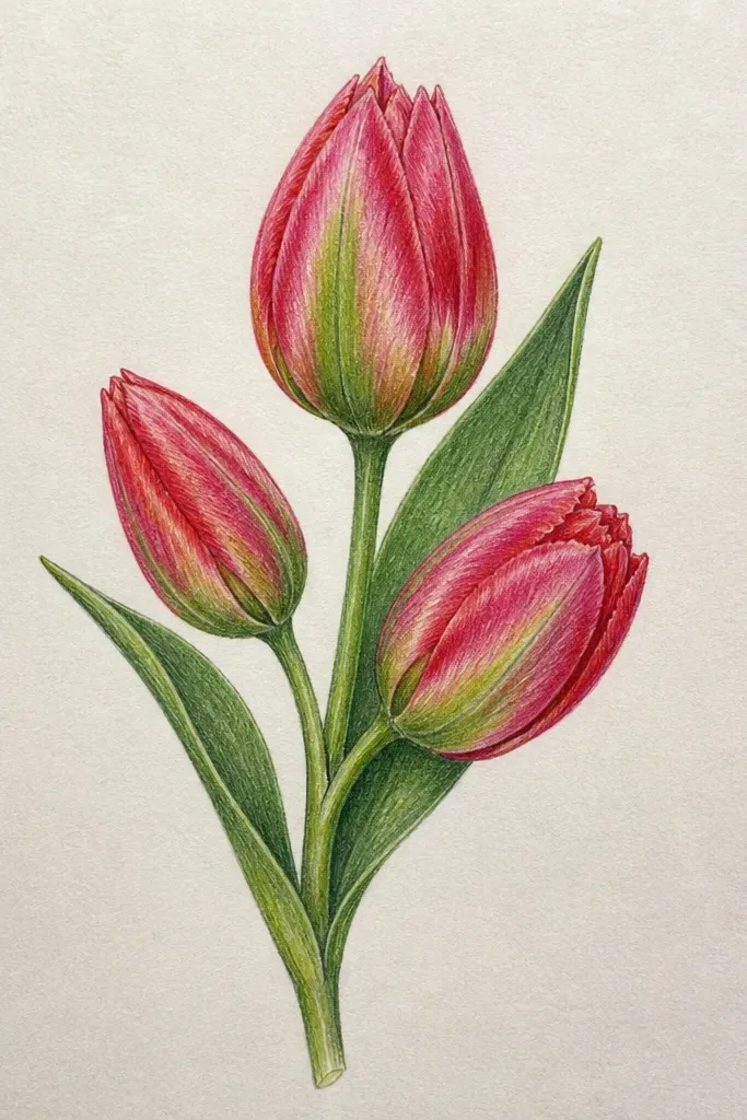
This idea makes your drawing look like a finished holiday element, not a single doodle. When you group three buds, your eye reads a theme right away, and you get variety without learning new petal styles. I like clusters because they fit corners on cards, and they also look good on gift wrap when printed small. Use one consistent line style across all buds so the cluster doesn't look like separate drawings pasted together. For color, match the buds with one palette but vary the intensity: darker outer petals on the front-facing one, lighter on the side-fold.
Start with a curved stem line that arcs like a wreath segment, then place three bud centers along it. Draw the first bud front-facing, the second side-fold to the right, and the third half-open with a tiny gap. Add simple leaves as two curved lines on the outer edge of the cluster, keeping them smaller than the buds. Shade each bud under its rim in the same direction, then ink over the pencil lines last so overlaps look clean.
Good to knowKeep the leaves thinner than the bud outlines; it keeps the buds as the focal point.
Common mistakeDon't make all three buds the same angle; identical angles look like a template.
11. Tulip Bud Border with Repeating Tiny Petals
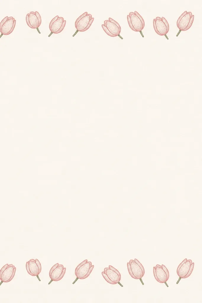
Borders are where tulip buds shine for seasonal cards, because you can repeat a simple shape and still get a cute, polished result. I like this version because each bud is small but still has clear overlap - you can't lose the tulip identity when it's mini. The trick is to keep the petal count consistent and the shading style uniform across the strip. This looks great with holiday color palettes like sage green + dusty rose, or navy + coral for a more modern vibe. It also makes your handwriting or message area look deliberate, not empty.
Draw a straight guide line for the border height, then place bud centers every 1.5 to 2 cm. Sketch each bud using a tiny rim arc and two outer petals, then add one inner fold line so it reads as a tulip bud. Rotate every other bud slightly (about 15 degrees) so the border doesn't look like it's stamped. Shade each bud under the rim with one set of short hatching lines and keep the stem lines thin so they don't overpower the border.
Good to knowUse a ruler for the border guide so your buds don't drift upward across a page.
Common mistakeDon't add extra petals to only a few buds; uneven complexity looks accidental.
12. Pencil-Only Bud with Soft Blending (No Ink)
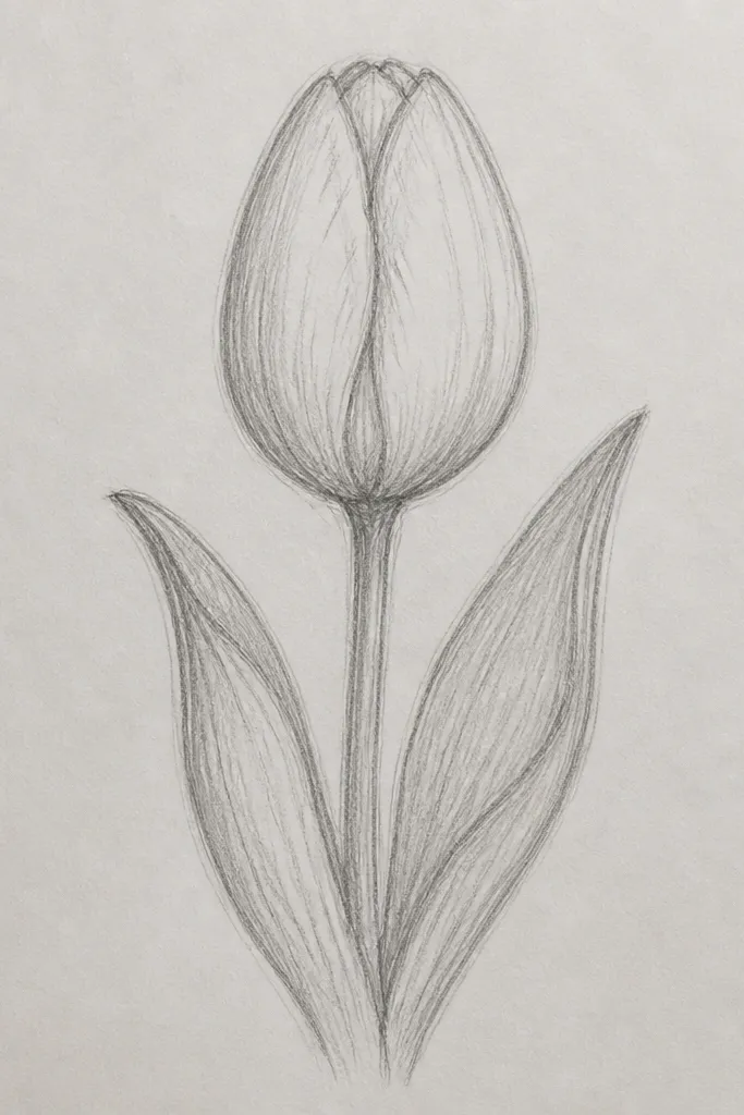
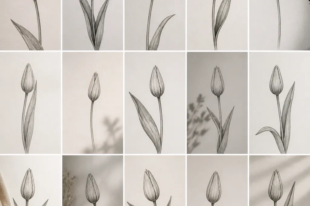
If you want a gentle, sketchbook look, pencil-only is the way I do it. You don't need ink to make a tulip bud look dimensional; you need value control. I build the bud with a 2B for outer edges, then blend with a paper stump or folded tissue for a soft gradient. The result feels cozy, great for winter and early spring stationery where harsh lines can look too sharp. It also flatters lighter color palettes because the shading already gives depth - you can leave it monochrome or add light colored pencil later.
Sketch your bud lightly in HB so you have room to adjust the petal curves. Press a 2B along the outer rim edges and along one inner fold line, then blend outward with a stump. Add a second darker layer near the deepest fold - just a small area, not the whole petal. Finally, lift highlights with a kneaded eraser on the top rim edge, and keep the stem thin so it doesn't compete with the petals.
Good to knowBlend the outer edges first, then stop; blending the whole bud makes it look flat.
Common mistakeDon't smudge the inner fold - it should stay darker than the outer highlight areas.
13. Tulip Bud with Patterned Petal Stripes
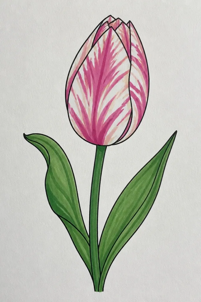
Patterned petals make a tulip bud look special without extra petals or complicated shapes. I use curved stripes because tulip petals naturally have subtle banding that follows the fold direction. This style works well for holiday prints where you want a little drama but still keep the drawing simple. For color, stripe with two tones of the same hue: for example, deep red stripes over a lighter rose base, or teal stripes over pale aqua. It's also a good choice if you're drawing on a small surface because the stripes give the eye something to read.
Draw the bud outline with a standard rim arc and center line, using a darker pencil for the outer rim. Fill the outer petals with a light base tone (or leave them blank if you're doing pencil only). Then add 3-4 curved stripes per outer petal, following the petal curve toward the center fold, keeping the stripes thinner near the rim. Add one darker stripe along the inner fold for depth, then lightly shade the rim edge so the stripes don't look pasted on.
Good to knowKeep stripe spacing even across petals; uneven stripes look like accidental pressure marks.
Common mistakeDon't draw straight stripes across curved petals; they should bend with the petal edges.
14. Mini Tulip Bud for Gift Tags (1.5-Inch Tall)
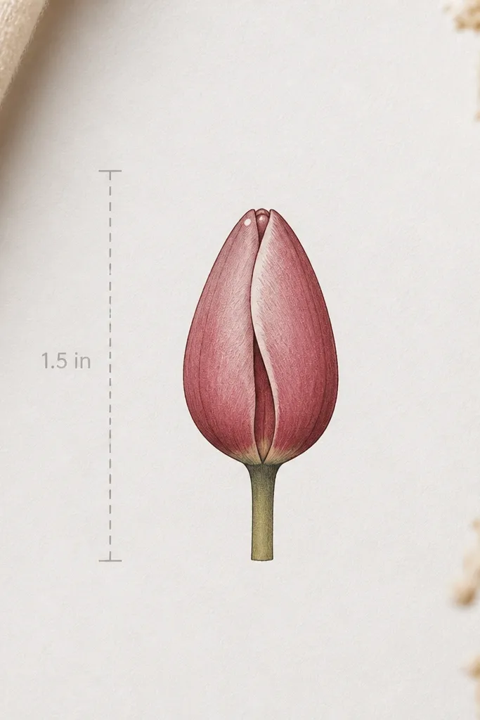
Small drawings need fewer lines, but they still need overlap. This mini bud is sized for gift tags and small stickers, and it stays readable even when printed at low resolution. I keep the petals simplified to three outer shapes plus one inner fold line, which prevents the bud from turning into a scribble. It looks cute on tags with twine and a kraft paper background because the contrast is strong. If you're working with limited time, this is the one I reach for - you can fit three buds on one tag and still have room for a name.
On your tag paper, mark a 1.5-inch height for the bud using a ruler. Sketch a simple rim arc at the top and a short center line down to where the stem ends. Draw three outer petals as overlapping cups, then add one inner fold line that tucks behind the left side. Darken the outer rim edges with a fine liner and add one tiny highlight dot or short highlight line near the top petal edge.
Good to knowUse a 0.3 liner for the final outline - thick lines make tiny buds look chunky.
Common mistakeDon't add leaves under a mini bud; they crowd the tag and steal attention.
15. Tulip Bud with Falling Snow Background Dots
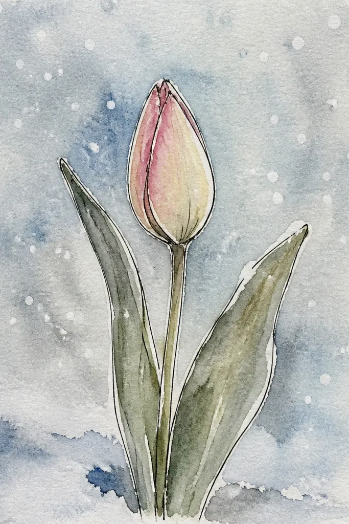
This idea is for holiday cards where the background does half the work. A tulip bud with falling snow dots looks festive even if the bud itself stays simple. I draw the bud first so the snow doesn't distract from the flower shape, then I place dots around it with a light touch. The bud stays the focal point because the snow dots are lighter and smaller than the bud lines. If you color the tulip, go for cool reds or rosy pinks so it pairs with the winter feel of the snow.
Sketch and ink a single front-facing or side-fold bud, then add minimal shading under the rim. Next, flick or place tiny white dots or light blue dots around the bud, making the density higher near the top and sparser near the bottom. Add a few slightly larger dots as "snow landing" and keep them off the bud outline so you don't blur the petals. Finally, add one or two sparkle marks - tiny crosses or star points - in the background only.
Good to knowIf your snow dots look too harsh, soften them with a light blue colored pencil over the dot edges.
Common mistakeDon't place snow dots on the petals themselves; it makes the bud look dirty.