1. Tiny Tight Cluster Bouquet with Confetti Background
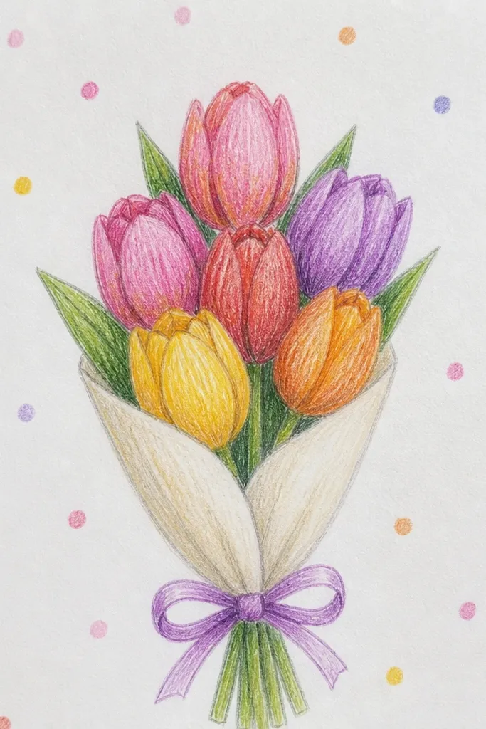
This one is for when you want “cute” without overthinking placement. A tight cluster makes tulips look lush even if each flower is simple, because overlapping hides sketchy stem lines. The confetti dots give you a playful holiday vibe while staying flat enough that the bouquet stays the star. Use 2 tulip colors plus one accent color so the drawing looks intentional, not random.
Step 1: Draw 7 to 9 tulip cups in a compact oval. Keep each cup tall, then add three petal fold lines inside the top half of the cup. Step 2: Connect stems into a single curved bundle at the bottom, then add 3 short leaf strokes that sit behind the front flowers. Step 3: Add a few 3-5 mm dot clusters around the bouquet and leave the center background light so the flowers pop.
Outline the tulip cups first, then erase any stray construction lines so the overlaps look clean.
Don’t add full leaves down every stem — it makes the bouquet look busy and flattens the flowers.
2. Fan-Shaped Bouquet with One Long Stem Ribbon
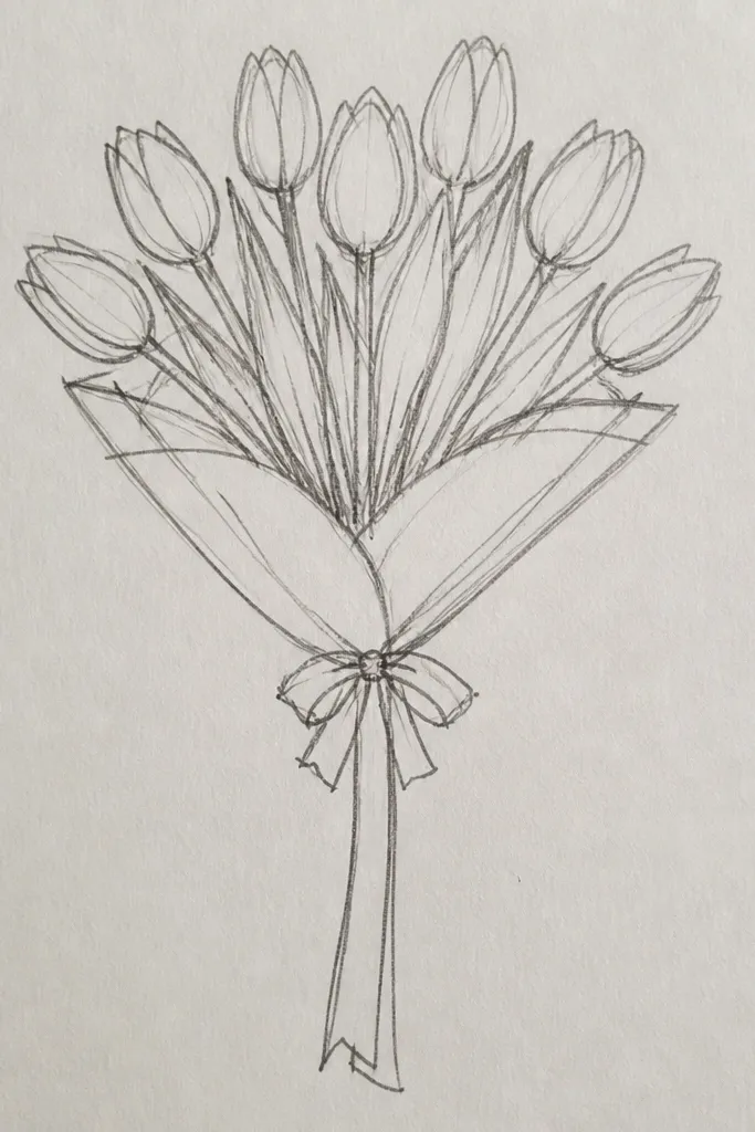
A fan layout is the easiest way to make a drawing look polished because every flower has a clear direction. The bouquet reads like a bouquet instantly: flowers radiate from one point, and the stems sweep together. Add one long ribbon strip to anchor the bottom and give you a clean line for the eye to follow. This setup looks great for spring and holiday cards because it stays tidy and graphic.
Step 1: Draw a small oval “origin” point low on the page, then sketch 8 tulip teardrop cups fanning upward from it. Angle each cup slightly differently, but keep their bottoms aligned to the origin. Step 2: Draw a single sweeping stem curve behind the front row, then add thin stems for the outer tulips. Step 3: Add a ribbon strip under the flowers — draw two parallel curves and connect them with a simple knot notch.
Keep the ribbon simple: one knot and two folds are enough. Too many folds make it look like tangled fabric.
Avoid drawing all stems at the same thickness — the fan looks fake when every line is identical.
3. Two-Tone Tulip Bouquet with White Petal Highlights
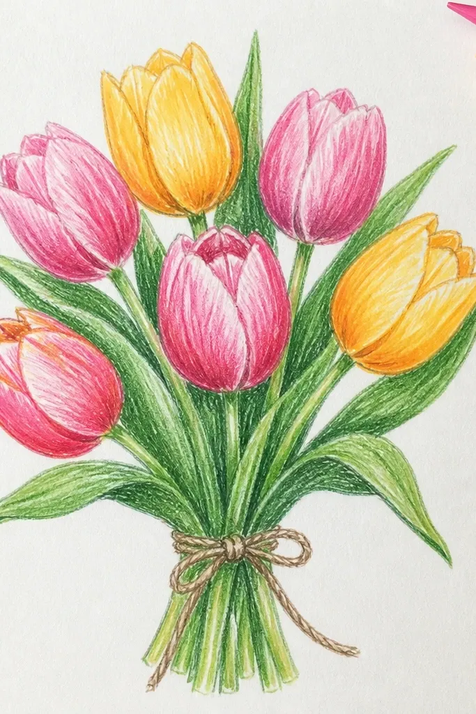
Two-tone coloring makes tulips look dimensional even if your shading is basic. This idea uses one tulip color for the outer petals and a slightly darker shade for the inner folds. The trick is leaving bright highlight space along the outer edge so petals look glossy and fresh. It’s also a clean look for beginner marker work because you’re only managing two values.
Step 1: Outline 7 tulips and keep the petals section lines faint but present, especially near the top. Step 2: Color the outer petal areas with your lighter tulip color, then color the inner fold sections with a darker shade. Leave a narrow strip uncolored (paper white) along the petal edge. Step 3: Shade stems with one light green pass, then add a darker green line on the underside of the stem curve.
Good to knowIf your marker bleeds, color first with light pressure, then go back for darker fold color only after the first pass dries.
Common mistakeDon’t fill the whole petal with the darker shade — the white highlight is what sells the shape.
4. Tulip Bouquet in a Simple Paper Bag Wrap
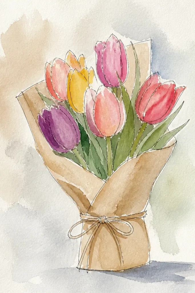
This is a holiday-friendly drawing because the container makes it feel gift-like. A paper bag wrap also solves a beginner problem: where do the stems go? The bag hides messy stem joins and gives you a flat area to add a few leaf tips and small tulip faces. Keep the bag lines bold and the flowers lighter so the bouquet still reads clearly.
Step 1: Draw a trapezoid bag shape centered on the page, then extend stems upward from behind the bag opening. Step 2: Place 6 to 8 tulips so their cups peek above the bag rim, and add three petal fold lines for each flower. Step 3: Add two handles as gentle arcs and shade the bag with light cross-hatching near the bottom edge.
Good to knowUse a single bag color like warm brown, then add one darker fold stripe. Two tones look more believable than patchwork shading.
Common mistakeDon’t let the bag outline overpower the bouquet — keep the bag lines slightly thinner than the tulip outlines.
5. Single-Line Bouquet with Bubble Dot Border
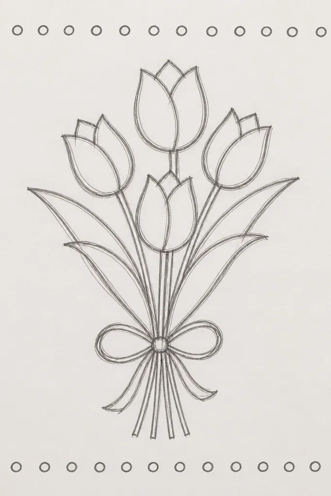
If you want the cleanest, most aesthetic look for beginners, go single-line. This style forces you to simplify: each tulip cup becomes one flowing loop, and stems become one elegant sweep. The bubble dot border frames the bouquet without adding extra clutter. It’s also great for line-art coloring later because your shapes stay crisp.
Step 1: Draw 6 to 7 tulip cups with one continuous line each, starting from the stem, looping into the cup, and finishing at the base. Keep your cups tall and narrow for a tulip silhouette. Step 2: Connect cups into one curved stem line, then add 3 small leaf arcs behind the front tulips. Step 3: Draw a border of bubbles around the bouquet — place bubbles 1 cm apart and keep them the same size.
Use a 0.7 pen for the border and a 0.5 pen for the tulip cups so the frame reads lighter.
Avoid heavy scribbles in the cup area — a single line should be clean, not shaded everywhere.
6. Watercolor-Style Tulips with Dry Brush Texture
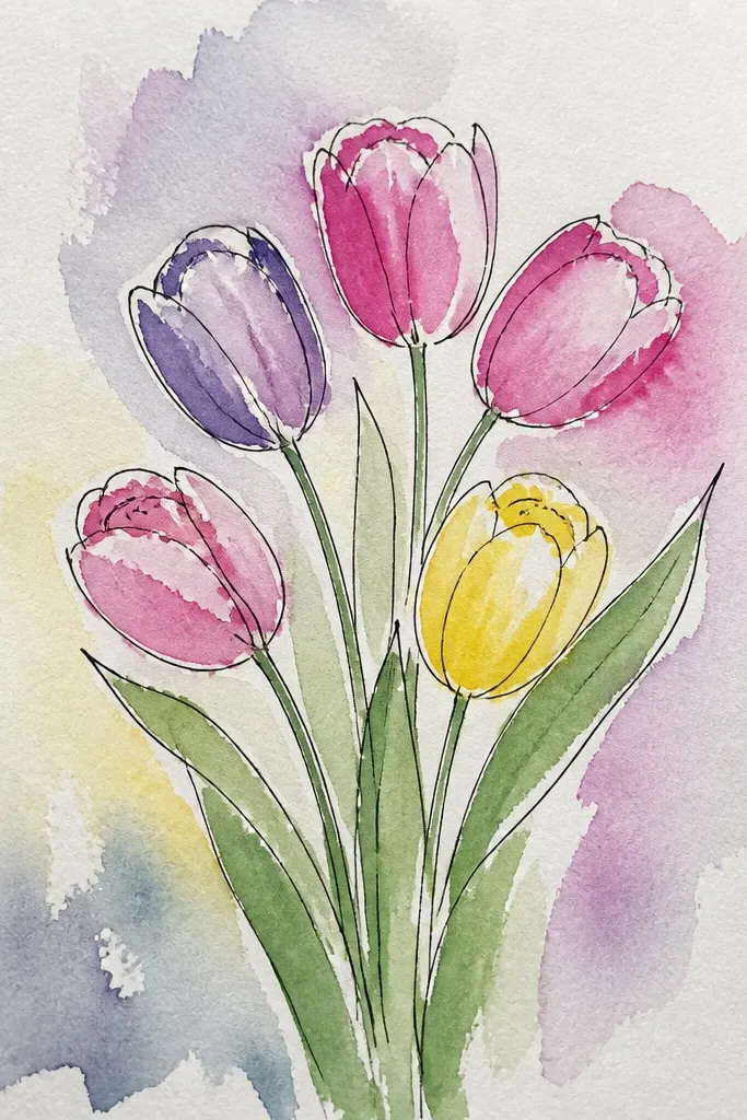
This idea looks painterly without needing real watercolor skills. The dry brush texture gives petals a natural speckled edge, so they never look flat. It also hides minor unevenness in beginner coloring. Use this if you want your bouquet to look soft and aesthetic for seasonal posts and greeting cards.
Step 1: Lightly sketch 8 tulips and their fold lines, then wet only the petal outer areas with clean water (not the stem). Step 2: Tap paint or watercolor marker onto the wet area and let it bleed slightly, keeping the darkest color inside the cup folds. Step 3: After it dries, use a nearly dry brush with a darker color to add tiny speckles near petal edges and on a few leaf tips.
Good to knowKeep the stems mostly unpainted except for a thin wash on the underside line.
Common mistakeDon’t over-wet the paper — muddy color happens fast when you soak stems and backgrounds together.
7. Minimal Tulip Bouquet with Bold Blocky Pot
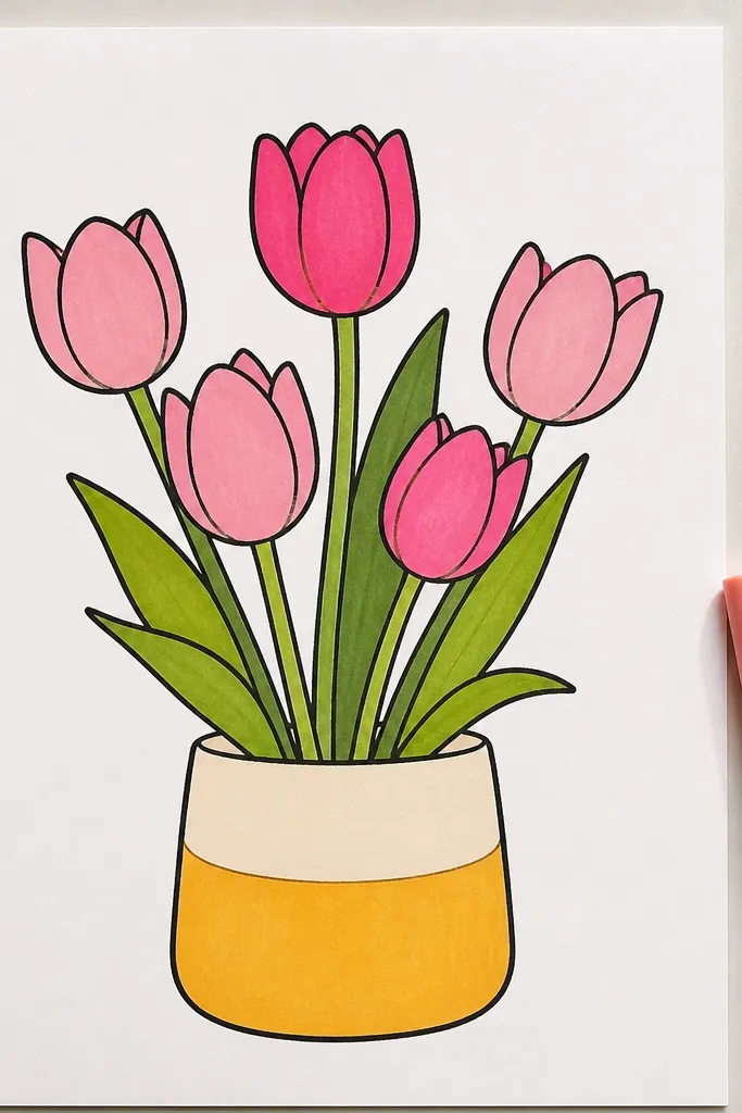
Minimal drawings look great when the container is graphic. A blocky pot gives structure, while the tulips stay simple and clean. This design is photogenic because it has strong shapes: rectangle pot, tall tulip cups, and a few leaf lines. It’s also a good practice project for learning spacing and consistent petal fold placement.
Step 1: Draw a rectangular pot with slightly curved corners, then add a base line and a simple rim. Step 2: Place 5 to 6 tulips coming out of the pot, keeping their cups evenly spaced across the pot width. Step 3: Add two leaf strokes per side, then color the pot with one flat shade and add a single shadow triangle under the rim.
Use ruler edges for the pot and freehand the tulips — the contrast is what makes it look intentional.
Avoid adding extra flowers behind the front row — minimal layouts collapse when you add depth too early.
8. Tulip Bouquet with Hanging Ornament Tags
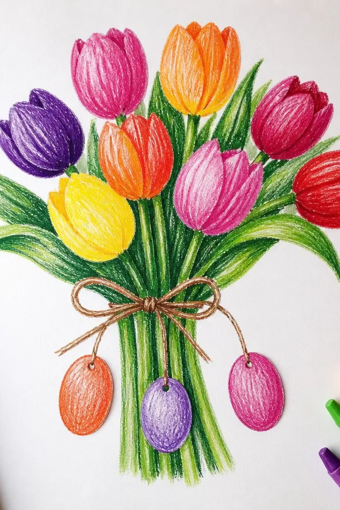
This one adds holiday cuteness without turning into a messy Christmas scene. Hanging ornament tags give you neat little shapes that frame the bouquet and create a vertical rhythm. The tulips stay simple, and the tags add just enough detail to feel seasonal. It’s also a great way to practice drawing small circles and tag strings cleanly.
Step 1: Draw 7 tulips in a loose cluster and add stems that come down to a ribbon knot area. Step 2: Hang 3 small ornaments or tags from the upper stems using thin strings — draw tiny circles or rounded rectangles. Step 3: Color the ornaments with one bright accent color and add a small highlight dot on each, then shade the tulip inner folds darker to keep the ornaments from stealing attention.
Keep ornaments smaller than the tulip cups. If ornaments match the flower size, the drawing looks crowded.
Skip drawing faces on the ornaments — it pulls focus away from the tulip bouquet.
9. Pastel Tulip Bouquet with Soft Halo Background
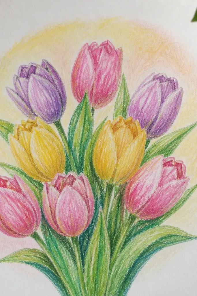
A soft halo background makes beginner tulips look more “finished” with almost no extra drawing. The halo creates separation between the flowers and the page, so even simple shading looks intentional. Pastel tulips also photograph well because they don’t look harsh under phone lighting. This is a great choice when you want something sweet for spring or holiday stationery.
Step 1: Outline 8 tulips with clear fold lines and keep the bouquet centered. Step 2: Color with pastels: one light pink, one pale peach, and a soft yellow for variety, with darker pastel in the inner folds only. Step 3: Add a faint circular halo behind the bouquet by coloring very lightly with a light gray or pale lavender around the outside edges.
Good to knowUse a light touch for the halo. If the halo is darker than the petals, it will steal focus.
Common mistakeDon’t outline the halo — a drawn line makes it look like a sticker instead of a glow.
10. Tulip Bouquet Top-Down Flat Layout with Ground Shadow
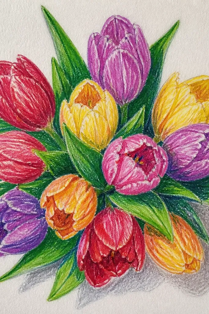
Top-down layout is a sneaky trick for beginners because it reduces complex stem angles. The bouquet sits like a flat arrangement, and you only need to draw the front cups and a few overlapping leaves. Add a ground shadow oval so the flowers look “placed” on paper instead of floating. This style is super photogenic because it reads clearly even in small thumbnails.
Step 1: Draw a wide oval ground shadow first, then sketch 9 tulip cups inside it. Keep the cups mostly upright and overlap them slightly. Step 2: Add stems as short lines that disappear behind the shadow oval, then add 4 leaf strokes that cross through the bouquet center. Step 3: Shade inner folds with a darker color and add a thin stem shadow line on the underside of each stem stub.
Good to knowIf your cups look uneven, align them by keeping the cup tops at a similar height.
Common mistakeAvoid long stems in this layout — top-down looks best with short stem hints.
11. Tulip Bouquet with Striped Wrapping Paper
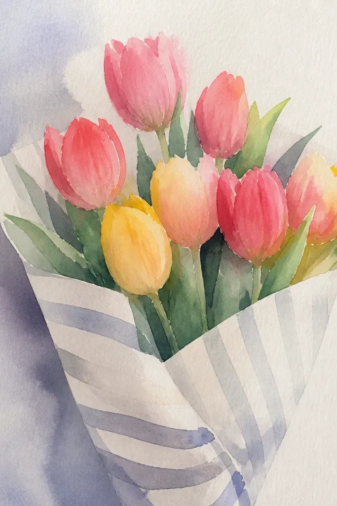
Wrapping paper turns a simple bouquet into a gift illustration. Stripes are easy to draw, and they create a strong pattern that makes the tulips stand out. Keep the stripes behind the flowers, not across them, so your petals stay the focal point. This design also gives you an easy color plan: one stripe palette plus tulip colors.
Step 1: Draw a wrapping shape around the stems, like a wide V-wrap that opens at the top. Step 2: Place 7 tulips behind the wrap edges so the cups peek out. Step 3: Add diagonal stripes on the wrap using a ruler for straight lines, then shade the wrap edge with a darker stripe group.
Use two stripe widths — thick bands for contrast and thin bands for balance. It looks more designed than equal stripes.
Don’t stripe the entire background — only stripe the wrap so you don’t compete with the flowers.
12. Monochrome Tulip Bouquet with Crosshatch Shading
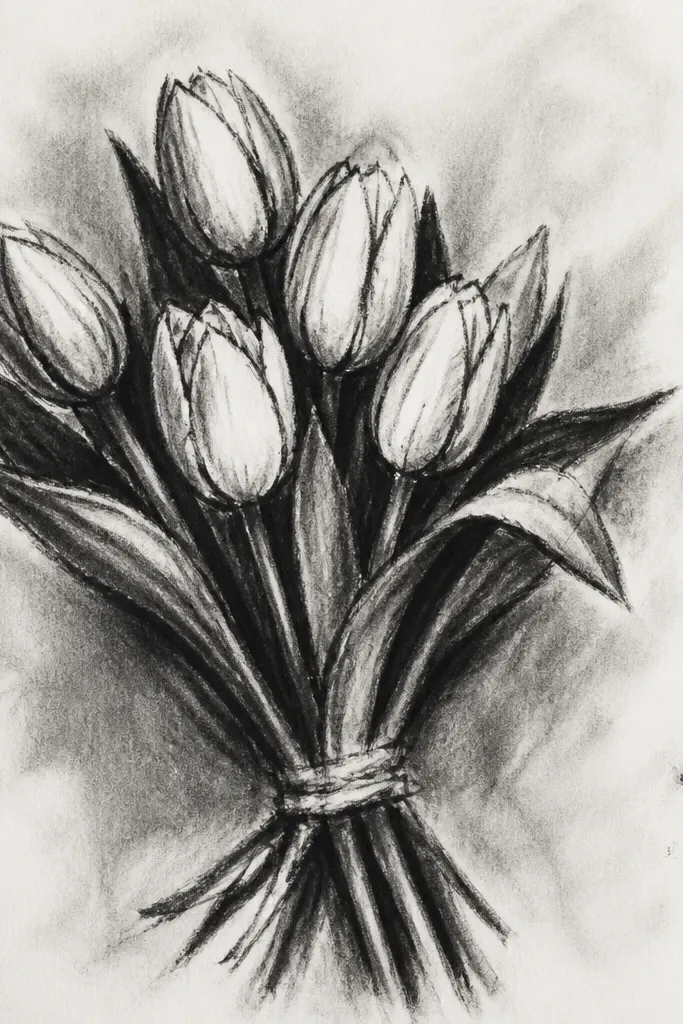
Monochrome drawings look expensive when shading is controlled. Crosshatch inside the tulip cup folds gives you depth without needing multiple colors. Add a small banner strip behind the bouquet for a clean seasonal look. This is a strong option if you only have one pen or one marker color and want it to still look dimensional.
Step 1: Outline 8 tulips and keep petal fold lines visible. Step 2: Crosshatch the inner fold sections with short, tight strokes and leave the outer petal edges lighter. Step 3: Add a banner behind the bouquet using two curved lines and a small notch at the ends, then lightly crosshatch the banner shadow area.
Crosshatch direction should follow the petal curve — it looks more natural than random scribbles.
Avoid shading the whole cup evenly. The inner folds need to be darker than the outer rim.
13. Tulip Bouquet with Ribbon Bow and Hanging Leaf Sprigs
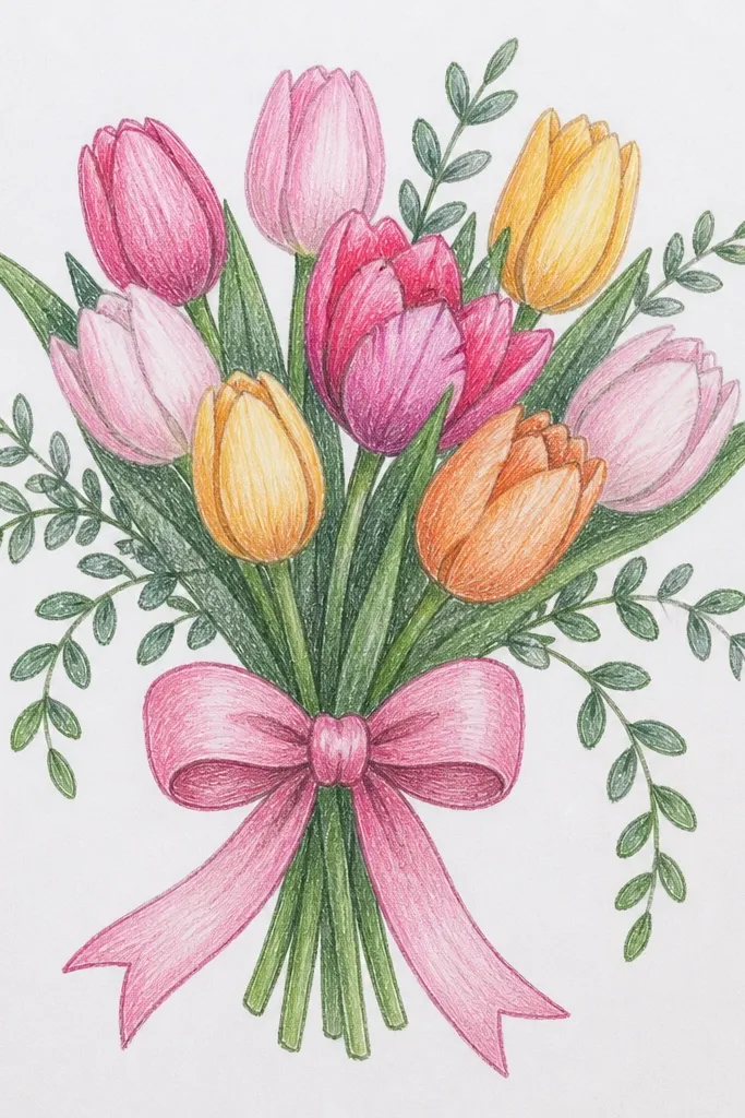
A ribbon bow makes the bouquet instantly cute, and hanging leaf sprigs add movement without clutter. The bow gives you a clear focal shape at the bottom, while the leaf sprigs add thin lines that frame the tulips. This is a great beginner project because you can keep the tulips simple and let the bow details do the heavy lifting for “aesthetic.”
Step 1: Draw 7 tulips in a gentle arc and connect stems to a point at the bottom. Step 2: Create the ribbon bow with two loops (draw heart-like curves) and a small center knot notch. Step 3: Add two thin hanging leaf sprigs from the knot — draw a leaf shape at the top and taper it down with one clean line.
Give the ribbon one shadow fold line under the top loop so the bow looks layered.
Don’t make the bow too big compared to the tulips. Match bow width to about half the bouquet width.
14. Tulip Bouquet Border Frame with Small Stars
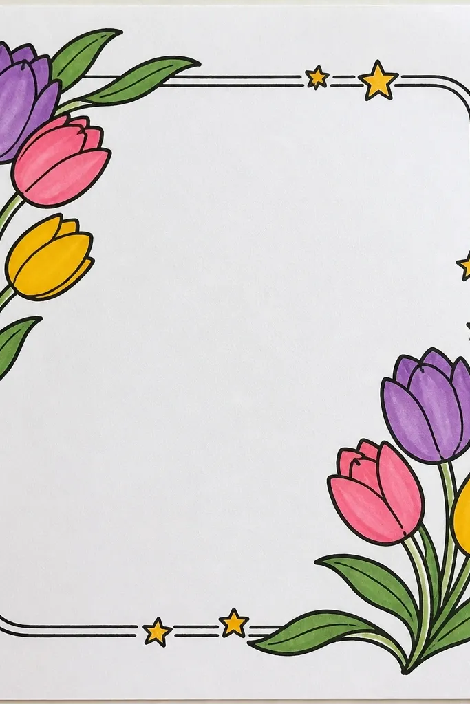
A border frame makes your drawing feel like a finished seasonal card even if you only spend one evening. Small stars add a festive, light touch without forcing you to draw complicated ornaments. Keep the frame thin and the stars small so the bouquet stays dominant. This style is photogenic because it creates a clear rectangle focus area.
Step 1: Draw the bouquet first in the center — 8 tulips with visible fold lines and a curved stem bundle. Step 2: Add a thin rectangular border around it with consistent margins (about 1 cm from the edges). Step 3: Place 6 to 10 tiny star shapes along the border corners and mid-sides, then color stars with one accent color and keep the rest of the background blank.
Good to knowUse the same star size everywhere. Changing sizes makes it look like a doodle instead of a design.
Common mistakeAvoid coloring the border heavily — a dark frame makes the bouquet look smaller.
15. Tulip Bouquet in a Clear Glass Vase with Frosted Condensation
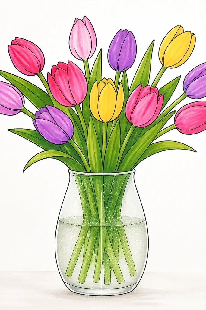
This one looks way more realistic than it has any right to, because the vase is the star. You draw the tulips like a normal bouquet, then you add frosted condensation streaks and tiny droplets on the glass to make the whole piece pop. The contrast between crisp white highlights and the cool, hazy blue-gray fog makes it feel fresh and photogenic. It also fixes a common problem with tulip drawings — flat flowers that look fine alone but boring when there’s no “container” story. This is beginner-friendly if you can draw simple ovals and curved petals; the time is about 45-70 minutes depending on how many droplets you add. It suits cards, wall art, and even classroom projects because the glass effects are forgiving and repeatable.
Sketch a vase first: draw a tall rounded rectangle, with a slightly narrower neck at the top and a wider base. Add 5-7 tulip stems that start at the vase opening and fan slightly toward the left, then draw petals as overlapping teardrops with one crisp highlight line on each tulip. For the glass, shade the vase edges with light gray pencil, then erase a few curved “shine” strips so the glass stays clear. Add condensation by dotting tiny circles (3-6 mm) along the vase front, then drag a few short streaks downward using a damp paper towel edge or a blending stump. Finish by darkening only the vase outline and the stem intersections so the droplets and highlights read cleanly.
Use a kneaded eraser for the shine strips — it lifts pigment without tearing paper fibers. Keep droplets clustered near the top third of the vase for a more believable condensation pattern.
Don’t shade the whole vase the same tone — leave clear gaps for highlights or the glass turns into a gray blob.