1. Pastel ribbon bouquet with 3 stacked roses
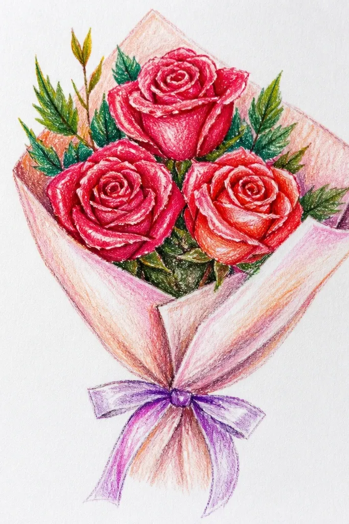
This one looks cute because it uses a simple vertical arrangement: three roses stacked like a neat gift tag. The ribbon gives you an instant focal point, and the clustered placement makes the bouquet feel cohesive. Draw each rose using the same center spiral and petal curve style, then vary only the outer ruffle size so the set looks natural. Keep the leaves small and tucked behind the ribbon so the roses stay the star. It’s perfect for Mother’s Day cards, spring stationery, and any page where you want “pretty” without complex backgrounds.
Start by sketching a tall oval guide for the bouquet and place three rose centers along it: top, middle, bottom. Draw the center spiral first, then add 6-8 overlapping C-shaped petals around it for each rose, and finish with a light outer ruffle of bigger U curves. Add a ribbon banner across the roses with two flowing tails and a small bow knot at the top edge. Finally, ink with a 0.5 fineliner, erase pencil marks, then color roses with soft pastel pencils or markers and keep the ribbon slightly darker for contrast.
Good to knowColor the ribbon before you shade the roses so you don’t accidentally muddy the rose centers.
Common mistakeDon’t spread the roses far apart — you need overlap or near-touching edges for bouquet clarity.
2. Botanical corner bouquet with a thin frame
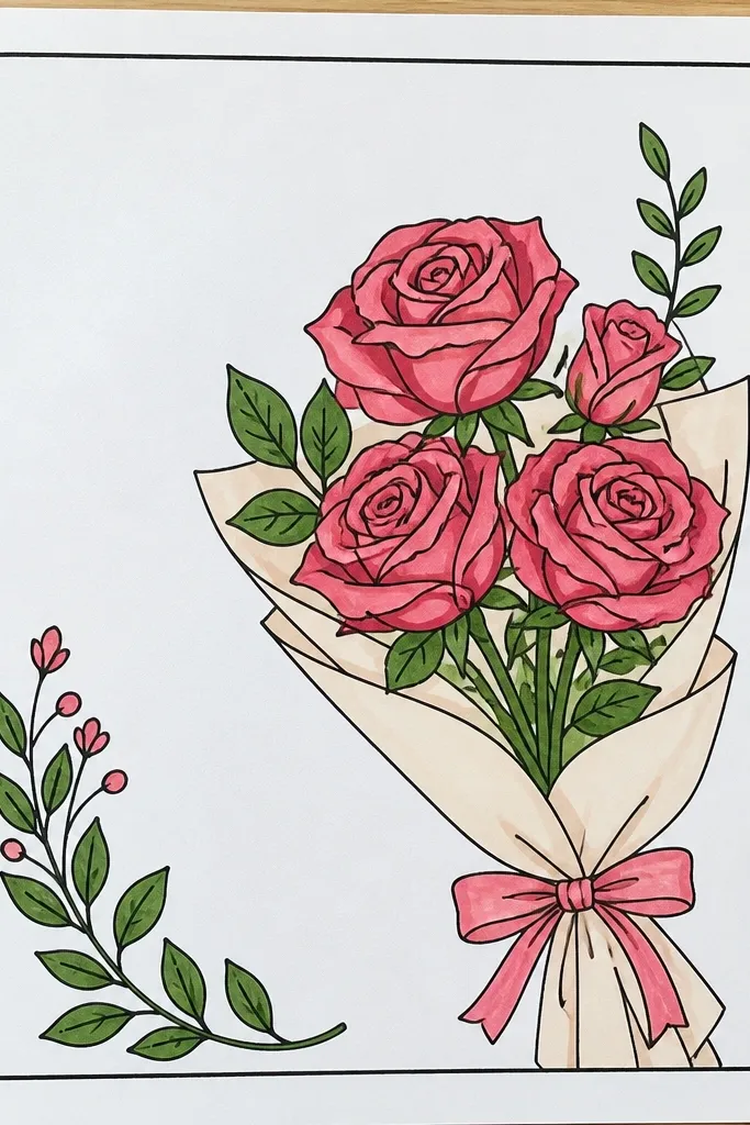
Corner bouquets look aesthetic fast because they use negative space like a design tool. You’re not filling the whole page; you’re placing a bouquet inside a light frame so it feels like a sticker or label. The rose style stays simple: tight centers, few petals, and tiny leaf clusters that don’t overwhelm. A thin frame also makes your lines look intentional, even if your roses aren’t perfect. This works great for planner covers, holiday labels, and mini wall art where you want one clean element rather than a full-page scene.
Draw a light rectangular frame near the top corner with 1 cm margins from the edges of the page. Inside it, sketch one main rose and two smaller ones tucked around it, keeping their centers at different heights. Add thin stems and 3-6 small leaves per cluster using simple teardrop shapes with a short center vein line. Ink the frame and stems first, then ink each rose last so you can adjust spacing. Color lightly with colored pencils, leaving the frame mostly uncolored except for a soft wash if you want it to pop.
Good to knowUse a ruler for the frame, but freehand the stems — straight lines plus organic leaves look balanced.
Common mistakeAvoid thick coloring around the frame edges; it makes the bouquet look cramped.
3. Single rose in a teacup with rose buds around
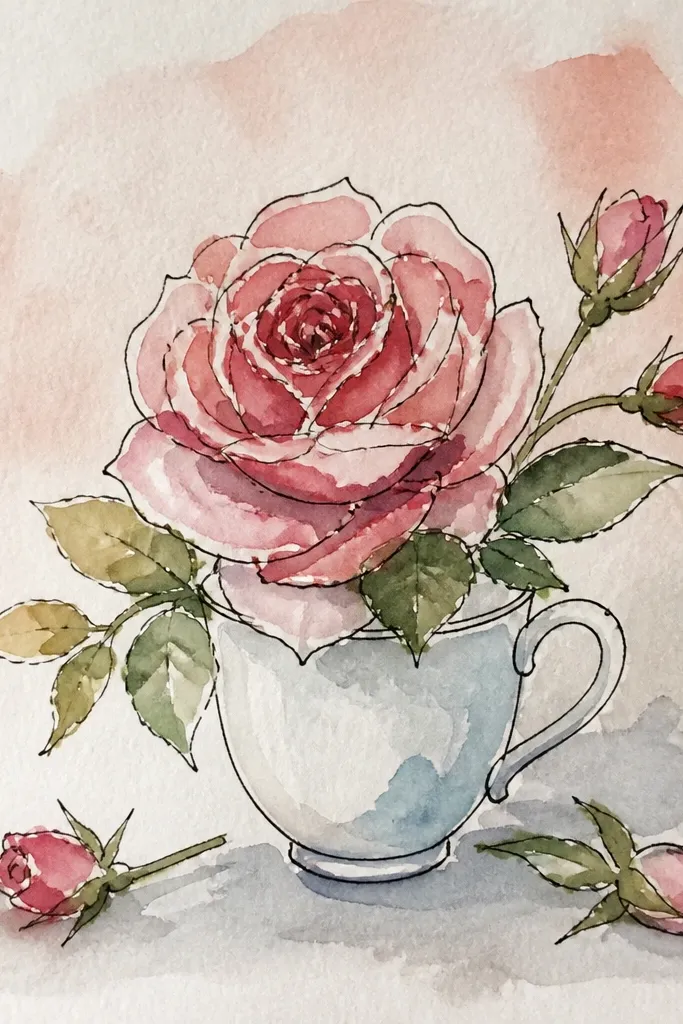
This idea is cute because it mixes one detailed focal rose with tiny supporting buds. The teacup shape gives you a built-in base, so the composition doesn’t float. Keep the teacup lines simple and slightly curved, then let the rose petals do the work. Add 4-6 buds around the cup rim to create that “bouquet” feeling without drawing a full cluster of large roses. It’s a great match for cozy fall and winter holiday pages, and it also works for desktop backgrounds or gift tags.
Sketch an oval teacup opening and a small saucer base below it, then draw a simple handle on the side. Place one main rose rising from the cup, starting with a tight spiral center and 8-10 overlapping petals that get slightly larger as they go outward. Add tiny buds around the cup rim using small teardrops or mini C-shaped petals. Ink everything with a 0.3 fineliner for buds and 0.5 for the main rose outline. Color the cup with a light neutral (cream or pale gray) and color the rose and buds with one consistent palette.
Good to knowLeave a thin white gap inside each petal while coloring — it keeps the rose looking fresh instead of flat.
Common mistakeDon’t make the teacup too detailed; a clean cup makes the rose look more aesthetic.
4. Washi-tape style bouquet stripes
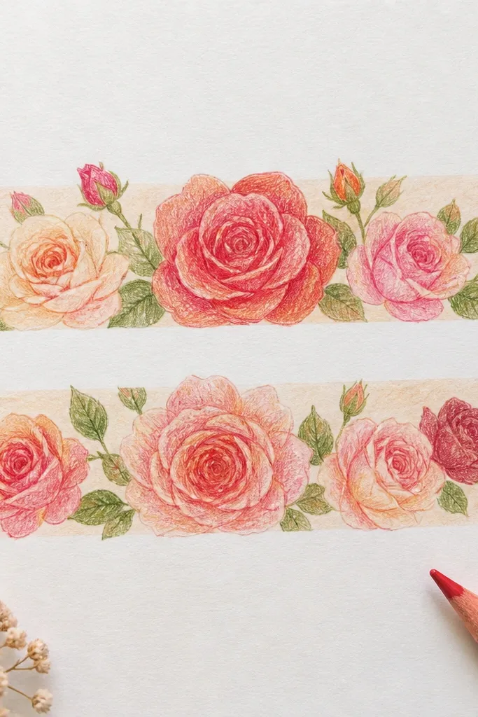
Washi-tape style drawings look instantly cute because they borrow real packaging design. You draw the bouquet on a “tape” strip so the page looks like a craft sticker. The rose technique stays simple: three roses with matching petal curves and small leaf sprigs between them. Add a few confetti dots behind the tape for a finished look without heavy shading. This is ideal for holiday planners, handmade cards, and any page where you want a playful aesthetic instead of a realistic one.
Draw 2-3 diagonal tape strips across the page, each about 1.5-2 cm wide, with slightly uneven edges. Under the strips, sketch a bouquet cluster with three rose centers and 2-3 bud shapes tucked near the stems. Keep stems thin and mostly hidden under the tape so the roses look like they’re “stuck on.” Ink the rose petals first, then ink the tape edges last, so the tape frames everything. Color the tape with muted patterns (light pink, pale blue, tiny dots) and color roses with one coordinated palette.
Add tiny tape fold shadows using a light pencil at the strip edges for depth.
Skip the full background scene; the tape framing is the design — don’t compete with it.
5. Christmas red rose bouquet with holly sprigs
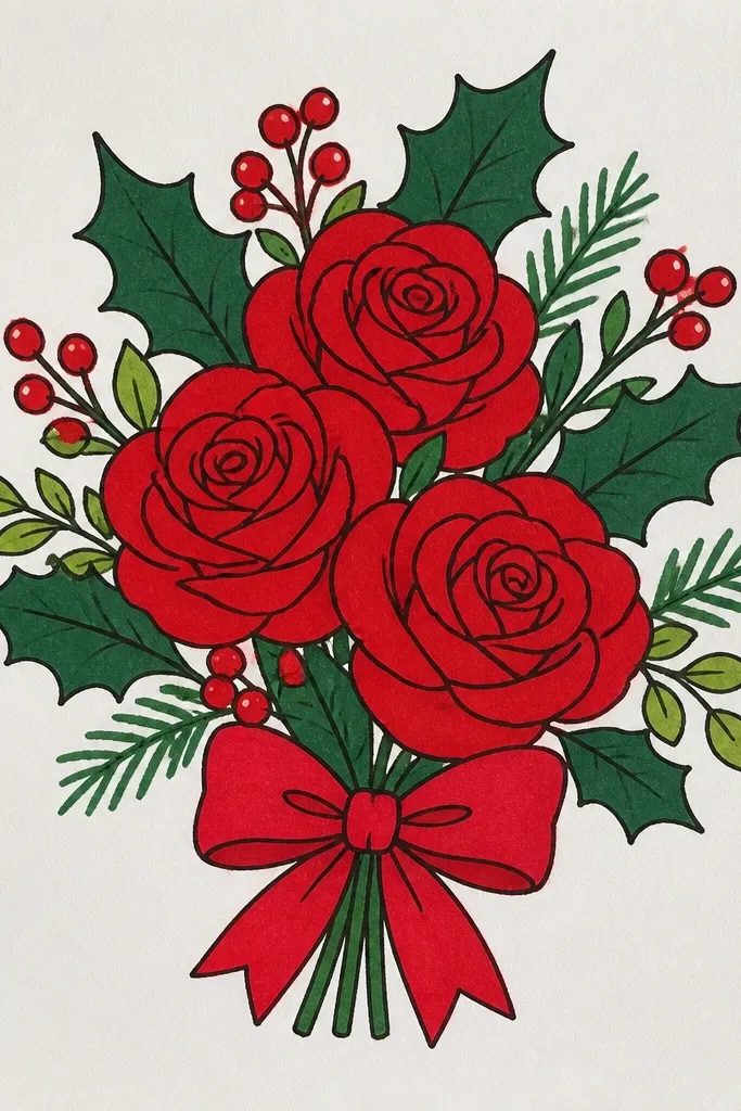
Holiday roses look best when you add one clear seasonal cue. Red roses plus holly sprigs give you instant Christmas energy without turning the page into a cluttered ornament. The roses stay cute by using fewer petals and a softer outer ruffle, not hyper-detailed realism. Add 6-10 holly leaves around the cluster and include berries as tiny dots. This layout reads well even at small sizes, so it’s perfect for gift tags, wrapping-paper labels, and card corners.
Sketch a bouquet oval and place two main roses on the left and right, then one smaller rose in the center. Draw each rose with a tight spiral center and 7-9 petals shaped like rounded C curves. Add holly leaves by drawing small pointed teardrops with a short center line, then cluster them around the roses. Finish berries with tiny filled circles and a few light leaf vein lines. Ink with a 0.5 fineliner, erase pencil, then color: deep red petals, dark green holly, and bright red berries with minimal shading.
Good to knowUse a darker green for holly outlines and a lighter green for the leaf fill so the berries stay crisp.
Common mistakeDon’t add too many accessory elements; holly plus roses is enough.
6. Autumn rose bouquet with burnt orange leaves
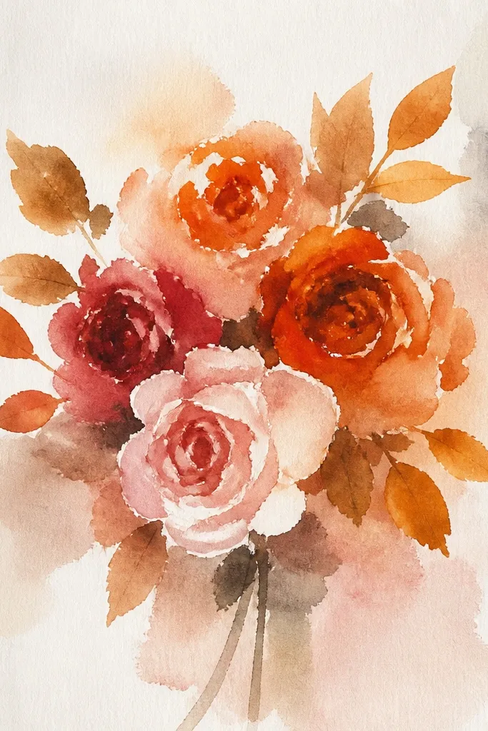
Autumn bouquets look aesthetic because they mix warm rose color with leaf shapes that have variety. You’ll keep the rose drawing simple — tight centers and 6-8 petals — then surround it with 8-12 leaf silhouettes in different sizes. Add one small swirl vine or curly stem to connect everything. The result feels seasonal without needing a background scene. It’s a great fit for Thanksgiving cards, fall journaling pages, and any DIY craft where you want warmth and color contrast.
Start with one large rose in the center and two smaller roses at the top edges of your bouquet oval. For each rose, draw the center spiral and then ring the spiral with rounded C petals, finishing with a thin outer ruffle. Create leaves using 3 leaf types: teardrop leaves, maple-like lobed leaves (3-4 lobes), and tiny oval leaves. Place leaves around the roses so they overlap the bouquet boundary. Ink first with a fineliner, then color using burnt orange, mustard, and light brown; add a few pencil shading strokes along leaf veins only.
Color one leaf type darker than the others (like burnt orange) to give the page a clear focal area.
Don’t shade every petal; leave most rose petals light and let leaves carry the warmth.
7. Minimal line-art bouquet with dot background
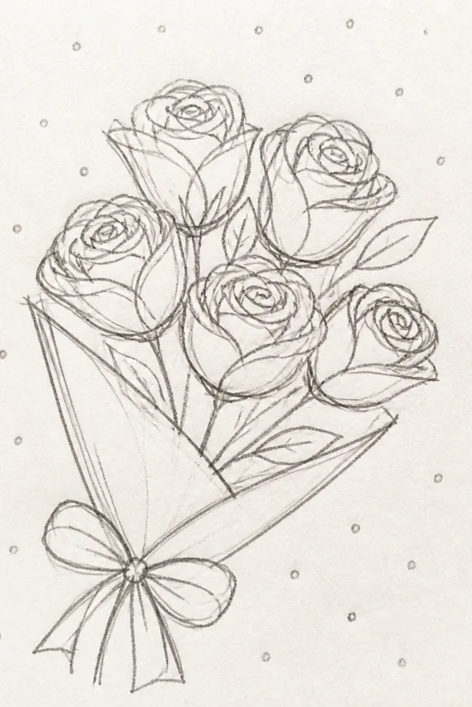
If you want cute and simple without coloring, this minimal line-art idea wins. The roses use thin, consistent strokes and a small number of petals, so the drawing stays clean. A dot background turns empty space into texture and makes the bouquet look intentional. Keep the leaves sparse and add one tiny bud at the bottom to balance the composition. This works for monochrome invitations, printable-style cards, and any page where you want a modern aesthetic.
Sketch three rose centers in a triangular layout — top left, top right, and bottom center. For each rose, draw a center spiral and then add 5-7 petals with simple C curves, keeping gaps between petals. Add 3-5 leaf shapes using teardrops with one center line, and include one small bud near the bottom. Place a dot field behind the bouquet using a pen tip or marker, leaving a clear bubble around the roses for contrast. Ink all lines, then erase pencil and go over dot edges lightly so they match line weight.
Good to knowUse larger dots farther from the bouquet and smaller dots near the roses for a subtle depth effect.
Common mistakeAvoid filling the whole page with dots — leave breathing room around the bouquet.
8. Watercolor wash bouquet with inked roses
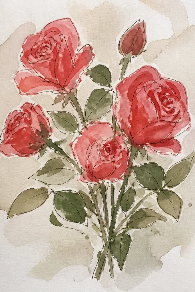
This one looks polished because the roses are inked sharply while the background is soft and airy. You get that aesthetic contrast: crisp petal lines over a blurry wash. Keep the rose petals simple and let the wash do the color work. Use 3-4 rose tones (like dusty pink, blush, and a hint of peach) and keep leaves a muted green-gray. It’s perfect for spring and bridal-style pages, and it’s beginner-friendly if you manage water control.
Draw your bouquet cluster lightly in pencil, then ink the roses and stems with a waterproof pen so watercolor won’t smear them. Wet the background area behind the bouquet with clean water and add diluted watercolor washes in two or three colors, keeping them lighter near the rose edges. Let the wash bleed slightly, but avoid flooding over the ink lines. Add a few leaf washes using a thin green, then let everything dry fully. Finish by adding tiny highlight dots or light speckles with white gel pen if you want extra “lift” in the look.
Keep a paper towel handy and dab around ink lines — it prevents watercolor from creeping into petals.
Don’t ink with regular gel pens if you plan to watercolor; use waterproof ink.
9. Rose bouquet in a heart frame
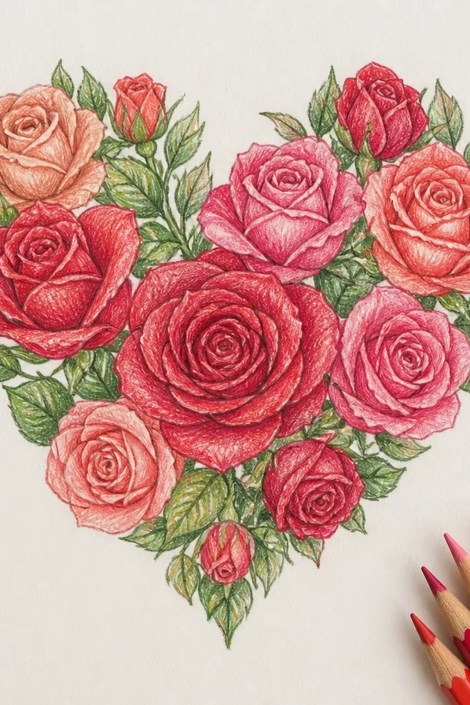
Heart frames make roses look instantly gift-ready. The trick is to keep the bouquet compact inside the heart and use one consistent rose style so it reads clean at a glance. Draw the heart first, then tuck roses along the inner curve so petals follow the heart shape. Add a few tiny leaves or berry dots to keep the center from feeling empty. This is a strong choice for Valentine’s Day, anniversaries, and sweet DIY cards.
Draw a heart outline with a smooth top dip and a pointed bottom. Inside it, sketch two main roses near the upper left and upper right, then one smaller rose near the bottom center. Use the same center spiral and C-petal method for all roses so they match. Add small leaf sprigs between roses and along the heart edge, keeping them thin so the heart line stays visible. Ink with fineliner, erase pencil, then color roses in one palette and keep the heart outline either uncolored or lightly tinted.
Make the heart line slightly thicker than the rose lines for an instant “frame” effect.
Don’t cram too many leaves into the heart; the heart outline is part of the design.
10. Rose bouquet with polka-dot wrapping paper background
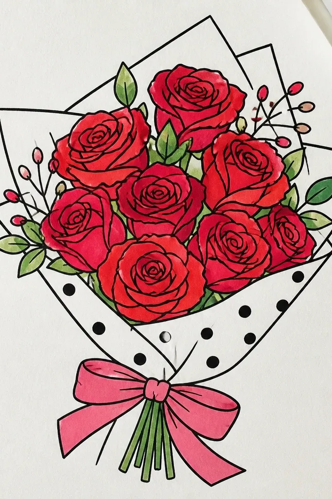
Wrapping-paper backgrounds make the bouquet feel like a real gift. You’ll draw a simple ribbon wrap around a clustered bouquet and then add polka dots behind it so the page looks busy in a good way. Keep the roses simple — fewer petals, consistent curves — and let the background pattern carry the texture. This is great for birthdays, holiday packaging labels, and any page where you want a playful look without complicated shading.
Sketch your bouquet cluster and add a ribbon wrap band across the center with two tails and a small knot at the top. Draw roses using 6-9 C/U petals and a tight spiral center, varying only size. Behind the ribbon and bouquet, lightly map a polka-dot grid with pencil so dots stay evenly spaced. Ink the roses and ribbon, then erase pencil dots you don’t want left behind. Color the ribbon one solid shade and color the dots lightly in a contrasting color (like pale green dots under pink roses).
Keep dot size consistent — 3-4 mm dots look best for clean aesthetics.
Don’t color the dots too dark; they steal attention from the roses.
11. Monochrome black rose bouquet with white highlight dots
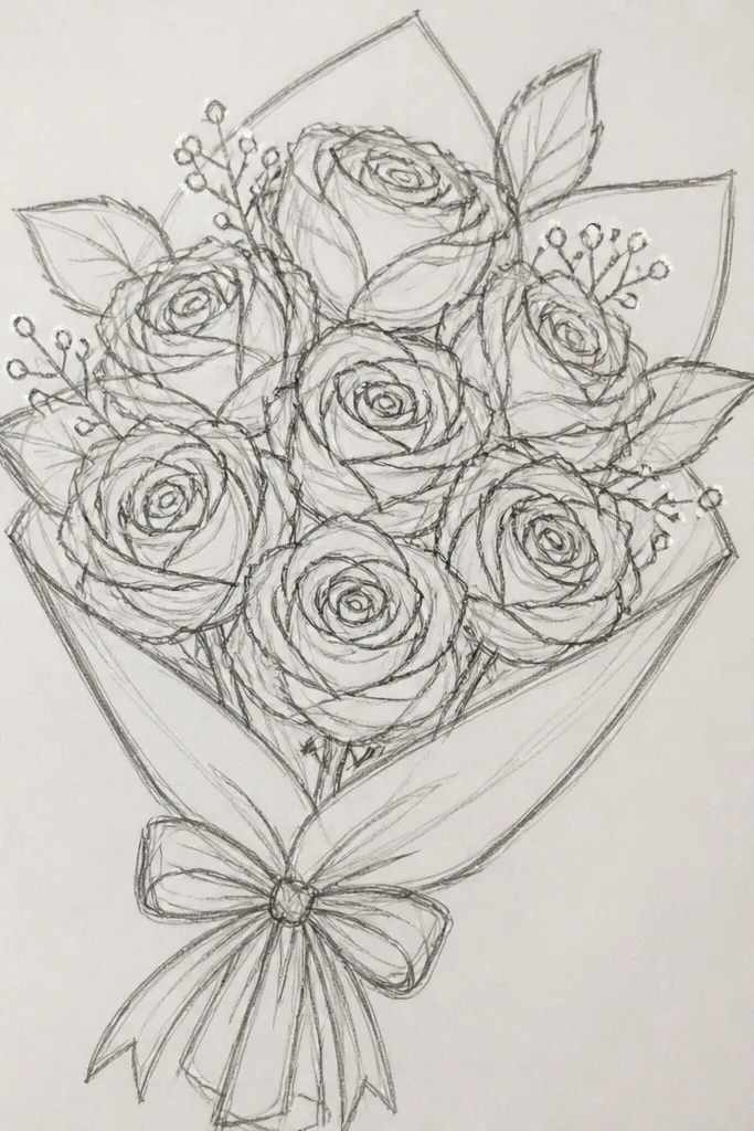
Monochrome looks dramatic and clean when you add tiny white highlights. This is a great option if you want something aesthetic without using multiple colors. Draw the roses in black ink with a tight spiral center and simple petal curves, then add white gel pen dots along petal edges to create sparkle. Add a few leaf outlines in the same black so everything looks cohesive. The page will look crisp and graphic, perfect for modern holiday cards and minimalist DIY prints.
Use pencil to place three roses in a cluster — one center rose and two smaller ones at the sides. Ink the roses with a 0.5 fineliner, keeping petal lines smooth and not overly dense. Add thin stems and a few leaf outlines using teardrops with a center line. After the ink dries, add white gel pen highlights: small dots or short dashes on the upper half of each petal. Leave the background blank or add a few sparse dots around the bouquet for texture.
Good to knowLet the ink dry fully before white gel pen so it doesn’t smear or look cloudy.
Common mistakeAvoid heavy cross-hatching inside every petal; it makes the bouquet look muddy.
12. Rose bouquet with gold leaf effect dots
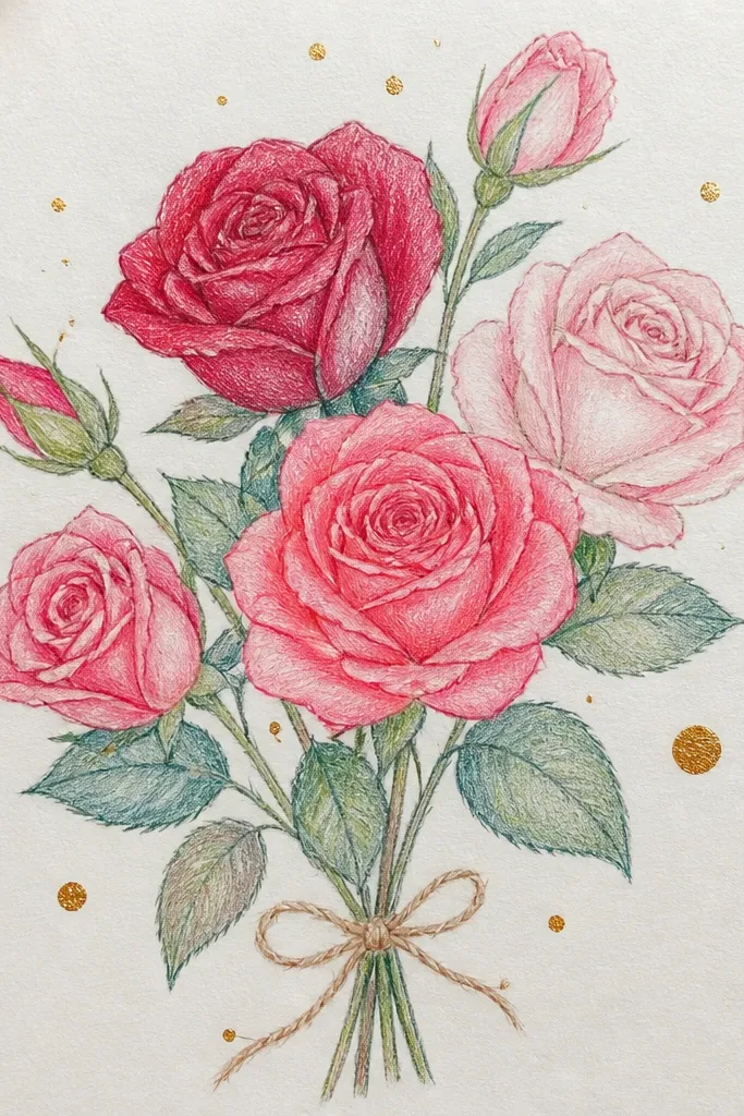
Gold-dot accents make a simple bouquet look “fancy” without complex techniques. You draw a cute rose cluster and a ribbon, then add metallic-looking dots behind and around the bouquet to create a halo. Keep the roses in a soft pink or red palette so the gold pops. This works well for holiday gift tags, New Year cards, and any occasion where you want sparkle that still looks handmade. The look is clean and photogenic because the dots guide the eye to the roses.
Sketch a bouquet oval and draw three roses inside it, using the same center spiral and C-petal overlaps. Add a ribbon banner across the lower third with a small bow on top. Ink everything, then color roses lightly with marker or pencil and keep leaves a muted green. For the gold effect, use a metallic gold gel pen or paint marker to dot around the bouquet edges, leaving a clear space near the rose centers. Add a few dots on the ribbon folds so the sparkle feels connected.
Good to knowDot in clusters of 5-8, then leave gaps — scattered single dots look less intentional.
Common mistakeDon’t cover the whole page with gold dots; keep it mostly behind the bouquet.
13. Rose bouquet with lace border and simple roses
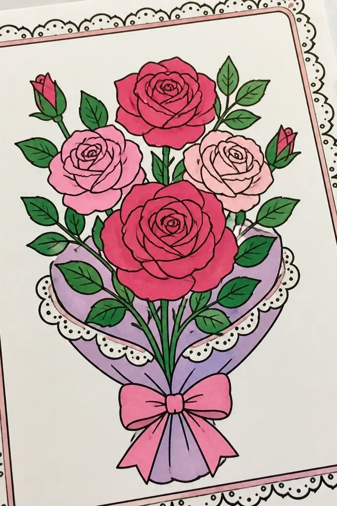
Lace borders make the whole page look like a craft card even when the rose drawing is simple. You’ll keep the roses cute by limiting petals and using a clean outline, then the border adds the “fancy” texture. Draw a scalloped lace pattern along one or two sides, and place the bouquet in the open center. This is great for bridal shower invitations, spring celebrations, and holiday-themed stationery where you want a delicate look.
Draw a thin rectangle on the page leaving 1 cm margins, then sketch a lace border along the top and bottom edges using repeating loops and small scallops. Place a bouquet in the center with two main roses and one smaller rose, all drawn with a tight spiral center and 6-8 petals each. Add tiny leaves and one short stem curl to connect the roses. Ink the lace first so it anchors the design, then ink the bouquet and erase pencil lines. Color the roses in soft pink or red and keep lace mostly uncolored or lightly shaded with a pale gray pencil.
Keep lace loops small and evenly spaced; uneven lace makes the whole page look shaky.
Avoid thick black lace outlines; thin lace lines read more elegant and clean.
14. Rose bouquet with ribbon bow and bow-hole detail
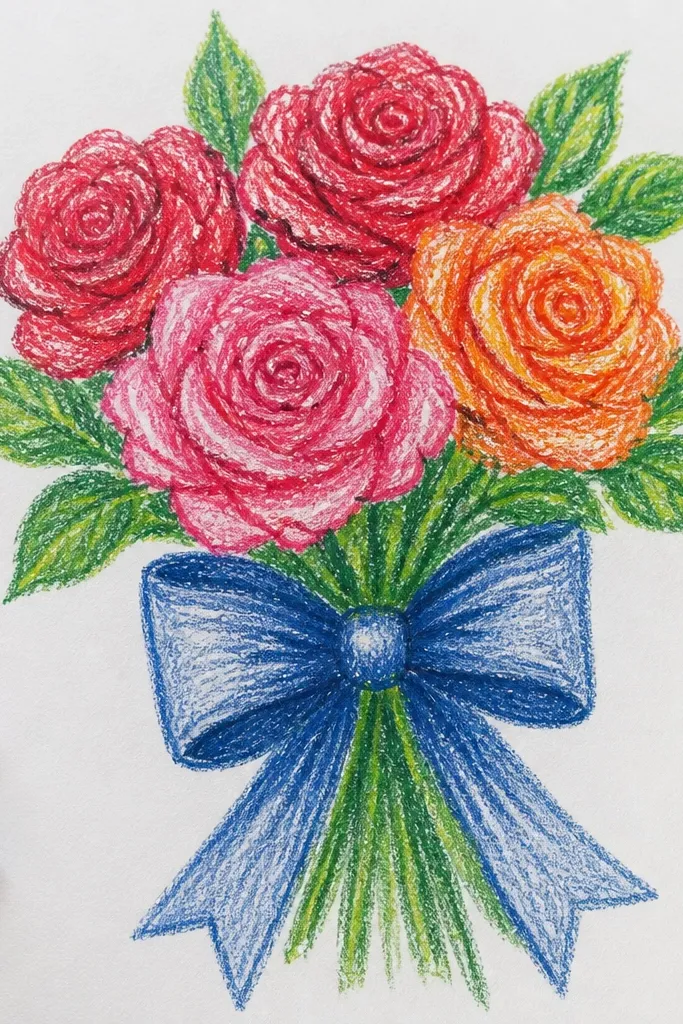
This idea looks aesthetic because it treats the ribbon bow like a design element, not an afterthought. The roses stay simple and clustered, and the bow adds that “gift” feeling that photographs well. Use a clean ribbon shape with a visible knot and small “bow-hole” lines where the loops cross. Keep leaves minimal so the ribbon and rose silhouettes stay crisp. It’s a strong pick for seasonal DIY cards, especially when you want a cute, centered composition.
Sketch a bouquet cluster oval and draw three rose centers inside it, slightly overlapping so the bouquet reads as one. Ink the roses with 0.5 fineliner, then add petals with C/U curves and a soft outer ruffle of fewer larger strokes. Draw a ribbon banner across the bouquet, then build the bow on top with two loops and a knot. Add 2-3 short lines in the knot area to create the bow-hole look, then erase pencil. Color the roses first, then color the ribbon with one shade and add a lighter stripe along one loop for fold shape.
Good to knowMake the bow loops wider than the roses' combined width — it frames the bouquet and looks balanced.
Common mistakeDon’t place the bow too low; it should sit where your bouquet silhouette is widest.
15. Rose bouquet with hanging garland strings
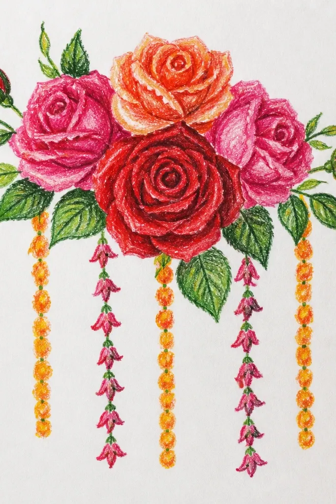
Hanging garland strings make a bouquet feel festive and airy. You draw a main rose cluster near the top, then add two string lines that drop down with tiny buds and leaf hints. This creates movement on the page, which is exactly what makes drawings look lively in photos. Keep the roses cute by using the same center spiral and limited petal count, then let the small buds repeat down the strands. It’s a great choice for holiday season pages and party invitations.
Draw a top bouquet cluster with two main roses and one smaller rose, then add a short stem stem base beneath them. From the sides of the cluster, draw two slightly curved hanging garland lines downward. Place tiny buds along each line every 1-1.5 cm using small C-shaped petals or teardrops. Add a few tiny leaf accents between buds to connect the garland to the bouquet. Ink all lines, erase pencil, then color roses with one palette and color buds with a lighter shade so they look like ornaments.
Vary bud size by 20-30% down the strand so it looks natural, not like a repeating pattern.
Don’t make the garland lines too thick; thin strings keep the bouquet as the focus.