1. Single Rose with Citrus Slice Backdrop
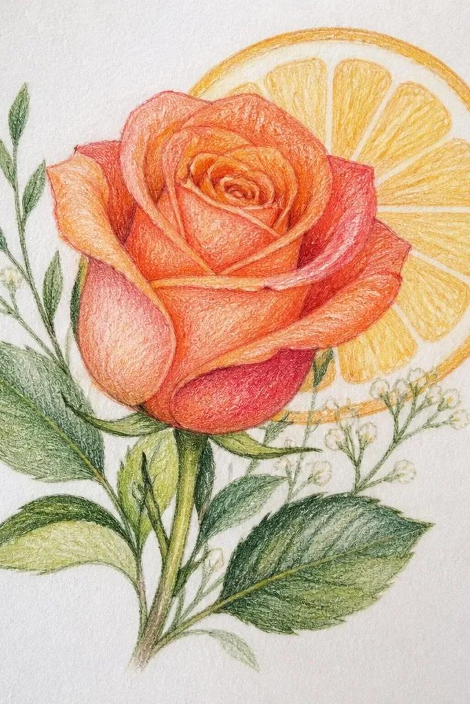
This idea works because the rose is your hero bloom and the citrus slice gives you a clear warm light source. The contrast between saturated red petals and the yellow background makes the rose look dimensional without needing a huge bouquet. Keep the lemon rind slightly out of focus with lighter pencil pressure so your rose stays sharp. It fits small spaces because the composition is tight and the rose head does most of the visual work. Expect about 45-90 minutes depending on how many petal folds you render.
Start by sketching a single rose head slightly off-center, then add a partial lemon slice behind it so the rind forms a shape for your background. Lay a light base of pale red (or pink) across the petals, then add darker red along the petal folds and at the base where petals overlap. Color the lemon with a warm yellow base, then deepen the rind with orange-brown and a thin ring shadow behind the rose. Finish by burnishing the rose highlight edges with a light cream/white pencil and adding a few crisp vein lines.
Use a tissue to test your background pressure on scrap first — you want the lemon to be brighter but not so smooth that it looks washed out.
Don’t darken the whole rose — keep the darkest values only in overlaps and the inner petal creases.
2. Daisy Chain in a Milk Glass Cup
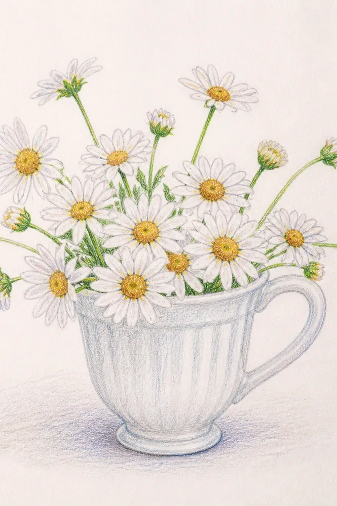
A milk glass cup gives you automatic highlights, which colored pencil loves. The white petals are simple shapes, but the real beauty comes from the transparent cup look — you draw a few strong highlight bands and soft shadow edges. This bouquet reads clean in small formats because the daisies repeat a pattern and your cup controls the boundaries of the drawing. It’s also a great way to practice crisp petal spacing without making the whole piece busy. Plan for 60-120 minutes.
Sketch the milk glass cup first, then place 6-10 daisies around the rim with stems that arc in one direction. Color the cup with a very light cool gray base, then add slightly darker gray at the bottom and where the daisies overlap. For the daisies, lay a light yellow base in the centers, then shade the petals with a pale gray-blue, followed by slightly darker gray at petal folds. Add a few tight dark lines at the center edges and use white pencil to draw the brightest glass highlight streaks.
Good to knowKeep the cup highlights as thin lines — thick white blocks make the glass look chalky.
Common mistakeDon’t outline every petal — shade the edges with pressure changes instead of hard black lines.
3. Lavender Sprigs with a Soft Gray Background
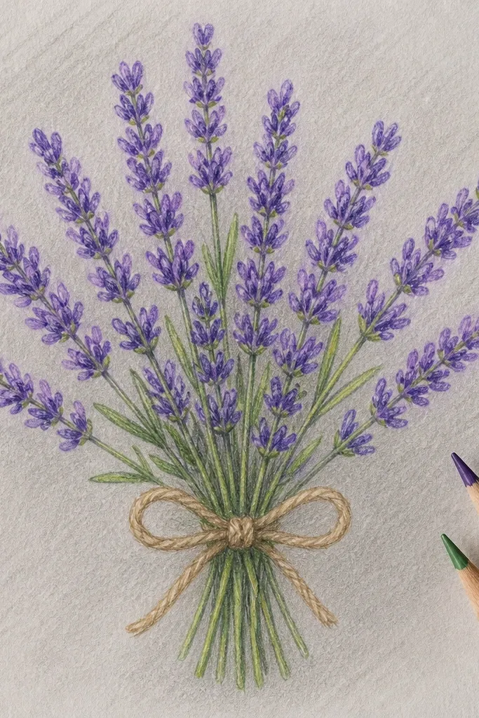
Lavender is perfect for small spaces because you can pack multiple flower heads into a narrow area and still keep it airy. The soft gray background makes purple look richer and gives you an easy “air” effect around the stems. This is a smart project if you want a clean, modern look without dark, heavy shading. The trick is making each lavender bloom look like small clustered buds instead of one purple blob. Time: 50-100 minutes.
Draw 3-5 lavender sprigs that taper upward, then lightly sketch the bud clusters along each stem. Start with a pale lavender base over the buds, then add deeper purple at the lower edges of each cluster. Shade the stems with a cool green-gray, and keep leaf detail minimal so the flowers lead. For the background, apply a smooth light gray wash using a light pencil pressure, then darken only behind the densest bud clusters for separation.
Good to knowUse a sharper pencil for the bud edges; softer pencil tips blur the clusters and flatten the texture.
Common mistakeDon’t shade the entire background the same value — vary it behind each sprig so the flowers pop.
4. Peonies in a Teal Enamel Pitcher
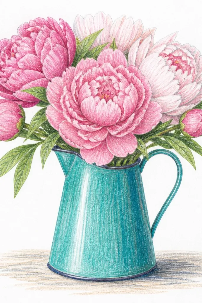
Peonies give you huge petal surfaces, which is exactly where colored pencil can look stunning. A teal enamel pitcher adds a cool color anchor, so warm pinks and corals read richer by comparison. The enamel look is all about controlled edge highlights and a slightly darker rim shadow, which you can do with a few pencil values. This bouquet is photogenic because the petals have natural layered folds and you can keep the arrangement compact. Budget 70-140 minutes for a polished version.
Sketch the pitcher shape first, then place 2-3 peony heads overlapping it so you get depth. Block in the pitcher with a mid teal base, then darken the bottom and add a thin shadow line where the peonies sit against it. For the peonies, use a pale pink base, then layer rose and coral tones in the folds, keeping the outer edges lighter. Add deep accents in the petal creases with a darker rose and finish with a white pencil highlight on the top ridges and where petals catch light.
For enamel shine, draw one or two narrow highlight bands and let the rest of the surface stay matte-soft.
Don’t make petal shadows too black — use dark rose or berry tones so the pink stays alive.
5. Sunflower Bouquet with a Dark Ink-Like Background
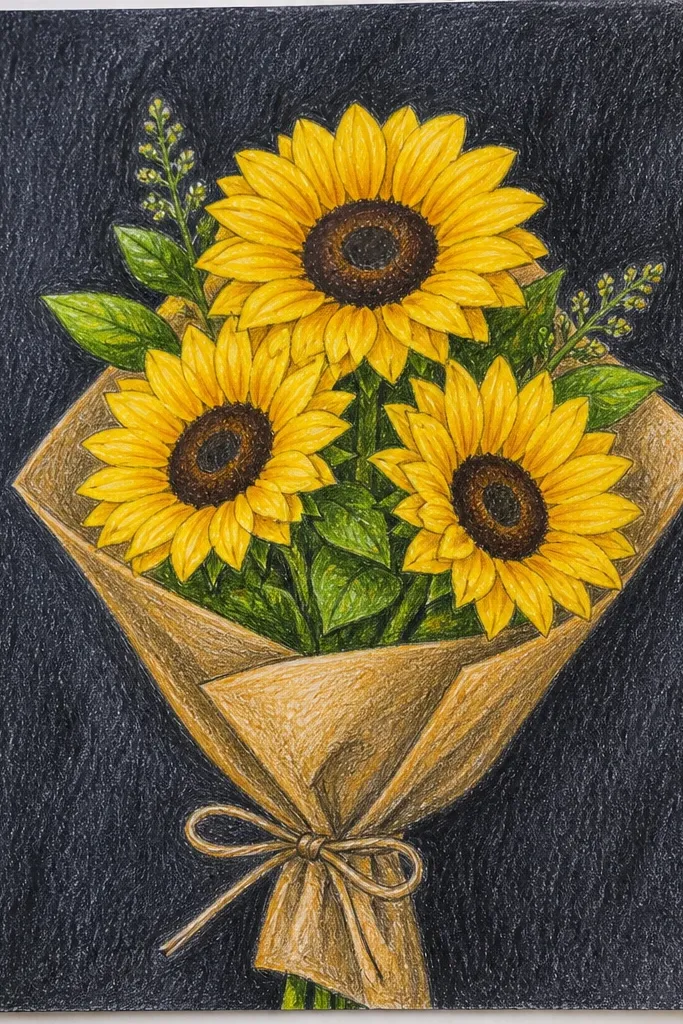
Sunflowers pop hard against a dark background, and that’s why this idea looks dramatic even in small spaces. The petals can be rendered with warm yellows and soft oranges without worrying about complex gradients. The dark background gives you a natural frame, so you don’t need extra props to make it feel finished. The look is bold and photo-ready because the centers and petal highlights create strong contrast. Time: 60-120 minutes.
Sketch 4-7 sunflower heads grouped so they overlap slightly, then pick one head as the hero with the strongest contrast. Apply a dark background with a dark blue-gray pencil, keeping it even but leaving lighter areas near the petals. Color petals with a light yellow base, then build mid orange toward the center and darker burnt orange at the petal bases. For the center, layer a warm brown first, then add tiny darker dots and use a white pencil to mark a few bright highlight points on petals.
Leave a thin halo of lighter background around the petals — it keeps edges crisp.
Don’t press hard into the dark background early; you’ll lose tooth and can’t layer highlights cleanly.
6. Tulip Trio in a White Paper Bag Corner
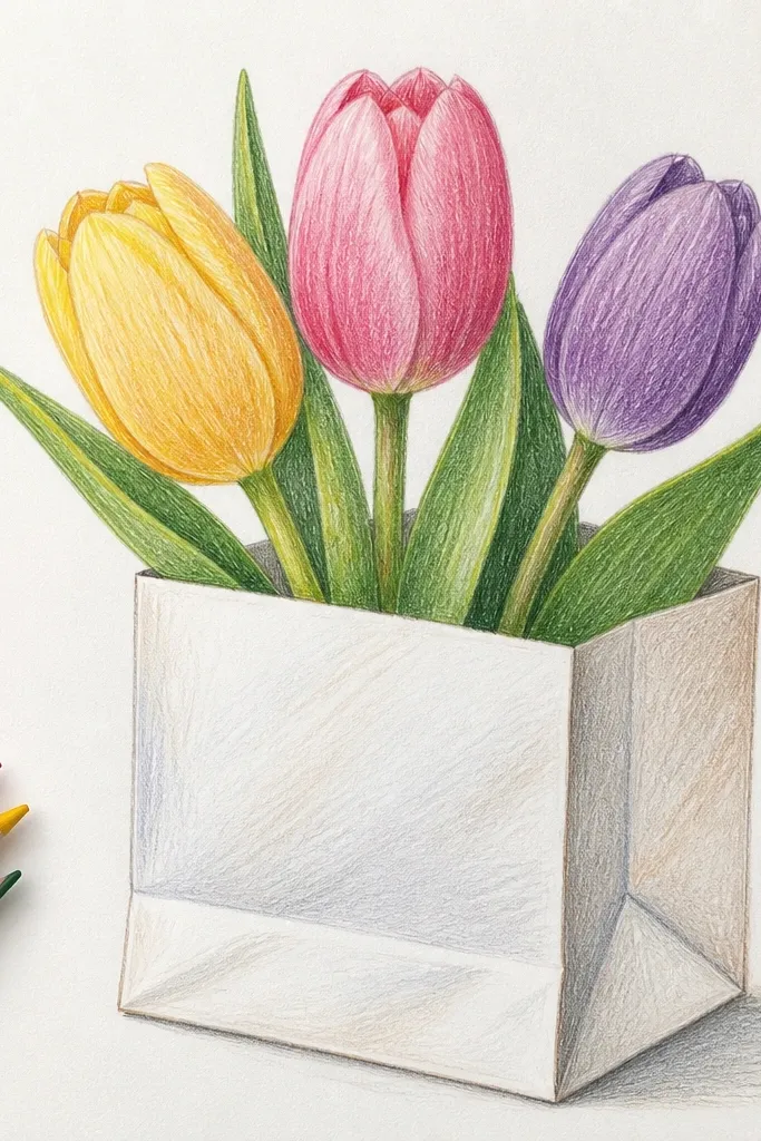
A paper bag corner is a small-space cheat code. It creates a strong viewpoint angle and gives you a background texture to make tulip stems look dimensional. Tulips also have simple shapes, so you can focus on color transitions from light highlight to deeper petal base. This idea looks good in photos because the bag edge frames the bouquet and the tulip heads create a clean vertical rhythm. Time: 50-95 minutes.
Draw the paper bag corner with a fold crease line, then place three tulip heads leaning slightly toward the crease. Color the bag with a warm gray base, then add a darker shadow along the fold and under the tulips. For tulips, start with a pale highlight tone at the top of each petal, then deepen the color at the base and along inner folds. Add thin leaf veins lightly and finish with a white pencil on tulip petal edges and a soft shadow cast onto the bag.
Good to knowUse the bag crease as your shadow guide — if the crease shadow is consistent, the whole drawing feels lit.
Common mistakeDon’t over-texture the bag; one or two light streaks are enough.
7. Ranunculus Burst with Soft Pastel Wash
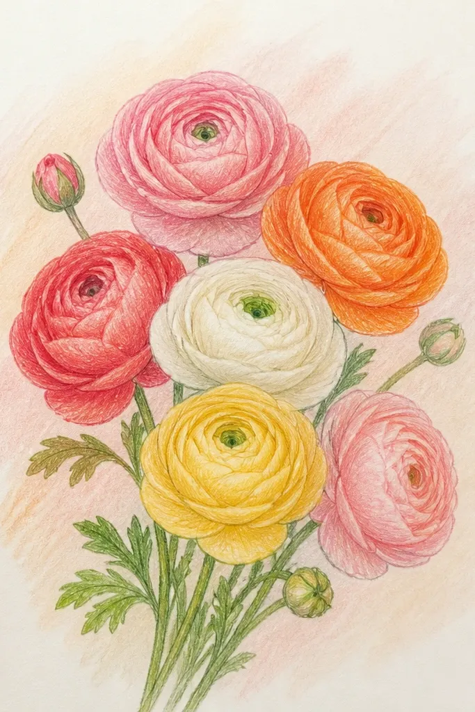
Ranunculus looks like a flower made of thin petals stacked in layers, which makes it ideal for showing colored pencil layering depth. A soft pastel wash background keeps the bloom airy and lets petal highlights stand out. This is a great choice when you want something “pretty” without heavy contrast. The look stays photogenic because you can create a clear spiral center and distinct petal rows. Time: 70-130 minutes.
Sketch one ranunculus head large enough to fill the center, then add a few smaller buds around it. Apply a very light pastel wash behind the bloom using a light pencil tone, then deepen only a little near the bloom edges. Color the outer petals first with a pale base, then add mid-tones in each petal row, keeping the center tighter and darker. Finish with a darker center spiral and use white pencil to pick out the top edges of the newest petals.
Sharpen your pencil for the petal row edges — ranunculus looks best when the petal layers are readable.
Don’t smear the center; keep the spiral structure with controlled lines.
8. Wildflower Mini Bouquet on a Patterned Notebook Page
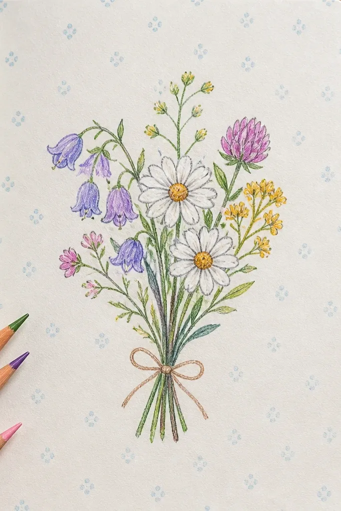
This is an aesthetic trick: the “pattern” can be minimal, but it makes the bouquet look styled instead of floating. Use tiny dots or thin lines as a background texture so your flowers gain context. Wildflowers also let you mix shapes — daisies, tiny buds, and a couple of leaves — without needing perfect symmetry. It’s photogenic because the background gives you visual interest while the bouquet stays the focal point. Time: 40-80 minutes.
Sketch a small bouquet cluster at the center, with stems that angle down slightly. Add a simple background pattern outside the bouquet area first, then keep the bouquet background mostly clean to avoid confusion. Use a limited palette of 5 colors: one main flower color, two greens, one warm shadow color, and a cream highlight. Shade flowers with light base layers, then add tiny dark centers and leaf veins last.
Keep the pattern behind the stems lighter than the flowers; it should support, not compete.
Don’t add too many different flower types; pick 3 main shapes and repeat them.
9. Cherry Blossom Branch with Petals Falling
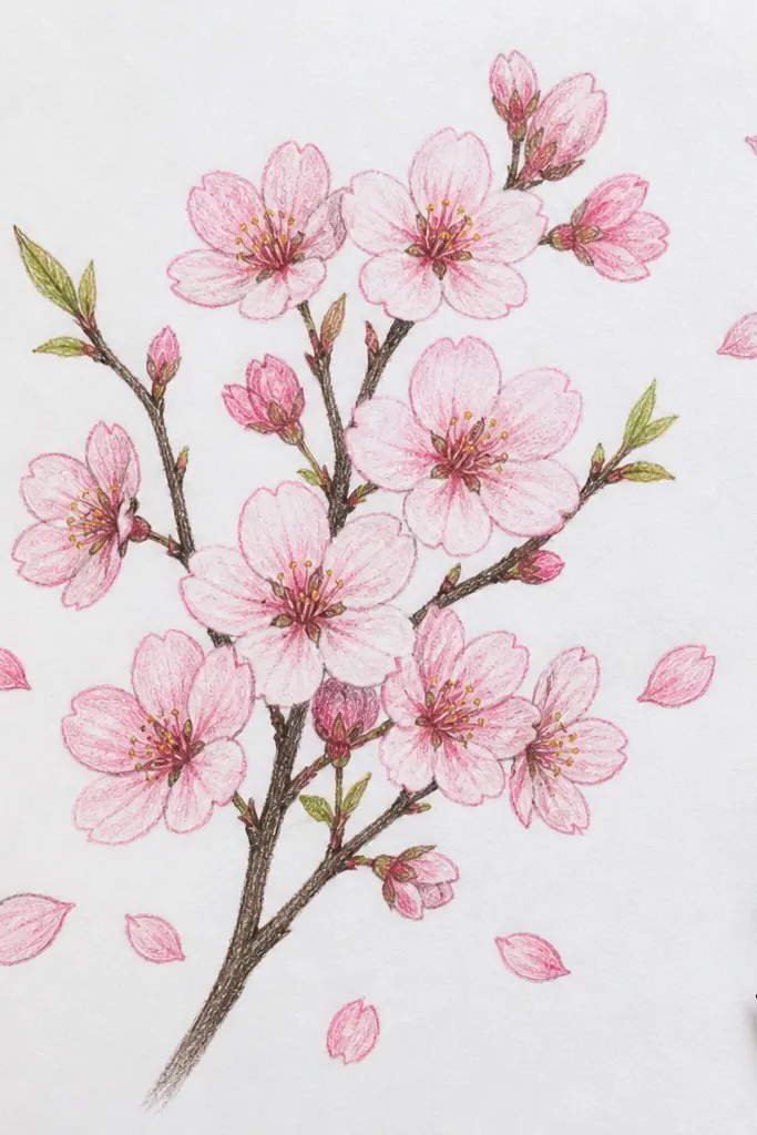
Cherry blossoms look delicate, but you can still make them pop with the right edge control. A branch plus falling petals gives you motion and depth, which reads well in small compositions. The key is using light pink layers with darker blush on the petal folds and a few crisp highlight touches on the top surfaces. The background can stay simple, which keeps this project doable and clean. Time: 60-110 minutes.
Draw a branch curve across the page, then place 8-12 blossom clusters along it. Add 5-10 falling petals below with varied sizes and slight rotation so they don’t look like repeats. Color petals with a very light pink base, then deepen the folds with rose and add darker accents on the petal undersides. Shade the branch with a cool brown-gray and add thin shadow lines under blossoms and petals for depth.
Use white pencil on only the top edges of petals — it sells the airy feel.
Don’t outline blossoms in dark lines; shade the edges instead.
10. Garden Roses with a Burgundy Tablecloth Shadow
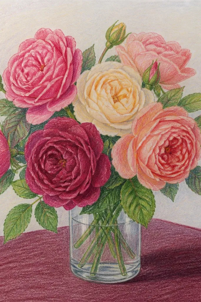
This idea leans into color drama. A burgundy shadow under the bouquet makes the petals look like they sit on a real surface, even when your background is otherwise plain. Roses give you enough complexity for a layered look without needing a huge bouquet. The result is a drawing that reads “styled” because the ground shadow is believable and the petals catch light. Time: 70-140 minutes.
Sketch a small bouquet of 3 roses, then lightly draw a ground shadow shape beneath them with a soft edge. Color the table shadow first with a muted burgundy, then darken it where stems overlap and lighten it at the outer edge. Build rose petals with a light base, add darker tones in folds, and keep the brightest highlights on the outer petal ridges. Finish by reinforcing the darkest overlap shadows between petals and adding a few crisp leaf edge lines.
Pick one shadow color and stick to it — burgundy should show up in petal undersides too for cohesion.
Don’t smear the shadow with heavy pressure; keep it soft and controlled.
11. Orchid Cluster with a Clean White Background Glow
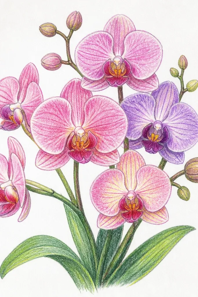
Orchids look high-end, and colored pencil can make them feel crisp because their petals have clear shapes and sharp color breaks. A clean white background creates a “glow” effect around the cluster, making edges look intentional. This idea is small-space friendly because you can draw 2-3 orchids and still get a complete composition. The best part is the color control: you place deep purples and warm highlights only where the petals fold. Time: 60-120 minutes.
Sketch three orchid heads close together with one slightly forward. Leave the background mostly white — you only add a light gray behind the orchids to separate them from the paper. Block in petal colors with light purple and blush tones, then add darker purple near the inner folds and along petal edges. Add thin lines for the orchid veining and use a white pencil to sharpen highlight edges on the top petals.
Good to knowKeep your darkest purple concentrated in the inner throat of the orchid — it makes the bloom look dimensional.
Common mistakeDon’t shade the whole background gray; you’ll lose the bright airy look.
12. Hydrangea Bouquet with a Two-Tone Petal System
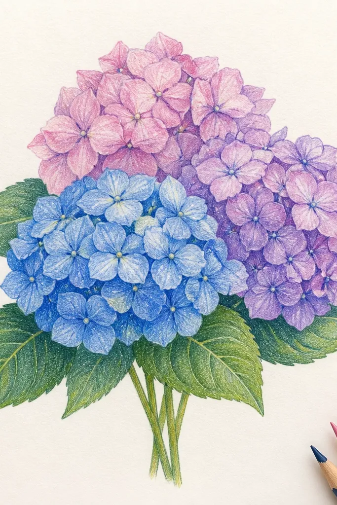
Hydrangeas are photogenic because they’re made of lots of small petal clusters, which colored pencil can render without needing perfect realism. This idea uses a two-tone system so the bouquet looks cohesive instead of random. Choose either blue-purple or pink-purple depending on the vibe you want, then repeat the tones across the cluster. The background can stay muted so the flower mass looks like a soft cloud. Time: 75-150 minutes.
Sketch a rounded hydrangea shape and divide it into 4-6 lobes with light pencil lines. Apply a light base tone across all petals, then add the second tone in patches — think “clusters within clusters.” Deepen shadows under each lobe with a darker blue or plum, and add tiny highlight dots with white pencil on the outer petal tips. Finish by tightening edges with a slightly darker tone so the hydrangea mass looks defined.
Good to knowUse a light circular motion for base petals, then switch to short strokes for the petal tips.
Common mistakeDon’t over-define every single petal; define the lobes and let the rest stay soft.
13. Dahlia Bloom with Coppery Vase Highlights
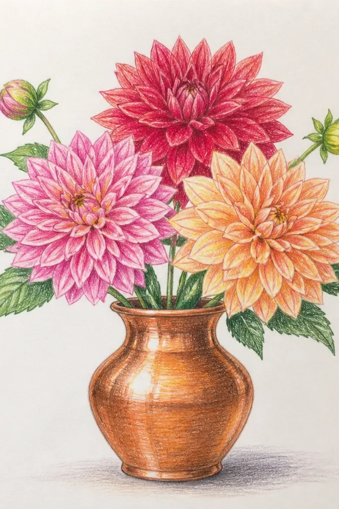
A dahlia is a natural for colored pencil layering because the petals are many and slightly curved. Pair it with a coppery vase look and you get a high-contrast, metallic vibe that photographs well. The copper effect comes from warm browns plus a few bright highlight strokes, not from heavy shading. This is a strong choice if you want the drawing to look “finished” even with a small bouquet size. Time: 65-130 minutes.
Sketch one large dahlia head and a narrow vase silhouette beneath it. Base the vase with a warm umber, then add darker brown at the bottom and where the vase curves away from light. For the dahlia, lay a light base across petal surfaces, then layer darker tones along inner petal folds and between petal rows. Add white pencil highlights as thin arcs on the petals and a couple of thin highlight bands on the vase curve.
Good to knowFor metallic, keep highlights narrow and curved — straight white lines look fake.
Common mistakeDon’t make the vase fully dark; leave warm mid-tones so it reads as metal, not dirt.
14. Minimal Rose and Fern Leaves in a Thin Frame Composition
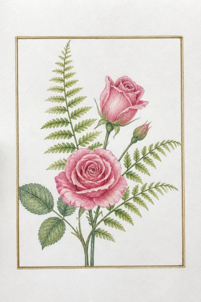
This is the “small space” idea that still looks intentional. A thin vertical composition uses negative space as part of the design, so your rose and fern leaves read crisp instead of crowded. Colored pencil looks best here when you keep edges clean and shadows light but directional. The fern leaves also give you repeating textures, which makes the piece feel styled even if it’s simple. Time: 45-90 minutes.
Mark a narrow vertical rectangle as your composition guide, then sketch one rose head at the top and fern stems flowing down. Shade the fern leaves with a cool green base, then deepen veins with a darker green and soften edges with lighter pressure. For the rose, use a light base and build petal folds with deeper rose tones, keeping one bright highlight side. Add a soft cast shadow under the rose on the negative space area.
Good to knowChoose one direction for leaf strokes and stick to it — it keeps the drawing calm.
Common mistakeDon’t fill the empty space with extra petals; the negative space is the aesthetic.
15. Blue Cornflowers with a Yellow Paper Cutout Background
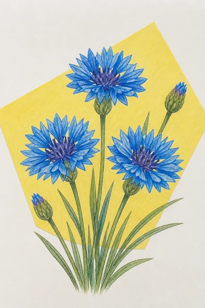
Cornflowers look instantly charming because their petals are flat and their centers are crisp. A yellow paper cutout shape behind them gives you a graphic, cheerful background that makes the blues look brighter. This is a great pick if you want a clean, poster-like look without complicated shading. The drawing looks good in small frames because the blue petals have strong shape clarity and the background stays simple. Time: 40-80 minutes.
Sketch 5-8 cornflowers clustered, then block in a single yellow background shape behind them. Color petals with a light blue base, then add deeper blue along the petal fold line and at the petal base. Shade the centers with a warm yellow-brown mix, then add tiny dark specks. Use white pencil sparingly on the petal highlights and add a soft shadow where flowers overlap the yellow shape.
Keep your blue values separated: light blue for most petals, darker only for folds and overlap edges.
Don’t blend the centers until they turn muddy — specks should stay distinct.
16. Rose Bouquet Wrap in Kraft Paper Texture
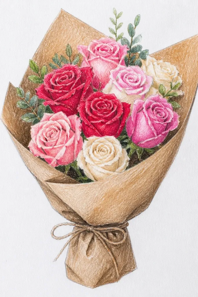
This is an aesthetic idea that looks expensive because the wrap adds story. Kraft paper texture makes the bouquet feel like a gift, and the warm browns help rose colors look richer. You don’t need a complex bouquet — 3-4 roses with a few leaves is enough. The key is drawing the paper texture with controlled lines so it looks like fiber, not scribbles. Time: 70-140 minutes depending on texture detail.
Sketch the bouquet first, then draw the kraft paper wrap as a loose V shape around the stems. Base the kraft paper with a light warm brown, then add slightly darker brown streaks following the wrap folds. Shade rose petals with light base colors, then deepen folds and overlaps with darker rose tones. Finish by adding crisp leaf edges and a few highlight lines on the kraft paper where it catches light.
Texture looks best when it follows the fold direction — draw streaks that curve with the wrap.
Don’t go heavy on texture everywhere; leave smoother areas so the roses stay the focus.
17. Succulent Bouquet with Tiny Blooms and Dark Green Leaves
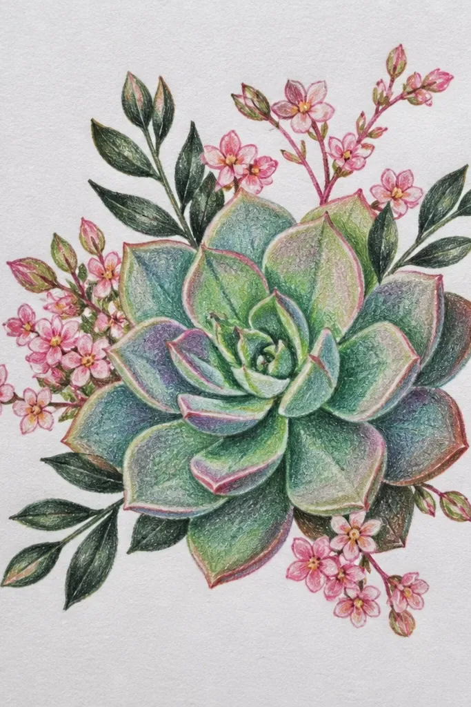
Succulents are a fresh change from traditional florals, and they photograph well because their leaves have clear edges and sculpted shapes. Tiny blooms give you a focal pop without needing a large flower head. A dark green leaf palette makes your highlights stand out, especially if you use a light cream pencil for leaf edges. This idea is great for small spaces because the shapes can stack neatly in a compact cluster. Time: 60-120 minutes.
Sketch a tight cluster of 6-10 succulent leaves, then add 2-4 small bloom tips on top. Base leaves with dark green, then use lighter green to mark the curved inner highlights on each leaf. Add small bloom colors on the tips with a light base, then darken the underside. Finish by drawing thin cast shadows under leaves so the stack looks 3D.
Use short, curved strokes for leaf edges; straight shading lines make succulents look flat.
Don’t make all leaves the same value — vary the darkness so the stack reads.
18. Marigold Bouquet with Orange Petal Gradients
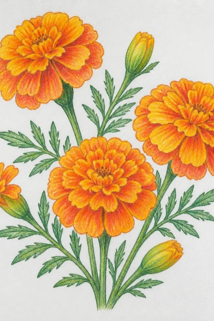
Marigolds are all about gradient control. If you want a project that teaches you how to make color pencil look like smooth light, this is it. The layered petals create natural mid-tones, and the bright centers add a strong focal point. Keep the background neutral so the orange stays clean and doesn’t muddy. This bouquet looks sunny and photogenic even when it’s small. Time: 60-110 minutes.
Sketch 3-6 marigold heads grouped with one front bloom. Apply a light peach or pale orange base across petals, then deepen toward the petal base with a darker burnt orange. Shade the center with warm brown first, then add a lighter yellow ring and tiny darker specks. Add white pencil highlights on the top petal edges and a soft shadow beneath each bloom.
Blend by layering, not by heavy pressure — orange stays brighter when you build gradually.
Don’t use black for shadows; use dark brown or deep orange so the hue stays warm.
19. Wild Orchid Leaves with a Purple Flower Accent
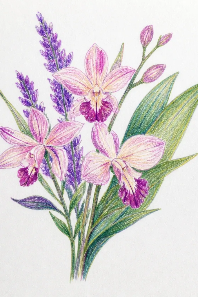
Long leaves give you elegant movement, and one purple bloom makes it feel designed instead of random. This idea is perfect for small spaces because the leaves create a strong shape silhouette, and the flower adds contrast. Colored pencil looks especially good on leaf edges when you shade the underside darker and leave a clean highlight strip on the top. The aesthetic is airy, modern, and easy to photograph because the composition has one clear focal point. Time: 50-95 minutes.
Sketch a fan of 5-7 long leaves, then place one purple flower head near the top center. Base leaves with a medium green, then deepen the underside with a darker green and add a lighter highlight strip along the top edge. Color the flower with a light purple base, then layer deeper purple in the folds and around the center. Use a white pencil to sharpen the flower edge highlights and add a small cast shadow where the flower touches leaves.
Keep leaf strokes consistent length — uneven leaf strokes make the silhouette look messy.
Don’t shade every leaf with the same intensity; vary darkness so the fan has depth.
20. Anemone Bouquet with Black Center Stars
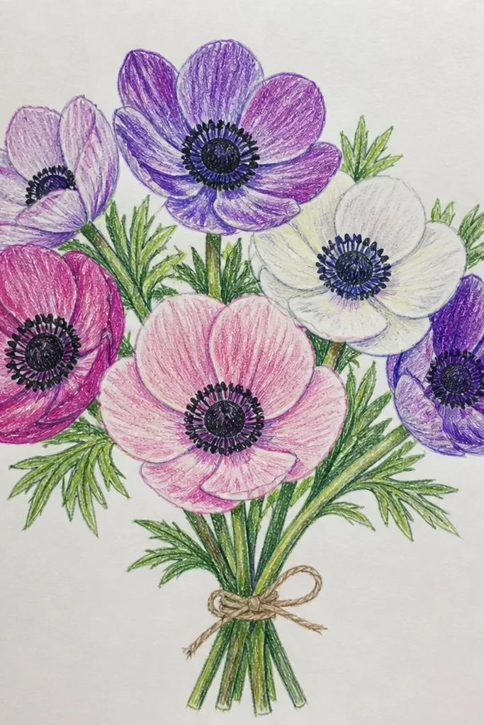
Anemones look striking because of their bold center “star” shapes. You get a high-contrast look without needing a huge bouquet, and that makes it ideal for small spaces. Pale petals give you room for subtle shading, while the dark center draws the eye instantly. The black centers also make your highlights on petals look cleaner. Time: 55-105 minutes.
Sketch 4-7 anemone blooms clustered with a few stems crossing behind. Color petals with a pale base (cream or light gray-pink), then shade folds with a slightly darker tone. For the center, use a deep brown-black first, then add lighter gray dots or lines to form the star-like texture. Finish by using white pencil on the petal highlight edges and adding a soft shadow beneath the blooms.
Let the center texture be small and sharp — tiny points make the anemone look alive.
Don’t fill the center solid black; leave micro highlights so it doesn’t flatten.
21. Peach and White Flower Bouquet with Soft Window Light
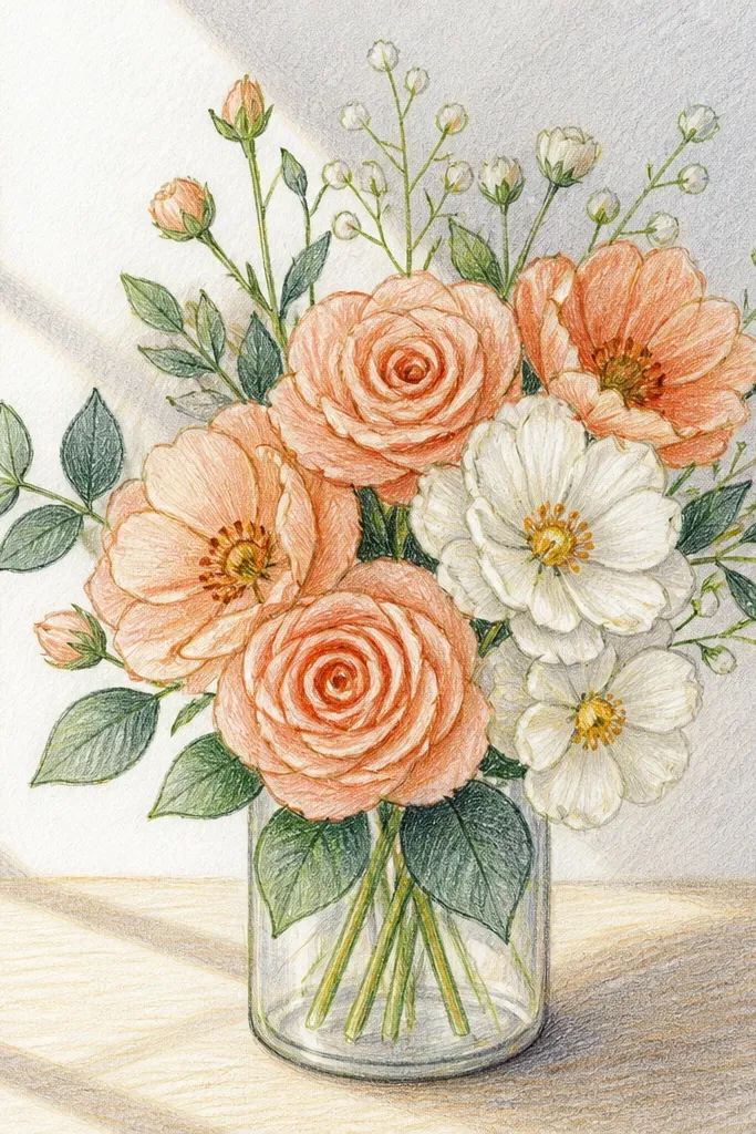
This is the “pretty lighting” drawing that makes colored pencil look expensive. A window-light gradient background gives you an obvious direction for shadows, and peach/white flowers blend nicely into that light. The bouquet can be small — 3-5 blooms — and still look full because the light direction makes edges separate. It’s a solid choice if you’re tired of flat shading and want a believable light source. Time: 70-130 minutes.
Sketch a compact bouquet of 3-5 blooms with stems that lean slightly toward the light direction. Create a light gradient background by layering light warm gray on the darker side and leaving the lighter side near-white. Shade petals with a pale peach base for peach blooms and a pale gray-pink base for white blooms, then deepen folds with rose or soft brown. Add cast shadows under petals on the gradient side and use white pencil only on highlight edges facing the light.
Draw your shadow shapes first, then fill petals — it keeps the lighting consistent.
Don’t shade highlights on the shadow side; keep them aligned with the light direction.
22. Christmas Cactus Blooms with Red Accents
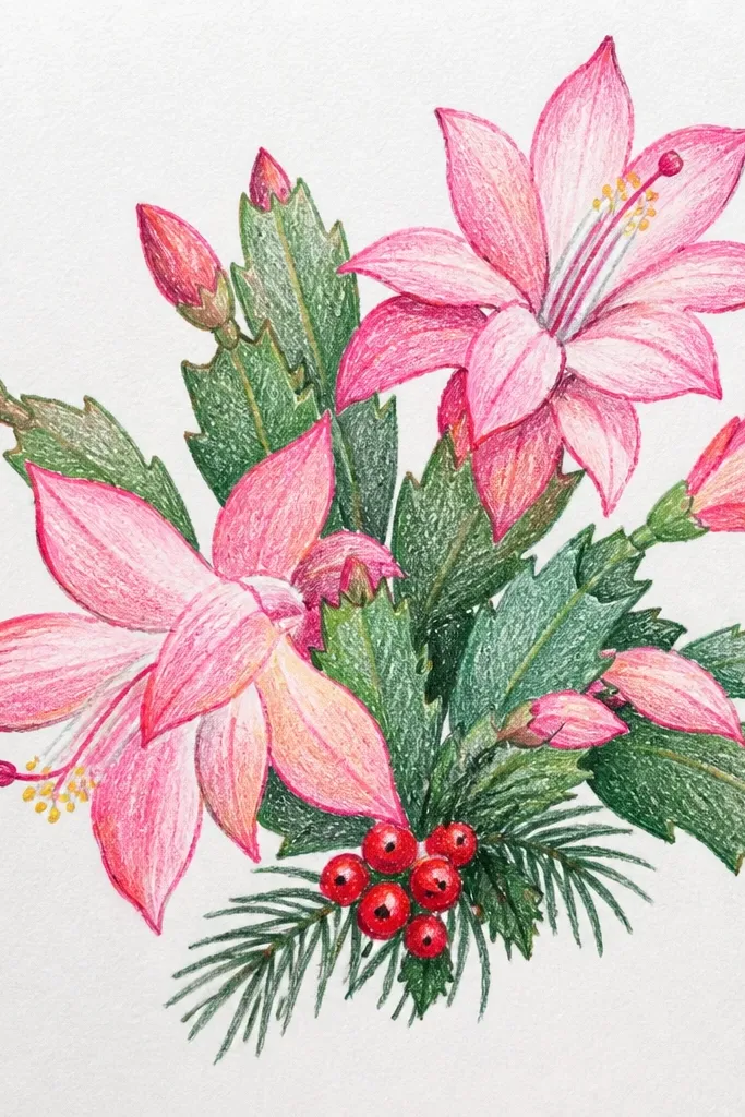
This seasonal bouquet idea is perfect for holiday drawing because it has built-in structure. The cactus pads give you repeating geometry, and the red blooms create instant festive contrast. Colored pencil shines here because the pads have subtle highlights along edges and the blooms have layered petal folds. It looks great in small spaces because the shapes stack and frame the red flowers. Time: 60-120 minutes.
Sketch the cactus pad shapes first as overlapping segments, then add 1-3 red blooms on top edges. Base pads with dark green, then shade the underside darker and draw a thin highlight line along the top edges. Color blooms with a light red base, then deepen petal folds with deeper red or berry tones. Add small shadow gaps between pads and use white pencil on the brightest bloom edges.
Good to knowUse a slightly cooler red for shadows so the red stays clean and doesn’t turn brown.
Common mistakeDon’t over-detail every pad — keep texture simple and focus on bloom highlights.
23. Autumn Bouquet of Dried Flowers in a Small Glass Bottle
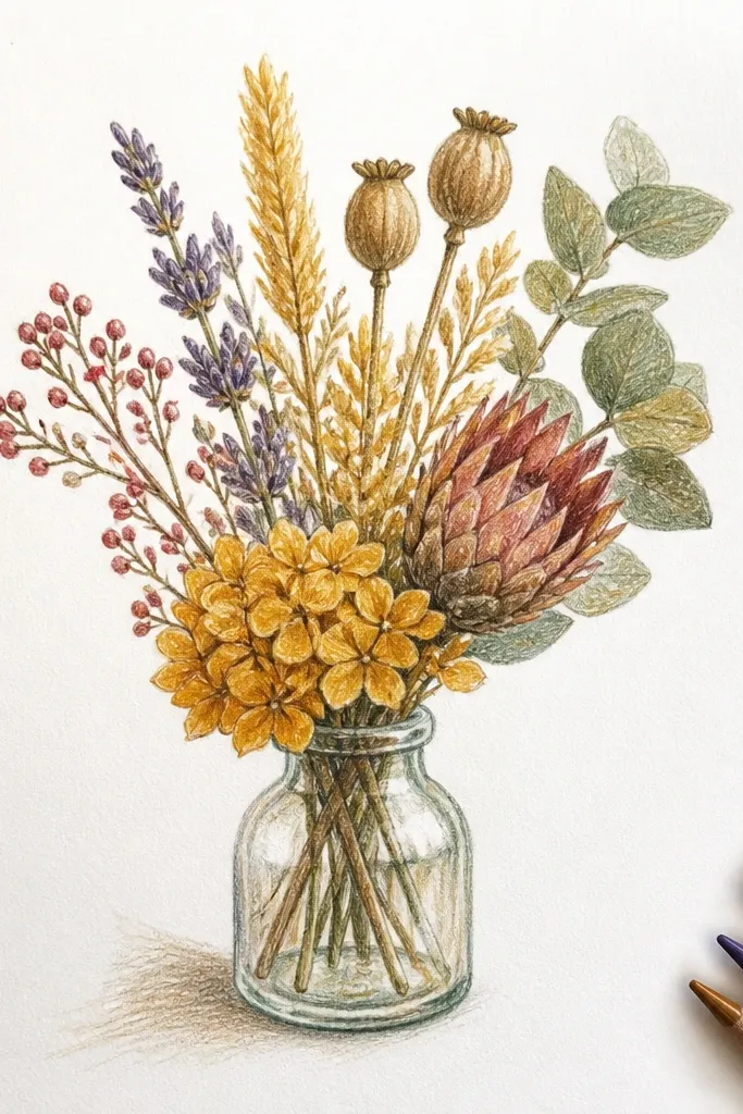
Dried flowers look charming because they’re not perfect and they’re full of texture. A small glass bottle makes the whole piece feel styled, and the amber tones give a warm autumn look that still photographs clearly. This idea works in small spaces because the bottle shape holds everything together, and you can use fewer stems for impact. Colored pencil can mimic the dry, matte look by using lighter pressure and avoiding heavy burnishing on the flowers. Time: 70-140 minutes.
Draw the bottle silhouette with a simple neck and a rounded body, then sketch 5-8 dried stems inside it. Base the bottle with a very light gray-blue and add darker edges where light would be blocked by stems. Color dried flowers with muted browns, dusty oranges, and soft yellows; layer lightly so the texture stays dry. Finish by adding a few bright bottle highlight lines and soft shadows where stems overlap the glass.
Good to knowKeep burnishing for the glass only — matte flowers need toothy texture.
Common mistakeDon’t make dried flowers glossy; avoid heavy white highlights on petals.
24. Classic Rose Bouquet with a Striped Linen Background
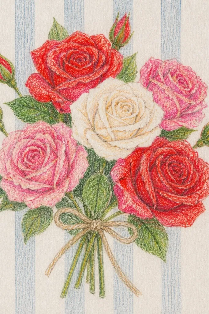
Stripes give your drawing a designed look fast, and roses give you the color control to make it beautiful. The trick is drawing stripes lightly enough that they don’t compete with petals, then letting your rose shadows fall across the stripe direction. This idea is photogenic because the stripe pattern frames the bouquet and makes the rose edges look crisp. It works in small spaces because the bouquet doesn’t need extra props. Time: 60-120 minutes.
Sketch a compact rose bouquet of 3-4 roses and a few leaves, then add a light striped background behind them with very low pressure. Shade the background stripes with alternating light gray values so they stay subtle. Build rose petals with light base colors, deepen folds with darker rose tones, and add a soft shadow under each bloom that respects stripe direction. Use white pencil for highlights on petal edges and a slightly darker tone for overlap shadows.
Good to knowKeep stripes behind petals lighter than the petal values — roses should lead.
Common mistakeDon’t draw dark stripe lines; heavy stripes make the bouquet look secondary.
25. Monochrome White Lily Bouquet with Gray Shadows
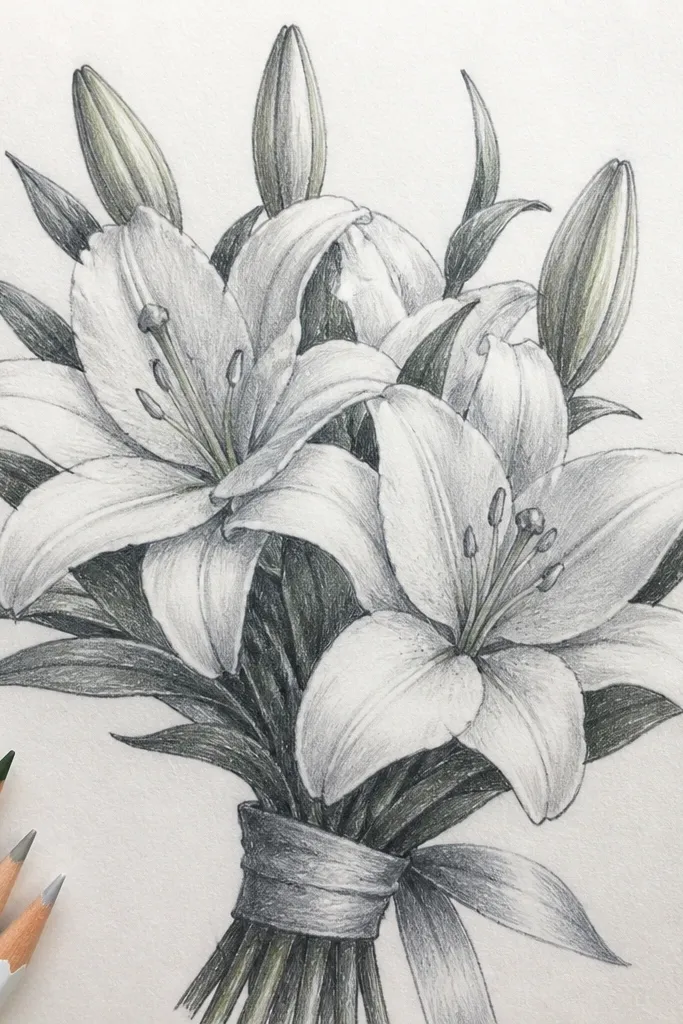
Monochrome lilies are a clean, high-style look that teaches you shading without color distraction. You get dramatic depth using only light grays, cream highlights, and a few darker shadow accents. The anthers and pistil details add interest, and the petals can be shaped with smooth gradients. In small spaces, this works because the bouquet is simple and the lighting does the heavy lifting. Time: 60-110 minutes.
Sketch 3 lily heads with one slightly turned toward you, plus a few stems and leaves. Color petals with a very light gray base, then deepen folds with mid gray only where petals overlap. Add the lily throat with a slightly darker warm gray, then shade anthers with a dark gray-brown. Finish by burnishing the brightest petal edges with white pencil and adding soft cast shadows under the blooms.
Good to knowUse two grays: one mid for folds and one darker for overlap shadows; it keeps the contrast crisp.
Common mistakeDon’t use one gray for everything; flat monochrome happens when values don’t separate.