1. Daisy Stack Bouquet with Center Dots
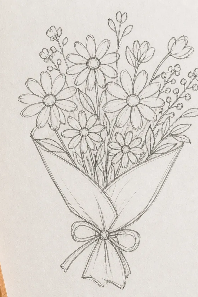
This one looks cheerful because daisies are naturally graphic. You’re using repeatable petal arcs that sit around a center dot, so the drawing stays clean even if your lines aren’t perfect. The bouquet reads clearly on paper because the flowers are separated and stacked, not tangled. It’s low maintenance: you can finish the whole page with minimal shading and still get that spring feel. This is a great choice for greeting cards and bookmarks because the silhouette is simple and bright.
Start by sketching three light circles for the centers, one at the top, one middle, one bottom. Around each center, draw 10-12 short U-shaped petals — keep the petals the same size for a tidy look. Add two stems that slightly curve and connect to small leaf bumps. Finally, darken the centers with a pencil or fine marker and add one light shadow under each petal with a second pencil pass.
Good to knowPress lightly on petals, then go back only once to darken outlines so the petals stay crisp in scans.
Common mistakeDon’t shade every petal — one inner shadow per flower is enough.
2. Tulip Cluster Bouquet with Teardrop Cups
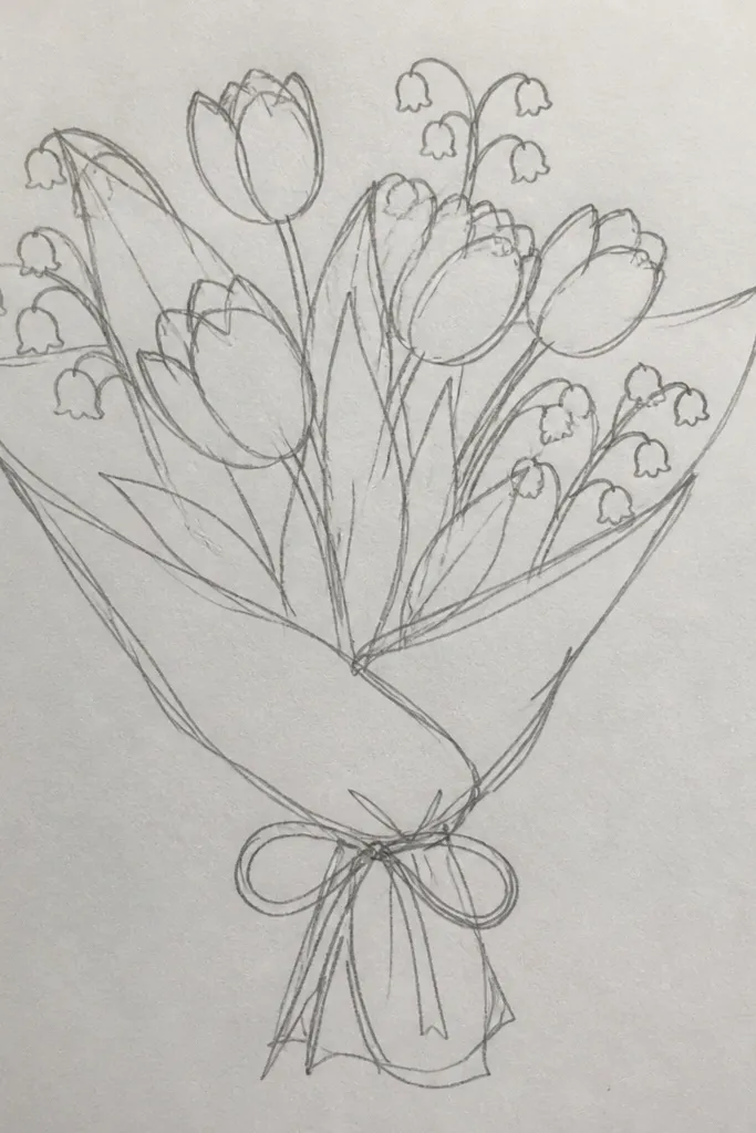
Tulips look polished fast because their shape is basically a teardrop cup. You’ll get a clean, elegant bouquet silhouette without drawing complex petal folds. The trick is to keep each tulip slightly tilted — straight-on tulips can look flat. Add a few leaves that angle outward and the whole page looks airy. This style also handles color really well since tulip petals show off gradients.
Draw 5-7 teardrop outlines where the narrow end points down toward the stems. Inside each teardrop, draw a smaller teardrop that stops about halfway up — that creates the cup fold. Connect each tulip to a stem line that curves gently and keep spacing between blooms. Add two leaf shapes: one long oval leaf and one smaller pointed leaf. Color by using one base shade, then add a darker streak along the inner fold and a lighter edge on the outer rim.
Good to knowIf your teardrops wobble, trace over the outline lightly with a ruler edge for the bottom point, then erase the guide lines.
Common mistakeDon’t make all tulips the exact same height — stagger them for a believable bouquet.
3. Peony-ish Puff Bouquet with Layered Petal Loops
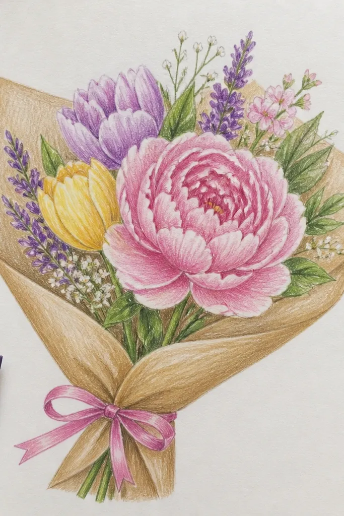
This bouquet looks “soft and fancy” without needing fancy drawing. The puff shape comes from layered loops, so your flower has volume even with minimal shading. It reads well because the petals are grouped in rings, not scattered. Use it when you want something that looks like a centerpiece and still stays low maintenance. It also works great in monochrome pencil if you prefer clean line art.
Start with one big circle or slightly oval guide for the main flower. Draw three rings of petals using small loop curls that touch the ring outline, leaving slight gaps for shape. Add a second smaller puff flower to one side with fewer petal loops. Then sketch stems that rise from the bottom and connect to the puff centers. Finish by darkening petal bases and adding one shadow patch under the top ring.
Good to knowKeep loop sizes consistent within each ring; mixed sizes make it look messy fast.
Common mistakeDon’t outline every loop heavily — just darken the outer ring and petal bases.
4. Wildflower Meadow Bouquet with Tiny Stems
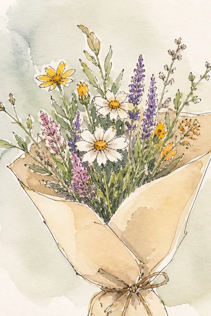
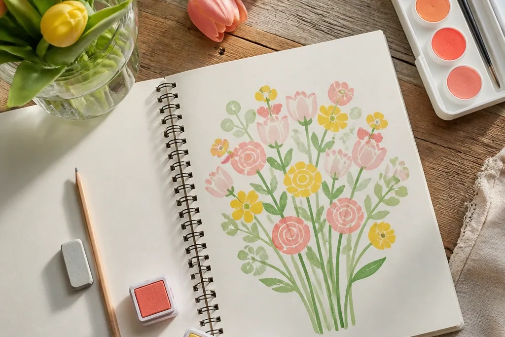
Wildflowers look springy because they’re irregular in a good way. This bouquet works because each flower is small and quick, so you can add lots of variety without spending time on detail. The thin stems create a delicate feel, and the spacing between flowers keeps the page from turning into a scribble. It’s perfect if you like airy drawings and you want a page that looks lively even with light color. This also photographs well because the silhouettes are scattered and natural.
Sketch a light cluster using 12-16 thin stem lines that converge slightly toward the bottom. Add quick flower heads: 4-petal clover shapes for some, tiny 3-petal blossoms for others, and one or two small round buds. For leaves, use a mix of tiny ovals and small teardrops attached to stems. Keep everything light pencil until the layout looks balanced. Then color only the flower heads: one green for leaves, and 2-3 colors for blossoms with minimal blending.
Use a single thin pen for stems at the end; it makes the whole bouquet look intentional.
Avoid thick stems throughout — thick lines make wildflowers look heavy.
5. Forget-Me-Not Mini Bouquet with Five-Petal Stars
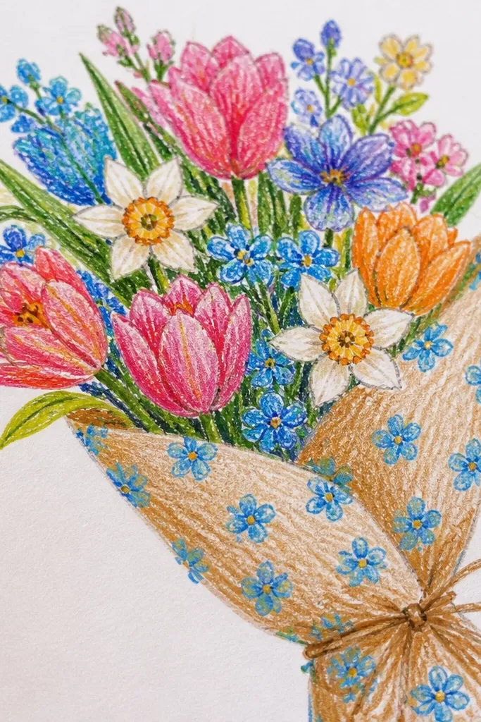
Forget-me-nots look cute and detailed without being hard. Each flower is a simple five-petal star with a tiny center, so repeating it gives you a lot of texture fast. The bouquet stays low maintenance because you don’t need to draw distinct flower faces. It’s a strong choice for small paper sizes since the flowers are small and the spacing does the work. Add blue and a touch of yellow in the centers and it instantly reads spring.
Draw 10-14 small flower circles lightly across one side of your bouquet area. Around each small circle, draw five rounded petals — like a star made of soft teardrops. Add tiny centers as small dots and connect flowers with thin stems that curve. Place 3-4 small leaf shapes that look like short ovals with a pointed end. Color the petals in light blue, then add a tiny yellow dot in each center and a faint darker blue at the base of each petal.
Good to knowKeep the petals slightly different sizes; it makes the cluster look natural instead of stamped.
Common mistakeDon’t over-outline every petal — a single clean outline per flower is enough.
6. Cherry Blossom Branch Bouquet with Puffy Petals
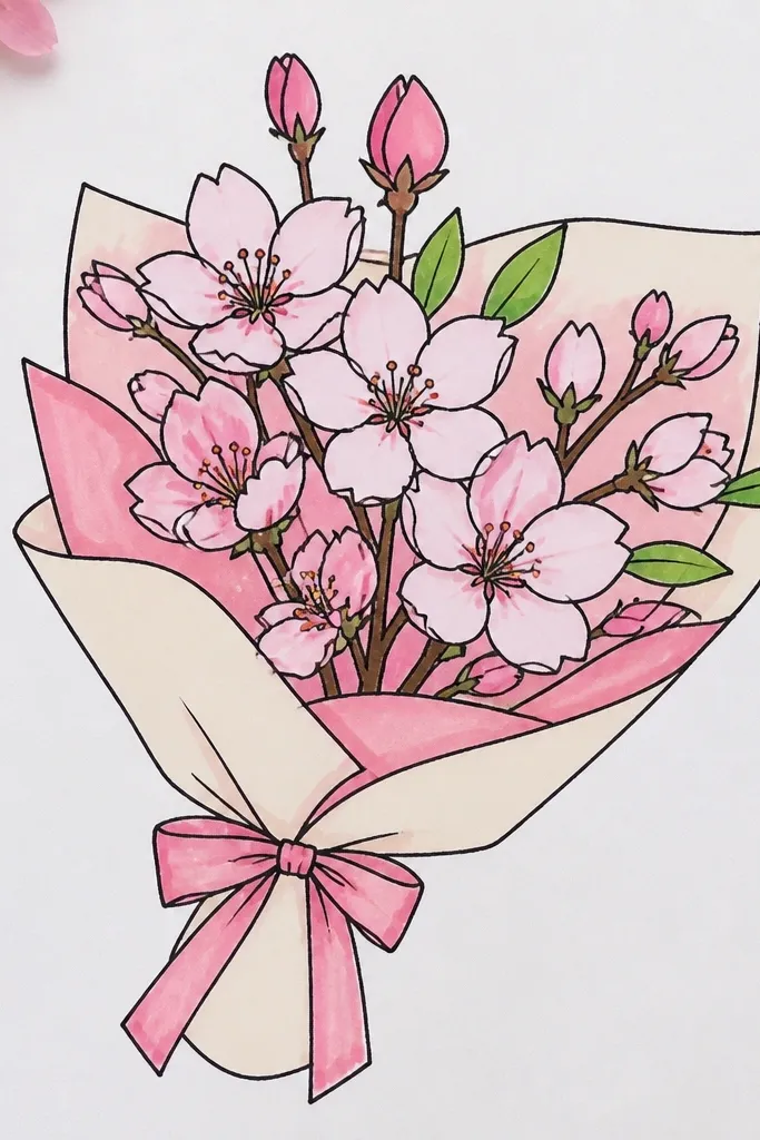
Cherry blossoms look dramatic because of the cluster effect. Even if each flower is simple, the grouping creates a soft cloud on the page. This is ideal when you want a spring drawing that looks airy and elegant without long shading sessions. The branch gives you a strong line to anchor everything, so the page doesn’t feel empty. It’s also a great option for ink or marker drawings since the forms are clean.
Sketch a gentle curved branch line across the page. Add small clusters along it: for each cluster, draw 3-6 tiny circles as guides. Around each circle, draw 5 petals using short curved strokes that overlap slightly. Add a few small leaves with simple almond shapes and a short center vein line. Color with soft pink petals and lightly shade the cluster edges; keep the branch darker so it stands out.
Good to knowUse a slightly darker line for the branch only, then keep blossoms lighter so the branch leads the eye.
Common mistakeDon’t place clusters evenly across the whole branch — leave gaps for breathing room.
7. Anemone Bouquet with Ringed Center and Rounded Petals
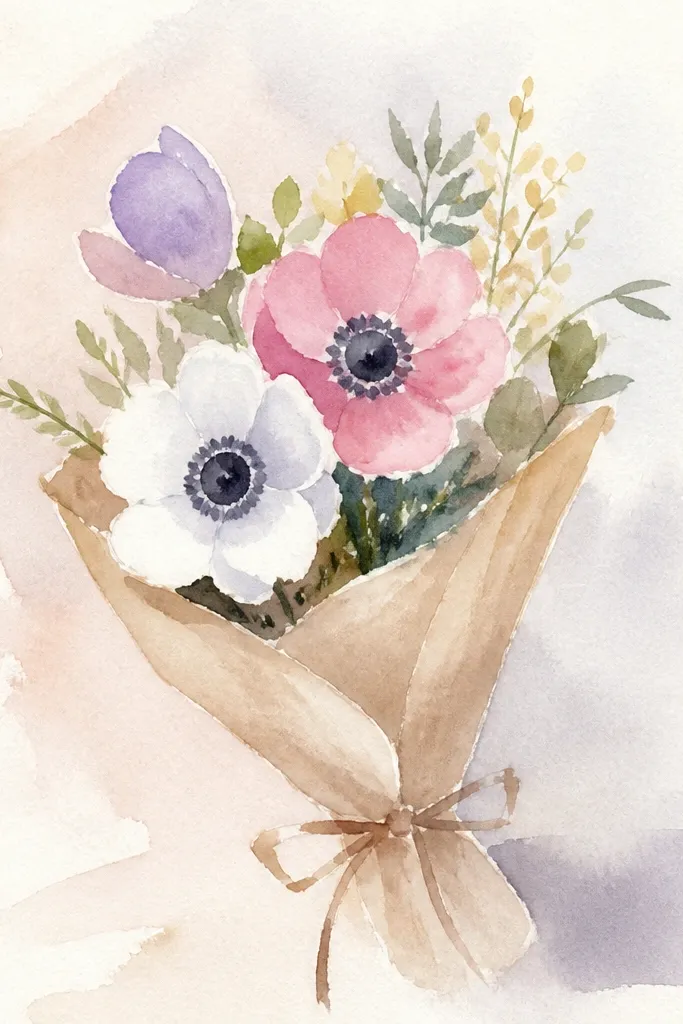
Anemones look striking because their center is graphic. You get an instant focal point from the ringed center, while the petals stay simple and round. This bouquet works well if you want a drawing that looks a little more grown-up without adding complexity. It also looks good in limited color — you can do mostly one petal shade and one strong dark center. The result is a bouquet that pops on white paper.
Draw 6-8 flower heads using a small circle for the outer petal guide. Add 8 rounded petals around each circle, keeping them evenly spaced but slightly different lengths. For the center, draw a smaller inner circle, then a thicker ring around it using a darker outline. Connect flowers with two or three stems that braid slightly at the bottom. Add a few leaves shaped like narrow ovals with a pointed tip, then color petals and leave the center darkest and most contrasty.
Good to knowMake the center ring the darkest part on the page; it’s what makes the flower look finished.
Common mistakeDon’t blur the center ring with heavy shading — keep it crisp.
8. Lilac Spray Bouquet with Long Oval Blossoms
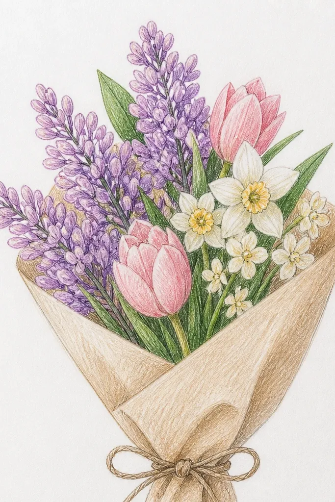
Lilac drawings look aesthetic because the whole flower is a bunch of tiny pieces arranged along a stem. You don’t draw one complicated blossom — you draw a repeating pattern of small ovals clustered in lines. This gives you texture without a ton of detail. It’s a great pick if you want a bouquet with movement and a vertical feel. The purple color looks especially photogenic, even with light pencil shading.
Sketch one main stem and a few side branches that angle outward. Along each branch, draw small groups of oval buds, each bud pointing slightly different directions. Add a few longer blossoms at the top of clusters for variety. Keep leaf shapes simple: short ovals attached to the main stem. Color by using a light purple base, then add a slightly darker purple on one side of each oval cluster.
Use short strokes for buds instead of outlines — it keeps the lilac airy.
Don’t draw every bud with the same size and spacing; lilacs look best when they vary.
9. Hydrangea Cloud Bouquet with Petal Dots and Ring Shapes
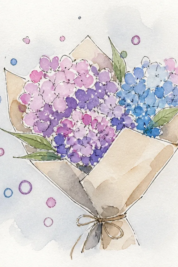
Hydrangeas look like a soft watercolor effect even in pencil. The trick is to build the “cloud” using small petal dots and tiny ring shapes, so the flower has texture without heavy shading. This bouquet is perfect for low maintenance because you can keep your marks simple and still get a full look. It also gives you a strong visual hierarchy: one big main cloud plus a few supporting stems. If you want something that looks like a bouquet centerpiece, this is it.
Start with a large circle or rounded oval for the hydrangea cloud. Fill the area with tiny petal marks: short curved strokes and small ring-like loops scattered across the cloud. Add a few slightly larger petals near the outer edge to create depth. Draw two stems beneath that connect to small leaves. Color using one main shade like soft blue or pink, then add darker specks around the outer edge and lighter specks in the center.
Leave tiny white gaps on purpose; gaps make the flower look airy instead of gray.
Avoid smearing the center — hydrangea texture should stay speckled.
10. Garden Rose Bouquet with Spiral Center
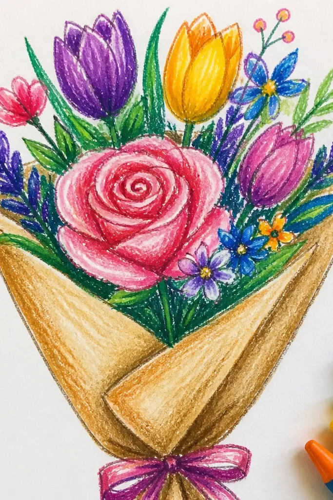
Roses look hard, but a bouquet rose drawing becomes easy when you start with a spiral center. You’re building layered petals around that spiral, so the flower reads as a rose even if your petals are simple. This bouquet looks romantic and clean, and it photographs well because the rose silhouette is strong. It’s a good choice when you want one main focal flower plus smaller filler blooms. Keep the shading light and concentrated near the inner petals.
Draw a small spiral in the center of your main rose, then wrap petal outlines around it like incomplete circles. Add 5-7 outer petals using curved C-shapes that overlap slightly. For the bouquet effect, add two smaller buds on the side using teardrop shapes wrapped in a few petal lines. Sketch stems that curve gently and place 2-3 leaf shapes with a clear center vein line. Color by shading the inner petals darker and leaving the outer petals lighter.
Erase only the spiral guide lines after you ink or commit the outer petal shapes — it keeps the rose crisp.
Don’t draw a full tight ring of petals; leave openings so it still looks layered.
11. Spring Wild Tulip + Daisy Mixed Bouquet
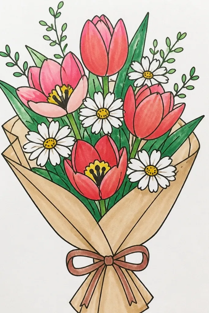
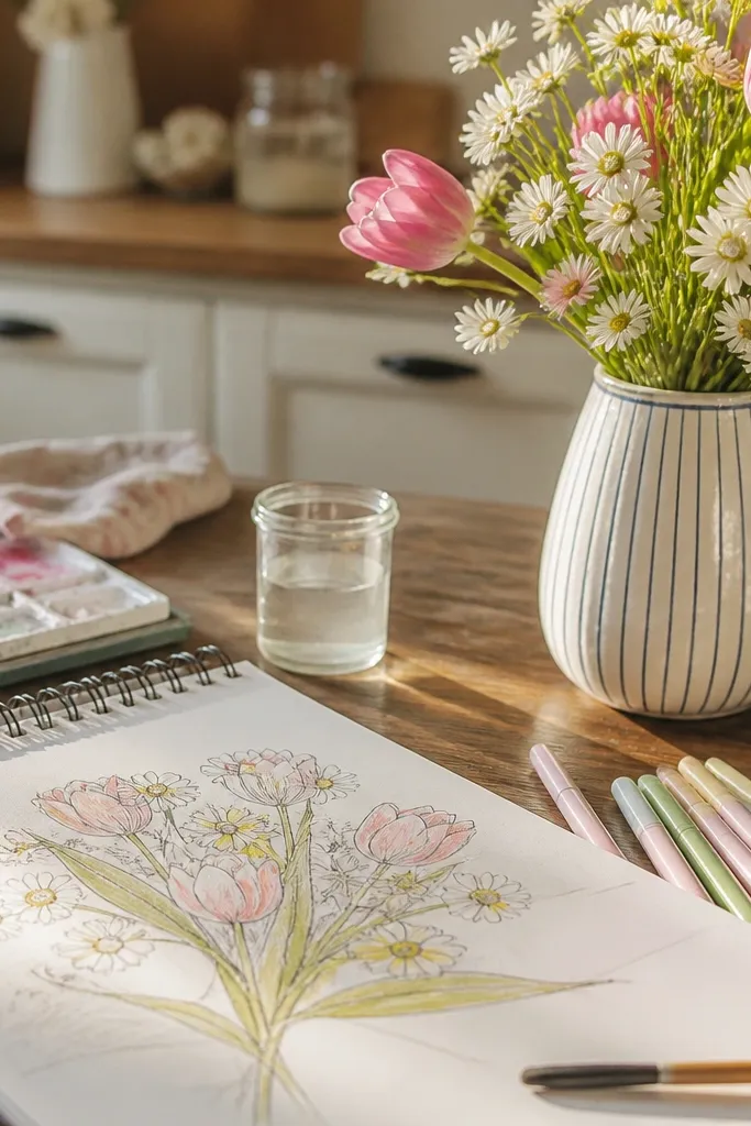
Mixing flower types makes your bouquet look “designed” fast. Tulips give you height and shape, while daisies add bright round centers that keep the page lively. This combo works because the visual patterns are different but compatible: tulips are teardrops, daisies are arcs around a dot. You get a balanced composition without intricate shading. It’s great for low maintenance because each flower is easy on its own, then you just arrange them.
Sketch a tall tulip in the center using a teardrop cup shape, then add two shorter tulips on the sides. Place 4-6 daisies around the base and sides, making sure their centers are visible. Draw stems as two main curves that gather at the bottom. Add leaves as simple ovals on the tulip stems and fewer leaves on the daisy side. Color tulips with one base shade and a darker inner streak, then color daisies with a warm yellow center and light petals.
Keep daisies smaller than tulips so the tulip remains the focal point.
Don’t crowd the centers — if everything touches, the bouquet turns into a blob.
12. Ranunculus Bouquet with Rolled Petal Layers
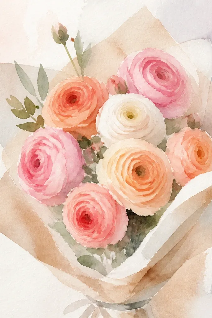
Ranunculus looks lush, but it’s built from simple rolled petals. The eye reads the flower as full because you draw many small petal segments that spiral around a center. This bouquet is a smart choice if you want a “wow” look without drawing realistic petals one by one. It also handles limited time well: you can make one main ranunculus and fill the rest of the bouquet with simpler blooms. The result is a soft, layered spring centerpiece.
Draw a small circle for the center, then add short curved petal segments around it like tiny commas. Each new petal should start slightly outside the previous one, spiraling outward. Add two smaller ranunculus blooms by repeating the same idea at a smaller size. Sketch stems beneath and place 2-3 leaves as narrow ovals with a pointed tip. Color by shading the outer petals lighter and adding darker tone to the inner spiral.
Use a consistent petal “comma” size; it makes the spiral look intentional.
Don’t make the petals too long — ranunculus petals should stay compact.
13. Spring Bouquet Ribbon Wrap with Flowers Above
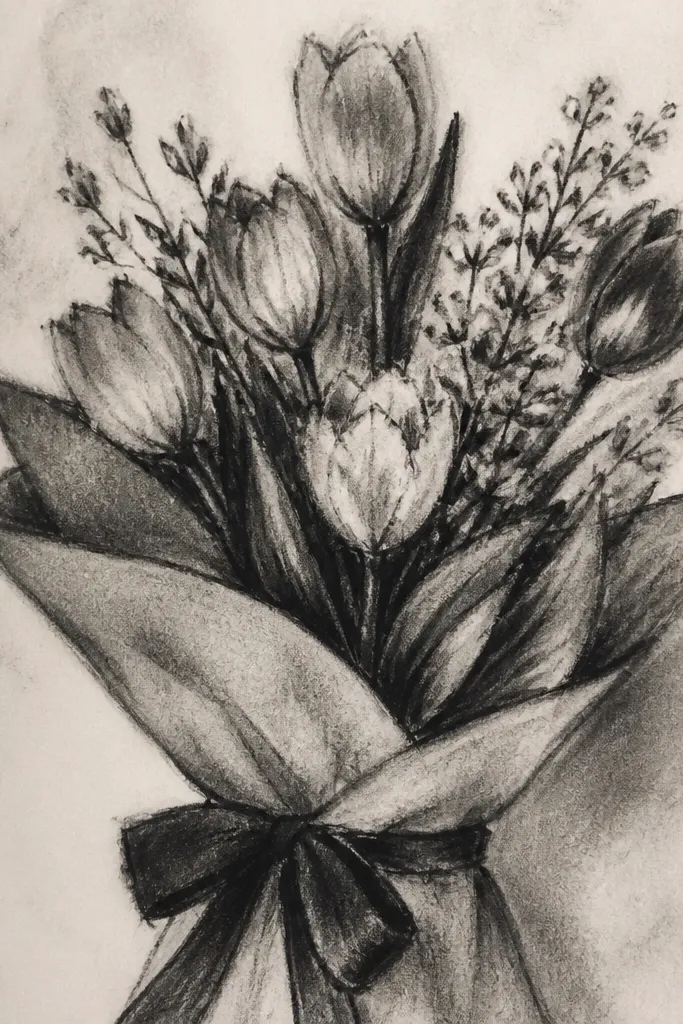
This one looks extra gift-ready because the ribbon instantly frames the bouquet. The flowers can be simple — the ribbon makes the composition feel complete and photogenic. It’s low maintenance because you’re not chasing realism; you’re building a clean layout with a few recognizable shapes. This style is great for drawing on card stock since the ribbon gives you a clear bottom focal point. Add light color to the flowers and keep the ribbon darker for contrast.
Draw 6-8 flower heads loosely at the top half of the page using any easy set from this list, then connect them to stems that meet at one point. At the bottom, sketch a gathered bundle and draw a ribbon bow: two loops with a center knot. Add two ribbon tails that curve outward and taper. Place 2-3 leaves near the stem bundle for balance. Finish by coloring flowers first, then color the ribbon with a darker shade and a lighter highlight along the fold.
Good to knowOutline the ribbon edges a bit darker than the flowers so it reads as the frame.
Common mistakeAvoid thin, flat stems with no gathering point — the bouquet needs one clear bottom anchor.
14. Bluebell Stem Bouquet with Bell Shapes
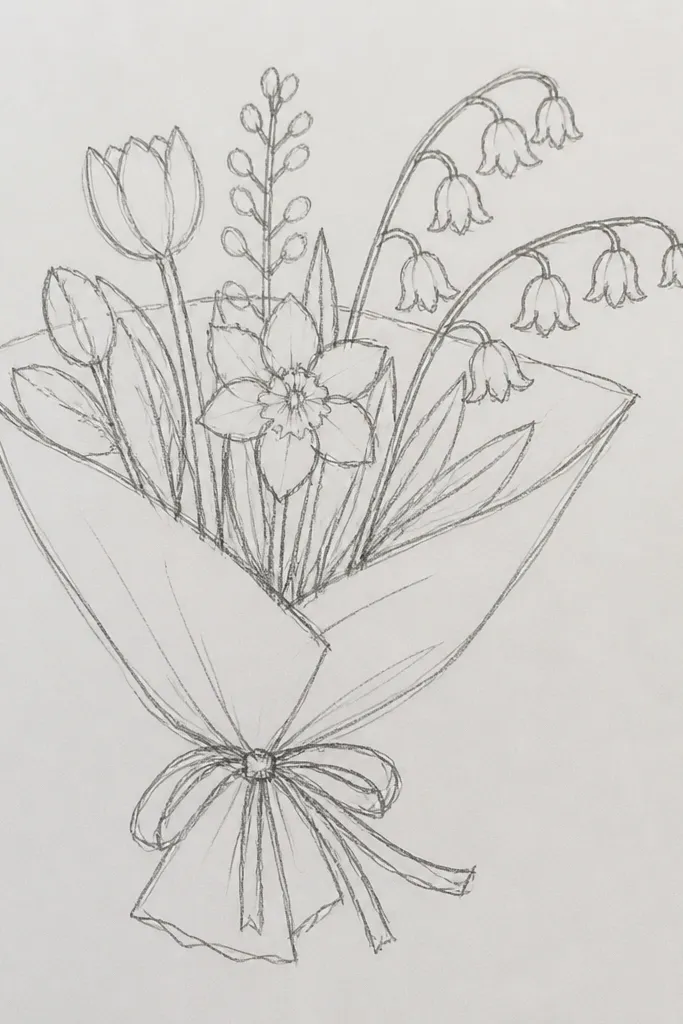
Bluebells look delicate and springy because the flowers hang and overlap. You’ll get an aesthetic result by drawing bell shapes that taper at the top and flare slightly at the bottom. The overlap creates depth without shading. This bouquet is low maintenance because each bell is basically one curved outline plus a line for the bell mouth. Great for vertical pages since the stems add a graceful line. Color the bells blue and keep the centers slightly darker for a polished look.
Sketch one main curved stem with 4-6 side offshoots. On each offshoot, draw hanging bell shapes using a rounded top and a slightly flared bottom. Add a small line inside each bell to suggest the mouth. Place small leaf shapes near the base of the side stems. Color bells in light blue, then add a darker blue line near the bell mouth and a tiny highlight at the top edge.
Good to knowVary the bell angles — rotate each bell slightly so they don’t look like copies.
Common mistakeDon’t draw bells all facing the same direction; it kills the hanging effect.
15. Spring Bouquet Frame Border with Flower Corners
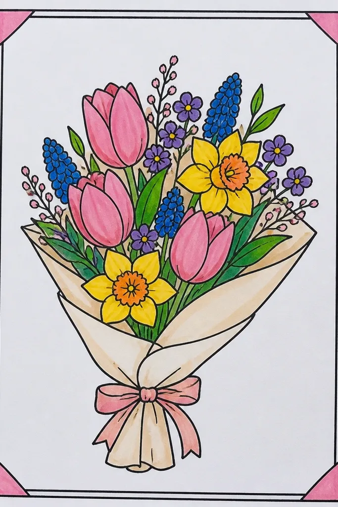
If you want your drawing to look “finished” instantly, a frame border does it. This idea makes the center bouquet feel intentional without adding time to each flower. Use easy flower shapes in the corners — tiny daisies, tiny tulips, or forget-me-not stars — then keep the main bouquet simpler. The border also makes photos cleaner because your drawing has a clear edge and composition. It’s a smart low maintenance option for printable card layouts and journal pages.
Lightly draw a rectangle border around the page with even margins, then sketch a simple bouquet in the center using 3-5 bigger flowers. In each corner, add 2-3 small flowers using one repeated shape so the corners match. Connect corner flowers to a couple of thin stems that point inward. Add tiny leaves to fill gaps near the border. Ink or darken only the border and main bouquet outlines, then color the flowers with 2-3 shades each.
Good to knowUse a ruler for the border, but keep the flowers organic — crisp edges plus soft shapes looks best together.
Common mistakeAvoid coloring the border — let the flowers carry the color.