1. Velvet Purple Pansy Bouquet with Butter Throat
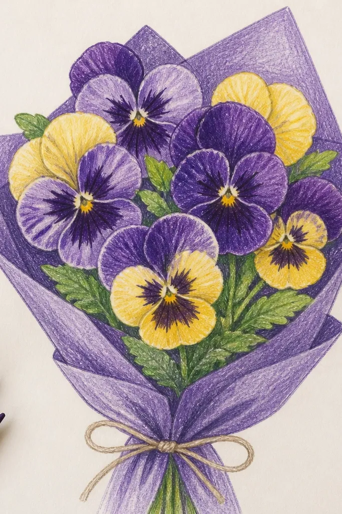
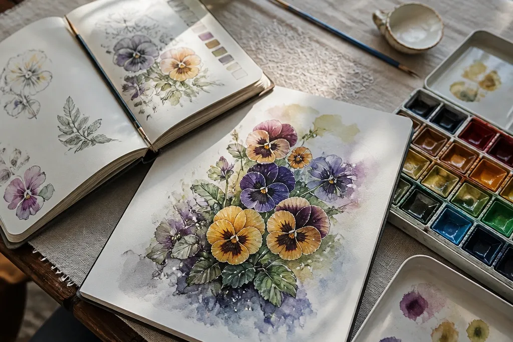
This bouquet is all about contrast: deep purple petals with a butter-yellow throat that looks like a tiny jewel. The trick is to keep the petal edges slightly lighter than the petal center, then intensify only the throat and the darkest fold lines. Use a calm off-white background so the petals feel like they’re lit from the front. It looks high-end because the colors stay controlled and the center details repeat across each flower. Skill level is beginner-friendly if you’re comfortable with basic petal shapes and light shading; plan about an hour.
Start by sketching 8 pansies in a loose cluster, with 1 front flower bigger than the rest. Draw the top petal first as a curved teardrop, then add the side petals wrapping slightly outward, then the bottom petal as the widest shape. Shade with a light purple pencil for the base, then press harder only under the petal folds and around the throat. Finish by adding butter-yellow at the center and a few dark lines radiating outward from the throat. Use a kneaded eraser to lift a couple of highlight spots on each petal edge before you darken the folds.
Good to knowKeep the throat shape consistent across flowers; identical center geometry makes the whole bouquet look intentional.
Common mistakeAvoid coloring the whole petal the same dark shade — the folds need darker pockets, not uniform darkness.
2. Ink + Watercolor Pansy Bouquet on Cold-Press Paper
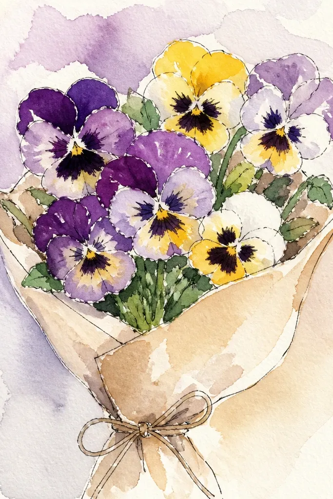
This is the most “gallery” looking option because the ink gives you crisp structure and the watercolor gives you soft transitions. The pansies look premium when the ink outlines stay thin and the wash stays light enough to let paper texture show through. Keep the bouquet shape tight, with a few stems peeking out so it reads like a real arrangement. You’ll also get that airy feel without needing heavy detailing on every single petal. This is best if you like ink work and you’re okay with letting watercolor do some of the blending for you.
Tape cold-press watercolor paper and lightly pencil your bouquet: 7 flowers, grouped so they overlap. Ink only the petal edges and the throat lines, using a fine liner so the darkest marks stay where they matter. Wet the petal areas with clean water using a small round brush, then drop in diluted purple and violet watercolor. Leave some white paper gaps along petal highlights so the flowers look glossy. Let it dry fully, then go back with a darker wash for the throat and fold shadows.
Good to knowIf your watercolor bleeds, wait for the first wash to dry completely before adding throat details.
Common mistakeDon’t flood the entire bouquet with wet paint — it turns into one flat blob.
3. Rose-Gold Blush Pansy Bouquet with Warm Brown Centers
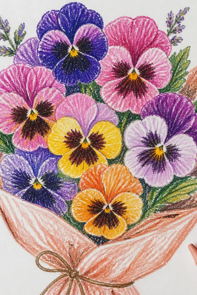
This bouquet looks high-end because it leans warm and muted instead of loud. Blush petals with warm brown centers read like styled vintage florals, especially when you add thin darker lines in the throat. The edges should look slightly rosy, while the folds go deeper into mauve-brown so you get depth without heavy saturation. Keep the background creamy and minimal so the warmth feels intentional. It’s a great choice for seasonal spring art that still feels classy for fall frames.
Sketch 9 pansies in a triangular bouquet shape, with the top flower slightly higher. Block in petal shapes with a light peach pencil, then shade folds with a mauve pencil using gentle pressure. Add warm brown only at the throat and along a few fold creases, not across the entire petal. Use a white gel pen or white colored pencil to place tiny highlight strokes on each petal edge. Finally, add a few thin stem and leaf lines in a muted olive so nothing competes with the flowers.
Use two pressure levels: light for the petal face, heavy only for fold shadows around the throat.
Skip bright red accents in the throat; warm brown keeps this look refined instead of candy-like.
4. Monochrome Slate Pansy Bouquet with Graphite Texture
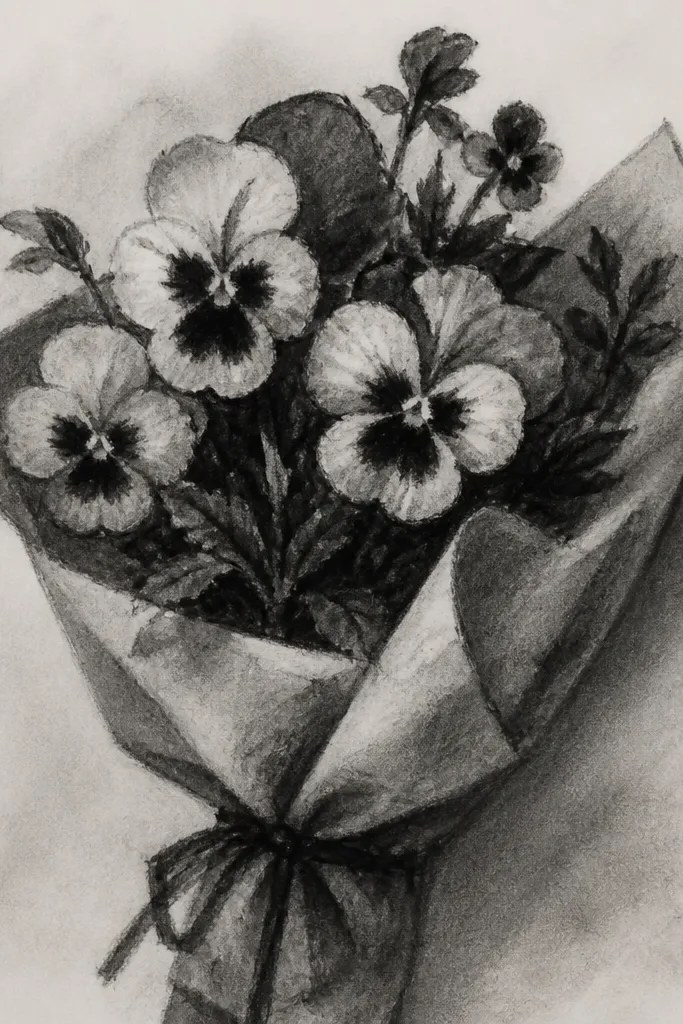
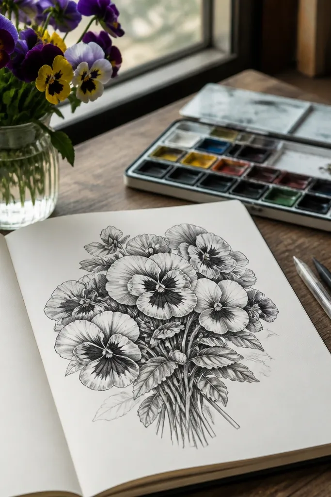
Monochrome drawings can look expensive fast because they remove color noise and force you to nail value. This slate pansy bouquet uses graphite to create soft gradients and a textured look on petal faces. The center becomes the star: dark throat marks, a few radiating lines, and a smooth gradient into the lighter petal edge. Keep the background blank or lightly shaded so the flowers pop. This is ideal if you want a clean, modern look that still feels detailed.
Start with a pencil sketch of 10 pansies, all facing slightly different angles so the bouquet feels alive. Use a 2B pencil for petal outlines and a softer 4B/6B for throat depth. Rub graphite lightly with a blending stump on petal faces, then lift highlights with a kneaded eraser along petal edges. Add crisp throat lines with a mechanical pencil so the center looks sharp. Leave the background mostly white, then add a faint oval shadow under the bouquet to ground it.
Good to knowGraphite looks smoother with fewer layers — build values gradually and stop before it turns shiny.
Common mistakeDon’t smudge the throat details — it kills the “center jewel” effect.
5. Teal and Cream Pansy Bouquet with Soft Spot Coloring
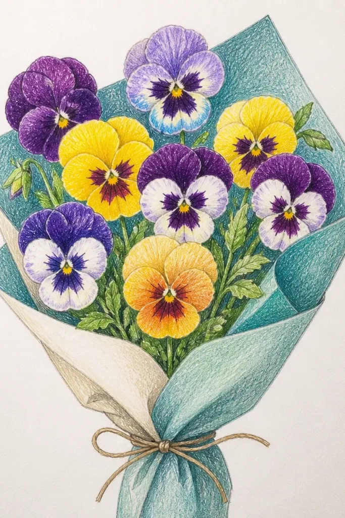
This bouquet looks high-end because the colors feel airy and clean, not heavy. Teal petals with cream highlights and small dark spots in the throat mimic real pansy markings without turning into scribbles. The key is to keep the spots tiny and spaced, then anchor everything with a few darker fold shadows. Use a very light wash behind the bouquet so it feels like studio light. It looks great for spring prints and it’s friendly if you’re still learning how to place pansy markings.
Sketch 8 pansies and lightly mark where each throat will sit. Base the petals with a light teal pencil, then blend softly toward the petal edges. Place cream highlights along the top petal and the outer curve of side petals using a white pencil or paper-lift technique. Add tiny dark specks and short lines at the throat, keeping them concentrated in the center. Finish by deepening fold shadows with a slightly darker teal and lightly tinting the background with a pale gray-blue wash.
Use a scrap paper to test your spot size; tiny consistent dots look intentional, big dots look messy.
Avoid outlining every spot — let the base color do the work.
6. Gouache Pansy Bouquet with Crisp White Petal Edges
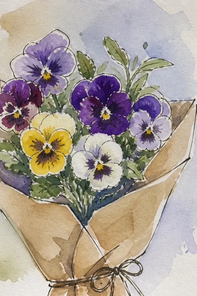
Gouache gives you that designer look because it’s opaque and holds crisp color boundaries. This bouquet is built around sharp white petal edges that make each flower feel separated from the background. The throats are darker and more saturated, so they read like a focal jewelry detail. You’ll get a smooth, matte finish that looks great in frames and on greeting cards. If you like painting but want control, gouache is the sweet spot.
Use watercolor paper or heavy mixed-media paper and lightly pencil your bouquet of 7 pansies. Block the petal base colors with diluted gouache, keeping each petal shape filled but not overworked. After the first layer dries, paint a thin darker shade along fold lines and around the throat. Then paint the petal edges with a small brush using opaque white gouache, leaving tiny gaps where you want highlights. Add leaves with a muted green and keep stems thin so the bouquet stays airy.
Good to knowLet each layer dry fully before adding white edges; it prevents chalky smears.
Common mistakeDon’t mix too much water into gouache — it turns translucent and loses the crisp look.
7. Pansy Bouquet in a Woven Basket Outline Style
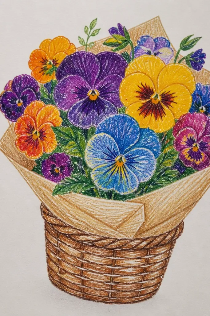
This idea looks high-end because the basket framing makes the bouquet feel like a finished product, not a random cluster. Use thin, consistent outlines for the basket and stems, then give the pansies more texture through light shading and throat detail. The woven pattern should be simple: a few repeating arcs, not a full render. Keep the background blank so the basket outline and flower centers become the focal points. It suits wall art, tags, and seasonal gift wraps because it reads clearly from a distance.
Draw a basket shape first using a slightly oval base and curved sides, then add a few horizontal and vertical weave lines. Place 9 pansies inside the basket, overlapping so the top petals peek out. Shade petals lightly with pencil, then add darker throat lines and a deeper throat fill. Add a thin shadow under each flower where it overlaps the basket rim. Finish with small leaf accents and a clean outline pass on the basket and stem lines.
Keep basket lines lighter than the flower centers — flowers should be darker and more detailed.
Avoid heavy crosshatching on the basket; it competes with pansy markings.
8. Black Paper Pansy Bouquet with White Gel Highlights
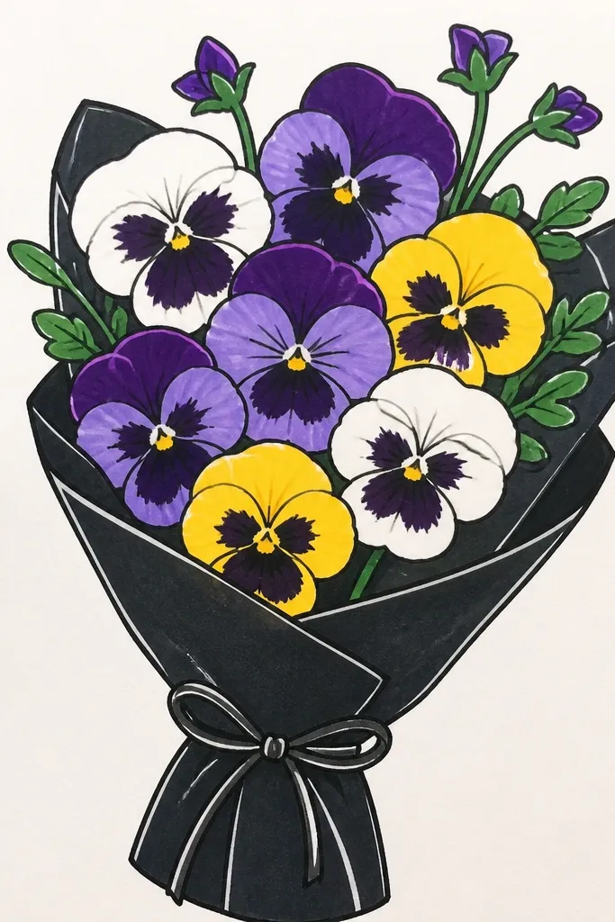
Black paper makes everything feel premium because it forces strong contrast and gives you instant depth. This bouquet uses white gel pen or white paint for petal highlights, plus a few controlled color accents for petals and throats. The pansy center becomes dramatic: dark throat areas, crisp highlight strokes, and clean petal edges. It’s bold and photogenic, especially for seasonal holiday cards. This is easier than it sounds because you don’t need heavy blending on a dark base.
Work on black cardstock and sketch your bouquet of 8 pansies with a light chalk pencil or white pencil. Color petal areas with diluted colored pencil or marker, leaving highlight zones untouched. Add the throat jewel with a dark purple/black tone, then scrape or lift slightly if you want a soft glow edge. Use a white gel pen to draw petal edge highlights and a few short vein-like lines. Add a minimal background by leaving it black, then add a soft gray shadow under the bouquet with a blending stump.
Test your gel pen line thickness on scrap; thinner lines look more realistic on petal edges.
Don’t cover the whole petal with white — highlights should be selective or it looks chalky.
9. Pastel Rainbow Pansy Bouquet with One Color Per Flower
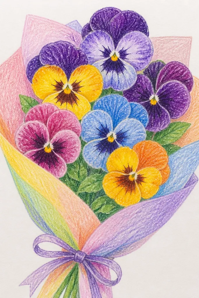
This bouquet looks high-end because it stays organized even though it uses multiple colors. Each pansy gets one main pastel color, but you keep the throat theme consistent with a warm cream center and a dark line set. That makes the bouquet feel like a planned design, not random coloring. The background should be one neutral wash so the flowers don’t compete. It’s great for spring and for anyone who wants a cheerful look without losing the “styled” feel.
Sketch a bouquet cluster of 10 pansies with a clear focal front bloom. Choose 5-6 pastel hues and assign one hue per flower, using the same warm cream throat approach each time. Base the petals lightly, then deepen fold shadows with a slightly darker version of the same color. Add throat marks in dark brown or deep purple and keep them similar across all flowers. Finish with a very light background wash in pale gray or cream and add small leaf shapes in muted green.
Keep the throat and fold shadow colors consistent across the whole bouquet; that’s what makes it look cohesive.
Avoid mixing multiple main colors into one flower; it looks muddy and loses the design rhythm.
10. Sepia Vintage Pansy Bouquet with Film-Photo Grain Background
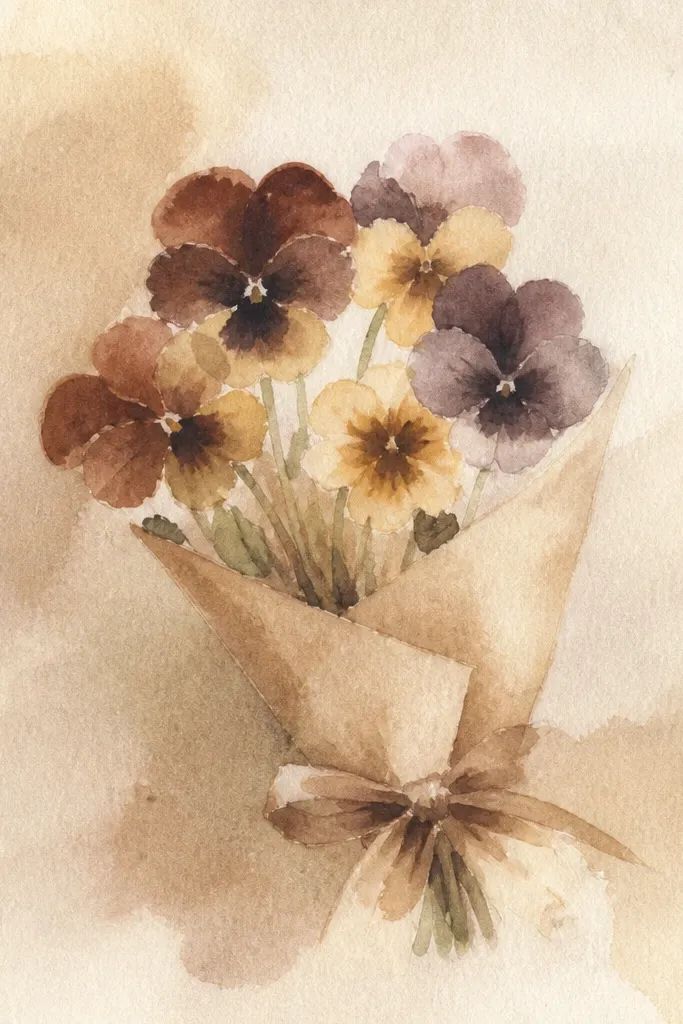
Sepia drawings look expensive when the background has texture and the petals have gentle value shifts. This bouquet uses warm sepia tones, with darker throat marks that feel like vintage ink. The petals get a soft gradient from lighter outer edges into deeper fold shadows, so they look dimensional without modern saturation. Add a subtle vignette around the bouquet so the flowers sit in a framed glow. It’s perfect for fall prints and antique-style holiday décor.
Sketch 7-9 pansies with simple outlines and place the biggest bloom at the front. Color petals with a light sepia base, then add darker sepia only in folds and around the throat. Use a small amount of darker brown to draw a few throat lines and specks, keeping the center crisp. For the background, tint the page lightly with diluted sepia, then add a grain texture using a dry brush or stippling with a scrap toothbrush. Finish by darkening the edges of the paper slightly for a vignette effect.
Use less grain than you think; subtle texture reads vintage, heavy texture reads messy.
Don’t make the entire bouquet uniformly brown; the folds and throat need darker pockets.
11. Two-Tone Pansy Bouquet with Ombre Petal Fade
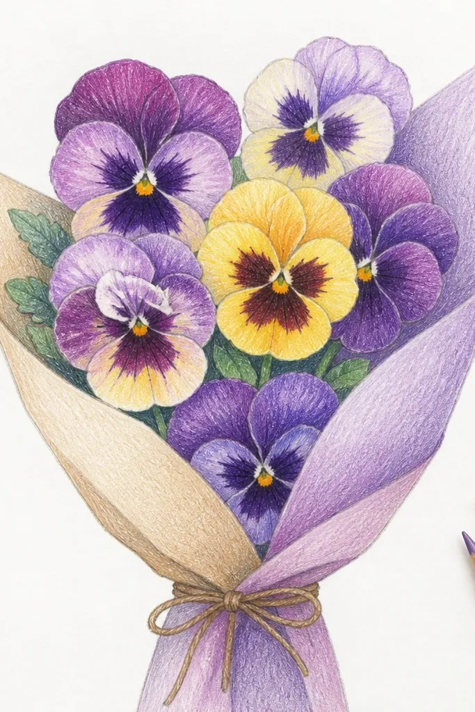
Ombre petals look high-end when the fade direction is consistent and the highlight stays clean. This bouquet fades from a deeper outer petal edge into a lighter inner petal area, then you reinforce the folds with a darker line. The throat jewel stays the darkest point, so the eyes land in the right place. Keep the background blank or lightly washed so the ombre has room to show. This is a great choice if you want a polished look without heavy detail work.
Sketch 8 pansies tightly grouped, with overlapping petals. Choose two tones that blend well, like indigo to pale lavender or plum to peachy cream. Base the petal outer edges with the darker tone, then blend inward with light pressure using a blending tool or layering colored pencil. Add throat jewel with the darkest color and a few short radiating lines. Use a white pencil to place highlight strokes along the fade boundary where the light hits.
Good to knowBlend from the petal edge toward the center, not back and forth; that keeps the fade smooth.
Common mistakeAvoid blending the throat fade; the throat needs a sharper center than the petal.
12. Floral Linework Pansy Bouquet with Minimal Coloring
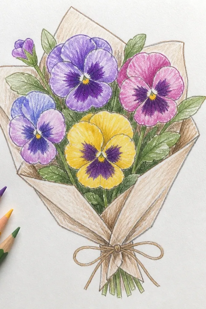
Minimal coloring looks expensive when your linework is confident and the centers are still detailed. This bouquet uses fine pen lines to define the petal edges and throat markings, then adds tiny controlled color fills to keep it airy. The background stays mostly white, so the flowers feel crisp and modern. You get a high-end editorial look that works for printable art and quick holiday cards. This is best if you like drawing clean shapes and you’re comfortable with pen control.
Draw a bouquet of 9 pansies using a fine liner, with the front flower slightly larger. Ink the petal outlines and throat markings first, keeping line thickness consistent. Color only the largest petal areas with light colored pencil, leaving the highlights and some paper showing. Add a darker throat fill in a small area, plus a few short lines to suggest the pansy folds. Finish with a few leaf outlines and a very light pencil shadow under the bouquet.
Good to knowUse fewer color strokes than you think; white space is part of the design.
Common mistakeDon’t outline every single spot inside the throat; a few crisp lines beat a dense pattern.
13. Watercolor Resist Pansy Bouquet with Lifted Highlights
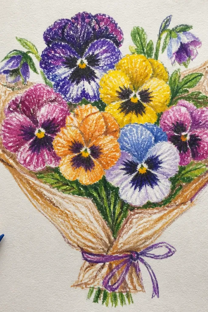
This is a clever way to get that glossy, high-end petal look without overworking. Watercolor resist lets you keep highlight shapes bright while the rest of the petal washes smoothly. The pansy centers look especially good because you can keep tiny bright points in the throat area. The bouquet reads premium because the highlights are clean and the wash edges stay soft. It’s a mid-level technique since you need to control wet paint, but the result is worth it for photogenic art.
Lightly pencil 8 pansies and decide where highlights will sit on each petal edge. Apply masking fluid or a white resist gel to those highlight areas, then paint the petals with diluted watercolor in your chosen palette. Let it dry, then remove the resist to reveal bright highlight shapes. Add throat jewel details with a darker watercolor and a fine brush after the petals dry. Finish by darkening folds with a second light layer so the center stays the darkest point.
Good to knowUse a small brush for throat details; fine control prevents the center from turning into a watercolor bloom.
Common mistakeDon’t rush the resist removal — pull it when the paint is fully dry.
14. Color Pencil Burnished Pansy Bouquet with Soft Velvet Finish
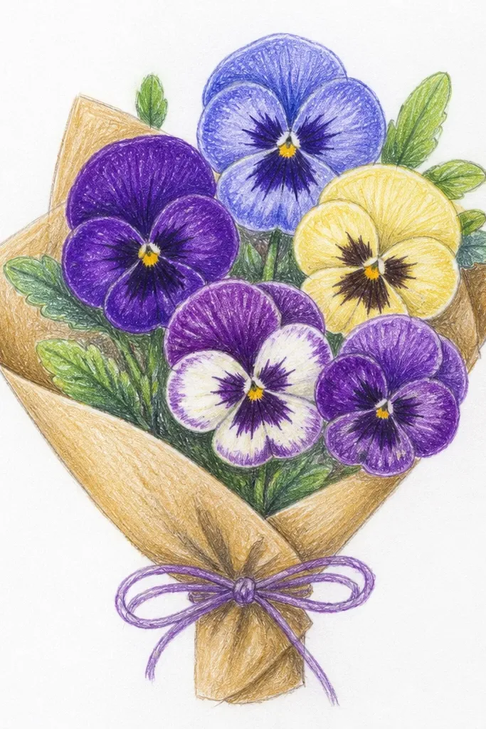
Burnished colored pencil looks high-end because it creates smooth, velvety transitions instead of patchy color. This bouquet focuses on layered shading: light base color, then darker fold shading, then center jewel details. The petals look like fabric because the gradient is controlled and the highlights are crisp. Use a textured paper like Bristol smooth or lightly toothy paper so you can build layers without streaks. It takes longer than a basic colored pencil drawing, but the look is worth it.
Sketch 10 pansies in a bouquet cluster, with 1 front flower as the focal. Layer the base petal color with light strokes, then switch to heavier pressure only in folds and around the throat. Add a dark throat jewel and a few radiating lines, keeping them sharp. Burnish the petals by gently rubbing the colored pencil pigment with a blending tool or clean tissue in small circles after the layers set. Place highlights with a white pencil or by lifting slightly with an eraser before burnishing.
Work in thin layers and stop before the paper gets slick; slick paper makes streaks.
Avoid heavy darks too early; you need the lighter underlayers to make the velvet effect.
15. Pansy Bouquet with Gold Ink Center Dots
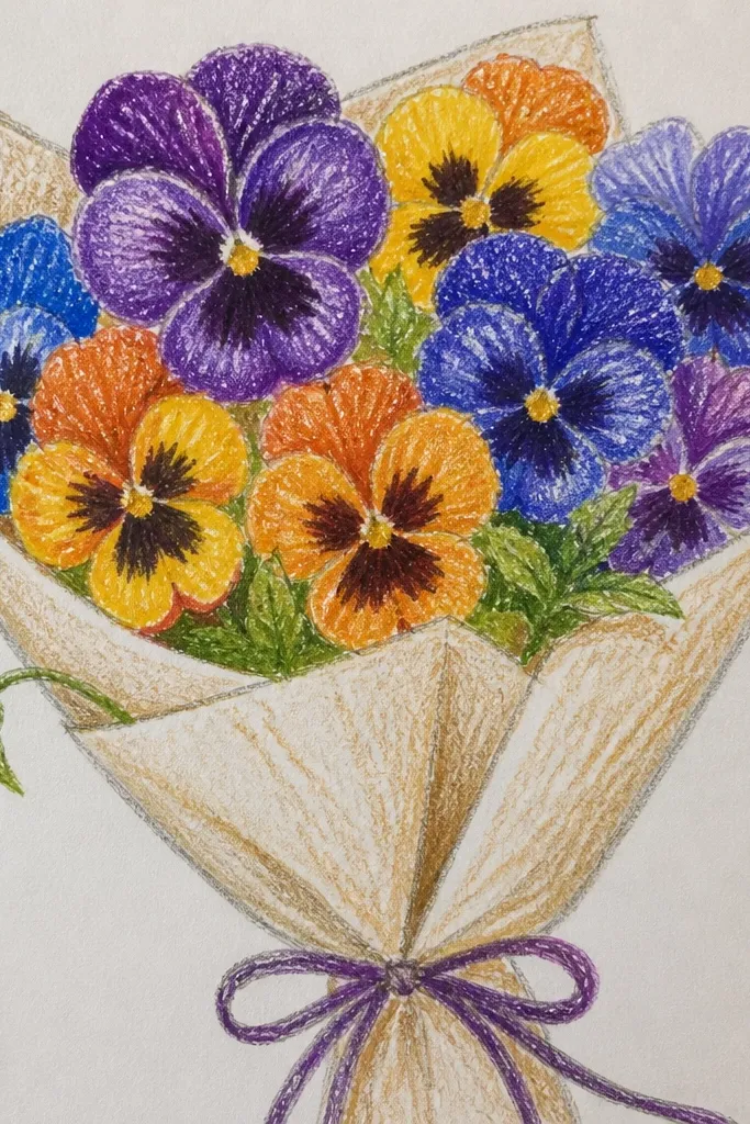
This bouquet looks expensive because the gold center dots catch light and make the pansy jewel feel dimensional. Keep the gold strictly in the throat area and a few tiny dot accents — that restraint is what makes it look stylish, not gimmicky. Pair purple or blue petals with a warm cream base so the gold reads warm and premium. Background should stay pale so the dots can sparkle visually. It’s a strong option for holiday-themed seasonal art without turning into full-on Christmas cliché.
Sketch 8 pansies and ink the petal outlines and fold lines with a fine black pen. Color the petals with colored pencil or watercolor in purple/blue, keeping highlights light. Use gold ink or gold gel pen to place small dots inside the throat jewel area, plus a couple of tiny dots along the fold curve. Add a darker throat fill in purple-brown so the gold has contrast. Let everything dry, then add minimal leaves and stems in muted green-brown.
If gold ink smears, outline the throat with pencil first and paint the gold only after the throat base is fully dry.
Don’t put gold on every petal edge; it flattens the design and makes it look busy.
16. Crayon-Resist Pansy Bouquet with Soft Pastel Bloom
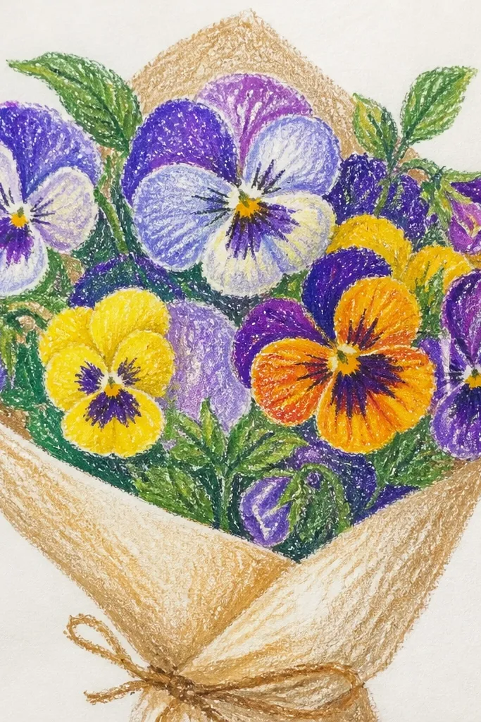
Crayon-resist looks high-end when you use it for controlled highlights, not messy scribbles. This bouquet uses waxy crayon marks to preserve bright petal highlights, then watercolor washes build gentle color fields. The pansy center stays sharp because you can draw the throat markings over the lighter wash. It feels whimsical but still clean, especially with a limited palette. This works well for seasonal holiday stationery because the colors stay light and the flowers look airy.
Sketch 9 pansies lightly on watercolor paper and mark petal highlight spots. Rub crayon lightly on those highlight areas and a few subtle vein-like lines, then paint over with diluted watercolor in pastel purple and blue. Let the wash dry, then go back with pencil or fine pen to add throat lines and fold crease marks. Add a darker throat jewel using a small amount of deeper pigment. Finish with a light background wash so the bouquet edges feel integrated.
Good to knowUse a small watercolor brush and keep the wash watery; thick wash hides the resist texture.
Common mistakeDon’t press too hard with crayon; deep wax can repel watercolor and create patchy spots.
17. Pansy Bouquet with Patterned Background Strips
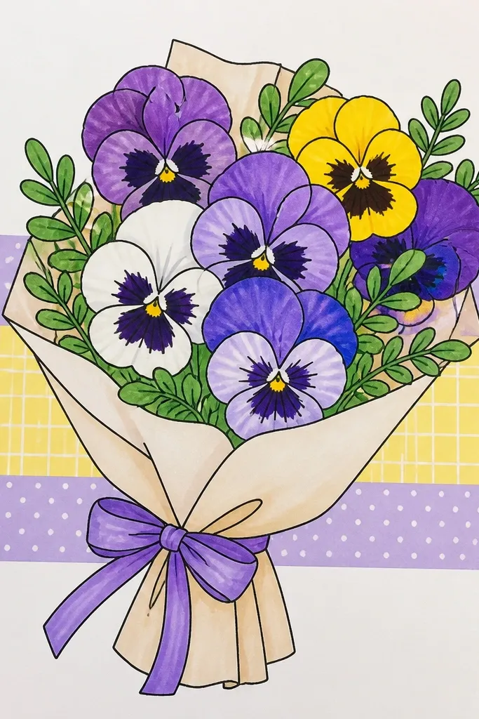
A patterned background can look high-end when it’s subtle and the pattern stays behind the flowers. This bouquet uses pansies as the main subject while the background has vertical strips or soft dots that don’t steal attention. The trick is to keep the pattern low contrast — think pale gray lines or muted pastel dots. The bouquet stays stylish because the pattern adds texture without making the petals compete. It’s great for seasonal holiday décor where you want something more playful than a blank page.
Sketch your bouquet of 7-10 pansies and lightly outline the leaves and stems. Block in the pansies first with pencil, then color petals and throats while keeping the background uncolored. Add a pale pattern behind the bouquet using light gray pencil or diluted paint: vertical stripes, or tiny dots in two spacing sizes. Strengthen the pansy center jewel with darker throat fills so it stays the focal point. Finish with a clean outline pass on the flower edges and a light shadow under the bouquet to separate it from the pattern.
Good to knowKeep the pattern value lighter than the petals; if the background gets darker, it turns into visual clutter.
Common mistakeAvoid bold black pattern lines behind light petals — it creates a harsh contrast that looks cheap.
18. Pansy Bouquet with Stained-Glass Style Petal Windows
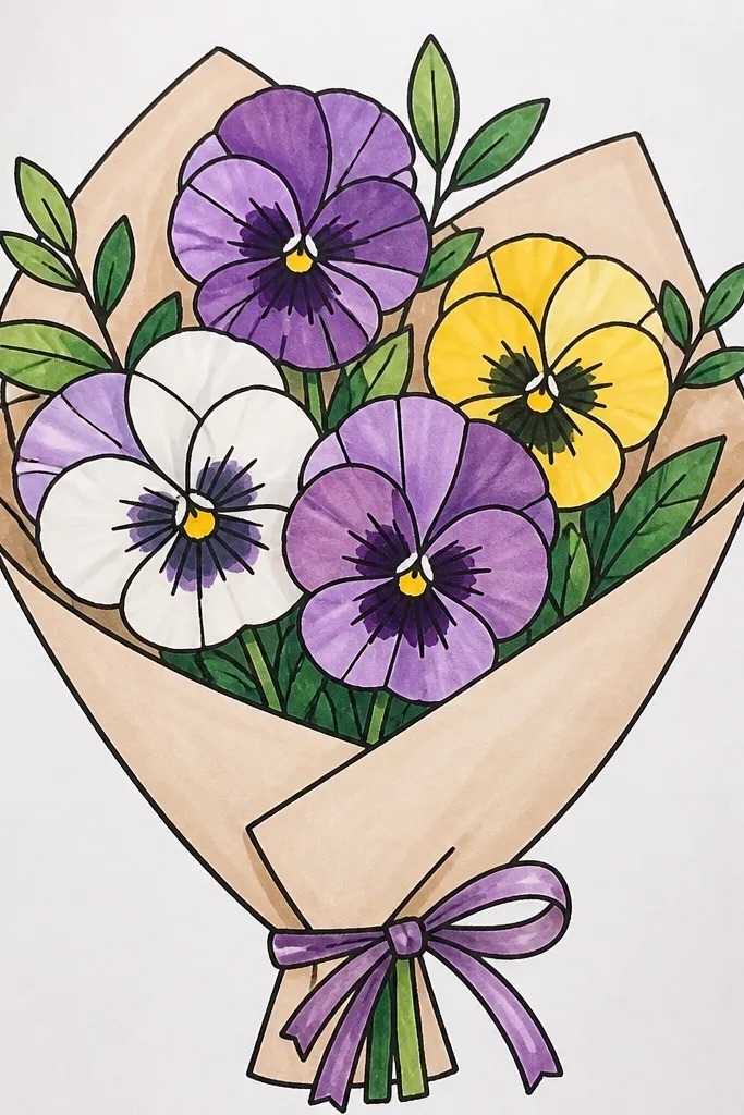
Stained-glass style is one of the fastest ways to look high-end on paper because the outlines create instant structure. Each pansy petal becomes a window: colored sections separated by clean lines, with a darker center jewel that feels like leaded glass. This makes the bouquet look crisp and decorative even if you keep it simple. Use a limited color set and let the linework do the heavy lifting. This is a fun option for holiday-themed seasonal art because it looks like ornament design.
Sketch 8 pansies and outline each petal with a thicker black marker so the “lead” lines are clear. Color each petal section with bright but controlled colors like violet, sapphire, cream, and a touch of olive for leaves. Leave small white gaps between colored sections to mimic glass highlights. Add throat jewel with darker purple and a few short radiating lines. Finish by adding a faint pale wash background so the stained-glass windows pop without looking flat.
Good to knowKeep your marker line thickness consistent across the whole page; uneven lines make it look handmade in a bad way.
Common mistakeDon’t color over the outline lines — the separation is the effect.
19. Pansy Bouquet with Soft Leaf Silhouette and Clean Negative Space
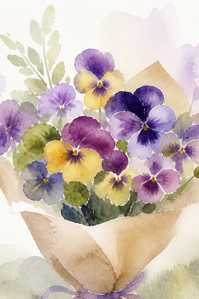
This is the most “styled print” looking approach because it uses negative space like a design element. The bouquet has clean pansy shapes, minimal leaf silhouettes, and a blank background that makes the colors feel intentional. The pansy centers still get detailed throat marks, so the flowers don’t look like outlines. This style is great when you want a high-end result with less filling and fewer background decorations. It also photographs beautifully because there’s no busy texture behind the petals.
Sketch 8 pansies in a tight cluster and keep leaf shapes to 3-5 simple silhouettes around the bouquet. Draw petal outlines and throat lines with a fine liner. Color petals with light layers, then deepen fold shadows and throat jewel with a darker tone. Leave the background untouched and add only a faint pencil shadow under the bouquet base. Use a white gel pen for a few petal edge highlights so each flower looks lifted off the page.
Good to knowTreat negative space as part of the flower — leave highlight gaps that match the petal shape flow.
Common mistakeAvoid adding extra doodles in the background; it breaks the clean, high-end look.
20. Pansy Bouquet in Tea Stain Ombre Wash with Cut-Paper Petal Shapes
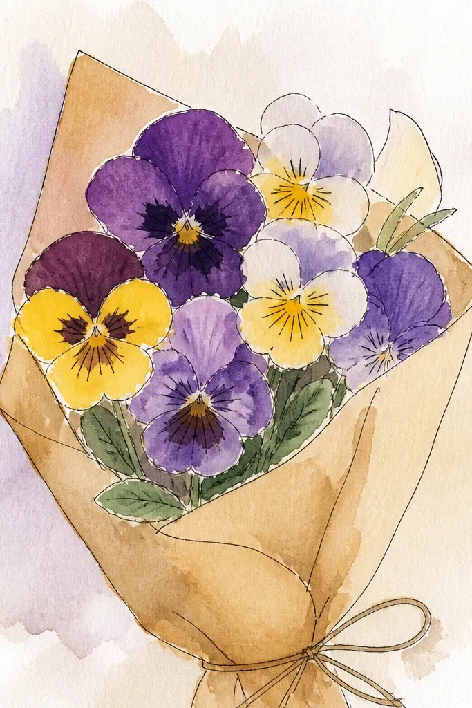
This one looks like a vintage pressed-flower print but with sharp, graphic petal edges. You start with a tea-stained ombre background, then build the pansies from cut paper shapes so the petals stay crisp instead of muddy. The contrast between warm brown wash and clean purple-violet paper makes the bouquet read instantly, which is why it photographs so well. It also fixes a common problem with watercolor pansies — the petals blur when you layer too much pigment. This is beginner-friendly because you’re drawing less and composing more, and the finished piece takes about 60 to 90 minutes. It fits stationery art, gift tags, and small wall prints where you want a warm, antique vibe without heavy illustration skills.
Cut your base paper to 5x7 inches (or 8x10 if you want bigger flowers). Brew black tea, then dilute it to a light tan and paint a vertical ombre wash from top to bottom; let it dry fully. Trace and cut 5 petal shapes per flower from scrap paper in two tones: deep violet for the outer petals and pale lavender for the top petals; add tiny snips for the wavy edge so the shape looks natural. Glue the petals onto the dried tea wash in a bouquet cluster, then add the “butter throat” using a small oval of yellow paper with a dot of dark brown marker in the center. Finish with a thin pen outline around only the darkest petal edges, plus a few leaf silhouettes cut from muted green paper. Seal with a light spray of matte fixative from 12 to 14 inches away once everything is dry.
Good to knowUse a craft knife and a metal ruler for cleaner petal edges; dull blades make ragged shapes that don’t photograph well. If your tea wash beads, wipe the paper lightly with a dry brush before it dries to even out the tone.
Common mistakeDon’t glue wet paper pieces onto a still-damp tea wash — the edges bleed and the whole bouquet loses its crisp look.